photographer

The Photocritic Holiday Gift Guide: photography presents big and small

If your photographer-loved-one is no longer a beginner; if there's nothing in the macro, high-speed, or landscape lists to light their studios; and if smartphone photography isn't her or his bag, we've another list of suggestions of gifts that might just fit the bill. Starting at £10, we hope we can help you find the perfect present for the photographer in your life. Lining up your presents


5527468270112_000_b

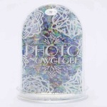
A photo snowglobe

It's as cheesy as a French fromagerie, but at £10 and with space for two photos of your choice, I could barely resist this snowglobe from Urban Outfitters.


Screen Shot 2014-11-22 at 12.12.38

Camera-shaped ice cube tray

We have ice cube trays in a variety of shapes, from fish to stars. There's no reason why we wouldn't add some photography-themed trays to the mix. One tray from Enlight Photo costs £10.


XX3A3608_large

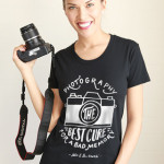
A t-shirt

Click and Blossom have some photography-themed t-shirts for women and men, boys and girls starting at $25. I'd be happy adding quite a few of them to my wardrobe. Or you could choose from one of their cushions or bags.    

personalized-puzzles

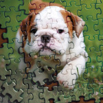
Your image on a puzzle!

Puzzles Print will provide a 1,000-piece jigsaw with one of your images on it for £30. A 15-piece puzzle for a little person is £22, with a welter of sizes in between the two. There are magnetic options and collages, too.

If you're in the US, USAPhotoPuzzles offers a similar service.


foldio-portable-studio-1b7c.0000001399132487

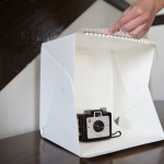
Foldio pop-up studio

The Foldio is a pop-up studio, made in miniature. The walls are white and there's a row of built-in LEDs to cast light on your subject. From as flat as a pancake it takes minutes to erect, held together with magnets.

$49 from Photojojo


Screen Shot 2014-11-22 at 12.30.38

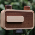
ONDU pinhole camera

Light and a box &mash; pinhole photography is photography at its most simple, and most enlightening. I fell in love with ONDU's hand-crafted wooden pinhole cameras earlier this year. Everyone should go back to the basics of the medium every now and again; this is perfect.

Starting from €90 from ONDU


fpssbk2

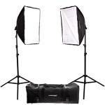
Lighting set-up

It's not fancy with flash, but for anyone wanting to start with artificial lighting, a basic set-up with some continuous lights and soft-boxes is a good place to start. Like this one for $135, or this for £150.

If you need something cheaper, this one is coming in at $55.


djipfc40

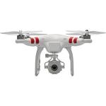
Quadcopter

It seems impossible to move amongst a photography or tech blog or news site without stumbling across, or being swooped upon, by a remote-controlled aircraft carrying a camera. You can get started with aerial photography for $500 with a DJI Phantom FC40. Or you could spend as much as $3,000 for the new DJI Inspire 1 with its 4K camera.


Gifts for landscape photographers < < Holiday Shopping with Photocritic > > Books for photographers


Can I use this photo I found on the Internet?

(Or, the non-photographer's guide to image use) It's a truth universally acknowledged that articles, newsletters, blog posts, posters, and basically anything involving blocks of text can be improved upon by the addition of an image. When you're writing about the local cycling club's criterium or producing a short introduction to crochet and macrame, you'll probably want some pictures to illustrate events or to explain techniques alongside your race report or detailed how-to. Can you take a look at the site of a local photographer and use some of his images from the cycle race? Can you conduct a Google Image Search for 'crochet' and download some photos of great examples of people's work?

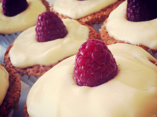
Cakes with Flickr denim filter

The short answer is always 'No'. Just because someone has posted an image on the Intergoogles, it doesn't mean that it is free for other people to use. You can't use the china in John Lewis' window display without paying for it first, and a photo on Flickr is just the same. Images belong to the people who create them—or in some circumstances, to their employers—so they get to decide how and when they can be used and what the appropriate fee for using them is. We put them on our websites or on photosharing sites because we're proud of our work and we like to display our capabilities, but it's not an open invitation to filch them.

There are a few exceptions to this rule, but until you know better, work under the assumption that every photographer keeps the tightest control over the use of all of her or his images. Being confronted by an angry photographer wielding an invoice for unauthorised image use is not a pleasant situation, so remember: You can't use other people's photos. Mmm'kay?

For completeness, what are these exceptions you talk of?

Some people are happy to licence their images under Creative Commons terms. Creative Commons licences aren't designed as an alternative to traditional copyright, but a complement. They're easy-to-use copyright licenses that allow you permission to use a photographer's images under terms decided by the photographer. One photographer might let you modify and use his images commercially, but another might say that her images must be attributed, cannot be used commercially, and aren't to be modified. However, not all photographers use Creative Commons terms (you'll see it close to the photo if they do) and if there's no evidence of a Creative Commons licence, assume that you can't use the image.

If you receive an image in a press release or it's made available to you from the press section of a website, this will be free to use in the context of the product or situation. For example, when Olympus releases a new camera, it will make a bundle of images illustrating it available to me. Provided that I'm writing about that camera, I'm free to use them in an article. The National Portrait Gallery will supply a selection of images from each of its exhibitions so that if you're reviewing it or publicising one, you have photos to illustrate the article. But, you can only use those photos in relation to the relevant exhibition and they must be attributed under the terms set out by the NPG.

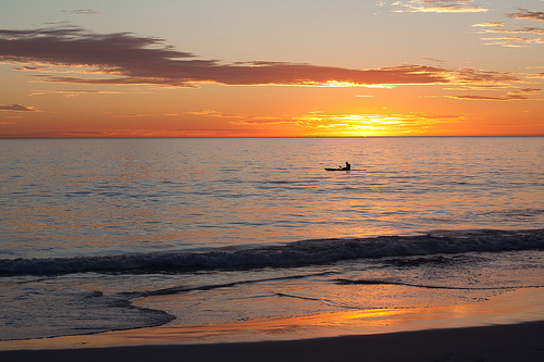
Sunset kayaker, Mullaloo

Some news agencies, for example AFP, are happy for you to use their photographers' images non-commercially and for personal use provided that you credit the photographer and agency and link back to the site. But, some agencies aren't. And you wouldn't want to face the wrath of AP or Reuters. Again, unless you're absolutely certain, assume that an image isn't free to use.

But what if you see an image and want to use it? What should you do?

Get in touch with the photographer! Most of us make it easy to send an email: do just that. We don't bite. Mostly. Tell us who you are, why and how you'd like to use a photograph that we've taken, and ask if you can come to an arrangement. The worst that we can say is 'No'.

That's not so hard, is it?

How NASA uses sound triggers to capture amazing rocket launches

The internet is full of a Crazy Frog (No, not that Crazy Frog, thankfully) today. This little buddy took a leap of faith in front of a photographer's sound-triggered camera at a NASA launchpad. The full story is available over on Mashable, but have you ever wondered how these photographers do their job? NOW WE'RE TALKING.

For security and safety reasons, photographers aren't allowed anywhere near the launch pad at launch. For obvious reasons, they can't use remote-triggered cameras either (Think about it... Would you allow anyone with a radio transmitter near a space rocket?), and so they use other techniques instead. Specifically, sound-triggered cameras.

There are a great many different ways of doing this, of course, but over on the Triggertrap website, there's a fantastic interview with Walter Scriptunas II, who shoots NASA rocket launches using the sound triggers built into the Triggertrap v1 camera triggers. Clever stuff, and well worth a read!

A Closer Look: Jonathan May


I've handed over the reigns to Gareth again today. He's taken a slightly different approach to his article this week: he's going to take a closer look at a photographer he admires, and examine just what it is that does it for him.

All yours, Gareth...

A Closer Look is a series of articles looking at the work of photographers whose work means something to me. When I am influenced by the work of others, I like to take less tangible elements away from the images. It isn't useful, in my opinion, to closely study the technical style of a given photographer, as you are at risk of losing your individuality. A more useful practice is to study what you love about an image beyond the immediately visible.

This week, I'm looking at Jonathan May, a photographer I became aware of when he was selected as a finalist in the National Portrait Gallery's Taylor Wessing 2011 Photographic Portrait Prize.

A small disclaimer: just because I admire May's work doesn't necessarily mean I can speak about it with authority – I merely aspire to describe what I like about it.
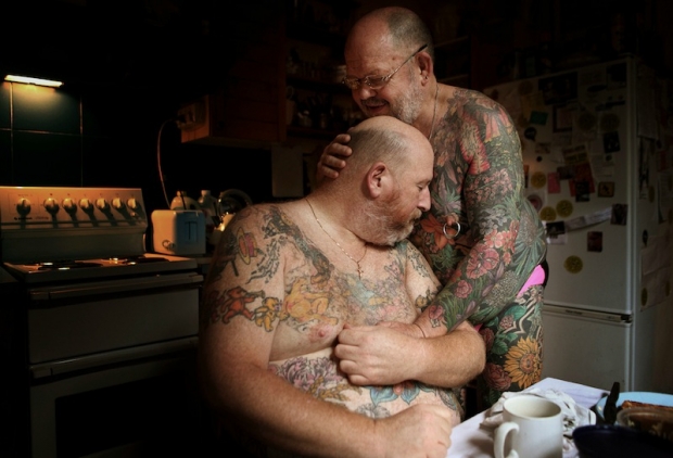
may.jpg

The first thing that strikes me about May's work is that it's often very positive in tone. This is extremely refreshing in the current climate, because so many photo stories, whilst absolutely beautiful and shot with a mastery that leaves me open-mouthed, are of subjects that are, frequently, unrelentingly bleak. Now don't get me wrong, I think it's  vital for photography to be able to highlight issues and tell stories that would go untold and unseen by the world. Not only that, but I think the people who bring such stories to the world are genuine superheroes (and possibly slightly unhinged): it's just that the saturation of such stories makes me yearn for something different.

You can see this immediately in his set L'Afrique. I feel that, in the West, we have a skewed image of Africa: a combination of the doom and gloom of the media and the plethora of photo projects that cover injustice, poverty, war and political horrors throughout the continent. It feels like from north to south, east to west, it comprises misery and human suffering. There is, of course, much of that, all of which needs to be exposed to the world and not kept a secret, but there is also a vast and beautiful culture and history which is seldom celebrated in the face of documenting all that is wrong with Africa.

May's shots of Africa exhibit a warmth, respect and admiration for African culture. It is refreshing to see a story of Africa that feels more celebratory than exploitative: in L'Afrique we become students, soaking in the beauty, gazing up at these people, learning, engaging on a human level.
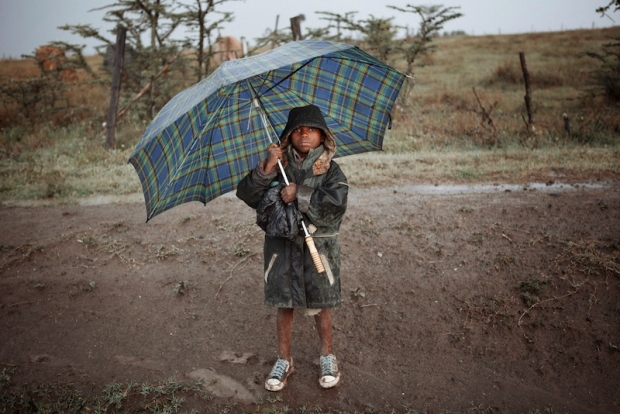
afrique.jpg

The most important skill exhibited in L'Afrique is May's ability to act as the humble recorder whilst still applying his style, skill and proficiency to the images. If an image evokes more of the photographer than it does the subject, it's doing something wrong, in my opinion. This is something May is acutely aware of and he elevates his subjects whilst remaining anonymous to us, the viewer.

It's a feeling May achieves in many of his projects and is something evident in any story he tackles. I love his ability to find beauty in topics and stories that are infrequently covered. This is why one of my favourite photo stories of his is Greens: a look at crown green bowling, more specifically the bowling club his grandfather founded.

There is something quite beautiful in the telling of a story through the paraphernalia and objects that surround the people involved in the story, and Greens achieves this beautifully. An image of a somewhat chintzy clubhouse carpet with a table occupying the corner tells us as much as a one of his intimate, shallow depth of field portraits does. It's when these two are combined in a series that they unlock the power of one another: although they are strong images on their own, the effect is compounded when they are brought together, contrasting as they are in content.
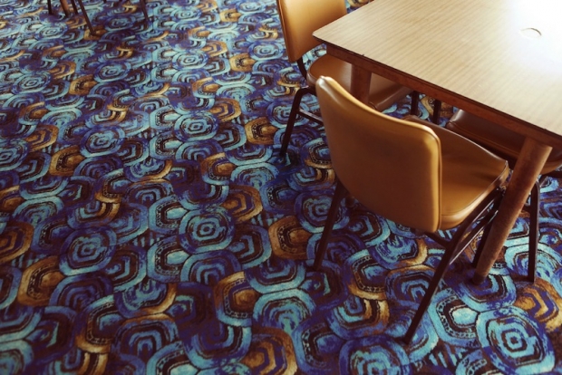
greens.jpg

As a portrait photographer halfway through my first ever long-term photo project, I am fascinated with the idea that a portrait of someone can be greatly enhanced by an image of their surroundings, or of something that is illustrative in some way of who they are, as opposed to a single image of the actual person.

There are dozens of single images within Jonathan May's work that I love but, in the interests of not making this article tediously enormous, I will look at my absolute favourite and attempt to articulate why I adore it.
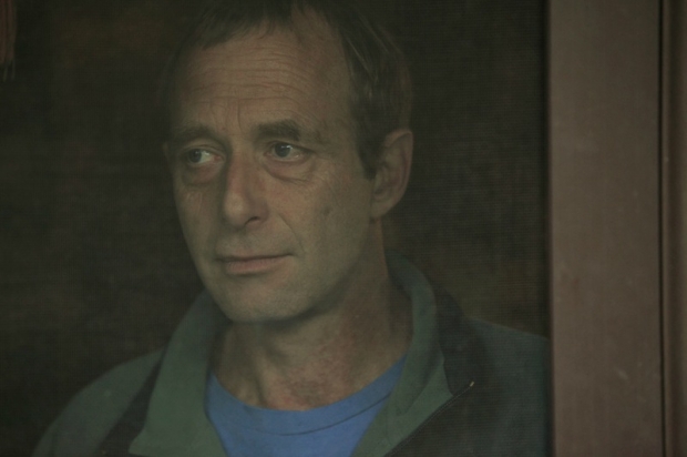
caravanport.jpg

This is a portrait from May's series Caravans, a story about a society that is often looked down on and dehumanised in many ways. The series itself has all the trademarks of May's work, but there is something about this particular portrait that, as I cycled through the images, was like a punch in the stomach: a good punch in the stomach, if that makes sense (it doesn't).

Initially, the intimacy of the composition grabbed me, so I brought it up in full screen. The background is uncluttered and plain yet far from blank: it further draws us to the subject's face. The expression that May has captured is utterly captivating: it's an expression that is both inscrutable and full of emotion at the same time. His mouth is ever so slightly curled up at one side, suggesting a smile may be breaking out. There is the tiniest hint of a wet glint in his eye, as if he is holding back a tear, but it's all so slight that we're not sure whether that is a projection of what we are seeing in his face or the reality of the situation. When I look at his face, I see a man remembering: an expression of fond reminiscence. We are the ones to lay down the final brushstroke, the canvas is left open for us.

And 'canvas' is an appropriate word here: the mesh of the door has muted and diffused the light and the wooden frame forms the right hand side of the image, creating the feel of a Renaissance-era painting, faded over time. I love the idea that something so beautiful can come from a seemingly innocuous shot of a man looking out of a window in his caravan. That, dear readers, is the magic of photography.

What I'd really like is for these columns to become discussion points about the artist in question. I want to hear what you think of Jonathan May's work – does it resonate with you? Does it excite you? Does it bore you? What do you like? What do you hate? Let's hear your opinions!


The illustration was by the mightily talented James, of Sweet Meats Illustration.

You can check out Gareth's photography here.

And if you're wondering about the copyright implications of reproducing May's work in this article, it's covered under fair dealing, as criticism and review.
How the iPhone copes with only having a f/2.8 aperture


If you ask any photographer whether they would be willing to take photos with a fixed focal length lens, many would say 'yes'. Prime lenses are as old as photography itself, and there are many excellent reasons to embrace them. Ask the same photographer if they'd be happen to work with a fixed-aperture lens, however, and you wouldn't get many good responses.

And yet, this is the reality of taking photos with an iPhone 4: It doesn't matter how bright or dark your scene is, you're stuck with a f/2.8 aperture lens. This is a problem if you want to use the iPhone with an external flash (not that you could anyway - here is why) - but how does the iPhone cope with extremely bright situations?

The lower limits

As you (probably) know, an exposure is controlled by 3 factors: ISO, Aperture and shutter speed. If aperture is fixed, you have to deal with any lighting situations with the other two. In low light, the iPhone will ramp up the ISO.

In fact, if I press my iPhone against a dark surface and take a photo, the camera reveals its limits:

photo_2_2.jpg

This incredibly boring photo reveals the limits of the iPhone's camera: It won't use slower shutter speeds than 1/15th of a second, and it won't go beyond ISO 1,000:

screen_shot_2012_08_16_at_150955.jpg

The upper limits

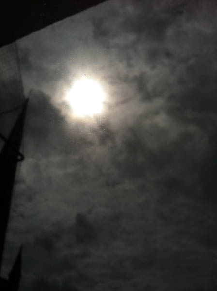
Similarly, it's easy to test the iPhone's upper limits, by pointing the camera at a ridiculously bright light source. The sun will do. This photo:

photo_2.jpg

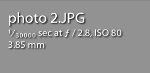
... Reveals the other set of extremes:

screen_shot_2012_08_16_at_151109.jpg

... Which is that whilst the iPhone is still stuck at f/2.8, the maximum shutter speed is an incredible 1/30,000th of a second.

Putting these two figures together (about 4 EV steps of ISO and another 11 EV steps of shutter speed) reveals the exposure range available to an iPhone  photographer: an impressive 15 stops of difference from the lowest light to the brightest lighting situations.

Of course, this is nothing compared to the extreme shutter speed, aperture, and ISO ranges of modern SLR cameras, but hey - it's not bad for a device you keep in your pocket at all times!

Finally a useful way to make money off events photography


Event photography is many things, but 'easy to make money off' isn't one of them, and it strikes me time and time again that the way most photographers do it, doesn't make much sense.

I recently went on a motocross day, for example; there was a pro photographer there, who sold his pictures on disc or as prints (he had a little colour laser printer set up in a trailer); it works, of course, and with the prices he was charging, I'm sure he was making a decent living, but it doesn't seem like a very efficient way of doing things.

20090802_img_7549_600px.jpg

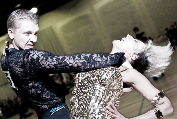
The same thing goes for stuff like high-school sports events, junior-league sports, dance competitions, and more traditional event photography, like parties and weddings etc... The whole mechanic behind having to actually produce the photos and get them to your potential customers is, if you'll forgive my French, and absolute ball-ache.

Doubly incredible, there isn't much in the way of websites out there that make things any easier for you. There are a few companies that embrace event photography, but they make it really work-intensive to actually sell anything, which is yet another challenge.

I've long since given up finding a useful solution, and then someone pointed me to the startup Frozen Event - they just launched their service in beta, but holy dogs, is it head and shoulders above anything else I've seen in the field.

As a photographer, you can simply upload your photos to an event, and then users can browse through them, and buy the images they like.

It's bloody clever, and I reckon if you do events every now and again, it's well worth keeping an eye on 'em! There's a pretty decent blog as well, which seems to focus on events photography specifically.

Rights and Respect in photography

Today, I stumbled across an article on Found Photography, titled ‘Your rights as a photographer‘. At first, I was intrigued, thinking that it would have something to do about copyright.

Instead, it turned out to be about photographing Amish people, who, according to the article, "The Amish don’t like to be photographed because it might cause them to be tempted by pride". The article then finishes with some tips about your rights, if you come across Amish people in public places, and what your rights are regarding photographing them.

This reminded me of a different discussion I had a while ago, which regarded photographing people who didn’t want to be, also for religious reasons: Some Native tribes, for example, believe that a photograph of them means you steal their soul. It would, therefore, be less than wise to photograph them.  

The rights, as described in the article, are as follows:

1. Almost anything you can see you can photograph. If you can see it, you can take a picture of it. If you are standing on public property you can photograph anything you like, including private property. It is important to realize that taking a picture is different than publishing a photo, which leads to point number two.

2. As long as you are not invading someone’s privacy, you can publish their photo without permission. You can take someone’s picture in any public setting and publish it without consequence (even if it portrays the person in a negative way) as long as the photo isn’t “highly offensive to a reasonable person” and “is not of legitimate concern to the public.” You can even publish photos if you took them on private property. While you may be punished for being on private property, there is no legal reason why you can’t publish the photo from prison!

3. As long as you aren’t using someone’s likeness for a purely commercial purpose, you have the right to publish the photo. You can use your photos of other people without their permission for an artistic or news purpose, but you can’t use them for a commercial purpose (such as an ad). You could sell a photo of a person without their permission, but you couldn’t use the photo in an ad saying the person endorses your product.

Whilst this is all correct, and really important to keep in mind, there is a different consideration to keep in mind, which brings me to the point of this article...

Respect in Photography

As a photographer, I have experienced feeling that I have touched people in a ways I wish hadn’t. An accidental invasion of privacy, so to speak, which made me feel as if I had commited the rudest form of sexual harassment – without even being aware of it.

In photography, One day, you can take a photograph of someone who is not wearing any clothes, but it will be okay. The next day, you can take a picture of someone who is fully dressed, even if you don’t see their face, and it is the worst of possibly imaginable sin. What is okay in one situation can be wrong in another.

The legal aspect

Many countries in Europe have added the European Convention on Human Rights as part of their set of laws. This convention has something that is devastating to privacy, called Section 10.

“Everyone has the right to freedom of expression. This right shall include to receive and impart information without interference by public authority and regardless of frontiers.” In practice, this is roughly the same as the 1st Amendment in the American Bill of Rights – the freedom to expression.

The conclusion drawn from the 1st amendment and Section 10 is that you can always take pictures. Even on private property, you have the right to photograph anything you can see.

Despite of something being legal, it doesn’t mean that you should, though.

The moral aspect

Several minority cultures believe that taking a picture is the same as stealing somebodys soul. Taking a picture of a member of such a culture is inexcusable. Upon having taken the picture – as far as they are concerned – it is too late.

If you, as a photographer – especially as a professional photographer – make the mistake of taking a picture of a member of such a minority group, you have fucked up beyond forgivenness. Call it a breach of professional conduct, or a kick to the shins of common sense.

Other times, however, you meet people of whom you really couldn’t have known their aversion to photography. I have experienced taking a picture of a couple looking wonderfully in love. When they realised I took the picture, the male half of the couple came over and asked me for the film. Apparantly he was married, and didn’t want me to publish the picture. What was I to do? I decided to promise him to not use the image, and deleted it off my camera. Not a legal choice - a moral one.

In the grand scheme of things, I haven’t been a photographer for all that long. Situations like that will arise again, I am sure. And I am certain that modesty, along with a dose of appropriateness, will get me through those situations.

I have a few friends who work as wartime photographers. In the job, they see some of the most horrible things known to man. The pictures in the newspapers are the mild versions of some of the pictures I have seen people come back with. And the pictures never go outside their photo albums. Why? Because some things don’t need to be shown.

A man far wiser than me said to me once: "These things are not secret, but they are sacred, and should not be taken lightly".

I know of no respected photographer who didn’t have respect for the subjects s/he photographs. And – even if you aren’t the best photographer in the world – showing respect will get you the respect you need to get a good start in the lion’s den that is Photography.

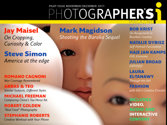
New iPad photo magazine: Photographer's I


The front cover. It even has my name on it. Score.

If you've ever held an iPad playing full-resolution video, or showing a slide show, you would be forgiven for thinking "Screw magazines, this is the future". I'm not sure if I completely agree - for one thing, that would do bad things to my fun-to-write column for Photography Monthly, but there's also something tactile and wonderful about magazines in general - but there can be no doubt that an iPad is fantastic in many ways.

So, if you were to design a photography 'magazine' for the iPad, what would you do? I would ensure that it contains top photography writers and contributors (like Abbas, Paul Harcourt Davies, Natalie Dybisz, Michael Freeman, Bob Krist, Steve Simon, my good self, and many other talented 'togs). I would include a load of video content, I would make sure that the iPad's screen gets a proper work-out with glorious high-resolution images.

And once all of that is done, I'd call it Photographer's I. Ladies and gentlemen, fire up your iPads, turn to the App store, and get your copy of Photographer's I today. It's funny, you'll definitely learn something, and it's easily the best thing since some dude sliced a loaf of bread with the sharp edge of his MacBook Air.

Get it here. Go on.

I Just Remembered How Fun Photography Is

Baileys - the smile maker.

Blinkers. Yes, those things they put on horses to keep them looking straight ahead. But I’m not talking about real blinkers, no: these are special, invisible, metaphorical blinkers. In particular, I’m talking about the ones that form around the eyes of a photographer once in a while. The more you learn, the less you experiment. It’s the process of going from a hobbyist to taking photos for a living, or indeed to just having the drive and need to improve. We all get it once in a while and it can be hard to shrug off, especially when we’re looking for a new subject or concept but feel bound by the rules. So how do we start afresh? How do we tear those blinkers off (no, stop clawing at the sides of your face – like I said, they’re metaphorical blinkers) and find a fresh new approach? This week, I think I found the answer: you have to remind yourself that photography is fun. 

Baileys - the smile maker.

At the moment, I’m undertaking a couple of portraiture projects. One of them was born of frustration, of sorts, at feeling like I had no ideas, or that anything I could think of only took a quick trip to google to discover that it had already been done. Of course it had: seeing as there are 7 billion people in the world (that’s right, I read the news), it’s quite likely that someone has had a similar idea to your incredible, totally original megaplan that just formed in your massive, omnipotent, glowing master brain. Any project I could think of seemed boring, limp, overdone, predictable, stiff, stupid, silly. The only photo work I was doing was commissioned stuff – stuff I’ve been doing for a while for which I have naturally developed a pattern. This is an inherently human problem: we are genetically programmed to recognise and find comfort in patterns, yet simultaneously, we get tired of repetition. We need variety, change, difference. This is why we are often warned about photography as a job, because we find that when it goes from a creative pastime to something we do as a matter of course or a process we repeat for cash, it becomes that other thing: it becomes work.

Just chillin'

You can imagine my delight, then, when I began this new photo project and the blinkers came flying off at speed at wild angles. Tragically, one of them flew headlong into a small boy. Thankfully this small boy is also metaphorical and represents creative inhibitions, so we can all relax. This long term project was coming along nicely, when I felt something at the sides of my face. That’s right, further blinkers, only these ones were flesh coloured and therefore harder to detect at first. I sat down and sighed heavily, like a man struggling with a tortured, extended metaphor. The subject was interesting, but I needed to mix up my approach also.

The company I am following for my project had an office party upon reaching a milestone, and I was invited. As I am both never one to turn down the opportunity to take photographs yet also never one to turn down the opportunity to party,
I found myself in something of a quandary. Then I came up with the solution: I would take my equipment, set it to an auto mode to make it at least a little foolproof, and then set them loose with it. Tonight, they would take photos of each other, in a relaxed environment where they were in control of everything. As I handed the camera over to the first willing participant, a wave of consternation laden questions passed over me. Will they be into it? What if they break the camera? Will this work, or will it just be a bunch of terrible, unusable snaps? Is this cheating? How far is too far when breaking the rules? Has the gin run out?

I have no idea what's happening here.

I was absolutely delighted to discover that almost everyone was not only willing but eager to have a go. In addition, they took greater care of my camera than I do, holding it with extreme care as if I had given them my newborn baby. I smiled as I watched the behaviour of those with the camera and how it differed from person to person. Some would try to be more stealthy in their approach, waiting to become unnoticed before firing off a few shots at distracted individuals. Others initially took the camera with some uncertainty, gingerly padding around wondering what to do. I would turn away and check back on them a few minutes later to find the same person sliding down the wall into a crouching position, snapping here, snapping there, rushing around the other side of the sofas to get that crucial shot they’d just spotted. Some would simply observe and record, whilst others would get their workmates to pose or dance or do something silly. It made me incredibly happy to see people enjoying photography, to see everyone take to it and have a go and the fun and enjoyment it was bringing them.

That’s when I had a somewhat simple yet important revelation – they were having fun with the camera. Because that’s one of the many things photography is: fun! Somewhere along the line, although I had never stopped loving what I do, I had forgotten to relax and have fun, instead of being intense and super concerned all the time when taking photos.

I also got a lot out of being on the other side of the camera. As a portrait photographer, it’s important to get a sense of how it feels to be the subject as well as the photographer. That sense of empathy can help you when it’s your turn to take photos again. I also realised that it can be easy to forget that someone is taking photos, and you get used to it more quickly than I thought. This is also useful to me, because where once I might have hesitated to shoot, because I wondered if the shot would be natural enough or if I was being overly conspicuous, it seems that often this would not have been the case.

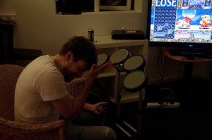
This is Dave. He has lost.

What was even more rewarding was that the learning process did not stop there. When I uploaded the images to my machine the following day to look over them, I was initially picking out all the focusing problems, all the low lighting issues, the odd compositions with peoples’ head coming out of other peoples’ backs or not being quite right in the frame and the strange choice of angles. On my first pass through the images, I was thinking “hmmm, can’t really use that, can’t really use that, not sure about that”. On my second pass, I learned something – on at least a few images that I had supposedly looked over, I had missed some brilliant moments that made the photograph worth including, such as Dave losing at a game of Super Puzzle Fighter, his head in his hands, which was being matched by his onscreen avatar and accompanied by the word “LOSE” in big letters in the top right. It was a brilliant little image and, regardless of how much intention was behind it, it had recorded a whole story in one frame. Surely, this is the very essence of a great photograph. I had lost myself in the rule of thirds and exposure levels, looking purely at the technical and missing the artistic, the story being told in the image. It was an eye opener for me – a technically proficient image still lacks punch and excitement if there’s no story within it. It’s not that I didn’t know this, of course, but sometimes learning by experience is infinitely more valuable than learning something in theory.

If you’re feeling burnt out with your photography or you feel like you’re treading water, it’s probably because you’ve forgotten how to have fun. Don’t allow the technical to overwhelm you. Remember, photography is part science, part art, and wholly fun.

Thanks to Gareth Dutton for this. You should completely check out his work, too!


Photo week at Apple

photo_regentstreet

For anyone who was looking for any kind of excuse to saunter over to the Apple Store on Regent Street, they’re laying on a series of photography events over the week 7 to 14 November. And they extend a bit beyond just using the iPhone. Apple’s brought on board NK Guy, the MV collective, and David Ward and Eddie Ephraums, amongst others, to offer a series of workshops, talks, aimed at photographers of varying abilities and backgrounds.

There are beginners’ guides to lenses, portfolio reviews for slightly more experienced photographers who are looking to progress, as well as in depth looks at different types of cameras and which sorts of photographer they suit and a talk from pro Mark Esper. There are plenty of sessions that cover the iPhone camera and the plethora of apps, but there’s an off-camera lighting masterclass and a session that explores the best means to back up your image archive, too.

You will have to reserve your spot at some sessions and there’s quite a bit going on, so you’d be best heading over the Regent Street website and taking a look at the full schedule.

The Dead Sea Scrolls just got interactive

Zoomed right in to the Temple Scroll

Despite my constant mocking of the megapixel race in common-or-garden cameras, I am more than happy to admit that there are times when resolution really is make-or-break, and I’ve just found an instance of it. Google, the Israel Museum in Jerusalem, the photographer Ardon Bar-Hama, and scores of archaeologists and historians have worked to make five of the Dead Sea Scrolls accessible via the marvel that’s the intergoogles.

Zoomed right in to the Temple Scroll

The Great Isiah Scroll, the Temple Scroll, the War Scroll, Commentary on the Habakkuk Scroll, and the Community Rule Scroll have all been photographed in 1,200 megapixel glory so that you can zoom in close enough to see the contours of the animal skin on which they were written. If you’re browsing the Great Isiah Scroll, you can also click on the Hebrew text to get an English translation, or just look on in wonder at something written about 2,000 years ago that was preserved by being hidden in jars in a series of caves.

The Great Isiah Scroll, with translation

I reckon this is pretty awesome, and not in a godly way!

(You can read more on the omniscient Google’s blog.)

This is photography; there's no beta

People 11 - oh my!

‘Getting something done, anything, which can then be iterated on is more important to me than hitting an intended vision.’ So said one of my friends in a conversation with me over the weekend. He’s a software developer and he subscribes to the ideal of ‘release early and release often’. For him, it’s better to get his project out there in a functional but imperfect state, and then work on refining it. I laughed and replied that that philosophy is utterly contrary to how I work, both as a photographer and a writer.

Whatever I do, I have to do it the very best of my capabilities every time, because once the shutter has clicked or the book has gone to print, there’s no going back. Whilst I’m convinced that I’ll never take the perfect photograph, it is what I strive for whenever I pick up my camera. I don’t think that there’d be any point in practising the craft of photography – or of calling myself a photographer – if I didn’t.

And if photography isn’t about the vision, then please do tell me what it is about, because I’ve been doing wrong for about 25 years.

My friend was astonished by my response. He genuinely believed that you can treat photographs as an iterative project. The specific example that he cited was concert photography. At which point I spluttered into my coffee and decided that I had to take things back a few steps and divide the craft of photography from its outcome.

The craft of photography, yes, that is iterative. But then, just about everything in life is iterative. You do something, you analyse it and identify what you did well and what you could have done better, you learn from it, and you apply what you learned next time. This approach is just as valid for photography as it is for baking a cake, acting a role, or doing the long jump. In striving for that elusive perfect photograph I need to build on my previous successes and failures and attempt to do it better every time.

The outcome, a photograph, is definitely not iterative. A photograph captures a single instant, a fleeting moment, and when it has gone, it’s gone. There is no going back. Try as hard as you might to recreate it, the light will be different, the atmosphere will have changed, the look will have passed. You have one shot, and it has to be the best you can make it. There’s no possibility of the release of an updated version that you can debug, patch holes, and clean up. It is definitely about hitting an intended vision.

And despite my friend’s beliefs, this is every bit as true for concert photography as for any other type of photography. You’ve three songs to condense the atmosphere, the energy, the look, into an image. All of what you can see, feel, and hear needs to be translated into a photograph. Then it’s done. Over. Finished. And the next concert that you go to will have a completely different feel, a different look, a different sense of presence, so you will have to do your very best all over again to encapsulate it in a picture.

No, there’s no beta in photography. You’ve one shot; it has to be the best that you can manage. Every time.

(Yeah, we probably all know this. But I needed to get this off of my chest.)

Walking in the air

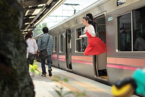
img_e7fc6d2904d10440b38cd22838c3b0af2cb31bf6

How do you take a photo that makes it look as if you’re floating, or maybe flying? If you’re Natsumi Hayashi, a twenty-something photographer based in Tokyo, with a fast shutter-speed and by jumping up and down. Lots. Up to 300 times per shot, in fact. Sometimes she uses a self-timer and sometimes she ropes in a friend to click the shutter. But she still has to jump up and down. And with some shots taking up to an hour to get right, I’m surprised that she isn’t permanently exhausted.

I’m completely stunned by her ability to maintain a composed facial expression whilst she’s leaping about.

You can follow Hayashi’s jumping exploits – and those of her cats, which don’t levitate – on her photo blog, Yowayowa camera woman diary.

(Thanks, Graeme.)

Today, I'm only shooting feet

_small_DSC_3339 - Version 2

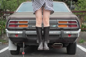
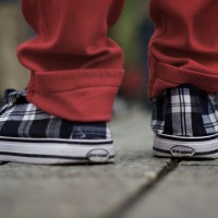
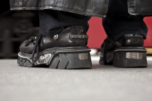
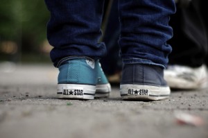
We love a bit of street photography here at Small Aperture, and we’re always looking for new ways to tempt newbies to have a go at it or give old hands some ideas for their next outing pounding the streets. When Thomas Leuthard, a photographer based in Switzerland, dropped a couple of suggestions in my inbox, I asked him if he wouldn’t mind expanding on them a bit. So, here’s one of his suggestions, and I have to say, I love it. Thomas, over to you…

Today, I’m only going to shoot feet…

When you’re shooting on the street, it’s far too easy for your eye to get distracted. Therefore, it’s a good idea to have a small concept to concentrate on whilst out with your camera. Beginner or not, it helps to have a plan; something to hold on and to follow to. I like the concept of just shooting feet. The reason for that is very simple: feet are always out there and people wear different shoes.

In addition to saying that you’ll shoot only feet, it can help to set yourself some more boundaries. Try picking a few (or even all) from this list:

  • Detail only
  • Camera on the floor
  • From the back while standing
  • Same focal length
  • Same aperture (a small one)
  • Landscape format
  • In colour
  • A series of 10 photos
  • All in 60 minutes

I like time limitations as I find that I normally work better under pressure. It means that I know that I have to hurry up and can’t just hang around with my camera looking down at ladies’ legs. I have a mission and have to fulfil it in the time provided. (How very James Bond!)

If you target your focus, you’ll be astonished by how much you can accomplish. It doesn’t matter if you’re a beginner or an old hand, try to focus on one thing. It can be a colour, body part, accessories, or whatever you fancy, really. It is all about focussing on the essential and not getting overwhelmed by the rest of the street.

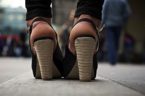
Anyway: back to our feet that we’re shooting. If you want to get a good and easy shot on a pair of shoes, try a bus stop, a pedestrian crossing, or anywhere else where people have to stand still for a moment. This is your moment and you have to be quick. Set your camera to aperture priority and try f/4. If you’re shooting with your camera on the floor, flick on autofocus. You’ll look like an idiot with your head down there, peering through the viewfinder. You might need to practise, but that’s half the fun, no?

Sure, you’re going to have to be brave, but if anyone asks, tell her or him that you study photography and that today’s topic is feet. They will think you are crazy and walk away. It’s true, people often don’t understand what I do and why I do it, but I often find that showing them some photos helps to explain it. They soon realise how beautiful street photography can be.

It’s all a question of good ideas, interesting angles, and composition. A good street photo doesn’t need to show faces. Feet are perfect, and the chances are you won’t have any legal issues, publishing someone’s feet.

Now, go forth and have fun, and try not to walk into lamp posts or anything whilst you’re looking down!

This article was guest written by Thomas Leuthard, and all of the images are his. You can see more of his street photography on his website: 85mm.

News in brief: It’s all about the final result

I stumbled across a lovely article by ctein on The Online Photographer, where he talks in great detail about a rather bloody fantastic image.

“Making that photograph was a significant challenge”, he writes, and explains how he managed to push the boundaries of what was physically possible in photography, in order to to capture a picture of a space shuttle back in 1975.

In all the hard work he did to get the photo, he learned a brutal lesson… the story of which is definitely worth a closer read…

What is this? - In our NewsFlash section, we share interesting tidbits of news. Think of it as our extended twitter feed: When we find something that get our little hearts racing, we'll share it with you right here! Loving it? Great, we've got lots more News Flash articles - and, of course, we're still on Twitter as well, for even shorter news tidbits.

Improving your post-event sales with PicsCliq

PicsCliq Logo

If photography is your job, the world of wedding photography can be tricky to break into, especially if you’re looking for it to be your main source of income. Maybe you’re great at shooting the stuff but have no idea how to get decent sales from what you produce. All those wedding guests are potential customers: if only you could interest them all in a getting a print of their own. Basically, we’re talking about post-event sales and how PicsCliq can help boost those sales.

So, how do you get the most out of your post-event sales? Now I don’t do weddings but, as far as I know, barricading the church door and only letting people out once they’ve bought a print is frowned upon and considered “a bit unprofessional”. A big frustration of many event and wedding photographers is that they find it hard to connect with their potential customer base once they leave the venue.

This is where PicsCliq comes in. PicsCliq is, essentially, a service designed to drive sales for your work following an event by taking advantage of social media sites such as Facebook and Twitter. A service like Facebook is handy for increasing awareness of the images because, it can be safely assumed, a large chunk of the attendees of the wedding will have an interest in looking at the wedding photos put up by the happy couple. The downside of Facebook is that once a photographer uploads their work, it’s hard to control how and where it is used.

My wedding portrait of a (sickeningly photogenic) chum of mine.

PicsCliq integrates with Facebook, filling in what is missing from uploading on your own: control of the images and, most importantly, sales options for those who are viewing the image. This is the gap that PicsCliq is looking to fill, allowing you to take proper advantage of the exposure social media can offer you. PicsCliq refer to themselves as a “full service solution”, as they handle everything, from the initial generation of traffic, right through to the printing, packaging and shipping of the work.

It’s free to sign up and upload your images to PicsCliq and they only make money if they actually generate sales for you, so it’s certainly worth a punt.

Personally, I think this is ideal for new professionals looking to start making money from photography. Although PicsCliq are currently focusing on weddings, they do plan to expand into all kinds of events in the near future.

Go and find out more at www.picscliq.com.

Implied nudity in portraiture

Implied Nudity - part 2

It doesn’t take much of a brain to fathom what a ‘nude’ photo is. If bits that are normally covered up on the beach are on display, then it’s a nude.

Similarly, a ‘non-nude’ photo is pretty straightforward: There are no hoo-hoos, wee-wees or breasticles on display.

So, what is all this ‘implied nudity’ stuff all about? Well, it turns out that there’s an ‘in-between’ stage of nude photography: Implied nudity. Used creatively, it can add an interesting dimension to your portraiture. Here’s how and 

Right: Not a terrible portrait, but it isn't exactly super exciting ever. But there seems to be a lot of skin on display. Hmm, I wonder if I can make this photo more interesting... (click the picture to see it bigger, on Flickr...)

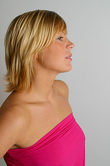
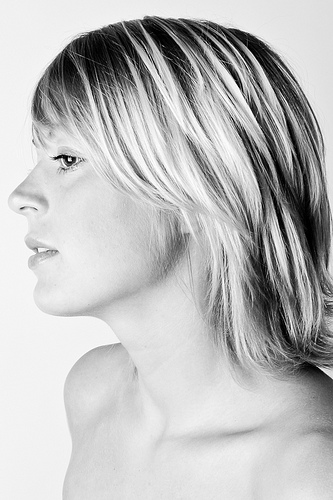
Put very simply, implied nudity happens in one of two ways: The model is dressed, but the photo is shot in a way where it looks as if she might not be. Or the model might be in some state of undress, but the photo is shot in such a way (through lighting, perhaps, or by the model’s position), where you can’t be sure whether or not they are naked.

So, er, what’s the point?

Humans are funny creatures: our minds constantly play tricks on us. When pieces of information are missing, our minds tend to ‘fill in’ the information. When you read smthng lk ths sntnce, your mind doesn’t really struggle to fill in the missing letters, for example – the same happens in photography. In a photo where a model is covering up her breasts, your mind will automatically ‘fill in’ the missing bits.

With this in mind, you can use that to your advantage as a photographer: By hiding your model’s dangly, bouncy, or naughty bits, you can sometimes create a photo which is even more allusive and erotic that one where it’s all on display.

Right: Now that's more like it. All it took was to de-saturate the image, fiddle with the contrast a little, and do a tighter crop, which in effect hides all her clothes.

There are a few different situations where this works extremely well. In the past, I have been known to do ‘nude’ sessions with models (especially models who aren’t that experienced), and then taken photos only of their face or head-and-shoulders. Some people relax (or tense up) in a completely unique way when they are not wearing clothes – which gets reflected in their face.

unfurled_1.jpg

Another great example of implied nudity by Emily - see the full version on Flickr.

I think I’ve taken some of my best portraits this way – simply because the model was concentrating on making their bodies look good, so they forgot to worry about their face. The result? Beautiful, intimate portraits where you would never have known the model wasn’t wearing clothes.

The opposite is also true, of course: You might well find yourself working with a model who would love to do nudes, but is too shy to actually strip off. Using these techniques, you can create the illusion of nudity.

Showing more by hiding more

Right: You can use implied nudity to create tension in a photograph... She's in a graveyard. Surely, she's not naked. Is she? (clicky for bigger)

We all have different tastes and preferences for what we think is attractive. Combine this with the afore-discussed tendency for people to ‘fill in the blanks’, and you can see what might happen: In a photo where something is hidden, it gives the viewer the opportunity to read as much (or as little) into the scene as they want to.

The great thing is that the viewer tends to ‘fill in’ the blanks with whatever their own fantasies or beauty ideals are, which means that by tapping into the fantasy world of your viewers, you can actually make your model more attractive: After all, your viewers are going to be attracted to whatever their fantasies cook up!

You can't see much (is she wearing a bra? Is she not?) - but it's the implication of nudity which makes this photo. (clicky for bigger)

So – a rather long and picture-heavy post to make a rather simple point: If you haven’t experimented with implying nudity in portraiture before, why not give it a shot – you might like what you come up with!

Parallax - the iPad-only photography magazine

parallaxcoverX

Talk about a niche market. The dudes over at Bedouin Ventures have just launched a photography magazine that’s exclusive to the iPad. They wanted to create something that played to the iPad’s strengths and wasn’t just a glorified pdf loaded with adverts. So they came up with Parallax, a magazine which is zoomable, includes slideshows and videos, and makes use of hyperlinks.

The first edition has just been released. All you have to do is download the Parallax app for £1.79 ($2.99) and then you’ll be able to access the content wherever you are. (Except for the hyperlinks. You’ll need an internet connection for those.) Said content includes an interview with photographer Sebastiaan Bremer, how to build your own studio, a new perspective on wedding photography, a healthy dose of inspiration from Big Sur in California, and a fair bit more.

Parallax’s focus is on great images and good writing. And of course making the most of being exclusive to the iPad.

According to the website, Parallax is a quarterly publication, but also according to the website the next edition will be available in Winter 2010. Perhaps they run on an exclusive calendar?

Interested? You can find out more from the website, or you can download the app from the App Store. If you’ve an iPad.

Astronomy Photographer of the Year 2011

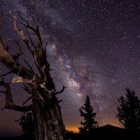
Blazing Bristlecone, by Tom Lowe

In September last year, I got mightily excited when the results of the Astronomy Photographer of the Year competition were announced. The winning picture was the rather awesome Blazing Bristlecone by Tom Lowe. Well, now it’s your turn to see if you can top that. The National Maritime Museum in Greenwich, together with Flickr and Sky at Night magazine has just opened Astronomy Photographer of the Year 2011 for entries.

There are four categories to which you can submit your pictures: Earth and Space, Our Solar System, Deep Space, and Young Astronomy Photographer of the Year (if you’re under 16). There are also three special prizes: People and Space, Best Newcomer, and Robotic Scope Image of the Year. So plenty of opportunity, then.

I suppose that you want to know what prizes are on offer? Well, the overall winner banks £1,500; category winners take home £500; and there’s £350 for special prize winners.

If you want to enter, you do so via Flickr, and you’ve until 13 July 2011, but all the details are on the competition website.

And if you’ve not yet been to see the exhibition of last year’s entries, you can still do that until 27 February, at the National Maritime Museum in Greenwich.

(Image: Blazing Bristlecone, by Tom Lowe.)

Creating photographic habits that stick

Have you ever noticed how you learn a lot faster when you're under some serious peer pressure? Wouldn't it be great if, when you've decided to learn a new photography technique, your social network on Facebook ramps up and tries their best to help you reach your goals?

My good friend Laurie has done just that. Combine it with the tips from my Breaking Photographer's Block article, and you're destined to learn faster than a kid the first day at school.

The trick behind HabitualApp is that you set yourself a goal: Do something for 30 days on the trot. If you miss a day, you go back to 'start', until what you are trying to do becomes part of your life - whether it is exercising every day, keeping your to-do list items low, or remembering to take a photo every day, it can help you along. Check it out on HabitualApp.


Do you enjoy a smattering of random photography links? Well, squire, I welcome thee to join me on Twitter -

© Kamps Consulting Ltd. This article is licenced for use on Pixiq only. Please do not reproduce wholly or in part without a license. More info.