photos

Seven suggestions for better smartphone photos of food

A bird has just tweeted in my ear that today is International Food Photography Day. We've already quite a few articles here on Photocritic that delve into the mystery of making brown gack look tasty and cold chicken appear hot. But seeing as most people aren't going to be pulling out their dSLRs in Le Gavroche or the French Laundry to take photos of their dinner (or at least, I hope not), we thought that we'd focus on smartphone food photography today, for when you don't have a controllable aperture or variable shutter speeds at your disposal.

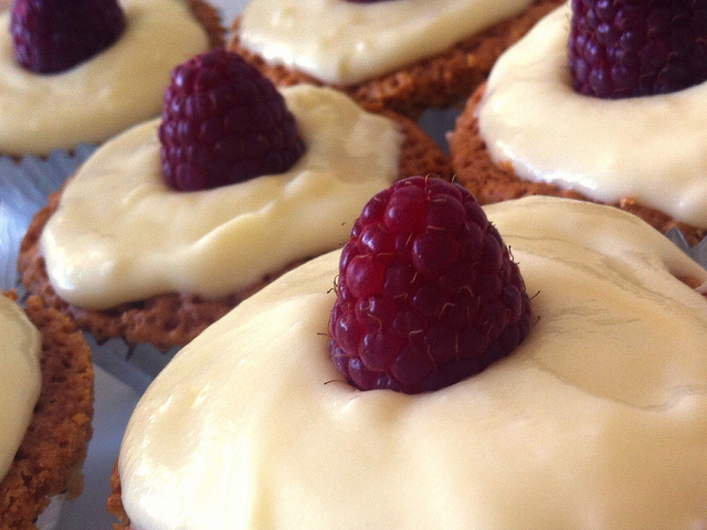
1. Get closer

We probably sound like a broken record here at Photocritic, urging people to get closer, but we really do mean it. And we definitely mean it for food photography. Lean in.

Lean in; drink up!

2. Look for the light

Use natural light, and lots of it, to photograph food. Avoid flash wherever possible, especially smartphone flash. It's rarely a good look.

Lots of natural light

3. Alter your angles.

Experiment with different angles when it comes to food photography. Up high, down low, looking across your food. Give it a whirl!

Yum!

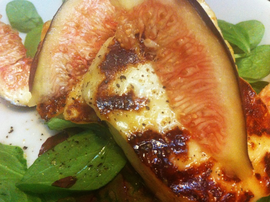
4. Check the background

You really do not want clutter distracting from your food. So check for spills, crumbs, and cruet sets in the background. Think about using this tip in conjunction with getting closer and altering your angles for maximum impact.

Nothing to distract from this fig!

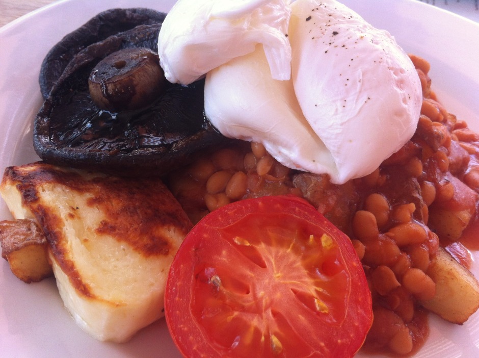
5. Unwobble the white balance

Wobbly white balance can manage to make even the most delicious, fragrant, and beautiful dish look unappetising. Whites need to look white and not tinged with mouldy greens or unnatural blues. Fire-up Snapseed, load up your image, and push that 'Warmth' slider around until the colours look right.

White egg whites are much more appealing than blue-white ones

6. Sprinkle some editing magic

As well as adjusting the white balance of your food photos, don't forget to give them a quick crop if they need it—especially to slice away anything extraneous or distracting in the background—and to increase the brightness and contrast a smidge. That will give your image a bolder and more appealing feel.

A colour boost with EyeEm's Vanilla filter

I don't tend to add filters to my food photos, but if that's your thing, Mayfair gives reliably good results in Instagram, I like Vanilla in EyeEm, and ColorVibe is good in Flickr. But it doesn't hurt to play around yourself!

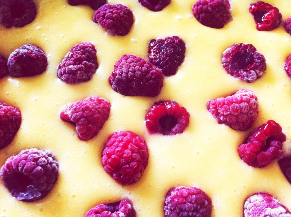
7. Be selective

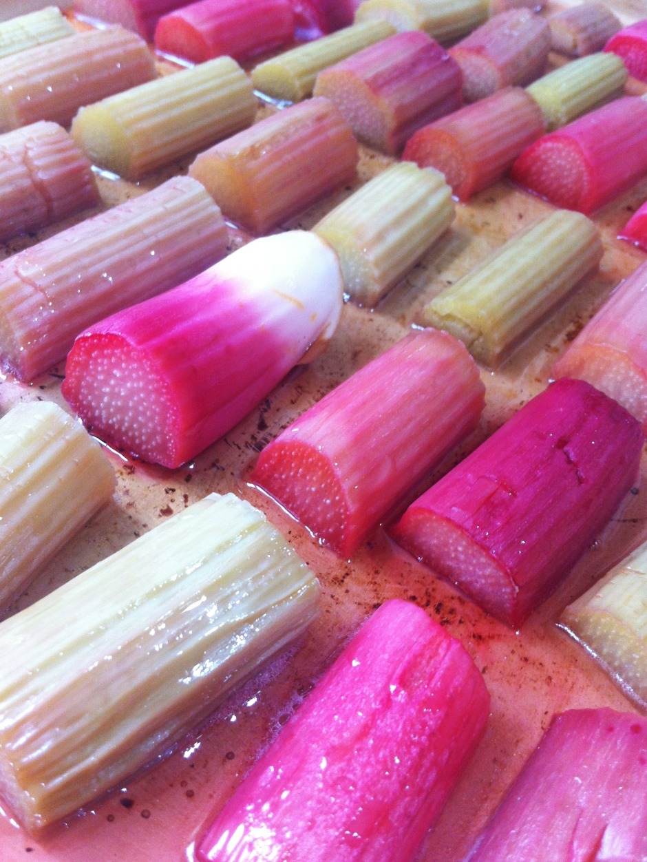
It doesn't matter how tasty your chickpea curry actually is, making it look appealing can be very difficult without some serious styling. The colours are dull and the textures uninteresting. The best photos of food make you want to reach into the image and snatch the cherry off of the top of the cake. They tend to be bright and full of feeling. So be selective in what you photograph. Think about colour, texture, and pattern.

Bright colours in a repeating pattern - just what the eye eats before the mouth

And now you can put your new-found skills to use by entering the Fujifilm and Pink Lady Snap the Rainbow competition!

Q&A: What is the ideal image spec that can be used for web and print?

The key thing to keep in mind is resolution. An image online that covers the entire width of the Quora page would be less than 1000 pixels wide. If that photo is as tall as it is wide, it's a 1 megapixel photo (1,000 x 1,000 pixels) If you take that photo and print it in high quality (300 dots per inch), it would be quite small (8.4 x 8.4 cm / 3 x 3 inches). So, if you are looking to buy / commission / create photographs that work both in print and on screen, then worry about print resolutions, not about the resolution on screen.

The second thing you need to worry about, is sharpening the image for its target output medium. Glossy magazines need the photos sharpened differently than if you want to show it on screen, or print it on newsprint. Cambridge in Colour has a great Guide to Image Sharpening.

Question via Quora

What are leading lines?

The Photocritic Photography Fundamentals magical mystery tour has reached 'l', for 'leading lines'. It's time to join these vital compositional tools in their seductive tango. Lines, they're important things. Train lines get you from A to B (occasionally via Z), cricketers are always looking to bowl good lines, and in photography they can make or break your images. Lines can be confrontational and restrictive, creating borders and boundaries, but they can also be alluring and sultry, drawing you into an image and not letting you go. These are 'leading lines' and they're powerful tools in your photographic arsenal.

There are, broadly speaking, four types of leading lines that you can introduce to your photos to give them depth and interest. There are both naturally occurring and man-made leading lines, and as a general rule, once you've seen one, you can't un-see it.

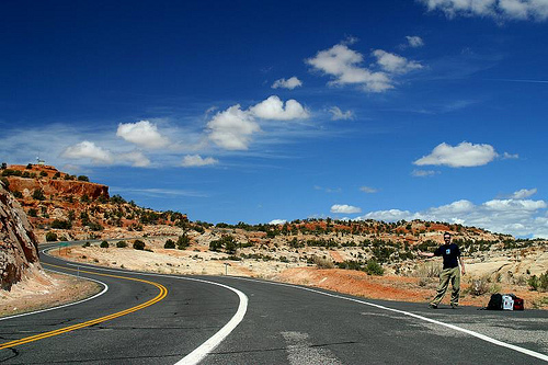
The first type of leading line is a path or roadway that creates a sense of depth in your photos. Parallel lines will naturally converge at a point owing to perspective, which means that any road will draw you into a photo and give you a sense of motion. These types of leading lines will make you feel as if you're going somewhere in your photo.

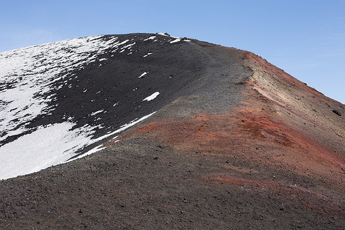
Etna ii

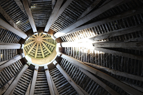
Next are leading lines that pull your eyes across the image and deposit you firmly at your subject. These lines don't have to be straight and they can be single or multiple, but they're just as effective as but more attractive than a neon sign flashing 'The subject is here!'

Dovecote

There are also lines that take you on a journey through an image, forming a narrative. These lines can be straight or curved as they lead you from one point to another.

Arizona 2003

Finally, look out for invisible lines that send the viewer from one point to another. If that sounds a bit elusive, think of people's eyelines. Humans are curious by nature and once we've made eye contact with someone, we'll automatically look to where she or he is looking, too. If your subject isn't looking directly at the camera, the viewer will follow her or his eyeline to see what's so interesting.

7

Roads and paths form obvious leading lines, but so do walls and fences, bridges and bricks. Nature's leading lines are formed from rivers, branches, stems, shorelines, and light and shadow. Lines don't have to be unbroken, but can be formed from several points, for example lamp posts or trees.

Once you start to use them, you realise what a powerful compositional feature they are, directing the eye, joining the dots, and completing the narrative.

TL;DR

  • Leading lines are a compositional tool used to bring interest to your image
  • They can add depth and perspective to a photo
  • They can direct the eye to the photo's subject
  • They can lead the viewer on a narrative journey through the image
  • They can be implied lines, for example sightlines
  • Leading lines can be created both naturally and by man-made objects

Key << Photography Fundamentals >> Macro

Planned Flickr downtime

Flickr will be having a period downtime for site maintenance from 16:00 to 22:00 PDT on Thursday 25 July. (You can see what time that'll be for you if you're not in san Francisco, here.) There won't be any web or mobile access for the duration and neither will you be able to reach the API. A site-wide notice will go up an hour beforehand to make sure that you're in the process of uploading all of your photos from your safari trip when they pull the plug.

Infinite iPhone colour manipulation with ColorTime

When it comes to smartphone photography my default editing app is Snapseed. It does just about everything that I want in an app that I use on a device with a screen that's the size of the palm of my hand and it's intuitve. Sometimes, however, I find myself looking for a bit more control, the ability to adjust shadows, highlights, and midtones independently, or a white balance correction that is more fine-tuned. I've found it. It's called ColorTime. mzl.ncemfpho.320x480-75

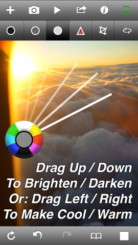
ColorTime allows you to select between shadows, mid-tones, highlights, and saturation, adjusting the intensity on a colourwheel. Dragging up adds white or brightens the image; swiping your finger downwards introduces darker tones; and then you can increase warmer tones by swiping to the right and cooler colours by swiping leftwards.

Furthermore, you can paint particular areas of your image to adjust the tones selectively, or choose between the centre or edges of the image.

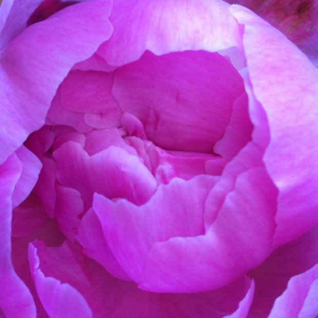
A rather blue-tinged peony

There are of course many occasions when any of this is useful, but I've found it particularly helpful for correcting the white balance in my iPhone photos, which always seem to be far too blue, and for adding a golden hour-like glow. If that's all far too subtle and practical for you, it's possible to make near-infinite adjustments: you keep moving your finger upwards (or downwards, left, right, four o'clock, 11 o'clock, whatever) until you reach the edge of the screen, and then you start over again.

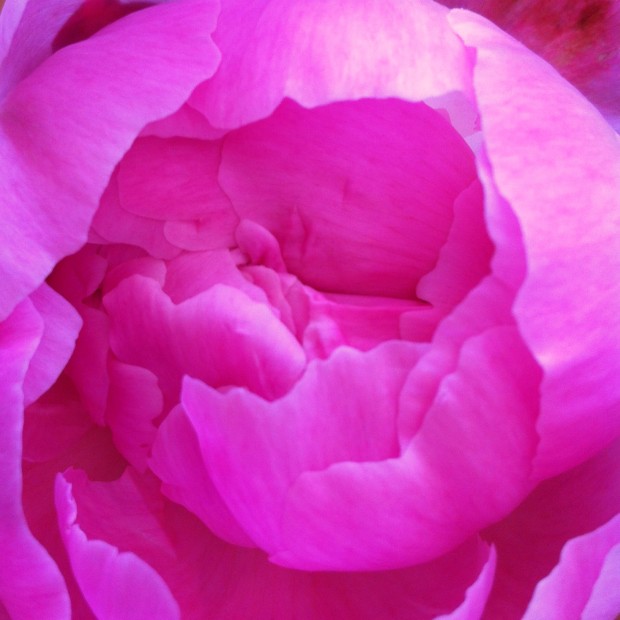
... made to look rather more pink with ColorTime

The independent shadow, mid-tone, and highlight functions, in combination with the colour wheel, means that you can add blue to the highlights but orange to the shadows. If you want.

If you decide that you don't like you last adjustment, you hit the back arrow and it revokes it; if you decide that you've screwed it all up and want to start over, select the revert button. Should you not be able to decide, you can toggle between the original image and your adjusted image to decide which works best. Or you could select the animate function and let ColorTime present you with a loop of optins.

There is a crop and rotate function, but I haven't found it that easy to use. It feels underdeveloped and doesn't give you the control that you'd expect when the rest of the app is so responsive. It's not a huge problem, but for the moment, I will continue to crop in Snapseed.

I've really enjoyed using ColorTime and it has provided me with some terrific results. However, it is a learning curve. None of the buttons is labelled and I have occasionally found myself mistakenly adjusting entirely the wrong thing, but thankfully there is that undo feature. And there's a guide that is relatively easy to access.

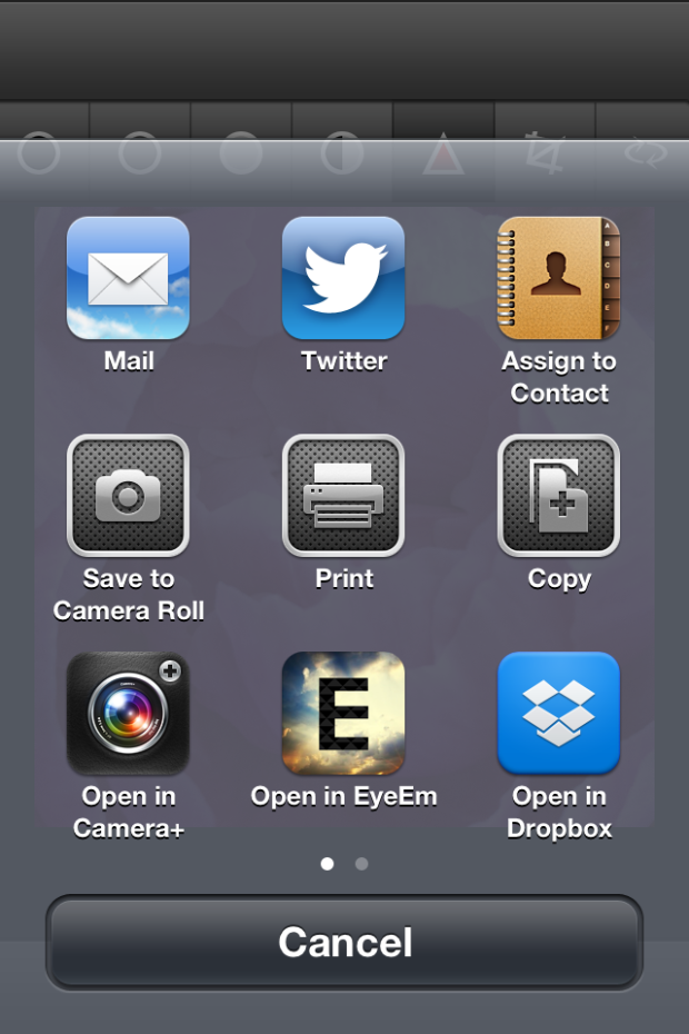
When you're done, you can save your fixed image to your camera roll, email it far and wide, tweet it, save it to your Dropbox, or choose from a few other options.

photo

ColorTime is £1.49 in the App Store. For anyone who does even a moderate amount of iPhone photography, I reckon it's worth it.

A surreally good competition winner

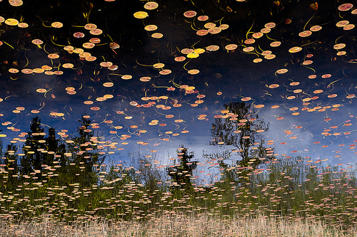
It's been a little while coming, we know, but Haje and I have finally settled on the winner and runner-up for our surreal-inspired photo competition. It was a very close call between the two, but we're delighted to announce that the spoils go to: Phantom Lake Phantom Lake, by They call me Alex.

Screen Shot 2013-07-04 at 18.58.39

and The Grind, by Hooker771

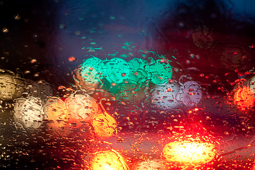
What appealed to us about both these photos was that neither relies on extensive manipulation. They're in-camera surreal creations. And they look terrific, in particular because of their gorgeous use of colour.

Congratulations both Hooker771 and They call me Alex!

The Ilex Press has very kindly provided a copy of my newest book, Surreal Photography: Creating the Impossible, for the winner. I hope that you enjoy it!

As an aside, that was the last competition that we'll be running for the forseeable future. It was a great deal of fun to dream up themes and watch you complete the briefs with such enthusiasm, but we thought that we'd quit while we're ahead. Thank you to anyone who ever entered and to those who generously provided prizes, too.

Snapchat does Snapkidz

I must be horribly old and terribly boring. The prospect of sharing ephemeral photos with my friends via Snapchat doesn't hold that much appeal. Lots of 13 to 23 year olds love it, though, and plenty of under-13s would love to love it, but can't for legal reasons. (For Snapchat to send these young people's messages, they would have to collect personally identifying information without their parents' consent. That's not permissible under the Children's Online Privacy Proetction Act.) To meet their legal obligations, then, Snapchat has introduced Snapkidz. Pre-teens can sign up to the app and will be able to take photos, to edit them, and to scribble on them; they just can't send them. Instead they'll be saved to the camera roll. Then of course they can be sent by SMS or iMessage, but Snapchat won't be storing these young people's data. And when they do turn 13, their worlds can be augmented with spontaneously deleting messages. Or they could just lie about their ages when they sign-up but I'm sure that no one would be that nefarious.

Snapkidz is available just as an iOS update at the moment. If it proves popular, an Android roll-out might be considered.

We might not be able to make our own panoramas on Mars, but we can look at Curiosity's

Over the course of almost six weeks towards the end of last year, Curiosity roved around the area of Mars called 'Rocknest', collecting over 900 photos. The majority of the images (850) came from Curiosity's telephoto camera Mast Camera instrument, as well as 21 from the Mastcam's wider-angle camera, and 25 black-and-white shots (most of which were of Curiosity itself) from the Navigation Camera. These have been stitched together to create a 1.3 billion pixel image, showing Mars' dusty landscape across its horizon to Mount Sharp.

A panoramic snapshot

The image is ready and waiting for public perusal on Nasa's website. You can even choose between raw and white balanced versions. There's also a slightly more manageable 159MB version available for download, too.

You can zoom in and out, exploring the finer details of Mars' landscape and the differences in the dustiness of the atmosphere. You might be there some time!

(Headsup to Engadget)

Best thing about iOS 7? The camera is bloody fast.

We already took a quick peek at the new camera app in iOS 7, but then I was able to borrow an iPhone 5 running iOS 7 off a friend, to see what changes Apple may have been making to the camera. There are lots of little improvements, but the #1 thing that strikes me about it is how incredibly, incredibly fast it is. The camera in general was one of the things I disliked the most about iOS 6, but in the newest version of the operating system, Apple have completely knocked it out of the ballpark.

Gone is the skeuomorphic "shutter closing" animation that made the camera feel horribly laggy. In the new camera app, you can take photos as quickly as you can press the shutter button. No, seriously - if your subject is bright enough, and your thumb is fast enough, you can practically record video, that's how incredibly fast it is.

It's not just really quick at taking pictures, either - you can swipe from the lock screen to launch the camera, and the code boffins at Apple must have done some serious re-coding of the camera app: It launches in fractions of a second, and and you're immediately ready to take photos.

Let's take a closer look.

At the beginning of the video below, I'm just showing how easy it is to go straight to the camera (Drag from the bottom right of the screen). Then, I'm launching the camera, then going straight into taking a load of photos in rapid succession, followed by showing off the pictures I've just taken in the camera roll:

Really impressive stuff - and that doesn't even touch on any of the other improvements on the photography side of things.

Suffice to say that I think Apple have finally created some software that's worthy of the extremely capable cameras that are finding their ways into the iPhone 5 and new iPod Touch devices. Way to go, guys, and keep up the great work for photographers!

People in glass houses

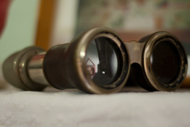
Binoculars Where does the line exist between public and private? At which point does photography become voyeurism, or even exploitation? When you live in the Zinc Building, a glass-fronted set of apartments in New York's TriBeCa district, this question has just been thrown into sharp relief by a new exhibition at the Julie Saul gallery in Chelsea.

Arne Svenson, a photographer living on the second floor of a building opposite the Zinc Building, used a telephoto lens to capture images of the residents of the Zinc Building from his flat. These have now been curated and exhibited at the Julie Saul gallery under the title 'The Neighbors'. None of the subjects can be identified from their images, and Svenson maintains that by living in a glass-fronted building, they are putting themselves on a stage:

For my subjects there is no question of privacy; they are performing behind a transparent scrim on a stage of their own creation with the curtain raised high. The Neighbors don’t know they are being photographed; I carefully shoot from the shadows of my home into theirs.

For the residents of the Zinc Building, however, there is a distinct feeling that their privacy has been violated and consequently they are contemplating legal action. The feeling seems to be that there is a difference between an odd stolen glance and a concerted campaign to document their lives from the shadows. Even if they cannot be identified, it feels creepy.

Bearing in mind I'm in no way a legal expert and certainly not one in New York law, I think that there are two critical factors here; first, that Svenson took these photos from his own flat; second, that the images were captured using a long lens. Would someone standing on the street, without optical assistance, have been able to discern these scenes? If this weren't the case then the residents' expectations of privacy were reasonable and their sense of intrusion justified. Legality aside, from an ethical standpoint Svenson's location adds a distinct element of voyeurism and exploitation to his actions: he observed them purposefully and secretly from the security of his own flat.

Even if Svenson's actions are deemed legal, it is ethically dubious situations such as these, which provoke a sense of violation in the public, that leave photographers facing a barrage of abuse and do nothing to support or promote our rights to shoot in public. To say that we should never push the boundaries and paint ourselves into a photography-less corner would be foolish and detrimental to the medium. Rather, we need to be respectful of our subjects; just because we can do something doesn't mean that we should.

Meanwhile, I might just start drawing my bedroom curtains when I change. Nobody can see me from the street and the only possible view into the room comes from the first floor windows of two houses several hundred metres away. But you never know.

(Headsup to The Online Photographer)

International Women's Day 2013


In honour of International Women's Day, I've pulled together five stories told by five female photojournalists that I think elucidate why we need a day to celebrate our mothers, sisters, and wives. There's a great deal that I could say about women's rights, but the photos say it better. Please take a look.

Agnes Dherbeys: The Street With No Name Cambodia
Because women shouldn't feel that there's no alternative than to sell sex to make ends meet.

Anastasia Taylor-Lind: The National Womb
Because women are more than baby-making machines.

Andrea Bruce: The Widows of Varanasi
Because women are more than just wives to their husbands.

Lynsey Addario: The Criminalization Mothers
Because women are people, too.

Stephanie Sinclair: Self-Immolation: A Cry for Help
Because no woman should live in fear.

These are not the only stories told about women, by women. There are millions of women and billions of stories. These images are barely a drop in an ocean.

A marvellous March photo competition


For the month of March we're looking for images that make use of patterns. Get creative looking for Fibonacci spirals in vegetables, ancient mosaic tesserae, or jars lined up on a shelf. If your image comprises a pattern, we want to see it!

Thanks to the wonderful team at Fracture, the winning entrant will be able to claim a 12 inch Fracture for free.

To submit an entry, head over to the Small Aperture Flickr pool, and link your image in the March 2013 competition thread. (Remember, we've changed the rules slightly and the image must be in the thread as well as in the pool.) It's still one entry per person. The competition opens today (Friday 1 March) and closes on Friday 29 March 2013.

I've reproduced The Rules for your reference, so all that remains is to wish you good luck!

The Rules

  • If you decide to enter, you agree to The Rules.
  • You can’t be related to either me, Haje, or Gareth to enter.
  • One entry per person – so choose your best!
  • Entries need to be submitted to the right place, which is the relevant monthly thread within the Small Aperture Flickr group.
  • There’s a closing date for entries, so make sure you’ve submitted before then.
  • You have to own the copyright to your entry and be at liberty to submit it to a competition. Using other people’s photos is most uncool.
  • It probably goes without saying, but entries do need to be photographs. It’d be a bit of strange photo competition otherwise.
  • Don’t do anything icky – you know, be obscene or defame someone or sell your granny to get the photo.
  • We (that being me, Haje, and Gareth) get to choose the winner and we’ll do our best to do so within a week of the competition closing.
  • You get to keep all the rights to your images. We just want to be able to show off the winners (and maybe some honourable mentions) here on Pixiq.
  • Entry is at your own risk. I can’t see us eating you or anything, but we can’t be responsible for anything that happens to you because you submit a photo to our competition.
  • We are allowed to change The Rules, or even suspend or end the competition, if we want or need to. Obviously we’ll try not to, but just so that you know.

If you've any questions, please just ask!

A much-needed update for Flickr's iOS app


Android users enjoyed a significant upgrade to Flickr in August, but iOS users were left languishing with a fairly basic app that didn't offer half of the functionality of the website. In fact, using the mobile site was a superior experience to the app. That changed around lunchtime (here in the UK, anyway) today. An updated Flickr for iOS is now available, complete with in-app camera and snazzy new layout.

Ignore the moaners and groaners who are dyspeptically lamenting that Flickr has added a filter option to the camera function. Yes, they included the option to wash your photo, taken on the newly introduced camera, with some kind of filter. Everyone's doing it now and it isn't really new or exciting. In fact, it's probably the scourge of modern photography and we'll succumb to scurvy if we continue to apply them.

But you know what? This upgrade is about a whole lot more than a selection of filters. Some much-needed functionality has been added to the app, which was quite frankly rather poor before hand, bringing what you can do with the app closer to what you can do with the website.

For me, the most exciting addition is the ability to interact with the groups you belong to. You can see the photos that have been submitted to them and you can participate in their discussions. Previously, I found not being able to do that from the app highly frustrating.

When you explore your contacts' uploads, you can select from two layouts. One shows you the uploads by adte alone. The other gives you the streams of your contacts organised by most recent upload. 

As for uploading your own images, take a picture, make your edits with Aviary, apply a filter (or not), and then upload it to your photostream, add it to a group or set if you want, write a description, and complete everything with tags. Or you can select one from your phone's camera stream.

This update improves the functionality of the app hugely, but even I, in my rose-tinted Flickr-adoration, know that Flickr has suffered from stagnation. I don't know if it's enough, but it's a start. And I'm very happy about the improvements.

Whoah! And there's more! Flickr has just announced that over the next few days it'll be rolling out an improved navigation bar and a new-style Explore page on its website. I'm not seeing that yet, but I'm looking forward to trying it.

Montblanc photographs the entire world at the same time


Now how's this for a brilliant idea - Montblanc have come up with a PR stunt that has participants around the world to take photos at exactly the same time. In “The Montblanc Worldsecond”, the company launches their ambitious photo project that invites everyone to capture moments of beauty photographically. A specially developed mobile photo app (for iPhone and Android) features a countdown function, ensuring that all cameras of will take a picture at the very same instant.

The photos are then uploaded to the worldsecond.montblanc.com Web site, creating a stunning mosaic of globally shared moments, of “Worldseconds”.

The Montblanc Worldsecond mobile app will be available for Apple iPhone and Android phones in November 2012. For further information, visit the website.

Is stock imagery getting too specific?


As a stock photographer, you have to make your money any way you can. I suppose there are only so many saleable photos of 'businessman on mobile phone', but when you look at stock sites, you'll often find photos that are just a little bit ludicrously specific. The funny-guys over at CollegeHumour spotted that as well, and created this rather fabulous video about it:


So, the question - dear readers - is stock photography getting way too specific, or is this the only way that stock photographers can still carve themselves out a niche?

How to keep your photos safe: Backup routines!

As photographers, we spend a lot of time thinking about how to take the most beautiful photos ever. Do you spend enough time keeping them safe?

How often do you back up your photos? If you have to think for more than a fraction of a second to answer that question, the real answer is 'not often enough'

There are a few important steps to creating a backup strategy.

Choose what to back up

This is the easiest bit. Think about this: What do you want to back up? The answer, here, is probably either 'my photos', or 'my photos and lots of other stuff'.

I do both - but I go out of my way to take better, more frequent, and more redundant backups of my photos, because they're more valuable and important to me.

Choose how to back it up

Automatic back-up at home - Until recently, I was using an Apple Time Capsule; but I've had two of the damn things fail on me within a year (and I've written a separate rant about that elsewhere). So I've upgraded to a Drobo FS instead (Amazon US / UK) - Firewire 800 and fully-redundant RAID means that even if one of the drives kick the bucket, I don't lose any of my precious files.

Along the same trait is Automatic back-up over the internet - In addition to my Drobo, I use a service called Mozy, which is an online backup service (for more about why, see 'store the backup' below). It's pretty clever, actually, for about $5 per month you get unlimited storage, and it takes backups in the background, all over the internet. By having your back-ups off-site, your stuff is still safe even if someone steals everything in your house, there is a fire, or similar horribleness. I signed up for a 2-year subscription, set it up, and haven't looked at it since (apart from checking if it's still backing up every now and then. It is. I'm impressed.)

If you don't like Mozy - or if you're looking beyond just backups - there's always Dropbox, which is a bloody good solution, too; very well integrated, includes some clever sharing features, and is tightly integrated with your computer OS - you can even use it to keep folders synced between your different computers, and they have a clever online file browser, too.

Right: That's 50,000 photographs just waiting to be destroyed because someone opened the hard drive enclosure to take a photo...

Consider RAID...

... Over a network: RAID solutions can work in many different ways - you can do them over a network (Check out 'Network Attached Storage' on Amazon (.co.uk or .com)).

... Hooked up directly to your PC or Mac: As far as stand-alone RAID goes, you can buy ready-built solutions (Like the G-Tech G-Raid 3TB FireWire 800 / Hi-Speed USB solution available from Amazon.com, or the WD MyBook 2GB solution from Amazon.co.uk) - but there are loads of other options available, too.

If you're feeling thrifty and a bit DIY-tastic, you can build your own RAID solution by getting two big harddisks. I'm rather fond of Western Digital Caviar Green drives; they are reliable, quiet, and cheap-tastic: Amazon.co.uk / Amazon.com. In addition, you'll need an enclosure. The Drobo seems to be the gold standard, but you don't have to spend that much money; Look for Firewire 800 enclosures if your computer supports it - if not, USB2 or FireWire should do the trick.

Check your backup integrity

3281381941_88a30e70cb_o.jpg

I was kicking myself when I thought I might have lost this photo - turns out that I did have a backup of it, despite deleting the folder by accident. Phew! Click for bigger version on Flickr

Remember that you have to be sure that what you are backing up is actually working: There's no good in taking a backup of a corrupted file. Obviously, you can't check every file for integrity every time, but what you can do is to ensure that you keep older backups, too.

Only recently, I discovered that I had deleted a folder of pictures by accident several months ago. If I had only kept a recent snapshot of my pictures folder (as it were, pun fully intended), I'd have been buggered. Luckily (or rather: due to having a sane backup strategy), I was able to dig out an older backup of my photos folder, which still contained the deleted folder, and I was able to restore my photos. Phew!

For important shoots, I immediately burn them to DVD - that way, I know I have a backup somewhere which isn't being touched.

Think about where you store your backups

Okay, so perhaps this bank vault is a bit over-kill, but if your photos are valuable to you (say, if you're a commercial photographer, or if you can't stand the thought of losing them), you might want to consider renting a deposit box, and keep a backup of your photos on an external harddrive there. You only need a tiny bank box, so it shouldn't cost the world.

iosafe_solo.jpg

It's important to think about how you are storing your backups. Remember that you're backing up for all sorts of reasons: If your computer breaks, and external harddrive is handy. But what if someone breaks into your house? It's no good having a full set of backups on external harddrives if the thieves can just take them with them, too. House fires, floods, etc - there are lots of reasons why keeping your backups in your house is a good idea (they're easily available), but there are risks, too.

If you do have to keep your backup harddrive in your house, you can't do much better than ioSafe's brand new Solo G3 backup solutions. They are fire and water-proof (so likely to survive a house fire, and subsequent fire department rescue operation. They aren't exactly good for travelling (the unit sitting under my desk weighs approximately a billion tonnes), but the flipside of that is that they're also practically bullet-proof. In the beforementioned housefire, that's a very good thing: If you can find your ioSafe Solo in the remaining rubble, it's probably there, hugging your data gently.

iosafe_portable.jpgPersonally, I keep the harddrive connected to the network hidden away in the attic. That way, a casual thief is unlikely to run off with it, so even if my computer is stolen, I don't lose my photos.

In addition, I keep a backup on an external drive which I leave at my parent's house - it's low-tech, and the backups are generally about 2 months old every time I swap the drive over, but it's better than not having it handy.

Finally, I have the Mozy backups - although they would be a pain int he arse to restore: I'd have to download hundreds of GB of data. There's an alternative way, too: ordering DVDs or an external harddrive with your data, but that, too, is a pain... In short, Mozy is my absolute last resort.

And finally... Try recovering the backup

The best thing that might happen to you is that you go your entire life without ever having to restore a back-up. Nonetheless, it is an extremely good idea to try it anyway.

If you're unable to restore your backups (perhaps there's a problem with the backups? Maybe the restore feature of your favourite backup package isn't working?), you may as well not bother with the hassle of backups at all: they're only useful if you can use them if the worst happens.

The bank vault and harddrive photos are from iStockPhoto.
500px offers 'Plus' membership, in between free and 'Awesome'


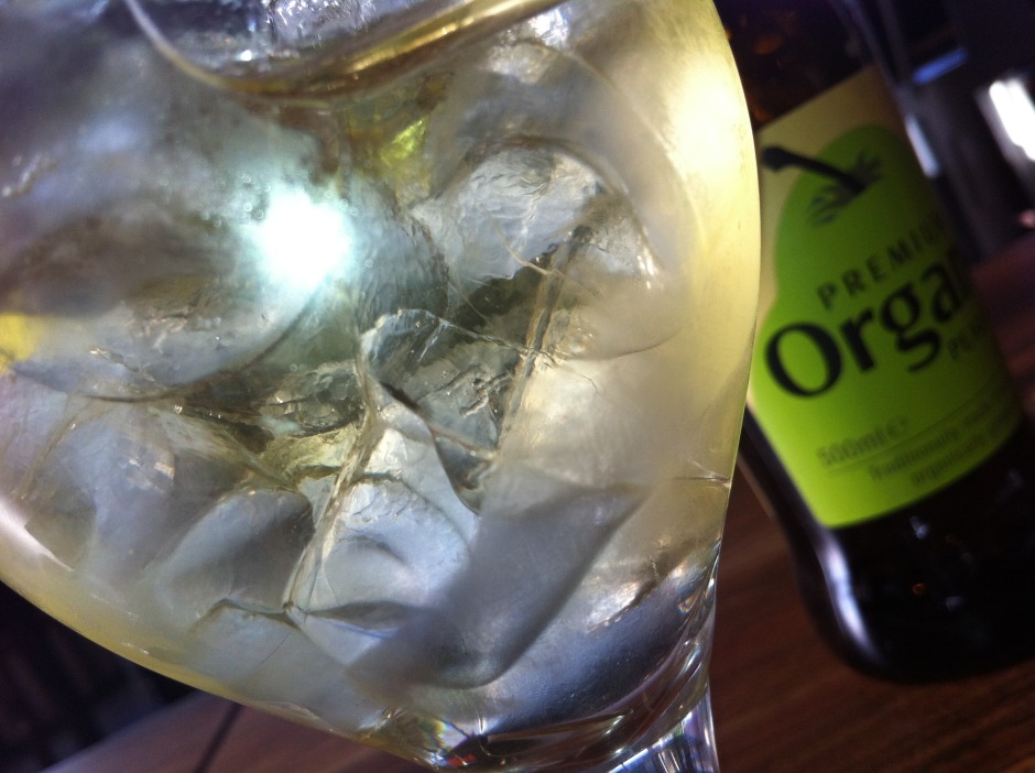
Pretty graphs from 500px

500px has just announced a subscription package in between its free-forever-but-somewhat-limited membership and its all-singing-all-dancing-$49.95-a-year-Awesome service. Called the slightly-less-than-inspired Plus membership, it costs $19.95 a year and offers almost everything that Awesome does, barring the 'personalised portfolio'.

That means you can upload as many photos as you want (uploads are limited to 10 a week with the free service), it allows you to sell your images via the 500px store (something you can do with free memebership), it provides you with the ability to collate your images into collections, sets, or stories, and it gives you access to advanced statistics on your images. Yes, it is all rather similar to Flickr's Pro membership, and comes in about $5 a year cheaper, too.

The analytics includes the basic stats that you'd expect: the number of likes, dislikes, favourites, and comments that each of your photos receives over a time period of your choice. However, it also allows you to analyse who are your most engaged followers and friends and shows you which were your most popular images. And it comes with an interactive graph. Being a sucker for graphs and pie-charts, this is the bit that I like the most.

For anyone who is in the slightest concerned about Flickr's longterm future, 500px is looking increasingly like a viable alternative. You can check out the site here, and the membership options here.

A photo competition for April!


For April we'd like to see your photographs of glass vying for the top spot in our competition pool. (Don't ask me how I came up with the theme; I don't know.)

So perhaps you'll photograph an interestingly lit wineglass, maybe some delicate Venetian glass perfume bottles will catch your eye, or a window could be just the thing that gets your creative juices flowing. As long as the photo features glass, it's eligible.

The super team at Fracture are providing a 12" Fracture for the talented winner.

The competition opens today (Thursday 5 April) and runs until Thursday 26 April 2012. Entries should be submitted to the Small Aperture Flickr pool, but please remember that it is one photograph per person. Thank you.

The Rules have been produced below, for your reference:

The Rules

  • If you decide to enter, you agree to The Rules.
  • You can’t be related to either me or Haje to enter.
  • One entry per person – so choose your best!
  • Entries need to be submitted to the right place, which is the Small Aperture Flickr group.
  • There’s a closing date for entries, so make sure you’ve submitted before then.
  • You have to own the copyright to your entry and be at liberty to submit it to a competition. Using other people’s photos is most uncool.
  • It probably goes without saying, but entries do need to be photographs. It’d be a bit of strange photo competition otherwise.
  • Don’t do anything icky – you know, be obscene or defame someone or sell your granny to get the photo.
  • We (that being me and Haje) get to choose the winner and we’ll do our best to do so within a week of the competition closing.
  • You get to keep all the rights to your images. We just want to be able to show off the winners (and maybe some honourable mentions) here on Pixiq.
  • Entry is at your own risk. I can’t see us eating you or anything, but we can’t be responsible for anything that happens to you because you submit a photo to our competition.
  • We are allowed to change The Rules, or even suspend or end the competition, if we want or need to. Obviously we’ll try not to, but just so that you know.

If you've any questions, please just ask!

Our foodie-fantastic competition has a winner!


Congratulations tvsshenoy!

We asked for foodie photos throughout December and wow did you give us some treats. There were lots of photos of fruit, quite a few of fish, and fair bit of cake, too. Some even had Haje and me salivating. But the winner stood out from the crowd, with its colourful sparkle and lovely composition.

Congratulations to tvsshenoy for a beautiful bowl of pomegranates. You've just won yourself a 12" Fracture.

Details of our January competition will be going up later today.