Uncategorized

Master Photography Awards winners

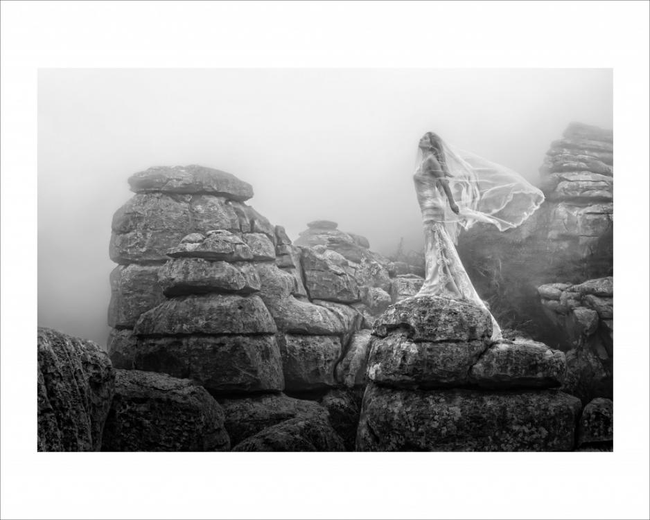
Jose Luis Guardia Vazquez

Seeing as the AoP awards received a bit of (not entirely unwarranted) criticism for their choice of winners, shall we see if the Master Photography Awards can do any better? The Masters awards have a vast array of different categories that cover wedding, commerical, and portrait photography. There are prizes for UK and overseas photographers. Winners are judged on the impact, composition, colour management, and workmanship of their photographs.

This year, the International Photographer of the Year was named as Jose Luis Guardia Vazquez. His work also happened to bag him Overseas Best Image and European Portfolio. Clare Louise was judged the winner of the UK Portfolio prize, whilst the Rest of World Portfolio award went to Keda Z. Feng. James Crockford was honoured with the UK Best Image prize.

Jose Luis Guardia Vazquez

Colin Buck, the chief executive of the Master Photographers Association had this to say about the winners: ‘Huge congratulations go to all our major winners. The competition was especially fierce this year and it seems that, once again, the bar has been raised in terms of imagination and technical expertise. The creativity displayed by the top level of photographers is truly amazing and I’m sure it must act as a huge inspiration for the rest of the industry.’

You can check out the rest of the winners on the MPA website.

Photomonth East London

Colour 9 - okay

For the past five years, there’s been a bit of a thing going on every autumn in East London that aims to bring photography to as many people as possible. It’s the East London photomonth, with exhibitions, events, and activities taking place throughout October and November at a host of venues in places whose London postcodes begin ‘E’. Yes, they have called it ‘photomonth’ and it does span October and November. Interesting.

There is, however, so much going on that I can possibly forgive the organisers their somewhat loose definition of a month. You can sign up for a photowalk; have your portfolio reviewed by a bundle of professionals; attend a seminar or ten; buy some prints for charity; develop your skills at a workshop; or take a look at one of the literally hundreds of exhibitions that are being held in cafes, galleries, museums, libraries, pubs, and even record shops across the City, Hackney, and Tower Hamlets.

The exhibitions tend to be free, but if you’re dropping into Lock 7 to look at the photos of Dhaka’s rickshaw riders or having a browse of the Pictures of the Day at Tina, We Salute You (yes, that really is the name of a cafe), do have a coffee. On the other hand, the photowalks are about £20 and the lectures and seminars vary in price; the black and white processing and printing course is £85; a beginner’s guide to digital photography is £40.

Still, there’s nothing to stop you from taking a look at Julia Margaret Cameron’s photographs of children at the Bethnal Green Museum of Childhood, the exhibition of photos documenting the Battle of Cable Street that’s in the Tower Hamlets Local History Library, or Hackney Observed at the Hackney Museum.

For the full run down, head over to the photomonth website, pick a day, and hit East London. (It’s not nearly as scary over here as you might think.)

Making your own grey cards


BEFORE: The Apple iPhone 4 has a great camera, but it's struggling with white balance. By using a grey card, I can fix it...

Most cameras are capable of creating 'acceptably good' white balance on your photos. And even if they're failing, you can make a pretty decent guess for what you think the white balance should have been in post production.

But what if you want to take the guesswork out of the equation, and get perfect white balance every time? The professionals use something called a 'gray card' (or 'grey card', depending on where in the world you learned to write English). The name says it all: it's a gray piece of card or plastic that you can use to balance your photographs.

Finding yourself a gray card

img_0875.JPGDoes that sounds a bit high tech? Well, it really isn't - and the great news is that you can use just about anything that is neutrally coloured. Of course, without advanced colour calibration equipment, it's hard to find something that's actually perfectly neutral. For our purposes, however, you don't need to do that: anything that's just about gray will do. Why? Because once you have your photos balanced consistently, it's easy to make sure they are all well-balanced.

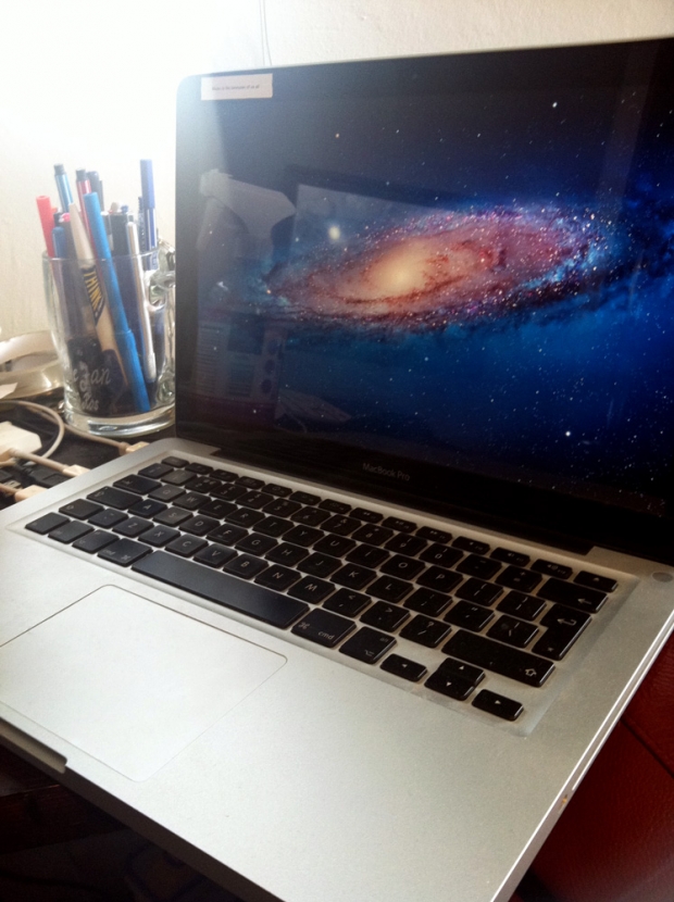
You can use anything that is neutrally coloured, but we would recommend using something that's light gray - it gives the camera the best colour reading, and it makes it easier to do your balancing in post production, too. The lids on coffee cups tend to work pretty well, and personally, I've been using my Macbook. The matt, light silver material is relatively neutral, and since I tend to bring my laptop on photo shoots with me, it's always there when I need it.

Printing off a gray card

If you know what printer you are going to be using to print your images, you could create your own gray card as follows:

1. Open up a photo taken with your camera in Photoshop. This ensures that the correct color profiles are in your image file.

2. Delete the image, and fill the frame with 18% gray.

3. Send the file to your printer, and take it with you on shoots.

The key thing here is that your 'gray card' may not be perfectly neutral, but the important thing is that your printer thinks it is neutral - so if you colour balance your photographs to this particular card, your images should come out neutral when you print them next. Clever, eh?

It could be argued, of course, that if you're serious enough about white balance that you are going to use a gray card, then you may as well buy a set of gray cards that are definitely perfectly colour balanced, but having a home-made set of cards is much better than shooting without anything, so it's a great place to start.

How do you use a gray card? - Whatever you've decided to use as your gray card, the way you use it is pretty simple, and I've covered the process as a video and how-to article; How to use a grey card.

Getting a professional-grade gray card

Of course, you could just decide to go full hog and get a professional gray card. It just so happens that I'm selling some lovely A6-sized cards 

AoP Awards winners

aopawards_photo_4col

In case you missed it, the Association of Photographers held their annual awards last week, which honours professional photographers and their work – both commissioned and non-commissioned – across genres including advertising, portraits, and editorial. So as to keep up with the changes that are being made to cameras, and specifically to cover video capability, the AoP introduced the Moving Image category this year, too.

Almost 3,000 images and videos were submitted by nearly 400 entrants. There were 17 ‘Best in Categories’ and three Gold awards. A few of them are here for your perusal. Enjoy!

Nick Meek – Best in Catergory and Gold winner for the Environment series

Allan Stone – Best in Category and Gold winner for the Object series

To take a look at the other winners, head over to the AoP Awards website!

(All images are, of course, copyright their respective photographers.)

Low-down on the iPhone 4S camera spec

camera_megapixels

There was speculation galore as to what exactly Apple would be revealing at its iPhone announcement yesterday. Whilst some people were disappointed that there was only an iPhone 4S and no iPhone 5 (come on people, it’s a phone, I don’t think that anyone needs to be disappointed by it), the camera spec and app development is a bit interesting. Here’s a quick run down of what Apple’s crammed into its glass and stainless steel body.

  • 8 megapixel sensor. No megapixels aren’t everything, but that is a 60% increase on the last sensor they used.
  • Custom lens with an f/2.4 aperture and an advanced hybrid IR filter to help create sharper and brighter images.
  • The camera is pretty quick, but unfortunately the PR is vague on just how fast. The camera app launches faster than on the iPhone 4 and the shot-to-shot capability is ‘twice as fast’.
  • Taking photos should be easier and faster. You can access the camera by double-tapping the home button and you can use the volume-up button as a shutter release button. There are compositional grid lines onail your rule of thirds and you can lock exposure and focus by tapping the screen.
  • The Photos app gives you some post-processing control, taking care of crop, rotation, red-eye removal, stuff like that. You can organise your images into albums, too. I like that bit.
  • iOS 5′s integration with Twitter and iMessage will let you send your images direct to Twitter or straight to anyone else whose number you have.
  • Photo Stream means that any photo you take on your iPhone gets pushed to the iCloud automatically and then on to your Mac, your iPad, or even your PC. If you’ve Apple TV, you can look at your Photo Stream there.
  • Naturally enough it can make videos. (Well the iPhone 4 could, so they were hardly going to leave it out, were they?) Full 1080p HD resolution and a new video image stabilisation feature. The sensitivity, sharpness, and low light capability have been bumped up, too. And the iMessage thingamy-bob means that you can share your videos with your contacts pretty easily, too.

So that’s that. Did you know that it can make phone calls, too?

(More info from Apple, of course.)

Our October photo competition

Angles 8 - monument reflected ii

Quite how the inspiration for this month’s competition theme struck me is a bit of an odd one. I wanted to do something associated with postcards, but seeing as ‘go and take a picture-postcard picture’ isn’t exactly very helpful for you or for us, I went for a variation on that. We’re looking for photographs of monuments and landmarks this month. The Eiffel Tower, the Coliseum, the Brandenburg Gate, the Sydney Opera House. That sort of thing. Whatever you fancy, it just needs to be monumental. And preferably quirky. It doesn’t have to be quirky, but we like quirky things here in the Mansion. The one that we like the best will win a fabulous 12″ Fracture.

You’ve from today – Wednesday 5 October – until Wednesday 26 October to submit your entry. As ever, you’re allowed one submission per person, and they need to go in our Flickr pool.

If you’ve any questions at all, drop me a note. Otherwise The Rules are here for your reference, and good luck!

The Rules

  • If you decide to enter, you agree to The Rules.
  • You can’t have written for Small Aperture or be related to either me or Haje to enter.
  • One entry per person – so choose your best!
  • Entries need to be submitted to the right place, which is the Small Aperture Flickr group.
  • There’s a closing date for entries, so make sure you’ve submitted before then.
  • You have to own the copyright to your entry and be at liberty to submit it to a competition. Using other people’s photos is most uncool.
  • It probably goes without saying, but entries do need to be photographs. It’d be a bit of strange photo competition otherwise.
  • Don’t do anything icky – you know, be obscene or defame someone or sell your granny to get the photo.
  • We (that being me and Haje) get to choose the winner and we’ll do our best to do so within a week of the competition closing.
  • You get to keep all the rights to your images. We just want to be able to show off the winners (and maybe some honourable mentions) here on Small Aperture.
  • Entry is at your own risk. I can’t see us eating you or anything, but we can’t be responsible for anything that happens to you because you submit a photo to our competition.
  • We are allowed to change The Rules, or even suspend or end the competition, if we want or need to. Obviously we’ll try not to, but just so that you know.

(The picture? That’s the Monument, in London. Reflected in the walls of a public convenience. I kid you not.)

September photo competition winner!

Champagne copy

After last month’s brief haitus where Haje was incommunicado and I’d crawled into a hole and hidden, leaving Gareth to judge the August photo competition all by his lonesome, we’re back. We really enjoyed judging this month’s low-key entries, too. There were some fantastic variations on the theme, with portraits, animal photos, and landscapes. But one really caught our eye. So the lucky winner of the prize from Fracture is…

Eerie SS Dicky by Steven Johnson

Many congratulations, Steven! If you get in touch with me, I’ll let you know how to claim your prize.

Everyone who entered: thank you. We loved your submissions. Everyone who didn’t enter: please think about entering this month’s competition. The details will be going up soon!

Capture Tower Hamlets

Frame 6 - waiting

Tower Hamlets. London Borough. Home to the Tower of London, Canary Wharf, and what is traditionally regarded as the East End. Did you know that it took its name from being the shambling conglomeration of hamlets that surrounded and serviced William the Bastard’s imposing castle to the north of the Thames? (Now can’t you just tell I’m a historian by training? Don’t worry, lesson’s over.) It’s also a gem for street photography. And the council is somehow managing to encourage people to get out there and have a go at it.

Tower Hamlets council is looking for photographs that summarise the borough in a snapshot. They want people, places, life; everyday and extraordinary. It’s all part of the the Mapping the Change project that aims to document change across three London boroughs.

Anyone over the age of 18 can submit up to five images that they believe capture the essence of Tower Hamlets. The photos must’ve been taken in the borough within the past five years and you need to state exactly where they were taken. (Handy-dandy map here.) So if you happen to be in Outer Mongolia but have photo of Brick Lane that you think deserves a look, why not submit it?

Finalists’ images will be displayed at Tower Hamlets Local History Library and Archive in November and December. There are prizes on offer for the winners, including a camera, a portfolio review, and shopping vouchers. The terms are straightforward, too, which makes a change.

The deadline’s 17 October, so you probably ought to get cracking. All the details are on the project website.

(Picture’s mine, taken on the corner of Brick Lane and Hanbury Street.)

Winners of Street Photography Now

Screen Shot 2011-10-03 at 09.46.24

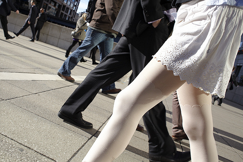
In October 2010, the Photographers’ Gallery and the authors of Street photography Now, Sophie Howarth and Stephen McLaren, launched a 52 week street photography project. The idea behind it was to get photographers from across the world back on the street and documenting life around them. Each week there was a challenge and photos were submitted to a Flickr pool. Although it wasn’t intended to be a competition, the two people who were deemed to have made the biggest contribution to the project have just been awarded with £500 of Thames and Hudson books. And they were…

Jo Paul Wallace and Jack Simon

B side #20

Week 20 (Slow down, the next picture may be very quiet and close), B-side, by Jo Paul Wallace

/>

Week 48 (Things are what they seem to be, or maybe something else), by Jack Simon

Congratulations both. In addition to their piles of books, both have dedicated galleries of their contributions on the Street Photography Now project website. You can take a look at Jo Paul Wallace’s here and Jack Simon’s here.

A slightly different side to steamy

Fort William-2303

Our intrepid cruise ship photographer correspondent, Ross, currently isn’t sailing the ocean blue. He’s on holiday. So where in the world is he? Well, at home in Scotland, naturally enough. When you spend your life visiting idyllic holiday destinations for a living, a month at home, on the sofa, with your feet up is probably just what you want. Of course, he has been out and about taking photographs.

One month till I’m back to work in the Caribbean: Time for a quick holiday!

There was a bump against my ankle, waking me suddenly. I glanced around. The surroundings were unfamiliar, the immediate view was not. To my left was a trolley stacked high with the finest Scottish produce, bags of tablet, McCoy’s crisps and of course Tunnock’s caramel wafers. There couldn’t be a more Scottish view to awaken to, unless there were Tennent’s lager tins also on offer. I looked down, there was, a row right beside the Bacardi Breezers. Shaking my head I redirected my gaze out of the misted up window. It was almost time.

Rushing past us, the highlands of the North of Scotland were green for once. I know that’s the way they always look in the films as Mel Gibson runs across them but in reality better adjectives would normally be bleak, sleety, or just plain old grey and drizzly.

Spending my whole life jumping from one exotic country to another there’s little time for a holiday. And when that illusive holiday does come there’s always that tricky choice. Where to go? These days ease and convince come into it in a big way, not to mention cost. Spending so much time in airports I’ll do anything to avoid them when I can. It’s not the long waits or intrusive scanning that’s the issue. I just get annoyed seeing a 60p can of Irn Bru being marked up to £1.99. And don’t get me started on the salted peanuts.

With this in mind my holiday was booked quickly, a five-hour car ride north and I was in the Scottish Highlands.
So here I sat, the countryside flashing by, for less than the cost of a Ryanair flight I was in landscape photographer’s heaven.

The Fort William to Mallaig railway. You’ve seen it, really, you have, it may be an obscure north west of Scotland rail route but it featured in the slightly well known series of films. Almost unique in the fact that it still runs with a steam engine it is perhaps better known as the Hogwarts’ Express. The train and its route over the viaduct through the glen have been committed to celluloid for generations to see. If you ever find yourself in the horrendous situation of having to re-watch the first Harry Potter film then you can take some solace in appreciating that scene and considering the photographic possibilities. Be warned though, there’s still about another hour after that to weather.

I’m getting distracted, anyways, shooting on a steam train brings with it it’s own sets of challenges. From the rapidly moving scenery to the changing of light in the glens to the sudden burst of smoke from the engine covering your lens, the whole experience is a steep learning curve.

I shouldered my way to the spot I’d sussed out when we first got onto the train. The passages between carriages weren’t open to the outside, but there were windows. They were the kind that slid down – not all opened fully though. I had found one on the left side of the train that did. That was my spot. Now we were approaching Loch Ness I steadied myself with one last bite of my Tunnock’s wafer before switching to Aperture Priority, putting on my sunglasses and sticking my head out into the overcast gale.

My mind flashed back to the first time I’d taken my camera for a little outing on a steam train. Boy was that a learning curve. It was Alaska, heading through the Chilcout Pass. Manual was useless, the light changing too much, after a while I realised Aperture Priority was the only way to go. Sunglasses were essential; I learned that one the hard way. All’s going well then suddenly the wind blows the smoke into your face…and the tiny fragments of coal with it. Imagine getting a bit of sand in your eye every five minutes, that’s what it’s like, it’ll spoil the day for
anyone. I had no idea what I was in for, even finding a spot to shoot that day was a challenge.

Every photographer will have their own tips for this type of shooting, but the same simple rule applies: Next time will be better! It’s a big learning curve shooting in that kind of environment and you can’t imagine some of the
challenges you’ll have to overcome on shooting a simple train ride. This applies to every environment though, to every shoot.

Think of it like this; you’d be crazy to spend all that money to go on a holiday photographing the Amazon jungles without having a practice in your local forest first.

With practice you know what you’re looking for. You know the gear you need. You know the techniques your going to employ. All this comes together for you to get the most out of your experience and the most out of your photography. Practice really does make perfect. Without practice you’ll stick your head out of the metaphorical train, looking the opposite way, and get hit on the head by the foliage beside the tracks.

All I’ll say is I got some great shots, both on the train and at each end of the journey. Steam engine plus Scottish glens equals great stuff. Without having done this before I’d not have produced pictures of half the quality. Nor been able to dodge many of the pitfalls that ruined my Alaskan shots.

What’s the moral of the story? Is it to take advantages of the country you live in, of the scenery around you
and discover some amazing shots on your doorstep without spending more than a few pounds? Is it to practice before spending all that money on a fancy photography holiday? No.

The moral of the story: If you’ve never tried Tunnock’s caramel wafers don’t pass the chance up, I highly recommend them.

Ross Sheddon is a portrait photographer and digital artist, currently working for Princess. In his career he’s worked everywhere from Vietnam to China to Egypt, Greece, Alaska, and back. Despite running out of new countries to visit his eyes remain open for new weird and wonderful sights always around him.
New toys from Flickr

Screen Shot 2011-09-28 at 21.33.19

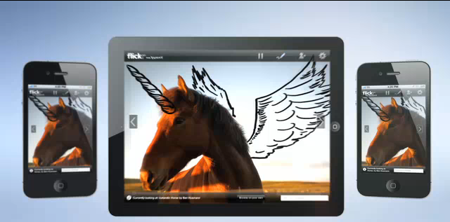
With over five billion photos on Flickr, it has moved far beyond a niche hangout for photographer-types. It’s mainstream and it’s social, and it’s embracing that. Or at least it’s going a bit of way towards running with realising that it’s part of the social media phenomenon but trying to maintain some olde worlde charm by introducing Photo Session.

The idea is that you can get all your friends who are scattered across the globe together in one virtual place, be it from their laptops, iPhones, or iPads, to look at photos of your latest trip kayaking down the Nile, at the same time, with conversation, possibly some wine, and doodles. Yes, doodles.

It might be the doodles that gives Photo Session a glimmer of hope

You choose the photos and invite upto ten people to join the session. Then you can flick through your album and yak about the icky colour of the Nile and its fearsome crocodiles until your hearts are content. There are no special requirements, but if your guests want to play with the stuff, like the doodles, then they need a Yahoo! ID.

Now I don’t know about you, but I was kinda glad when photo-sharing websites like Flickr allowed me to escape the mind-numbing marathon sessions of sitting through other people’s interminably boring holiday snaps that left me wondering whether eating the photographic paper might induce a faster death. The Photo Session oodjimaflip seems somehow regressive, no? Maybe the doodles features will salvage it?

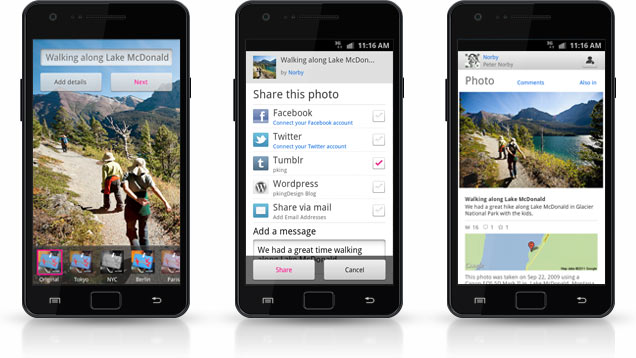
In other slightly more practical news, there’s also a shiny new Android app for Flickr. You can take photos, mess around with filters, and then send them on to Flickr, as well as Facebook, Twitter and anywhere else that you share photos online. The interface has been custom-designed for Flickr, so that you can make use of maps and tags and navigate it easily. And of course you can see the comments and activity on your own Flickr photos and look at them full-screen.

The Dead Sea Scrolls just got interactive

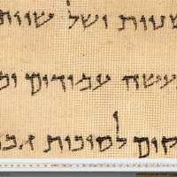
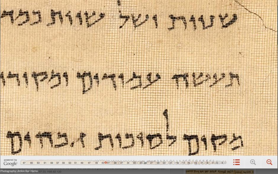
Zoomed right in to the Temple Scroll

Despite my constant mocking of the megapixel race in common-or-garden cameras, I am more than happy to admit that there are times when resolution really is make-or-break, and I’ve just found an instance of it. Google, the Israel Museum in Jerusalem, the photographer Ardon Bar-Hama, and scores of archaeologists and historians have worked to make five of the Dead Sea Scrolls accessible via the marvel that’s the intergoogles.

Zoomed right in to the Temple Scroll

The Great Isiah Scroll, the Temple Scroll, the War Scroll, Commentary on the Habakkuk Scroll, and the Community Rule Scroll have all been photographed in 1,200 megapixel glory so that you can zoom in close enough to see the contours of the animal skin on which they were written. If you’re browsing the Great Isiah Scroll, you can also click on the Hebrew text to get an English translation, or just look on in wonder at something written about 2,000 years ago that was preserved by being hidden in jars in a series of caves.

The Great Isiah Scroll, with translation

I reckon this is pretty awesome, and not in a godly way!

(You can read more on the omniscient Google’s blog.)

Pictures from the ice

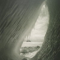
2580016

Whenever I think of Scott’s or Shackleton’s ill-fated Antarctic expeditions, I tend to be more preoccupied with Titus Oates being some time and 22 men being marooned on an island for four months. That both of these expeditions had official photographers who schlepped along tonnes of equipment, including whatever they needed to develop their images from glass plates, has sort of passed me by.

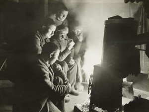
But Scott’s doomed Terra Nova expedition was accompanied by the first official polar expedition photographer, Herbert Ponting, and Frank Hurley was one of the 22 men stranded on Elephant Island when the Endurance was trapped and crushed by ice. Ponting was never meant to travel across the ice to the Pole and Hurley managed to salvage 120 plates, a pocket-sized camera and a few rolls of film before the Endurance was lost. So some, at least, of their pictures survive.

The night watchman spins a yarn, 1915, by Frank Hurley

Ponting presented his images to George V, whilst a selection of Hurley’s work was given to George V by Shackleton. And the Royal Collection will be exhibiting them from 21 October 2011 to 12 April 2012.

Ponting’s pictures consist of the wildlife and icebergs that they encountered as they sailed from New Zealand to Antarctica, as well as scenes of life on board ship and even shots of Scott’s last birthday dinner in 1911.

Hurley did what I can only think of as totally crazy things – like climb the rigging and spend three days out on the ice watching as the Endurance broke up – to get his photographs. As if going on a polar expedition isn’t dedication enough to the cause of photography. But he was, of course, rewarded with some wonderful pictures.

The Heart of the Great Alone will show at the Queen’s Gallery, Buckingham Palace, from Friday 21 October 2011 to 12 April 2012. Tickets for adults are £7.50, more details available from the Royal Collections website.

(Featured image: Grotto in an iceberg, 5 January 1911 by Herbert Ponting. Both images courtesy of The Royal Collection © 2011, Her Majesty Queen Elizabeth II.)

Instagram 2.0

Instagram 2.0

The mega-successful photo-sharing and iPhoneography icon, Instagram, with its gajillion users, has just undergone its first major upgrade since it hit the App store just under a year ago. It’s Instagram 2.0. It’s faster and it has a gamut of new features. Wanna know what’s new?

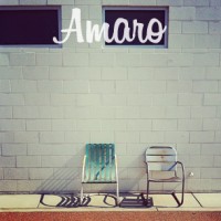
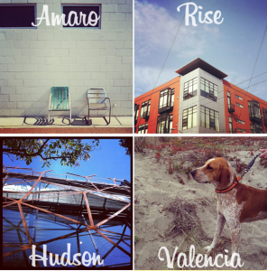
Well, first up is Live Filters, which means that you can apply whichever filter floats your boat before you snap your pic, and see what it looks like. As for those filters, they’ve introduced four new ones: Amaro, Rise, Hudson, and Valencia.

There’s a new tilt-shift doo-dad that’s super-fast: pinch, pan, and rotate and watch it all in live view.

In response to people’s requests for higher resolution images, they’ve done just that. If you use an iPhone 4, resolution has increased from 612×612 to 1936×1936. If you’re stuck with the iPhone 3GS, resolution is now 1536×1536.

Borders are now optional. Much better! And you can now rotate your photos so that they’re not stuck on their sides. Fabulous!

But it’s all still only available for devices-Apple. If you’re an Android user, no Instagram for you.

All the details are over on Instagram’s blog.

AoP Awards Ceremony and Exposure 2011

photographerslogo

Busy next week? Well, Wednesday and Thursday to be precise? Wednesday night is the Association of Photographers’ Awards ceremony, from 17.00-18.00 at Ambika P3 at the University of Westminster, swiftly followed by the awards party at the same venue, from 19:00 onwards. Tickets are £10 for members, £20 for non-members in advance. Wait until the day, though, and those prices go up £5.

Exposure 2011 follows the next day, at the same venue. From 11:30 to 20:00 you can feast your eyes and ears on a series of talks, demonstrations, seminars, and exhibitions. There’s a Blurb book-making workshop; a lighting for fashion and beauty photography demonstration; a discussion of our rights when we take photos in public, as well as lots more. That’ll cost £10 for members or £15 for non-members, too.

If you’re interested, take a look at the Exposure website or Awards Ceremony website for more details.

The AoP Awards Ceremony and Exposure 2011 will be held at Ambika P3, University of Westminster, 35 Marylebone Road, London, on Wednesday 28 and Thursday 29 September 2011.

City Cycle Style - pictures of poncey people who pedal

image025

London is positively crawling with über-trendy cyclists. Cape-clad women on their three-speed Dutch bikes and cool-dude guys on their bright orange fixies are everywhere. When I cycle through hipster-tastic Hoxton on my ten-speed racer (she’s called Elspeth, by the way), I couldn’t feel more out of place. But in their wisdom, the City of London is attempting to promote cycling by emphasising just how trendy it is with a series of 40 photographs of London’s ‘most stylish cyclists’.

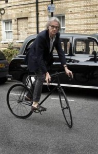
Sir Paul Smith riding a Limited Range Paul Smith Cycles by Mercian.

All the photos have been taken by fashion photographer Horst A. Friedrichs. They feature London dignitaries the Right Honourable The Lord Mayor of the City of London Alderman Michael Bear, Mayor of London Boris Johnson, fashion designer Sir Paul Smith, and shoe designer Jonathan Kelsey.

The exhibition is being held outdoors, 24 hours a day, at the Royal Exchange, which is bang smack in the City. At the end of the exhibition the pictures will be sold off, with the proceeds going to The Lord Mayor’s Appeal 2011. This year, the appeal is called ‘Bear Necessities – Building Better Lives’ and it aims to help disadvantaged young people in the UK and beyond.

‘From fashionistas to financiers, an increasing number of Londoners are taking to the saddle,’ says Friedrichs. ‘The bicycle is now being seen as a reflection of your own personality and fashion choices rather than a simple way to get around. I hope the exhibition will show London exactly how you can ride in style and encourage more people to start cycling.’ I’m sorry, I think I want to vomit.

The Rt. Hon The Lord Mayor of the City of London Alderman Michael Bear with a 1980 Gentleman’s Raleigh Superbe.

You know, if you really want to encourage people to cycle, you want to emphasise just how universal it is. Fashionistas and hipsters won’t help people who don’t think of themselves as a la mode and constantly on trend. Nope, it’ll just make cycling seem all that much more unobtainable. It would’ve been a far more inclusive and likely successful venture if you’d shown everyone, from couriers dashing across junctions to kiddies pedalling to school, via me on my racer and my friend Elena on the bike that she built herself (how cool is that?), as well as the trendy-types. Oh, and some more women, too.

You don’t need to be stylish to cycle, you just need a bike.

Still, the photos are kinda cool.

City Cycle Style runs from 28 September to 29 October 2011, 24 hours a day, at The Royal Exchange, London, EC3V 3LR.

(Featured image is of Jonathan Kelsey)

Taylor Wessing shortlist announced

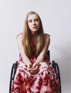
Andie, by David Knight

The National Portrait Gallery received 6,000 submissions from 2,506 photographers – some amateur, some professional, and some just graduated from art school – for the 2011 Taylor Wessing Photographic Portrait prize. Somehow, the judges managed to whittle down that list to 60 photos for exhibition and five shortlisted for the £12,000 prize.

Which is your favourite?

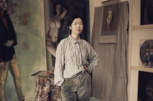
Wen, by Jasper Clarke

Clarke was born in 1978. He left school without any qualifications in 1991 and began taking pictures with a camera given to him by his father. He graduated from Edinburgh’s Napier University and moved to London to assist the likes of Nadav Kander and Liz Collins. His shortlisted portrait, taken in hipster-tastic Hackney, is of Wen Wu, a Chinese artist. It’s from a personal project depicting artists, musicians, and other creative types who live where they work.

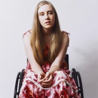
Andie, by David Knight

Although he now lives in Australia, Knight was born in Oxford. This portrait was commissioned by Loud for the Cerebral Palsy Alliance to raise awareness of the condition throughout Australia. Knight commented: ‘I wanted the portraits to be positive and to convey the kids in an uplifting way. You don’t immediately notice Andie is in a wheelchair; you just see a beautiful young woman.’

Christina and Mark, 14 months, by Dona Schwartz

Dona Schwartz is an American photographer based in Minnesota. This image is from her current series, On the Nest, which documents those moments when parents’ lives change. This one shows a parents in their child’s empty bedroom, after he’s flown the nest.

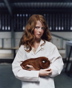
Harriet and Gentleman Jack, by Jooney Woodward

This photo by Jooney Woodward, a London-born and educated, but Dorset-raised photographer, shows 13 year old Harriet Power who was a steward at the Royal Welsh Agricultural Show, in the guinea pig judging enclosure. I didn’t even know guinea pigs were judged at the Royal Welsh Agricultural Show!

Of Lili, by Jill Wooster

Born in Connecticut, Wooster now lives in London. The portrait is part of a series portraying women in their forties and fifties at pivotal stages of their lives. Lili, says Wooster, ‘Is a complicated character. I like the way her androgyny makes her appearance seem both guarded and relaxed at the same time, capturing both her confidence and vulnerability.’

Exhibition

If you want to see the photographs yourself, you can do so at the National Portrait Gallery (St Martin’s Place, London, WC2H 0HE) from Thursday 10 November until 12 February 2012.

(All images are, of course, copyright their photographers and used with permission.)

Introducing the Canon Powershot S100


Today, Canon launched a replacement for the rather spiffing S95. Say hello to the Canon Powershot S100!

The reason why I've been recommending the S95 to everybody, is that it's a mighty awesome piece of kit. It's got a wide-angle lens, a wide maximum aperture, an effective image stabiliser, can shoot in RAW format, has a fantastic 3-inch display, and full manual settings if you want 'em.

Most importantly - in compact camera terms, the imaging sensor is enormous. How big is 'enormous'? Well, it's 1/1.7" (7.49 x 5.52 mm). That's a very big deal indeed, because the bigger sensor means that the pixels are less close together; that means better depth of field, better high-ISO performance, and more bragging rights too, I suppose.

What's updated?

The S100 ups the megapixel count from 10 to 12.1, adds the brand new Digic 5 image processing chip, and adds a couple of new ISO levels; you can now turn it all the way to 11; or rather: 6400. The lens has been improved, too: From the already lovely 28-105mm zoom range, the Powershot S100 has a 24-120mm equivalent zoom, and a closer minimum distance for macro shots (30mm instead of 50mm).

The longer focal range comes at a cost, of course, if you zoom all the way in, your maximum aperture drops to f/5.9. Not super impressive, perhaps, but that's life - and it's usually a good idea not to zoom in all that far on compact cameras anyway. The widest aperture when you're fully zoomed out stays at f/2.0 - rather juicy indeed.
The biggest update on the video front is that the S100 shoots in full HD - 1920 x 1080 pixels at 24 frames per second, whereas the S95 'only' shoots 1280 x 720.

Finally, the S100 adds a built-in GPS receiver, to help you geocode your images as you take them. Presumably, it would also be used to set the clock.

Despite all the new goodies, the S100 is only 4 grams heavier than the S95, whilst keeping roughly the same size otherwise.

So, do I want one? Well, if you already have a Powershot S95, then there doesn't seem to be quite enough of a benefit to upgrade to the new camera - unless you're itching for a spot of GPS action, or if high-def video is a dealbreaker for you. Apart from those two things, the S100 seems to be a solid evolution of an already absolutely rock-solid camera.

Very impressive indeed.

The pictures go round with Adobe Carousel

Adobe Carousel

I do love the imagery of the name Adobe’s given its latest photo editing and synching software, Carousel: your photo gets on at one point and gets off at another.

How does it work? There’s a set of apps for your iPad, iPhone, iPod touch, and your Mac OS (sorry Windows users, you’ll have to wait until sometime in the first half of 2012). You download them across all your devices (provided that they’re compatible, of course: iPhone 3GS and above, iPod Touch 4G, Mac OS X Lion). Then you import your photo library into Adobe Carousel and take new photos using Adobe Carousel on your iPad or iPhone.

Through the magic of the cloud, all those photos will be accessible automatically on any of your Carousel-carrying devices. From then, any edits, deletions or additions to the library that you make on one device will be automatically updated on all the devices linked with your account.

No Flash involved, no manual synching required, and version control for everyone. Oh, and you don’t have to worry about clogging up your iPad with photos, either.

As for the editing software in Carousel, it’s based on Lightroom. It uses multi-touch gestures, and allows you to adjust exposure, shadows, highlights, white balance, vibrance, clarity, and contrast. There are also over 12 ‘looks’, which are basically presets, that allow you to mess around with the look (now there’s a surprise) of your photos.

Unfortunately, none of this comes cheap. The introductory price for Carousel is £39.99 (US $59.99) for a year, or £3.99 (US $5.99) for a month’s subscription. You can renew at that price for two years. Miss the boat, which sails on 31 January 2012, and you’ll be paying £69.99 for a year or £6.99 for a month. Sure, you can install it on as many (Apple) devices as you own, but is synching across them worth that much? I’m not convinced it would be for me.

Have a poke around here and let me know what you think.

Super-groovy grey cards from Photocritic

Grey cards

Obviously I’m in a slightly spend-thrift mood at the moment. Following on from yesterday’s t-shirt, these much cheaper and probably more useful (unless of course I had no clothes, or something) grey cards have just caught my eye. Just what we need for making sure our white balance is spot-on.

There’re three A6-sized cards – one matt black, one white, and a neutral 18% grey – all neatly stashed in an envelope. The corners are rounded, there’s drilled hole for lanyard-securing purposes, and on the back of the cards there are instructions for how to use them as well as a rather useful cheat sheet of the aperture scale, zone system, and a pre-shoot check-list. How rather nifty!

All of this for only £6.99, which is bargain-tastic, methinks. Shipping in the UK is free; Europe costs €1.60 and the USA US$2.25. Available here!

Even more – if you want a swift introduction into how use a grey card, take a look at this video.