2c i

'Shooting Yourself' goes on sale this week!

We're nothing if not collaborative here at Photocritic, and Shooting Yourself is a great example of that - containing photos of around a hundred self-portraiture artists, curated by yours truly, and with a big load of input from Daniela (also of Photocritic fame)... It's one big orgy of words, pictures, and - yes - self portraits! Find out more over on my other website, and pre-order your copy from your favourite bookshop. If you can't wait, or if you prefer a digital copy, you can grab a virtual copy of Shooting Yourself from Ilex Instant. You've got to hurry, though, I hear Ilex Instant is about to run out! (I jest, I jest... Adam, my publisher over at Ilex, ensures me that they have plenty of digital stock)

What are you waiting for? Shuffle over and grab your copy today!

Crazy or sensible? A full-frame sensor in a smaller-sized body.


Same-same-but-different? How about the 5D MkIII's sensor, in a smaller body?

Sometime yesterday, a couple of articles on a rumoured smaller-sized Canon camera with a full-frame sensor popped into my news feed. Most of yesterday was spent writing, not reading, and I didn't get the chance to pay much attention to them until this morning.

The gory details of the camera are themselves interesting: it would be smaller and lighter than a 5D MkIII, with a mostly plastic construction and possibly a pop-up flash. It'd have a 19 point auto-focus system, a sensitivity range of ISO 100 to 51,200, and 22 megapixel full-frame sensor.

But what actually interested me more was F-Stoppers' reaction to this potential new camera:

Canon Rumors has said that an entry level full frame doesn’t make sense, and though affordable access to the 5D MKIII sensor is tantalizing, I kind of agree. A full frame sensor isn’t really necessary for most of the photographers out there and may just be an attempt to move emphasis away from megapixel count and grab a few more of those consumer dollars that drive the company.

Really? You reckon that there are photographers out there who wouldn't be seriously interested in a camera that has a full-frame sensor, but is smaller and lighter than a 5D MkIII. Sure, Canon would have to get this camera absolutely right, but hell, I'd love a full-frame sensor in a body that I didn't need a small trailer to transport.

You see, I like this idea of having choice. My reasons for choosing to use a camera that isn't classically categorised as 'Pro' or 'Prosumer' aren't necessarily dictated by whether or not I'm scared of all the knobs and levers on one, or whether or not I think I need to be able to shoot lots and lots of frames per second, or whether or not I'm wooed by all those extra megapixels. One of them is size and weight. The other is cost. There are certain elements in a camera that I'm prepared to sacrifice for others, but if I'm offered a camera that closer meets my wish-list, then so much the better.

Ideally, I'd like some kind of identi-kit camera, where I could pick and choose the elements that are most important to me. The progressive scale where you have more of everything in each iteration doesn't necessarily meet my needs. Of course, in some respects, it goes with the territory; increase one factor and it automatically increases another. Still, wouldn't it be great to have a camera that meets your specifications? If that's even a possibility, it's a long way off. But until then, Canon offering a variation on a theme is a good thing, in my opinion.

From Pixels to Postcards


I've done a lot of travelling over the past year (In fact, I'll only be in London for about 100 days in all of 2011 - how's that for a crazy travel schedule), but of course, the People Back Home™ want to know what I've been up to. I do post all my stuff to Flickr as I go along, but sometimes you want to send them a postcard when you're out and about.

There are a slurry of Take-a-photo-send-a-postcard services out there, but some are absolutely useless. The worst failure of the lot is ShootIt, which didn't manage to get any of my postcards to my dying grandmother. Suffice to say that I don't have a lot of time for them.

After I posted the ShootIt post, the lovely people from TouchNote got in touch, with a simple message: "Sorry for your loss, give us a try". I figured 'what the hell', and went for it.

I'll be honest with you, I haven't looked back: The postcards are of fantastic quality, the service is easy to use, and they keep their promises: Postcards are sent out by first class mail the next day, and they arrive promptly most of the time.

Testing the iPhone app

The only hiccup with the service was that their iPhone app wasn't really all that easy to use. No problem, of course, but if you're on the road, it's nifty to be able to take a photo with your iPhone, edit it in Photoshop Express, and then send it as a real postcard to your friends or family. The great news is that they've just updated their app, making it super easy to use.

The service isn't limited only to iPhones, by the way; It's available on iPhone, Android, Windows Phone 7, and Palm devices, and apparently they have managed to convince Sony Ericsson to pre-install their app on millions of phones starting next year, so suffice to say that it seems they've got the economy of scale working for them.

Anyway... The iPhone app. It is so easy to use, in fact, that I can just post a series of images, and you'll see exactly how it all works:

img_0917.PNG

img_0918.PNG

img_0919.PNG

img_0921.PNG

img_0922.PNG

img_0924.PNG

img_0925.PNG

And that was it. Easy, eh? Of course, I did already go to the web-site to add 'credits' (that's 'postcards' to you and me) to my account, which makes it all a little bit smoother.

How much does it cost?

Touchnote charge 1.49 for their postcards. "One fourty-nine what, I hear you cry" - well, anything. It's £1.49 if you're in the UK, $1.49 in the US, and €1.49 in Euroland. Obviously, you're better off paying in Dollars, but whatever currency you're paying, it's a pretty good deal: Here in the UK, at least, you'll frequently find yourself paying £1 for a post-card (and losing your will to live in the process).

Of course, you can also buy more credits in one go, which saves you a nice chunk of cash in the process:

screen_shot_2011_09_29_at_122421.jpg

Conclusions

I love technology. I love photography. I love being able to send post-cards directly from my iPhone. The idea is such a no-brainer, that it's no wonder that there's plenty of people out there offering the service. All they have to do to do it well, is to offer a great service at a good price. In my mind, that's where Touchnote have got their product bang on the money. Competitively priced, great quality, easy to use, and just all-around lovely.

The only downside, I suppose, is that your postcards lose that "ooh, look, a foreign stamp" exotica that you get from getting a postcard sent from a far-flung corner of the world. On the other hand, if you're anything like me, you'll probably forget to post it until you get home and end up sticking a UK stamp on it anyway, so that hardly makes much of a difference.

So - Touchnote. It's highly recommended, and you should definitely give them a shot. Literally.

September photo competition winner!

Champagne copy

After last month’s brief haitus where Haje was incommunicado and I’d crawled into a hole and hidden, leaving Gareth to judge the August photo competition all by his lonesome, we’re back. We really enjoyed judging this month’s low-key entries, too. There were some fantastic variations on the theme, with portraits, animal photos, and landscapes. But one really caught our eye. So the lucky winner of the prize from Fracture is…

Eerie SS Dicky by Steven Johnson

Many congratulations, Steven! If you get in touch with me, I’ll let you know how to claim your prize.

Everyone who entered: thank you. We loved your submissions. Everyone who didn’t enter: please think about entering this month’s competition. The details will be going up soon!

Sony's range of video marketi... ahem... tutorials

Screen Shot 2011-08-11 at 14.31.57

Oh Sony, you get my hopes up, and then you dash them. Actually, you’ve done more than dash my hopes, you’ve disappointed me. I was so excited by the prospect of the Sony HowTo videos that you released today. People seem to love video tutorials and I really thought that you were on to a winner with your series of four minute shorts to help people get the most out of their cameras. ‘Aha!’ I naively thought, ‘Somewhere I can direct newbies to help them out a bit!’ But I’m hanging my head here.

You see, I don’t want to watch a four minute advertisement for a Sony product. And I can pretty much guarantee that people who already own the product – and are looking to make the most out of it – really don’t need any adverts for it. No, if I watch a four minute video called Learn to shoot in low light, I’m expecting a quick fire session in shutter speed, aperture, ISO, and the benefits of using a tripod. I don’t want to be preached at about the benefits of Sony lenses and sensors and the Auto HDR mode on some its cameras.

Get better results from your digital camera shows me how to shoot large or small resolution images, obviously on a Sony camera. Is that the best that you can manage in four minutes? Really?

There are more, but I can’t face wading through any more Sony adverts.

You’ve missed a trick here, Sony, and made fools of yourselves. Shame on you for calling them tutorial videos. That would be about helping people to become better photographers. These are self-promotional guff. Educate people for education’s sake, not for advertisement. It’ll serve you far, far better in the long run.

42nd Street Photo: One to Avoid

New York is a city that's the home to many a fantastic photographic retailer. Between the rather fantastic B&H, the solidly competent Adorama, and - if you're going to shop online anyway - the ever-reliable Photo & Video section at Amazon, there shouldn't really be any reason to go anywhere else... ...As aptly confirmed by the nightmare of an ordering scenario a friend of mine, Sarah, had just before Christmas at the tail-end last year.

What happened?

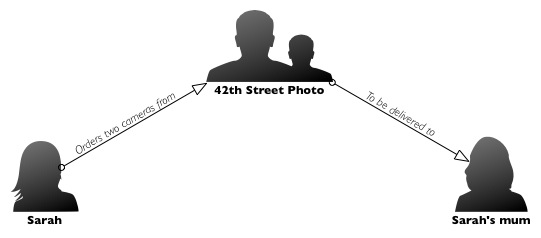
Sarah lives in London, but her parents live in California. She decided to order a couple of cameras (given how much cheaper camera equipment is in the US, that makes sense), and have it shipped to her parents address. Sound pretty straightforward, right?

kerfuffle.jpg

It probably would have been, if it hadn't been for the fact that she decided to try and use 42th Street Photo to place her order. Here's what happened;

On December 17, Sarah ordered a Canon Powershot S95 and a Canon EOS Rebel Digital T2i, but because her shipping address (in California) was different from her invoice address (in London), the order was blocked. Fair enough, I suppose, there's a lot of credit card fraud out there.

Dodgy card charges

So instead of trying to confirm with Sarah that this was a genuine order, they call the shipping address, where her mother answers the phone. Now, I don't know much about credit card security, but it sounds to me as if they are worried about that, they should call the invoice address - not the shipping address. I'll leave this thought for you: If you were a fraudster, would you be at the shipping or the invoice address? Exactly.

Interestingly enough, Sarah's card was charged on Friday December 17th, so they clearly didn't care much about the security anyway. Also, by the time the 18th rolled around, the order status on 42 Photo had already updated to 'shipped'. So why did they call? Well.. when they spoke to Sarah's mother on the 21st (four days after the card was charged and the cameras had supposedly shipped), they tried to upsell to faster shipping (even though their website, they said that shipping was only going to be 'less than 10 days') so the order could get there in time for Christmas. Then, they tried to add memory cards to the order, stating that "the camera wouldn't work without them".

Weird upselling

Parents come in all sorts of shapes and sizes - and amounts of photography knowledge. It just so happens that Sarah's mother's photography knowledge is, well, shall we say, somewhat lacking. So when somebody calls her and tells her that Sarah must have made a mistake, and that she must have forgotten to order a piece of the camera which is needed for it to work, what should she do?

I find it curious anyway, that a phonecall to someone at a delivery address should potentially be enough to add additional charges (shipping; memory cards) to a credit card that was already charged and authorised via a website, but that's by the by.

In addition, if you check the 42nd street Photo website, you'll find their terms and conditions state "Although you have received an email confirming your order, we do not charge your credit card until the item is ready to be shipped and all customer adjustments if any are applied" (emphasis mine). Since the card was charged on the 17th, and 42 street Photo started calling Sarah's mother on the 21nd, that was clearly ignored as well.

Shipping... Too late.

Then, eventually, Sarah receives a shipping confirmation on the 22nd of December, via UPS, stating that the items had been shipped, and were scheduled to be delivered on December 30th - 3 days later than expected.

Now, most people are perfectly happy to wait for another three days, but there was an itsy-weeny problem: Sarah was going to leave the country on the 29th, and needed her cameras with her. Since the order was placed on the 17th, and the 42 Street Website promised a 10-day delivery (at most), Sarah figured she would have a couple of days leeway. Instead, the cameras would arrive two days too late.

What have we learned?

Between the slow shipping (5 days to ship an order of cameras that are marked in stock?), charging the credit card too early, breaching their own terms and conditions, trying to upsell memory cards and shipping (the latter, presumably, to cover their own ass for being too slow in shipping the items in the first place), trying to get a person unrelated to the transaction to authorise additional spending on a credit card, rude one-line replies to genuine customer service woes, and an apparent lack of care about fraud prevention...

I don't know about you, but I don't think I'll be turning to 42 street photo for my photography needs in the future.

Walking in the air

img_e7fc6d2904d10440b38cd22838c3b0af2cb31bf6

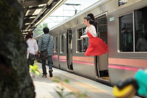
How do you take a photo that makes it look as if you’re floating, or maybe flying? If you’re Natsumi Hayashi, a twenty-something photographer based in Tokyo, with a fast shutter-speed and by jumping up and down. Lots. Up to 300 times per shot, in fact. Sometimes she uses a self-timer and sometimes she ropes in a friend to click the shutter. But she still has to jump up and down. And with some shots taking up to an hour to get right, I’m surprised that she isn’t permanently exhausted.

I’m completely stunned by her ability to maintain a composed facial expression whilst she’s leaping about.

You can follow Hayashi’s jumping exploits – and those of her cats, which don’t levitate – on her photo blog, Yowayowa camera woman diary.

(Thanks, Graeme.)

How do you time-lapse?

timelapse-silhouette

So, I’ve been thinking about doing a cool little project where I’m building a way of adding time-lapse to any camera – and have been wondering if perhaps I should be offering the final product as a commercial product that you can buy.

To make this a reality, I’d love to hear a little bit about the solutions you’re currently using – and what you like and dislike about it. With a bit of luck, I should be able to come up with something (gasp) better – at a lower price, too!

If you’re interested in telling me what you are currently using – or if you would just like to add a wish-list of stuff you wish a timelapse timer could do, please do me a favour and fill in the survey!

Awesome, thank you.

~ Haje

Photographers' rights flashmob

phnat-city.3-211x300

Ever been part of a flashmob? No, neither have I. But if you fancy giving it a whirl it the name of photographers’ rights and in celebration of International Press Freedom Day, the dudes who run I’m a Photographer, Not a Terrorist! are organising one on Tuesday 3 May, 12:30, at London’s City Hall. It’s to highlight the increasing restrictions that private management companies are flinging at photographers who want to take pictures in public spaces. We’re talking about places such as Canary Wharf and the Thames Path between Tower Bridge and City Hall, here.

Ostensibly, anti-terrorist legislation is what justifies this behaviour. Having been on the receiving end of some vile, heavy-handed treatment by a security guard, I don’t wonder if they’re not just getting off on a power trip. Anyway, before I manage to ruin my peaceful Tuesday afternoon by getting worked up that street photography is going to be consigned to the albums of history, I’ll remind you: Tuesday 3 May, 12:30, City Hall, London. In case you were wondering, the National Union of Journalists London Photographers Branch is supporting it.

If you happen to have a tripod that you can bring along, too, then do.

More information from I’m a Photographer, Not a Terrorist!

Very cute slideshows from Cute Slideshow

CS_Icon_512

I’ve hundreds of photos on my iPhone but, bizarrely, I don’t tend to do much with them, except for contribute to Haje’s Locks on Toilet Doors project, or document the bruising on my recently injured foot. When I was asked to review a new app that would let me turn these loved-but-languishing photos into slideshows, and even set them to music, I got a bit excited.

Very cute slideshows, but you can't export them

The app’s called Cute Slideshow and it’s made by Cute Logic. You can put together a slideshow of up to 1,000 images from your camera roll, use 20 different transitions, add text, and choose a sound track from your iPod music library. It took me about ten minutes to put together a slideshow, complete with music, that paid tribute to my shoe collection. I was very proud of my slideshow and I was impressed by how easy it was to make something so fun.

I’d really like to be able to show you my slideshow, too. But I can’t, and this is where Cute Slideshow falls down.

Unless you’ve an iPhone 4 or a fourth generation iPod Touch, your slideshows are stuck there on that piece of kit. Even with an iPhone 4, you can only display them on an external screen using a cable. To turn Cute Slideshow from something that I think is quite cute into something that I think is rather groovy, I’d really like to be able to export my slideshows.

One of my friends, who has been my mental sparring-partner for the past eleven years, raised all sorts of problems when it comes to exporting slideshows. ‘What about platform compatibility?’ he asked. ‘And coding for YouTube is a nightmare,’ he told me. ‘Could there be rights issues with the music?’ Well…

The interface is very simple, though

Pick one or two platforms that’d be compatible to play slideshows; don’t most of us have access to a selection, anyway? I’m not a coder, so I don’t know how much of a problem coding for YouTube is, but as a consumer, having a product that doesn’t do quite what I want it to isn’t very useful. As for the music rights issue, there’s no difference with this than any other slideshow or time-lapse or video that you or I might set to music: it’d depend on how we used it.

I want to love this app, but it feels as if it doesn’t go far enough. I’m sure that there are plenty of people who’d be happy viewing their slideshows on their iPhones or iPod Touches, or be able to hook up their iPhone 4 to their big screens. For me, though, it feels a bit half-baked.

What my sparring-partner and I did agree on, though, was that this would be a great app for the iPad.

So the verdict? Great start, but this cake needs a bit longer in the oven.

Cute Slideshow is available from the App Store for £1.79 or US$2.99.

When the going gets tough, the tough get... crowdfunding

Henderson 035

Prizes might not be the only reason that we enter photo competitions, but they certainly provide an incentive and a lovely recognition of achievement. It’s rather groovy being able to point to something and say that you won it because one of your photos was thought to be awesome. But prizes for photography competitions aren’t necessarily high on corporate sponsors’ lists of charitable good causes when money gets tight. So what are the options for competition organisers when the pot at the end of the rainbow vanishes?

If you’re the Edgar Degas Foundation, the organisers of the Dutch photography prize, Bouw in Beeldprijs, you turn to the general public.

Last year, Bouw in Beeldprijs, which is seen as an important platform for Dutch photography, had over 140 entries. This year, it’s in excess of 200. To ensure that this year’s ten finalists are supported and that there’ll be a competition next year, the organisers are looking to raise €10,000 in donations from ordinary people who (probably) have an interest in the arts.

The music industry has already looked at crowdfunding, so why not photography?

Bouw in Beeldprijs is grateful for any donation, no matter how small. Those who are able to give a little more might get a ticket to the competition’s exhibition, a print of one of the entries, a limited edition print, a private viewing, or public recognition of their support. (And if you want to, you can contribute here.)

Whether or not they’ll be able to make it work, I don’t know. Do people care enough? Do people have enough to spare? But at least they haven’t let the competition keel over and die.

(Featured image: Transvoid, by Roderik Henderson.)

Our March photo competition

Shilouette skyline

Seeing as Haje is gallivanting across the globe and I’m starting to plan what can only be described as a crazy-mental-trip that might not come off (but I really, really hope that it does; finances and Middle East stability permitting), we’ve taken that as the inspiration for this month’s competition theme. We’re looking for pictures of skylines. At dawn or dusk, in silhouette or technicolour, give us some new horizons to explore.

There will of course be a fabulous prize for the winner supplied by the lovely people at Fracture.

The competition is open as of the very minute that I press the ‘Publish’ button (which will be on 9 March) and it’ll run for three weeks, until Wednesday 30 March 2011.

The rules are exactly the same as last time, but for completeness, I’ve put them below. Now we just want to see your gorgeous, gorgeous photos. Good luck!

The Rules

  • If you decide to enter, you agree to The Rules.
  • You can’t have written for Small Aperture or be related to either me or Haje to enter.
  • One entry per person – so choose your best!
  • Entries need to be submitted to the right place, which is the Small Aperture Flickr group.
  • There’s a closing date for entries, so make sure you’ve submitted before then.
  • You have to own the copyright to your entry and be at liberty to submit it to a competition. Using other people’s photos is most uncool.
  • It probably goes without saying, but entries do need to be photographs. It’d be a bit of strange photo competition otherwise.
  • Don’t do anything icky – you know, be obscene or defame someone or sell your granny to get the photo.
  • We (that being me and Haje) get to choose the winner and we’ll do our best to do so within a week of the competition closing.
  • You get to keep all the rights to your images. We just want to be able to show off the winners (and maybe some honourable mentions) here on Small Aperture.
  • Entry is at your own risk. I can’t see us eating you or anything, but we can’t be responsible for anything that happens to you because you submit a photo to our competition.
  • We are allowed to change The Rules, or even suspend or end the competition, if we want or need to. Obviously we’ll try not to, but just so that you know.

(If you really want to know, the featured image is one of mine. I took it in Edinburgh, just after a thunderstorm.)

Interview: Graeme Taylor

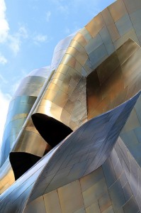
EMP/SFM by Graeme Taylor

Towards the end of last year it seemed as if every geeky, gadgety, or photography website was featuring the awesome Glide 2, a slow-motion film shot from a high-speed train. In two weeks alone, it generated over 735,000 views. It was made by the lovely Graeme Taylor, and I was fortunate enough to be able to catch up with him over braised lamb shanks earlier this week, and heard about the similarities between maths and photography, finding a train suitable for filming, and devising a follow-up to Glide.

Daniela: You’re not actually a professional film-maker or photographer are you, Graeme? What do you do?

Graeme: No, and seeing myself labeled with descriptions such as ‘video artist’ has been entertaining! I’m a research mathematician, which I’d argue is a creative activity far closer to, say, photography, than the tedious grind of high-school calculations. Both maths and photography require a certain amount of technical ability, but beyond that, inspiration, experimentation, and the desire to ask lots of questions that start ‘what if…’ or ‘how could I…’ are crucial. It’s just that in my day job I’m trying to capture the behaviour of abstract concepts rather than a landscape or piece of architecture.

DEB: So do you envisage yourself making money from photos or films?

GT: I’m still rather pleased that I’m able to make money from mathematics! To be honest, I like the fact that my photo and video projects are purely hobbies, rather than having to be financially viable activities. Probably as a side effect of the way mathematics works (where you publish your results for all to build upon), I’m more interested in people seeing and enjoying my work than trying to maximise the amount of money I can extract from it. Of course, if anyone wants to sponsor future projects, that’s fine by me!

DEB: Where did the idea for a slow-motion film of a train coming into a station originate?

GT: The usual role of slow motion video is to capture a complicated, high speed activity from a static viewpoint. My first thought was, ‘What if the camera is the high speed object?’ I hoped that this would allow me to recreate the effect of panning through frozen motion which is common in films – the most obvious inspiration would be bullet time, of course. Somewhere along the line I came up with the other piece of the puzzle, which was to record something mundane rather than an action sequence. Then a station seemed like an obvious solution.

EMP/SFM by Graeme Taylor

DEB: Did it take a great deal of preparation?

GT: My original plan was to record from a train that wasn’t stopping, so that I’d have constant speed through the station. I also knew I wanted a slam-door train so that I could film through an open window rather than glass. So the idea spent a lot of time on the back burner as I tried to think of a suitable journey – although I travel a lot by train, I couldn’t find a location that was busy enough to warrant filming, yet somehow unimportant enough for the train to blast through without stopping.

So I stopped trying to prepare and decided to wing it! Having decided to take my chances with stopping services, I took to travelling in the front carriage of trains (no great burden on London-bound journeys, as that meant booking first class) and always having the slow motion camera with me. As it happens, though, Glide was my very first capture of this type, and Glide 2 was taken the following weekend at the same station. So, perhaps a happy accident – if my first few experiments had failed due to poor light or focusing issues (as many other attempts have), then I might have given up early.

DEB: How does it feel knowing that you’ve made something that has become an intergoogle sensation?

GT: My favourite part has been people I know getting in touch to say they spotted it on a blog they follow, through facebook friends, or the like, rather than as a result of my own efforts at self promotion! It’s also fascinating to track its progress on Twitter and to see how different descriptions might or might not catch attention and propagate, or when it made an impact in non-English speaking communities and there’d be a flurry of comments I could only decipher with Google translate.

Elliot Bay Waterfront, by Graeme Taylor

DEB: Do you have people you look to for inspiration, or people’s work you respect or admire?

GT: I gave up on trying to compile a Flickr favourites stream, or posting photos/videos I particularly enjoyed, because I’d never have time for anything else! But generally speaking, I’m most interested in techniques that allow us to see things the human eye ordinarily wouldn’t: from compressing extended periods of time into a single picture with long-exposure pinhole to capturing slices of action with high-speed digital imaging. Any image/footage that I look at and think ‘How did they manage that?’ will impress me, whether it’s from a big name or just some random online experimenter like me.

DEB: What kit do you use?

GT: All my slow-motion work has used a Casio Exilim FH20 in 210fps mode. There are a few others in the Exilim high speed range and some are quite old, so with some shopping around it’s easy to find one at a reasonable price these days.

I also have a Canon 550D, which can do 60fps in 720p quality. With a lot more post-production than the Exilim it might be possible to push that further and still get something that feels like video rather than stop-motion, but I suspect high-end video software would cost more than the camera!

Curious Christmas Kitten, by Graeme Taylor

DEB: What was it that got you interested in photography and film-making?

GT: Looking back, even at high school I was always the guy with the camera, and hosted pictures from social events online – which in those days meant getting film developed, scanning each image, and hand-coding the site. If only I’d had the sense to invent Facebook… I kept shooting casually through undergrad, then I started taking a lot more photos as a post-grad. When I finished my PhD I made the jump to the world of dSLRs.

But whilst it’s rare that I’ll go somewhere without a still camera to hand, film-making tends to be restricted to specific projects. Still, the sudden success of the glide idea and the high-def modes on the 550D mean I’m thinking about video a lot more these days! After all, I have a few hundred subscribers awaiting a follow-up…

DEB: So what’s next, then?

GT: I have a location in mind for a glide-like film using a car rather than a train, which is complicated by my inability to drive! So the next slow-motion footage I post will likely be from this year’s Upchuck juggling convention, which is happening in February. I’m also thinking about the opposite end of the spectrum, which is time-lapse. I spent last week in New Orleans and have a few hundred photos from that to sift through. Oh, and there’s the day job to attend to as well.

Many thanks to Graeme for this interview. If anyone is interested in collaborating with Graeme on some slow-motion film work – from martial artists to scientists – let me know and I’ll put you in touch.

Portraits that make you go 'Ooh!'

IMGP7665(2)

For a little under a year, The Guardian has been running a Sunday feature ‘The 10 Best…’ It has covered everything from fashion blogs to female comedians via mathematicians. Yesterday, it was the turn of photographic portraits. I was thoroughly surprised by the 10 photos selected by Eamonn McCabe. There was a mixture of candid shots, street photography, and posed portraiture. Some were of celebrities, some weren’t. Most, but not all, were black and white. And they weren’t necessarily what I would attribute as the ’10 best’.

But then it occurred to me: what exactly was it that surprised me in his selection, which you can check out here, and why should I be surprised at all?

The point is, of course, that these portraits are his personal opinion of what constitutes the ‘best’. Just because I disagree with, or am surprised by, his selections doesn’t invalidate them. In fact, it’s a bit of an eye-opener. What is it that he sees in a portrait that I don’t? If anything, I’d like a bit more commentary on what it is about these portraits that ‘does’ it for him, rather than the background to photographers who took them. (Don’t get me wrong, I am interested in that, I’d just rather be discussing the photo.)

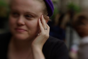
I took this photo a few years ago. Why do I like it so much? It says something about my subject that, at the time, was important to her.

If I’m going to become a better photographer, knowing how other people interpret pictures is pretty useful. It doesn’t have to mean that I’ll stop taking the kind of photos that I like, more that trying to see a picture through someone else’s eyes shows me something new, a different angle, an alternative perspective. I’m not asking for anyone to justify her or his choices, more try to explain to me what it is that makes it outstanding.

And of course, from time-to-time we put up a ’10 of the best..’ here on Small Aperture. For us, these selections are very much about finding 10 shots that we hope will inspire you to go out and take some pictures. But for now, I’m kinda interested in knowing what are your favourite portraits. You don’t have to offer ten. One, or three, or five, will do. But what is it about that portrait that makes you go ‘Oooh!’?

(Thanks to Catherine for the image of me. Why do I like that one so much? It captures the day that it was taken perfectly. I look relaxed. We had sunshine and showers.)

The White Cliffs of Not-Dover

Picture 3

When you think of iconic images of Britain, what springs to mind? The Palace of Westminster? A London bus crossing Waterloo Bridge? Stonehenge? How about the White Cliffs of Dover? If you’re Dover Town Council how hard do you think it would be to come across a photo of one of your town’s most famous landmarks to put on your website? Surprisingly, would be the answer.

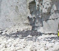
If you toddle over to Dover Town Council’s website, the striking image of white cliffs rising out of the breaking waves aren’t those at Dover, but they are the cliffs at Seven Sisters, found up the road in the next county, Sussex. The Council has put it all down to these times of austerity and not wanting to pay for the requisite image. That, most certainly is commendable. But why choose an image of a landmark over 70 miles away?

Dover-not-Dover

Why not look for images of Dover Castle? Or, heaven forfend, run a competition inviting people to submit their favourite images of Dover, or more specifically of the White Cliffs. Is it that hard?

And if you happen to have any awesome shots of the White Cliffs, I’m sure that Dover Town Council would love to hear from you.

NYU professor to install camera in his head

bilal

A New York University professor has decided to surgically install a thumbnail-sized camera into the back of his head for a project titled “The 3rd I.”

Wafaa Bilal, an Iraqi assistant professor of photography at NYU, is creating this project with the help of Mathaf: Arab Museum of Modern Art, located in Qatar. Once the project begins, the camera on the back of Bilal’s head will snap one still shot per minute for an entire year. The camera will then feed these images to the museum, where visitors can watch his personal activity on several monitors.

However, the project seems to be creating some controversy over the issue of privacy. Students are crying foul about having a camera watching their every move. After some debate among the NYU administrators and faculty, Bilal has agreed to place a black lens cap over the camera while on university property.

It seems odd, though, that these students are putting up such a fuss. After all, he is a photography professor, and these are photography students. If anything, you would think they might be completely supportive of such a project. And what can this tiny camera, snapping one image per minute, actually capture that might incriminate these students? And what the heck are they doing in class that they don’t want anyone else to see anyways?

Maybe it’s just me, but I think this privacy issue is getting a little out of control. While NYU classrooms may technically be considered private property, I think a university campus can also be seen as public space. Personally, I don’t do anything in public that I don’t want any members of the public to actually see. Makes sense to me.

What time is it? Oh, it's f/5.6 o'clock!

fstopwatch

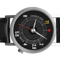
Lately, photography-related novelty items have appeared all over the web. Look around online and you’ll see things like bowling ball camera bagslens coffee mugs and camera dial laptop decals, just to name a few. So what have they come up with now?

The latest is the F-stop Watch. What makes this watch fun is its lack of hour and minute labels. Instead, it features several aperture stops in order to help you tell time. While the design might make things tricky when someone asks you what time it is, I’m sure it’s easier to read than on some of these watches.

The F-Stop Watch is available through NeatoShop for $36.

Laptopogram-tastic!

laptopogram

Fancy having a go at producing a photo that doesn’t require a camera? No, I haven’t lost the plot, of course you can. All you need is a laptop (or a TV, or a mobile phone, or one of those new-fangled iPad malarkies, or any electronic gadget that involves a screen and a backlight, really) and some photographic paper. How cool is that?

You hold the photographic paper to the screen, expose it briefly, and then develop it. You should be left with an image of whatever was on the screen. I have to say it again: How cool is that?

Aditya Mandayam dreamed up the process when on a residency with Benetton at their lab, Fabrica, in Treviso. And I thought Benetton was where my Ma bought me clothes when I was younger. Want to learn more? About laptopograms that is, not Benetton. Go here.

(Thanks Photojojo!)

What's in your kit bag, and why?

canonelph.jpg

On Photocritic, I don’t generally bother talking too much about equipment, unless I’m particularly excited about something. My approach towards photography is that a good photographer can take good pictures with bad equipment. A bad photographer can only take mediocre photos with good equipment. In other words: If your technical skills and photographic insight aren’t up to scratch, you’ve already lost the game: No amount of equipment can save you.

Nevertheless, I often get comments and e-mails asking about what type of equipment I use. It’s an interesting question, but asked wrongly. My equipment list is boring. The argumentation for choosing each of these pieces of equipment is what is interesting, because it might help you pick which lens or gadget you buy next!  
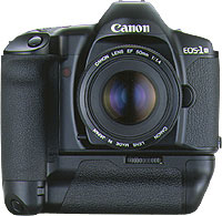
1994_eos-1n-hs.jpgThroughout my photographic history, I’ve had a lot of different cameras. I started with a Canon A-1 SLR (which I still have!), and then went through a series of exciting cameras. I had a Canon RS, which used to be the fastest camera Canon ever made. I had a Canon EOS 1Nhs, which was pretty damn quick as well. Then I went digital, and had a D60, 10D, 20D, 300D, and now I’m on a 30D. Why such a quick succession? Well, I used to work as a photographer, and cameras get used a lot. They get bumped into things, they get dropped, and the shutter mechanism gets slack after taking tens of thousands of photos. Also, I’m a gadgets nut, and I love playing with a new camera. Sure, there are no massive differences between the D60, 10D, 20D and 30D, but for every upgrade, there was a little bit more speed, a few new toys, and they just got better and better.

So why do I use a 30D now, rather than, say, a 400D or a 5D? The simple answer is cost and timing. I love the fact that Canon brought out the 300/350/400 cameras, because they bring photography to the masses. I genuinely believe that every aspiring photographer should be able to afford a digital SLR, because it’s the single best purchase you can make. It doesn’t matter if it’s Canon, Nikon, or one of the other brands. It doesn’t matter if it’s the bottom of the line model. By their very nature, dSLR cameras are unlikely to be the bottleneck of your photography skills. Lenses, flash guns, studio equipment, and all that might be, but especially as you’re first starting out, it doesn’t really matter.

Personally, I’m a right clumsy git, so I decided to invest a little bit more money to get the 30D. When I was in the market for a camera again around the same time as when my book deal came through, the 30D just started to become available. I like its bigger screen than the 20D, and I like the fact that it’s sturdy, rugged, and looks like it can take a battering. Because I no longer work as a professional photographer, I take a lot fewer photos (and my stuff is no longer insured against any damage, so I take better care of it too), so in retrospect the 30D is probably a bit over-kill: I could have easily done with a 400D. My main argument for it now isn’t that it’s stronger and faster, but that it’s heavier. I’ve got huge hands and I’m not very good at holding stuff still, so a heavier camera is rather useful in that respect.
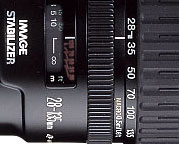
28-135.jpgThe first lens I bought for my kit was the 28-105 f/3.5 zoom from Canon. It is a decent lens, but in retrospect, I regretted buying it. I quickly replaced it with the 28-135 f/3.5 image stabilized lens. When I go travelling and have to pick a single lens, is the lens that gets to go on adventure with me. It’s wide enough to be useful for most landscape stuff, and zooms in far enough to be good for portraiture, wildlife, and all that. It’s also a macro lens, and it works surprisingly well at taking photos up close, too. It’s not a cheap lens, and it’s not all that sharp either, but it has a special place in my heart nonetheless…
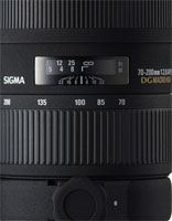
sigma70-200.jpgThe next lens I bought was a 70-200 f/2.8 EX APO lens from Sigma. It’s bloody expensive, but it’s also one of the best lenses I own. Because it stays at f/2.8 throughout its zoom range (in general, zoom lenses that have the same aperture throughout their zoom range are of better quality for reasons that are slightly beyond this write-up, I’ll do that one as a separate article some day), you get a long lens that’s perfect for concert photography. Which, incidentally, is why I bought it. (more about concert photography here and here). The lens is quite heavy, but it’s really sharp, handles well, has a fantastic bokeh, and is great for all sorts of sneaky photography.

For work, I started doing a great deal of interior photography, and needed to go wider than the 28mm afforded by my other lenses. With my recent success with the Sigma lens, I decided to go with the Sigma 17-35mm f/2.8-4.0 lens. It’s a peach, what else can I say.
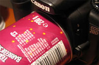
pringlesmacro.jpgOther stuff in my kit bag is the Lensbaby lens, which I’ve fallen completely in love with (as explained at great length here), a 50mm f/1.8 mk1 prime (as rambled about here), my home-made macro extension tube, and a Canon 135mm f/2.8 Soft Focus lens, which I to this date haven’t quite figured out how to use. Sure, it’s a great prime lens, but the soft focus bit is an absolute mystery to me.

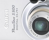
canonelph.jpgFor parties, going out, and all that sort of stuff, I keep a nifty little Canon Digital Elph S500 handy, too. The battery life of it is absolutely amazing, and the lens is spot-on. Sharp and reasonably fast. The camera itself is virtually indestructable, too (I’ve dropped it more often than I care to remember, but its metal casing really holds its own), and it’s small enough to carry around everywhere.

My final gadgets are a Slik tripod, a standard Canon Speedlite 420 flash gun (my 550s kept breaking or getting stolen, it seems as if the 420 agrees with me better — knock on wood), and a LowePro Stealth Tracker photography backpack to lug it all around.

The last piece of kit worth mentioning is my Apple dual G5 2.0 Ghz with a 19″ Eizo flatscreen TFT monitor and Photoshop CS2. It’s not strictly photo gear, but I couldn’t be a photographer without it, so it obviously belongs in this list :)


So, where do I go from here? I’m currently drooling over the Canon 100mm f/2.8 Macro lens, as based on my experiences, and those of many of my friends, it’s supposedly one of the sharpest and best prime lenses out there. The fact that it’s a perfect focal length for portraiture, the fact that it’s a magnificent macro lens, and the fact that it’s not actually that expensive for what you’re getting, means that I have to fight hard to keep my credit card in my pocket. Must… save… up… money…

So, enough about me. What’s in your kit bag? Why? And what is your next purchase?


Do you enjoy a smattering of random photography links? Well, squire, I welcome thee to join me on Twitter -

© Kamps Consulting Ltd. This article is licenced for use on Pixiq only. Please do not reproduce wholly or in part without a license. More info.

First steps in Portraiture

sunglassesintro.jpg

My entry into Photography was a very gentle and gradual one. As such, I don’t actually remember much of how it all came about, nor do I remember the specific steps I took, nor in what order I learned the lessons, or why.
Handy, then, that there are people out there who are just coming to terms with their disease, errr, affliction, errr, passion that is photography. In this case, my dear friend Anna went on a rant-a-licious rampage, which might help some budding photographers gain some self-esteem and follow a new-ish photographer in her first footsteps towards what’s promising to become a life-long obsession: Taking good portrait photos.

Without further ado, I’ll hand you over to Anna! 


This last year I’ve become very interested in taking photos of people. There are several reasons for this; firstly I actually have some friends now and want to take photos of them that they genuinely like and secondly, because it’s a damn difficult thing to do and I like a proper challenge. I don’t do conventional portraits (you know the ones; sit up straight, smile for the camera etc.). You can look at those once, put them in a drawer or on your grandma’s wall and they don’t tell you anything at all about the person. When I take a photo of someone, I want it to convey something about their character and in some cases, when it’s someone I know and care about, I want it to reflect that as well.

monochrome-portrait.jpg
Photo by Anna Badley

guitarplayer.jpgThe first proper portrait I did was April this year. The friend in question was highly suspicious of my abilities, hugely hungover and rather lined and crumpled (he used to smoke 20 a day and had recently given up). I only had a compact digital camera with me at the time and the light was fading rapidly. I put it into sepia and made it look old fashioned because he’d insisted he didn’t want to look ginger on it, the awkward bastard. He was actually quite chuffed with his portrait and has merrily posted it on websites to show people. More importantly though, it stands as a record of how crumpled he actually was, and now, 9 months on, I’ve taken some more photos where he looks a lot less crumpled and he’s pretty pleased about this. This is what giving up smoking does for you.
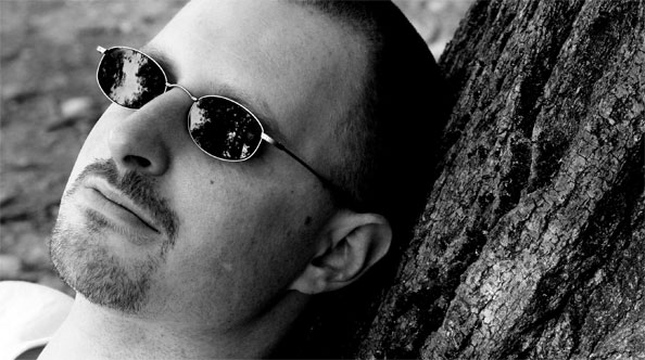
Since then I’ve taken a lot of photos of people. Most of them have been fairly reluctant to let me point a camera at them but glad they did when I show them the results. I’ve found that women are more difficult to photograph than men because they are more worried they will look awful which is a bit of a self-fulfilling prophecy really. If you are anxious about being photoed, the photo will inevitably look crap. This has proved to be the case with my mother. She has the ability to grin inanely in an alarming way that she only ever does when someone points a camera at her. I even managed to capture the stages of facial contortion that lead to the inane grin by taking four photos over the course of a second – normal, anxious having noticed the camera, attempting to form grin, GRINNING ANXIOUSLY.

sunglasses.jpg
Photo by Anna Badley

I suspect this anxiety people instantly develop when a camera is pointed at them is because of too many bad pictures taken in the past – rabbit-in-headlights, blinded by flash, cheesy grinning forced posing type shots that never see the light of day again. Let’s face it, there’s nothing like a crap portrait to knock your confidence about how attractive you are and photos can be horribly unkind because they catch you for the tiniest split second where you might be laughing and thus showing off your crooked teeth.

portraitsalma.jpgThere was a point to this post (I’ll get there in the end, honestly) and it was that as Christmas has just been and gone there are a lot of people out there who have been let loose with new cameras, or new lenses for old cameras. Basically, the world is not a safe place right now if you’re nervous about having your photo taken. However, for all those new camera owners, you might get a photo worth sticking on your wall if you try out these five things:
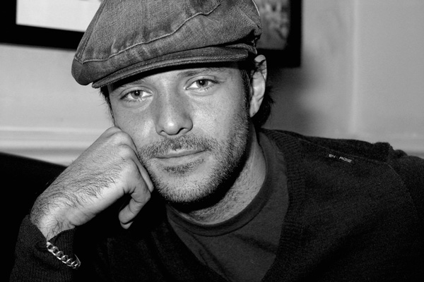
1. Try and shoot in daylight rather than indoors. This will stop the flash going off and giving people red eye. Red eye makes people look mental. Of course, if this is the aspect of their character you are trying to capture, then that’s fine.

2. Photograph one or two people at a time instead of trying to get large groups together; you’ll never get everyone smiling nicely at once and also big group photos rarely look good when printed because you have to stand further back to take them so everyone looks smaller and blurrier.

portraitjames.jpg
Photo by Haje Jan Kamps

3. Never ask anyone to smile. It never works because it makes them think about what their mouth is doing – disastrous. Tell them a joke or pull faces at them if you must, or take a non-smiling photo for a change. In fact, if you can catch them when they’re not aware you’re taking a photo that’s even better; for example if they are engrossed in doing something they enjoy doing. You could even take a photo of them from an unusual angle – from the back, perhaps? For the truly camera-shy, there is always the option of snapping them whilst they sleep. This is probably a bit ethically dubious, however, and you might want to show them the photos when they wake up and check they’re okay about it.


4. Timing. With a digital camera you can afford to get a bit carried away and blast off fifteen or so shots of one person on the off-chance one will come out right – a great way to learn what works and what doesn’t. There is no shame in this; even the professionals get a bit trigger-happy sometimes. You can also check the photos you’ve just taken to see if people have their eyes closed etc. which is a major bonus. However, whether you’re working with digital or film, it’s still worth watching and waiting for a potentially good shot and not just panicking and pressing the shutter button the moment you’ve got your victim (er…I mean model) where you want them. Talk to them a bit. Give them time to relax. Ply them with drink. Chloroform them if needs be (only kidding).

5. Failing all else, you can hide all sorts of atrocious things by changing your photos to black and white or sepia. This is very easy in digital – quite a lot of digital cameras actually have these options on the camera itself – sometimes under the manual settings. This means you can actually go all arty and shoot in black and white or sepia if the mood takes you. Not so easy in film of course – you have the options of starting off with a black and white film in the first place, or scanning your photos and adjusting them in an art package. Black and white is a wonderful way of hiding spots, disguising drink-related red faces…and getting rid of purple and pink anoraks.

Good lord I went on a bit there. Sorry about that. I’ll shut up now.

Some of the pictures in this article were taken by Haje, because Anna didn’t send me any before she vanished for her Christmas break. If you like her photos, why not check out Anna’s DeviantArt page or her Flickr stream?


Do you enjoy a smattering of random photography links? Well, squire, I welcome thee to join me on Twitter -

© Kamps Consulting Ltd. This article is licenced for use on Pixiq only. Please do not reproduce wholly or in part without a license. More info.