Loss of sight doesn't mean an automatic loss of creative expression through photography. Tammy Ruggles, a fine art photographer from Kentucky, talks about her life and work.
Sean Batten, the winner of the UK National Award - 2014 Sony World Photography Awards, chats with Photocritic
As part of the 2014 Sony World Photography Awards, the judges went on the hunt for the best photographers representing a selection of different countries. In the UK it was 41 year old Sean Batten, a C++ and C# software developer who's from Bristol but now lives in Surrey, who came out on top. He particularly likes architectural and street photography, so his winning image of Canary Warf tube station isn't too much of a surprise! Sean took his winning image at Canary Wharf tube station at 12:54 on a Wednesday. He says that it was planned to the extent that he took his camera to work that day knowing that he wanted some photos of Canary Wharf and the area, but that particular view came about by chance: 'I just happened to go into the smaller entrance on Upper Bank Street and was impressed by the smaller space (compared to the rest of the station) and the impressive, and imposing, roof.'
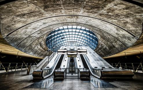
Taking photos on the Underground isn't anything new for Sean, so he knew what to expect in terms of being able to get his shot: 'The staff don’t mind what you do as long as you’re not obstructing anybody and you don’t use a tripod.' Not being able to use a tripod meant that he shot wide open at ƒ/2.8 with his 14-24mm lens on his Nikon D800. The light coming in from the glass roof together with the shadows meant he needed three bracketed shots to cover the dynamic range.
He took a series of images to help secure against camera-shake, and although he knew he had a good image on his hands when he started to process the sets, it was down to social media that he entered it into the Sony World Photography Awards. 'I uploaded it to Flickr and got a lot of positive feedback, so it seemed like an obvious choice to enter into the Sony WPO awards.'
Now that Sean has a new Sony A7 to play with, I asked him if there's anything in particular that he's looking forward to photographing. Unsurprisingly, he's looking forward to taking it out and around London for some street photography, being lighter and more discreet than his Nikon D800. For someone who enjoys street photography in the capital, he hasn't had too many bad experiences with his camera.
Sean says that it can be difficult trying to take photos outside the Shell Centre on the Southbank, but that his experiences with the police have been positive. 'Every 5 November I go along to the Operation Vendetta march from Trafalgar Square to Parliament Square and there’s always a load of police to make sure the event goes off without any trouble. They never ask you to stop taking photos, and will even stop and let you take their picture, sometimes alongside a protestor!'
As for his dream shoot, that's an easy answer: 'Antarctica! I’ve always wanted to go, and these days it's become a more of a possibility, even though it’s still expensive. If I win the lottery then that’s where I’ll be going with my camera.' Although, if he doesn't win the lottery, he'll aim for San Francisco or Seattle.
Many congratulations to Sean, and our thanks for taking the time to talk with us. You can see his winning image 'in bigness' (as my father would have it) at the Sony World Photography Awards exhibition at Somerset House, London, from 1 to 18 May 2014. Sean is particularly looking forward to seeing winner of the Smile category, by Alpay Erdem, and the winner of the Korean National Award by Dowon Choi. Otherwise, you can see more of Sean's work on his Flickr stream.
Postcards: A Martin Parr video exclusive
Only in England, an exhibition of work by two of Britain's most respected documentary photographers, Tony Ray-Jones and Martin Parr, has been running at London's Media Space since September last year. As the exhibition draws closer to the end of its six month run, Media Space has released some exclusive video footage of Martin Parr exploring a file of Ray-Jones' collected seaside emphemera. It's a sweet insight into the interests of Ray-Jones, and Parr's excitement at unveiling a little more about him.
If you'd like to see Only in England, you've until 16 March to do so. Tickets cost £8, or £5 for concessions and can be booked online. Media Space is a part of the Science Museum.
Only in England will run at the National Media Museum, Bradford, from 28 March to 29 June 2014.
A Closer Look: Jonathan May
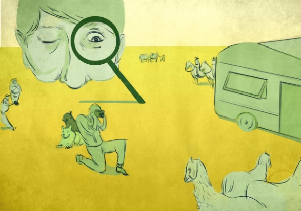
I've handed over the reigns to Gareth again today. He's taken a slightly different approach to his article this week: he's going to take a closer look at a photographer he admires, and examine just what it is that does it for him.
All yours, Gareth...
A Closer Look is a series of articles looking at the work of photographers whose work means something to me. When I am influenced by the work of others, I like to take less tangible elements away from the images. It isn't useful, in my opinion, to closely study the technical style of a given photographer, as you are at risk of losing your individuality. A more useful practice is to study what you love about an image beyond the immediately visible.
This week, I'm looking at Jonathan May, a photographer I became aware of when he was selected as a finalist in the National Portrait Gallery's Taylor Wessing 2011 Photographic Portrait Prize.
A small disclaimer: just because I admire May's work doesn't necessarily mean I can speak about it with authority – I merely aspire to describe what I like about it.
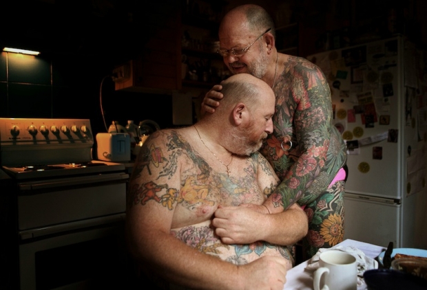
The first thing that strikes me about May's work is that it's often very positive in tone. This is extremely refreshing in the current climate, because so many photo stories, whilst absolutely beautiful and shot with a mastery that leaves me open-mouthed, are of subjects that are, frequently, unrelentingly bleak. Now don't get me wrong, I think it's vital for photography to be able to highlight issues and tell stories that would go untold and unseen by the world. Not only that, but I think the people who bring such stories to the world are genuine superheroes (and possibly slightly unhinged): it's just that the saturation of such stories makes me yearn for something different.
You can see this immediately in his set L'Afrique. I feel that, in the West, we have a skewed image of Africa: a combination of the doom and gloom of the media and the plethora of photo projects that cover injustice, poverty, war and political horrors throughout the continent. It feels like from north to south, east to west, it comprises misery and human suffering. There is, of course, much of that, all of which needs to be exposed to the world and not kept a secret, but there is also a vast and beautiful culture and history which is seldom celebrated in the face of documenting all that is wrong with Africa.
May's shots of Africa exhibit a warmth, respect and admiration for African culture. It is refreshing to see a story of Africa that feels more celebratory than exploitative: in L'Afrique we become students, soaking in the beauty, gazing up at these people, learning, engaging on a human level.
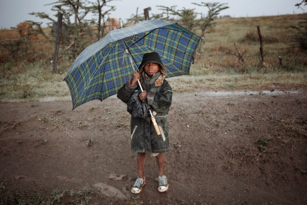
The most important skill exhibited in L'Afrique is May's ability to act as the humble recorder whilst still applying his style, skill and proficiency to the images. If an image evokes more of the photographer than it does the subject, it's doing something wrong, in my opinion. This is something May is acutely aware of and he elevates his subjects whilst remaining anonymous to us, the viewer.
It's a feeling May achieves in many of his projects and is something evident in any story he tackles. I love his ability to find beauty in topics and stories that are infrequently covered. This is why one of my favourite photo stories of his is Greens: a look at crown green bowling, more specifically the bowling club his grandfather founded.
There is something quite beautiful in the telling of a story through the paraphernalia and objects that surround the people involved in the story, and Greens achieves this beautifully. An image of a somewhat chintzy clubhouse carpet with a table occupying the corner tells us as much as a one of his intimate, shallow depth of field portraits does. It's when these two are combined in a series that they unlock the power of one another: although they are strong images on their own, the effect is compounded when they are brought together, contrasting as they are in content.
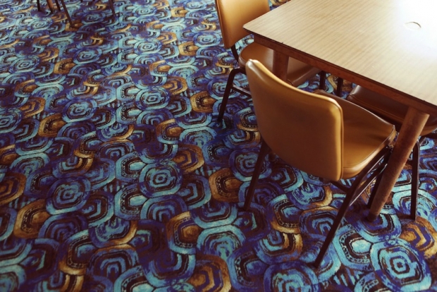
As a portrait photographer halfway through my first ever long-term photo project, I am fascinated with the idea that a portrait of someone can be greatly enhanced by an image of their surroundings, or of something that is illustrative in some way of who they are, as opposed to a single image of the actual person.
There are dozens of single images within Jonathan May's work that I love but, in the interests of not making this article tediously enormous, I will look at my absolute favourite and attempt to articulate why I adore it.
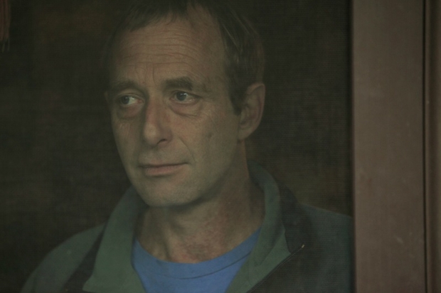
This is a portrait from May's series Caravans, a story about a society that is often looked down on and dehumanised in many ways. The series itself has all the trademarks of May's work, but there is something about this particular portrait that, as I cycled through the images, was like a punch in the stomach: a good punch in the stomach, if that makes sense (it doesn't).
Initially, the intimacy of the composition grabbed me, so I brought it up in full screen. The background is uncluttered and plain yet far from blank: it further draws us to the subject's face. The expression that May has captured is utterly captivating: it's an expression that is both inscrutable and full of emotion at the same time. His mouth is ever so slightly curled up at one side, suggesting a smile may be breaking out. There is the tiniest hint of a wet glint in his eye, as if he is holding back a tear, but it's all so slight that we're not sure whether that is a projection of what we are seeing in his face or the reality of the situation. When I look at his face, I see a man remembering: an expression of fond reminiscence. We are the ones to lay down the final brushstroke, the canvas is left open for us.
And 'canvas' is an appropriate word here: the mesh of the door has muted and diffused the light and the wooden frame forms the right hand side of the image, creating the feel of a Renaissance-era painting, faded over time. I love the idea that something so beautiful can come from a seemingly innocuous shot of a man looking out of a window in his caravan. That, dear readers, is the magic of photography.
What I'd really like is for these columns to become discussion points about the artist in question. I want to hear what you think of Jonathan May's work – does it resonate with you? Does it excite you? Does it bore you? What do you like? What do you hate? Let's hear your opinions!
The illustration was by the mightily talented James, of Sweet Meats Illustration.
You can check out Gareth's photography here.
And if you're wondering about the copyright implications of reproducing May's work in this article, it's covered under fair dealing, as criticism and review.
Capturing butterflies in flight

My friend Alexander James has been working on a cool project for a while, that I wanted to share with you guys: Photographing butterflies in flight.
 "My photographs are always presented ‘as-shot’ without cropping or post production either traditional or digital", Alex says, which immediately made me go back and take another look at the photos. No editing? How... But...
"The quality of the work and the purity of the process is paramount", he says, and explains that he works to distilling elements out of his images with the strong use of deep blacks. "I'm hoping to convey rich layers of meaning in what at first appear deceptively simple images", he explains.
And as such, the project Distil Ennui became a realisty: Aimed "to extract the essence and beauty of life to appease world weariness".
I think we could all do with a little bit less of the world weariness - and a little bit more with the beauty of life.
Editorial Photography - My Story So Far
In yesterday’s SA article, I referenced the old axiom “write what you know”. I know Hulk Hogan’s real name (Terry Bollea), I know how to play Street Fighter and I know most of the words to Rapper’s Delight. Sadly, none of these are suitable for a photography blog (a shame, because the words to Rapper’s Delight would definitely fill up a full article). Then I remembered I know about editorial photography, which was the fourth and final thing I know, so I figured I’d tell you about my experiences with editorial, how to get into it and finish with a little shoot report about my very first editorial shoot.
Editorial photography, essentially, is photography which accompanies an article or story of some kind to assist in illustrating and bringing life to that story. In short, it’s pretty pictures to look at whilst you read. Editorial is great because those are the only criteria you need to class images as editorial photography, so it can suit a wide range of interests. For example, editorial can be in the form of fashion photography, documentary photography, food photography (like in those nice photos of delicious recipes you find in the weekend magazine supplements that you will never actually make) or editorial portraiture accompanying an interview.
Getting Involved
Although editorial is a saturated market, there are a lot of publications around, all with picture editors looking for images to commission. It’s up to you to make yourself known by providing striking, relevant images.
Take a look at your portfolio – what sort of images do you take? Where would you fit in? If you spend all your time shooting landscapes, you might want to look at countryside magazines, walking magazines, or even holiday magazines if your landscapes are shot abroad. If you’re a food-tographer (I just made that portmanteau up: horrible, isn’t it?) then you’ll obviously want to be looking at food mags or supplements in weekend newspapers, as mentioned above. It all depends on what you shoot. What is important is that you contact the image editor / art editor of the right publications for your work.
Cut The Cr…iminally out of date work
Be your own harshest critic. Look at your photos, look at the old stuff that doesn’t cut it and replace them with newer, better images. Don’t be sentimental with an old image just because you have a fondness for it – your site should be displaying your best work. I can’t remember where I heard this, so I’m afraid I can’t credit it, but the best single sentence I heard about displaying my work in an online portfolio was “your site is not for you”. Even if there is an image you still like, if it’s not relevant to who you’re trying to attract with your work, or there is one that is technically much stronger, either remove it completely or move it to a different section of the site.
Editorial? Sounds Drier than a Cream Cracker in the Gobi Desert
I beg to differ, my friend. There are many reasons I love editorial photography, but the main reason is the pressure. Depending on the shoot, more often than not you’re given a location, a subject and (if you’re lucky) a general idea of what shots you’re required to take. No two shoots are the same. When you arrive, all number of problems could crop up in a variety of areas. There might be terrible light levels, you may encounter snotty, uncooperative PR (as a disclaimer, I’ve encountered some lovely, lovely PR people, too, who have helped me get some of my favourite editorial shots, so there are some lovely PR types, too).

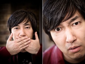
Keita Takahashi, photographed for GamesTM. I had a whole area cordoned off and fifteen minutes to get what I needed. That's more like it!
Sometimes, you’ll have 20 minutes to get your shots, sometimes you’ll have 20 seconds. Sometimes, your flashgun stops communicating with your camera halfway through a shoot and you have to swear under your breath, tear it off, and quickly adjust your settings (that was a fun shoot). Sometimes, you’ll turn up with half a dozen brilliant ideas that you think will look fantastic in the magazine and the subject says “no, we don’t want to do any of those. Just get some of us looking natural”.
Basically, thinking on your feet and creating something aesthetically pleasing and striking using your surroundings is at the heart of on-location editorial photography. And I love it. The satisfaction of solving the photographic puzzle laid out in front of you, and the resulting positive feedback, is one of the main reasons I quit my 9 to 5 and became a full-time freelancer.
Editorial isn’t for everyone, and it can be very hard to break into, but if you’re keen on it just get your work out there: contact picture editors with your stuff and, if it appeals to them (and they don’t already have two dozen photographers already working for them), they might just give you a shot. My main magazine work came simply from me finding out who the photo editor was, sending an email with a link to my online portfolio and, well, that was it. Aim for local magazines, too – people who publish around your area. It might not pay at first, but it’ll look good on your portfolio and, in my opinion, nothing gives you a bigger buzz than seeing your own work published.
Once Upon a Time, in a Fancy London Office…
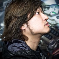
Here’s a little story about my first ever editorial commission. GamesTM magazine, a regular client of mine, asked me to accompany a journalist to procure interview and posed portraiture shots of a videogame designer who was visiting from Japan. This would be Goichi Suda – the critically acclaimed and much loved head of Grasshopper Manufacture, one of my favourite companies. So far, we have two stress factors to add to the mix: first editorial ever? Check. Photographing someone who, in my nerdy world, is essentially a celebrity (and a hero of mine)? Check.
We turn up to the fancy London office, only to discover that Suda-san has literally just arrived by alternative flight, Eurostar then underground train, because his original flight was cancelled. He was meant to arrive the day before. Understandably, he’s not that keen on having his photo taken, seeing as he’s not had any sleep for many, many hours. They ask if I can return tomorrow. I’m more than happy to do that and I just sit in on the interview. The thing is, I’ll be returning tomorrow on my own, essentially representing GamesTM. That’s stress factor number three. They warn me that they’ll have to fit me in between two scheduled interviews, so I’ll probably only get fifteen minutes (ah! Fifteen minutes seems like luxury these days). Thankfully, I plan ahead and get some test shots done in the room we’ll be using the following day to shoot.
Except the next day, everything’s moved. And we don’t have fifteen minutes, we have about five. Stress factor number four. I’m not blaming the lovely PR people for that, because they were on an extremely tight schedule and it was kind of them to let me back the next day at all. But five minutes for your first editorial shoot is unbelievably stressful. Did I mention that Suda-san doesn’t really speak any English, apart from “nice to meet you” and “I like your t-shirt” (I had a cool tshirt on, because I’m dead cool and that)?
So now I have five minutes to make sure I get the kind of shots that are good enough to ensure that GamesTM like them enough to ask me back and become a regular customer. In a room I didn’t plan for. I also have to direct my subject through a translator. “Baptism of fire” doesn’t even begin to cover it.
The thing is, I thrived under the pressure: we created a series of fun headshots with a range of expressions that were meant to represent the different sides of Suda51 – his dedication to his artistic vision and his role as a businessman who needs to make sure his work has a broad enough appeal to sell. This is the sort of stuff I would take in my stride these days but, at the time, I felt like my head was going to pop. The payoff, though, when the magazine used about a dozen of the images, turning it into a multi-page article, was more than worth the pressure at the time.
I Suppose I Should Round this up, Then.
I think everyone should have a go at editorial photography in some way. It is possible to create work with an editorial feel without waiting for a commission. Create a series of images that tell a story, similar to a mini project. If you get into the habit of telling a story with your images, regardless of your subject matter, it will help you get more out of your photos and take them to the next level.
Being a real life CSI photographer

Anyone who watches crime shows on TV will have heard the whirring sound of someone clicking seemingly endless photographs of skid marks, broken glass, and bodies. In fact, more people than ever before know what forensic photography is: Photography used to record details at crime and accident scenes as part of the evidence-gathering process. It's no job for amateurs — except perhaps when a bystander* with a camera phone gets off a few shots before first responders arrive. Camera phone photos are being used as evidence in an increasing number of criminal and civil trials.
*) Just a random aside: if you are one of those bystanders, I would recommend you take your photos with a camera, and take the memory card out. In the UK, at least, police have the power to seize the evidence - by force if necessary - and you won't see your camera phone again until after the trial. If you witnessed something quite serious, you could be talking months. It's less painful to have to give up your memory card than your whole camera or phone.
I was lucky enough to be able to interview an UK crime scene investigator, C, whom I know via my role as a Special Constable in the Metropolitan Police. In the Met, we call them SOCO (Scene of Crime Officers), but the job is pretty much the same.
"The core role of a CSI is to attend crime scenes and identify, document and collect evidence.", C explains. "At one end of the scale it could be a criminal damage and at the other, a murder scene."
What's in a CSI's photo bag?
"I keep all of my kit in a Pelican Case.", C says, pointing to a sturdy-looking piece of kit on the floor. Pelican cases come in all sorts of shapes and sizes, but they have their absolutely incredible robustness (some would say 'bullet-proof', but that would probably be like swearing in church in presence of a Crime Scene Investigator) in common. They aren't cheap, but they can be had from Amazon (USA/UK) at reasonable prices.
"The Pelican case keeps everything protected", C says, and adds, laughing: "Another advantage is that it can also double as somewhere clean to sit."
C shows me the content in the case. I have to admit: Given the high-tech feel of forensics in general, I am a little bit disappointed. There's a Nikon D200, a 18-35mm lens, a 60mm Macro lens, four 512MB CF cards, an SB-800 flashgun and extension cable, a Metz 45 Flashgun a Quantam battery pack and extension cable and a shutter release cable. Packed into the lid of the case are various scales, stickers, a spare pair of gloves, and a white balance card.
"Unfortunately", C says wistfully, "I don't have any say in the equipment I'm using. The D200s were purchased before I arrived, and before that everyone was shooting with film. We've had the Nikon D200 cameras for a while now. They do the job very well, and with all the budget constraints I don't see this changing anytime soon."
"Don't get me wrong", C interjects, "I like all the equipment. I have to say, though, my favourite has to be the 60mm lens. It provides incredible detail."
The macro lens comes in particularly handy in certain situations. "Sometimes fingerprints cannot be lifted in the normal way", C explains, picking up the 60mm lens, and weighing it in his hands, "for example if they are in grease or blood. I use this lens to photograph fingerprints with a scale. It surprises me each time I do it."
Even though C has two different flashes at his disposal, he doesn't like using them much. "I don't like flash. I use it when I need to but if I can find another way then I always try that first.", he says. "When I attend someone's home address for injury photos, I'll always suggest we do it in the rear garden for example. This gives us the use of the natural light instead of the flash inside."
"On the more exotic scale of things, we have use of Ultra Violet photography. The UV can show up bruises and injuries that aren't visible to the naked eye or camera. This is particularly useful when photographing bite marks."
"We also have use of 'body mapping photography'. This is where we take a series of photographs at different angles of a person, usually deceased, and the injuries can be put onto a 3D digital model for court." Why would you bother, you might ask? Well, most importantly, it prevents having to show the actual photographs of a dead body in court.
At the crime scene
Crime scene investigators have a little bit of leeway in how they do their job, but the most important thing is to keep the audience for the photos in mind: It's the jury who will eventually convict - or acquit - the suspect of a crime.
"Some of the things I do make it easier at court when a jury or judge are looking at my photos.", C says, clearly passionate about getting this bit right. "They've never been to the scene and may not even know where it is. The trick is to take photos as if the viewers were walking through the scene. Each photo has something from the last photo in it, this helps join it all together."
"I use stickers with arrows on them, these indicate points of interest", C says, waving vaguely at the stickers in his Peli case. "I'll normally take a wide shot, another one closer to a subject and then a close up with the 60mm lens. I also use the distinctive yellow number markers."
The thing you see in the movies, with the gruff police officers saying "Nobody touch anything" as they cordon off a crime scene? Yeah, that's pretty accurate. "Nothing is moved in the scene until the photographs are taken", C says. "This means I can present a true and accurate record of the scene when I arrived. If I find something as I move items, then it's photographed as I go."
What's the job like?
"My job involves attending crime scenes - but some times I attend scenes where there isn't a crime involved. Sudden deaths and suicides are one example. I attend in order to ensure that there is no foul play and to document the scene for the Coroner."
"Sadly", C says, "people get an odd impression of what my job is from watching CSI and shows like that. Obviously, I don't have a gun - they don't even hand those out to the beat coppers here in England - but my van doesn't have lights and sirens either. Hell, I think my van is the least desirable of the whole fleet! Beats taking the bus though."
"I work a shift pattern, like most people in my office. The hours are between 0700-2200 every day of the week, every day of the year. Once or twice a week, I end up on call", C explains, "which is often after a late shift. When that happens, it means I am on call until 0700 the next morning".
It isn't all photography, the job of a CSI, either. "Some of the items I could be collecting are footwear impressions, fingerprints or items for DNA consideration.", C says, "There are many techniques for recovering these items."
Despite the perceived glamour around the job, Being a CSI isn't a particularly creative job. "I use to photograph weddings before this job and that was really creative", C laughs, takes a sip of his tea, and shares a couple of anecdotes about the daft things brides and bridesmaids get up to. Then, he goes a bit quieter: "My new job is quite different".
"Crime Scene Photography is record photography. Everything needs to be taken as if the person viewing the photo was actually at the scene. This is something I struggled with when I first started. I'd look at my photos and think 'What the heck is that!?' I have got used to it now". C doesn't miss the creative aspect of photography, however: "I can be creative when I use my camera at home!", he says.
The most challenging situations to photograph come from technical and non-technical angles. "Sometimes I may need to use balanced and reverse balance flash. That can sometimes get the cogs in my head turning slowly.", he smiles, miming the aforementioned slow-turning cogs with great precision.
The other obvious challenge with a job like this is the things you come across on your average work day. "I'm human", C assures me in a tone that makes me think that people have an odd tendency to forget that.
"I know that a lot of things I see are upsetting. One thing I am good at is not being emotionally involved with a job. I see all sorts of horrid things, but to me it's a career, a professional one", he says. "I see deceased adults, children, people with horrific injuries and things you'd never think possible. The trick is to remain professional and remember that people involved expect me to do a good job. So that's what I do."
"I'm happy to admit that I am a clean freak. I like everything to be organised and in its place", C says, with a serious expression on his face. Not hard to understand, perhaps - how organised C is will directly affect whether a criminal gets locked up behind bars, or walks out of the courthouse whistling a Lady Gaga tune."My van is one of the tidiest I've ever seen - and you should look at my fingerprinting case! It's immaculate!".
Between you and me, it's people like C that make working with the police that little bit more fun.
After the fact
"I'd say about 75% of the photos I take will end up in an album for court", C says, explaining where his photos fit into the grand scheme of things. "If I produce an album for court, then I also have to produce a statement. The statement will outline how I conducted my examination and what I recovered. I also state some observations I make at the scene too."
"If the defence indicate that they may wish to contest part of my evidence or question me in relation to it, then I will be warned that I have to come and be questioned in court". Being 'warned for court' is a phrase that gives any member of police staff the chills, as it isn't a pleasant thing, having a defence lawyer trying to shred apart anything you've said or done. "I have been warned a few times", C says, and gently taps the wooden chair he is sitting on, "but yet had to give evidence in this role".
"I love the spontaneity of my job", C says without hesitating for a split second, when asked why he's doing it. "Each day really is different. I could go on duty and have a number of jobs to attend when something happens and the day's plans go up in the air. I love being out of the office. Being stuck at a desk would drive me insane. The hard work pays off when I identify an offender, that's what it's all about".
After thinking for a moment, he adds, laughing - "Y'know what I really love? Catching the same guy for more than one job!"
To hopeful future CSI officers...
If you're interested in becoming a CSI, the first two things you should know is that it ain't like on the telly, but that it's a great job anyway.
"I'd never give it up for anything", C says.
"You've got to be motivated and dedicated. Once you start a scene, you've got to finish it", he says, with a shrug. Yes, that does mean that you're working horribly long hours from time to time. "Attention to detail is paramount. You'll need to have a strong stomach; you'll see lots of horrid things."
Of course, a solid interest in - or, even better, experience with - Science, Policing and or Photography will be a great help.
When a vacancy comes up, there will be hundreds of applicants. You'll need to set yourself out from the rest somehow.
About C
C prefers for his name not to be known. His name isn't C - that's short for CSI for the purpose of this interview - but he's a great guy, and I'm really grateful that he has helped me with this article.
C's a CSI for a large police force in the UK, but he has worked for the police in various other roles before, including being a Special Constable (like me!) for six years, with another force. He loves his job, and he loves talking about it, too - because a lot of people find it interesting, for obvious reasons.
If you liked this article, take a look at C's blog, and consider following him on Twitter - he tweets as @CSIguy01
Walking in the air
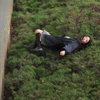
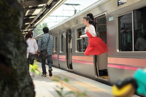
How do you take a photo that makes it look as if you’re floating, or maybe flying? If you’re Natsumi Hayashi, a twenty-something photographer based in Tokyo, with a fast shutter-speed and by jumping up and down. Lots. Up to 300 times per shot, in fact. Sometimes she uses a self-timer and sometimes she ropes in a friend to click the shutter. But she still has to jump up and down. And with some shots taking up to an hour to get right, I’m surprised that she isn’t permanently exhausted.
I’m completely stunned by her ability to maintain a composed facial expression whilst she’s leaping about.
You can follow Hayashi’s jumping exploits – and those of her cats, which don’t levitate – on her photo blog, Yowayowa camera woman diary.
(Thanks, Graeme.)
A Closer Look: Rania Matar
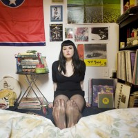
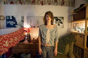
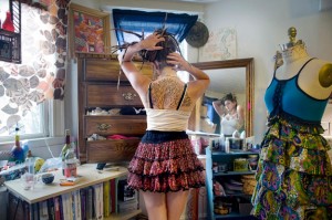
As of late, I’ve become more and more drawn to portraiture which makes extensive use of the surrounding environment to tell us more about the subject themselves, to the extent that it is now creeping into my own work. Although I love the intensity that an intimate close up portrait can bring, the creative freedom that is afforded to you in an environmental portrait allows you to tell a story, to show more of the subject and who they are. This, amongst other reasons I will explore in this Closer Look, is what drew me to Rania Matar’s beautiful portrait series “A Girl and Her Room”.
Last week, I looked at Anastasia Taylor-Lind’s Women of the Cossack Resurgence – a look at a female-dominated society, photographed by a female photographer. I wanted to further explore this area with Rania’s work. Much of Rania’s work is focused on women and women’s issues, “A Girl and Her Room” being one such project. The project examines those difficult teenage years, looking at the strains associated with the transition from childhood into adulthood and the various pressures experienced by girls growing up in today’s society. One the one hand, they are children. On the other, there is pressure from peers, media and popular culture to move into adulthood.
The series is excellent at exploring that confusing period of your life, where half of you desperately wants to grow up and be taken seriously as an adult and the other half doesn’t want to fully let go of childhood. Rania often portrays this in the series by juxtaposing themes of adulthood with themes of childhood. This is sometimes reflected in the subject’s choice of clothing, which indicate physical and social maturity – “going out” dresses, evening gowns and the like. Sometimes, it is reflected in their surroundings – a shelf full of various make-up, bags, shoes and posters of models and bands. In the same glance across the image, you notice paraphernalia associated with childhood: stuffed toys, bunk beds, colourful drawings and photos of themselves as a younger girl.
The very first image you encounter in the series – “Siena 17, Brookline MA, 2009″ – implements this juxtaposition extremely well. Siena’s wall is plastered with posters of models in bikinis and adverts for fragrance and cars, whereas her bedsheets are patterned with pictures of farmyard animals and a large stuffed teddy rests in front of her.
There’s just so much to talk about here, I’m finding it hard to be concise (surprise surprise), but what I find really wonderful about the images is the different degrees of maturity and each girl’s unique response to growing up. Girls the ages of 12 through to 21 and 22 are photographed and it’s fascinating to see what items incrementally change in the room – a sort of battle for room space between objects of the past and objects of the future. It’s also interesting to note that there is no hard and fast rule to what stage of maturity a girl is at relative to her age – everyone goes through that change at their own pace, and this is demonstrated by the incredibly diverse personalities on display.
There are many themes running through the images: the extensive inclusion of the mirror and how it reflects the subject’s preoccupation and concerns with self-image: the inclusion of pregnant girls and the even greater gulf between being forced to grow up and accept responsibility and the desire to remain a child: the subjects who live in other countries whose rooms, although initially seemingly different, follow the same patterns and reflect the same anxieties, concerns and desires as those of the North American girls.
Aside from being rich in thematic detail, the individual images are also rich in physical detail. Rania includes dozens of little touches in each image. Initially, I consider the subject and her expression, then my eyes move around the room at every little detail, then back to the subject again. What is truly magic about Rania’s work is her composition – some of the rooms are absolutely packed with bits and pieces yet Rania manages to include all this without losing the subject herself in the background. That incredibly clever use of space is the master stroke that sets these portraits apart, as it would be all too easy for them to feel too busy and overloaded.
The series has inspired me to really look at and develop my own environmental portraiture, paying very careful attention to use of space. I urge you to go and look at the “A Girl and Her Room” project as a whole – it’s important to view the featured images here as part of the whole series, because not only is a story told in each picture, but a story is told as you progress through each image. Plus, they’re great, so why wouldn’t you go and look at them all?
A Closer Look: Anastasia Taylor-Lind

To continue my Closer Looks this week, I’m looking at the absolutely beautiful work of Anastasia Taylor-Lind. It’s important to look at a female photographer and her work because I personally feel that women are a little under-represented in photography. To follow through with this theme, then, I will be looking at Anastasia’s series “Women of the Cossack Resurgence” – a fascinating look at Cossack revivalism.
I won’t get too far into the ins and outs of the story and background of the series, for fear of making myself look a bit stupid and publishing inaccuracies. It would be much better if you scooted over to Anastasia’s site and had a look at the flavour text to fully acquaint yourself with the background behind the series. What I want to do with this article, as a portrait photographer, is attempt to get a bearing on just how she achieves such beautiful images.
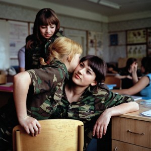
Anya Romanova (centre) and her Year 8 friends at Ataman Platov Cossack Cadet School. This image was featured in the Taylor Wessing Photo Prize 2010.
With portraiture (and photography in general) preparation is key. The image is not just the click of the shutter, it is all kinds of preparation approaching that moment. For these images, Anastasia spent a week in the school with the girls, attending their classes, sleeping in one of the dormitories, being one of them. The benefits of this were twofold. First, it would allow her to connect, identify with and get to know the girls, so that the resulting images more accurately portrayed their character. Second, it would mean her subjects would relax and be used to the camera.
Another preparation that was important here was kit preparation. Anastasia used a 6X6 Bronica with a waist-level viewfinder. Compared to your normal DSLR, this allowed Anastasia to take the camera away from the front of her face: now they were talking to her and not to a camera with someone hiding behind it.
Recently, I have often felt there is something of a barrier between myself and my subject when I raise the camera to take a shot. My own approach to alleviating this problem is to practice being able to effectively compose more quickly, making sure I take the camera away from my face as often as possible, to let my subject know I’m still there and haven’t been taken over by a large metal facehugger. That human connection is very important, in my opinion.
Many of the shots in the series explore the bond between the girls in the school. There are images of the girls dressing each other’s hair, embracing, spending time together in the dormitory at bedtime and, in one of my favourites of the series, possibly whispering secrets to each other. I feel as if these images have been included because they resonate with Anastasia as a woman.
I’m not saying that a male photographer wouldn’t have noticed this connection between the girls, but I wonder whether the moments would have been captured as intimately. Maybe I’m wrong, but I do think there is something to the idea that your best work is borne of an emotional connection of some form with the subject. Again, this reinforces the importance for me of Anastasia staying with the subjects of her portraiture for several days – it’s as much to prepare her for the images as it is to prepare them.
To finish with, I want to look at an individual portrait from the series and tell you what I like about it. I honestly feel like going through every portrait in the series, because they’re all beautiful, but we all know how much of a waffle fiend I am (imagine having to sit and listen to me waffle – at least you can just close your browser when you get bored), so I’ll limit myself to one.
By which I mean two. I was torn between the image of Galina Prokopenko, the 75 year old Karate instructor and the basket-weaving class image. Aside from being allergic to concision, I chose these two images because they are stylistically similar and hold qualities that I, whilst not wishing to be overly gushing, find absolutely wonderful. Putting aside the fact that the subjects are both totally relaxed, natural and bursting with character, they share a compositional style that I am very interested in at the moment.
Anastasia manages to balance the image of the subject in the frame with background detail, without taking focus away from the subjects themselves. If we look at Galina first, there is a beautiful balance between her pose and positioning in the frame with the floral wallpaper. The table tells us a little more about Galina without being an intrusive object in the scene. The lighting appears to be natural window light and the gentle vignetting draws us to Galina (who is a striking enough character to be drawn to in the first place, to be fair to her).
There are similar elements at work in the basket weaving portrait. The positioning of the girl in the frame, combined with the angle of the basket and its outreaching strands, the bottom of a plant creeping in on the image and the small wooden ornament make for an interesting composition. The lighting is again quite beautiful, the face being the most prominently lit feature in the image, focusing our attention on her expression of concentration. There is just enough of a hint of attention in her expression to suggest to us that she is listening to instructions from a teacher to the right of the camera.
Although the qualities described above would be enough to class these two images as excellent examples of portraiture, the true magic for me comes from the way everything is subtly visually linked. In the portrait of Galina, the pink of the floral wallpaper links to Galina’s pink lipstick. Similarly, the floral pattern on the wall links through to the floral pattern on the teapot and to the one on the tablecloth. I love how this is contrasted by her military appearance: it shows us that the personas of great-grandmother and soldier can both exist in one person.
Similarly, there is a very strong visual theme of flora and nature running through the basket weaving image: the hanging leaves link to the leafy pattern on the wallpaper, which is linked to the floral ornament on the wall, which is wooden, linking us to the basket itself, linking us to the camouflage pattern of the girl sitting, which is of course intended to mimic colours found in nature.
These are the qualities that take these portraits to the next level. I will cease my trademark waffling now, I hope you have enjoyed looking at these portraits in depth as much as I have.
To wrap up on a personal note – I’m really very glad I’ve written these two “Closer Looks” on a couple of my favourite portrait photographers. My intention was to get you lovely readers geared up about portraiture but, as it happens, I’ve also reinvigorated myself on the subject. It can be all too easy to fall into the trap of only taking photos when you’ve been commissioned to do so: this is a mistake. I don’t know about you, but I’m off to set up some portrait sessions just for the love of it. I suggest you do the same.
A Closer Look: David Chancellor
The more observant of Small Aperture’s loyal readers may have noticed that my blogging on Small Aperture has increased as of late. Well I have further bad news for you: I’ll be looking after our dear litle blogging site for the whole week. As a portrait photographer, I’m kicking off the week by looking at one of many portrait photographers whose work I enjoy, in the hope to inspire you, help you get more out of portraits and, ultimately, explain to you and to myself why I am particularly attracted to looking at and creating portraiture.
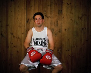
David Chancellor was the winner of 2010′s Taylor Wessing National Portrait Gallery Photo Prize – a wonderful exhibition which was displayed in, you guessed it, London’s National Portrait Gallery. I’m not going to look at his winning entry, “huntress with buck” – instead I’ll be looking at a portrait series of his, entitled “Boxers”.
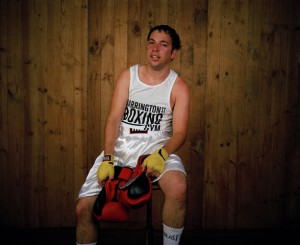
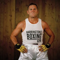
What I love about “Boxers” is the simplicity at the heart of the idea. It has that “why didn’t I think of that?” appeal to it. On the basic level, it’s a “before and after” spot the difference affair, showing each fighter just before their fight and immediately after their fight. This series has a quality that I see in many excellent pieces of portraiture (and any photography, for that matter): a simple, strong idea that has been executed exceptionally well.
From a technical perspective, they are absolutely beautiful – the lighting separates the boxers from the background so that they are especially prominent in the image. Another important detail is that the boxers are situated in the same position in the frame in their before and after shots (or, at least, those who were still able to sit up straight afterwards are!) which adds to the intensity of the “after” shot, as it almost seems like no time at all has passed between the two images, as they don’t appear to have moved anywhere in the interim.
So we’ve briefly examined the setup of the shots, but what takes a portrait from a pretty picture to something that holds your attention and gets you thinking beyond what you can initially see? To achieve this, we need a story.
The boxers in these images are not professionals. They are part of a phenomenon in South Africa known as “White Collar Boxing”, where men and women who have white collar jobs train for around three months to take part in a special boxing event against others of the same background. Not only that, but the boxers in this series are about to have their very first fight. Armed with this knowledge, whole new areas of intrigue are opened up to us, and this is where a well-lit, professionally composed image begins to turn into a real piece of portraiture.
Now, we are scrutinising their expressions prior to their fights. You can see the nervous energy they are harbouring under the surface, the kind that only builds up prior to a tense situation such as a physical fight, especially your first ever fight. Look at how some try harder to hide that nervousness, or indeed tackle it head on, especially for the camera. In a way, to point a camera at you the moment before your fight is the non-verbal equivalent of someone saying “how are you feeling about your first fight?” to which they answer non-verbally. I know that sounds a little pretentious, but go back and look at them with that idea in mind – they’re answering the question for you with their expression. Isn’t that just magical?
The “after” shots are similarly rich with story and intrigue. Did they win, or lose? What injuries do they have? Some of the boxers look so utterly exhausted, it gives across a feeling of relief and release, especially when compared to their “before” images, packed with nervous energy. My personal favourite is Steve “the paratrooper” Burke: the expression of absolute defiance and confidence combined with the pose is incredibly imposing and powerful.
I’m pretty sure he won.
The final sign of a great portrait or series of portraits is what it leaves you with, or what questions it makes you ask that go beyond the initial image. What fascinated me is considering what drives these “ordinary”, office job people to step into the ring and do something that, in my opinion, is incredibly daunting and frightening. Were some attracted to the thrill of the idea and the danger involved? Was it a result of feeling bored and stuck in a 9 to 5 driving the need to do something different? Was it the need to challenge themselves to instil a sense of progress and improvement in their lives? Bearing in mind that David tells us that White Collar Boxing is hugely popular across South Africa, it brings you to ask questions about the human condition, about what drives us.
David allows us to come to these conclusions and ask these questions ourselves, which is an important distinction to make. I’m all for setting up a series of portraits with a little bit of flavour text to tell you what you’re looking at, but it’s important to strike a balance. I have an intense dislike for photo projects where the photographer has written three pages of text to accompany the photographs, telling you what colour schemes to look out for, how the images all link to each other and which of your preconceptions will be challenged. This should all come across in the image: you shouldn’t be told how to feel (or what your prejudices and preconceptions are, for that matter).
And that, dear readers, is why I love “Boxers” and why I love portraiture. I’ll be taking a look at another portrait story later in the week.
We’ve included a couple of David’s “Boxers” images in this article purely for editorial and critique purposes. I hope my article has already moved you to do so, but please go and explore the full set on David’s site. Here’s a direct link – http://www.davidchancellor.com/docs/photos.php?id=3:5
Fame in 10... 9... 8...

Think quick: when was the last time you found a photographer you got really excited about? For me, it was a couple of weeks ago, when I came across Lauralyn. Armed with a cheap pocket camera, a 10-second timer, and a great deal of patience, she performs an ongoing fictional autobiography, in a series of photos that ooze raw honesty and sensuality. Obviously, I wanted to find out more - and what's the point in writing for a popular blog if you can't abuse your privileges to get some interviews?
Lauralyn is an unusual photographer in many ways. She doesn't shy away from controversy in her astonishingly, almost voyeuristically frank blog - and her photography is equally honest. As far as vision goes, her conceptual self portraiture would put a great deal of professional photographers to shame, which makes it all the more awesome that she shoots mostly on very simple equipment. "I am on my fifth Sony Cybershot camera", she laughs, "I love 'em, but I do wish Sony would comp me a few - I've got a nasty habit of breaking the suckers".
Of course, with equipment that's cheap enough to nearly be disposable, it enables you to take bigger risks to get the photos you really want. "In lieu of a tripod", Lauralyn explains, "I set my camera in a dish packed with tin foil, and place it on a small table that's lightweight enough to carry from place to place". She might have broken her last camera for a while, though, as she does confess to having taking the plunge on a tasty gorillapod for a recent shoot.
A rebel without a photography course
Lauralyn's interest for art started early on, she recalls. "As a youngster, I was politely asked to leave school mere weeks before completing my 10th grade year. By the time I got kicked out, I was showing up to an average of about 5 classes per week. I chose instead to spend most of my time either in the Art Building drawing and painting, or on the campus of a nearby university - immersing myself in the thriving arts and music scene there."
When she was 18 years old and staying in Paris as a nanny for a while, Lauralyn bought her first camera (a secondhand 35mm Minolta for $135 USD). "I was traveling with a painter who had been accepted into the Cite Internationale des Arts, and she helped me get comfortable with the camera. She persuaded me to use black and white film. There may have been something magical about that camera, or perhaps it was simply the fact that I was capturing images of the most beautiful city I'd ever seen in my life..."
"I have always loved to take "candids" of my friends and my children, but I did nothing artistic with photography from the time I left Paris at age 18 until..." We're getting ahead of ourselves a little bit. Let's rewind a few years...
From Divorcee to Digital Diva in 3 easy steps
"In my early 20's I moved to my mother's birthplace, met the man who would become my husband of 10 years, and the father of my 4 children. We divorced amicably and although I wouldn't say that we're 'friends' exactly, we do manage to be friendly with one another". After her divorce, Lauralyn discovered online dating - with a vengeance. "I became a ravenous online dater", she laughs, and makes a little tiger-growl.

After one too many dating mishaps, a friend encouraged her to start writing about it - and for the next few years, she spilled the beans on-line, "much to the chagrin of those in my community who felt uncomfortable knowing so much about my indiscretions".
"Where is this blog"? I hear you cry, "I, too, want to hear of these wanton indescretions!". Not to worry, point your fine browsing equipment at the Big Ugly Truck (nsfw).
Online dating turned out to be the inspiration for getting into photography again. "I realized after being on the same dating sites for so long, that guys were showing less and less interest in me and my worn-out, old profile", Lauralyn recalls. So, as any girl with a creative streak would do, she reached for her camera and went for it.
"At first I just held the camera out - away from my face, and snapped fairly uninteresting pics", she recalls, but soon decided to make some changes. "I put up a new avi on Twitter (@biguglyblog) of myself in a black bikini, and saw not only a jump in hits to my blog, but a rise in my Twitter followers as well. One new follower suggested I contribute a photo to Twitter's weekly #HNT (half nekkid Thursday) meme".
The birth of a photo blog
Of course, whenever an attractive lady posts half-naked photos of herself on the internet, the response is predictably popular. "In no time at all, I was addicted to my weekly photo shoots", Lauralyn admits. She decided to let her old blog (and dating, for that matter) fall by the wayside - and instead took up self-portraiture as her new chosen form of self expression, on the freshly minted Big Ugly Pix blog.
"Self portraits", you might say. "Isn't that an exercise in navel-gazing?" Well perhaps, but as I always like to say; the only model you consistently have available (and the only one who might ever 100% agree with your vision), is yourself. Lauralyn would agree - "I'll be the first person to admit that I've become rather self-centered in the last few years, but at the risk of (further) painting an unflattering picture of myself as some sort of reprehensible narcissist", she titters, "I have to be honest and say that - I continue to take these pictures because in doing so - I'm exploring a creative outlet that is thrilling and both mentally and physically challenging. I find it terribly rewarding."
As far as addictions go, Photography tends to be significantly more expensive than any sort of drug abuse - but by using relatively cheap Sony cameras, that particular door to bankruptcy has been bolted shut. Instead, our dastardly auto-portraiturista has channeled her addictions differently. "I have become inexorably addicted to each and every facet of this type of self-portraiture: from brainstorming the themes and the costume, to scouting out locations and then going out on the shoots themselves".
You have probably noted from the photos (and That Other blog, if you took the time to have a quick look there) that Lauralyn doesn't shrink away from a challenge - something that's reflected in all aspects of her work. "I relish testing my physical ability and tempting fate by trespassing on private property or photographing myself naked (or partially so) in public places". The addiction metaphor works well also in the rewards column of the equation. "Coming down from the high I get from pulling off a questionable or particularly difficult shoot can take hours. Obviously, that sensation that was magnified the few times I've been detained by the police in the course of my art."
As photographers, you sometimes can't help yourself at the end of a good day's shooting: The excitement of finally seeing your hard work on a big screen in front of you can be thrilling. "Reviewing a shoot's images for the first time is the closest thing to the ecstasy one feels as a child while tearing into presents and digging through stockings to find all sorts of goodies on Christmas morning, as an adult", Lauralyn explains, her eyes on fire with excitement.
Feeding on Feedback
But of course, the feedback loop doesn't stop there. Lauralyn's work is her own creative insight, of course, but she is deeply populist in that she devours her online feedback with great gusto. "I thrive on getting feedback, whether it's positive or negative", she says, "It lets me know that people are reading my blog". Of course, she prefers favourable comments like the rest of us, but Lauralyn seems to have found a healthy way to deal with negative feedback, too. "Even if my commenters don't approve of my unorthodox behavior, or consider me an artist at all, I do appreciate the feedback".
Lauralyn explains how she lives in a relatively small community (both virtually and in real life), and doesn't do anything to hide her blogs from public view. Needless to say, not everybody approves, and she frequently gets negative responses. "When someone responds to my work with impassioned negativity I take that to mean that something about the images impacted the viewer emotionally - hatred is an emotion, after all."
Whilst she isn't currently making any money of her art, I sense that Lauralyn does seem to have an undercurrent of driven ambition about her. "I will never have a typical high wage-earning career", she says, and points out that she never continued school after she dropped out aged 16. She wears impulsivity on her chest like a medal, and thrives with having come to the realisation that that is who she really is. "I am guilty of following artistic whims, just because I want to", she says, "But I believe that the reason I've dug my heels in all these years and refused to hold down a normal job for very long is because for one thing: it makes me feel like a caged animal".
In a way, she has made it further than many of us. "I've got the what-do-I-wanna-be-when-I-grow-up part finally figured out", she smiles, and hints that it took her a while. "Now I just have to figure out how to make it generate some income."
Whilst Lauralyn's model is the same for every shoot, her repertoire is constantly changing and evolving. She's no stranger to nudity in her shots, and the photos are often bold, challenging, and eye-catching. It may seem like a desperate cry for attention, I ventured, but that notion was laughed away. "If you knew me in person, you might hardly recognize from the photos. I dress like a slob, rarely wear make-up, my hair is a mess, and for the most part I am a happy, upbeat person."
Who is this person?
An actor in her own fictional autobiography, she explains how she is frequently startled when she downloads a new batch of photos. "Oh my god, I don't even know who that is", she laughs, and I'm starting to understand where the 'thrill of the chase' is coming from.
"I don't try to deliberately emote anything specific during a shoot. I go in knowing only this: the location, what to wear and a general idea for a theme or some sort of physical stunt. But getting into frame and striking a convincing pose or performing some physically demanding feat in 10 seconds, sometimes hundreds of times in quick succession, is difficult enough without also trying to manifest any particular emotion", Lauralyn says.
She describes a feeling that seems very familiar to me from long days in the darkroom, or in a photo studio, hell-bent to get the light perfect: "I do find though, that after certain shoots, I kind of snap out of an eerie fog, after which it hits me how deeply immersed I was without even knowing it at the time. It's a very peculiar sensation."
Balancing family life
At 42 and as a mother of four kids, aged 8, 11, 12 and 14; does she worry what her kids might think if they found out about her blog? "What do you mean 'found out'", Lauralyn says, genuinely (and rightly) insulted by the insinuation. "They know they know all about it - in fact, I stick to a policy of never posting pictures on my blog that I wouldn't let my children see. In a way, they are my filter, the litmus test I use before I post."
Personally, I think I was scarcely aware of the fact that nudity even existed (or, at least, not that it meant anything) before I hit puberty, but Lauralyn has taken a progressive approach with her kids. "I realise that there is a possibility that they might at some point be ridiculed by their peers for what I do, and I have discussed that their mother is an artist", she smiles proudly, nodding in the direction where her children are. "Every time I hop up on my little soap box to hammer this stuff into their heads, they nonchalantly reiterate, 'No one talks about it mom'".
Of course, all artists have to struggle with the unavoidable truth that as soon as their art becomes well known enough, people will start talking - but there is no shortage of examples of artists who have dealt with that challenge amicably. One of those artists is Lauralyn's fellow Virginian photographer Sally Mann. "I have to say", Lauralyn muses.
"Mann has become something of a role model for me. Not so much because I wish to emulate her style of photography - her work, to me, is inimitable as well as unsurpassable - but more so because she raised her kids to have a very firm grasp on what she was doing as an artist and (more importantly) why. They were properly prepared to deal with potential fallout from the controversy surrounding her work, and in adopting and applying Sally Mann's strategy, I hope that my children will be equally as well-equipped to deal with our own (smaller-scale) brouhaha..."
Ultimately, however, Lauralyn has her course set out: "When people fuss at me for posting naked photographs of myself on the internet, claiming that what I'm doing will hurt my children in the long run - all I can think is that I am doing this for my children. Someday", she says, wagging her slender finger at me in mock admonishment, "it's gonna pay off, just watch!"
I think the thing I admire most about Lauralyn's approach to her work, is that she has a very clear picture (pun not intended, of course), of how she benefits from it - directly and indirectly.
And then, just as she takes the last sip of her coffee and gets up to leave, she succinctly voices the dream of every photographer - perhaps every human being - that ever lived. "I'm clinging to the notion that one day I'll earn a living doing the thing that I love most".
Lauralyn works and lives in Virginia. You can check out her photos on her website or on Flickr, follow her daily twitterings at @biguglyblog. Her defunct-since-july-but-still-enthralling-reading dating-and-life-blog is still up at Big Ugly Truck, as well.
Do you enjoy a smattering of random photography links? Well, squire, I welcome thee to join me on Twitter - Follow @Photocritic
© Kamps Consulting Ltd. This article is licenced for use on Pixiq only. Please do not reproduce wholly or in part without a license. More info.
Adding passion to nude photography

I’ve been a fan of Renoux on DeviantArt for a long time: His style of strongly emotive nude photography always appealed to me strongly. Playful, and with levels of nudity ranging from regular portraits to borderline pornography, he manages to capture the essence of the human body in a way that is quite unlike any other photographer I have come across.
I had a chat with Pascal Renoux, to find out what drives him…
Depending on your work, this article might not be safe for work.

 The notion of emotive nudes itself is something you rarely find: You often get people expressing emotions in photography, and nude photography are a tuppence a dozen all over the internet. The combination is rare, and people who can pull it off well are even further between.
Pascal Renoux is 45 years old, and started to take photographs in is late teens. The interesting twist? There is a 15-year hiatus in his work, where he worked primarily with painting and drawing. About 4 years ago he re-visited photography again, and has since started producing an impressive catalog of mind-bendingly good photographs.
When you see his photos, you’d be forgiven to think he is a professional photographer, but the equipment he uses would dictate otherwise. “Actually”, he admits, “I only have a Sony DSC-R1 and a light reflector”. Granted, as far as non-SLR cameras go, the R1 is one of the best choices on the market, but it is inspirational to see that Pascal creates his artwork with technology which is financially available to all digital photographers.
 “I’ve been working with photography professionally since the beginning of 2007″, Pascal says, and explains that financially, it hasn’t been a dance on roses. Photography “is rather complicated, but filled with enthusiasm.”
“Above all, I am interested in portrait photography”, Pascal explains. In fact, he makes the important distinction that al his people-photography are portraits. “The face is the most important element of a photograph – doubly so for nude photos”.
In portraiture, one of the most important elements is to connect well with the model. “A lot of preparation goes into a shoot”, Pascal says, “I often e-mail back and forth with the model before a session, and we collaborate on the type of images we take. In particular, I am interested to hear from my models about the photographs they would like to see, and what they want to get out of a photography session.”
 Despite preparation, it is never easy to tell how well you connect with a model. “I don’t know why or how, but there is always some form of bond between the model and myself”, Pascal muses. “After all, there is a complicity between us, and we have a common goal: to make the best photographs possible. To do so, I always seek out a tranquil environment to take photos in, it helps relaxing the model, and creates a friendly atmosphere. Then we take it from there”.
The ambition for his nude portraits is always the same. “My goal is to make images that are dynamic and have a capability of moving you. I find the human body to be beautiful, and I have discovered that nudes have a potential to express strong emotions that range well beyond the sensual aspect that is most common for this type of photography”.
 “I do use a studio to take my photos”, Pascal says, “but I only use natural light, usually in the morning. I do use reflectors to guide the light where I want it to go, but flashes and artificial lights? None of that”.
Personally, I take a lot of inspiration from Pascal’s work – so where does he go for his? “I am fond of many photographers, and at some time or another, they all inspire me. Particular favourites are Mona Kuhn, Sally Mann, Sarah Moon, Toni Catany, Jock Sturges or Keith Carter”, he says, and hints that if you want to find out more about these photographers, you should tap up his photo blog on artphotoblog.net.
All photos © Pascal Renoux. This interview was conducted in French, which isn’t a language I’m particularly fluent in, so I’ve taken some minor liberties in its translation.
Make sure to check out Pascal’s DeviantArt gallery, his photo blog, and his personal website, too!
To see bigger versions of the photos in this article, try these, in order of appearance: Caroline, Le Cri Rose, Mlle D. jr, Muriel O, Nu Rouge and Un frais matin d’ete. Enjoy!
Do you enjoy a smattering of random photography links? Well, squire, I welcome thee to join me on Twitter - Follow @Photocritic
© Kamps Consulting Ltd. This article is licenced for use on Pixiq only. Please do not reproduce wholly or in part without a license. More info.
Interview: Eric Cheng, underwater photographer
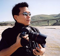
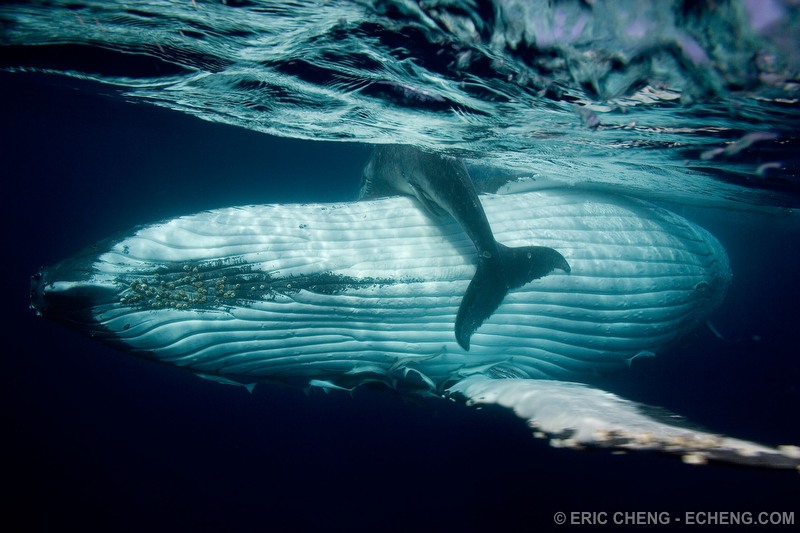
I’ve always had a huge fascination with marine life, so when I had a chance to interview a photographer that specializes in a unique genre, I immediately went after Eric Cheng, an underwater photographer based out of San Francisco. Shooting underwater since 2001, Eric is the winner of numerous awards and competitions, founder of an online community for underwater photographers, editor of a quarterly print magazine, and frequently organizes photography expeditions and workshops across the planet. He even has two degrees in computer science from Stanford and plays the cello. Talk about chick magnet. Unfortunately, the only chick he has time for these days is a 14-foot long Bahamian tiger shark named Emma.
SA: How did you get started in underwater photography?
EC: Although I have been interested in photography since high school, I was 25 years old when I discovered underwater photography. When I was 19 years old, I started a saltwater reef aquarium, which instilled a fascination within me for fish and other marine life. I became SCUBA certified not long after, but only did about 20 dives in the next six years. On a whim, I planned a dive trip to Palau—my first dive trip ever—and bought an Ikelite underwater housing for my Nikon Coolpix 990 digital camera. I was hooked – my interests in marine life and photography merged and changed my life!
SA: How much time do you spend on a boat these days? What’s a typical day in the life of an underwater photographer while on assignment?
EC: I spend about half of my time on boats. It’s funny – everyone thinks that I am “on vacation” all the time, but a typical day on assignment is long and tiring. We do between three and five dives a day, and with a surface interval between each dive, it pretty much takes up all of the hours between morning and evening. And because everyone now shoots using digital cameras, a great deal of time is spent downloading, backing up, organizing and editing. Still, it’s fun. At home, I’m constantly connected to the computers and the internet. Underwater photography takes me to some of the most remote locations on the planet; there is no internet access there, so the pace of life slows down, even with such a busy schedule.
SA: How different is underwater photography compared to another genre, such as landscape photography?
EC: In some ways, they are similar. Both genres require a connection to nature – an understanding that we are there to capture what nature might throw our way, and that it might take quite a bit of time for a particular event to happen. But underwater photographers immerse themselves into an incredibly harsh environment, one that is often filled with adrenaline and fast-moving spectacle. On a daily basis, underwater photographers deal with getting thrown around on the surface of the ocean before jumping into the same, rough ocean and being swept away by strong currents. Almost every reef animal in the ocean is venomous, and the ones that aren’t venomous are all trying to get away from us. We bring our own lighting underwater because light gets stripped away by water as it travels through it, but even with large, heavy strobes, a subject that is six feet from the camera is still too far away.
SA: What do you like the most about shooting underwater?
EC: Discovery. Despite its majority coverage on our planet, we really don’t know much about the ocean. I like that someone can do the same dive every day for years and still have a good chance of seeing something new.
SA: I’ve seen some of your shark photos. Is photographing sharks frightening or exciting, or perhaps both? Do you have any crazy shark stories?
EC: Remember how I said that nearly all of my best photos were taken within six feet of the subject? For sharks, it’s even closer. Most were taken within just a few feet.
Last week, I stuck a little GoPro helmet-cam into a shark’s mouth so I could get footage from inside. The footage looks scary, but that shark was only after the tiny bit of fish I used to entice it. If humans were a shark prey item, there would be many more than the five (average) killed each year (and in most cases, they aren’t eaten).
I do have some “crazy” shark stories. Here’s one. The most famous tiger shark in the world is named Emma. She lives in the Bahamas and is 12-14 feet long, depending on who you ask. I’ve been photographing her for nearly five years and can identify her by her markings and behavior. I’ve seen Emma get pregnant and slim down after giving birth, twice. Emma treats different individuals differently: she has favourites. Can you imagine that? She’ll come in and look for Jim, the captain of the boat, and will leave if he isn’t in the water. If he is in the water, she’ll stay, for days. Each encounter with Emma is special because it could be the last; tiger sharks are allowed to be killed in the Bahamas by recreational anglers. It would be tragic if Emma were killed, not only because of the bond we have formed with her, but because it would cost the Bahamas tens of thousands of dollars a year in lost tourism.
SA: The types of camera equipment you use in underwater photography must be completely different from most photographers’ kits. What pieces of gear are the most crucial to your line of work?
EC: All of the pieces of gear are the most crucial. Packing is an ordeal because I have hundreds of tiny little parts that have to go together in order for my gear to work properly. If even one doesn’t work, some critical feature of my camera or life-support equipment will no longer be available. Obviously, the most important ones are the o-rings, which seal the camera up to prevent water from getting inside. But other little parts allow access to the physical buttons on my camera and strobes. Also, electrical systems on boats tend to be quite primitive, so I travel with as many redundant parts as I can: spare chargers, spare batteries, spare cables, spare strobes, spare camera, etc.
Assuming all of the gear arrives undamaged, the most crucial skill is simply diving skill. Excellent buoyancy and body control in the water are absolute requirements for good underwater photography. If you’re crashing into the reef or thrashing around in place in order to stay in one place, you have little hope of capturing a great image.
SA: Underwater photography has taken you to many different ocean environments around the world. What place (or places) is the most memorable to you? Can you tell us a little about it?
EC: I get asked this question all the time, and I never have a proper answer. Each place I go has something special that I am after, and there is no way to rank them! For example, I go to Indonesia, Papua New Guinea, and the Solomon Islands for marine diversity and healthy reefs; to the Bahamas, Galapagos, Cocos, and French Polynesia for sharks; to Dominica, Ogasawara (Japan), and Tonga for whales. It’s too hard to pick one that is the most memorable.
SA: You’re editor of a couple of important resources for underwater photographers. Can you tell us about them?
EC: Wetpixel.com is the premiere online community for underwater photographers and videographers. I’ve been running this site since 2001, and it has become incredibly rewarding to be a part of the community. Many underwater photographers find themselves to be the only person in their town or city with the interest, and Wetpixel is a place where they can go to find peers.
Wetpixel Quarterly is a quarterly print magazine featuring the best in underwater photography. I call it a “magazine,” but it is really a mini-coffee table book. It is universally acclaimed by marine enthusiasts because we put in beautiful, compelling images instead of images that will sell advertising. Unfortunately, print seems to be going away, and we are in the process of figuring out how to keep a print product without breaking the bank.
SA: It seems that a lot of underwater photographers are also quite passionate about marine conservation. How important is photography to the success of ecological conservation?
EC: I’d like to think that photography is very important to the success of marine conservation. The vast majority of people on this planet will probably never set foot in the ocean. I live in coastal California, and most of my friends here have never done more than dip their feet. People are fascinated by it—and afraid—and no one really cares about what happens to the ocean because it’s just not a part of their everyday lives. Still, many of the people who have seen my images have written to say that it has made them think about ocean differently, and that pushes me to continue to share my work. But I still see them eating shrimp, so that makes it hard for me to be optimistic in the long term.
SA: What kind of advice can you give someone that’s looking to pursue a career in underwater photography? Other than moving to the beach, of course!
EC: I don’t really have any advice for people who want to pursue underwater photography as a career. It’s nearly impossible to do, and many folks out there who are frequently published struggle to make a living at it. Startup costs are extremely high, and if you start out in a dive-related industry, you’ll probably never make enough money to buy a decent underwater photography rig.
I always recommend getting a proper education. Study something useful and practical; hopefully, something you’re also interested in. Make enough money to buy a camera, lenses, underwater housing, strobes, and accessories, and start shooting in your spare time. Publish your work: post it on the web, and to sites like Wetpixel. If you’re good, you’ll get noticed, and opportunities will come to you!
Thanks to Eric for sharing his stories and bringing us into his vast underwater world of photography! Be sure to browse through more of his photos or visit www.echeng.com to learn more about Eric and his work.
Eric’s Gear:
- Canon 5D Mark II
- Canon 7D
- Nauticam underwater housing
- Ikelite and INON strobes
- Light & Motion underwater lights
- BS Kinetics 3D underwater video housing
- Tokina 10-17mm fisheye zoom
- Canon 15mm/2.8 fisheye
- Sigma 20mm/1.8 prime
- Canon EF-S 60mm macro
- Canon 100mm macro
- Kenko 1.4x, 2.0x teleconverters
- INON “insect eye” endoscopic lens


