Stay in touch on Twitter - find us on @Photocritic

Gareth Dutton

The Taylor Wessing Photographic Portrait Prize 2012

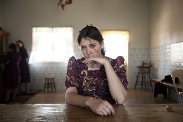
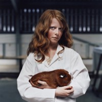
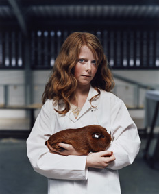
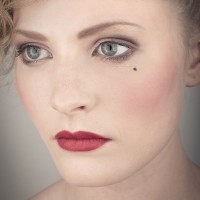
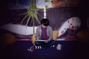
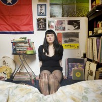
Margarita Teichroeb by Jordi Ruiz Cirera. 1st Prize (Copyright Jordi Ruiz Cirera).

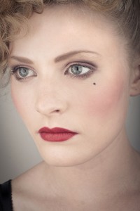
This year the Taylor Wessing Photographic Portrait Prize, hosted at the National Portrait Gallery in London, had 5,340 entries from from 2,350 photographers, some professional, some student, some amateur. Of those entries, 60 are exhibited at the gallery. One picture is judged the winner, and then there are second, third, and fourth placed prizes to be had, too.

I popped along and took a look early in November and Gareth went this week. My immediate reaction to the overall exhibition was that it felt very muted and subdued, with relatively few bold colours. Just like everything, photography has fashions and right now, that's in vogue. Gareth, however, goes into this trend more deeply in his analysis, so I'll hand you over to him, and his impressions of the winning entry and the runners up.

This year's winning entry was Margarita Teichroeb by Jordi Ruiz Cirera. What I have noticed is that, every single year, people react angrily to the winning entry and indeed to many of the shortlisted images. Because I hate being happy, I decided to trawl some comments underneath online articles announcing the winners. Thankfully, it wasn't all bad, but the main complaint was the somewhat reductive argument that it was 'just a woman sat down, looking worried.'

This attitude baffles me. I feel like these comments are the result of a combination of bitterness and laziness, or a reluctance to make an effort to interpret the image. Saying that Margarita Teichroeb is 'just a woman sat down looking worried,' is like saying The Exorcist is 'just a scary film about a little girl.'

Margarita is a woman living in a Mennonite community in Bolivia. Mennonite communities often frown upon and do not allow photography, believing it is a form of graven image. This is reflected in Margarita's deeply worried expression. She is attempting to obscure her face, possibly partly subconsciously, and it is clearly a uncomfortable experience for her.

In print, it is a breathtaking image. The sense of connection between the viewer and the subject as you look into her eyes is really quite powerful: the emotion captured is so raw and real. In being so very nervous, Margarita has laid her honest feelings completely bare in front of us. People often speak of a person looking 'natural' in an image, which they always translate as looking relaxed, essentially. However, I think a 'natural' portrait comes in many flavours, the key being the genuineness of the expression, regardless of what emotion is being expressed. Margarita has a genuine, natural expression of concern on her face.

The deeper level to the image is what it says about the Mennonite community. The beliefs held by these people are clearly strong religious beliefs: Margarita's concern and conviction tell a story of the wider community and give us a telling insight into the isolation and strict rules which typify this community.

For those reasons, I agree with the judges' decision to award it first prize: Margarita Teichroeb is an image that captures genuine, raw emotion whilst simultaneously telling a much wider story. It is not 'just a woman sat down looking worried.' I would recommend you take a moment to visit www.jordiruizcirera.com and have a look at the series that the image came from. They are excellent. I particularly like the contrast between the children's portraits and those of the adults. The children have not yet been moulded by the strict rules of the community the way the adults have, and this is clear to see in their significantly more relaxed and confident expressions.

Addressing the other winning entries, I mostly agree with the judges' decisions here, also, Spencer Murphy's Mark Rylance being my personal favourite. One image that doesn't grab me, however is The Ventriloquist by Alma Haser.

Like any art form, photography often goes through fashion spells. At present, there seems to be a penchant for low contrast images, sometimes with no true blacks, sporting very neutral, window light tones. As it happens, this style really appeals to me, as there is often a feeling of truth to the final shot: a feeling of the image not hiding anything.

With The Ventriloquist, however, it feels as if the photographer is a little too aware of the current trend and has processed it in that style for no real reason other than it being currently popular. I also feel that it has been processed quite clumsily. The story behind the image of two friends is that the photographer 'wanted to turn their verbal banter into a visual image.' I appreciate that interpretation can be a very personal thing, but to me, 'banter' conjures up images of fun and affectionate jibing, a key element of a close friendship. Her decision to capture them both with neutral, blank expressions is at odds with this idea.

I feel that all the visual decisions made in the image were to tick the boxes, so to speak, of what is currently appetising in photography. The clumsy processing and attempts at distant, emotionless expressions leave me cold and feel incongruous to the message and I feel like it doesn't belong in the winning entries. A better replacement for a posed, conceptual portrait would have been Nadia Lee Cohen's absolutely stunning American Nightmare, for example. If the judges were more interested in the sense of companionship and the relationship between the two subjects, a better fit would've been the delightfully simple yet beautiful Rosa and Adoney by Sarah Booker.

Nevertheless, I felt that the entire selection of 60 images were varied and a fair final decision, even if I disagreed with some of the entries.

Should you have the opportunity to pay a visit, do go. It costs £2, and we'd be very interested to hear what you have to say about the entries. The Taylor Wessing Photographic Portrait Prize 2012 exhibition is at the National Portrait Gallery, London, from 8 November 2012 to 17 February 2013.


Gareth Dutton is a portrait and editorial photographer based in London. You can see his work here.

A Closer Look: Jonathan May


I've handed over the reigns to Gareth again today. He's taken a slightly different approach to his article this week: he's going to take a closer look at a photographer he admires, and examine just what it is that does it for him.

All yours, Gareth...

A Closer Look is a series of articles looking at the work of photographers whose work means something to me. When I am influenced by the work of others, I like to take less tangible elements away from the images. It isn't useful, in my opinion, to closely study the technical style of a given photographer, as you are at risk of losing your individuality. A more useful practice is to study what you love about an image beyond the immediately visible.

This week, I'm looking at Jonathan May, a photographer I became aware of when he was selected as a finalist in the National Portrait Gallery's Taylor Wessing 2011 Photographic Portrait Prize.

A small disclaimer: just because I admire May's work doesn't necessarily mean I can speak about it with authority – I merely aspire to describe what I like about it.

may.jpg

The first thing that strikes me about May's work is that it's often very positive in tone. This is extremely refreshing in the current climate, because so many photo stories, whilst absolutely beautiful and shot with a mastery that leaves me open-mouthed, are of subjects that are, frequently, unrelentingly bleak. Now don't get me wrong, I think it's  vital for photography to be able to highlight issues and tell stories that would go untold and unseen by the world. Not only that, but I think the people who bring such stories to the world are genuine superheroes (and possibly slightly unhinged): it's just that the saturation of such stories makes me yearn for something different.

You can see this immediately in his set L'Afrique. I feel that, in the West, we have a skewed image of Africa: a combination of the doom and gloom of the media and the plethora of photo projects that cover injustice, poverty, war and political horrors throughout the continent. It feels like from north to south, east to west, it comprises misery and human suffering. There is, of course, much of that, all of which needs to be exposed to the world and not kept a secret, but there is also a vast and beautiful culture and history which is seldom celebrated in the face of documenting all that is wrong with Africa.

May's shots of Africa exhibit a warmth, respect and admiration for African culture. It is refreshing to see a story of Africa that feels more celebratory than exploitative: in L'Afrique we become students, soaking in the beauty, gazing up at these people, learning, engaging on a human level.

afrique.jpg

The most important skill exhibited in L'Afrique is May's ability to act as the humble recorder whilst still applying his style, skill and proficiency to the images. If an image evokes more of the photographer than it does the subject, it's doing something wrong, in my opinion. This is something May is acutely aware of and he elevates his subjects whilst remaining anonymous to us, the viewer.

It's a feeling May achieves in many of his projects and is something evident in any story he tackles. I love his ability to find beauty in topics and stories that are infrequently covered. This is why one of my favourite photo stories of his is Greens: a look at crown green bowling, more specifically the bowling club his grandfather founded.

There is something quite beautiful in the telling of a story through the paraphernalia and objects that surround the people involved in the story, and Greens achieves this beautifully. An image of a somewhat chintzy clubhouse carpet with a table occupying the corner tells us as much as a one of his intimate, shallow depth of field portraits does. It's when these two are combined in a series that they unlock the power of one another: although they are strong images on their own, the effect is compounded when they are brought together, contrasting as they are in content.

greens.jpg

As a portrait photographer halfway through my first ever long-term photo project, I am fascinated with the idea that a portrait of someone can be greatly enhanced by an image of their surroundings, or of something that is illustrative in some way of who they are, as opposed to a single image of the actual person.

There are dozens of single images within Jonathan May's work that I love but, in the interests of not making this article tediously enormous, I will look at my absolute favourite and attempt to articulate why I adore it.

caravanport.jpg

This is a portrait from May's series Caravans, a story about a society that is often looked down on and dehumanised in many ways. The series itself has all the trademarks of May's work, but there is something about this particular portrait that, as I cycled through the images, was like a punch in the stomach: a good punch in the stomach, if that makes sense (it doesn't).

Initially, the intimacy of the composition grabbed me, so I brought it up in full screen. The background is uncluttered and plain yet far from blank: it further draws us to the subject's face. The expression that May has captured is utterly captivating: it's an expression that is both inscrutable and full of emotion at the same time. His mouth is ever so slightly curled up at one side, suggesting a smile may be breaking out. There is the tiniest hint of a wet glint in his eye, as if he is holding back a tear, but it's all so slight that we're not sure whether that is a projection of what we are seeing in his face or the reality of the situation. When I look at his face, I see a man remembering: an expression of fond reminiscence. We are the ones to lay down the final brushstroke, the canvas is left open for us.

And 'canvas' is an appropriate word here: the mesh of the door has muted and diffused the light and the wooden frame forms the right hand side of the image, creating the feel of a Renaissance-era painting, faded over time. I love the idea that something so beautiful can come from a seemingly innocuous shot of a man looking out of a window in his caravan. That, dear readers, is the magic of photography.

What I'd really like is for these columns to become discussion points about the artist in question. I want to hear what you think of Jonathan May's work – does it resonate with you? Does it excite you? Does it bore you? What do you like? What do you hate? Let's hear your opinions!


The illustration was by the mightily talented James, of Sweet Meats Illustration.

You can check out Gareth's photography here.

And if you're wondering about the copyright implications of reproducing May's work in this article, it's covered under fair dealing, as criticism and review.

Make over your portfolio


When I first started to use Lightroom to post-process my images, I described its non-destructive capability as being able to go back to your teacher and ask for a new sheet of drawing paper when you'd messed up your finger-painting by adding a few too many red splodges. When you're editing your work first time around, this is marvellous, wondrous, and often absolutely heaven-sent. But what about second time around? Third time around? A few years down the road? You change, you learn more, fashions change, and suites are upgraded. You can still go back, dig out that original Raw file, and edit it all over again. Gareth is here to tell precisely why you should be doing this.

Today, we're going to look at some photos with horrible processing and make fun of them. You might think that is harsh, cruel, or even downright bad form, but I don't care: I'm here to kick the ever-loving shingles out of these images because they're bad. Compositionally and conceptually, they're fine, but the processing on them is horrible. So we're going to tear them apart (semi-constructively) and tell you what's bad about them, and how bad or unnecessary processing can lead to an inferior portfolio, and what you can do to improve your existing work without leaving your computer.

olddad.jpg

Easy on the clarity slider, buddy – I can only imagine this chap thought 'Maybe if I keep hitting "sharpen", the image will get better and better every single time! I've seen Manny Librodo's stuff – everyone loves that guy. Let's copy it!'

Add to that the weird yellow glow which I can only imagine is coming from a nearby burning Lancaster Bomber and you have an introspective moment ruined by gaudy, overblown highlights and a shirt that STANDS OUT like a neon, strobe-lit fifty foot long thumb. Ugh.

oldinaba.jpg

Someone get some ice on that guy's cheek, it appears to be approaching 1,000 degrees Celsius. Not only that, but I'm pretty sure that's a wig: nobody's hair is THAT shiny.

oldmoly.jpg

Now this is an absolute cracker. What better way to draw attention away from the background than to put a massive, gaudy vignette around your image? I mean he might as well have put a large, red arrow pointing at the subject, accompanied by the words 'HERE! THE THING YOU SHOULD BE LOOKING AT IS THE DUDE IN THE MIDDLE. OK? GLAD I COULD HELP, DUDE.'

As for the headshot, I see the Germans took down another one of our brave pilots. Better move away from that burning wreckage, my friend – it looks like you're within about a metre of it.

The Not-at-all-obvious Reveal

These photos all have something in common: they're all my photos. 'Crikey O'Reilly of the First Degree!' I hear you exclaim, as your monocle pings out and shoots across the room, ricocheting off your cat, Mr Plot Twist, and sends him screeching and careering out of the room.

We all know it's very easy to allow your online portfolio to go stale: we diligently replace our old images with new, better work, ensuring only a representative and varied handful of our best work is on display at all times. Don't we? Admittedly sometimes we forget, and we all probably need to update, replace and trim the deadwood more often than we do. However, there is another way a portfolio can go stale, something that is much harder to detect: I'm talking about our processing.

My process of keeping my online portfolio up to date usually goes as follows: look over recent shoots and pick some of my absolute favourite images, look at my existing online work, hold a sort of faux television talent show where I print out all the photos, consider each one intently, and then pause for a ludicrously long time–giving everyone involved the collywobbles, or just sending them catatonic with boredom–before announcing who's made the cut and is still in with an opportunity of landing themselves a Christmas number one and first album deal that everyone will promptly ignore after the next series. Oh, sorry, no, just a place on my website. But anyway, the point is, I clean out the deadwood and ensure that only my best work is on display... except there's something I've missed.

With every portfolio update, there are always a couple of images that never get cut. This usually is either down to them having a particularly interesting quality or because they are notable in some other way, such as being a portrait of someone well known (or well known in the videogame world, in my case). The problem is, these images tend to evade scrutiny with each portfolio update. Well it hit me the other day when looking at some of my images that survive the cut every time, just how rough the processing was and how much I had learned since I'd first taken them, processed them, and uploaded them with a glowing sense of pride to my website.

I decided to pull the original files off my backup external hard drive (you are all backing up your images, right?) and reprocess some from scratch. Not only did they look better, thanks to a more careful post-processing approach than my previous, ham-fisted attempts, the reprocessed images actually helped my portfolio look stronger as a whole, as these new images now fitted into to the overall aesthetic a lot better. What I ended up with was a more consistent look which reflects my current style, instead of a fairly consistent style punctuated by nasty little poorly processed shots.

It's a really great, uplifting thing to do: I was happy with what I had captured in these images but shocked at how I had treated them in post. In addition, it allowed me to reflect on what lessons I had learned from my days as a naive, wet-behind-the-ears but terribly enthusiastic post-processor to where I am today.

One of my biggest lessons? You don't need to over-process everything. Sometimes a shot benefits from an aggressive filter. Sometimes a vignette is appropriate: it depends on your customer, the target audience, and the theme.

For example, although I reprocessed a couple of the photos of game designer and artist Keita Takahashi, I retained the aggressive processing, because the images are intended to reflect Takahashi's wild and bizarre imagination. Seeing as the background is a mural painted by Takahashi himself, I wanted the images to feel like we were inside his imagination.

taka.jpg

More often than not, however, filtering and gaudy effects are unnecessary and often detract from the final image. Keep your eye on what's interesting in the original image and draw out that; if there's nothing of interest there, then it's probably not the photo for your portfolio.

Another lesson learned was the importance of good cropping, an understanding and respect of the power of composition and how it can can draw out a lot more from an image than a gaudy filter. 

moly.jpg

I looked at the image of Peter Molyneux sat at a table with the counters properly for the first time in a long time and wanted to crawl into a very tiny space, never to emerge, feeding on moss and small insects that were unlucky enough to scuttle into my awful, fauxtographic gobhole. What was I thinking adding that horrendous vignette?! If I wanted to draw attention to the subject, a good crop would do a significantly better job than a vignette on a whiteboard.

And just for completeness, here are the re-edited versions of the other two originals:

dad.jpg


inaba.jpg

It will hurt and it will force you to critically tear your own work apart but it's a bit like doing the vacuuming: the longer you leave it, the worse it will get, but you'll feel so much better afterwards.


The illustration is by the talented James of Sweet Meats Illusttration.


The rise of the Fauxtographer


And now on Pixiq, in the latest installment of Dutton's Musings, photographer Gareth Dutton investigates the rise of a dangerous species of human frequently mistaken for an industry professional: the Fauxtographer. Readers are advised that this article contains strong language and should approached with a sense of humour.

Disclaimers

Now it’s important to throw in a few disclaimers and make some important distinctions here. I do not consider myself to be some kind of extreme photography super-being, moulded into human form by the very hands of the Gods of Photography: in fact I recently investigated the concept of self-critque and the need for evaluation and improvement. The kind of photography I admire is leagues and leagues ahead of anything I’ve ever produced, and is something I aspire to be able to match in terms of quality following many, many more years of hard work, effort and self-evaluation. With this in mind, this is not a column simply being used as a vehicle to look down on people with less talent than me (not that I consider myself of particularly exceptional talent).

This isn’t an article to disparage, condescend to, or discourage new photographers, either – everyone begins at the bottom and works their way up. I applaud anyone who has a love of photography and works hard to improve their craft. Finally, I like to think of myself as a photographer before anything else, but I still have respect for those to whom photography is a business first and an art from second, provided they back it up with a professional product / service and knowledge of their craft. This is an article to identify a menace that affects any photographer trying to make a living in the current environment.

The beast in question

With that clarified, I will now identify the creature known as 'The Fauxtographer' by its defining characteristics. The Fauxtographer is a parasitic creature of which there are many classes, but they all share common, easily identifiable traits: they are born when they notice a competent photographer making money from their images and conclude 'I can have a go at that.' Much like the common head louse, the incubation period of the Fauxtographer can often be as short as one to two weeks. Off they pop to buy a dSLR, whack the settings to auto, and carelessly snap away. They spend a ludicrous amount of time working on their bio and their marketing strategy to work out how they might sell the atrocious abomination of light they end up with. The Fauxtographer can often be found greviously abusing Adobe Photoshop and is genetically incapable of understanding the concept of subtlety. 

In fact, for the purposes of your elucidation and to help you spot a Fauxtographer in the wild, I have provided a handy example of the banner ad you might find emblazoned across the website of the specimen in question. Be warned, you might require sunglasses, a sickbag, or both:

fauxtogs.jpg

More often than not, the Fauxtographer actually believes it is creating something with which it could approach a customer wearing a completely straight face. It’s not fully known whether the beast‘s astonishing lack of self-awareness is a universal trait or one exhibited by specific species of Fauxtographer. To dig deeper into the genetic makeup and behavioural traits of the Fauxtographer, we will initially focus on a particularly common and harmful breed, the Wedding Fauxtographer.

The Wedding Fauxtographer

Fortunately, we have a case study for you today, thanks to the magic of YouTube and the somewhat farcical television show Judge Joe Brown (oh America and your crazy TV – we’re secretly slightly jealous that something so ludicrous would never be commissioned this side of the Atlantic). It’s quite a long clip, so I will point you to the important moments.

  • 3:20 – when asked what speed her lens is, the fauxtographer in question replies with 'I don’t know.'
  • 4:43 – the horrible photos in question, to the amusement of the 'jury'. All the hallmarks of mind-breakingly ugly fauxtography are on show here – selective colouring, stupid filters, a cruddy cut and paste job situating the faces of the bride and groom in front of a background of flowers for some reason and, most importantly, a basic lack of technical and artistic understanding of how to take a photo. The Fauxtographer goes on to avoid the question 'What ƒ-stop did you use?' several times because the beast clearly had no idea what Joe was asking it.

The Wedding Fauxtographer is one of the most dangerous species of Fauxtographer currently known to entomologists, as their potential to damage their surrounding environment is arguably the greatest. First, the Wedding Fauxtographer manages to simultaneously ruin a significant moment in the lives of at least two people and likely their families, too, as well as charge them for the privilege. Furthermore, if family members in the wedding party had passed on since the event, this especially galling, even infuriating.

Second, the Wedding Fauxtographer (although this is applicable to any Fauxtographer) damages local business. In areas with a significant Fauxtographer infestation, the skilful, talented photographer charging a reasonable price for quality work is undercut by the Fauxtographer. This is due to the Fauxtographer charging peanuts for work that looks like it’s been conceived, photographed, and post-produced by a drunken monkey.

The unsuspecting victim is drawn in using marketing non-words and phoney titles the Fauxtographer has obtained from some worthless three day course, such as 'Supreme Explosive High Wizard of Photosmithery'. It sounds impressive but is, in fact, complete, unadulterated, purified, distilled toss.

Treatment and removal

So what can be done to eradicate this infestation? Sadly, it seems the rate of reproduction may be too rapid to make a significant impact on their numbers, but there is a way to improve the situation in your local area: ensure you charge a reasonable price for your photography. If there is a Fauxtographer near you peddling cheap twaddle, do not attempt to match its price. Instead, you must maintain your rates. This will help educate the typical customer and create a distinction between what you do and what the Fauxtographer is doing. In time, the old adage 'you get what you pay for' will ring true in their ears and customers will come to you for your images, your service and your prices. Not only that, it will alter the perception of what is considered a reasonable rate in the eyes of the customer.

Are they really that dangerous a creature?

Whilst it is undoubtedly entertaining and amusing to spend an hour perusing the worst of the worst output created by these horrific hominids, it is my belief that they are a genuine pest, requiring fumigation. I’m mostly speaking metaphorically, there. Mostly.

Putting the silly, painfully extended metaphor aside, people who saturate the market with poor quality images and carefully crafted marketing nonsense to dupe customers into buying into their product are utterly loathsome: it gives photography a bad name and puts us in a bad light. Any photographer worth their salt would rather create something they can be proud of and value it accordingly than to peddle cheap and nasty wares to the uninitiated: the customer relies on us and trusts us to do a good job.

Once, when I was particularly struggling for money, I accepted a wedding reception photobooth gig: it was an easy job for an easy paycheque. However, when I got there, the business owners didn’t know a damn thing about photography or what equipment they had, except that it was the cheapest they could get away with. When I started adjusting the aperture and shutter speed, they nearly had heart attacks and shrieked: 'Don't touch the settings! Our mate has them set just right.'

I had landed in the Fauxtographer’s den and was assisting in propagating their species – these were people who were posing as professionals to make an easy buck out of the uninitiated.

They asked me back for further gigs, I turned them down. Some of you might find that insane, given that I was struggling with my bills, but that wasn’t photography to me, and it wasn’t the reason I pick up a camera every day and take photos.

I am not a Fauxtographer, and I never will be. If I am ever in dire need of extra cash, I‘ll do something more honest, like go door to door selling vulnerable old people insurance policies they don’t need.


Illustration by the very talented James of Sweet Meats Illustration.

You are bad at photography: Improving your work whilst managing self-confidence


Flipping Nora Madcakes - this is proper rubbish!

After a manic six weeks, I'm finally taking a day off. It will involve Olympics-watching, novel-reading, and cake-baking. Whilst I'm lounging on the sofa, I shall leave you in Gareth's capable hands to tell you that you're a bad photographer, but it isn't as terrible and soul-crushing as you might think.

You'll be glad to hear that I'm not here to shamelessly plug something, or big myself up (I think that phrase went out of fashion in the mid-nineties), or to give you the bottom line on how to use a particular lens, or how you should photograph faces, or plants, or the sky, or... anything, actually. I'm not here to shove a project in your face, either (the next edition of that will be in a couple of weeks or so, I imagine).

I'm here to tell you that you are bad at photography.

You are a bad, bad photo person. Yes, I know that shot you posted got favourited twenty times on Flickr and you were invited to add your image to the group called "Baffling HDRs of Random Nonsense!", but you are bad at photography. I know that portait session with your friend was a lot of fun, and she loved all the images, and she put them up on Facebook where they got dozens of likes, but you are bad at photography.

You are bad at photography and so am I. Why do I say this? To be honest, I mainly say it to get a reaction out of you so you actually bother reading my nonsense (it's known as "The Tabloid Tactic"). Manipulative, I know. I imagine you are currently puce with pure, unbridled photo-rage, clawing and scratching at the screen with your bare hands, fingernails now bleeding, in the (utterly insane) belief that you can physically harm me via The Internet: you're shouting "I think you'll find I came third in The Guardian's Photo Competition last week, you ingrate! The theme was 'tranquility'! TRANQUILITY!", before breaking down and sobbing into your brunch. Which you just took an Instagram photo of. Tear-sodden Eggs Benedict.

Calm down, this is not a personal attack, I promise. What I'm really trying to say, or rather ask, is, what do we gain from considering ourselves "good" photographers? What use is there in looking at an image you've taken and thinking 'Yep. Maximum art achieved. I have mastered the art of photography, right there. Nothing left for me to learn'?

Here's where I get serious for a whole three sentences: I think "good" is a dangerous word in photography, because it lets you settle. You snuggle up in that comfy 'I'm good now' seat and you remain at that skill level; in short, you stagnate creatively.

I know it's not nice, but it's necessary: critique, both self and from others, is what improves our images. If there's one thing you should do to every photograph that you take, it's to evaluate it. It should be noted, however, that it is very possible to go too far the other way: maintaining a healthy balance is the key. Instead of saying 'This photo is great,' I tend to go with 'I'm happy with this shot.' Similarly, it's better to identify what you could have done better with a photo you're not happy with, as opposed to sitting, head in hands, wailing uncontrollably because your subject isn't quite on the rule of thirds. Not that I've ever done this. Nope.

So where the piggles do I get such critique, I hear you collectively ask? Well, I happen to know that Daniela is turning her attentions to this very question in the not-too-distant future, but until then, one place to get some useful feedback is on DPChallenge. It's a good place to begin, but my personal advice would be to take critiques with a pinch of salt – the members of DPChallenge tend to be very focused on technical elements of critique. This certainly isn't an awful thing to focus on, but there will come a time where you are much more comfortable with the technical basics and you want to experiment with rule breaking. It all depends on your current skill level, really, but you'll definitely learn a thing or two, regardless of experience.

Immerse yourself in as much critique as possible – look at images that you really like on the site, images that you think are stunning and you feel a million miles away from, ability-wise. Now have a look at the critiques and what people think the photographer could have done better. The more critique you read, the better you will get at critiquing images yourself, including your own. Hey, look: you're getting better! Soon you'll be looking at work you create six months ago and thinking 'I can't believe all the mistakes there are in that photo – what a load of rubbish!' You see that? That's progress.

Here's your homework, then: get some proper, constructive feedback and critique on your work and learn something from the experience. It's daunting at first, but take it on the chin and keep working at getting better. Not "good", not "great", just better.

Hello personal project! Hello Games!


For readers who've followed me here from Small Aperture, you might have been wondering what happened to my trusty side-kick Gareth. Well, apart from becoming Daddy to his adorable little girl in December, he's embarked on a project to document a year in the life of a videogame company. This is his mid-term report, showing how he settled upon the project, the insane fears that initially overwhelmed him, and how he thinks he's doing so far.

Welcome back, Gareth...

When we think of great photography, to many, it's the idea of that one, iconic image: the one that sums up a whole story, an attitude, a way of thinking, an era, in one shot. These images should form imprints on our minds, be burned into our retinas as significant, moving pieces of imagery that make waves, make things happen, raise awareness, engender change.

Well I'm here to say knockers to that, because I'm doing the exact opposite – a long term photo project that will, once it's done, have taken me over a year to complete. Although it's true that everyone loves an iconic image, it's also true that everyone loves a good photobook, or a photo story. Yes, everyone. Yes, no, I can see your hand raised there, I'm going to ignore it. You DO enjoy a photobook, now put your hand down. All the way down. And don't sulk. I can see thattoo, so stop it. Thank you.

This is, essentially, my first, proper, long term, large-scale personal project. The first thing that smacked me in my big, beardy face was the difference between a project like this and a single commission. Imagine taking the visualisation you have in your head of a shoot lasting four or five hours. Now try and do that for a year.

How am I supposed to imagine where this will be in a year's time? What if we have hovercars by then? Should I incorporate that into my plan? Maybe cameras will be installed directly into our eyes and I will have become redundant as a photographer. Maybe, just maybe, cameras will have become sentient, like those Terminator films, and they'll be walking around, Gorillapods for legs, photographing us and uploading the images to Flickr where their other camera friends will comment on how good the shot is, even if it's not that good: 'Sony Cybershot #432 says "great shot, love the tones on that human, lol"'. We'll all be rendered artistically obsolete, and all the Canon EOS 1Ds will have MySpace profiles where they photograph themselves from a high angle to make their bodies look thinner.

Admittedly, I may have panicked a bit too much about it, but with these incredibly likely future events looming on the horizon, I wondered whether I was too casually getting into a project of a scale far larger than I was used to.

As one of my main hobbies is videogames and I have a bulk of editorial portraiture work I have undertaken for videogame publications, I decided to approach a small, independent games company with the prospect of documenting their day-to-day lives as they developed a videogame. I decided on this project for three, simple, extremely important reasons:

  1. My heart would be in it, as it's a subject I'm passionate about.
  2. It is a subject that I have not seen covered before anywhere else, so it is unique and fresh.
  3. Arguably the most important reason, it is about the people involved and a document about how much they love and care about what they are doing.

Keeping these reasons in mind simultaneously boosted my confidence and raised the stakes. These people had seen my quite-nice-portraits of industry figures they recognised and loved: they had been taken in by those images. As far as they were concerned, I would definitely do a good job of documenting their lives and the images would all come out as absolute classics to rival Neil Leifer's shot of Muhammad Ali standing over a downed Sonny Liston. Except instead of it being in a boxing ring in front of a couple of thousand people in Lewiston, Maine, I was to create the same, timeless images in a small, converted office that houses ten people in Guildford, Surrey.

The whole team are so nice and we get on so well that I would constantly (and still do, to some extent) have this enormous fear that I would let them down, that the work would not measure up to what they were expecting. My first piece of advice to anyone undertaking a large project would be to get a mock up put together as soon as you can. I spent a good six months looking at the images I had been taking in isolation, but once we did a mock up or put them in context in some way, I felt so much better about them. Similarly, when the article recently went live on Eurogamer (a popular gaming news and features website) and I could see the images in context, with an accompanying story, it made so much more sense.

Essentially, I'm learning as I go: it's incredibly fun, if a little stressful, and I am soon to spend an entire week with them in the attempt to capture some more natural shots of the more nervous members of the team, by sheer virtue of battering them into submission by constantly being there.

So to summarise this wall of insane, yet honest, writing, I'll tell you what I've learned about photo projects:

  1. Make sure you give a damn about the subject you're covering. If your heart's not in it, you won't produce interesting, emotional results.
  2. It's about the story and the people, and not necessarily about whether everyone in the shot is on the rule of thirds or exposed perfectly (although don't use this as an excuse for sloppy images)
  3. Get the shots in context in some way as soon as you can. Seriously, it will stop you from going insane.

Once the intensive week is complete (and I get a second to myself), I will bring you another update, documenting my ups, downs, and ultimately what I have learned from the experience. Basically, you'll be my collective, silent psychiatrist.

I Just Remembered How Fun Photography Is

Baileys - the smile maker.

Blinkers. Yes, those things they put on horses to keep them looking straight ahead. But I’m not talking about real blinkers, no: these are special, invisible, metaphorical blinkers. In particular, I’m talking about the ones that form around the eyes of a photographer once in a while. The more you learn, the less you experiment. It’s the process of going from a hobbyist to taking photos for a living, or indeed to just having the drive and need to improve. We all get it once in a while and it can be hard to shrug off, especially when we’re looking for a new subject or concept but feel bound by the rules. So how do we start afresh? How do we tear those blinkers off (no, stop clawing at the sides of your face – like I said, they’re metaphorical blinkers) and find a fresh new approach? This week, I think I found the answer: you have to remind yourself that photography is fun. 

Baileys - the smile maker.

At the moment, I’m undertaking a couple of portraiture projects. One of them was born of frustration, of sorts, at feeling like I had no ideas, or that anything I could think of only took a quick trip to google to discover that it had already been done. Of course it had: seeing as there are 7 billion people in the world (that’s right, I read the news), it’s quite likely that someone has had a similar idea to your incredible, totally original megaplan that just formed in your massive, omnipotent, glowing master brain. Any project I could think of seemed boring, limp, overdone, predictable, stiff, stupid, silly. The only photo work I was doing was commissioned stuff – stuff I’ve been doing for a while for which I have naturally developed a pattern. This is an inherently human problem: we are genetically programmed to recognise and find comfort in patterns, yet simultaneously, we get tired of repetition. We need variety, change, difference. This is why we are often warned about photography as a job, because we find that when it goes from a creative pastime to something we do as a matter of course or a process we repeat for cash, it becomes that other thing: it becomes work.

Just chillin'

You can imagine my delight, then, when I began this new photo project and the blinkers came flying off at speed at wild angles. Tragically, one of them flew headlong into a small boy. Thankfully this small boy is also metaphorical and represents creative inhibitions, so we can all relax. This long term project was coming along nicely, when I felt something at the sides of my face. That’s right, further blinkers, only these ones were flesh coloured and therefore harder to detect at first. I sat down and sighed heavily, like a man struggling with a tortured, extended metaphor. The subject was interesting, but I needed to mix up my approach also.

The company I am following for my project had an office party upon reaching a milestone, and I was invited. As I am both never one to turn down the opportunity to take photographs yet also never one to turn down the opportunity to party,
I found myself in something of a quandary. Then I came up with the solution: I would take my equipment, set it to an auto mode to make it at least a little foolproof, and then set them loose with it. Tonight, they would take photos of each other, in a relaxed environment where they were in control of everything. As I handed the camera over to the first willing participant, a wave of consternation laden questions passed over me. Will they be into it? What if they break the camera? Will this work, or will it just be a bunch of terrible, unusable snaps? Is this cheating? How far is too far when breaking the rules? Has the gin run out?

I have no idea what's happening here.

I was absolutely delighted to discover that almost everyone was not only willing but eager to have a go. In addition, they took greater care of my camera than I do, holding it with extreme care as if I had given them my newborn baby. I smiled as I watched the behaviour of those with the camera and how it differed from person to person. Some would try to be more stealthy in their approach, waiting to become unnoticed before firing off a few shots at distracted individuals. Others initially took the camera with some uncertainty, gingerly padding around wondering what to do. I would turn away and check back on them a few minutes later to find the same person sliding down the wall into a crouching position, snapping here, snapping there, rushing around the other side of the sofas to get that crucial shot they’d just spotted. Some would simply observe and record, whilst others would get their workmates to pose or dance or do something silly. It made me incredibly happy to see people enjoying photography, to see everyone take to it and have a go and the fun and enjoyment it was bringing them.

That’s when I had a somewhat simple yet important revelation – they were having fun with the camera. Because that’s one of the many things photography is: fun! Somewhere along the line, although I had never stopped loving what I do, I had forgotten to relax and have fun, instead of being intense and super concerned all the time when taking photos.

I also got a lot out of being on the other side of the camera. As a portrait photographer, it’s important to get a sense of how it feels to be the subject as well as the photographer. That sense of empathy can help you when it’s your turn to take photos again. I also realised that it can be easy to forget that someone is taking photos, and you get used to it more quickly than I thought. This is also useful to me, because where once I might have hesitated to shoot, because I wondered if the shot would be natural enough or if I was being overly conspicuous, it seems that often this would not have been the case.

This is Dave. He has lost.

What was even more rewarding was that the learning process did not stop there. When I uploaded the images to my machine the following day to look over them, I was initially picking out all the focusing problems, all the low lighting issues, the odd compositions with peoples’ head coming out of other peoples’ backs or not being quite right in the frame and the strange choice of angles. On my first pass through the images, I was thinking “hmmm, can’t really use that, can’t really use that, not sure about that”. On my second pass, I learned something – on at least a few images that I had supposedly looked over, I had missed some brilliant moments that made the photograph worth including, such as Dave losing at a game of Super Puzzle Fighter, his head in his hands, which was being matched by his onscreen avatar and accompanied by the word “LOSE” in big letters in the top right. It was a brilliant little image and, regardless of how much intention was behind it, it had recorded a whole story in one frame. Surely, this is the very essence of a great photograph. I had lost myself in the rule of thirds and exposure levels, looking purely at the technical and missing the artistic, the story being told in the image. It was an eye opener for me – a technically proficient image still lacks punch and excitement if there’s no story within it. It’s not that I didn’t know this, of course, but sometimes learning by experience is infinitely more valuable than learning something in theory.

If you’re feeling burnt out with your photography or you feel like you’re treading water, it’s probably because you’ve forgotten how to have fun. Don’t allow the technical to overwhelm you. Remember, photography is part science, part art, and wholly fun.

Thanks to Gareth Dutton for this. You should completely check out his work, too!


The Taylor Wessing Photographic Portrait Prize 2011: Winners Announced!

Harriet and Gentleman Jack, by Jooney Woodward

We’re back around to that time of year again, where the winners of the Taylor Wessing Photographic Portrait Prize are announced. As a portrait guy myself, I adore this competition and the results it produces, especially when it’s time to take a wander around London’s National Portrait Gallery and see the selected entries in print. You may recall that last year’s winning entry was David Chancellor’s Huntress With Buck – a striking image of a young, red headed girl on horseback, the recently killed buck draped over the horse’s neck. Interestingly, this year’s winner bears some thematic similarities, albeit in a somewhat more humane context.

This years winning entry is entitled “Harriet and Gentleman Jack”, by Jooney Woodward. The portrait is of 13 year old Harriet Power and her guinea pig, Gentleman Jack. It’s interesting to draw parallels between this and Chancellor’s winning image last year. Both are of young, red headed girls, creating a striking contrast in the image. In addition, the animals in both images are also red / auburn in shade, which complements and creates a visual connection between the subject and the animal. What’s really neat about comparing these two images is that they have a major contrasting difference in the story they tell: “Huntress With Buck” portrays a world where animals can sometimes be seen as tools and commodities, whereas “Harriet and Gentleman Jack” portrays a world of the animal as a pet, as a companion.

Harriet and Gentleman Jack, by Jooney Woodward

Personally, I find the winning entry this year to be encouraging and proof that the judges are on the right track with this competition. Whilst I love portrait competitions, sometimes I get the sinking feeling that, with some competitions, there is often too heavy an emphasis on an portrait having to be about the exotic, or the extreme, or the exploitative: images of homeless people or perhaps of someone in shocking living conditions, be it in a third world country or in a down-and-out part of New York.

Whilst I appreciate photography’s unique ability to illuminate ways of life that would otherwise remain hidden to all and the subsequent value and importance of such images, it’s just nice to see that, hey, people without problems have interesting lives and personalities too. A photographer shouldn’t feel they should have to ingest a cocktail of vaccines and travel to the most obscure corners of the Earth in order to create a portrait of worth. I’m also pleased that the actual subject matter of the images that were shortlisted this year feels fresh and original. It inspires me and helps me realise that there are still new ideas to be found out there – we just need to look for them!

If you live in London or you’re planning on visiting, you would be absolutely mad to not give the exhibition a look. It’s on at the National Portrait Gallery for only £2.

"What The Jiminy Christmas Are You Taking a Photo Of?!?!?!"

SudaConfused

You are approached by a complete stranger with a look of pure incredulity etched across their stupid face – “Um, excuse me, what are you taking a photo of?!!???!”

“Uh, well, I’m taking a photo of this wall”

“Why?!?!?! Why would you want to take a photo of that wall?!!”

“I dunno – I like the textures and the brick work”

“…..are you a terrorist?”


Pointless Conversation With Stranger, Take Two

“Um, excuse me, what are you taking a photo of?!!???!”

“How many times have you been to the toilet today? Are you feeling regular? Need more bran?”

“I beg your pardon?!”

“Oh, well I just figured that seeing as you’re fine with approaching complete strangers and brazenly poking your nose into their day to day life, you wouldn’t mind me throwing a couple of questions back your way”

Pointless Conversation With Man Who Owns High-Vis Jacket

“I’m sorry sir but I’m going to have to ask you to put that camera away”

“Why? I’m allowed to take photographs in a public place”

“Now don’t make me talk into my little radio thing”

“What about those people with compacts? They’re taking photos”

“…..erm….please put the camera away sir”

“I don’t see how that’s diff…”

*man begins to talk into little radio thing*

“sigh”

What is this even a photo of? It's stupid - it's not even, like, a mountain or anything.

Pointless Conversation With Man Who Owns High-Vis Jacket, Take Two

“I’m sorry sir but I’m going to have to ask you to put that camera away”

“What seems to be the problem, pseudo-officer?”

“Well that camera looks like a professional one or something, so you probably have some kind of terrorist or illegal money making agenda. You know something? I don’t even know myself! Ain’t that somethin’?! Now put that camera away”

(you remove the large hotshoe flashgun from your camera)

“Huh? Where did he go? Excuse me sir, have you seen a man with one of those professional, up-to-no-good type cameras around here?”

Email Conversation With Potential Business Customer

Dear Gareth,

We here at Corporation Corporations love your photos. We feel they really capture the ethos and corporate direction behind our new advertising campaign – “We Are Stuffy Robot People Who Enjoy Using Made Up Words”. Could we possibly liaiseise and actionate a request to utilise your images for our advertiseination strategemator? We would like unlimited rights to 200 of your images forever and ever and ever and ever.

By way of payment, we clubbed together and have come up with the tantalising offer of half a packet of Chewits only briefly sat on by Kevin (our Chief Exec) and a pirated copy of Dirty Dancing.

Please let us know if you agree to this as soon as possible. Otherwise, we’ll probably just bully some poor new photographer with lots of talent but no idea of what he should be charging into giving us his work for free, throwing out the classic “it’ll be good exposure for you” line, the “exposure” being “hey everyone, this guy gives you his stuff for free!”.

Kind Regards,

Business McMickeytake.

Sound Familiar?

Everywhere I look, it seems that photography, despite its ubiquitous, omnipresent nature, is held in a shockingly low regard in many respects. I’m aware that it’s not as simple as that but there are many instances where the inherent ignorance of photography and its worth really stand out. News items often crop up, detailing incidents where images have been used without the photographer’s consent, sometimes with full knowledge of the copyright breach, sometimes without. Either way, it shows a disregard for the value of photography and the photographer. I’m not saying it never happens, but how often do you hear of copyright theft of works of art using other media?  Nowhere near as often. There are, of course, other factors in place here, such as the ease of distribution of photography compared to (some) other art forms: maybe the digital age of photography and the Internet has increased the immediate availability, accessibility and sheer volume of photographs so dramatically that people feel that nicking off with this one image from thousands upon thousands won’t really matter.

The ease of sharing, creating, editing and distributing images that digital has brought is, then, something of a double-edged sword. However, at the heart of it all, I feel that general ignorance and a low opinion of photography is at the heart of the problem.

WOW - I bet this guy's camera was well brilliant!

Widely Held View #1: Expensive Camera = Great Photographs

People think photography is easy: you can see it in the stock responses and reactions to a variety of situations. Again, I appreciate there are shades of grey to this, and not everyone is interested in photography – that’s fine, of course – but let’s look at weddings. I’ve experienced the situation where people think that they don’t need to get a wedding photographer in, because they have a friend with a DSLR. They are of the opinion that it is the camera itself that is allowing for such fantastic images to be captured, not the skill of the photographer. Now, I don’t do weddings, but I am sometimes asked as a favour to take photographs at a wedding. I’m perfectly happy to do this, I may even enjoy it, but I always tell them to hire an actual, proper wedding photographer. I don’t do wedding photography, so it would be a silly idea to book someone who didn’t have the experience (which brings me to my second point).

Widely Held View #2: If You Are A Photographer, You Are An Expert At Photographing Everything

There is this fallacy that if you’re proficient and able in one area of photography, then you can do ‘em all. This is again indicative of the general view held of photography – the idea that it’s not very diverse, that it’s easy to master. Although this seems like a more innocent presumption than some of the others, it fuels the ignorance and reinforces the idea that anyone can do this. Yes, anyone can take a photograph, but not everyone can take a good photograph.

Widely Held View #3: If You’re Photographing in a Public Place and Not Using a Compact, You’re a Terrorist or Weirdy Man / Woman

This also goes for choice of subject. You’ll get enough rolling eyes and presumptions that you’re a tourist just from photographing a landmark (plus possible infuriating hassle from Captain High-Vis), but start photographing a park bench or a grid or the texture on a wall and you’re regarded as a mental man or someone documenting possible ways to burrow into Buckingham Palace to explode the Queen’s Corgis. Oh and god have mercy on your soul should you decide to crouch to take a photograph. What sort of rabid, dribbling nutbox crouches to take a photo?

Widely Held View #4: A Photographer’s Time, Effort, Ability and Product are Not Worth Paying For

Despite the mild irritation of the other widely held views and the poor public attitude they highlight, this is the one that is a real problem. Regardless of the area of photography you work in (I mean, they’re all the same anyway, right?), I imagine you will have encountered this problem on a number of occasions, and probably still do encounter it. Personally, I have one or two stand out moments. I remember someone phoning to enquire about getting some actor headshots done. When given a price, they were astonished, hostile even, and stated that they had been quoted £50 elsewhere. So that’s about 2% of the cost of the equipment used, before my actual time and ability are taken into account. I just replied with “ok” and waited for the phone call to end.

I constantly hear about my peers, contacts and friends involved in photography being offered next to nothing (if anything at all) for use of their images in some advertising campaign or for use in promoting an event of some kind. When refused, the potential customer tends to get genuinely annoyed by this, like they’re turning down a stonking deal. They then proceed to use some poor sucker’s work for free, because they bought the “it’ll give you good exposure” line.

Too Long Didn’t Read

If you take anything away from this slightly manic rant (maybe I shouldn’t drink so much coffee in the mornings) please take away this. I’m pretty sure I’ve said it on Small Aperture before but, to be honest, I don’t think it can be said enough. I’m thinking of tattooing it onto my forehead, or having it pumped out of giant speakers across the entire planet, or beamed into people’s brains via satellite (NASA still haven’t got back to me on that one, I must chase them up).

The message is simple – do not sell your work for peanuts. Do not let it go for free. The less you value your work, the less photography is valued. If you work cheap, it affects all of us.

If we all stood up and requested a decent price for our images and refused to work for free, the value of what we do would increase. Furthermore, people might actually start paying attention to the quality of the images on offer if they had to part with a noticeable amount of cash.

If they don’t want to pay you for your time, you don’t do it. There are areas of photography and assignments that I love doing that I’ve had to turn down, because I won’t do it for free. Sadly, this leads to someone else stepping in and doing a lacklustre job for free. In that instance, I don’t blame the customer, I blame the photographer: you are driving the market down.

What Do You Think?

Admittedly I went off on one a bit there. My ultimate purpose for this article was to get some opinions together – what do you think is the major cause of this dim view of photography many seem to hold in today’s climate? Is it the saturation of the market? Is it the availability of professional equipment? Is the Internet to blame? Am I being overly sensitive? Am I flat out wrong and should hang my head in shame like a silly monkey man? Let’s get the chatter going – we want to hear what you think.

August Photo Competition Winner!

Champagne-copy-200x200

It seems that our usual competition judges Daniela “Editor Extraordinaire” Bowker and Haje “International Man of Mystery” Jan Kamps have gone AWOL, leaving I, Gareth “Owns A Camera, Likes Faces” Dutton to judge August’s photo competition. After Daniela made no less than ten posts announcing ten cameras over two days on Small Aperture, she began to think her hands were small, affordable yet robust compacts with in-camera effects options. I asked her if she’d like to judge this month’s photo competition but I couldn’t get any sense out of her whatsoever: I just left her there poking the palm of her right hand, muttering “how do you turn the flash off?”. As for Haje, he’s almost definitely off doing something cool and brilliant in a place I’ve never been to – I bet he’s photographing a magic bear whilst whizzing down a zipline made of singing gold thread in El Salvador. Sorry? Get on with what, exactly? Oh the competition, right.

This month’s theme was “texture” and we had some great shots to choose from. The entire experience was, quite frankly, texturific. We eventually pared it down to a handful and then agreed upon a winner:

Bark by Herve Sliwa

Congratulations to Herve Sliwa on winning our August photo comp – be sure to get in touch with Daniela to claim your prize! We also felt an honourable mention should go to J.C Chang for his entry:

Mud Curls by J.C Chang

Thanks for the entry J.C and thanks to everyone for their contributions. If you didn’t quite make it this time, never fear – keep trying and submit another pic for our September competition which will be announced in a week’s time. The harder you try, the better you’ll get!

Editorial Photography - My Story So Far

Atsushi Inaba for GamesTM. I had all of 60 seconds to grab this lead image.

In yesterday’s SA article, I referenced the old axiom “write what you know”. I know Hulk Hogan’s real name (Terry Bollea), I know how to play Street Fighter and I know most of the words to Rapper’s Delight. Sadly, none of these are suitable for a photography blog (a shame, because the words to Rapper’s Delight would definitely fill up a full article). Then I remembered I know about editorial photography, which was the fourth and final thing I know, so I figured I’d tell you about my experiences with editorial, how to get into it and finish with a little shoot report about my very first editorial shoot.

Editorial photography, essentially, is photography which accompanies an article or story of some kind to assist in illustrating and bringing life to that story. In short, it’s pretty pictures to look at whilst you read. Editorial is great because those are the only criteria you need to class images as editorial photography, so it can suit a wide range of interests. For example, editorial can be in the form of fashion photography, documentary photography, food photography (like in those nice photos of delicious recipes you find in the weekend magazine supplements that you will never actually make) or editorial portraiture accompanying an interview.

Atsushi Inaba for GamesTM. I had all of 60 seconds to grab this lead image.

Getting Involved

Although editorial is a saturated market, there are a lot of publications around, all with picture editors looking for images to commission. It’s up to you to make yourself known by providing striking, relevant images.

Take a look at your portfolio – what sort of images do you take? Where would you fit in? If you spend all your time shooting landscapes, you might want to look at countryside magazines, walking magazines, or even holiday magazines if your landscapes are shot abroad. If you’re a food-tographer (I just made that portmanteau up: horrible, isn’t it?) then you’ll obviously want to be looking at food mags or supplements in weekend newspapers, as mentioned above. It all depends on what you shoot. What is important is that you contact the image editor / art editor of the right publications for your work.

Cut The Cr…iminally out of date work

Be your own harshest critic. Look at your photos, look at the old stuff that doesn’t cut it and replace them with newer, better images. Don’t be sentimental with an old image just because you have a fondness for it – your site should be displaying your best work. I can’t remember where I heard this, so I’m afraid I can’t credit it, but the best single sentence I heard about displaying my work in an online portfolio was “your site is not for you”. Even if there is an image you still like, if it’s not relevant to who you’re trying to attract with your work, or there is one that is technically much stronger, either remove it completely or move it to a different section of the site.

Editorial? Sounds Drier than a Cream Cracker in the Gobi Desert

I beg to differ, my friend. There are many reasons I love editorial photography, but the main reason is the pressure. Depending on the shoot, more often than not you’re given a location, a subject and (if you’re lucky) a general idea of what shots you’re required to take. No two shoots are the same. When you arrive, all number of problems could crop up in a variety of areas. There might be terrible light levels, you may encounter snotty, uncooperative PR (as a disclaimer, I’ve encountered some lovely, lovely PR people, too, who have helped me get some of my favourite editorial shots, so there are some lovely PR types, too).

Keita Takahashi, photographed for GamesTM. I had a whole area cordoned off and fifteen minutes to get what I needed. That's more like it!

Sometimes, you’ll have 20 minutes to get your shots, sometimes you’ll have 20 seconds. Sometimes, your flashgun stops communicating with your camera halfway through a shoot and you have to swear under your breath, tear it off, and quickly adjust your settings (that was a fun shoot). Sometimes, you’ll turn up with half a dozen brilliant ideas that you think will look fantastic in the magazine and the subject says “no, we don’t want to do any of those. Just get some of us looking natural”.

Basically, thinking on your feet and creating something aesthetically pleasing and striking using your surroundings is at the heart of on-location editorial photography. And I love it. The satisfaction of solving the photographic puzzle laid out in front of you, and the resulting positive feedback, is one of the main reasons I quit my 9 to 5 and became a full-time freelancer.

Editorial isn’t for everyone, and it can be very hard to break into, but if you’re keen on it just get your work out there: contact picture editors with your stuff and, if it appeals to them (and they don’t already have two dozen photographers already working for them), they might just give you a shot. My main magazine work came simply from me finding out who the photo editor was, sending an email with a link to my online portfolio and, well, that was it.  Aim for local magazines, too – people who publish around your area. It might not pay at first, but it’ll look good on your portfolio and, in my opinion, nothing gives you a bigger buzz than seeing your own work published.

Once Upon a Time, in a Fancy London Office…

Here’s a little story about my first ever editorial commission. GamesTM magazine, a regular client of mine, asked me to accompany a journalist to procure interview and posed portraiture shots of a videogame designer who was visiting from Japan. This would be Goichi Suda – the critically acclaimed and much loved head of Grasshopper Manufacture, one of my favourite companies. So far, we have two stress factors to add to the mix: first editorial ever? Check. Photographing someone who, in my nerdy world, is essentially a celebrity (and a hero of mine)? Check.

A couple of the resulting images from the Goichi Suda shoot - my first editorial.

We turn up to the fancy London office, only to discover that Suda-san has literally just arrived by alternative flight, Eurostar then underground train, because his original flight was cancelled. He was meant to arrive the day before. Understandably, he’s not that keen on having his photo taken, seeing as he’s not had any sleep for many, many hours. They ask if I can return tomorrow. I’m more than happy to do that and I just sit in on the interview. The thing is, I’ll be returning tomorrow on my own, essentially representing GamesTM. That’s stress factor number three. They warn me that they’ll have to fit me in between two scheduled interviews, so I’ll probably only get fifteen minutes (ah! Fifteen minutes seems like luxury these days). Thankfully, I plan ahead and get some test shots done in the room we’ll be using the following day to shoot.

Except the next day, everything’s moved. And we don’t have fifteen minutes, we have about five. Stress factor number four. I’m not blaming the lovely PR people for that, because they were on an extremely tight schedule and it was kind of them to let me back the next day at all. But five minutes for your first editorial shoot is unbelievably stressful. Did I mention that Suda-san doesn’t really speak any English, apart from “nice to meet you” and “I like your t-shirt” (I had a cool tshirt on, because I’m dead cool and that)?

So now I have five minutes to make sure I get the kind of shots that are good enough to ensure that GamesTM like them enough to ask me back and become a regular customer. In a room I didn’t plan for. I also have to direct my subject through a translator. “Baptism of fire” doesn’t even begin to cover it.

The thing is, I thrived under the pressure: we created a series of fun headshots with a range of expressions that were meant to represent the different sides of Suda51 – his dedication to his artistic vision and his role as a businessman who needs to make sure his work has a broad enough appeal to sell. This is the sort of stuff I would take in my stride these days but, at the time, I felt like my head was going to pop. The payoff, though, when the magazine used about a dozen of the images, turning it into a multi-page article, was more than worth the pressure at the time.

I Suppose I Should Round this up, Then.

I think everyone should have a go at editorial photography in some way. It is possible to create work with an editorial feel without waiting for a commission. Create a series of images that tell a story, similar to a mini project. If you get into the habit of telling a story with your images, regardless of your subject matter, it will help you get more out of your photos and take them to the next level.

Why Projects are Good for You

An image from the early stages of a project I'm working on, looking at possessions.

Do you sometimes feel like you’re snapping away aimlessly, fluttering from one photographic subject to another with no rhyme or reason, like some sort of gormless butterfly? Do you feel like you’re at saturation point with your usual subject matter? Have you said to yourself recently “oh look, a lovely sunset. I should get my camera out really, but…meh”? This is, in some ways, a good sign. You’re not content with just taking a photograph, you want more out of your end product. What you need, my disillusioned friend, is a project.

Projects are hard. You have to come up with an interesting theme with an element of originality, work out what form it’ll take, ideally write a project statement and then figure out how it’ll all come together once it’s finished. It’s a long term, complicated process. Which is why it’s very good for your photography. Now I don’t claim to be Mr Project who lives at Project House, Project Lane, Lower Project, Projectsville, Projectstershire but I thought I’d offer a little advice to get you started on and excited about project work. Let’s look at a few key elements that should factor into your project, whatever if may be.

An image from the early stages of a project I'm working on, looking at possessions.

Shoot What Interests You

The well known saying “write what you know” holds a lot of truth. If you write about something that you know about, you do so from an informed standpoint. Writing about an area in which you are knowledgeable gives you a solid foundation from which to create something entertaining and artistic. With photography, it’s slightly different. Rather than just shooting what you know, you should shoot what interests you. Even if you’re au fait with the subject matter, if the subject doesn’t interest you, the work is likely to lack that passion which, in my opinion, is an essential ingredient for creating a piece of work that has real artistic value.

With writing, you can break the “write what you know” rule in a way, but not properly. You may wish to write about something that you know little or nothing about but are interested in: this is still possible but first you must research the subject in some way. Therefore, you can never truly write about something you don’t know about. With photography, you have the freedom to shoot something you are not familiar with. A perfect example of this is the British photographer Leo Maguire, who has spent four years entering and documenting the lives of two families from the Irish traveller and Romany gypsy communities. The subject interested him, yet he knew nothing about it. This is the advantage we have as photographers. Whatever you shoot, be sure that you genuinely care about it.

Have A Plan

So you know what you want to shoot, now you need to think about how you’re going to shoot it. For the sake of example, let’s say you have an unhealthy interest in apples (is that possible, given their inherently healthy nature?) and want to create a project around apples. Apples is the project for you, you appley weirdo. You need to consider a number of factors – will you be shooting all the different kinds of apples you can find? Will you be documenting the journey of an apple from being picked to ending up on a supermarket shelf?

Those are the only two things I can think of for apples, probably because I don’t care enough about apples.

Then you need to think about the overall structure and presentation of your final project. If you’re just shooting apples and the different varieties you can eat, you may want to take each individual apple, set up a mini studio with clean, white light, take a shot of the whole apple, cut it neatly in half, take another shot, turn the pieces over, take another, get in close for that essential pip detail, take another. Then you’ll want to put those four images into a 2X2 square format, mounted into a frame, and entitle it “#12 – Braeburn, 18th August 2011″. Maybe if you’re following the life of an apple, you’ll want to order your final images into a sensible, chronological order, then turn them into a photobook, sprinkled with facts about apple production and quotes from people involved in the process.

Why am I talking about apples so much?

The point I’m making is if you have an idea of how the finished piece will look in your mind’s eye before you begin, it will help the final project look more cohesive and connected. Also, knowing what form you want your end product will take means you will shoot accordingly, in a fashion that will suit the layout, media and presentation you have in mind for the final piece.

Be Efficient: Set Targets

This one is very important. Simply put, make it like a homework project. If you don’t set yourself targets and goals, you’ll never actually get it finished. Going back to the apples (I’m committed now), it might be “photograph and post-process two apple types a week” or “have 30 apple types photographed and ready to be printed by the 1st of September”. It doesn’t matter too much exactly what your targets are, just set a goal that is quantifiable in some way.

Be flexible - the initial layout of these pieces was significantly different to their current form.

Be Flexible

Once you’ve got the wheels in motion, you may find that there are elements of the project that you don’t like, don’t work or don’t excite you. This can happen to you at any time. You need to be prepared to change things, to cut things and to rethink things. This may feel frustrating at first, but think of it as a natural evolution of the project. If, halfway through your freaky apple project you think “What in the Jimmy Cricket am I doing, photographing apples all the time?! Pears are my one true passion!” then go ahead and restart your project using pears. More sensibly, if the 2X2 format looks boring to you, evolve it and make it 3X3, or a single, ultra high detail single photo of an apple exploded into several sections.

When I wrote that last sentence I meant the photo exploded into sections, not the apple, but now I’m thinking it would be more interesting to explode the apple. Heck, let’s have two images in a diptych format: one of a pristine, perfect Golden Delicious and one of that same apple smashed up all over the clean, white studio background. See what happened in those last few sentences? That’s the evolution of an idea. By remaining flexible we’re now on our way to a much more interesting, artistically valuable project.

Projects are Good for You

Projects are good for you because they teach you form, discipline and planning. Not only that, but photography comes into its own once you start creating images that are relevant to each other. A strong photo series can be an exciting journey – a story can be told, a theme runs through that can be followed, understood, appreciated and enjoyed. If a picture is worth a thousand words, a project is worth ten thousand. Finally, projects are good for you because they should make you think more deeply about every aspect of your photography, which means that your work will improve substantially. Don’t worry too much if your project isn’t too original at first, just getting into the habit and the process of creating and completing a project is more important. Plus, it’s incredibly fun and will refresh your enthusiasm for photography.

(How do you tell if a butterfly’s gormless?)

Don’t Be Scared of Studio Lighting

Softboxes were placed very close to the model here, meaning there is very low contrast between the specular highlights and the diffuse value, giving flattering, evenly lit skin.

To clarify, this month’s Photography Concept on Friday is not a self-help guide for photoaugliaphobics ( people with a fear of glaring lights – of course I looked that up ) – it’ll centre more around the basics of studio lighting and the basic properties of light. If you’re interested in a bit of studio lighting but don’t know where to start, or would like to know at least a little before you begin, then this month’s PCoF is for you. 

Specular Highlights and Diffuse Value

Softboxes were placed very close to the model here, meaning there is very low contrast between the specular highlights and the diffuse value, giving flattering, evenly lit skin.

Now it’s very easy to go into too much detail too quickly with studio lighting. I am writing from the point of view that you have never seen or considered the principles of lighting before, so please don’t roll your eyes too far back into your head if any of this seems obvious. Everyone starts somewhere – I started to improve my studio lighting the moment I got these concepts into my head.

Specularity refers to an object’s shininess. If you imagine a snooker ball in a pub (or snooker hall, if you’re a more reputable sort than myself), the bright white spot on that ball is the specular highlight of the ball.

Diffusity refers to how evenly spread out light is across an object. The more diffuse the light, the less contrast there is. This is represented by a more gradual transition from light to dark across an object. An object with a strong specular highlight has a higher contrast value around that highlight, as the brightness of the object changes much more suddenly.

In Short – Specular Highlights mean more contrast, Diffuse Lighting leads to less contrast.

Now, let’s look at a situation where we control the light source- we’ll ignore the different properties surfaces can have for now, to keep it simple (a snooker ball is a lot more reflective than human skin, for example. If your skin is as reflective as a snooker ball, see a doctor).

Controlling Light

There are two factors we should keep in mind for basic control of lighting. These are the size of your light source and the distance of your light source from the object being lit.


Size of Light Source

The size of your light source determines how it lights the object in question. Assuming the distance is the same, let’s look at the difference between a torch and a softbox (which look like this).

A torch has a very focused, directional beam – the light isn’t very diffuse. When you use a torch in the dark, it only lights the small area you point the torch at. On our imagined snooker ball, this creates a strong specular highlight, giving high contrast to the ball. If we replace this with a softbox, a much larger light source, we create a light source with more diffuse, spread out quality. This will lessen the contrast on our snooker ball, and light it more evenly than the torch will.

In Short – The larger the light source, the more diffuse the lighting, giving us less contrast. The smaller the light source, the more focused the lighting is on one point, giving us greater contrast.

As an extra point if you’re not confused yet – the more diffuse the light, the darker it is, due to the light available from the light source being spread more thinly.

Distance of Light Source

Due to the Afro of Doom in this pic, I had to move the light sources much farther away. This has led to a greater contrast between the specular highlight and the diffuse, which is why we see the stronger highlights on the bridge of the nose, for example. To combat this, I used my large light source for the face and brought the smaller one in for the hair.

The distance of the light source shares many qualities with the size of the light source, seeing as they are almost exactly the same thing as far as your camera is concerned. The closer the light source is to your subject, the larger it is and the further away it is, the smaller it is. Therefore, all the qualities pertaining to size of light source apply here also. There are two differences, however.

The first, most obvious difference is that the closer the light source, the less far the light has to travel, meaning the light is stronger.

The second, less obvious difference, is the difference between the specular highlight (high contrast area) and the diffuse value (low contrast area). The closer you place the light source, the less difference there is between the specular highlight and the diffuse value. The farther away you place the light source, the greater the difference there is between the specular highlight and the diffuse value.

In Short / To Simplify – All you really need to keep in your head here is that the farther away you place the light, the more contrast you will have between the shiny bit and the non-shiny bit. As you put the light closer, the difference between the two will be lessened, allowing for much more even lighting. So, for even lighting, put your light source closer. For higher contrast, move it back.

Oh Sweet Lord My Brain What Have You Done?

Essentially, explaining the basics of lighting is the equivalent of explaining the offside rule in football – it’s actually fairly simple but once you start trying to explain it, it sounds horribly complicated. It’s really not. What I suggest to you is, take this mini guide, go and rent some portable studio lighting (when I rented mine a few years ago, it only cost me £40 for a week), find some unsuspecting victims (or snooker balls) and try this stuff out. It’s not nearly as daunting as you might think. Go on, get some studio lights and try it yourself, it’s fun!

In the future, I’ll do some more lighting write ups, if people have found this useful. Just remember, if you’re still having trouble with the difference between size of light source and distance of light source, use this handy, cow based reference.

SOS, Drowning in Lens Choices, Send Help

lens

“Only a complete idiot would pass up the opportunity to grab a 14-50 f/2.8 Zoom EFS EX IS USM ASPH L DFS OMG LOL Mark II at that price”. You may have heard this sentence (with fewer made up acronyms at the end) from some grumpy camera store owner who decided to bite your head off because you dared to consider buying a lens beyond the kit lens your new DSLR came with. (disclaimer – only 94% of them are like this, some are nice). Intimidated by the camera shop troll, you decided to go online, where the user ratings were either “5 stars! Buy this! Remortgate your house it’s worth the £3,000!” or “0 stars! Avoid! This lens gives you smallpox somehow!” and nothing in between. Well now you can relax, because here at Small Aperture, we’re going to help you on your way to a relaxing, informed first lens purchase.

Lens Terminology Explained

First off, let’s look at an example lens name and go over what each part of the description means, so you know what features you’re looking at. I’m going to use the Canon EF-S 55-250mm F/4.0 – 5.6. I’ve picked this lens purely for the name, as it has the most commonly occurring type of description and it will allow me to run through what it all means.

Canon EF-S is the brand name and the fit of the lens – it tells us what kind of cameras it will fit on. I’m a Canon user, so if you have a Canon, take a look at your camera now. If it has a red dot and a white square, your camera can use lenses that are described as either “Canon EF” or “Canon EF-S”. If you only have a red dot, you can only fit EF lenses to the camera. It’s worth pointing out at this stage that you don’t have to buy only Canon lenses as a result of this – any lens that is described as “Canon-fit” will be OK for your camera. If you’re unsure, your best bet is to take your camera with you to the shop, endure the eye rolling and see whether the lens you’re after will fit your camera. It’ll give you a chance to test it, too.

On location, my "walkaround lens" allows me to zoom out and capture environmental detail which my prime would have trouble with.

55-250mm indicates the focal length range. Simply put, the low number is how wide your lens will go (literally how much width and how “zoomed out” your point of view can get) and the high number is how far you can zoom in. For reference, a 17mm focal length will give you a decent amount of width for landscape images and 250 will give you a decent amount of zoom for basic wildlife photography (although those looking to travel abroad on safari and the like would probably be interested in a higher zoom, something like 500mm).

F/4.0-5.6 describes the maximum aperture at both ends of the focal length range (more on aperture in our first PCoF here, read this first if you’re not sure about aperture). In this example, F/4 is the lowest aperture you can set at the “wide” 55mm end of the focal length range, and F/5.6 is the lowest aperture you can set at the “zoom” 250mm end of the focal length. You will notice that some of the more expensive zoom lenses only have one number here, for example the Sigma 70-200mm F/2.8. This means that the lens is able to be set to its lowest aperture of F/2.8 at any focal length, be it 70mm or 200mm.

These are the most commonly occurring suffixes to a lens name that you’ll need to know and understand. There are many, many other suffixes – some that describe features, some that describe the particular product range that brand of lens is in. For example, “L” on a Canon lens is referring to the top of the range series of lenses that Canon make (indicated by a red ring around the base of the lens) whereas “USM” refers to “UltraSonic Motor” and refers to a small motor built into the body designed to aid speed of autofocus. There are so many of these and they tend to be company-specific. In addition, they tend to be half product description, half marketing tool, so don’t get too dazzled or excited by these things.

So Which One Do I Buy?

To know what lens to buy, it’s important to ask yourself what kind of photography you undertake the most.

I took this using a 50mm prime for the extra detail it provides me.

Portraiture

As a portrait photographer who takes a lot of head / head and shoulders images, my main lens is a Prime Lens. A prime lens is one that has a fixed focal length: that is, you can’t zoom in nor can you zoom out. A fixed focal length means that there are significantly fewer moving parts inside the lens. This allows the glass inside the lens to be much more precise, allowing for sharper, higher quality images. This is exactly what you need for striking portraits. The other advantage is that this sometimes brings the price down. I don’t want to be seen as endorsing a particular company over another, but I have used the Canon EF 50mm f/1.8 II for a few years and it is dirt cheap for the quality it provides me. You can pick one up for about £80. For balance, Nikon have an equivalent lens of the same price, the Nikkor 50mm F/1.8 is a good buy and also seems to get very good reviews. Another good reason for using a prime is it teaches you to think about composition more, as you can’t just zoom out or in more to get the desired crop.

Landscape / Architectural

If you are a landscape and architectural sort of person, you will want a lens with a good wide-angle focal length. I only dabble in landscape for my own enjoyment, so I find my walkaround lens (see below) serves me just fine with a wide focal length of 17mm. Those that are serious about landscape will want to look at how wide the focal length goes (14mm is good) and the actual quality of the lens glass itself. Detail and sharpness are of the most importance for the landscape photographer. Maximum aperture is less of a problem, because you will be looking at setting your aperture to ranges of f8 -f11 and beyond anyway, to get all the detail of the landscape in. As I say, my Tamron walkaround creates landscapes that are sharp and vivid enough for me, but those of you looking for more might want to take a look at the Canon EF 17-40 F/4L (where it starts getting pricey), the Tokina 12-24mm f/4 which fits Nikon cameras (very wide angle) or you might even want to go super wide with the Sigma 10-20mm f/4-5.6 EX DC.

All this lens talk is making me want to buy things.

Close Up, Abstract and Insects

If you like looking at ants up close (weirdo) or if your photography is all about extreme close up, abstract work, you need a Macro Lens. These are lenses with very high levels of magnification, and are used for insect and other high-magnification photography. I can’t say I’ve done much of this but it sure looks like a lot of fun! I don’t have time for fun. I would advise reading up extensively on the subject if you’re serious about macro photography.

Don't forget that you can play around with the rules - here I've used a landscape lens to create a portrait. What a rebel!

Stop Trying to Pigeonhole Me you Square! My Photography Transcends Categories, I Photograph All!

If you do a bit of everything (and even if you don’t) you’ll want to find a good “walkaround lens”. This is a term used to describe a general purpose lens that will always come in handy for most situations – something that will do a variety of jobs to a decent level of quality. When on assignment for a magazine commission, I take my both my walkaround lens and my prime for portraiture. Again, not wanting to advertise, but you will find that many people recommend the Tamron 17-50mm f/2.8. Now if you’ve been paying attention, you will see that this means the lens has a maximum aperture of f/2.8 at both 17mm and 50mm focal lengths. You can pick one of these up for around £320-£360 these days and, for the price range, the image quality is excellent. Put it this way: I have been using it for published magazine work for over a year now, and my clients have been more than happy with what we’ve ended up with. It’s good for me because I can use it for portraits but also I can zoom out and grab some surrounding environmental detail aswell.

So who’s feeling spendy? Is spendy a word? Does anyone care? It’s Friday, which means tomorrow is Saturday, which means it’s time to buy your very first lens. Hopefully, by applying what you’ve learned from this, you’ll be able to stride into the camera shop and bellow “SHOPKEEP, PROCURE ME A CANON-FIT PRIME WITH A 50MM FOCAL LENGTH OF THE FINEST QUALITY, SPORTING AN ULTRASONIC MOTOR! MAKE HASTE!“. Go on, do it. I double dare you.

Rania Matar's A Girl and Her Room comes to London

girlroom

Further to my Closer Look at her series back in April, I am, quite honestly, massively excited to hear that Rania Matar is exhibiting her “A Girl and her Room” series in The Mosaic Rooms in London at the start of July.

It’s currently one of my favourite series and, as I’m sure you all know, seeing a series of images exhibited and in print is a totally different experience to looking at them online. I suggest you all pop down there and check this series out whilst it’s in London, unless you’re some kind of terrible person who hates nice things. In that case, I would suggest you just sit in a blank room, staring at the wall or something.

Personally, I can’t wait to see this series, as it has inspired my own personal project and, aside from enjoying the images, I’m hoping for further inspiration from having the opportunity of seeing the images in print.

A Girl and Her Room opens in the Mosaic Rooms on the 1st of July and runs until the 23rd of July.

Flickr's Favourite Camera and How it Really Doesn't Matter

Disgustingly, I took this using my phone. Is it a photograph? Yes, yes it is.

A follow up to a recent TechCrunch article caught our eye here at Small Aperture. The essence of the articles is as follows – the iPhone 4 is dominating Flickr stats as Flickr’s most used camera. The tone taken seems to be one of pure dismay, the Instagram app being the currently favoured target of demonisation. The suggestion is that the saturation of images taken using a camera phone is indicative of “the state of photography right now”. Personally, I am not convinced this is a bad thing.

With the advances in technology over recent years, those who could be classed as “casual photographers” have been able to enjoy the freedom of taking a photo using their phone, adding a few fun effects to it, and uploading it to Flickr, Facebook and other such social community sites to share with their friends incredibly easily and quickly. This upsets some, who feel that photos should only be taken with a “proper” camera, and that to take an image with a smartphone, upload it to Flickr, and have some of your friends praise it, even though you don’t even have an official photography degree or qualification of any kind, is a terrible insult to and a threatening encroachment upon our precious medium.

Passive aggressive sarcasm aside, my point is that I really don’t think it matters that a smartphone camera is at the top of Flickr’s most used stats, whether you’re of the opinion that Flickr is being used incorrectly or whether you’re seeing it as representative of photography’s general decline. In actual fact, I feel there are several positives to draw out of the significant increase in casual photography. Yes, I’m going to begin addressing them now, in a new paragraph which is coming up next. Seamless.

Disgustingly, I took this using my phone. Is it a photograph? Yes, yes it is.

First, it could be argued that the increase in the use of smartphones as cameras has shifted the market and helped to create better defined demarcations between the “casual user”, the “enthusiast” and the “professional” photographer. At one time, anyone with a passing interest in photography and a disposable income would have grabbed themselves a higher end point and shoot or even an entry level DSLR or bridge camera. These would be used purely for better quality family snaps, in anticipation of travelling abroad to document their time visiting various countries or, god forbid, to pursue it as a casual hobby, for fun. This still happens, of course, but now there is a greater degree and freedom of choice for people who enjoy dabbling in photography but can’t or don’t want to spend too much money. I can’t see how this is a negative development. Unless you hate people.

Essentially, we are witnessing the birth of the next generation of photography snobbery. The first generation (sadly still lingering, grumbling in the corner with its slippers and pipe) are the “film is just better” crew. It’s not photography if it’s not film, digital is cheating, I miss inhaling dangerous chemicals and so on. There is a place for both film and digital photography. Film is absolutely beautiful and has that romantic, inimitable quality to it, but when digital came along it brought photography to a brand new audience of enthusiasts and professionals, expanding and developing the medium. This is happening again: we will see photography tackled in new ways and artists will pick up and find a way to embrace the advantages new technology brings.

Another plus to introducing new people to photography is the overall increase in appreciation of the medium. The more commonplace it becomes, the more accepted it is, and we will suffer fewer problems down the line. It’s a bit like one of the other largely demonised interests in my life – videogames. Since the Nintendo Wii came along and introduced casual gaming to a massive new audience, when someone notices a games console in my house, they no longer immediately consider me a dangerous recluse who spends all his time dreaming up violent fantasies, entrenched in his own filth in a basement somewhere, not eating for fear of losing precious gaming seconds (I save all that for weekends). Similarly, the stigma and prejudices aimed at photographers, of which there are many, will start to soften and melt away.

An image from Michael Wolf's "Paris Street View" series, taken by photographing and cropping an image found using Google Street View. See more of Michael's work here - http://www.photomichaelwolf.com

The important thing to take away from all this is that it is problematic and dangerous to hold the stance of “the better the camera, the better the photograph”. Photography should be seen as independent of the equipment used: for me, photography lies in the intangible essence of what you are trying to achieve. It’s about composition, choice of subject, timing and the story you tell by combining all these elements. A stunning example of this is a series of photos that have caused significant controversy this year – a series of images taken using Google Street View by Michael Wolf (link to a February BJP article here). I won’t go into depth on my thoughts of it here, that’s for another article, but I admire the thought process behind this series and applaud it. The outrage caused is most likely the same outrage from those who are upset by the increased use of smartphones being used to take photographs.

This all reminds me of the story of a good friend and fellow photographer of mine. He was once complimented on one of his images by an unwitting fan, who had no intention to offend by any means: “wow”, he enthused, “you must have a really good camera!”.

Visibly disgruntled, he replied “yeah, and Shakespeare had a really nice pen”.

Obituary: Tim Hetherington

Portrait of Tim, copyright Matt Stuart.

It is with great sadness that we report the news that Liverpool born British photojournalist Tim Hetherington has tragically been killed whilst covering the conflict in Libya.

Tim studied literature at Oxford University, later returning to college in order to study photojournalism. He was a fearless and admirable photojournalist, famous for his long-term documentary project work: Tim lived and worked in West Africa for eight years and reported on social and political issues worldwide.

Portrait of Tim, copyright Matt Stuart.

Tim was not only a photojournalist but also a film maker, his directorial début being Restrepo – a documentary following a platoon of soldiers in Afghanistan. It was awarded the Grand Jury Prize at the 2010 Sundance Film Festival.

Unfathomably brave photojournalists like Tim ensure that the truth of faraway conflicts and incidents is told and not simply seen as a statistic or an abstracted headline. I won’t do Tim an injustice by attempting to analyse his work beyond this: his images are both incredible and incredibly important.

There are many, many quotes and statements to come out of this tragic incident but we’re going to go for a very simple one at Small Aperture. Tim was a regular contributor to Vanity Fair magazine and photo director Susan White said that she would always remember his ‘magnificent, warm smile’.

We must also take time to remember similarly incredible photojournalist Chris Hondros of Getty Images, who also died in the attack.

Take a little while to learn more about Tim today:

Tim’s Website

British Journal of Photography’s Report

Guardian Article

Parting Glance: Tim Hetherington – Article by The New York Times

Daily Mail Accused of Stealing Image from Flickr

ccomms

Last week, the British Journal of Photography posted an article explaining that photographer Steve Leachan had discovered that the Daily Mail and Mail Online had delved into his Flickr account and used one of the images therein without his knowledge or permission. Steve had uploaded the image to his Flickr account under an “All-Rights Reserved” notice. Not only that, but it also appears that the watermark on the original uploaded image had been removed using the clone stamp tool.

An update was posted the following day to indicate that photographer Vicky Tuff had been in touch with BJP to inform them that she had suffered from copyright infringement by the Daily Mail. The BJP article was updated again yesterday, on the 18th of April, when Nicholas Smith got in touch to say that one of his images had also been used without permission in the very same Daily Mail article.

This is the latest in a growing number of cases BJP has reported of the Daily Mail taking images and using them without the photographer’s knowledge and / or permission: it’s sickening and infuriating.

Once the bile stopped bubbling and boiling inside me (although that could’ve been the waffles and coffee I had this morning) and I had some time to reflect, one question arose in my mind and is now floating there, dead centre, white on black: why are photographers treated like second class citizens?

If it isn’t our images being used without our permission, without credit and without pay, it’s being hassled by authorities in the street for taking photographs in a public place. As a freelancer, I’ve had my share of horror stories in the past and have heard many from colleagues and fellow photographers. A couple of years ago, I had a most unpleasant experience with a client who I did some work for in exchange for credit and exposure. When it came to it, the client flat out refused to credit me for my work. I informed them that I wouldn’t be releasing the images to them if they weren’t happy to put any kind of credit on the images and an angry torrent of abuse ensued from said client.

With copyright law being so gleefully abused by major organisations, it's important that we stand up for ourselves.

Add that to the dozens upon dozens of stories I’ve heard from some of my peers about companies offering an absolute pittance for lifetime rights to an image and then failing to understand why they’ve refused the offer and it becomes distressingly apparent that photography and photographers are seemingly held in very low regard by the rest of society. I’ve had people come up to me in the street when I’m shooting architecture and ask, with a bewildered expression on their face, what it is I’m doing. This usually happens when I’m not pointing the camera directly at a landmark. I tend to reply with “I’m taking a photograph”, which tends to invoke an incredulous “of what?!” response.

With our list of aggressors including authorities, (certain) newspapers, businesses and the general public, it’s a wonder any of us make money, especially when combined with the current economic climate. To bring this slightly ranty tangent back to the original copyright theft issues, don’t resign yourself to the fact that “this is just the way it is” when it comes to what happens to and with your images. Don’t work for free and don’t be afraid to charge for your services. It may feel strange to turn work down from time to time, when the client is offering too little, or indeed, no money, but working for free and letting your work be used without your permission has a knock-on effect to all self-employed photographers, because it drives the value of photography even further down: I don’t remember any of my photography kit being free.

Regardless of whether it’s a high profile case like the Daily Mail’s atrocious behaviour or a small, personal issue, don’t be afraid to kick up a stink if your images are being used without credit and without your permission. It’s probably a bad idea to immediately go steaming in because it’s not always the case that people are deliberately avoiding crediting you: smaller businesses or people unused to dealing with photography might just need a friendly reminder of the process (initially, at least). It’s when the big guns who should know better start taking the mick that we need to take action.

In short, if we truly care about what we do, we must educate people about the value of photography. Make yourselves heard.

A Closer Look: Rania Matar

RM3

As of late, I’ve become more and more drawn to portraiture which makes extensive use of the surrounding environment to tell us more about the subject themselves, to the extent that it is now creeping into my own work. Although I love the intensity that an intimate close up portrait can bring, the creative freedom that is afforded to you in an environmental portrait allows you to tell a story, to show more of the subject and who they are. This, amongst other reasons I will explore in this Closer Look, is what drew me to Rania Matar’s beautiful portrait series “A Girl and Her Room”.

Last week, I looked at Anastasia Taylor-Lind’s Women of the Cossack Resurgence – a look at a female-dominated society, photographed by a female photographer. I wanted to further explore this area with Rania’s work. Much of Rania’s work is focused on women and women’s issues, “A Girl and Her Room” being one such project. The project examines those difficult teenage years, looking at the strains associated with the transition from childhood into adulthood and the various pressures experienced by girls growing up in today’s society. One the one hand, they are children. On the other, there is pressure from peers, media and popular culture to move into adulthood.

Geneva, 22, Brookline MA, 2010

The series is excellent at exploring that confusing period of your life, where half of you desperately wants to grow up and be taken seriously as an adult and the other half doesn’t want to fully let go of childhood. Rania often portrays this in the series by juxtaposing themes of adulthood with themes of childhood. This is sometimes reflected in the subject’s choice of clothing, which indicate physical and social maturity – “going out” dresses, evening gowns and the like. Sometimes, it is reflected in their surroundings – a shelf full of various make-up, bags, shoes and posters of models and bands. In the same glance across the image, you notice paraphernalia associated with childhood: stuffed toys, bunk beds, colourful drawings and photos of themselves as a younger girl.

The very first image you encounter in the series – “Siena 17, Brookline MA, 2009″ – implements this juxtaposition extremely well. Siena’s wall is plastered with posters of models in bikinis and adverts for fragrance and cars, whereas her bedsheets are patterned with pictures of farmyard animals and a large stuffed teddy rests in front of her.

Siena 17, Brookline MA, 2009

There’s just so much to talk about here, I’m finding it hard to be concise (surprise surprise), but what I find really wonderful about the images is the different degrees of maturity and each girl’s unique response to growing up. Girls the ages of 12 through to 21 and 22 are photographed and it’s fascinating to see what items incrementally change in the room – a sort of battle for room space between objects of the past and objects of the future. It’s also interesting to note that there is no hard and fast rule to what stage of maturity a girl is at relative to her age – everyone goes through that change at their own pace, and this is demonstrated by the incredibly diverse personalities on display.

There are many themes running through the images: the extensive inclusion of the mirror and how it reflects the subject’s preoccupation and concerns with self-image: the inclusion of pregnant girls and the even greater gulf between being forced to grow up and accept responsibility and the desire to remain a child: the subjects who live in other countries whose rooms, although initially seemingly different, follow the same patterns and reflect the same anxieties, concerns and desires as those of the North American girls.

Aside from being rich in thematic detail, the individual images are also rich in physical detail. Rania includes dozens of little touches in each image. Initially, I consider the subject and her expression, then my eyes move around the room at every little detail, then back to the subject again. What is truly magic about Rania’s work is her composition – some of the rooms are absolutely packed with bits and pieces yet Rania manages to include all this without losing the subject herself in the background. That incredibly clever use of space is the master stroke that sets these portraits apart, as it would be all too easy for them to feel too busy and overloaded.

Shannon 21, Boston, MA, 2010

The series has inspired me to really look at and develop my own environmental portraiture, paying very careful attention to use of space. I urge you to go and look at the “A Girl and Her Room” project as a whole – it’s important to view the featured images here as part of the whole series, because not only is a story told in each picture, but a story is told as you progress through each image. Plus, they’re great, so why wouldn’t you go and look at them all?

http://www.raniamatar.com/portfolio/recent/girl-room.php#girl-room/1-01.jpg

The Golden Hour

A lovely Golden Hour Winter Rose, taken by our very own Daniela

It’s that time of the month again – Photography Concept on Friday (remember to refer to it as ” PCoF ” to look cool in front of your friends) looks at the Golden Hour. The Golden Hour is sometimes referred to as the Magic Hour. It’s not to be confused with Happy Hour, although they do share similarities – it’s the one hour of the day you should look to take advantage of as much as possible.

To further confuse you, the Golden Hour occurs twice a day, so technically it’s the Golden Two Hours. It is essentially the first hour of light around dawn and the last hour of light around dusk. For outdoor photography, these hours are special, because the light is of a particularly beautiful quality. Tones are warmer, the light is softer and the shadows are longer.

A lovely Golden Hour winter rose, taken by our very own Daniela

Now for a little bit of science (and I mean “a little bit”). The reason the light is of a different quality at this time of day is due to the positioning of the sun. The closer the sun is to the horizon, the farther the light has to travel through the Earth’s atmosphere. This reduces the intensity of direct light, such as the kind you might see at high noon (think duels in Wild West films). During Golden Hour, more of the light comes from indirect light from the sky.

Contrast is less pronounced during the Golden Hour, so in landscape photography, shadows are less dark and highlights are less likely to be overexposed. Golden Hour is great for everything, in fact – portraits benefit from the beautiful, dramatic lighting, as the diffuse, soft, warm nature of the light is kind to skin tones.

My advice would be to get creative with the Golden Hour: don’t just limit it to landscapes and portraits. The most mundane of objects and grottiest of side streets can be transformed into beautiful scenes. Go and find something that you know has almost no photographic potential and see how it looks, quite literally, in a different light. Heck, take your own objects outside and set up a still life out in the park.

So instead of taking advantage of the Happy Hour this Friday evening, why not take advantage of the Golden Hour? I use The Golden Hour Calculator to find out exactly when the Golden Hour begins and ends. It’s absolutely brilliant – it shows you exactly when the Golden Hour starts and ends each day. For all you London types, the Golden Hour this evening starts at 7:12pm and ends at 8:32pm.

Go forth, dear readers, and discover a whole new, beautifully lit world.