It's back! The Polaroid 300

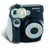
Polaroid 300

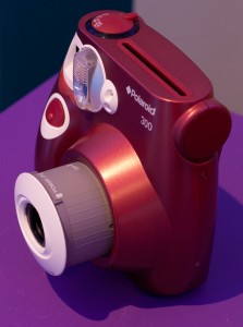
The Polaroid 300 is back after a hiatus of just over two years, and rather cute it looks too. Mmhmm, the original instamatic camera has been revived and relaunched and looks good enough to eat. Seriously, one of my friends took one look at it and asked if it were edible.

I assumed a more conventional approach and took photos with it. I also carried it with me wherever I went and asked friends and family what they thought of it. Aside from the enormous amount of fun I’ve had with it, and the constant stream of ‘Oohs!’ and ‘Aaahs!’ from my nearest and dearest, what’s the Small Aperture verdict on this pretty piece of kit?

Design

Aside from looking delectable, the Polaroid 300 is a very tactile camera. It has a rounded but chunky design that you really want to hold. This is a good thing in more ways than one: although it does have a flat bottom and can stand up, the bottom is too small and it falls over far too easily. Thankfully it seemed to survive the couple of occasions that it did take a drunken wobble, but I wouldn’t want it tumbling from any great height.

The shutter release button is a big thing on the front of the camera and there’s a dial on the top which allows you to select your shooting mode. Everyone seemed to muddle up the two initially, but when you know, you know. Next to said dial is the film slot, where your picture pops out when it’s taken.

There's the shutter release button, on the front

The viewfinder is on the far right of the camera. One of my friends who is left-eyed found this problematic, but I didn’t notice, being right-eyed and all. What I did find irritating was my finger’s ability to wander in front of the viewfinder when searching for the shutter release button. They’re a little too close for convenience.

Loading the film into the back of the camera was super-easy. So easy in fact, I worried that I’d done something wrong. There’s a little counter in the bottom right corner showing you how many pictures out of your pack of ten you’ve left to take.

I’ve been playing around with the bright blue model, but there’s a gorgeous burgundy red option. Or you could stick with plain black. But who’d want black for a fun camera such as this?

Oh so lovely in red. And look at that on-off function!

My favourite-feature award has to go to the on-off mechanism, though: you pull the lens away from the camera body and on it comes. How groovy is that?

Handling

You’ve four shooting modes to choose from: indoor/dark; cloudy/shady; fine; or clear. Whichever mode you’re in, though, the flash will always fire. And to be entirely honest, it’s a bit of a hit-and-miss affair. The lens is freaking huge, though, and it doesn’t tally up to the size of the viewfinder. You’ll get whatever you can see through the viewfinder and quite a bit more besides in your photo.

The picture whirrs out of the slot almost instantly, but you’ll see nothing at all for at least ten seconds. Then your image will slowly begin to emerge through the misty white haze of development. After about 40 seconds you’ll have a much better idea of what you’ve snapped.

Pictures

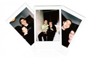
They’re Polaroid pictures. They’re tiny. The colours are washed out. Everyone’s skin tone is about six billion shades out of whack. I took one photo in the garden, using the cloudy/shady setting (because, well, it was) and it looks as if I took it in the dark. Everything is soft and mushy. But they’re Polaroid pictures; what else did you expect?

I’m going to magnet mine to my fridge.

The verdict

Each picture works out at around £1 a go. That’s not cheap, and some people might find this prohibitive. But it is instantly gratifying and this camera is, essentially, a toy. You’re not going to use it to document your entire trek across the Himalayas or your safari through the Kruger National Park. It’s for parties and for picnics and probably even a bit of posing.

When we’re so accustomed to being able to take hundreds of photos, to discarding the terrible ones, to editing the ones that we do want to keep, that it’s refreshing to revert to old-fashioned one-shot photography. Even if the camera is pretty much a play-thing, it makes you think about your picture that tiny bit more.

Polaroid 300s are available lots of places, including the lovely Amazon, for £79.99 in the UK, or $89.99 from Amazon US. A pack of film (10 exposures) is £12.99.

Where'd my mirror go?

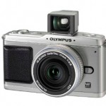
The Olympus Pen has an optional viewfinder attachment, turning it into the bastard lovechild of a SLR camera and a rangefinder. Which might not be such a bad thing, actually...

It’s early autumn so everyone has leapt aboard the Christmas juggernaut, God help us. Christmas isn’t just celebrating half-a-dozen similar but morally incompatible festivals of religious and secular nature.

If you create electronic equipment, it’s also (not to mention ‘mostly’) about making berkovets of cold, hard cash.  


Needless to say, the photographic world conforms to this standard. This week alone, four camera manufacturers released five different cameras. Nothing unusual there, then (however much I wish the festival frenzy was restricted to seven days immediately prior to 25 December). But take a second look at these cameras, and listen to the rumours coming out of both Canon and Nikon, and you’ll notice that there’s an interesting trend emerging: A movement away from the angelic (D)SLR – or (Digital) Single Reflex Camera we all know and love, and an elegant hop towards mirror-less, or EVIL (Electronic Viewfinder, Interchangeable Lens) camera bodies.

Trend? Whatyoumean trend? I see no trend!?

Some trends come in oddly-photographed packages

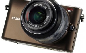
The observant amongst you will have spotted that only one of the five new cameras that were launched this week was of the mirror-less variety: namely the Samsung NX100. That’s hardly a trend, is it? Well, no. But some other interesting things have been going on. Olympus’ E-5 is its new flagship camera, but as I said over on Small Aperture, I don’t think that they’ve done justice to the camera that is supposed to be heading up their range. Nothing about it makes me go ‘Wow!’ and reach for my credit card. As a self-confessed camera geek, that’s pretty much the reaction I’m expecting when new camera equipment gets let loose. The Nikon D7000, released the same day, is far better value for money than Olympus’ new flagbearer.

It’s not just the uninspired E-5 that suggests Olympus will soon be ceasing production of SLRs, but squeaks from within the camp are saying something similar.

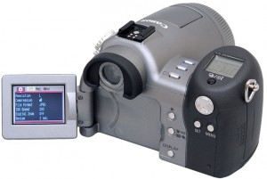
Quite apart from the retro-tastic tiny swivel-scrreen, the Pro90 used an EVF - or Electronic Viewfinder.

If the murmurings from ‘the other’ manufacturers aren’t convincing enough for you, listen to the rumours from Canon and Nikon. Neither of these behemoths of the optical world have produced current-generation mirror-less cameras yet (although both Canon and Nikon have created ELF – Electronic View Finder – cameras in the past, with varying success. Photocritic editor Haje notes that he had a Canon Pro90 about 10 years ago, but ended up trading up to a ‘true’ SLR, because it was ‘pro’ only in name – not in actual fact), but perhaps that could be about to change?

The intergoogles are awash with images of the Canon EVIL, and its prospective range name: EIS. There’s a strong hint that Nikon will announce a mirror-less camera, Q, at Photokina this month. So I’ll say it again: mirror-less cameras.

What is this mirror-less camera you speak of, Miss Bowker?

I should probably begin by saying that in a way, ‘mirror-less camera’ is a bit of a misnomer, after all, compact cameras do not have mirrors either. But the problem is that no one has been able to settle on a name or even an acronym for this other breed of magical-picture-making-machine that benefits from interchangeable lenses but doesn’t have the bulky mirror fandango of the SLR. You might hear them referred to as Mirror-less Interchangeable Lens Cameras (MILCs); Digital Interchangeable Lens cameras (DILs); Micro cameras; Single Lens Direct view cameras (SLDs); or my personal favourite: Electronic Viewfinder Interchangeable Lens cameras (EVILs). In the absence of any generally agreed term, I’ll stick with mirror-less camera.

In order for the mirror to be able to flip out of the way, there has to be a gap between the imaging sensor and the lens. Mirrorless camera designs do away with this gap.

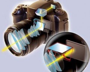
Anyway, if you want to know how a mirror-less camera works, you need to know how an SLR, or single lens reflex camera, works first. It’s pretty simple, actually. When you take a picture, you need to be able to see what your lens is seeing otherwise you’ll be decapitating your portrait subjects and accidentally omitting the most interesting feature of your Italian vista. With an SLR, there’s a mirror that redirects the light seen through the lens to your eye, via the optical viewfinder. When you press the shutter release button, the mirror flips out of the way and the sensor (or film, if you’re feeling retro) is exposed to the light and therefore the image. Tah-daa, there’s your picture.

As the term ‘mirror-less’ so aptly reflects, these cameras don’t have mirrors to redirect the image through to your eye via an optical viewfinder. Instead, you see the image on an LCD screen, or an electronic viewfinder, if you’re really lucky. The lack of the mirror malarky reduces the size of the mirror-less camera when compared to an SLR, yet you still get all the goodness of the flexibility of interchangeable lenses and a big sensor.

‘Awesome!’ people might be thinking. Muchly-flexible, muchly-smaller camera. Well, not quite.

Drawbacks of the mirror-less camera

We use SLRs because they give us so much control over the pictures that we shoot. It’s not just about the range of lenses, because, hell, the mirror-less cameras are offering that. It is about the mirror-less camera not autofocusing as fast and having a slower frame rate than an SLR. In addition – at least in our SLR-accustomed eyes, it is about the mirror-less camera being less comfortable, and less intuitive to use when composing pictures using an LCD screen.

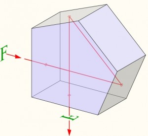
In your SLR camera, you'll find the pentaprism in the 'hump' at the top of your camera, just by the eye-piece. It adds to the bulk of your camera (which is bad) but enables you to 'preview' what you are photographing, literally at the speed of light (which is good). If camera manufacturers instead had used a mirror (which would have taken up less space), you would be looking at the world upside down, which would have given a mighty confusing photography experience.

That screen adds an extra layer of communication between you and your image. If you’re a sports or wildlife photographer – or indeed a photographer with any interest in action shots – a mirror-less camera is just not going to be fast enough for you. With a mirror, you are optically connected with your subject, and you get the information you need at the speed of (dare I say it…) light. In other words: you need that mirror.

Compare a mirror-less camera to a high-end compact camera and you’ll notice that perhaps a mirror-less camera isn’t as small as you thought it was. Sure, there’s no more bulk from the mirror, and the pentaprism is absent, but the lens is going to add something significant that the compact does so well in hiding away. You’re never going to be able to pocket a mirror-less camera the same way that you can a Canon S95. This ‘smaller, more portable’ selling point is probably going to have to be re-thought.

In addition, I’m not completely convinced that sensor- and monitor technology is as far advanced as we need it to be. If you have a current-generation dSLR, you may have a feature known as ‘live view’ – this flips the mirror out of the way and lets you use the display on the back of the camera as a viewfinder. For some applications, this works great, but, well, not always.

“I decided to try shooting using only Live View on my 550D for a whole day”, says Haje, editor of this fair blog, “But I gave up after about an hour. I know the 550D probably isn’t the pinnacle of Live View / Electronic Viewfinder technology, but for the technology to become even remotely interesting, it has to be drastically improved. In three years, perhaps. Right now, I’ll stick with the speed of light, thanks.”

Positives for the mirror-less camera

Despite me clattering the mirror-less camera ideal, it does have at least one noticeable positive: lens flexibility. Historically, photographers have bought into a brand because they favour their lenses.

Canon lenses fit Canon bodies and Nikon lenses fit Nikon bodies. (Yes, you can buy generic brand lenses, too, but the mount will still be brand-specific.) Cross-over only happens with the use of an adapter, but the adapter can place the lens too far away from the body and that presents focusing problems. However, the smaller size of the mirror-less camera means that the adapter doesn’t place the lens so far from the body and focusing is no longer a problem. Say hello to lens cross-over, in the style of the moderately successful Four Thirds standard, where Kodak, Olympus, Fuji, Panasonic, Sanyo, Sigma, and, (with a camera manufactured under licence by Panasonic) Leica have joined forces to try to create an universal lens mount and pool their imaging sensors.

The Olympus Pen has an optional viewfinder attachment, turning it into the bastard lovechild of a SLR camera and a rangefinder. Which might not be such a bad thing, actually...

There are a few other cameras out there that do similar things. Digital rangefinders, like the Leica M8 and M9, for example, don’t have mirrors; they rely instead on a different camera design and educated guesswork to get the images the way you want them. Rangefinders, however, are usually met with a Marmite-like effect: You love them and you’ll sell your firstborn to be able to afford the ridiculous price-tag for a Leica M9, or you can’t get along with them, simply because they aren’t SLR cameras.

The mirror-less cameras may be at an advantage by taking the good things about rangefinders (the fact that the lenses can be closer to the sensors because there is no mirror between is a huge benefit, optically) and SLR cameras (much cheaper components, great, well-tested sensors, and an enormous range of lenses available), and merging them in a lovely, uniform package.

What does this mean for photographers?

You know, I don’t think that mirror-less cameras are going to have some great revolutionary impact on the industry or on photographers. Not really. They’re not efficient enough for some types of photography and they’re not small enough to present a serious challenge to high-end compacts. And I don’t think that lens cross-over is a big enough selling point on its own.

There probably is a place for mirrorless cameras in the photography landscape, but I don't see guys like this making the switch in the foreseeable future. (photo by Mike Baird, click to see full size)

Olympus might be leaving the SLR market behind, but if it does, it could well be that it is keen to try to carve itself out a niche after the brand has recognised – after a long and valiant battle – that they simply can’t compete with the rest of the marketplace.

Regardless of Olympus’ strategic direction, I don’t see Canon or Nikon abandoning SLR technology in a hurry, and neither do I see photographers deserting SLRs in droves. What the mirror-less camera does do, is to give consumers more choice and the manufacturers the impetus to push the boundaries with compacts and SLRs. Either way, I think it’s safe to say that mirrorless won’t be the revolution that’ll reduce the our humbe SLR servants to a niche equivalent to where we see film photography today.

And honestly, if the manufacturers want this one to catch on, they have to settle on a universally recognised name. Marketing is all about your consumers being able to identify with your product. At the moment, consumers can’t even make sense of what the product is, much less where it fits into their photographic arsenal.

This post was written by Daniela Bowker, who normally serves as my trusty side-kick as the editor of the Small Aperture photography blog, with a lot of input and second opinions from myself.


Do you enjoy a smattering of random photography links? Well, squire, I welcome thee to join me on Twitter -

© Kamps Consulting Ltd. This article is licenced for use on Pixiq only. Please do not reproduce wholly or in part without a license. More info.

Pictures in the park

Picture 3

It might be cutting it a bit fine, but if you’re an American resident and you’ve a stunning picture taken in just about any park, or at a National Monument, in America you’ve still time to enter into the Canon Photography in the Parks competition. There are some rather cool prizes up for grabs, too.

It’s free to enter, and you can submit photos until 30 September 2010. There are two categories, one for entrants aged 13 to 17 and another for those aged 18 or over. You never know, you could walk away with a new Canon 5D Mark II, or a Pixma Pro9500 Mark II printer, or a trip for two to a national or state park.

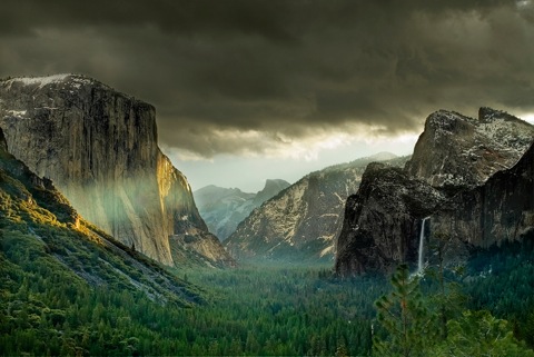
And to inspire you, here’s the photograph that took the grand prize in the 2009 Teen Contest: First Ray, by Chikku Baiju.

First Ray, by Chikku Baiju, winner of the 2009 Teen Contest Grand Prize

Other 2009 winning entries can be seen here, whilst far more details, including The Rules, are available from Photography in the Parks.

Happy 5 Billionth, Flickr!

Flickr

Have you ever wondered how many photos there are lurking amongst the Flickr webs? Well, as of today, there are 5 billion. Yes, really, 5 billion. Woodwards Collage was uploaded by yeoaaron on 18 September 2010.

For the last four years Media Culpa, a public relations and media blog based out of Sweden, has been tracking Flickr’s upload milestones. A basic graph they created shows a steady increase of about one billion photos uploaded per year since 2007. Will that rate of growth stabilise, or increase, do you think?

Woodwards Collage, by yeoaaron

Anyway. Congratulations to Aaron Yeo and Flickr for reaching this mega-milestone!

via TechCrunch

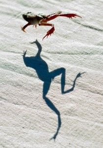
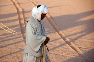
10 scintillating shadows and silhouettes

Poolside shadow ii

Bad shadow can ruin a picture: you’ve obliterated what you were supposed to be looking at, or mysteriously zombified your subject. But sometimes, good shadow can make a picture, making it that bit more interesting. Other times, shadow is the picture. I’ve been taking a look around for shadowy and silhouette-comprised pictures that I think might be worth a second look. What do you think?

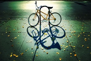
1 – Autumn Cycle

Autumn Cycle, by moriza (Mo Riza)

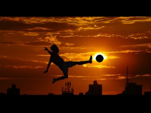
2 – World’s Favorite Sport

World's Favorite Sport, by vramak (Rama V)

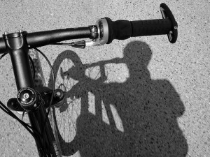
3 – Shadow Rider

Shadow Rider, by lowjumpingfrog (John Norton)

4 – Dance When No One’s Watching

Dance When No One's Watching, by vramak (Rama V)

5 – Discovering her shadow!

Discovering her shadow!, by Just Taken Pics (Ste Elmore)

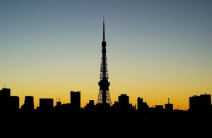
6 – pre-dawn silhouette

pre-dawn silhouette, by switchstyle

7 – Me and my shadow

Me and my shadow, by jronaldlee (James Lee)

8 – It takes a long time to grow young

It takes a long time to grow young, by nattu

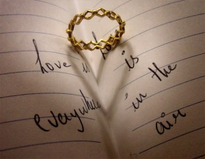
9 – Love is…

Love is..., by lovelypetal

10 – Shadows

Shadows, by Xavi Talleda

All photos used in this article are used as ‘fair dealing‘. If you have strong reservations against your photos appearing on Small Aperture, please contact us, and we’ll get them taken down. Please support the artists creating these photos by clicking on the photos to take a closer look at their work!

What is shutter speed?

When we’re thinking about exposing our pictures correctly, there are three variables to consider – aperture, ISO, and shutter speed. All of these have an effect on how light or dark your picture is, as well as affecting other aspects of your photo. We have looked at the effects of aperture and ISO in previous articles, so it’s time to consider shutter speeds, and what lowering your shutter speed can do to your pictures.

What do you mean by shutter speed?

To get to grips with what shutter speed is, we need to know what a shutter is. And to do this, it helps to understand the very basics of how a camera works. Light enters a camera lens, travels into the camera body and is recorded as an image when it hits the sensor (or film) in the back of the camera. The amount of time the light is allowed to hit the sensor for is controlled by the shutter; a piece of metal or fabric that opens and closes when the picture is taken. The slower the shutter speed, the longer the shutter is open for. Get it? Okay.

What does this mean for your pictures?

Well, two things. First, the longer your shutter speed is, the longer that you’re letting light hit the sensor – which means that your picture will be brighter. This is great news for taking pictures at night, as you can correctly expose dark scenes without having to use flash. As long as you’re photographing still objects, that is – the second effect of slow shutter speeds is that whilst a shutter is open, all movement during this period is recorded. This means that photos of people in dark rooms can be out of focus if slow shutter speeds are used without flash.

Long Exposure

Long Exposure, by Danny Wartnaby

How can I control it?

Try changing your camera from Auto mode to either Shutter Priority mode (‘TV’ on a Canon camera; ‘S’ on a Nikon) or Program mode (P), and experiment! For most long shutter speed work, a tripod is necessary, as it allows you to ensure that your camera isn’t moving whilst you’re taking your pictures. This makes sure that any static objects in your photo remain in focus.

Be Creative

Using slow shutter speeds, you can get some amazing effects – I’ve always loved photos featuring light trails and more recently have become amazed by shots of star trails, which use exactly the same premise as capturing the trails left by car headlights. You can also use slow shutter speeds to create fantastic panning effects.

A Haunted Trail

A Haunted Trail, by Joshua Debner

I’ve chosen just a few examples, but there are plenty more ideas out there. So what are you waiting for?

All photos used in this article are used as ‘fair dealing‘. If you have strong reservations against your photos appearing on Small Aperture, please contact us, and we’ll get them taken down. Please support the artists creating these photos by clicking on the photos to take a closer look at their work!

Introduction to kite photography

Caption

Go fly a kite. No, seriously. Do it. Then tie a camera to the kite, and get some of the awesomest photos you’ve ever taken.

Sounds scary, eh? Well, there appear to be plenty of people who have had a go. The idea is simple: You take a kite, attach a camera, and take photos with a birds-eye view. It’s actually not entirely unlike what the world-famous French photographer Yann Arthus-Bertrand is doing, sans the ridiculously high costs of having to rent (or buy!) a helicopter.  


Kite aerial photography

A great example of kite-assisted photo by goodmolecules on Flickr

Kite photography, Kite Aerial Photography, or KAP, as it is known among friends, has been with us for absolute yonks – the first famous image I have been able to find out about was taken by a George Lawrence in the early 1900s. His early pioneering work in the field became particularly famous when he took a photo of the 1906 San Francisco earthquake.

He wasn’t the first, however, as commenter David Hunt (of kaper.us fame) points out – Apparently, the first kite aerial photograph was taken in 1889 by Frenchman Arthur Batut. The first American to take an aerial photograph was William Eddy – photos done by the both of them are available online.

There are a lot of different ways of pulling this off, though – from using a very simple compact or disposable camera with some sort of a trigger, to using an elaborate mechanism that allows you to control the imaging device with great precision from the ground.

If you prefer to start off small (may be a good idea), it makes sense to start with David Hunt’s article, explaining how you can introduce yourself to the genre for under US$20 – a reasonable introduction price to any hobby, we’d say.

Triggers

Picture-4.jpg

The first – and trickiest problem, I’m sure you’ll agree – is to find out how you can actually set off the camera: Every idiot can tie a camera to a kite, but how do you take the photo?

There are three ways, essentially: A preset timer takes a photo, you can use a timer that takes photos on intervals, or a remote control that lets you choose when to take a photo. The first option is cheapest: one solution is to use a thread and a storm match. You light the storm match, and you’ll have 5-6 seconds to get the kite as high as possible, as described on this page, but it isn’t a very flexible solution, and you’d end up sending the kite up again and again and again. Very tedious.

The second solution – intervals – is easiest done with digital cameras. Some digicams have a time-lapse feature built in (I remember one of my first cameras, the Casio QV-8000SX had this functionality built-in), but it is actually surprisingly rare. Cameras that accept a remote control can usually be quite easily adapted to do time-lapse photography, by creating your own remote control that sends signals to take photos at the intervals you choose, but this requires some electronics skills. If you are going to go to those lengths, you may as well go for solution #3 – us a radio-remote with an electronic trigger!

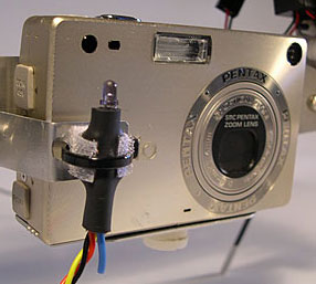
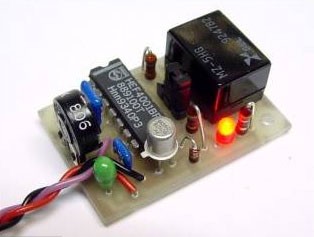
Picture-3.jpgOne of the easiest ways to use a radio remote, apparently, is GentLED, an universal camera remote system that weighs only 3 grammes, and can be set to control a wide array of different stills cameras and camcorders. The system has been developed especially for kite photography, but can also be used for other applications, obviously. They start at €20.

If you are hell-bent on not using any pre-fabricated items, our friends over at Engadget threw themselves into the mix head-first, and actually hacked a digital camera to do time-lapse photography. The idea is that once you set it to take pictures every minute (or whatever), you can just concentrate on flying the kite, and see what your camera comes back with.

More advanced stuff – Cradles, remote controls & getting high-tech

None of this is nearly hardcore enough, of course – we want proper stuff! What happens when you go all the way?

Well, Roy Latham explains:

Picture-22.jpg

The rig includes a Sutton Flowform 16 stickless kite with a long nylon fabric tail and the camera platform.


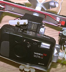
The camera platform uses a Yashica T4 camera and two Futaba servos. One servo controls pitch and the other actuates the shutter. Note that since we are mainly interested in straight down, there is no need for an azimuth servo.

We asked for an elevation control on the grounds that since we would have the kite aloft anyway, it would be irrestable to want to take some more conventional scenic pictures.

The Futaba radio control unit is a popular unit used for radio controlled model airplanes and the like. The framework for the camera platform was custom crafted of aluminum, with some nylon fittings.

Mounting a camera to a radio controllable cradle can help you aim the camera for each shot. There are many different cradle designs available, but Scott Haefner’s solutions seem to stand out as particularly elegant.

Other resources worth checking out:

Kaper.us, an Article on BBC about kite photography, Charles Benton’s KAP page, Scott Haefner’s KAP page, Peter Bults’ KAP encyclopedia and blog, 360° panoramas using KAP, KAPnet’s directory of KAP parts, Some of the best KAP photos on flickr… And finally, a fantastic article in Science News about the scientific application of kites and kite aerial photography.


Do you enjoy a smattering of random photography links? Well, squire, I welcome thee to join me on Twitter -

© Kamps Consulting Ltd. This article is licenced for use on Pixiq only. Please do not reproduce wholly or in part without a license. More info.

Channel Five launches photo course

Five

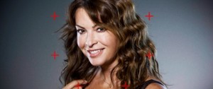
What are you up to tomorrow night? If you’re having a quiet night in, you might want to have a look at Channel Five’s new programme: ‘How to take stunning pictures’. It’s a joint venture between Panasonic and Channel Five and the aim is to help amateur photographers take better pictures with some professional help.

Pull up a chair and grab your SLR - Channel Five is launching their photo course

Hosted by Miss Gadget Show, Suzi Perry, there are six programmes that each focus on a different theme: landscapes, portraits, action shots, holiday snaps, celebration photos, and animals. A guest photographer will host a masterclass and then send off some amateurs to see who can get the best shot. I suppose you could try it out, too!

Lumix have sponsored the series and it’s going out on a variety of media: Panasonic’s IPTV service Vieracast, Panasonic’s and Channel Five’s websites, and of course, Channel Five at 19:30 on Tuesdays.

10 resplendent reflections

IMG_0447

I’m not entirely sure why, but I’ve always loved photos that make use of reflection. I could go all philosophical and say that it’s about capturing the image of the image, but I’ve never thought about it that deeply. Quite simply: they are the kinds of pictures that I find appealing and would happily hang on my walls. So when I was recently surfing the Flickr-webs, these are the reflective beauties that caught my eye.

1 – A Reflection of Hope

A Reflection of Hope, by ecotist

2 – City Refraction, City Reflection

City Refraction, City Reflection, by lrargerich (Luis Rargerich)

3 – Reflections

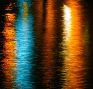
Reflections, by kevindooley (Kevin Dooley)

4 – Reflections of Glasgow (1)

Reflections of Glasgow (1), by Shuggie!! (Karl Williams)

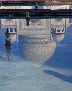
5 – Reflection of Taj Mahal

Reflection of Taj Mahal, by Ze Eduardo (Jose Eduardo Silva)

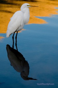
6 – Shy Reflections – Snowy White Egret (aka Heron)

Shy Reflections, by Darvin Atkeson

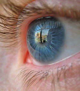
7 – Eye Reflection

Eye Reflection, by PicturePurrfect685

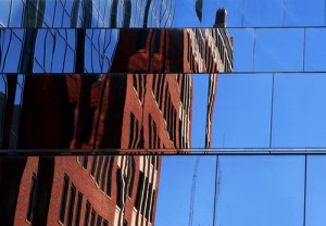
8 – Glass reflection

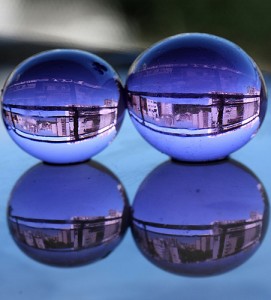
Glass reflection, by mirellawognum (Mirella Wognum)

9 – Regent’s reflection #1

Regent's reflection #1, by Brian Negus

10 – another funky reflection

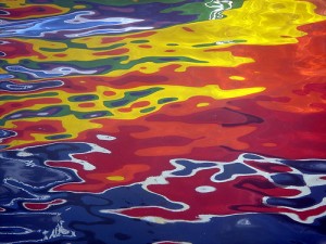
another funky reflection, by annpar (Ann P)

All photos used in this article are used as ‘fair dealing‘. If you have strong reservations against your photos appearing on Small Aperture, please contact us, and we’ll get them taken down. Please support the artists creating these photos by clicking on the photos to take a closer look at their work!

Astonishing astrophotography

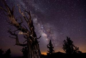
Blazing Bristlecone, by Tom Lowe

I always thought that stargazing was best done in the desert, immersed in blackness, but the winners of the National Maritime Museum Astronomy Photographer of the Year awards have brought beautiful glimpses of the heavens to an exhibition at the museum in Greenwich. And not all these celestial images were shot on barren tundra, either.

The museum announced the winners of its annual competition this morning, and the exhibition—featuring all of the entries—runs from today until 27 February next year. Even better? Entry is free. But if you can’t make it to Greenwich, here’s a peek at the overall winner to whet your appetite.

Overall winner: Blazing Bristlecone, by Tom Lowe

Blazing Bristlecone, by Tom Lowe

To see all the winners, head over to the National Maritime Museum’s website, or of course visit the exhibition.

Astronomy Photographer of the Year exhibition runs from 10 September 2010 to 27 February 2011, 10:00 to 17:00 daily, at the National Maritime Museum, London, SE10 9NF.

Women photographers speak for PhotoVoice

PhotoVoice

Have you heard of PhotoVoice before now? No? Well, it’s a London-based organisation that aims to empower individuals and communities from disadvantaged backgrounds to improve their circumstances—socially and economically—through photography. They organise projects the world over that brings photography to people who might otherwise not experience it. This autumn, however, they’re organising a series of lectures for the general public, and very interesting the line-up sounds, too.

Kicking off things on Tuesday 5 October at 19:30 is the fine art photographer and film-maker, Sarah Moon. Not only will Moon be talking about her experiences in and motivations for photography and film-making, but she’ll also be showing her film, Black Riding Hood.

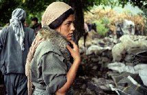
Picture by Anastasia Taylor-Lind

On Thursday 11 November, Mary McCartney, the fashion, portrait, and documentary photographer will be in conversation with Robin Derrick, the Creative Director of British Vogue.

Anastasia Taylor-Lind, a bright young thing in photojournalism and documentary photography, will be flying in from her current base in Syria to round off the series. She’ll be speaking on Thursday 2 December, from 19:30.

I think that I might just bounce along to one of these.

Entry to each lecture is £10 in advance or £12 on the door. All the lectures will be held at South Place Ethical Society, Conway Hall, 25 Red Lion Square, London, WC1R 4RL. More information is available from PhotoVoice.

Making a time-lapse

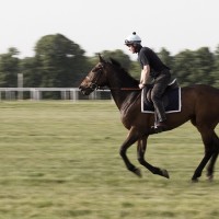
Canter

Every photographer experiences a creative block at some time or another. So what do you do when this happens? I personally fall into a foetal position on the floor, kick my legs, and spin around in circles while crying like a six-year old. But what do YOU do? Well, here’s a thought. How about a time-lapse? If you have a dSLR and a sturdy tripod, then you already have most of the ingredients for this magnificent recipe. So let’s get started!

Equipment

While many dSLRs have an “interval shooting” feature built in already, some don’t, so you’ll also need a way to time and trigger your shutter release. There are several pieces of hardware available, but I like to use a Hähnel Giga T Pro. It’s the only one I’ve ever used, but it seems to work perfectly fine and is easy enough to figure out. Whatever you decide to go with, make sure it has an interval timer function and an exposure count control. Without these two features, you won’t be able to create your time-lapse.

Essential kit, if your camera doesn't have an 'interval shooting' function

For this tutorial, you’ll also need QuickTime software, which you can download here. (If you own a Mac and you’re running Snow Leopard, then you’ll notice that you have QuickTime X and can’t install QuickTime 7. Read this post by Apple to get around this problem.)

The location

You can shoot a time-lapse of just about anything you want. Obviously, it makes more sense to shoot a scene that has a lot of motion in it, such as fast-moving clouds, a busy city square, or a train station. Once you determine your scene, it’s time to get set up. Keep in mind that you’ll need to dedicate some time to this project, so bring along a book or something to keep you occupied while you shoot. ‘How long should I shoot,’ you ask? Well, that depends. And in order to figure that out, you’ll need to do some basic number crunching.

The maths

To determine the time required to shoot your time-lapse, you’ll have to work backwards. For simplicity’s sake, let’s say that we want our final video to be one minute in length. A normal time-lapse video will consist of 15 frames per second. So 15 frames times 60 seconds is 900 frames.

How smooth or choppy you want those 900 frames to flow is up to you. If you’re shooting clouds, then you’ll probably want a smoother effect, so you’ll want to shoot in shorter intervals, say every five seconds. So 900 frames taken every five seconds is 4500 seconds, divided by 60 seconds per minute, which comes out to 75 minutes, or an hour and 15 minutes worth of shooting. Phew!

So now that you have your location picked and how long you’ll be shooting for, let’s get set up.

The set-up

Place your tripod where you want and frame your shot. Make sure your tripod is as stable as you can get it. Any movement during your 900 shots will be very visible once you combine everything together in your final video. If you brought your camera bag with extra gear in it, the added weight could help with stabilisation, so try hooking it onto your tripod.

Get comfy whilst your time-lapse is shooting

Now check your camera for settings. Because you’re taking 900 frames, you’ll want to shoot in JPG to make sure they all fit on your memory card. Also, since your video will likely be used for web-friendly applications like Youtube or Vimeo, you don’t really need to have extra-large high resolution photos.

Make sure you focus your shot and then disable your auto-focus to ensure consistency across all of your frames. You’ll also want to shoot in either manual or aperture-priority mode. If you’re out in an open field during high noon with a lot of clouds in the sky, you’re bound to be in bright sunlight during some shots and darker shade during others, so aperture-priority will help ensure proper exposures throughout your time-lapse.

Once you’re all set up, program your interval timer to the correct settings and start shooting. Grab your book and get comfortable. You’ll be there for the next 75 minutes.

Creating Your Video

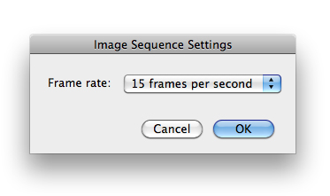
Once you’ve downloaded your photos to a folder on your computer, it’s time to put everything together. Open up QuickTime and click Open Image Sequence under the File menu. Select only the first image in your sequence and click Open. Next, you’ll want to select your frame rate. For our example, we’ll go with 15 frames per second. Click OK and QuickTime will do the rest for you.

You now have your master time-lapse video. Make sure to save it as is. You can then go back to the File menu and choose Export for Web to save the video as a more web-friendly version, ready for Youtubing.

Congratulations, you now have your first time-lapse video!

Extra Steps

While this tutorial simply covers the basics of time-lapse photography, there are plenty of other methods available to play with, so once you get some practice down, you can start experimenting a bit. For example, you may want to batch-edit your photos in Photoshop to create a more unusual time-lapse, such as one in monochrome.

If you’re shooting a busy street at night, you might want to use a slow shutter speed to make the car headlights streak throughout your video. Or you may want your time-lapse to pan across a large scene, a bit like this one, to give your video a wow factor. The options are endless.

Time-lapses can be a great way to create a fun and unique project on a lazy Sunday afternoon. Maybe you have things to do around the house, so you set up your gear in your backyard and shoot while you do your chores. Or maybe you’re at a cafe in a busy city square. Why not shoot a time-lapse of the buzz around you while you sip on a cappuccino and read a book? It’s simple to do and I’m sure you’ll be pleased with your results.

And just so that you know, this is my favourite time-lapse out there:

Hayaku: A Time Lapse Journey Through Japan from Brad Kremer on Vimeo.

Editing software doesn't have to cost the earth

Unedited Wow, that’s a really nice picture. It’s a shame about that big spot on her chin though. And she won’t thank you for that bit of hair she has on her lip there. Y’know, I think her hair is a slightly darker shade of red than that OH GOD IT’S WRONG IT’S ALL WRONG.

Now I admit, you can end up getting a bit OCD about image editing (see first paragraph). While this is true, take a portrait of anyone you know who is even the slightest bit vain and your vision of keeping them “just as they are”, complete with dark circles under the eyes from working late and that bit of spinach in the teeth from tonight’s dinner, might not be met with the standing ovation you were expecting.

Wouldn’t it be nice to be able to just tidy up those minor niggles that pop into your pictures sometimes? Wouldn’t it be nice to be able to do it without sacrificing central heating and eating nothing but rice and “no frills” tinned tomatoes for a month, just to save up enough money?

Well read on, budding image makers, for I have tried and tested four different lower-price solutions for you. (Cos, well, we’ve already looked at the free ones.) As a portraiture photographer first and foremost, I decided to take the same, straight out of camera, unedited image and try to get the most out of it using these four different packages:

  • Corel Paintshop Pro X3 – £79.00
  • Nikon Capture NX2 – £113.61
  • Portrait Professional – £69.95
  • Adobe Photoshop Elements 8 – £77.46

I’ll be testing each one using the same four criteria: exposure tweaking / editing, retouching and sharpening, black and white conversion, and toys and fun filters. Here’s the image I’ll be using:

Corel Paintshop Pro X3

Upon first loading up, Corel had a fairly easy and clear layout, arranged logically. It’s essentially an organiser and image editor in one. After a bit of fiddling, I worked out how to bring up my image and start messing with it in the editor.

Exposure tweaking/editing

I adjusted the colour balance to make the image cooler, then used curves to alter the shadows, midtones and highlights. I have to say, there was little subtlety in the changes in tone and exposure. Another thing I noticed was that there isn’t instant feedback to the changes you make in the preview pane — it takes a good second, as if it were the victim of satellite delay on a news programme. It might be my poor brain being a useless, pickled mess but by that time I’d pretty much forgotten what my image looked like before the tweak.

Corel with sharpening

Retouching and sharpening

I used the clone brush to even out the skin tones, bringing the opacity down to even out skin tones and remove bags from under the eyes. This was fairly effective, but again not as subtle as I would have liked. There is a “makeover” tool which is fairly effective for removing individual spots and blemishes.

When sharpening, the high pass sharpen wasn’t too bad, but left the picture a bit grainy. The unsharp mask (which is often used for a slightly more dramatic sharpen) was nowhere near as subtle as I’d have liked it to be, and bringing the slider up to any remotely significant amount was creating a weird ring around the iris; I’m quite sure that “weird ring around my irises” isn’t the first thing my clients ask for in their portraits.

Toys and fun filters

Your usual array of brush stroke effects and the like here but something I hadn’t seen before was quite a cool little feature called Time Machine. This runs you through a few different classic image making methods, from the Daguerrotype images of 1840 to a classic cross-processed look. And they don’t look half bad, to be fair. Plus there’s a paragraph explaining how each photographic method worked at the time, so you get a little history lesson, too!

Ooh, with toys!

Corel using even more toys!

You may have noticed that I didn’t include a black and white conversion section for Corel. That’s because there is a “black and white film” effect hidden away in the filters section, which oddly gives a much greater degree of control over black and white conversion than the other option on offer, which was a simple remove colour option. I found I made a better conversion using the black and white film filter.

Corel does black and white

Summary

A good variety of tools available for image editing, but not enough power and subtlety in the tools themselves. A bit like borrowing an old toolbox from your grandad ñ lots of stuff in there, but most of it isn’t worth using.

Portrait Professional

I will be putting all of the categories together for this one, as they all sort of happen at the same time. Plus, there are no fun toys or filters to speak of, nor are there any black and white conversion options, apart from sliding the saturation to 0. This piece of software is a little different from the others in that it is designed specifically for portrait images.

After loading up my JPEG image, I had to define where the eyes, nose, edges of the face, chin, sense of humour, likes, dislikes, opinion on Jedward all are in the subject’s face (some of those aren’t true, I’ll leave you to work out which they are), to create what can only be described as what might pass for a death mask in the TRON universe:
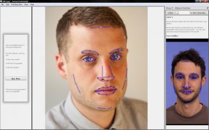
Portrait Professional

You are then taken to the editing suite, where everything is a slider. It felt a bit like create-a-character mode in a computer game, as I was able to adjust the shape of his mush in several ways, using a slider. None of them looked particularly natural, though.

The other sliders all deal with skin smoothness, wrinkle removal, spots and blotches, dark shadows under eyes and so on. Essentially, this program appears to be a piece of “quick fix” software to make portraits looks good. However, I’m really not sure who this software is aimed at – to professionally retouch an image requires a careful, complex level of attention, skill and patience, working on individual areas of the face for a significant period of time. There are no shortcuts, and this software can only do so much towards improving an image before the face you started with begins to look plastic and unreal.

Interestingly, I was also unable to save the image in the trial version. I decided to delve closer by zooming into the image and started to realise why they might not want us to save the image – the amount of detail lost when using the various sliders make the retouch job look amateurish.
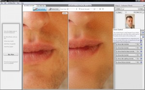
Portrait Professional not doing such a great job

It looked like I had taken a wire wool scouring pad dipped in hydrochloric acid, held my subject down, and proceeded to scour his face until it was featureless and sterile. Actually, maybe that would save me time after the shoot in retouching – anyone fancy a free portrait session? No?

Like anything in life, there are no “quick fixes”. I personally would avoid this particular piece of software. If you’re serious about using photo editing software to get more out of your pics, there are much better programs out there for similar prices.

Nikon Capture NX2

What I immediately liked about NX2 was the fact that it didn’t take very long at all to load ñ it popped up on my screen and was ready and waiting without any fuss. I chose my photo and I was into the editing suite in seconds. There was a very clear and uncluttered layout and it almost felt like I had used it before. Each adjustment you made to the photo would be recorded as a “step”, so that could return to a step should you find it needed adjusting later on, which is a nice, non-destructive way of editing.

Exposure tweaking/editing

Editing exposure was very simple and effective. All was done from a simple “adjust” menu. The results were displayed very quickly, more quickly than in PaintShop Pro, which made it easier to make finer adjustments to the image. I was also impressed with the amount of fine control there was to be had over the exposure and other settings. As before, I used curves to edit the shadows, mids and lights and then altered the colour temperature to make the image cooler.

NX2 with sharpening

Retouching and sharpening

The auto retouch brush did a good job of removing blemishes without blurring the skin.Unfortunately, there was no clone brush I could use to smooth out skin tones. Looking in help, they suggested using a gaussian blur to smooth out skin tones. Unfortunately, this just gives you a picture of a dude with a blurry face. I used this in combination with the selection brush (works like a photoshop mask) in order to localise the blur to desired areas of the skin. Not the best solution, but it did help a little with skin tones and blemishes.

I used the same sharpening methods (high pass sharpen and an unsharp mask). There was a better fine level of control here than with Paintshop Pro but not as good as I’d have liked.

Black and white with NX2

Black and white conversion

There was a dedicated black and white conversion button, the sliders offering a good level of control again, although I felt the options were a little too simple. All in all, though, it was possible to get a good black and white conversion.

Toys and fun filters

None. Zip. Nuttin’. NX2 seems to be pushing itself as a very serious digital darkroom type thing, and you are very silly for wanting silly effects. Silly Billy.

Summary

To conclude, NX2 feels a bit like a beginner’s Adobe Lightroom, in a good way. It offers a decent level of fine control and immediate feedback. Both of these factors are very important when tweaking an image to get it just so. It’s a great place to start when learning how to get more out of your images. A few sessions learning with this program would definitely benefit your shots but at £113, are things getting a bit pricey?

Adobe Photoshop Elements 8

First Impressions

You knew it was coming, how could we not include Adobe? Photoshop Elements 8 (or PSE8 as I’ll call it from this point) is what you imagine it would be a sort of simplified, stripped down version of Photoshop. However, you are still able to make full use of a wide variety of tools and the layout was as clear and user-friendly as you would expect.

Exposure tweaking/editing

Retouched and sharpened with Elements 8

I initially loaded up my RAW file which loaded up Adobe camera RAW, a sort of pre-import tool that allows you to mess with colour balance, exposure etc before loading it up into the editing suite proper. There’s no mistaking the difference in the subtlety of changes you can make here, with instant feedback on how it’s looking.

Retouching and sharpening

Retouching was simple and effective. I used the clone stamp on various settings both to even out the skin tones and remove blemishes. Although there is a dedicated spot removal tool, I would recommend doing it manually with the clone stamp. No real complaints here. As before, I ran both a high pass filter and an unsharp mask on the image. Both were the most effective of all the packages. There really doesn’t seem to be any better software for portrait retouching and sharpening at this price.

Elements does black and white

Black and white conversion

As with its bigger brother, Elements has a dedicated convert to black and white tool. It’s slightly simplified but essentially very similar to the “full” version. It has some presets you can meddle with to see how different mixes harbour different results.

Toys and fun filters

An extensive range of fun toys and filters to mess with your photos, from various sketch / brush effects to turning your image into a mosaic and adding clouds (for when you need that clouds-over-a-mosaic look). In case you were wondering, here is that much sought-after look:
And Elements has toys, too!

Summary

To conclude, PSE8 has everything you need to start practicing enhancing and getting more from your images. The price is on a par with the other packages on offer here and it will give you a chance to see whether you really need the bigger, more feature packed full version, for a fraction of the price.

And the winner is…

It was probably something of a foregone conclusion, but it seems that PSE8 has it, at least it does for me. Nikon Capture NX2 does a valiant job of providing an alternative to Adobe Lightroom at a slightly cheaper price, but not much cheaper than Lightroom 2, so I’m not sure it’s particularly worth dropping your pennies on, especially at over £100. In addition, I feel you can do most of what NX2 offers in Photoshop Elements 8.

And because I should probably warn you, it’s worth mentioning a program I downloaded the trial of which was going for around £25, called Pixbuilder. It was essentially MSPaint with (very bad) layers and curves options thrown in. If you’re wondering “how cheap is too cheap for my image editing software?”, the answer is “that cheap”.
A camera in the attic

Canon 518

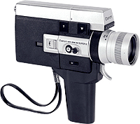
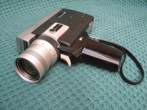
If you follow Small Aperture on Twitter, where we’re known as smallaperture, you might have noticed my incredibly enthusiastic announcement last night that we found a Canon Auto Zoom 518 Super 8 movie camera in the attic of the Small Aperture mansion. Then again, I’m surprised people the other side of the city didn’t hear me squeeing. It was certainly the most exciting thing that happened to me yesterday.

Anyway, now that I’ve calmed down—if only marginally—I have a 1967, or thereabouts, home movie camera in my possession. Apparently it has a 9.5-47.5mm f/1.8 lens, shoots at 18 frames per second normally as well as having a slow motion option, has manual and automatic settings for aperture, and a super-zoom. It’s in its cute carrying case and everything.

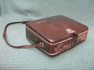
It comes in a cute case and everything!

But I don’t have any super 8 film cartridges, hence my task is to locate some of those. I don’t think it’ll be too difficult, though. Then, I need to find out if this baby still works. Although she isn’t exactly antediluvian, it looks as if she’s been up there, amongst decades of accumulated junk and curios, for quite some time. It gets me thinking about what she might’ve shot, too, and maybe if any of the films are up there in random boxes.

Definitely a camera in there

Okay, I know that there isn’t exactly a great deal to tell you all right now, but I was far too excited to keep this to myself. I shall doubtless keep you updated on progress!

My new toy!

Spending money to make money

moneys

A couple of days ago, I did an article on making money via stock photography, and one of my eagle-eyed readers pointed out that you had to pay for the service I recommended.

I had a bit of a think, and was trying to make up my mind if I should write something more about the topic, ‘if it is worth investing money into trying to make money off photography’. Obviously, in most business, you are dependent on making an investment in order to start earning anything, but can the same be said to be true for photography?

Before I had time to formulate my thoughts, one of my regular readers who is also an old friend dropped me an e-mail which pretty much sums up my opinions on the matter – I’m sure he doesn’t mind if I reproduce it here:

Yeah, you do have to pay, but the thing is, if you manage to sell a couple of images, you can make that money back easily. They seem to have one of the best systems out there, and it’s all about having faith in your product.

If you don’t think your photos are good enough that you will be able to sell them, then paying for the service is not for you. If you believe your pictures are good enough to compete, then you’ve got yourself a winner.

I’ve been able to make a profit from this website over the past 3 months, and I’ve had my account for about 7 months. In total, I’m running at a loss, but if the last 3 months are anything to go by, I’ll be running a profit overall from next month onwards.

I’m really excited, actually, it’s the first time I’m making money off my photos. Even if I end up not making much from this, I can say I’m making money of photography, which has been a life-long dream for me.

YMMV, of course, but I’ll stick with Photostockplus for as long as they’ll have me.

Thanks a lot for that, Tim.

Agree? Disagree? First, have a look at the original post, and let us know, below!


Do you enjoy a smattering of random photography links? Well, squire, I welcome thee to join me on Twitter -

© Kamps Consulting Ltd. This article is licenced for use on Pixiq only. Please do not reproduce wholly or in part without a license. More info.

10 funky fisheyes

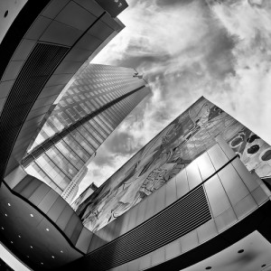
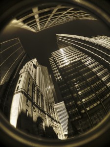
The Gas Company Tower by Metal Man (Michael Chen)

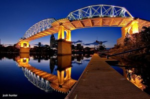
Recently, we posted an article on the use of a fisheye as an everyday lens. While writing that article, I came across some amazing photos that are perfect examples of how a fisheye lens can make your images stand out far above the rest. If you’re thinking about buying one, or perhaps borrowing a friend’s, then take a peek at these photos for some fisheye inspiration.

1 – The Gas Company Tower

The Gas Company Tower by Metal Man (Michael Chen)

2 – The Shelby Street Bridge

The Shelby Street Bridge by joshunter (Josh Hunter)

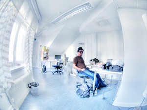
3 – Office: Want Otso’s job?

Office: Want Otso's job? by wili_hybrid (Ville Miettinen)

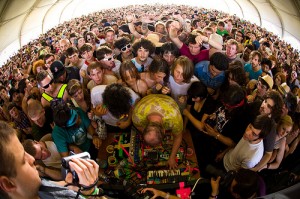
4 – Dan Deacon @ Coachelle 2008

Dan Deacon @ Coachelle 2008 by Mick 0

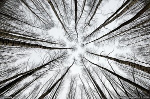
5 – Under the birches

Under the birches by taivasalla (Niklas Sjoblom)

6 – La Fontaine des Mers – Instax Windows

La Fontaine des Mers - Instax Windows by Slightlynorth (Shawn McClung)

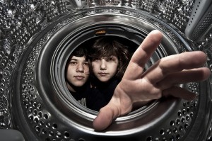
7 – Washing Time!

Washing Time! by Zak Milofsky

8 – HDR IR A look up

HDR IR A look up by Lone Primate

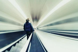
9 – Going down

Going down by Potyike

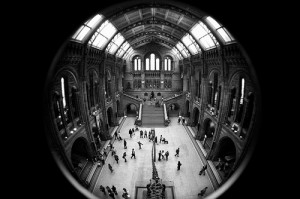
10 – Natural History Museum

Natural History Museum by wokka

All photos used in this article are used as ‘fair dealing‘. If you have strong reservations against your photos appearing on Small Aperture, please contact us, and we’ll get them taken down. Please support the artists creating these photos by clicking on the photos to take a closer look at their work!

SoShowMe

Astrid Harrisson

The wonder that is the intergoogles allows everyone to exhibit their photos, whether it is on a Flickr stream, or on FaceBook, or on something like Shotblox. But it’s a bit different to seeing your photos made big and hanging on a gallery wall. However, for a handful of people who usually post their pictures on Flickr and FaceBook, they had the opportunity to see their work made big and hanging on a gallery wall last night.

London gallery theprintspace ran competitions over the course of a year, offering the opportunity for people to submit up to three photos a month to its FaceBook or Flickr groups. Each month the theme of the photos would change, and so would the professional photographer who selected the winners. The result is an intriguing mix of images.

There’s everything from beguiling landscapes to candid portraits through arresting still lifes. The only link between the images is how they were drawn together—by using social media—which means that there’s something for everyone to enjoy.

I’d recommend heading over to Shoreditch for an hour to have a wander. It’s free!

SoShowMe runs from 3 to 15 September, 09:00 to 19:00, at theprintspace, 74 Kingsland Road, London, E2 8DL.

Picture by Astrid Harrisson.

Apple ventures into the bright new world of HDR

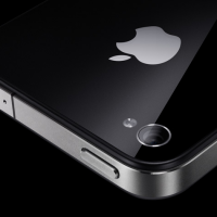
iPhone

Well whaddya know, the first topic that Steve Jobs discussed at Apple’s Special Event yesterday, when it came to the iPhone, was HDR photos. With the release of Apple’s iOS update (iOS 4.1) next week comes a new feature for the iPhone camera: HDR.

When you activate the phone’s camera, you’ll see a button on the top of the screen that says ‘HDR’. If you select this feature, the camera will take a normal ‘raw’ photo as well as an HDR image. Both will be saved to the iPhone’s camera roll.

According to Jobs, the camera will take three exposures in rapid succession: one underexposed, one exposed properly, and one overexposed. Some ‘complex algorithms’ (got to love that phrase) will then merge the three images together, creating one HDR photo. However, it’s more likely that the iPhone software automatically processes two extra images from the original rather than actually taking three separate photographs.

The slow speed of the phone’s shutter release would cause all sorts of camera shake problems, therefore making ‘real’ HDR photos difficult to achieve. While this may disappoint true HDR enthusiasts, the new native feature is a big step forward for smartphone photography and should help propel HDR photography into the global mainstream.

HDR: it’s where all the cool kids seem to be playing.

Friday 2 September 2010, Update: Seems as if it’ll only be available for iPhone 4. Oh Apple, why do you taunt 3G and 3GS users so?

The Photographers' Gallery gets a refit

Photographers' Gallery

At a cost of £8.7 million, The Photographers’ Gallery in London will be ensconcing itself in a regenerative cocoon at the end of this month before emerging redeveloped, fully accessible, and with even more gallery space in time for Christmas 2011.

The refurbishment plans, drawn up by O’Donnell + Tuomey, include galleries across three floors, a floor dedicated to learning and resources, and moving the cafe and bookshop to the ground floor. All of this is a reduced version of the original plan that pretty much bulldozed the Ramillies Street building, but had to be scaled back when the Gallery couldn’t secure the £15 million of funding that it needed.

The Gallery won’t be going quiet during its facelift, though. It has organised a programme of events, projects, and talks that will take place in and around the Soho area of London where it is based. Its offices are moving into temporary accommodation and from here the Gallery will continue to sell its prints and offer access to as many of its resources as it can.

Whether or not the refurbishment will be enough to energise the Gallery, which has suffered criticism recently for being too narrow and out-of-touch—or even if it can survive being closed for 14 months—remains to be seen. But the plans do look very exciting.

Corinne Day: obituary

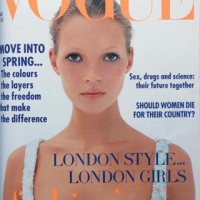
Corinne Day obit

If the 80s could be summed up by sequins, shoulder-pads, and stilettos, then the 90s was about something utterly contrary to that. Drawn, gaunt, and almost grubby it came to be known as heroin chic; and the fashion photographer responsible for this transition was Corinne Day.

Day was brought up by her grandmother and was a self-taught photographer. It was something that she came to after one job had already led to another career. She started out as a courier, flying packages across the world, but began modelling after it was suggested to her by a photographer who was seated next to her on a plane. When modelling, she met Mark Szaszy, the film maker who would become her life partner and would first hand her a camera.

There are two shoots in particular for which Day will be remembered, both featuring Kate Moss. The first was a 16 year old Moss frolicking half-naked on Camber Sands, dressed in clothes bought on Portobello Market—most notably a feathered head-dress—that featured in July 1990 issue of The Face. The second was Underexposed, shot for British Vogue in 1993. Yes, that was the series of photos that were variously described as ‘just this side of porn’, ‘hideous and tragic’, and ‘very young and very dead’. If photography is about provoking a reaction, she most certainly managed it.

But there was more to Day than these photos. She worked for British, Italian, and Japanese Vogue. She documented the lives of her friends, often in the direst and bleakest of situations: living in squats, ravaged by drug abuse, and bloodied by violence. She shot the cover of Moby’s album Play, and she was exhibited at the National Portrait Gallery, at the Victoria and Albert Museum, and at the Science and Design Museums. Day’s photographs were intimate depictions of people.

This intrusive portrayal of people included herself. In 1996, Day collapsed, was rushed to hospital, and subsequently diagnosed with a brain tumour. This sequence of events, and the treatment of the tumour were all documented and published as Diary in 2001.

The tumour, however, returned. Despite extensive treatment, much of it paid for by funds raised by the Save the Day campaign organised by her friends to sell limited edition photograph prints, Day died at home, on Friday 27 August 2010.

Whether you find Day’s pictures shockingly arresting or naturally attractive, her influence on fashion photography is undeniable.

Corinne Day, photographer, 19 February 1965 — 27 August 2010.