Your photo on the cover of a book?

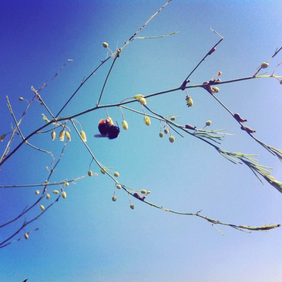
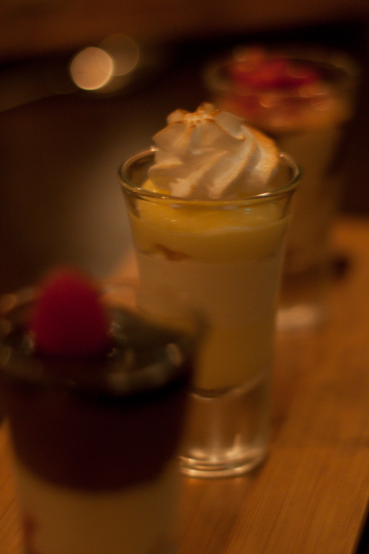
Fancy a go? My newest book is due, many-things-but-mostly-the-weather-permitting*, to be published in April next year. Apart from me signing off on the final proofs, its publishers, the Ilex Press, and I have one outstanding task to complete: selecting a final image to include on the book's front cover mosaic. Seeing as the book is dedicated to the phenomenon of social photography, we—or rather Adam, the Associate Publisher at Ilex—couldn't think of a better means of finding the perfect fit than to ask you if you've an image that you would be proud to see gracing the cover of an internationally published book.

As well as having your picture on the front of the book, you'd receive a copy of it (when it's released) as part of your prize. If you're very lucky, Ilex might have something else up its sleeve for you, too.

On a need-to-know basis, you need to know that you have between now and Monday 2 December 2013 to submit an image to the special Ilex Social Photo Flickr pool. The photo must be square format and you must own the copyright to it. The winner will be selected by me and the Ilex Photo team and announced on Friday 6 December 2013. Importantly, you will retain all rights to your image and it will only be used by Ilex on the cover of the Social Photography book and for the purposes of promoting the competition.

If you've any other questions, holler. Otherwise: good luck!

* Delivery of my book Surreal Photography: Creating the Impossible was delayed by a typhoon in the South China Seas earlier this year. More recently, several containers of books were lost to the waves as a result of storms. The loss of books is in no way comparable to the loss of lives, this merely serves to illustrate why we don't have accurate delivery dates.

Palette: a tactile interface to edit your photos

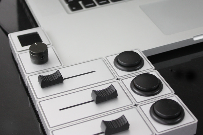
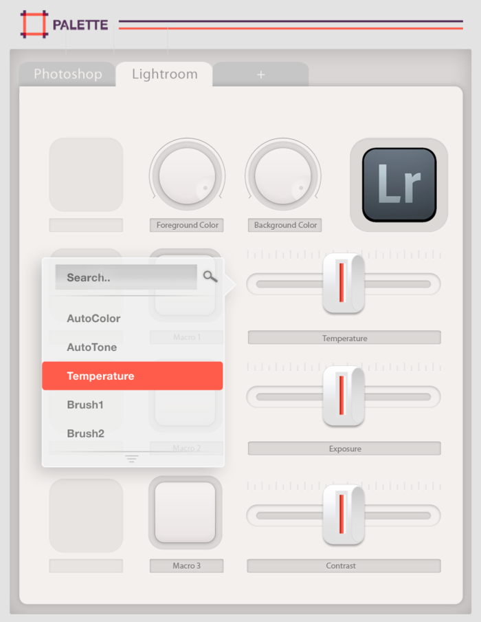
When you're beavering away in your editing suite, converting images to black and white, tweaking the colour balance, and adjusting the levels, how do you work? Graphics tablet? Mouse? Keyboard shortcuts? A mixture? The team behind Palette is looking to provide a new, more tactile means of making adjustments and applying presets to our images. They're hoping that Kickstarter can help bring to life their customisable, modular, hardware interface for editing. Comprising blocks that fit together like Lego, a palette allows you to edit your images using tactile controls. Different functions are assigned to different controller blocks; these include buttons, sliders, and dials.

Palette in aluminium

If you decide that you need to reconfigure your palette, switching your toy camera preset to a black and white preset, you can do that via the Palette web app.

Assign your most used adjustments their own controllers

The Palette team is looking for CA$100,000 in Kickstarter funding. Pledges for Palettes start at CA$99 for the brushed aluminium four module starter kit, comprising a master block, a button, a dial, and a slider. Then come six module apprentice kits and 16 module professional kits as well as some limited edition cherry wood ones, too.

Palette might not be so great for editing on the move, but I like the idea of having physical controls over my edits, rather than relying on mouse, keyboard shortcuts, and trackpad. I also find Palette's flexibility and reconfigurement and expansion capability appealing. It's also worth pointing out that Palette isn't just for photographers: the controllers can be assigned to interact with music production suites and video editing programmes; if you've another idea, get in touch with the team.

Interested? There's a heap more information on Palette's Kickstarter page!

Photo books from Flickr

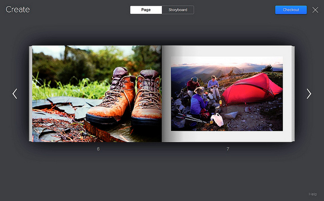
Flickr's been offering prints, courtesy of Snapfish, for quite some time. Click on the 'More' button and you can turn your images into prints in a variety of sizes. There are options to create canvases, calendars, and collages, too. It's relatively simple, without any faffing around uploading pictures that you've already uploaded to a print site. From today, you can create a photo book straight from a Flickr set: you can send an existing set straight to print, or you can create a new set especially for book binding. There aren't any decisions about paper or bindings to be made: Flickr has done that for you. Books start with twenty pages of premium white lustre-finish proPhoto paper. You can choose between full bleed printing (that's images taking up the entirety of a page) or images with a margin, and it's bound in a hardcover with a matching dust jacket.

Simple to make photo books from Flickr

Books measure 11 inches by 8.5 inches and cost $34.95 for 20 pages. Add $0.50 for each additional page. At the moment they're only shipping to US addresses, but that should be changing soon.

Naturally, I had to go and have a play around to see what the process was like. It's ludicrously easy. Head to your Sets, choose the set you want to make into a book, hover over it, and click on the book icon. Then you get to rearrange your images into the order you want. When you're happy, hit the checkout button and everything should be good to go.

There aren't decisions about book sizes and paper type to be made, and there are no captioning options, either. The Flickr tools automatically crop and position your images, but you can choose rearrange them or zoom in or out. You know, I quite like those decisions being made for me. Choice is good, but too much choice can be overwhelming, especially when you don't know about the technicalities. I've an odd feeling that this, along with the photos already being uploaded, will make me more likely to create a photo book and not less. But I'll have to wait.

I did, however, encounter a problem: there was a note telling me that my images weren't of print quality. Thinking this was very odd—all of the photos in the sets I'd tried to turn into photo books had been taken with a dSLR and were definitely of sufficient resolution—I dropped a quick email to the Flickr team. They've suggested that it's because I have some iPhone images in my photo stream and it shouldn't be a problem.

Anyway, you can check out the Flickr Photo Book video yourself, if you fancy:

Adobe extends its Photoshop + Lightroom subscription offer to everyone

In September, Adobe announced that, for a limited time, owners of Photoshop CS3 would be eligible to sign up to a special Photoshop + Lightroom subscription that would cost them only £8.78 ($9.99) a month. I thought it read like a sweetner for the huge numbers of loyal Photoshop users who felt snubbed by the switch to Adobe's subscription-only model. However, it wasn't of any use to anyone who owned Lightroom and felt like trying Photoshop, or was just getting started with Creative Cloud. Now, if you're not too disgusted with Adobe's handling of its hacking fiasco and prepared to trust it with your credit card details, anyone can sign up for this not-bad-value offer, regardless of whether you own CS3 or later.

Photoshop + Lightroom for $9.99 a month for everyone (but sign up soon)

For £8.78 ($9.99) a month, you will have access to Photoshop, Lightroom, 20GB of cloud storage, and Behance ProSite. However, you must commit to an annual subscription and you must sign up between now and 19:59 GMT on 2 December 2013. (For CS3 owners, you still have until 31 December 2013 to sign up.)

All the details are waiting for you on Adobe's website.

Pushing a pop-up flash further with Rogue's Safari Flash Booster

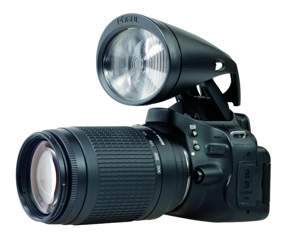
Rogue has announced a nifty, battery-free attachment that should enable anyone using the pop-up flash on a Canon or Nikon dSLR to send its light further than it could otherwise reach. The Safari Flash Booster has been optically engineered to focus up to eight times more light from a pop-up flash and optimized for lens focal lengths over 100mm. With luck, it should enable you to use faster shutter speeds and achieve sharper photos. No batteries, just the hotshoe

The Rogue Safari Flash Booster costs £25 and should be available in stores and online in time for Christmas. To check if your camera is compatible, check here, and the rest of the details are here.

Oxford Dictionaries' Word of the Year? Selfie

'Selfie?' I've been taking them for yeeeaaars, dahling! The word isn't exactly new, we've been using it since 2002. And the concept definitely isn't new, seeing as the first one was taken in 1839 by one Robert Cornelius. But a staggering 17,000% increase in its use over the past year has meant that 'selfie' has taken the crown as Oxford Dictionaries' 'Word of the Year' for 2013.

Could I possibly have written about selfies without including one? Well yes... but no.

It had stiff competition from the likes of 'twerk' and 'binge-watch', but fought them off with unselfconscious vigour and now joins the likes of 'credit crunch' (2008) and 'omnishambles' (2012) in the pantheon of neologisms. Its next task is to gain respectability from an entry into the Oxford English Dictionary. A place in the Oxford Dictionaries Online, awarded in August this year, isn't quite sufficient.

For some, selfie is an indictment of the self-obsessed instant-gratification generation. Those of us in the know, however, aren't at all concerned by the self-portraiture arrivistes with their smartphones and duckfaces. And you can always keep one step ahead of the game with a little help from Haje's book!

Ooh! Ilex has some copies of Haje's Shooting Yourself to give away in honour of this momentous day! All the details are here!

Sony's hunting for the UK's best photographer

As part of the 2014 Sony World Photography Awards, the search is on the for the best UK photographer. In addition to the 15 Professional categories, 10 Open categories, the Student Focus competition for higher education photography students aged 18-28, and a Youth Competition for photographers under the age of 20 that comprise the competition, the winner of the UK National Award will be chosen from entries to the 2014 Open category taken by UK nationals. The Open competition categories are: architecture, arts & culture, enhanced, low-light, nature & wildlife, panoramic, people, smile, split second, and travel.

Whichever talented person is selected as the best in the UK, the announcement will be made on 18 March 2014. The winner will receive Sony camera equipment and see her or his work displayed alongside the two runners up, as well as the winners and runners up from the other categories, at 2014 Sony World Photography Awards Exhibition held in London from 1-18 May 2014.

Entry is free and can be completed via the World Photo website. All of the necessary terms and conditions are there, too. But the crucial factor is the deadline for entries: 6 January 2014.

No more Fujifilm FP-3000B?

I woke up this morning to the plaintive cries of a small but dedicated group of photographers who are lamenting the loss of the next in Fujifilm's line-up of films that has hit the discontinuation wall. Apparently, Fujifilm is winding up production of its FP-3000B instant black and white film. This peel-apart film was renowned for being quick to develop and being highly sensitive to light with an EI of 3,200. With its axing, there will be no other 3×4 black and white instant films available. For anyone who shoots medium format and uses instant film as a quick proof, it's a loss. And of course it's a loss to the people who just enjoy taking photos with it.

If you're particularly concerned by the loss of 3000B, a petition has been established to request that Fujifilm reconsider the decision. There's also the #fuji3000b hashtag to keep interest levels up. But in the meantime you might do well to stock up on the remaining supplies.

As I've not seen any official correspondence on this, I have emailed Fujifilm UK to confirm. I await its response.

Update: Fujifilm US has issued confirmation via Twitter.

SmugMug's Camera Awesome now available for Android

Riding high on the success of Camera Awesome for iOS, SmugMug has released Camera Awesome for Android. Camera Awesome lets you take control of your smartphone photography with creative editing features that includes special effects, pre-sets, filters, and frames. You can also share photos straight from the app, whizzing them to social networks or via email and text to family and friends. Awesomise your smartphone photos with Camera Awesome for Android

So as to make Androind users feel loved and not left out because they had to wait, there are some Android-specific features for them to enjoy, too. These include:

  • Shooting modes that include high-speed burst, panorama, and HDR
  • Anti-shake video mode for video image stabilization
  • Face recognition and tracking to automatically identify and track multiple faces in a shot to keep subjects in perfect focus
  • ISO, White Balance, and Exposure: power users can choose from multiple white balance modes, exposure compensation values, and manually select ISO settings from 100 to 1600
  • Resolution settings that allow you to shoot both photos and video in multiple resolutions
  • Selective Editing that lets you add or erase a filter to particular areas of an image at a touch
  • Sharing: in addition to sharing on Facebook, Twitter, Sinaweibo, Google+, Instagram, Photobucket, Picasa, Tumblr, YouTube and Flickr, you can now share to any other services via supporting apps installed on a device

Camera Awesome costs £1.87 on the UK Google Play store or $2.99 in the US. If you'd like the iOS version, you can find it in the App Store here.

Ten top tips for fantastic food photography

Today, 14 November 2013, is International Food Photography Day. I'm not sure that I really need any type of excuse to take photos of many things at all, especially food, but it's definitely a good excuse to brush up on the necessary skills.

Photographing food so that it looks good enough to eat isn't necessarily as intuitive as you think it might be. But, it also isn't that hard, either. Ten simple tips later, and you should have some fabulous food photos.

1. Choose your food carefully

It doesn't matter how tasty your lentil soup actually is, because it is a muddy yellow-brown colour and has a bog-like consistency, it is never going to look as appealing as a strawberry-topped, floaty-light sponge cake.

Stick to foods that are visually appealing - bright, glossy, and with interesting textures - unless you really have to photograph the aubergine paté. If that's the case, try to introduce some contrasting colours, say a garnish, and use an interesting setting, like unusually shaped crockery, to help you out.

2. Use natural lighting

Flashes do horrible things to food, like give them ugly shiny patches. Where you can, photograph food close to a window with plenty of sunlight. Of course, that's not always going to be practical - midnight sun is a bit hard to come by unless you happen to be around either of the poles in high summer - so if you do have to resort to a flash, try to bounce it off a wall or use a diffuser to soften the effect.

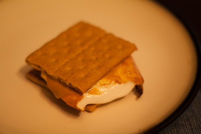
The ISO was through the roof, but it meant that I didn't need to use flash for this fire-lit smore

3. It's all about the angles

Experiment with as many different angles as you can manage: from below, from above, from the side and slightly down, side-ways on. Snap, snap, snap!

4. Consider your depth-of-field

If you're shooting from a lower angle, looking over or across your food, you'll probably find that a shallower depth-of-field is preferable. You'll want a ratio of food-in-focus to background blur that lets the subject stand out.

Think about your angles and your depth of field

On the other hand, if you're taking overhead shots, a smaller aperture will be your friend so that everything looks crisp.

5. Get your white balance right

Blue-tinged cream or a green cast on meat is going to look just grim, so get your white balance right for your lighting conditions. (Unless of course the photos are for an article on food poisoning, then maybe you do want everything to look off.)

6. Get close. No, that's not close enough. Closer still.

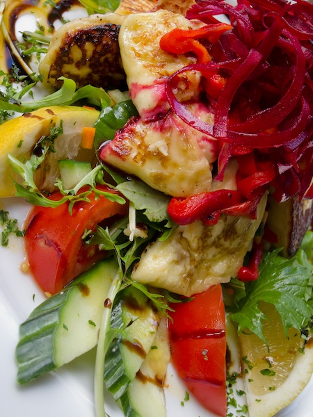
Food photography is about making things lush and tempting. Get in as close as you can so that when you look at the photograph, you feel as if you can practically reach through it and sneak a cherry from the top of the trifle, and smell the zest from the lemons.

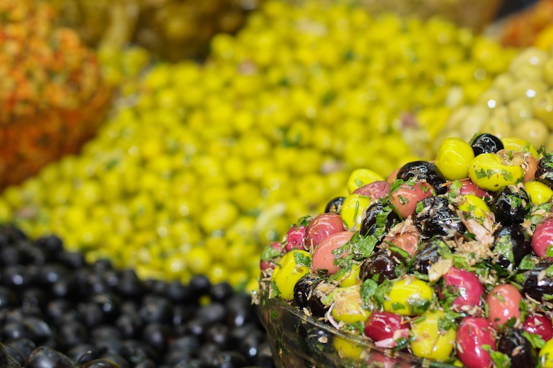
Nothing but olives

7. De-clutter

You don't want anything ugly or distracting in the photo; you want the food to shine. Okay, so this is a given for just about any type of photography, but it's easy for salt and pepper cruets to sneak into a shot when they shouldn't be there, or for a puddle of spilled orange juice to seep across the background. A quick bit of repositioning can do wonders.

8. Make sure the crockery and cutlery is clean

No, you don't want smears of sauce smattering the brim of the plate or thumbprints on the knife.

9. Do you want to style it?

If you're photographing your meal in a restaurant, then it is already going to have been styled. The presentation will be perfect and the crockery will work with the table setting. But if you're doing it at home, then it's worth thinking about the crockery you use, whether or not you need or want a table cloth, and just where you shoot.

Crown Derby china is not going to do very much to show off your seared scallops and for heaven's sake, a boudoir with red velvet curtains is not the ideal setting for a Toy Story birthday cake. But wouldn't that work a treat for red velvet cupcakes?

10. It's not just about the finished product

There's a whole heap of work that goes into preparing something as beautiful as a wedding cake and a whole heap of enjoyment that goes into eating it, so documenting that is just as rewarding as photographing the finished product.

It's not just about the finished product

When I - for my sins - baked my cousin's wedding cake, I photographed the entire process, starting with the ingredients assembled on the kitchen counter and ending with the last crumbs left on the cake stand. It made a great photobook gift for the happy couple, too.

What are you waiting for? Muster your baking pans and set up your tripod!

Falling out of love with the Taylor Wessing Portrait Prize

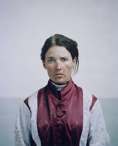
I had just opened up a new compose window to write my review of this year's Taylor Wessing Portrait Prize exhibition (in short: uninspiring and hackneyed) when someone sent me a link to this BBC article. Suddenly, my lamentation of a rather bland competition exhibition took on a new complexion. This year's Taylor Wessing Portrait Prize was won by Spencer Murphy for his photo of mud-spattered jockey Katie Walsh at Kempton Park racecourse. When I first saw it, I felt quite non-plussed by the image; it didn't seem to convey any of the energy or determination that I know fires jockeys. They're steely people, but they're driven by adrenaline. Even when they're exhausted, they still buzz. If you can convince one to sit still, or you can capture one in motion, jockeys are great subjects. It was an image that I knew I should have loved but I didn't; somehow it fell short.

Katie Walsh by Spencer Murphy

Murphy said that he wanted Walsh's portrait to convey 'both her femininity and the toughness of spirit she requires to compete against the best riders in one of the most demanding disciplines in horse racing.' National Hunt jockeys are extraordinarily tough and to portray this along with Walsh's feminity would have made for a glittering image. My interpretation of the portrait, though, was that Walsh appeared nothing more than miserable. It was a lovely picture and there is a gorgeous depth to it that Murphy had hoped to achieve by using a medium format camera, but I wasn't convinced by its characterisation. Now, I'm wondering if one line in that BBC article explains it. Walsh hadn't ridden at Kempton the day the photograph was taken. It's made to look as if she's just unsaddled and weighed-in, but that doesn't seem to be the case. 'Spencer Murphy took the shot of jump jockey Walsh at Kempton Park, although she had not raced there that day.'

So is the mud, the rosy cheeks, and the skid-lid hair nothing more than a contrivance? My friend who sent me the link to the BBC article felt very strongly that Murphy should not have been awarded the £12,000 prize. I don't want to put words into his mouth, but I was under the impression that he felt in some way deceived by the image. It wasn't telling the story that it purported to tell. A portrait of a jockey in silks is one thing; but a portrait of a jockey in mud-spattered silks that makes it look as if they've just ridden a driving finish on soft ground, when they haven't, is another.

This is potentially problematic for a major prize, depending on what's expected by the judges. Should the judges want nothing more than a beautiful image that tells a story, it might not matter how it's achieved. If the photograph is meant to be telling the subject's story, we might be venturing into more difficult territory with respect to portraiture and prizes when an image has been staged. I don't wish to state if Murphy's photo should be eligible or ineligible for the prize: I'm insufficiently familar with the competition's rules to make that judgement. But having seen the portrait of Walsh in the flesh and not been especially moved by it, I think that it might be more problematic for the art of portraiture.

When I was wandering around the exhibition this morning with Gareth, we commented on how many of the photos' subjects felt more akin to puppets in the thrall of the photographer, rather than as people being photographed. When you looked at these images, it felt as if they were lacking a crucial element, a certain something that was able to elevate them from being 'a picture of a person' to being a portrait. Portraiture is about capturing spirit. It's about distilling the essence of an individual into pictorial form. When a photograph moves away from capturing someone's spirit to something more manipulated by the photographer, is it still a portrait? Perhaps I set too much stall in the notion that a portrait isn't just a photograph that happens to have a person as its subject. I believe that it's meant to be more than that.

Photos are meant to make you feel something; a portrait needs to leave you feeling what the subject feels, too. I'm left wondering if it were the contrivance behind Murphy's portrait of Walsh that left me feeling hollow.

If you'd like to explore the exhibition for yourself and decide if I'm being nothing more than a cynical and overly-pricipled misery, it runs until 9 February 2014 at the National Portrait Gallery, London.

What is white balance?

You may have spotted the lightbulb, cloud, electricity and woodshed symbols on your camera's screen or menus. You may have also ignored them as being yet another degree of complexity that you don't need to know about. Alternatively, you may have seen people on the Internet earnestly discussing colour temperature and swearing by all sorts of essential products that will guarantee perfect results, if you re-mortgage your house this one last time. And ignored it as another expense that you can probably do without.

Well that thing you're ignoring is one of the most powerful ways of making your photos convey the scene you wanted to capture: white balance.

All a question of balance

WB.jpgThe idea behind white balance is very simple: it's a way to correct all the colours in your image to take account of the light they were shot with. This is because not all light sources (bulbs, fluorescent strip lamps, conveniently nearby stars), produce light equally across the whole of the visible spectrum.

Midday sunlight pretty much does, but conventional tungsten-filament light bulbs don't – they mainly produce light down at the red and yellow end of the spectrum. This is why all you get rather muddy orange photos if you take pictures indoors without a flash. Fluorescent strip lights, street lights and camera flashes also produce limited ranges of colours.

The visual spectrum

WB2.jpg

Although this scale is only approximate, it gives an idea of how colors relate to one another. The visual spectrum are the colours that your eyes are sensitive to. Idealised midday sun will shine roughly equally across this whole range. Other light sources will only emit some of these frequencies, or will be biased towards one end of the spectrum.

Your eyes are good at compensating for this — amazingly good, in fact — but your camera isn't.

How it works

Although the maths behind it is pretty fiendish, the way cameras deal with white balance isn't too hard to understand. Your camera measures the amount of red, green and blue light that have been reflected onto its sensor. If the light source you're using isn't producing much at the blue end of the spectrum, then the blue bits of your sensor will receive much less light than they would in daylight. The green will be a bit muted and the red end of things will be quite happy.

Changing the white balance simply tells the camera to expect disproportionately low levels of blue light and makes sure it bears this in mind when deciding what colours things should be.

What do I do about it?

There are several ways of making sure you get the white balance right. The first is to choose one of your camera's presets that is designed for the type of light you're working with. Choosing the light bulb setting when you're working under conventional light bulbs should give a pretty good result, for instance. It won't be perfect, though, because light bulbs aren't all exactly the same, and one fresh out of the packet will produce whiter light than one that has been hanging around for a couple of years, so you may find that none of the presets give you the right result. Morning or afternoon sun won't match the ‘sunshine' setting, and particularly light or heavy cloud cover won't match the ‘cloudy' setting, so camera presets have to be averages and best-guesses.

A much better way of getting the right result is to set the white balance based on the actual light you're shooting under. Most cameras have the ability to set a manual white balance. This usually involves shooting a picture of a white (or, better still, neutral grey), object under the lighting that you're working under. This teaches it how to balance the levels of the red, green and blue information that it's recording. You must remember to do this every time the lighting conditions change, though.

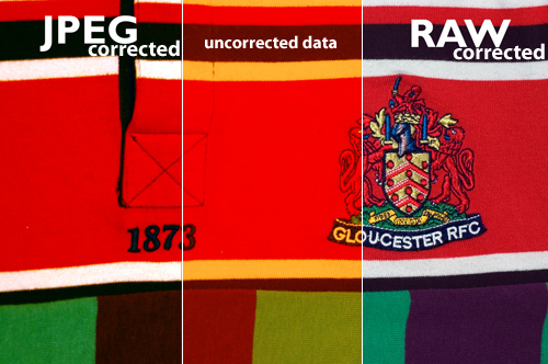
The final way of getting the white balance right is to correct it later. Without wanting to get dragged into a debate about file formats (I can be as geeky and techie as the next man, often more so, but life really is too short), the best way of correcting the white balance after you've taken your shot is to save the RAW data coming from the sensor. Although some software will try to adjust the white balance of jpeg images, the results are simply not as good because there's a risk that the data the software needs to work with is exactly the data that's been thrown away in order to make the file so lovely and small.
jpgvsraw.jpg

Let's look at this with an example — This raw and a jpeg files above are intentionally exposed with completely the incorrect white balance (see the middle bit). The raw was very easily corrected to give a realistic impression of colour. However, in spite of a great deal of tweaking, the same rendering of colour could not be pulled back out of the JPEG file. Note especially the areas in the intersecting area between the red and white: The RAW file renders this perfectly, while the JPEG file is obviously struggling.

However, if your camera doesn't let you save the raw data, don't worry, you can usually tweak the white balance a little bit before the quality suffers too much. As with every other aspect of photography, the best thing you can do is get the shot as perfect as possible when you press the shutter button. If you set a manual white balance before you take the shot, it will minimise or eliminate the need to correct later.

Buy buy buy

There are a variety of products available that can help you get your white balance right. They fall into two main categories: neutral cards and diffusers. Neutral grey cards can either be used as a known-neutral object for setting a manual white balance value, or can be slipped into the photo and used as a reference, when fiddling around on the computer later. Diffusers slip onto the front of the lens so that, when pointed at a light source, they spread the light out across the sensor and allow a manual white balance to be set.

That's it. No magic involved at all. They don't really add functionality, they just let you use your camera's built-in functions better.

What to do instead

Some people try to use the translucent plastic lids from various snacks as improvised diffusers. This can work, so long as the lid is neutral in colour. But most people find that they get good results using a piece of photocopier paper. You know, the white stuff. It's not always perfectly white and it can be a bit hard to get hold of half way up a mountain, but for most situations, it works very well. It won't guarantee that the bride's dress appears EXACTLY the right shade of off-white, but it'll make sure that your team's rugby shirts are recognisably cherry and white. Which is what's important.

WB4.jpg

For reasons that aren't entirely obvious, that icon just up there is a common symbol for manual white balance. Perhaps it is supposed to be a gray card? Only icon designers will ever know.

WB3.jpg

Although this scale is only approximate, it gives an idea of how the presets relate to one another, with the ‘tungsten' lightbulb correcting for very orange light and the ‘shade' setting compensating for very blue light.

No right answer

All the way through this article, I've talked about getting the white balance ‘right'. Well, just like the eternal question ‘which camera should I buy,' there is no definitive right answer. That's because, up until now, I've been talking about how to get white (and, as a result, colours), to appear as it would do under bright sunlight. However, there are lots of situations in which you don't want your photo to look like it was taken in midday sun.

Sunrises, for instance. Or sunsets. If you're going to spend three hours sitting in a cold field, waiting for the sun to rise or set and give you the perfect light, I wouldn't recommend that you then try to correct for the thing that made the light so good: the fact that it doesn't look like midday sun. So don't try to set a manual white balance and make sure the camera isn't trying to automatically correct the colour. So try using the ‘sunny' preset value, this will ensure the image shows just how different from midday sunshine the scene looked (which is presumably why you're taking it).

You may find, however, that this gives a more extreme orange or blue tinge than you expected. This is because your brain is very good at compensating for different colour temperature and still judging what colours should look like. That's why photos taken in orange-ish light come out astonishingly orange. So I'm afraid you still have to play around on the computer if you really want to convey the scene as you remember it or to tell the story you want to. Because, hell, this is photography, not a science.

How does White Balance relate to Colour Temperature?

In this section, we're getting geek-a-licious, and going into depth to find out why white balance is important, how it works, what colour temperature is, etc. If you're new to all of this, you can happily skip this, and know that the first half of this article probably made you a much better photographer. If you're a hard-core photographer, geek, or perhaps even both, however, you'll want to read the rest of this… Because geeks get all the hot chicks.

Depending on which camera and software you use, you may have found white balance described in terms of colour temperatures, using a scale marked K. Although it may seem like an odd way of describing the characteristics of light sources, there is actually a good reason for it.

The idea of colour temperatures comes from a simplified model used by physicists to show how energy is given off objects when they are heated. Think about how hot steel becomes red hot, then white hot: that's essentially what they're going on about.

Who is this Kelvin bloke, anyway?

lordkelvin.jpgColour temperature is measured in Kelvin (named after a rather clever physicist who was made Lord Kelvin in recognition of his work and, like all good Victorian scientists, had an excellent beard), which is pretty much the same as Celsius, but starts counting at absolute zero (-273 degrees C), rather than the freezing point of water. Its relationship to colour is actually the work of Max Planck who, being more recent German scientist, had a moustache, rather than a beard.

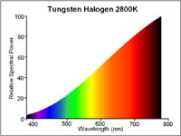
Basically, the idea is that as an object gets hotter, it gives off shorter, more energetic, wavelengths of light. So when it's relatively cool (a mere 1500K – 1773 degrees C), it gives off most of its energy at the red end of the spectrum and could be described as red hot. By 5500K, it will give off all frequencies in the visible spectrum equally – it will be white hot. As it gets hotter still, its output will increase and it will produce less red light, lots of blue and even some UV light, beyond the limits of human vision. You can think of it as the crest of a wave, rolling through the visible spectrum from red to violet as the temperature increases, if that helps.
halogen.jpg

A traditional lightbulb (‘tungsten light') has a low colour temperature, it produces most of its light at the red end of the spectrum. Boosting the levels of blue and reducing the levels of red will compensate for this.
d65.jpg

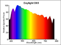
6500K (also known as D65) is the standard for midday sunshine. The entire visible spectrum is lit with roughly equal amounts of all colours and a neutral object would reflect red, green and blue equally. Many cameras use 5500K as their daylight setting because the sun in the morning and afternoon is cooler than D65.

It's worth noting that, rather helpfully, red and orange-tinged light relates to a colder temperature than blue-tinged light, which occurs at high temperatures. So be careful when you start talking about making pictures look warmer, because you could mean two completely contradictory things by saying it.

What does this mean for my camera?

Your camera measures light in RGB, which is a colour space which takes light measurements at three points along the visible spectrum, red at one end, green in the middle and blue near the other end.

As we have seen, under candlelight, there are far more red photons bouncing around than blue photons, so you have to tell your camera to adjust the levels of red, green and blue in relation to one another, so that they compensate for the low temperature of the light. More precisely, colour temperature actually adjusts the relationship between red and blue, with very little need to mess about with the green.

A different light

Now think about a situation in which your subject is sitting in mixed lighting. Take a picture of a person sitting under artificial light, but with daylight coming in from the window. Try to correct for the daylight and the artificial light goes orange, correct for the artificial light and the daylight goes blue. Unfortunately, there's nothing white balance can do about this. Even the most expensive white balance correction tool won't help, the best it will offer is an average of the light sources, depending on how you use it. The best thing to do is close the curtains or add some flash to ensure you have control over the dominant light source.

But that's not quite the end of the story, because there's more to white balance than just colour temperature. Colour temperature is based on the behaviour of heating an idealised material, which is a good approximation for light sources that generate light by heating things (lightbulbs, candles, the sun). The key property they share is producing light all the way across the visible spectrum; they are just biased towards one or other end.

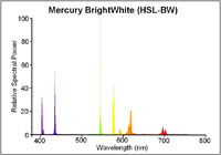
This is not true of all light sources however and, consequently, not all light sources can be adequately described with a colour temperature. Fluorescent strip lights, for example don't work by being heated*, so don't behave like the idealised material and only produce light at certain wavelengths along the spectrum.
mercurybright.jpg

Even a modern, bright white fluorescent strip light will only emit light at very specific points along the spectrum. Note the large green spike. Correction for this peak requires more than a simple colour temperature, red/blue adjustment.
ceramichalide.jpg

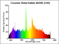
Exotic light sources (such as ceramic metal halide arc lights) produce an even output across the whole spectrum, making them excellent for judging colour. The pronounced green spike is still present.

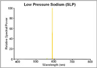
The same is true of street lamps. In fact, the low pressure sodium vapour street lights used by many countries to light motorways only produce light at two wavelengths along the spectrum, both of which are orangey-yellow. If you were to shoot a photo under these lights, no matter how you tweaked the white balance settings, you would never get the colours right because the only thing that your camera could tell you about the objects is how well they reflect orange. A black and orange image, rather than black and white.
slp.jpg

Low pressure sodium lights only emit light at two very specific wavelengths. It is impossible to interpret any colours under such a light.
shp.jpg

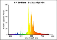
High pressure sodium lights tend to be used in town. They're still predominantly orange but produce enough other wavelengths to allow colour recognition.

That's an extreme example, though. Usually, the problem is just that there are gaps, here and there, in the light's emission spectrum. The way that your camera or software deals for this is to boost or reduce the level of green. This adjustment of the green, in relation to the red and blue you adjusted with the colour temperature, attempts to compensate for a peak or an absence in the middle of the spectrum. It can't work miracles, of course and, as we've seen with the low-pressure sodium lamp example, it can't create information about colours that weren't being lit in the first place, but in most cases, correct use of white balance will get your whites brilliant white. Though not at 303K (30 degrees C).

Footnotes

All diagrams with kind permission of lamptech.co.uk

*) Extra geekery: fluorescent light strips work by electrically exciting mercury until it emits UV light, which is then absorbed by a coating on the bulb that then re-emits the energy as a lower-energy, visible light photon in a process known as fluorescence. Well, you did ask…

This article was written by my good friend Rich. In his everyday life he's an engineer and a journalist, but after work hours, he becomes the uber-geek and highly talented photographer I know best :)

Vibration and camera shake << Photography Fundamentals >> Zoom

Considering the square crop

I've never been a particular fan of the square crop; I have no good reason for my disfavour, but it doesn't stop me from recognising that it does have its place in the canon of crop. And that's not just its historical position, but its artistic one, too. Consequently I do use it from time-to-time, and I've spotted an increase in the frequency that I at least try it out on my photos. That doesn't mean to say I'll use it, but it's worthy of closer consideration. If you're accustomed to the rectangular frame, you'll notice almost immediately that the compositional rules with which you are so familiar don't seem to apply any longer. The frame is different and you must think differently, too.

Dynamic shift

Primarily, the tension within the frame has shifted. What makes a picture 'work' and what holds the eye to the frame has changed. With a rectangular crop, the eye has a tendency to move across the image until it finds its focal point; with a square crop the eye moves around the image. This shift in the dynamic, from fluid to static, presents you with a great setting for capturing the serene. Striking still lives with plain backgrounds and posed portraits work a treat in a square frame.

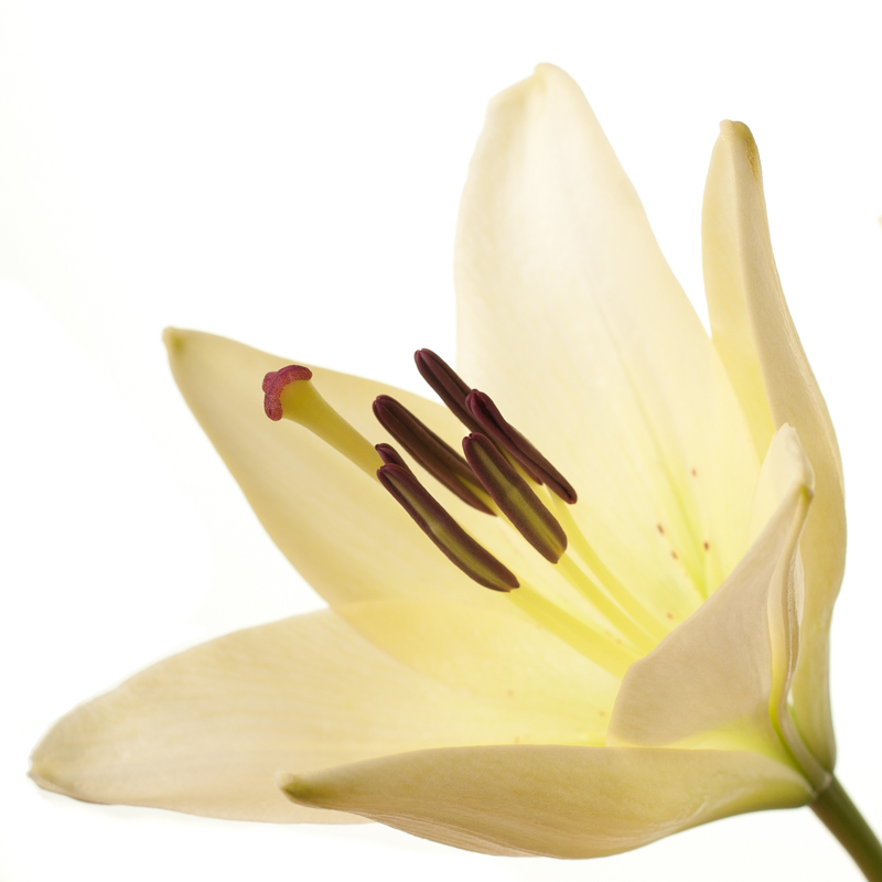
Lily square

Centred subjects

Centred subjects have a tendency to look flat and dull in a rectangular frame, but that circular eye motion that we make with square-cropped images means that they don't lose their impact.

Centre placement works because the eye moves around the frame

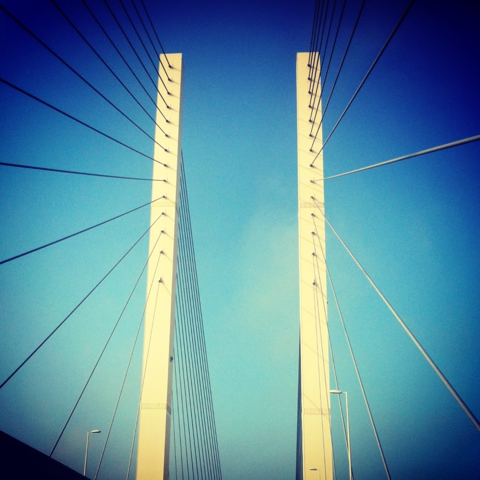
Symmetrical images

Following on from the centred subject comes the symmetrical subject. When you place a symmetrical subject within a square frame, it is bounded and the symmetry emphasised.

Okay, so it isn't perfectly symmetrical, but I was in a moving car (being driven, not driving) when I took it

Evenly balanced images

Splitting the frame and balancing your subject across it: black against white, calm against active, rough against smooth, will work to the benefit of a square crop. There's nothing wrong with splitting your frame horizontally or vertically, but diagonal divides work brilliantly, too.

Buzzzzzzzz

The point is, of course, to use whichever crop works best with your vision and your image. Don't feel that square crops carry the mark of the Instagram devil and that a rectangular frame is somehow symbolic of photographic purity. Try it; you never know, you might like it.

My Adobe account was one of 150m compromised. I'm not a happy camper.

I started off with a headline that said I was livid with Adobe over the hacking debacle. I realised that 'livid' was a gross exaggeration—there are many other situations in this world that make me angry, and this is not one of them—but I am displeased with the manner in which Adobe has conducted itself. I believe Adobe has handled this security breach abysmally and treated its paying customers with contempt. A recap of the facts: on 3 October 2013, Adobe's systems were attacked. It was initially reported that 2.9 million customers suffered the theft of their their user name, encrypted payment card number, and card expiration date. Adobe also had some proprietary sourcecode stolen. Later in the month it was revealed that upto 38 million customers' IDs and encrypted passwords had been taken, with the potential for this number to be even higher, and some Photoshop code went, too. As of last night, we're looking at 150 million stolen users names and encrypted IDs.

Any company that holds millions of users' personal details and credit card numbers is going to be a target for nefarious types who'd like to waltz away with free money and the ability to create havoc elsewhere on the Intergoogles. We saw it happen to Sony. Companies that don't hold users' credit card data are still targets for attack. Twitter knows this to its cost. We all know it's possible. This is why we expect companies to implement robust security protocols in addition to practising adequate password hygiene ourselves. We do our bit to protect ourselves and when we part with money for the privelege of goods or services, we expect those taking our money to safeguard our personal details that they acquire in the process.

But when the worst happens—and never forget that if you can make something, you can break it, too—how a company handles the investigation, responds to the crisis, and communicates to its customers or users becomes all-important. The attack itself was a failing on Adobe's part, but its reponse has been a more significant failing.

I received an email from Adobe on 4 October informing me that its systems had been breached, attackers 'may have obtained access to your Adobe ID and encrypted password,' and I was advised to reset my password. Details were also made available in a blog post by Brad Arkin, Adobe's Chief of Security. I reset my password pretty damn quick. Since then, however, there has been no further communication with me as an Adobe customer either through email or blog. This is despite last week's revelation that the breach was far larger than previously believed and discovering yesterday evening, via LastPass, via Mashable, that my account was one of 150 million that were compromised. There have been no updates, no confirmations, no reminders, and no progress reports. I do understand Adobe's position of only wishing to provide updates on verifiable information, but if such a persistent silence isn't indicative of a complete lack of progress, it lends itself to the suggestion that Adobe would rather that we forgot that this happened.

This veil of secrecy and hope of collective amnesia via silence is in complete contrast to Buffer's response to a security breach at the end of October. Buffer's a social media management system: it allows me and its millions of other users to schedule posts to Twitter, Facebook, LinkedIn, and Google+. On 26 October 2013 it was attacked and several accounts were compromised; they started to spew spam. As soon as the Buffer team became aware, they emailed all of their subscribers, detailing what had occurred to the best of their knowledge, what steps they were taking to rectify the situation, what we needed to do as users, and where we could find updates on the developing situation. Since then users have been provided with an analysis of the breach and the steps taken to secure Buffer.

As far as I can tell, the Buffer team has responded to every email, Twitter post, and blog comment concerning the attack. Buffer's response has been an exercise in transparency and honesty, which appears to have endeared it to people who now feel more confident in the service. I cannot speak similarly of Adobe.

In a professional capacity as a writer, Adobe has corresponded with me further. On 29 October, I published an article covering the increased extent of the breach. Heather Edell, Adobe’s Senior Manager of Corporate Communications, emailed me on 30 October requesting that I make a clarification to the article. She also confirmed that Adobe had chosen not to divulge further details of the attack until they could be verified. Adobe appears to have chosen a path of damage limitation, but with every revelation made by companies or on blogs and websites that aren't Adobe, it is growing increasingly exposed and less in control of the situation.

Adobe has a responsibility to its customers to handle their data securely; when there's a breach, they can expect to be kept informed of what has become of their information, and most importantly, what they can expect Adobe to do now to maintain their security and privacy. This expectation of security is even more important now that many of Adobe's products are issued on a rolling subscription basis, rather than being available in stand-alone, single purchase format. If customers want to use Adobe products, they have no option other than to hand over their credit or debit card details. But I'm left wondering how safe it is to do that. Silence doesn't breed trust, transparency does that.

2013 UK Picture Editors' Guild Awards winners announced and on display

The 2013 UK Picture Editors’ Guild Awards winners were announced on 5 November and now a free exhibition of the winners' and runners' up images is on display in the rotunda of the Museum of London. This year's overall prize, the SABMiller Photographer of the Year, went to Stefan Wermuth of Reuters. Alan Sparrow, UK Picture Editors' Guild Chairman, said: ‘This year’s entries produced some of the closest scoring amongst our judges, but a clear winner emerged early. I think that the work of Stefan Wermuth makes him an outstanding SABMiller Photographer of the Year.’

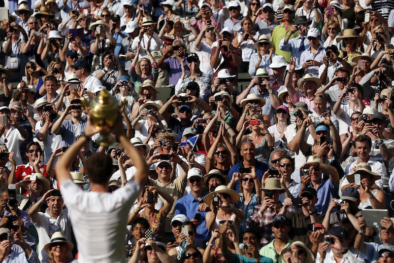
Andy Murray of Great Britain holds the winner’s trophy up to the  spectators after defeating Novak Djokovic of Serbia in the men's  singles final at the Wimbledon Championships.  © Stefan Wermuth / Reuters

Entries were received from over 400 photographers across the UK and in addition to the Photographer of the Year prize, twelve further categories had prizes awarded. These included the Genesis Regional Photographer of the Year, which went to Anthony Chappel-Ross of The Press, York; the Nikon Sports Photographer of the Year, won by Adrian Dennis from Agence France-Presse; and the UK Picture Editors’ Guild Photo Essay of the Year taken by Jack Hill of The Times.

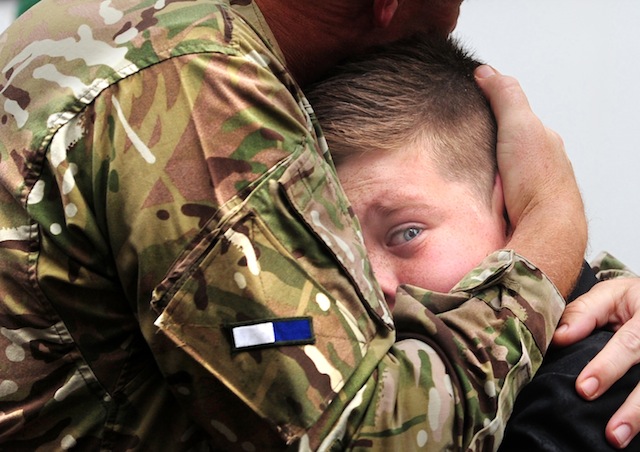
CO Vaudin of 2 Signal Regiment embraces his son, Nicholas, 12,  on his return from Afghanistan. Anthony Chappel-Ross © The Press, York

The exhibition runs until 16 March 2014 at the Museum of London, 150 London Wall, LONDON EC2Y 5HN.


The full list of winners:

SABMiller Photographer of the Year - Stefan Wermuth, Reuters

Bloomberg Business Photographer of the Year - Jason Alden, Bloomberg/The Independent Highly Commended - Stefan Wermuth Commended - Leon Neal, Anthony Devlin

British Airways Fashion and Entertainment Photographer of the Year - Dave Benett, The London Evening Standard Highly Commended - Jason Alden Commended - Lia Toby, Jon Enoch

BT Citizen Photographer of the Year - Björn Olsson Highly Commended - James Wood Commended - Eleanor Bennett, Ian Barstow

Fixation Young Photographer Bursary - David Hedges, South West News Service Highly Commended - Chris Fairweather Commended - Daniel Mullan, Jack Taylor

Getty Royal Photographer of the Year - Mark Stewart, Freelance Highly Commended - Chris Jackson Commended - Andrew Parsons, John Stillwell

Genesis Regional Photographer of the Year - Anthony Chappel-Ross, The Press, York Highly Commended - Frank Dwyer Commended - Stephen Garnett, Mike Tipping

Nikon Sports Photographer of the Year - Adrian Dennis, Agence France-Presse Highly Commended - Ian MacNicol Commended - Mike Egerton, Rebecca Naden

Nikon Videographer of the Year - David Hedges, South West News Service Highly Commended - Julian Simmonds Commended - Edmond Terakopian

OpenText News Photographer of the Year - Stefan Wermuth, Reuters Highly Commended - Justin Tallis Commended - Jack Hill, Dave Thompson

UK Picture Editors’ Guild Photo Essay of the Year - Jack Hill, The Times Highly Commended - Rick Findler Commended - John Giles, William Wintercross

UK Picture Editors' Guild Chairman's Award - Paul Delmar, Press Photography/Photo-Journalism Consultant

What can you do about vibration and camera shake?

Nice picture... shame about the blur. There are times when you expect to see some blur in a photo: panning shots, long exposures, and even in some short exposure photos when the subject is moving really fast (think the wheels on a Formula 1 car). But most of the time, we're looking for sharp photos without any evidence of fuzziness. In this photography fundamentals session, we're looking at vibration and camera shake, and how best to avoid it. Unfortunately, it's easy for the photography deities to conspire against us so that we end up with not-quite-sharp images. Often it's because our subjects move—about which there's little that you can do, especially if you're photographing children or animals—but frequently it's down to camera shake rather than motion blur. We might get the wobbles, we might need to use a slightly longer exposure to ensure that there's enough light on the subject and that means we can't hold the camera quite as still as it needs to be, or we might be using a lens that has a high magnification factor, in which case the slightest movement can show up as camera shake.

If you're not sure if a photo is exhibiting signs of camera shake or if you've just screwed up your focus, take a look at the nature of the blur. A plain old badly focused image will probably have at least one area in focus, but it won't be the right area. The blur will likely be quite smooth, too. A camera shaken photo, on the other hand, will be blurry all over, and the blur is probably sharp and jagged. You might have a double-exposure-like effect, with everything appearing twice in the frame. However it manifests itself, it isn't ideal.

Don't try shoot hand-held at 1/10 second. It's not a great result.

Camera and lens manufacturers have made it easier for us to capture tack-sharp photos with the introduction of stablisation technology. You'll often hear manufacturers claiming that their vibration reduction or image stabilisation mechanisms can offer however many stops advantage, or let you shoot with a slower aperture or shutter speed than you could manage only hand-held without noticing any camera shake. Still, there's nothing like going back to basics and doing everything that you can to produce a blur-free photo.

First of all, you can take the technical approach and reconsider your exposure. If you can, use a faster shutter speed and compensate for it using a faster aperture and a faster ISO. If you're concerned about noise, remember that a smidge of noise is better than a blurry photo.

Second, brace yourself. If you're hand-holding your camera, keep your elbows in, against your chest. Don't stand there trying to stop traffic with your arms out at 90° to your body. If I had a penny for every person I'd told to keep their elbows in, I'd be a few pounds to the better by now. If you're using a long lens, make sure that you have one hand on the camera and the other supporting the lens. The combination of a long lens' weight and its magnification factor makes it a camera shake party.

Without a tripod to hand, I propped my camera on a wall

Third, breathe right. Seriously. Inhaling or exhaling at the wrong moment can cause camera shake. Try not to inhale or exhale at the same time as you depress the shutter button. And while you're at it, depress the shutter button gently.

Four, use a stabilisation device. It doesn't matter if it's a tripod, a monopod, a brick wall, or a string tripod: get your camera stable. And trust me, the length of time for which you're capable of holding your camera steady is much shorter than you think it is.

Strobe, phone, or point-and-shoot

Five, use a remote shutter release. We've already noted that breathing at the wrong moment and an over-zealous trigger-finger can lead to camera shake. If you're in a very sensitive situation, for example you're using a macro lens, using a remote shutter release eliminates your need to touch the camera and with it the inherent threat from your lungs and muscles.

That should help to keep your photos sharp.

Time-lapse << Photography Fundamentals >> White balance

The Nikon Df has people talking. That's a good thing.

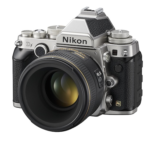
Sitting back and watching the comments unfold about Nikon's Df camera has made for a mildly entertaining distraction today. For anyone who's missed out on the announcement or the teaser videos released in the run-up to its unveiling, this is it: I think it's ugly, but that's me.

The Nikon Df has a 16 megapixel full-frame sensor powered by an EXPEED 3 processor, giving it the same guts as the Nikon D4. Sensitivity ranges from ISO 100 to 12,800, and is extendable to 204,800. It has a maximum continuous shooting speed of 5.5 frames-per-second, 39 point auto-focusing system, and pre-AI lens compatibility but no capability to match its retro-looks. It (and a 50mm ƒ/1.8G) also comes with a £2,750 ($3,000) price tag.

Mostly, the comments have ranged from 'Oh my good freaking deity of choice and all commensurate attendees, I have to own this camera right now and will sell a kidney to fund it!' to 'What a stinkingly ugly camera! Anyone prepared to pay that much for something that looks as if it has been welded together for spare parts must have more money than sense!' They do, however, go via: 'It had me until I saw the price,' and 'No video? It's not for me.' Even the more tempered comments are laced with a sense of disappointment or disbelief.

It's a camera that has divided opinions and caused people to talk. Lee Morris, over on FStoppers, has described it as a camera that exemplifies everything that is wrong with photography right now. That's not to say that the camera itself is terrible and awful, but that the current retro-obsession has maybe gone too far and that cameras have become fashion accessories rather than tools. Jaron Schneider, another FStoppers contributor, takes a different tack. He calls it a camera 'to remind you why you are a photographer.' There's very little by the way of ambivalence, and that is a good thing.

Why do I think that? I think that Nikon's produced a concept camera. It's expensive. It costs less than the D4, but it's still an almost-£3,000 camera. It has particular appeal with its capabilities and ergonomics. Many people will appreciate the dials and its old-school-lens-love, but it doesn't shoot video. For some people video's an irrelevance, for others it's a deal-breaker. I also happen to think it's ugly. That, however, is a matter of personal aesthetic preference. And to be truthful, I think I'm done with the retro-thing (although I will admit that I think Fujifilm has its styling right in this respect). I'm also entirely sick of the onanism that's taking place over it. That, though, is probably the point.

It's not meant to be a camera for anyone and everyone, it's meant to be a camera that gets people talking and it has certainly accomplished that.

Nikon's created a camera because it can. Not because it's ground-breaking or the market is baying for it, but because it has the creative latitude to do so. There are at least three reasons why I've absolutely no desire to own a Df, but if it's the kind of camera that reminds people why they love photography, then more power to Nikon.

So long, Everpix

Everpix, the San Francisco-based photo management and organisation app, has announced that it has commenced shut down of its service and will cease operations entirely on 15 December 2013. The idea behind Everpix, founded in 2011 by two ex-Apple employees and an ex-Odopod designer, was to bring organisation to the thousands of photos that we all have, scattered across different devices, sorting them according to creation date, making them searchable, and allowing you to share them easily by email, photo page, or social media. According to the Everpix team, in a blog post, 'We were unable to secure sufficient funding in order to properly scale the business, and our endeavors to find a new home for Everpix did not come to pass. At this point, we have no other options but to discontinue the service.'

There are full details on the shut-down process on its support site, and users will be emailed in due course, too. But the team has assured users that their images will be available for download until 15 December 2013, they will receive refunds on the cost of their apps, and their data will not be sold or transfered to any other companies. From now on, no one will be able to sync images from their devices to Everpix and sign-ups have been suspended.

You'd think with so many million photos in existence, there would be ample demand, but Everpix's demise proves that it isn't easy money. The image storage, sharing, and back-up space is a crowded place. Everpix isn't the first, and I doubt that they'll be the last, especially now that the likes of Flickr and Google+ offer oodles of free storage and the beginnings of automated back-up. If nothing else, please remember not to place all of your eggs in one basket.

Alamy changes payment structure; Photographers complain; Alamy backs down

'Okay, hands up... we got it wrong and we’re sorry we messed everyone around.' That's a fair admission from a company that manages millions of images and millions of pounds-worth of sales every year. It happens to be the response from stock house Alamy to the backlash it faced from its contributing photographers when it recently changed its payment protocols. In a move that gave with one hand but took with another, it announced that it would be lowering its payment threshold from $175 to $100—allowing photographers to be paid more frequently for their sales—but that there would be fees for some methods of payment. Get your money more often, but pay for the privilege. This didn't go down very well with Alamy's contributing photographers. Not very well at all.

Hence the apology, the admission that it got it wrong, and the redrawing of the payment thresholds. Again.

From the December payrun onwards, Alamy photographers only have to accrue $75 in fees before they can be paid and no transaction charges are being applied, regardless of the currency selected.

According to Alamy: 'We respect our photographers, you’re important to us and we want to be fair.' They also appear to listen, which is somewhat refreshing.

(Hat-tip to Will)

Lollipod: versatile, light-weight, colourful camera supports

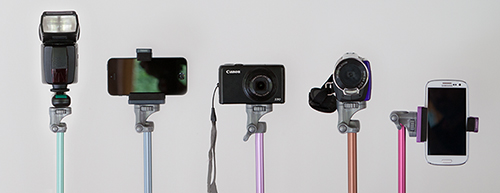
For anyone who has been searching for a light-weight, multi-functional support device, the very thing might just have been announced today. It's called the Lollipod and it is designed to switch between acting as a tripod, monopod, boom, and lighting stand. The Lollipod weighs 320g, is 320mm when collapsed, can extend to a maximum of 1,130mm, and is capable of supporting a camera, flash, or smartphone up to 430g in weight. That means any point-and-shoot should be fine on it and you might get away with a Canon 100D, too. But chuck your camera (or strobe or whatever else) on a set of scales first to check.

Strobe, phone, or point-and-shoot

It comes with a standard fit ball head, which means that you'll need to purchase an adapter to secure your smartphone. Lollipod will be introducing their own universal one sometime early next year. Until then, the team recommends the Joby JM1–1ww GripTight. There's also a stabilising kit for windy days and carrying bag for convenience.

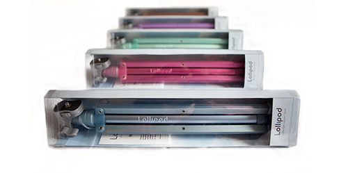
You can choose from gold, dark blue, light blue, hot pink, violet, and minty green and they're on sale at an introductory price of £29.99 (usually £34.99); €37 (usually €41.99); or $48 (usually $55.66), plus shipping. They're not, however, available in Australia, South East Asia, or France. All purchases are made direct from Lollipod.

Pick a colour!

Now, if only someone would develop a microphone-stand-come-tripod; ideal for all those photographer-musicians in the world.