Everything that's hip and cool from EyeEm this spring and summer.
Model releases: when and why you need them
7 super suggestions for selling stock
Love them or loathe them, stock agencies are a significant sector of the photography industry. How else do people who are looking to buy images for use in publications, in advertising campaigns, or on websites acquire them without commissioning a photographer? For some photographers, then, selling stock imagery can be an important source of income. It might not keep the wolf away from the door, but it could well keep the candles burning. In which case, how do you make the best of it? If you're looking to make a bit of pin-money selling your photos, what are the dos and don'ts? If you're already in the stock game, how can you do it better? I spoke to a variety of stock agencies—Alamy, Shutterstock, and EyeEm Market—who kindly shared their words of wisdom to help you make the most out of the stock market.
Content
It might come as a surprise, or it might not, but stock agencies need photos of anything and everything. That's pretty much the entire point of them, you see. Alan Capel, Head of Content at Alamy says: 'Everything can be updated, good photographers will look for a new take on old clichés.' Like me a few weeks ago, people need generic photos of the father-of-the-bride. However, there are particular types of imagery that are preferable and subjects that have growing demand. So think about producing:
- Real-looking, natural-feeling photos; posed and staged photos aren't so in demand
- Photos that are out-of-the-office and out-of-the-ordinary; think oil rig as opposed to desk, farm yard instead of back yard, mountain-top rather than table-top
- Images from the emerging markets: Brazil, Russia, India, China, South Africa
- Healthcare and medical photos
- Anything that documents culture and diversity
- Photos local to you - who else is there to shoot them?
'We’d love to see more adventurous shoots in more unusual locations/scenarios!' says Capel. While he knows that might be easier said than done, 'Photographers are tenacious and resourceful and they will find a way.' And if you're pursuing the emerging markets theme, that should include lifestyle and local culture as well as business and industry photos. Remember: there are consumers in those emerging markets, too!

Is there anything that absolutely should be avoided? Well, if a photo's good, anything goes. But over at EyeEm, they warn people off of pets, pot plants, and predictable self-portraits.
Spotting trends
It's probably a good idea to keep one eye on what's happening now and another on the horizon. Scott Braut, VP of Content at Shutterstock, recommends using social media to gauge trending topics and examining news headlines for common themes (for example politics, pop culture) to help you pick out favourable subjects. But at the same time, think about what might be happening in two, three, or four years' time: Olympic Games, World Cups, centenaries, and anniversaries.

Style
It's always best to stick to what you know best, which is your own style. But Capel says not be afraid of adding another string to your bow by including mobile images—Alamy has the stockimo app for that, and there's the new EyeEm Market, too—and Braut says that photos with Instagram-esque filters are popular.

Selection
Be ruthless when it comes to submitting photos to stock houses: if something about an image doesn't feel right, it's probably wrong. Don't include it.
And both Braut and Capel say the same thing about repetitious photos: don't do it! Make sure that each photo you submit is distinct, so that they don't detract from each other.
Accessibility
People need to be able to find your images to buy and use them. This means that they need to be identifiable through tags, labels, and key-words. Capel suggests thinking along these lines:
- Literal - what is actually in the shot
- Conceptual - what moods, emotions, concepts does the shot evoke
- Photographic – predominant colours, any techniques or treatments used
At EyeEm, their top search terms include the abstract, such as 'happiness' and 'hope' as well as more descriptive, for example 'family' and 'fitness'. Spread your net far and wide, but make sure your terms are accurate.

And don't be afraid to re-visit and re-label photos after you've submitted them. You never know what you might think of with fresh eyes.
Practicalities
Photos that have people in them will require a model release if they're to be used commercially. Logos have to be rights cleared and securing that can be a proper pain. It's much better to do away with labels on bottles, use plain clothing, and hide obvious branding.

Finally
The word that came up again, and again, and again was 'real'. Buyers want imagery that's natural and believable, not contrived. There's a whole world out there waiting to be documented, so go explore!
Photo-sharing app EyeEm launches EyeEm Market - a sales platform for mobile images
Before Instagram hit the app store with its mission to square crop all of our photos and apply one of a dizzying array of filters, there was a Berlin-based start-up called EyeEm that was offering mobile photographers the opportunity to share their images and get to know each other. Instagram might've grabbed the headlines and the Facebook swag, but EyeEm didn't go anywhere. EyeEm quietly grew its network of users to over 10 million and concentrated on helping them to get the most out of their mobile photography with challenges, blog post tutorials, competitions, and allowing mobile photographers to connect with each other. That's paid off and it's allowed EyeEm to start on its next venture: EyeEm Market. It's what it sounds like, a stock house for mobile images on EyeEm. EyeEm users were invited to join by email this morning and the plan is to launch in late spring 2014.

Terms for members have already been set out: 'You always remain the copyright holder of your images and make 50% net revenue from each photo you sell.'
While EyeEm hasn't disclosed the details of the potential buyers it has approached, it's confident that it could be helping its users to take their first steps into a new branch of the professional image market. To that end, it's published some image guidelines for those who are hoping to make some sales. This includes no pets, no plants in pots, and no selfies (unless they're particularly unusual); and to concentrate on the holy trinity: business, health, and family. Not forgetting geo-tagged landscapes and images that can be hard to otherwise get.
Is this another nail in the coffin of professional photography, showing how everyone can now be a photographer and make money from their smartphone cameras? Regard the situation from one stand-point, and yes, that is exactly what EyeEm Market means. But think about it from a slightly different perspective and it demonstrates how the image market place is changing.
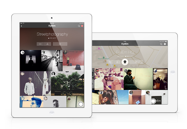
Photo-buyers want mobile images. They're part of the photographic landscape now—part of the zeitgeist, if you will—and we can't put the genie back in the bottle. Instead, we have to embrace it. If we can present photo-buyers with an adequate means of accessing and paying for the images that they want, there's a chance it will drive up quality and ensure that the creative industries are rewarded adequately. It's a damn sight better than images being used without recognition and without recompense because there's no means of buying them.
We can't ignore the market; we have to seize all the opportunties that it presents.
And EyeEm has seized its opportunities and shown that there's more than one way to make a buck from photo-sharing apps.
Alamy changes payment structure; Photographers complain; Alamy backs down
'Okay, hands up... we got it wrong and we’re sorry we messed everyone around.' That's a fair admission from a company that manages millions of images and millions of pounds-worth of sales every year. It happens to be the response from stock house Alamy to the backlash it faced from its contributing photographers when it recently changed its payment protocols. In a move that gave with one hand but took with another, it announced that it would be lowering its payment threshold from $175 to $100—allowing photographers to be paid more frequently for their sales—but that there would be fees for some methods of payment. Get your money more often, but pay for the privilege. This didn't go down very well with Alamy's contributing photographers. Not very well at all.
Hence the apology, the admission that it got it wrong, and the redrawing of the payment thresholds. Again.
From the December payrun onwards, Alamy photographers only have to accrue $75 in fees before they can be paid and no transaction charges are being applied, regardless of the currency selected.
According to Alamy: 'We respect our photographers, you’re important to us and we want to be fair.' They also appear to listen, which is somewhat refreshing.
(Hat-tip to Will)
Instacanvas is now Twenty20, but how is its vision?
Did you hear of Instacanvas? It was a canvas printing company devoted entirely to Instagram images. You could link your Instagram account to their website and choose your favourite filtered, square-cropped photo to hang on your wall. Or, you could establish your own gallery and let other people wander through your photos and select your Madagascan sunset to adorn their living room. The idea was that it freed people from the tyranny of mass-produced images supplied by Swedish furnishing behemoths and instead provided them with the opportunity to choose from millions of photos created by people like them. Matt Munson and Instacanvas' other co-founders wanted to let people buy and sell images without a curatorial middleman. Smartphones have brought photography to everyone; why can't everyone benefit from the plethora of photos?
Plenty of people agreed with that sentiment.
Instacanvas has grown enormously since those first heady days when it went public in May 2012. Its range of products has grown, although your public gallery remains Instagram-only you can upload photos from other sources to print for yourself, and the number of photos on its books is in the region of 30 million. It's perhaps this achievement, and the potential that it holds, that has led to Instacanvas' next steps.
It's now called Twenty20 and it is venturing into the stock image market. With a book of images to rival Fotolia or Shutterstock, how are things shaping up for this 13-person operation based in Santa Monica?
I have to say that my first experience with Twenty20's website didn't get off to the greatest of starts. For anyone who lives in a cricket-playing country, your first Google hits for 'Twenty20' will be about the limited overs form of the game. Don't forget to modify 'Twenty20' with 'canvas' and things should be better. When you hit the splash page you're faced with something attractive, but utterly uninformative. There's no mission statement or suggestion as to what it is or does, there's no 'About Us' link or 'Contact us' option, and there's no indication as to how to access what lies beneath. How frustrating!

Eventually, I learned that in order to be able to find out what Twenty20 is all about or just to peruse its wares, I needed to register. My gut reaction to this was that it felt in someway deceptive; now I'm more inclined to perceive it as absurd. Why actively try to prevent people from learning more about your company by demanding information from them? I persevered because of professional interest, but would someone who's casually looking for wall art?
Taking this a stage further, would someone who's looking for stock imagery be bothered to sign up and then navigate to the stock pages when you can rock up at Shutterstock, Fotolia, or iStock, type your desired subject into the search box on the front page and be presented with pages of findings immediately?
Munson told me that forcing people to register is a recognised tactic to encourage interaction on social media sites and it's something that other social media sites employ, for example, Twitter. It's an interesting theory, but I'm not sure it's quite the right approach for Twenty20. For a start, Twitter's splash page isn't link-less or a desert of information, and Twitter is rather more well known than Twenty20. When your aim is to convince people to part with their money, you need to do everything that you can to lure them in, rather than push them away. Twenty20 might have its roots in social networking, but ultimately it's about sales and this has to be as easy as possible.
Once people have been lured in, selling products via Twenty20 is refreshingly simple. Signing up with Instagram means that your images are there, ready and waiting to be made into prints or prisms to hang on your own walls, or to be curated into a gallery ready for anyone else to peruse and transform into something to hang on their walls. You don't set your own fees, they're standardised, which makes it easy for buyers and you know that you'll always take a 20% cut of the sale.
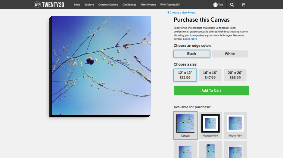
Although the pricing structure for digital image files is uncomplicated: $20 per image, with discounts for bulk buys, acquiring them isn't quite as easy. You need to contact the Twenty20 team to proceed. I'm hoping that this is merely a teething problem in Twenty20's new venture. First because it puts it on the back foot when compared with other stock houses; second because this is where I think that Twenty20 could excel. Imagine how much easier it would be to buy and sell news-oriented Instagram images via Twenty20, rather than have them used fee-free by news publications? Wouldn't it be great if your skinny-no-foam-latte photo is the one favoured by wannabe-hipster food blogs? (If they were real hipsters, they'd be using their own Instagrams, clearly.) But this relies on the system becoming faster and easier to use: instant access to your Instagram images.
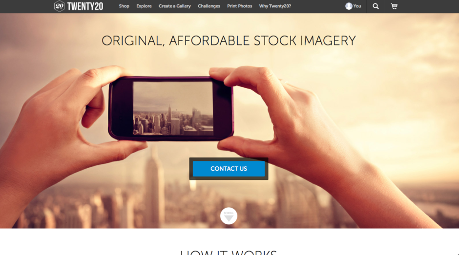
When you have crossed the drawbridge, negotiated the portcullis, passed through gatehouse and into the bailey, and finally made your way into the keep that is Twenty20, there are some beautiful products for purchase and a welter of images for sale. It's such a shame that Twenty20's website design has made everything so inaccessible. Indeed, it's ironic. It's a company that's built on the principle of bringing the wealth of gorgeous digital media that languish in the aether onto people's walls and breaking down the barriers that sit between digital artists and their potential clients that have been erected by the curators of galleries and stock houses. There might not be any curatorial gate-keepers accepting or rejecting images, but there are technological ones discouraging people from making use of Twenty20.
If Twenty20 wants to truly realise its vision, I think it needs to follow through with its technological accomplishments to the same degree as its ideological principles. The theory's simple; keep the practicalities that way, too.
PhotoRankr is a photo sharing site where you can sell them, too
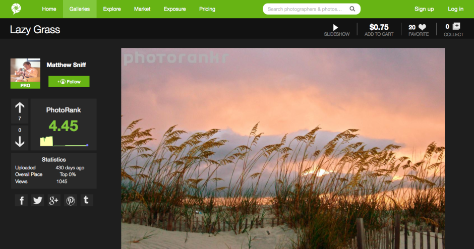
It's easy to think that there are far too many photo-sharing websites in the world. How many can you name in the next ten or twenty seconds? And how many of them meet your needs and expectations? For brothers Jacob and Matthew Sniff, the fact that these sites didn't meet their expectations inspired them to build their own; they called it PhotoRankr. It's a platform that gives photographers the ability to share and sell their work in one place. It's a social network where photographers can interact, learn from each other, and rate each other's images in a gamified setting. It's an online marketplace where they can sell their images at their own price. And it provides photographers with portfolio hosting to help them make the most out of their photography.
Does it work?
PhotoRankr was built by photographers who felt frustrated that their images weren't accepted for sale by the major stock houses. They wanted anyone who takes photos to have the opportunity to be able to sell her or his work. As Jacob Sniff puts it: 'It’s a fact that more people who [sic] have it [photography] as a hobby than as a profession, and the barrier to entry is low. Yet, no site openly allows for anyone to sell images today and this is a mistake.'
In addition, they've attempted to make it more appealing to photographers by building in the social elements that bring success to sites such as Facebook and Flickr. In particular, rather than having a picture editor determine whether or not a photo makes the grade, any photo is allowed to be displayed on PhotoRankr, but the community votes it up or down.
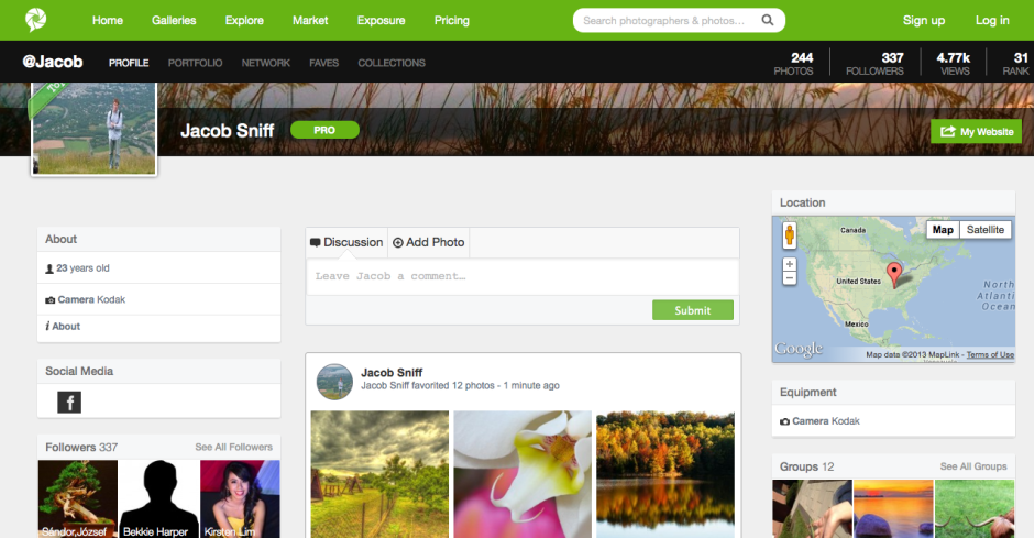
It's a reasonably priced platform, providing photographers with three subscription options. There's a free account to which they can upload 30 images each week, charge up to $20 for them, and retain 60% of sales. The 'Plus' account ($40/year) allows for 10GB of uploads, has a $100 price cap, and a 70% sales retention. Those subscribing to a 'Pro' account ($100/year) have no pricing limits, no upload limits, and retain 90% of their sales fee.
The aim is admirable, but being so photographer-oriented is also the site's failing. In constructing a platform aimed at photographers, they haven't paid as much attention to the buyer as they should have.
First, what type of buyer are they attempting to attract? Are they attempting to create a more stock-house model, with digital image files provided for professional use? Or are they aiming at the fine art market, with canvas prints? Not all images are able to be purchased as prints, but all are available as digital files; however, there's a distinct feeling that the collection is more skewed towards hanging on the wall than inclusion in corporate booklets.
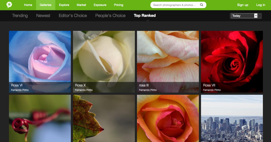
Stock houses work because they provide a diverse spectrum of images; these images include subjects that aren't necessarily pretty or compelling, are perhaps obscure, but are still in demand. Examples would include factories, rotting meat, or ploughed soil. When you introduce the social element into ranking images, it's going to be those that are appealing and attractive that rise to the top, not necessarily those which are needed. You'll end up with a market where the photographers are at risk of serving themselves and their social ranking, rather than the customers.
If the intention is to allow people to hang images on their walls, there needs to be a more streamlined process that allows buyers to see more easily in which formats their chosen images can be purchased. Some are available as canvases, some as posters, some as postcards, some not at all. It isn't obvious immediately, though.
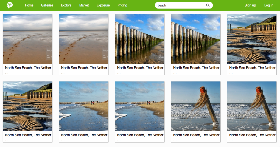
Second, searching for images suffers from a few hiccoughs, too, with duplicates appearing with alarming frequency.
Finally, the purchase interface requires some refinement. The licence agreements are buried away in the bowels of the terms and conditions section, rather than being a click away from each photo. Anyone buying an image needs to be able to identify how they're able to use it quickly and easily. Chashing through the website is not user-friendly. The shopping cart page does not render properly, which makes it unappealing for purchasers. And there is no easy means to access your shopping cart from the front page or a search page. This makes browsing after you've made a selection and then wanting to return to the cart without attempting another purchase impossible. It might be easy for a PhotoRankr photographer to sell her or his images; but it isn't easy for the public to buy them.
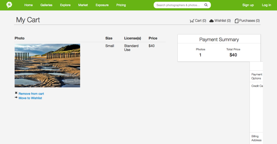
I think PhotoRankr needs to consider what it wants to be and what its priorities are. Is it a 500px-style community of photographers that offers sales on the side - in which case, they're already competing with an established market. Or are they a sales site where consumers can find what they want and need, purchase it easily, and provide photographers with a useful sales platform? If that's the case, they need to pay some more attention to the customers.
If PhotoRankr can decide on its direction, and clean up its sales mechanism, I do think that it has potential. And I don't want to see the work of a dedicated group of people come to nought.
OJO Images joins the iStockphoto stable
Microstock megalith iStockphoto has announced that it's added another house to its stock photography village in the form of OJO Images. From today, all of OJO images 31,000 royalty-free files will be available exclusively through iStockphoto, which is in turn a part of Getty Images. They're expecting the number of files to increase to 45,000 by the end of October this year. Between its ever-expanding image archive and a new long-term pricing strategy, which prices half of its image library at half price, iStockphoto is claiming that acquiring content is now easier (and cheaper) than ever for those who need it. That's great for publications and companies, but not necessarily for photographers who sell their images as stock.
It isn't just iStockphoto that's owned by Getty; so are Jupiter Images, Thinkstock, Clipart.com, and Stock.XCHNG. As the centre of stock photography power gravitates closer and closer to Getty Images, we're drifting towards a situation that affords people who try to sell their images fewer options and fewer rights. The unpalatable Getty contract is one issue; so is the inability of smaller, more fairly priced stock houses competing against the image behemoth. Piled-high sold-cheap images from one of the biggest names in stock photography are easy for businesses in need of images to buy and use and harder for photographers to make a living by selling.
One man's tea is another man's poison, I suppose.


