Photo walks are fun to participate in, but also not that hard to organise. You might want to think through a few things first, though.
My favourite tools have disappeared from Snapseed! Help!
The unlikely and serious consequences of teenage sexting
An 18 year old and a 19 year old are in a relationship. They're committed to and respectful of each other. They enjoy consensual sex and every now and again they share a naughty photo. A 16 year old and a 17 year old are in a relationship. They're committed to and respectful of each other. They enjoy consensual sex and every now and again they share a naughty photo.
What's the difference? Both couples are over the age of consent and no one is being forced into doing anything they do not wish to do. Yet the younger couple is breaking the law. By sharing photos of themselves, they're distributing indecent images of children. They are, of course, under the age of 18 and therefore still children. That they are accustomed to each other's bodies in the flesh means nothing when they're pixillated.
The penalty for distributing indecent images of children is much more serious than a slap on the wrists, too. It can result in being placed on the sex offenders' register. For anyone, that is a life-altering punishment; for someone who is 16, it could be life-ruining.
This issue has been brought into the public consciousness again (it raised its head towards the end of last year) after Nottinghamshire Police sent a letter to schools in the county asking them to advise their pupils about the potential consequences of 'sexting'. Recently, the police have dealt with several cases where sexting has taken a turn for the nasty, and while they've not prosecuted the young people involved, the outcome could have been different.
Much of what I've been reading around this topic today—for it seems to be overtaking the BBC—involves admonishing young people not to be so stupid or to consider the consequences of their actions should these photos make their way onto the Intergoogles; invokes despair that young people are capable of such recklessness and disregard for other people's feelings and reputations; or it criticises their lack of self-respect and gutter behaviour. There's also a great deal of concern about the pressure that might be applied to young people to take and share lascivious photos when they really don't want to.
Some of these concerns are valid. The teenaged equivalent of revenge porn can be deeply painful and horribly humiliating with tentacles that spread much further than school. While its perpetrators might be content to wreak harm and havoc on those whose images they share, I doubt that they realise just how extensive the consequences can be. As for coercing young people into sharing pictures that they probably wouldn't want to show their parents; it's another of those pressures of conformation piling up on young people: to be thin, to wear particular clothes, to smoke, to drink, to have sex. Between Snapchat and Slingshot and WhatsApp and any other means of sharing an image, we have for ourselves the social media age incarnation of 'I'll show you mine if you show me yours,' behind the bike sheds, except with potentially longer-lasting and farther-reaching consequences.
We cannot and should not tell young people what to do; it's about giving them the skills, the self-confidence, and the information to make their own choices and about providing them with non-judgemental support when they have to live through it. Vilifying them for a lack of self-respect is unlikely to achieve very much.
These are all pertinent points for anyone under 16 who's legally regarded as not being able to give consent. Indeed they remain valid for anyone over the age of 16; but there's a particular issue relevant to 16 and 17 year olds that seems to be overlooked.
There's a disconnect between the legality of their engagement in consensual physical sexual activity and the illegality of recording that same consensual physical sexual activity. A law that's designed to protect young people from exploitation has the potential to criminalise them. I hope that those who have to enforce it apply some common sense to any situations that come their way.
Unpicking Snapseed's Ambiance slider
If you use Snapseed to edit your smartphone photos, you might have noticed the 'Ambiance' slider under the 'Tune Image' settings. Ambiance? Isn't that the mood or feeling you get at a party, not a photographic term? Yes, exactly, and that's why I avoided it for quite a while. I just couldn't figure out how to apply it effectively to my photos. And Google, which owns Snapseed, was hardly helpful. The Google help page ambiance explanation reads:
The Ambiance control is a special type of contrast that controls the balance of light in a photo. It can be used to balance backlit photos or to accentuate contrasts throughout your photo. Swipe right for photos where the subject is darker than the background. Swipe left to increase the contrast of dark objects and create a slight glow around darker objects. This is especially helpful in photos that are slightly flat.
I wasn't aware that there was a 'special type of contrast' available to photographers, just the plain old difference between light and dark, so that was surprising. And it's all very well telling us to 'swipe right for photos where the subject is darker than the background,' but what effect will it have?
As with just about everything associated with photography, the best way to understand it is to use it. So that's how I've come to write this and present you with some compare-and-contrast examples where I have swept the slider both left and right on a series of photos and analysed its impact.
In order to create examples that are clear enough for illustrative purposes, all of the ambiance settings, whether positive or negative, have been exaggerated. Subtlety and demonstration aren't natural bedfellows; that's for the real thing.
Dried berries
Let's start with this image of some dried berries. I've adjusted the white balance to correct for a light temperature that was out by several thousand Kelvin and cropped it marginally, but that's all. It's a good base.

By increasing the ambiance setting by 60 points, you can see that the image has taken on a more reddish tone. The background has also been lightened, but the highlights—say those on the bottom right of the centre berry—haven't become overwhelming, as you might otherwise expect from an increase in contrast. The definition of the berries has improved, but not at expense of the highlights.
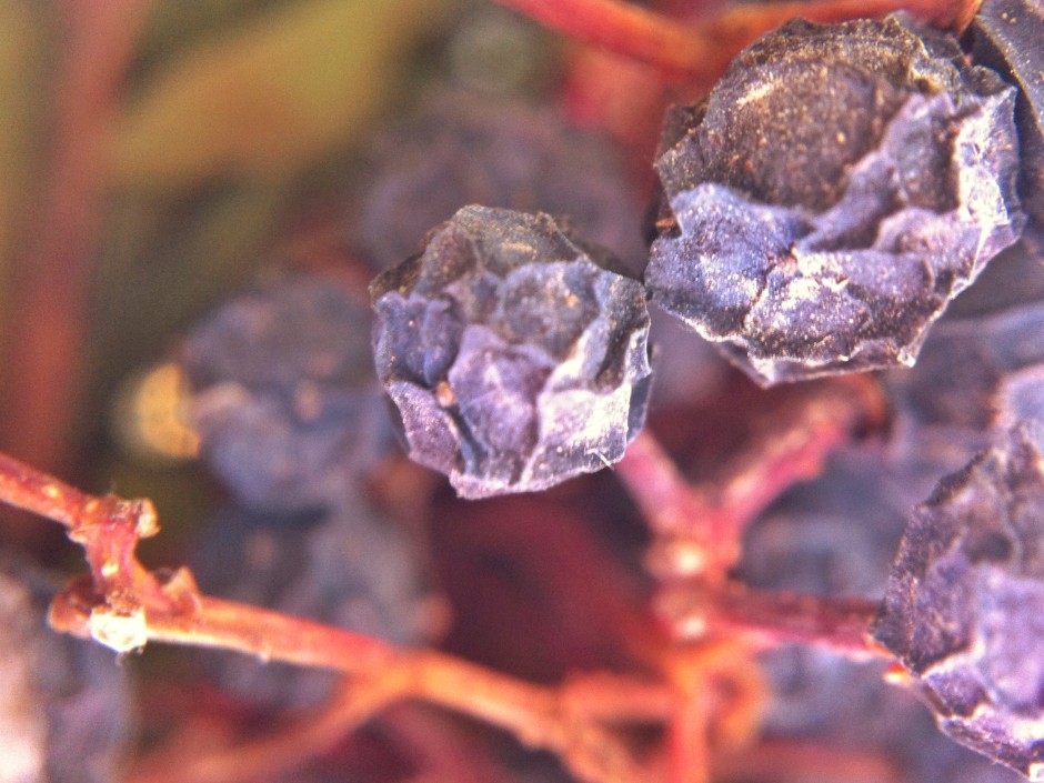
When I swiped the slider to the left and dropped the ambiance by 60 points, you can see that the background became darker, the red tone has diminished, and the berries have become softer looking and less defined. A negative ambiance setting has given the photo a softer, more muted look.

Eva
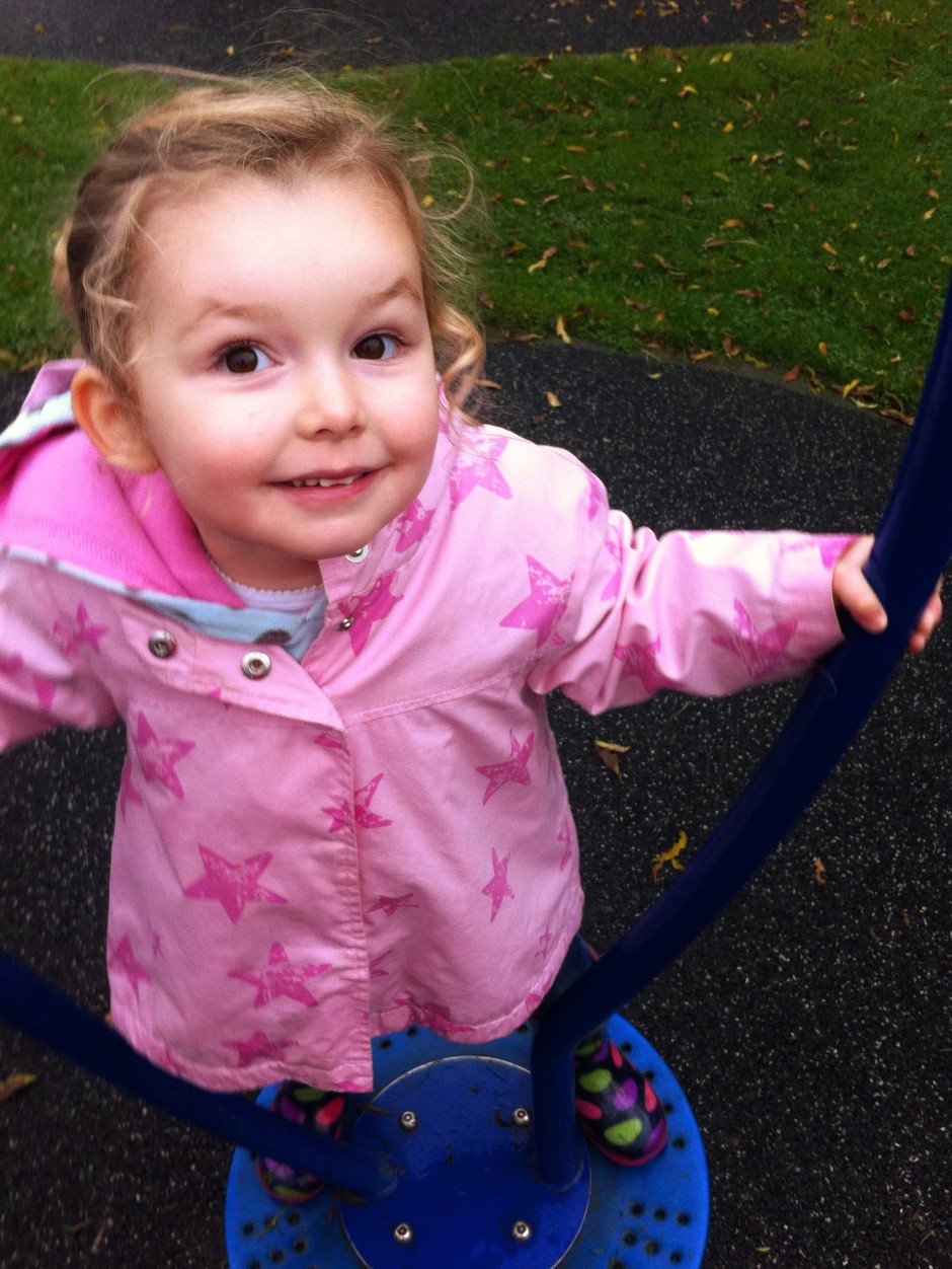
This is my niece, Eva. She's three. She's being spun (by me) on an upright-spinny-device in the park. I've adjusted the original image to correct the white balance, but that's it.
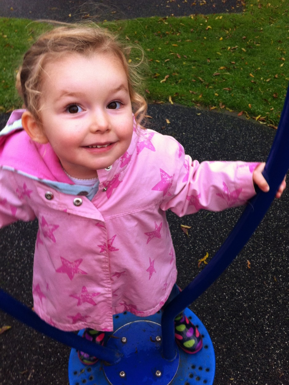
When I increased the ambiance, pushing it to +60 made Eva look as if she's been on a sunbed every day of her life since birth. It was awful. So I went for +30 instead. She still looks comically rosy-cheeked, but not horrifically so. Her coat is an unattractively bright shade of pink, her wellies are deeply saturated, but the grass looks good.
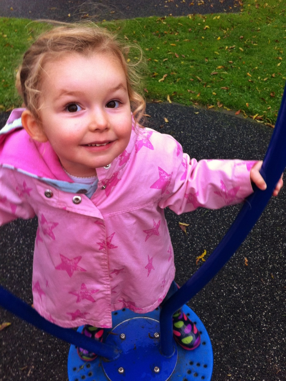
Decreasing the ambiance to -30 had a rather pleasing effect, though. Her skin became more milky and the darker background helped her to gain even prominance in the image. I reckon that decreasing it even further could make for an even better look.
Me
Having tried increasing ambiance in Eva's portrait to unpleasant effect, I didn't even bother trying it with my self-portrait. Decreasing the ambiance, this time to -100, was effective, though. I'm not sure if I prefer the original (again, slightly cropped and heavily adjusted for white balance) image or the edited one, but it's a good demonstration of the tool and shows how it gives a more muted feel to your photos.


Having a swipe and swish with the ambiance slider is definitely something to be considered when you're fiddling with your smartphone photos. The general rule seems to be that left is great for portraits and go right a bit for still lifes. But every photo's different. And maybe 'ambiance' isn't such a terrible descriptor, either. One way is more lively and bouncy and the other more muted and moody. Just like the atmosphere can be at a party.
EyeEm and Getty Images team up to licence mobile photos
You might be thinking that EyeEm, a mobile photo-sharing app, and Getty Images, the international stock agency, have been in the news enough this week. On Sunday EyeEm announced that it is establishing EyeEm Market, a means for its members to sell their mobile photos and today Getty Images unveiled its new embed feature that will make 35 million images free for use in non-commercial contexts. Now, though, they've teamed up to announce that Getty Images will be making EyeEm images available for licensing across its platforms, including iStock by Getty Images and a bespoke Getty collection. For EyeEm, this places their users' images on a huge stage with millions of potential buyers for royalty-free and rights-managed licences. As Florian Meissner, EyeEm's CEO said: '... now because of our partnership with Getty Images and their extensive distribution network, members of our community will have a great opportunity to earn revenue from their creative work.'
From Getty's perspective, Craig Peters, SVP Content, Getty Images says: 'We are seeing increased demand for fresh, original content that reflects the world as consumers see it, so we are pleased to be partnering with EyeEm to open up this collection to our customers and to provide this talented community of photographers with a new revenue stream.'
Whatever anyone might wish to say about the death of professional photography, Getty perceives that there's a need for mobile images and EyeEm is able to fill it. We can't make it go away by ignoring it, so we might as well embrace it.
It's exciting times for Getty, EyeEm, and mobile photographers.
Photo-sharing app EyeEm launches EyeEm Market - a sales platform for mobile images
Before Instagram hit the app store with its mission to square crop all of our photos and apply one of a dizzying array of filters, there was a Berlin-based start-up called EyeEm that was offering mobile photographers the opportunity to share their images and get to know each other. Instagram might've grabbed the headlines and the Facebook swag, but EyeEm didn't go anywhere. EyeEm quietly grew its network of users to over 10 million and concentrated on helping them to get the most out of their mobile photography with challenges, blog post tutorials, competitions, and allowing mobile photographers to connect with each other. That's paid off and it's allowed EyeEm to start on its next venture: EyeEm Market. It's what it sounds like, a stock house for mobile images on EyeEm. EyeEm users were invited to join by email this morning and the plan is to launch in late spring 2014.
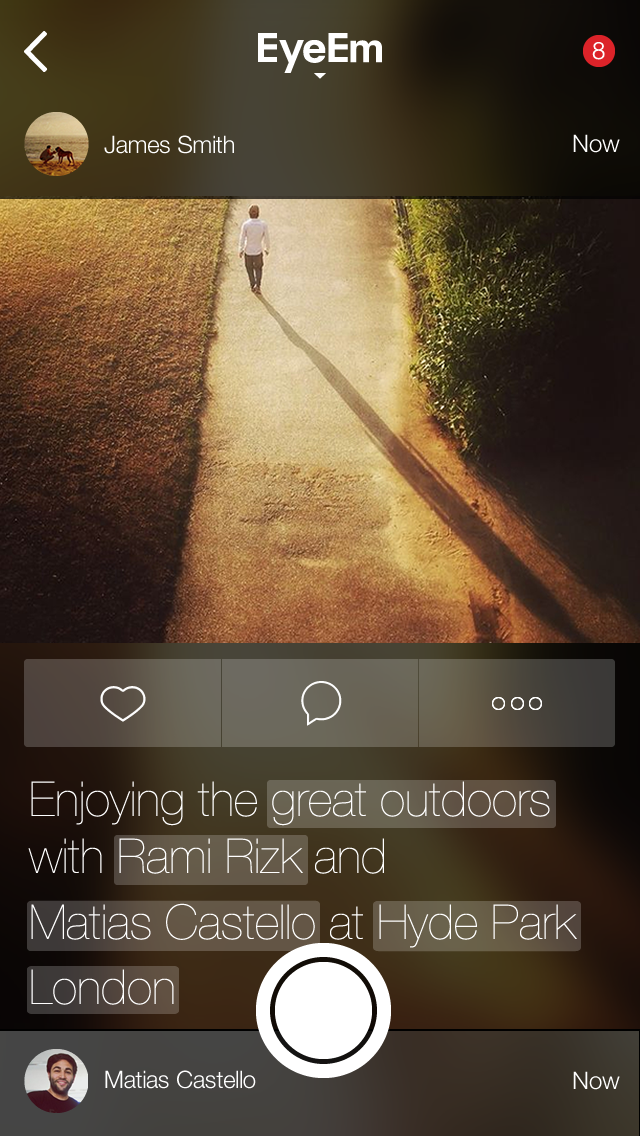
Terms for members have already been set out: 'You always remain the copyright holder of your images and make 50% net revenue from each photo you sell.'
While EyeEm hasn't disclosed the details of the potential buyers it has approached, it's confident that it could be helping its users to take their first steps into a new branch of the professional image market. To that end, it's published some image guidelines for those who are hoping to make some sales. This includes no pets, no plants in pots, and no selfies (unless they're particularly unusual); and to concentrate on the holy trinity: business, health, and family. Not forgetting geo-tagged landscapes and images that can be hard to otherwise get.
Is this another nail in the coffin of professional photography, showing how everyone can now be a photographer and make money from their smartphone cameras? Regard the situation from one stand-point, and yes, that is exactly what EyeEm Market means. But think about it from a slightly different perspective and it demonstrates how the image market place is changing.
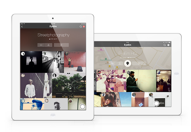
Photo-buyers want mobile images. They're part of the photographic landscape now—part of the zeitgeist, if you will—and we can't put the genie back in the bottle. Instead, we have to embrace it. If we can present photo-buyers with an adequate means of accessing and paying for the images that they want, there's a chance it will drive up quality and ensure that the creative industries are rewarded adequately. It's a damn sight better than images being used without recognition and without recompense because there's no means of buying them.
We can't ignore the market; we have to seize all the opportunties that it presents.
And EyeEm has seized its opportunities and shown that there's more than one way to make a buck from photo-sharing apps.
SmugMug's Camera Awesome now available for Android
Riding high on the success of Camera Awesome for iOS, SmugMug has released Camera Awesome for Android. Camera Awesome lets you take control of your smartphone photography with creative editing features that includes special effects, pre-sets, filters, and frames. You can also share photos straight from the app, whizzing them to social networks or via email and text to family and friends.
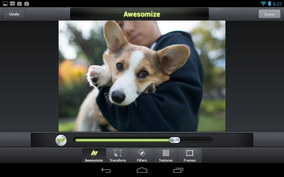
So as to make Androind users feel loved and not left out because they had to wait, there are some Android-specific features for them to enjoy, too. These include:
- Shooting modes that include high-speed burst, panorama, and HDR
- Anti-shake video mode for video image stabilization
- Face recognition and tracking to automatically identify and track multiple faces in a shot to keep subjects in perfect focus
- ISO, White Balance, and Exposure: power users can choose from multiple white balance modes, exposure compensation values, and manually select ISO settings from 100 to 1600
- Resolution settings that allow you to shoot both photos and video in multiple resolutions
- Selective Editing that lets you add or erase a filter to particular areas of an image at a touch
- Sharing: in addition to sharing on Facebook, Twitter, Sinaweibo, Google+, Instagram, Photobucket, Picasa, Tumblr, YouTube and Flickr, you can now share to any other services via supporting apps installed on a device
Camera Awesome costs £1.87 on the UK Google Play store or $2.99 in the US. If you'd like the iOS version, you can find it in the App Store here.
Instagram, meet Windows
It has only taken three years since Instagram's launch and 18 months since the Android app was released, but people using Windows phones will no longer have to indulge in techno-shenanigans or work via third party apps, some of which pushed Instagram's patience, to access Instagram. The news was made public at the Nokia World conference in Abu Dhabi earlier today and then confirmed by Instagram. According to Instagram's CEO, Kevin Systrom, 'Our ultimate goal is to bring Instagram to everyone who wants to use it.' As a consequence, an Instagram app will be rolled out to Windows phones users in the next few weeks.
With Windows phones being all dressed up in terms of cameras but having fewer photo sharing parties to go to, Nokia and Microsoft had been pushing for Instagram compatibility with their devices for quite some time. As far as they were concerned, the lack of access was something that gave iOS and Android platform phones a significant edge. How much this changes anything with respect to numbers and sales figures remains to be seen, but Nokia and Microsoft are certainly feeling quite happy about this right now.
(Headsup to the Verge)
Flickr updates its iOS app
A shiny new update has just appeared in my app store app for Flickr. It's not one of those 'Minor bug fixes' updates, but includes six bullet points of improvements. It is a filter-heavy update, but there are some major changes to the editing features, too. The app has lost its Aviary editing appearance, and Flickr has said that the team who created it were from the recently acquired KitCam and GhostBird software outfits. The look is new and so are the tools.
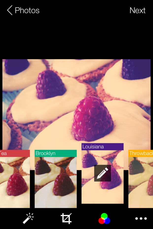
Gone are the previously animal-named filters; instead there are 14 new filters, some with names that give you idea of what to expect, like 'Antique' or 'Lomo' others that, quite frankly, seem to be plucked out of the aether. Say, 'Dublin' or 'Louisiana.' These can be applied 'traditionally' in post-production, or 'live' as you take photos in-app.
If you're using the Flickr app to take photos, rather than the iPhone's native camera app, there are focus and exposure lock options, a pinch-to-zoom tool, and a grid to assist with composition.
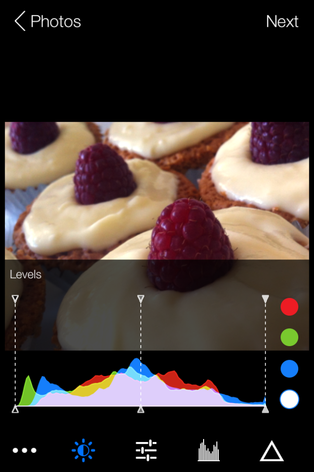
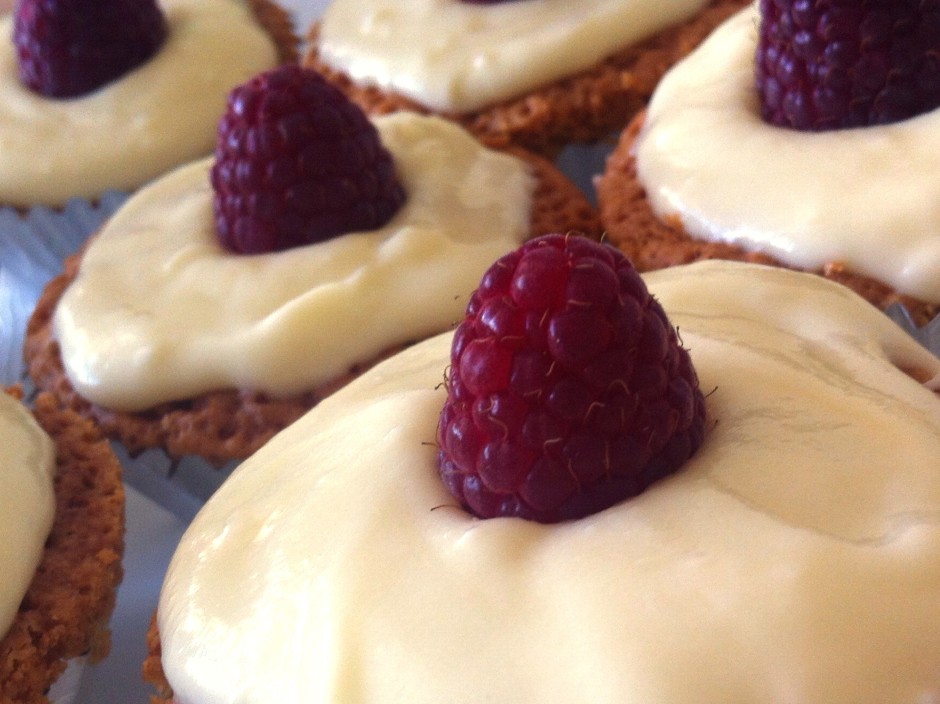
The new editing tools are a more sophisticated selection than before. They include the usual, like brightness, contrast, and white balance, but extend to colour balancing with red, blue, and green channels, a levels tool, and a sharpening function. The crop function allows you to flip and rotate images as well as straighten them. I must say: I don't find the pinch-to-zoom crop function that intuitive to use. Neither am I keen on my cakes being upside down, but you never know when you might need it.
It's possible to add customisable vignettes, linear or radial tilt-shift effects, colour bursts, and worn effects to your images, too. (If you're struggling to find those, they're hiding beneath the filter icons.)
The animated transitions for the camera and editing tools that are meant to provide users with 'the best camera experience yet' might be over-egging the pudding a little, but this is an update that suggests Flickr's mobile focus is sharpening. Far more control is being placed in the hands of the people who are using their mobile phones to take photos. It's a sign of the maturation of the mobile photography phenomenon.
Using a variety of different apps to achieve the effect that I want for my photos isn't something I've shied away from. I'll happily bounce between my iPhone's camera app, Snapseed and ColorTime for editing (and maybe other apps like Juxtaposer for more extreme effects), and Flickr for sharing. With this update, it seems that Flickr is trying to make itself into a much more rounded photo-making and photo-sharing facility. I've not spent enough time with it yet to determine if it's enough for me to leave behind Snapseed, but that's certainly Flickr's intention. It's both serious and playful: so can it successfully appeal to both sides of the market?
Oh, and I've noticed that the Flickr 'r' is now purple - bringing a touch more Yahoo! to the blue and pink of Flickr.
How exciting is the iOS 7 camera app?
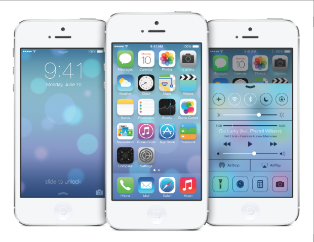 Whilst everyone else is arguing about whether the new flat design and Crayola coloured icons that comprise iOS 7 are genius or travesty, shall we take a look at what's been updated, reshuffled, and introduced camera-wise?
Taking on an iPhotos feel, photos are now automatically organised into 'moments'. It's a twee name for a fairly neat concept: images are sorted and labelled geographically and temporally using their metadata. This will let you search photos you've taken in one particular location by date. It's a more sophisticated digital version of having holiday albums sorted by year and place, with each photo captioned; you can see all the photos from one place organised by date, too.
Airdrop will allow you to drop an image into someone else's iPhone over the same wi-fi network. If we can Airdrop to other devices, for example a MacBook Air, that'd be neat.
Photo Stream already allowed you to share with your friends and for you to comment on their streams; now you can insert your photos into their shared streams, creating a collective album.
Moving between camera, video, panorama mode, and the square crop feature is managed by a swipe. Yes, you read that right, there's a square shooting mode built into the camera app, along with a range of filters. It feels like a dreadful disease that afflicts smartphones. With any luck, it's a childhood illness and everyone will grow out of it soon.
The conclusion? There's nothing revolutionary or even exceptionally exciting here. It feels more like a consolidation of features and in some respects even a game of catch up. That's not to say that sharing images via Airdrop isn't a welcome addition, it's just that it isn't setting alblaze the world of mobile photography.
Sharing mobile phone photos with EYE'EM

Do you have a camera phone? Do you use it all? Ever wonder what to do with your pictures? As the mobile photography movement continues to gain popularity, various methods of sharing these phoneography masterpieces have popped up across the scene. David Smith tells us about more about one of the latest to appear.
It’s called EYE’EM, a Berlin-based mobile photography platform that allows users to upload their photos and share them with the rest of the world. Founded in January 2010, EYE’EM hit the ground running and launched their first competition in March, receiving more than 3000 entries. The winning images were displayed at an exhibition at Schlechtriem Brothers gallery in Berlin, with finalists also having their work featured in the EYE’EM Annual, a book dedicated to the world’s most talented mobile photographers.
How it works
EYE’EM streams users’ photos in real-time as they’re uploaded to the site. Simply create a user profile and click on the site’s uploader to begin sharing your work with the invite-only community. You can tag your photos, comment on others’, and even share via Twitter and Facebook. EYE’EM is currently working on mobile apps for multiple devices to make uploading photos even easier.
What’s next for EYE’EM?
Following the success of their first competition in March, EYE’EM has recently announced their Second Mobile Photography Exhibition of 2010, this September in New York City at the renowned Openhouse Gallery. The exhibition will feature fine prints as well as digital screens displaying the crème de la crème of all photos submitted to EYE’EM’s platform.
The featured submissions will be selected by an international panel of photographers and other creatives, as well as by the EYE’EM community through the ability to like, comment, and share photos. Also included will be images from select NYC mobile photographers that have made an impact on the scene over the last few years. Submission deadline is 5 September. All you have to do to is upload your best mobile shots: the EYE’EM community will take care of the rest!
Just the beginning
With continuous advances in mobile phone cameras and software applications, you can be sure to see more competitions and websites like EYE’EM to help mobile photography gain acceptance as a legitimate art form. More and more photographers are using their mobile phones everyday to add an alternative lineup to their portfolios, as can be seen on EYE’EM’s live-stream.
EYE’EM is an invitation-only community, but they’ve given us 30 invites. So if you feel like having a go, first 30 comments will win the goodies. (Just remember to put your e-mail address in the e-mail field. We won’t publish it, but if you don’t, we won’t be able to contact you!)
But now, I think I’ll go upload my latest iPhone masterpiece: “Darth Tater.”


