When you hear the term 'high-res' thrown about with such abandon when it comes to images for web use, have you ever stopped to think just how big or how high quality and image meant for the web needs to be?
From screen to print with Printhug and IFTTT
Tell the truth, how often do you print any of your photos? And how often do you go to have a selection of your images printed only to be deterred by the prospect of having to upload them to a print company's website, which always seems to be a slow process, and then prevaricate about their sizes and formats? If the answer to the first question is 'not very often' and if the answer to the second question is 'more often than I'd like', then photo print service Printhug has an IFTTT-based solution to transfer images from digital to print with the minimum of fuss.
Should you have not heard of IFTTT, it's an automation programme that allows you to write 'recipes' to connect various apps and services in your digital life (IFTTT calls them 'channels') in order to do things. All recipes are based on the statement 'If this, then that.' If you do something on one channel, this prompts an action in another channel. If I publish a new article here on Photocritic, a tweet is posted on Twitter linking to it.
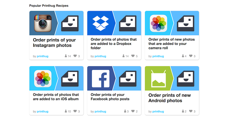
With Printhug, you extrapolate the IFTTT theory to 'If I post an image to Instagram and tag it #printhug, then Printhug will print it.' You can substitute 'Instagram' for 'Facebook' if you prefer. Or have the images that you upload to a particular Dropbox folder sent to print without any fuss.
Print orders can be aggregated from several different sources, for example Instagram, Flickr, and Facebook, and a minimum order can be set, too, ensuring that you accumulate a viable number of prints before they're mailed to you.
Square photos are automatically printed in 4×4" format (49¢ each), while you've a choice of 6×4" (49¢), 7×5" (89¢), and 10×8" ($3.49) rectangular prints.
Printhug ships to USA, Australia, Canada, France, Germany, Ireland, Italy, Mexico, New Zealand, Spain, and the United Kingdom. How much it'll cost will depend on how much you order.
Want to give it a go? Head over to the Printhug website to learn more and sign up. Or take a look at the Printhug channel on IFTTT.
Let wedding photographers do their jobs; or why you can't expect a disc of unedited images on the cheap
Oh dear. That was a bit awkward. Sitting on the floor at my nephew's birthday party, trying to capture pass-the-parcel photos that weren't anything other than wadges of wrapping paper thrust towards me in a multi-coloured de-forested haze, I encountered a fairly recently married and really rather belligerent woman who who wanted to berate me for the fees charged by photographers. In particular, she was infuriated that her wedding photographer wouldn't just hand over a DVD of all the original images from her big day and couldn't understand why they needed to be edited and why she couldn't have them straight away. Yes, oh dear. Despite being focused on my attempts to capture my nephew smiling and my niece not resembling a demonic, sugar-crazed monster, I did try to offer a reasonable explanation for why her wedding photographer wouldn't just hand over raw images for a flat fee. Naturally, I coined what I think is the perfect analogy when it was too late and I was on my way home. Thus for the benefit of everyone who might yet face this scenario, here it is:
Asking a photographer to hand over a memory card, USB, or DVD of raw images is akin to asking an author to present you with their book in manuscript format: unedited, unformatted, and including the paragraphs and chapters that didn't make it.
For any brides, grooms, or parents of the soon-to-be- or just-marrieds out there who might be wondering the same thing, I hope this helps.
A bundle of unedited, unprocessed images isn't the whole story, the right story, or the finished story. You have to trust the photographer to produce a final version that's just right, as right as a book is on publication, as a painting on hanging in a gallery, or as a sculpture upon exhibition. What you're paying for is the complete product, finished by the photographer and making use of all of her or his skills. While any photo needs to be properly exposed and well composed, there are adjustments and edits that need to be made in post-production. And sometimes, they look better in black and white, too. This is all a part of what a photographer does; it is an integral part of of the process of creating images.
To continue with the book/author analogy, when you purchase a book, you don't get to choose the words on the page, or the images that might illustrate it; what you do get to choose is the format in which it comes, whether that's a signed hardback copy or a digital download. When your wedding photographer has done her or his job to tell the story of your wedding day, you can select from luxury albums or USB transfer.
If you're still not sure why photography is so expensive, there are plenty of photographers who've done their best to break down their costs and explain why wedding photography starts at around £1,500. (Yes, there are people who do start cheaper, and some more expensive. It's an average figure.) We even have an article covering it here on Photocritic. However, hoping that you'll be able to reduce your costs by asking for unedited images in digital format is a misrepresnetation of your wedding photographer's job.
I don't especially want to launch into a 'you get what you pay for' tirade about the perils of hiring an inexperienced photographer and the images from your wedding day being an unmitigated disaster. I understand that some people have very restricted budgets and finding the fees requested by some photographers is beyond them. There are photographers to suit every budget; you need to be certain of what they can provide and if it meets your expectations, but you must let them do their jobs. And that job is a finished product, just like an author's book.
How to create an image gallery in Wordpress
We spend quite a bit of time discussing sharing our images here, there, and yon on Facebook, Twitter, and Instagram, as well as on custom-built platforms such as Photoswarm or Photoshelter, but we don't tend to talk so much, if at all, about good old Wordpress. I've no idea why we tend to overlook CMSs—perhaps because there's an assumption that you should know what you're doing if you have one—but at least for once, I thought we'd change that. [gallery ids="6934,6938,6939,6935,6936"]
Wordpress benefits from a huge number of plugins that you can use to augment your website-running experience, from free ones to premium ones, to plugins that block spam to those that manage your editorial calendar. But if you want to insert a simple gallery of images into a Wordpress post, there's no plugin required. You can manage it directly the Add Media function. It's not the most glamorous of galleries—it doesn't offer a carousel, for example—but it does allow you to sample a selection of images.
Create a new post
That's an obvious place to start. Give it a title, add the text that you want, create some tags; all the usual.

Hit the Add Media button
Go to add images just as you usually would. Hit the Add Media button towards the top left of the page.
Select Create Gallery
You'll automatically find yourself on the Insert Media panel. On its top left you'll see three options: Insert Media, where you already are; Create Gallery; and Set Featured Image. (There's Insert from URL just below those, too.) Choose Create Gallery.
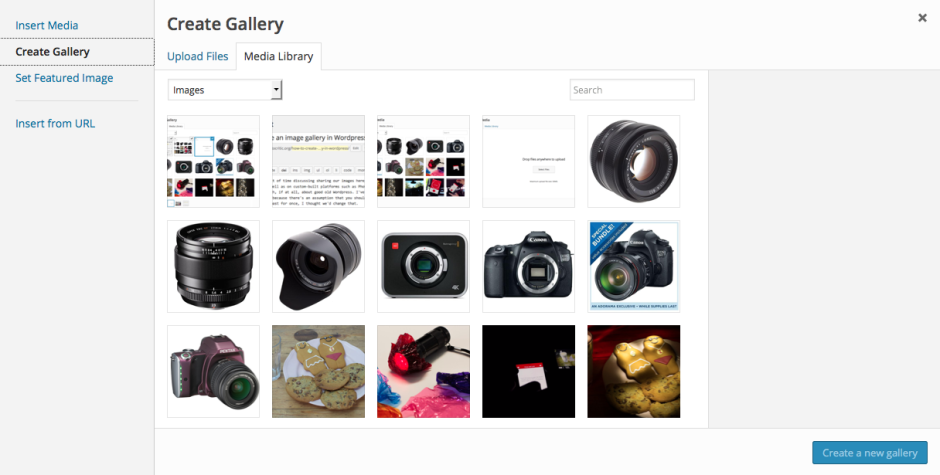
Upload or select your images
If you've already uploaded the images to your Media Library, go ahead and select them now. Otherwise choose the Upload Files tab and go ahead and upload your chosen images from your computer as you usually would.
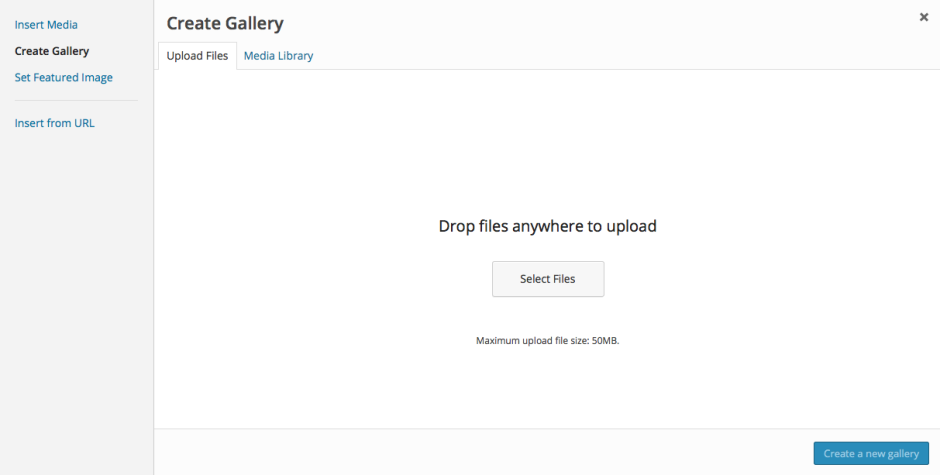
Create your gallery
When you've selected your images, press the 'Create a new gallery' button at the bottom right of the page.
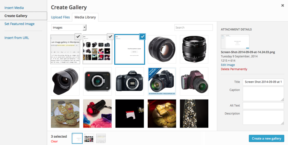
Now you get to organise your gallery, deciding on the order in which you want the images to appear (drag-and-drop to re-arrange them), in how many columns you'd like them arranged, and whether you'd like the images to link through to an attachment page when a viewer clicks on them. Don't forget to add captions if you need them, too. Do that beneath each image. Tap Insert Gallery and you're done!

If you'd like to try a carousel of images, you might want to check out the Jetpack plugin, but otherwise, this should keep you in image galleries for the moment.
Standing out in the crowd - or how to take meaningful photos among lots of people
'Tis the summer (here in the northern hemisphere). 'Tis the season for festivals and fairs and fetes. 'Tis the season when people might want to capture crowd scenes with their cameras. Shooting crowd scenes is easy, yes? There's so much going on that all you have to do is raise your camera, point it in the right direction, and shoot to produce an interesting photo, yes? Ehm... no. Anyone who's ever tried to take a compelling crowd scene photo will appreciate that it's far harder to get it right than it is to get it wrong. Frequently, crowd photos emerge as amorphous collections of strangers with no clear narrative or obvious focal point. Anyone whose attention doesn't wander irretrievably will be left asking 'So it's a photo of what?' But mostly the eye will scan over an ordinary crowd scene shot, fail to find anything of interest and be drawn into the story, and move on to the next shiny thing. Your audience is gone.
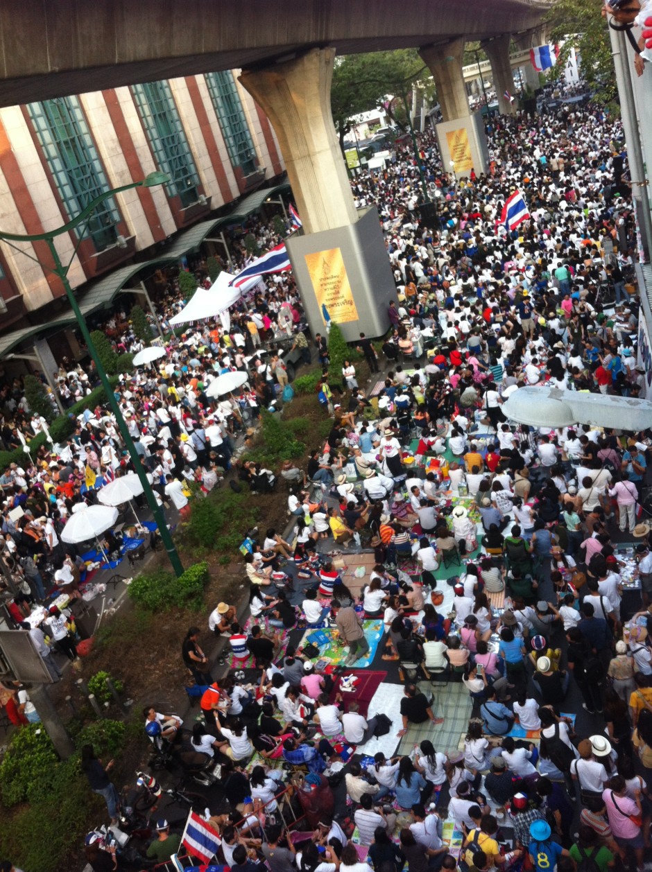
What makes crowd photos so difficult? The very fact that there is so much going on in these scenes is usually their undoing. Every photo must tell a story. (Along with 'Get closer!' and 'Just because it's on the Intergoogles, it doesn't mean it's free to use!' it forms the third edge of the Photocritic mantra triumvirate.) Rather than expecting your audience to determine what the story might be among the tens, maybe even hundreds, of people, you have to set about deciding on what the story is and composing an image that conveys that.
When you're thrust amongst a crowd, or are perhaps looking down upon one, ask yourself: 'What am I trying to relate here? What's the story?'
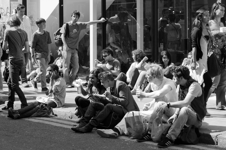
Perhaps it's the sheer number of people? Maybe it's the focus of thousands of individuals on one figure on a stage? Is it a solitary red shirt in a sea of blue? Sometimes it's a case of waiting patiently for that moment: a sting of eye contact, a dropped doll, a wearied pause. Define the story and you're halfway to creating a compelling image.
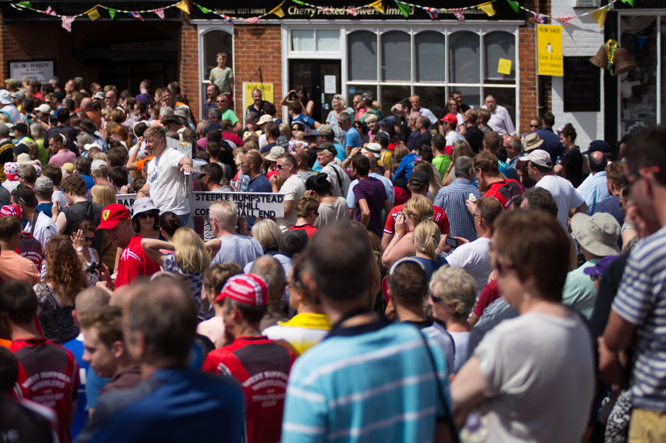
Now, ask yourself: 'What can I do to convey this?' How you compose and expose your photo will ensure that your audience can grasp what you're trying to say and will help them to connect with it.

When you're trying to express numbers, find a point of juxtaposition to emphasise them: look for something small or noticeable that stands out and contrasts against the heaving mass. When a horde is focused on one thing, use lines to direct the viewers' eyes and channel them into the moment. For an aberration in the flow of things, try to isolate the rogue figure and plant it amongst the norm.
Rather than point and shoot, hoping that you'll produce an image that people will find interesting, draw on your compositional skills—the rule of thirds, leading lines, colour theory, pattern and repetition—together with your technical knowledge—focal length, aperture, shutter speed, and metering—to tell a story. Then you'll capture the crowd.
Just because you found it on the Intergoogles it doesn't mean it's free to use
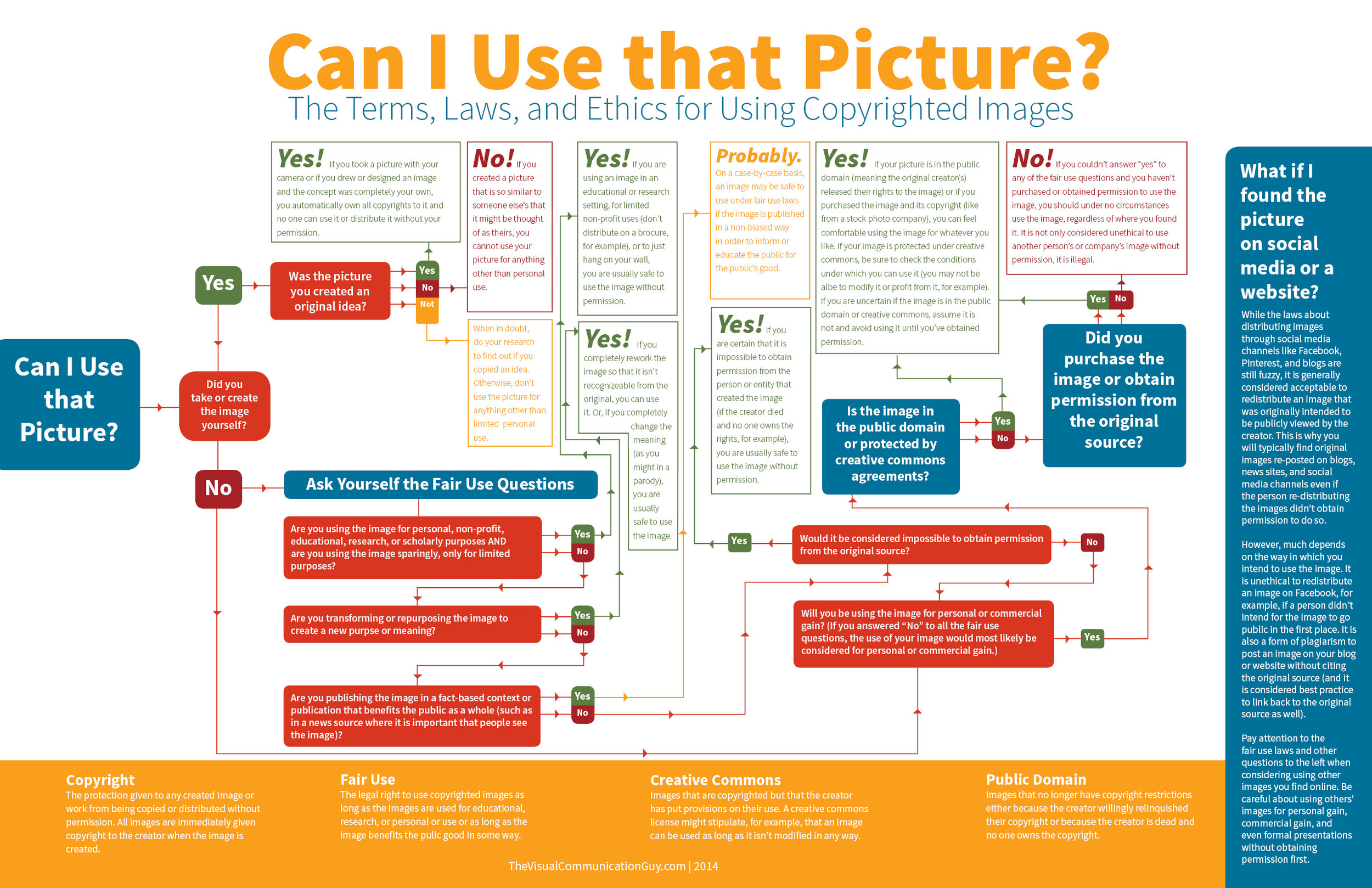
I was having a fairly good morning, until I took my lunchtime peruse of Feedly to see if anything interesting or exciting had dropped into it. Apart from a new post by my favourite film critic, nothing was outstanding until I reached Lifehacker. The Lifehacker team has just posted a link to a visual media usage rights flowchart created by The Visual Communication Guy. Excellent! Ignorance is no excuse when it comes to image theft and unauthorised use and reproduction of photos. While we're all perfectly aware that when you place something on Facebook, Flickr, or your personal version of Frankie's Funky Photos, there's a real chance that someone will try to use it improperly, the more that we can educate people about the right way to do things, the better. This one, however, was not quite so excellent.
You'll find the original here and the Lifehacker article here.
Apart from the fact that it's far too dense and word-heavy, it contains at least one humongous, glaring, verging on the unforgiveable fault for something that purports to advise on usage rights. Take a look and tell me if you can see it. (And tell me how many others you can see. There are plenty.)
Found it?
If you haven't, because it's a horrid thing to read, here it is:
While the laws about distributing images through social media channels like Facebook, Pinterest, and blogs are still fuzzy, it is generally considered acceptable to redistribute an image that was intended to be viewed publicly by the creator. This is why you will typically find original images re-posted on blogs, news sites, and social media channels even if the person re-distributing the images didn't receive permission to do so.
No, no, no, no, no, no. And for good meaure I'll say it again. No.
Images that are shared on social media aren't free for redistribution unless the creator has expressly said so. I put my images on Flickr and use them here on Photocritic and put them on my personal website to display them, to illustrate concepts, to tell stories. I do not put them on the Intergoogles so that anyone else can make use of them. And you should never assume that anyone else does, either.
The law regarding this is hardly fuzzy about the situation, either. There's been at least one monumental court case that supports this opinion, when photographer Daniel Morel sued AFP and Getty Images after they redistributed his images from the Haitian earthquake, which he'd shared via Twitter, without his permission.
Copyright exists from the moment that someone creates something, whether it's a photograph, a tune, a poem, or a piece of prose. It doesn't matter how a creator wishes to share her or his creation with the world, unless she or he has definitely signed away the rights to it, the rights remain theirs.
To be fair to the Visual Communications Guy, he does state 'My rule above all else? Ask permission to use all images. If in doubt, don’t use the image!' in the post that accompanies the flowchart, but that's not really good enough. It's the flowchart that people are going to share and see, not the article. When incorrect information such as this gains traction, we all suffer. Suddenly what's not right becomes commonly accepted. Or people who were doing their best to not be ignorant are in the wrong when they thought they were doing right.
So I'll say the mantra and everyone can repeat it after me: 'Just because I found it on the Internet, it doesn't mean it's free to use.'
The unlikely and serious consequences of teenage sexting
An 18 year old and a 19 year old are in a relationship. They're committed to and respectful of each other. They enjoy consensual sex and every now and again they share a naughty photo. A 16 year old and a 17 year old are in a relationship. They're committed to and respectful of each other. They enjoy consensual sex and every now and again they share a naughty photo.
What's the difference? Both couples are over the age of consent and no one is being forced into doing anything they do not wish to do. Yet the younger couple is breaking the law. By sharing photos of themselves, they're distributing indecent images of children. They are, of course, under the age of 18 and therefore still children. That they are accustomed to each other's bodies in the flesh means nothing when they're pixillated.
The penalty for distributing indecent images of children is much more serious than a slap on the wrists, too. It can result in being placed on the sex offenders' register. For anyone, that is a life-altering punishment; for someone who is 16, it could be life-ruining.
This issue has been brought into the public consciousness again (it raised its head towards the end of last year) after Nottinghamshire Police sent a letter to schools in the county asking them to advise their pupils about the potential consequences of 'sexting'. Recently, the police have dealt with several cases where sexting has taken a turn for the nasty, and while they've not prosecuted the young people involved, the outcome could have been different.
Much of what I've been reading around this topic today—for it seems to be overtaking the BBC—involves admonishing young people not to be so stupid or to consider the consequences of their actions should these photos make their way onto the Intergoogles; invokes despair that young people are capable of such recklessness and disregard for other people's feelings and reputations; or it criticises their lack of self-respect and gutter behaviour. There's also a great deal of concern about the pressure that might be applied to young people to take and share lascivious photos when they really don't want to.
Some of these concerns are valid. The teenaged equivalent of revenge porn can be deeply painful and horribly humiliating with tentacles that spread much further than school. While its perpetrators might be content to wreak harm and havoc on those whose images they share, I doubt that they realise just how extensive the consequences can be. As for coercing young people into sharing pictures that they probably wouldn't want to show their parents; it's another of those pressures of conformation piling up on young people: to be thin, to wear particular clothes, to smoke, to drink, to have sex. Between Snapchat and Slingshot and WhatsApp and any other means of sharing an image, we have for ourselves the social media age incarnation of 'I'll show you mine if you show me yours,' behind the bike sheds, except with potentially longer-lasting and farther-reaching consequences.
We cannot and should not tell young people what to do; it's about giving them the skills, the self-confidence, and the information to make their own choices and about providing them with non-judgemental support when they have to live through it. Vilifying them for a lack of self-respect is unlikely to achieve very much.
These are all pertinent points for anyone under 16 who's legally regarded as not being able to give consent. Indeed they remain valid for anyone over the age of 16; but there's a particular issue relevant to 16 and 17 year olds that seems to be overlooked.
There's a disconnect between the legality of their engagement in consensual physical sexual activity and the illegality of recording that same consensual physical sexual activity. A law that's designed to protect young people from exploitation has the potential to criminalise them. I hope that those who have to enforce it apply some common sense to any situations that come their way.
Back to basics with a pinhole camera
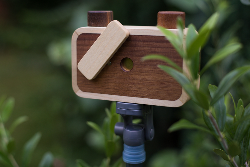
A few weeks ago I was contacted by Elvis Halilović, the man behind the ONDU Pinhole camera company, asking me if I'd like to try out one of his handmade, wooden pinhole cameras. It's not the sort of offer I'm likely to decline. Last week my entirely gorgeous 135 Pocket Pinhole arrived through the post. On Monday I took advantage of glorious sunshine and the flourishing abundance of the allotment and headed out with a few rolls of film to see what the camera could see. Today I collected an envelope of developed images from the shop in town.
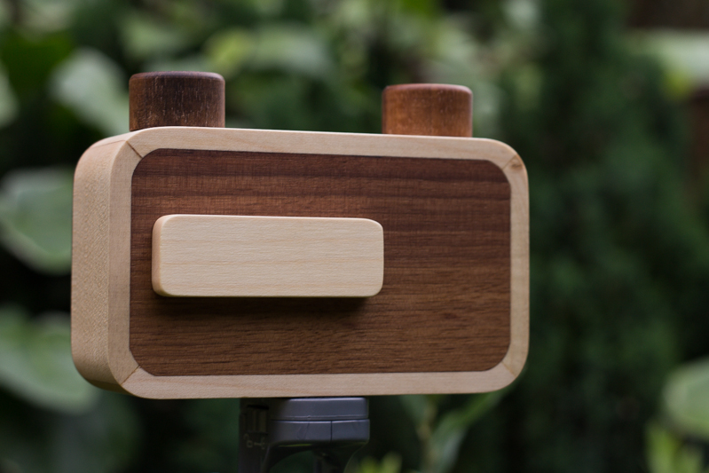
How did they turn out? Actually not all that brilliantly. The film was expired, which has resulted in all of my photos having a rose pink cast. Despite the very useful exposure guide provided by ONDU, judging shutter speed was a very hit-and-miss affair that was counted in pink elephants and almost everything is over-exposed. My little Lollipod stand is a perfect match for the ONDU pinhole, but I've not mastered opening the shutter without disturbing the camera, and of course the longer exposures means motion blur, so everything is hazy. And without a viewfinder, you're guessing at just what the camera can see, so what's in the frame isn't necessarily what I'd anticipated would be there.
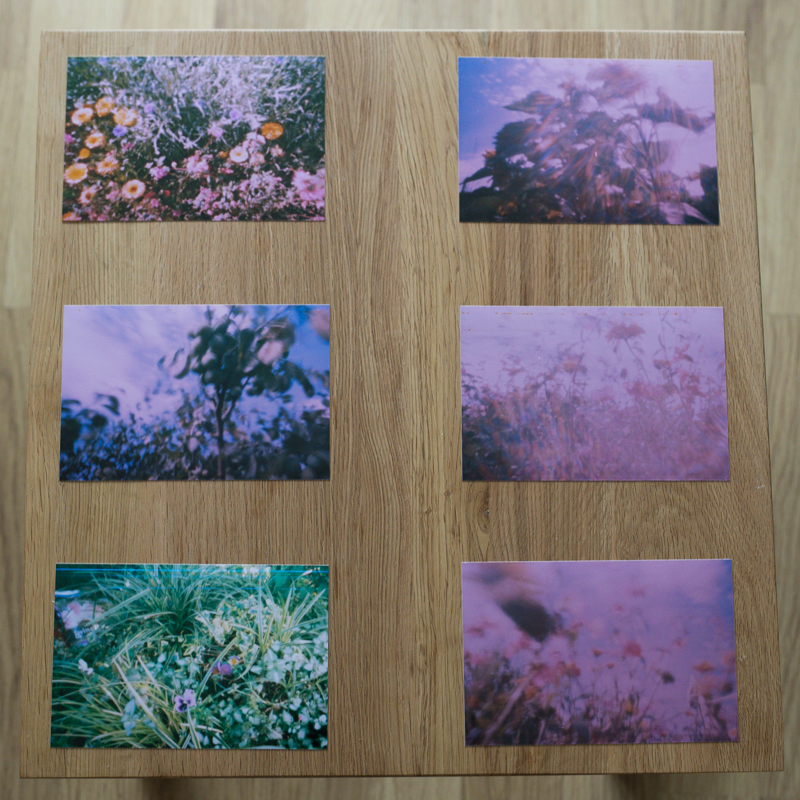
But the truth is, none of that matters. What matters is that I'm proud of these pictures and that I had fun taking them. I enjoyed experimenting with exposure times and attempting to determine what the camera could see. I recalled the anticipation of my childhood, when I'd send films off to be developed and have no idea what would be sent back to me. It was, in fact, the most fun that I've had with a camera for a very long time.
I won't deny that I had a few frustrations, but they weren't enough to deter me. The ONDU requires you to tape the film onto the receiving spool and count one-and-half rotations to wind on between frames. Loading the film was a bit tricky and I succeeded in breaking one roll with a heavy-handed winding action. There were a couple of unintentional double-exposures, too. No one said this was going to be easy, or indeed fast, though.
Perhaps the best tip that I have is to head out with a notebook when you're shooting, to record the lighting conditions and exposure time for each frame. When I go out next time, if the lighting conditions are similar, I'll know to open the shutter for a fraction shorter duration. If the conditions are different, I'll be making more educated guesses. Whatever the light, I'll be having more fun.
Pinhole photography itself is intuitive, with the requirement to judge and estimate and guess. It's also visceral and plays on your emotions of surprise and vexation. The more that you practise it, the better you'll become, not just at pinhole photography, but at the general discipline of photography. It pulls you back to the founding principles of expose and compose: a simple concept but with a nuanced practice.
The opportunity that a pinhole camera gives you is to play with light in a box: photography in its most deceptively simple form. If that doesn't intrigue and inspire you, and remind you what's wonderful about taking pictures then I'm not sure what will. Get hold of a pinhole camera and go back to basics; you won't regret it.
The Nokia Lumia 630's magical photo-improving screen
I wasn't paying attention; it was an advert. But when I heard the words 'And with its big screen, even my photos look fab!' my ears pricked up. Did I actually hear that correctly? It took another few advert breaks to establish that my aural capabilities were not deceiving me and some marketing team somewhere was touting at least one major feature on a smartphone as a screen that's sufficiently large to ensure that poor photos look good. Insert a mildly despondent sigh here. In terms of marketing hyperbole, it does make a welcome change from the might of the megapixel, but I'd prefer a claim that had a ring of credibility to it at least. Logic dictates that a bigger screen won't make an out-of-focus, badly exposed photo look better. It will just make it look bigger. And the out-of-focus-ness more out-of-focus.
What is this smartphone with the magical photo-improving screen? It's the Nokia Lumia 630. You can check out the statement for yourself. It comes at around 15 seconds.
Sorry sweetheart, I don't want to burst your new purchase bubble, but the size of the screen on the Nokia Lumia 630 isn't going to improve your photos if they're already not terribly good. You're responsible for that. Go out, take more photos, think about the composition and the lighting, take more photos, and apply what you've observed. That'll make your photos look better, because they'll be better. Photography's a skill that can be improved with practice and evaluation. Trust me.
As for the marketing team behind the Lumia 630, please don't try to convince people that there's a technological solution for everything. Some improvements require effort and application. I know that might seem awfully old-fashioned and not necessarily fit with the image you're attempting to promote, especially in our increasingly visual society that appreciates immediate advancements, but there's only so far your phone can go. Oh, and lay off the gender-stereotyping, too. Women the world-over, and a great many men, will thank you for it.
ImageBrief: a new approach to selling images
Control, commission, and contacts. If that sounds like a reasonable premise under which to sell your image online, you might want to check out ImageBrief. It's an online global image marketplace where buyers request specific images to meet their needs and photographers submit photos that they believe meet the brief. The average fee is $800 and photographers take upto a 70% cut. Interested?
How does ImageBrief work?
Buyers, who are a mixture of art buyers, creative directors and editors at advertising agencies, brands, corporates and publishers, as well as freelancers, submit a brief describing exactly what they want in detailed but natural language. Photographers who are signed up to ImageBrief can then submit photos that they think meet the brief's criteria for consideration. Before any images are presented to buyers, however, they're all vetted by the ImageBrief staff to ensure relevance and maintain quality. For the successful photographers, there's a potential 70% of the commission fee available. I've not seen one brief below $200 and plenty in excess of $1,000.
Photographers are able to keep up with new briefs via email and an iPhone app notification. There's an Android app in the works.
In a world where the stock agency model holds sway, how is ImageBrief attracting buyers and photographers?
It's all very well having a great model that serves buyers' needs without giving them photo-blindness from trawling through acres of potentiall suitable images, and gets photographers' images in front of buyers, but if no one knows about it, it doesn't benefit anyone. ImageBrief has found that word-of-mouth has worked in their favour, togetehr with social media and targetted email campaigns. Rainer Waelder was spotted by the ImageBrief team and invited to submit a portfolio for consideration.
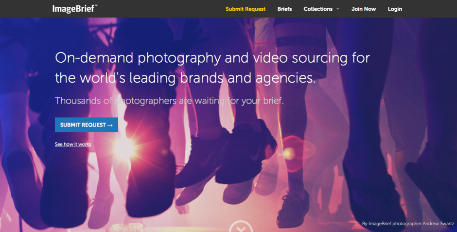
The ImageBrief team is very keen to point out that its fresh approach is part of its appeal: 'The images are different, the process is different and the outcome for the brands and clients they represent is different.'
The importance of the curaton model
ImageBrief regards the curation model as critical to its success and integrity. 'It's what allows us to present such amazing, tailored content. Each of our photographers is reviewed upon registration and then images are curated every step of the way to ensure quality and relevance to the client.' The buyers aren't overwhelmed in their search and photographers making sales take better a better cut of a significant fee. It's win-win.
Photographers' opinions
Uploading images to a stock agency and forgetting about them might seem like a relatively easy and stress-free option to sell your photos, but ImageBrief photographers are quick to point out that it doesn't offer nearly the return that an ImageBrief sale does. 'I’ve only made one sale so far with ImageBrief though I have been shortlisted several times. But that one sale was my biggest ever and more than made up for the effort expended on other briefs. One of the great things about ImageBrief is that it attracts high-profile clients still willing to pay a fair and proper rate for images. That makes us photographers feel it’s worth our while to submit images in the first place,' says UK photographer Matt Doggett.
What's next for ImageBrief?
A commissioning platform is in the works that is intended to allow clients to seek out a photographer when they haven't found the perfect pre-existing image. This can be tailored based on location, categories, or references. A new premium account structure will let photographers put themsleves forward for assignments and maybe develop relationships with clients that could go for ages.
Want to get involved?
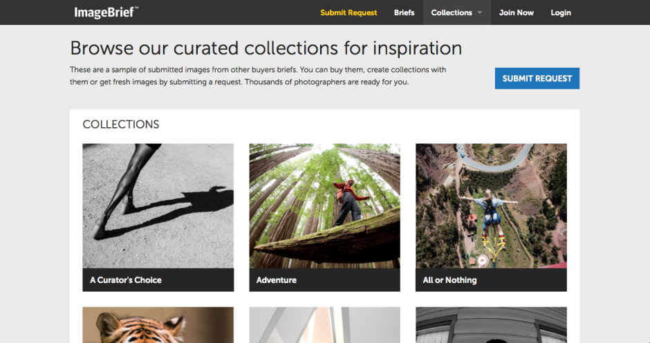
It's free to sign up to ImageBrief and that's probably the fastest way to learn how it works. Look at the kinds of images that clients are buying in the 'Collections' section. Download the app so that you can keep on top of new briefs.
ImageBrief photographer Slobodan Blagojevic recommends being selective and making sure that you fulfil the brief to be in with a chance, but perhaps more importantly 'do not think of ImageBrief as just another stock library, i.e., do not submit typical stock imagery. Clients come to ImageBrief precisely because they want something different, something fresh, something unique.'
The handy-dandy social media photo sharing guide
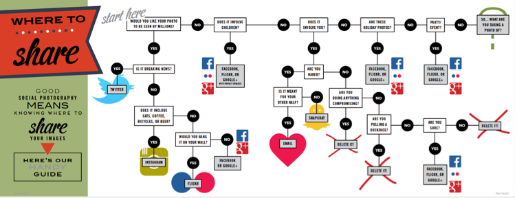
One photo, so many options. Where on this huge web of interconnected social media outlets are we best sharing our quick snaps, our painstakingly created works of art, and our selfies? Really, it all comes down to whom you want to see them. The chances are that different people follow you in different social media spaces, and if Twitter's mostly a work thing for you, selfies on the beach aren't all that appropriate a posting there. You're probably best putting those on your friends- and family-only Facebook account. It only takes a few moments of thought, really, but if you're new to the social media fandango, seeing all those apps lined up on your phone can be a little overwhelming. For a bit of fun, I drew up (quite literally, it involved an enormous sheet of paper and felt-tipped pens) this handy-dandy guide to sharing your photos via social media. Of course it isn't meant to be taken deadly seriously, but it's a pretty useful starting point all the same.
You can find it looking even more beautiful in print in the delicious-looking Social Photography, which is available now, either in print or to download!
What's the story?
Last week I was fortunate enough to attend a Q&A session with Mary Ellen Mark, winner of this year's Sony World Photography Awards' Outstanding Contribution to Photography. She was asked many pertinent questions and gave a great many eloquent answers, but it was the statement that 'Photography has to say something,' that struck the most resonant chord with me. It chimed right back to one of the very first things that I was taught when I started to wield a camera. I learned the basics of photography from my friend Daniel's mother, exploring the hedgerows around my school and attempting action shots of my classmates playing sport. Linda was patient, enthusiastic, and inventive. I was desperate to do well under her tutelage and one of the most piercing criticisms that she could give of my photos was 'But what's it a photo of, Daniela?' You see, every photo is meant to tell a story, and if your audience cannot discern what you're trying to say, then you've failed in your task as a photographer.
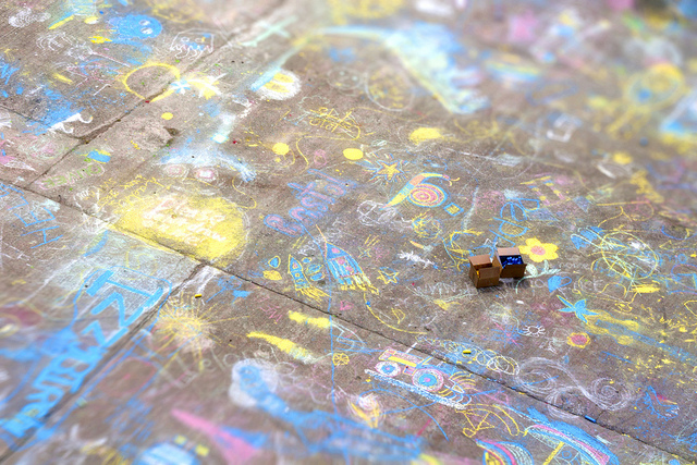
'What's the story?' is a mantra that has adhered with me for some 27 years, and it's the starting point for any critique that I give a photo, whether it's mine or it's someone else's. Even a photo of a gorgeous flower in bloom has a story to tell, and this story is the origin of all picture-taking. Your audience needs to be able to connect with your image and they will do that through its story.
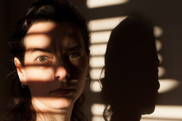
When you're faced with a compelling scene, it's pointless to wave your camera about wildly, snapping at everything you think is relevant and hoping that something will come out of it. All that you'll succeed in producing will be photos as scatter-brained as your approach. Think about: there is a story there that caught your eye and you need to convey it. So think about what that story is and concentrate on narrating it through an image.

When you shoot a landscape, picking out the isolated stone house nestling in the valley will convey a sense of loneliness, or maybe peace. Catching the glint in your nephew's eye as he sneaks a biscuit out of the tin says everything about his cheeky furtiveness. It's all there for the telling.

Building further on this notion, by identifying the stories in your photos and concentrating on how you aim to tell them, your photography will improve. You will have a clearer idea of how to compose your frame and it will give you a starting point for your technical settings. You might not get it right first, or even second or third time, but you will be working in the direction of whatever it is that you're trying to say rather than fumbling in the dark. In every possible way you'll be strenghtening your photography: creatively, technically, and practically.

Before you depress the shutter button, ask yourself, what's the story and how am I going to tell it? Remember: every photograph has to say something.
For one day only iStock is paying 100% royalties toartists
The terms and conditions under which photographers sell their images via stock agencies are frequently criticised and as a consequence the money that they can make from sales is often lamented. For one day only, however, iStock by Getty Images is trying to make photographers feel better about the deal and their contribution to the stock business. As part of its celebration of Small Business Week in the US, it has declared 14 May 2014 to be '100% Royalty Day'. 100% Royalty Day means that:
- 100% of sales on all exclusive/only available from iStock content sold through cash and credit file downloads will go directly to iStock by Getty Images artists
- double royalties will be paid to artists whose exclusive content is sold via iStock by Getty's new subscription scheme
However, it's not quite the gold-plated celebration of small businesses that it appears to be at first blush. That pesky word 'exclusive' makes all the difference. If you're not afraid of a little stock agency promiscuity then you won't be eligible for any extra pennies accrued. And of course, it's not exactly easy to encourage people to select your content for download on 14 May; they'll download it at their convenience. Still, if you are an exclusive iStock by Getty contributor, it's better than a poke in the eye with a sharp stick.
Feature image: Amesy/ iStock by Getty Images
Social Photography on sale in the US!
I've heard a rumour that my newest—and possibly prettiest—book, Social Photography is now on sale in the US! Naturally I'm incredibly biased (although my father probably wins the prize for most enthusiastic cheerleader), but I am very proud of it. In a nutshell, it's a guide to making the most out of your smartphone, from taking better pictures to sharing them astutely.
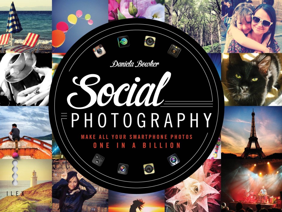
You can go into a bricks-and-mortar store to purchase it, use your preferred online retailer, or download it as an ebook.
For people in the UK wanting to lay their hands on a physical copy, they'll be here next month. Of course I'll be sure to tell you when! That would be now! Woohoo!
7 super suggestions for selling stock
Love them or loathe them, stock agencies are a significant sector of the photography industry. How else do people who are looking to buy images for use in publications, in advertising campaigns, or on websites acquire them without commissioning a photographer? For some photographers, then, selling stock imagery can be an important source of income. It might not keep the wolf away from the door, but it could well keep the candles burning. In which case, how do you make the best of it? If you're looking to make a bit of pin-money selling your photos, what are the dos and don'ts? If you're already in the stock game, how can you do it better? I spoke to a variety of stock agencies—Alamy, Shutterstock, and EyeEm Market—who kindly shared their words of wisdom to help you make the most out of the stock market.
Content
It might come as a surprise, or it might not, but stock agencies need photos of anything and everything. That's pretty much the entire point of them, you see. Alan Capel, Head of Content at Alamy says: 'Everything can be updated, good photographers will look for a new take on old clichés.' Like me a few weeks ago, people need generic photos of the father-of-the-bride. However, there are particular types of imagery that are preferable and subjects that have growing demand. So think about producing:
- Real-looking, natural-feeling photos; posed and staged photos aren't so in demand
- Photos that are out-of-the-office and out-of-the-ordinary; think oil rig as opposed to desk, farm yard instead of back yard, mountain-top rather than table-top
- Images from the emerging markets: Brazil, Russia, India, China, South Africa
- Healthcare and medical photos
- Anything that documents culture and diversity
- Photos local to you - who else is there to shoot them?
'We’d love to see more adventurous shoots in more unusual locations/scenarios!' says Capel. While he knows that might be easier said than done, 'Photographers are tenacious and resourceful and they will find a way.' And if you're pursuing the emerging markets theme, that should include lifestyle and local culture as well as business and industry photos. Remember: there are consumers in those emerging markets, too!

Is there anything that absolutely should be avoided? Well, if a photo's good, anything goes. But over at EyeEm, they warn people off of pets, pot plants, and predictable self-portraits.
Spotting trends
It's probably a good idea to keep one eye on what's happening now and another on the horizon. Scott Braut, VP of Content at Shutterstock, recommends using social media to gauge trending topics and examining news headlines for common themes (for example politics, pop culture) to help you pick out favourable subjects. But at the same time, think about what might be happening in two, three, or four years' time: Olympic Games, World Cups, centenaries, and anniversaries.
Style
It's always best to stick to what you know best, which is your own style. But Capel says not be afraid of adding another string to your bow by including mobile images—Alamy has the stockimo app for that, and there's the new EyeEm Market, too—and Braut says that photos with Instagram-esque filters are popular.
Selection
Be ruthless when it comes to submitting photos to stock houses: if something about an image doesn't feel right, it's probably wrong. Don't include it.
And both Braut and Capel say the same thing about repetitious photos: don't do it! Make sure that each photo you submit is distinct, so that they don't detract from each other.
Accessibility
People need to be able to find your images to buy and use them. This means that they need to be identifiable through tags, labels, and key-words. Capel suggests thinking along these lines:
- Literal - what is actually in the shot
- Conceptual - what moods, emotions, concepts does the shot evoke
- Photographic – predominant colours, any techniques or treatments used
At EyeEm, their top search terms include the abstract, such as 'happiness' and 'hope' as well as more descriptive, for example 'family' and 'fitness'. Spread your net far and wide, but make sure your terms are accurate.
And don't be afraid to re-visit and re-label photos after you've submitted them. You never know what you might think of with fresh eyes.
Practicalities
Photos that have people in them will require a model release if they're to be used commercially. Logos have to be rights cleared and securing that can be a proper pain. It's much better to do away with labels on bottles, use plain clothing, and hide obvious branding.
Finally
The word that came up again, and again, and again was 'real'. Buyers want imagery that's natural and believable, not contrived. There's a whole world out there waiting to be documented, so go explore!
Twitter's augmented its photo capability: multiple images per tweet and image tagging
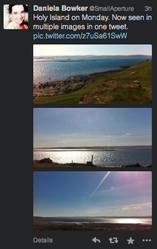
If you've ever been frustrated by Twitter's inability to attach multiple images to a single tweet, today's your lucky day. An update that's mid-roll-out will allow you to select up to four images to share in one 140 character missive. Tap on a preview image to see it full size, and then slide through to view the group.
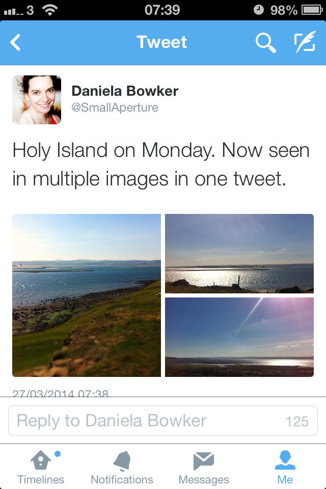
The update has already made it to my iPhone and is steadily making its way to Android and the website version. However, multiple attachments haven't caught up to apps such as TweetDeck yet. So you're saved from seeing your friends' coffees in triplicate if that's your tweet loft of choice.

In addition to multiple images, tagging people in photos is now possible, too, and their handles won't eat into your 140 character count, either. A maximum of ten people can be tagged in one photo and they'll all receive a notification telling them that they've been featured in a photo. If you'd rather not be tagged in photos, you can turn off the feature in your settings. If you don't see the update yet, hold tight, it'll be there soon.
Update! 11:10, Thursday 27 March 2014: It seems as if TweetDeck is now displaying multiple images.
Flickr's implemented its new photo page
In October last year, Flickr implemented a beta version of a new photo page. It was only a beta version, users could opt out, and they were invited to provide feedback on the new-look page, but inevitably there was considerable discontent with the proposed changes. I saw lots of frothing and foaming at the mouth in the feedback forum, some of it sadly lacking in articulated, constructive criticism. And in truth, the beta version did have plenty of bugs, omissions, and oversights that desperately needed rectifying. Flickr's venture into the realms of the new was along a rather rocky path and needed quite a bit of work. A little under six months after implenting the beta, and it seems that Flickr has rolled-out the new-look photo page for everyone. Or at least, I was using the old-style page, and now I'm suddenly not, and my 'Return to the old-style page' button has disappeared. The toddler-type tantrums of 'I don't like it' on the feedback page don't seem to have made much of an impact. And to be fair, neither have the calmer, cooler, and more considered objections to the new layout. The new-look page is here, whether users like it or not. Now it's time to see how many of the niggles have been addressed and kinks ironed out.
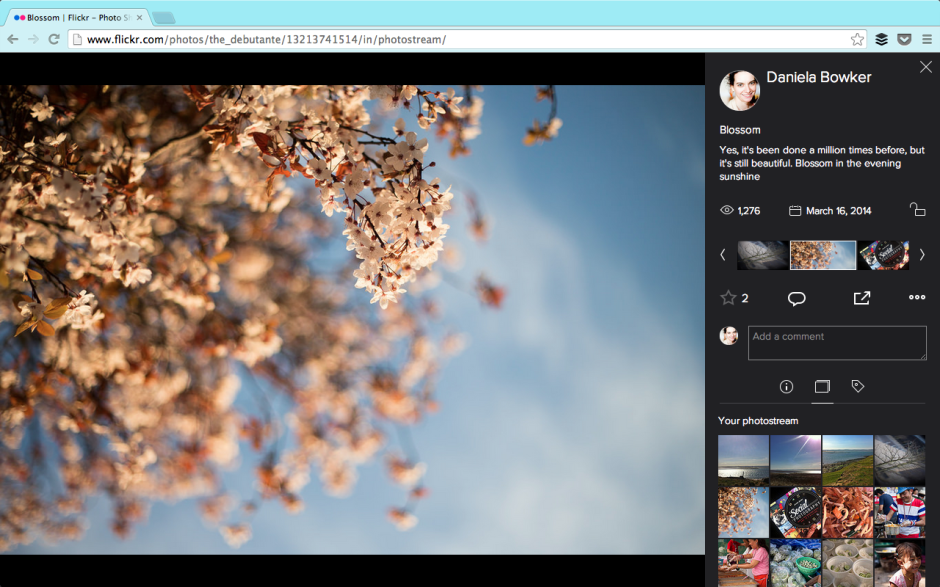
I'm pleased to say that the Flickr team has listened to quite a few of the gripes. For example: you can now see who 'favorited' your photos, rather than there being just a number of 'favorites'. Rich EXIF data are available. Tags have returned to being unhastagged. You can add a photo to a set from the photo page. Lots of the functionality that Flickr users knew and used didn't make it over in the initial beta release. That's been steadily remedied and things are looking more familiar, if different.
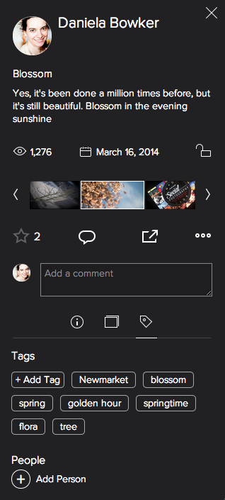
But not everything is yet hunky-dory. A particularly significant bug from my perspective involves sharing preferences. Mine are turned off in my settings. No one looking at my photos should be able to share them via social media or embed them into their blogs. Except that when I look at Flickr logged out of my account, my photos can still be shared and embedded. I'd like to see that fixed sharpish. And it would seem that Flickr's usual location services are still in the process of being ported properly. My map has disappeared and I'd like it back. That's irritating as opposed to concerning.
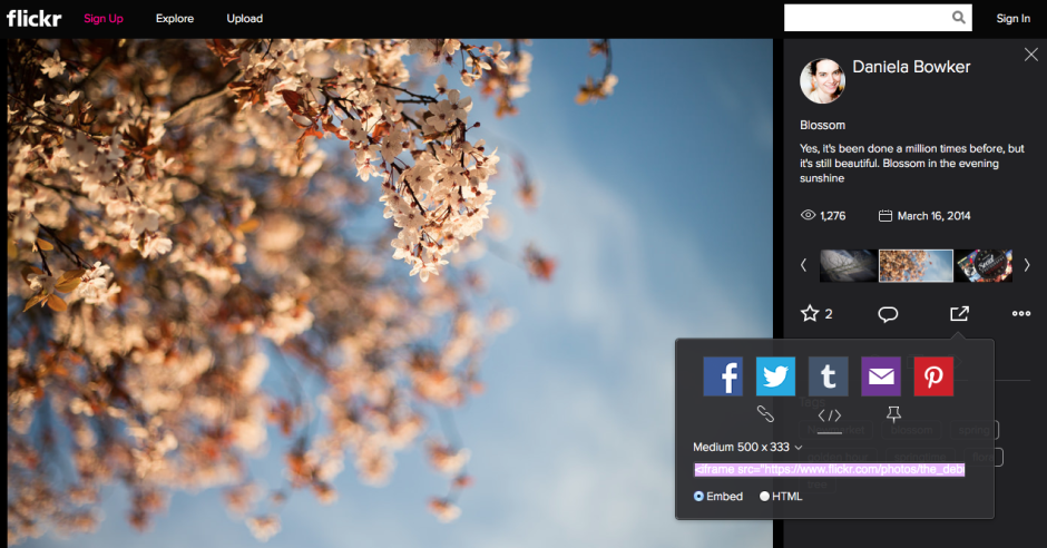
While I'm not especially concerned by being able to accompany my images with significant pieces of text, I favour short explanations, I know some people who feel aggrieved that the text box is so squashed and insignificant now. For them, being able to use words and pictures in tandem was a favourite feature of Flickr that has been marginalised.
Thankfully, there's a feedback button on every photo page. I shall be making use of it.
As for the new photo page itself, I'm not too bothered by it. My persistence in using the old page was primarily a result of the lack of functionality in the beta version and most, although not all, of those concerns have been addressed. What remains to be seen is how those who initially reacted so negatively to the redesign respond to the changes. Have they grown accustomed to it or have their complaints been addressed? Are the changes unpleasant enough or sufficiently significant in their eyes to see them walk away from one terabyte of free storage together with the network that they've built there? And if there is mass dissent amongst users, what will the impact be on Flickr? Even if, at worst, I'm ambivalent towards the new look Flickr page, what sort of effect will it have on my use of the site if people whom I follow and with whom I interact begin to desert it? I know of some users who feel the changes keenly, and if they choose to quit, my Flickr experience will be the poorer for it. A social network that steadily loses its sociability doesn't have a great deal of value.
Has Flickr really been made awesome again?
Juxtaposition: London past and present in pictures
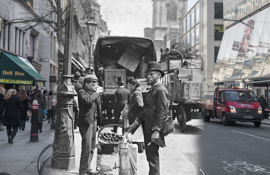
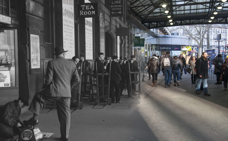
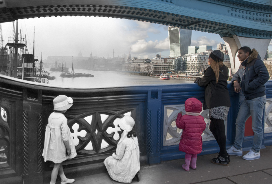
I'm a big fan of the Museum of London. It panders to my penchant for Romans, hosts very interesting exhibitions, and has a great app to guide you around the city itself: Streetmuseum. To mark the launch of version 2.0 of Streetmuseum, the museum has released 16 gorgeous, ghostly images of the city, merging past with present. You can look over the Thames from Tower Bridge, from the 1920s on the left and the 2010s on the right; or stand on the corner of Long Acre and Neal Street (just about where Marks and Sparks is now), looking towards Covent Garden Tube station, 2010 on the left, 1930 on the right. It's wonderful to see how much London has, and hasn't changed.
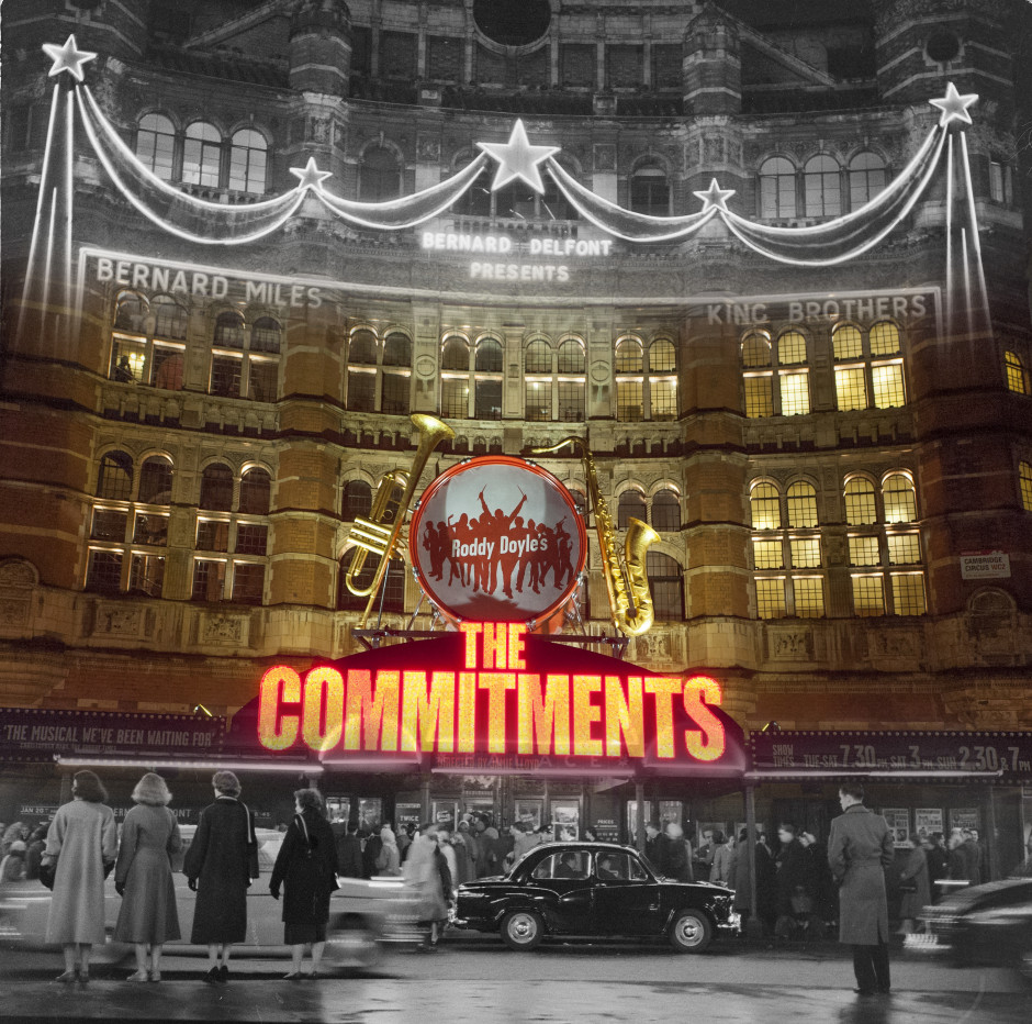
The new version of the app has had 100s more city locations added to it, meaning that you can select a destination from a London map or let yourself be geo-tagged to your present location. Then a historical image of London will appear on your screen and you can expand it to learn about where you are. Most of these are in central London, but some are in its outer reaches, too.
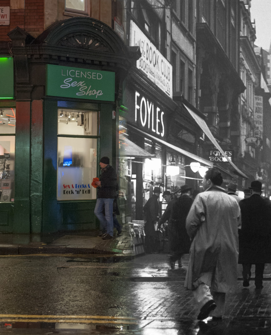
The photos range in date from 1868 to 2003 and were taken by photographers including Henry Grant, Wolfgang Suschitsky, Roger Mayne, and George Davison Reid.
The app is free to download to your iPhone and is available now.
Flickr has a new embed feature. Expect uproar.
In another update that aims to make Flickr a more fully web-integrated photo-sharing experience, it has rolled out a revised photo embed function. This one should make it easier to add full-bleed Flickr photos and videos to external sites. Any embedded photo will automatically be displayed with its full title and its owner's Flickr name. Flickr's stats feature will also track the number of views your photos embedded into external sites are generating, to give you an idea of their popularity and reach.
Before anyone and everyone starts to yell that Flickr is being irresponsible, is encouraging copyright infringement and image theft, and doesn't have the best interests of its users and their images at heart: you can disable embedding. You do this in Settings, under privacy and sharing. It will also prevent other users from tweeting or pinning your photos at the same time. This doesn't stop you from being able to tweet, pin, and Facebook-share your own images, though. But if you're using the new photo experience beta (which I'm not), it doesn't look as if you can embed your own images into external sites when sharing is restricted. Self-embedding is still possible with share-restricted photos in the old layout though.
Here: I've embedded my own image straight from Flickr, but every Tom, Dick, Harry, Annie, Melanie, and Madge doesn't have the ability to do this because I've disabled the feature for them.
Whether this is by accident or deign on Flickr's part I'm not sure, but I have mentioned it to them. It's a useful feature for me, but I prefer to retain as much control over the use of my images as I can.
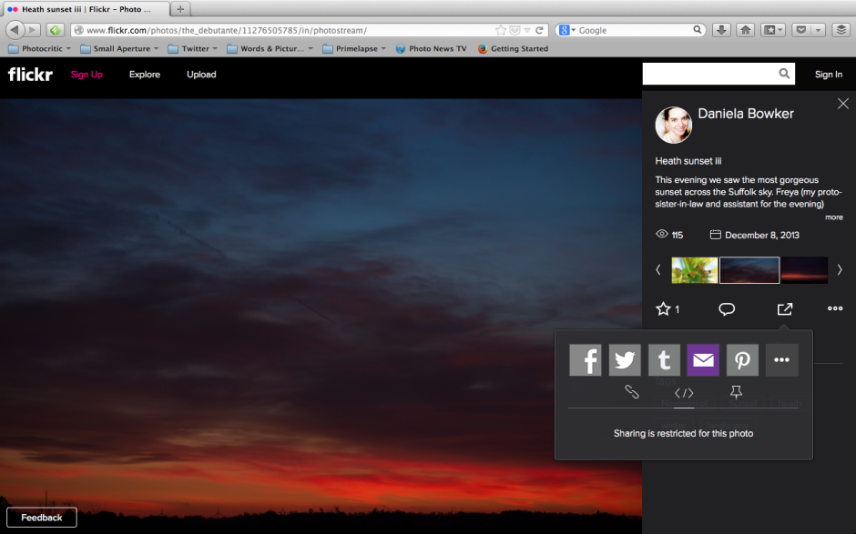
If you share a photo privately, either with your Flickr friends and family or through a guest pass, it can't be embedded by those people who are privileged to see it. It remains a privilege.
As a reminder, you can also restrict who is able to download your images from Flickr, too. Of course, if someone really wants to use your image, they will, because any image that can be seen on a screen can suffer from copyright infringement. There are tools available to help you protect them, however.
Enabling better image embedding isn't just about spreading the beauty of Flickr users' gorgeous photos; it's also about spreading the Flickr brand, too. Easy embedding will encourage people to use the feature and encourage people who're seeing embedded Flickr images on external sites to visit Flickr itself and to see more of a user's Flickr photostream. Flickr doesn't wish to remain an isolated realm of internalised image sharing, it has a world to take on.
Video comes to photo storage app Loom
I've been a fan of Loom since since I tried out its public beta version earlier this year. It's a photo storage service that allows you to access your images across all of your devices as well as auto-upload them to take some of the strain off of keeping your back-ups secure. It's easy to use and looks good, too. Today they've released their biggest update to date, which will allow users to play and stream videos on their iPhones, iPads, and from the website. The process that their developers have implemented lets users watch their videos almost automatically without any of that pesky buffering. As soon as you press 'play' it starts to stream the lowest quality version of the recording while simultaneously buffering the higher quality one and switching to that as soon as your Internet cnnection and screen resolution lets you. Yes, it's similar to the system that Netflix uses.
They've made a pretty video to show it off, too:
Loom already gives you 5GB of storage for free; 50GB costs $39.99 for a year, or $99.99 buys 250GB of storage for a year. However, if you refer your family and friends to Loom you can pick up an extra 5GB for free.
Yes, Loom is only iOS-only at the moment, but Android expansion is planned. Let's hope that's Loom's next major update and it comes along quickly!


