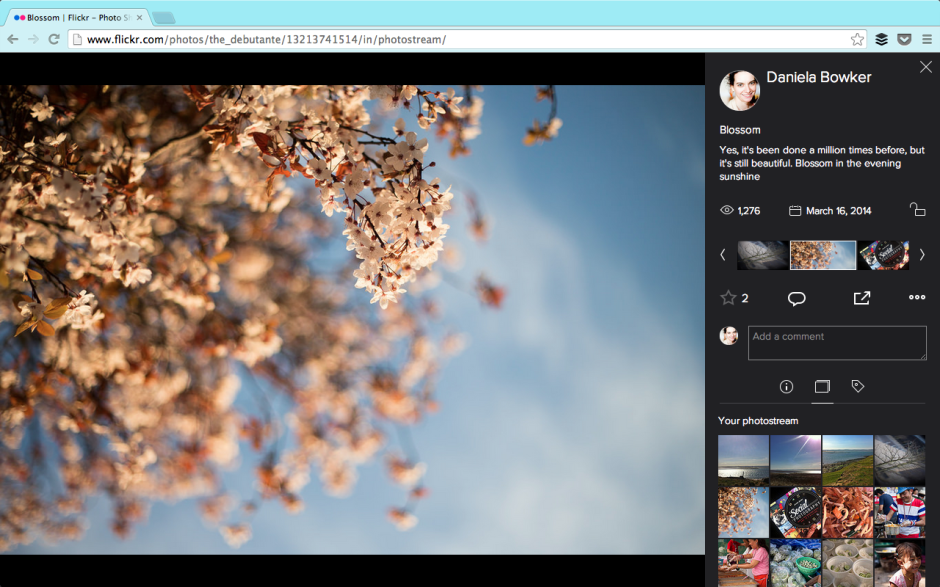
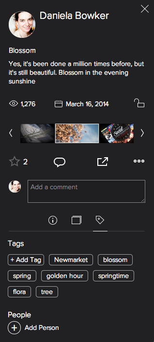
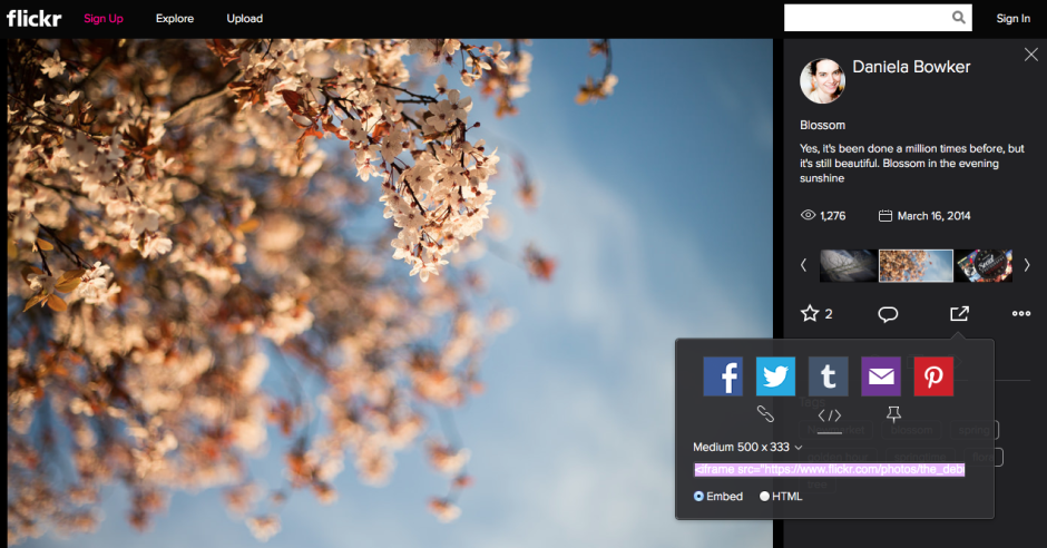
In October last year, Flickr implemented a beta version of a new photo page. It was only a beta version, users could opt out, and they were invited to provide feedback on the new-look page, but inevitably there was considerable discontent with the proposed changes. I saw lots of frothing and foaming at the mouth in the feedback forum, some of it sadly lacking in articulated, constructive criticism. And in truth, the beta version did have plenty of bugs, omissions, and oversights that desperately needed rectifying. Flickr's venture into the realms of the new was along a rather rocky path and needed quite a bit of work. A little under six months after implenting the beta, and it seems that Flickr has rolled-out the new-look photo page for everyone. Or at least, I was using the old-style page, and now I'm suddenly not, and my 'Return to the old-style page' button has disappeared. The toddler-type tantrums of 'I don't like it' on the feedback page don't seem to have made much of an impact. And to be fair, neither have the calmer, cooler, and more considered objections to the new layout. The new-look page is here, whether users like it or not. Now it's time to see how many of the niggles have been addressed and kinks ironed out.

I'm pleased to say that the Flickr team has listened to quite a few of the gripes. For example: you can now see who 'favorited' your photos, rather than there being just a number of 'favorites'. Rich EXIF data are available. Tags have returned to being unhastagged. You can add a photo to a set from the photo page. Lots of the functionality that Flickr users knew and used didn't make it over in the initial beta release. That's been steadily remedied and things are looking more familiar, if different.

But not everything is yet hunky-dory. A particularly significant bug from my perspective involves sharing preferences. Mine are turned off in my settings. No one looking at my photos should be able to share them via social media or embed them into their blogs. Except that when I look at Flickr logged out of my account, my photos can still be shared and embedded. I'd like to see that fixed sharpish. And it would seem that Flickr's usual location services are still in the process of being ported properly. My map has disappeared and I'd like it back. That's irritating as opposed to concerning.

While I'm not especially concerned by being able to accompany my images with significant pieces of text, I favour short explanations, I know some people who feel aggrieved that the text box is so squashed and insignificant now. For them, being able to use words and pictures in tandem was a favourite feature of Flickr that has been marginalised.
Thankfully, there's a feedback button on every photo page. I shall be making use of it.
As for the new photo page itself, I'm not too bothered by it. My persistence in using the old page was primarily a result of the lack of functionality in the beta version and most, although not all, of those concerns have been addressed. What remains to be seen is how those who initially reacted so negatively to the redesign respond to the changes. Have they grown accustomed to it or have their complaints been addressed? Are the changes unpleasant enough or sufficiently significant in their eyes to see them walk away from one terabyte of free storage together with the network that they've built there? And if there is mass dissent amongst users, what will the impact be on Flickr? Even if, at worst, I'm ambivalent towards the new look Flickr page, what sort of effect will it have on my use of the site if people whom I follow and with whom I interact begin to desert it? I know of some users who feel the changes keenly, and if they choose to quit, my Flickr experience will be the poorer for it. A social network that steadily loses its sociability doesn't have a great deal of value.
Has Flickr really been made awesome again?


