Don't feel constrained by one of the best known rules in photography. If you've a clear idea of where your subject needs to be in the frame, go ahead and place it there!
Who wants to conform? Choosing an app for rectangular Instagram images
Instagram images are distinctive because of their filters and their square crops. They're the first two elements on the Instagram Spotter's Guide. But who wants to be forced to conform and always have to slice off the sides of your photos and submit a perfect square? Exactly! An entire industry has grown up around the Instagram phenomenon, encompassing everything from postcards to marshmallows, and it includes a goodly selection of apps that add a border to your rectangular photos that'll ensure they look square when imported to Instagram. (And if you choose a coloured border, it empahsises how the image is, in fact, square.)
I road-tested five of these apps. If I had the choice of a paid or a free version, I always went for the free one, which meant that one of my judging criteria was how intrusive or distracting the ads were. Otherwise, I was looking for an intuitive interface and something that didn't run too slowly. Thus, in order of preference, I present the Oblong Collective.

=1. Instacrop
iOS-only, free
With no frills and a desperately simple interface, Instacrop comes joint top of my list. Tap to select a photo from your camera roll, hit share to select from Instagram or EyeEm, and you're done. If you're so inclined you can select from paid-for border colours. There are banner ads at the bottom of the screen and a pop-up ad before you can share your photo, but I didn't find them too instrusive.


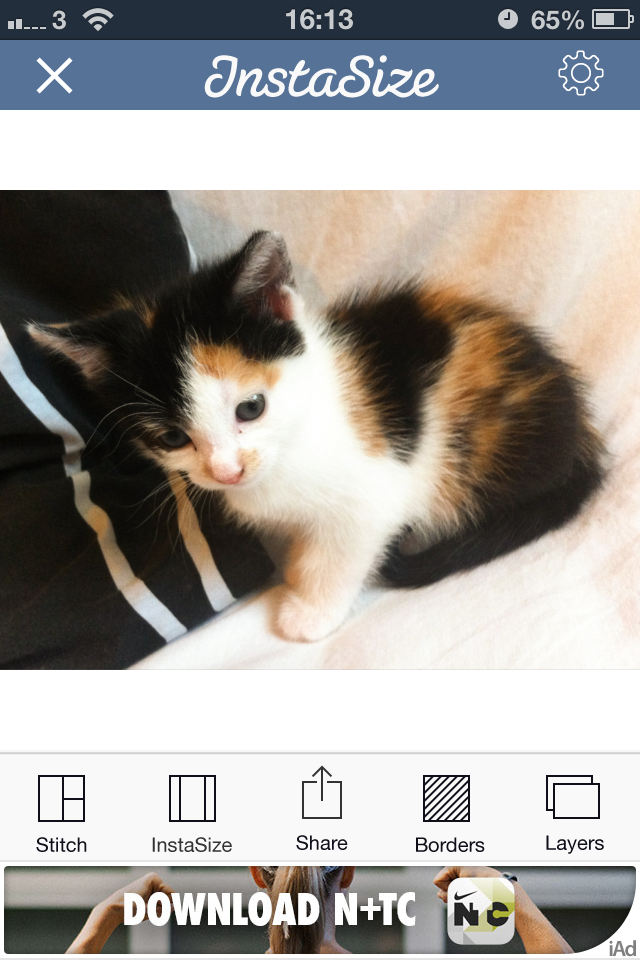
=1. Instasize
As well as allowing you to post rectangular images to Instagram (and Facebook and Twitter), Instasize allows you to create diptychs and triptychs, overlay a filter or text, and choose from a huge variety of borders. I didn't find the ads too distracting and the app didn't run too slowly, either. It shares top spot because if you're looking for a bit more functionality than just rectangular images, it has it.

3. #NoCrop
As with Instacrop, it's a case of tapping to import an image from your camera roll and then tapping to share to Instagram, Facebook, or Twitter. You can email or save the image, too. #NoCrop gives you the option to adjust your border size using a pinch-to-zoom motion or to reposition your image in the frame. This one is also ad-supported and they pop-up every now and again.

4. Squaready
iOS-only, free; Squaready Pro, £1.49
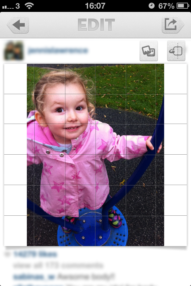
Squaready gives you lots of options to borderise your images: let it do it for you with an instant adjustment, choose from three different sized borders, or pinch-to-zoom to alter it yourself, and then select a border colour. There're are options to edit your images with Camera+ or three other programmes, too. All of this sounds great, but I didn't find the interface as simple to use as Instasize and it was much slower, too.


5. Squaregram
iOS-only, free (There is a SquareGram for Android, but it's developed by a different company.)
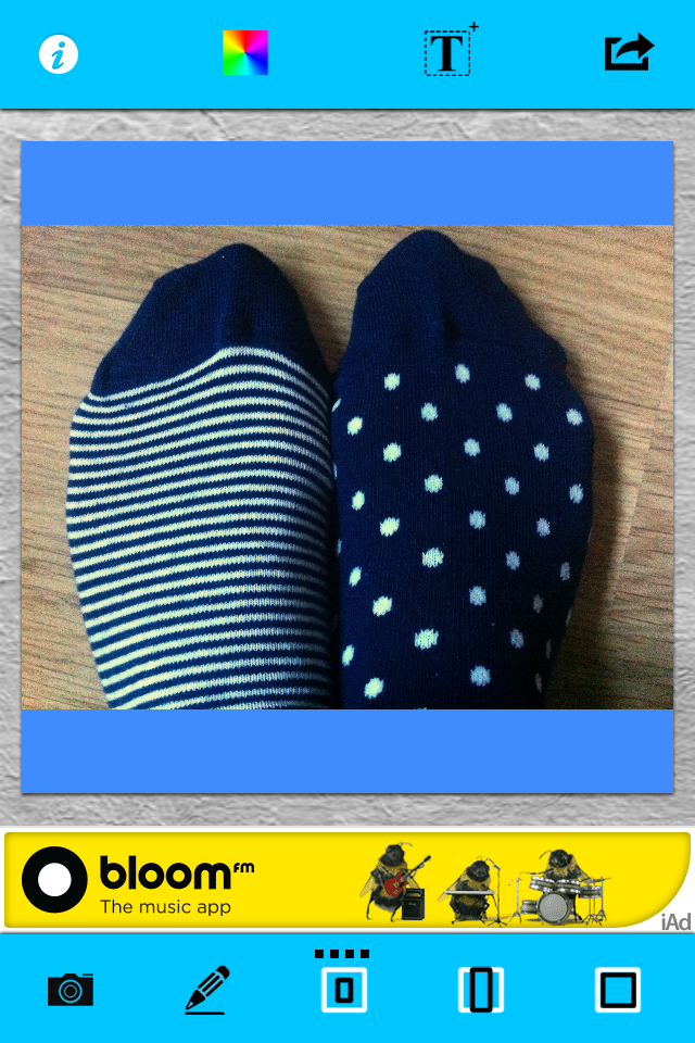
My first encounter with Squaregram did not end well: I closed it in a fit of frustration. Apart from it running very slowly with lots of intrusive ads, the interface wasn't especially intuitive. I couldn't figure out how to remove a text box when I'd been experimenting with adding one, which really bothered me. I did give it another go, and I liked that I was able to choose a border colour and corner curvature, but it ddn't make up for how disappointing it was first time around.
If you've any pet apps for sharing non-square images to Instagram, let us know down there!
Your photo on the cover of a book?
 My newest book is due, many-things-but-mostly-the-weather-permitting*, to be published in April next year. Apart from me signing off on the final proofs, its publishers, the Ilex Press, and I have one outstanding task to complete: selecting a final image to include on the book's front cover mosaic. Seeing as the book is dedicated to the phenomenon of social photography, we—or rather Adam, the Associate Publisher at Ilex—couldn't think of a better means of finding the perfect fit than to ask you if you've an image that you would be proud to see gracing the cover of an internationally published book.
As well as having your picture on the front of the book, you'd receive a copy of it (when it's released) as part of your prize. If you're very lucky, Ilex might have something else up its sleeve for you, too.
On a need-to-know basis, you need to know that you have between now and Monday 2 December 2013 to submit an image to the special Ilex Social Photo Flickr pool. The photo must be square format and you must own the copyright to it. The winner will be selected by me and the Ilex Photo team and announced on Friday 6 December 2013. Importantly, you will retain all rights to your image and it will only be used by Ilex on the cover of the Social Photography book and for the purposes of promoting the competition.
If you've any other questions, holler. Otherwise: good luck!
* Delivery of my book Surreal Photography: Creating the Impossible was delayed by a typhoon in the South China Seas earlier this year. More recently, several containers of books were lost to the waves as a result of storms. The loss of books is in no way comparable to the loss of lives, this merely serves to illustrate why we don't have accurate delivery dates.
Considering the square crop
I've never been a particular fan of the square crop; I have no good reason for my disfavour, but it doesn't stop me from recognising that it does have its place in the canon of crop. And that's not just its historical position, but its artistic one, too. Consequently I do use it from time-to-time, and I've spotted an increase in the frequency that I at least try it out on my photos. That doesn't mean to say I'll use it, but it's worthy of closer consideration. If you're accustomed to the rectangular frame, you'll notice almost immediately that the compositional rules with which you are so familiar don't seem to apply any longer. The frame is different and you must think differently, too.
Dynamic shift
Primarily, the tension within the frame has shifted. What makes a picture 'work' and what holds the eye to the frame has changed. With a rectangular crop, the eye has a tendency to move across the image until it finds its focal point; with a square crop the eye moves around the image. This shift in the dynamic, from fluid to static, presents you with a great setting for capturing the serene. Striking still lives with plain backgrounds and posed portraits work a treat in a square frame.
Centred subjects
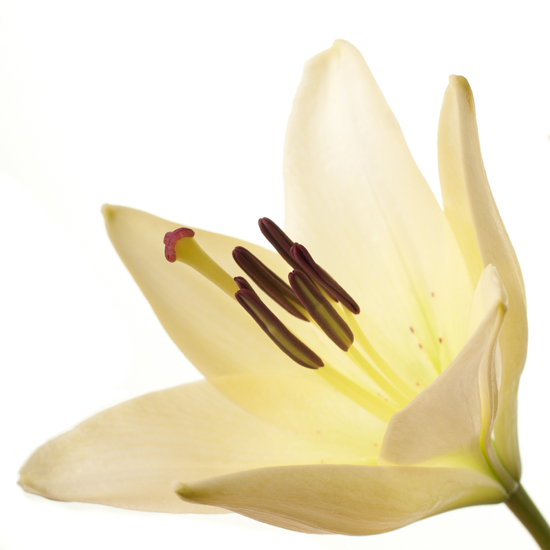
Centred subjects have a tendency to look flat and dull in a rectangular frame, but that circular eye motion that we make with square-cropped images means that they don't lose their impact.

Symmetrical images
Following on from the centred subject comes the symmetrical subject. When you place a symmetrical subject within a square frame, it is bounded and the symmetry emphasised.

Evenly balanced images
Splitting the frame and balancing your subject across it: black against white, calm against active, rough against smooth, will work to the benefit of a square crop. There's nothing wrong with splitting your frame horizontally or vertically, but diagonal divides work brilliantly, too.

The point is, of course, to use whichever crop works best with your vision and your image. Don't feel that square crops carry the mark of the Instagram devil and that a rectangular frame is somehow symbolic of photographic purity. Try it; you never know, you might like it.
How exciting is the iOS 7 camera app?
 Whilst everyone else is arguing about whether the new flat design and Crayola coloured icons that comprise iOS 7 are genius or travesty, shall we take a look at what's been updated, reshuffled, and introduced camera-wise?
Taking on an iPhotos feel, photos are now automatically organised into 'moments'. It's a twee name for a fairly neat concept: images are sorted and labelled geographically and temporally using their metadata. This will let you search photos you've taken in one particular location by date. It's a more sophisticated digital version of having holiday albums sorted by year and place, with each photo captioned; you can see all the photos from one place organised by date, too.
Airdrop will allow you to drop an image into someone else's iPhone over the same wi-fi network. If we can Airdrop to other devices, for example a MacBook Air, that'd be neat.
Photo Stream already allowed you to share with your friends and for you to comment on their streams; now you can insert your photos into their shared streams, creating a collective album.
Moving between camera, video, panorama mode, and the square crop feature is managed by a swipe. Yes, you read that right, there's a square shooting mode built into the camera app, along with a range of filters. It feels like a dreadful disease that afflicts smartphones. With any luck, it's a childhood illness and everyone will grow out of it soon.
The conclusion? There's nothing revolutionary or even exceptionally exciting here. It feels more like a consolidation of features and in some respects even a game of catch up. That's not to say that sharing images via Airdrop isn't a welcome addition, it's just that it isn't setting alblaze the world of mobile photography.


