Non-destructive editing capability built into Android Kitkat

Google gave us a few new things to think about last week, including improved photo editing and archiving tools in Google+ and an update to Snapseed, but something seems to have been overlooked. Sitting quietly in the Gallery app on Android devices running Kitkat, you'll find a new and rather tasty peach of an addition to your mobile post-production needs: a non-destructive editing programme that's equipped with some powerful tools. Developed by Nicolas Roard and his team, you can use the suite to adjust curves, apply graduated filters, make local adjustments, and fiddle with individual colour channels, as well as create your own pre-sets.

There's a demonstration video to show you even more of what it's capable of accomplishing, but nothing beats a bit of experimentation.

There's only an auto-white balance function, which is something of an oversight in my opinion, layers capability is on the way (from what I can tell), and there's no Raw support; all the same, the Google team is showing that they are growing in stature when it comes to their image editing options.

Some people have wondered how this sits alongside Snapseed and the photo editing options in Google+. For a start, Snapseed is universally available whereas the Gallery editor is Android-only. If you're an Android user, they do different things. The Gallery editor is non-destructive and lets you play around a lot more than Snapseed; Snapseed is super for making quick adjustments and applying ready-made effects. It all depends on what you want for your photos.

(Headsup to Engadget)

Fujifilm to cease UK E6 processing

Fujifilm has announced that from 1 November 2014, it will no longer provide E6 processing in the UK. The year-long notice period is to ensure that anyone with remaining rolls of Fujichrome Sensia process-paid film and pre-paid processing vouchers have sufficient time to use them. Gabriel Da Costa, product manager for Fujifilm, commented that the lab's closure had a degree of inevitability to it: '... increased production costs coupled with decreasing global demand led to the Fujifilm Corporation in Japan discontinuing Sensia film in 2010. As UK stocks of Sensia were run down the numbers of E6 films being processed has obviously declined too.'

Fujifilm ran its lab in partnership with CC Imaging, a Leeds-based pro lab. CC Imaging will continue to trade as normal and its customers will still be able to have their transparency films developed there, but not under the 'Fujifilm Processing Laboratory' brand after 1 November 2014.

Da Costa added: 'Particular recognition must go to Mark Senior and John Weldon, the owners of CC Imaging, and their team who have looked after the lab and its customers so well. We would also like to thank all the lab's customers for their support over the years. We are delighted that CC Imaging plan to continue and we wish them every success for the future.'

Queries regarding this announcement can be addressed to the Fujifilm Processing Lab by email: info@fujifilmprocessinglaboratory.co.uk, or visit the processing lab website, or call 0113 244 8221.

Photographing Fireworks: How to get the perfect firework photos

Oh my, it’s nearly That Time Of Year again: burning effigies, sparklers, terrified dogs, and jacket potatoes with charred skins and raw middles. Guy Fawkes' Night is 5 November, so perhaps it’s a good idea to brush up on the ol' fireworks skills in preparation for displays this weekend and next, yes? Indeed…

Rock on… 

Many a budding shutterbug has attempted unsuccessfully to photograph fireworks by merely pointing their film camera to the sky and shooting, resulting dark useless prints. With the advent of digital photography, photographing fireworks has become easy, just by following some basic steps…

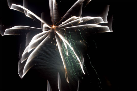
fworks2.jpg

  1. Find a location away from the crowd and power lines. An elevated location on a hillside works well. You might want to scout out your perch beforehand: Especially on big fireworks nights (such as July 4th in the US, November 5th in the UK, and new year's eve in most of the world), a lot of the prime photography spots will be taken hours before the fireworks, so plan ahead!
  2. Set the shutter speed to 1 second or longer. Don’t be afraid of underexposing your photos, though. You won’t.
  3. Use a low ISO - you want as little digital noise as possible.
  4. Use a tripod. If you can’t find a tripod use a nice steady base.
  5. Turn off the flash. This might seem like common sense, but remember you are photographing lights, so you don’t need to add more light yourself.
  6. Shoot in RAW. You need as much exposure latitude as you can get, in order to be able to do any adjustments you need to do in post-production.

Point your camera toward the sky and shoot. A key to getting a good shot is anticipating when the firework will explode. Initially you will have many hit and miss shots. As the show goes along, you will be able to perfect your timing, and getting better shots as you're learning!

Case study

screen_shot_2011_11_04_at_123826.jpg

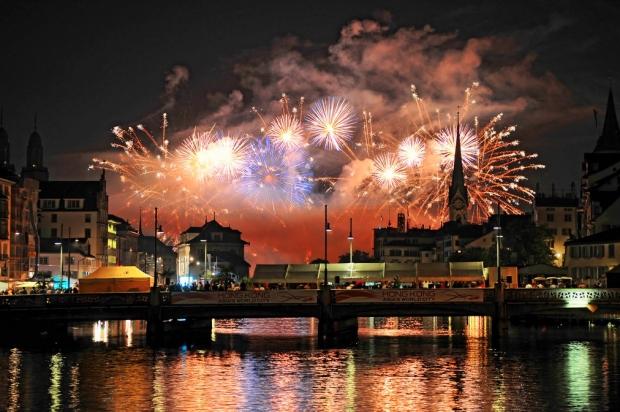
This fantastic photo is called Fireworks over Zürich, and is (cc) Tambako the Jaguar on Flickr

To get a shot like this, you'll need to use all the above tips, and you'll probably need to shoot in fully manual (although, interestingly, this shot was taken in Aperture priority).

Take a load of test exposures to see what works best; expose for the fireworks (so, use your histogram to determine how your exposures are working out) where possible, and adjust your shooting as you go along. The above photo was taken with an f/3.2 exposure, using a 1/4th of a second shutter speed, and ISO 400, with a -1/3 EV exposure bias. The results are gorgeous, but a slightly longer shutter speed might have made the water look more 'flowing', and could have increased the 'streaks' of the photographs just that little bit extra. Switching the camera to ISO 100 and 1 second shutter speed would have achieved both of these things.

The most important thing to keep in mind is that there aren't any hard-and-fast rules for how to get the best fireworks shots - Experiment and see what works best for your particular lighting scene!

Even more fireworks photography!

Can’t get enough? Well, try the guides, tutorials and tips from Better Photo.com, Garry Black, about.com, calphoto, DPchallenge, and Smithsonian institute!

What do beards, witches, and fathers have in common?

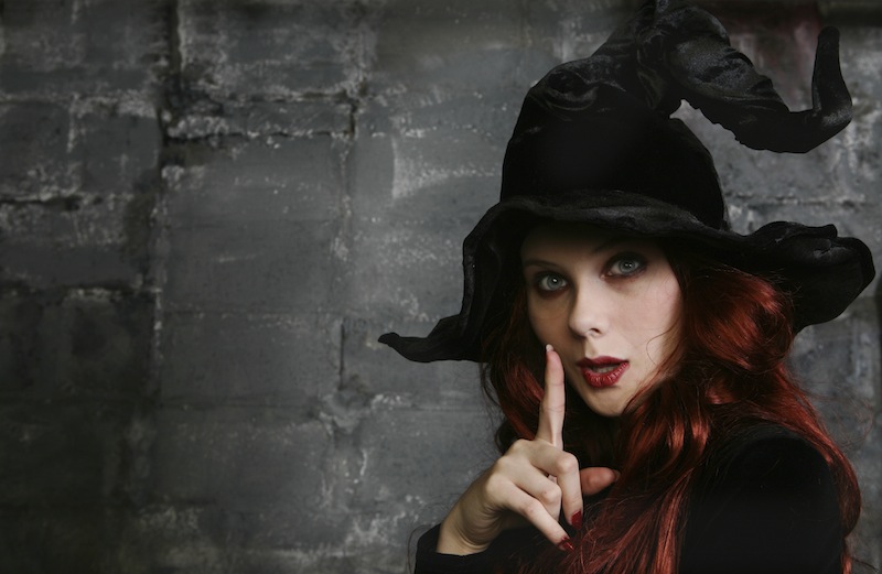
What do beards, witches, and fathers have in common? Witches often come with beards in folklore? Some dads have beards? Ehm... According to stock house iStock, we can expect to see all three of them at the vanguard of visual trends in the coming months. Move over vampires, the covern is on the rise. It doesn't have to be all eye of toad and wing of bat, either. Think swishing black taffeta and piercing eyes for our 21st century witches.

Witch hat - bobbieo #9722956, via iStock by Getty

Do you remember 'that' poster of the topless man cradling a baby? Just a vague recollection of it hanging in the window of Athena or plastered to the wall of teenaged girl's bedroom? It was taken by Spencer Rowell in 1986 for the poster shop Athena and it's supposedly the biggest-selling poster in British history. While that might've heraled the 'New Man' aesthetic, this season you'll be looking at dads having all the fun with their children.

Little boy - LifeSizeImages #20428785, via iStock by Getty

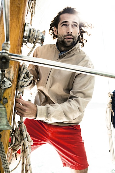
Beards. We're going to be seeing a lot more beards. They were all the rage on the Paris, London, and New York catwalks, I'm told. Something to do with 'geek chic'. I bet that the male half of team Photocritic never thought of himself as a fashion icon!

Beared sailor - Alija #24912776, via iStock by Getty

Instacanvas is now Twenty20, but how is its vision?

Did you hear of Instacanvas? It was a canvas printing company devoted entirely to Instagram images. You could link your Instagram account to their website and choose your favourite filtered, square-cropped photo to hang on your wall. Or, you could establish your own gallery and let other people wander through your photos and select your Madagascan sunset to adorn their living room. The idea was that it freed people from the tyranny of mass-produced images supplied by Swedish furnishing behemoths and instead provided them with the opportunity to choose from millions of photos created by people like them. Matt Munson and Instacanvas' other co-founders wanted to let people buy and sell images without a curatorial middleman. Smartphones have brought photography to everyone; why can't everyone benefit from the plethora of photos?

Plenty of people agreed with that sentiment.

Instacanvas has grown enormously since those first heady days when it went public in May 2012. Its range of products has grown, although your public gallery remains Instagram-only you can upload photos from other sources to print for yourself, and the number of photos on its books is in the region of 30 million. It's perhaps this achievement, and the potential that it holds, that has led to Instacanvas' next steps.

It's now called Twenty20 and it is venturing into the stock image market. With a book of images to rival Fotolia or Shutterstock, how are things shaping up for this 13-person operation based in Santa Monica?

I have to say that my first experience with Twenty20's website didn't get off to the greatest of starts. For anyone who lives in a cricket-playing country, your first Google hits for 'Twenty20' will be about the limited overs form of the game. Don't forget to modify 'Twenty20' with 'canvas' and things should be better. When you hit the splash page you're faced with something attractive, but utterly uninformative. There's no mission statement or suggestion as to what it is or does, there's no 'About Us' link or 'Contact us' option, and there's no indication as to how to access what lies beneath. How frustrating!

Attractive looking, but what's it about?

Eventually, I learned that in order to be able to find out what Twenty20 is all about or just to peruse its wares, I needed to register. My gut reaction to this was that it felt in someway deceptive; now I'm more inclined to perceive it as absurd. Why actively try to prevent people from learning more about your company by demanding information from them? I persevered because of professional interest, but would someone who's casually looking for wall art?

Taking this a stage further, would someone who's looking for stock imagery be bothered to sign up and then navigate to the stock pages when you can rock up at Shutterstock, Fotolia, or iStock, type your desired subject into the search box on the front page and be presented with pages of findings immediately?

Munson told me that forcing people to register is a recognised tactic to encourage interaction on social media sites and it's something that other social media sites employ, for example, Twitter. It's an interesting theory, but I'm not sure it's quite the right approach for Twenty20. For a start, Twitter's splash page isn't link-less or a desert of information, and Twitter is rather more well known than Twenty20. When your aim is to convince people to part with their money, you need to do everything that you can to lure them in, rather than push them away. Twenty20 might have its roots in social networking, but ultimately it's about sales and this has to be as easy as possible.

Once people have been lured in, selling products via Twenty20 is refreshingly simple. Signing up with Instagram means that your images are there, ready and waiting to be made into prints or prisms to hang on your own walls, or to be curated into a gallery ready for anyone else to peruse and transform into something to hang on their walls. You don't set your own fees, they're standardised, which makes it easy for buyers and you know that you'll always take a 20% cut of the sale.
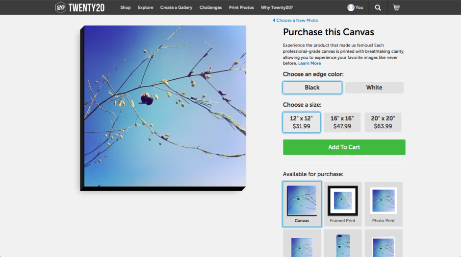
Oh-so-easy to turn your own Instagram images into canvas prints

Although the pricing structure for digital image files is uncomplicated: $20 per image, with discounts for bulk buys, acquiring them isn't quite as easy. You need to contact the Twenty20 team to proceed. I'm hoping that this is merely a teething problem in Twenty20's new venture. First because it puts it on the back foot when compared with other stock houses; second because this is where I think that Twenty20 could excel. Imagine how much easier it would be to buy and sell news-oriented Instagram images via Twenty20, rather than have them used fee-free by news publications? Wouldn't it be great if your skinny-no-foam-latte photo is the one favoured by wannabe-hipster food blogs? (If they were real hipsters, they'd be using their own Instagrams, clearly.) But this relies on the system becoming faster and easier to use: instant access to your Instagram images.

Make it easier to access and buy your stock and they will come

When you have crossed the drawbridge, negotiated the portcullis, passed through gatehouse and into the bailey, and finally made your way into the keep that is Twenty20, there are some beautiful products for purchase and a welter of images for sale. It's such a shame that Twenty20's website design has made everything so inaccessible. Indeed, it's ironic. It's a company that's built on the principle of bringing the wealth of gorgeous digital media that languish in the aether onto people's walls and breaking down the barriers that sit between digital artists and their potential clients that have been erected by the curators of galleries and stock houses. There might not be any curatorial gate-keepers accepting or rejecting images, but there are technological ones discouraging people from making use of Twenty20.

If Twenty20 wants to truly realise its vision, I think it needs to follow through with its technological accomplishments to the same degree as its ideological principles. The theory's simple; keep the practicalities that way, too.

There's a Snapseed update in town, but it's not for everyone

Snapseed has released an update to its iOS and Android apps, bringing two new features to its editing suite. You can now apply an HDR effect to your photos using the HDR scape filter and in the Tune Image function there is now the ability to adjust shadows with a dedicated shadows slider. BUT if you're still running iOS 5 or 6 (some people are) please don't update yet. There's a bug that is presenting problems with saving or sharing images when you're running these versions. The team behind Snapseed is aware of this and they're working on an update to address it.

Update! If you're an iOS 5 or 6 user, it's now safe to download. HDR-away.

Adobe's security breach in October was far more serious than believed

Adobe announced that it had suffered a security breach in early October that had resulted in the compromise of approximately 3 million customers' data as well as the loss of some proprietary source code. Attackers made away with customers' names, encrypted payment card numbers, and card expiration dates as well as the code for the ColdFusion web application and its Acrobat programmes. KrebsOnSecurity, the firm that spotted the initial attack has now placed the figure of customers affected by the breach at some 38 million, and the source code that was lifted is also said to include Photoshop. According to the KrebsOnSecurity blog, it has taken some time to uncover the extent of the violation because:

At the time, a massive trove of stolen Adobe account data viewed by KrebsOnSecurity indicated that — in addition to the credit card records – tens of millions of user accounts across various Adobe online properties may have been compromised in the break-in. It was difficult to fully examine many of the files on the hackers’ server that housed the stolen source because many of the directories were password protected, and Adobe was reluctant to speculate on the number of users potentially impacted.

Over the weekend, a large file of username and hashed password pairs was posted by AnonNews.org, which appear to be Adobe account details.

Adobe has contacted all of the active customers whom it believes to have been affected and claims that there has been no 'unauthorised activity' on any of the compromised accounts since the attack. It now remains for the inactive customers to be contacted. And regardless of whether users were active or inactive, their passwords were reset if Adobe believed that they were affected by the attack.

Whether Adobe chose to downplay the extent of the attack earlier in the month because it couldn't be certain of the number of affected customers or because it prefered to minimise the damage does not present it in the best light. One scenario makes it look careless, the other deceptive. I wonder how many customers are now looking for alternative products and providers... or waiting for a replicant based on the stolen code?

(Headsup to Engadget)

Update! Heather Edell, Adobe's Senior Manager of Corporate Communications emailed me in the early hours of 30 October. She stated that:

In our public disclosure, we communicated the information we could validate. As we have been going through the process of notifying customers whose Adobe IDs and passwords we believe to be involved, we have been eliminating invalid records. Any number communicated in the meantime would have been inaccurate. So far, our investigation has confirmed that the attackers obtained access to Adobe IDs and what were at the time valid, encrypted passwords for approximately 38 million active users. We have completed email notification of these users. We believe the attackers also obtained access to many invalid Adobe IDs, inactive Adobe IDs, Adobe IDs with invalid encrypted passwords, and test account data. We are still in the process of investigating the number of inactive, invalid and test accounts involved in the incident. Our notification to inactive users is ongoing. We currently have no indication that there has been unauthorized activity on any Adobe ID account involved in the incident.

In short: 2.8 million users had their names, encrypted payment card numbers, and card expiration dates filched by the attackers. An additional 38 million users had their user IDs and encrypted passwords stolen. However, because Adobe was unable to validate the number of users affected by the loss of user IDs and encrypted passwords, it did not disclose this initially. It has waited until it has more accurate figures.

What is time-lapse photography?

This photography fundamentals session looks at the theory behind time-lapse photography: how it works and what you can use it to achieve. For a collection of time-lapse videos from across the world, housed in one place, check out Primelapse. If you feel inspired and want to have a go at trying it yourself, we've a tutorial on that, too!

Speeding up time

Anyone who has ever watched a nature documentary will be familiar with time-lapse photography, even if they couldn't identify the technique itself as time-lapse. When you watch an African riverbed flood and desiccate and flood again over the course of a year, but the footage has been condensed into a running time of thirty seconds, that's time-lapse. Seeing a plant grow, flower, and die within the space of ten seconds would have been achieved using time-lapse photography, too.

The Oxford English Dictionary's definition of time-lapse photography is:

the photographic technique of taking a sequence of frames at set intervals to record changes that take place slowly over time. When the frames are shown at normal speed the action seems much faster.

The difference is in the frame-rates

How about a photographically or cinematographically-oriented explanation? Video is made by shooting a series of photographs (or frames) in succession and then stringing them together so that they can be watched in sequence. Films shown in the cinema are usually filmed at 24 frames-per-second; depending on where you are in the world, television programmes will have a frame-rate of 24 or 25 frames-per-second. When they're played back at 24 or 25 frames-per-second it gives the impression of things happening in 'real time'.

The time-lapse sequences in the nature documentary, however, will have a much slower frame-rate with a significant period of time elapsing between each shot. They might have been 60 frames-per-minute, or six frames per minute, or 24 frames per day. When these frames are strung together and shown as a video replayed at 24 or 25 frames-per-second, it makes whatever was recorded appear to take place faster than it really did. It's an excellent technique for documenting change and a great first step into film-making.

Documenting change

For anyone interested in having a go at time-lapse photography, it will require identifying a subject that is going to change over time, taking a series of photographs of this subject as it morphs, and then piecing together these photographs to create a video. The result will be a video showing the change happening faster than it really did. You don't have to worry about recording sound, about focus-pulling or panning, or about directing your subjects. All you really have to remember is that the faster the change takes place, the shorter the interval between each shot will need to be. This is why a pregnant woman's swelling belly can be documented with one photo a day but a melting ice cube will need several shots every minute over the course of, say, 30 minutes.

Time-elapsed sequences can be as involved or as simple as you want. They can be shot over a matter of minutes, for example drifting and shifting clouds; the span of months, such as the construction of a building; the course of years, or anything in between. They can be taken on the move, for example in a car or on a bus. And they can involve shifting vantage points and changes in focus as you grow more sophisticated. The key is to have a subject that is changing.

If you were to reverse the time-lapse process and shoot hundreds or thousands of frames-per-second and replay them at 'normal' speed, or 24, 25, or 30 frames-per-second, you would create the opposite effect: slow-motion photography!

TL;DR

  • Time-lapse photography is a technique that is often used to document change
  • It works by shooting a series of images over a period of time but playing them back at 'normal' cinematic or televisual speed; this gives the impression that things happened faster than they did in reality
  • Time-lapse photography projects can take place over minutes, days, months, or years
  • The faster that something changes, the shorter the interval between frames is needed to document it

Speed << Photography Fundamentals >> Vibration and camera shake

Olympus' Stylus 1 feels like a curate's egg of a camera

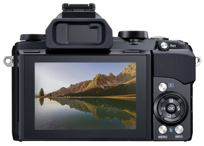
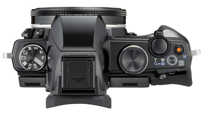
The best way that I can describe Olympus' new Stylus 1 premium compact camera is as a curate's egg: it's good in parts. Some elements of it really appeal and some leave me indifferent at best. For a camera that Olympus had hoped would shake up the top end of the compact camera market it feels rather lack-lustre. Channeling the OM-D series of cameras, but scaled down in size

For a start, the zoom range is impressive. At the equivalent of 28 to 300mm, it beats its Nikon, Canon, and Fujifilm rivals into a cocked hat. None of those (the Nikon P330, Canon S120, Fujifilm XQ1) goes beyond 120mm. And the Stylus 1 has a constant ƒ/2.8 aperture across the range; there's no dropping down to ƒ/5.6 as you zoom in on your subject. But this is where some trade-off comes in. The others have bright ƒ/1.8 apertures at their lenses' widest angles, which narrow as the focal length increases. What would you prefer?

I'm not convinced by that 'hump' in my pocket

The standard resolution for this type of camera is 12 megapixels and Olympus hasn't deviated from that. Is there any need to? There's wi-fi, which you'd expect; a customisable lens ring and to button to put your most-used functions where you want them; it has a sensitivity range of ISO 100 to 12,800; and everything is powered by a TruePic VI processor.

Aesthetically, the Stylus 1 is channeling the OM-D E-M series, a look that is driven home by the inclusion of an EVF that comes with a 'hump'. This is a strange addition for something that is designed to slip into a pocket; it measures 116 by 87 by 56.5mm, but would you want something lumpy sitting against your thigh? There appears to have a disconnect between the camera's technical intentions and its ergonomics. It's not a design that's blowing back my hair and I'd be inclined to pass it over in favour of the Fujifilm XQ1.

All the controls you'd expect from a top-end compact

The biggest disappointment, though, is the 1/1.7" sensor. Fujifilm squashed a 2/3" sensor into the XQ1 and Sony has managed a full-frame sensor in a compact body. We know that it can be done and this is where Olympus really could have broken away from Canon and Nikon, but it hasn't. And at £550 (or $700), it feels very unsatisfactory.

There are things to like about the Stylus 1, but for me, there isn't enough. Olympus, you could have done better.

Review: Photoristic HD iPad editing app

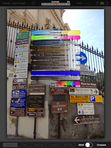
When I first downloaded Photoristic HD to have a go at some editing on an iPad, I was expecting an all-round editing package that would be great for my parents to use to make adjustments to their photos on their iPad. They use a point-and-shoot, record everything in JPEG, my mother has a proclivity to take wonky photos, and my father doesn't understand the concept of 'getting closer' no matter how much I try to impress it upon him. They need a simple but comprehensive editing app. Photoristic HD combines general editing functions (white balance, exposure, contrast, highlights, shadows, vibrance, saturation) with advanced colour adjustments and a barrel of filters. It can process images of upto 20 megapixel resolution, and saving and sharing is easy. It sounded promising. So much for my expectations. This was not an app that felt I could present to my parents to help them make their photos look better. It wouldn't meet their needs. But when I got past this disappointment, I realised that Photoristic HD offers something different for iPad editing and it might not be all that bad.

photo

Photoristic is easy to use: you swipe left or right to adjust the values of whichever function you've selected, be it the like of contrast, shadows, or highlights underneath the balance tab, or one of the eight colours sitting beneath the hue, saturation, or luminance tabs. You can convert to black and white with the toggle of a button and you can apply one of a huge selection of filters—black and white options, selective colour choices, and colour filters—with two taps.

I'm not a frequent filter-fyer and I actually found many of Photoristic's too harsh or intense for my tastes. I wouldn't want to let my parents loose with these. All their photos would come out too brash, too sharp, too in-your-face. Photoristic does, however, let you save your own presets, which is moving well beyond the realm of my parents' use, but does present it in a different light.

The Polar Sun preset doesn't do it for me

This gives you the chance to combine its split tone function, colour controls, and the adjustments in the balance tab to create your own effects. Now that I've taken a step back, I wouldn't hesitate to name Photoristic's fine colour control and ability to save presets as its most valuable feature. No, it isn't an all-round editing package; it's something else. I was able to create my own cross-processed effects or add a bit of golden hour magic to a photo taken nowhen near sunset or sunrise. And I was able to save these as presets to apply to any photo I process through the app.


Having fun with split toning

There are buttons that allow you to sequentially undo your previous edits or compare your current version to your original image. When you're content with your handiwork you can save your image to your photo library or Dropbox, email it onwards, send it to print, or share it to Facebook or Twitter.

Should you get a bit stuck, the help button is towards the top left corner.

The most critical omission that prevents Photoristic from being a comprehensive editing package is a crop and rotate feature. With every photo that I put through the app I felt frustrated that I was unable to straighten it or slice off a few extraneous pixels. And my parents, with their skewed horizons and distant subjects, definitely need it. It's all very well being able to bring out the blue of a sky, tone down the red of someone's nail polish, or help negate a green cast, but crop and rotate is one of the basic functions that we rely on in an editing suite.

Standard edits are fine, but oh for the love of a crop function

I was so surprised by the omission that I emailed the developers to check that I hadn't missed it anywhere. They confirmed that there isn't a crop and rotate function yet, but it is expected in a future iteration.

When you realise that Photoristic isn't a basic editing app but instead offers more sophiscated controls to adjust colour and create your own filters for your photos, it takes on a different complexion. If you're looking for an iPad app to let you take control of your photos' colour effects and filters, then do consider downloading Photoristic. It's £2.99 in the UK and $4.99 in the US.

I shan't be showing my parents how to use it.

(All photos courtesy of my parents.)

Another Olympus Image Space pop-up event

Olympus' second pop-up event, Image Space @ Icetank, kicks off on Saturday 2 November in London's Covent Garden. A series of activities has been scheduled that includes workshops, talks, debates, and interviews. There will also be opportunities to go hands-on with Olympus' new OM-D E-M1. Sessions include the chance to assist Damian McGillicuddy when he photographs model Ulorin Vex on a commercial shoot, a discussion of the power of the personal photographic project, and an introduction to social media for photographers.

You can see the full run-down of of what's available and book yourself onto a session or two on the Olympus website. All of the sessions are free but you do need to reserve a place.

Olympus Images Space @ Icetank runs from 2 to 9 November 2013 at 5-7 Grape Street, LONDON WC2H 8DW.

How adverts will appear on Instagram

Instagram has released a preview of how the advertisements that its users will soon be seeing—as soon as next week if you're in the US—will appear. This is a one-time ad from Instagram to serve as a taster. Real ads will start with those from a select few brands that already make use of the service. Instagram ad example

Advertisements will be identifiable by a 'Sponsored' label in the top right corner, where the timestamp would normally be. So that Instagram can determine what works and what isn't so successful in terms of adverts, you can tap on the '...' button to hide an advert and explain what made it unappealing.

I've already made the case for adverts on Instagram; this example looks tasteful enough but of course you can't be sure what any other company will come up with. They are, however, easy enough to identify as adverts.

Headsup to TechCrunch

Are you seeing Dubble?

The notion of multiple exposure photography is familiar: take a photo and then re-expose the same frame, or merge together two or more digital photos, to create a fun, or a ghostly, or a creative image. It's something that photographers have been doing since the dawn of photography, sometimes deliberately and sometimes accidentally, and whether you choose to shoot double exposures with your Holga or engage the multiple exposure setting on your Canon 6D, it's not that hard. But what about turning double exposures into something even more fun, very easy, and incredibly social? This is precisely what Adam Scott, Angelo Semeraro, Ben Joyce, and Uldis Pirags are aiming to do with their app Dubble.

dubble

You take a photo. You upload it to Dubble and share a few details about it. The Dubble algorithms then work their binary wonder and combine your photo with another from the Dubble community. Bingo! A socially, randomly generated double exposure. You and your Dubble counterpart can then both share your joint creation and take joint credit for it on Facebook, Flickr, and Twitter. By the end of the year there should be Instagram and Tumblr integration, too.

Dubble tutorial

The Dubble community started up in the summer of 2013, with 40 family and friends of the founders, across 18 countries, taking and sharing their photos to create Dubbles. They've merged Spanish music festivals with the family pet, a flamingo with a cityscape, and a fairground carousel with a French beach. Now, the iOS app is publicly available for download and dubbling fun.

Adam Scott, Dubble's CEO is understandably excited about the app: 'We’ve worked really hard to develop an app that we hope will tap into the fantastic social and creative potential of collaborative multi-exposure digital blending with a complete stranger. Our ambition is to become the most exciting collaborative photography community in the world.'

I think I might go give this one a try!

Review: MacWet gloves

The clocks go back this weekend in the UK. This means that winter is approaching, along with its longer nights and colder weather. I'm digging out my hats, scarves, and gloves and this year a new pair of gloves will be joining my wardrobe. They're made by MacWet and it seems as if they might be suitable to wear while wielding a camera. MacWet gloves are typically worn by sportswomen and men, people such as jockeys and golfers who prefer to retain the functionality of their fingers despite the cold, but also need to be assured of grip. Dropped reins and flying golf clubs are far from fun. They come in two flavours: the lighter-weight Micromesh and the fleece-lined Climatec version for much colder days.

MacWet's lighter-weight Micromesh gloves

Thinking that photographers might benefit from warmer hands with the added bonus of un-dropped cameras, they sent me a Micromesh pair to try out. I suffer from terrible circulation so have a goodly selection of gloves for the colder months; for photography purposes I use a pair of fingerless woollen gloves with a mitten topping that gives me a modicum of warmth without jepordising my control over my camera. Despite my huge scepticism about the potential efficacy of the MacWet gloves, my fingerless mittens have now been relegated to recreational wear.

My first concern was that a begloved finger would be too cumbersome and clumsy to afford me accurate control over the buttons and dials on my camera. So far, I've not experienced any problems at all, but I have been using the lighter Micromesh version. The gloves come in sizes 6 to 12, and the size 7s I've been wearing have been snug. No, a layer of fabric is never going to allow you the tactile responsiveness of your bare skin, but I've not been disappointed.

Second, what about grip? No concerns at all. My camera hasn't slipped through my grasp and neither have any lenses when changing them, whether the gloves have been wet or dry. The heavier-weight Climatec gloves are both water resistant and windproof, but my hands haven't felt uncomfortable when I've doused the Micromesh version. When they get dirty, you can chuck them in the washing machine at 40°.

If you are of the glove-wearing persuasion, you might want to think about a pair of MacWet gloves. The Micromesh gloves are £28 a pair; the Climatec gloves are £30.

What's Nokia brought to the mobile photography landscape with its new phones?

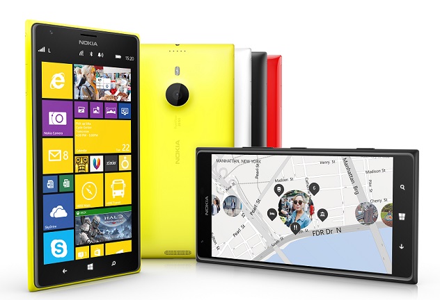
There's been a lot of love for the cameras that Nokia have been squishing into their mobile phones of late. It isn't just about the 41 megapixels found in the Lumia 1020, but more about their cameras' quite impressive low-light capability, image stabilisation, and the control that the camera app affords you. With the anouncement of the Nokia 1520 and 1320 in Abu Dhabi today, has anything new been brought into play in the smartphone landscape? Let's start with introduction of a Windows phone-compatible Instagram app. Instagram is hardly new to smartphoneography and if filtered, shared photos don't float your boat, it'll hardly seem like a big deal. However, for people at Microsoft and Nokia, the lack of an Instagam app on their phones was considered to be a significant factor in holding back sales of their devices when compared against Instagram-friendly iOS and Android. The Windows phone has now been opened up to a wealth of people who might otherwise have dismissed it out-of-hand, and with it, its camera's capabilities and functionality have been pitted against those of other manufacturers.

That's the 20 megapixel Lumia 1520

Lots of the other toys might not bring anything revolutionary to the Lumia cameras, but they are fun and functional.

The new Refocus app isn't new to camera technology—it's the same idea as a Lytro, allowing you to refocus your images after you've taken them—and something similar is available for iPhones, with the Focus Twist app, but it is bringing more functionality to Nokia phones and giving more options to users. Refocus also allows your Facebook friends (and other socially networked people) to fiddle with your photos and interact with them.

The Beamer app and the Storyteller function are meant to make Nokia phones more interactive, too. Beamer will allow you to share photos with anyone whose screen is compatible via a via social media, email, or SMS link. Storyteller creates a temporal story of your photos, placing them on a map along with chronological notation.

Previously, there were two separate camera apps in Nokia phones: Smart Cam and Pro Cam. These have now been combined into a single Nokia Camera app, which should make shooting quicker and simpler.

But the introduction of Raw file support does signal that Microsoft/ Nokia does mean business with its cameras. If they can do it, why shouldn't or couldn't any other camera manufacturer? We're seeing the gradual adoption of larger and larger sensors into smaller and smaller camera bodies; why not the introduction of Raw files into smartphones as standard?

Rihanna's Sheikh Zayed Grand Mosque photo shoot curtailed

Rihanna does seem to have a knack for making faux-pas when it comes to on-location photo shoots. In September 2011 a Northern Irish farmer asked her, politely, if she wouldn't mind putting on some more clothes or choosing a different location other than his field to film the music video for We Found Love. This weekend she was asked to leave the Sheikh Zayed Grand Mosque in Abu Dhabi after posing for some 'inappropriate pictures.' According to the mosque, at first she tried to gain access via an entrance that isn't intended for visitors. When she did make it in through the correct gate, she proceeded to pose for some photos. Photography in the grounds of the mosque isn't forbidden, but its guardians do keep an eye on how it's done. They don't want the sanctity of the space to be violated by lascivious lounging or provocative posing. Anyone can take photos for personal use without permission, but commercial photography does need to be pre-arranged. While it is unclear if Rihanna was a little too risqué in her modelling, she definitely didn't have permission. According to a spokesperson for the mosque, Rihanna's trip hadn't been co-ordinated with the admnistration and she, and her entourage, was asked to leave.

At least she turned up appropriately dressed, in a black jumpsuit and headscarf. Her experiences in a field in Northern Ireland seem to have taught her something. It's probably a good idea to speak to management before starting a photoshoot in the grounds of one of the UAE's most visited buildings, however.

If you're interested, some photos taken outside the mosque wound their way onto her Instagram stream.

Headline image courtesy of Wikipedia.

Headsup to Yahoo! News

Instagram, meet Windows

It has only taken three years since Instagram's launch and 18 months since the Android app was released, but people using Windows phones will no longer have to indulge in techno-shenanigans or work via third party apps, some of which pushed Instagram's patience, to access Instagram. The news was made public at the Nokia World conference in Abu Dhabi earlier today and then confirmed by Instagram. According to Instagram's CEO, Kevin Systrom, 'Our ultimate goal is to bring Instagram to everyone who wants to use it.' As a consequence, an Instagram app will be rolled out to Windows phones users in the next few weeks.

With Windows phones being all dressed up in terms of cameras but having fewer photo sharing parties to go to, Nokia and Microsoft had been pushing for Instagram compatibility with their devices for quite some time. As far as they were concerned, the lack of access was something that gave iOS and Android platform phones a significant edge. How much this changes anything with respect to numbers and sales figures remains to be seen, but Nokia and Microsoft are certainly feeling quite happy about this right now.

(Headsup to the Verge)

What was an optical low-pass filter and why did we need one?

Fujifilm tried it with the X-Pro1 at the beginning of 2012 and carried on with the X-E1 in autumn 2012 and the X20 early 2013. Nikon's D800E had a go, too. Pentax did it with its K-5 II s in 2012 and recently its K-3. The Olympus OM-D E-M1 went without, and so did the Ricoh GR, Sony's RX1R, and the newly announced Sony A7R and Nikon D5300. What sort of fire have these manufacturers been playing with? They have all omitted the optical low-pass filter, or anti-aliasing filter, from their cameras.

But what was an optical low-pass filter, why did we used to need them, and why can our cameras suddenly cope without them?

Low-pass filters

A low-pass filter comprises several layers of optical quartz that have been cemented together and placed in front of a camera's sensor. They were put there to help prevent the appearance of moiré in images, or that odd effect when anything with a close pattern, for example ties or denim, would appear to be swirling and fuzzing, almost like the screen of an untuned television set or an animated gif. Moiré can be hugely distracting.

Mis-align one grid with another and the effect is not great (Diagram courtesy of Wikipedia)

Moiré

If you're familar with the concept of temporal aliasing in video, when spinnning wheels sometimes look as if they're going backwards, moiré isn't too far removed from that.

The pixels in a camera's sensor are arranged, somewhat logically, in a grid. If you were to photograph a subject that also has a close-knit grid-like pattern there's a significant chance that the pixel-grid and the pattern-grid won't align perfectly, leading to a jumpy, swirly clash of lines of pixels and lines of pattern. Imagine one patterned transparency placed over another, but with the patterns mis-aligned. It's called aliasing.

To prevent this from happening, camera manufacturers placed optical low-pass filters—or anti-aliasing filters—before their sensors. These filters worked by softening and blurring the image a touch, reducing the effect of the moiré. If you shot in JPEG you might not have noticed this added softening because the camera would compensate for it, but for anyone who favoured Raw, you would notice the need the sharpen your images. It also ate into the detail that your sensor could record, too.

What's changed, then? Why can we now do without these filters?

To a degree increased pixel density has helped to create a situation where moiré doesn't happen anymore, or at least it happens less frequently. The more pixels there are on the sensor, the less likely they are to form a grid of a size that will clash with a subject's patterning.

Add editing software that is more capable of dealing with moire to moiré's less frequent appearances, and the filters become less desirable, especially when they eat into an image's resolution and sharpness.

Finally, manufacturers such as Fujifilm are moving away from sensors with rigidly aligned pixels to slightly more randomly distributed pixels, as you'd find on film. This negates the propensity for grids and lines to clash.

Better without the low-pass filter because...

... it should improve colour rendition, sharpness, and detail in your photos.

If all they did was remove the filter, why were the Nikon D800E, Pentax K-5 II S, and Sony's RX1R and A7R more expensive than their filtered counter-parts?

It wasn't quite as simple as removing the filter. The filters needed to be replaced because they performed other functions, too, for example acting as infrared filters. New technology isn't always cheap. Sony's kept with the 'One-with, one-without' option for its new full-frame mirror-less camera, the A7 and A7R, but Nikon's D5300 is low-pass filter-free and so is the Ricoh Pentax K-3. It seems this is way of things to come.

2013 Wildlife Photographer of the Year competition

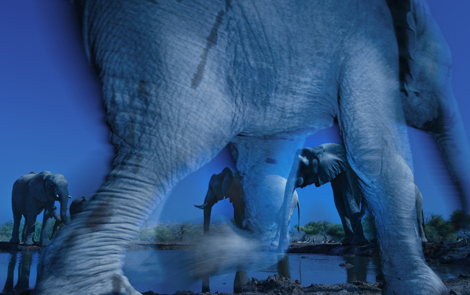
I spent a rather glorious morning at the Natural History Museum today, persuing the winners of the International Wildlife Photographer of the Year awards and speaking with some of the photographers. If you have the opportunity to drop by and take in the show, you really should. I loved every single photo in the the animal portraits category, and many more. The winners are here for your enjoyment, the rest of the finalists can be seen on the NHM's website. A word for anyone who thinks that wildlife photography is the preserve of the long lens: Greg du Toit used a wide-angle lens to capture the elephants in his winning photo, Essence of elephants and he wasn't the only photographer to make use of a shorter focal length. You expect to see them used for acquatic images, but here they were used to photograph birds and big cats, too. At least four photographers made use of fisheye lenses and one opted for a tilt-shift. It isn't just about the telephoto.

Essence of elephants, by Greg du Toit (South Africa) Nikon D3s + 16-35mm f4 lens + polarising filter; 1/30 sec at f22; ISO 800; Nikon SB- 900 flash + SC28 remote cord; mini-tripod; Nikon cable-release.

I was struck by the intense blue of Greg's image. As he said, it has an underwater intensity to it. He particularly wanted to convey the mysterious energy that he feels when he's around elephants and felt that this shade, captured around sunrise and helped on its way with a polarising filter and white balance, did just that.

Mother's little headful by Udayan Rao Pawar (India) Canon EOS 550D + 100-400mm lens; 1/400 sec at f13; ISO 1600

With a few more young wildlife photographers like Udayan, the genre is in very safe hands. It's not just his obvious ability, but also his passion and dedication. Whether he chooses to pursue conservation photography or a place in the Indian air force, he'll go far.

The exhibition runs from 18 October 2013 until 23 March 2014 at the Natural History Museum, Cromwell Road, London.