Triggertrap Redsnap goes live on Kickstarter

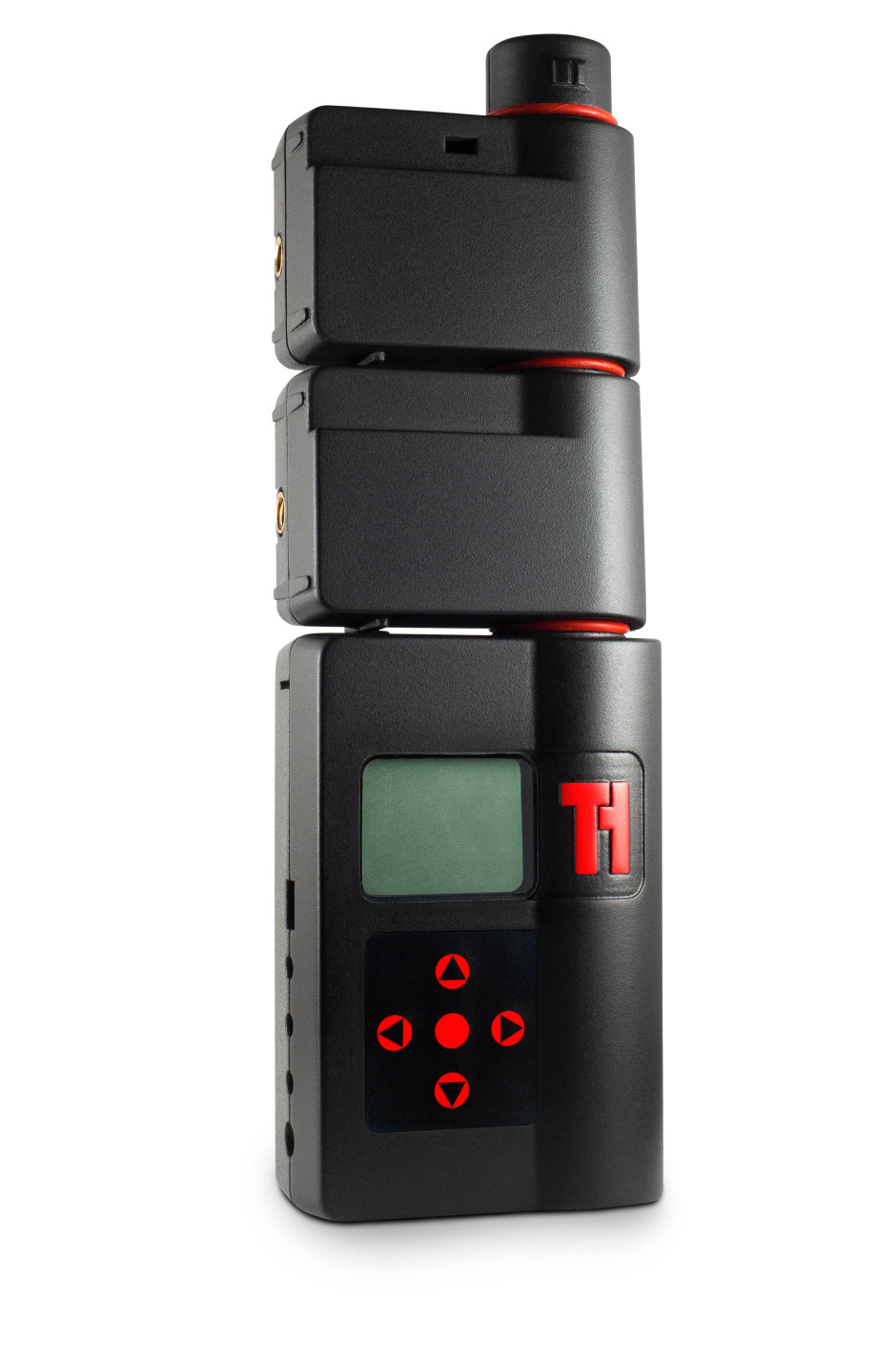
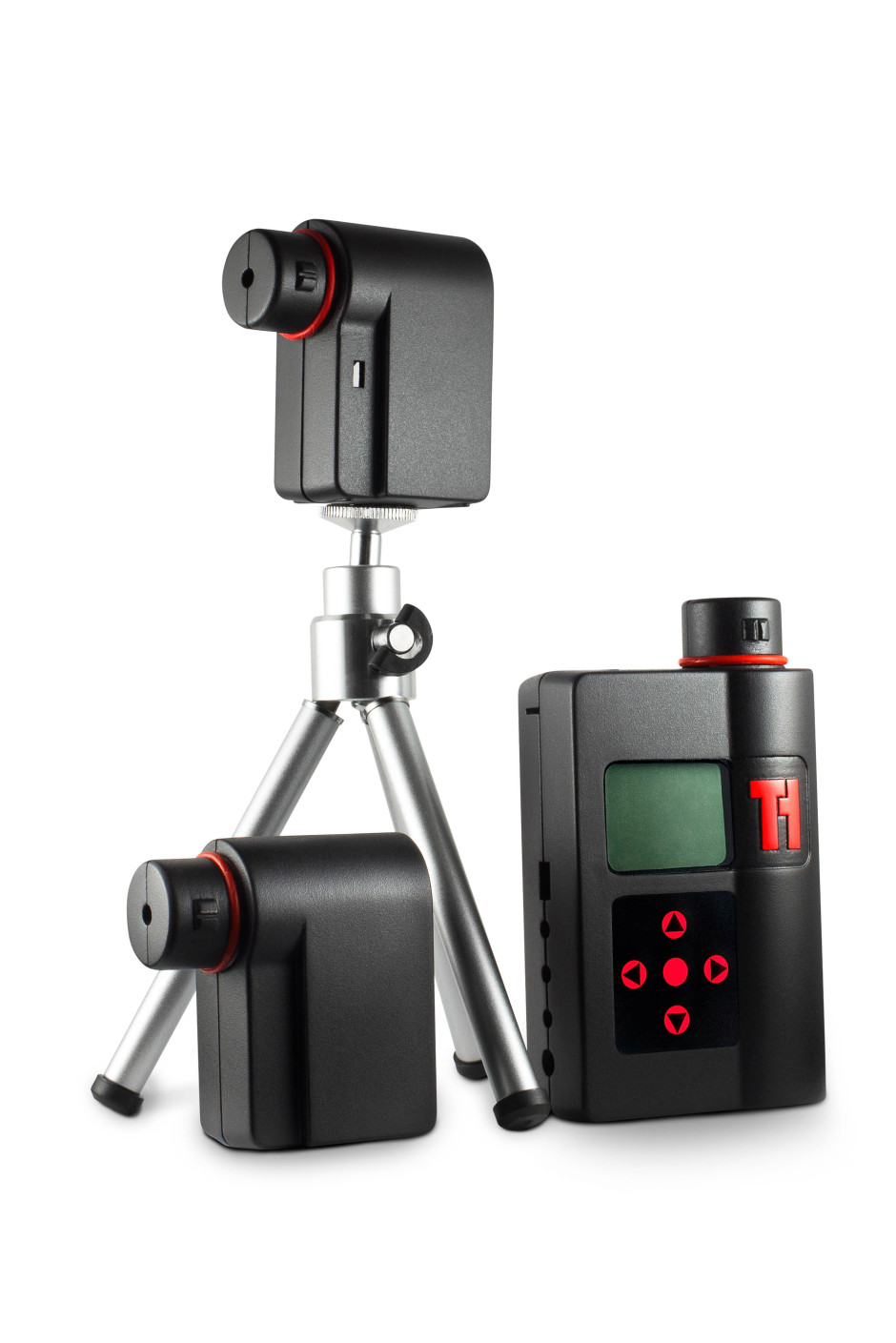
When Haje Jan Kamps (that is the very same Haje Jan Kamps who publishes Photocritic) launched his first Kickstarter project to deliver the Triggertrap universal camera trigger, back in 2011, little did he know that it would spawn a mobile app with 14 ways to trigger your camera, a high-speed triggering device, and an actual company with offices and employees. Now, Triggertrap is returning to Kickstarter to bring you Redsnap: an infinitely expandable high-speed camera triggering tool. Redsnap is a modular system, offering photographers the ability to build the camera trigger that they need for each shoot.

Triggertrap Redsnap 19

The base block includes the time-lapse options Triggertrap is known for: timelapse, TimeWarp (timelapses that include acceleration), long exposure HDR, and star trail mode. On top of that you can add a high speed laser sensor, great for capturing a bullet in flight; a high speed sound sensor, to capture bursting balloons and smashing vases; a high-speed light sensor to make sure you snap a lightning strike; and a passive infrared sensor (PIR) that's ideal for stalking lions and tigers and bears. Or butterflies, if you feel like something a little less adventurous. That's the initial offering of modules; more are in the works.

Redsnap has three outputs to connect it to three cameras, three flashes, or a combination of both. There's also a connector that allows it to communicate with the Triggertrap mobile device, bringing its triggering options into play, too.

What do you get for your Kickstarter backing, then? The timelapse kit is £35; the wildlife kit is £120; and multiple-sensor kits are priced between £125 and £190. If you're really, really desperate, you can pledge £1,000 and be first in line for a pre-production prototype.

Even more information awaits you on the Kickstarter page, and of course there's a video, too.

Triggertrap Redsnap 16

Instagic picks your 10 best Instagram shots and mails them to you each month

When I was a little one (not that I'm very much bigger now, but never mind), every time that I dropped a roll of film into the chemists to be developed, I would be engulfed by anticipation. How would my photos come out? Were they as good as I'd hoped? How many had I screwed up this time around? And of course, it was easy: drop in the film, leave your name, turn up the next day, and pay your fee. Now, I sepnd hours piddling about uploading the images that I want printed to whichever site is currently in my favour, I piddle about some more resizing them, I piddle about paying for them and sorting the delivery address, and then I have to wait for them. Some of the romance has gone, knowing what will be coming through the letterbox. Instagic is aiming to restore some of that romance and anticipation when awaiting the arrival of prints, starting with your Instagram feed.

You pay a monthly subscription fee of $9.99. Instagic picks the ten best photos from your Instagram feed each month, prints them in 4×4 format, and sends them to you wherever you are in the world.

The Instagic elves select the best photos from the previous month, to keep things current. They take into consideration the creative and technical make-up of your photos and how you've used filters, as well as the social feedback that your shots have accumulated. Don't worry if you've been low on photographic inspiration for four weeks, they'll have a peek back into the archives and pick some of your better, previously unprinted images, to make up the numbers.

There's no option to pay a one-off fee (although I think that could be a winner) for someone who doesn't feel that they warrant a monthly subscription, but existing subscribers can add one-offs to 'top up' their subscriptions if they've had a prolific month. The Instagic team is considering a range of other subscription packages, too. Ten seemed to be the 'magic number' for prints and Instagram felt like the right platform to start their venture, but there are plans to branch out to other subscription levels and different platforms, for example Flickr and Facebook.

I can understand how some people might feel a bit uneasy leaving algorithmic elves to choose their 'best' photos each month, but I'm rather charmed by the surprise of the concept. And I certainly appreciate not having to wade through the rigmarole of sending images for printing. Instagic could be onto something here.

Pinhole, Printed - a 3D printed pinhole camera on Kickstarter

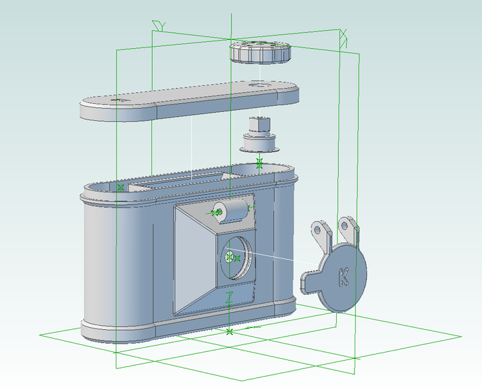
So much of the fun of pinhole cameras, apart from the pictures that they produce, is their simplicity. They're the very basis of photography: light, a box, and something to capture your image. What's more, they're simple enough that you can make them yourself, out of coffee cans, cardboard boxes, or canibalise a bodycap to make one for a dSLR camera. But what about if you introduced new world technology to old school simplicity, and you 3D printed a pinhole camera? Step forward Clint O'Connor and his Pinhole, Printed project on Kickstarter. By backing his project you can snap up a print-it-yourself kit that comes complete with the items that can't be printed—pinhole, O-rings, red window, screws—for $29. If you're not endowed with a 3D printer, you can buy a ready-printed camera along with two rolls of film and the STL files for $49. Whichever reward you opt for, it includes a guidebook to help you get your exposures right, too.

The pinhole camera you'll produce is the Flyer. It is printed in ABS, Acrylonitrile Butadiene Styrene—the same material used to make Lego—making it light but sturdy. It takes 120 format film, has a 70&deg field of view, an ƒ-stop of 133, and can be mounted on a tripod. Old school meets new world.

Pinhole, Printed

Pinhole, Printed managed to achieve its Kickstarter goal within 13.5 hours of going live on 10 October 2013, so now it's a case of staking your claim on one of the limited edition Kickstarter versions of the Flyer (they're marked with a 'K') or on the files so that you can print own (they don't come with a 'K'). You've until 10 November 2013 to make a pledge.

Five free and easy ways to back-up your smartphone photos

According to a piece of research conducted by the printing company SnapBox, which I initially read about on the Amateur Photographer website, 36% of the people they questioned had lost 'precious picture memories' from their smartphones; 28% because they'd dropped or damaged their smartphones. That's a lot of pixels that've disappeared into the aether and quite a few slightly downcast individuals. It doesn't have to be this way. Snapbox reckons that you should print out your smartphone photos to keep them safe. It would; it's a printing company. I'm also a fan of printing and I periodically have sets of images printed. But I'm a bigger fan of backing up your data. And the truth of the matter is: it can be both free and easy.

Here are five options to auto-upload images from your smartphone to the Cloud, and until you hit their data limits, none of them will cost a penny.

Amazon app logo

1. Amazon Cloud Drive

Set up an Amazon Cloud Drive account, download the Amazon Cloud Drive Photos app, flick the Auto-Save function to 'On' and you're up-and-running.

5GB for free, more GB with payment. iOS and Android.


Dropbox logo

2. Dropbox

Dropbox gives you 2GB of free cloud storage when you sign-up. There's a free app for iOS and Android devices. When you've downloaded it, head to Settings and the Camera Upload option. Flip the toggle from 'Off' to 'On' and you're done.

2GB for free, more GB with payment. iOS and Android.

Flickr logo

3. Flickr

When Flickr updated its app for iOS 7, it included an auto-upload feature that will back-up your camera roll images to your Flickr account and keep them private until you're ready to share them. If you want to share them at all.

With Flickr offering 1TB of free storage, you have to take a lot of mobile images to come close to exhausting your limit. However, you do need to be running iOS 7 for this feature.

Google+ logo

4. Google+

You might not have any interest in a Google+ account, but it does have a free and rather nifty benefit. It allows you to auto-upload all of your smartphone images to a private album from its app. Provided that you upload them as standard sized images, so 2048 pixels on the longest edge, they won't count towards your Google Drive quota, either. Go to Settings > Camera and Photos > Auto Backup and then switch the toggle from 'Off' to 'On'.

A Google+ account is free, the app is free download, and you get 15GB of free Google Drive storage. Storage of 'standard sized' image is unlimited. iOS and Android compatible.

Loom logo

5. Loom

Loom is designed to collate all of your images from all of your devices in one place, and make them accessible from anywhere. In order to make this easy it has integrated auto-upload functions, including one from your iPhone. When you first establish your account, you can power upload everything on your camera roll to Loom in one sitting. After that, it's a case of opening up the app to let it synch.

5GB for free, more GB with payment. Loom is iOS-only at the moment, but an Android version is planned.

Told you: easy. And don't forget that you can set your iPhone to store your images in the iCloud, too. No more lost photos and videos now, mmkay?

Flickr's new photo page beta is an exercise in feedback

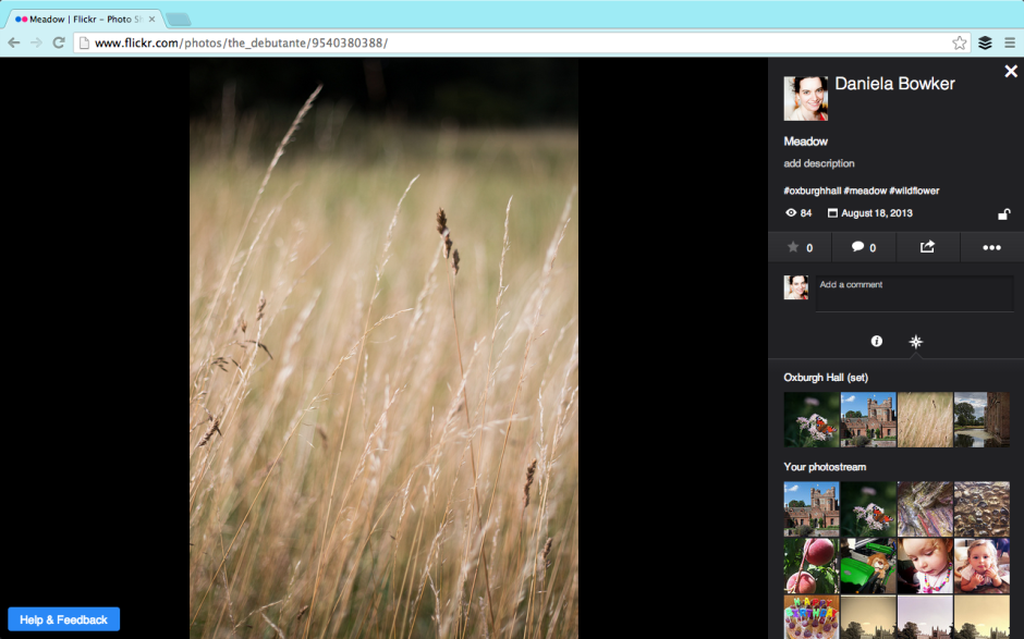
Flickr unveiled a new photo page layout beta this week. It's part of the overhaul that it started to roll out earlier in the year; I suppose that major revamps to a site that's been left to moulder and sink under its own ennui can't be enacted quickly. The beta version is opt-in and Flickr is soliciting feedback from its users. Reassured that I could revert to the previous layout, I switched to the new style photo page early on Friday morning. This allowed me to poke around, see what I liked and didn't, and leave some comments that I hoped wouldn't sound like haranguing but would help the developers on their way. I could also get a feel for what other people were saying about the new layout in the feedback forum.

Even if you've no particular interest in Flickr and its photo page layout, new or otherwise, you can regard this as an exercise in how to give and receive feedback. It just happens to reference the new Flickr photo page layout.

Gosh the feedback forum is a shouty place.

Flickr's photo page beta

There are quite a lot of people who hate the new layout. We're not talking being marginally unimpressed and having a bit a sniff about it; we're talking ALL CAPS threatening to quit levels of disgruntlement. However, apart from 'It's too much like Facebook,' the general complaint is that the potential new layout makes the Flickr experience poorer. However, there are very few suggestions or specific examples as to how the new layout makes the Flickr experience poorer. If Flickr is to improve the beta, it needs to know what works and what doesn't. This has to be articulated by the complainants, not grizzled and gurgled in a fit of toddler-type rage.

Having some kind of structured feedback mechanism can help to manage the comments and suggestions. It focuses people's opinions and it makes it easier to analyse how many people are thinking along the same lines. Unfortunately, that can deter people who want to say something from speaking up, too. They don't want to work through a ten or 20 question form to make one suggestion that isn't even covered by the standard questions. They don't want to feel as if the questions are corralling or leading them. It's a tricky business, but sometimes you need something systematic to ensure that feedback is constructive.

A bit shouty, a bit light on content

Apart from the 'Oh My God what have you done its ghastly and hideous and I hate and I'm going to leave in a huff and never come back' exclamations, there have been some legitimate criticisms and some sensible suggestions. There are also some features that we're accustomed to that haven't yet been implemented. They are in the works. Lots of the complaints concern these omissions. Flickr: I'd recommend reassuring users that features they know and love that don't appear in the beta yet but will be there soon, will be there soon. This will save your moderators untold waves of consternation and keep users happy. Better yet, make sure that they're included in the beta before it's released.

Please fix the tags, Flickr. And the comments box.

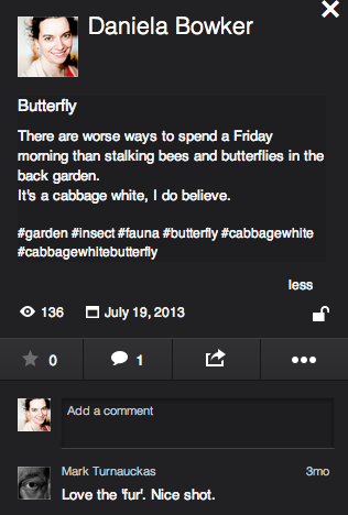
The legitimate criticisms concern comment boxes, tags, and 'favorites'. The comment box is now very small and there's no ability to insert images into it. I'm not a fan of the stickers and banners and awards that some people feel compelled to bestow on pictures and shove into comments, so that's not exactly a great personal loss. It can, however, be useful to augment a comment with an image. This is something that the developer team needs to reassess.

The new tagging format has also come under justified criticism. We know what tags are on Flickr, they don't need to be preceded by a hashtag to identify them as they do in a character-limited tweet. And we rather like having spaces between words, too. The Flickr moderators have stated that this is under review; hopefully that isn't lip service.

In the new layout, it's impossible to determine who has marked a photo as one of her or his favourites. Rather, the number of times as photo has been 'favorited' is indicated. The team is 'gathering feedback' on this feedback. If you feel strongly about it, pitch in.

Some people have suggested that the new layout isn't respecting aspect ratios. I've had a look at photos in various different aspect ratios and this isn't evident to me. If this were a bug that's now been squashed, confirmation from Flickr would be appreciated, and reassuring for those who've noticed it or are disturbed by its prospect.

Sensible suggestions include: the option to view images on white, the ability to minimise the side bar, and retaining the photo's title and description beneath it and not placing it to the right.

Can I have my full location and rich EXIF data back please?

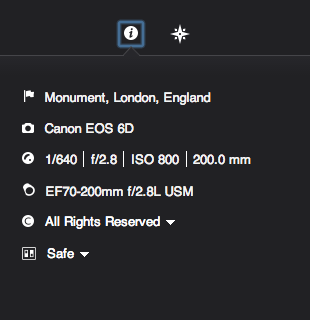
As for the features that we appear to have lost but probably haven't because they're still percolating their way through the layers of re-coding and bug-squashing are: all-sizes and Lightbox viewing, rich EXIF data, HTML and BBcode snippets, the ability to assign images to groups and sets from the photo page, geo-location and map-placement data, and editing options. These are many of the features that I like about Flickr and their omission does leave the beta experience lacking. For this reason, I shall be switching it off and hoping that the Flickr team does listen to the keenly observed and well-argued cases for improvement. They might also do well to listen to the critiique that launching a beta with only skeleton functions in place is like unveiling a car without a steering wheel, gearbox, or engine.

When Marissa Mayer was appointed CEO of Yahoo!, 'The Internets' sent her an open letter asking her to 'Make Flickr awesome again.' To her credit, she's given the Flickr team the means and the impetus to overhaul the site and there does seem to be a genuine desire to restore Flickr to its once-held pinnacle of picture-sharing prowess. And they're asking the users for their input. Flickr users shouldn't throw this back in Flickr's face with unconstructive comments that only makes them look ungrateful. Likewise, the Flickr developers do need to listen to what the users have to say. We're the ones who have to interact with it, afterall. The feedback process is a two-way engagement. I do hope that everyone is listening.

Using the Light Blaster in commercial work

I've got to say; I've had a Light Blaster for quite a while now, and I love mine, but I'm finding myself spending relatively little time in the studio recently. Well, that is, until we started working on a brand new Triggertrap product... But that's not what this post is about, and I'm not able to share those shots yet, so... Check out these three videos of people using the Light Blaster in commercial jobs, and feel the creativity sizzle...

http://youtu.be/H3mYTHuelhI

http://youtu.be/zSzokXLAv0o

http://youtu.be/_0p3bHva-Bo

True-View is a Kickstarter campaign to let you make 3D photos and videos with your smartphone

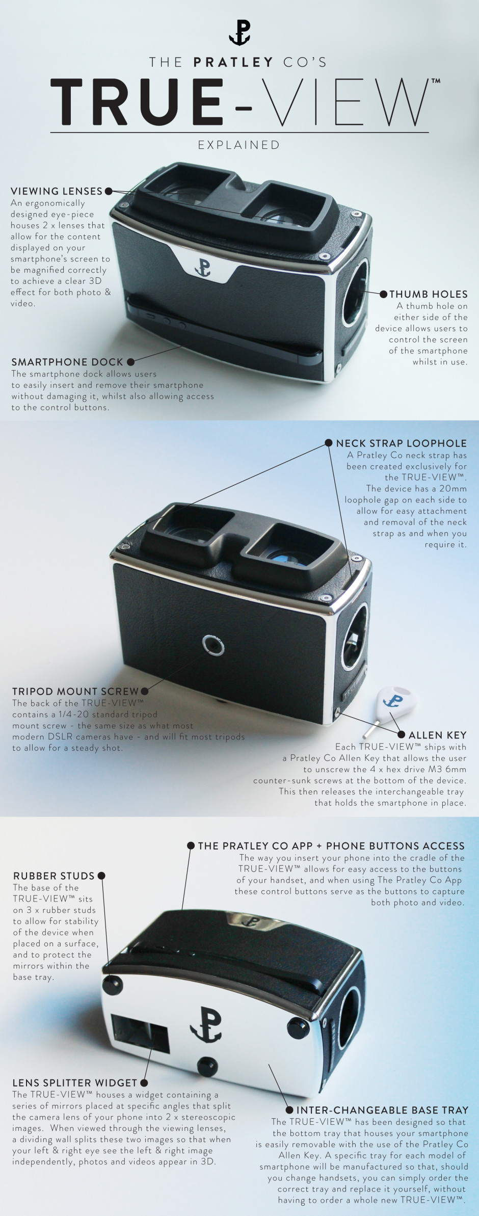
If you're looking for an example of a small company with big dreams and an ethos of 'doing things right', have a look at the Pratley Company. They're two brothers, Peter and Martin Brennan, and their friend Oscar Fernandez and they have just launched a Kickstarter appeal to help get their dream of the True-View off the ground. The True-View is a device that allows you to take photos with your smartphone but see them in 3D. So how does it work? Through mirrors and physics. When you place your smartphone into the True-View, a series of mirrors inside it reflects light off of each other, effectively splitting your phone's lens into two. This produces a pair of stereoscopic images. When you view them through the True-View the two images are displayed side-by-side. The left eye sees the left image, and the right eye sees the right image. Then it is down to the brain, which amalgamates them into a single image where there's a perception of depth. It appears to be 3D.

True-View explained

If you think that this sounds similar to the Poppy, a 3D viewer that met its Kickstarter goal within a remarkably short period of time, you would be right. However, the Pratley team is keen to point out the differences. First, and perhaps most significantly, the True-View is Android-compatible, whereas the Poppy only catered for iOS devices. For anyone with a non-Apple phone who felt excluded from the Poppy party, now's your chance.

The Pratley Co presents - The TRUE-VIEW™ from ThePratleyCo on Vimeo.

It isn't just that True-View caters to a larger market than an iOS-only device, however. It has been designed to be a sustainable and more artisan product. If you change phone you won't need a new True-View, you just have to replace its base, where the phone is secured. Quite a bit of it is hand-crafted and the Pratley team has gone out of their way to meet with engineers and manufacturers to get the right people for the job. In their words: 'We could send our design files off to a cheap factory in China and see what comes back, but it just didn't feel like the right way to do this.'

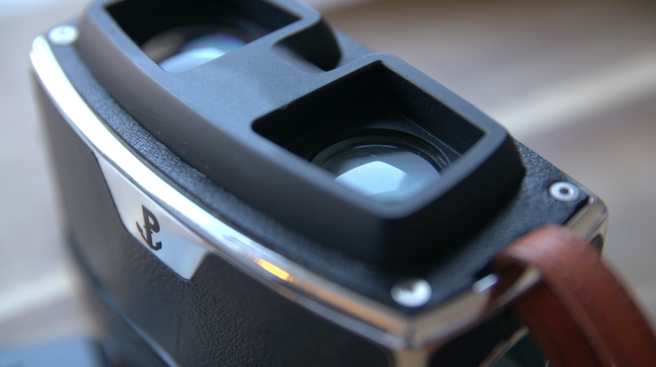
They also wanted something that was beautiful and not just functional: the True-View has a leather stipple effect similar that of more retro cameras and a silver chrome piping finish.

Leather and chrome

All of this means that the True-View has an enormous Kickstarter goal of £125,000. This requires a lot of people to pledge £65 (approximately $105) for a True-View. These guys want to change the way that we think about 3D imagery; if you love stereoscopy, check out their Kickstarter.

Well Done U - a short film competition

Have you ever said something off-the-cuff and then after a moment's pause you realised that it was actually a rather good idea? This happened a few weeks ago, on live radio. Simon Mayo and Mark Kermode have a film review show on BBC Radio 5 Live on a Friday afternoon. They insist it's more two middle-aged men wittering on, with the odd mention of films, hence its moniker 'Wittertainment'. That's slightly by-the-by, but when one of them came out with 'Well done you!' in response to a listener's correspondence, the other mumbled something about it being a good title for a film competition. So it came to be. The BBC Radio 5 Live Kermode and Mayo Film Review Show's Well Done U short film competition.

If you want, you can watch two middle-aged men wittering on about the competition in this video:

What are the judges looking for? Pretty simple in concept but probably not so easy to achieve: a well done 'U' certificate film. As you'd expect, it needs to be creative and technically competent, but the judges want you to think about what you're producing, too. You need to write a brief summary of what you're looking to achieve with your film and they'll look to see if you achieve it.

Your film needs to be two minutes in length and conform to the BBFC's 'U' certification criteria; you need to be an amateur film-maker and a UK resident.

You have until 8 November to submit your entry and if you want to work as a team, that's perfectly acceptable. The entry form and full requirements and terms and conditions can be found on the Well Done U competition page.

Judging happens in two stages. The Wittertainment production team will narrow down the entries to a top 25 by 6 December 2013. These films will be exhibited on the BBC 5 Live website and on the Kermode and Mayo YouTube channel. Mark Kermode and Simon Mayo will select a top three and anounce the grand winner on their film review show on 20 December 2013.

What do you win? Not so much, save for the glory of being chosen to appear on a major BBC radio station to talk about your film, a trophy, and to have the film formally certificated by the BBFC. I'd take it.

Flickr's new automatic features: upload and straighten

Flickr has taken another step along its path to the epiphany that the future is mobile by introducing an automatic upload feature to its iOS app. You do have to be using iOS 7, though. It'll upload your iPhone images to Flickr and keep them private until you've edited them and are ready to share them with the world. Or you could use it as a private archive of your naughty selfies. Naturally this comes a week after I've made other arrangements for my iPhone image library and deleted approximately 1,000 photos from my camera roll. (Yes, okay, I'm refusing to update to iOS 7 for battery life reasons, but that's by-the-by.)

Flickr's new toys: auto-upload and auto-straighten

I was impressed with the Flickr app's straighten feature when it was overhauled recently (not so much the crop feature), but it's now added an automatic straighten function. Take a photo, open the crop/straighten function, select straighten, et voila! If you're not happy with Flickr's straightening prowess, you can put your own powers to the test and over-ride it.

So it's not all about automation, thankfully.

Wild Tales: an exhibition of images by Graham Nash

When you hear the name Graham Nash you'd be forgiven for your brain automatically leaping to The Hollies and He Ain't Heavy, He's my Brother, or jumping on the Marrakesh Express with Crosby, Stills and Nash. As singer/songwriters go, he's rather on the influential side. (He's managed to be inducted into the Rock and Roll Hall of Fame and the Songwriters Hall of Fame twice.) However, Nash owned a camera before owned a guitar and he's a bit of a photographer, too. Over the years he's amassed a portfolio of images that documents his life on the road and the people he's worked with along the way. To mark the release of his memoir, Wild Tales, an exhibition of his pictures and drawings, also called Wild Tales, is being held at the Proud Camden gallery in London.

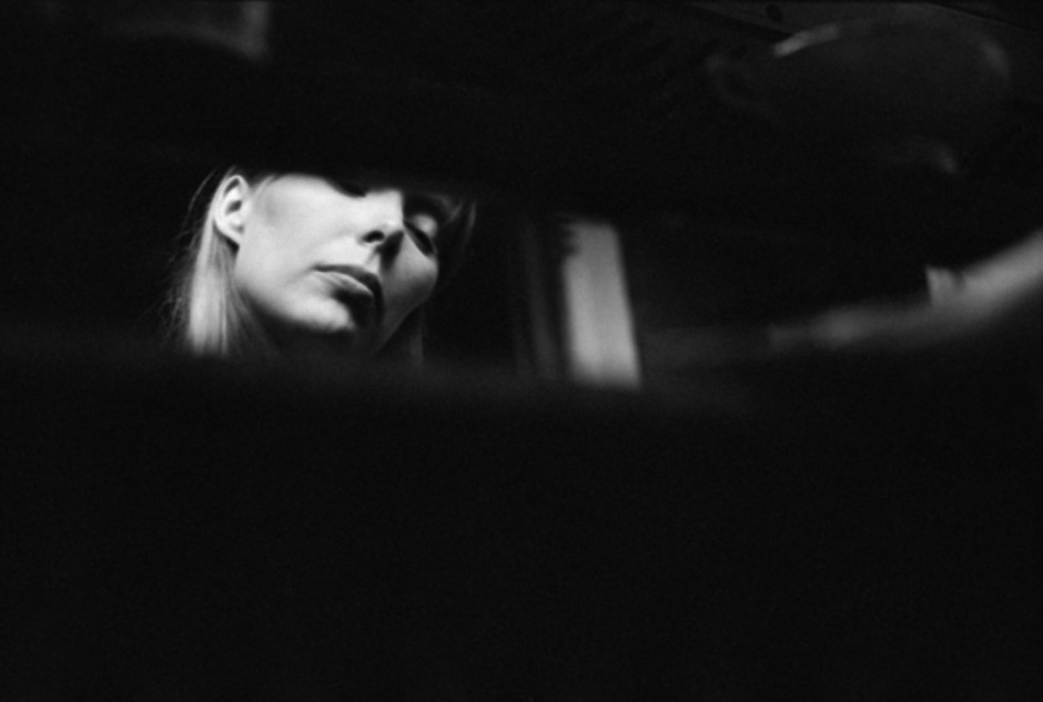
'Joni Listening to Music, 1969 ' © Graham Nash

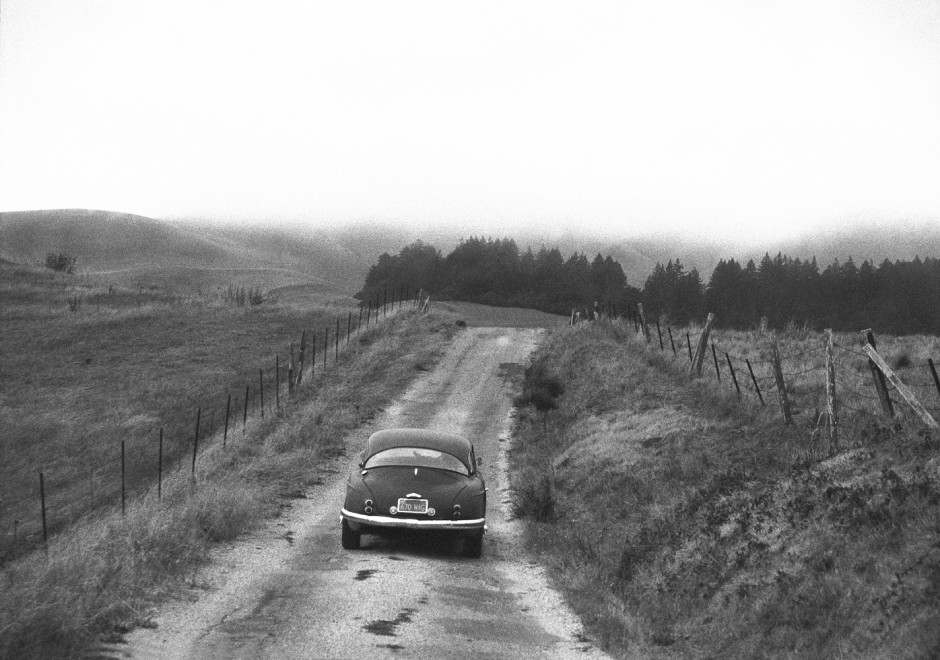
It gives you the opportunity to gaze at Joni Mitchell lost in a song, peer at Neil Young and he drives off into the distance after a recording session, and ponder his self-portraits.

'Neil Driving Home, Northern California, 1988' © Graham Nash

The exhibition is free to enter and runs from 9 to 20 October 2013 at Proud Camden, The Horse Hospital, Stables Market, Chalk Farm Road, London, NW1 8AH.

(Featured image 'Graham Nash, Self Portrait, Plaza Hotel, 1974' © Graham Nash)

How can a lens have a 'speed'?

This week's Photography Fundamentals column answers a question that came to me as an anguished plea in my Twitter feed from a relative newcomer to photography. In short: How can a lens have a speed? Whilst he knew that speed equated to aperture and that a 'fast' lens was one with a large aperture, the terminology felt far from intuitive. How could an opening behind a lens be described in terms of 'fast' or 'slow'?

I'm guessing that if he were perplexed by the use of the the word 'speed' in conjunction with 'lens', there are a few other people out there who find the concept that lenses can be 'fast' puzzling, too. Or illogical. Or something that's accepted terminology. Or something that made sense many years ago but has since become obsolete. This might help.

It's not actually as illogical as it sounds to refer to lens speed. It's more a case of joining the dots.

We know that large apertures are referred to as 'fast'. A lens with a large maximum aperture, let's say ƒ/1.8 for the sake of an example, is described as a 'fast' lens. We know that the larger the aperture, the more light is able to reach the sensor (or film, if you're old school). We know that by the virtue of the exposure triangle, the more light that is able to hit the sensor, the shorter the time the sensor needs to be exposed to capture the image and the faster the shutter speed we can use. The shorter exposure time is a direct result of the larger aperture. The larger aperture allowed for a faster image capture, hence a large aperture is a fast aperture.

If you were wondering, yes, it's for this reason that higher ISOs are referred to as fast ISOs: increased sensitivity allows for faster capture.

A lens can have a 'speed' then, because it refers to how fast it can allow you to capture your images, which I hope isn't nearly as illogical as it first seemed.

Rule of thirds << Photography Fundamentals >> Time-lapse

PhotoRankr is a photo sharing site where you can sell them, too

It's easy to think that there are far too many photo-sharing websites in the world. How many can you name in the next ten or twenty seconds? And how many of them meet your needs and expectations? For brothers Jacob and Matthew Sniff, the fact that these sites didn't meet their expectations inspired them to build their own; they called it PhotoRankr. It's a platform that gives photographers the ability to share and sell their work in one place. It's a social network where photographers can interact, learn from each other, and rate each other's images in a gamified setting. It's an online marketplace where they can sell their images at their own price. And it provides photographers with portfolio hosting to help them make the most out of their photography.
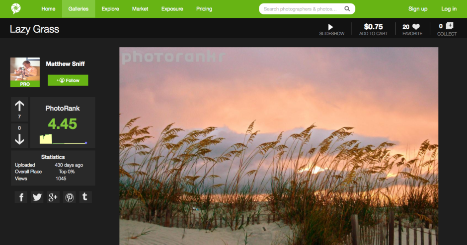
PhotoRankr lets you vote images up and down

Does it work?

PhotoRankr was built by photographers who felt frustrated that their images weren't accepted for sale by the major stock houses. They wanted anyone who takes photos to have the opportunity to be able to sell her or his work. As Jacob Sniff puts it: 'It’s a fact that more people who [sic] have it [photography] as a hobby than as a profession, and the barrier to entry is low. Yet, no site openly allows for anyone to sell images today and this is a mistake.'

In addition, they've attempted to make it more appealing to photographers by building in the social elements that bring success to sites such as Facebook and Flickr. In particular, rather than having a picture editor determine whether or not a photo makes the grade, any photo is allowed to be displayed on PhotoRankr, but the community votes it up or down.
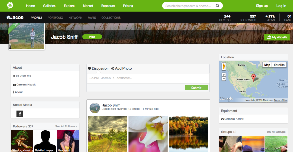
The things you'd expect from a social network: somewhere to say something about yourself, the chance to comment and choose favourites and to accumulate followers

It's a reasonably priced platform, providing photographers with three subscription options. There's a free account to which they can upload 30 images each week, charge up to $20 for them, and retain 60% of sales. The 'Plus' account ($40/year) allows for 10GB of uploads, has a $100 price cap, and a 70% sales retention. Those subscribing to a 'Pro' account ($100/year) have no pricing limits, no upload limits, and retain 90% of their sales fee.

The aim is admirable, but being so photographer-oriented is also the site's failing. In constructing a platform aimed at photographers, they haven't paid as much attention to the buyer as they should have.

First, what type of buyer are they attempting to attract? Are they attempting to create a more stock-house model, with digital image files provided for professional use? Or are they aiming at the fine art market, with canvas prints? Not all images are able to be purchased as prints, but all are available as digital files; however, there's a distinct feeling that the collection is more skewed towards hanging on the wall than inclusion in corporate booklets.
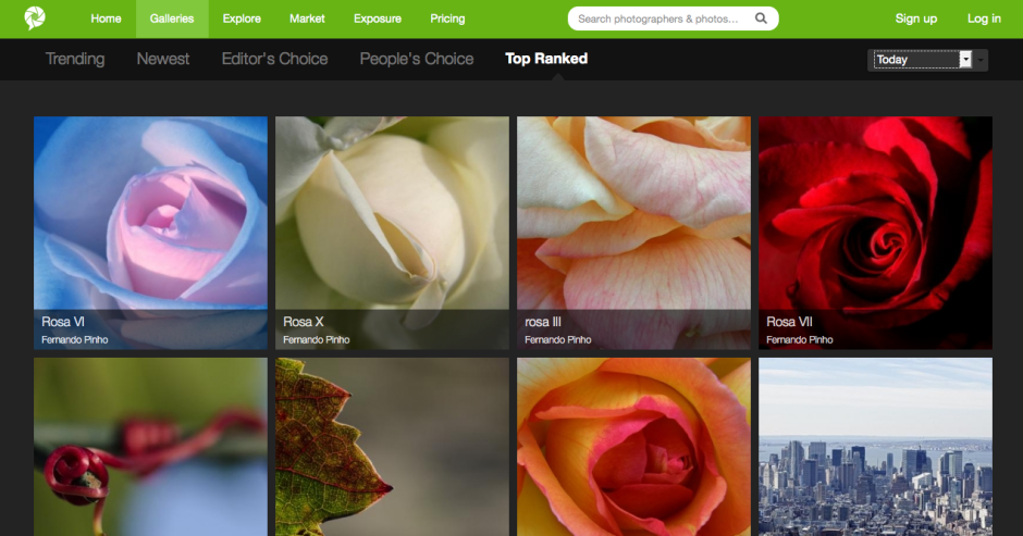
There's a definite feel to the highest rated photos

Stock houses work because they provide a diverse spectrum of images; these images include subjects that aren't necessarily pretty or compelling, are perhaps obscure, but are still in demand. Examples would include factories, rotting meat, or ploughed soil. When you introduce the social element into ranking images, it's going to be those that are appealing and attractive that rise to the top, not necessarily those which are needed. You'll end up with a market where the photographers are at risk of serving themselves and their social ranking, rather than the customers.

If the intention is to allow people to hang images on their walls, there needs to be a more streamlined process that allows buyers to see more easily in which formats their chosen images can be purchased. Some are available as canvases, some as posters, some as postcards, some not at all. It isn't obvious immediately, though.

Second, searching for images suffers from a few hiccoughs, too, with duplicates appearing with alarming frequency.
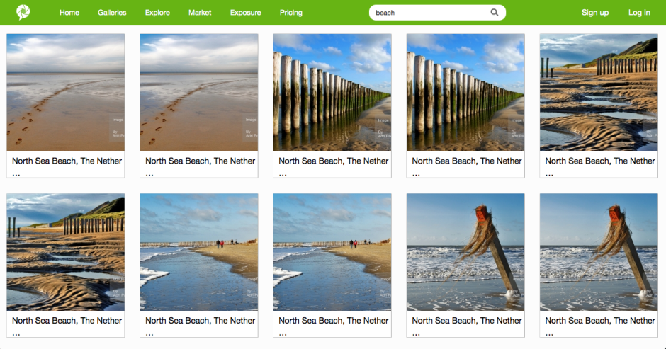
PhotoRankr search - a few too many duplicates for my liking

Finally, the purchase interface requires some refinement. The licence agreements are buried away in the bowels of the terms and conditions section, rather than being a click away from each photo. Anyone buying an image needs to be able to identify how they're able to use it quickly and easily. Chashing through the website is not user-friendly. The shopping cart page does not render properly, which makes it unappealing for purchasers. And there is no easy means to access your shopping cart from the front page or a search page. This makes browsing after you've made a selection and then wanting to return to the cart without attempting another purchase impossible. It might be easy for a PhotoRankr photographer to sell her or his images; but it isn't easy for the public to buy them.
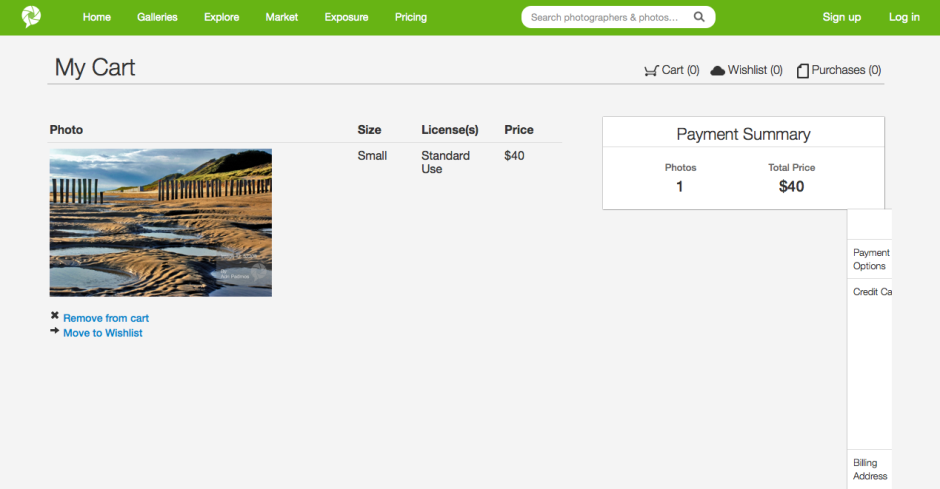
The sales mechanism needs some refinement

I think PhotoRankr needs to consider what it wants to be and what its priorities are. Is it a 500px-style community of photographers that offers sales on the side - in which case, they're already competing with an established market. Or are they a sales site where consumers can find what they want and need, purchase it easily, and provide photographers with a useful sales platform? If that's the case, they need to pay some more attention to the customers.

If PhotoRankr can decide on its direction, and clean up its sales mechanism, I do think that it has potential. And I don't want to see the work of a dedicated group of people come to nought.
Searching for places to shoot with ShotHotspots

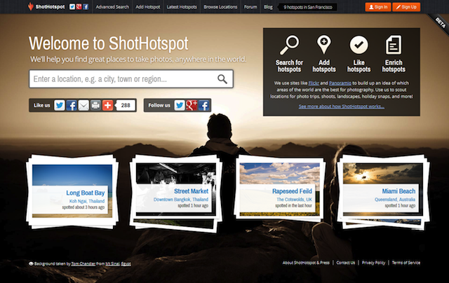
When you feel as if you've exhausted all the shooting locations in your vicinity and are in search of somewhere fresh; or if you're heading to lands-afar (or maybe just a few hours up the road for a long weekend) and want to know what to photograph and where to take yourself, what do you do? Ask around friends and contacts for new ideas? Scour guide books for advice? Trawl through photo-sharing websites and travel blogs looking for inspiration? I do all of these, and to date they've been effective. But now ShotHotspot is adding another course of action into the mix. homepage

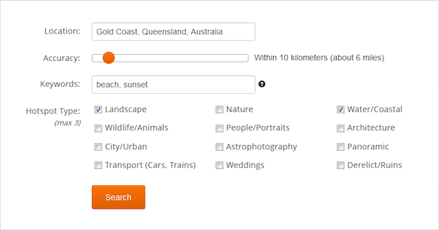
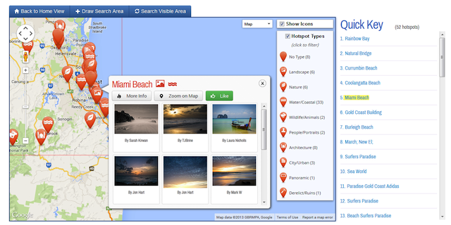
ShotHotspot is a website that aggregates the geo-location data of photos on Flickr and Panoramio in attempt to pinpoint photography hot-spots and display them on a map. When you search, you can specify criteria, for example landscape or architecture, and location accuracy, from exact location to within a 100 kilometre radius, to refine your results. Users can share their own suggestions for places to take photos, too. As more people add their recommendations, the site becomes more valuable.

advanced-search

Of course, the success of ShotHotspots does depend on the willingness of photographers to share their location data and not guard their favourite shooting locations too preciously, as well as for travellers not to be deterred by the same wildly popular location being returned on searches time and time and time again.

Furthermore, it could benefit from some more accurate location data aggregation and increased suggestions from users of the site. To be honest, my experiences with it have been slightly disapppinting so far. For example, searching for 'Wildlife/ Animals' within a 10 mile radius of 'Newmarket, UK' should yield a welter of photos of racehorses galloping up the heath, foals frolicking in their paddocks, not to mention the bees and butterflies that I photographed using my iPhone (and therefore were ably geo-located) and posted to Flickr this summer. There were 11 results.

hotspot-map

Try the same location details but with the key word 'Horse' added, and the category 'Wildlife/ Animals' removed, and you get eight location suggestions. Some of them don't even feature horses. These were far from the only searches I conducted and so often I felt that the site didn't show me anything exciting or special.

I think ShotHotspot has the potential to be a fun, useful site to spend time exploring. Even if you don't want to find new places to practise photography, you can use it to see what's around a particular area. Right now, however, I've had more success using Flickr and a few key search terms. And of course, so much of the fun of travel photography is wandering, exploring, getting lost, and finding things to photograph. Still, keep it in mind.

Loom weaves together your photos from multiple devices into one place

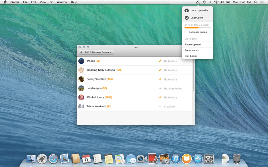
For a little while now I've been testing out the public beta version of Loom, an online photo library that is synchronised across my different devices. In all, I've been rather impressed by what I've seen and given it left public beta today and now anyone can sign up for a Loom account, it only seemed fair to share. With so many cloud storage options available, why would you want to sign up for Loom? From its developers' perspective: 'We’re making it quick and easy for you to access and manage your entire photo and video library on every device, without taking up local storage space.' The idea is that whatever device you used to take a photo and wherever it has been stored and developed initially, you can bring it into Loom's weave and have it accessible and identifiable wherever you are and whether you're on your iPhone or sitting at your Mac. Then you can share it, if you want, via email or message.

From a user's perspective, it does what the founders intended: makes it easy for you to look at all of your images in one place.

Loom all products

Install Loom on your iPhone and when you first log in you'll be asked if you want to transfer your entire camera roll to your Loom library. I clicked 'Yes'; it took a while, but it transfered the lot. Now, every time that I open Loom it copies my new images and videos over from my camera roll to Loom. By selecting the 'Nonstop upload' option in settings, it enables uploading even if you close the app. Useful when you need to shift large numbers of photos in one sitting.

If you install the Loom uploader on your Mac you can use it to hunt down the photos on your internal or external hard drive, be they JPEGs or Raw, and back them up to the cloud. The Loom team reckons that it can support over 130 different types of Raw file, but if you find one that won't trip the light fantastic, let them know and they'll try to fix it.

All of your images will appear in your timeline, but you also have the ability to file them according to whatever Byzantine or idiosyncratic method you prefer. If you delete a photo from your local drive or your phone, it'll still be there in Loom. This has allowed me to free up significant space on my iPhone, precisely what the Loom team intended. (Yes, the photos are backed up somewhere else, too!)

Loom desktop

At present, Loom is iPhone-, iPad-, and Mac-only; however, there are plans to widen its access in due course. The team is very keen to hear what its users want from the service, too. As well as opening itself up to public subscriptions, which might generate it some income, it has also received $1.4 million in seed funding from sources that include Tencent, Google Ventures with MG Siegler, Great Oaks VC and angel investments including Will Smith (Overbrook Entertainment), and Damon Way (founder of DC Shoes).

Your first 5GB of storage comes free; after that there's a 50GB option that costs $39.99 for the year or you can pay $99.99 for a year of 250GB storage. You've nothing to lose by checking it out.

Instagram is introducing ads. And that's okay.

Oh the humanity! Anyone might've thought, by looking at the streams of disappointment, consternation, and even vitriol spewing forth in the comments sections of tech sites such as Engadget, TechCrunch, and the the Verge this morning, that the team behind Instagram had been responsible for the flaying of puppies and drowning of kittens in their own private pleasuredome. The revelation was in fact far more mundane than that: Instagram has announced that it will be introducing advertisements into its subscribers' feeds on a phased basis. Given that we knew this was coming, it was hardly revelatory. And indeed, contrary to wails and huffs of some of its subscribers, it's a perfectly acceptable course of action. A few of the commenters appear convinced that the move to include 'a small number of beautiful, high-quality photos and videos from a handful of brands that are already great members of the Instagram community,' is entirely the responsibility of the nefarious Facebook, which bought Instagram for $1 billion last year. While the specifics of the advertising programme might well have been the brainchild of members of Facebook's staff as opposed to Instagram's, and Instagram would have needed to prove itself profitable to justify the sale, it could hardly have remained either free or ad-free as an autonomous entity. It would have been forced to monetise its platform through some means. Its developers cannot sustain themselves on airballs and its servers do need to function. This requires cash, with or without Facebook.

What then, are the options to raise these funds, aside from advertising? First, Instagram could have opted for a subscription-only model, which would almost certainly have been corporate suicide. Or second, it could have implemented a freemium model, more on which later.

Rather than ask its users to part with their money directly, it's asking companies to part with their cash in order to place their brand in front of Instagrammers' eyeballs. This is sensible. The particular benefit of switching to an ad-supported revenue model is that apart from the aesthetics of the interface, nothing changes for the user. There are no forms to be filled out and importantly, no money needs to be exchanged. From Instagram's perspective, advertising means that it doesn't need to determine an appropriate subscription price-point that makes it attractive to subscribers but simultaneously sustainable.

Presented with the choice of the occasional advertisement appearing in your feed and having to do nothing to continue posting photos of your cats to your legions of followers, or having to pay up front to use a service that has heretofore been free, what's easier and more appealing? Unless you are heavily invested in your Instagram feed, you might think quite carefully about subscribing. A great many people will decide that it isn't worth their money, others will simply not be bothered to get out their credit cards; either way, it would be disastrous for Instagram. Advertisements might deter a few embittered users, but inertia will be the dominant force.

This then, brings me to the freemium model: advertisements for those who aren't prepared to pay at all, and a fee for those who'd prefer their Instagram experience to be ad-free. It's possible this is something that Instagram might consider implementing when advertisements have been rolled-out world-over (at present they're US-only), but if it hasn't, it should.

Instagram, if you're listening, there are plenty of people out there who do understand that you can't survive on hope and feathers. We're generally fine with advertisements, provided that it's obvious they are advertisements and it's easy for us to ignore them. We would, however, prefer to be able to pay a minimal yearly subscription fee or a slightly larger one-off payment in order to avoid the ads. We're reasonable and appreciate the virtues of hot dinners, running water, and rooves over our heads.

For anyone who's disgusted by the notion of Instagram including advertisements, please pause for thought. How do you expect the service to sustain itself without an income? And what are your proposals for an alternative model?
Love, Captured: a rather sweet photo competition from eHarmony

In celebration of its fifth birthday, online dating site eHarmony is running a rather sweet photo competition; it's looking for photos that capture the essence of love. They can be slushy, smoochy depicitions of couples in love or slightly more abstract interpretations of the giddy sensation. There's a £5,000 prize for the winner, which will be selected from 25 finalists by four judges: relationship expert Jenni Trent Hughes, editor of Practical Photography Ben Hawkin, photography blogger Annie Spratt (aka ‘Mammasaurus’), and Marketing Director of eHarmony.co.uk, Romain Bertrand. They'll be making their decision according to three criteria: creativity, quality, and charm.

Entries can be submitted between now and 17 January 2014. You must be over 18 and a UK resident to enter, you can submit as many images as you wish, but they cannot have been previously published. As always, I recommend that you read the terms and conditions carefully. All the details are to be found on the Love, Captured website.

Good luck!

Adobe's undergone a security breach. Time to reset your passwords.

Adobe has issued a communication to all of its customers this morning that it has sustained an attack to its network and its system has been breached. As a consequence, anyone who has conducted a transaction with Adobe has potentially had their name, encrypted payment card number, and card expiration date accessed by the attackers, although the number of affected customers has been placed at 2.9 million by Adobe's Chief Security Officer, Brad Arkin. Adobe does not believe that any decrypted card numbers were removed from their systems. The recommendation is for all Adobe customers to change their account passwords, which you can do by following this link, and to change the passwords of any accounts that might share your original Adobe password or ID. You should also keep a close eye on your bank transactions, be alert for any unusual payments, and to notify your bank if you spot anything untoward.

In addition to customer data, proprietary sourcecode for the ColdFusion web application and Acrobat programmes were filched. This has the potential to open up millions of users to security breaches, if the hackers can capitalise on any security holes or bugs in the code. Just think how many people use Acrobat.
The breach was spotted by Brian Krebs of Krebson Security; he has asserted that the hackers responsible were also behind the LexisNexis hack and it probably commenced at some time in mid-August.
Keep alert, people, and please remember to practise proper password security.

(Most information came direct from Adobe, some additional details from Ars Technica)

Five ways to liven up your autumn photos

This is a guest post by Danny Groner, who is the manager of blogger partnerships and outreach at Shutterstock. Here in the northern hemisphere, autumn is upon us, which means that we've already started to see some of the red, orange, and yellow colours of the season crop up. Marketers and advertisers know how to appeal to our autumnal eye, sprinkling these bright colours everywhere possible. For photographers looking to cover the autumn season, that poses a challenge: How do you shoot these natural settings in new, innovative, and vibrant ways? Here are five suggestions for how to add some flavour to the autumn season:

Apply traditional colours unconventionally

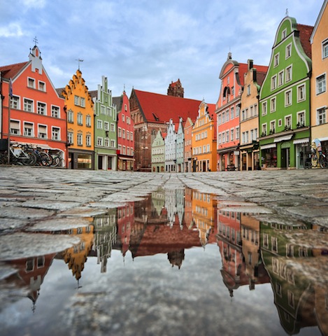
House image via Shutterstock

Keep close to what is proven to work this time of year, but adapt your style to show these colours in another way. For instance, a row of houses, instead of forestry, might offer the same feelings of seasonal foliage without leaves piling up. It's about the season after all. Discover an urban forest beyond the trees.

Bring it indoors

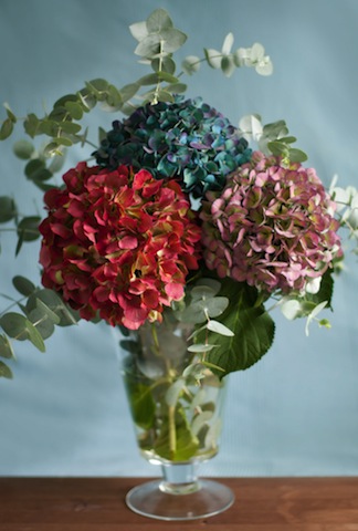
Flowers image via Shutterstock

Flowers and plantlife may grow predominately outdoors, but that doesn't mean that you can't bring their vivacity inside. A well-placed bouquet, taken with the right light and proper angle, can give the same punch as inside its more natural setting. Moreover, solid colored walls can complement the flowers, adding a nice backdrop to your pictures.

Go minimal

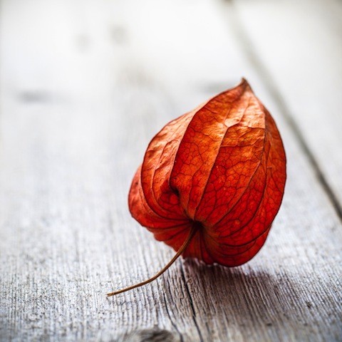
Leaf image via Shutterstock

If you do decide to use leaves to help tell your story, you don't have to do it with so many. Sometimes, less is more. In this case, you can see more expression from a lone leaf than you may find inside of a pile of them. It's a living being, and focusing on one will help convey some emotion that can get lost in transit otherwise.

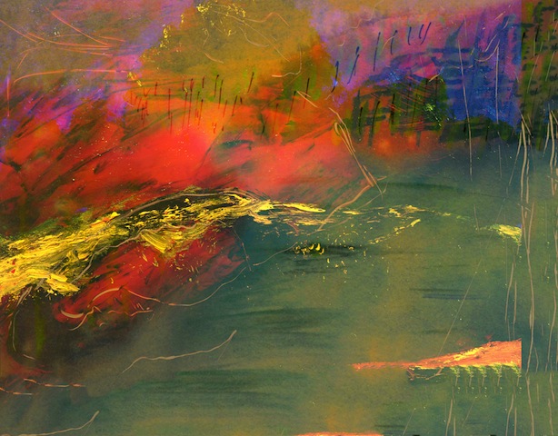
Be abstract

Abstract image via Shutterstock

Your favourite colours can go further if you allow them to blend and dance. Inside pieces of artwork, there's more flexibility and movement than what is naturally created. Reds and oranges can look and feel remarkably louder when paired with some darker colors. Art and photography have a similar relationship worth exploring.

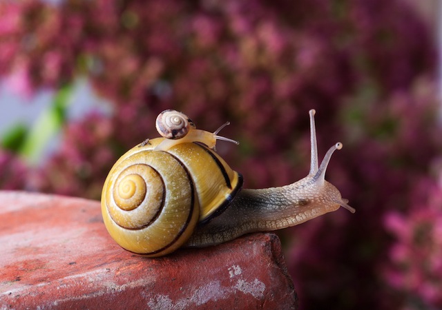
Use non-traditional colours

Snail image via Shutterstock

Nature has so much more to offer than the most traditional colours. Surprise your audience with some other colours, like purples, that show up this time of year but may take a little more digging. It's worth pursuing a shot through a slightly different lens. Even if you don't know what you're looking for as you trudge through piles of leaves, you'll recognise it when you see it. It may not look as familiar at first, but it'll surely be at peace with the season at hand.

What is the rule of thirds?

This week's Photography Fundamentals column digs into composition, and one of the most-cited 'rules' of the discipline: the rule of thirds. Even if you don't know what it is, you've probably heard of it. We are, therefore, here to explain what it is and why it's useful. And then when you understand the rule and you know how to implement it, you can go ahead and break it properly. We have a natural tendency to place our subjects in the centre of the frame. It makes sense, logically, to have our point of focus right in the middle, being gloried by its surroundings and utterly unavoidable to the eye. Except that centred subjects don’t really make for very interesting images. There’s an unmistakable flat and dull quality to them. Compare this:

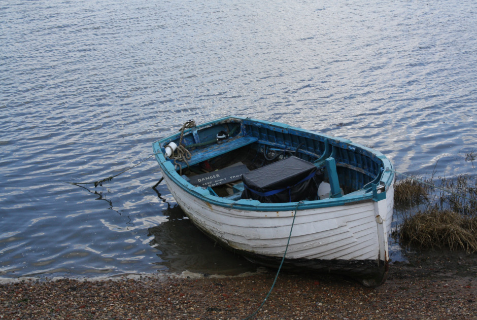
IMG_0347

With this:

Washed up copy

Next time you’re watching a film or TV, notice where the heads and the eyes of the people doing the talking are. I’ll bet they’re not in the centre of the frame.

Instead, they’ll be positioned slightly to one side. They’ll probably be making use of what’s called the rule of thirds.

Imagine that your frame is divided by four lines: two running horizontally and two vertically. They are equally spaced and split the frame into nine smaller rectangles. The points at which the four lines intersect create four ‘points of interest’. This grid is your guide for composing an image.

rule-of-thirds grid

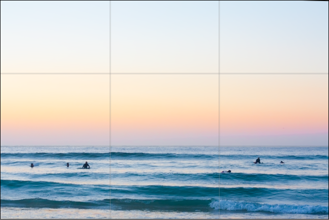
Aim to position subjects that run upright through your image along one of the vertical tri-lines. Lines running across the image—especially skylines and horizons—should run along a horizontal tri-line. (Definitely not through the centre with a horizon.)

The horizon is sitting perfectly along the lower tri-line.

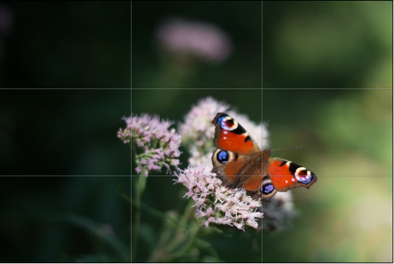
Aim to place anything that’s of particular significance to the composition, for example the eyes in a portrait and the sun in a sunset scene, on one of the points of interest.

The butterfly is sitting on the lower-right point-of-interest.

Variations

I often find that rather than using the rule of thirds to place my subjects, I have a natural predeliction for the Golden Rectangle. It's based on the mathematical princple of the Golden Ratio: an irrational number equal to approximately 1.618. It's also known as Phi (φ). If you want the technical explanation, it's

If you divide a line unevenly into two sections a (longer) and b (shorter), the ratio of these two sections will equal φ if a divided by b is equal to the sum of a plus b divided by a.

The Golden Ratio translated to Golden Rectangles. (Diagram thanks to Wikipedia.)

Yes. Ahem.

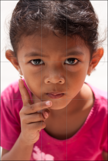
Rather than divide your frame using three equally spaced lines along each edge, as you would with the rule of thirds, you have two longer sections (a) either side of a shorter section (b). The ratio of the longer side to the shorter is the golden ratio.

It looks like this:

Her eyes are sitting on the Golden Ratio's points-of-interest.

Square crops

If you're using a square crop for any of your photos, you might find that the rule of thirds doesn't produce the sort of dynamic image that you're used to with a rectangular frame. That's because the eye tends to move around a square photo, rather than across it. For this reason, centred subjects often work effectively in square frames. Or try dividing the frame into triangles, and using those for balance.

Butterfly

TL;DR

  • The rule of thirds is a compositional aid that places two equally spaced lines across your frame, and two down it
  • The horizontal lines can be used for the strong placement of horizons and skylines
  • The vertical lines can be used to position key vertical elements in your frame
  • The four points at which the lines intersect are known as 'points of interest'
  • Use the points of interest to place significant elements of your composition, for example the eyes in portraits or the sun in sunsets, in your frame
  • There are variations on the rule of thirds, based on the mathematical principle φ
  • The rule of thirds doesn't necessarily work with a square crop; you might find a centred subject works better

Quality vs quantity << Photography Fundamentals >> Speed

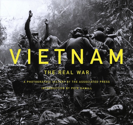
'Vietnam: The Real War' - a book of 300 seminal images from the Associated Press

The Vietnam War is sometimes referred to as the 'last newspaper war' - there were TV news reporters there, but their cameras weren't as discreet and portable as 35mm stills cameras and we didn't yet have rolling news coverage. The conflict's iconic images were seen in print, and iconic they were. Many of them are immediately recognisable even if you never saw them on the day that they were published. The Associated Press had over 50 photographers posted to Vietnam, four of whom won Pulitzer prizes for their coverage. Their images documented the war from positions of unequalled battlefront access and today, to commemorate the 50th anniversary of the conflict, 300 of their images are being published in a new book: Vietnam: The Real War.

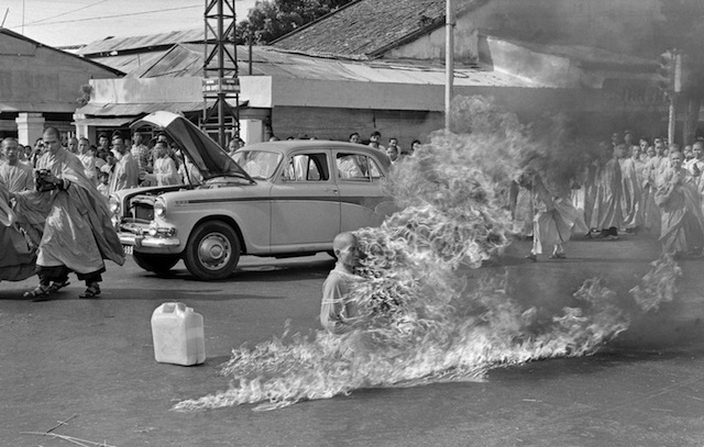
In the first of a series of fiery suicides by Buddhist monks, Thich Quang Duc burns himself to death on a Saigon street to protest persecution of Buddhists by the South Vietnamese government, June 11, 1963. (AP Photo/Malcolm Browne)

Fifty years on, even after seeing them so many times, these images never fail to shock, horrify, or give you cause to reflect. The collection includes Malcolm Brown's photo of a Buddhist monk self-immolating on a Saigon street in 1963. It was this image, supposedly, that prompted President John F. Kennedy to say: 'We’ve got to do something about that regime.' And there's Nick Ut's photo of a scorched, naked girl fleeing a napalm attack, the veracity of which President Richard Nixon allegedly questioned. Showing the impact of the war on civilians, soldiers, and rebels, the book is a testimony to the power of conflict reporting.

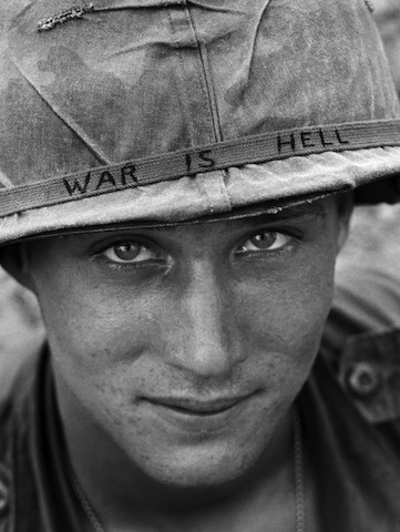
An unidentified American soldier wears a hand-lettered slogan on his helmet, June 1965. The soldier was serving with the 173rd Airborne Brigade on defense duty at the Phuoc Vinh airfield. (AP Photo/Horst Faas)

The book's introduction is by Pete Hammill, who reported from Vietnam in 1965. 'Across the years of the war in Vietnam, the AP photographers saw more combat than any general,' he says. 'This book shows how good they were. As a young reporter, I had learned much from photographers about how to see, not merely look. From Vietnam, photographers taught the world how to see the war.'

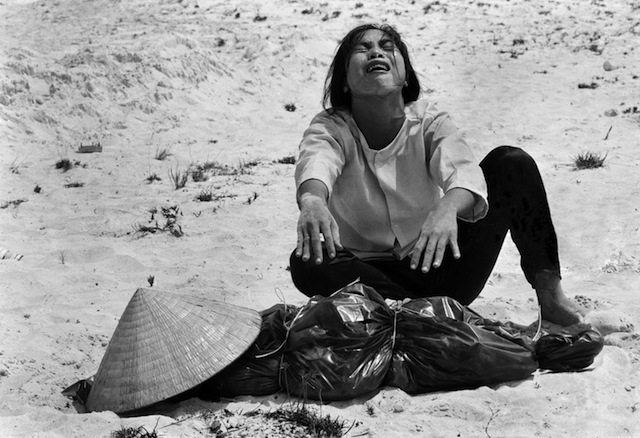
A woman mourns over the body of her husband after identifying him by his teeth, and covering his head with her conical hat. The man’s body was found with forty-seven others in a mass grave near Hue, April 11, 1969. The victims were believed killed during the insurgent occupation of Hue as part of the Tet Offensive. (AP Photo/Horst Faas)

Vietnam: The Real War is available to buy from Amazon for £24.99

AP_vietnam_bookcover