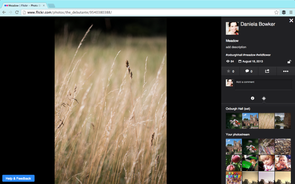
Flickr unveiled a new photo page layout beta this week. It's part of the overhaul that it started to roll out earlier in the year; I suppose that major revamps to a site that's been left to moulder and sink under its own ennui can't be enacted quickly. The beta version is opt-in and Flickr is soliciting feedback from its users. Reassured that I could revert to the previous layout, I switched to the new style photo page early on Friday morning. This allowed me to poke around, see what I liked and didn't, and leave some comments that I hoped wouldn't sound like haranguing but would help the developers on their way. I could also get a feel for what other people were saying about the new layout in the feedback forum.
Even if you've no particular interest in Flickr and its photo page layout, new or otherwise, you can regard this as an exercise in how to give and receive feedback. It just happens to reference the new Flickr photo page layout.
Gosh the feedback forum is a shouty place.

There are quite a lot of people who hate the new layout. We're not talking being marginally unimpressed and having a bit a sniff about it; we're talking ALL CAPS threatening to quit levels of disgruntlement. However, apart from 'It's too much like Facebook,' the general complaint is that the potential new layout makes the Flickr experience poorer. However, there are very few suggestions or specific examples as to how the new layout makes the Flickr experience poorer. If Flickr is to improve the beta, it needs to know what works and what doesn't. This has to be articulated by the complainants, not grizzled and gurgled in a fit of toddler-type rage.
Having some kind of structured feedback mechanism can help to manage the comments and suggestions. It focuses people's opinions and it makes it easier to analyse how many people are thinking along the same lines. Unfortunately, that can deter people who want to say something from speaking up, too. They don't want to work through a ten or 20 question form to make one suggestion that isn't even covered by the standard questions. They don't want to feel as if the questions are corralling or leading them. It's a tricky business, but sometimes you need something systematic to ensure that feedback is constructive.

Apart from the 'Oh My God what have you done its ghastly and hideous and I hate and I'm going to leave in a huff and never come back' exclamations, there have been some legitimate criticisms and some sensible suggestions. There are also some features that we're accustomed to that haven't yet been implemented. They are in the works. Lots of the complaints concern these omissions. Flickr: I'd recommend reassuring users that features they know and love that don't appear in the beta yet but will be there soon, will be there soon. This will save your moderators untold waves of consternation and keep users happy. Better yet, make sure that they're included in the beta before it's released.

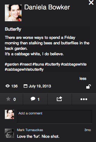
The legitimate criticisms concern comment boxes, tags, and 'favorites'. The comment box is now very small and there's no ability to insert images into it. I'm not a fan of the stickers and banners and awards that some people feel compelled to bestow on pictures and shove into comments, so that's not exactly a great personal loss. It can, however, be useful to augment a comment with an image. This is something that the developer team needs to reassess.
The new tagging format has also come under justified criticism. We know what tags are on Flickr, they don't need to be preceded by a hashtag to identify them as they do in a character-limited tweet. And we rather like having spaces between words, too. The Flickr moderators have stated that this is under review; hopefully that isn't lip service.
In the new layout, it's impossible to determine who has marked a photo as one of her or his favourites. Rather, the number of times as photo has been 'favorited' is indicated. The team is 'gathering feedback' on this feedback. If you feel strongly about it, pitch in.
Some people have suggested that the new layout isn't respecting aspect ratios. I've had a look at photos in various different aspect ratios and this isn't evident to me. If this were a bug that's now been squashed, confirmation from Flickr would be appreciated, and reassuring for those who've noticed it or are disturbed by its prospect.
Sensible suggestions include: the option to view images on white, the ability to minimise the side bar, and retaining the photo's title and description beneath it and not placing it to the right.

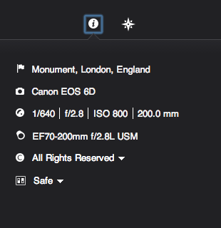
As for the features that we appear to have lost but probably haven't because they're still percolating their way through the layers of re-coding and bug-squashing are: all-sizes and Lightbox viewing, rich EXIF data, HTML and BBcode snippets, the ability to assign images to groups and sets from the photo page, geo-location and map-placement data, and editing options. These are many of the features that I like about Flickr and their omission does leave the beta experience lacking. For this reason, I shall be switching it off and hoping that the Flickr team does listen to the keenly observed and well-argued cases for improvement. They might also do well to listen to the critiique that launching a beta with only skeleton functions in place is like unveiling a car without a steering wheel, gearbox, or engine.
When Marissa Mayer was appointed CEO of Yahoo!, 'The Internets' sent her an open letter asking her to 'Make Flickr awesome again.' To her credit, she's given the Flickr team the means and the impetus to overhaul the site and there does seem to be a genuine desire to restore Flickr to its once-held pinnacle of picture-sharing prowess. And they're asking the users for their input. Flickr users shouldn't throw this back in Flickr's face with unconstructive comments that only makes them look ungrateful. Likewise, the Flickr developers do need to listen to what the users have to say. We're the ones who have to interact with it, afterall. The feedback process is a two-way engagement. I do hope that everyone is listening.
