adobe

You shall go to the ball: a little fun with layer masks

The sheer scope of Photoshop means that when you first open it up, and indeed for a good long while thereafter, it can be a little—or even a lot—overwhelming. It offers you so many possibilities that deciding where to start can be an agony of choice. Whatever bells and whistles Photoshop might offer you, one of its biggest boons is most certainly layers, making them one of the first things with which you should experiment.

A brief explanation

Layers are what allow you to edit non-destructively, so that any adjustment that you make can be easily amended or even removed altogether without having an impact on your other edits, or your original files. The most common description that you will hear about the layers function is that it resembles a pile of transparencies, each of which contains information comprising the final image and can be altered individually. How many layers can each image have? As many as your operating system can support.

So many options!

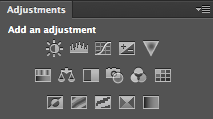
Some layers might contain images, effects—for example shadowing—or text. Other layers, however, could appear devoid of content. These are adjustment layers, and they hold the information that governs the edits made to the image as a whole, or to given areas of it. This way, you can alter how something looks without destroying the original image.

You can name layers individually, so rather than trying to remember that Layer 23 adjusts the luminosity of the unicorn’s coat, you can call it ‘Unicorn coat luminosity.’

Layer masks

If you want to create composite images, layer masks will be essential to your work. A layer mask will allow you to place one image over another and mask selected areas of the upper layer from view. Effectively, this allows you to see through it to the image below, thereby creating a montage. Of course, you’re not restricted to just two layers when it comes to compositing; you can include as many as you need.

Going to the Industrial Opera

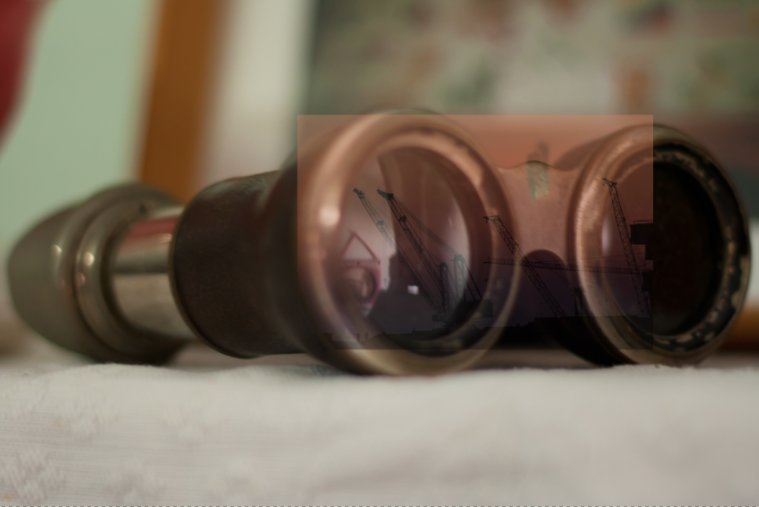
To give you some idea of what layer masks can achieve and how you can use them, I created an incongruous scene of an industrial sunset reflected in the lenses of a genteel pair of antique opera glasses.

[gallery columns="2" ids="7012,7013"]

Choosing your story

Having a clear idea of the story that I wanted to tell with the image was the first step. It meant that I didn't have to engage in too many changes and I was able to line up the images and accoutrements I needed. Of course things will evolve as you create them, but I would advise starting out with at least a basic 'recipe'.

Deciding on the light

As contradictory as it might sound, surreal images need to be grounded in reality to ensure that they're believable. Unless you're creating a Peter Pan-type figure, objects need shadows, for example. In this case, I needed to check that how my image reflected in the glasses was accurate, even if it were several degrees from reality. I did this using a pair of sunglasses and a torch to look for reflections.

How many layers?

My torch experimentations determined that I couldn't use one copy of the sunset scene to cover both lenses; the angles were wrong. It needed to be positioned separately over each lens of the opera glass. That meant importing the sunset image twice, onto two different layers.

Background and Layer 1

I started by making the opera glasses my background layer and then imported the first sunset layer and then added a layer mask by clicking on the Create new layer mask button at the bottom of the Layers panel.

I decreased the sunset layer’s opacity to about 40% to help me to scale it down to the size that I wanted and shift it into place over the opera glasses' lens.

Sunset over the lenses

Scale images at Edit>Transform>Scale; hold down the shift key to maintain proportions when adjusting the size.

Brushing away the excess

Happy that my sunset layer was in the right place, it was time to mask the parts of it that interfered with the image of the opera glasses. I did this by using the brush tool and the layer mask to 'paint away' the areas of the sunset scene that I didn't want visible.

Brushing away the extraneous data

When you're choosing what to show and what to hide in a layer mask, you paint with black to hide anything extraneous. If you paint away something and change your mind, switch the brush colour to white and it will reveal it.

[gallery columns="2" ids="7021,7022"]

I zoomed in close and used a relatively small brush with a mid-size feather to get the edge that I wanted.

Blending layers

When I was satisfied with my handiwork, I played around with the opacity and blending mode options to determine how the layers meshed together over each other to finalise the effect I wanted. Opacity and blending modes are the subject of a whole other article, but in this instance I set the opacity to 100% and opted for a screen blend.

Sunset over the second lens

With the second lens, it was a very similar process, except that I positioned the image of the sunset differently across the lens.

[gallery columns="2" ids="7018,7019"]

I selected the screen blend again, and adjusted the opacity until I was happy with the result.

Flattening and saving

Happy with my handiwork, I saved the image as a PSD file before flattening the layers and saving it as a JPEG file.

Binoculars final

Alternative views

Having saved my 'finished' version as a PSD file meant that I was able to return to it for adjustments, or to try other looks having laid the ground work. One of the alternative views I created of it was to insert a black & white adjustment layer above the background layer to create black-and-white opera glasses with coloured lenses.

An alternative view

More where this came from!

Surreal Screen Shot This image, together with lots of advice on creating surreal images through in-camera and compositing techniques as well as examples from surreal masters such as Miss Aniela, can be found in my book Surreal Photography: Creating the Impossible. Right now it has been selected by the fickle finger of Amazon super-deals and is available for the bargain price of 1 penny or 2 cents; there's no telling how long it might last, so why not give it a try? Even if you don't own a Kindle, you can download a Kindle reading app for free to use on your smartphone or tablet.

Adobe has acquired Aviary. Good or bad?

When I saw last night that image editing start-up Aviary had been acquired by image editing behemoth Adobe my initial reaction was 'Hmm. Great for the Aviary team; but I'm not sure it's so great for consumers.' Fifteen or so hours on from that, and my opinion hasn't changed considerably. I'd probably augment it with 'Smart move by Adobe.' Using the term 'start-up' to describe Aviary might not be entirely accurate, but it's a question of interpretation, I suppose. It has been around since 2007 and its code has been used to edit over 10 billion photos. Even if you don't use its smartphone app to adjust your images, you might well have come across its editing tools that have been built into platforms such as Flickr and Mailchimp using its software development kit.

Great for Aviary

If part of the definition of 'start-up' is the intention to see your company acquired by another one, then Aviary at least meets that criterion. Judging by Aviary CEO Tobias Peggs' effusive blog post announcing the acquisition, this is all their Christmases, Chanukahs, and Eids rolled into one. And that's even without the agreed fee being disclosed.

Screen Shot 2014-09-23 at 14.29.41

The Aviary offices are close to those of Behance, which was acquired by Adobe in 2013. Their proximity meant the Aviary people talked a lot with Scott Belsky, Behance's co-founder who now serves as Adobe's VP of Products and Community, and 'it became obvious that we shared a strong vision for mobile creativity. It became even more obvious that we should join forces, accelerate combined efforts and better serve even more app developers and even more people wanting to be creative on mobile.' Aviary is all about allowing people to be creative, through its own apps and through its SDK. It thinks it can better do this by partnering with Adobe.

Smart move by Adobe

Apart from Aviary's app being a peach and Adobe being keen to expand its mobile prowess, Aviary's SDK is well established. Adobe's isn't: it launched as a beta in June. According to Scott Belsky: 'We have high hopes for the Creative SDK and are thrilled that Aviary will infuse wisdom, technology, and reach to new developers.' Provided that the likes of Flickr, Mailchimp, and Shopify don't run screaming, Adobe has made a calculated acquisition to expand itself into a market where it didn't have a strong foothold. For anyone familiar with the English Premier League, it feels a little like accusations of Manchester City buying its way to football titles rather than building its own team. If you can't beat the opposition, buy it.

Not so great for consumers?

We know that I'm cynical; it says so in my Twitter bio. Thus from my cynical consumer standpoint, I wonder how beneficial this is for Aviary's users. The Aviary and Adobe teams are enthusiastic for what they can build together, but in trying to merge two company's visions into one coherent strategy how much creativity will be sacrificed and how much will consumer choice suffer? To what degree might smaller company 'Let's do this!' mentality be eclipsed by corporate hierarchy? Might Aviary become less accessible as it is absorbed into Adobe's Creative Cloud?

My visceral reaction is that while there are potential benefits to be harnessed from the acquisition, there are plenty of pitfalls, too. I'd like to be proved wrong. I hate the see a good thing fail and I really like Aviary.

However, whether Aviary was 'right' to sell or not isn't within my purview, not really. It's a company, it's not the NHS. It acts in its best interests, not mine. I wish them all the best.

Is Adobe's Lightroom Mobile fully embracing the mobile experience?

Adobe: purveyor of world-recogned photo editing options: some for desktop, some for mobile, and some that enable cross-over between devices, such as Photoshop Touch and Photoshop, via the Creative Cloud. That was all well and good, but what about Lightroom? When would that be available on a tablet as well as a desktop, people were wondering. What was taking so long? As of today, that wait for a mobile version of Lightroom is over. But is the Lightroom that people were expecting? For a start, it's Lightroom for iPad. There's no alternative tablet offering. You need to be using at least an iPad 2 running iOS 7 to make use of it.

Second, it isn't so much Lightroom for iPad, but Lightroom for desktop with an iPad outpost. As Adobe puts it, it's a companion app. Whatever you do on your iPad will always come back to your desktop Lightroom catalogue via the Cloud. For the majority of Lightroom users who want mobile access (and are iOS-based) this is probably how they envisioned using Lightroom mobile, as something that works in tandem with their desktop version: a manoeuvrable dinghy tethered to much bigger-engined boat. However, anyone who might have been expecting a stand-alone app independent of the desktop, however hollowed-out that might have needed to be, will be disappointed.

I'm not sure that the full fire-power of Lightroom would function on a tablet without being scaled down and refined in some way (and indeed Lightroom Mobile is a limited version of Lightroom), and making those types of sacrifices to functionality is possibly not something that Adobe wishes to contemplate or existing users would accept without having full-scale back-up, hence this iteration. Are Lightroom users the mobile-only type? Yet, I do feel as if there's a degree of reluctance to embrace a truly mobile experience on Abobe's part. The Creative Cloud is there when Adobe wishes to take advantage of it and lock users into a subscription, but not necessarily to put users' interests first and give them a workable and truly mobile-only editing option in a world that's increasingly portable.

Amongst other things, Lightroom mobile will allow users to:

  • Sync mobile edits, metadata and collection changes back to the Lightroom catalogue on a Mac or Windows computer
  • Automatically import images captured on an iPad and sync back to a Lightroom catalogue on the desktop
  • Work on images, even when the iPad is offline, for a truly portable experience
  • Sync photos between Lightroom 5 and Lightroom mobile; synced photos can also be viewed from any Web browser

And finally, the synchronisation-based architecture means that the mobile version of Lightroom is only available if you subscribe to the Creative Cloud. That means if you want the option to edit on your iPad, you need to shell out either £8.78 ($9.99) for the monthly photography subscription, or whatever Creative Cloud package takes your fancy. There's no option for stand-alone Lightroom users.

I'm not an iPad-user so there's no decision for me to make here, but I would be interested to know if you think that this version of Lightroom Mobile fulfils your needs, or if you think that Adobe has missed a trick.

Adobe unleashes some new Photoshop tools

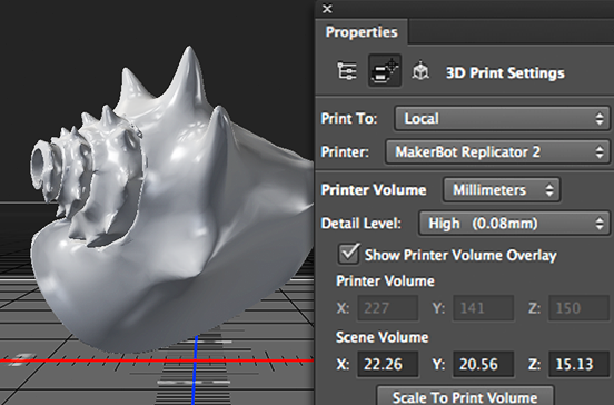
Adobe has announced an update to its Creative Cloud suite of applications, and with it some new tools for Photoshop. Headlining the update is the integration of 3D printing capability into Photoshop. It should now be possible to design print-ready 3D models from scratch or to refine existing models and then send them to a locally connected 3D printer or make use of new partnerships with MakerBot and Shapeways to have them print 3D creations. If you're not so exciting by 3D printing as Adobe is (or perhaps wondering why 3D modelling is included in an image manipulation package), Adobe has also brough Perspective Warp and linked Smart Objects to Photoshop.

Print to your own 3D printer, or connect to a commercial one!

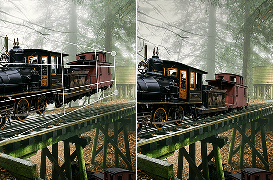
Perspective Warp is able to manipulate an image to alter the standpoint from which a subject is viewed. That could have particular creative uses when playing around with composites, but more general practical advantages to correct distortion in lenses.

Perspective warp: great for surreal creations, or just correcting lens distortions

Linked smart objects should improve collaborative processes by automatically updating a final design (for example a poster) if a file contained in it (a photograph, for instance) is amended or updated. No longer will the old version of the photo need to be removed and replaced with the new edit.

Re-edit a linked smart object and it'll autimatically update in a final design

In line with the subscription model, these applications, together with those made to InDesign and Illustrator, will not have to be paid for and should be available for use as soon as Creative Cloud updates.

Adobe extends its Photoshop + Lightroom subscription offer to everyone

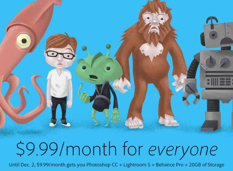
In September, Adobe announced that, for a limited time, owners of Photoshop CS3 would be eligible to sign up to a special Photoshop + Lightroom subscription that would cost them only £8.78 ($9.99) a month. I thought it read like a sweetner for the huge numbers of loyal Photoshop users who felt snubbed by the switch to Adobe's subscription-only model. However, it wasn't of any use to anyone who owned Lightroom and felt like trying Photoshop, or was just getting started with Creative Cloud. Now, if you're not too disgusted with Adobe's handling of its hacking fiasco and prepared to trust it with your credit card details, anyone can sign up for this not-bad-value offer, regardless of whether you own CS3 or later.

Photoshop + Lightroom for $9.99 a month for everyone (but sign up soon)

For £8.78 ($9.99) a month, you will have access to Photoshop, Lightroom, 20GB of cloud storage, and Behance ProSite. However, you must commit to an annual subscription and you must sign up between now and 19:59 GMT on 2 December 2013. (For CS3 owners, you still have until 31 December 2013 to sign up.)

All the details are waiting for you on Adobe's website.

Adobe's security breach in October was far more serious than believed

Adobe announced that it had suffered a security breach in early October that had resulted in the compromise of approximately 3 million customers' data as well as the loss of some proprietary source code. Attackers made away with customers' names, encrypted payment card numbers, and card expiration dates as well as the code for the ColdFusion web application and its Acrobat programmes. KrebsOnSecurity, the firm that spotted the initial attack has now placed the figure of customers affected by the breach at some 38 million, and the source code that was lifted is also said to include Photoshop. According to the KrebsOnSecurity blog, it has taken some time to uncover the extent of the violation because:

At the time, a massive trove of stolen Adobe account data viewed by KrebsOnSecurity indicated that — in addition to the credit card records – tens of millions of user accounts across various Adobe online properties may have been compromised in the break-in. It was difficult to fully examine many of the files on the hackers’ server that housed the stolen source because many of the directories were password protected, and Adobe was reluctant to speculate on the number of users potentially impacted.

Over the weekend, a large file of username and hashed password pairs was posted by AnonNews.org, which appear to be Adobe account details.

Adobe has contacted all of the active customers whom it believes to have been affected and claims that there has been no 'unauthorised activity' on any of the compromised accounts since the attack. It now remains for the inactive customers to be contacted. And regardless of whether users were active or inactive, their passwords were reset if Adobe believed that they were affected by the attack.

Whether Adobe chose to downplay the extent of the attack earlier in the month because it couldn't be certain of the number of affected customers or because it prefered to minimise the damage does not present it in the best light. One scenario makes it look careless, the other deceptive. I wonder how many customers are now looking for alternative products and providers... or waiting for a replicant based on the stolen code?

(Headsup to Engadget)

Update! Heather Edell, Adobe's Senior Manager of Corporate Communications emailed me in the early hours of 30 October. She stated that:

In our public disclosure, we communicated the information we could validate. As we have been going through the process of notifying customers whose Adobe IDs and passwords we believe to be involved, we have been eliminating invalid records. Any number communicated in the meantime would have been inaccurate. So far, our investigation has confirmed that the attackers obtained access to Adobe IDs and what were at the time valid, encrypted passwords for approximately 38 million active users. We have completed email notification of these users. We believe the attackers also obtained access to many invalid Adobe IDs, inactive Adobe IDs, Adobe IDs with invalid encrypted passwords, and test account data. We are still in the process of investigating the number of inactive, invalid and test accounts involved in the incident. Our notification to inactive users is ongoing. We currently have no indication that there has been unauthorized activity on any Adobe ID account involved in the incident.

In short: 2.8 million users had their names, encrypted payment card numbers, and card expiration dates filched by the attackers. An additional 38 million users had their user IDs and encrypted passwords stolen. However, because Adobe was unable to validate the number of users affected by the loss of user IDs and encrypted passwords, it did not disclose this initially. It has waited until it has more accurate figures.

Adobe's undergone a security breach. Time to reset your passwords.

Adobe has issued a communication to all of its customers this morning that it has sustained an attack to its network and its system has been breached. As a consequence, anyone who has conducted a transaction with Adobe has potentially had their name, encrypted payment card number, and card expiration date accessed by the attackers, although the number of affected customers has been placed at 2.9 million by Adobe's Chief Security Officer, Brad Arkin. Adobe does not believe that any decrypted card numbers were removed from their systems. The recommendation is for all Adobe customers to change their account passwords, which you can do by following this link, and to change the passwords of any accounts that might share your original Adobe password or ID. You should also keep a close eye on your bank transactions, be alert for any unusual payments, and to notify your bank if you spot anything untoward.

In addition to customer data, proprietary sourcecode for the ColdFusion web application and Acrobat programmes were filched. This has the potential to open up millions of users to security breaches, if the hackers can capitalise on any security holes or bugs in the code. Just think how many people use Acrobat.

The breach was spotted by Brian Krebs of Krebson Security; he has asserted that the hackers responsible were also behind the LexisNexis hack and it probably commenced at some time in mid-August.

Keep alert, people, and please remember to practise proper password security.

(Most information came direct from Adobe, some additional details from Ars Technica)

Adobe's Projects Napoleon and Mighty are go!

Abode mooted Projects Napoleon and Mighty at Adobe MAX in May this year. They were ideas explored by the Experience Design (XD) team: 'Mighty', a cloud pen, and Napoleon, a digital ruler. Today, they've brought them to life. Mighty, the cloud pen, was dreamed-up with a focus on the future of drawing. It's a pressure sensitive device to be used for drawing that's also connected to Adobe's Creative Cloud. This connection allows you pull up Kuler themes and create a 'cloud clipboard' so that you can save, access, and re-use things you've already drawn.

The design of Mighty was down to a team at industrial design firm Ammunition. They settled on a triangular grip with a twisted stem that's comfortable to hold and sits naturally in the hand.

Adobe Napoleon and Mighty

Napoleon is a digital ruler that was designed to bring back some of the feeling of drawing with analogue tools like the t-square and triangle. As Michael Gough, Adobe's VP of experience design puts it: 'There is something about the confidence of drawing a line aided by a physical device—the tactile feedback you get as you move the straightedge around—as well as the fluidity and accuracy of drawing that comes from interacting with physical objects.'

Adobe will teaming up with Adonit, 'an awesome band of makers with a shared belief in the power of creative devices paired with apps and services,' to bring Mighty and Napoleon to you in the first half of 2014.

What's that you say Adobe? You've updated Photoshop Express for iOS?

Amongst the bundle of app updates waiting for me this morning there was one from Adobe, for Photoshop Express. I noticed that the icon had altered, which suggested that it was a more significant update than a few bug fixes, and I wasn't wrong. There's a new look and feel to the app, as well as integration with Adobe Revel that allows you to store and share your images across the Cloud. I've already been having an explore. There are now 22 filters to choose from, ranging from a chilly 'Winter' effect, to a soft 'Dream' look, via the sepia-toned 'Memory' filter. I would say that the choice is overwhelming, but the filters take so long to process that I gave up trying to apply them and stuck with natural. The crop function provides the usual suspects of constraints and straighten, as well as the capability to rotate an image or to flip it along its horizontal or vertical axis.

Photo 13-09-2013 07 27 45

In the adjustments tab you're given control over contrast, clarity, exposure, highlights, shadows, temperature, tint, and vibrance. There's also a noise adjustment, but that's a paid-for feature. I found the adjustment controls on the previous version of Photoshop Express difficult to use, with features paired up beneath a tab and one of those controlled by a vertical swipe and the other by a horizontal swipe. It was far too easy to adjust one when you wanted to change the other. The new interface dispenses with the dual-adjustment system, each adjustment is made individually using a slider and some have an auto-adjustment feature. The new sliders are a definite improvement, but they could benefit from some refinement. There's no visual indication (for example a blue line) of how far away from the mid-point you've moved the slider apart from a pop-up numerical value and the mid-point itself isn't marked. Making alterations is, therefore, a little crude.

Just as the filters are slow to render, so are the adjustments. Changes don't happen in real-time as you move your finger along the slider, making it difficult to gauge your alterations. I'm sure that more practice will yield more accurate results, but when I'm already using an app that is responsive, it doesn't inspire me to make the switch to Photoshop Express.

As well as the auto-enhance button, there's a red eye removal option, and the choice of 20 different frames for your pictures. Again, they're very slow to render and they don't encourage me to try adding a frame to my images.

My initial impressions are of a very capable editing app, and to be fair you would expect nothing less from Adobe, that provides a welcome improvement to its interface and offers some very useful features (I'm especially taken by independent highlights and shadows adjustments). However, it is excruciatingly slow, which makes me hesitant to move away from my current favoured edited solutions. If Adobe were to do something about the app's pace, I might well be tempted. It is free, though, so take a look and see what you think.

Cookie the month-old kitten, looking adorable

That's Photoshop and Flickr who've both upped their antes in the past few weeks. Snapseed, I think it's your move.

(I've no idea what the Android update is like, or even if there is one. If anyone wants to share - please do!)

Review: The Long Exposure eBook


Long exposure photography is about capturing space and silence, like visually holding your breath; it is about capturing the beauty and calmness of a scene... And it's really good fun to boot!

The new book by Ireland-based David Cleland is a fantastic introduction to the process of capturing long exposure photographs. It documents the simple steps he employs every time he embarks on a long exposure photo shoot.

bookinside.jpg

The e-book covers everything from the equipment you will need right through to post- production processing in Adobe’s brilliant Lightroom 4. This guide has been written with the beginner to the long exposure process in mind; however, the enthusiast and professional alike may find something of relevance also. The know-how in this book will enable you to capture stunning long exposure images on even the simplest of camera set-ups.

More info? Head to David's website - and dont' forget to keep an eye on his Twitter, while you're at it!

Get to know CS 5.5 better, for free

Adobe CS 5.5

The dudes at Adobe are offering a one-off workshop-come-seminar-come-learning event to get to know Creative Suite 5.5 that bit better. Guess what? It’s free. If you already use CS3 or CS4 and are thinking of upgrading, they reckon that it’ll be especially useful for you. You’ll get to see the new features in CS5.5, as well as learn lots of tips and tricks to make the most out of it.

The plan is for Team Adobe (or at least members of it) to show off some of CS5.5′s groovy new features. How about the content-aware fill in Photoshop or the bristle brush and beautiful strokes from Illustrator? Maybe you’re more of a web-design person, in which case you’ll be introduced to the new-fangled HTML5/CSS3 support and jQuery Mobile/PhoneGap integration, as well as being able to preview designs for desktop, tablet, and smartphone browsers alongside each other.

There are also fancy new tools that work in conjunction with the Digital Publishing Suite. Interactive publications here you come!

Fancy going? It’s at the Vue Cinema, Fulham on 11 May, from 09:00 to 16:00. Tickets are free, but space is limited. Head over to the Adobe events page to register.