editing

Top 3 edits you should make to every photograph

Earlier this week an infographic design agency, NeoMam Studios, sent us an infographic about 'smoasting' which they'd produced on behalf of print company Photobox. Once I'd got over the shock of awful elision of 'social media' and 'boast' to form the ghastly portmanteau word 'smoast', there was one particular statistic that caught my eye. Take a look at the infographic and guess which it was.

Despite the prevalence of Instagram, the host of editing features that are built into apps such as EyeEm, Facebook, and Twitter, and the plethora of free-to-download editing programmes, only 28% of photos are cropped or styled in some way? Wow! I am surprised. And it's something I think deserves remedying.

While Team Photocritic advocates getting as much right in-camera as possible—you'll certainly not be able to turn a sow's ear into a silk purse—we're not beyond a little post-processing, either. If it's good enough for Cecil Beaton and Horst, it's good enough for us, too. A snip here and a swipe there can elevate an ordinary image into something a bit more special.

This isn't about air-brushing away half of someone's thigh, but about making minor adjustments to three specific areas: the crop, the colour, and the contrast. Here at Photocritic we call them The Three Cs. They're not complicated and they'll make a world of difference.

Crop

However well composed you think your image is, it will almost certainly benefit from having a few pixels shaved off it. It might be a case of reinforcing the rule of thirds, removing a bit of unwanted background that crept into the frame, or getting a bit closer to your subject.

The original isn't that bad

Being a purist, I tend to stick to traditional 4:3 or 3:2 ratios, but don’t feel limited by my prejudices. Select from any of the standard crops, from square to 16:9, or free-style it to adjust the crop any way you like.

But a crop does make it better

At the same time as cropping, make sure to straighten your image, too. Unless you are deliberately tilting the frame for creative reasons, uprights should be upright and horizons should be level. When lines that are expected to be upright or level are wonky, it has an unpleasant impact on our sense of balance. By correcting wonky lines, you'll produce a stronger image.

Colour

Light has a temperature, and depending on the source of the light, or the time of day if it’s the sun, that temperature will vary. When the temperature varies, so does the colour of the light. As a general rule, we don’t notice the variation because our eyes cleverly adjust to the changes. Our cameras on the other hand aren’t quite so clever.

Notice how the sheet and Cookie's white fur has a blue tinge?

Have you ever noticed how white objects in your photos can show up with blue or yellow casts? That’s because the white balance in your photo was off.

Corrected by nudging the white balance slider to the right

It's a relatively easy correction to make using the 'Warmth' or 'White Balance' function in an editing programme. If you think the whites are looking a bit too blue (or if an image looks a little 'cold' over all), nudge the slider to the right. If the whites are too reddish in tone, or the photo looks a bit warm, slide it to the right. It's a case of trial and error to make the right adjustment, but the more that you practise it, the better you'll understand the shortcomings of your camera and how it reacts to different types of light.

Now if you want to intensify or tone down your colours, you can do so using the saturation slider. I don't recommend bumping up the saturation too much; it can result in a cartoon effect rather than a photo!

Contrast

Contrast is the difference between the dark and light tones in your photos. Images shot on bright sunny days tend to have a lot of contrast, with dark shadows and bright highlights, but those taken in fog won’t have a great deal of tonal variation and will be low contrast. From time to time, you’ll want a low-contrast image, but, generally speaking, your photos can be improved by increasing the contrast a touch. It brings definition and depth to them.

The original looks good enough to eat

Don’t go overboard, though, as too much of a good thing can turn bad. You’ll find that if you over-cook the contrast you’ll lose too much detail and end up with an ugly image. Subtlety beats brickbats.

But increasing the contrast can bring some depth

If you use Snapseed to make your edits, it's worth getting to know the ambiance slider, too. I've often found that this is a preferable alternative to the contrast slider.

Anything else?

At this point, any other adjustments are gravy. I'm a fan of Snapseed's 'centre focus' options and often apply one of those. You might want to play with a tilt-shift effect. Or there's the waterfall of filters you can try in any programme, but you might find that you prefer your own edits to prefabricated filters, now.

Oh, and don't forget that it all starts with a decent photo, so check out our eight tips for better smartphone photos, too.

10 alternatives to Apple's Aperture

Now that everyone has got over their shock that Apple will be consolidating its image editing and organisation features later this year, with the result that its top-end programme Aperture will be closing up completely, people are probably beginning to think about alternatives. I've pulled together ten Aperture alternatives and sought out their positive and negative features. They're all Raw compatible, but do double-check their non-destructive capability. A standard gripe for the majority of these programmes is that they're tricky to get to learn, or that the interfaces aren't intuitive. While it is entirely possible that some of these programmes do have seriously unfriendly workflows and interfaces, it might also a case of them being different to what you know. I remember opening Lightroom for the first time and wondering if it controlled the International Space Station, too. It's all a learning curve. Still, it's probably worth bearing in mind that the open-source options don't have such pretty interfaces as the paid-for programmes.

And finally, we really don't know what Apple's plans are for its photo management and editing programmes. It's possible that Aperture's features will be integrated into whatever comes next. Or maybe they won't, if Apple is looking for a simpler, more consumer-friendly package. But it remains to be seen.

Adobe Lightroom

Lightroom is probably the most obvious option for people looking for an Aperture replacement. It's a comprehensive editing suite that sets the standard in its field. In addition to the expected functions, Lightroom includes advanced features such as brushes, gradient tools and specific lens corrections. It's my editing suite of choice that I feel offers me almost everything I want in an image editor.

However, some photographers—me included—are concerned that the option to purchase Lightroom as a stand-alone editor will be subsumed into the subscription model Creative Cloud and we'll find ourselves beholden to Adobe in perpetuity. If the potential for that bothers you, you might wish to look elsewhere.

Positives

  • Regarded as the market-leader in its class

Negatives

  • Feature-laden interface can be overwhelming
  • Some people unhappy with Adobe

Lightroom perpetual licence: £102.57 Adobe Photography CC bundle (Photoshop CC + Lightroom): £8.78 ($9.99)/month

Corel AfterShot Pro

If anyone doubted that Corel were still in business, yes, it is. And if you're wondering what happened to image editing software Bibble, it was bought by Corel... and became AfterShot Pro. The first version met with significant criticism for lack of basic features such as red eye correction and a reset button. This has been corrected for version 2, together with improved batch editing features and new noise reduction features. By all accounts, it's a pretty nippy piece of kit.

Corel has also stated that it is looking to make life as easy as possible for Aperture users who are looking for a alternative programme. It's reasonable price together with its comprehensive feature set makes AfterShot Pro a compelling option. And you can check it out for free before buying, too.

Precise control with selective editing in Corel's AfterShot Pro

Positives

  • Quick and responsive
  • Comprehensive feature set
  • Supports layers
  • Batch processing options
  • Enjoys local editing features

Negatives

  • Idiosyncratic lay-out
  • Limited plug-in selection
  • No web or email sharing capability

Corel After Shot Pro: £57.99 (usually $79.99, currently $59.99)

Cyberlink PhotoDirector Suite

PhotoDirector claims itself to be 'a unique application that combines all the features you need for photography in a single workflow – efficient photo management, complete adjustment and creative editing.' It comes with some serious editing firepower—from body-slimming tools to content aware object removal—and some sparkling reviews. You can try before you buy with a 30 day free trial. If the PhotoDirector Suite is a bit too pricey for you, have a look at PhotoDirector Ultra, instead.

Create tilt-shift effects in PhotoDirector

Positives

  • Intuitive interface
  • Comprehensive feature set
  • Facial recognition

Negatives

  • No batch processing
  • Inconsistent import times
  • No geo-tagging capability
  • Limited lens correction profiles

Cyberlink PhotoDirector: £114.99 (currently £89.99)

PhaseOne Capture One Pro

You might think of Capture One as being a medium format image processor, but it's capable of handling dSLR- and EVIL-created files, too. It's history of medium format processing means that many of the features that you're accustomed to seeing in places such as Photoshop as well as Aperture and Lightroom come as standard in Capture One. You might need to take a deep breath when you look at the price, but there is a free trial to test it out first.

Positives

  • Comprehensive feature set
  • Supports layers
  • Local adjustment tools
  • Clean and customisable interface

Negatives

  • Expensive
  • Can be sluggish

Phase One Capture One: €229 (currently €114)

Darktable

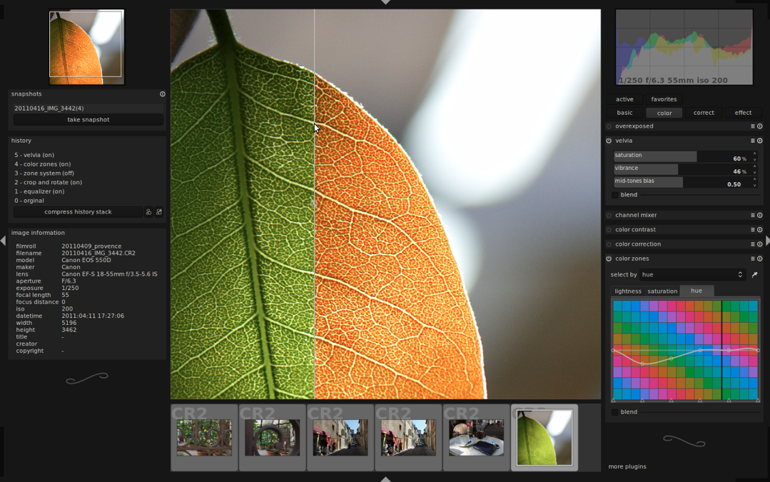
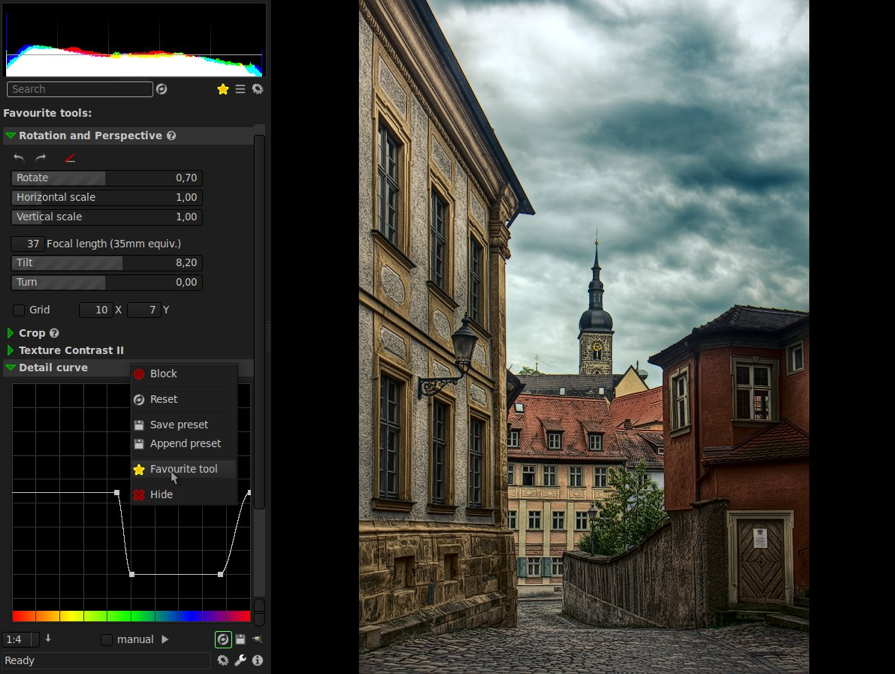
Darktable is a free, open-source image editing suite that does seem to offer the most comprehensive and user-friendly experience without having to pay for anything. While one should never judge a book by its cover, the Darktable website is the most professional looking one in the open-source category.

Darktable in action
Darktable in action

Positives

  • It's free
  • Impressive range of functions, including split toning, film emulation, watermarking
  • Tethered shooting support

Negatives

  • Interface requires refinement
  • Clumsy and confusing image filing system
  • Undo system could be better

Darktable

digiKam

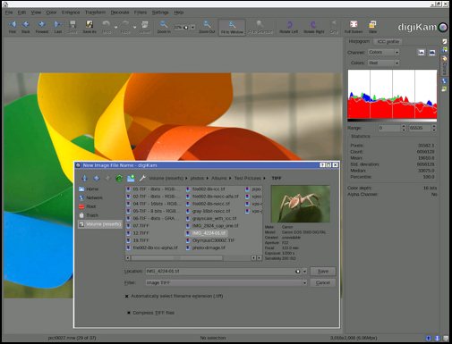
The digiKam website does give me a mild headache, but plenty of people seem to like the software. In particular it includes some features that aren't available in places such as Lightroom yet, for example fuzzy search and facial recognition.

digiKam in action
digiKam in action

Positives

  • It's free
  • Map integration for geo-tagged images
  • Facial recognition and fuzzy search capabilities

Negatives

  • Can be buggy
  • Idiosyncratic workflow

digiKam

Lightzone

Once upon a time, Lightzone was a commercial enterprise under the aegis of the now-defunct Light Craft company. It went off-line unexpectedly in Sepember 2011, but resurfaced as an open-source initiative tentatively in December 2012 and then more fully in June 2013. Given it was once a commercial product, Lightzone does benefit from better-than-average-for-anope-source-project documentation.

Lightzone, with notes

Positives

  • It's free
  • Extensive functionality
  • Well documented for an open-source project
  • Intuitive layout
  • Previews effects in miniature
  • Supports layers
  • Localised adjustments

Negatives

  • Users need to register before downloading the software
  • Weak image management tools

Lightzone

Hasselblad Phocus

Hasselblad's Phocus might have started out for Hasselblad cameras, but it now supports a wide range of manufacturers' devices.

Positives

  • It's free
  • Mobile app
  • Intuitive, attractive interface

Negatives

  • Not that many people know about it or use it (maybe that's a good thing?)

Hasselblad Phocus

Photivo

Most of what I've read about Photivo suggests that it's a powerful piece of kit, but that it isn't necessarily easy to leap into it and get started. It doesn't offer any management features, just development functions, and is open about it not being for beginners.

Photivo in action
Photivo in action

Positives

  • It's free
  • Localised adjustments
  • Extensive control
  • GIMP integration

Negatives

  • Not necessarily intuitive
  • Not designed for image management

Photivo

Raw Therapee

Raw Therapee seems to offer a peculiar mix of some incredibly advanced editing capability with some serious oversights. While its demosaicing feature is super for low noise images, it's reported that it doesn't cope well with noisier photos. With today's strospheric ISOs, it might be a dciding factor.

Raw Therapee dealing with chromatic aberration

Positives

  • It's free
  • Demosaicing feature
  • RL Deconvolution sharpening tool

Negatives

  • Slow
  • Complicated workflow
  • No batch processing option
  • No localised adjustments
  • Wobbly image management interface

Raw Therapee

So near yet so far for Fotor

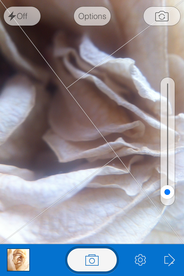
When I was conducting my recent app spring clean, one of the apps that wasn't sent packing was Fotor, an editing package that I was asked to review by its makers. I've been trying it out for a few days, but the images I've edited specifically for this review I shot today, in glorious sunshine with the help of an Easy Macro band. As an editing package, Fotor offers a lot, but I think it falls short of replacing one of my current favourites. Fotor gives you the option to import photos from your camera roll or take a photo in-app. If you opt for in-app, you get a choice of three subject placement overlays: grid, golden spiral, golden triangle. Or none at all, if you prefer. Whether you take a photo in-app, import it for editing, or save it after editing, it will be stored in Fotor's photo folder, according to date.

In-camera shooting options

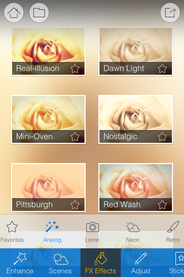
When it comes to editing functions, features, and filters, Fotor is well endowed. You can adjust contrast and brightness and saturation and white balance and shadows and highlights, add text and stickers, apply a tilt-shift effect or a vignette, and compile a collage. There's a gamut of free filters—nine folders, ranging from 'Lomo' to 'Scratch', each with nine options—as well as some paid-for additions and 12 paid-for scenes.

A good range of basic edits

Fotor includes some neat touches. Being able to assign your favourite filters to a specific folder, making them easier and faster to apply, for example. Having each photo's details (time and date, exposure, and geo-location) at a tap is great. And I appreciate having plenty of sharing options, too.
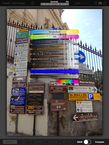
More than enough filters to go around

However, there are some frustrating oversights. The omission of a straighten function being top of my list. And not being able to crop a vertical image using a 4:3 aspect ratio without first rotating it to a horizontal aspect, and indeed various other aspect ratios, is a bit... odd.

A very odd crop function and no obvious straighten feature

I didn't find the slider that is used to control the intensity of the adjustments especially accurate: if I tried to set it to 12 points, it would easily wind up at seven or 16. Without a reset button, returning the slider to 0 was sometimes tricky. And I have to confess that I'm fond of being able to compare my adjustments with the original image, which I can't do with Fotor.

But when all was said and done, I did like the final edit

Fotor, I'm afraid, won't be making its way to the 'Photography A' folder on my phone. It doesn't offer me enough of what I need and there's too much of what I don't. But that isn't to say it won't be for you. It's free to download and available for Android and iOS, so worth a look.

What is the clarity slider? And why might you want to use it?

Your photography has been progressing and you've made the leap from shooting in JPEG to Raw. Along with this, you've plunged headlong into Lightroom and all of the editing marvels that it affords you. Plenty of the controls are familiar, after all you've been adjusting the white balance in your iPhone photos since you realised you could stop people looking corpse-blue with a simple slide to the right in Snapseed. A few of the others need a bit more thinking about, but they're essentially the same. And then there's the clarity slider. Clarity? What the blinking heck is that all about?

Defining clarity

Before we wade headlong into the ocean of clarity, we need to take a step back and have a quick re-cap of contrast. Contrast is the difference between light and dark in an image. Increase contrast and an image will seem bolder; decrease contrast and it'll have a more muted feel. Adjust the contrast and it has an effect across the entirety of the photo: highlights, shadows, and mid-tones. This is where clarity comes in.

Clarity's influence over contrast happens in the mid-tones of an image; by increasing clarity, you sharpen the edge detail and definition among these tones, leading to a punchier, sharper looking image. Conversely, decrease the clarity value and you'll soften edge detail and lose definition.

Ramping up the examples

The effect that the clarity slider has on your photos is likely as clear as mud until you see it in action. I have, therefore, reproduced the same image but with different clarity adjustments, to see how it looks.

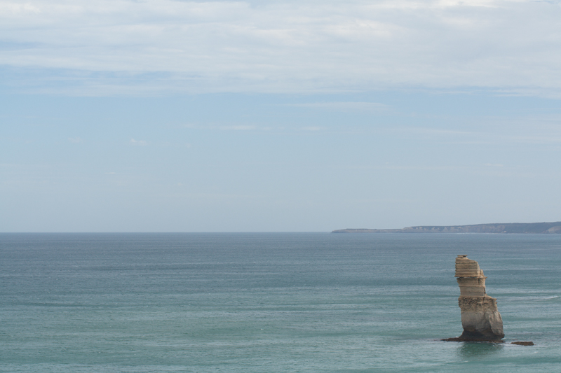
My original photo of a lonely Apostle off of the Victorian coast. It's been adjusted for crop and white balance.

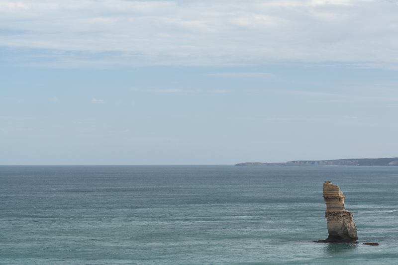
Same image but with the clarity slider pushed to +50. Note how much more defined the waves are, and how the strata in the Apostle are clear?

With the clarity slider moved to -50, everything becomes much softer.

Why, then, would you want to adjust the clarity in your photos? For a start, I've exaggerated the adjustments in my examples to show you precisely the impact it can have. With more subtlety, it can add definition to landscapes, or emphasise a misty, dreamy feel, and give portraits a gentler feel.

Subtler examples

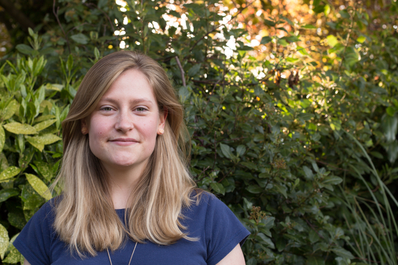
These aren't especially thrilling portraits of my cousin, Emma, but they serve the purpose of exploring the clarity slider perfectly.

Nothing terrible (or exciting, either, to be fair) about the original here

There's nothing at all wrong with the original image (it's been cropped and white balanced); but look at how Emma's skin appears softer and more even with a -15 point adjustment to clarity. The background hasn't been affected too much, but she looks better for it.

But a slight adjustment to the clarity slider (-15), softens Emma's skin a touch.

If you'd like to get even more advanced, you can use Lightroom's adjustment brush to paint softer and more even skin with a negative nudge, but bring definition to a portrait subject's hair by selecting that and giving it a positive clarity adjustment. That's what I've done here.

Here, I've softened Emma's skin with negative clarity, but brought out the definition in her hair with a positive clarity brush.

A cautionary conclusion

As with most things, subtlety is the key to clarity. Too much of it in either direction can leave your photos looking more like cartoons or watercolours than you otherwise might want. And you're not going to want to fiddle with the clarity slider on every photo, either. But at least you can have a bit more confidence about what it does and how you can make it work for you now.

Is Adobe's Lightroom Mobile fully embracing the mobile experience?

Adobe: purveyor of world-recogned photo editing options: some for desktop, some for mobile, and some that enable cross-over between devices, such as Photoshop Touch and Photoshop, via the Creative Cloud. That was all well and good, but what about Lightroom? When would that be available on a tablet as well as a desktop, people were wondering. What was taking so long? As of today, that wait for a mobile version of Lightroom is over. But is the Lightroom that people were expecting? For a start, it's Lightroom for iPad. There's no alternative tablet offering. You need to be using at least an iPad 2 running iOS 7 to make use of it.

Second, it isn't so much Lightroom for iPad, but Lightroom for desktop with an iPad outpost. As Adobe puts it, it's a companion app. Whatever you do on your iPad will always come back to your desktop Lightroom catalogue via the Cloud. For the majority of Lightroom users who want mobile access (and are iOS-based) this is probably how they envisioned using Lightroom mobile, as something that works in tandem with their desktop version: a manoeuvrable dinghy tethered to much bigger-engined boat. However, anyone who might have been expecting a stand-alone app independent of the desktop, however hollowed-out that might have needed to be, will be disappointed.

I'm not sure that the full fire-power of Lightroom would function on a tablet without being scaled down and refined in some way (and indeed Lightroom Mobile is a limited version of Lightroom), and making those types of sacrifices to functionality is possibly not something that Adobe wishes to contemplate or existing users would accept without having full-scale back-up, hence this iteration. Are Lightroom users the mobile-only type? Yet, I do feel as if there's a degree of reluctance to embrace a truly mobile experience on Abobe's part. The Creative Cloud is there when Adobe wishes to take advantage of it and lock users into a subscription, but not necessarily to put users' interests first and give them a workable and truly mobile-only editing option in a world that's increasingly portable.

Amongst other things, Lightroom mobile will allow users to:

  • Sync mobile edits, metadata and collection changes back to the Lightroom catalogue on a Mac or Windows computer
  • Automatically import images captured on an iPad and sync back to a Lightroom catalogue on the desktop
  • Work on images, even when the iPad is offline, for a truly portable experience
  • Sync photos between Lightroom 5 and Lightroom mobile; synced photos can also be viewed from any Web browser

And finally, the synchronisation-based architecture means that the mobile version of Lightroom is only available if you subscribe to the Creative Cloud. That means if you want the option to edit on your iPad, you need to shell out either £8.78 ($9.99) for the monthly photography subscription, or whatever Creative Cloud package takes your fancy. There's no option for stand-alone Lightroom users.

I'm not an iPad-user so there's no decision for me to make here, but I would be interested to know if you think that this version of Lightroom Mobile fulfils your needs, or if you think that Adobe has missed a trick.

Review: Photoristic HD iPad editing app

When I first downloaded Photoristic HD to have a go at some editing on an iPad, I was expecting an all-round editing package that would be great for my parents to use to make adjustments to their photos on their iPad. They use a point-and-shoot, record everything in JPEG, my mother has a proclivity to take wonky photos, and my father doesn't understand the concept of 'getting closer' no matter how much I try to impress it upon him. They need a simple but comprehensive editing app. Photoristic HD combines general editing functions (white balance, exposure, contrast, highlights, shadows, vibrance, saturation) with advanced colour adjustments and a barrel of filters. It can process images of upto 20 megapixel resolution, and saving and sharing is easy. It sounded promising. So much for my expectations. This was not an app that felt I could present to my parents to help them make their photos look better. It wouldn't meet their needs. But when I got past this disappointment, I realised that Photoristic HD offers something different for iPad editing and it might not be all that bad.

photo

Photoristic is easy to use: you swipe left or right to adjust the values of whichever function you've selected, be it the like of contrast, shadows, or highlights underneath the balance tab, or one of the eight colours sitting beneath the hue, saturation, or luminance tabs. You can convert to black and white with the toggle of a button and you can apply one of a huge selection of filters—black and white options, selective colour choices, and colour filters—with two taps.

I'm not a frequent filter-fyer and I actually found many of Photoristic's too harsh or intense for my tastes. I wouldn't want to let my parents loose with these. All their photos would come out too brash, too sharp, too in-your-face. Photoristic does, however, let you save your own presets, which is moving well beyond the realm of my parents' use, but does present it in a different light.

The Polar Sun preset doesn't do it for me

This gives you the chance to combine its split tone function, colour controls, and the adjustments in the balance tab to create your own effects. Now that I've taken a step back, I wouldn't hesitate to name Photoristic's fine colour control and ability to save presets as its most valuable feature. No, it isn't an all-round editing package; it's something else. I was able to create my own cross-processed effects or add a bit of golden hour magic to a photo taken nowhen near sunset or sunrise. And I was able to save these as presets to apply to any photo I process through the app.


Having fun with split toning

There are buttons that allow you to sequentially undo your previous edits or compare your current version to your original image. When you're content with your handiwork you can save your image to your photo library or Dropbox, email it onwards, send it to print, or share it to Facebook or Twitter.

Should you get a bit stuck, the help button is towards the top left corner.

The most critical omission that prevents Photoristic from being a comprehensive editing package is a crop and rotate feature. With every photo that I put through the app I felt frustrated that I was unable to straighten it or slice off a few extraneous pixels. And my parents, with their skewed horizons and distant subjects, definitely need it. It's all very well being able to bring out the blue of a sky, tone down the red of someone's nail polish, or help negate a green cast, but crop and rotate is one of the basic functions that we rely on in an editing suite.

Standard edits are fine, but oh for the love of a crop function

I was so surprised by the omission that I emailed the developers to check that I hadn't missed it anywhere. They confirmed that there isn't a crop and rotate function yet, but it is expected in a future iteration.

When you realise that Photoristic isn't a basic editing app but instead offers more sophiscated controls to adjust colour and create your own filters for your photos, it takes on a different complexion. If you're looking for an iPad app to let you take control of your photos' colour effects and filters, then do consider downloading Photoristic. It's £2.99 in the UK and $4.99 in the US.

I shan't be showing my parents how to use it.

(All photos courtesy of my parents.)