Feature Articles

When cropping heads isn't a photographic crime

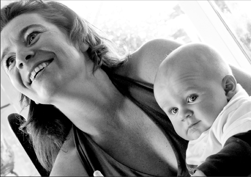
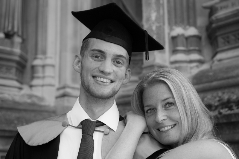
Have you ever had someone take a photo of you and a friend, only to find out later that they cut off the tops of your heads? It looks ridiculous, and if someone’s head 'sticks out' of the composition, your photo is ruined. In other words, it’s not hard to imagine where the don’t-crop-people’s-heads rule came from. When you are working with people and portraits you will soon learn that there are good ways to crop people, and others that are not so good. Cropping heads is at the top of the naughty list. Don’t do it! Slicing off some of the lovely Sarah's head would not have been a good look

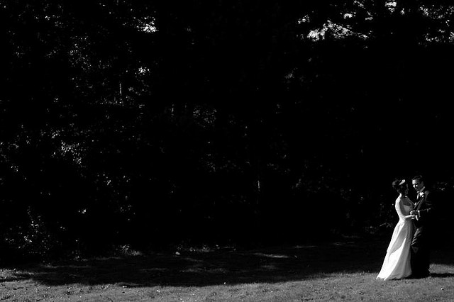
Except that, sometimes, cropping heads can be highly effective.

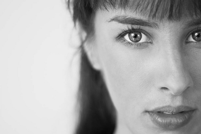
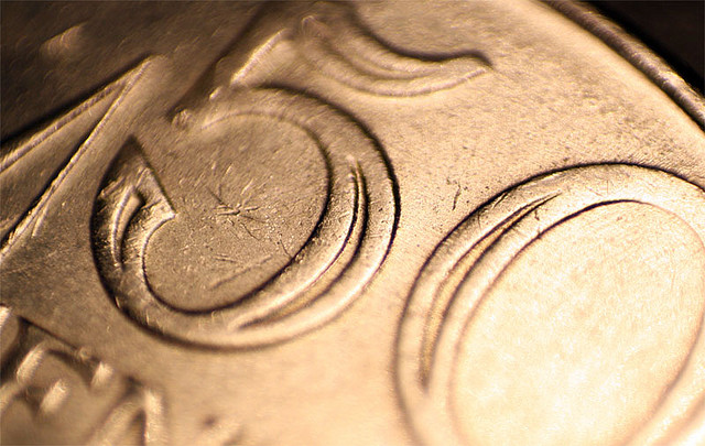
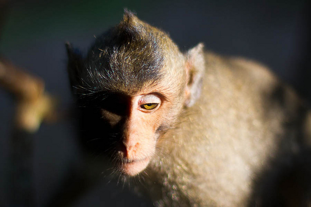
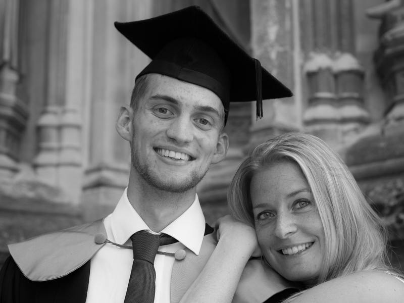
When can you break this rule-of-rules? When you've got in close—really close—to your subject. If your composition is focused only on somebody’s face, it can improve the shot to crop in close.

Get closer!

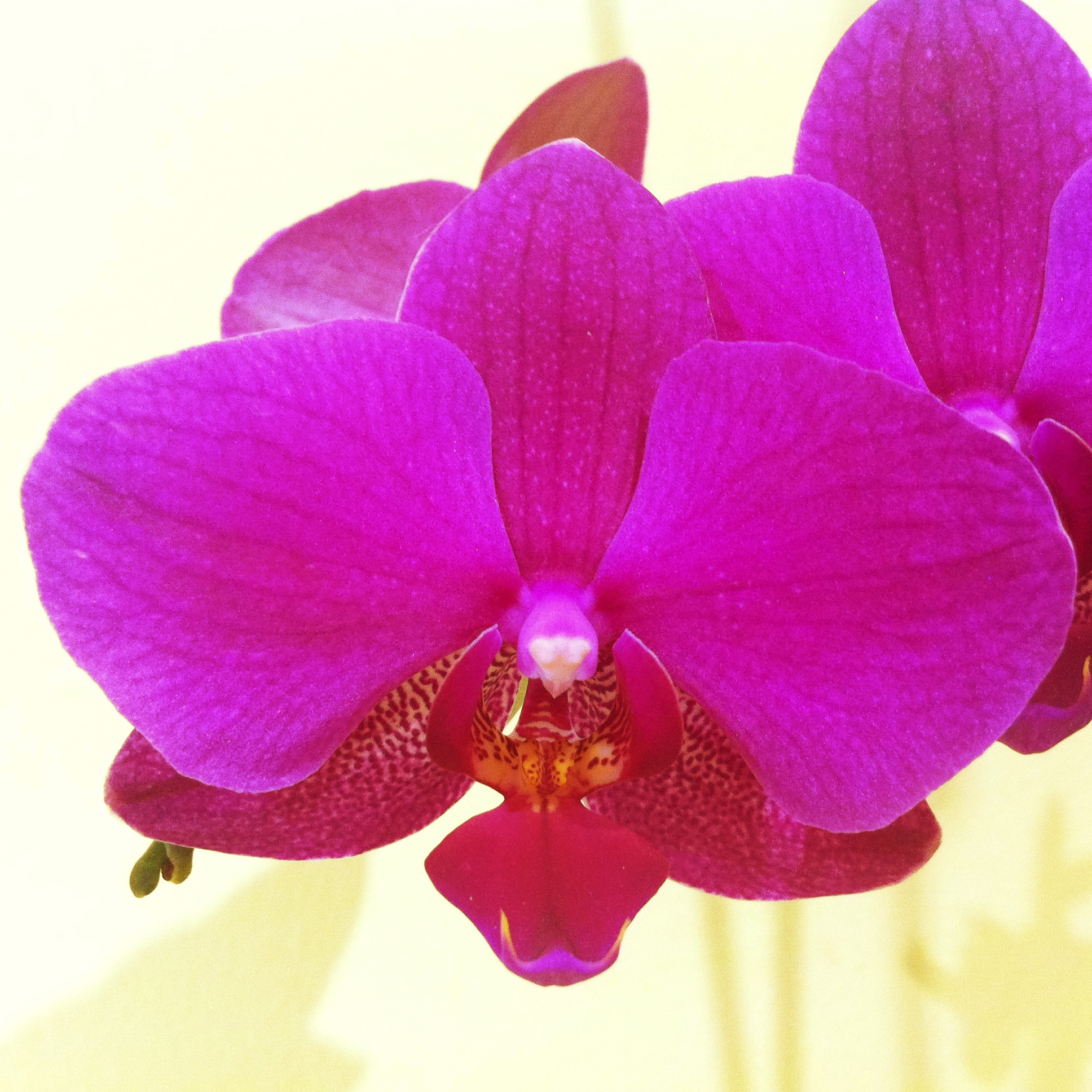
Don't be afraid to break the rule and crop in close and slice something off of the top, bottom, or sides of the head when the features of the face are the focal point of your composition. The reasoning is this: if you’re going to get in close, get in really close. By filling the frame completely with someone’s face it can make cropping her or his head unavoidable, but it also doesn’t look unnatural.

The key is to decide whether your composition is mainly about the body, upper body (shoulders and above), head, or just the face. Each type of shot has a different purpose, and only the face shots will look natural if you decide to crop the head. Otherwise it merely looks like you failed to plan your shot.

Intentional or accidental? It's hard to tell.

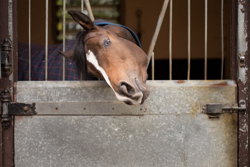
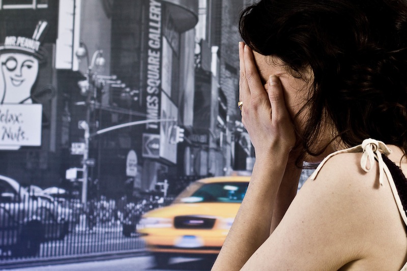
But in-keeping with the adage that if you're going to break the rules, break them properly, if you are going to crop into somebody’s head, make sure that you do it properly. A composition where only a thin sliver of someone’s head is cut off looks accidental. If you go even closer and cut them off across their forehead, the composition looks a lot more powerful, and at least nobody is left wondering whether or not you did it by accident!

Be bold - get in close!

Be bold!


Rules Screen Shot More unusual ways of looking at things, remembering rules, and then breaking those rules, are in my lovely book, The Rules of Photography and When to Break Them. It's available as an e-book and in a dead tree version (UK, US).


The winners of our Patience is a virtue long exposure competition are...

It took some serious deliberation. There were a lot of emails between us. There was even the odd expletive. Finally, however, Haje, Tom, and I have selected our five favourite photos from the Photocritic Long Exposure Competition. In no particular order I present to you the winners of Patience is a Virtue:

Set Fire to the Rain by Cybjorg

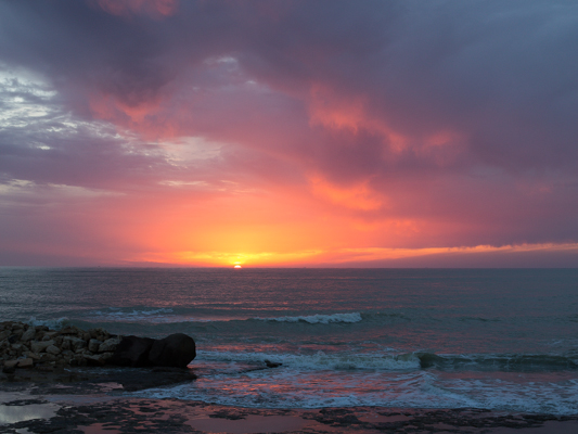
Sunrise at Botany Bay, Edisto Island by Luke Robinson

Tower Bridge traffic by Nick Jackson

Blades of Light by Paul Shears

and Cairngorm Panorama by Ian Appleton

Many congratulations to the five of you! I shall be in contact presently to enable to you claim your Triggertrap gift card prizes!

We'd also like to say thank you to everyone who entered and made our lives a little bit tricky when it came to selecting a winner. As Haje said when we first sat down to draw up a shortlist of our favourites: 'There's some serious talent there!' Please do go look at the selection in the Flickr pool: there are some inspiring images.

Setting up an affiliate programme

Making money from photography can be hard. Between 'rights for reach', Getty permitting non-commercial use of some its images for free, falling stock percentages, and embedding rather than purchasing for website use, it feels as if there's a grizzly trend for photographers to make money in ways that uses their images as income generation leads, rather than income generators. Making some more of these can be useful (Image by Haje)

I'm far from keen on this descent of the photograph from product to income lead generator, but whining about the situation won't cure it. Rather, you need to harness all of your assets and put them to work for you. Even if you are continuing to make money from your photography, or if you're an amateur who doesn't sell their work, it is worth capitalising on your website views to have some other means of bringing in some pennies, especially if you find yourself thinking 'If only I had a pound for every time some bought a Really Good Widget on my recommendation!' Maybe you should consider affiliate marketing?

What is affiliate marketing?

The theory behind affiliate marketing is fairly simple. You form some kind of partnership with companies and retailers related to your sphere of operation. If and when you mention their products or products that they sell on your website, maybe in an article or perhaps in an advertising box or a banner, you include a unique tracking link to their website or webstore. Should your readers click on that link and make a purchase, you get a kick-back from the sale. If you promote a product, consciously or not, you might as well benefit from it.

Which companies offer affiliate schemes?

There's a welter of photography-related companies that run affiliate schemes that you can incorprate into your website. You can choose from retailers and e-tailers such as Adorama, Amazon, B&H, Jessops, and Waterstones. Plenty of printers and print firms offer affiliate schemes: Moo, Photobox, Shutterfly, and Snapfish, for example. Our publishers, Ilex, runs an affiliate scheme. And so does Triggertrap.


Photographed with Triggertrap

Which affiliate schemes should I join?

First, you really need to think about the content that you produce and the nature of your readership. You'll do best out of affiliate marketing if you form partnerships with companies that will appeal to your readers. After that, you need to decide on how mercenary you want to be. Are you prepared to link readers to any company in order to capitalise on their spending? Or are you more discerning and will use your affiliate links as more of an endorsement? If you're always using a particular product and singing its praises, encouraging other people to use it, why not make some pin-money from that?

What do the links look like and how do I use them?

Generally speaking there are two forms of affiliate marketing you can use: links and banners. When you form an affiliate partnership with a company, you'll be provided with a dedicated affiliate link. Every time that you mention the company or any of the products that it sells, you link to its website or the product in its webshop and add the affiliate link to the end of the URL.

For example, say I ran the Really Good Widget Company and you signed up as an affiliate partner. I'd give you an affiliate link which might look like ?afl=101. If you mentioned one of my Really Good Widgets in a blog post or article, you would link to its page in my webstore and apend ?afl=101 to its URL. If a reader clicked the link and bought a Widget, I'd give you a percentage of that sale.

A 'perfectly exposed' image isn't always the story you want to tell (Image by Daniela)

Affiliate links can take a little time to insert: you need to hunt down the webpage to which you want to link and add your unique affiliate code, but it's not too much of a faff, especially if you were already going to link there. If you're handy with coding, you can write a bookmark to automatically add your code to a URL with a click.

As well as these links, some companies provide affiliate linked banners and boxes that you can insert into your website which look like advertising. If your readers click through from your website to their webstores and make a purchase, you'll receive a share of the sale. Provided that you can easily include a banner or some advertising boxes on your website, these are simple to use.

How much can I expect to earn?

How long is a piece of string? For a start, I don't think that I've found two affiliate schemes that offer the same rewards. Ilex offers a 15% share of each sale; Triggertrap starts with a 5% share of the order value, but that rises to 10% after you generate 50 sales. Other companies are less generous, with 3 or 4% shares of order values. And it depends on the expiration length of your affiliate links, too. Some companies provide 7-day cookies but others offer 30-day cookies. This means that when someone clicks through a link, they don't necessarily have to make the purchase immediately. With a 7-day cookie they could return within the following week and buy their Really Good Widget and you'd still get your fee; but with a 30-day cookie, their click is remembered for almost a month.

Do you have all your prints made through Photobox? Tell people and use an affiliate link to make some money back from them.

Do take note of the scheme's minimum payment sum, too. Some companies set a high threshold and you'll need to generate a lot of sales before you can reap the benefits in cash. Also give some consideration to payment method. Cashing an international cheque is expensive. Do you have or want to have a Paypal account? Is an electronic bank transfer best?

You also need to deploy your affiliate links effectively. Bombarding your readers or viewers with affiliate links that you've shoe-horned into blog posts or image captions at every opportunity might not win you many favours. But if you used a technique mentioned in an Ilex book, link to the book when you blog about it. If you shot an image using Triggertrap, link to Triggertrap when you caption it. You need to be positive about your linking, but not overly enthusiastic.

I'm sure that there are some people who've managed to sustain their empires through affiliate marketing alone, but they're likely very scarce. Don't expect affiliate marketing to make you a fortune, but with careful management it will be preferable to a poke in the eye with a sharp stick.

Is there anything else I need to know?

Yes. EU law demands that if you use cookies on your site you must declare this to your visitors. Seeing as affiliate marketing relies on cookies, you will need to include a cookie banner on your website should you be based in the EU. The good news is that for anyone using WordPress, there are a welter of cookie banner plug-ins available. Pick one and away you go.

Some companies want you to have a minimum number of visitors to your site each month before you can sign up. It helps to have your figures to hand before you try to forge any partnerships.

Finally, signing up for a US-based affiliate programme when you're extra-US can be a headache when it comes to the IRS. I know this from experience. Affiliate marketing is meant to make you money, not cost you money in terms of time or frustration; do consider fiscal geography when signing up for an affiliate programme.

Great! Where do I sign up?

Most companies that offer affiliate marketing have a link at the foot of their websites. This will take you through to an affiliate programme portal, which is usually operated by a third party. Affiliate Window is popular. Triggertrap uses LeadDyno. For some you need to provide quite a bit of information from the outset, others are quite minimalist.

Signing up for Triggertrap's affiliate programme is remarkably easy

Once you've done that, you'll be given your affiliate code and banners to include on your website. Then you can start to watch the pennies roll in.

An auto-focusing modes primer

Autofocus is such a wonder-tool in our cameras that I'm sure quite a few of us have no idea how we ever managed to take tack-sharp photos without it. But how many of us actually use it to its full potential? There's a bit more to auto-focus than the single or one shot default. Without further ado, here's a quick primer into the different auto-focusing modes you're likely to find on your camera, and when best to make use of them.

One or Single shot

This is probably what you think of as 'auto-focus'. You point your camera at your subject, you line up your auto-focusing points over it, you half-depress the shutter button, and the camera attempts to focus on the subject. When it finds focus, it 'locks' onto it until you complete the depression of the shutter button or release it and re-focus your shot. This mode is great for most subjects that don’t move a lot.

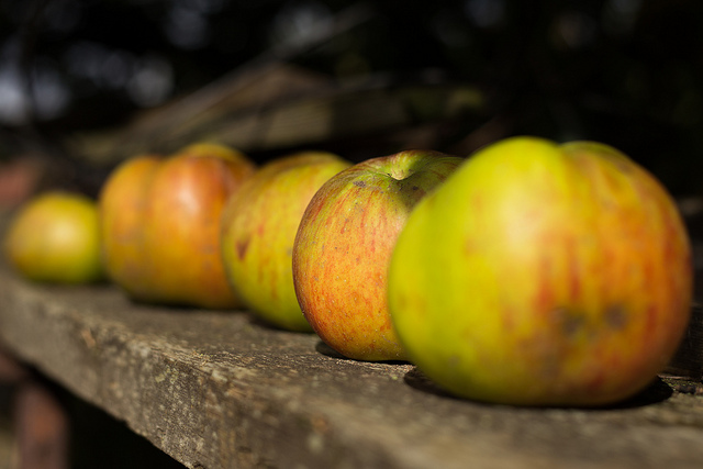
The apples weren't going anywhere; one shot was just fine

Canon calls this mode 'One shot'; you'll see it marked as 'AF-S' on Nikon, Fujifilm, and Sony cameras; Olympus refers to it as S-AF and Pentax as AF.S.

Continuous or Servo mode

When you're shooting fast-moving subjects and want to keep them in focus, try using continuous or servo mode. While you half-depress the shutter release button, the camera will repeat the auto-focusing operation in order to keep your subject sharp as it moves across the frame.

Tracking something fast moving? Try AI Servo or AF-C mode.

Canon reckons its servo mode can track subjects approaching or receding at upto 50 kilometres per hour, making it good for capturing plenty of sports.

Nikon, Fujifilm, and Sony refer to this mode as AF-C; it's marked as AI Servo on Canon cameras; on a Pentax you'll see it as AF.C; and it's C-AF on an Olympus camera.

Intelligent or Automatic auto-focus

'Intelligent' focus is a half-way house between single shot and continuous auto-focus. When you half-depress the shutter button, the camera is set to recognise movement in the subject. For subjects that don't move, the camera will use one shot auto-focusing. Should it detect movement from the subject, it will automatically switch to continuous auto-focus and start to track the subject.

Animals (and children) often favour AF-A mode

While this mode might seem like the best of both worlds, and it can be very handy particularly if you're photographing children or animals, it can sometimes be a bit of a let-down and isn't quite fast enough to deliver the results you want.

Canon calls this mode AI Focus AF. It's AF-A on Nikon and Sony cameras, while Pentax refers to it as AF.A.

Manual focus

It was learning to align the focusing markers in an SLR that first got me hooked on photography, almost 30 years ago. Back in the early 80s, auto-focus was only just beginning to make its way into cameras. Now we often wonder how we cope without it. But still, there are times when auto-focus simply won't do and you need to switch to manual focus, maybe for macro shots or some landscapes. If there's no obvious manual focus option on your camera, try looking on your lens: there's likely a switch to be flicked there.

Macro shots can benefit from manual focus (Image by Haje)

Often, but not always, your camera will help you by beeping or flashing when it thinks that you might have achieved focus on your subject. If you're using live view rather than through the lens, try using the manual focus assist option that lots of cameras have now. Rather than displaying the full frame, it zooms in on the area where you've focused, making it easier to hone in with precision on your subject. It's a useful tool to demonstrate just how big a difference a small adjustment can make to your focusing, too.

Exploiting your camera's capabilities

Your camera is gifted with heaps of different tools to help you get the shots that you envisage; there's more to it than exposure and metering. Don't forget to make use of them - that's why they're there!

Sizing up split toning

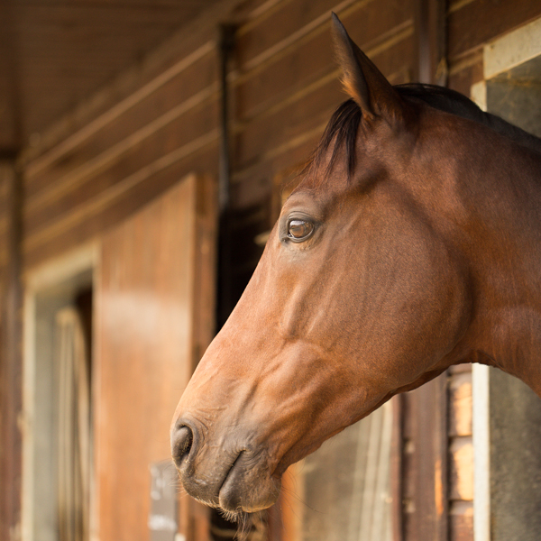
Historically, split toning was used when developing photos from negatives. Two different toners would be used one after the other in order to produce different colours in the highlights and shadows of an image. For example, follow selenium with gold and you'll produce purple-blue mid-tones; or use sepia and then blue for sepia highlights, blue shadows, and green mid-tones. The effect could be altered by using different papers, too. While chemical split toning isn't an exact science, it does offer some compelling effects for your photos and can give them an entirely different feel. You can use it to add warmth or to cool down an image; you might want to introduce a blue tint, or an orange cast.

Now, split toning is more likely to be achieved using the dedicated split toning panel in Lightroom, or with a colour balance adjustment layer in Photoshop, and it is far more controllable. If you've not ventured into the split toning panel, the degree of variation that it offers you might be a little overwhelming; it can radically alter your photo in a ways that you might not anticipate. That shouldn't stop you from experimenting, and to get you started, here are some suggestions. And don't forget that if you're working in Lightroom, nothing can't be undone.

A quick introduction

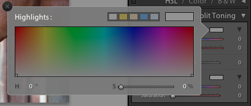
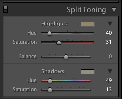
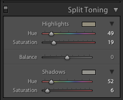
If you're using Lightroom, the split toning panel allows you to select the colours that you would like to emphasise in both the highlights and the shadows, the saturation for each of these tones, and then the balance between them.

The eyedropper is likely easier to use than the sliders

If you find using the sliders to control these adjustments a little too abstract, click on the colour swatches beside 'Highlight' and 'Shadow' and use the eyedropper to select the precise colour you'd like for each.

The balance slider places more emphasis on either the highlights or shadows. Once you've selected your highlight and shadow tones, move it about a bit to see which direction, if any, you prefer.

Black and white

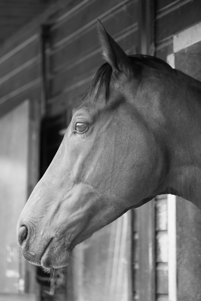
The straight black and white conversion is fine. But could it be warmer and have more depth?

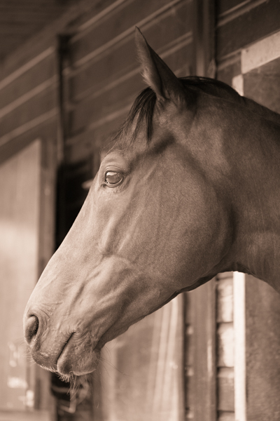
The original black and white conversion of Willie's portrait is coming up quite grey-green in tone. By adding some muted browns—that in the shadow very pale—you can introduce a great deal more warmth to the image and bring about an almost-sepia tone.

You don't need to push the saturation or the tones too far

Willie with a sepia feel is less harsh.

Adding warmth

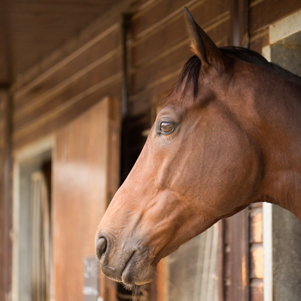
Would bringing some warmth produce a more golden-hour feel to the photo?

This photo was taken fairly early in the morning, on a day when the cloud didn't lift. While the light was wonderfully diffuse, it wasn't especially warm. Even after correcting the white balance, it still felt as if it needed to be brought to life. By adjusting the highlights and shadow tones, it meant I could introduce a more golden-hour feel to the photo.

The adjustments don't need to go too far

You don't need to push too far into the oranges or yellows to intensify the warmth in a photo: sticking to browns and beiges might be enough.

A warmer and more golden Willie

Of course, if you wanted to do the opposite and bring about a colder feel to a photo, you would do that by applying more silvery-blue tones, greys, greens, and even some yellows, to the shadows and highlights.

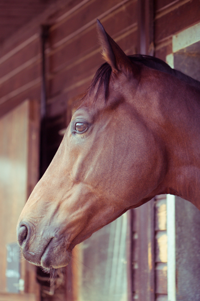
Cross-processed look

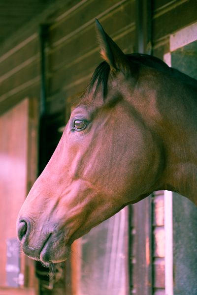
Greens in the highlights and magentas in the shadows

Until now, I've used fairly similar highlight and shadow tones in my split toning adjustments. But for a cross-processed effect, you need to select contrasting colours for your highlight and shadow tones: green and magenta, or cyan and yellow, for example. Which you apply will depend on whether you're looking for a warmer or cooler over all effect.

[gallery columns="2" ids="7128,7127"]

By reversing the shadow and highlight tones (now magenta highlights and green shadows) you can see the imapct it has

By adding a graduated filter, upping the contrast and saturation, and reducing the clarity, you can create a fake toy camera look. We've a tutorial for that, in case you'd like to give it a go.

Split tone away!

The best way to get a feel for split toning is to try it for yourself and see what you can achieve using it. Remember: if you don't like it, you can undo it.

Learning to look (or training your photographic eye)

When you've been shooting for a while, you might start to notice that as well as being able to handle your camera more deftly, you're also pressing the shutter more instinctively and with a greater degree of conviction that you'll create a good image. Indeed, you are producing a greater number of better photos. While this might seem to be some form of photographic clairvoyance, it's actually rather more prosaic than that. You've actually grown more observant as a photographer and instead of developing some kind of sixth sense, you're learning to look.

Looking for light

First and foremost, and maybe without even realising it, you're becoming more attuned to light, to its quality, to its direction, to its temperature, and to its quantity. You're getting a feel for the type of light that makes for great photography and you're growing a better understanding of where to stand to make the most of it.

Light. Shade.

If you're still learning about light, start by thinking about from where the light is coming and how it's falling on your subject. Consider what's illuminated, what's in shade, and how where you're positioned will have an imapct on that.

Knowing your domain

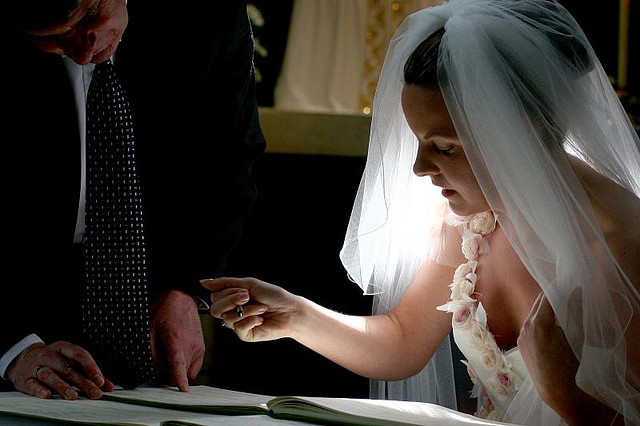
When you understand how a game is played or the schedule of an event, it makes it easy to anticipate how things might go or what should happen next. For example, a tennis player about to receive a serve is likely to stand on the appropriate side of the court; a religious marriage ceremony usually follows a particular format. These are illustrative examples of 'domain knowledge.' By knowing how tennis is played and religious weddings are conducted, it gives you a fighting chance of predicting what’s going to happen next.

They don't all do this...

That sort of 'domain knowledge' is vital in many aspects of life, but it's also darned useful when it comes to photography, whether it’s nature, landscape, portrait, wedding, or even street photography.

The more familiar we are with our subject matter, the better we become at anticipating its 'movement': its pace, nuance, and rhythm. If you photograph enough sunrises and sunsets, you'll develop an intimate knowledge of how the light changes as the sun sinks beneath the horizon or the impact of clouds on colour. Similarly, if you spend enough time observing people in a particular public place, you’ll become more familiar with the way they interact with one another within that space. Complete enough portrait sessions and you’ll become quicker at noticing how comfortable or otherwise your subjects are in front of the camera, and interact with them so that you are able to capture their essence.

Knowing how easily someone gets the giggles–and responds to them–made for a great shot

When it comes to sports photography, knowing how the game works and what to expect is a vital element in ensuring that you can get a shot. Understanding the idiosyncracies and routines of animals will help you with your wildlife and your pet photography.

This increased observance, whether of people, environment, or structure, increases your chances of capturing a precise moment because you know what to expect.

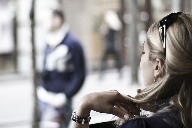
Wait a little; watch a bit A girl in a coffee shop, staring at the guys walking by.

It helps then, to be prepared for whatever it is that you're planning on photographing. As well as doing some research, make an effort to actively think about what you see. Even when you're out and about and not especially in a position to be taking photos, train your eye to look for 'moments': for shafts of light, for interactions and reactions, for interesting backgrounds or subjects. Being able to anticipate what comes next will help you to get the shots you want.

Thinking before you shoot

Perhaps the most common mistake anyone who's new to photography makes is adopting a 'scatter-gun' approach. All too often when confronted with a scene worthy of photographing, the temptation is to fire away without really thinking about the images we’re capturing. This is partly because it costs nothing to take a photo these days, and partly because we feel that if we take enough shots we’re bound to stumble across the image we want to capture.

That face!

This is something that we've covered in depth of Photocritic before now, but it bears repeating. It is much better though to slow down and spend some time observing the subject. This isn’t always possible if you’re photographing a short-lived or unexpected event, but in most cases you do usually have time to consider your subject and assess it for its specific qualities. You can explore a variety of shooting angles, change your point of focus or depth of field, or wait for a change in the light, even shift your subject’s position or posture. You should learn to visualise the image you want to capture and actively seek out that image, rather than reacting to images you’ve shot in the hope that one of them fits the bill.

Let wedding photographers do their jobs; or why you can't expect a disc of unedited images on the cheap

Oh dear. That was a bit awkward. Sitting on the floor at my nephew's birthday party, trying to capture pass-the-parcel photos that weren't anything other than wadges of wrapping paper thrust towards me in a multi-coloured de-forested haze, I encountered a fairly recently married and really rather belligerent woman who who wanted to berate me for the fees charged by photographers. In particular, she was infuriated that her wedding photographer wouldn't just hand over a DVD of all the original images from her big day and couldn't understand why they needed to be edited and why she couldn't have them straight away. Yes, oh dear. Despite being focused on my attempts to capture my nephew smiling and my niece not resembling a demonic, sugar-crazed monster, I did try to offer a reasonable explanation for why her wedding photographer wouldn't just hand over raw images for a flat fee. Naturally, I coined what I think is the perfect analogy when it was too late and I was on my way home. Thus for the benefit of everyone who might yet face this scenario, here it is:

Asking a photographer to hand over a memory card, USB, or DVD of raw images is akin to asking an author to present you with their book in manuscript format: unedited, unformatted, and including the paragraphs and chapters that didn't make it.

For any brides, grooms, or parents of the soon-to-be- or just-marrieds out there who might be wondering the same thing, I hope this helps.

Photo 04-10-2014 15 41 24

A bundle of unedited, unprocessed images isn't the whole story, the right story, or the finished story. You have to trust the photographer to produce a final version that's just right, as right as a book is on publication, as a painting on hanging in a gallery, or as a sculpture upon exhibition. What you're paying for is the complete product, finished by the photographer and making use of all of her or his skills. While any photo needs to be properly exposed and well composed, there are adjustments and edits that need to be made in post-production. And sometimes, they look better in black and white, too. This is all a part of what a photographer does; it is an integral part of of the process of creating images.

I pronounce you... (Image by Haje)

To continue with the book/author analogy, when you purchase a book, you don't get to choose the words on the page, or the images that might illustrate it; what you do get to choose is the format in which it comes, whether that's a signed hardback copy or a digital download. When your wedding photographer has done her or his job to tell the story of your wedding day, you can select from luxury albums or USB transfer.

The book needs to be finished before you buy it

If you're still not sure why photography is so expensive, there are plenty of photographers who've done their best to break down their costs and explain why wedding photography starts at around £1,500. (Yes, there are people who do start cheaper, and some more expensive. It's an average figure.) We even have an article covering it here on Photocritic. However, hoping that you'll be able to reduce your costs by asking for unedited images in digital format is a misrepresnetation of your wedding photographer's job.

Till death do you part (Image by Haje)

I don't especially want to launch into a 'you get what you pay for' tirade about the perils of hiring an inexperienced photographer and the images from your wedding day being an unmitigated disaster. I understand that some people have very restricted budgets and finding the fees requested by some photographers is beyond them. There are photographers to suit every budget; you need to be certain of what they can provide and if it meets your expectations, but you must let them do their jobs. And that job is a finished product, just like an author's book.

You want to become a better photographer? Take fewer photos!

The shock! The horror! The blasphemy! How can we here at Photocritic, a place that purports to teach people about photography, nay has over 2,000 students in its online school, dare to utter a statement that is contrary to the received wisdom of practice making perfect and the 10,000 hours rule? How can we possibly suggest that taking fewer photos might put you on a path to being a better photographer? Quite easily, as it turns out. Upon his graduation, my cousin was gifted with a Nikon D5300 and promptly legged it to Italy where he proceeded to photograph everything in sight. While I might be prone to hyperbole, that is scarcely an exaggeration. When he returned, he asked me if I would peruse his images and advise him on improving his photography. When he told me that there were in excess of 2,000 images, I dispensed my first piece of advice: that he needs to take fewer photos. He looked at me incredulously and said: 'But I see so much that I want to photograph!' And therein lies the problem.

Memory is cheap. Images are ubiquitous. We communicate via self-destructing snaps and have developed a penchant for deliberately aged-looking photos of cups of coffee. As a consequence, there is a persistent temptation to take hundreds, if not thousands, of photographs every time that we venture out with a camera. While this might serve our most pressing needs to relay where we are and what we are doing, the act of creating an image that will stand the test of time requires a more considered approach.

Too many coffees

If you want to improve your photography it demands that you practise it as a craft, and strive to make each photo better than the last, rather than regard images as digital currency in our social media-dominated world. It's time to step back, slow down, and take fewer of them.

Tell your story

All photos are about telling stories. They are about communicating something that you see to other people. This applies whether you're sharing a Snapchat chat or creating a fine art print. But if you are intent upon taking better photos, it should be at the forefront of your mind whenever you pick up your camera. Before you even raise your camera to your eye, you must ask yourself: 'What am I trying to say?' Until you have defined the story that you want to tell, don't click that shutter release button.

Not perfect, but at least I knew what I was trying to achieve.

Without a grounding narrative, your photo will fail to convey anything of value and will, effectively, be wasted. Show some restraint and discipline at this point and you'll benefit your photo-taking skills enormously. First, you will produce a meaningful image. That's step one towards becoming a better photographer. By thinking about what you want to say instead of randomly spraying your camera in the direction of something that you hope might make an image out of one of twenty three variations on a theme, you'll have increased the chances of saying something significant.

I'd worked out this story before I even scurried down the bank to the waterfall

Second, when you have identified the story you want to tell, you have to figure out how you're going to tell it. To do this, you will need to think about the light, know how best to use your camera, and consider how to manipulate light and tools to achieve your aims. That will improve your photography.

Third, I can guarantee that five miniscule variations on the same sunset scene over the Alps will not offer you any meaningful improvement on the first iteration. Of course we've all done it: taken nineteen photos of the exact same scene using focal lengths that vary over a distance of 3mm; shuffled half a pace to the left, and then switched the right; adjusted the aperture by a stop; and finally reverted to where we started. Looking back at the series of images, there's no discernible differences between them and you're left wondering which you actually prefer and which it's worth investing your time editing. If you take a moment to decide what you really want, you'll make your life easier.

[gallery columns="4" ids="7083,7084,7085,7086"]

By honing your story-telling skills, slowing down your photo-taking process, and reducing the number of photos that you take, you'll force yourself to practise your skills. If that won't make you a better photographer then I doubt much will.

Edit judiciously

All photos deserve a little editing love. This isn't about airbrushing away half of a model's thigh, but subtle tweaks that enhance rather than alter an image. You cannot turn a sow's ear into a silk purse, so you must think of editing your images as adding the final touches to turn something already good into great. You must be working with already-good raw materials. In addition to taking great photos in-camera, learning how to finish them in post-production is part of the process of becoming a better photographer.

Not such a bad original

Apart from giving yourself a better opportunity to manage this by working with fewer, higher quality raw images, you also need to be shooting in Raw. Raw format gives you the flexibility to create images as you want them to be, rather than as the camera thinks they should look. When you shoot in JPEG format, your camera makes various decisions about the final version of the image, for example contrast and colour, that you really should be making yourself. It's a case of you being able to realise your vision, rather than your camera trying to decide for you.

But a teensy crop, a white balance fix, a bit more contrast, and some sharpening makes all the difference.

On a purely practical level, Raw images are significantly larger than JPEG files; you'll probably find that you need to shoot fewer images because storing them becomes a little more complicated.

Fewer photos means more time to edit and finish those you do take, helping you to create a better final product.

Reflect on your images

When you're trying to get somewhere, it helps if you know your starting point. On your (endless) journey to becoming a better photographer, you need to know how well you are doing at every given point and what you must do to improve. This is something that comes from evaluation and critique, given by both yourself and other people. Critically evaluating photos is demanding, however, and finding the stomach to do it for thousands of photos, or at least a good proportion of your catalogue, is probably overwhelming. You want to give yourself the best chance of being able to assess and to improve, and while it might sound counter-intuitive, it comes from fewer, rather than more, images.

Would I have preferred boy in-focus and wall blurred? I'm still not sure.

Go back to the five miniscule variations on the sunset scene over the Alps. With so little to choose between them, when you're in post-processing being able to determine their faults and their positive points will likely be a struggle. Rather than being a distinct iterative process, you might find it's easier to stick a pin in the collection to select one. Think more carefully about one or two shots when you take them, and you'll be able to reflect on them more effectively and improve your skills as a consequence.

[gallery columns="4" ids="7089,7090,7091,7092"]

Of course, being able to play and experiment is a thoroughly important part of improving your photographic skills. What we're saying is that you need to do it in a way that actually helps you, rather than overwhelms and hinders you.

Practice does make perfect

It is a truth universally acknowledged that the more you practise photography, the better the photos that you'll take. But the word 'practise' carries with it far more connotations than simply pointing your camera and depressing the shutter release button in the hope rather than the expectation that it will result in a well-exposed, beautifully composed shot that tells a meaningful story. It demands that you approach photography as a discipline: that you decide on what you are trying to say before you try to say it (or 'engage brain before opening mouth,' as my primary school teacher would say) and that you evaluate your images to establish what you are doing well and what you can do better. Then, you need to work on making those improvements.

Do I like it? Mostly. Could I do it better? Of course.

It's a never-ending process that you'll be working on for as long as choose to take photos.

Happy with it? Yes. Could it be better? Definitely.

Back in the old days of film you typically had 12, 24, or 36 exposures to a roll. Even if you had multiple rolls of film in your bag having them developed was expensive, or time-consuming if you did it yourself. It meant that you took a little more care in composing and exposing each shot, because every frame cost you money. Each exposure was precious. If you're serious about improving your photography, I'd advocate placing a restriction on the number of photos you can take in one day, or over the course of a trip or excursion. It will soon instill a sense of discipline into your picture-taking!

Four photos good; two photos better

This advice then, is not about using your camera less, it's about using it with more care, attention, and precision. It is about working to ensure that every frame you expose and develop tells the story that you want it to tell, and that you can use each image as a platform to taking a better one next time.

Sleep on it; it usually helps.

Prepare yourself to capture the meteor shower from Halley's Comet's impromptu fly-by

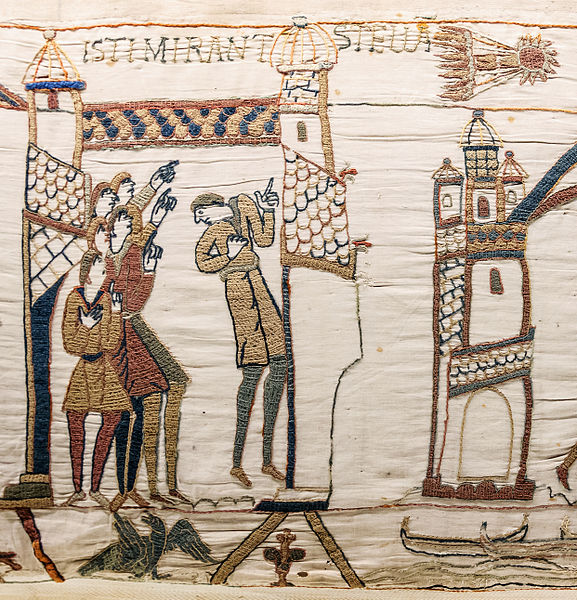
Halley's Comet made its last swoop past earth in February 1986. I remember it well because I was in primary school at the time, learning about the Norman Conquest. In addition to the boos, hisses, and cheers elicited by the key players and the confusion surrounding Harold Godwinson's death, Halley's Comet plays a starring role in the Bayeux Tapestry, which documents the invasion of a loosely termed 'England' by William of Normandy and his cronies. That we had the opportunity to experience the same celestial phenomenon as the people we were learning about, all of whom lived 900 years before us, was rather special. The timing could not have been better for a memorable series of lessons. Halley's Comet blazing a trail across the Bayeux Tapestry (image courtesy of Wikimedia)

Seeing as Halley's Comet is on a 76 year schedule, it isn't expected again in all its glory until July 2061; however, we are being treated to an impromptu meteor shower in the next few days. The comet is likely to deposit a trail of cosmic dust into our atmosphere on 21 and 22 October 2014, giving us a shooting star display visible to the naked eye.

If that isn't an excuse for trying a little night photography, I don't know what is. So apart from the hoping for clear skies, what else can you do to maximise your chances of capturing the tail lights of Halley's Comet?

The basics

Whatever means you use to take your photos, capturing a meteor shower is fundamentally the same process: shooting a series of long exposures. There are a few options for how you go about it, but once you know that bit, it's fairly simple.

Location

The darker the sky, the better the chance you will have of being able to see the streaks of light as the comet's dust burns through the atmosphere. Ideally, then, you need to be somewhere that doesn't suffer from too much light pollution and has an uninhibited view of the sky. Open and accessible heath- or park-land that's relatively far from city lights is ideal; just be certain you're not venturing somewhere you shouldn't, either because the land is privately owned or you're disturbing a sleeping bull! I'd advise not going alone, either. Shooting in secluded or isolated locations is not necessarily a solitary activity.

Equipment

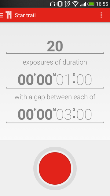
Shooting the night sky means long exposures, so you're going to need a tripod, and an intervalometer will ensure the best results, although you can get by without one. Naturally we recommend Triggertrap, especially because its star trail mode makes life easy, but your mileage may vary. For your lens, a fast, wide-angle lens is advisable. You're never quite certain where they'll start or where they'll end, so the wide-angle provides you with sufficient flexibilty, and it gives you the option to introduce an interesting foreground to the shot, too. The darkness of the sky means that you need fast glass to let in enough light. And an empty memory card is a good idea: you'll be taking a lot of images.

The set up

While shooting stars can turn up anywhere, they are most likely to cluster around a single point called the radiant. Don't aim your camera directly at the radiant, when you've worked out where it is, but about 45° to one side of it. You also want to compose the frame so that it is visually interesting beyond just the shooting stars. Think about including something intriguing in the foreground. Turn off the auto-focus, use as wide an aperture as you dare—you might not want it all the way open for sharpness—and focus to infinity.

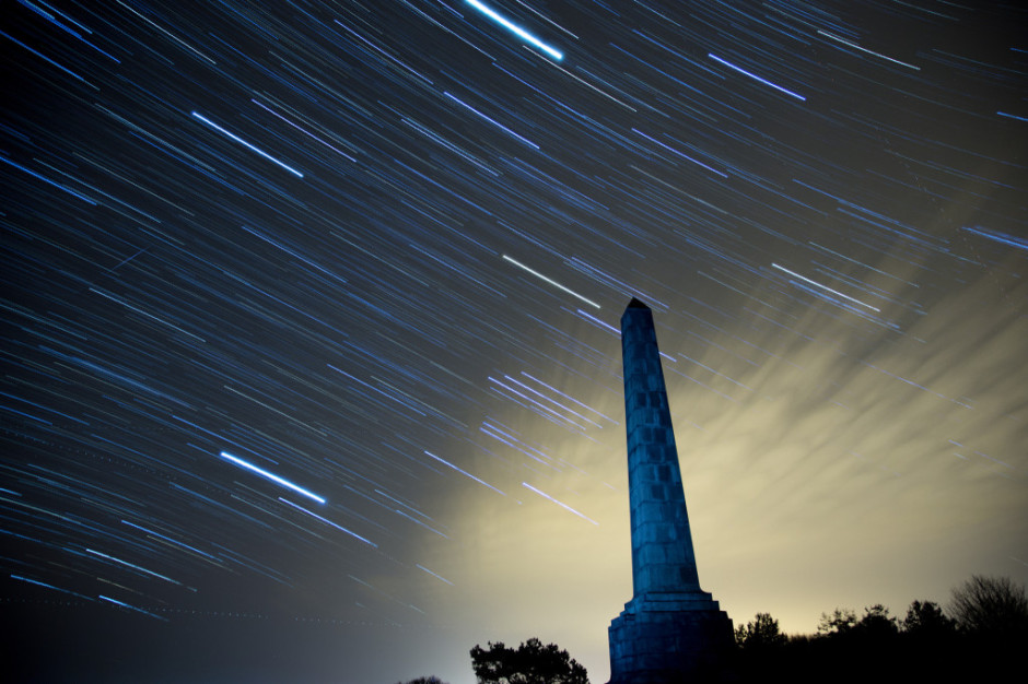
The best option to photograph a meteor shower is very similar to capturing a star trail image, when you compile a series of long exposures shot over a significant period of time into a single image, but with a few key differences. You can read our star trail tutorial here, and if you'd like to shoot a star trail image that hopefully captures some shooting stars, go right ahead. Otherwise, you can tweak the process and use it as the basis to capture a series of photos from which you'll select the ones that show shooting stars streaking across them.

Star trails by Thomas Langley (thanks to Triggertrap)

What are these tweaks you'll need to make, then? First and most obviously, you'll not compile all of your frames into a single image that charts the movement of the celestial bodies across the heavens. Instead, you'll pluck out the indvidual images displaying shooting stars, or maybe composite several images showing shooting stars.

Second, you might need to use a slightly shorter shutter speed than you would with a star trails sequence, to ensure that you don't capture the turn of the earth. With a star trails shot, the movement of the earth is exactly what you want, but with single meteor images, not so much. Between 10 and 25 seconds is recommended, but a few test shots should help you to decide what you need to use. This slightly shorter shutter speed will require you to adjust the ISO to get a good exposure, too.

Finally, you can chance not taking your series of images with very short intervals between them, as you would with a star trails sequence, but leave the gaps a little longer. That means you might miss a few opportunities, but the law of averages suggests that if you shoot over a period of a few hours, the odd photo will have a shooting star zooming across it.

Choose your exposure time, number of exposures, and the interval between them

When you have set the focus and established your shutter speed and ISO, you will need to set your intervalometer as you would for a recording a time-lapse sequence, using the exposure time that worked best in your test shots. If you're using Triggertrap's star trail mode, set the exposure time that you established in testing with your chosen interval between frames, and select the number of frames you want to take. With a slightly longer interval between frames, say five or ten seconds, you could shoot for hours!

If you don't have an intervalometer, there's no reason why you can't try your hand at meteor shower photography. Instead of relying on a remote triggering device to release your camera's shutter, you'll be doing it yourself, which might get tiresome. Just as you would with a star trail-based sequence, aim your camera in the right spot and focus to infinity. With your camera in manual mode, use the widest aperture you can, select a shutter speed between 10 and 25 seconds, adjust the ISO accordingly, and press that trigger. Over, and over, and over, again!

Remember to keep warm, and here's hoping for clear skies.

Mean and moody low-key photography

As a photographer, you're usually aiming to ensure that your photos are well-exposed and have an even tonal distribution. If you were to look at the histograms from these images, the data would be spread across them. Neither the shadows nor the highlights would be 'clipped', or have areas that are so dark or so light, respectively, that they contain no data. If you were to look at these images, they would look 'right', and be pleasing to the eye. A 'perfectly exposed' image isn't always the story you want to tell

However, that isn't always going to be the kind of story that you want to tell. On occasion, you are going to want to convey a dark and brooding narrative, maybe even so far as to be menacing, that delves into darkness. You will look to shoot a low-key image.

Identifying low-key images

Low-key photography is a style of taking pictures that focuses on producing shots that mostly include dark tones—a person in a dark room with only a tiny bit of light on their face is a good example. You might have noticed how products are often shot using low-key photography, too.

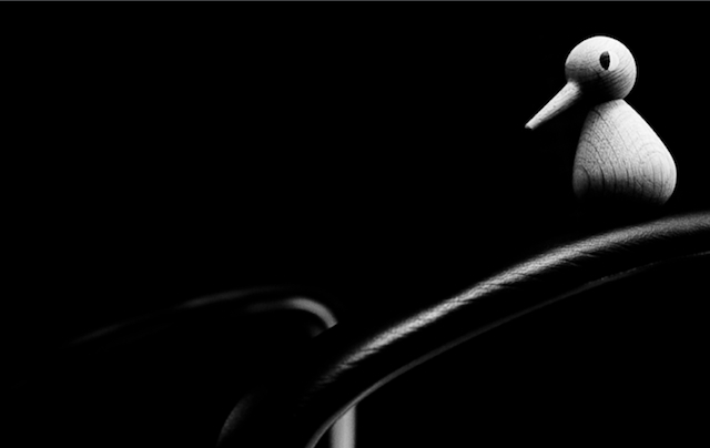
The histogram for this photo is mostly black, but look at it—your eyes are immediately drawn to Ducky’s eye.

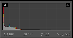
Screen Shot 2013-05-07 at 15.02.48 If you were to look at the histogram of a low-key image, you'd see that the majority of the data are pushed towards the left-hand side. Don't worry that your shadows might be clipped: it's a part of the look.

Setting up a low-key shot

You're aiming for extreme contrast in a low-key shot, with most of the image dark or even fully black with just a little of subject highlighted to draw the viewer's eye. Since a lack of lack is your primary tool in taking a low-key photo, it's actually fairly easy to set up and while you do need extensive control over your light source, don't think that you require an elaborate studio.

One method of getting the low-key feel is to place the subject in a dark room, then turn the light on in an adjacent room. Open the door just enough to get the right amount of light on your subject, but not enough to light up the background.

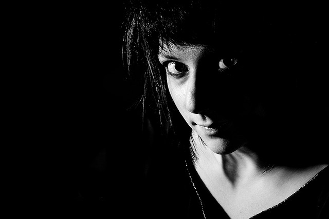
Salma: Intriguing and broody

Another means to getting a low-key feel is with candle-light, which can elicit a suitably gothic feel, or by using a torch. Torches are easy to direct and definitely cheap! If you want to start manipulating light in your photography but don't yet have the means or desire to go the whole hog with flashes or a studio set-up, low-key is a good option.

You will certainly need to be in manual mode in order to achieve a low-key shot. If you leave it to your camera to decide on optimal metering, it will try to over-expose the scene and ruin the effect. Using spot-metering to expose for the sliver of light, wherever it might be, is a good idea, too. This will help to keep that area light but the shadows dark.

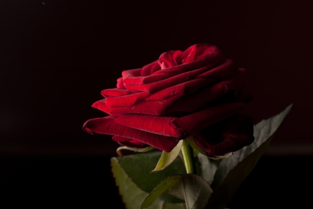
Using dark-coloured subjects will add to the low-key feel

The general rule is to keep things dark. Complete blackness around your subject (or even as part of your subject) is perfectly acceptable.

Processing low-key images

Ideally, the combination of manual control and carefully manipulated light means that you won't need to adjust the exposure beyond the odd tweak to the blacks or the highlights to ensure that they're sufficiently dark or light. It is worth considering converting your low-key images to black and white: initially, this can help you to identify and perfect the contrast in low-key images but over all it can help to increase the drama and mood in the photo.


Rules Screen Shot More unusual ways of looking at things, remembering rules, and then breaking those rules, are in my lovely book, The Rules of Photography and When to Break Them. It's available as an e-book and in a dead tree version (UK, US).


From kittens to chickens to cheetahs: the Photocritic guide to animal photography

The number of photos of cats floating about the Intergoogles is testimony to how much we love photographing animals. But I bet we could all do it a bit better, whether they're our pets, cows on the closest farm, or gazelles in the wild. We've put together our top tips, dos and don't, and favourite recommendations for animal photography.

Pets and domesticated animals

Photographing pets is distinctly similar to photographing children: get down to their level, gird yourself with patience, and be ready to move fast. Much like my favourite photos of my nieces and nephews, many of my favourite photos of animals have been captured sitting (or crouching, in the case of mucky straw) on the floor, allowing them to play about me and simply being ready to capture kittens, lambs, hens, dogs, and various assorted being cute or idiosyncratic.
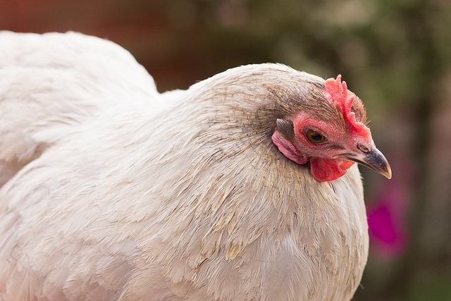
Violet in the garden

The chances are that you'll be exhausted and maybe a bit dirty at the end of it, but you should have some good photos. There is, of course, a bit more to it than that.

The non-negotiables

When it comes to taking photos of animals, some things should be on the checklist every time.

Get the eyes in focus - just like a portrait of a human, your viewers will be looking to make eye-contact with the subject, so get the eyes sharp.
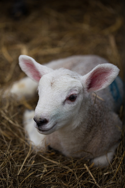
Just like a human portrait, get the eyes in focus

Capture spirit - again, it's the same with humans, you need the photograph to convey the playfulness, the inquisitiveness, or the quirkiness of the animal.
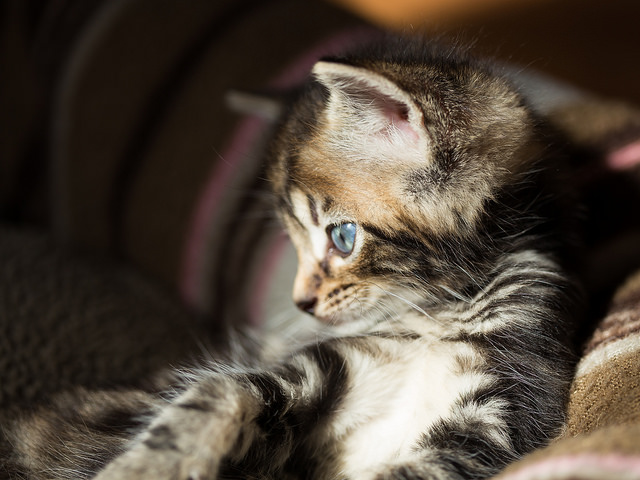
Mine! All mine! Now sod off!  Actually, this was one of Haje's foster kittens. The photo's mine and the kitten is now someone else's. But it's a kitten on the Internet. I couldn't think of a more appropriate image for this article.

The subject needs to be doing something - it doesn't matter if it's a dog asleep in a contrived position or a kitten chasing a toy, there needs to be something of interest happening in the shot.
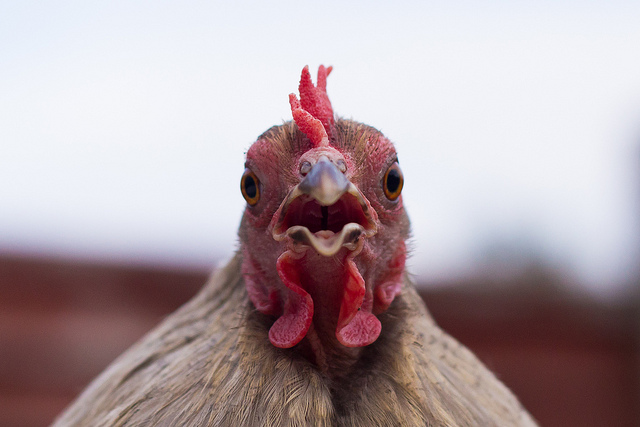
Violet

Consider the background - you don't want clutter or a litter tray in the background of your photos, so pay attention to where you're taking them.
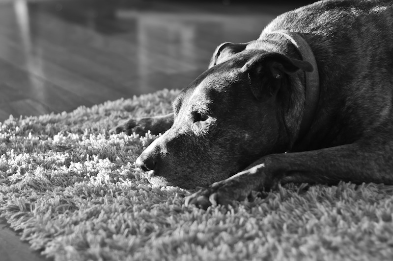
There's nothing in the background to distract from the lovely light and an unusually quiet Willis

Be respectful - Don't do anything that hurts or distresses an animal for the sake of a photo. Don't pick up rabbits by their ears, provoke dogs, or yank horses' chiffneys or headcollars. Not only will the animal not like you for it, but it's unacceptable behaviour.

The debateables

Depending on the type of photo you're trying to take, you will need to make some choices. There's no right or wrong to these points; they're up for consideration.

Flash - Some people say avoid it altogether, others say use it judiciously. I'd say for heavens sake don't startle a sleeping dog or potentially damage a very young animal's eyes with flash, but used properly, you can produce some cracking shots with artificial light.
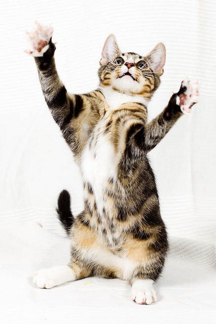
Flash can work (Image by Haje)

Kit - I've photographed animals with all sorts of camera and lens combinations. Sometimes, it's been a case of grabbing what's closest, so my iPhone, to ensure that I didn't miss the moment. Then again, I've headed down to the yard armed with all manner of lenses and a dSLR for photographing horses. Remember the adage that the best camera is the one you have with you, but don't forget to think about what you're trying to achieve with your photos, from portraits to macros to action shots, and select your kit appropriately.
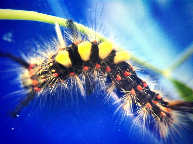
I don't have a caterpillar farm, but I did take it with my smartphone, because it's what I had to hand

The recommendations

Use a fast shutter speed - Unless you're trying panning, do aim to keep your shutter speed as fast as possible to avoid motion blur, particularly if you're aiming to capture animals at play. Up the ISO if you need to; noise is easier to fix than blur.

Consider your angles and proximity - while it's advisable to get down to the same level as your subjects, do consider shooting from above and below, too. The key here is to consider what you're doing and the story you're telling, rather than reverting to the default of standing up to shoot.
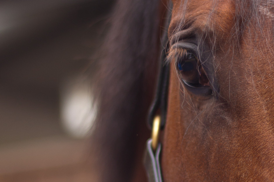
Look closely...

As well as the usual recommendation of getting closer, have you considered getting really close to your subject? Macro and abstract shots can work wonderfully to intrigue, inspire, and give a different perspective on your subject.

Grabbing their attention - I talk to dogs, use toys for cats, and make clip-clopping noises to encourage horses to prick their ears. If you know your pet, you'll know how to distract it or attract its attention. If the subject isn't your pet, talk to its owner.
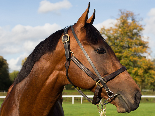
Want pricked ears? Try clip-clopping with your tongue.

Be careful

Cats scratch, dogs bite, and horses kick. They're also sentient and can be unpredictable. Don't do anything to upset your subjects or that endangers you. It's common sense, really.

Wildlife

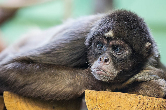
While photographing pets is similar to photographing children, you might notice some similarities between wildlife and sports photography. You're going to be out in the elements, watching for the perfect moment, and most likely with a big lens. However, wildlife photography isn't restricted to the African savannah. There are squirrels in the park, birds in the woods, spiders in their webs, and wild monkeys in the Thai temple complexes. You don't have to travel to exotic locations to take wonderful wildlife photos. And if you are fortunate enough to be going on safari, you can always get in some practice with deer at home.
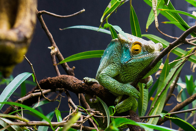
Now you see him, soon you won't (Image by Haje)

Know your subject - If you want to make the most out of your subject, then you need to know what to expect from it. Where are you likely to find it? When is it active? When does it feed? What should and shouldn't you do around it? There's little point arriving in the Serengeti in June and expecting to see wildebeest, as by then they'll be on their way to the Masai Mara.

Know your kit - In order to be able to capture the wildlife images of your wildest dreams, you need to be intimately acquainted with your kit and understand its precise capabilities. How many extra stops does your image stabilisation really give you? What's the slowest speed at which you can hand-hold your camera? How high can you push your ISO before noise really becomes a problem? What's the optimal aperture for sharpness with your lenses? Do any of them have a proclivity to flare?
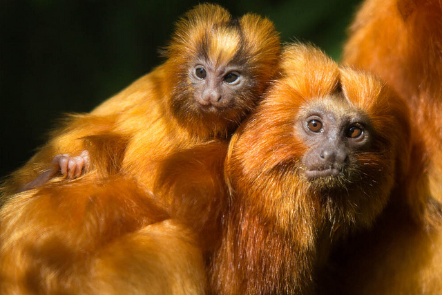
Don't let the monkey grab your kit (Image by Haje)

The better that you know your kit, the less time you'll have to spend fiddling and faffing and the more likely you are to make a crucial moment.

Use support - You might not necessarily want to use a tripod: it could be too cumbersome and too slow to move, but the chances are you'll need some kind of support for your camera when out in the field, particularly if you're using a long lens. Think about all of the options, from monopods to beanbags, and decide which one will work best for you.
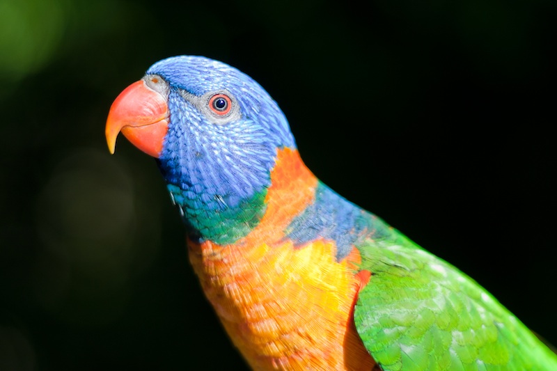
I was leaning on something to help keep me stable for this shot

Be prepared - This isn't just about ensuring that you have the right camera kit with you and to hand, but also the right personal kit. In addition to cameras, lenses, filters, supports, remote triggers, batteries, and memory cards, you need to be dressed appropriately for the conditions and with changes of clothes if necessary. If you're as much as a feast for mosquitoes as I am, you'll need suitable insect repellant. You need to consider food and drink and appropriate storage for it. Do you require permits or a guide? And don't forget your sunscreen.
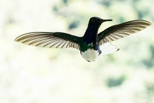
Getting a little bit of help from a machine (in this case, Triggertrap Mobile) made it easier to capture this photo.

Capture action - The same as with pets and domesticated animals, aim to photograph action. Or at least if an animal is doing nothing, it needs to be doing nothing in an interesting way, for example with a glorious sunrise behind it, or curled up asleep in an unlikely pose.
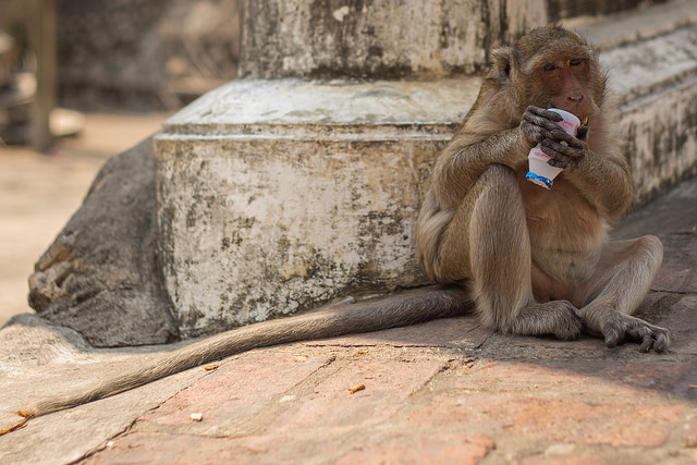
How could I not photograph him eating a yoghurt container?

Wide and close - You might well be using a long lens to photograph wildlife just to get close enough to identify it, but don't restrict yourself to close-ups. Think about placing your subject in its environment and providing it with context. Primarily, this is important for story-telling, but if you have travelled a long way to experience something magical, you'll want to record that, too.
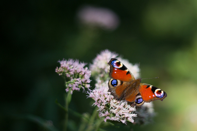
I could have got even closer, but did I need to?

Conversely, abstract close-ups can make for very striking photos. Don't be afraid to experiment!

Consider the light - While it probably should go without saying to think carefully about the quality, quantity, and direction of light, it's worth repeating. You might well find that as well as providing the best light for photography, the golden hours are also when many animals are at their most active.
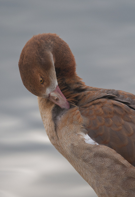
Early morning, Hyde Park

Be careful and enjoy - Just as with pet and domesticated animal photography, be careful and be respectful. Don't do anything to endanger yourself or your subjects. Remember to adhere to the required codes and to clean up after yourself.

Finally, remember to enjoy it. Absorb the atmosphere and don't be afraid to put down your camera, either. Sometimes the picture in your memory can be better than the one taken by your camera.
Are photographs for humans?

Last month I was invited along to the inaugural EyeEm Festival & Awards. Among other things, I was on a panel on "The Camera of Tomorrow". I do quite a bit of panel-ing (is that a word?) but I'm unable to shake this particular one from my mind, because at some point, the discussion wandered into a topic that I haven't given much thought so far: Who actually consumes photography?

Are photos for humans or machines?

Getting a little bit of help from a machine (in this case, Triggertrap Mobile) made it easier to capture this photo. But who will be viewing the image?

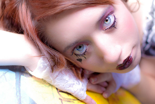
One of the big and scary ideas that came up was that the average photograph - or frames in a video, as may be the case - are no longer primarily for human consumption. As computers and image recognition becomes better, we now live in a world where even though if your photo is seen by 50 of your friends on Facebook, that very same photo will be seen by hundreds, if not thousands, of robots. Image recognition bots, facial recognition bots, localisation calculation bots, Google Images, scientific and statistical analysis bots... Who knows.

If you think about it: say you are a scientist who is trying to map the increase or decrease of water in a particular lake. You could install expensive equipment - but where would you get historical data? Well, if that lake happens to be a popular holiday destination that people tend to share photos of, you could actually do image-driven research: Photos taken on smartphones are tagged in the metadata by time and GPS location; Scrape the internet for photos taken in that particular location, then use image recognition software to estimate the water level in the lake. Science fiction? Nope - perfectly possible, and projects like this are already in action at universities and in commercial settings all around the world.

That's a relatively benign example: What about the data we put out there ourselves? That the trend of taking selfies is an incredibly powerful tool: By posting photos to Twitter, and describing (or even hashtagging) the photo as a 'selfie', it means that over the years, computers can start to map your ageing process, and potentially learn about the way that human faces tend to age. Add a layer of geo-location on top, and perhaps scientists will find that humans living near power stations have, on average, slower hair growth (just to pick an example). To a data scientist / statistician, the possibilities are absolutely mind-boggling.

Of course, there are less salient uses too: By posting selfies online, you're feeding an incredibly powerful facial recognition opportunity: Facial recognition based on a single photograph can be incredibly difficult (think about it: You're just a new pair of glasses, a baseball cap, or a beard away from looking very different from a single photograph). If, instead, one were to collect all the photos I've ever posted of myself online, you've got a huge amount of data: What I look like in different lighting situations, with a hat, with a beard, with glasses on, in the morning, in the evening, smiling, angry, moody... All of this is data that could be used to create a mathematical formula for what "I" look like. Feed that into a network of CCTV cameras (they say that you can travel from anywhere to anywhere else in London without ever stepping out of reach of a CCTV camera), and it's possible to track my every movement through my home city. Scary? Perhaps - but against that lens, it becomes all the much clearer that the chief consumer of imagery is, indeed, computers - and by sharing photos of ourselves, we're making it all a lot easier for whoever wants to track us around.
Is there anything machines can't do better than humans?

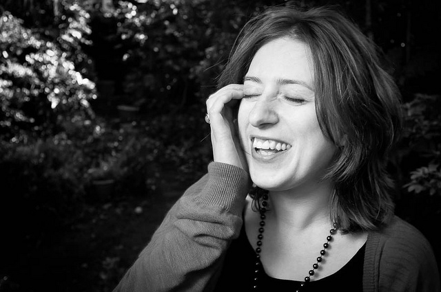
In low light, machines start struggling with all sorts of things, including focus. Which is why shooting manual is the only way I could capture this shot of EyeEm's CTO Ramzi Risk

Ok, so we're being ruled by robotic overlords; what else is new... Is there anything humans can actually do better?

Of course, you can teach a computer to take photographs - it isn't even a very big challenge. A computer could even take some highly proficient photographs, technically: Focus, white balance, depth of field, colour saturation - even triggering the camera at exactly the right point in the process of taking a photo is all describable mathematically, which means that computers are rather good at it. In fact, when you think about it: Most of us heavily rely on computers already: Exposure light meters, automatic focus - they've been the computer-powered helpers in the world of photography for years, and we wouldn't want it any other way. 

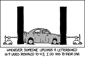
The other side of photography, however is trickier: The artistic side. This is where a recent XKCD comic hit the nail on the head:

XKCD 1425

Put simply, whereas a photo can be objectively 'bad' technically (Out of focus, motion blurring, white balance issues, exposure issues, wonky horizons, etc etc etc), deciding what makes a good photograph creatively can be very difficult to ascertain even to humans (Go on, give it a shot: See if you like / admire / understand why each of the top 10 photographs picked by Time magazine to be the best of 2013 were chosen. There is a recurring theme; more about that below).

Of course, what makes a 'good' photo is partially down to taste and cultural convention, but also down to a very difficult to answer question in general: What makes a good photograph? There are a few technologies that already exist to help people determine which photo in a burst of shots is 'best' tends to be limited to technical elements (From a set of 10 photos, pick the photo with the least camera blur, the least motion blur, and where people aren't blinking), rather than the aesthetic side of things.

But what about the story?

Interesting? Sure. Good? Well... That depends.

The other - and perhaps most important part - of photography is where machines truly fall short: Computers may one day be able to create photographs that are technically proficient and aesthetically pleasing, but the most powerful photographs are the ones that have a third layer: A story that's worth telling; a story worth listening to, and thinking about.

Every photograph that ever tugged at your heart-strings will have done so because it tells (part of) a story. In fact, the photo doesn't even have to be particularly creative or technically perfect - a slightly blurry photograph of your recently deceased grandmother could move you to tears - not because of the photograph, but because of the story it tells.

Ultimately, the story is all that matters; A technically perfect photo of a person is a photographic rarity, and may be interesting for that reason. If the lighting and setting is also great, you may be on to a good artistic photograph too. But the reason we identify with portraits is the stories they tell: Either because we (think we) know the person in the photo, or because we, as human beings, relate to something about the person in the photograph.

It may very well be the case that machines have overtaken humans as consumers of photography, but machines have a different purpose than humans: Computers see photographs as datapoints in an almost unfathomably large matrix of data. Humans see photographs as stories and memories. Maybe that's a thought worth taking with you into your next photo shoot - I certainly will.

Top 3 edits you should make to every photograph

Earlier this week an infographic design agency, NeoMam Studios, sent us an infographic about 'smoasting' which they'd produced on behalf of print company Photobox. Once I'd got over the shock of awful elision of 'social media' and 'boast' to form the ghastly portmanteau word 'smoast', there was one particular statistic that caught my eye. Take a look at the infographic and guess which it was.

Despite the prevalence of Instagram, the host of editing features that are built into apps such as EyeEm, Facebook, and Twitter, and the plethora of free-to-download editing programmes, only 28% of photos are cropped or styled in some way? Wow! I am surprised. And it's something I think deserves remedying.

While Team Photocritic advocates getting as much right in-camera as possible—you'll certainly not be able to turn a sow's ear into a silk purse—we're not beyond a little post-processing, either. If it's good enough for Cecil Beaton and Horst, it's good enough for us, too. A snip here and a swipe there can elevate an ordinary image into something a bit more special.

This isn't about air-brushing away half of someone's thigh, but about making minor adjustments to three specific areas: the crop, the colour, and the contrast. Here at Photocritic we call them The Three Cs. They're not complicated and they'll make a world of difference.

Crop

However well composed you think your image is, it will almost certainly benefit from having a few pixels shaved off it. It might be a case of reinforcing the rule of thirds, removing a bit of unwanted background that crept into the frame, or getting a bit closer to your subject.

The original isn't that bad

Being a purist, I tend to stick to traditional 4:3 or 3:2 ratios, but don’t feel limited by my prejudices. Select from any of the standard crops, from square to 16:9, or free-style it to adjust the crop any way you like.

But a crop does make it better

At the same time as cropping, make sure to straighten your image, too. Unless you are deliberately tilting the frame for creative reasons, uprights should be upright and horizons should be level. When lines that are expected to be upright or level are wonky, it has an unpleasant impact on our sense of balance. By correcting wonky lines, you'll produce a stronger image.

Colour

Light has a temperature, and depending on the source of the light, or the time of day if it’s the sun, that temperature will vary. When the temperature varies, so does the colour of the light. As a general rule, we don’t notice the variation because our eyes cleverly adjust to the changes. Our cameras on the other hand aren’t quite so clever.

Notice how the sheet and Cookie's white fur has a blue tinge?

Have you ever noticed how white objects in your photos can show up with blue or yellow casts? That’s because the white balance in your photo was off.

Corrected by nudging the white balance slider to the right

It's a relatively easy correction to make using the 'Warmth' or 'White Balance' function in an editing programme. If you think the whites are looking a bit too blue (or if an image looks a little 'cold' over all), nudge the slider to the right. If the whites are too reddish in tone, or the photo looks a bit warm, slide it to the right. It's a case of trial and error to make the right adjustment, but the more that you practise it, the better you'll understand the shortcomings of your camera and how it reacts to different types of light.

Now if you want to intensify or tone down your colours, you can do so using the saturation slider. I don't recommend bumping up the saturation too much; it can result in a cartoon effect rather than a photo!

Contrast

Contrast is the difference between the dark and light tones in your photos. Images shot on bright sunny days tend to have a lot of contrast, with dark shadows and bright highlights, but those taken in fog won’t have a great deal of tonal variation and will be low contrast. From time to time, you’ll want a low-contrast image, but, generally speaking, your photos can be improved by increasing the contrast a touch. It brings definition and depth to them.

The original looks good enough to eat

Don’t go overboard, though, as too much of a good thing can turn bad. You’ll find that if you over-cook the contrast you’ll lose too much detail and end up with an ugly image. Subtlety beats brickbats.

But increasing the contrast can bring some depth

If you use Snapseed to make your edits, it's worth getting to know the ambiance slider, too. I've often found that this is a preferable alternative to the contrast slider.

Anything else?

At this point, any other adjustments are gravy. I'm a fan of Snapseed's 'centre focus' options and often apply one of those. You might want to play with a tilt-shift effect. Or there's the waterfall of filters you can try in any programme, but you might find that you prefer your own edits to prefabricated filters, now.

Oh, and don't forget that it all starts with a decent photo, so check out our eight tips for better smartphone photos, too.

You shall go to the ball: a little fun with layer masks

The sheer scope of Photoshop means that when you first open it up, and indeed for a good long while thereafter, it can be a little—or even a lot—overwhelming. It offers you so many possibilities that deciding where to start can be an agony of choice. Whatever bells and whistles Photoshop might offer you, one of its biggest boons is most certainly layers, making them one of the first things with which you should experiment.

A brief explanation

Layers are what allow you to edit non-destructively, so that any adjustment that you make can be easily amended or even removed altogether without having an impact on your other edits, or your original files. The most common description that you will hear about the layers function is that it resembles a pile of transparencies, each of which contains information comprising the final image and can be altered individually. How many layers can each image have? As many as your operating system can support.

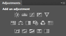
So many options!

Some layers might contain images, effects—for example shadowing—or text. Other layers, however, could appear devoid of content. These are adjustment layers, and they hold the information that governs the edits made to the image as a whole, or to given areas of it. This way, you can alter how something looks without destroying the original image.

You can name layers individually, so rather than trying to remember that Layer 23 adjusts the luminosity of the unicorn’s coat, you can call it ‘Unicorn coat luminosity.’

Layer masks

If you want to create composite images, layer masks will be essential to your work. A layer mask will allow you to place one image over another and mask selected areas of the upper layer from view. Effectively, this allows you to see through it to the image below, thereby creating a montage. Of course, you’re not restricted to just two layers when it comes to compositing; you can include as many as you need.

Going to the Industrial Opera

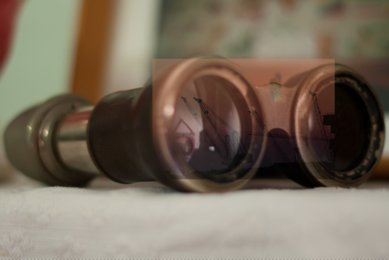
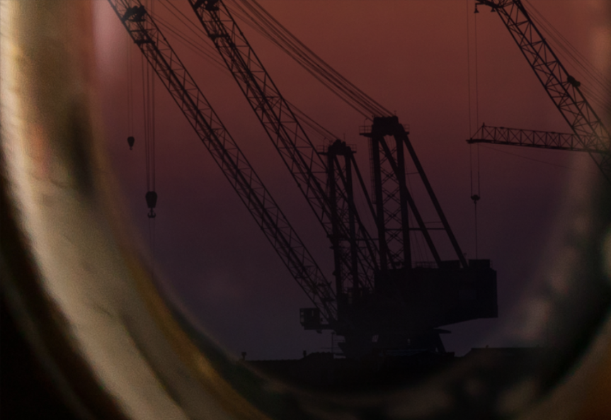
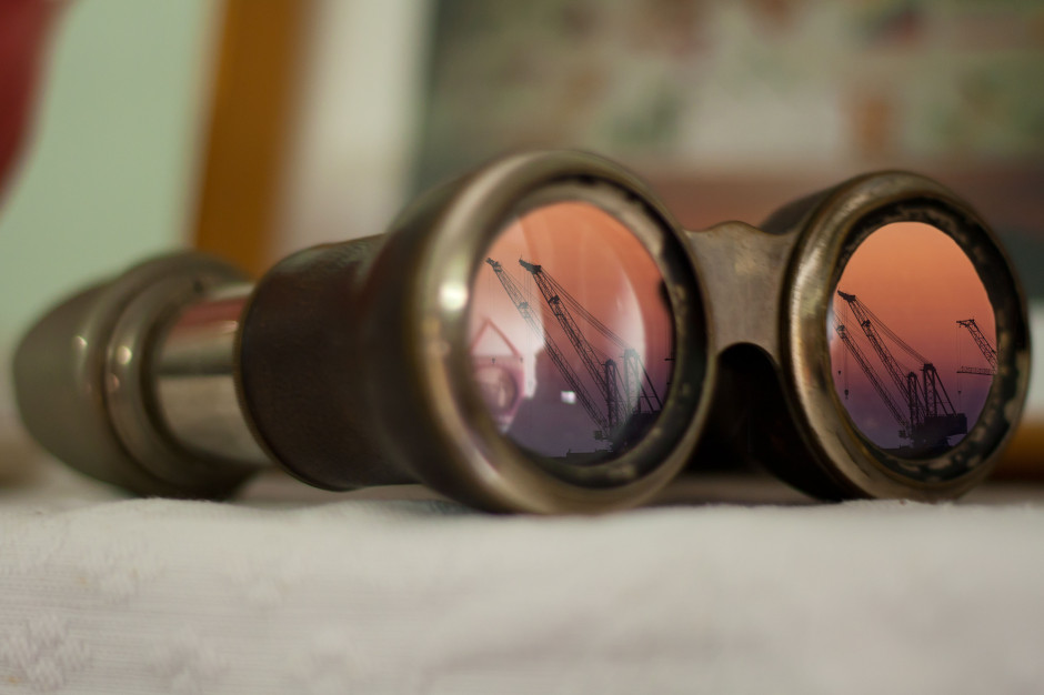
To give you some idea of what layer masks can achieve and how you can use them, I created an incongruous scene of an industrial sunset reflected in the lenses of a genteel pair of antique opera glasses.

[gallery columns="2" ids="7012,7013"]

Choosing your story

Having a clear idea of the story that I wanted to tell with the image was the first step. It meant that I didn't have to engage in too many changes and I was able to line up the images and accoutrements I needed. Of course things will evolve as you create them, but I would advise starting out with at least a basic 'recipe'.

Deciding on the light

As contradictory as it might sound, surreal images need to be grounded in reality to ensure that they're believable. Unless you're creating a Peter Pan-type figure, objects need shadows, for example. In this case, I needed to check that how my image reflected in the glasses was accurate, even if it were several degrees from reality. I did this using a pair of sunglasses and a torch to look for reflections.

How many layers?

My torch experimentations determined that I couldn't use one copy of the sunset scene to cover both lenses; the angles were wrong. It needed to be positioned separately over each lens of the opera glass. That meant importing the sunset image twice, onto two different layers.

Background and Layer 1

I started by making the opera glasses my background layer and then imported the first sunset layer and then added a layer mask by clicking on the Create new layer mask button at the bottom of the Layers panel.

I decreased the sunset layer’s opacity to about 40% to help me to scale it down to the size that I wanted and shift it into place over the opera glasses' lens.

Sunset over the lenses

Scale images at Edit>Transform>Scale; hold down the shift key to maintain proportions when adjusting the size.

Brushing away the excess

Happy that my sunset layer was in the right place, it was time to mask the parts of it that interfered with the image of the opera glasses. I did this by using the brush tool and the layer mask to 'paint away' the areas of the sunset scene that I didn't want visible.

Brushing away the extraneous data

When you're choosing what to show and what to hide in a layer mask, you paint with black to hide anything extraneous. If you paint away something and change your mind, switch the brush colour to white and it will reveal it.

[gallery columns="2" ids="7021,7022"]

I zoomed in close and used a relatively small brush with a mid-size feather to get the edge that I wanted.

Blending layers

When I was satisfied with my handiwork, I played around with the opacity and blending mode options to determine how the layers meshed together over each other to finalise the effect I wanted. Opacity and blending modes are the subject of a whole other article, but in this instance I set the opacity to 100% and opted for a screen blend.

Sunset over the second lens

With the second lens, it was a very similar process, except that I positioned the image of the sunset differently across the lens.

[gallery columns="2" ids="7018,7019"]

I selected the screen blend again, and adjusted the opacity until I was happy with the result.

Flattening and saving

Happy with my handiwork, I saved the image as a PSD file before flattening the layers and saving it as a JPEG file.

Binoculars final

Alternative views

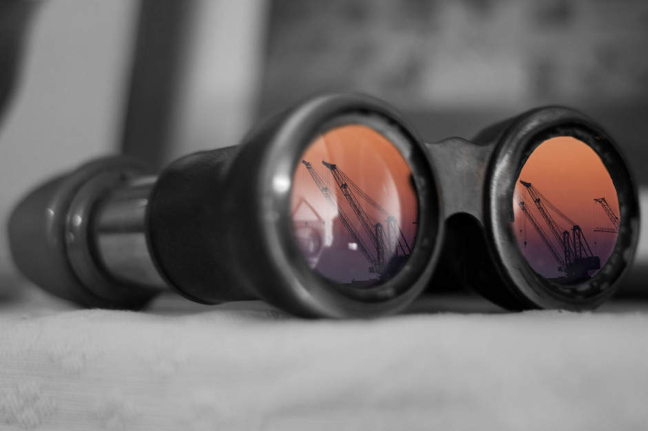
Having saved my 'finished' version as a PSD file meant that I was able to return to it for adjustments, or to try other looks having laid the ground work. One of the alternative views I created of it was to insert a black & white adjustment layer above the background layer to create black-and-white opera glasses with coloured lenses.

An alternative view

More where this came from!

Surreal Screen Shot This image, together with lots of advice on creating surreal images through in-camera and compositing techniques as well as examples from surreal masters such as Miss Aniela, can be found in my book Surreal Photography: Creating the Impossible. Right now it has been selected by the fickle finger of Amazon super-deals and is available for the bargain price of 1 penny or 2 cents; there's no telling how long it might last, so why not give it a try? Even if you don't own a Kindle, you can download a Kindle reading app for free to use on your smartphone or tablet.

Digital zoom: best avoided

Whenever I'm asked for quick tips for better smartphone photos, I usually proffer the same advice that I give to any other type of photographer: get closer and tuck your elbows into your body. But with smartphones (or indeed with some point-and-shoots) that first pointer in augmented with an admonishment to avoid digital zoom. So that's do get closer, but don't get closer using the capability that manufacturers have baked into their devices to accomplish it. Get closer, but nix the digi-zoom.

The truth is, digital zoom sucks. One day it might not, but right now it does. It sucks because digital zoom is nothing more than a glorified cropping tool. Whereas optical zoom relies on the physics of lenses to ensure that what you see appears larger or closer, digital zoom simply crops away the extraneous pixels and enlarges those remaining in the picture. While this might get you closer to your subject—and that's rule number one—it has an unfortunate effect on your images.

Get closer!
Get closer!

By enlarging the pixels that are on display, you've degraded your picture quality. You're spreading your information more thinly over the same surface area. It's the technological equivalent of spreading one teaspoon of jam over a slice of toast rather than two. Even if the processor is clever enough to use interpolation to enlarge the image, there's probably still some degradation.

Don't believe me? Have a look at these examples and tell me which is superior. I'll bet you a friendly pound that you prefer the image where I've got closer to my subject using my hands and my feet rather than the slider on my iPhone.

The first step in the art of getting closer is to do so physically: walk in, reach in, lean in. Getting optically closer is your next step. And if you're still not close enough, take the photo with what you've got and crop in after the fact. You'll still be spreading those pixels more thinly, but at least you'll have better control over the final image.

Get really close with an Easy-Macro band

And if you want to get really close, try an Easy-Macro band. It's $15 well spent.

Review: Cosyspeed camera bags

I'm not known for my physical exercising prowess - in fact, thinking of going to the gym sends me into cold sweats, which means that I felt I've exercised, so I don't go. When I realised I was going to have to spend six days straight at Photokina, on my feet, demoing demoing my little heart out for my day job, it served as a great reminder for why I stopped carrying a full-size SLR camera: Less weight = less exercise. Perfect. At Photo Plus back in October, I first saw the Sony A7, and I fell a little bit in love. I traded in my Canon 6D in favour of a Sony A7, and I haven't looked back - to my particular photography needs (I travel a lot, I want high quality photos, I don't really do sports, and I don't need fast auto-focus), the A7 is a perfect camera.

However the A7 is still an expensive piece of kit, and carrying it around safely for six days straight was always going to be a challenge: I need it to be easily available for demoing Triggertrap to people, but I also need it to be safely stashed away. That's where Cosyspeed Camslinger 160 comes in.

Cosyspeed Camslinger 160

Cosyspeed is a relatively new company, and they're focusing on making product especially for mirrorless cameras (hence the name - Cosy, I'm going to guess, is short for Compact System, which is one of the names that didn't quite stick for mirrorless cameras, alongside 'EVIL' - short for Electronic Viewfinder, Interchangeable Lens). The camera bag comes in two sizes, the slightly smaller 105, and the larger 160. Both of them are designed to wear at the hip - and it does make you feel a little bit like a cowboy wearing them.

Me, wearing the Cosyspeed Camslinger 160. Also a great example for why they don't let me model stuff very often.

I've tried a great many carrying systems in my life; some of them - especially Peak Design's offerings - are fantastic for large SLR cameras with honking great lenses attached. But the one problem all other carrying systems have, is that you have to keep your camera exposed to the world: Unprotected from rain or bumps. Of course, with a full-size camera, you don't really have the option of protecting it - but surely, these kinds of innovations are precisely why we are looking at more compact cameras in the first place?

I was amazed by the Cosyspeed Camslinger bag - I wore it for 6 days, 12-16 hours per day, and I was constantly demoing, so I found myself accessing the bag hundreds of time per day. It's a great quick-draw solution, meaning that your camera can stay protected whenever you don't need it - and easily available when you do need it.

At this point, I briefly have to sing the praises of the closing mechanism...

Push to close, pull out to open. Simple, secure, and brilliant.

I've never seen these kind of pushbuttons used on a camera bag before, but they're brilliant. To close it, you simply push down, but at that point, the bag is securely closed (you can also use the bungee cord to add a second layer of security on top). It takes a little bit of time to get used to, but it's a fantastic system, meaning I can have my hands free, then suddenly just magic my camera out of the bag to show someone something (or to take a photo, of course).

With the bag, it doesn't really make sense to use a camera strap - good job, then, that the guys have also created a finger-strap. I think in the longer term perhaps a proper hand-strap might be a better way go to, but in the couple of weeks I've used the fingerstrap, I've grown to love it - it's small and simple, and just means you have a second chance in case someone bumps into you and you drop the camera - another advantage of the mirrorless cameras, of course: Try trying to save a full-size camera with one finger!

A finger strap looks silly, but works surprisingly well.

All in all - if you shoot with a compact SLR or a mirrorless camera, I think it's very much worth giving the Cosyspeed bags a closer look - They are by far the best camera bags for mirrorless cameras out there - They're well designed, well made, and I'll certainly be using mine for many years to come - it's a perfect match with my Sony A7 and the way I like to shoot.

Aspect ratio: what it is and why it matters

Did you go to see Wes Anderson's glorious fondant fancy of film The Grand Budapest Hotel? Did you notice how the size of the picture varied depended on the era being portrayed in the story? As the story moved between 1985, 1968, and 1932, the aspect ratio, or size of the image, jumped from 1.85:1 to 2.35:1 to 'Academy Ratio'. This was part of Anderson's story-telling technique: the aspect ratio provided viewers with a visual cue for each period of the narrative. It's also a reflection of the changes to aspect ratio that film and television have experienced over the years. But what about photographers? Where does aspect ratio come into stills?

Frame size

Maybe we need to back-track and establish precisely what we mean by 'aspect ratio' first. It's the size of the image expressed as a ratio, width to height. You'll often see film-making aspect ratios expressed as a value to 1 (like to 2.35:1 and 1.85:1 mentioned earlier), whereas the most common photography aspect ratios are 3:2, 4:3, and 1:1, although there are plenty more besides. If your image has an aspect ratio of 3:2, it will be three units wide and two high. When you come to print it, you might choose a 6×4" or a 12×8" print.

The entire rectangle is 3:2 (900 by 600); the red zone represents 4:3 (800 by 600); and the purple zone is 1:1 (600 by 600).

Originally, these aspect ratios were as a result of our film sizes. Lots of medium format cameras produced square, or 1:1, images; 35mm cameras used film that measured 36 by 24 millimetres, giving an aspect ratio of 3:2. What's referred to in the film-making world as 'Academy Ratio' is very close to 4:3. It's also the common aspect ratio you'll find in smartphone cameras as well as Micro Four Thirds and some medium format cameras. 16:9 is usual for recording video.

While our digital sensors might preserve these aspect ratios in their physical dimensions, at the press of a button I can switch between 3:2, 4:3, 16:9, and 1:1 on my camera. And when I import an image into Lightroom or edit it in Snapseed, I can select from 1:1, 3:2, 4:3, 5:4, 7:5, 8.5:11, 16:9, or settle upon an entirely idiosyncratic free-styled aspect ratio. But why would I want to?

Composing the frame

It's about composition, and dividing and filling your frame.

Photographers talk a lot about subject placement, about the different rules that can be used to divide the frame, and about negative space. All of these elements contribute to creating visually appealing, dynamic images that draw the eye. It follows, then, that the dimensions of the frame will have an impact on composition: on where you place your subject and how much space surrounds it and how you divide your frame.

Different rectangles

We've already written about the square crop here on Photocritic, and how the eye has a tendency to move around a square frame, as opposed to across it, which it does with a rectangular crop. When changing between 3:2 and 4:3 crops, are there any considerations that need to be made?

Lily square

At its simplest, you have more space to fill with a 3:2 frame. Depending on your style and your subject, this can mean your subject has more room to breathe compared to a 4:3 crop. But it can also mean your subject has that bit too much space and feels a touch lost. You certainly need to be aware of this when you're shooting; and indeed if you intend to have prints made.

When I photographed my cousin on his graduation day, I adhered to my preferred 3:2 aspect ratio. It was how I approached filling the frame on the day and, consequently, how I processed the images afterwards. However, when my aunt had her prints made, she opted for a 24×18 canvas. I had to re-crop her favourite shot in a hurry. You can see both of them here. Can you see why I prefer the 3:2 aspect ratio in this instance? It doesn't feel nearly as squashed as the 4:3 version does.

My preferred 3:2 ratio - a little wider, with more room for the subjects to breathe

What my aunt needed for her print: 4:3 ratio. I think it looks more squashed. (Image measures 800 by 600 pixels.)

If you compare these sunset photos, you can see how much of the view the 4:3 version loses when compared with the 3:2 aspect ratio. It can prove difficult to fill the extra space in a landscape shot, but sometimes you need it, too.

Sunset, 3:2. (Image 600 by 400 pixels.)

Sunset, 4:3. (Image 533 by 400 pixels.)

Of course, you don't have to adhere to 3:2 or 4:3 aspect ratios. I decided that 4:5 worked best for this bee enjoying the Sicilian springtime flowers. The more compact frame focused attention on the bee better than the larger 2:3 version.

The original 2:3 version

A more compact, and focused, 4:5 version

Don't forget, if you switch from landscape to portrait orientation, then the aspect ratio will alter format accordingly. Width always goes first, thus 3:2 will change to 2:3 and 4:3 becomes 3:4. Or in the case of the bee, it's 4:5.

Opting for a different aspect ratio doesn't necessarily mean that you need to use a different compositional rule; however, in some circumstances, you might find the Golden Ratio preferable to the rule of thirds. It depends on your vision for the image. But do think about how much space you need around your subject. If you're struggling to fill it, think of trying 4:3; if it looks squashed, consider 3:2. Or try something else. Try not to feel too constrained by the constraints of aspect ratio.

But I will leave you with closing thoughts from xkcd. Who could put it better?

Trying the golden triangle

One of the first compositional rules that we learn is the rule of thirds. It's relatively simple but definitely effective: divide the frame into three, horizontally and vertically, and use the divisions to place your subject. But rules are made to be broken—once you understand them properly, that is—or at least adapted and challenged. If you're looking to leave behind the rule of thirds but still want place your faith in geometrically validated subject-placement, try the golden triangle. Look closely...

Determining the golden triangle

Draw an imaginary diagonal line across your frame. Now draw imaginary lines from the other two corners, which each meet the long line at right angles. It should look something like this:

Where the lines meet: your points-of-interest

Your points-of-interest are where the lines meet. Use them to place your focal point, for example the eyes in portraits, and use the lines to divide your frame and draw the eye to the focal point to help create dynamic images.

Why use the golden triangle?

On a mundane and practical level, it's easier for some people to visualise the triangle than it is the rule of thirds. Moving towards a more creative purpose, by using triangles to compose your frame you're introducing a strong compositional shape to it with a great sense of balance pitted against a precarious point. And triangles have a nifty way of retaining the attention of the eye within the frame: the eye moves from one point to another in a continuous loop.

[gallery ids="6953,6954,6955"]

Quite specifically with the golden triangle, you give yourself a means of dividing the frame in a way that is frequently more pleasing to the eye than a horizontal or vertical split. As well as using the lines to draw the eye to focal points, the use of triangles in the frame brings balance to the image. Think of one half as blue and the other as yellow. Or shadow versus light.

White against stripe

By counter-poising the two points-of-interest against each other, you can enhance the sense of balance in the frame. You get dynamism and balance in one go: brilliant.

Cards balanced against foot

Putting it into practice

It's all very well knowing the theory - what about the practice? Try portraits with your subject leaning into the frame and the eyes on a point-of-interest. Use the rule to place bridges in your frame, and have the eye travel along them to a focal point. Just give it a try - you never know!

Triangles galore!

Riding the waves to smooth water images

Photos that feature milky-smooth flowing water seem to have a Marmite effect on people: they're either loved or hated. I'm often rather ambivalent towards them, but it doesn't mean that it isn't a useful technique to have up your sleeve if you're faced with a weir or waterfall and you want to capture an image with smooth-looking water that has a sense of flow to it. Image thanks to Tom at Triggertrap

There's no great secret to shooting a photo that has water flowing through it that looks smooth: it's done using a long exposure. The slow shutter speed captures the the water as it moves, making it blurred. The blur, in this instance, gives the water a smooth appearance.

Shooting long exposures in daylight hours comes with an inherent problem, however. Over-exposure. Our cameras' sensors are capable of detecting far more light than we think they are, and even using the lowest possible ISO and smallest available aperture, a long exposure can result in an over-exposed photo when taking during the day. To get around this irritation, you might want to try a neutral density (ND) filter over your lens.

APL0719-1024x681

ND filters are grey filters that cut down the amount of light that enters your lens without affecting the colour of your images. They come in different grades, or densities, blocking out between one stop and 12 stops of light. Screw one over your lens and you'll give yourself a great deal more flexibility when it comes to shooting daytime long exposures.

Then of course you'll need a tripod. You might want to capture the motion blur of the water, but you'll want to avoid camera-shake and the rest of the scene getting the wobbles. Even though you'll be using a very small aperture with an enormous depth-of-field, still think carefully about your framing of the shot and its point-of-focus. Make sure it's telling a story.

Image thanks to Tom at Triggertrap

Obviously you'll need to have your camera in manual mode to ensure that you can adjust the shutter speed, ISO, and aperture to get the photo that you want. Almost certainly you will need to use the lowest ISO and smallest aperture avalable. When it comes to shutter speed, you might find that you need to venture into bulb mode to get the shutter speed you need. And we recommend that you use a remote shutter release to prevent jolting your camera on its tripod and shifting its focus, too.

Then it's a case of hitting the cable release and leaving the camera to do its thing.


All images are courtesy of Triggertrap. You can learn more about using remote releases on the awesome Triggertrap How-to site!

How to create an image gallery in Wordpress

We spend quite a bit of time discussing sharing our images here, there, and yon on Facebook, Twitter, and Instagram, as well as on custom-built platforms such as Photoswarm or Photoshelter, but we don't tend to talk so much, if at all, about good old Wordpress. I've no idea why we tend to overlook CMSs—perhaps because there's an assumption that you should know what you're doing if you have one—but at least for once, I thought we'd change that. [gallery ids="6934,6938,6939,6935,6936"]

Wordpress benefits from a huge number of plugins that you can use to augment your website-running experience, from free ones to premium ones, to plugins that block spam to those that manage your editorial calendar. But if you want to insert a simple gallery of images into a Wordpress post, there's no plugin required. You can manage it directly the Add Media function. It's not the most glamorous of galleries—it doesn't offer a carousel, for example—but it does allow you to sample a selection of images.

Create a new post

That's an obvious place to start. Give it a title, add the text that you want, create some tags; all the usual.

Meta

Hit the Add Media button

Go to add images just as you usually would. Hit the Add Media button towards the top left of the page.

Select Create Gallery

You'll automatically find yourself on the Insert Media panel. On its top left you'll see three options: Insert Media, where you already are; Create Gallery; and Set Featured Image. (There's Insert from URL just below those, too.) Choose Create Gallery.

A bit more meta

Upload or select your images

If you've already uploaded the images to your Media Library, go ahead and select them now. Otherwise choose the Upload Files tab and go ahead and upload your chosen images from your computer as you usually would.

Increasingly meta

Create your gallery

When you've selected your images, press the 'Create a new gallery' button at the bottom right of the page.

Does this get any more meta?

Now you get to organise your gallery, deciding on the order in which you want the images to appear (drag-and-drop to re-arrange them), in how many columns you'd like them arranged, and whether you'd like the images to link through to an attachment page when a viewer clicks on them. Don't forget to add captions if you need them, too. Do that beneath each image. Tap Insert Gallery and you're done!

Meta-overload

If you'd like to try a carousel of images, you might want to check out the Jetpack plugin, but otherwise, this should keep you in image galleries for the moment.