Case Logic SLRC-206-BLACK camera bag review

With lots of clever features, and great ergonomics, Case Logic pulls a surprise winner out of the hat. When you're thinking camera bags, Case Logic may not be the first brand that pops to mind, but my recent experiences with one of their very reasonably-priced photo backpacks might just be enough to change your mind.

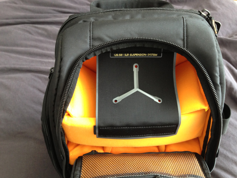
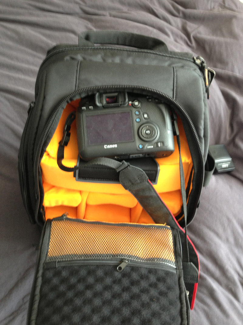
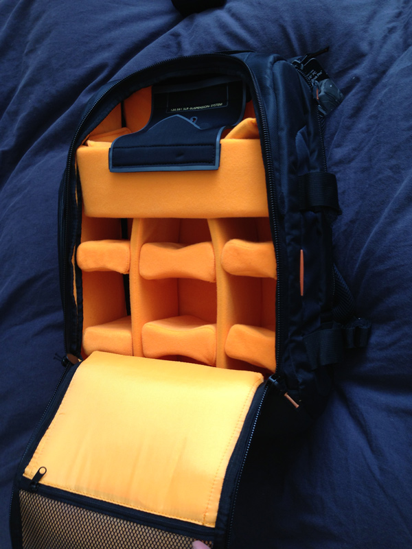
The not-really-that-creatively-named SLRC-206-BLACK is a good-looking bag that has a load of features I haven't seen on any camera bags in the past. For one thing, their 'SLR Suspension' system is incredibly clever: There are two straps of velcro that stop the zippers from opening beyond a certain point. If you open the bag like that, only the top part of the main compartment is available, and it has a clever 'suspension system' which enables you to put your camera away and grab it again in a matter of seconds. The main compartment of the backpack also has oodles of re-configurable space for lenses and other accessories. As you might expect, the bag also has several front- and side pockets for keeping filters, lens caps, and any other equipment you may be lugging around.

At the side of the bag, it has a couple of incredibly sturdy nylon straps for strapping down a tripod or similar. These are the biggest and most flexible I've ever seen on a camera bag, too - an absolute winner.

At the back, there's a large laptop pocket that should fit most laptops - and best of all, it's secured with zippers that make me confident of its water-resistance prowess.

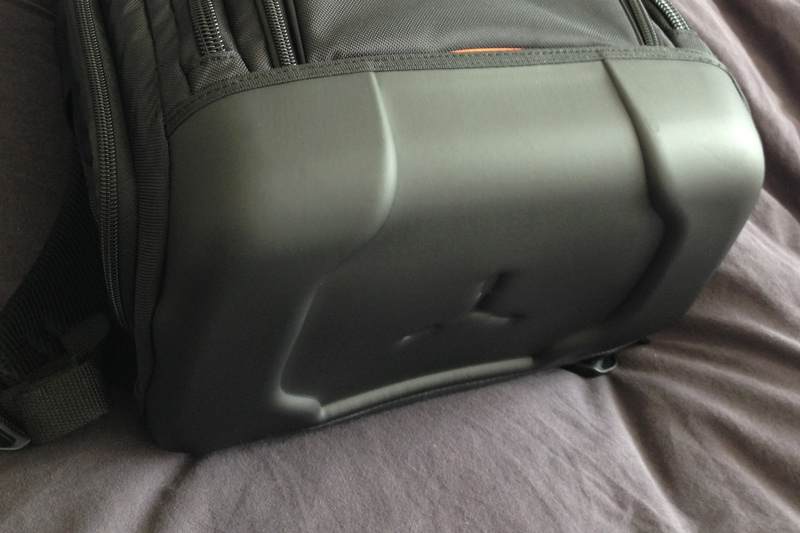
The final cleverness is the bottom of the bag - CaseLogic decided to envelope the bottom in a sturdy rubberised plastic, resulting in a base that is rock solid (even when loaded with only a heavy camera, it wouldn't topple over), and water-proof. Perfect for photographers on the go.

So is it all heaven and butterflies? Well, no. Personally, I'd have wished they had attached the shoulder straps to the other side of the zips, so you'd have to move the straps aside to access the laptop compartment. As it stands, the entire weight of your camera rests on a zip that is perhaps a little bit too good, so on one occasion it zipped itself open. Because the straps are attached to the 'loose' side, it means that if the zip opens, the entire laptop compartment is pulled open by the weight of your cameras and lenses, leaving it a big gaping rain-trap, with your laptop reaching for the heavens. It's a minor niggle, of course, but I was surprised that Case Logic had missed such a simple thing, when they were so incredibly careful with the design of the rest of the bag.

Anyway; As I mentioned in the beginning of the article, if there's one thing I've learned from this review, it's that Case Logic is worth a closer look; They have an extensive range range of camera bags and camera cases, and if the build quality (and price tag!) of this one is anything to go by, they may well be a force to be reckoned with.

The Camera Case

The SLR suspension system is really quite clever

Camera in its Special Place

Great lens storage compartment

Laptop case

Great waterproof bottom

Q&A: What's the best compact camera with an optical or electronic viewfinder?

Personally, I have a bit of a love relationship with the Canon S-series of cameras. Yes, they don't have an optical or EVF viewfinder, but think about it this way: In designing these cameras, Canon decided to create the highest-end compact cameras they could, and there was no way that they were going to stick a poor screen on there. Even in bright screen, my S95 (and, subsequently the S100 and S110) work fantastically well, regardless of situation: I've used mine extensively both under and above water (see www.flickr.com/search/?w=83688756@N00&q=Canon+S95 for a rather broad sample), and I've never missed the viewfinder even once.

The other benefit of no viewfinders is that the screens can be far, far bigger, which has its own benefits.

TL;DR: Don't ignore cameras without viewfinders, LCD tech has gotten very far in the past few years.

Question via Quora.

Flickr updates its iOS app

A shiny new update has just appeared in my app store app for Flickr. It's not one of those 'Minor bug fixes' updates, but includes six bullet points of improvements. It is a filter-heavy update, but there are some major changes to the editing features, too. The app has lost its Aviary editing appearance, and Flickr has said that the team who created it were from the recently acquired KitCam and GhostBird software outfits. The look is new and so are the tools.

All new filters for Flickr

Gone are the previously animal-named filters; instead there are 14 new filters, some with names that give you idea of what to expect, like 'Antique' or 'Lomo' others that, quite frankly, seem to be plucked out of the aether. Say, 'Dublin' or 'Louisiana.' These can be applied 'traditionally' in post-production, or 'live' as you take photos in-app.

If you're using the Flickr app to take photos, rather than the iPhone's native camera app, there are focus and exposure lock options, a pinch-to-zoom tool, and a grid to assist with composition.

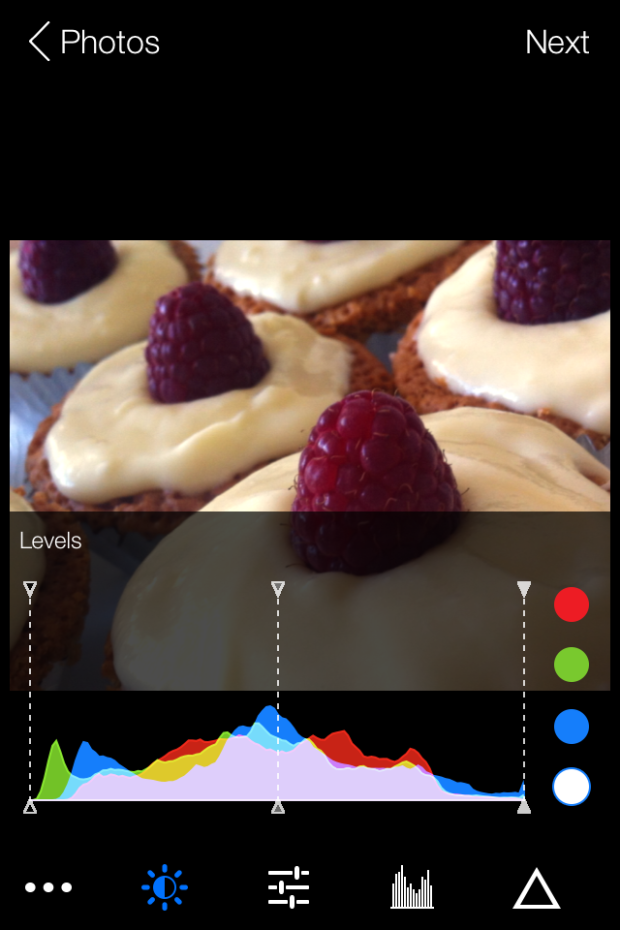
The new editing tools are a more sophisticated selection than before. They include the usual, like brightness, contrast, and white balance, but extend to colour balancing with red, blue, and green channels, a levels tool, and a sharpening function. The crop function allows you to flip and rotate images as well as straighten them. I must say: I don't find the pinch-to-zoom crop function that intuitive to use. Neither am I keen on my cakes being upside down, but you never know when you might need it.

It's possible to add customisable vignettes, linear or radial tilt-shift effects, colour bursts, and worn effects to your images, too. (If you're struggling to find those, they're hiding beneath the filter icons.)

Flickr levels screen shot

The animated transitions for the camera and editing tools that are meant to provide users with 'the best camera experience yet' might be over-egging the pudding a little, but this is an update that suggests Flickr's mobile focus is sharpening. Far more control is being placed in the hands of the people who are using their mobile phones to take photos. It's a sign of the maturation of the mobile photography phenomenon.

Using a variety of different apps to achieve the effect that I want for my photos isn't something I've shied away from. I'll happily bounce between my iPhone's camera app, Snapseed and ColorTime for editing (and maybe other apps like Juxtaposer for more extreme effects), and Flickr for sharing. With this update, it seems that Flickr is trying to make itself into a much more rounded photo-making and photo-sharing facility. I've not spent enough time with it yet to determine if it's enough for me to leave behind Snapseed, but that's certainly Flickr's intention. It's both serious and playful: so can it successfully appeal to both sides of the market?

Photo 20-08-2013 14 32 02

Oh, and I've noticed that the Flickr 'r' is now purple - bringing a touch more Yahoo! to the blue and pink of Flickr.

What is a prime lens?

We've taken a jump over 'O' and landed directly on 'P' for the next part of the Photography Fundamentals series. Here, we'll be taking a look at prime lenses, what they are, and why you should have one. At least one. In fact, we reckon that until you've got a decent prime lens, you've not really lived, photographically speaking. Here's why.

Define prime

What's a prime lens? For once, it's a simple definition: it's a lens with a fixed focal length. They might be 35mm, 50mm, 85mm, 100mm, whatever, they just don't move. And yes, this can most definitely be a good thing.

A bit of history

Back in the infancy of photography, we never had anything but prime lenses. When you bought a camera body, you also had to buy a camera lens to go with it. A 50mm ƒ/1.8 was pretty much the slowest lens you could buy as a starter kit.

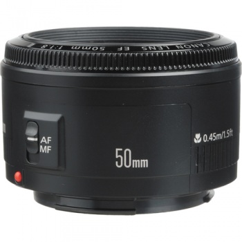
To this day, a 50mm ƒ/1.8 is the cheapest lens you can buy in the entire Canon EF lens arsenal. And if you don’t have one, you’re missing out.

Canon's 50mm ƒ/1.8 - a bargain at under £100

From your first prime, you move on. You might get a faster ‘normal’ prime, like a 50mm ƒ/1.4 or a ƒ/1.2 (or, if you’re intro your retro gear, the incredibly bright Canon 50mm ƒ/0.95. This lens is four times faster than the human eye, and is one of the fastest lenses in the world along with, for example, the lenses available for the Nikon 7 range finders in the early 1950s.)

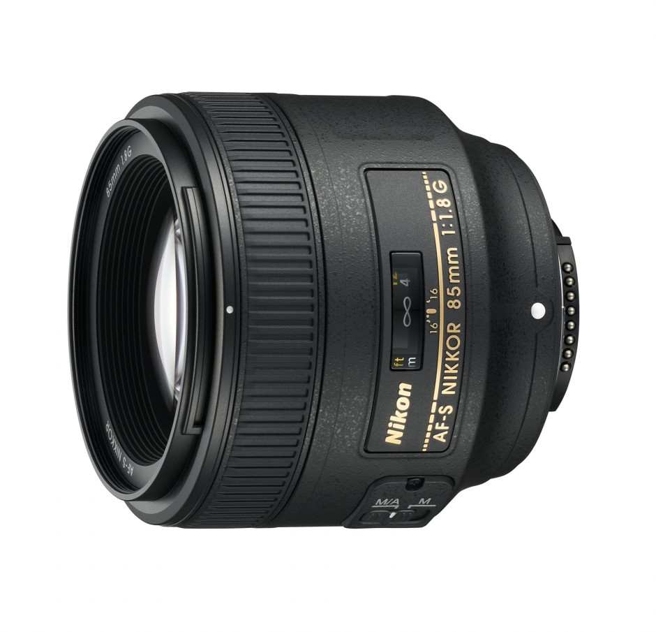
If you’re into landscapes, a 28mm would be the natural choice. 85mm, 100mm, and 135mm prime lenses became the de facto standard for portrait photography all ’round the world.

Nikon's 85mm ƒ1.8

The first zoom lenses were patented in the early 1900s, and the first commercial production of zoom lenses for stills photography started in the early 1960s. All of a sudden, zoom lenses were all the rage.

Why would you limit yourself to a single focal length, when you can cover a whole range? So, manufacturers shrugged, and started creating zoom lenses.

What’s going on now?

Nowadays, all ‘kit lenses’ (lenses you get bundled with camera bundles) are consumer-grade zoom lenses. My dad recently got suckered into buying an 18-55mm and a 55-200mm lens (after I explicitly told him to buy a Canon 28-135 ƒ/3.5 Image Stabilised lens… Tssk, doesn’t the lad know I run a photography blog, or something?), for example, and he isn’t stupid. It’s just too tempting to get a wider zoom range, in the hope that the increased flexibility will get you the photos you need.

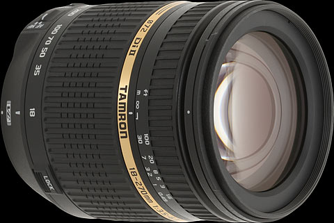
Tamron's 18-270mm offers a huge focal range, but is it as sharp as a prime lens?

The thing is, a zoom range is all good and well, but ultimately, it’s all about sharpness. Are your photos so crisp they jump out of the screen at you? If not, you’re probably doing something wrong. So what happens if I tell you that one of the sharpest lenses a consumer can buy is also the cheapest lens Canon makes? You’d be surprised, right? But it’s the truth. Time and time again, people are amazed when they review consumer-grade zooms against far cheaper prime lenses. But — as Tabaware explores — they aren’t even in the same league.

So why is this? Well, it’s damn simple, really… it’s far easier to mass produce a prime lens: Because it only has to be sharp at one focal length, the optics are a hell of a lot simpler. So they can concentrate on getting it to be really good, rather than just being good enough.

Why should I care?

It really depends, to be honest: What do you want out of your photography? If you are looking for convenience and holiday snaps, by all means, go for the first and best zoom lens. Hell, I've a few of them myself and love to use them, but still, there’s a certain feeling of zen about using prime lenses. They can be slightly limited, sure, but they’re also sharper than a surgeon’s scalpel, cheap as a bag of crisps, and they are just a better idea overall, especially as you are just learning about photography.

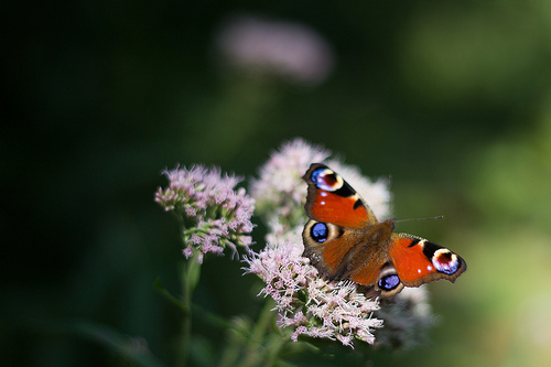
Peacock butterfly

So, if you’re in the market for a new camera, and the kit comes with some two-bit zoom lens, see if you can’t convince the salesperson to do you a deal. “So, you want to sell me this lens? How much does it normally cost? Interesting. I can see that you sell a 50mm ƒ/1.8 for less than that. Can you give me one of those instead?” Sure, money-wise, you’ll lose out. But your portfolio will thank you for it for years to come.

Are prime lenses really such a good idea?

Well, yes, I would argue so. I'm a frequent traveller and it isn't unusual for me to get on a plane with just my camera body, a 50mm ƒ/1.4, and Canon PowerShot S95.

Check out the gallery from one of my trips to Vietnam, or a bigger collection of my photos taken with the humble 50mm.

Convinced yet? Good. Head over to your favourite photographic retailer, and buy yourself a lovely little prime. Lazy? Okay then - Canon users, click here. Nikon users, click here. Pentax users, you can click here. Sony users, click here. And Olympus users, click here. You're welcome.

TL;DR

  • Prime lenses are lenses with fixed focal lengths
  • They are usually sharper than zoom lenses because they have fewer moving parts
  • And fewer moving parts also makes them cheaper to manufacture and less likely to suffer from a fault

Noise << Photography Fundamentals >> Quality versus quantity

Q&A: What is the ideal image spec that can be used for web and print?

The key thing to keep in mind is resolution. An image online that covers the entire width of the Quora page would be less than 1000 pixels wide. If that photo is as tall as it is wide, it's a 1 megapixel photo (1,000 x 1,000 pixels) If you take that photo and print it in high quality (300 dots per inch), it would be quite small (8.4 x 8.4 cm / 3 x 3 inches). So, if you are looking to buy / commission / create photographs that work both in print and on screen, then worry about print resolutions, not about the resolution on screen.

The second thing you need to worry about, is sharpening the image for its target output medium. Glossy magazines need the photos sharpened differently than if you want to show it on screen, or print it on newsprint. Cambridge in Colour has a great Guide to Image Sharpening.

Question via Quora

Sony's A3000 is a big mirrorless camera

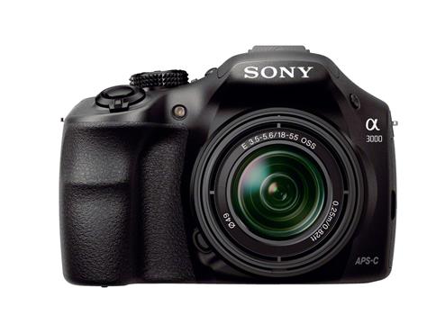
I'm trying my very hardest to get my head around this one. Sony's new A3000 is a mirrorless camera that's bigger than your common-or-garden EVIL camera, a bit smaller than a traditional dSLR, and roughly the same size as the Canon 100D. And it has been deliberately designed to be on the larger side. Sony A3000 with 18-55mm kit lens

This means that Sony has taken a class of camera that was developed with the specific intention of including almost all of the traditional SLR's best features barring the pentaprism and optical viewfinder, which were removed in order to make it smaller, and then made it larger but omitted the key bits of a camera's mechanism that draws people back to the SLR time and time and time again: the pentaprism and optical viewfinder. No. My logic here is failing me. Anyone?

The A3000 is an E-mount camera with a 20 megapixel APS-C sensor that has an ISO range of 100 to 16,000. There are 25 auto-focus points and it can manage 2.5 frames per second continuous shooting. That can be upped to 3.5 frames per second on switching to speed priority shooting mode.

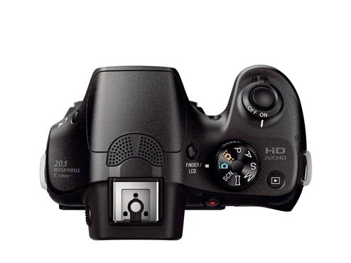
Mode dial, hot shoe, general SLR-likeness, but no mirror

Full HD video can be shot with either 50i or 25p modes and it can be hooked up to stereo microphone. There's also the hotshoe for flashes and a range of filters and effects.

It has a few more megapixels of resolution than Sony's NEX-3N, but they're otherwise very similar cameras. Except that the A3000 is larger and it doesn't have a tiltable screen.

Price-wise it'll be in the region of £370 ($399) and available from September 2013.

Can you fix the focus on a blurry photo after the fact?

I seem to be on a roll this week, with finding incredibly interesting topics to write about over on Quora. In this case, the question was as simple as it was interesting: "Is it possible to focus an unfocused image with a computer program?".

Answer...

There are many technical challenges with focusing an image after the fact, and it depends heavily on how out-of-focus the original image is. It is possible to do some sharpening that gives the illusion of a photo being in better focus, but actually re-focusing the photo? Not so much.

Here's why...

Take an image like this for example (see the photo on my Flickr stream for a larger version):

Just chillin'

The bird in the foreground is in focus (well, more or less), but the plants in the background are not. Now, blurring this photo would be relatively trivial, because you are discarding information.

If your goal was to 're-focus' the photograph so the trees in the background were in focus, however, you're looking at a completely different problem, at least if your photo is taken with a conventional camera (Light-field cameras like the Lytro work differently)... The problem is that you're trying to re-generate information that simply isn't there.

Another example

Let's take another example. This photo, for example (see Flickr for a larger version):

What big eyes you have...

In this photo, you have an extreme macro shot of a fly. You can see the individual facet eyes of the fly, and count the hairs on its back. However, it has very shallow depth of field, and if you look at the legs in the background of the photo, they are just blurry stalks. Now, the technology you are looking for, would somehow magically be able to find out the size, direction, and shape of each of the hairs on the fly's legs that are out of focus in the background.

It stands to reason that this information simply doesn't exist. I took the photo, and I have no idea what colour the hairs were, how many there were, and how evenly they were spaced. This photo is a pretty good document of the fly, of course, but it is physically impossible to recreate information that isn't there - unless you have a data source to base this information on.

On the other hand, Adobe is doing some really interesting stuff with their 'deblur' technology. This isn't the same as focus blur, however; the idea of Adobe's deblurring is to take a photo that was sharp to begin with, but suffers from motion blur. This means that, in theory, a lot of additional information exists in the image, it is just spread over an even surface. As such, it is possible to 'unblur' the image by throwing clever algorithms and a lot of computing power at the problem. Sadly, this is only possible in very limited cases. It's not possible to re-focus an image, but it is possible to evaluate the photo to remove certain image artefacts, much like noise reduction filters etc.

For further reading, check out the vaguely related concepts of Focus stacking (which uses focusing at several focus depths, and calculates an image with deeper depth of field), HDR (which does a similar thing, but for images with various exposures) and, of course, the Lytro camera, which is able to focus after the fact, but struggles with its own problems (including much lower final resolution than we are used to from our digital images).

TL;DR: No, you can't focus an image after the fact.

Exposure: The Oxfam Photography Prize for Women 2013

UK-based female photographer aged between 18 and 25? You might be just what Oxfam is looking for to complete a commission for its forthcoming spring fundraising campaign. This autumn, Oxfam will be commissioning three female photographers from Magnum to document projects that are taking place in Armenia, Chad, and Sri Lanka. They'd like three young, aspiring photojournalists to join one project each and to help tell the stories of women who live in poverty through a series of 100 images that will be used in Oxfam's future fundraising communications.

As well as having the opportunity to go out on assignment, the successful applicants will receive mentoring from the Magnum photographer on their projects, and receive £1,000 on delivery of the image series.

Image by Abbie Trayler-Smith

Applications for this commission are being handled by IdeasTap. You'll need to complete a selection brief that involves submitting a portfolio of images that highlights your skills as a photojournalist, a story-teller, and portrait photographer. The judges—two from Oxfam, one frm Magnum, and one independent judge—will be looking for all of that as well as originality, a strong relationship to the subject, and excellent communication skills.

As with all IdeasTap briefs, you do need to be an IdeasTap member in order to participate, but it's free to sign up.

You've until midday on Monday 9 September 2013 to complete the application process. More information and the application process are all detailed on the IdeasTap website. Good luck!

Crowdfunding an iPhone camera: Is the Ladibird project a scam?

Today, I came across an interesting IndieGogo campaign, for the Ladibird; a snap-on professional camera for the iPhone 5. Initially, I thought it was a brilliant idea, but then I started reading about the product, and I immediately became incredibly skeptical. Allow me to explain...

The sample images

First of all, the thing that made me wonder what's going on, were the sample images. They look fantastic, without a doubt, but when you look at the Ladibird video, you see that the product is just a 3D render. So that made me wonder: Where did the example photos come from? Right at the bottom of the page, they explain that the shots are taken with "a 50mm prime lens on a 12 megapixel Nikon D700".

Now, there's a lot of problems with this, in my mind: For one thing, the Nikon D700 is a high-end professional camera that cost USD $3000. It's also a full-frame camera, with a 36mm x 24mm sensor built in. The Nikon lens used (a 50mm f1/8) is also a mighty sharp piece of kit. Do you think it's fair to use photos taken with a pro-level camera as examples for what an iPhone accessory lens can do?

The specifications

In the IndieGogo campaign, the Ladibird manufacturers do the following:

The Specifications

The thing that isn't clear to me, is why they are talking about a 'mirrorless sensor' as if that's a standard. Mirrorless cameras have wildly different sensor sizes; The Pentax Q has a 6.17 x 4.55 mm sensor. The Sony NEX-6 has a 23.5 x 15.6 mm sensor. The Leica M9 has a 36 x 24 mm sensor. And there are tons of sizes in between.

The lens spec itself, too, is fuzzy. They are talking about a "Ladibird 50mm (35mm equivalent) large aperture prime lens", which patently doesn't make sense, unless they have a sensor that is 45% larger than that found in the highest of high-end SLR cameras. A more likely explanation is that they have their terms mixed up, and that they have a lens which actually has a 35mm focal length (Which is roughly a 50mm equivalent on an APS-C size sensor), but it does worry me: Would you trust a lens designed by a company that isn't sure which way around the crop sensor conversion factors go?

Developing sharp lenses is an incredibly difficult and challenging task.

But what about the large sensor and 50mm?

All of this makes sense, apart from the fact that they are talking about limited depth of field, which doesn't depend on the focal length: There's no reason why a 50mm should have more pleasing depth of field than a 100mm lens. It is mostly dependent on the aperture, but that isn't mentioned in the marketing material.

The Ladibird guys have done a great marketing tasks, but as someone who's written a book on mirrorless cameras, and has technical edited a rather chunky stack of books about photography, I can't help but feel I'm somewhat qualified to evaluate this project, and it's setting off all manner of alarm bells.

In their marketing site, they've equaled small sensors with blurry photos. That's patently not true: The Nikon 1 series have tiny sensors in them, but are capable of producing fantastically sharp images. Similarly, my iPhone 5 has a miniscule sensor in it, a quick browse through the 'most interesting' photos taken with the iPhone 5 on Flickr reveals that many of them are tack-sharp works of art. This would infer that a small sensor is in and of itself no reason to buy a Ladibird.

The other argument they make is that the 50mm f/1.8 lens is cruise control to awesome photos. Now, in most cases that might well be true, but those specs alone aren't enough. "50mm" only means that the lens has a focal length of 50mm. There's nothing inherently better about this, and there are many examples of absolutely dreadful 50mm lenses out there. In fact, I could build a 50mm lens myself out of a couple of lens elements, a kitchen roll, and some Blu-Tack in about 20 minutes, but I can pretty much guarantee that the photo quality is going to be severely lacking.

So, is Ladibird a scam?

I have no way of knowing that, but the IndieGogo page does set off an awful lot of alarm bells.

I won't be backing the IndieGogo campaign myself, and I'll tell you why: I know how incredibly hard it is to build photography equipment, and so far, we haven't seen a single prototype or sample image from these guys. Even the mock-up image doesn't seem realistic (to have a 50mm focal length, the lens barrel would probably need to be longer), which makes me wonder how far along in the process they have come.

If the mockup image represents the current state of play, then I fear they're about to get a rude awakening if they think that $20,000 is enough money to develop a fully functional prototype of the Ladibird. For a product this advanced (Apple MFi; App development; Sensor design; Lens design; Testing; industrial design; production design; prototyping...), I'd estimate you may not be able to complete the full development cycle for less than $150,000. Bear in mind two things: $150k is a very low estimate for a product this advanced, and at the end of this phase, they will have perhaps half a dozen prototypes; they still wouldn't have created a single Ladibird for the Indiegogo backers.

Don't get me wrong, I really do want a product like the Ladibird to exist, but wouldn't part with any money until I've seen at least a couple of sample images.

The biggest worry is that the marketing material is such a hodge-podge of technical, factual, and physics-related inaccuracies... Let's put it this way: if Ladibird was a book, and it was passed to me for technical editing, I'd have to craft a very difficult letter to the publisher, suggesting that it's in a shape beyond where a tech-editor can help, recommending that the book was cancelled or seriously re-written. It certainly wouldn't be in a state to offer pre-selling it to the public.

Or, put in other words: I'd probably just wait until the product is available to buy in a store.

What is noise?

Photography Fundamentals has reached part 'N', for 'noise'. Digital noise is instantly recognisable in a photo, and we know that keeping your ISO low is the best way to avoid it, but why exactly does it happen? Why does your image quality go down the pan as soon as you touch that ISO dial? What's with all the digital noise?


In 2006, this was the reality of digital noise in photos ...

How does an imaging chip work?

Whether you use a CCD or a CMOS chip in your camera, the basic functioning of an imaging chip is pretty much the same: Imagine millions of tiny little light meters squashed into a tiny little chip the size of a postage stamp. How many million? Well that depends on the resolution of your camera, of course, but if you’ve bought yourself a Canon EOS 700D, you’ve got a 18.5 or so million pixels (of which 18 million are used). All of these pixels are somehow fitted on roughly 22mm by 16mm sized space – yes, that’s about the same area as the button on your average door-bell.

When you take a photograph, there are a set of shutter curtains which move aside – exposing the imaging chip for as little as one eight thousandth of a second – giving the sensor time to measure the light that falls on it. Then, the shutters close again, and the sensor sends the measurements to the camera’s cpu, which does some calculations, and then stores the whole thing as a digital file.

Where does ISO come into it?

Now you know pretty much how an imaging chip works – but where does ISO come into it? Well, all imaging chips operate at the lowest ISO your camera supports – usually ISO 100. In this mode, your camera takes its light measurements from its millions of tiny little light sensors, passes it directly to the brain of the camera, which then stores it.

When you crank up the ISO value to, say ISO 400, another step is added to the mix: Your camera still takes the same measurement, but in the CPU of the camera, the measured values are multiplied by 4, to get ISO 400. Or by 8 to get ISO 800. Or by 32 to get ISO 3200. Pretty straight-forward stuff, right?

So, er, Where does digital noise come from?
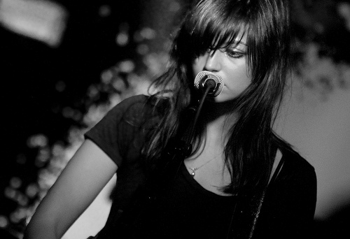
Silhouette in concert
Silhouette in Concert by yours truly – Also see the full-resolution image for an excellent example of digital noise in photography

Well, think about it: while chips have gotten much, much better in recent years, it’s still a case of 18 million tiny little sensors doing their thing in a space the size of your thumb nail.

The problem is that – as with all precision measuring instruments – they can only be so precise: all of them introduce a degree of measuring inaccuracy. The problem with imaging chips is that they are internally inconsistent, and they are unpredictable.

The inconsistency is a problem which can largely be resolved: The camera can take a photograph, and realises that if one particular pixel always reads a little bit higher than its immediate brethren, it can calibrate so that one pixel is adjusted down to fit better. This calibration is done before the camera leaves the factory, and it’s trivial for camera manufacturers to built-in calibration checks on an ongoing basis – it’s relatively trivial to detect a dead pixel, for example, and then interpolate what its likely value would have been from its surrounding neighbours; and because there are 18 million of them, and we rarely check each individual pixel of a photograph, you’d never know.

The unpredictability issue is different, however; imaging chips are sensitive to temperature, and the act of taking a photograph actually causes the chips to warm up a tiny little bit (there’s a lot of electronics in a camera, after all, including the battery, the CPU, and all the circuitry to tie it all together – all of which generates various amounts of heat). Some cameras have a ‘noise reduction’ feature where they take another photograph immediately after you take a long-shutter-time photograph – but with the shutters closed. The theory is that it should be recording perfect darkness, but in practice it records a variety of readings from all the sensors. By subtracting these readings from the original image, you reduce (some of) the digital noise in an image.

Imaging chips are precise enough that at ISO 100, the differences in readings introduced by digital noise are practically unnoticeable. The problem comes from the multiplication process.

A thought experiment

Imagine you take a photograph of a perfectly grey wall at ISO 100, ƒ/8.0 and 1/30 second exposure time. Three randomly selected pixels now read 100.5, 100 and 102. No problem; it looks great, and the stored values are within 2% of each other – the wall looks like a perfectly even, gorgeous grey wall.
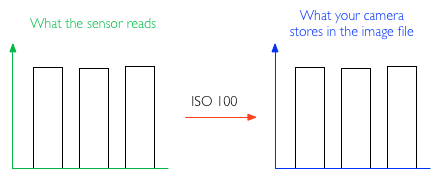
iso_100.png

Now, switch the camera settings ISO to 800, ƒ/8.0 and 1/240 second. The final result — in a perfect world — should be precisely the same: We’ve reduced the shutter speed to 1/8 of the original exposure, but the camera will multiply the exposure by 8 because we’ve changed the ISO. The same pixels now read 12.6, 12.5 and 15.5: The margins of error are the same as above. The camera multiplies it all by 8, and stores 101, 100 and 120 to the memory card. Suddenly, there’s a 20% discrepancy between the three values, which becomes very clear in the final image: What you’re seeing here is digital noise.
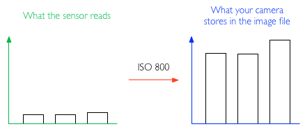
iso_800.png

Now, imagine the same effect at ISO 3200: the pixels read 3.5406, 3.1250 and 5.1875, which the camera multiplies back up to 113, 100 and 166 – a far shot off from the 100, 100, 100 you’d get with a perfect imaging chip.
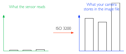
iso_3200.png

In reality, the metering tolerances in an imaging chip aren’t that pronounced; but the point is that if you multiply any meter reading by 32 (or much more, depending on how your ISO settings on your camera will take you), you’re talking about pretty serious discrepancies, and some pretty serious noise in your final image.

How can I reduce digital noise in my pictures?

Use as low ISO as you can get away with; Often, it’s better to use a tripod and a remote release cable combined with a longer shutter speed and lower ISO, than trying to shoot free-hand at shorter shutter speeds and higher ISO.

Use shorter shutter speeds; If you can, use shorter shutter speeds – the metering discrepancies will still be there, but less pronounced.

Keep your camera’s insides cool; when you take a lot of photos, you’re introducing more camera noise. Also, if your camera has a ‘Live View’ mode, it sucks battery, and means that the camera’s electronics are constantly working hard – which causes heat, and introduces more noise.

Use noise-reduction software; There’s a few options out there by now, but I've been consistently impressed by the RAW processor built into Lightroom - the before-and-after pics at the top of this article, for example, were processed with Adobe Lightroom. Personally, I quite like a bit of noise in my photos – it makes them look more accessible and ‘real’, I feel – but that might just be me.

noisynoisy.jpg

TL:DR;

A super-brief summary of all of the above, courtesy of Redditor IAmSparticles

When you increase the ISO setting on a digital camera, you're increasing the gain and magnifying any faults in the data from the sensor. It's like turning up the volume on a radio station with really bad reception. You can hear the faint signal better, but the static gets louder, too.

The problem is worse on smaller sensor chips (pocket cameras and phone cameras) because all the pixel sensors are packed together in a tighter space, causing more heat buildup and interference between them, and therefore more errors in the output.

Macro << Photography Fundamentals >> Prime lens

A leaner, commercial market focused Kodak to emerge from Chapter 11 bankruptcy

Following round-after-round of reduncdanies, the sale of a patent portfolio, and its exit from the film production business, Kodak's plan for to restructure itself and emerge from Chapter 11 bankruptcy as a leaner company focused on delivering to the commercial imaging markets, for example commercial printing and packaging, has been approved. The U.S. Bankruptcy Court for the Southern District of New York confirmed Kodak’s 'Plan of Reorganization' and commented: 'It will be enormously valuable for the Company to get out of Chapter 11, and begin to regain its position in the pantheon of American business.' Whether or not Kodak will ever be able to regain the standing it once had as a stalwart of the American manufacturing and technology landscape is debatable, but the optimism is charming.

Once the company has finalised some outstanding elements of the reorganisation, which includes settling up with the Kodak Pension Plan in the UK for the sale of its document imaging and personalised imaging businesses, it should be fit to emerge from Chapter 11 on 3 September.

Other people can see your posts, y'know? How a gun dealer undid himself on Instagram

Using Instagram as a storefront for goods that you're selling is growing in popularity (especially in Kuwait), being a free and easy way to advertise items. A few clever hashtags and a group of loyal followers later gives you an instant marketplace. It works a treat for vintage products and handmade crafty items. Announcing that you've a hoard of guns for sale and gloating over the money that you've made from them via Instagram probably isn't the smartest move imaginable, though. Somehow, this disconnect between bright idea and 'Hmm, that's illegal and I could probably be prosecuted for arms dealing,' didn't occur to New York rapper Matthew Best.

Best's candid Instagram shots showing guns and bundles of money were initially spotted by narcotics investigators; from there, a single undercover officer tracked and broke a cross-state gun-running ring comprising at least 19 people and brought in a haul of 254 frearms. Best and his mate Omole Adedji were buying guns from Walter Walker of Sanford, North Carolina, and Earl Campbell of Rock Hill, South Carolina; the guns were brought into New York on cheap bus rides, and then sold for three times what Best and Adedji paid for them via a network of runners.

A rather chuffed Mayor Bloomberg and Police Commissioner Raymond Kelly announced the swoop and displayed the seized weapons at a press conference in New York yesterday. The lone officer who bought up every gun Best and his crew put up for sale to prevent them from hitting the streets didn't put in appearance; he has work to do.

I'm not sure that anyone would try to sell a stolen gun on a bus (at least, that's something I'm yet to encounter on a London bus, and I have seen a few odd shenanigans there), so why do it on Instagram?

(Headsup to The Verge)

What is macro?

The Photography Fundamentals roadshow has reached stop 'M', where we're taking a very brief look at macro. We've kept it brief because otherwise it would become an incredibly detailed exploration of the subject that wouldn't so much be an introduction, which is the guiding principle behind the Photography Fundamentals series, but a tome. Although we think of macro photography as being the art of caprturing tiny things, it's not quite that. It's actually about capturing things very close. When you photograph little things, like ladybirds or lily pollen, you obviously want to get in close to fill your frame and get the best detail. This is probably why we associate 'macro' with 'small'. You could, however, have a macro shot of a skyscraper. It wouldn't be the entire skyscraper, but a very detailed, up-close section of it.

Reversed 28mm lens

Getting this close usually requires a specialist macro lens to achieve a photo, although there are ways around this using extension tubes, bellows, reversing rings, and other bits of kit. As for a macro lens, the technical definition is of a lens that can record an image on a camera's sensor that's the same size as the object being photographed. It has a magnification of factor of 1:1. Similarly, if the image of the subject on the sensor were half the size of the actual subject, the magnification would be 1:2; if the image on the sensor were a quarter of the size of the actual subject, that would be a magnification of 1:4.

That strict definition of what it takes to produce a macro image has loosened over time and lots of people are happy to say that 1:10 magnification counts as macro. Simply: you're really close.

Que? (Macro)

All of that magnification means that macro photographs frequently have very shallow depths of field.

TL;DR

  • Macro photography is extremely close-up photography
  • The strict definition of macro photography is an image with a magnification factor of 1:1 - the subject will be at least the same size in real life as it is recorded on the sensor
  • The looser definition of macro photography is of images with a magnification of 1:10. It's still close!

Leading lines << Photography Fundamentals >> Noise

Jim Jannard is stepping down as Head of Red

Eight years after taking on Sony, Arri, and Panavision in an attempt to create a digital cinema camera that was 'respectful to film'; six years after delivering on his promise of a 4K camera under $20k, with the Red One; and after seeing his cameras used to create feature films spanning from The Amazing Spiderman to The Social Network, Jim Jannard has announced that he's had enough, that he's tired, and that he's stepping down as the face of Red. He will be replaced by Jarred Land.

With the release of the Dragon sensor, part of the Red ideal to make obsolesence obsolete with more resolution, more dynamic range, and more color depth, Jannard is done. In his words: 'I read on CML and other idiotic forums, that I an a hypester, a scam artist. I just have to wonder what these guys are smoking. But I have to say... they have gotten to me. I don't need this. I don't deserve this. Life is short and I am tired.'

He set out to address what he saw as a shortcoming in the camera industry and, as to be expected, made some enemies along the way. It probably means he got something right.

You can read his full statement over on RedUser.

EISA 2013-2014: who won what

In 1982, the editors of 20 European publications met to dole out a 'Camera of the Year' award. It went to the Minolta X700. From that meeting, EISA—the European Imaging and Sound Association—was formed and since then, the group comprising representatives from 50 magazines across 20 European countries has been doling out awards that recognise excellence in consumer electronics every June. The awards have grown considerably since 1982 and now encompass audio, home theatre, in-car electronics, video, mobile, and green categories as well as the original 'Camera of the Year' prize. And yes, the photo category is far more extensive than just 'Camera of the Year' now. Looking at the winners, its a broad reflection of where manufacturers are deploying their resources and focusing their efforts. Nothing is especially surprising in the camera categories, but perhaps the lens classes are of more note?
Here's the run-down:

Cameras

Camera 2013-2014: Nikon D7100

Advanced Camera: Sony Alpha SLT-A99

SLR Camera: Canon EOS 100D

Advanced SLR Camera: Canon EOS 6D

Compact System Camera: Samsung NX300

Advanced Compact System Camera: Olympus PEN E-P5

Compact Camera: Sony Cyber-shot DSC-HX50/HX50V

Advanced Compact Camera: Fujifilm X100S

Travel Camera: Olympus TOUGH TG-2

Lenses

Lens 2013-2014: Tamron SP 90 mm ƒ/2.8 Di VC USD Macro 1:1

Zoom Lens: Tamron SP 70-200 mm ƒ/2.8 Di VC USD

Professional lens: Canon EF 200-400mm ƒ/4L IS USM Extender 1.4x

Compact System Lens: ZEISS Touit 2.8/12

Compact System Zoom Lens: Panasonic LUMIX G Vario 14-140 mm ƒ/3.5-5.6

Photo-Video cameras

Photo-Video Camera 2013-2014: Panasonic Lumix DMC-GH3

Photo-Video Accessory: Manfrotto MVH500AH

Action Cam: GoPro HERO3 Black Edition

Software

Photo Software: DxO Optics Pro 8

Innovation of the Year

Photo Innovation 2013-2014: Samsung Galaxy NX

10 ways to break photographer's block

A spot of pinhole photography may help you break your photographer's block.

As a writer, I know the feeling all too well – with a sense of dread and a deep sense of apathy, I stare at the blinking cursor and the completely blank TextMate document. I have ten thousand thoughts and feelings and stories that are chomping at the bit to get told, but it’s just so difficult to get started… And the exact same thing can happen to me when I’m taking photos.

So… What can you do to get out there and beat photographer’s block? What can you do when your camera’s batteries are charged, your memory card is fresh, the weather is fabulous, and the light is reflecting tantalizingly off your expensive glass lenses, but your inspiration is just kicking it on a rocking chair on the porch with a cold ice tea, like a metaphor stretched to well beyond the sensible breaking point?

Fear ye not, my photo siblings… Here’s my Top 10 tips to breaking the photographers’ block.

1. The 100 step challenge

The 100 step challenge is one I’ve promoted here on Photocritic before – because it’s one of those things I’ve found work incredibly well indeed. It’s easy: Grab your camera, and start walking. Count your steps. After 100 steps, stop where you are, and where you’re standing, you have to take a photograph.

“But there won’t be anything there”, I hear you cry. Well, yes, but that’s the point. The idea behind the 100 step challenge is to force yourself to see scenes and to create pictures even if there’s nothing there to be seen. It’s kind of like free association writing, where you just start writing, and keep your hand moving even if you have nothing to say – sometimes, the greatest things are created when you’ve run out of things to say.

Even if you don’t get a single good photo out of your 100-step challenge, you’ll have had a nice walk out of it, right?

2. Recreate a photograph you love

Everyone has a photo that they really like. Hopefully, you’ve got a few hundred photos in mind – think about the great photographers who’ve lived before you, and pick one of their photos. Then go ahead and copy it – sure, it’ll be plagiarism, but you’ll learn something in the meantime.

The photo on the right is Still waiting (Yorgos III), from my Flickr stream. Click on it to see it bigger.

3. Learn from the greats

Only in the last few weeks, I’ve written about The top 50 photography websites and 50 amazing flickr streams. That’s 100 URLs worth of inspiration. Pick one at random, study their style, and either recreate one of their photos, or use the observations you’ve learned about style to create a photograph in a similar style.

Flickr especially tends to be open to questions, so if you’re struggling to recreate a style or a ‘feel’ – go ahead and post your best try to Flickr, and ask the photographer whose work you’re imitating where you went wrong…

4. Self Portraiture

The only model you’ll have consistently available is yourself – go ahead, do something awesome. Use make-up if you don’t usually use make-up. Wear girl’s clothes if you’re a boy, or vice-versa. Try to make a recognisable portrait of yourself without showing your face. Go crazy – here’s some inspiration.

Photo on the right: Self portrait sans self

5. Rapid Fire

120 minutes – 120 different photos. Related to the 100 step challenge, but more hectic. This works well with street photography especially – go ahead, shoot first and ask questions later. You may end up with 120 duds, of course, but hell, it’s a lot of fun to come up with them anyway, right?

6. Play the Random game

Play the Random Game – which you do by calling up a Wordsmith random word of the day. That’s the word you have to try to illustrate with a photograph.

If you’re struggling, plug the word into Google Image Search. If it comes up with something, then go ahead and try to copy it!

Bonus challenge: As I was writing this, the word that came up randomly was Bloviate. Illustrate that :)

7. Flickr’s Interestingness

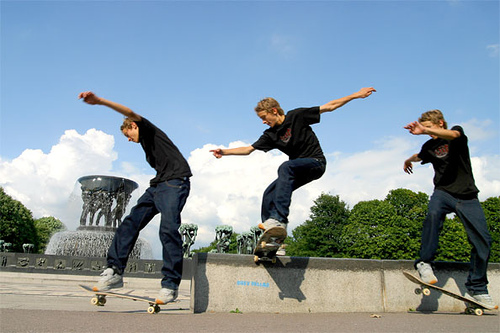
Skate-zo-phrenia-105.jpg

This is Skatezophrenia, from my Flickr stream. Click on it to see it bigger.

I keep telling people this, but if you manage to stay uninspired even after browsing Flickr’s Interesting in the last 7 days for half an hour, you may as well hang up your photographic spurs.

If you want to continue exploring, find the Flickr name of a photographer you admire (or one you’ve just discovered), and plug their name into the Flickr Scout tool from Big Huge Labs, sorting by Best Position – that’ll list a users ‘most interesting’ photos – a great way to get an introduction to a user’s most popular photographic work.

8. Try something new

Lamb of God at Sonisphere IPhotography generally comes in a ton of genres, and I bet you a lot of money that you’re not as conversant in all of them. So why not try to work on improving your work in one genre? For me personally, portraiture really clicked after I had done a load of animal and live band photography.

Not convinced? Well, then… Start a whacky project, like photographing only feet for a few days, or taking photos of toilet locks (see also). If that doesn't float your boat... Have you tried panoramas (see CleVR)? HDR (see our guide / HDR on Flickr)? Portraiture (see “Portraiture: Borrow their soul!” and Do It Yourself: Build A 1600W Studio Broadlight at Shutterbug)? Nude photography (see Renoux’ work and my own Nude photography 101: Photographing your girlfriend)?

How about macro photography (on Flickr)? Long exposure photography (on Flickr)? Photojournalistic photography? Astrophotography (on Flickr)? Street or candid photography (on Flickr, Wikipedia and Photo.net’s guide)? Paperazzi-style photography? Food photography (for all the icky tricks, read my article)? War photography (my modest contribution can be found in this Flickr set)?

Kite aerial photography? Lomography? Night photography? Infrared photography? The list is long, and this is only a small selection of ideas…

Surely, there’s one style or another where you feel that perhaps you could try it again, and improve a little?

Photo: Lamb of God at Sonisphere

9. Don’t take any photos

Perhaps if you don’t feel like taking photos, it means that you’re not ready to take any photos. Hey, it could happen.

Dig out your library, see if there’s any of your photos you’ve missed. Re-edit some photo sets. Re-upload some of your photos to Flickr, and see if you can’t get some inspiration from your old work.

10. Stop procrastinating

What are you doing reading these guides on the internet anyway? Grab your camera, get out there, do stuff. Stop moaning. No, seriously, outside. Or inside, for that matter. Just do it already!

11. Help your fellow photographers

Do you have something that breaks you out of a rotten spell of photography block every time? Or even just some of the time? Or perhaps just once? The tips above do it for me every time (especially 7, 5 and 2, to be honest, but I guess it’s more important to find something that works for you)… Go on, leave a comment and tell us how you broke your dry spell!

Hat tip to @karbassi on Twitter for the idea for this article!

Illustrative images in the news: unfair or acceptable practice?

Perusing my copy of the Guardian yesterday afternoon, my eye was caught by the Open Door column where the readers' editor addresses readers' suggestions, complaints, and concerns. Yesterday, Chris Elliott, said readers' editor, was responding to criticism of the use of generic photos to illustrate news stories. As it happens, it is hardly a condition restricted to the Guardian. Before the 'Your Letters' section of the BBC website was so cruelly snatched away from us earlier this year, someone would pipe up every time that 'Drunk Girl' was used to illustrate an article, usually pertaining to binge drinking. At the end of June this year the ever-insightful Liz Gerrard wrote about the endangerment to photojournalists by news publications through the persistent use of generic images.

Back with the Guardian, the dissatisfied reader had asked the question 'How many stories can be illustrated by the same picture?' before now without receiving a response, but had been riled again by the use of a photograph of Angela Merkel gesticulating towards David Cameron that was illustrating an article headlined 'GCHQ surveillance: Germany blasts UK over mass monitoring'. On closer reading, Angela Merkel hadn't come close to remonstrating with David Cameron over the issue; rather, the German justice minister had written to the UK justice secretary and home secretary about things. It was an old image hauled out to give life to the story.

Exactly how fair is this practice?

Elliott responded by stating there are rules to ensure that readers are not misled by the images attached to articles. Specifically: 'Photographs: digitally enhanced or altered images, montages and illustrations should be clearly labelled as such.' Well that's a relief to know. But what about the accuracy of an unadulterated image as it pertains to a story?

He also referred the complaint to a senior sub-editor who is responsible for web content. Her reply was that images are crucial for SEO purposes and all online stories should have one. As a consequence, the use of generic pictures and 'identification shots' to illustrate stories when there are no live images is quite common. Her comment on the image in question is a little perlexing, however: 'I would have thought that a picture of Cameron with Merkel, even if it wasn't live, would be a legitimate way of illustrating a story about the two of them (though [the reader's] complaint seems broader – that she wasn't involved as much as we suggested) – especially if the caption makes no claims it happened yesterday/today.'

So, was it or wasn't it a legitimate use of the image? The senior sub-editor doesn't address this directly. I'm inclined to agree with the reader: the link between the image and the article is too tenuous to be sustainable. But Roger Tooth, the Guardian's head of photography, has a different interpretation:

Surely the point is that an intelligent use of photography means that we don't have to be too slavishly literal. In the case of Cameron/Merkel they are symbols of, as well as leaders of, their respective countries. Pictures are very often used in the Guardian in an illustrative way.

There is something that rankles with me about this comment. Illustrative photography is entirely respectable in certain situations, for example feature articles, but when you're dealing with hard news stories, it's often the image that acts as the reader's lever into it. For this reason, there is a reasonable expectation of accuracy between the photo and the copy. It isn't just a case of luring eyeballs towards an article under less than faithful pretences, but also about conveying an accurate version of events, especially if people don't go on to read the entire piece.

With respect to the specific image mentioned by the Guardian reader, there's something disingenuous about its use because it suggests that the contretempts took place at the highest level when really it didn't. In this case, illustrative picture use doesn't do the story justice. On a more general level, the use of broad 'illustrative images' does little to support the integrity of news publications and even less for the straightened circumstances in which news photographers now find themselves.

Even if editors aren't deliberately manipulating the use of images to support copy, the continued, careless deployment of pictures is only eroding the validity of the press at a time when it can scarce afford to be blase. No, it isn't the most significant obstacle that the press faces right now, but it's one that does have an impact on the public perception of the journalistic craft. And it isn't a difficult fix.

Snapping pictures of pictures. Why?

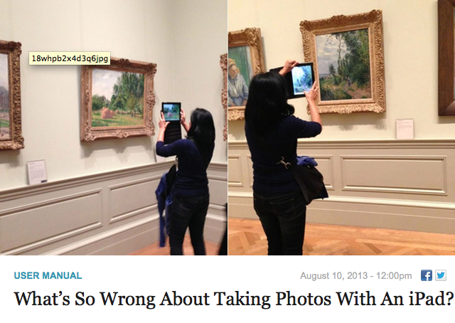
Over at Gizmodo on Saturday, they asked the question 'What's so wrong about taking photos with an iPad?' I've covered the 'using the iPad as a camera' issue before, so I'm not going to rehash it because that would be boring and actually it rather misses my point because what caught my eye was the image choice to illustrate the article. It was of a young woman using her iPad to photograph impressionist paintings in a gallery. This. This is something that I just do not understand. Not specifically using an iPad to photograph multi-layered, complex works of art, normally exhibited in carefully controlled environments, but photographing them at all. What's the obsession?

It wasn't just the Gizmodo article that got me thinking this; it's something that I've noticed before now in various galleries. Rather than taking time to absorb a piece, to let its colours and its story and its brushwork wash over you, people seem to be intent on looking at it through their three inch—or in the case of a tablet, slightly larger—screens, grabbing a quick photo and moving on from it. I cannot determine any pleasure in that I'm not certain how appreciative it is of the artist's skill and talent.

Stuff taking photos with an iPad; how does taking photos of works of art do them any justice at all?

When you have a Renoir worth millions hanging before you, you pay it the attention it demands and the respect it deserves. That doesn't come from a photo snapped hastily with a miniscule-sensored camera that you'll probably never actually look at again. Even if you do look at your snapshot again, it'll never be able to entrance and captivate you in the same way that the original can. I promise you, a pefectly lit, carefully composed medium format reproduction of a Guardi, a Stubbs, or a Fantin-Latour cannot, in any way, compare to the real thing. So don't think that your iPad-snap or point-and-shoot shot will. You're in a gallery to observe the art, why not do that?

It's almost as if people are taking photos to remind themselves that they've actually seen something, rather than really looking at it and being able to remember it for how glorious it is.

Yes, I suppose that people can waste their time and money photographing delicate, intricate pieces of art with cameras of varying quality in far-from-optimal lighting conditions, rather than gazing at it, enjoying it, and absorbing it if they want to. But can they damn well make sure that they do not stand directly in front it, obscuring my view, when I'm trying to do just that?

OJO Images joins the iStockphoto stable

Microstock megalith iStockphoto has announced that it's added another house to its stock photography village in the form of OJO Images. From today, all of OJO images 31,000 royalty-free files will be available exclusively through iStockphoto, which is in turn a part of Getty Images. They're expecting the number of files to increase to 45,000 by the end of October this year. Between its ever-expanding image archive and a new long-term pricing strategy, which prices half of its image library at half price, iStockphoto is claiming that acquiring content is now easier (and cheaper) than ever for those who need it. That's great for publications and companies, but not necessarily for photographers who sell their images as stock.

It isn't just iStockphoto that's owned by Getty; so are Jupiter Images, Thinkstock, Clipart.com, and Stock.XCHNG. As the centre of stock photography power gravitates closer and closer to Getty Images, we're drifting towards a situation that affords people who try to sell their images fewer options and fewer rights. The unpalatable Getty contract is one issue; so is the inability of smaller, more fairly priced stock houses competing against the image behemoth. Piled-high sold-cheap images from one of the biggest names in stock photography are easy for businesses in need of images to buy and use and harder for photographers to make a living by selling.

One man's tea is another man's poison, I suppose.

What are leading lines?

The Photocritic Photography Fundamentals magical mystery tour has reached 'l', for 'leading lines'. It's time to join these vital compositional tools in their seductive tango. Lines, they're important things. Train lines get you from A to B (occasionally via Z), cricketers are always looking to bowl good lines, and in photography they can make or break your images. Lines can be confrontational and restrictive, creating borders and boundaries, but they can also be alluring and sultry, drawing you into an image and not letting you go. These are 'leading lines' and they're powerful tools in your photographic arsenal.

There are, broadly speaking, four types of leading lines that you can introduce to your photos to give them depth and interest. There are both naturally occurring and man-made leading lines, and as a general rule, once you've seen one, you can't un-see it.

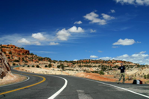
The first type of leading line is a path or roadway that creates a sense of depth in your photos. Parallel lines will naturally converge at a point owing to perspective, which means that any road will draw you into a photo and give you a sense of motion. These types of leading lines will make you feel as if you're going somewhere in your photo.

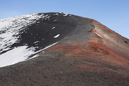
Etna ii

Next are leading lines that pull your eyes across the image and deposit you firmly at your subject. These lines don't have to be straight and they can be single or multiple, but they're just as effective as but more attractive than a neon sign flashing 'The subject is here!'

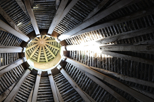
Dovecote

There are also lines that take you on a journey through an image, forming a narrative. These lines can be straight or curved as they lead you from one point to another.

Arizona 2003

Finally, look out for invisible lines that send the viewer from one point to another. If that sounds a bit elusive, think of people's eyelines. Humans are curious by nature and once we've made eye contact with someone, we'll automatically look to where she or he is looking, too. If your subject isn't looking directly at the camera, the viewer will follow her or his eyeline to see what's so interesting.

7

Roads and paths form obvious leading lines, but so do walls and fences, bridges and bricks. Nature's leading lines are formed from rivers, branches, stems, shorelines, and light and shadow. Lines don't have to be unbroken, but can be formed from several points, for example lamp posts or trees.

Once you start to use them, you realise what a powerful compositional feature they are, directing the eye, joining the dots, and completing the narrative.

TL;DR

  • Leading lines are a compositional tool used to bring interest to your image
  • They can add depth and perspective to a photo
  • They can direct the eye to the photo's subject
  • They can lead the viewer on a narrative journey through the image
  • They can be implied lines, for example sightlines
  • Leading lines can be created both naturally and by man-made objects

Key << Photography Fundamentals >> Macro