The First Amendment trumps privacy, rules New York judge in 'The Neighbors' lawsuit

In May I wrote about the controversial exhibition of photos by Arne Svenson, 'The Neighbors', hosted at the Julie Saul gallery in Chelsea, New York. If you didn't have the chance to read about it then, Svenson had stood in his flat and used a long lens to photograph the occupants of the glass-walled flats opposite his own. The residents of the Zinc Building met the images and the exhibition with a distinct sense of violation and some of them chose to pursue Svenson through the courts. One such case, presented by the Foster family, was presided over and has subsequently been dismissed by New York state Judge Judge Eileen A. Rakower. She has ruled that the photos were protected by the First Amendment and that the images were not in violation of New York's civil rights laws.

The Fosters had claimed that because the photos were available for sale, they constituted commercial use, which breached laws governing the use of people's likenesses commcercially without their consent. Judge Rakower, however, determined that the images were not used for commercial purposes as artists are at liberty to create and to sell works of art that resemble individuals without their consent.

In this instance, however, the primary purpose of the photos was artistic, and consequently the First Amendment trumps privacy. According to Judge Rakower: 'The value of artistic expression outweighs any sale that stems from the published photos.'

(Heds up to A Photo Editor and PDN)

Shutter Magazine's crumbled Chinese wall between editorial and advertising

Whenever I read a magazine—which I do, actual dead tree publications, usually involving food, I'm a sucker for food magazines—I always find myself skipping over the pages that are discreetly marked 'Advertisement' towards the top or the bottom of the page, but that look suspiciously similar to editorial content. I don't need the gushing exultations of PR people telling me how wonderful, life-changing, and revolutionary a product is; it's the publishing world's equivalent of the infomercial. I'm far more interested in a reviewer's impartial and honestly held opinions. That's rather the point of buying a magazine or subscribing to a blog. It sticks in the throat a bit when you realise that some publications are entirely prepared to, and will even solicit the exchange of money to run copy covering products that masquerades as a review. You read what people have to say because you trust them (or in some cases because they provide a cracking laugh), not because they've been paid by a manufacturer or developer to say it. You might expect that some review models or copies would have been provided gratis for the purposes of the review, but that goes with the territory.

The exchange of money is a slightly different prospect.

When the delineation between editorial and advertisement disappears, how do you trust what the publication says at all? Where does real end and the sunshine and rainbows existence of advertising executives start? My throat is currently jammed up like a beaver's dam because that's exactly what happened when Shutter Magazine approached Triggertrap to feature it as its 'Editor's Pick' for September.

For the fee of $2,000, Shutter Magazine was prepared to endorse Triggertrap's Flash Adapter as a monthly 'Editor's Pick', which would include a full page editorial review of the product, a hi-res image of it, and a video review hosted by Sal Cincotta, Shutter Magazine's publisher. I've taken a very close look at Shutter Magazine and nowhere do I see any previous 'Editor's Picks' labelled as advertisements or paid-for content. Furthermore, it was the publication's Advertising Sales person who made the approach, not the editor requesting a product for review.

Thinking this was rather disingenuous, Haje Jan Kamps (CEO of Triggertrap, publisher of Photocritic, and former editor of gadget website T3.com) probed a little further.
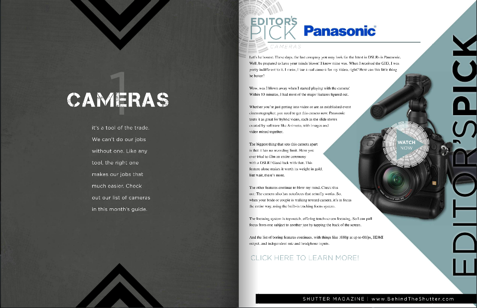
I can't see any kind of advertising disclaimer here. Can you?

Shutter Magazine claimed that the $2,000 fee was primarily to cover the video production costs (having looked at one of the videos, I reckon my grandmother could have done a better job in her living room, but what do I know?) but it would be possible to secure a half-page 'review', without a video, for $600.

'When I was an editor,' says Haje Jan Kamps, former editor of gadget website T3.com, 'running advertising as editorial on my website would have been completely unacceptable, and for good reason: It would completely have ruined the reputation of the site. The importance of the "Chinese wall" between editorial and advertising cannot be overstated. After all, who would trust any recommendations from a publication that sells its Editor's Picks to the highest bidder?'

That sums up the situation effectively: the integrity of any publication depends on its impartiality and for its readers to be able to determine what is genuine editorial content and what has been paid for. There's nothing intrinsically wrong with advertising - we'd be lying if we said we didn't want any here on Photocritic; bloggers have to eat, too - but it needs to be obvious and transparent.

We responded to Shutter Magazine's Advertising Sales person, highlighting that we found the practice distasteful and verging on the unethical, and requested a comment from the editor and the publisher. We're awaiting the director's comment, but Shutter Magazine has been keen to point out that the 'Editor's Picks' run in 'a separate section from our monthly magazine, and that we incur video costs. I also made it 100% clear that we're selective over our Picks as well.' Unfortunately, I cannot find any evidence of the 'Editor's Picks' being indicated to Shutter Magazine's readers as advertorial content, and I'm not convinced there's a world of difference between discerning back-handers or indiscriminate ones.

Kamps' opinion is perhaps even more strident than mine: 'It's entirely possible that this is just an over-zealous sales-man overstepping his mark, but in my mind, passing off paid-for content as editorial awards and editorial content is getting dangerously close to fraud.'

We understand publishing and we understand advertising. We wouldn't expect any publication to forego advertising revenue if that's what it needed to put out copy every issue. We just want to know where the fantasty ends and the reality begins and that when a journalist or writer says something, she or he really means it. Shutter Magazine, we're looking at you.

How many photos do we take?

According to a piece of research commissioned by SmugMug and conducted by pollsters YouGov, we manage to take a quite astonishing 600 million photos every week here in the UK. Ah-ha, 600 million pictures of kittens, puppies, kiddies, and sunsets. Wondering how they got to that figure? It goes like this.

  • The adults questioned for the survey gave the average number of photos they took each week at 19. That doesn't include holidays or special occasions.
  • There're 47,754,569 adults in the UK, 30% of whom do not take photos in an average week.
  • Seventy per cent of 47,754,569 do take photos. That's 33,428,198 people.
  • Multiply 33,428,198 people by 19 photos, and you get just over 635 million.

That's a lot of photos.

Roughly half of those photos are of people, about a fifth are landscapes, and a tenth are of pets and other animals. No one was brave enough to put a figure on how many of those portraits were selfies.

However, 56% of those questioned had lost images because of technical failure, theft, or even human error and almost three-in-ten didn't have a back-up routine of any description. That leaves me wondering, just how valued are images now? Are they becoming so ubiquitous that people aren't too bothered if a swathe of their photographic library suddenly disappeared into the cyber-abyss, or is it more a case that they've never stopped to consider what a catastrophic hard drive failure or a stolen phone might mean? These are slightly different prospects to the threat of fire or flood to printed photos.

The good news is that backing up your photos isn't that difficult and storage is cheap now, too!

Anyway, what do we think? Is 19 a fair number of photos a week? I'd totally skew the figures: I don't think that my potential response of 'Ehm... a few hundred last week,' really counts!

Learning by doing with the Bigshot DIY camera

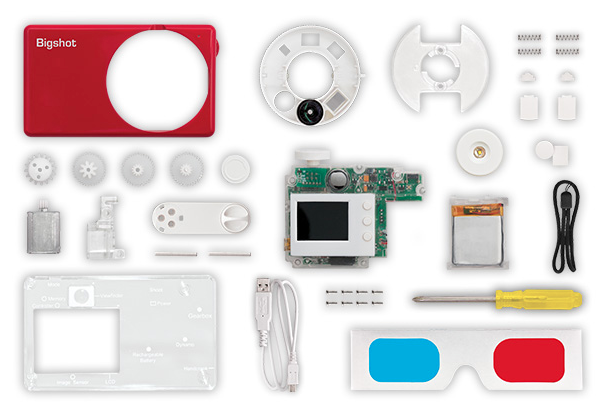
I've just stumbled across a magical photographic triumvirate: DIY, getting kids involved in photography, and education. It's called the Bigshot Camera: a self-assembly camera that teaches whomsoever is building it, whether aged eight or 108, about key science concepts in the process. It's a rather tasty science and creativity sandwich.

Bigshot in bits

The camera has to be assembled in a specific order, but there are detailed instructions on the website to make sure that you get it right. Even more importantly, as you work through each stage you have the opportunity to learn about the science underpinning it, from optics to mechanics via electromagnetism and electronics, and back again. When it's complete, you should have a fully functional camera with a rotating wheel that houses normal, wide-angle, and 3D-capable lenses. If the battery dies, you can crank it back into life yourself.

One of the motivating factors behind Bigshot is learning by doing, and inspiring young people to get involved with science and engineering. It's the sort of project that a parent (or auntie) can work on with their child (or niece... I'm looking at you, Eva), but there's plenty of support for teachers who want to incorporate it into their teaching plans, too. Each camera costs about $90, but Bigshot has an extensive outreach programme, Bigshot for Good, that aims to bring the project to less privileged children, wherever they are.

Bigshot assembled

From an idea that sprang to life in 2006, the Bigshot has been developed by Shree Nayar, a Professor of Computer Science at Columbia University. Along the way he has received research and design support from students led by Guru Krishnan and Brian Smith and funding support from a Google research award and an ONR Instrumentation Grant. Nayar founded Kimera, a social venture aimed at bringing the Bigshot to children and teachers the world over, in 2011. And from this month you can go ahead and order yourself one from the Bigshot website.

As for future plans, the Bigshot team is exploring two potential avenues: to continue to deepen the Bigshot camera experience by developing new features and enhancing the learning platform, or to develop other gadgets that lend themselves to the Bigshot concept of building, learning, and using.

The Bigshot website is well worth a wander: it's a veritable hive of knowledge and information, whether or not you want to buy a camera. Me? I'm totally in the queue for when they start shipping beyond North America!

Faceifi lets you identify people using photos

'Why can't I find out more about somebody from just a photograph?' That was the question that started Faceifi, which is a bit like a social directory where you identify people using images of them rather than by name. That makes it an actual, digital facebook, I suppose. The theory goes Faceifi helps you to control your online identity. You create a Facifi profile by uploading at least five photos of yourself and providing a link that tells people more about you. The link can direct to Facebook, Twitter, a blog, or anywhere you like. Using the Faceifi database anyone can search for you, either by looking for your image or by using a photo of you that they have, and then find out more about you from your link. Yep, if you have a Faceifi profile and someone snaps a picture of you on the Tube, they can find out whatever you've chosen to share. And that's not creepy. At all.

Right now, Faceifi has a desktop and an iOS interface, with an Android version in the works. It's also planning on expanding what users can share, for example with a short biography, and introducing in-app messaging. But it doesn't have very many users, which means that at present you're unlikely to find the person for whom you're searching. That has the potential to change as and when more people sign up to Faceifi, but will they?

I can't say that I'll be signing up for Facifi anytime soon. Sometimes, I rather appreciate being nothing more than a face in the crowd.

What do you think? Useful, or just a bit over-indulgent?

(Headsup to The Next Web)

Nikon's Photo Contest 2012-2013 winners

In a year with a record number of entries—99,339, from 153 different countries and territories—Nikon has announced the winners of its Photo Contest 2012-2013. Understandably, the competition was very definitely Nikon-oriented, with one of its four categories dedicated to the motion snapshot function found in Nikon 1 series cameras (that's the Harry Potter-esque feature that combines stills and video) and a special award for the best photo taken with a NIKKOR lens.

There were three other categories: single photo, photo story comprising a series of two to five images, and a photographic video up to 45 seconds in length.

The judges selected their grand prize winner from a total of 48 first, second, and third placed entries made from the photo, photo story, and photographic video cateogies and three winners from the motion snapshot category. They were looking for the photographer's ability to tell a universal story, diversity, the strength of their message, creativity, and the techniques used.

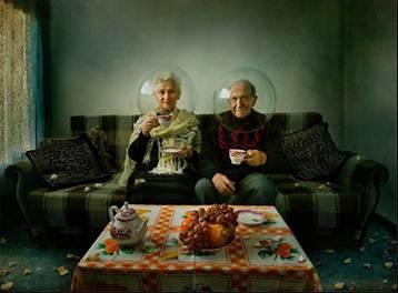
Elegy of Autumn, by Dina Bova

The Grand Prize was awarded to Dina Bova for her Elegy of Autumn. Chris Rainer, one of the judges, said of it: 'Our Judges loved this image. It tells so many stories. It is at once traditional and respecting of the elders set in a classic living room, yet whimsical with the reference to space travel. It points to our future while honoring our past.'

The winning images will be exhibited in Tokyo from August to September and Osaka between September and October this year.

What is key?

This week's Photography Fundamentals issue looks at key. Key is an element of the photography canon that crosses over with other artistic disciplines, most notably music and painting. I'm the least musically-talented person known to man, but even I manage to spot the similarities.

When we talk about the 'key' of an image we're talking about the range of tones or brightness that it comprises. Primarily we use it when we're describing images as being either 'high-key' or 'low-key', which are at the extremes of the range of brightness—light or dark respectively—and the feelings that these images convey. However, 'high-key' and 'low-key' can also be used to describe lighting set-ups, not just a style of photo.

High-key

High-key images are light and bright, either with upbeat and positive connotations or with dream-like, ethereal qualities. They will be low on contrast with very few, if no, shadows. If you look at a high-key image's histogram, it will exist mostly in the right half of the graph, with just about all of its pixels pushed above middle-grey and into the near-whites and whites.

The intensity of colours begins to fade as brightness increases, which means that high-key images are frequently black and white. If they are in colour, they tend towards pastels in tone. Or they could be the classic white-on-white.

Lily

It's easy to think of high-images as being 'just over-exposed', but getting them right is a bit more complicated than simply setting some positive exposure compensation. To achieve a good high-key image you need to bathe your subject in even light and keep everything about the image on the pale side. Unless you have deliberately blown-out the background to get it bright white, and with the exception of specular highlights, there will still be detail across the image.

I like to think of high-key images as the photographic equivalent of reading Jane Austen, but you can pick your own literary metaphor. Music-wise, it'd be a song composed in the major key.

Low-key

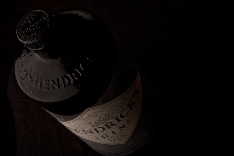
Low-key images evoke feelings that might be sombre or miserable, or even fearful or threatening. Like high-key images, they're low on contrast, but this time they are predominantly dark or black in tone and their histograms are clustered towards the left-hand side of the graph.

Hendricks

Anything that needs to be portrayed with a sense of impending doom is perfect low-key material. Just as high-key images aren't all about over-exposure, low-key images aren't focused on grisly under-exposure. There will still be detail in the shadows. If you don't want to be too purist about how your histograms look, having the odd bright area can strenghten the feel of a low-key image by re-inforcing just how dark the shadows are.

If you want a literary comparison, think gothic horror novels, or the minor-key for a musical equivalent.

High-key and low-key lighting

Cinematically, high-key or low-key lighting means something quite specific. High-key lighting has a low key-light to fill-light ratio that produces evenly lit scenes that are practically shadow-free. Low-key lighting, on the other hand, has a high key-light to fill-light ratio (yes, it's counter-intuitve) that creates pools of light and harsh shadows.

TL;DR

  • Key refers to overall tone of an image
  • High-key images are light and bright with a general sense of positivity
  • Low-key images are dark, brooding, and can even feel menacing
  • Although high-key and low-key images rely on technical over- or under-exposure to achieve them, this is controlled and does not negate details in the highlights or shadows respectively

ISO << Photography Fundamentals >> Leading lines

When Rihanna sued Topshop over a t-shirt

Topshop, the clothing emporium that was some kind of mecca for my friends when we were teenagers but never, ever had clothes to fit me, has just lost a multi-million pound court case to Rihanna, who accused it of 'passing off' a t-shirt with her mug on the front of it.

The t-shirt in question was a square-cut sleeveless jobby called the 'Rihanna Tank' by Topshop and it featured an image of her with her hair piled on top of her head. The original photo was shot during the video shoot for We Found Love. Yes, that's right, it was taken during 'that' shoot when a Northern Irish farmer politely told her to put on some more clothes if she wanted to film on his land. (What a contentious song it have proved to be.) Topshop then licensed it from the photographer, printed it on a bundle of t-shirts without Rinhanna's approval, and found themselves with a hefty legal bill.

There doesn't seem to have been any issue about the actual photo, just the way that Topshop used it. So what was the problem? To be proved as 'passing off,' the accusation needs to stand three tests:

  1. The claimant (in this case Rihanna) needs to have established a reputation (she's got one of those)
  2. The defendant (here, Topshop) needs to have misled the public (that is, caused them to think Rihanna endorsed the t-shirt)
  3. Some form of 'damage' (in this case to Rihanna's reputation) needs to have occurred.

The judge, Mr Justice Birss, thought that Topshop was responsible for passing off. However, he was quite clear that there is 'no such thing as a general right by a famous person to control the reproduction of their image' and that the photo didn't breach Rihanna's privacy.

My not-legally-trained and using-common-sense reading of the judgement is that the image Topshop used was too similar to the images that appeared on the album artwork for Talk that Talk. As a consequence some poor misguided souls who actually want to go around wearing a t-shirt with a picture of Rihanna on it might have bought it thinking that she had some how approved it and it was potentially related to the album.

With respect to Rihanna, the judge ruled that this could be deemed damaging to her 'goodwill' and reputation in the fashion spehere. Obviously Rihanna needs to protect her reputation in the fashion sphere now that she has endorsed a range of clothes at Topshop-rival River Island. Make sense now?

Do we have to start worrying about people suing the pants off of photographers in an attempt to protect their images? Probably not yet. The judge was quite clear about that.

Headsup to the BBC and the Guardian

Review: Think Tank's Streetwalker Pro camera bag

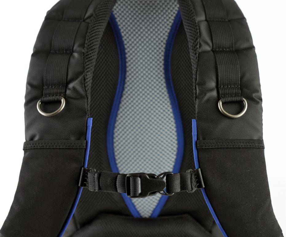
When Think Tank offered me the chance to spend some time schlepping around my gear in one of their bags to see how it (and I) fared, of course I said yes. Legions rave about their bags and I wanted to give one a go for myself. So I opted for a Streetwalker Pro (the name does have dodgy connotations, I know) and it and my photographic impedimenta have been inseperable since its arrival.

Feature-StreetWalker-Pro-15

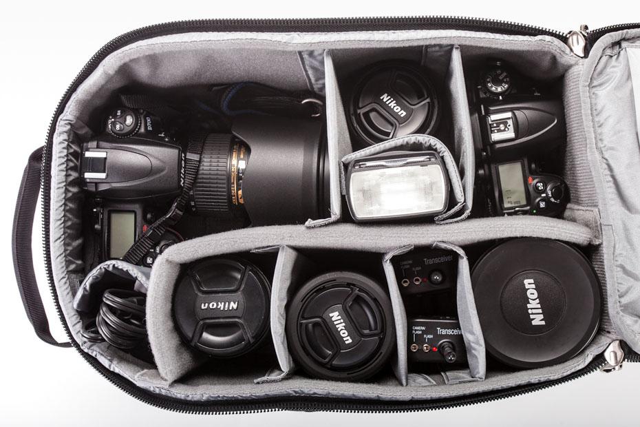
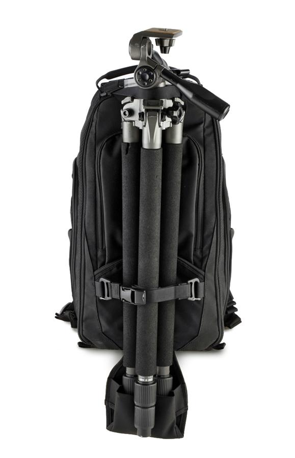
The Streetwalker Pro is intended for use on the move—days out and expeditions when you'll want a goodly selection of gear—but not necessarily travel. There's no laptop compartment in the Streetwalker Pro; for one of those, you'll need to look to its slightly larger companion, the Streetwalker Pro Harddrive. When I say I goodly selection of gear, I really mean it. This bag is a veritable TARDIS. It comfortably holds a full-frame body, a 70-200mm, and between two and four other lenses. You can play divider Tetris and get flashes, cables, remote releases, and all sorts in there, too. It has more pockets than I know what to do with. There's a tripod carrying-system. And it comes with a waterproof cover. If I were to fill it completely, I'd probably not be able to pick it up.

Feature-StreetWalker-Pro-12

It's also a taller, narrower bag than your average camera bag. For little me, this is a huge boon. I often find myself waddling about beset by a bag that makes me twice as broad as I am normally, which screws with my spatial awareness, particularly when in crowded places. It's plenty comfortable with well-padded straps. The internal padding leaves your gear feeling secure and the build quality means that you don't fear the bag faling apart on you.

StreetWalker-Pro-9

As it's a day-out-taking-photos-bag, having somewhere to put a sweater would be useful, but there's that much space in the bag you could probably stuff it in and not worry too much. If some of the pockets expanded a little more, that would be useful. My biggest concern, however, was that I found I needed to set it down every time that I wanted to open it up, particularly if what I wanted was towards the bottom of the bag. Other people might not find this so problematic, but I'd appreciate some easy-access zips.

At $190, the Streetwalker Pro is a good bag, but it isn't perfect. My quest for the perfect camera bag continues!

8 tips for better Smartphone photographs


Taken with an iPhone 4

Forgive me for stating the obvious: You get much better photos with a camera than without one. So, whilst I would much rather always be taking photos with SLR body with a sharp Prime lens, the truth of the matter is that you'll sometimes come across moments where you're just bursting to take a photo - and you may not have a 'real' camera handy.

If you're a hard-core photographer, you'll probably have a reasonably recent smart-phone. Great news: The phone comes with a surprisingly capable camera built-in.

It's not without limitations, of course, but here's eight tips to get the most out of your mobile phone snaps...

1) Clean your lens

Mobile phones are usually subjected to all sorts of abuse. Mine lives in my hand and my pocket; neither of which is the greatest environment for a clean lens.

Fingerprints, grease, or pocket fluff are the #1 reason for rubbish smart-phone photos, so check it, and clean it before shooting!

2) Shine a light

Modern mobile phones often come with impressive ISO ranges so you can take photos even in low light; but that doesn't mean you should: The small sensor size introduces a lot of noise, which isn't very nice, and certainly isn't conducive to awesome snaps.

Turn up the lights in the room, or go outside in daylight for the best photos.

3) Rez it up

If your camera has several settings, use 'em! As a general rule, the higher the resolution of your mobile camera, the clearer your photographs will be.

Bear in mind, though, that the higher the resolution of your photo, the larger its file size will be, so if you're e-mailing them, try to make them smaller before you kill your grandma's 28.8 kbit/s modem.

4) Nix the digi-zoom

Using digital zoom to zero in on your subject is fun if you want to use your mobile phone instead of binoculars, but it ain't much good if you're wanting to take photos. For photography, keep it zoomed all the way out, and crop the images later instead.

5) Steady now

When taking photographs, the more steady your camera is, the clearer your picture will be. Simples. If you can, lean your elbows on a sturdy surface, or place the phone against a lamp-post or similar for extra crispness.

6) Don't lose your (white) balance

If your mobile phone has the option of adjusting the camera using white balance, go ahead and experiment how the different settings impact on your photographs.

7) Get closer. No, even closer

To avoid having to zoom in or crop your shots later, ensure that your subject fills your viewfinder.

8) Sprinkle some editing magic

Even though your phone may have built-in editing features out of the box, consider editing them with a separate app instead.

For the iPhone, my favourite editing apps are Snapseed and Photoshop Express - Try 'em out, and use the filters and editing tools to add a bit of sizzle.

Got that? Great. Now go snap some photos you're proud of. Oh, and post them in the comments, I'd love to see what you guys come up with!

Five more Fujifilm films discontinued

Fujifilm has been gradually scaling back its film production as demand declines, so it doesn't really come as much of a shock when it announces that more of its range has been cut. Today, five types of film—two 35mm format and three 120mm format—are being discontinued. Gone are:

  • Fujifilm Neopan 400 35mm black and white film
  • Fujichrome Provia 400X 35mm and 120 colour transparency film
  • Fujifilm Superia 400 120 medium format colour negative film
  • Fujifilm Reala 120 medium format colour negative film

Apart from stocking up on supplies while they remain, Fujifilm is recommending the following substitutions:

  • Neopan ACROS 100 for Neopan 400
  • Provia 100F for Provia 400X
  • FUJICOLOR PRO 400H 120 medium format colour negative film for both Superia 400 120and Reala 120 films

Gabriel Da Costa, Fujifilm's product manager for professional film, thanked all of their customers who have supported these film brands over the years. I wonder for how much longer he and his team will be doing their jobs?

iblazr, a synched flash for smartphones, is looking for Kickstarter support

Most of the time when I'm taking photos with my iPhone I accept it for what it is and try my best to work within its limitations; it's far from my primary camera so it's not that much of a bother. However, I do get frustrated with its dismal low-light performance and glarey flash. So when I saw this Kickstarter project for a synchronised flash for smartphones and tablets, I sat up and took notice. It's called the iblazr and its the brainchild of a Ukrainian team of developers and designers.

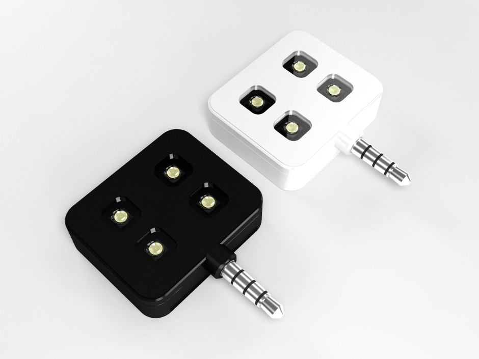
Black and White

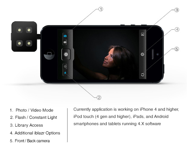
The iblazr synchs with a smartphone or tablet via its headphone jack and is compatible with both the front- and rear-facing cameras. It charges via a USB cable and is good for about 1,000 flashes or 40 minutes of continuous light. Its functionality, including a choice of stills or video mode and adjustable brightness, is controlled via the free iblazr app.

Screen Shot 2013-07-26 at 15.56.19

If you want some off-camera flash action, you can hook it up using a headphone extension cable and you can even have a dual flash with a headphone splitter.

You can watch the video to learn a bit more:

The project needs to hit $58,000 to reach its goal; it's already on $26,000 with 39 days still to go. If you put $39 into the project, you can choose between a black or a white iblazr as a reward. For people who are serious about their smartphoneography, it seems a reasonable proposition.

Tried the BJP iPad app? They've made a video to show you what you're missing

The British Journal of Photography has been around since 1854 and has evolved from a weekly to a monthly magazine with a website and a fairly-recently launched iPad app. The journal definitely works to keep itself relevant on all platforms so if you've not tried out the iPad app, they've just released a video to show you what you're missing. (Assuming that you have an iPad, of course.)

The BJP app brings readers the highlights of the monthly print editions, as well as iPad-extra features, photos, and multi-media content, every quarter. BJPOnline can be accessed from the app and there are the usual sharing options for articles. The moving image cover was created by Reed+Rader. Where the iPad app probably stands out the most, however, is in its ability to cover motion picture news and features in a way that a print magazine can't.

The shell app is free to download and there's an entire range of subscription options to meet your needs.

Don't install that newest Fuji X-Pro1 firmware upgrade!

If you haven't already done so, definitely do not install version 3.0 of the firmware that was released for Fujifilm's X-Pro1 on 23 July 2013. Fujifilm has pulled the update and announced that there is a malfunction when it comes to recording videos with the new firmware. If you have already installed the upgrade, contact Fujifilm's customer services and they will advise you on the best course of action.

In the UK, the number that you need is 0844 553 2322, or you can email fujitec@fuji.co.uk. Non-UK people can find their relevant contacts here.

Fujifilm is working on a replacement firmware upgrade, but there's no word on when that'll be available.

Want a Poppy iPhone-to-3D-camera device? Get in quick!

Poppy, the Kickstarter project that allows you to turn your iPhone into a 3D camera, will hit its Kickstarter deadline at 10:50 EDT on 26 July 2013. Now whilst the project reached its funding goal within a remarkable nine hours of going live and is sitting pretty with over $175,000 pledged to the cause, if you want a Poppy and haven't made a pledge already, you probably should. For a $49 donation (plus shipping fees), you'll be first in line for a black Poppy; a $59 pledge (plus the shipping fees) gets you a white version. Wait until Poppy is in full production and you'll have to pay at least $69, plus the shipping fees, and you'll be behind the Kickstarter backers in the queue.

Want? Head over to Poppy's Kickstarter page before the deadline.

What is ISO?

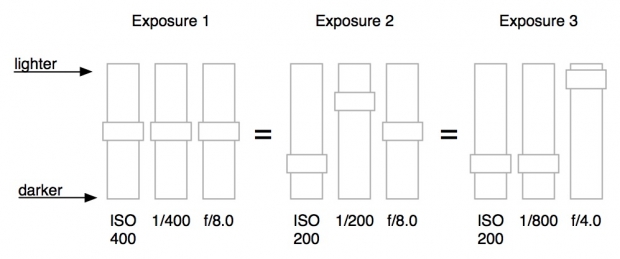
We know that exposure is controlled by the holy triumvirate of shutter speed, aperture, and ISO. You give with one and take with another until the light hitting your sensor is just right for the image that you want. We also know that whilst these guardians of our sensors have practical applications, they can be creative. Aperture has already been cross-examined in our Photography Fundamentals series; this week it's the turn of ISO.

Sensitivity to light

Once upon a time, in days of old, when we shot on film and had to fend off dragons simultaneously, we also had to choose the ISO of our film when we bought it. 100? 200? 400? Huh? Now it's just a button on our cameras and we can change it every shot. But that doesn't mean that ISO is any less significant now than it was then. In fact, changes to ISO have been one of the major breakthroughs in modern photographic technology.

Back in those old film days, ISO referred to how sensitive a film was to light. Depending on the conditions that you thought you'd be shooting in primarily, you'd have to select the ISO of your film and be done with. (If you want to really geek out on ISO trivia, Haje has you covered.) Now you can push a button and see it increase from roughly 100 to anything as high as 102,400 (but that's extreme). That's a lot of numbers but they still mean the same thing: it's how sensitive your sensor is to light. (Or, technically, how much the signal from each pixel on your sensor is amplified.)

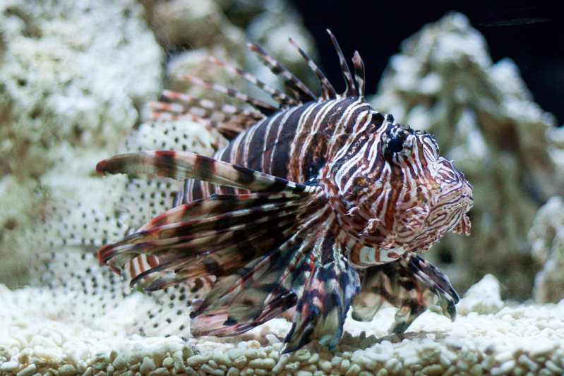
Flash in an aquarium? Bad plan. ISO 800? Gets the shot!

The higher the number, the greater the sensitivity to light.

Low vs High

The general rule is that the brighter the conditions, the lower you want your ISO to be. As conditions become dimmer, you can increase sensitivity to help you get a good exposure. However, even if it's a low-light situation, you still want your ISO to be as low as possible.

There's a trade-off, you see. As you increase sensitivity, you also increase the tendency towards digital noise, or the graininess you see in some photos. Now we do have a full Photography Fundamental on noise lined up for you but the low-down is that too much noise can make images look poor. It's best to avoid too much of it.

Whilst too much noise does give me a headache, I'm more than prepared to sacrifice a bit of image quality in order to secure my shot. Yes, I'll take a smidge of noise over motion blur almost any day. (Unless I really want motion blur, that is.)

Yes, it is a bit noisy, but I'd rather the noise than no photo

Which ISO to use

Well, seeing as ISO forms part of the mighty triumvirate with aperture and shutter speed, you'll need to consider those in order to get the exposure that you desire. But do stick with the rule I mentioned earlier: as low as you can get away with.

Equivalent exposures

It's really easy to leave your camera to automatically select the ISO for your shots, but it is a really useful tool. And the more control that you take over your own images, the better. Don't just concentrate on aperture and shutter speed.

TL;DR

  • ISO refers to the sensitivity to light of film or the digital camera's sensor.
  • The higher the number, the greater the sensitivity.
  • A low ISO generally offers the best image quality, and great for brightly lit situations.
  • A high ISO setting may be required to capture images in low light situations, but can cause noise to show up in your photos

Histograms << Photography Fundamentals >> Key

Planned Flickr downtime

Flickr will be having a period downtime for site maintenance from 16:00 to 22:00 PDT on Thursday 25 July. (You can see what time that'll be for you if you're not in san Francisco, here.) There won't be any web or mobile access for the duration and neither will you be able to reach the API. A site-wide notice will go up an hour beforehand to make sure that you're in the process of uploading all of your photos from your safari trip when they pull the plug.

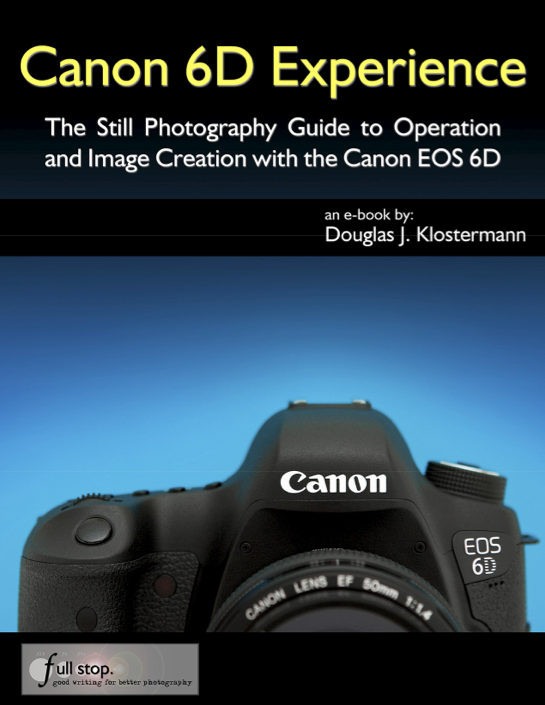
Book review: The Canon 6D Experience

Screen Shot 2013-07-23 at 16.33.28 The Canon 6D Experience is part of Douglas J. Klostermann's series of e-book guides to Canon's and Nikon's dSLRs. There are ten Canon books and five Nikon books, ranging in price from $7.99 for guides to the oldest models of camera to $14.99 for the latest cameras. I've been taking a flick through it and seeing how it fits in with my use of my Canon 6D.
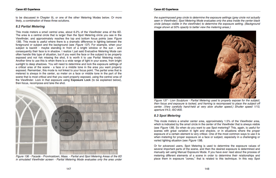
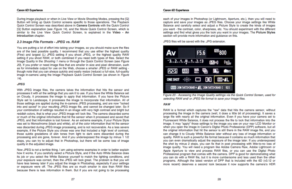
The best way to describe the Canon 6D Experience is as an augmented instruction manual. It doesn't just explain what a function is and how to operate it, but what effect or impact it will have on your photography. It shows you how to expose and re-compose your images, provides examples of different apertures and ISOs, and explains about metering. It covers a great many of the functions that I never use in my camera because I almost always shoot in Raw and almost never venture into liveview mode. Towards the end of the book it moves away from the camera itself and covers composition and discusses lenses.

Diagrams and pictures to explain metering

This, then, is perhaps where this book falls down, or falls between two stools. For someone new to dSLRs and still finding their way in photography, would they be starting out with a 6D? In the book's introduction it says: 'If you are relatively new to dSLR photography and are still in the process of learning all the controls of a dSLR and the exposure concepts of digital photography, you have perhaps ventured towards the proverbial deep end of the pool by choosing the advanced 6D!' Of course there will be some beginners who've gone straight for the 6D, but they're not the camera's intended market. This guide will suit them well, but I'm not sure how many will be needing it.

Not sure that we need a look at Raw vs JPEG for a 6D user?

For anyone who's comfortable with Canon cameras and is a competent photographer, a lot of the book's content is superfluous. It isn't that there isn't useful material in there, but that it's buried amongst the information we already know. Having a smaller, more dense publication that looks at the high level functions of the camera and compares it with other models might be more useful.

All of this leads me to think that if the books in this series that cover the lower specced models are written with the same attention to detail, they would be extremely valuable guides for people finding their way in dSLR photography.

On a very picky production level, I would have liked to have seen references to other chapters in the book numbered, or even hyper-linked. It is an ebook, after all. That would have made navigation a great deal easier.

My verdict, then? At $14.99 I can't really recommend the Canon 6D Experience; I just don't think it offers enough to kind of photographer who'd be using this camera. (Unless you really have thrown yourself in at the deep end.) If you're newer to photography and have a Nikon D5200 or a Canon 700D, for example, do check out the other books!

The Canon 6D Experience, by Douglas J. Klostermann, published by full stop and available for download from Dojoklo.

Metroprint launches Instragram print app

Photo 22-07-2013 09 44 00 When Metroprint, a British-based photographic print service, launched its Instagram print service in November last year, I did rather haul it over the coals. For a start, when I first gave it a go, I couldn't order prints direct from my smartphone, but had used a desktop interface, and when this piece of bad design or flawed planning was finally rectified, the interface sucked. I was far from impressed. You can probably tell from my article.
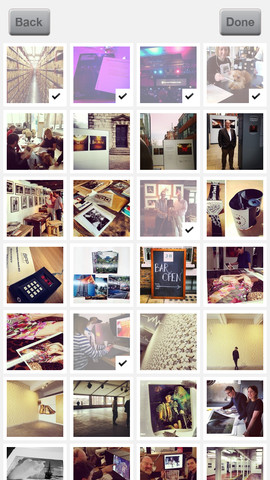
Anyway, eight months on and Metroprint has announced that it might just about have caught up with the times. Perhaps they even took notice of an email that I sent to them and I'm sure a good few other people might've told them something similar. There is now a Metroprint Instagram print app.

I downloaded it straight away (that bit's free).

metroprint 2First impressions are indeed favourable. You hook up with Instagram from the app, select the images you'd like printed, opt for glossy or matt, upload the images, and pay via Paypal. Prints are 42p each. UK delivery is £2.65, European delivery costs £5, and anywhere else in the world is £5.50. You would, therefore, do well to bulk order as it's a little pricey for a single 5×5 print.

From iOS you can also choose images from your camera roll and Metroprint are planning on more features soon.

If I do decide to get a print, I'll let you know what they're like. Otherwise, you can download the app from Apple's App Store or Google Play.

The Photo Man - a trader in found photos

Mark Kologi buys and sells found photographs. If not millions, then many thousands of old pictures have passed through his hands over the years. Forgotten bits of people's lives move from one place to another, one life to another. He speaks about his trade, and whether or not he takes liberties with people's lives, in this video made by Ben Kitnick and Saxon Richardson.

The Photo Man from Ben Kitnick on Vimeo.

As someone who has pondered the fate of old photographs, in my possession but not taken by me, his musing that it's better they find new homes rather than be binned struck a chord. I do wonder how I might feel if I found a photo I'd taken, or a photo of me or someone I know, amongst his stock. You?

(And remember, don't use a found photo for commercial purposes, you could end up in a Vampire Weekend of trouble.)