What is a histogram?

H is for histogram! This week's Photography Fundamentals installment explains the graph that you can draw up on your camera for each image, or appears in the top right corner of your workspace in Lightroom or Photoshop. What does it depict and how is it useful?

It's a graph

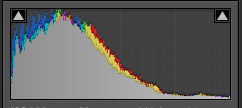
A histogram is a graph that shows the tonal range, or the distribution of brightness, of an image's pixels. On its X-axis it runs from black to white, 0 to 255. On its Y-axis it charts the number of pixels at any brightness value.

Screen Shot 2013-07-17 at 17.21.13

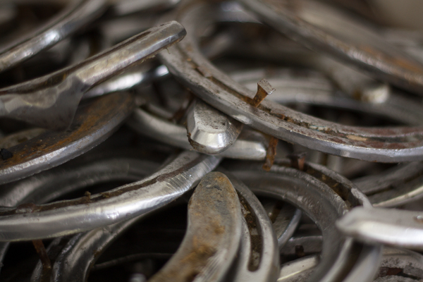
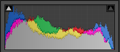
Lots towards the left, but a few specular highlights, too

By looking at a histogram you'll have a feel for the exposure of an image. If the majority of the pixels are sitting in the left-hand side of the histogram, the image will have a lot of darker tones. An image with plenty of bright tones will have a histogram that's predominantly situated in the right-hand side.

A perfect histogram?

There's no such thing as a perfect histogram. Instead, you need to use it as a tool to help you judge if you've exposed your image how you want it exposed. Sure, if your image has a histogram that's concentrated towards the left, it might be under-exposed. It might also be a low-key image with predominantly dark tones.

However, the majority of images will have histograms that peak around the centre, in the mid-tones, but taper out towards the blacks and the whites.

Screen Shot 2013-07-17 at 18.52.27

A broad sweep from left to right

If you've any 'blown highlights' or catasrophically over-exposed pixels that are pure white and don't contain any detail, you'll see those peaking right up against the right-hand side. These are sometimes called 'clipped highlights'. You can expect to see some if you've the sun in the frame, or specular reflections on water or metal, so don't think that they're always a bad thing!

And contrast?

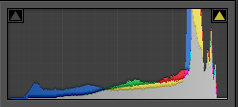
Histograms also indicate the contrast found in a scene, too. A narrow peak will mean a lower contrast image; a broader peak is indicative of an image with high contrast.

Screen Shot 2013-07-17 at 18.44.17

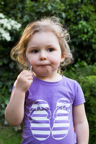
A narrow peak towards the right hand side - lots of brights and not much contrast

Where to find a histogram

All dSLRs and EVIL cameras will have a histogram included in their menu functions; higher end compacts often have them, too. On my Canon it's just a case of viewing an image in playback and then hitting the Info button twice.

When you're editing, the histogram is usually in the top right corner of your screen, but it will depend on your programme, obviously.

TL;DR

  • A histogram is a graph displaying the distributon in brightness of an image's pixels
  • There's no 'perfect' histogram; they're tools to help you assess exposure and contrast in an image
  • Darker images will have histograms with data concentrated towards the left hand side of the graph
  • Brighter images will have histograms with data concentrated towards the graph's right hand side
  • High contrast images will have broad peaks in their histograms; low contrast images will have narrower peak

Golden hour << Photography Fundamentals >> ISO

Photographing people who wear glasses

My brother has worn glasses full time for absolutely years, which has meant that I learned how to photograph him wearing them to avoid hideous green glare rather intuitively. I probably did have to think about it at some point, but I don't really remember and now I just seem to do it. That was until this week, when one of the students at Photocritic Photography School piped up and asked me what he should do when he has a portrait subject who wears glasses. For lots of reasons, the answer is never 'Ask your subject to remove them,' so what do you do?

Look at the light

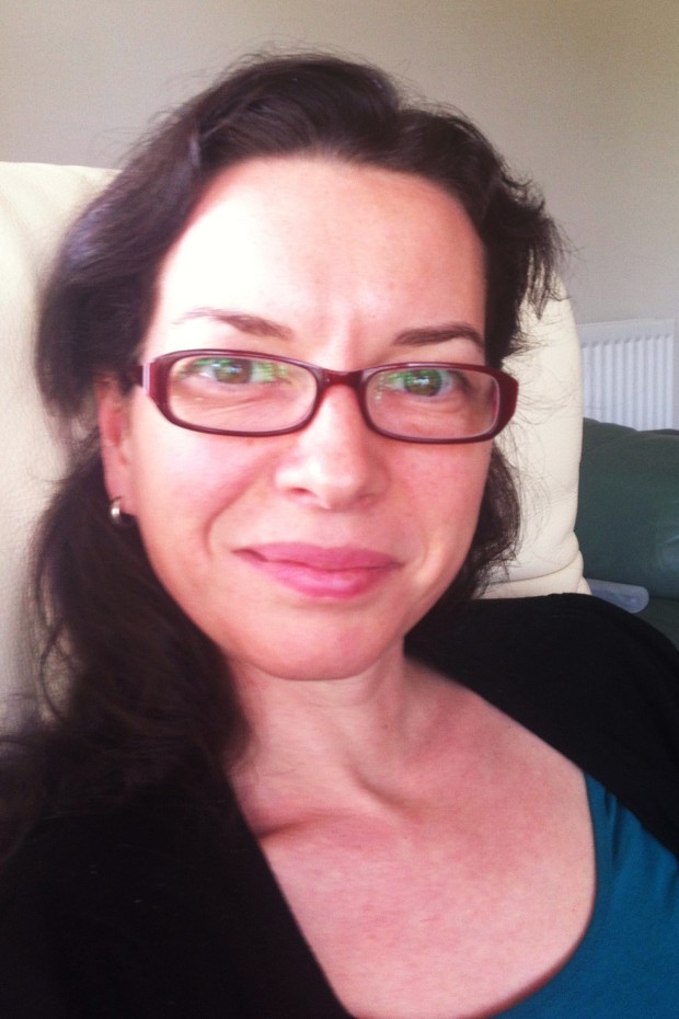
Me and some wonderful green glare, taken with an iPhone

The most obvious problem that glasses will present to you is that they reflect light. Instead of seeing straight through spectacles' lenses and into your subject's eyes, you'll have a unpleasant, usually green-tinged, reflection glaring back at you.

Going back to GCSE physics, we know that the angle of incidence (or the angle at which light will hit someone's glasses) is equal to the angle of reflection (or the angle at which the light will bounce back off the glasses). If light is coming in at an angle of 31° to the normal of your subject's glasses, it'll bounce off at 31° on the other side of the normal*. There's a helpful diagram here.

Consequently, if your light source is too close to your camera the light has a much greater chance of bouncing straight off your subject's spectacles and into your camera's lens. And if the light is coming from straight behind the camera and your subject is looking straight back at the camera, you haven't got a cat's chance in hell. But the upshot is: know where your light is coming from.

* The normal is an imaginary line running perpendicular to the plane of the glasses.

Altering angles

Minimising glare is easiest by one of three means:

  • move your light source
  • move your subject
  • or move your camera

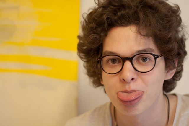
Pokey-out tongue copy

By shifting your light source or yourself, you can alter either the angle of incidence, and therefore reflection, or take your camera out of the firing line. Sometimes, though, your light source can't be shifted (say, when it's the sun) and you moving might not be an option. Then it's down to your subject.

Tilting and turning

If your subject tilts her or his head downwards, just by a few degrees, not by much, it'll be sufficient to adjust the angle of the light and prevent a reflection bouncing back into the camera lens. Or she or he could turn fractionally away from the light source; not enough to wreak havoc with your shadows, but enough to prevent that horrible glare.

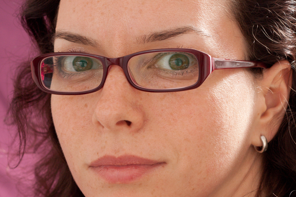
Me, angled away from the light

When you ask subjects to tilt their heads or change the angle of their shoulders, you might find that their spectacle frames begin to encroach into the view of eye. At this point it becomes a trade-off between reflection obfuscation and frame obfuscation. You need to decide where your tipping point is.

Quit posing

If you opt for more candid shots, you'll be able to capture your subjects looking away or looking down and doing it naturally but still without any nasty reflections.

Downward tilt, candidly snapped.

Go with it

Sometimes, you just have say that the glare is there and it's better to have a photo with a reflection than no photo at all!

Infinite iPhone colour manipulation with ColorTime

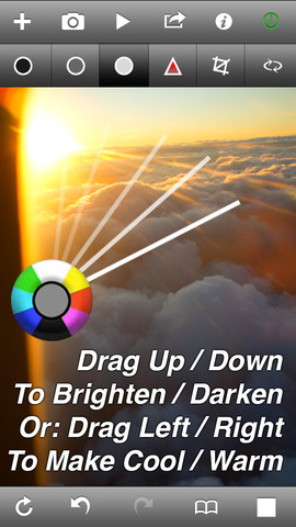
When it comes to smartphone photography my default editing app is Snapseed. It does just about everything that I want in an app that I use on a device with a screen that's the size of the palm of my hand and it's intuitve. Sometimes, however, I find myself looking for a bit more control, the ability to adjust shadows, highlights, and midtones independently, or a white balance correction that is more fine-tuned. I've found it. It's called ColorTime. mzl.ncemfpho.320x480-75

ColorTime allows you to select between shadows, mid-tones, highlights, and saturation, adjusting the intensity on a colourwheel. Dragging up adds white or brightens the image; swiping your finger downwards introduces darker tones; and then you can increase warmer tones by swiping to the right and cooler colours by swiping leftwards.

Furthermore, you can paint particular areas of your image to adjust the tones selectively, or choose between the centre or edges of the image.

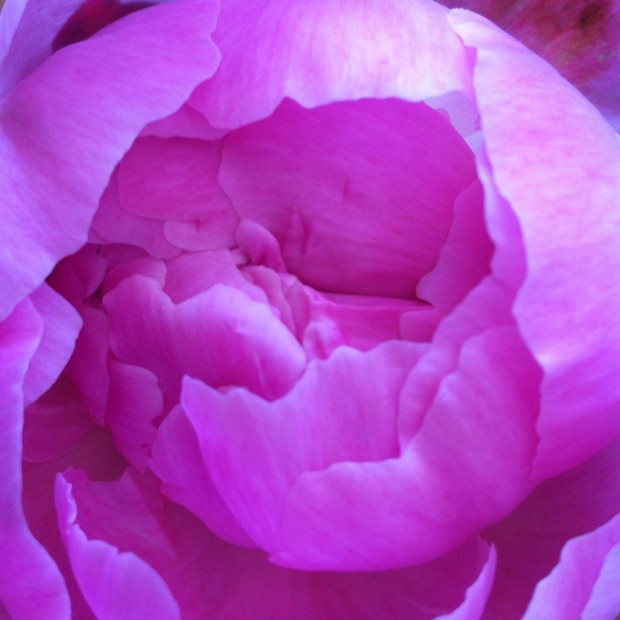
A rather blue-tinged peony

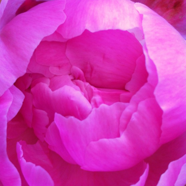
There are of course many occasions when any of this is useful, but I've found it particularly helpful for correcting the white balance in my iPhone photos, which always seem to be far too blue, and for adding a golden hour-like glow. If that's all far too subtle and practical for you, it's possible to make near-infinite adjustments: you keep moving your finger upwards (or downwards, left, right, four o'clock, 11 o'clock, whatever) until you reach the edge of the screen, and then you start over again.

... made to look rather more pink with ColorTime

The independent shadow, mid-tone, and highlight functions, in combination with the colour wheel, means that you can add blue to the highlights but orange to the shadows. If you want.

If you decide that you don't like you last adjustment, you hit the back arrow and it revokes it; if you decide that you've screwed it all up and want to start over, select the revert button. Should you not be able to decide, you can toggle between the original image and your adjusted image to decide which works best. Or you could select the animate function and let ColorTime present you with a loop of optins.

There is a crop and rotate function, but I haven't found it that easy to use. It feels underdeveloped and doesn't give you the control that you'd expect when the rest of the app is so responsive. It's not a huge problem, but for the moment, I will continue to crop in Snapseed.

I've really enjoyed using ColorTime and it has provided me with some terrific results. However, it is a learning curve. None of the buttons is labelled and I have occasionally found myself mistakenly adjusting entirely the wrong thing, but thankfully there is that undo feature. And there's a guide that is relatively easy to access.

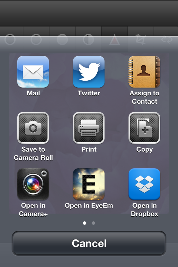
When you're done, you can save your fixed image to your camera roll, email it far and wide, tweet it, save it to your Dropbox, or choose from a few other options.

photo

ColorTime is £1.49 in the App Store. For anyone who does even a moderate amount of iPhone photography, I reckon it's worth it.

What is the golden hour?

The chances are that you've heard of the golden hour (or magic hour, it's sometimes known as that, too), and you know that photos taken during this magical time slot are blessed with a sizzling, glowing quality that gives them a spectacular edge. But when exactly is it? And what makes it so special? This week's Photography Fundamentals is here to explain all!

When is it?

Early morning oranges iii

First up, golden hour can last between 45 and 90 minutes, and it happens twice day, around sunrise and sunset. The closer that you are to the equator, the shorter the period it lasts. Yes, it does mean that at the Poles, at certain times of the year, the Golden Hour can last nearly all day, too. I suppose that the 'Golden 90 minutes to three hours, or sometimes even all day' doesn't sound quite so catchy, does it?

Why does it happen?

When the sun appears to be closest to the horizon, its lightwaves have to travel further than when they're overhead, as happens during the middle of the day. This softens and diffuses them, as they bounce around more and don't hit their subjects directly. You're left with gorgeous soft lighting, gentle, long shadows, and less chance of over-exposing your highlights.

Golden Hour light is typically much warmer in hue, too. The blue light waves are scattered further, leaving your subjects to pick up more of the red and orange tones, and bask in their warmth.

Winter Rose

All of this means that just about any type of photography you can accomplish outdoors will benefit from the Golden Hour: portraits, landscapes, architectural, and street.

What's its effect?

Portraits will take on gorgeous, even skin tones and there won't be any harsh shadows appearing beneath your subjects' eyes and nose, which is never really an attractive look, I'm sure that you'll agree.

Tanya

Landscapes sizzle with soft light, unusual shadows, and saturated colours.

Buildings look as if they're glowing during the Golden Hour, especially stone ones. It appears that rather than reflect harsh midday light, they absorb the softer early morning or late afternoon rays.

Tower wide-angle

You won't benefit from just the glowing stone of the Leaning Tower of Pisa if you capture it early in the morning, you'll avoid the crowds, too.

And somehow, during the Golden Hour, even the most insalubrious of streets can appear a touch more charming than they really are, whilst anyone or anything in them will be flattered by the sun's golden tones.

To help you go forth a shoot beautiful, radiant images, there's even a handy golden hour calculator.

TL;DR

  • The golden hour happens twice each day, around sunrise and sunset
  • It lasts roughly 90 minutes
  • As the sun is at its furthest point from the earth, its light is softer and more diffuse, having had to travel further
  • Photographs take on a warm glow and shadows are softer during the golden hour

Focal length << Photography Fundamentals >> Histogram

Blasting images into images with Light Blaster

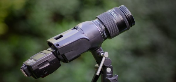
mail_blast_header_250 What do you get when you combine old 35mm slides, a speedlight, a lens, and the genius of the DIYPhotography hackers? You get the brand new Light Blaster: a strobe-based image projector that lets you transform your photos in a flash.

By inserting a 35mm slide into the Blaster and synching it up to your camera it'll project the slide's image wherever you direct it when you release your shutter. You can create textured backgrounds, send secret messages, or give people wings!

You'll need to provide a strobe (any commercial speedlight will do) and a lens to get things working, but if you don't have any old 35mm slides kicking around, or no way easy way of printing any yourself, the Light Blaster team has put together four collections of slides: backdrops, effects, wings, and a totally random selection. When they say totally random, they really do mean it. You have no idea what might turn up in that box.

light-blaster-07-500

As for the lens requirement, the Light Blaster is compatible with any EF or EF-S Canon lens out of the box. Only have Nikon lenses to hand? There's an adapter for those. By changing the lens attached to your Blaster, you can alter the expanse of your projection: shorter focal lengths create wider projections, longer focal lengths project your image into a more compact area.

After that, it's all down to your imagination! (Or you can check out what other people have been doing with it, for some inspiration.)

A Canon-mount Light Blaster costs $99; with a Nikon adapter, it's $116. A box of slides is $17. You can learn more and pick up yours from the Light Blaster website.

Setting up a scream-triggered photobooth - because whyever not?

If anyone had wandered along to the Maker Faire in the Elephant and Castle area of London (yes, it's really real; no, there are neither castles nor freely roaming elephants but both would be a vast improvement) on Saturday they would have found me, and the London division of Team Triggertrap, asking people if they wouldn't mind awfully screaming at the top of their lungs for us. Seriously.

You see, we'd set up the Triggertrap ScreamGrab studio because we reckoned that people summoning the exhaustive energy to scream like bellows, and then releasing it in one extended Aiouuuuuuu! would make for fantastic portraiture. And it would give Triggertrap with the sound threshold set to Very Loud Indeed™ a rather good workout. We weren't wrong!

Have a look at these if you need convincing:

And the rest you can see on Triggertrap Flickr stream.

Inspired? Want to know how we did it, so that you can give it a go yourselves? Read on!

The basics

At the least, what you need to do is to get an audio trigger that will take a photo when the volume hits a certain level, and a camera. In our case, we decided to use the Triggertrap Mobile app, but we discovered to our horror that the app itself was way too sensitive: Even with the sensitivity threshold all the way to the top, you didn’t really have to put your back into the scream to trigger the camera (in fact, speaking normally was loud enough to snap a shot). Uh-oh.

In the Android version of the app, there’s a separate slider for sensitivity, but we don’t have that level of control over the iOS app (and I did want to use the iPod Touch I had brought along, so that I wouldn’t have to tie up my phone all day).

After a spot of last-minute panicking, we discovered that there was a very simple, and delightfully low-tech solution to this: I simply stuck a small piece of packaging tape over the microphone on the iPod Touch. Hacky? Well, yes, but who cares – it did the trick!

With the tape in place, we were able to use the sensitivity slider to fine-adjust the triggering threshold. Perfect for what we were trying to do!

In theory, with the app configured and hooked up to the camera using a connection kit, that’s all you need to get the photo. Stick it on a tripod, and you’re good to go – really, everything else is showmanship. But to turn this into a far more fun experience, for us and for our sacrificial victims, we turned it into much more of a show.

The kit

For the ultimate ScreamGrab experience, I set up with the following:

  • Canon EOS 6D set to manual exposure & manual focus
  • Tripod
  • Triggertrap Mobile Dongle + connection cable
  • iPod Touch (connected to power, to make sure it didn't die)
  • Tripodclamps clamp to hold the iPod Touch in place (so that your screamers can see how loud they need to scream)
  • Canon ST-E2 flash trigger
  • 2x Canon Speedlite 580EX II flashes
  • 2x light stands
  • 2x white umbrellas

What I did

Let's start with the lighting: I added a Canon ST-E2 infra-red flash transmitter to the camera’s hotshoe, and I set up a couple of Canon EX580 II flashes on super-cheap lighting stands with umbrellas. I fired the flashes on manual output (1/16 each), then set up the camera in manual exposure (1/180 second and f/10, ISO 640) and manual focus. This meant that all the shots were completely repeatable, and I wouldn’t have to make any adjustments throughout the day.

In fact, if it hadn’t been for people being different heights, there wouldn’t have been any reason to touch the set-up at all: even the batteries in the flashes, the flash transmitter, and the camera, lasted all day long. Impressive stuff – but then, battery consumption was the chief reason why I only set the flashes to 1/16 output – in my experience, in modern cameras, you may as well let the ISO do the work, and give your flashguns a break.

Finally, I wanted to ensure that the iPod Touch was clearly visible, so people would be able to see the black ‘needle’ move on the app – so they knew how loud they had to shout to trigger the camera. To achieve that, I used a Tripodclamps clamp. It’s simple: It bolts to the tripod, then squeezes the smartphone firmly to hold it in place. It looks good, and it makes it easy to demo the device, too, which is a bonus.

Someone check for the Four Horsemen of Apocalyspe - I shot in JPEG!

I should also mention at this point that the camera was shooting JPEGs rather than in RAW. The Canon 6D shoots enormous RAW files, and since I had a fully controllable lighting situation, I didn’t expect I’d need to do a lot of adjusting the images. More importantly, the JPEGs are much much faster to download via the tethered connection, faster to process in Lighroom, and it meant that my poor little MacBook Air didn’t slump to its knees. Having said all that, I do generally recommend shooting in Raw. Here is why, and I also wrote an article about why this particular situation (controllable light, need for speed) is an exception where JPEG is acceptable. Because, yes, I’m an insufferable nerd about this sort of stuff.

Turning it into a show

To show off the images, I decided I had to shoot ‘tethered’. I was in luck; my Canon camera comes with a piece of software called EOS Utility, which enables tethered shooting. In this case, I hooked up a27″ monitor to my MacBook Air. I made sure that all photos that were taken were shown on the audience-facing big screen as soon they were shot. Great for instant gratification – even the most reluctant screamers giggled their heads off when they saw their mugs on the big screen.

Instant publishing

I anticipated (correctly) that people would want a copy of their photos – but how do you go about doing that? Quite a few people used Instagram and took a photo of their photo on the big monitor, but obviously we wanted something a little bit better than that. So, I devised a workflow.

I was running Lightroom 4, using the ‘auto import’ feature. In this way, the photos would be downloaded by the Canon EOS Utility to a folder, and Lightroom 4 would automatically import them from that folder into a library. The import script applied a preset to the image (white-balance, some vignetting, some extra contrast and some colour effects to make the photos pop out more). It also applied a description and title to the images, so it would be as quick as possible to publish them online.

From there, I only did one edit to each photo: A quick crop. This was necessary because we didn’t have a lot of time to frame people properly, and besides, a lot of people either jumped or hunched over as they were howling at the camera, so the framing was almost always off anyway.

After cropping, we just dragged the photo to the Flickr publishing tool within Lightroom, and hit the ‘publish’ button. With one person manning the computer, that meant that from squeal to Flickr, it could take as little as a minute or so, including the processing, resizing, and uploading.

We also had an IFTTT set-up, so that we could auto-tweet our ScreamGrabs. Except that Twitter sent us to Twitter Jail for too many tweets!

Other ideas?

It would really have been awesome if we could have had a printer there, and printed out people’s ScreamGrabs as they were taken – but we didn’t really know how many people to expect, and we only had two people at our little stand at any time, so I suppose we wouldn’t really have had time to deal with the logistics of printing anyway — but it would have been amazingly good fun, so perhaps that’s something we’ll do next time.

The other idea that came up, was that perhaps we should have been recording people’s screams! Playing the screams, along with a slide-show of all the photos, would have been a fantastic project, I think – but it didn’t come up as an idea until someone mentioned it to us about half-way through the day. Again, I have no idea how you’d deal with the logistics of matching up the sounds to the pictures… But it would have been great.

In the Triggertrap ScreamGrab booth, everyone can see you scream!
A surreally good competition winner

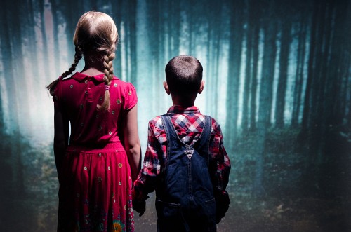
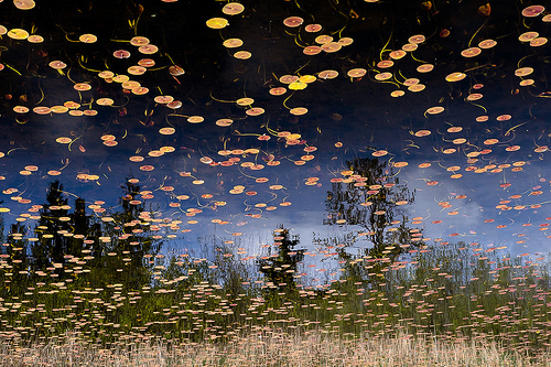
It's been a little while coming, we know, but Haje and I have finally settled on the winner and runner-up for our surreal-inspired photo competition. It was a very close call between the two, but we're delighted to announce that the spoils go to: Phantom Lake Phantom Lake, by They call me Alex.

Screen Shot 2013-07-04 at 18.58.39

and The Grind, by Hooker771

What appealed to us about both these photos was that neither relies on extensive manipulation. They're in-camera surreal creations. And they look terrific, in particular because of their gorgeous use of colour.

Congratulations both Hooker771 and They call me Alex!

The Ilex Press has very kindly provided a copy of my newest book, Surreal Photography: Creating the Impossible, for the winner. I hope that you enjoy it!

As an aside, that was the last competition that we'll be running for the forseeable future. It was a great deal of fun to dream up themes and watch you complete the briefs with such enthusiasm, but we thought that we'd quit while we're ahead. Thank you to anyone who ever entered and to those who generously provided prizes, too.

What is focal length?

Having made it through a, c, d, and e (we skipped b), the photography fundamentals cruise ship's next port-of-call is f, where we'll be exploring focal length. There's a lot to take in here, so I hope that you're wearing comfortable walking boots.

Your camera's lens works by refracting the light from what it can 'see' and converging it at a single point, the focal point, to create an image. Just how much the lens is able to 'see' depends on its focal length.

The distance between the lens and the imaging sensor (or film, if you're old school) is what determines focal length. It's measured in millimetres.* A shorter focal length means a wider angle of view, so the lens 'sees' more. These are called, somewhat unoriginally, wide-angle lenses. By the same token, increase the focal length and the angle of view decreases and pulls you closer to your subject. Lenses with larger focal lengths, roughly over 135mm, are known as telephoto lenses. Those in between, around the 50mm mark, are 'normal' lenses.

focal_4.png

Here you have a wider angle of view that takes in more of the scene.

focal_5.png

A narrower angle of view draws you closer to your subject.

* Long lenses don't really measure 20, 30, or 40cm; they create the telephoto effect by a complex series of elements thatwork together to create that same effect.

The crop factor

When we talk about focal length, we're usually doing it with reference to a 35mm, or full-frame, sensor camera. If you're using a camera that has a sensor smaller than full-frame, for example a Nikon D5100 with an APS-C sensor or an Olympus PEN with a Four Thirds sensor, it will have a magnifying impact on the focal length of your lenses. The smaller sensor is only able to detect a portion of the entire field of view, making it appear as if you're closer to your subject.

This is known as the crop factor. Multiply the sensor's crop factor (for example 1.5 for a Nikon APS-C sensor) by the lens' given focal length and you'll have the effective focal length. (It doesn't actually change the focal length, but it looks that way.)

This can be very useful when you use a telephoto lens, because your 200mm lens on your Nikon D5100 suddenly becomes the equivalent of 300mm; but it can be a bit of a pain when you're using wide-angle lenses as they will lose some of the impact of their increased angle of view.

So that we're all straight, I'm going to be referring to focal lengths as if they apply to a full-frame sensor.

Rough-and-ready guide to focal lengths

  • 22-35mm - Wide-angle - Landscapes
  • 35-70mm - Standard or normal - Street, documentary, some portraiture
  • 70-135mm - Medium telephoto - Portraiture
  • >135mm - Telephoto - Sports and wildlife

Wide-angle lenses are good for...

Wide-angle lenses might be the go-to lens for landscapes, but there's more to them than that!

3255378073_6c6f44d3df

Emphasising the foreground

You’ve probably noticed that if you take a portrait with a wide-angle lens, the subject’s nose looks comically large and her or his chin juts out further than Brighton pier. Why? Well, the lens' wide angle of view means that in order to get in close enough to fill the frame with your subject, you have to get in very close. The closer that you get, the larger whatever is in the foreground will appear. As those objects are likely to be a nose and a chin, in a portrait, they are going to look huge compared to the rest of the face.

Tower_wide_angle

If you were to photograph a building close-to and from below, this same foreground-emphasising effect would make the base of the building look stupidly large and the entire structure ridiculously tall. Being close, the foreground is emphasised and the lens' wide angle of view gives the entire scene the illusion of somehow being stretched or exaggerated.

Enclosed spaces

When you're taking photos in an enclosed space, using a wide-angle lens will ensure that you can include everything in your scene that you want to be there. This is why estate agents use wide-angle lenses to photograph inside properties, so that the rooms can be shown in their entirety.

Converging verticals

Whatever lens you use, including your own eye, perspective means that parallel lines will appear to converge eventually. Just think of train tracks coming to a point as they streak away into the distance. When you use a wide-angle lens, this convergence happens faster than it would with a normal or telephoto lens.

You can use this convergence effect creatively, to envelop people in trees or give buildings an odd look. But of course, you might not always want your buildings to tip backwards or their parallel walls to converge. Standing further back from your subject and not tilting your camera upwards can help to overcome the problem, but sometimes this isn't always possible. I don't know about you, but I find that standing in the middle of a busy road to take a photo doesn't do me many favours. Thankfully, there are lens correction effects available in most editing suites!

Telephoto lenses are good for...

You might associate telephoto lenses with hardened sports photographers and weather-beaten wildlife photographers, but they're good for a whole lot more.

Kites_again

Normalising

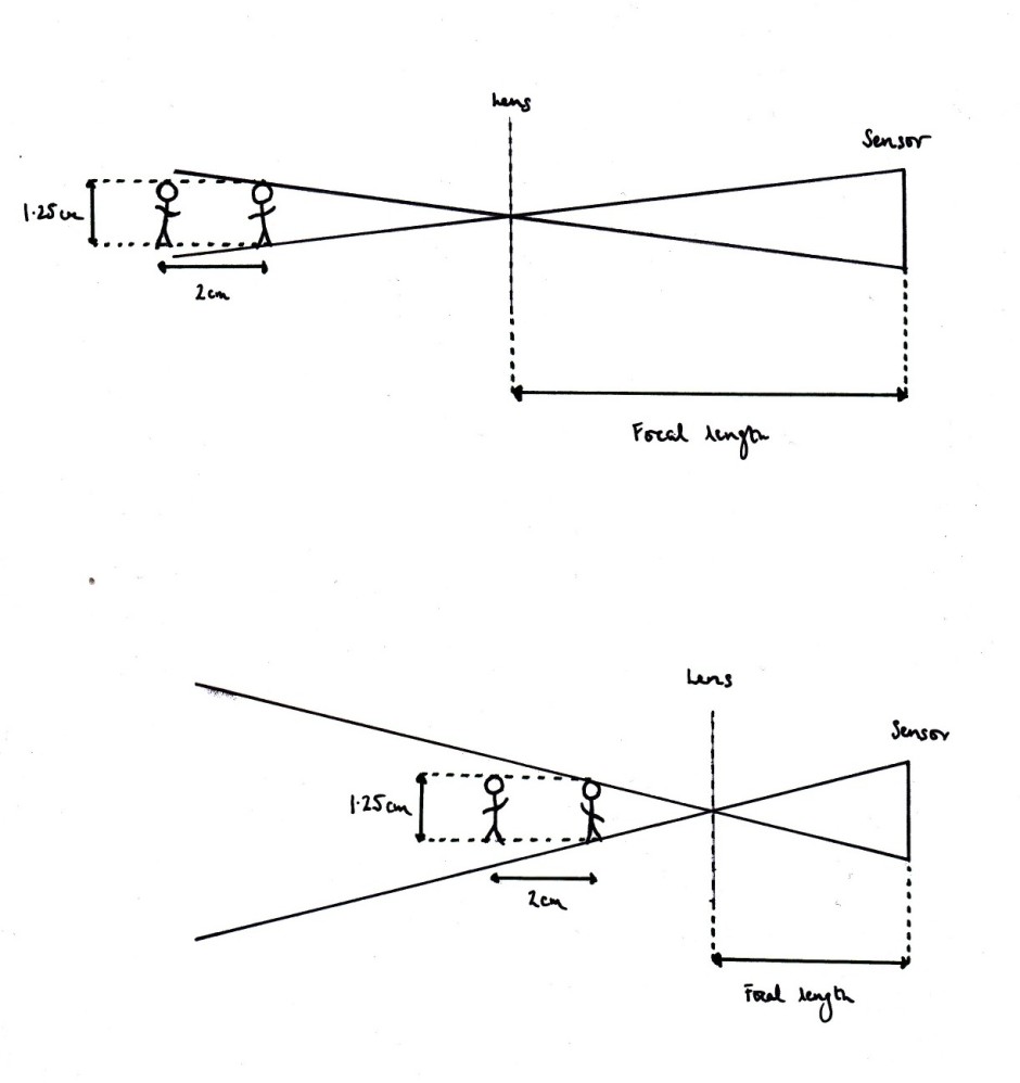
Having a narrower angle of view means that the subjects fill the frame more; giving the impression of being closer together and closer in size.

Focal length diagram 2 copy

Instead of objects in the foreground looking larger, as would happen with a wide-angle lens, telephoto lenses make their background objects appear comparatively larger. It's because of the narrow angle of view: things in the background take up proportionally more of the frame, which makes them look closer in size to things in the foreground. It's called the normalising effect.

This then is why portrait photographers prefer longer lenses, often around 85mm.

Density

By giving the impression of compressing scenes and bringing subjects closer together, you can use a telephoto lens to make it look as if more is happening in your image, and that it is somehow more dense. For example, a moderately busy street scene could become bustling when shot through a telephoto lens.

Layering

Classically, it's a wide-angle lens that is used for landscape shots, so that everything in a sweeping vista gets in the frame. However, I've taken some of my favourite landscape photos with a telephoto lens. They have this beautiful stacked look that can emphasise the different layers in the environment.

Depth-of-field

You often hear it said that telephoto lenses have a shallower depth-of-field. This isn't strictly true. It would be more accurate to say that because telephoto lenses are mostly used to magnify subjects, and the subject will then fill more of the frame, the depth-of-field appears to be shallower. Not that there's anything wrong with that; it allows you pick out your subject from a beautifully blurred background.

6839779191_fbb311c4c6

TL;DR

    • Focal length is the distance between the lens and the sensor
    • It is measured in millimetres
    • Shorter focal lengths produce wider angles of view, that capture large scenes
    • Longer focal lengths bring you closer to your subject and have a magnifying effect

Exposure << Photography Fundamentals >> Golden hour

What's in a name? Pentax Ricoh to become Ricoh

From 1 August 2013, the Pentax Ricoh Imaging Company Ltd will be no more. Instead, it will be the Ricoh Imaging Company Ltd. It took a little while in coming, but a new name wasn't wholly unexpected after Hoya sold Pentax to Ricoh in 2011. The Pentax name won't be going away entirely, however; it'll remain as the brand name for dSLR and interchangeable lens cameras as well as binoculars. The Ricoh brand will apply to compact cameras and new technological innovations.

After Olympus and Fujifilm axed the lower half of the compact camera ranges earlier this year, Pentax/ Pentax Ricoh/ Ricoh is taking a slightly different tack. Rather than axing the line (something that might happen in the future), the cameras are being severed from the Pentax name. That's one way to maintain brand integrity!

Aspiring young food photographers, get your entries in to Pink Lady competition!

Aged 17 or under? Love taking photos of food? Pink Lady (yes, those very same pink-skinned apples) have a competition for you! It runs between today and 31 Janaury 2014 and the panel of judges includes David Loftus (Jamie Oliver's food photographer) and Yotam Ottolenghi (one of my favourite chefs). Any photograph that features food is fair game: food in the field, food in preparation, or food on a plate and you need to be 17 or under on 31 January 2014 to be eligible. The entire category has been divided into three age ranges: 15 to 17, 11 to 14, and 10 and under.

If you win your category there's a trophy to mark your success and vouchers towards new camera kit to celebrate it. Your photo will also go on display at an exhibition at the Mall Galleries in London in spring next year along with the finalists from the adult categories.

There are some specific entry requirements for your images, for example they can't be posted on social media networks or have been entered in any other competitions, so please do read the conditions carefully. And whilst the adults might have to pay to enter their categories, there're no fees for the youth competitions. You can also be anywhere in the world to submit an entry. Last year's overall winner came from Romania.

You can have a look at last year's winning and commended photos to see what you're up against, but what do you have to lose? It sounds like a tasty competition to me!

What is exposure?

The next stop in our (mostly) alphabetical journey through photography's fundamental principles is at 'e', for 'exposure'. Are you ready? Excellent! Onwards!

Exposure

Without an exposure, we wouldn't have an image (that's how fundamental this principle is) because it's the action of revealing your sensor, or your film if you're old-school, to light in order to record an image. Introducing too much light to your sensor will result in over-exposure and a too-bright image. Conversely, under-exposure is the result of not exposing the sensor to enough light, rendering a too-dark image.

Under-exposed to the left; over-exposed to the right; just right in the middle. (Image by Haje)

So far, so simple.

ExposureTriangle

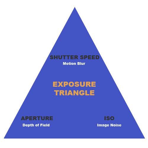
Exposure is measured in 'stops' and controlled by three variables in your camera: aperture, shutter speed, and ISO. As well as determining how light or dark your images will be, they all have other aesthetic effects on your images, which is why you need to understand and be able to manipulate them to produce the images that you want. We started this series with aperture, which controls depth of field. We'll get to shutter speed and ISO and their respective abilities to freeze or blur motion and to introduce noise into our pictures. But for now, we'll concentrate on the impact of varying aperture, shutter speed, and ISO on exposure.

Equivalent Exposures

By giving and taking from aperture, shutter speed, and ISO, you can keep your relative exposure the same, but change how your image looks.

You might've set up shot to get a 'good' exposure, but you decide that you want a greater depth of field so need to use a smaller aperture. A smaller aperture allows less light to hit the sensor, so if you change only the aperture, your photo would be under-exposed. How can we solve this? You can use the other two adjustments to compensate for the lack of light captured by using a smaller aperture: maybe you want to use a slower shutter speed, to expose the sensor for longer? Or perhaps increase the ISO to make the sensor more sensitive? You could even do a bit of both.

Equivalent exposures

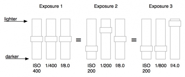
Let's look at an example with some numbers. We’ll start with an exposure of 1/200 second, ƒ/8.0, and ISO 400. What would happen if you were to change your shutter speed to 1/100 second? That would let twice the amount of light into your camera compared with 1/200 second, because the shutter was open for twice as long. Your photo will now be brighter.

Now you change your ISO to 200. This halves the sensitivity of the sensor, and the photo will come out looking like it is the same overall exposure. The photo won’t be identical, but from the point of view of brightness, it will be about the same. It’s possible to change any of the settings to compensate for any of the other settings.

A faster shutter speed can make up for a larger aperture, a lower ISO can make up for a slower shutter speed, and a smaller aperture can make up for a higher ISO. They’re all related.

TL;DR

  • 'An exposure' is the action of revealing your sensor (or film) to light to create an image
  • Too much light results in an over-exposed, too bright image; too little light produces an under-exposed, too dark image
  • Exposure is controlled by three variables: aperture, shutter speed, and ISO
  • Exposure is measured in 'stops'

Dynamic Range << Photography Fundamentals >> Focal length

Poppy - turning your iPhone into a 3D camera

Did you have a Viewmaster stereoscope as a kid? One of those 3D viewing contraptions into which you'd insert a 'reel' of images that were in a cardboard disc, look through the eye holes and then depress a lever to rotate the images through the viewing mechanism? Yes! One of those! I had one, too. In fact, it's probably still at my parents' house, somewhere. But if Joe and Ethan from Hack Things have anything to do with anything, there will soon be an iPhone compatible equivalent that lets you turn photos and videos into stereoscopic masterpices. It's called Poppy, and they've just launched their Kickstarter appeal to get things moving.

Nothing about Poppy is digital—apart from your iPhone—it works entirely with optics. You insert your iPhone into the device and a set of mirrors captures a pair of binocular images on your iPhone's lens. When you look through Poppy's viewfinder, the images are combined to create a 3D scene.

Have a look at the video, because Joe and Ethan explain it better than I ever could.

You can watch your own videos in 3D through Poppy, or whatever you fancy off of YouTube. If you make a video using Poppy and want to share it with your friends, they can see it in 3D with the stylish addition of a pair of red-blue glasses.

If you head over to Kickstarter and pledge your support to raise $40,000, you can help bring Poppy into production and maybe even get your hands on one of the first models. I'm not a fan of 3D at all, that's no secret, but the nostalgia of this really appeals!


Update! 27.vi.2013 16:30 BST: Less than 24 hours after launching their Kickstarter appeal, Ethan and Joe have exceeded their funding requirement for Poppy. Wow!

Triggertrap brings high speed photography zooming to a camera near you

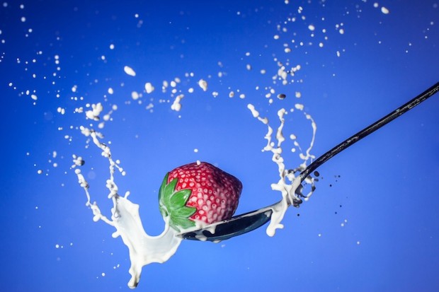
If your attempts at capturing balloons bursting, glass shattering, or droplets forming a perfect corona have been less than successful until now, the team at Triggertrap—who love to find creative ways to let you trigger your camera—might just have a solution for you. Not only have they succeeded in making Triggertrap Mobile's triggering system upto 12 times faster (from 60 milliseconds to five milliseconds depending on your device), but they've released the Triggertrap Flash Adapter, too. Strawberry Cream Milk - Chris Martino

By combining a new Triggertrap Flash Adapter with a Triggertrap Mobile Dongle, an iOS device running Triggertrap for Mobile, and a hot shoe-compatible flash (there wouldn't be much flash photography going on without one), you should be capable of freezing motion, however fast it's happening.

Triggertrap Flash Adapter TT-FA1 Product Photo 03

Set yourself up in a darkened room with your camera on a long exposure, your camera and flash ready to trigger using one of Triggertrap's firing mechanisms, and whatever you're trying to capture at high speed, and off you go!

If you want to see the Flash Adapter in action, there's a video waiting for your perusal:

Introducing Triggertrap Flash Adapter from Triggertrap on Vimeo.

Or you could just head over to the Triggertrap store and order one. They're retailing at $29.95 - but remember that you'll need the mobile dongle and the app running on your smartphone, too.

Did you know: Bulb Mode!

I've been doing a lot of talking about Bulb Mode with people recently - as this is relevant to how the Triggertrap Mobile App does stuff like HDR and Star Trail photography modes - but it only recently occurred to me that not a lot of people know what 'Bulb' mode on your camera means. Contrary to popular belief, 'Bulb' mode has nothing to do with light bulbs; it is a remnant from something that most photographers today haven't even heard of: An Air Bulb Remote. If you have an old (or retro-styled) camera, you may have spotted a small hole with a screw thread in your shutter button. It's possible to screw in a mechanical remote control here, which physically 'presses the button' on your camera when it is activated.

This is a Bulb Remote: Squeeze the bulb to take a photo. (Photo cc Denkhenk)

There are two ways these remote controls work: They either have a cable running inside a sleeve (much like the brake system on your bicycle), or a system working on pneumatic pressure. In the case of the latter, you'll have a air hose with a small piston at the end. When the pressure is increased in the air hose, the piston extends, and the shutter button is pressed.

Traditionally, the pneumatic systems had a small 'bulb' at the end, so when you squeeze the bulb, the piston extends, and the picture is taken. This is the bulb that camera manufacturers refer to when they say 'Bulb' mode.

So now you know! What's your favourite depreciated bit of photography jargon?

Snapchat does Snapkidz

I must be horribly old and terribly boring. The prospect of sharing ephemeral photos with my friends via Snapchat doesn't hold that much appeal. Lots of 13 to 23 year olds love it, though, and plenty of under-13s would love to love it, but can't for legal reasons. (For Snapchat to send these young people's messages, they would have to collect personally identifying information without their parents' consent. That's not permissible under the Children's Online Privacy Proetction Act.) To meet their legal obligations, then, Snapchat has introduced Snapkidz. Pre-teens can sign up to the app and will be able to take photos, to edit them, and to scribble on them; they just can't send them. Instead they'll be saved to the camera roll. Then of course they can be sent by SMS or iMessage, but Snapchat won't be storing these young people's data. And when they do turn 13, their worlds can be augmented with spontaneously deleting messages. Or they could just lie about their ages when they sign-up but I'm sure that no one would be that nefarious.

Snapkidz is available just as an iOS update at the moment. If it proves popular, an Android roll-out might be considered.

Video on Instagram, with filters

It wasn't really the surprise that Facebook had been hoping for, after TechCrunch had speculated that today's announcement would involve Instagram and video, and be a competitor to Twitter's Vine. So what does Instagram's video-clip sharing feature have to offer? Well, first and foremost there are filters. Thirteen of them to be precise. How could there not be?

Then users can choose the length of their videos, anywhere between three and 15 seconds.

Clips can be stitched together to form a collage.

And unlike Vine, videos won't loop.

Finally, if you're using the service on an iOS device, you can deploy the Cinema Stabilsation function, to help reduce camera-shake.

My guess is that it won't tempt people to Instagram who weren't already there, but it might well eat into Vine's market of existing Instagram users.

We might not be able to make our own panoramas on Mars, but we can look at Curiosity's

Over the course of almost six weeks towards the end of last year, Curiosity roved around the area of Mars called 'Rocknest', collecting over 900 photos. The majority of the images (850) came from Curiosity's telephoto camera Mast Camera instrument, as well as 21 from the Mastcam's wider-angle camera, and 25 black-and-white shots (most of which were of Curiosity itself) from the Navigation Camera. These have been stitched together to create a 1.3 billion pixel image, showing Mars' dusty landscape across its horizon to Mount Sharp.

A panoramic snapshot

The image is ready and waiting for public perusal on Nasa's website. You can even choose between raw and white balanced versions. There's also a slightly more manageable 159MB version available for download, too.

You can zoom in and out, exploring the finer details of Mars' landscape and the differences in the dustiness of the atmosphere. You might be there some time!

(Headsup to Engadget)

What is dynamic range?

The Photocritic Photography Fundamentals series continues with dynamic range. No, we're not talking about high dynamic range (HDR) photography here, we're going back a step. Dynamic range and HDR are linked but before you can have HDR you need to have dynamic range, and whilst HDR is a tool, dynamic range is a basic principle that underpins photography.

Not just about photography

Dynamic range isn't a concept that's restricted to photography. It's something that we make use of every day, with our eyes and our ears. It's what allows us to hear someone mounting the stairs at the same time as listening to the radio, or be able to see both the sunny and shady areas of a garden simultaneously. Being a 'range' it does have its limits, though: when you're in a dark room that has a brightly lit window, you won't be able to see the view through the window and the room interior simultaneously. One will be over- or under-exposed when the other is properly exposed. The tipping point is the extent of your eyes' dynamic range.

Dynamic range is the maximum difference between bright and dark or high and low that you're able to absorb simultaneously.

So it relates to photography how?

In photography terms, dynamic range is how much difference in contrast your camera is able to record. If you imagine a landscape picture with bright white clouds that are almost over-exposed, the more detail you are able to detect in the shadows is indicative of a wider dynamic range. It follows then that a camera with a wider dynamic range will be of more use than a camera with a narrower dynamic range: it has the ability to record more data and therefore produce images with more detail.

Being able to see highlight and shadow detail is down to dynamic range

Measuring dynamic range

There's no strict measurement for dynamic range in cameras. Sometimes you'll see it referred to as 'EV', sometimes as 'stops'–as in ƒ/stops–and even as 'bits'. In fact, you often won't find it referred to on a camera's specification and you have to go to independent testing and review websites to get a dynamic range measurement.

If you're anything like Team Photocritic and like amassing geeky facts, you'll want to know that the dynamic range of the human eye is approximately 24 stops; cameras have a dynamic range of between ten and 15 stops.

Making the most of your camera's dynamic range

The huge caveat to dynamic range is that you can only make the best of it if you shoot in Raw. Shooting in Raw records vast amounts more data than if you shoot in JPEG and allow your camera to make decisions about what information should be kept and what should be discarded. The bucket-loads of data and the accompanying flexibility that comes in a Raw file is as a result of your camera's dynamic range. Shoot in JPEG and you'll miss out.

TL;DR

  • Dynamic range is the maximum difference between bright and dark (or high and low acoustically) that you can absorb simultaneously
  • Photographically, dynamic range is the maximum degree of contrast that your camera can record
  • Dynamic range can be measured in 'EV', sometimes as 'stops'–as in ƒ/stops–and even as 'bits'
  • To make the most of your camera's dynamic range, you need to shoot in Raw

Contrast << Photography Fundamentals >> Exposure

Review: sending files freaking fast with Minbox

When it comes to online storage and collaborative working, I'm a huge fan of Dropbox. For just sending large files the two big names are WeTransfer and YouSendIt. But there's a new kid on the file transfer block that claims to be 'freaking fast'. It's Minbox, and I've been checking it out.

To be able to use Minbox you have to download the app; unlike WeTransfer, there's no send-from-web option. But unlike WeTransfer, the size of your files isn't limited to 2GB. In fact, they're not limited at all. You can send a file as large as you can manage before your internet connection konks out, for free. Minbox advertises itself as being 'freaking fast' and even with the cringingly slow connection that we suffer from at the Photocritic Outpost, the upload was on the speedy side when I tried it out with a bundle of high-res images.

You can upload files from the menu bar, or by right-clicking on a file

To send a file all you have to do is right-click on it and then choose between sharing it as a link or sending via the service. If you want to schedule when it will be sent your recipient, that's entirely possible. You can also opt to convert Raw image files to JPEGs and videos to Mp4 format.

Once you've sent a file, it resides in your Minbox collection for 30 days, after which it will self-destruct. Whether or not it'll do it with Mission Impossible-style smoke, I don't know as nothing I've shared yet has reached its expiration date. If you want to delete the file from your collection, you can do so by following the link from the viewed confirmation email.

Your collections

This is probably my second biggest bugbear with Minbox. At present, either waiting for the files to expire or following the email link are the only means of deleting them from your collection. You can't do it from the collection itself, despite being able to forward or share files from there. It feels a bit inefficient. The good news is that Michael Lawlor, who's Minbox's CTO, assures me that this will be rectified soon.

My biggest bugbear is that at present Minbox is app-based. There's no way I can access my collections from the web, which would allow me to manage and forward files from a computer other than my own. Again, this is on the developers' Big List and should be possible soon.

As a file recipient, you can preview your received file before downloading it and you can email it on or share a link to it from the preview page. Coming soon, you'll also be able to comment on it and share it to Twitter, Tumblr, or Facebook.

All of this is free. If the coders succeed in ironing out those usability kinks, I wouldn't hesitate to recommend it for transfering large files. Even with the kinks, it's an impressive service, if you have a Mac. Other operating systems are currently out of the Minbox, but if enough interest is expressed in providing for them, it's a possibility.

Coming soon there will be a Pro service that'll offer indefinite storage and scheduled expiration, amongst other things.

Minbox: it's one to watch.

Has the Creative Cloud storm encouraged Adobe to rethink its prices?

Well this is intriguing. Photo Rumors is reporting that Adobe recently surveyed some of its customers about a restructure to the not-very-well-received new Creative Cloud subscription model. Instead of the proposed $49.99 a month for the complete Cloud, or $19.99 a month for a single product subscription it asked how customers felt about paying $9.99 a month for Photoshop or $29.99 for all of Creative Cloud on a three year contract. At the end of the period, you'd be entitled to a permanent copy of CS6 and a promise to keep it updated for file types and camera. Now I didn't receive one of these fabled questionnaires and I've not heard of anyone who did. Whether it did or didn't survey a selection of its users, Adobe is under no obligation whatsoever to respond to the findings. And if it thinks that it can get away with the new pricing structure then why should it change. If there is a change to the subscription model in the offing, the rumoured structure is quite a departure from the original plan. I'd suspect it would be somewhere between the two. Let's wait to see.

(Headsup to Photo Rumors)