Uncategorized

10 of the best: iPhone apps

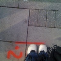
Feet at the station

Did you know that since Apple launched the iPhone, over 200,000 apps of all kinds have been released? Just a few, then. From navigation to games, sports scores to language lessons, there aren’t many applications you can’t find in the AppStore.

However, photography apps have taken the market by storm and there are currently over 2,700 available for iPhoneographers across the globe. David here has installed fifteen of them. With so many to choose from, finding the right apps can get a little tricky. Let us save you some time and with David Smith’s help, show you a few of the best ones we’ve come across.

Photo-editing and camera apps

Hipstamatic

£1.19/$1.99

Hipstamatic is one of the better toy camera apps available in the AppStore. The developers really tried to make this app feel like you are holding a camera in your hands instead of a phone. The design is sleek with a simple but unique UI, complete with virtual shutter and flash buttons. Users are also given the option to swap virtual lenses, films, and flashes to provide numerous possible combinations, giving Hipstamatic exposures a very distinct look.

There are, though, some downsides. First of all, you can’t edit photos that are already in your camera roll. Second, the small virtual viewfinder makes it difficult to know exactly what’s fitting into the frame of your shot.

Lo-Mob

£1.19/$1.99

A solid film simulation and experimentation app, Lo-Mob has 39 preset ‘filters’ to choose from. While not necessarily the most options to play with, the filters that are provided are very clean and high quality. Lo-Mob is a good app to have when you don’t want to waste too much time fumbling through countless filters and films to edit your shot.

Take a photo (or import one from your camera roll), select one of the preset filters, save the new photo back to your camera roll, and you’re off and running.

Film Lab

£0.59/$0.99

Just as the name might suggest, this app’s emphasis is on film simulation. Film Lab provides users with 13 popular film brands, such as Kodak and Ilford, along with several types of film under each make. A simple toolbox allows you to adjust brightness, contrast, sharpness, hue, and saturation through the use of sliders.

Best Camera

£1.79/$2.99

Best Camera may not have the greatest variety of effects and filters to apply to your photos, but where the app shines is through its online sharing community. Like most photo apps, users are able to share their work via Twitter, Facebook, and Flickr, but Best Camera brings their app to a new level by displaying a live-stream of images on their website, TheBestCamera.com.

Users can not only create an online portfolio, but can also browse and rate other photos taken with the app, as well as see what effects were used to create those photos. The talent seen in Best Camera’s live-stream is brilliant, and if you don’t want to pay the sticky price for the app, at least check out the most popular uploaded images here.

Adobe Photoshop Express

Free!

The world’s most popular photo-editing software has arrived in mobile form. While the original Photoshop app was released some time ago, a completely upgraded version hit the AppStore earlier this month. PS Express gives users a strong selection of editing features to choose from, including crops, color control, contrast, sharpening, borders, and several preset effects. Each adjustment can be made with the use of sliders, a familiar feature to all Photoshop users. An all-around solid app on its own, and the price tag makes it a must-have for all iPhoneographers.

Speciality photography apps

Flickr

Free!

For photographers, one of the greatest things about smartphones is the ability to whip out your portfolio in seconds, right there in the palm of your hand. The Flickr app for iPhone makes this simple to do. Users can browse their own photostreams and view recent activity on their accounts, as well as search for photos within the entire Flickr community. It’s a free app and if you have a Flickr account, there’s no reason to not have it on your iPhone.

Project 365

Free or £0.59/$0.99 for Pro version

The idea of this app is simple: “Take a picture every day of the year, become a better photographer and never forget a day in your life.” Project 365 allows users to attach one image to each day of the year, giving them a colorful calendar of photos to look at. Not only is it good practice for photographers, but it’s also fun to go back and look at the pictures you took six months ago that you’ve already forgotten about.

iTimeLapse Pro

£1.79/$2.99

I’ve always been fascinated with time lapse photography, so when I saw this one in the AppStore, I had to get it. I have to admit that I was a bit sceptical about how well it would work. But it surprisingly worked very smoothly and did exactly what it said it would.

Granted, you’ll need some sort of support method to keep your iPhone perfectly still, as well as a good hour or longer to kill. You’ll also want to make sure you disable the auto-lock feature as it seemed to kill the app when my phone went into sleep mode. Phone calls, text messages, and battery warnings will also stop the time lapse process, so putting your phone in ‘airport mode’ is a must. Minus the few inconveniences, this app makes for a fun project on a boring Sunday afternoon.

Just for fun

FatBooth

£0.59/$0.99

My sister showed me this app a while back by sending me a picture of what looked like me after eating a dozen of these.

While this may not be the most useful photo-editing app out there, it’s still fun to see pictures of your friends weighing 300 pounds and then embarrass them by posting the pics on their Facebook walls. And if you don’t have any friends, you can always spend a few enjoyable minutes fattening up George Clooney a little.

App of the Dead

£1.19/$1.99

If you’re anything like me, you enjoy a nice cappuccino at your neighborhood cafe, taking your two-year old nephew to the zoo, summer trips to the beach, and watching mindless flesh-eating zombies tear the limbs off unaware bystanders during an end-of-the-world zombie apocalypse.

App of the Dead was created in part to help promote famous zombie-flick director George A. Romero’s latest film, Survival of the Dead. Like FatBooth, this app essentially alters a portrait of you and your friends, but instead of adding a hundred pounds to your face, this one adds soulless eyes and rotting flesh, turning you into one of the walking dead. The effects are pretty decent and although a bit pricey for such a one-dimensional app, it’s quite fun for any of you flesh-eater fans out there.

And finally

There is almost an app out there for anything you want. If you’ve come across one that has revolutionised your life, or perhaps gives you a good giggle, please let us know!

Blacked Out

Blacked out 2

As part of my terribly glamorous lifestyle, which yesterday included writing a story-telling workshop for a theatre company and doing my laundry, I also attended the opening of the Blacked Out exhibition, held in an old railway arch in south London.

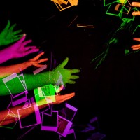
The exhibition features the work of eight artists, all of whom explore the interplay of light in a blacked out, urban space. There’s everything from a mirrored tunnel to an installation that uses glow-sticks. But it was of course the photographs that grabbed my attention the most. Okay, no, it was the glow-sticks. I admit it. How could I resist a neon Minnie Mouse hairband?

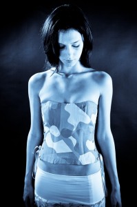
Convulsion Compulsion, by Sally Butcher

However, I was drawn to Sally Butcher’s beautiful photographic prints that layered delicately lit different aspects of the female body. Their subtlety was almost unnerving, but I found myself captivated by their strange contrast of tension and ethereality. And this contrast was taken up a few notches by the prints being in black and white, and the strange lighting of the venue.

If you’re in or around London, and the London Bridge area in particular, it’s worth an hour of your time. (And not just to play with the glow-sticks.)

Blacked Out runs from 21 to 28 August, 13:00 to 18:30, at Arch 897, Holyrood Street, London, SE1 2EL.

Make your own reflector

With a reflector

After writing about saving money on your photography a while back, we thought that perhaps you’d actually appreciate having a look at some of the suggestions that we made in a bit more detail. A good place to start is with a reflector. Duncan Howsley will tell you all that you need to know!
So you have bought a dSLR and a lens (or two). You have been taking portraits of friends and family. Whilst they look good, they don’t quite match up to your expectations: the lighting is not quite right and there are shadows in odd places. Or maybe you have been reading about off-camera lighting and want to experiment with using light in new ways; maybe you just want to take your pictures to the next level.

This is lit from the right with a reflector helping to light her face on the left

Unfortunately, buying a lighting set up can be both very expensive and complicated. Okay, so the recent popularity of the Strobist movement has increased awareness of affordable and DIY solutions to this problem, but investing in these systems is still a big step, it doesn’t matter if you’re still wet behind the ears with your dSLR or are a veteran of the manual campaigns. Fear not, however, as other solutions are available!

One of the most simple and affordable ways of controlling light is using reflectors. As if the name didn’t already give it away, they allow you to manipulate the light that’s available by reflecting it at the subject. If you want to splash out and buy a reflector, there are plenty on offer. Most take the form of a large, collapsible disc with both gold and silver faces. These two faces allow for control over the light temperature—essentially, the colour of the light—on the subject. The gold side providing warmer tones.

You can use a reflector with both artificial light and natural light. You can also use them in the same way as fill flash, allowing you to light up the subject’s eyes as well as removing shadows under the nose and chin. Pretty useful.

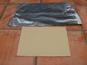
So, are you ready to get into primary-school-teacher-mode, dig out the scissors and glue and have a go yourself? I thought that you were. You’ll need a roll of aluminium foil, some cardboard, glue, and scissors to make a perfectly sufficient, if not slightly unwieldy, DIY reflector.

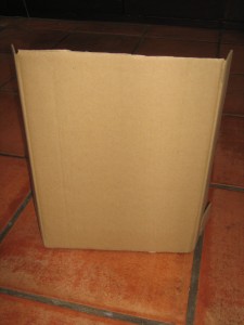
First, select your piece of cardboard. However big it is will be the size of your reflector. A cereal packet will make a cereal-packet-sized reflector, whilst the box that your new vacuum cleaner came in will make a fairly epic sized reflector.

Plain cardboard, still with side flaps at this point

Second, lay out your aluminium foil. It needs to be larger than your piece of cardboard. Foil not as wide as your cardboard? No problem! Use several pieces.

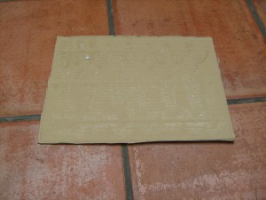
Third, apply glue to your cardboard. (Spray adhesive is probably easiest, but remember to do it somewhere well-ventilated and take adequate precautions.)

There is glue on this. Honest.

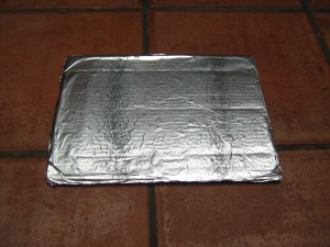
Fourth, stick your foil to your cardboard. Avoid sticking yourself to the cardboard. That’s messy. Fold the overhanging foil around the back of the cardboard and stick it down to make it look tidy, et voila! One reflector!

Tah-dah!

No go forth and take beautifully lit shots knowing that your reflector cost you practically nothing.

If primary-school-teacher-mode isn’t quite doing it for you and you want to advance to secondary school DT level, this blog shows you how to make a rather more snazzy reflector.

Sharing mobile phone photos with EYE'EM

EYE'EM

Do you have a camera phone? Do you use it all? Ever wonder what to do with your pictures? As the mobile photography movement continues to gain popularity, various methods of sharing these phoneography masterpieces have popped up across the scene. David Smith tells us about more about one of the latest to appear.

It’s called EYE’EM, a Berlin-based mobile photography platform that allows users to upload their photos and share them with the rest of the world. Founded in January 2010, EYE’EM hit the ground running and launched their first competition in March, receiving more than 3000 entries. The winning images were displayed at an exhibition at Schlechtriem Brothers gallery in Berlin, with finalists also having their work featured in the EYE’EM Annual, a book dedicated to the world’s most talented mobile photographers.

How it works

EYE’EM streams users’ photos in real-time as they’re uploaded to the site. Simply create a user profile and click on the site’s uploader to begin sharing your work with the invite-only community. You can tag your photos, comment on others’, and even share via Twitter and Facebook. EYE’EM is currently working on mobile apps for multiple devices to make uploading photos even easier.

What’s next for EYE’EM?

Following the success of their first competition in March, EYE’EM has recently announced their Second Mobile Photography Exhibition of 2010, this September in New York City at the renowned Openhouse Gallery. The exhibition will feature fine prints as well as digital screens displaying the crème de la crème of all photos submitted to EYE’EM’s platform.

The featured submissions will be selected by an international panel of photographers and other creatives, as well as by the EYE’EM community through the ability to like, comment, and share photos. Also included will be images from select NYC mobile photographers that have made an impact on the scene over the last few years. Submission deadline is 5 September. All you have to do to is upload your best mobile shots: the EYE’EM community will take care of the rest!

Just the beginning

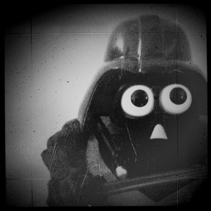
Darth Tater. David's prize-winning entry?

With continuous advances in mobile phone cameras and software applications, you can be sure to see more competitions and websites like EYE’EM to help mobile photography gain acceptance as a legitimate art form. More and more photographers are using their mobile phones everyday to add an alternative lineup to their portfolios, as can be seen on EYE’EM’s live-stream.

EYE’EM is an invitation-only community, but they’ve given us 30 invites. So if you feel like having a go, first 30 comments will win the goodies. (Just remember to put your e-mail address in the e-mail field. We won’t publish it, but if you don’t, we won’t be able to contact you!)

But now, I think I’ll go upload my latest iPhone masterpiece: “Darth Tater.”

Found: Cheap strobist flash review

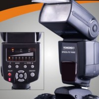
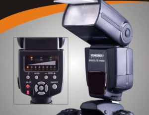
It looks a bit cheap, and the LED interface can be tricky to wrap your head around, but who cares: it's all about the light you get out of the flashgun.

If you’re an aspiring strobist, you might be shocked by the amount of cash you have to plonk down for a few Canon EX-580s. To get a decent set-up, you’ll need 3 of them, at least. And at $450 a pop, you’re not going to be much richer for it, really.

Luckily, there is a way out: The Chinese company Yongnuo makes some absolutely bargainous flashguns: the YN-560s are nearly as powerful as the 580s, and have a few clever tricks up their sleeve.

At $85 per flashgun, they’re also a fifth of the price of the Canon equivalent – but does it stack up?

It looks a bit cheap, and the LED interface can be tricky to wrap your head around, but who cares: it's all about the light you get out of the flashgun.

The legendary flasher David Hobby, of Strobist fame, got his paws on a production model YN-560 speedlight.

He found that the production quality was solid, but the Quality Assurance left quite a bit to be desired:

I so wanted to love you, YN-560. Now you hit me with a second, non-working feature. The absence of which essentially makes the flash unusable for me, necessitating a round-trip return to China.

On the one hand, this is why I strongly suggest buying direct. On the other hand, I would also suggest that Yongnuo join LumoPro in hand-checking each unit before it goes out. It is only a wasted effort if your quality control is hitting 100%. And you are not there yet, Yongnuo.

Then again, for $85, you can afford to buy a few extra ones, and keep sending the defective ones back to China for replacement under their 1-year warrantee, can’t you?

You can read the Strobist’s full test drive over on the Strobist blog.

Found: Translocation - animals in unusual places

Translocation

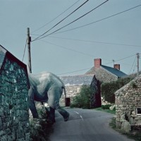
Whilst Basil Fawlty was convinced that herds of wildebeest could not be seen sweeping majestically through Torquay, Scottish photographer George Logan has created a series of great photos that show a host of beautiful African animals in the unlikeliest of places.

Rhinos standing at a Highland dry-stone wall? Warthogs congregating on a cobbled street? Giraffes grazing in the shade of windmills? Mongooses at a bus stop? They’re all part of the Translocation project, a collaboration between Logan, the Born Free Foundation, and Hewlett Packard Indigo, which aims to raise funds for the construction of Ensessakotteh, a conservation centre near Addis Ababa in Ethiopia.

The website is great, but I bet that the book looks even better. You should go take a peek.

Colour filters on a keyring

Photojojo filters 2

Colour filters: love them. The crinkled mess they always seem to end up in, no matter how carefully I store them: not so much.

If only someone would find an easy-to-store, easy-to-use solution for creased and wrinkled gels. ‘But Daniela,’ goes an email that has just dropped into my inbox, ‘we have!’

Those clever people over at Photojojo have put eight colour filters onto a keyring. So you get the entire spectrum, plus a double helping of green, in one easy-to-use place. Not only will they stay wherever you attach them, being on a keyring and all, but because they’re made from acrylic they won’t crumple either. Huzzah!

Now you can turn your whole world sky-blue-pink with a filter or eight over your lens, or just bits of your world lime-green-orange by using a handy-dandy elastic band to secure a filter over your flash. Not keen on lime-green-orange? Try imperial-purple-yellow with scarlet spots instead.

Available from Photojojo for US$15.

3D video camera on the cheap

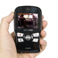
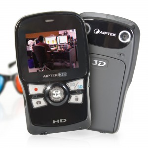
Okay so it looks a bit My-First-Camera, but who cares, if the final results look good.

With Toy Story 3 earning just shy of £40million during the first two weeks of its release, geeks still reeling from the beauty of Avatar, and all of Hollywood being a-flutter about 3D, you’d almost think there’s some sort of trend going on, or something.

It’s not just in the cinemas the revolution is raging: Sky is announcing the arrival of a new 3D channel later this year. It seems 3D has taken over our cinemas and is now making its way into our living rooms.

Okay so it looks a bit My-First-Camera, but who cares, if the final results look good.

Firebox is jumping on the bandwagon, and is giving mere slobs chance to get a piece of the action, with a HD 3-D Camera priced only £199.99. Awesome stuff.

This sleek, portable camera has been developed by the German technology firm Aiptek. It’ll have you recording in 3D super easily, without breaking the bank – sure as hell a lot more affordable than the $2,000 version from Panasonic

The little gem uses two separate lenses and image sensors to record videos in 3D.

Watching it couldn’t be easier: You can playback your recording immediately on the device, upload it straight onto YouTube 3D using the embedded USB connector and 3D glasses (included), or watch it on your fancy-pants 3D TV, through the supplied HDMI cable.

The battery will last for up to 1.5 hours and has an expandable memory suited for 32GB SD cards.

The Aiptek 3D Camera is available now from Firebox.com, and will set you back the princely sum of £199.99.

Found: Misadventures by Matt Sartain

sartian1

Some times, you get some hellacool projects happening here and there. “Misadventures”, by San Francisco-based photographer Matt Sartain explores individuals on long and epic journeys through dreamlike landscapes.

A fantastic collection of photos – and well worth a peek!

Check it out: Matt Sartain via PetaPixel

When the revolution comes...

The days of films have been numbered - and flat digital sensors might be next against the wall...

The cameras that we use today, the ones that we think of as digital. They’re not quite as digital as they wish they were.

Oh, they’re cameras, yes, definitely, they paint pictures with light and everything, but they’re not digital. Our ‘digital cameras’ so far have been film cameras that have been adapted for digital sensors. One expert claims that the real world of digital photography awaits.

In the next five years, we’ll see f/0.5 lenses, digital zoom that’s better than its optical equivalents, extremely high sensitivity sensors, and ludicrously high dynamic range.

Ladies and gentlemen… we present the revolution of the digital camera…

The days of films have been numbered - and flat digital sensors might be next against the wall...

You see, very often it’s easier to adapt something that you have and already know and understand to integrate new technology than it is to re-invent the whole genre for your new development. And in many ways, that’s just what has happened with camera technology. When film cameras were first being used, it was important that things were flat. It made them easier to transport. And there’s been a huge hang over from that obsession with the flat as cameras have become more widely used, and entered into the digital realm. Digital sensors in cameras are flat.

And when you stop to think about it for a minute, that’s a bit, well, silly. Our eyes, which at the moment are definitely more powerful than a camera lens, are curved. So why aren’t we making curved sensors? Oh yeah, because we’ve always made them flat. (Mmhmm, we’re having a bit of a ‘No, we’re not going to sail off the edge of the earth moment here,’ aren’t we?)

Can we make curved sensors? Well, Gary Sutton reckons that we can.

Let’s take a look at what he has in mind…

Video – in 5 parts

The white balance of your eyes...

white-balance

People have been thinking about how we perceive the world since the dawn of time. You can go all the way to ancient philosophy, with Plato’s Allegory of the Cave, for example, where Plato wonders whether if you never saw the ‘real’ world, whether you would know. Or, indeed, even care.

The senses are curious, because how would you know whether you see the world the same as somebody else? To me, for example, the rainbow never really made much sense: Sure, it looks the way I have always seen it, but that doesn’t mean it makes any sort of logical sense. How do I know, for example, that what I think of as ‘red’ isn’t what the rest of the population sees as ‘blue’. Of course, I’ve been pointing at colours and naming them since I was barely able to talk, so it’s pretty well-ingrained that ‘red’ is ‘red’, and that ‘orange’ is ‘orange’… But what if they aren’t?  

Deep philosophy about the very core of colour theory aside, I know for a fact that I don’t see the world the same as other people. Specifically, I know that what I see isn’t the real truth, because both of my eyes are giving me a different impression. Yes, really.

Two eyes, two realities

I noticed many years ago that my eyes are subtly different from each other: My left eye has a ‘colder’ colour balance than my right eye. I’ve spent a bit of time experimenting, and it appears that there is about an 800 kelvin difference between the two. That means that if I look at the left photo with my left eye, and the right photo with my right eye, these two look identical:

It’s been a bit of a curiosity for me for a while, and a while ago, I tweeted about it. As a result, I got a pretty big response, with the vast majority of responders saying something along the lines of “omg, me too!”.

That got me to thinking… Seeing as both my eyes are different from each other, there’s a 100% chance that one of them is ‘incorrect’. On the other hand, there’s nearly as big a chance that both my eyes are ‘incorrect’. Of course, white balance can be measured objectively, but ultimately, as photographers, we make a subjective judgement call on how we want to white balance our photos.

How can you test it?

Honestly, I have no idea how you can test it scientifically – but I find it’s most noticeable when I’m indoors, in medium-to-low light (presumably because my pupils will be bigger, but I have no physiological explanation for why this might be the case). Hold a hand in front of one eye, then move it to the other. You’ll see the picture ‘jump’ slightly to the side, but if your eyes differ from each other, you’ll also see the colour temperature change slightly.

So what does that mean to me as a photographer?

Nothing, I think. There are ways you can correct for your colour vision, apparently (you can wear slightly tinted glasses or contacts, for example), but ultimately it makes very little difference: Your eyes are absolutely incredible at capturing light, and your brain can handle colour balancing perfectly fine most of the time. In fact, your eyes / brain combination is vastly superior in this respect than a camera / computer combo.

I just think of it as a curiosity, and secretly, somewhere deep inside, I’m quite pleased that nobody in the whole world sees their surroundings exactly identically to what I do.


Do you enjoy a smattering of random photography links? Well, squire, I welcome thee to join me on Twitter -

© Kamps Consulting Ltd. This article is licenced for use on Pixiq only. Please do not reproduce wholly or in part without a license. More info.

DIY Toy camera presets for Lightroom

A street photo from Oslo, Norway, took on a completely different flavour with my new toy camera filters

Given the popularity of the Holga, Lomo, and the other toy cameras out there, I suppose it was only a question of time before some enterprising soul would release Hipstamatic, the app which lets you take cool, toy-camera like photos on your iPhone.

There’s something about that app which jars quite viciously with me, however: Unlike the ‘real’ toy cameras, this app doesn’t actually alter the iPhone camera at all. And despite getting pretty awesome results (if you like that style of photography, of course), it’s all post-processing.

That got me thinking… It has to be possible to make my own post-processing presets for Lightroom, to turn my carefully lit, exquisitely sharp and ridiculously high-resolution camera RAW images into blurry, colourful, vastly attractive garbage. So I created a couple of presets for Lightroom 3 – and I’ll walk you through the thinking behind one of them and I’ll show you how to make your own. How’s that for a double whammy of awesome?  


Toy cameras tend to get their special look by being terrible cameras. Their light meters will be off by a quarter country mile (so we need to either over- or under-expose the images for a start). They are likely to have light leaks (so we ought to add streaks to the picture), and the hip and cool crowd is fond of cross-processing the film, so we need to make a couple of changes to the way the colours are being displayed.

Exposure and sharpness

So, I’m going to start messing about with the exposure in this photo. I’m being conservative by only over-exposing it by 0.75, but you can always change this later, if a photo suits a bigger mis-exposure. Next, I’m ramping up the blacks a little bit to get a feel of a smidge of extra contrast, and I’m whacking the contrast and brightness right up. Yes, this makes your photo look wrong. And no, there’s nothing wrong with that!

Finally on this screen, the clarity goes down a lot. This adds quite an appealing blur to the image, which is typical for the kind of Polaroid effect I’m going for here.

Colours

It’s surprisingly difficult to get a realistic cross-processing look, but since I’m messing about with a polaroid-alike photo here, I’m on safer ground: adding some highlight and shadow toning gives that deliciously ‘not quite right’ polaroid look. To find the settings that work, keep experimenting – it’s not always easy to come up with the look you want.

Crop

Set the crop tool to 1:1 (that’s square), and crop your image. Then, it’s time for a spot of Vignetting – these are meant to be toy cameras after all…

Light leaks

The light leak effects are typical for toy cameras - and my little preset wouldn't be complete without 'em!

To get the proper feel of a toy camera, you’re going to have to try to add some light leaks. This is pretty easy, actually: Simply add a Graduated Filter across your image, with some interesting characteristics.

Personally, I decided to just brighten and then re-darken the image. I created one thin graduated filter with the settings shown below … And then another one just underneath it which had the opposite settings (approximately – it’s not as if toy cameras are an exact science). This creates quite a realistic bar of light leakage across your image.

Of course, light leaks are meant to be unpredictable and a bit random, but the great advantage of doing them in Lightroom is that you can take some of the guesswork out of them. Use the opportunity to move the light leaks around, and highlight the bits of the photo you would like – or hide the bits of the photo you’re not too fond of. There are no rules – make your own!

Finally, I saved all the above settings to a preset called “broken Polaroid”, and now I can go ahead and drastically reduce the quality (and improve the interestingness) of my photos!

Okay, then, let’s see some examples

A couple of guys on a motorcycle in India were a prime candidate for toy camera tasticness

This was the image I used when I first created the Lightroom preset, and I think it works quite well

A street photo from Oslo, Norway, took on a completely different flavour with my new toy camera filters

Laptopogram-tastic!

laptopogram

Fancy having a go at producing a photo that doesn’t require a camera? No, I haven’t lost the plot, of course you can. All you need is a laptop (or a TV, or a mobile phone, or one of those new-fangled iPad malarkies, or any electronic gadget that involves a screen and a backlight, really) and some photographic paper. How cool is that?

You hold the photographic paper to the screen, expose it briefly, and then develop it. You should be left with an image of whatever was on the screen. I have to say it again: How cool is that?

Aditya Mandayam dreamed up the process when on a residency with Benetton at their lab, Fabrica, in Treviso. And I thought Benetton was where my Ma bought me clothes when I was younger. Want to learn more? About laptopograms that is, not Benetton. Go here.

(Thanks Photojojo!)

Budding photographers wanted by the RHS

Something exotic at Kew Gardens

We like to get photographers started young and a bit of competition along with the chance to win a digital camera can’t hurt. Little Ones and Slightly Bigger Ones can test out their garden-related photography skills in the Royal Horticultural Society Young Photographer of the Year competition.

Under 11s can submit up to five photographs on anything that catches their eye in the garden, from squirmy tadpoles in a pond to super-tall sunflowers. Under 18s can also submit up to five photos, but theirs have to fall into one of six different categories: a garden plants study; abstract; the seasonal garden; garden wildlife; gardens and gardeners; and fruit and veg.

The overall winner bags a digital camera as well as the title RHS Young Photographer of the Year. Come second or third and receive some photography vouchers. Not bad!

Entries are being accepted now until 31 August 2010. Head over to the RHS website for more information, an entry form, and The Rules.

The model, the photographer, and the album cover

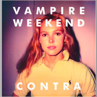
Vampire Weekend - Contra

Well, this is a curious one. It seems as if Vampire Weekend, whom I happened to see on Sunday when they headlined at Latitude, the photographer Tod Brody, and Vampire Weekend’s record company have found themselves in hot water over the photograph of a young woman used on the cover of band’s album, Contra.

It’s the sort of thing that happens when you use a picture of someone for commercial purposes without their consent, which is precisely what Ann Kirsten Kennis—amodel back in the 1980s and 1990s—is alleging. Whilst Brady is claiming that he took the photo as a test shot in 1983, Kennis’ lawyers say that it is more likely that her mum took the picture using a Polaroid camera. They aren’t really sure, though, and don’t know how Brody came to be in possession of the image. Even more odd: the model release that Brady submitted to support the photograph names the model as one Kirsten Johnsen.

Kennis is claiming $2 million in damages whilst Brady is claiming that Kennis has slandered and defamed him.

Hmm. I shall be intrigued to know how this one works out. It might be a while yet. The defendants have not yet submitted a response to Kennis’ allegations and a court date hasn’t been set.

(Thanks Photo District News)

Small freebies up for grabs

rawhdr

If you fancy playing around with HDR but aren’t really sure where to begin, something has just dropped into my inbox that might be what you need.

The dudes over at rawhdr.com have given us 10 free image sets (three raw versions of the same image: one under-exposed, one over-exposed, and one at the ‘correct’ exposure) to give away to our readers. They provide a selection of images suitable for HDR manipulation, you choose which ones you like and download them, and then away you go to manipulate until your heart is content. There are also eight tutorials available, exploring what HDR can do to images and explaining how it works.

The first ten people to get in touch with me by posting a comment below (remember to put your e-mail address in the e-mail field. We won’t publish it, but if you don’t, I won’t be able to contact you!) to win the freebies!

One map and lots of photos at Historypin

historypin

Photos can be a really important historical resource, and it isn’t just the pictures taken at significant events or of famous figures that are valuable. Those pictures stored in boxes in dusty attics or filed away in albums, your mother’s first holiday snaps and your great-grandparents’ wedding portraits, they all have a story to tell.

In fact, I’ve already written about how the images that we capture in our everyday lives will help to teach people living hundreds of years in the future about us. So how about making use of the photos that we already have?

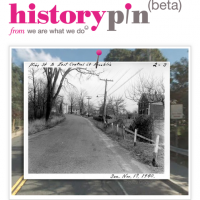
If you head over to Historypin you can find thousands of old photographs pinned to a giant map of the world, and you can add your own together with the story behind the image. You can search by place, by subject, and by date. And you can even compare how an area looked then with how it looks now. Can’t you tell I’ve had far too much fun looking at photos of the area where I live?

The people behind it are We Are What We Do, a movement that aims to inspire social change through lots of people doing lots of little things. The theory behind Historypin is not just to build a resource, but to get different generations talking to each other. They teamed up with Google who supplied the map and the Street View capability that allows old and modern picture comparisons.

Yes, it is still in Beta, which means that there are a few kinks that need working out; and because it a community project some areas are devoid of pictures and others have hundreds, but, I’m completely charmed by the idea. Old pictures and little bits of people’s lives scattered over a giant map of the world. What’s not to like?

Now, I wonder if they have any pictures of where my grandparents were married…

The good, the bad, and the ugly - free picture editing software

Original

If you’re just wetting your feet in photography, or perhaps if money is tight, you might not want, or be able, to splash out on expensive editing software. There is, however, quite a selection of free editing packages out there. We thought that we’d give four of them a spin and tell you what we thought.

Testing out these wonders we have N. Maxwell Lander, a Toronto-based queer photographer and website designer, who also happens to be a bit of a picture editing genius. So, what’s to be said for Picasa and Picnik, GIMP and Pixlr?

The Little Guys – Picasa and Picnik

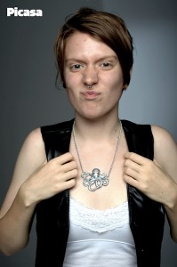
Picasa is handy. Picnik is similarly handy. Really, what you need in a photo editor will determine which program is best for you. If you need really basic alterations and really awesome organisation, as well as somewhere online to store and share, Picasa is for you.

I’m not gonna lie, I’m a giant Google fan. I use a whole lot of their products for a variety of things. Picasa web albums are my favourite way to share my photos with clients. I don’t, however, use Picasa as a standalone app. My number one reason? No localised edits, save for a retouch brush for blemishes. Picasa—as well Picnik—both do generalised editing, which for the snaps coming out of your point-and-shoot camera are fine. Although, I’m willing to bet your camera came with software that could do all the same things.

Here's what you can do with Picasa

The perils of online apps

Hands down I’ll recommend Picasa over Picnik. The features are similar, but Picnik is an online app, and I just don’t trust online apps – they get real slow, real fast. Since I can see no advantage of using an online one, it’s a lose-lose scenario for me. Realistically, you’re going to get similar edits out of both as all the basics are there: red eye removal, saturation, contrast, crop, rotate, those bits and pieces. For me, a huge factor in photo editing is how easy the program is to play around in, how much I enjoy being in there. I didn’t end up trying all of Picnik’s features, because I didn’t find it to be an enjoyable experience.

Based on user experience, and especially when we are talking about low-intensity users, I would have to choose Picasa. The layout of everything is easy and accessible, and there aren’t too many options to get overwhelmed by.

But effects can be fun!

There is one thing I will give Picnik – it has fun effects. I am hesitant to admit that since becoming an iPhone user I have gained an appreciation for overdone, stereotypical photo effects. While I think that these types of effects can become cheesy very quickly, I am getting sucked into their charm… but only, and I hope you will follow my example, only for playful snaps. Your slightly wonky party pics will look way cooler in the 1960s effect then a ‘correctly’ adjusted photo.

This is the sort of fun that you can have with Picnik

The Big Guns – GIMP and Pixlr

Alright, here’s where things get a little intense. GIMP and Pixlr. In comparison to the last two, they are both wonders. The features that exist in either far surpass anything Picnik and Picasa can offer. Both programs are capable of doing 90% of my Photoshop workflow, which is saying something.

Same same…

Things they both have to offer – localised edits (such as brushes and selections), layers (for “non-destructive” editing and adjustments), a wide variety of adjustment (contrast, saturation, curves, colour…), many many filters, and they both open raw files (although GIMP is the only one that can edit the raw). There are more, but already we’ve a hefty list of features that could keep anyone occupied for years of photography (and probably everything you need to be a pro).

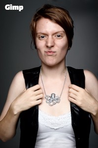
How things turn out using GIMP

…but different

There are a good number of differences between the two, and some negatives to consider, because no program is perfect. With GIMP, the main negatives concern interface. It is irritating to work in. It’s possible that if I weren’t one of Photoshop’s biggest cheerleaders, I wouldn’t find it so, but I’ve checked in with a good number of people and almost everyone I’ve talked to agrees. There is something about the way it is set up that makes it unpleasant to work in, and who wants to be irritated by their editing software?

Trouble with GIMP

As far as technical negatives with GIMP, there are three major ones that stick out for me: limited size of the brush (which I’m sure if I could write code I could change, but really, what a stupid thing to do), no adjustment layers (all adjustments, in order to be non-destructive, must occur on a new merged layer), and, this one is only for Mac users I believe, separate windows for each item. Palettes, toolbox, and image are all separate windows, which means I have to click back on my image before entering a quick key… which makes it not quick… which makes it useful how?

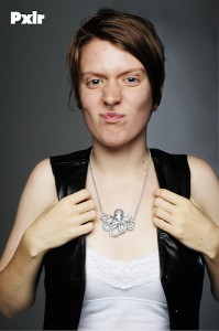
Results using Pixlr

Those are three really big things for me, and coupled with the annoying interface I was irritated beyond belief when trying to complete my whole edit in GIMP.

The ups and downs of Pixlr

Pixlr, on the other hand, only shares the lack of adjustment layers from that list, and isn’t at all obnoxious to work in. I found it an easy and accessible interface, and, would you believe it, the quick keys work! The downside to Pixlr? It’s an online editor. Sometimes it’s slow and it even crashed on me a couple times when I started getting into larger file sizes and more layers…. oh wait, did I forget to mention that GIMP did that too? They both got overwhelmed with serious editing, which is a shame because they could both be amazing options. As it stands, they are more like curate’s eggs: excellent in parts.

The verdict?

Ultimately, you get what you (don’t) pay for. The free suites offer basic editing, some clever effects, as well as some serious technical capabilities. But they also come with speed issues, reliability issues, and in some cases user interfaces that aren’t so user-friendly. But if you’re prepared to persevere, they will do what you need them to.

Feedback on your photos at Focussion

Focussion

Feedback on photographs can be a funny thing: of course you don’t want to be shot down in flames and told that it’s an awful picture, but more often, you don’t just want to hear: ‘Great shot!’. Knowing why someone thinks it is a great shot, or what you could have done to make it that bit better is far more valuable. But with so many millions of images up for critique in the usual haunts, it’s easier to just say the obvious, or say nothing at all. So how about a site that actively fosters sharing feedback?

This is precisely what Focussion has been designed to encourage: photographers leaving other photographers feedback on their work. Sign up to Focussion (it’s free) and you’re awarded 250 credits. Those 250 credits will allow you to post 10 pictures to the site. In order to be able to post more photos, you need to leave comments on other members’ photos. Each comment that you leave earns you five credits. It’s a feedback economy.

What kind of feedback will this one get?

The focus is on the photographs, not on features, and making sure that they gain feedback. The most recently uploaded images appear on the front page and the most recent comments are on the right side bar. There’s nothing complicated about it, although I would like to see a less clunky method for being able to view a given member’s entire catalogue. Right now, this can only be done by finding one of her or his photos and clicking through from there.

And the cynic in me can’t help but think that it is all too easy to leave ‘Great shot!’ comments, rather than something properly constructive. Perhaps by introducing a second layer of critique, whereby the recipient of the feedback rates how useful it was, the feedback process can be strengthened. But maybe this moves away from the simple model that inspired it. If you give constructive feedback, you’re likely to attract it, too.

Focussion went live on 4 June and already has about 80 members. You should head over there, sign up, and share a little picture-love.

PhotoEngine: edit in real-time

Oloneo

If you’ve ever wanted to turn off or dim a light in a photograph after you’ve taken it, or if you’d like to be able to adjust exposure as if you were still behind the lens but aren’t, then the people over at Oloneo might have just the piece of HDR software for you. What’s more, it makes the adjustments in real-time.

PhotoEngine allows you to alter the lighting in your pictures, for example to switch on or off light sources or adjust their white balance. It also gives you the capacity to recover details lost to over-exposure, or to restore areas that have been under-exposed. And there’s a noise reduction tool, too.

PhotoEngine is still in Beta and is only available for Windows, but you can learn more about it and download it for free from Oloneo.