Photography Theory

Becoming a better photographer - with Photo Forensics!

If you've been anywhere near a technology magazine in the past few months, you can't have failed to see a series of Tamron adverts, showing off their 'astonishingly compact and leightweight' lens with 15x zoom lens. However, when I was having a peek at the advert, I started wondering what, exactly was going on here.

The advert in question is this one:

screen_shot_2012_09_26_at_144731.jpg

Now, don't get me wrong, this is a lovely photograph. But I can't help but wonder whether we're all victim of somewhat false advertising here. There are a whole load of things wrong with this photographer, and as an observant student of photography, I'm sure you can spot at least some of them. Take a close look at the image, and think like a photographer - what are you seeing?

Depth of field

One of the problems I had with this photograph, are the claims about zoom length and depth of field. The two photos are a wide shot and a very up-close photos, and since this is a 18-270mm lens, it stands to reason that Tamron have taken one photo at each of the focal lengths. So, that means that the widest possible aperture the main photo could have been taken at, is f/6.3 (this is a f/3.5-6.3 lens after all). As such, the top photo would have been taken at 270mm and f/6.3.

screen_shot_2012_09_26_at_144735.jpg

The shadow and highlight on the adult's arm, along with the highlight portion on the boy's arm would indicate that the light is coming from above and left in this photograph. Lovely; but that leaves us with some questions. If we follow the 'sunny 16' rule, this photo would have to be taken at ISO 100 with 1/100th of a second at f/16.

However, there's a very distinct shallow depth of field thing going on, which leads me to believe that this image will have to have been taken wide open - at f/6.3. That's entirely possible, of course, but then the camera would have to be shooting at 1/4000th of a second or thereabouts. No problem, but there appears to be some motion blur on the droplets falling off the oar in the background - indicating that this image will have been taken with a shutter speed of 1/200 or less.

Of course, all of this is possible if they used a Neutral Density filter (in this case, to get from 1/4000 to 1/200, you'd need a ND4 filter or thereabouts) when taking this photo, but as far as a like-for-like comparison goes, that seems a little bit weird for an entry-level consumer lens.

screen_shot_2012_09_26_at_153319.jpg

Another argument for why this photo doesn't quite stack up in my mind, is that for this particular lens, you only have to focus up to about a 30ft / 10m distance. After that, you've focused to infinity, which means that even at f/6.3, you actually have pretty decent depth of field. If the top photo is taken from the distance implied by the bottom photo, I'd say that something really curious is going on in these shots: To me, it looks that the distance to the boat is about 10 meters - and if that is true, then the picture is a physical impossibility without extensive photoshopping.

Or rather: I can't really see how a 270mm f/6.3 lens could have taken this photo from the distance the bottom image would imply - especially considering how the boy is perfectly in focus, whilst the boat just in front of him, and the paddle just behind him is out of focus.

If you ask me, it looks as if the photo was taken from much closer than the inset photo claims, the lens blur on the foreground (on the boat) is genuine, whereas the person in the background has been blurred in Photoshop, after carefully applying a mask around the boy. That would certainly explain why there doesn't appear to be any further depth of field fall-off between the man's elbow / paddle and his face - they all seem to be blurred the same amount, which seems unlikely if the photo was taken in the way it is implied

Lighting

The other thing that I find weird in this photograph, is how it looks like the lighting is quite different in the two photos. If you look at the smaller, inset photo, you can see that the life vest the boy is wearing is significantly brighter than his face. On the main photo, however, we are getting remarkable detail and dynamic range in his face.

In fact, the fact that we have perfect definition in the directly sunlit arms of both the people in the photo is astonishing; you'd expect a lot less definition in the shadows in this image... Which makes me believe that this photo has either been through some rather extensive photoshopping to lighten the shadows (nothing wrong with that...) or that a reflector was used to achieve the top photograph.

Again, of course, there's nothing wrong with using a reflector, or photoshopping a photo to make it look better, but I can't quite help but think that whatever is going on here, it would take some expert photoshop or lighting skills to get that much detail out of the photo - and if that is the case, is it a honest comparison between the two shots?

No help from Tamron

Of course, I wanted to find out for myself how these photos compared to their originals, so I e-mailed Tamron back in May to get my hands on higher-resolution versions of the photos used in this advert. Back then, I received an out-of-office e-mail from their press office, but I never received a reply to that e-mail, nor to any of my other enquiries. A shame; I think it could have been really interesting to see how far off I was in my 'photo forensics'.

What can you learn?

Anyway - the point of this article isn't to point fingers - it is entirely possible that Tamron's photos are entirely above board, and that the photos shown are direct-out-of-the-camera versions of photos taken with the Tamron 18-270mm lens...

The point I'm trying to make is that you can learn an incredible amount about a photograph by just looking at it, without having any additional information about the equipment used. The key to learning something from this exercise is to ask the right questions, and apply everything you know about photography to the image to 'reverse engineer' how it was taken.

I made a habit of analysing photographs I've seen in magazines a long time ago:

  • Where does the lighting come from? Is it natural lighting, flood, or flash lighting? How is the light managed / adjusted / reflected / diffused?
  • What is the shutter speed and aperture likely to be?
  • What angle was the photo taken from?
  • What focal length lens was the picture taken with? Was it taken with a telefocus or a wide-angle lens?
  • What digital enhancements were done on the photo before it ended up on print?

By spending 30 seconds on any photo you see around you, you can train yourself to become a better photographer, even when you are miles away from your photographic equipment!

Amah's day off: or how to shoot your story

A great many column inches across the Intergoogles are devoted to the notion that photography is not a crime and to the rights of photographers to be able to shoot what they want to, where they want to, when they want to. This is something about which I have been vocal in the past and until that heaven-sent day when officious security guards without an understanding of the law and with an over-inflated sense of ego get their acts together, I will be continue to be, too. I spend what seems an absurb amount of time explaining to the non-photographic public that, yes, actually, when they are in a public place I do have every right to take their photograph. The term is 'no reasonable expectation of privacy.'

These are our rights.

However, if the obverse of our photographic coin are our rights, the reverse is our responsibility. Anyone who practises the craft of photography has a responsibility to their story and to their subject. We're privileged to be able to record the world around us, to be able to slice moments out of time and make pictorial records of them, and to be able to show people another life, a different way. Unless we're prepared to do this with sensitivity and respect, there's no point in doing it all. What's the point of telling the story if we're going to ride rough-shod over the subject?

We have a responsibility to tell stories honestly and with compassion, protecting and respecting our subjects as necessary.

This was rammed home to me today as I went to catch the ferry from Hong Kong Island to Kowloon.

Story i

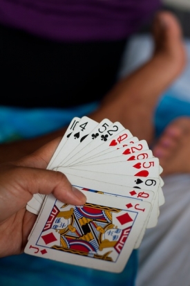
Sunday is the day off for Hong Kong's great tribe of amahs. In years gone by, amahs were housekeeper-cum-nursemaid spinsters who became a part of the family for whom they cared. They'd watch one generation grow up and help to raise the next, a constant presence in the family. Nowadays, amahs are imported domestic help for Hong Kong's more affluent residents. They cook, they clean, they care for the children, and they walk the dog.

The majority of amahs come from the Phillipines, but there are plenty from Malaysia and Indonesia, too. As they are live-in employees, they have nowhere to socialise other than in public. On Sundays, then, they gather in their thousands to worship, to chatter, to do their hair and nails, to play cards, to eat, to drink, and to be merry. The entire area around Central station on Hong Kong Island is a fantastic cacophony of cackling laughter, raucous gossip, and 80s music. (There might well be other music, but I only heard reminders of my childhood.)

Everywhere I looked, there were incredible photo opportunities.

Every time that I raised my camera to my face I was met by resolute head-shaking. None of these women were in the least content having their photos taken.

So what to do? I could I have stood there explaining that I didn't care whether or not they were happy with me taking their photos, they were in public, and dammit I can. But these are pretty feisty ladies, and I didn't much fancy having a few thousand of them chasing me through the streets and across the aerial walkways of Hong Kong. I'm not the protagonist in a martial arts film, thankyouverymuch. And obviously something was bothering them. It would have been easy to walk away and leave it. But, there was more to this than met the eye. They were women, I'm a woman: I approached them.

Story ii

It transpires that many of these women are working here illegally. They are terrified that if their images are splashed all over the intergoogles or over newspapers and magazines, the wrong person might see it and they can be deported. They don't know who I am or what I'm going to do with their pictures, so they'd much prefer their collective anonymity and safety in immense numbers.

Even worse, some of these women are abused by their employers. The majority of maltreatment is verbal, but there's physical and probably sexual abuse, too. They don't want to rock any boats and they don't want to get into trouble, so no pictures, please.

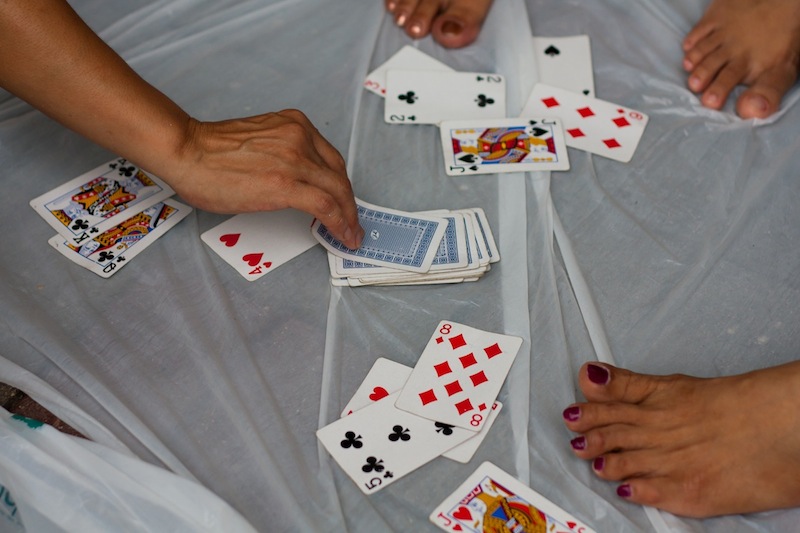
What, then, if I took their photos so that they couldn't be identified? Shots of hands and feet with no faces at all? What would I do with the photos, they asked. Tell your story, I said.

Okay.

I have my pictures, the world has a story, and for one two-hundredth of a second, these Filipina amahs have the respect that they deserve.

When more than just the horizon splits your frame

Horizon on the upper third; shoreline on the lower third. Perfect!
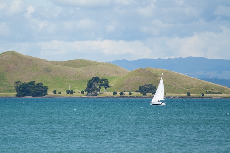
I'm doing quite a bit of landscape photography at the moment; it was my photographic resolution for 2012, and seeing as I'm travelling right now, felt like a sensible choice. This of course means that you'll be subjected to a hefty quotient of landscape articles for the foreseeable future. I'm sorry if that doesn't float your boat, but I'll do my best to keep them entertaining and informative.

So there I was, at the top of Rangitoto, a volcanic island just off of Auckland, snapping away at some landscapes, when it occurred to me: it's a cardinal rule of photography that horizons shouldn't run through the middle of photos, you should apply the rule of thirds. If you want more emphasis on the area above the skyline, you place the horizon on the lower of the two imaginary lines dividing your frame into thirds. Should you prefer that more attention to rest on the foreground, place the horizon on the upper third dividing line. That we know.

What, though, should you do when there's more than one dividing line in an image? For example, if you've a series of islands in your frame. Or a shore line and a skyline right in front of you. Yes, the horizon is the horizon, but these strong lines can also have a nasty impact on your photos if you manage to get one of them smack-bang in the middle of your frame, too.

If you've two dividing lines running through your image, ideally one would go closer to the upper third and the other towards the lower third, with both avoiding the middle. That should keep things dynamic, and prevent your image from looking flat and dull. The first image up there does just that: the shoreline is on the lower third, the horizon is on the upper third. Bingo! But, geography isn't always that accommodating towards geometry - and let's face it, it's why photographing landscapes can be so inspiring - so sometimes you will need to get a bit creative with your cropping.

The skyline might be running along the upper third tri-line, but it does nothing for the shoreline

Take the examples with the solitary yacht. The first one (above) has the skyline is running mostly along on the upper third, but the shoreline is perilously close to the centre. By cropping a bit from the lower half, I've been able to place the shoreline on the lower third, giving it an overall better feel.

Pushing the shoreline, and indeed the skyline, lower, has a more pleasing impact

That shoreline is so strong in this image that it needs to be properly accommodated to prevent the photo from looking oh-so-obviously split in half.

In fact the blue of the sea is so strong in this picture that if you wanted to, you could even push it a little further down the image, which pushes the actual horizon closer to the centre of the frame. Of course, that might not float your boat at all!

An even lower shoreline might work, too, given how strong it is

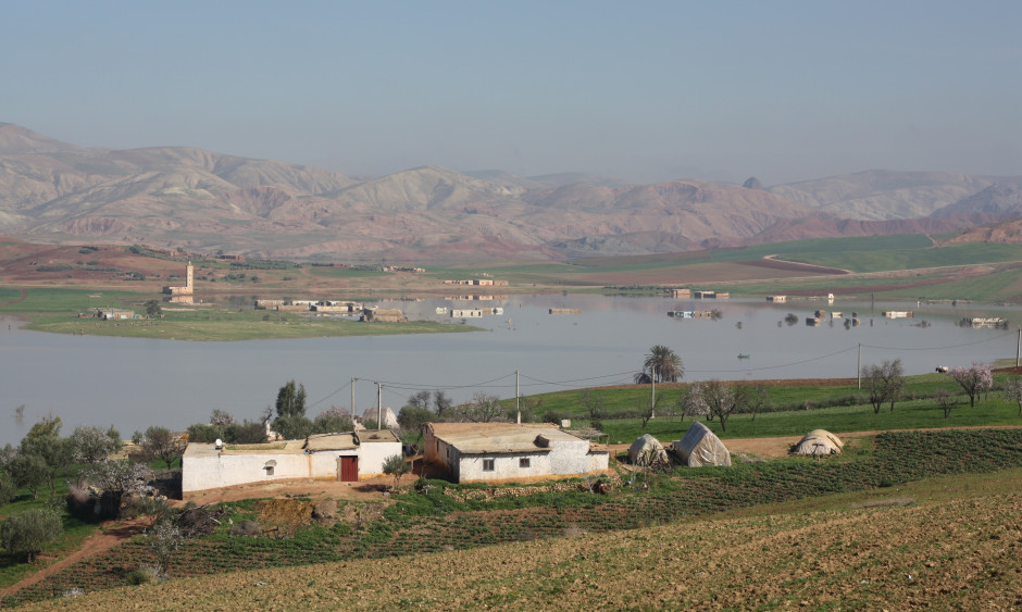
If you've an image where you have three or more strong dividing lines running through it, the chances are that one of them will end up running straight across the centre of the frame, with others above and below it. Provided that the central line isn't overwhelmingly strong and obviously bisects the scene, there should be sufficient movement across the entire photograph to keep it fluid and interesting. You can see that in the photo of the flooding I took in Morocco (down below). The floodplain runs through the centre of the image (look carefully and you can see the reflections), but the skyline and the shoreline are both strong enough to stop it from coming over as boring. In other words: don't worry too much.

When there are multiple dividing lines running through your images - use your judgement!

Finally, don't forget that if you're using a non-destructive editing package, there is nothing to stop you from playing around with the composition of your image until it looks right. Apart from making that picture look pretty, it'll also ensure that the next time you encounter a similar situation, you'll have a better idea of what works and you'll have to do less fiddling in your editing suite.

Oh, actually, this is finally: make sure your horizons are straight.

Picking a picture project for 2012

New Year is just around the corner and there is perhaps a chance you're looking for a photo project to keep you inspired and develop your skills throughout 2012. My dislike for 365 self-portrait projects isn't exactly a well-guarded secret, but that doesn't mean to say that I don't see the value in embarking on some kind of project. Quite the contrary, in fact. So, after much trawling of the Intergoogles for interesting ideas, and even a little dreaming of my own, here are ten of my favourite potential photographic projects. And there's not a 365 (or 366, given it's a leap year) self-portrait project in sight.

Architectural features - The town where my parents live has an unusual number of buildings with clocktowers. (My brother and I noticed this, I kid you not, when we were devising a zombie survival plan.) These clocktowers are beautiful and would make for an interesting series of images. So would weather vanes, or doors, or windows. Any architectural feature that piques your fancy could prove a challenging project over the course of a year. Or even a lifetime.

Do a Monet - Haystacks, the waterlillies at Giverny, Westminster: he painted them at different times of the year in different lighting conditions. (And indeed at different stages of his life. If you're wondering why the late pictures of the Japanese bridge are so red in tone, it was as the result of cataracts affecting his vision.) Anyway. Pick a landmark or a landscape and set about photographing it at different times of the day, in different weather conditions, and throughout the year.

Fairytales - I've seen this one mentioned on countless different websites, so I can't give credit where it's due for the person who thought of it originally, but I love it. Gather your capes, dust off your wands, construct your gingerbread houses, and set up your tripods!

Numbers - There are lots of ideas for alphabet and number photo projects out there. For this one, though, I was inspired by the BBC website magazine's '10 Things We Didn't Know Last Week'. Each week, the article is accompanied by a reader's image of a cluster of ten things. It's included a pile of skulls (ick); the contents of someone's packed lunch (yum); ten chairs at a cafe (yeah); and a pile of ten puppies (cute). So start with one, and go as high as you can photographing randomly spotted numbers of items in groups.

Portraits without a person (or at least most of one) - Capturing the essence of a person doesn't have to mean photographing her or him. When you get to know people, you realise that there are things about them that somehow define them. My brother's recognisable by his curly hair and if I'm seen without a particular pair of earrings it's likely to be a cold day in hell. Go out in search of those things that help define a person and you have a whole new series of portraits.

Recreation - No, I'm not suggesting that you might want to recreate some of your favourite photographers' best shots. I'm going for something a little different here. Why not try recreating a favourite painting? I don't know, John William Waterhouse's The Lady of Shalott, any of Degas' ballerinas, maybe even one of Fantin Latour's flower paintings; whatever takes your fancy. Getting this one right might take a year of planning for one photo, but it's definitely a project!

Seven Deadly Sins - Anger, envy, gluttony, greed, lust, pride, and sloth. You might want to create representations of them in the studio, but you could take this as more of a social documentary project and head out to photograph evidence of them in your community.

The spectrum - One of my favourite competition themes that I've set was 'monochrome'. The idea wasn't to produce black and white images, but one in a predominant colour. Why not take this idea one step further? Produce a series of monochrome images that run through the spectrum.

Tell a story - Pick a favourite story and retell it using a series of photographs. You can make this as involved or as simple as you want, and if you choose a loved-one's favourite book, it could make a wonderful gift.

Your weakest technique - Which element of the photographic canon do you find most difficult? A few years ago, I decided that portraits were something that I needed to improve. So I set myself a challenge to take more pictures of people, to evaluate them, and to chart my progress over the course of a year. Last year, it was all about diversifying my use of studio lights and trying new techniques and ideas. And 2012? I might aim for landscapes. It's where, right now, I feel least confident. Ask me again in a year's time, and hopefully it'll be a different story.

If you're looking for even more inspiration, you could check out Rania Matar's wonderful A girl and her room, Gabriel Orozco's quirky yellow scooter photos, Irina Werning's brilliant Chini Project, or Pixiq's own Miss Aniela's extraordinary multiplicitous self-portraits. Not forgetting series of shoes, pin-hole photography, opposites and dichotomies, 100 strangers, shooting from the hip, or documenting a day in someone's life.

Just remember, when you pick a project, you're in it for the long haul. You want something that's going to stretch and challenge you, but isn't going to overwhelm or bore you, either. Learn, and have fun!

I Just Remembered How Fun Photography Is

Baileys - the smile maker.

Blinkers. Yes, those things they put on horses to keep them looking straight ahead. But I’m not talking about real blinkers, no: these are special, invisible, metaphorical blinkers. In particular, I’m talking about the ones that form around the eyes of a photographer once in a while. The more you learn, the less you experiment. It’s the process of going from a hobbyist to taking photos for a living, or indeed to just having the drive and need to improve. We all get it once in a while and it can be hard to shrug off, especially when we’re looking for a new subject or concept but feel bound by the rules. So how do we start afresh? How do we tear those blinkers off (no, stop clawing at the sides of your face – like I said, they’re metaphorical blinkers) and find a fresh new approach? This week, I think I found the answer: you have to remind yourself that photography is fun. 

Baileys - the smile maker.

At the moment, I’m undertaking a couple of portraiture projects. One of them was born of frustration, of sorts, at feeling like I had no ideas, or that anything I could think of only took a quick trip to google to discover that it had already been done. Of course it had: seeing as there are 7 billion people in the world (that’s right, I read the news), it’s quite likely that someone has had a similar idea to your incredible, totally original megaplan that just formed in your massive, omnipotent, glowing master brain. Any project I could think of seemed boring, limp, overdone, predictable, stiff, stupid, silly. The only photo work I was doing was commissioned stuff – stuff I’ve been doing for a while for which I have naturally developed a pattern. This is an inherently human problem: we are genetically programmed to recognise and find comfort in patterns, yet simultaneously, we get tired of repetition. We need variety, change, difference. This is why we are often warned about photography as a job, because we find that when it goes from a creative pastime to something we do as a matter of course or a process we repeat for cash, it becomes that other thing: it becomes work.

Just chillin'

You can imagine my delight, then, when I began this new photo project and the blinkers came flying off at speed at wild angles. Tragically, one of them flew headlong into a small boy. Thankfully this small boy is also metaphorical and represents creative inhibitions, so we can all relax. This long term project was coming along nicely, when I felt something at the sides of my face. That’s right, further blinkers, only these ones were flesh coloured and therefore harder to detect at first. I sat down and sighed heavily, like a man struggling with a tortured, extended metaphor. The subject was interesting, but I needed to mix up my approach also.

The company I am following for my project had an office party upon reaching a milestone, and I was invited. As I am both never one to turn down the opportunity to take photographs yet also never one to turn down the opportunity to party,
I found myself in something of a quandary. Then I came up with the solution: I would take my equipment, set it to an auto mode to make it at least a little foolproof, and then set them loose with it. Tonight, they would take photos of each other, in a relaxed environment where they were in control of everything. As I handed the camera over to the first willing participant, a wave of consternation laden questions passed over me. Will they be into it? What if they break the camera? Will this work, or will it just be a bunch of terrible, unusable snaps? Is this cheating? How far is too far when breaking the rules? Has the gin run out?

I have no idea what's happening here.

I was absolutely delighted to discover that almost everyone was not only willing but eager to have a go. In addition, they took greater care of my camera than I do, holding it with extreme care as if I had given them my newborn baby. I smiled as I watched the behaviour of those with the camera and how it differed from person to person. Some would try to be more stealthy in their approach, waiting to become unnoticed before firing off a few shots at distracted individuals. Others initially took the camera with some uncertainty, gingerly padding around wondering what to do. I would turn away and check back on them a few minutes later to find the same person sliding down the wall into a crouching position, snapping here, snapping there, rushing around the other side of the sofas to get that crucial shot they’d just spotted. Some would simply observe and record, whilst others would get their workmates to pose or dance or do something silly. It made me incredibly happy to see people enjoying photography, to see everyone take to it and have a go and the fun and enjoyment it was bringing them.

That’s when I had a somewhat simple yet important revelation – they were having fun with the camera. Because that’s one of the many things photography is: fun! Somewhere along the line, although I had never stopped loving what I do, I had forgotten to relax and have fun, instead of being intense and super concerned all the time when taking photos.

I also got a lot out of being on the other side of the camera. As a portrait photographer, it’s important to get a sense of how it feels to be the subject as well as the photographer. That sense of empathy can help you when it’s your turn to take photos again. I also realised that it can be easy to forget that someone is taking photos, and you get used to it more quickly than I thought. This is also useful to me, because where once I might have hesitated to shoot, because I wondered if the shot would be natural enough or if I was being overly conspicuous, it seems that often this would not have been the case.

This is Dave. He has lost.

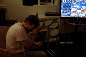
What was even more rewarding was that the learning process did not stop there. When I uploaded the images to my machine the following day to look over them, I was initially picking out all the focusing problems, all the low lighting issues, the odd compositions with peoples’ head coming out of other peoples’ backs or not being quite right in the frame and the strange choice of angles. On my first pass through the images, I was thinking “hmmm, can’t really use that, can’t really use that, not sure about that”. On my second pass, I learned something – on at least a few images that I had supposedly looked over, I had missed some brilliant moments that made the photograph worth including, such as Dave losing at a game of Super Puzzle Fighter, his head in his hands, which was being matched by his onscreen avatar and accompanied by the word “LOSE” in big letters in the top right. It was a brilliant little image and, regardless of how much intention was behind it, it had recorded a whole story in one frame. Surely, this is the very essence of a great photograph. I had lost myself in the rule of thirds and exposure levels, looking purely at the technical and missing the artistic, the story being told in the image. It was an eye opener for me – a technically proficient image still lacks punch and excitement if there’s no story within it. It’s not that I didn’t know this, of course, but sometimes learning by experience is infinitely more valuable than learning something in theory.

If you’re feeling burnt out with your photography or you feel like you’re treading water, it’s probably because you’ve forgotten how to have fun. Don’t allow the technical to overwhelm you. Remember, photography is part science, part art, and wholly fun.

Thanks to Gareth Dutton for this. You should completely check out his work, too!


Your favourite rules of photography


There are many ways to learn photography - one of the easiest ways is to learn a set of 'rules' that work like a shortcut toward getting awesome photos. You'll have heard of a lot of them before; there's the Rule of Thirds, for example, the golden mean, or simpler rules, too: Such as "get your photos in focus" and all the rules-of-thumb to do with equivalent exposures etc.

Do you know of any other “rules” for photography? Which rules to you stick to most of the times, and what rules do you love to break for best effect? Leave a comment below!

Why didn't I take that photo?

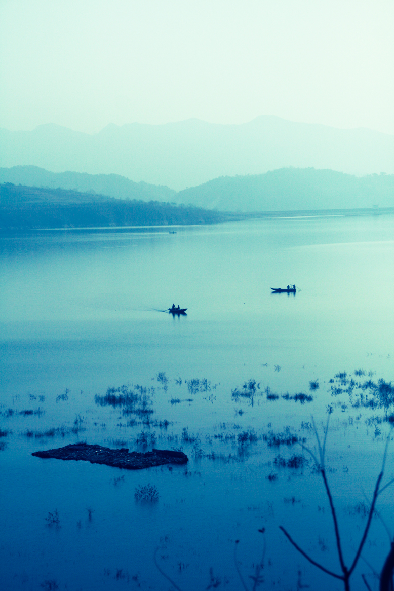
Boats in a lake

It’s Friday. Time for a treat. We’re bringing you the first in an occasional series written by Ross Sheddon, who’s an official ship’s photographer on a cruise liner. How much of an awesome job is that? We thought that we could enjoy his wanderings vicariously, as he talks us through where in the world he happens to be at the moment, and what he’s learned about photography in the process. In turn, what we can learn, too. And try not to turn green with envy. So, here we go, where in the world is Ross, and why didn’t he take that photo?

It’s a beautiful day in Scotland, the sun’s out, it’s almost warm. But I’m not there. Early morning and two hours north east of Qingdao I can see my breath on the cold clear window of the old bus. I wiped the condensation away for the hundredth time as the most amazing vistas of barren fields and leafless trees swept by.

I absent mindedly flicked the shutter speed up another notch on my trusty old 40D. It had been sitting in my lap like a sleeping child for most of the journey. It, like me, had very little to do until we reached our destination.

I sighed, a basic lesson of being a professional is this: You never shoot through windows. And you never, never, never shoot through the windows of a moving vehicle. The urge is always there but training and experience tells you that the shot will not be one of quality. You don’t do it, it’s the rules.

I’m sure you think you see where I’m going with this, rules are meant to be broken et cetera, et cetera. That’s for another article, what to take away from this is not to break the rules, simply to be ready. The best shot will come at you when you least suspect it and if you’re not ready you’ve no chance to capture it. You can’t always be in the front row of the rock concert; you’ve got to make the best of the opportunities that arise.

The bus swerves to give more room to an old truck trying to pass on the inside of the blind bend and I grip my camera a little tighter in reassurance. A flash of trees. A lake appears. It’s there for two seconds or more then it’s gone.

On a small back road, far outside Beijing, early in the morning, I’ve grabbed an image from the world around me. It’s not the sort that you get a second chance to shoot; my colleague behind me didn’t have her camera case open before it was past. If you’re ready when the shot comes you can take it, if not… well we’ve all had the pleasure of looking enviously at our friends and colleagues shots from the day we forgot to charge our battery and accidently left the spare packs in our other bag.

It may not be a shot that’s going to win any competitions; it may not sell as stock. It may simply sit forever on my hard drive but I got it. I got it. Every time I look at the image it reminds me of that time and place, the feel of the piece deeply invokes in me the memories of the moment, of the trip, of the whole country.

Around us at all times are shots waiting to be discovered. If we don’t have a camera in our hands then we’re going to be missing that opportunity. You can’t walk around every day with all your equipment strung around you like a Jessops-sponsored Rambo. I only suggest that when you know something might come, when you’re in an interesting place, have you camera set up and ready to crack of that shot before it presents itself, otherwise who knows what you’ll miss.

Perhaps more importantly remember, whatever country you’re in, the same things will always stop you grabbing that perfect shot:

  • Make sure all your batteries are charged.
  • Don’t leave your memory cards by the PC.
  • Put your camera back into your bag.
  • And never leave your passport in a Starbucks in Singapore – but that’s a story for another time.

Ross is a portrait photographer and digital artist, currently working for Princess. In his career he’s worked everywhere from Vietnam to China to Egypt, Greece, Alaska, and back. Despite running out of new countries to visit his eyes remain open for new weird and wonderful sights always around him.

"What The Jiminy Christmas Are You Taking a Photo Of?!?!?!"

SudaConfused

You are approached by a complete stranger with a look of pure incredulity etched across their stupid face – “Um, excuse me, what are you taking a photo of?!!???!”

“Uh, well, I’m taking a photo of this wall”

“Why?!?!?! Why would you want to take a photo of that wall?!!”

“I dunno – I like the textures and the brick work”

“…..are you a terrorist?”


Pointless Conversation With Stranger, Take Two

“Um, excuse me, what are you taking a photo of?!!???!”

“How many times have you been to the toilet today? Are you feeling regular? Need more bran?”

“I beg your pardon?!”

“Oh, well I just figured that seeing as you’re fine with approaching complete strangers and brazenly poking your nose into their day to day life, you wouldn’t mind me throwing a couple of questions back your way”

Pointless Conversation With Man Who Owns High-Vis Jacket

“I’m sorry sir but I’m going to have to ask you to put that camera away”

“Why? I’m allowed to take photographs in a public place”

“Now don’t make me talk into my little radio thing”

“What about those people with compacts? They’re taking photos”

“…..erm….please put the camera away sir”

“I don’t see how that’s diff…”

*man begins to talk into little radio thing*

“sigh”

What is this even a photo of? It's stupid - it's not even, like, a mountain or anything.

Pointless Conversation With Man Who Owns High-Vis Jacket, Take Two

“I’m sorry sir but I’m going to have to ask you to put that camera away”

“What seems to be the problem, pseudo-officer?”

“Well that camera looks like a professional one or something, so you probably have some kind of terrorist or illegal money making agenda. You know something? I don’t even know myself! Ain’t that somethin’?! Now put that camera away”

(you remove the large hotshoe flashgun from your camera)

“Huh? Where did he go? Excuse me sir, have you seen a man with one of those professional, up-to-no-good type cameras around here?”

Email Conversation With Potential Business Customer

Dear Gareth,

We here at Corporation Corporations love your photos. We feel they really capture the ethos and corporate direction behind our new advertising campaign – “We Are Stuffy Robot People Who Enjoy Using Made Up Words”. Could we possibly liaiseise and actionate a request to utilise your images for our advertiseination strategemator? We would like unlimited rights to 200 of your images forever and ever and ever and ever.

By way of payment, we clubbed together and have come up with the tantalising offer of half a packet of Chewits only briefly sat on by Kevin (our Chief Exec) and a pirated copy of Dirty Dancing.

Please let us know if you agree to this as soon as possible. Otherwise, we’ll probably just bully some poor new photographer with lots of talent but no idea of what he should be charging into giving us his work for free, throwing out the classic “it’ll be good exposure for you” line, the “exposure” being “hey everyone, this guy gives you his stuff for free!”.

Kind Regards,

Business McMickeytake.

Sound Familiar?

Everywhere I look, it seems that photography, despite its ubiquitous, omnipresent nature, is held in a shockingly low regard in many respects. I’m aware that it’s not as simple as that but there are many instances where the inherent ignorance of photography and its worth really stand out. News items often crop up, detailing incidents where images have been used without the photographer’s consent, sometimes with full knowledge of the copyright breach, sometimes without. Either way, it shows a disregard for the value of photography and the photographer. I’m not saying it never happens, but how often do you hear of copyright theft of works of art using other media?  Nowhere near as often. There are, of course, other factors in place here, such as the ease of distribution of photography compared to (some) other art forms: maybe the digital age of photography and the Internet has increased the immediate availability, accessibility and sheer volume of photographs so dramatically that people feel that nicking off with this one image from thousands upon thousands won’t really matter.

The ease of sharing, creating, editing and distributing images that digital has brought is, then, something of a double-edged sword. However, at the heart of it all, I feel that general ignorance and a low opinion of photography is at the heart of the problem.

WOW - I bet this guy's camera was well brilliant!

Widely Held View #1: Expensive Camera = Great Photographs

People think photography is easy: you can see it in the stock responses and reactions to a variety of situations. Again, I appreciate there are shades of grey to this, and not everyone is interested in photography – that’s fine, of course – but let’s look at weddings. I’ve experienced the situation where people think that they don’t need to get a wedding photographer in, because they have a friend with a DSLR. They are of the opinion that it is the camera itself that is allowing for such fantastic images to be captured, not the skill of the photographer. Now, I don’t do weddings, but I am sometimes asked as a favour to take photographs at a wedding. I’m perfectly happy to do this, I may even enjoy it, but I always tell them to hire an actual, proper wedding photographer. I don’t do wedding photography, so it would be a silly idea to book someone who didn’t have the experience (which brings me to my second point).

Widely Held View #2: If You Are A Photographer, You Are An Expert At Photographing Everything

There is this fallacy that if you’re proficient and able in one area of photography, then you can do ‘em all. This is again indicative of the general view held of photography – the idea that it’s not very diverse, that it’s easy to master. Although this seems like a more innocent presumption than some of the others, it fuels the ignorance and reinforces the idea that anyone can do this. Yes, anyone can take a photograph, but not everyone can take a good photograph.

Widely Held View #3: If You’re Photographing in a Public Place and Not Using a Compact, You’re a Terrorist or Weirdy Man / Woman

This also goes for choice of subject. You’ll get enough rolling eyes and presumptions that you’re a tourist just from photographing a landmark (plus possible infuriating hassle from Captain High-Vis), but start photographing a park bench or a grid or the texture on a wall and you’re regarded as a mental man or someone documenting possible ways to burrow into Buckingham Palace to explode the Queen’s Corgis. Oh and god have mercy on your soul should you decide to crouch to take a photograph. What sort of rabid, dribbling nutbox crouches to take a photo?

Widely Held View #4: A Photographer’s Time, Effort, Ability and Product are Not Worth Paying For

Despite the mild irritation of the other widely held views and the poor public attitude they highlight, this is the one that is a real problem. Regardless of the area of photography you work in (I mean, they’re all the same anyway, right?), I imagine you will have encountered this problem on a number of occasions, and probably still do encounter it. Personally, I have one or two stand out moments. I remember someone phoning to enquire about getting some actor headshots done. When given a price, they were astonished, hostile even, and stated that they had been quoted £50 elsewhere. So that’s about 2% of the cost of the equipment used, before my actual time and ability are taken into account. I just replied with “ok” and waited for the phone call to end.

I constantly hear about my peers, contacts and friends involved in photography being offered next to nothing (if anything at all) for use of their images in some advertising campaign or for use in promoting an event of some kind. When refused, the potential customer tends to get genuinely annoyed by this, like they’re turning down a stonking deal. They then proceed to use some poor sucker’s work for free, because they bought the “it’ll give you good exposure” line.

Too Long Didn’t Read

If you take anything away from this slightly manic rant (maybe I shouldn’t drink so much coffee in the mornings) please take away this. I’m pretty sure I’ve said it on Small Aperture before but, to be honest, I don’t think it can be said enough. I’m thinking of tattooing it onto my forehead, or having it pumped out of giant speakers across the entire planet, or beamed into people’s brains via satellite (NASA still haven’t got back to me on that one, I must chase them up).

The message is simple – do not sell your work for peanuts. Do not let it go for free. The less you value your work, the less photography is valued. If you work cheap, it affects all of us.

If we all stood up and requested a decent price for our images and refused to work for free, the value of what we do would increase. Furthermore, people might actually start paying attention to the quality of the images on offer if they had to part with a noticeable amount of cash.

If they don’t want to pay you for your time, you don’t do it. There are areas of photography and assignments that I love doing that I’ve had to turn down, because I won’t do it for free. Sadly, this leads to someone else stepping in and doing a lacklustre job for free. In that instance, I don’t blame the customer, I blame the photographer: you are driving the market down.

What Do You Think?

Admittedly I went off on one a bit there. My ultimate purpose for this article was to get some opinions together – what do you think is the major cause of this dim view of photography many seem to hold in today’s climate? Is it the saturation of the market? Is it the availability of professional equipment? Is the Internet to blame? Am I being overly sensitive? Am I flat out wrong and should hang my head in shame like a silly monkey man? Let’s get the chatter going – we want to hear what you think.

The Illusion of Colour

6-desaturateHave you ever wished that you could make it look as if your black and white photos were in colour? Well, through the magical powers of chromatic adaptation, you can!

Someone posted a really cool optical illusion on Reddit, and one of the commenters was wondering how it is done.

As it turns out, it’s really quite easy, so I decided to tap out a quick little tutorial. Here is how...

Creating a Chromatic Adaptation image

Start with the original image:

Arizona 2003 Arizona 2003 by Photocritic on Flickr

Upping the saturation will help your image seem more, er, saturated (clicky for bigger)

Upping the saturation will help your image seem more, er, saturated (clicky for bigger)

Inverse it in an image editing package like Photoshop or the Gimp (in Photoshop: Image → Adjustments → Invert).

Next, increase the saturation a little bit (this will help with the colour perception – in Photoshop, Image → Adjustments → Hue & Saturation).

Finally, blur the photo a little. This will ensure that you concentrate on colour, rather than the texture. In Photoshop, I used Filter → Blur → Gaussian Blur, with a setting of 2px, but experiment to see what looks best.

That’s your first picture:

5-blurred-image

For the second picture, simply desaturate your original photo. If you want, you can up the contrast a little bit, or even sharpen it further.

6-desaturate

The final result? Check out the video below. To see the effect, simply start the video and stare at the horizon. After 20 seconds, the image will change, and you’ll be able to see the optical illusion:

The effect isn’t very strong in this particular photo, but that’s because it’s such a gradient and vibrant photo to begin with. You may find that man-made, simpler structures (buildings etc) have a stronger effect. Experiment away, and if you make a particularly awesome one, post it in the comments!

Cheerio!

This is photography; there's no beta

People 11 - oh my!

‘Getting something done, anything, which can then be iterated on is more important to me than hitting an intended vision.’ So said one of my friends in a conversation with me over the weekend. He’s a software developer and he subscribes to the ideal of ‘release early and release often’. For him, it’s better to get his project out there in a functional but imperfect state, and then work on refining it. I laughed and replied that that philosophy is utterly contrary to how I work, both as a photographer and a writer.

Whatever I do, I have to do it the very best of my capabilities every time, because once the shutter has clicked or the book has gone to print, there’s no going back. Whilst I’m convinced that I’ll never take the perfect photograph, it is what I strive for whenever I pick up my camera. I don’t think that there’d be any point in practising the craft of photography – or of calling myself a photographer – if I didn’t.

And if photography isn’t about the vision, then please do tell me what it is about, because I’ve been doing wrong for about 25 years.

My friend was astonished by my response. He genuinely believed that you can treat photographs as an iterative project. The specific example that he cited was concert photography. At which point I spluttered into my coffee and decided that I had to take things back a few steps and divide the craft of photography from its outcome.

The craft of photography, yes, that is iterative. But then, just about everything in life is iterative. You do something, you analyse it and identify what you did well and what you could have done better, you learn from it, and you apply what you learned next time. This approach is just as valid for photography as it is for baking a cake, acting a role, or doing the long jump. In striving for that elusive perfect photograph I need to build on my previous successes and failures and attempt to do it better every time.

The outcome, a photograph, is definitely not iterative. A photograph captures a single instant, a fleeting moment, and when it has gone, it’s gone. There is no going back. Try as hard as you might to recreate it, the light will be different, the atmosphere will have changed, the look will have passed. You have one shot, and it has to be the best you can make it. There’s no possibility of the release of an updated version that you can debug, patch holes, and clean up. It is definitely about hitting an intended vision.

And despite my friend’s beliefs, this is every bit as true for concert photography as for any other type of photography. You’ve three songs to condense the atmosphere, the energy, the look, into an image. All of what you can see, feel, and hear needs to be translated into a photograph. Then it’s done. Over. Finished. And the next concert that you go to will have a completely different feel, a different look, a different sense of presence, so you will have to do your very best all over again to encapsulate it in a picture.

No, there’s no beta in photography. You’ve one shot; it has to be the best that you can manage. Every time.

(Yeah, we probably all know this. But I needed to get this off of my chest.)

Camera Exotica: the Pellicle mirror


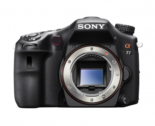
Sony's new Alpha SLT 77 uses ancient tech in a new way. Nifty stuff.

A pellicle mirror is a semi-translucent mirror used in a few very rare and far-between cameras - until recently, when Sony re-introduced the technology in a few of their compact system cameras. So why are Sony reaching into photography history to make new cameras?

Let's take a look at the technology...

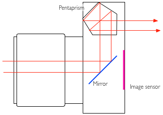
The idea of a pellicle mirror is that it takes the place of a moveable SLR mirror. In traditional SLR cameras, the tech looks something like this:

penta_1.png

The lens focuses the image and flips it upside-down in the process. It then reflects off the mirror, into the pentaprism. The pentaprism flips the image rightside-up again, so you're looking at the world as you're used to seeing it.

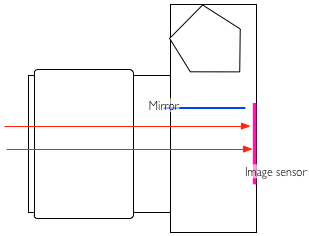
When you are taking a photo, the mirror flips out of the way, so the light reaches the sensor, enabling you to take your photograph:

penta_2.png

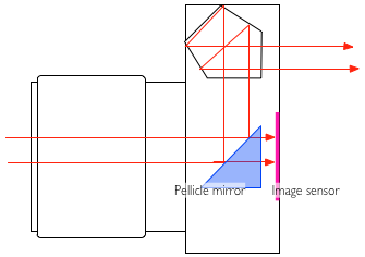
A pellicle mirror does things differently; it is, in fact, a semi-translucent mirror, which lets some light through to the imaging sensor, and some light through to whatever else needs to see the light: In Pellicle mirror SLR cameras, it sends part of the light into the pentaprism so you can view it through the viewfinder:

penta_3.png

Why use a pellicle mirror?

The advantages of using a pellicle mirror are many: The viewfinder never goes dark, so you can see what happens all the time. There's no mirror slap - this is good for macro photography, where even the slightest shake of the camera can cause a blurred image - and it makes the camera significantly quieter as well.

Finally, back when pellicle mirrors were first introduced back in 1965, it was the only way to get high-speed photography done, enabling pictures to be taken at a faster continuous rate. Why? well, because the mirror does not have to go up and down for every image.

The EOS 1N RS (RS stands for Rapid Shooting), for example, can take 10 pictures every second

There are a few disadvantages to using a pellicle mirror - traditionally, pellicle mirrors caused about a 1/3 stop of light loss. (Some light has to go to the viewfinder). In addition,   The mirror has to be kept perfectly clean, or else the light sensor and other electronics (as well as the image quality, obviously) will suffer, but cleaning a pellicle mirror is a bit of a specialised job.

The reason why a pellicle mirror has to be kept so much cleaner than a 'normal' mirror, is that a normal mirror isn't part of the optical path to the film or sensor: If you have a dirty mirror in your SLR, that's annoying when you're using your viewfinder, but it flips out of the way before a photo is taken, which means that it doesn't really matter. In addition, when you change lenses, the mirror offers a little bit of protection for the shutters whilst the innards are exposed. On a pellicle-mirror camera, what you see is what you get: It's the front-most element of the camera, and if it gets dirty, your images will degrade in quality.

Pellicle mirrors have been used in the Canon Pellix QL (1965), the Canon F-1 High Speed (a limited edition camera introduced for the 1972 Olympics), the Canon EOS RT (1989), and the Canon EOS 1N RS (1994). On the Nikon side, pellicle mirrors were used in the Nikon F2 HS and the Nikon F3 HS; the latter was introduced for the 1998 Nagano Olympics.

Pellicle mirrors in the digital age

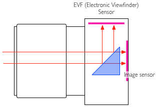
Sony have re-embraced the technology in a couple of new launches, including the top-of-the-line Sony SLT Alpha 77, and the Sony SLT Alpha 65:

penta_4.png

The advantages of using a pellicle mirror in this case are many; Using the image sensor for the EVF causes it to slowly heat up, which degrades image quality through the addition of extra noise. By using a dedicated (presumably lower-power-consumption) secondary sensor for the image preview, you can get better battery life, and higher quality photographs to boot.


Why Projects are Good for You

An image from the early stages of a project I'm working on, looking at possessions.

Do you sometimes feel like you’re snapping away aimlessly, fluttering from one photographic subject to another with no rhyme or reason, like some sort of gormless butterfly? Do you feel like you’re at saturation point with your usual subject matter? Have you said to yourself recently “oh look, a lovely sunset. I should get my camera out really, but…meh”? This is, in some ways, a good sign. You’re not content with just taking a photograph, you want more out of your end product. What you need, my disillusioned friend, is a project.

Projects are hard. You have to come up with an interesting theme with an element of originality, work out what form it’ll take, ideally write a project statement and then figure out how it’ll all come together once it’s finished. It’s a long term, complicated process. Which is why it’s very good for your photography. Now I don’t claim to be Mr Project who lives at Project House, Project Lane, Lower Project, Projectsville, Projectstershire but I thought I’d offer a little advice to get you started on and excited about project work. Let’s look at a few key elements that should factor into your project, whatever if may be.

An image from the early stages of a project I'm working on, looking at possessions.

Shoot What Interests You

The well known saying “write what you know” holds a lot of truth. If you write about something that you know about, you do so from an informed standpoint. Writing about an area in which you are knowledgeable gives you a solid foundation from which to create something entertaining and artistic. With photography, it’s slightly different. Rather than just shooting what you know, you should shoot what interests you. Even if you’re au fait with the subject matter, if the subject doesn’t interest you, the work is likely to lack that passion which, in my opinion, is an essential ingredient for creating a piece of work that has real artistic value.

With writing, you can break the “write what you know” rule in a way, but not properly. You may wish to write about something that you know little or nothing about but are interested in: this is still possible but first you must research the subject in some way. Therefore, you can never truly write about something you don’t know about. With photography, you have the freedom to shoot something you are not familiar with. A perfect example of this is the British photographer Leo Maguire, who has spent four years entering and documenting the lives of two families from the Irish traveller and Romany gypsy communities. The subject interested him, yet he knew nothing about it. This is the advantage we have as photographers. Whatever you shoot, be sure that you genuinely care about it.

Have A Plan

So you know what you want to shoot, now you need to think about how you’re going to shoot it. For the sake of example, let’s say you have an unhealthy interest in apples (is that possible, given their inherently healthy nature?) and want to create a project around apples. Apples is the project for you, you appley weirdo. You need to consider a number of factors – will you be shooting all the different kinds of apples you can find? Will you be documenting the journey of an apple from being picked to ending up on a supermarket shelf?

Those are the only two things I can think of for apples, probably because I don’t care enough about apples.

Then you need to think about the overall structure and presentation of your final project. If you’re just shooting apples and the different varieties you can eat, you may want to take each individual apple, set up a mini studio with clean, white light, take a shot of the whole apple, cut it neatly in half, take another shot, turn the pieces over, take another, get in close for that essential pip detail, take another. Then you’ll want to put those four images into a 2X2 square format, mounted into a frame, and entitle it “#12 – Braeburn, 18th August 2011″. Maybe if you’re following the life of an apple, you’ll want to order your final images into a sensible, chronological order, then turn them into a photobook, sprinkled with facts about apple production and quotes from people involved in the process.

Why am I talking about apples so much?

The point I’m making is if you have an idea of how the finished piece will look in your mind’s eye before you begin, it will help the final project look more cohesive and connected. Also, knowing what form you want your end product will take means you will shoot accordingly, in a fashion that will suit the layout, media and presentation you have in mind for the final piece.

Be Efficient: Set Targets

This one is very important. Simply put, make it like a homework project. If you don’t set yourself targets and goals, you’ll never actually get it finished. Going back to the apples (I’m committed now), it might be “photograph and post-process two apple types a week” or “have 30 apple types photographed and ready to be printed by the 1st of September”. It doesn’t matter too much exactly what your targets are, just set a goal that is quantifiable in some way.

Be flexible - the initial layout of these pieces was significantly different to their current form.

Be Flexible

Once you’ve got the wheels in motion, you may find that there are elements of the project that you don’t like, don’t work or don’t excite you. This can happen to you at any time. You need to be prepared to change things, to cut things and to rethink things. This may feel frustrating at first, but think of it as a natural evolution of the project. If, halfway through your freaky apple project you think “What in the Jimmy Cricket am I doing, photographing apples all the time?! Pears are my one true passion!” then go ahead and restart your project using pears. More sensibly, if the 2X2 format looks boring to you, evolve it and make it 3X3, or a single, ultra high detail single photo of an apple exploded into several sections.

When I wrote that last sentence I meant the photo exploded into sections, not the apple, but now I’m thinking it would be more interesting to explode the apple. Heck, let’s have two images in a diptych format: one of a pristine, perfect Golden Delicious and one of that same apple smashed up all over the clean, white studio background. See what happened in those last few sentences? That’s the evolution of an idea. By remaining flexible we’re now on our way to a much more interesting, artistically valuable project.

Projects are Good for You

Projects are good for you because they teach you form, discipline and planning. Not only that, but photography comes into its own once you start creating images that are relevant to each other. A strong photo series can be an exciting journey – a story can be told, a theme runs through that can be followed, understood, appreciated and enjoyed. If a picture is worth a thousand words, a project is worth ten thousand. Finally, projects are good for you because they should make you think more deeply about every aspect of your photography, which means that your work will improve substantially. Don’t worry too much if your project isn’t too original at first, just getting into the habit and the process of creating and completing a project is more important. Plus, it’s incredibly fun and will refresh your enthusiasm for photography.

(How do you tell if a butterfly’s gormless?)

Equivalent exposures

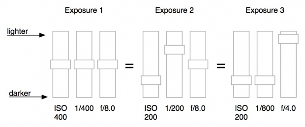
Changing, say, the aperture on your camera changes things beyond the amount of light that gets into your camera. As such, you might decide that you want a smaller aperture, in order to get a greater depth of field. A smaller aperture means that less light comes in to the camera. How do we solve this?

Your camera has three different adjustments for exposure: Shutter speed, aperture, and ISO. If you adjust one so the exposure would be brighter, you can adjust another one to compensate for the additional light captured.

For example: Let’s start with an exposure taken at 1/100 second, f/4.0 and ISO 200. Now, you can change your camera settings to 1/200 second. That would let half the amount of light into your camera compared to 1/100 second, because the shutter is only open for half the duration. Your photo will now be darker. If you change your ISO to 400, the sensitivity of the sensor is doubled, and the photo will come out looking more or less the same, from a brightness point of view, as with your original exposure.

You can change any of the settings to compensate for any of the other settings: A smaller aperture can make up for a higher ISO, a faster shutter speed can make up for a larger aperture, and a lower ISO can make up for a slower shutter speed.

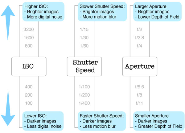
Other effects of exposure changes

Of course, ISO, Aperture and shutter speed don't just affect the brightness of the image... Here's a handy reminder for what else they affect:

brighter_darker_600_v2.jpg


Easy peasy!

The Golden Hour

A lovely Golden Hour Winter Rose, taken by our very own Daniela

It’s that time of the month again – Photography Concept on Friday (remember to refer to it as ” PCoF ” to look cool in front of your friends) looks at the Golden Hour. The Golden Hour is sometimes referred to as the Magic Hour. It’s not to be confused with Happy Hour, although they do share similarities – it’s the one hour of the day you should look to take advantage of as much as possible.

To further confuse you, the Golden Hour occurs twice a day, so technically it’s the Golden Two Hours. It is essentially the first hour of light around dawn and the last hour of light around dusk. For outdoor photography, these hours are special, because the light is of a particularly beautiful quality. Tones are warmer, the light is softer and the shadows are longer.

A lovely Golden Hour winter rose, taken by our very own Daniela

Now for a little bit of science (and I mean “a little bit”). The reason the light is of a different quality at this time of day is due to the positioning of the sun. The closer the sun is to the horizon, the farther the light has to travel through the Earth’s atmosphere. This reduces the intensity of direct light, such as the kind you might see at high noon (think duels in Wild West films). During Golden Hour, more of the light comes from indirect light from the sky.

Contrast is less pronounced during the Golden Hour, so in landscape photography, shadows are less dark and highlights are less likely to be overexposed. Golden Hour is great for everything, in fact – portraits benefit from the beautiful, dramatic lighting, as the diffuse, soft, warm nature of the light is kind to skin tones.

My advice would be to get creative with the Golden Hour: don’t just limit it to landscapes and portraits. The most mundane of objects and grottiest of side streets can be transformed into beautiful scenes. Go and find something that you know has almost no photographic potential and see how it looks, quite literally, in a different light. Heck, take your own objects outside and set up a still life out in the park.

So instead of taking advantage of the Happy Hour this Friday evening, why not take advantage of the Golden Hour? I use The Golden Hour Calculator to find out exactly when the Golden Hour begins and ends. It’s absolutely brilliant – it shows you exactly when the Golden Hour starts and ends each day. For all you London types, the Golden Hour this evening starts at 7:12pm and ends at 8:32pm.

Go forth, dear readers, and discover a whole new, beautifully lit world.

A brief introduction to white balance?

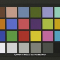
Photograph of X-Rite ColorChecker Color Rendition Chart

If you’re a new recruit to the digital photography vanguard, white balance might not mean very much more to you than a button on your camera. For veterans of the analogue campaigns, white balance is something much more familiar. However, knowing what white balance is and how it affects your pictures could help to make them a whole lot better. Thus we present to you the Small Aperture guide to white balance, in technicolour.

Light temperature

What we think of as white light isn’t really white. It’s actually the spectrum (red, orange, yellow, green, blue, indigo, and violet) mashed together. Light that comes from different sources – the sun, tungsten bulbs, fluorescent bulbs, candles – is made up of different proportions of the spectrum, and is said to have a different colour temperature (measured in Kelvins). Warmer light temperatures comprise more blue tones whilst cooler light temperatures makes things seem more orangey-yellow. (Yes, it seems counter-intuitive, but it’s about the energy in the light.)

Midday sunlight on a clear day is pretty evenly balanced across the spectrum and has a temperature about 5,000K, but light from tungsten bulbs has more red wavelengths in it, so will give your pictures a yellow or orange cast. Light on a cloudy day, on the other hand, is made up of more blue wavelengths. Unsurprisingly, this can give pictures a bluish tinge.

Auto White Balance

By the awesomeness that is nature, our eyes automatically adjust to these warmer or cooler temperatures of light, so things will always look as they should. Things that are white will look white, not a bit jaundiced or dying of cold.

Afro-Ken, taken with auto white balance

Now, digital cameras usually have an Auto White Balance (AWB) setting that overall does a pretty good job of compensating for the variations in light temperatures. But unlike our eyes, it doesn’t always get it quite right and pictures can come out a bit blue or yellow. In which case, you’ll find that there are a few options to help you out.

Presets

My camera has six presets – daylight, shade, cloudy, tungsten (incandescent) light, white fluorescent light, and flash – in addition to AWB and a custom setting.

If I’m shooting inside under incandescent lights (3,200K) and my pictures are coming out a bit yellow, I can try switching to the tungsten setting. It’ll balance things out with some blue tones.

Outside on a cloudy day the light will be warmer in temperature (perhaps 8,000K), so might give everything a blue hue. If I apply the cloudy setting: tah-daa! Less blue, better balanced pictures.

Afro-Ken photographed using the daylight setting

If you hadn’t already guessed, blue and amber filters would have done (and indeed still do) the job of these different white balance settings for film cameras.

See how much more yellow-y he looks in the 'shade' setting?

Custom white balance and RAW

I also mentioned that I’ve a custom white balance setting on my camera. This can be really useful if, for example, you’re photographing something that is predominantly red. Your camera might mistake all those red tones for light that’s cool in temperature and make things a bit too blue. If your picture has two different light sources in it, one warm and one cool, custom white balance can make sure you get the picture that you want, not what your camera thinks that you want.

When you set the custom white balance, you’ll need something that is white to act as a point of reference for your camera, so it knows what ‘white’ should look like.

Of course, if you shoot in RAW, you can always adjust the white balance in post-processing. If nothing else, it’s a fun five minutes to make a sunset glow blue.

In summation

  • Light comes in different temperatures: sometimes with more red wavelengths (lower temperature), sometimes more blue (warmer temperature)
  • Our eyes adjust to these different versions of ‘white’
  • Differences in light temperature can make our pictures look too blue or too yellow
  • In the film days, these differences were fixed using filters, now cameras have an auto white balance (AWB)
  • Sometimes, AWB doesn’t get it quite right, so you can adjust your camera to the light’s temperature using some preset white balances, or you can customise the white balance
  • If you need to, you can correct the white balance of a picture in post-processing

Experiment! Play around with the different settings to see what the effects are. You never know, you might decide that you quite like green sunrises!

For a giggle, here's Afro-Ken made to glow blue by using the tungsten setting without any tungsten lights

Temporal aliasing in video

You have seen it in countless car advertisements and well-polished movies / programmes about cars: As the car is accelerating, the shiny metal alloy wheels seem to slow down, and briefly turn backwards, before becoming a big blurry mess again.

But how? How? And how come have you never seen that happen in real life before? And why does the article-writer insist on using braindead rhetorical questions instead of just getting on with the blasted article?

Anyway, this effect is known as the 'wagon wheel effect', or 'temporal aliasing'

You can see it in many different circumstances, where something rotates. Take this fantastic example:

Why?

Imagine a 3-spoked alloy wheel. The wheel is symmetrical, which is quite important. Now, imagine that you are looking at the wheel as it is fixed on a car, rolling along at high speed. You won't be able to even tell how many spokes the wheel has, as it is all a blur. If you were to take a picture of the car with a very short shutter time (1/1000 of a second usually does it), and look at the image, you can see and count the spokes, because you will have frozen the motion.

When working in film or television, you aren't actually capturing the motion, you are capturing a series of still frames. In the case of television, 29.9 frames per second (let's call it 30 fps, for the sake of simplicity). That means that if your camera happens to take a picture every time the wheel has turned a 1/3rd, 2/3 or full revolution (because the axis of symmetry is every 1/3rd of the wheel. A 4-spoked wheel would require 1/4th of a rotation etc), it would appear that the alloy wheel is standing still, while the tyre is whizzing along, pulling the car with it.

If your camera's shutter aligns perfectly with a rotation that can be devided by 1/(the number of spokes), the wheel appears to stand still. If there is an offset, it appears to turn slowly forward or backward, depending on the timing difference.

How?

The easiest way to capture the effect on film is to accelerate slowly - that way, your car's alloys will definitely align with the camera's shutter time, and you will get the slowly-forward-to-still-to-slowly-backward motion. You could also let the car roll, so its deceleration causes the same effect.

A more advanced way to do it, is to use mathematics. You will need to find out how long the circumference of the wheel is, and how many spokes the wheel has.

If a wheel has a circumference of 2 meters (that would be normal for a regular saloon car, I believe. Corrections welcome), it will do a full revolution every 2 meters travelled. On a 3-spoked alloy, the wheel crosses the axis of symmetry every 2/3 meters. When filming with a camera that shoots 30 images per second, that means that you will want the car to be travelling 2/3 meters every 1/30 second, or a multiple thereof. In other words: at 20 meters per second, or 72 km/h (45 mph)

The formula:

Required speed = (circumference / number of spokes) / (fps)-1

Why never in Real Life™?

Actually, it is possible to see this phenomenon in real life. If you look at a car through the safety barrier (guard rail) between two directions of traffic, you might be lucky. If it is dark, and the streetlights flicker (they normally do, at either 50 Hz or 60 Hz, depending on the electrical system of the country you are in), you might also see the effect. In full daylight and with unobscured view, however, it is a theoretical impossibility.

A different example

Now that you know how it works for cars, you should also be able to explain how this awesome video works:

stunning bass-string shot from urbanscreen on Vimeo.

I'll give you a hint: The strings on a double bass vibrate somewhere in the region of  40Hz - 180Hz or so, and the camera this was shot with (the Canon 5D MarkII) shoots video at 30 fps or so...


Do you enjoy a smattering of random photography links? Well, squire, I welcome thee to join me on Twitter -

© Kamps Consulting Ltd. This article is licenced for use on Pixiq only. Please do not reproduce wholly or in part without a license. More info.

Dodging and burning


This image has extensive burning (at the back of her head) and dodging (top right) done to it - with remarkable effect!
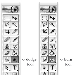
If you've spent any time in Photoshop editing your images, you'll have noticed a "dodging" and "burning" tools. They are used for making an image lighter and darker respectively, but why the odd icons? Why is there a lollypop and a fist as part of your Photoshop tool palette?

As you may have guessed, it's a hangover from the darkroom days - and it's a technique that is great fun to play with if you're ever printing your own images.

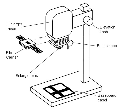
How a darkroom enlarger works

enlarger.jpg

A darkroom enlarger is sort of like a camera, but 'backwards'. In a camera, you have a lens that gathers light and projects it onto a film plane. A darkroom enlarger also has a lens, and the film is pretty much in the same place as in a camera, but a light bulb is placed on the opposite side of the lens. By turning the light bulb on, the lens 'projects' an enlargement of the image onto photographic paper.

You can 'focus' the lens so your image is sharply in focus on the paper, you can choose a more or less sensitive paper (analogous to picking a higher or lower ISO film), and you can choose a longer or shorter exposure (which turns the lamp on for longer / shorter). You can also select a different aperture on the projection lens, which has much the same effect as on your camera: A smaller aperture requires a longer exposure, etc.

To determine how light or dark your print is going to be, you choose an 'exposure' by choosing how sensitive the paper is you are using, you choose an aperture, and a 'shutter speed'. Just like with your camera, it's possible to over- or under-expose your image at this point.

Its worth keeping in mind that your photographic film will be negative, and the paper is negative as well - the dark portions of the film will become light on the final print, and the light areas on the film will be dark on the print.

Dodging in the darkroom

dodge.jpg

To dodge means to avoid something by a sudden quick movement, or to move quickly to one side or out of the way. It's a pretty good description of how you would dodge something in the darkroom. In the darkroom, you would use a piece of black paper on a thin stick - which, when seen in silhouette, looks a little bit like a lollypop.

When dodging in the darkroom, you would traditionally select a slightly longer exposure (it gives you a bit of time to work). Then, when your paper is being exposed by the light, you could make some portions of the image lighter by moving the dodge tool between the lens and the paper. Because some parts of the paper get less light, they are lighter on the final print.

Burning in the darkroom

Burning is, as you might have guessed, the exact opposite; When burning, you would traditionally do 'half an exposure' normally (or whilst dodging, as above), followed by another exposure of the same paper. Because the enlarger head is firmly fixed and the paper doesn't move between exposures, 'stacking' exposures like this is no problem.

When burning, you would use a tool that would block some light, but let some light through.The areas you are 'burning' will come out darker: more light on the paper causes the print to be darker.

For the burning process, it is useful to have a tool where you can easily change the aperture (i.e. the size of the hole that lets the light through) - and it turns out that your hand is the perfect tool. By changing the shape of your hand, you can make a small hole for the light to pass through for fine work, or you can create quite a big hole, for darkening larger parts of the image. Hence the hand icon in Photoshop!

So you call yourself a photographer?

If single lens reflex cameras are banned - can you use a twin-reflex camera instead? The point's moot now anyway, by the look of things.

If someone asks you if you’re a photographer, what do you say? ‘Yes, I’m a photographer.’ Or ‘No, I take pictures, but I’m not a photographer.’ It’s something that’s been playing on my mind recently, and something that I’ve been debating back-and-forth with a friend of mine who is, as far as I am concerned, a bona fide, hand-on-heart photographer, a veteran of the analogue campaigns, with a portfolio to prove it.

The dictionary definition of photographer is pretty straightforward, it’s a person who takes photographs.

And then there are numerous variations on the phrase ‘Owning a camera does not make you a photographer; it makes you a camera-owner.’

By the dictionary definition, just about every single person in the UK is now a photographer, what with the ubiquitous camera-phone and the millions of images uploaded to FaceBook every month. By the slightly more philosophical statement, there are plenty of people out there taking photos, but they can’t all be called photographers.

So we’re at something of an impasse. It seems as if we have a society of potential photographers, but not one of actual photographers.

I’m pretty convinced that every single camera-owner isn’t a photographer. Would you say that someone who owns a dSLR but never takes it off of automode and owns only the kit lens is a photographer? And is someone who is trying her or his hardest to get the most out of a point-and-shoot not a photographer? Nope, the camera that you use, or don’t use, doesn’t make you a photographer (or not).

Still, I’m not too keen on the idea that there is some mythical ability quotient that you have to fulfil before you’re granted the title Photographer, either. Who exactly is it who decides what constitutes ‘good enough’ in this situation? It’s not as if there’s a medieval-style Guild of Photographers who grants us apprentice, journeyman, or Master Photographer status. Ability is a bit too subjective a term to decide if someone is a photographer or not, thinksme. And honestly, don’t we all take bad photos?

Is the divide professional, then? Do you have to make your living by taking photographs to be a photographer? Well, no, I don’t think so. Think of it this way: would any of the players who competed in the 1995 Rugby World Cup be too pleased if you said that they weren’t really rugby players because they happened to be accountants, doctors, and members of the armed forces in their other lives? Why else do we have the most useful terms ‘professional’ and ‘amateur’ in our vocabularies? Photography, and by extension being a photographer, is not something that is determined by money-making status.

There is a common theme running through these slightly manic arguments about who is or isn’t a photographer, though. It might not be about the kit that you own, but it is about doing the best with what you have. It isn’t about whether or not your photos are good enough to be exhibited at the Royal Academy, but whether you strive to make your next shot better than your last shot. And it definitely isn’t about whether or not you earn your living from photography, but it is about wanting every photo that you take to be as good as you can make it.

Being a photographer is about practising a craft. It’s about wanting to create something; it’s about wanting to improve; it’s about wanting to learn.

So next time someone asks you ‘Are you a photographer?’ think about this before you answer: are those pictures that you take an expression of something, and part of a learning curve? If they are, then you’re a photographer.

Looking at composition

IMG_1365

People have been obsessing over composition – and the theory and maths behind it – for thousands of years. Pythagoras discussed it, Ancient Greek architects used it, and Fibonacci sequenced it. But what does it actually mean for you and me when we take a photograph?

Essentially, the resulting rules of composition help us to create pictures that please the eye and are easy to understand. Composition can make or break a picture, but is so often overlooked. Let’s look at some of the main ideas people are using.

Rule of Thirds

One of the oldest rules in of composition is known as the rule of thirds. It’s easiest to understand if you imagine a grid across your picture, splitting it into nine equal rectangles.

Basically, the rule says that placing your subject(s) on any of these lines will make for a better composition. Let’s look at some examples of the rule of thirds to help explain it:

The rule of thirds applies to landscapes...

...and to portraits

Roughly speaking, the horizon is placed on the bottom of the two horizontal lines (although it also works on the top) and lined up the subject with one of the verticals. You can also place extra emphasis on focal points of the picture by positioning them where the lines cross, such as the girl’s face in the second photo.

Maybe try imagining these lines next time you look through the viewfinder, and adjust your shot to see if it works better. It doesn’t have to be exact!
Symmetry

Almost the polar opposite of the rule of thirds, symmetry can change a photo from ordinary to extraordinary, especially when used in unexpected ways. Using symmetry in portraiture can be very unsettling, but also very effective! To get perfect symmetry in your photos, it’s probably easiest to use a tripod to frame the picture exactly as you want it to appear (and remember, a little ‘cheating’ in image editing software can also help you along the way).

Sharp Symmetry, by Scintt

Place of Contemplation, by Martin Gommel

Leading Lines

Leading lines are exactly what they sound like – they cut through the image, drawing your eye down them and into the picture. These are often used in landscape and architectural photography, and a favourite technique for photos of roads and railings. Often used to great effect when leading to a vanishing point, and frequently combined with symmetry, this can also have very dramatic results. Again, a tripod will help give you set up your shot for the composition you want.

Airport Symmetry, by Doris Hausen

Vanishing Point, by Luigi Caterino

Other techniques

I’ve only scraped the surface of the different techniques used by photographers to give their pictures the composition they want. Try using elements in the composition to frame the subject (such as the trees in the picture with the runner), and maybe try different techniques on the same picture – it might be the easiest way to find the one that works.

Ignoring the Rules

The theory behind what makes a ‘good picture’ can certainly be off-putting for many. After all, isn’t a good photo about how it makes you feel rather than how perfect it is? Possibly. But understanding conventions helps us decide when to follow them, but also when to break them for dramatic effect. So go experiment with unusual crops, dead-centre subjects and skewed horizons – you might just discover something amazing!

All photos used in this article are used according to Creative Commons licences. If you have strong reservations against your photos appearing on Small Aperture, please contact us, and we’ll get them taken down. Please support the artists creating these photos by clicking on the photos to take a closer look at their work!

Better ways than 365 days?


If you’re serious about improving as a photographer, there are better ways of accomplishing it than taking a photo of yourself e

If you can keep your self portraits interesting, it's worth continuing to experiement.

I think that the statement I’m about to make could unleash something of a furore. (Give me a moment: I’m going to batten down the hatches and take a deep breath.)

I have a loathing for 365 self-portrait projects.

I can’t bear them. They irritate me. Sometimes they even bore me. They don’t quite make me want to scratch out my eyeballs, although occasionally some of the pictures might. There, I’ve said it. Admission made. Given that the 365 Days group on Flickr has 19,175 members, I suppose I ought to qualify this statement, because there are a whole host of people prepared to disagree with me.

There are two predominant reasons that 365 self-portrait projects give me a shudder of discomfort. First, I don’t think that they necessarily encourage good photography; second, I think that they do encourage some sort of egotism and narcissism. Want me to unpick this a bit more? I thought that you might. Here goes.

Yes, it does seem counter-intuitive to say that a project that demands you take a photo every day doesn’t encourage good photography. If you’re shooting every day, surely it can only help you to improve. (This does seem to be one of the major driving factors in embarking on a 365 Days project.) But I’m not convinced that deliberately setting out to take a photograph of yourself every single day of the week for an entire year does that. Instead, I think that the combination of obligation to take a photo and limited subject matter stifles creativity. Having to take a photo of myself, a photo that I’m willing to present to the world, a photo that conveys my story, every day for a year sounds more like an exercise in endurance. And that does not good photography make.

So not only am I concerned by the potential for uninspiring, leaden self-portraits, but I can just see how the necessity to take said daily self-portrait becomes all-consuming and and obliterates the opportunity or the desire to take other photos. Don’t forget about landscape and macro and street and architectural photography.

What’s more, there are some days when you really don’t want to be photographed. Or is that just me? How on earth is that sense of being camera-shy, of feeling miserable and unphotogenic, of being tired or drunk or ill, ever going to make for a well-composed, intriguing photo? I’m not sure how many images of my feet, or any other sufficiently abstract body-part, people would be able to take, even if I did succeed in posing them creatively, using a thought-provoking depth-of-field, and arranging moody lighting.

Looking beyond portraiture

If you can keep your self portraits interesting, it's worth continuing to experiement.

Becoming a better photographer isn’t just about portraiture. Or self-portraiture. Or going off and getting yourself a Photography Masters Degree.

And this leads me into my second point of pique. If it is all about documenting my life (another key reason for starting the project), who the bloody hell is really that interested to know the minutiae of my day-to-day existence? I’m not that thrilling. Yes, there are things that I do from time-to-time that might ignite a frisson of excitement, but they’re relatively limited in the grand scheme of things. Keeping a pictorial diary could well be an unusual take on a journal, but my desire to lay myself that bare in public is supremely limited. You can tell me that we live in the age of social media and that I just need to get on and accept it all that you want, but the concept makes me itchy. My entire life isn’t for public consumption and I doubt that every Tom, Dick, and Harry, and Emma, Jo, and Kate need, or even want, to know what I ate for breakfast (Homemade spelt bread toast with blackcurrant jam, seeing as you asked. It was tasty).

If you know me well enough and you know that I’ve written about how photos are an incredibly valuable historical resource, especially those that tell the narrative of the mundane, you might find that statement a little perverse. But I’m talking about making sure that people in the future know about our unextraordinary lives so that they will enjoy a better understanding of how our society functioned. (And indeed the social media phenomenon will be something that future historians will pick apart and examine and debate and turn into theses.) Someone living in 3010 who uses my writings and my photographs in an attempt to build a picture of life in 2010 is a bit different to me contriving a shot for uploading to Flickr.

Widening the horizons

Documenting your life is about a great deal more than just taking self-portraits.

I’m not saying that there are no good 365 self-portrait photographers out there, I’m not saying that people won’t learn from the experience, and I’m not saying that they aren’t valuable in some sense. I’d have to be blindingly ignorant to think anything of the sort. And if you want to commit to taking a picture of yourself every day for a year, go ahead. But let me give you something to think about first.

If you’re serious about improving as a photographer, there are better ways of accomplishing it than taking a photo of yourself every day. In fact, I most definitely endorse taking a photo every day. But just make sure that you expand your subject matter and your technical repertoire beyond pictures of yourself. Borrow your friend’s macro lens and have a go at photographing teeny-tiny things. Drag your tripod out from beneath your bed (what’s it doing there, anyway?) and try your hand at some long exposures. Pick up some filters and mess around with their different effects on your images. Play around with reflectors and diffusers, artificial and natural light. Hell, try shooting on film or build yourself a pinhole camera.

These seem like real challenges to me, challenges that will help you to develop your craft as a photographer.

Now, if you want to document your life in pictures, remember that the picture doesn’t have to be about you. The things that you see, the places that you go, the people whom you meet; all of these contribute to your life and would be worthy of photographing. I bet that you’ve a camera-phone that would do that job pretty well, although I’d recommend shopping around for a compact camera to keep in a sock in your bag. This will tell a much richer story of your life, for you and for anyone else who stumbles on some cache of a fragment of this weird photo-sharing website that seemed be called Flickr in 1,000 years’ time.

For sure you’re going to end up with very different types of photographs if you adopt either of these two approaches, but the results – whether you’re aiming to improve your photography skills or record your life – will be something altogether better than 365 days of self-portraits.

This post was written by Daniela Bowker, who usually is the boss over at Small Aperture.


Do you enjoy a smattering of random photography links? Well, squire, I welcome thee to join me on Twitter -

© Kamps Consulting Ltd. This article is licenced for use on Pixiq only. Please do not reproduce wholly or in part without a license. More info.