Opinion & Editorial

Is Adobe's Lightroom Mobile fully embracing the mobile experience?

Adobe: purveyor of world-recogned photo editing options: some for desktop, some for mobile, and some that enable cross-over between devices, such as Photoshop Touch and Photoshop, via the Creative Cloud. That was all well and good, but what about Lightroom? When would that be available on a tablet as well as a desktop, people were wondering. What was taking so long? As of today, that wait for a mobile version of Lightroom is over. But is the Lightroom that people were expecting? For a start, it's Lightroom for iPad. There's no alternative tablet offering. You need to be using at least an iPad 2 running iOS 7 to make use of it.

Second, it isn't so much Lightroom for iPad, but Lightroom for desktop with an iPad outpost. As Adobe puts it, it's a companion app. Whatever you do on your iPad will always come back to your desktop Lightroom catalogue via the Cloud. For the majority of Lightroom users who want mobile access (and are iOS-based) this is probably how they envisioned using Lightroom mobile, as something that works in tandem with their desktop version: a manoeuvrable dinghy tethered to much bigger-engined boat. However, anyone who might have been expecting a stand-alone app independent of the desktop, however hollowed-out that might have needed to be, will be disappointed.

I'm not sure that the full fire-power of Lightroom would function on a tablet without being scaled down and refined in some way (and indeed Lightroom Mobile is a limited version of Lightroom), and making those types of sacrifices to functionality is possibly not something that Adobe wishes to contemplate or existing users would accept without having full-scale back-up, hence this iteration. Are Lightroom users the mobile-only type? Yet, I do feel as if there's a degree of reluctance to embrace a truly mobile experience on Abobe's part. The Creative Cloud is there when Adobe wishes to take advantage of it and lock users into a subscription, but not necessarily to put users' interests first and give them a workable and truly mobile-only editing option in a world that's increasingly portable.

Amongst other things, Lightroom mobile will allow users to:

  • Sync mobile edits, metadata and collection changes back to the Lightroom catalogue on a Mac or Windows computer
  • Automatically import images captured on an iPad and sync back to a Lightroom catalogue on the desktop
  • Work on images, even when the iPad is offline, for a truly portable experience
  • Sync photos between Lightroom 5 and Lightroom mobile; synced photos can also be viewed from any Web browser

And finally, the synchronisation-based architecture means that the mobile version of Lightroom is only available if you subscribe to the Creative Cloud. That means if you want the option to edit on your iPad, you need to shell out either £8.78 ($9.99) for the monthly photography subscription, or whatever Creative Cloud package takes your fancy. There's no option for stand-alone Lightroom users.

I'm not an iPad-user so there's no decision for me to make here, but I would be interested to know if you think that this version of Lightroom Mobile fulfils your needs, or if you think that Adobe has missed a trick.

Who still prints photos?

Back in the days of film, you didn't have much say over which of your photos were developed and printed, not unless you did it yourself. You took a roll of film, dropped it in at the chemist or local photographic shop, and waited for the prints to come back to you. We ended up with the duds along with the masterpieces, and shoeboxes of photos. Now, we can be far more selective about what we choose to print, and even if we want to print our photos at all. According to research conducted on behalf of Photoguard, a specialist photographic insurance company, 30% of people only ever look at photos online and about 55% of people who take photos have printed any in the course of the past year. Of those who do choose to print photos, it's people who prefer taking selfies who are most likely to send their images to print, with 82% of them doing so over the past year.

This selfie went one better than a photo print, it ended up in a book!

Of course, it's easy to assume the correlation between 'taking photos of themselves' and 'printing photos of themselves' but that's not necessarily so. They're just more likely to print photos that they've taken at all, and this might include coffee, cats, and kids, and beers, bicycles, and bumble bees.

Who's least likely to print their photos? It's the people who take 'art' photos (however that's defined) and photos of food. Apparently, 77% and 75% of people in those respective categories didn't send anything to print over the past year.

And why aren't people printing images? Apart from the 30% who only look at images online and the 20% who don't look at images at all, 37% of the survey's respondents found printing too expensive and 27% cited a lack of access to print facilities.

As someone who takes an enormous amount of pride in her photos and enjoys seeing her work in the flesh, it makes me quite sad that people either aren't quite sure how best to see their photos on paper so that they can hang them on their walls, put them on mantlepieces, or position them on desks, or find the cost of printing prohibitive. As Carly Wong, one of my Twitter friends put it: 'It's the test of a great photo too. If it's great it looks even better in print than it does on a computer screen.'

For the record, here are a few online print companies who'll run off 100 prints sized 6 by 4 for under £12 (and that's the top end), plus postage and packing. Some of them will give you free prints when you sign up, too.


If you want to know who was questioned for this survey, it was 320 professional photographers (UK adults who have been paid for photography work in the last three months) and 680 amateur photographers (UK adults who take photographs on a regular basis). The sample is broadly representative of the UK across age, gender and region. Respondents were interviewed between 13 and 17 January 2014.

'Experts' blame selfie culture for a rise in cosmetic surgery

Early this morning* I was perusing the BBC website, as I am wont to do every morning, when my eye fell upon the regular round-up of the newspapers and a headline in the Metro. Now, I am not accustomed to reading the Metro—it's aimed at metropolitan commuters and I, therefore, do not fall within its target demographic—but this headline had me rushing to its website.

Selfies blamed for plastic surgery rise

According to 'experts', the Metro doesn't care to enlighten us whom these experts are, 'The relentless rise of the mobile phone pictures, coupled with a fixation on celebrity culture, creates unrealistic expectations.' Furthermore, one-in-three US plastic surgeons has reported an increase in requests for plastic surgery from patients whose desire for intervention is based on looks-aware social media. One-in-seven US facial plastic surgeons has reported 'selfie pressure' as a common trend that had grown in the past year.

This trend is similarly noticable in the UK. The Metro cites Marc Pacifico, from the British Association of Aesthetic Plastic Surgeons, who claims that young people feel under 'incessant pressure' to conform to idealised images of beauty and compare themselves to celebrity images and those that have been digitally enhanced.

Apparently, there has been a ten per cent rise in nose jobs and seven per cent increase in the number of hair transplants over the past year.

Pacifico is of the opinion that if the current trend to take selfies continues it will result in people who are unaccepting of normal variations in appearance.

Shall we just put the brakes on this runaway train of an idea for the moment? While self-portraits might be making people increasingly aware of their appearance, and perchance more critical of it when their photos spread far and wide via Facebook and Twitter and can be compared to perfectly primped and preened personalities, to lay the blame squarely at their shutters for an increase in requests for cosmetic surgery fails to look at the big picture. (Pun shamelessly intended.)

Our appearances have been under scrutiny for millennia, and there have been mirrors and looking glasses to aid in self-scrutiny for just as long. As a consequence we've been comparing our appearances with other people, and going to ridiculous lengths to preserve them, for generations. Elizabethan lead skin whitener, anyone? Or the obsession with the Vidal Sassoon-Mary Quant assymmetric cut in the 1960s? This is not new, but our visually intensive culture does mean that we are subject to unrealistic presentations of perfection and our own short-comings.

Selfies aren't the direct cause of people feeling inadequate in their bodies; they're one of the many vehicles that transport people to a skewed confrontation with their appearances.

Herein is the real issue. It's the expectation of perfection and the inability to separate everyday reality from Hollywood fantasy that leaves people feeling as if they aren't, somehow, perfect as they are. Just I have argued concerning the use of Photoshop and image manipulation in magazines, the key to better body confidence is in education. It's about an understanding that we're all different and that none of us is perfect. Not one.

But do you know what I find even more disturbing than the insinuation that it's the selfie that can be blamed for an increase in the desire for cosmetic surgery? It's the frequency with which cosmetic surgery is presented as an accessible and normal solution for problems that exist in people's heads. When a doctor who wishes to bring affordable cosmetic surgery to the masses wins the BBC primetime TV show The Apprentice and when cosmetic surgery clinics and procedures are advertised on daytime television, it makes me think that people's emotions are manipulated more than their images are.

So instead of lamenting Pacifico's comments on the threat of the selfie to people's tolerance of normal variation in appearance, shouldn't we be using the selfie to celebrate that we're different? To revel in hair that's dark or blonde; curly or straight. To appreciate tall people and short people. To wonder in amazement at different skin tones. To actually take stock that we're all different and that's rather amazing.

(The BBC and the Metro)

* It's now yesterday morning, but nevermind.

Canon's rumoured withdrawal from the compact market is no great loss

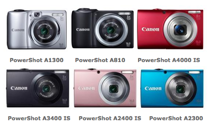
It is only a rumour, but there are suggestions that Canon will soon cease production of lower-end, sub-$200 point-and-shoot cameras. Given the steady erosion of compact camera sales and their inability to compete against the convenience and ubiquity of the smartphone, it's hardly surprising. It's also a step taken already by Olympus by Fujifilm. And just as we stated in the cases of both Olympus and Fujifilm, this is a good thing. By my count since January 2012, Canon has released twelve IXUS model cameras and ten Powershot A-series cameras. These are typically regarded as its cheaper and cheerier models. They tend to range between £80 and £180, although the odd few come in much higher than that, have more than enough megapixels to keep the pushiest salesperson smiling, a decent optical zoom range, the ability to record video, and sometimes are blessed with image stabilisation. Unlike Canon's dSLR range, which comprises a controlled range of cameras with clear spec expectations at given price-points, it's verging on the impossible to discern one compact model from another. Their variations in spec are so slender that they all merge into one rainbow-coloured haze.

Of course consumers need to choose between six almost-identical cameras

Herein is their downfall. First, they're not something that you'd go out to buy when you have a wirelessly connected smartphone in your pocket. There's not really enough value-added to justify the outlay. Second: when there are so many different cameras with so little to differentiate one from another, it's little wonder that consumers' eyes glaze over and they decide to stick with what they now know: their iPhones and their Samsung Galaxys. Choice is a good thing, but sometimes offering too much choice, without making obvious why it's needed, is self-defeating.

Let's not forget, that little tot-up of cameras didn't include any of Canon's Powershot SX range, which covers the superzooms, its D-series rugged cameras, the S- and G-series, which are its high-end compacts, and the quite-frankly-ridiculous N-series.

If anything can convince you that Canon really ought give up on the definitely-fled smartphone crowd, it's the N-series of cameras. They smacked of desperation, of designers under pressure to produce something 'young and funky and with-it' in an attempt to recapture a market long since gone, and engineers who'd rather be working on any other project than that one. Yes, they are out of the 'sub-$200' bracket of cameras that are expected to be axed, but they have no place in the range, either.

By relieving itself of the burden of the cheap end of the compact camera spectrum, Canon can refocus its attentions on the areas where there is hope, where there is potential, where there really is a market. Most definitely on its dSLRs, that seem to have gone off of the boil ever so slightly of late. Perhaps on its higher-end compact cameras, which are still selling and I believe show that compacts do still have a place in the canon of cameras, but could benefit from some innovation and development. And maybe even in the mirror-less division, where the EOS M has been so painfully disappointing.

This shouldn't be regarded as a move of panic or despair on Canon's part. I actually think it's rather mature. It shows how it might be beginning to analyse the market, to identify its strengths and weaknesses, and to come to terms with the idea of an evolving photography world.

Just a fantasy or an unrealistic depiction of perfection? Dunham, Vogue, Jezebel, and now Leibovitz

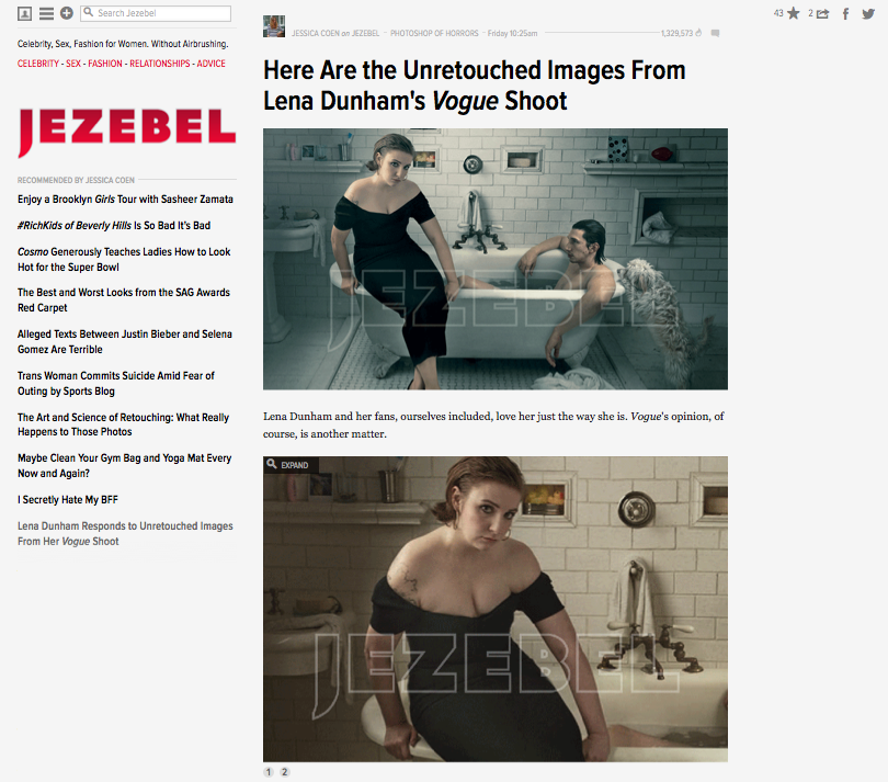
I don't watch Girls and I don't read Vogue, so the recent controversy involving Girls' Lena Dunham and her appearance in the glossy magazine failed to catch my eye. However, when Amateur Photographer reported that Annie Leibovitz is threatening legal action over the unsanctioned publication of the shoot's original image files, my interest was piqued. Dunham appeared on the cover of, and inside, American Vogue's February edition (we weren't treated to her here in the UK) in a shoot by Annie Leibovitz that raised plenty of eyebrows and plenty of questions. Some people were perplexed by the apparent clash of principles when a feminist role-model could appear in and on the cover of a magazine that is famed for its stylised and heavily post-produced shoots. Other people wondered why Vogue had opted for a head-and-shoulders shot of a woman known for not being the archetypal Hollywood stick-instect, rather than the usual full-body shot for its cover. And some people just worried about the Photoshop job.

One of the publications most vocal about Dunham's dalliance with Vogue was Jezebel, the feminist blog. Jezebel is highly critical of Vogue's use of idealised, unrealistic images of women that are presented as objections of perfection. While it supported the notion that Vogue could feature a woman who was not its usual front page fodder, it was critical of Dunham being tweaked to make her acceptable for that role: 'Dunham embraces her appearance as that of a real woman; she's as body positive as they come. But that's not really Vogue's thing, is it? Vogue is about perfection as defined by Vogue, and rest assured that they don't hesitate to alter images to meet those standards.'

Jezebel then offered a bounty of $10,000 for Leibovitz's original, unedited image files of Dunham so that it could do a compare-and-contrast. From Jezebel's perspective, this wasn't intended to shame Dunham or criticise her for working with Vogue, although even if it wasn't intentional it's still easy to construe it that way. It's a topsy-turvy version of damning with faint praise. When Vogue is renowned for its fantastical presentation of women, why pick on Dunham's shoot to explore how far it will go if it isn't intended as a criticism of her actions?

Nevertheless, Jezebel got what it asked for.

Compare and contrast

Someone, somewhere, produced the original images and Jezebel was able to lay them side-by-side with the edited versions. Were they extensively retouched? Retouched, definitely. Extensively? That depends on your definition of the word. There's a whole lot more adjustment going on there than I'd make to one of my photos, but I don't shoot for the cover of Vogue and I'm not in the habit of photographing TV stars with pigeons on their heads or posing on the sides of baths wearing evening gowns. As Dunham said to Slate: 'A fashion magazine is like a beautiful fantasy. Vogue isn't the place that we go to look at realistic women, Vogue is the place we go to look at beautiful clothes and fancy places and escapism... '

The furore of whether Dunham should or shouldn't have posed for Vogue, whether or not she's betrayed the feminist ideals that so many seem to have ascribed to her, and just how much alteration the images have undergone has now taken a new twist. For Annie Leibovitz is reportedly extremely unhappy that the unretouched images have made their way to publication and is considering legal action. Precisely what legal action she intends to make, against whom, is unclear. But sources close to Leibovitz claim that she would never have sanctioned the publication of the original images. Vogue has declined to comment and Jezebel has stated that it obtained the images via an anonymous source.

What do I think? I studied history at university. Then I trained to teach it. And I taught it for a bit, too. I'm often asked how I can bear to watch historical dramas without picking holes in their accuracy. My answer is always the same: 'It's a story, not reality.' I don't advise that anyone should take medical advice from a BBC hospital drama, either. When I glance at Vogue, or any other glossy magazine, I treat it in much the same manner. It's a fantasy that deserves the same suspension of disbelief as a film or TV show. It doesn't matter if it's Vogue or Homes and Gardens, it's not reality. When you've resurfaced from your dive into stylised perfection, that's what you need to remember.

(Headsup to Amateur Photographer)

The inimitable xkcd on taking photos

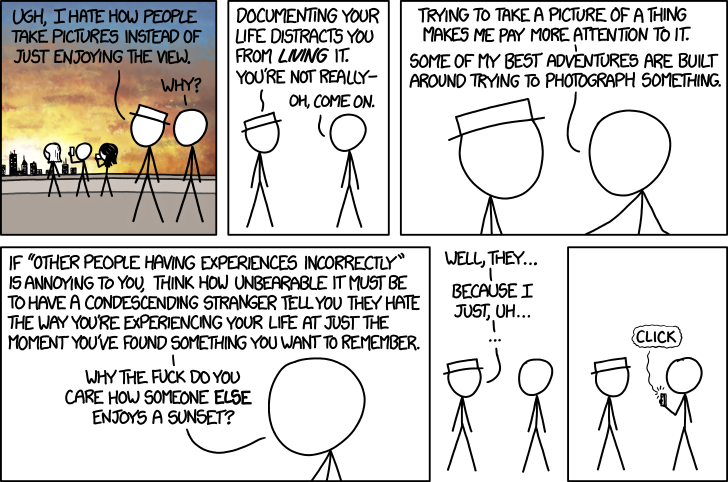
That whole debate about whether taking photos diminishes or improves your memory of events? I couldn't give a toss about it. Sometimes waltzing around a dancefloor with my brother to Sweet Caroline is a far better experience than taking photos of everyone else dancing. Other times, it's the act of climbing onto the shed roof in a floor-length skirt to take a picture of everyone singing happy birthday to my mother that forms the strongest recollection of an event. Use the camera or put it down: it doesn't really matter. You have to do what feels more important right then and there. But I do know that I'd rather not watch the entirety of a live concert via a four-inch smartphone screen and I certainly don't want my view obscured or enjoyment diminished by other people doing just that.

The wonderful xkcd sums up my sentiments perfectly. Thank you, Randall Munroe.

photos

Want to take photos of the weather? Please be careful

The UK has been battered by high winds and heavy rain on an intermittent basis since the end of October last year. Powerlines go down, homes flood, and trains and planes are cancelled. We appear to be caught in a cycle of disruption and inconvenience followed by respite that's becoming increasingly trying and increasingly deadly. Sadly, it isn't just people who are in the wrong place at the wrong time whose lives are being taken by falling trees or rising waters. Today the search is resuming for Harry Martin, a photography student from South Devon, who went out to photograph the stormy coastal waters on Thursday and has not been seen since.

In excess of 200 people have been involved in the search for the young man over the weekend along a 20 mile stretch of coastline close to his family home at Membland, Newton Ferrers.

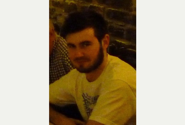
Harry Martin, last seen on Thursday. (Photo issued by Devon and Cornwall Police)

Inspector John Livingstone, of Devon and Cornwall Police, said that although the primary concern was that Harry had become lost on the exposed stormy coastline, it was always possible that he may be with friends. Being absent for this long without letting anyone know his whereabouts is, however, out-of-character for the young man who is studying film production at Greenwich University and was back home with his family in Devon for the Christmas holidays.

Waves of up to eight metres have been recorded off of Land's End, flats overlooking the seafront in Aberystwyth have been evacuated, and huge waves and more flooding are expected across the country today and tomorrow. All of this might look spectacular and make for very impressive photographs, but please be careful. I've done some ludicrous things to get photos before now, but they're never worth risking your safety, or those of people who might have to rescue you.

(Headsup to the BBC, additional information from the Torquay Herald Express)

Falling out of love with the Taylor Wessing Portrait Prize

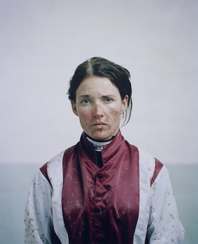
I had just opened up a new compose window to write my review of this year's Taylor Wessing Portrait Prize exhibition (in short: uninspiring and hackneyed) when someone sent me a link to this BBC article. Suddenly, my lamentation of a rather bland competition exhibition took on a new complexion. This year's Taylor Wessing Portrait Prize was won by Spencer Murphy for his photo of mud-spattered jockey Katie Walsh at Kempton Park racecourse. When I first saw it, I felt quite non-plussed by the image; it didn't seem to convey any of the energy or determination that I know fires jockeys. They're steely people, but they're driven by adrenaline. Even when they're exhausted, they still buzz. If you can convince one to sit still, or you can capture one in motion, jockeys are great subjects. It was an image that I knew I should have loved but I didn't; somehow it fell short.

Katie Walsh by Spencer Murphy

Murphy said that he wanted Walsh's portrait to convey 'both her femininity and the toughness of spirit she requires to compete against the best riders in one of the most demanding disciplines in horse racing.' National Hunt jockeys are extraordinarily tough and to portray this along with Walsh's feminity would have made for a glittering image. My interpretation of the portrait, though, was that Walsh appeared nothing more than miserable. It was a lovely picture and there is a gorgeous depth to it that Murphy had hoped to achieve by using a medium format camera, but I wasn't convinced by its characterisation. Now, I'm wondering if one line in that BBC article explains it. Walsh hadn't ridden at Kempton the day the photograph was taken. It's made to look as if she's just unsaddled and weighed-in, but that doesn't seem to be the case. 'Spencer Murphy took the shot of jump jockey Walsh at Kempton Park, although she had not raced there that day.'

So is the mud, the rosy cheeks, and the skid-lid hair nothing more than a contrivance? My friend who sent me the link to the BBC article felt very strongly that Murphy should not have been awarded the £12,000 prize. I don't want to put words into his mouth, but I was under the impression that he felt in some way deceived by the image. It wasn't telling the story that it purported to tell. A portrait of a jockey in silks is one thing; but a portrait of a jockey in mud-spattered silks that makes it look as if they've just ridden a driving finish on soft ground, when they haven't, is another.

This is potentially problematic for a major prize, depending on what's expected by the judges. Should the judges want nothing more than a beautiful image that tells a story, it might not matter how it's achieved. If the photograph is meant to be telling the subject's story, we might be venturing into more difficult territory with respect to portraiture and prizes when an image has been staged. I don't wish to state if Murphy's photo should be eligible or ineligible for the prize: I'm insufficiently familar with the competition's rules to make that judgement. But having seen the portrait of Walsh in the flesh and not been especially moved by it, I think that it might be more problematic for the art of portraiture.

When I was wandering around the exhibition this morning with Gareth, we commented on how many of the photos' subjects felt more akin to puppets in the thrall of the photographer, rather than as people being photographed. When you looked at these images, it felt as if they were lacking a crucial element, a certain something that was able to elevate them from being 'a picture of a person' to being a portrait. Portraiture is about capturing spirit. It's about distilling the essence of an individual into pictorial form. When a photograph moves away from capturing someone's spirit to something more manipulated by the photographer, is it still a portrait? Perhaps I set too much stall in the notion that a portrait isn't just a photograph that happens to have a person as its subject. I believe that it's meant to be more than that.

Photos are meant to make you feel something; a portrait needs to leave you feeling what the subject feels, too. I'm left wondering if it were the contrivance behind Murphy's portrait of Walsh that left me feeling hollow.

If you'd like to explore the exhibition for yourself and decide if I'm being nothing more than a cynical and overly-pricipled misery, it runs until 9 February 2014 at the National Portrait Gallery, London.

The Nikon Df has people talking. That's a good thing.

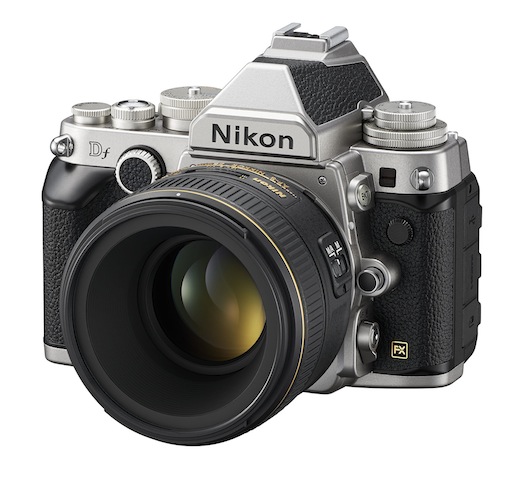
Sitting back and watching the comments unfold about Nikon's Df camera has made for a mildly entertaining distraction today. For anyone who's missed out on the announcement or the teaser videos released in the run-up to its unveiling, this is it: I think it's ugly, but that's me.

The Nikon Df has a 16 megapixel full-frame sensor powered by an EXPEED 3 processor, giving it the same guts as the Nikon D4. Sensitivity ranges from ISO 100 to 12,800, and is extendable to 204,800. It has a maximum continuous shooting speed of 5.5 frames-per-second, 39 point auto-focusing system, and pre-AI lens compatibility but no capability to match its retro-looks. It (and a 50mm ƒ/1.8G) also comes with a £2,750 ($3,000) price tag.

Mostly, the comments have ranged from 'Oh my good freaking deity of choice and all commensurate attendees, I have to own this camera right now and will sell a kidney to fund it!' to 'What a stinkingly ugly camera! Anyone prepared to pay that much for something that looks as if it has been welded together for spare parts must have more money than sense!' They do, however, go via: 'It had me until I saw the price,' and 'No video? It's not for me.' Even the more tempered comments are laced with a sense of disappointment or disbelief.

It's a camera that has divided opinions and caused people to talk. Lee Morris, over on FStoppers, has described it as a camera that exemplifies everything that is wrong with photography right now. That's not to say that the camera itself is terrible and awful, but that the current retro-obsession has maybe gone too far and that cameras have become fashion accessories rather than tools. Jaron Schneider, another FStoppers contributor, takes a different tack. He calls it a camera 'to remind you why you are a photographer.' There's very little by the way of ambivalence, and that is a good thing.

Why do I think that? I think that Nikon's produced a concept camera. It's expensive. It costs less than the D4, but it's still an almost-£3,000 camera. It has particular appeal with its capabilities and ergonomics. Many people will appreciate the dials and its old-school-lens-love, but it doesn't shoot video. For some people video's an irrelevance, for others it's a deal-breaker. I also happen to think it's ugly. That, however, is a matter of personal aesthetic preference. And to be truthful, I think I'm done with the retro-thing (although I will admit that I think Fujifilm has its styling right in this respect). I'm also entirely sick of the onanism that's taking place over it. That, though, is probably the point.

It's not meant to be a camera for anyone and everyone, it's meant to be a camera that gets people talking and it has certainly accomplished that.

Nikon's created a camera because it can. Not because it's ground-breaking or the market is baying for it, but because it has the creative latitude to do so. There are at least three reasons why I've absolutely no desire to own a Df, but if it's the kind of camera that reminds people why they love photography, then more power to Nikon.

What's Nokia brought to the mobile photography landscape with its new phones?

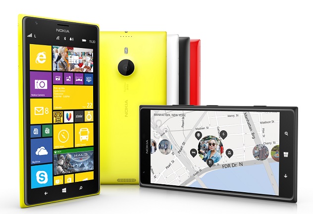
There's been a lot of love for the cameras that Nokia have been squishing into their mobile phones of late. It isn't just about the 41 megapixels found in the Lumia 1020, but more about their cameras' quite impressive low-light capability, image stabilisation, and the control that the camera app affords you. With the anouncement of the Nokia 1520 and 1320 in Abu Dhabi today, has anything new been brought into play in the smartphone landscape? Let's start with introduction of a Windows phone-compatible Instagram app. Instagram is hardly new to smartphoneography and if filtered, shared photos don't float your boat, it'll hardly seem like a big deal. However, for people at Microsoft and Nokia, the lack of an Instagam app on their phones was considered to be a significant factor in holding back sales of their devices when compared against Instagram-friendly iOS and Android. The Windows phone has now been opened up to a wealth of people who might otherwise have dismissed it out-of-hand, and with it, its camera's capabilities and functionality have been pitted against those of other manufacturers.

That's the 20 megapixel Lumia 1520

Lots of the other toys might not bring anything revolutionary to the Lumia cameras, but they are fun and functional.

The new Refocus app isn't new to camera technology—it's the same idea as a Lytro, allowing you to refocus your images after you've taken them—and something similar is available for iPhones, with the Focus Twist app, but it is bringing more functionality to Nokia phones and giving more options to users. Refocus also allows your Facebook friends (and other socially networked people) to fiddle with your photos and interact with them.

The Beamer app and the Storyteller function are meant to make Nokia phones more interactive, too. Beamer will allow you to share photos with anyone whose screen is compatible via a via social media, email, or SMS link. Storyteller creates a temporal story of your photos, placing them on a map along with chronological notation.

Previously, there were two separate camera apps in Nokia phones: Smart Cam and Pro Cam. These have now been combined into a single Nokia Camera app, which should make shooting quicker and simpler.

But the introduction of Raw file support does signal that Microsoft/ Nokia does mean business with its cameras. If they can do it, why shouldn't or couldn't any other camera manufacturer? We're seeing the gradual adoption of larger and larger sensors into smaller and smaller camera bodies; why not the introduction of Raw files into smartphones as standard?

Rihanna's Sheikh Zayed Grand Mosque photo shoot curtailed

Rihanna does seem to have a knack for making faux-pas when it comes to on-location photo shoots. In September 2011 a Northern Irish farmer asked her, politely, if she wouldn't mind putting on some more clothes or choosing a different location other than his field to film the music video for We Found Love. This weekend she was asked to leave the Sheikh Zayed Grand Mosque in Abu Dhabi after posing for some 'inappropriate pictures.' According to the mosque, at first she tried to gain access via an entrance that isn't intended for visitors. When she did make it in through the correct gate, she proceeded to pose for some photos. Photography in the grounds of the mosque isn't forbidden, but its guardians do keep an eye on how it's done. They don't want the sanctity of the space to be violated by lascivious lounging or provocative posing. Anyone can take photos for personal use without permission, but commercial photography does need to be pre-arranged. While it is unclear if Rihanna was a little too risqué in her modelling, she definitely didn't have permission. According to a spokesperson for the mosque, Rihanna's trip hadn't been co-ordinated with the admnistration and she, and her entourage, was asked to leave.

At least she turned up appropriately dressed, in a black jumpsuit and headscarf. Her experiences in a field in Northern Ireland seem to have taught her something. It's probably a good idea to speak to management before starting a photoshoot in the grounds of one of the UAE's most visited buildings, however.

If you're interested, some photos taken outside the mosque wound their way onto her Instagram stream.

Headline image courtesy of Wikipedia.

Headsup to Yahoo! News

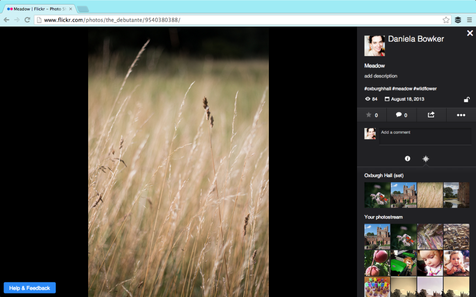
Flickr's new photo page beta is an exercise in feedback

Flickr unveiled a new photo page layout beta this week. It's part of the overhaul that it started to roll out earlier in the year; I suppose that major revamps to a site that's been left to moulder and sink under its own ennui can't be enacted quickly. The beta version is opt-in and Flickr is soliciting feedback from its users. Reassured that I could revert to the previous layout, I switched to the new style photo page early on Friday morning. This allowed me to poke around, see what I liked and didn't, and leave some comments that I hoped wouldn't sound like haranguing but would help the developers on their way. I could also get a feel for what other people were saying about the new layout in the feedback forum.

Even if you've no particular interest in Flickr and its photo page layout, new or otherwise, you can regard this as an exercise in how to give and receive feedback. It just happens to reference the new Flickr photo page layout.

Gosh the feedback forum is a shouty place.

Flickr's photo page beta

There are quite a lot of people who hate the new layout. We're not talking being marginally unimpressed and having a bit a sniff about it; we're talking ALL CAPS threatening to quit levels of disgruntlement. However, apart from 'It's too much like Facebook,' the general complaint is that the potential new layout makes the Flickr experience poorer. However, there are very few suggestions or specific examples as to how the new layout makes the Flickr experience poorer. If Flickr is to improve the beta, it needs to know what works and what doesn't. This has to be articulated by the complainants, not grizzled and gurgled in a fit of toddler-type rage.

Having some kind of structured feedback mechanism can help to manage the comments and suggestions. It focuses people's opinions and it makes it easier to analyse how many people are thinking along the same lines. Unfortunately, that can deter people who want to say something from speaking up, too. They don't want to work through a ten or 20 question form to make one suggestion that isn't even covered by the standard questions. They don't want to feel as if the questions are corralling or leading them. It's a tricky business, but sometimes you need something systematic to ensure that feedback is constructive.

A bit shouty, a bit light on content

Apart from the 'Oh My God what have you done its ghastly and hideous and I hate and I'm going to leave in a huff and never come back' exclamations, there have been some legitimate criticisms and some sensible suggestions. There are also some features that we're accustomed to that haven't yet been implemented. They are in the works. Lots of the complaints concern these omissions. Flickr: I'd recommend reassuring users that features they know and love that don't appear in the beta yet but will be there soon, will be there soon. This will save your moderators untold waves of consternation and keep users happy. Better yet, make sure that they're included in the beta before it's released.

Please fix the tags, Flickr. And the comments box.

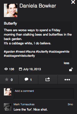
The legitimate criticisms concern comment boxes, tags, and 'favorites'. The comment box is now very small and there's no ability to insert images into it. I'm not a fan of the stickers and banners and awards that some people feel compelled to bestow on pictures and shove into comments, so that's not exactly a great personal loss. It can, however, be useful to augment a comment with an image. This is something that the developer team needs to reassess.

The new tagging format has also come under justified criticism. We know what tags are on Flickr, they don't need to be preceded by a hashtag to identify them as they do in a character-limited tweet. And we rather like having spaces between words, too. The Flickr moderators have stated that this is under review; hopefully that isn't lip service.

In the new layout, it's impossible to determine who has marked a photo as one of her or his favourites. Rather, the number of times as photo has been 'favorited' is indicated. The team is 'gathering feedback' on this feedback. If you feel strongly about it, pitch in.

Some people have suggested that the new layout isn't respecting aspect ratios. I've had a look at photos in various different aspect ratios and this isn't evident to me. If this were a bug that's now been squashed, confirmation from Flickr would be appreciated, and reassuring for those who've noticed it or are disturbed by its prospect.

Sensible suggestions include: the option to view images on white, the ability to minimise the side bar, and retaining the photo's title and description beneath it and not placing it to the right.

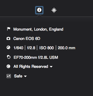
Can I have my full location and rich EXIF data back please?

As for the features that we appear to have lost but probably haven't because they're still percolating their way through the layers of re-coding and bug-squashing are: all-sizes and Lightbox viewing, rich EXIF data, HTML and BBcode snippets, the ability to assign images to groups and sets from the photo page, geo-location and map-placement data, and editing options. These are many of the features that I like about Flickr and their omission does leave the beta experience lacking. For this reason, I shall be switching it off and hoping that the Flickr team does listen to the keenly observed and well-argued cases for improvement. They might also do well to listen to the critiique that launching a beta with only skeleton functions in place is like unveiling a car without a steering wheel, gearbox, or engine.

When Marissa Mayer was appointed CEO of Yahoo!, 'The Internets' sent her an open letter asking her to 'Make Flickr awesome again.' To her credit, she's given the Flickr team the means and the impetus to overhaul the site and there does seem to be a genuine desire to restore Flickr to its once-held pinnacle of picture-sharing prowess. And they're asking the users for their input. Flickr users shouldn't throw this back in Flickr's face with unconstructive comments that only makes them look ungrateful. Likewise, the Flickr developers do need to listen to what the users have to say. We're the ones who have to interact with it, afterall. The feedback process is a two-way engagement. I do hope that everyone is listening.

Instagram is introducing ads. And that's okay.

Oh the humanity! Anyone might've thought, by looking at the streams of disappointment, consternation, and even vitriol spewing forth in the comments sections of tech sites such as Engadget, TechCrunch, and the the Verge this morning, that the team behind Instagram had been responsible for the flaying of puppies and drowning of kittens in their own private pleasuredome. The revelation was in fact far more mundane than that: Instagram has announced that it will be introducing advertisements into its subscribers' feeds on a phased basis. Given that we knew this was coming, it was hardly revelatory. And indeed, contrary to wails and huffs of some of its subscribers, it's a perfectly acceptable course of action. A few of the commenters appear convinced that the move to include 'a small number of beautiful, high-quality photos and videos from a handful of brands that are already great members of the Instagram community,' is entirely the responsibility of the nefarious Facebook, which bought Instagram for $1 billion last year. While the specifics of the advertising programme might well have been the brainchild of members of Facebook's staff as opposed to Instagram's, and Instagram would have needed to prove itself profitable to justify the sale, it could hardly have remained either free or ad-free as an autonomous entity. It would have been forced to monetise its platform through some means. Its developers cannot sustain themselves on airballs and its servers do need to function. This requires cash, with or without Facebook.

What then, are the options to raise these funds, aside from advertising? First, Instagram could have opted for a subscription-only model, which would almost certainly have been corporate suicide. Or second, it could have implemented a freemium model, more on which later.

Rather than ask its users to part with their money directly, it's asking companies to part with their cash in order to place their brand in front of Instagrammers' eyeballs. This is sensible. The particular benefit of switching to an ad-supported revenue model is that apart from the aesthetics of the interface, nothing changes for the user. There are no forms to be filled out and importantly, no money needs to be exchanged. From Instagram's perspective, advertising means that it doesn't need to determine an appropriate subscription price-point that makes it attractive to subscribers but simultaneously sustainable.

Presented with the choice of the occasional advertisement appearing in your feed and having to do nothing to continue posting photos of your cats to your legions of followers, or having to pay up front to use a service that has heretofore been free, what's easier and more appealing? Unless you are heavily invested in your Instagram feed, you might think quite carefully about subscribing. A great many people will decide that it isn't worth their money, others will simply not be bothered to get out their credit cards; either way, it would be disastrous for Instagram. Advertisements might deter a few embittered users, but inertia will be the dominant force.

This then, brings me to the freemium model: advertisements for those who aren't prepared to pay at all, and a fee for those who'd prefer their Instagram experience to be ad-free. It's possible this is something that Instagram might consider implementing when advertisements have been rolled-out world-over (at present they're US-only), but if it hasn't, it should.

Instagram, if you're listening, there are plenty of people out there who do understand that you can't survive on hope and feathers. We're generally fine with advertisements, provided that it's obvious they are advertisements and it's easy for us to ignore them. We would, however, prefer to be able to pay a minimal yearly subscription fee or a slightly larger one-off payment in order to avoid the ads. We're reasonable and appreciate the virtues of hot dinners, running water, and rooves over our heads.

For anyone who's disgusted by the notion of Instagram including advertisements, please pause for thought. How do you expect the service to sustain itself without an income? And what are your proposals for an alternative model?

Improving Raw-to-JPEG conversion is all well and good, Google, but photographers need Raw editing power

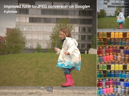
Plenty of people seem to be excited, or at least pleased, by Google's announcement that it has improved its Raw-to-JPEG conversion process for image files created by over 70 different cameras. I, however, cannot help but feel that Google, and the Nik Photography team that worked on the project, have overelooked one of the key factors that motivates photographers to shoot in Raw: we like the flexibility that it provides us. From a to b; Raw to JPEG; in Google+

The Raw-to-JPEG conversion process doesn't allow photographers to make edits to the Raw file, where the majority of the data are stored and where the photographer can have the most significant impact on the final version of her or his photos. Instead, it converts the Raw file to JPEG and expects the photographer to make edits to an already adjusted image. An image that has been adjusted according to what the conversion programme deems best, not the photographer.

It's a process that rather defeats the purpose of shooting in Raw.

I might as well shoot in JPEG format and allow the camera to make the development choices if I'm going to shoot in Raw and then let a series of Google-written algorithms develop my photos for me. It'd save oodles of storage space.

If Google is anticipating that photographers are using Google+ as a back-up of Raw files and just want a glimpse of them in JPEG for identification purposes, that's all well and good, although it does strike me as a ridiculous waste of development time to produce something they believe so sophisticated for what's a relatively trivial demand. Should the aim be for Google+ to rise as a serious contender for serious image storage and processing, it needs to rearrange its cart-and-horse configuration.


For completeness, the cameras whose files are supported by the new conversion process are:

Canon EOS: 100D, 1000D, 1100D, 1D Mark III, 1D Mark IV, 1Ds Mark III, 1Dx, 20D, 30D, 350D, 400D, 40D, 450D, 500D, 50D, 550D, 5D, 5D Mark II, 5D Mark III, 600D, 60D, 650D, 6D, 700D, 7D, M Canon Powershot: G12, G1X, S100 Nikon: 1 J1, 1 J2, 1 J3, 1 S1, 1 V1, 1 V2, Coolpix A, D300, D300s, D3000, D3100, D3200, D4, D40, D40X, D5000, D5100, D5200, D600, D700, D7000, D7100, D800, D800E, D90 Olympus: OM-D E-M5, PEN EP1, PEN EP2, PEN EP3, PEN EPL3, PEN EPL5 Panasonic: LUMIX DMC GF1 Sony: Alpha 700, NEX-5, NEX-5N, NEX-6, NEX-7, NEX-C3, NEX-F3, RX1, RX100, SLT Alpha 55, SLT Alpha 77, SLT Alpha 99


(Headsup to ePhotozine; full details on Google+.)

Flickr mysteriously grows a personality

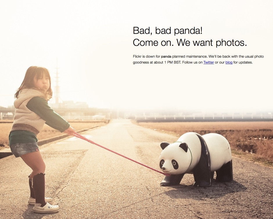
I've got to say... When the Flickr re-launch happened, I wasn't so sure... But it's really warmed on me. It's good to see that Mayer & co are taking the Flickr property seriously... And they've even been able to inject a spot of personality in the process. Take their 'sorry we are down for maintenance' screen, for example. Very cute indeed.

Bad panda.

How NASA uses sound triggers to capture amazing rocket launches

The internet is full of a Crazy Frog (No, not that Crazy Frog, thankfully) today. This little buddy took a leap of faith in front of a photographer's sound-triggered camera at a NASA launchpad. The full story is available over on Mashable, but have you ever wondered how these photographers do their job? NOW WE'RE TALKING.

For security and safety reasons, photographers aren't allowed anywhere near the launch pad at launch. For obvious reasons, they can't use remote-triggered cameras either (Think about it... Would you allow anyone with a radio transmitter near a space rocket?), and so they use other techniques instead. Specifically, sound-triggered cameras.

There are a great many different ways of doing this, of course, but over on the Triggertrap website, there's a fantastic interview with Walter Scriptunas II, who shoots NASA rocket launches using the sound triggers built into the Triggertrap v1 camera triggers. Clever stuff, and well worth a read!

Wander leads to Planett, but can these apps go any further?

In December 2011 I took a look at an app called Wander (no, not that Wander; a different one) that aimed to let you explore the world through images. It was a bit like having technologically-based pen-pal. Wander allowed you to connect with people in any one of 80 countries and you could share your lunch, your journey to work, and what you do of an evening to get to know each other and where you live, through pictures. It seemed like a fairly neat idea that allowed you to explore and learn about new places while sharing yours. It didn't, however, catch on as the developers had hoped and Wander closed down on 16 August owing to financial difficulties.

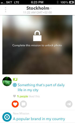
Undeterred, some of Wander's original developers have gone on to launch Planett, a Wander-esque app that allows users to discover new places and people by featuring photos tagged with 'missions' from all over the world and organising them into 'city feeds'. Wander's one-to-one element has had to take a back seat for now, but the Planett team is hoping that it can be introduced soon.

Screen Shot 2013-09-02 at 19.46.11

I'm impressed by the Planett team's tenacity, but I'm left with some nagging doubts about the app's viability. If it failed on financial grounds the first time around, how will the revamped version fare? There are two underpinning factors here: either Wander didn't fulfil a gap in the market and wasn't popular with potential users; or the team weren't able to monetise it effectively.

Rehashing an app that people didn't want to engage with won't necessarily make it any more popular. If that's the case, then Planett is, sadly, already on a hiding-to-nothing.

Not being able to monetise the app effectively could have been because the developers simply didn't know how to do it. They couldn't see a way to make the app economically lucrative and therefore didn't. That's fine if you're able to bankroll an app as a personal project, but not if you need to transform it into a self-sustaining business. Given that Wander closed owing to financial shortcomings, it suggests that it didn't fall into the category of a developer's part-time project. Seeing the way that Wander went doesn't fill me with confidence that Planett can be maintained as a developer's toy, either. If that were the case, then Wander would still be meandering along.

I sincerely hope that the Planett team hasn't sauntered over from Wander thinking that they can monetise it 'somehow' without having thought it through. Attempting the same scheme but expecting a different outcome is somewhere between futile and fanciful. What I would like to know then is what's the plan, Planett? I have asked Planett's developers to elaborate on the app's monetisation potential, but I'm yet to receive response. Without one, I can only anticipate Planett will head towards the same pale blue yonder of Wander.

Alternatively, the Wander team did attempt to monetise their app, but it didn't raise enough revenue. That doesn't bode well for Planett, either: it casts doubt on the monetisation potential of the app. Sure, Planett might have a different vision to Wander, but there's no evidence of it yet. Planett's developers need to consider if their app is something that plugs a gap in the market and if people will be prepared to pay for it, somehow.

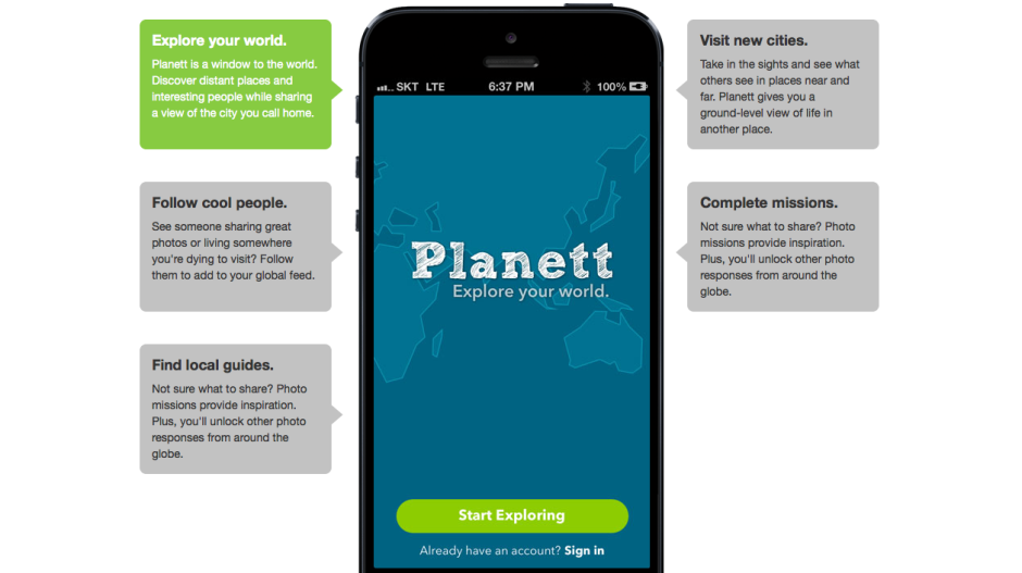
Screen Shot 2013-09-02 at 19.46.41Planett's selling points are that it allows you to explore your world, you can follow 'cool people' who share photos from places you want to visit, you can visit cities pictorially and explore them 'at ground level', and it provides you with photo missions to inspire you and get your creative juices flowing. As you share more images of where you live, you can unlock more images uploaded by other people.

Is this enough to tempt people to join and to share their photos? After all, you can already explore the world photographically using geolocation information with Flickr, Instagram, and EyeEm, and you can follow heaps of people with varying degrees of coolness on all three of those sites. EyeEm has the photo missions element built in, too. The real kicker for Planett is that these examples are already well-established communities with billions of photos, and that they're free. Without something to set it apart, Planett is facing an uphill struggle.

Wander's unique selling point was the one-on-one relationships that it fostered. Planett is hoping to adopt this feature but it hasn't got there yet. Without it, or another appealing and original facet, Planett is trying to establish itself amongst already settled groups that might not be willing to shift (or at least join).

There are billions of photos on the Intergoogles and hundreds, if not thousands, of different ways of sharing them. But if a new kid on the block is going to survive against already well-established communities and ensure its sustainability, it has to know to whom it is appealing, and how. Does Planett?

Crowdfunding an iPhone camera: Is the Ladibird project a scam?

Today, I came across an interesting IndieGogo campaign, for the Ladibird; a snap-on professional camera for the iPhone 5. Initially, I thought it was a brilliant idea, but then I started reading about the product, and I immediately became incredibly skeptical. Allow me to explain...

The sample images

First of all, the thing that made me wonder what's going on, were the sample images. They look fantastic, without a doubt, but when you look at the Ladibird video, you see that the product is just a 3D render. So that made me wonder: Where did the example photos come from? Right at the bottom of the page, they explain that the shots are taken with "a 50mm prime lens on a 12 megapixel Nikon D700".

Now, there's a lot of problems with this, in my mind: For one thing, the Nikon D700 is a high-end professional camera that cost USD $3000. It's also a full-frame camera, with a 36mm x 24mm sensor built in. The Nikon lens used (a 50mm f1/8) is also a mighty sharp piece of kit. Do you think it's fair to use photos taken with a pro-level camera as examples for what an iPhone accessory lens can do?

The specifications

In the IndieGogo campaign, the Ladibird manufacturers do the following:

The Specifications

The thing that isn't clear to me, is why they are talking about a 'mirrorless sensor' as if that's a standard. Mirrorless cameras have wildly different sensor sizes; The Pentax Q has a 6.17 x 4.55 mm sensor. The Sony NEX-6 has a 23.5 x 15.6 mm sensor. The Leica M9 has a 36 x 24 mm sensor. And there are tons of sizes in between.

The lens spec itself, too, is fuzzy. They are talking about a "Ladibird 50mm (35mm equivalent) large aperture prime lens", which patently doesn't make sense, unless they have a sensor that is 45% larger than that found in the highest of high-end SLR cameras. A more likely explanation is that they have their terms mixed up, and that they have a lens which actually has a 35mm focal length (Which is roughly a 50mm equivalent on an APS-C size sensor), but it does worry me: Would you trust a lens designed by a company that isn't sure which way around the crop sensor conversion factors go?

Developing sharp lenses is an incredibly difficult and challenging task.

But what about the large sensor and 50mm?

All of this makes sense, apart from the fact that they are talking about limited depth of field, which doesn't depend on the focal length: There's no reason why a 50mm should have more pleasing depth of field than a 100mm lens. It is mostly dependent on the aperture, but that isn't mentioned in the marketing material.

The Ladibird guys have done a great marketing tasks, but as someone who's written a book on mirrorless cameras, and has technical edited a rather chunky stack of books about photography, I can't help but feel I'm somewhat qualified to evaluate this project, and it's setting off all manner of alarm bells.

In their marketing site, they've equaled small sensors with blurry photos. That's patently not true: The Nikon 1 series have tiny sensors in them, but are capable of producing fantastically sharp images. Similarly, my iPhone 5 has a miniscule sensor in it, a quick browse through the 'most interesting' photos taken with the iPhone 5 on Flickr reveals that many of them are tack-sharp works of art. This would infer that a small sensor is in and of itself no reason to buy a Ladibird.

The other argument they make is that the 50mm f/1.8 lens is cruise control to awesome photos. Now, in most cases that might well be true, but those specs alone aren't enough. "50mm" only means that the lens has a focal length of 50mm. There's nothing inherently better about this, and there are many examples of absolutely dreadful 50mm lenses out there. In fact, I could build a 50mm lens myself out of a couple of lens elements, a kitchen roll, and some Blu-Tack in about 20 minutes, but I can pretty much guarantee that the photo quality is going to be severely lacking.

So, is Ladibird a scam?

I have no way of knowing that, but the IndieGogo page does set off an awful lot of alarm bells.

I won't be backing the IndieGogo campaign myself, and I'll tell you why: I know how incredibly hard it is to build photography equipment, and so far, we haven't seen a single prototype or sample image from these guys. Even the mock-up image doesn't seem realistic (to have a 50mm focal length, the lens barrel would probably need to be longer), which makes me wonder how far along in the process they have come.

If the mockup image represents the current state of play, then I fear they're about to get a rude awakening if they think that $20,000 is enough money to develop a fully functional prototype of the Ladibird. For a product this advanced (Apple MFi; App development; Sensor design; Lens design; Testing; industrial design; production design; prototyping...), I'd estimate you may not be able to complete the full development cycle for less than $150,000. Bear in mind two things: $150k is a very low estimate for a product this advanced, and at the end of this phase, they will have perhaps half a dozen prototypes; they still wouldn't have created a single Ladibird for the Indiegogo backers.

Don't get me wrong, I really do want a product like the Ladibird to exist, but wouldn't part with any money until I've seen at least a couple of sample images.

The biggest worry is that the marketing material is such a hodge-podge of technical, factual, and physics-related inaccuracies... Let's put it this way: if Ladibird was a book, and it was passed to me for technical editing, I'd have to craft a very difficult letter to the publisher, suggesting that it's in a shape beyond where a tech-editor can help, recommending that the book was cancelled or seriously re-written. It certainly wouldn't be in a state to offer pre-selling it to the public.

Or, put in other words: I'd probably just wait until the product is available to buy in a store.

Illustrative images in the news: unfair or acceptable practice?

Perusing my copy of the Guardian yesterday afternoon, my eye was caught by the Open Door column where the readers' editor addresses readers' suggestions, complaints, and concerns. Yesterday, Chris Elliott, said readers' editor, was responding to criticism of the use of generic photos to illustrate news stories. As it happens, it is hardly a condition restricted to the Guardian. Before the 'Your Letters' section of the BBC website was so cruelly snatched away from us earlier this year, someone would pipe up every time that 'Drunk Girl' was used to illustrate an article, usually pertaining to binge drinking. At the end of June this year the ever-insightful Liz Gerrard wrote about the endangerment to photojournalists by news publications through the persistent use of generic images.

Back with the Guardian, the dissatisfied reader had asked the question 'How many stories can be illustrated by the same picture?' before now without receiving a response, but had been riled again by the use of a photograph of Angela Merkel gesticulating towards David Cameron that was illustrating an article headlined 'GCHQ surveillance: Germany blasts UK over mass monitoring'. On closer reading, Angela Merkel hadn't come close to remonstrating with David Cameron over the issue; rather, the German justice minister had written to the UK justice secretary and home secretary about things. It was an old image hauled out to give life to the story.

Exactly how fair is this practice?

Elliott responded by stating there are rules to ensure that readers are not misled by the images attached to articles. Specifically: 'Photographs: digitally enhanced or altered images, montages and illustrations should be clearly labelled as such.' Well that's a relief to know. But what about the accuracy of an unadulterated image as it pertains to a story?

He also referred the complaint to a senior sub-editor who is responsible for web content. Her reply was that images are crucial for SEO purposes and all online stories should have one. As a consequence, the use of generic pictures and 'identification shots' to illustrate stories when there are no live images is quite common. Her comment on the image in question is a little perlexing, however: 'I would have thought that a picture of Cameron with Merkel, even if it wasn't live, would be a legitimate way of illustrating a story about the two of them (though [the reader's] complaint seems broader – that she wasn't involved as much as we suggested) – especially if the caption makes no claims it happened yesterday/today.'

So, was it or wasn't it a legitimate use of the image? The senior sub-editor doesn't address this directly. I'm inclined to agree with the reader: the link between the image and the article is too tenuous to be sustainable. But Roger Tooth, the Guardian's head of photography, has a different interpretation:

Surely the point is that an intelligent use of photography means that we don't have to be too slavishly literal. In the case of Cameron/Merkel they are symbols of, as well as leaders of, their respective countries. Pictures are very often used in the Guardian in an illustrative way.

There is something that rankles with me about this comment. Illustrative photography is entirely respectable in certain situations, for example feature articles, but when you're dealing with hard news stories, it's often the image that acts as the reader's lever into it. For this reason, there is a reasonable expectation of accuracy between the photo and the copy. It isn't just a case of luring eyeballs towards an article under less than faithful pretences, but also about conveying an accurate version of events, especially if people don't go on to read the entire piece.

With respect to the specific image mentioned by the Guardian reader, there's something disingenuous about its use because it suggests that the contretempts took place at the highest level when really it didn't. In this case, illustrative picture use doesn't do the story justice. On a more general level, the use of broad 'illustrative images' does little to support the integrity of news publications and even less for the straightened circumstances in which news photographers now find themselves.

Even if editors aren't deliberately manipulating the use of images to support copy, the continued, careless deployment of pictures is only eroding the validity of the press at a time when it can scarce afford to be blase. No, it isn't the most significant obstacle that the press faces right now, but it's one that does have an impact on the public perception of the journalistic craft. And it isn't a difficult fix.

Snapping pictures of pictures. Why?

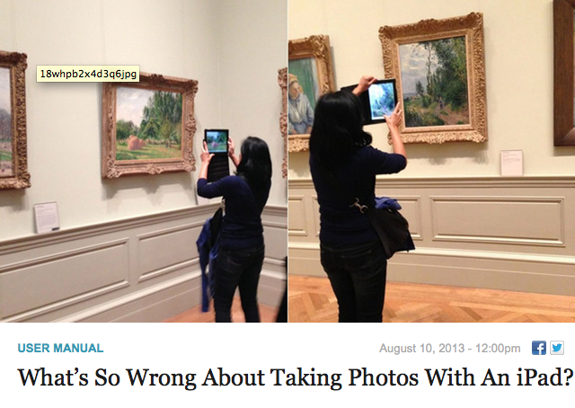
Over at Gizmodo on Saturday, they asked the question 'What's so wrong about taking photos with an iPad?' I've covered the 'using the iPad as a camera' issue before, so I'm not going to rehash it because that would be boring and actually it rather misses my point because what caught my eye was the image choice to illustrate the article. It was of a young woman using her iPad to photograph impressionist paintings in a gallery. This. This is something that I just do not understand. Not specifically using an iPad to photograph multi-layered, complex works of art, normally exhibited in carefully controlled environments, but photographing them at all. What's the obsession?

It wasn't just the Gizmodo article that got me thinking this; it's something that I've noticed before now in various galleries. Rather than taking time to absorb a piece, to let its colours and its story and its brushwork wash over you, people seem to be intent on looking at it through their three inch—or in the case of a tablet, slightly larger—screens, grabbing a quick photo and moving on from it. I cannot determine any pleasure in that I'm not certain how appreciative it is of the artist's skill and talent.

Stuff taking photos with an iPad; how does taking photos of works of art do them any justice at all?

When you have a Renoir worth millions hanging before you, you pay it the attention it demands and the respect it deserves. That doesn't come from a photo snapped hastily with a miniscule-sensored camera that you'll probably never actually look at again. Even if you do look at your snapshot again, it'll never be able to entrance and captivate you in the same way that the original can. I promise you, a pefectly lit, carefully composed medium format reproduction of a Guardi, a Stubbs, or a Fantin-Latour cannot, in any way, compare to the real thing. So don't think that your iPad-snap or point-and-shoot shot will. You're in a gallery to observe the art, why not do that?

It's almost as if people are taking photos to remind themselves that they've actually seen something, rather than really looking at it and being able to remember it for how glorious it is.

Yes, I suppose that people can waste their time and money photographing delicate, intricate pieces of art with cameras of varying quality in far-from-optimal lighting conditions, rather than gazing at it, enjoying it, and absorbing it if they want to. But can they damn well make sure that they do not stand directly in front it, obscuring my view, when I'm trying to do just that?