
It's time for another round of video photo critiques! This week, it's Pheasant Feathers Headdress by Greer Brooks.
So, check out the critique below, and if you want to have one of your own photos critiqued, check out this post!
When you hear the term 'high-res' thrown about with such abandon when it comes to images for web use, have you ever stopped to think just how big or how high quality and image meant for the web needs to be?
There's an assumption that high-contrast images are more dynamic, more compelling, more inviting. Have a go at some low-contrast photography. You might surprise yourself with the results.
Balance doesn't mean symmetry; it means an internal consistency and tension within your photos. And it's a vital element of composition.
Great photos might be down to a little bit of luck, but most of that 'luck' you make yourself. Don't believe us? Read on...

It's time for another round of video photo critiques! This week, it's Pheasant Feathers Headdress by Greer Brooks.
So, check out the critique below, and if you want to have one of your own photos critiqued, check out this post!

Peter's original image...
It's time for another round of video photo critiques! This week, it's Portrait by Peter Dahlgren. He has helpfully done a blog entry on the photo as well, to help you get a feel for how he's done it.
So, check out the critique below, and if you want to have one of your own photos critiqued, check out this post!
Nobody will ever be able to straight-facedly claim that Fujifilm's X100 is without its flaws, but by jove, is it turning it into one of my fave cameras nonetheless. One problem with this little peach is that the lens is exposed, and non-interchangeable - so if you, like me, tend to throw your camera over your shoulder, there's danger abound if you knock it into something.
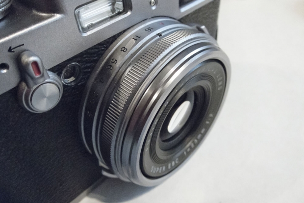 As a double bonus hazard, the camera doesn't have a filter thread, so it's impossible to put an UV filter on the lens for protection. Or is it? It turns out that it does, indeed, have a filter thread, but it's 'backwards' - instead of having the threads facing inwards, like on most cameras, on the X100, the threading is facing out.
"Ah, but that's no problem", I hear you say - "Filters have threading both ways, you can just mount it on the camera backwards!". Well, that's true, but there's a second snag with the X100: Because the inner lens barrel comes quite far out of the camera body, if you simply mount a filter, the lens is liable to get stuck (if you're lucky), or be damaged (if you're less lucky).
So, how to solve this conundrum?
Easy, if a little convoluted.
You need to buy two 49-mm filters, and be prepared to sacrifice one of them to The Cause. What we're going to do, is to stack a couple of 49mm filters, in reverse, on the lens.
Step by step:
Take off the ornamental ring
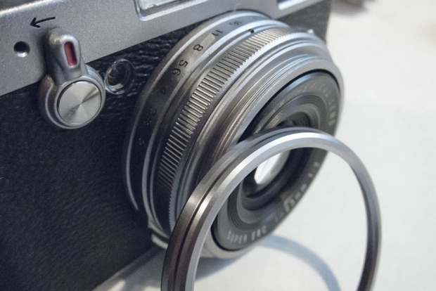
This image shows the problem we are facing: See how far that lens extends? Just attaching a filter would cause trouble...
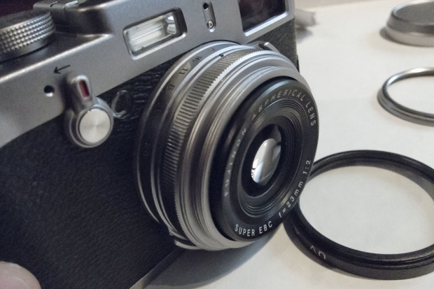
Now, the easiest way to take the glass out of a filter would be to unscrew the retaining ring in the filter. However, these can often be extremely well-attached; if you don't have a special tool, they can be very difficult to loosen. I got frustrated with my filter, and took a violent approach.
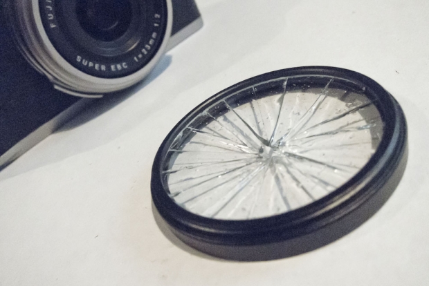
By giving the filter a sharp blow with a screwdriver, and then carefully removing the shards, I was able to take most of the glass out
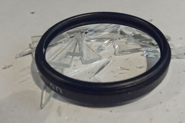
Of course, with most of the glass removed, it was possible to take the retaining ring out. I took out the rest of the glass, and made sure there weren't any fragments left.
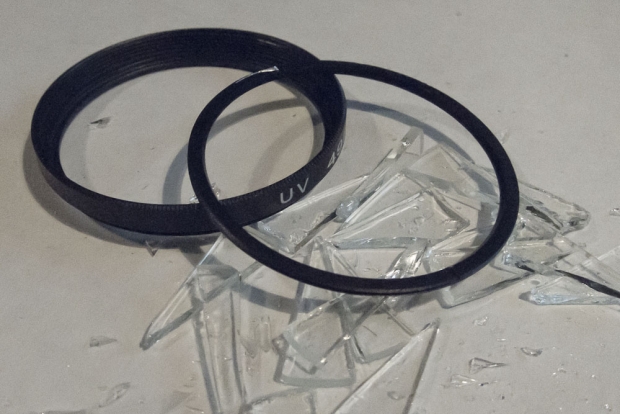
Mount the empty filter threading on your lens
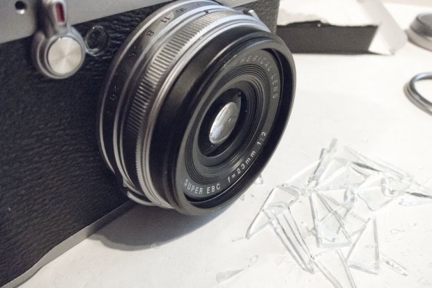
Loosely attach the second filter to the first filter. Then, operate the camera. See how close the lens gets to the filter. Slowly tighten the filter little by little, and keep experimenting with your lens. Be aware that some low-profile filters may not be thick enough to give you enough distance, so being careful at this step is a very good idea indeed.
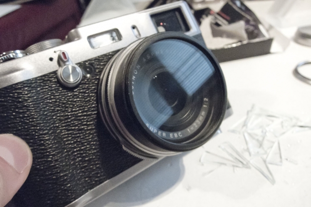
Remember the ornamental ring we took off in step 1? Put it back on, if you like!
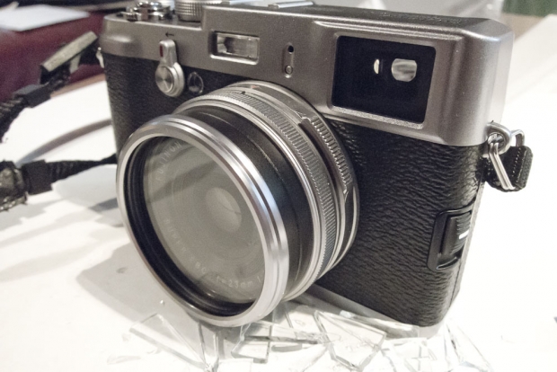
That's it!
So, that's how you can mount a filter on your X100 camera. Easy once you know how!

Birds and bees and all that.
I recently received an e-mail from a reader with the following question: "I have taken a series of nude photos of my wife. I enjoy having them, but our daughter is getting old enough to use my computer, and I am not sure how to keep her from finding them by accident. What would you recommend?"
It can come across a little bit funny, perhaps (Nude photos of your wife? Are you sure you're just not trying to hide your porn stash from your wife and kids?), but it's a fair enough question: Whether it's photos, videos, or other sensitive files, we all have items on our computers that we'd rather others didn't interfere with.
 The obvious solution, of course, would be to stick everything on a USB thumb drive (They have a whole category dedicated to USB thumb drives in Amazon.com and .co.uk.) and hide that somewhere; Thumb drives come in small packages with enormous storage capacities these days, so that should be easy enough. But what if you want to keep the data safe also if they're on a thumb drive?
I can't speak for the Windows world, as I haven't used a Windows PC for years (and I'd love to keep it that way, if I can help it), but on the mac, there are a few clever tricks you can try.
Personally, I think the best solution for sensitive documents is to use Disk Utility to create a virtual drive. I've created a little video showing you how:
(video not showing up? Look at this post in its original location!)
If you can't be bothered with the video, the steps are as follows:

You will now be asked to enter a password:

Enter it twice, make sure you untick the "remember password in my keychain" tickbox, and click OK. Now, it's absolutely imperative that you remember this password: If you don't, your files are going to be inaccessible forever: There is no 'back door', and the encryption is hard-core enough that it's virtually uncrackable with current technology. Forget your password, and you may as well delete the virtual drive: You'll never see your files again.
To use the drive, you'd use it much like you would use a DVD or a CD - or an external drive.
Photo credit: The photo in the top of this post was licenced from iStockphoto.
There are many ways to learn photography - one of the easiest ways is to learn a set of 'rules' that work like a shortcut toward getting awesome photos. You'll have heard of a lot of them before; there's the Rule of Thirds, for example, the golden mean, or simpler rules, too: Such as "get your photos in focus" and all the rules-of-thumb to do with equivalent exposures etc.
Do you know of any other “rules” for photography? Which rules to you stick to most of the times, and what rules do you love to break for best effect? Leave a comment below!

It's time for another round of video photo critiques! This week, it's Eagle, by Latrell Olner that's going on the proverbial chopping block.
So, check out the critique below, and if you want to have one of your own photos critiqued, check out this post!
Enjoy!
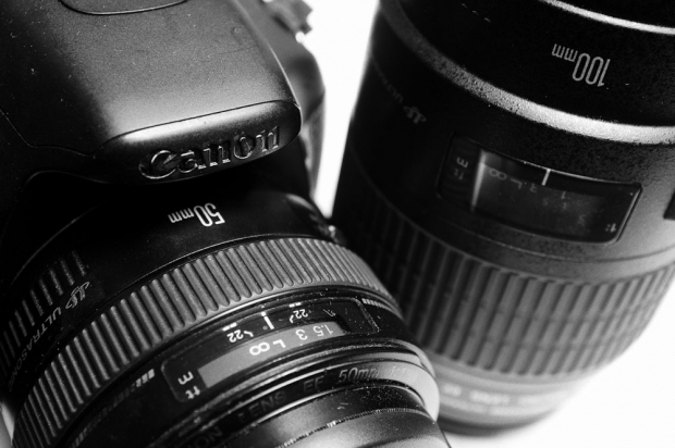
On SLRs, I prefer to go to the opposite extreme of long zooms...
The other day, I received an awesome question from Nick LaRoque via Twitter. He asks an understandable question: "I have a 30x zoom FujiFilm hs10, how do I get the same zoom range from a dSLR?"
It's a fantastic question, and one that is asked every now and again by people who are used to the ludicrous zoom ranges found in the 'bridge camera' segment of large compact cameras. Nick's HS10 packs a 30x zoom, and there are even wilder examples out there, including the deeply impressive Canon Powershot SX30, which squishes a 35x zoom (equivalent of 24-840mm) into a relatively modest package.
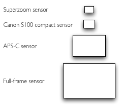 Well, there are a couple of things the compact camera manufacturers do. For one thing, they tend to use rather small sensors; both of the cameras mentioned above use 6.17 x 4.55 mm sensors. That is... Tiny. Compare those numbers to the sensor used in Canon's top-of-the-range compact shooter, the PowerShot S100:7.49 x 5.52 mm; the APS-C sensors used in many digital SLR cameras: 22.3 x 14.9 mm; and the full-frame sensors used in high-end cameras: 36 x 24 mm.
By using tiny sensors, the camera manufacturers can reduce the sizes of the optical elements of the lenses, which makes it viable to create very, very long zooms. That's great news if you like to take photos of things that are far away... Or is it?
The Canon SX30 has a maximum aperture of f/2.7-5.8, and the Fuji is remarkably similar: f/2.8-5.6. The first of those two numbers is not a problem; a 24mm f/2.7 is a reasonably fast lens that is quite versatile. The second number is another story, however. It means that when you are fully zoomed in, you are 'losing' two full stops of light. So: If you were able to take photos at a shutter speed of 1/50th of a second when fully zoomed out, you would have to take your photos at 1/15 when you're fully zoomed in.
That doesn't sound very bad, but the problem is that when you are fully zoomed in, every little vibration of your hands is dramatically amplified. In order to combat that, the rule of thumb is that you need to use a shutter speed that is equal or faster to the inverse of your focal length. I know that sounds a little bit mathematical, but it's easy to grasp with a couple of examples: If you are taking phtoos with your SX30 fully zoomed out, it's the equivalent of a 24mm lens. That means your shutter speed needs to be 1/24 of a second or faster. If you zoom to 100mm, you need 1/100 of a second or faster. And if you zoom all the way in, you're going to need 1/840 or faster. In practice, you're talking 1/1000 of a second, which is a very fast shutter speed indeed.
Now the problem is this: When you are fully zoomed in on the SX30, you are already at f/5.8. If you also need to use a 1/1000 shutter speed, that means that you basically need to be outside in bright sunshine in order to have enough light to be able to take the photo.
The camera manufacturers make a couple of changes to their cameras to make this easier: They introduce optical image stabilisation, which makes it possible to shoot at 840mm at, say, 1/500 or even 1/250 of a second. In addition, they include wide ISO ranges; the HS10 goes to ISO 6400, and the SX30 stretches to ISO 1600.
Of course, optical image stabilisation isn't perfect, and comes at the cost of battery life. Similarly, high ISO comes at the cost of image quality and digital noise.
Ultimately, I'm not saying that superzooms don't have a space in the marketplace, but in my experience, physics (well, optics, really) get in the way of superzoom compacts being as good as they look on paper.
The short answer: You don't want one.
The longer answer is that the superzoom compacts have a 28 mm2 sensor. A full-size SLR sensor covers 1620 mm2. Put differently, the surface area of a full-frame dSLR sensor is nearly 60 times bigger than that of the super-zooms. There are advantages to the bigger sensor: You get higher resolution sensors, less digital noise, and you are able to get more performance out of your expensive lenses. However, it does mean that the lenses have to be physically bigger.
If the sensor surface is 60 times bigger, it stands to reason that the glass that forms the rear lens element of the SLR lens also needs to be 60 times bigger; and this is where the problems start sneaking in. A compact camera lens might weigh about as much as an iPhone; or about 180 grams, which isn't all that much. Multiply that by 60, however, and you've got a completely different picture: suddenly, you're talking about a lens that weighs 10kg (over 23 lbs). It would also have to be around 70 cm (27") long. Finally, on a 840mm lens, the maximum apertures would be absolutely abysmal.
All of this means that if the SLR manufacturers built a lens that covered the 24-840mm zoom range, it would be so heavy that you could barely carry it, so long that you'd struggle using it, so dark that you couldn't actually take photos with it, and so expensive that you'd have to mortgage the house.
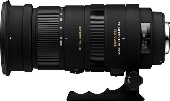
There are a few condenders in the SLR market for solid long-zoom lenses. One of the most popular ones is the Sigma 50-500 lens. It has some pretty favourable reviews, but it has its drawbacks as well. The f/4.0-6.3 maximum aperture range is about as good as they come, but if you need the longer end of the zoom range, you could be better served by more exotic lenses; such as the Canon 400mm f2.8, which is a whopping 2.5 stops faster at the same focal length, or the Nikon 500mm f/4.0... Which is also an incredible lens. Don't look at the price tags, though, you might pass out.
Tamron had a go as well, with their 18-270mm zoom lens. That's still only 15x - a far cry away from the 35x record from the compact camera world - but with f/3.5-6.3 maximum apertures, they've done an amicable job with keeping the aperture range relatively low.
Canon has a 18-200mm f/3.5-5.6 lens that only works on crop-frame sensors (known as an EF-S lens). This is because the lens intrudes further into the body of the SLR; by putting the rear lens element closer to the sensor, and designing the lens especially for the smaller sensor, they can keep the amount of glass used in the lens down, which means smaller and lighter lenses. Unfortunately, of course, if you buy one of these, and upgrade to a full-frame sensor later, you can't use your lens on your new camera.
Finally, there's a 18-200mm f/3.5-5.6 from Nikon as well. The review of this lens on DPreview summarises my take on superzooms rather well; "the phrase 'jack of all trades, master of none' springs immediately to mind. It's a lens which delivers somewhat flawed results over its entire zoom range".
In general, the general rule of thumb is that the longer the zoom range of a lens, the more compromises the lens designers had to make in turning the lens into a reality. The real question is; do you really want to invest in a SLR camera body, only to be held back by zoom lenses that become the bottleneck of your image quality?
So, instead, for SLR cameras, it's worth exploring the availability of the opposite extreme. To get the most from that fantastic, huge imaging sensor, don't ruin it all by adding inferior glass. A good prime lens, might perhaps be a good choice... Or you could consider a less extreme zoom lens with a solid performance.
Or, finally, if you're in love with the extreme zoom lens on your superzoom compact camera, perhaps you're the person they invented the genre for. When the time comes to replace it, buy one with a higher-resolution sensor, and keep on snapping.
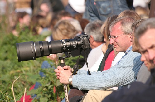
Photo Credit: The man with the long lens: A Longer lens than Me (cc) by Robbie Shade

Today's video critique is Biz Eating Apple, by DiaspirePhoto. Take a closer look at it on Flickr!
This is the third in my now-weekly series of video critiques. To see all (well... Both) critiques and to find out how to get your own critique, check out this post.
Well then, with that out of the way, let's get cracking on the critique:
Do you enjoy a smattering of random photography links? Well, squire, I welcome thee to join me on Twitter - Follow @Photocritic
© Kamps Consulting Ltd. This article is licenced for use on Pixiq only. Please do not reproduce wholly or in part without a license. More info.

The (in)famous disco twins
If you're using flashes on the go, you may have noticed that there's lots of ways you can create interesting effects: Bouncing the light of the ceiling, for example (that's possible even if you are using a compact camera, by the way), or similar.
A lot of photographers swear by Light Spheres, such as the ones marketed and sold by Gary Fong, Lumiquest and Sto-Fen. They're good products, there's no doubt about that, but I always had a problem with them: Basically, light doesn't care whether it travels through a pretty, $60 piece of plastic, or anything else.
The idea is simple: You're trying to increase the apparent size of your light source. When you do that, you can create some beautiful, soft light.
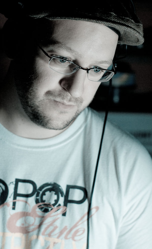
But does that mean you have to spend a lot of money? Like hell it does. The other day, I was going to go take some photos of my good friend Sherlock Ohms, who was going to do a spot of DJ'ing in central London. I had never been to the venue, so I couldn't know for sure whether the ceilings were light enough to trust bounce flash, and I didn't know how big the venue was, so wasn't sure whether I could bring along an umbrella. (In retrospect, I'm lucky I didn't; there were too many people and too little space).
As I was standing in my living room thinking about this little conundrum, my eye fell on the Jiffy bags I use to ship out my Gray Cards (you have bought a set, haven't you? Because if you haven't, you really ought to), and I had an idea: There's no reason why a bubble envelope shouldn't work as a lovely light diffuser.
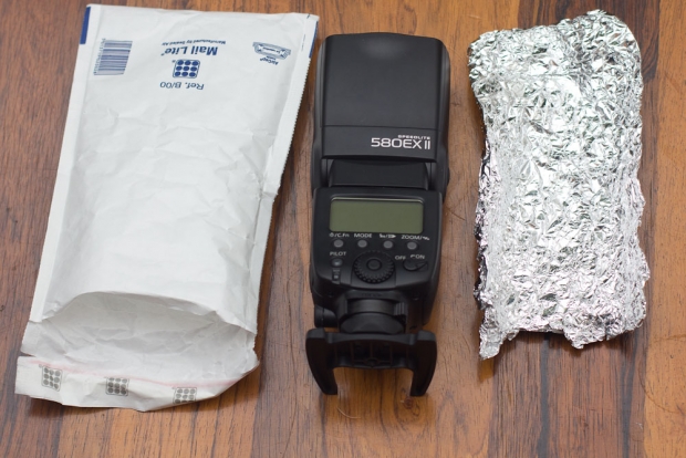
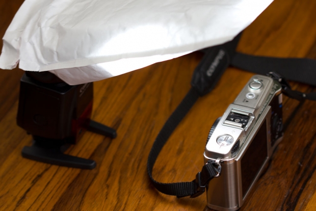
However, I wanted it to be a little bit directional as well; there's no point in lighting the area behind me, if I need the light to go forward. So I dove into the kitchen drawer and got some aluminium foil. I clad the inside of one side of the envelope with some foil, and simply stapled it into place (if I had had a little more time, I'd probably have glued it, to prevent the staples from scratching my flash).

Finally, all you need to do is to insert the flash head into the top of the envelope. It fit snugly, so I didn't have to do anything else. Perfect! If the envelope had been slightly larger, a rubber band would have been sufficient to hold it in place.
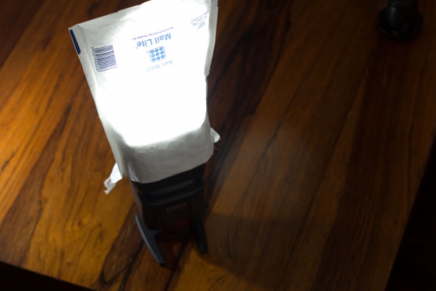
So there you have it; a $1 envelope and about $0.05 worth of aluminium foil made a beautiful light shaper. If it works? Well, let's take a look:

Looks like a studio shot, right? Well, the set-up shot isn't nearly as glamorous:
And the shots of my friend who was DJ'ing?
Today's video critique is Gay Balloons, by Sam Levy - take a closer look at it on Flickr!
Sam's photo is the second video critique I've done, so let me know if this format works a little bit better. To see all (well... Both) critiques and to find out how to get your own critique, check out this post.
Well then, with that out of the way, let's get cracking on the critique (oh, and if you can't see it because you're looking at it in a RSS reader or similar, simply come to the original of the article here so you can see it!)
Pont de Bratislava, by Flickr user Equismo
Today, I wanted to try something a little bit different. Personally, I'm an enormous fan of photo critiques (that might explain my name on Twitter - @Photocritic), as I think they are a great tool to learn from your mistakes, and from those of others as well, obviously.
I wanted to see if video was a useful way of doing these critiques; so here's a first attempt!
The photo I've taken a closer look at is Pont de Bratislava, by Flickr user Equismo:
This whole video critique thing is completely new to me, and I'm not sure if I've got it right quite yet - so any feedback you may have would be warmly welcomed! Also, if you want to enter your photos to be considered for critique, please add them to the Flickr group!
It’s Friday. Time for a treat. We’re bringing you the first in an occasional series written by Ross Sheddon, who’s an official ship’s photographer on a cruise liner. How much of an awesome job is that? We thought that we could enjoy his wanderings vicariously, as he talks us through where in the world he happens to be at the moment, and what he’s learned about photography in the process. In turn, what we can learn, too. And try not to turn green with envy. So, here we go, where in the world is Ross, and why didn’t he take that photo?
It’s a beautiful day in Scotland, the sun’s out, it’s almost warm. But I’m not there. Early morning and two hours north east of Qingdao I can see my breath on the cold clear window of the old bus. I wiped the condensation away for the hundredth time as the most amazing vistas of barren fields and leafless trees swept by.
I absent mindedly flicked the shutter speed up another notch on my trusty old 40D. It had been sitting in my lap like a sleeping child for most of the journey. It, like me, had very little to do until we reached our destination.
I sighed, a basic lesson of being a professional is this: You never shoot through windows. And you never, never, never shoot through the windows of a moving vehicle. The urge is always there but training and experience tells you that the shot will not be one of quality. You don’t do it, it’s the rules.
I’m sure you think you see where I’m going with this, rules are meant to be broken et cetera, et cetera. That’s for another article, what to take away from this is not to break the rules, simply to be ready. The best shot will come at you when you least suspect it and if you’re not ready you’ve no chance to capture it. You can’t always be in the front row of the rock concert; you’ve got to make the best of the opportunities that arise.
The bus swerves to give more room to an old truck trying to pass on the inside of the blind bend and I grip my camera a little tighter in reassurance. A flash of trees. A lake appears. It’s there for two seconds or more then it’s gone.
On a small back road, far outside Beijing, early in the morning, I’ve grabbed an image from the world around me. It’s not the sort that you get a second chance to shoot; my colleague behind me didn’t have her camera case open before it was past. If you’re ready when the shot comes you can take it, if not… well we’ve all had the pleasure of looking enviously at our friends and colleagues shots from the day we forgot to charge our battery and accidently left the spare packs in our other bag.
It may not be a shot that’s going to win any competitions; it may not sell as stock. It may simply sit forever on my hard drive but I got it. I got it. Every time I look at the image it reminds me of that time and place, the feel of the piece deeply invokes in me the memories of the moment, of the trip, of the whole country.
Around us at all times are shots waiting to be discovered. If we don’t have a camera in our hands then we’re going to be missing that opportunity. You can’t walk around every day with all your equipment strung around you like a Jessops-sponsored Rambo. I only suggest that when you know something might come, when you’re in an interesting place, have you camera set up and ready to crack of that shot before it presents itself, otherwise who knows what you’ll miss.
Perhaps more importantly remember, whatever country you’re in, the same things will always stop you grabbing that perfect shot:
Ross is a portrait photographer and digital artist, currently working for Princess. In his career he’s worked everywhere from Vietnam to China to Egypt, Greece, Alaska, and back. Despite running out of new countries to visit his eyes remain open for new weird and wonderful sights always around him.
There has been a huge craze storming through the tech world for a while now: The ability of shooting high-end, high-definition video with a dSLR camera.
At first, it was a bit of a novelty, and people didn’t really know what the hell to do with it. Then, some photographers realised that it’s actually sort of nifty, and that you can achieve incredible results on a tidy budget. Then, finally it went all a bit silly, and a lot of videographers leapt on the bandwagon.
Personally, I think it’s a waste of time and a complete fad. I’ll tell you why.
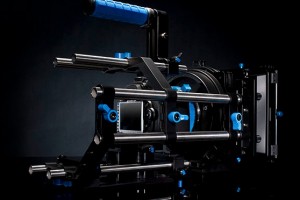
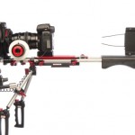
There is a SLR camera in there, somewhere, but if you have to add several lengths worth of metal tubing to your camera to adapt it to be useful as a video camera, it is probably not a good sign.
Videographers have for many years been using dedicated video cameras, whether they are ones with high-quality lenses built in, or the high-end, interchangeable lens, 3CCD jobbies.
There are lots of reasons for using a high-end camera: The bigger sensor sizes make a huge difference to the quality of video you can record; multiple CCD makes sense to get better colour reproduction; and interchangeable lenses means that your camera body is perfect for any job.
The biggest problem with interchangeable-lens video cameras, however, is one of production volumes: By its nature, fewer people own video cameras (especially high-end video cameras) – and the kind of people who are willing to part with vast amounts of cash for the privilege of shooting with a top-of-the-line video camera are probably professionals who get paid for their work. Canon and Sony (who manufacture many of the high-end video cameras) know this, and price their products accordingly.
As such, the bodies are expensive, and the additional lenses you can buy for these lenses are obscenely expensive.
So, when the dSLR manufacturers started including video on their SLR bodies – first almost as an afterthought, later with some more planning and better integration – a lot of people perked up. SLR lenses can be had cheaply (a consumer SLR lens is often vastly superior to a much more expensive fixed-lens video camera lens, for a variety of reasons), and the expensive SLR lenses are on par with – if not superior to – their video counterparts, whilst being a lot cheaper.
Consequently, videographers creamed their proverbial pants, and ran out to buy camera bodies, whether full frame (Canon EOS 5D mk2 et al) or crop-frame (7D et al), and a whole load of different lenses.
Cinema-quality video output with home-video price tag? What could possibly be wrong about that?
In the hands of talented people – including the man who has become a bit of an icon of the SLR-as-video-camera movement, Philip Bloom, a lot of deeply impressive video content has been created. In the case of Bloom, however, we’re talking about an experienced videographer who understands better than most the advantages and downfalls of this sparkly new format; Whether through design or instinctively, he has found ways around the downsides.
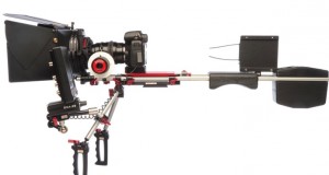
I'm all for hacking your camera and computer equipment, but if you have to go to these lengths to make the equipment usable, I cannot help but think that there must be a better solution. And if there is none, there will be soon.
The biggest problem with moving images vs. still images is that you handle the camera in a fundamentally different way. Imagine, for a moment, that you are holding a camera. You’re probably holding your hands out in front of you, with your right hand supporting the camera body, your index finger poised over the shutter button. When you take a photo, you have to hold this pose, completely quietly, for 1/60th of a second. Click. Flash. Job done.
When you’re filming video, you’re essentially doing the same thing, but 30 (or 25 or 24, depending on what format you are video’ing in) times per second. Suddenly, the device which has evolved from being a photography creation device is no longer as comfortable.
Of course, crafty aftermarket equipment manufacturers came up with loads of solutions. There are geared wheels for pulling zoom and focus. There are eye-cups, grip straps, etc. And then it all got a little bit silly: You can buy an elaborate ‘DSLR-Marksman shoulder support’ rig, at the same price as you originally paid for your DSLR body; cages for your dSLR so you can strap lights and microphone rigs to it, etc.
To me, the fact that you have to buy a camera body and then have to invest the same (or more) amount of money again can mean one of two things: 1) it’s a very flexible and modular system; the best thing ever to have come to the world of digital videography. Or 2) the whole SLR form factor is simply not fit for purpose, and is a stop-gap until something better comes along.
I know that a lot of the SLR-Video crowd feel passionately that option #1, above, is correct, but I’m willing to bet that a lot of them know, in their heart of hearts, that what’s going on in the DSLR-video world is weird and not all that helpful: Your viewfinders suck. Sound recording is haphazard at best. The video files are inflexible.
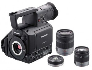
Panasonic recently launched this hideous-looking beast. It has one saving grace: it uses four-thirds camera lenses, which means there are lots of lenses available, from many different manufacturers.
To me, it seems that dSLR video has two advantages over other way of shooting video.
1) SLR cameras use SLR lens mounts. That means you can buy awesome lenses for not-a-lot-of-money.
2) SLR cameras have huge sensors, compared to their typical video equivalents, which gives a ‘look’ which is much closer to Hollywood than America’s Funniest Home Videos.
Don’t get me wrong: Both these points are golddust, and great reasons for shooting with SLR cameras. But it’s not going to last. Why?
The camera manufacturers are watching closely; I know that many of the prominent members of the SLR-video world have been approached by camera manufacturers, who want to talk to them about exciting new developments.
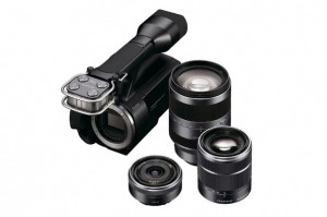
Sony is catching on too, with more affordable camcorders using consumer-grade (and potentially more exotic) lenses.
It’s only a question of time before Canon, Nikon and the rest of the gang cotton on, and start releasing proper video cameras – with a form factor that makes sense, proper audio capabilities, better file formats, decent viewfinders, and controls more finely attuned to the task at hand – whilst keeping the things we’ve grown to love about DSLR cameras: The lens mount and the sensor size.
I’m impressed by what people have been able to do with SLR cameras, and I admire the willingness to ‘hack’ the camera systems to be more suitable. As far as I’m concerned, it’s unfinished technology, poorly implemented, and not fit for purpose… But I’m willing to bet that’s going to change in the next 12 months.

You are approached by a complete stranger with a look of pure incredulity etched across their stupid face – “Um, excuse me, what are you taking a photo of?!!???!”
“Uh, well, I’m taking a photo of this wall”
“Why?!?!?! Why would you want to take a photo of that wall?!!”
“I dunno – I like the textures and the brick work”
“…..are you a terrorist?”
“Um, excuse me, what are you taking a photo of?!!???!”
“How many times have you been to the toilet today? Are you feeling regular? Need more bran?”
“I beg your pardon?!”
“Oh, well I just figured that seeing as you’re fine with approaching complete strangers and brazenly poking your nose into their day to day life, you wouldn’t mind me throwing a couple of questions back your way”
“I’m sorry sir but I’m going to have to ask you to put that camera away”
“Why? I’m allowed to take photographs in a public place”
“Now don’t make me talk into my little radio thing”
“What about those people with compacts? They’re taking photos”
“…..erm….please put the camera away sir”
“I don’t see how that’s diff…”
*man begins to talk into little radio thing*
“sigh”
“I’m sorry sir but I’m going to have to ask you to put that camera away”
“What seems to be the problem, pseudo-officer?”
“Well that camera looks like a professional one or something, so you probably have some kind of terrorist or illegal money making agenda. You know something? I don’t even know myself! Ain’t that somethin’?! Now put that camera away”
(you remove the large hotshoe flashgun from your camera)
“Huh? Where did he go? Excuse me sir, have you seen a man with one of those professional, up-to-no-good type cameras around here?”
Dear Gareth,
We here at Corporation Corporations love your photos. We feel they really capture the ethos and corporate direction behind our new advertising campaign – “We Are Stuffy Robot People Who Enjoy Using Made Up Words”. Could we possibly liaiseise and actionate a request to utilise your images for our advertiseination strategemator? We would like unlimited rights to 200 of your images forever and ever and ever and ever.
By way of payment, we clubbed together and have come up with the tantalising offer of half a packet of Chewits only briefly sat on by Kevin (our Chief Exec) and a pirated copy of Dirty Dancing.
Please let us know if you agree to this as soon as possible. Otherwise, we’ll probably just bully some poor new photographer with lots of talent but no idea of what he should be charging into giving us his work for free, throwing out the classic “it’ll be good exposure for you” line, the “exposure” being “hey everyone, this guy gives you his stuff for free!”.
Kind Regards,
Business McMickeytake.
Everywhere I look, it seems that photography, despite its ubiquitous, omnipresent nature, is held in a shockingly low regard in many respects. I’m aware that it’s not as simple as that but there are many instances where the inherent ignorance of photography and its worth really stand out. News items often crop up, detailing incidents where images have been used without the photographer’s consent, sometimes with full knowledge of the copyright breach, sometimes without. Either way, it shows a disregard for the value of photography and the photographer. I’m not saying it never happens, but how often do you hear of copyright theft of works of art using other media? Nowhere near as often. There are, of course, other factors in place here, such as the ease of distribution of photography compared to (some) other art forms: maybe the digital age of photography and the Internet has increased the immediate availability, accessibility and sheer volume of photographs so dramatically that people feel that nicking off with this one image from thousands upon thousands won’t really matter.
The ease of sharing, creating, editing and distributing images that digital has brought is, then, something of a double-edged sword. However, at the heart of it all, I feel that general ignorance and a low opinion of photography is at the heart of the problem.
People think photography is easy: you can see it in the stock responses and reactions to a variety of situations. Again, I appreciate there are shades of grey to this, and not everyone is interested in photography – that’s fine, of course – but let’s look at weddings. I’ve experienced the situation where people think that they don’t need to get a wedding photographer in, because they have a friend with a DSLR. They are of the opinion that it is the camera itself that is allowing for such fantastic images to be captured, not the skill of the photographer. Now, I don’t do weddings, but I am sometimes asked as a favour to take photographs at a wedding. I’m perfectly happy to do this, I may even enjoy it, but I always tell them to hire an actual, proper wedding photographer. I don’t do wedding photography, so it would be a silly idea to book someone who didn’t have the experience (which brings me to my second point).
There is this fallacy that if you’re proficient and able in one area of photography, then you can do ‘em all. This is again indicative of the general view held of photography – the idea that it’s not very diverse, that it’s easy to master. Although this seems like a more innocent presumption than some of the others, it fuels the ignorance and reinforces the idea that anyone can do this. Yes, anyone can take a photograph, but not everyone can take a good photograph.
This also goes for choice of subject. You’ll get enough rolling eyes and presumptions that you’re a tourist just from photographing a landmark (plus possible infuriating hassle from Captain High-Vis), but start photographing a park bench or a grid or the texture on a wall and you’re regarded as a mental man or someone documenting possible ways to burrow into Buckingham Palace to explode the Queen’s Corgis. Oh and god have mercy on your soul should you decide to crouch to take a photograph. What sort of rabid, dribbling nutbox crouches to take a photo?
Despite the mild irritation of the other widely held views and the poor public attitude they highlight, this is the one that is a real problem. Regardless of the area of photography you work in (I mean, they’re all the same anyway, right?), I imagine you will have encountered this problem on a number of occasions, and probably still do encounter it. Personally, I have one or two stand out moments. I remember someone phoning to enquire about getting some actor headshots done. When given a price, they were astonished, hostile even, and stated that they had been quoted £50 elsewhere. So that’s about 2% of the cost of the equipment used, before my actual time and ability are taken into account. I just replied with “ok” and waited for the phone call to end.
I constantly hear about my peers, contacts and friends involved in photography being offered next to nothing (if anything at all) for use of their images in some advertising campaign or for use in promoting an event of some kind. When refused, the potential customer tends to get genuinely annoyed by this, like they’re turning down a stonking deal. They then proceed to use some poor sucker’s work for free, because they bought the “it’ll give you good exposure” line.
If you take anything away from this slightly manic rant (maybe I shouldn’t drink so much coffee in the mornings) please take away this. I’m pretty sure I’ve said it on Small Aperture before but, to be honest, I don’t think it can be said enough. I’m thinking of tattooing it onto my forehead, or having it pumped out of giant speakers across the entire planet, or beamed into people’s brains via satellite (NASA still haven’t got back to me on that one, I must chase them up).
The message is simple – do not sell your work for peanuts. Do not let it go for free. The less you value your work, the less photography is valued. If you work cheap, it affects all of us.
If we all stood up and requested a decent price for our images and refused to work for free, the value of what we do would increase. Furthermore, people might actually start paying attention to the quality of the images on offer if they had to part with a noticeable amount of cash.
If they don’t want to pay you for your time, you don’t do it. There are areas of photography and assignments that I love doing that I’ve had to turn down, because I won’t do it for free. Sadly, this leads to someone else stepping in and doing a lacklustre job for free. In that instance, I don’t blame the customer, I blame the photographer: you are driving the market down.
Admittedly I went off on one a bit there. My ultimate purpose for this article was to get some opinions together – what do you think is the major cause of this dim view of photography many seem to hold in today’s climate? Is it the saturation of the market? Is it the availability of professional equipment? Is the Internet to blame? Am I being overly sensitive? Am I flat out wrong and should hang my head in shame like a silly monkey man? Let’s get the chatter going – we want to hear what you think.
Have you ever wished that you could make it look as if your black and white photos were in colour? Well, through the magical powers of chromatic adaptation, you can!
Someone posted a really cool optical illusion on Reddit, and one of the commenters was wondering how it is done.
As it turns out, it’s really quite easy, so I decided to tap out a quick little tutorial. Here is how...
Start with the original image:
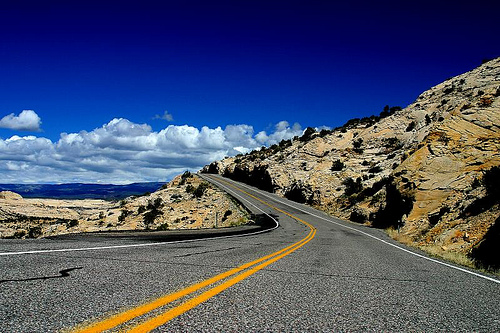 Arizona 2003 by Photocritic on Flickr
Inverse it in an image editing package like Photoshop or the Gimp (in Photoshop: Image → Adjustments → Invert).
Next, increase the saturation a little bit (this will help with the colour perception – in Photoshop, Image → Adjustments → Hue & Saturation).
Finally, blur the photo a little. This will ensure that you concentrate on colour, rather than the texture. In Photoshop, I used Filter → Blur → Gaussian Blur, with a setting of 2px, but experiment to see what looks best.
That’s your first picture:
For the second picture, simply desaturate your original photo. If you want, you can up the contrast a little bit, or even sharpen it further.
The final result? Check out the video below. To see the effect, simply start the video and stare at the horizon. After 20 seconds, the image will change, and you’ll be able to see the optical illusion:
The effect isn’t very strong in this particular photo, but that’s because it’s such a gradient and vibrant photo to begin with. You may find that man-made, simpler structures (buildings etc) have a stronger effect. Experiment away, and if you make a particularly awesome one, post it in the comments!
Cheerio!

‘Getting something done, anything, which can then be iterated on is more important to me than hitting an intended vision.’ So said one of my friends in a conversation with me over the weekend. He’s a software developer and he subscribes to the ideal of ‘release early and release often’. For him, it’s better to get his project out there in a functional but imperfect state, and then work on refining it. I laughed and replied that that philosophy is utterly contrary to how I work, both as a photographer and a writer.
Whatever I do, I have to do it the very best of my capabilities every time, because once the shutter has clicked or the book has gone to print, there’s no going back. Whilst I’m convinced that I’ll never take the perfect photograph, it is what I strive for whenever I pick up my camera. I don’t think that there’d be any point in practising the craft of photography – or of calling myself a photographer – if I didn’t.
And if photography isn’t about the vision, then please do tell me what it is about, because I’ve been doing wrong for about 25 years.
My friend was astonished by my response. He genuinely believed that you can treat photographs as an iterative project. The specific example that he cited was concert photography. At which point I spluttered into my coffee and decided that I had to take things back a few steps and divide the craft of photography from its outcome.
The craft of photography, yes, that is iterative. But then, just about everything in life is iterative. You do something, you analyse it and identify what you did well and what you could have done better, you learn from it, and you apply what you learned next time. This approach is just as valid for photography as it is for baking a cake, acting a role, or doing the long jump. In striving for that elusive perfect photograph I need to build on my previous successes and failures and attempt to do it better every time.
The outcome, a photograph, is definitely not iterative. A photograph captures a single instant, a fleeting moment, and when it has gone, it’s gone. There is no going back. Try as hard as you might to recreate it, the light will be different, the atmosphere will have changed, the look will have passed. You have one shot, and it has to be the best you can make it. There’s no possibility of the release of an updated version that you can debug, patch holes, and clean up. It is definitely about hitting an intended vision.
And despite my friend’s beliefs, this is every bit as true for concert photography as for any other type of photography. You’ve three songs to condense the atmosphere, the energy, the look, into an image. All of what you can see, feel, and hear needs to be translated into a photograph. Then it’s done. Over. Finished. And the next concert that you go to will have a completely different feel, a different look, a different sense of presence, so you will have to do your very best all over again to encapsulate it in a picture.
No, there’s no beta in photography. You’ve one shot; it has to be the best that you can manage. Every time.
(Yeah, we probably all know this. But I needed to get this off of my chest.)
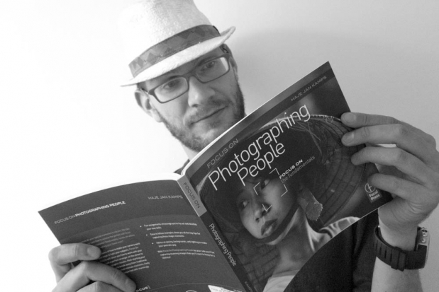
Who even reads books anymore, anyway? Oh, wait - I do. And I write them, too!
Cameras are digital. Developing is digital. The internet is digital. Surely, we’ve moved on beyond a world where we have to look at books for our photographic enjoyment, improvement, and development? Well, you’d be right in one way, of course: You can find nearly everything you might want to look at / learn about on-line.
And yet, there’s something unique about photography which makes books all that more enjoyable. For one thing, I believe the vastly higher resolution of a well-printed photography book is a more natural way of looking at photography.
Best of all? Books don’t have to be expensive. You can buy ‘em for cheap via the internet (type in the ISBN number into a search engine), you can buy them second-hand via the Internet (Amazon has a huge second-hand market of used books, and eBay ain’t bad neither), you can mooch them for free via sites like BookMooch, or you can head to your local library (you do have a library card, don’t you?), and check ‘em out for free.
Of course, I’m slightly biased – I make my living writing books – but I do think that you could do a lot worse than study what others have done in the past. If Twitter is anything to go by (I’m never quite sure if the assorted Twitter masses are a good or a bad hivemind – but if nothing else, it’s a very enthusiastic one), then books are definitely not dead – I did three recent tweets (1, 2, 3), which easily generated the most response I’ve ever had to anything I’ve babbled on about in my twitter feed – ever.
Maybe books aren’t the death of trees, but the birth of knowledge… And here are some of the books people are most passionate about…
Finding these books on sale: I’ve added links to Amazon.com and Amazon UK behind all the listed books. These are affiliate links, so if you end up buying one of the books, I get a kickback. If you’re outside the US or UK (which I know many of you are), the Amazon pages generally have an ISBN number on it – enter it into your favourite book shop, and you can see if it is available locally. Failing that, your local bookshop might be able to order it in for you if you give them the ISBN number .

Ansel Adams at 100, to me, is a stern reminder that someone was taking better photos than me 100 years ago.
Ansel Adams at 100 (US / UK) by Ansel Adams.The book marks the 100th anniversary of Ansel Adams and pays tribute to one of the most talented American landscape photographers whose portrayal of nature remains unsurpassable to this day Suggested by @Freeale
History of Photography by Josef Maria Eder (Amazon US / UK) offers comprehensive coverage on a collection of articles and rare photographs by pioneers in photography and contains materials for research into the history, technology and aesthetics of the medium. Suggested by @Wigwam
Lighting for Photography (Amazon US / Amazon UK) is is a classic book describing how Walter Nurnberg does a phenomenal job of using film studio lighting techniques in order to transform industrial photography after World War II. Suggested by @Wigwam
The Camera (US / UK) is one of Ansel Adams’s iconic technical books on photography, writted with the goal of teaching photographers the artistry of harnessing a camera to its fullest artistic potential. Suggested by @mrlizzard
The Negative (US / UK) by Ansel Adams is the second volume in Adams’ vital and celebrated series of technical books on photography, is geared towards enthusiastic photographers on how to use film and the film development process creatively. Suggested by @mrlizzard
The Print (US / UK) is the final book in Adams’ series of books on photographic techniques, deals with every possible detail like designing and furnishing a darkroom, advanced techniques like toning, bleaching, burning and dodging. Suggested by @mrlizzard

One of the biggest challenges as a photographer is to develop a photographic 'style' and 'language'. This book shows how one photographer pulled it off.
Within the Frame: The Journey of Photographic Vision (US / UK) by David CuChemin serves as a trip down the memory lane, the author creates vivid images of exotic destinations he visited to inspire photographers to express their vision through passionate and compelling photography. (on Twitter as @pixelatedimage). Suggested by @scuba_suzy
The Digital Photography Book (US / UK) by Scott Kelby is the ultimate resource in digital photography, this immensely popular book teaches the professionals and the amateurs the techniques of making any photo look more professional, sharper, clearer and dramatically gorgeous. Suggested by @bimal_tailor
The Photographer’s Eye: Composition and Design for Better Digital Photos (US / UK) by Michael Freeman uses real life examples from photographic assignments. The book combines traditional techniques with the latest technological trends to educate photographers to explore the hidden potentials in shooting dynamic digital photographs. Suggested by @jkremers and @BBluesman
PhotoJojo: The Book (US / UK) by (@SuperAmit on Twitter) his merry band of pirates. With crystal clear DIY instructions, the book discusses how creativity, simple crafting skills and imagination can go a long way into transforming simple, plain photos into vibrant works of art. Suggested by @HeatherGill
Photoshop LAB Color: The Canyon Conundrum and Other Adventures in the Most Powerful Colorspace (US / UK) by Dan Margulis elaborates on the immense potential of Photoshop. The book reveals the simple, subtle tools and techniques to use, which can make plain images come to life, and is written in a way that is approachable by “real people”. Suggested by @rpajuaba
The Complete Guide to Digitally Lighting, Photographing, and Retouching Faces and Bodies (US / UK). Lee Varis is a master in his craft and widely acclaimed photographer. He provides step by step instructions on how to achieve accurate skin tones in men and women using digital photography in and outside the studio. Suggested by @rpajuaba

Getting exposure right is easily the most important part of photography - and yet, it's something many people are struggling with. Read this book, and struggle nevermore.
Understanding Exposure (US / UK) is easy to read and a great, straight-forward introduction to the dark art of getting the exposure on your photos right once and for all. The book, aided with plenty of illustrations offers the basics of aperture, lighting and shutter speed, photography’s basic triumvirate, to beginning and intermediate photographers.
The Moment it Clicks (US / UK) is a book about the 30 years of Joe McNally’s photographic career, some of the images he has created and stories behind the images and the lessons learned from life experiences. Suggested by @ssphillips
Coming into Focus: A Step-by-Step Guide to Alternative Photographic Printing Processes (US / UK) by John Barnier is geared towards educating amateur and professional photographers about the non-traditional processes of photography that can serve as alternatives to standard methods. Transforming seemingly obsolete processes to life like magic, Barnier has a gift of making processes exciting and interesting. Suggested by @ louislucci_com
Photography (US / UK) by Barbara London, Jim Stone and John Upton is a fundamental book written mainly for students. It provides comprehensive coverage on color, black and white, digital and all around background on photography by means of illustrations and examples. Suggested by @louislucci_com
The Art of Bird Photography (US / UK). Famous bird photographer Arthur Morris shares some of his hard-won experience, explains various techniques for getting great photographs of birds. Most of it is pitched at a level suitable for amateurs. Suggested by @davidbrennphoto
Light In The Landscape (US / UK) by Peter Watson is an awe-inspiring book for photographers specialising in landscape photography, that describes the brilliant techniques used to capture some of the most captivating images of landscape by the world famous photographer. Suggested by @Frankkster
Reefs Revealed (US / UK). Armed with expertise on reel life, coupled with immense knowledge on natural-light filter-photography, Alex Mustard presents the importance of saving nature’s invaluable treasures to protect the future of our planet. Suggested by @scuba_suzy
A Diver’s Guide to Underwater Photography (US / UK). The beauty of underwater photography in its entire splendor has been unraveled in this book. A & A Ferrari share a wealth of information on techniques and equipment to use – and show off some incredible results. Suggested by @scuba_suzy

Okay, so I might be a teensy bit biased (I did write the damn thing, after all), but I happen to think this is one of the best books for people who are keen to get into macro / up-close photography!
Water Light Time (US / UK). Combining his love for underwater life and expertise in photography, David Doubilet does a phenomenal job of putting together stunning and breathtaking images of life that abounds under the sea. Suggested by @scuba_suzy
The Underwater Photographer: Digital and Traditional Techniques (US / UK) by Martin Edge is for intermediate level photographers who have a passion for under-water photography – a must-read. Valuable techniques have been laid down methodically for execution of outstanding results. Suggested by @scuba_suzy
Macro Photograpy Workshop (US / UK) by Haje Jan Kamps serves as a learning experience for amateur people who will explore, experiment and discover the innumerable possibilities a camera has to offer in terms of its functionality once you get close enough… Suggested by @Photocritic ;)
VisionMongers: Making a Life and a Living in Photography (US / UK) by David DuChemin is an engaging fusion of the basic techniques of photography with commerce – and shows how a good sense of business can lead to a very rewarding and successful career in photography; the author shares his vision and offers a wealth of advice, tips, and tricks. Suggested by @prairielight
Best Business practices for Photographers (US / UK). A true entrepreneur in this field, John Harrington sheds light on methodologies and formalities that you need to keep in mind, should you desire to carve out a successful and rewarding career-path in photography. Suggested by @brianlarter
The Life of a Photograph (US / UK) by Sam Abell features exquisite images that can be captured only in our wildest imaginations, takes us on a journey of Abell’s work – A book witnessing how he pours his whole heart into his photographic endeavours. Suggested by @allisterfreeman
Beneath The Roses (US / UK) Renowned for his artistry, Gregory Crewdson’s works seem less like photographs, and more like moments captured from epic movies, seemingly dark and troubling, with a definitive sci-fi twist in them. Suggested by @MilesStorey
American Music (US / UK) by Annie Leibovitz’s is a well-curated collection of portraits of a wide range of musical Americana: nearly a century of musical creativity, condensed into a fantastic book. Suggested by @SvanBaaijen

The original full-size, full-cost version of Helmut Newton's Sumo cost nearly $20,000 - luckily, there's a more accessible version out there these days.
The Art of God (US / UK) by Ric Ergenbright might well be the most visually appealing book of its kind, this nature photography book artfully presents text matching each photo and combines to make the “heart leap and the soul rejoice”. Suggested by @Frankkster
Visual Poetry (US / UK) by Chris Orwig is an awe-inspiring book that can encourage people from any walk of life to use their passion and creativity to transform digital images to splendid works of art using natural light. Suggested by @MDDunnPhoto and @tabby2004
Come Again (US / UK) is a collection of photographs from Beirut taken by Robert Frank took after being commissioned to capture the aftermath of the Lebanese war – and Polaroids of the city and its environment. Suggested by @dantebusquets
Snaps (US / UK) by Elliot Erwitt is The book is essentially an effort at portraying and capturing Erwitt’s work of 500 images, consisting of a wide range of subjects, ranging from famous personalities to the very ordinary. Suggested by @zenrhino

For many of us, this will be the closest we'll get to a space shuttle - or, indeed, the moon. What a gorgeous way to travel, though!
Full Moon (US / UK) by Michael Light may be the only science photography book dedicated to capture stunning and absolutely breathtaking images of the voyage to the moon and the return to planet earth. Suggested by @brettbeyer
Sumo (US / UK) by Helmut Newton made headlines for its unique and gargantuan dimensions, is back in a more cost effective version (The original cost nearly $20,000). It and covers Newton’s outstanding career from all possible perspectives. Suggested by @maxwellander
Terryworld (US / UK) is about Terry Richardson, an American fashion photographer who took the fashion world by storm. The book also contains 70 new photographs not featured in the original edition. Terry RichardsonSuggested by @joostdeleij
American Prospects (US / UK) by Joel Sternfeld is an exploration of the landscape as reflected on the changing states of American society. The impact of this work continues to resonate through contemporary artistic, photographic practice. Suggested by @shanegodfrey
The valley (US / UK) by Larry Sultan is an exhibition of photographs by the famous artist. It uses home, work and suburbia as the backdrop and looks at the transformation of middle-class suburban homes into stage sets for adult films. Suggested by @shanegodfrey
American Surfaces (US / UK) is a book that depicts the road trips taken by Stephen Shore all across the United States, and uses hundreds of color photographs as the medium of expression. Suggested by @shanegodfrey
The Americans (US / UK) is a monumental work of Swiss-born photographer Robert Frank. The book was first published in the U.S. and dramatically altered how photographers looked through their viewfinders – and the way Americans saw themselves. Suggested by @shanegodfrey
The lovely @photondetector went a bit mental with his suggestions for books, and provided a significant stream of fantastic ideas. It’d be rude to not give him his own mini section in this guide as a result (and you should follow him, too; he’s got a consistently awesome Twitter feed!)
Self Portrait With Cows Going Home (US / UK) by Sylvia Plachy is a powerful personal memoir about the author’s beginnings in communist Hungary, her emigration to Austria, New York with her parents and her repeated journeys back to Hungary.
Fashion Magazine (US / UK) by Lise Sarfati explores territories of childhood, adolescence and adult womanhood, and seeks to record possible becomings. Explorations of identity are encouraged by the clothing, which is both incidental and essential.
In High Fashion – The Conde Nast Years, 1923-1937 (US / UK) by Edward Steich is an extensive collection of the fashion photographer Steichen who remains unparalleled in his work on Vogue till date. He truly has become an icon of fashion photography.
Art & Fear: Observations On the Perils (and Rewards) of Artmaking (US / UK) is an unmissable book about making art. It draws from personal experience, and provides an incisive view into the world of art as it is experienced by art makers themselves.

If you ever thought the Polaroid camera was a toy, then here's your chance to change your mind... Forever.
The Polaroid Book: Selections from the Polaroid Collections of Photography (US / UK) is an unique selection of 400 works from the Polaroid Collection and is a treasure trove of photography. Barbara Hitchcock provides an engaging essay on the history which underpins it.
Deep South (US / UK) by Sally Mann is a much-anticipated collection of Mann’s exquisite, ethereal landscape photographs, taken in the years since she rose to international fame.
In The Garden (Website) by Beth Dow is filled with photos taken in formal English and Italian gardens, which naturally attract photographers in their offering of glimpses of the rich traditions of garden making.
Suspended In Time (Photondetector’s Review) by Matthew Larkin is a collection of stunning Ambrotypes whose unique photographs are made on black glass. Larkin’s pictures capture arresting moments of individuals engaged in the modern practice of suspension.
Turns out that a lot of people are deeply passionate about photography books – ways to learn, tips to improve, and the ever-evolving landscape of arts books. Did I miss any? If so, leave a comment below – If you write it in the same style as the bits above, I’ll add it to the article, too!

If you've been following my writings here on Pixiq and elsewhere, you'll have noticed that I have a bit of a bee under my bonnet about copyright. I've written articles about how infringing on my copyright harms me, and how me having an RSS feed here on Pixiq isn't an excuse to nick my articles.
It's something I'm passionate about, but obviously, it goes beyond that, too: I'm hoping that in the middle of all of this ranting and raving, that my fellow photographers learn something, and that the people who are infringing on copyright understand what the big deal is.
Rewind, for a moment, if you would, back to March 7th 2011. I am alerted by a piece of software I have written that there is a possible copyright infringement, and consequentially, I find a website kept by a teacher at a secondary school in Canada.
On his site, he has pasted a PDF for a photography club final assignment. Whilst I do think that was very good idea, he also copied a whole article from my site. Namely: Giving a Good Photo Critique. Whilst I'm flattered that he thinks it's a good article, I can't help but wonder: Since this is posted to a website, presumably the students have access to the internet, so just a link would suffice, right?
So, 160-something days ago, I send an e-mail to the school, including an invoice for them to pay, for unauthorised use of my content. I also sent the e-mail as a telefax, because I'm aware that e-mails sometimes get lost in school bureaucracies.
Following my e-mail and fax, I expected them to get back to me and apologise for using my content by mistake, and pleading with me over low school budgets etc, and a promise that it would never happen again.
In return, I would tell them that I thought copyright infringement by a secondary school is a serious matter. And then I would probably not enforce the invoice, because ultimately, any secondary school that has a photography club sounds like they are the good guys, right?
Well, it appears that isn't the case; Instead of getting a response, a whole lot of nothing happened.
So, on April 9th, I sent another e-mail, this time including the principal, the teacher who copied the content, and the general information e-mail address for the school. The e-mail was met with a wall of deafening silence.
On 21 April, I sent another e-mail, this time to all of the above plus the Vice Principal, the two acting vice principals, and the person who is listed as the Accounts support staff person. Again, no reply whatsoever.
So, on May 10th, I sent them a letter (for the attention of the principal), pointing out the multiple times I had tried to contact them by e-mail, letter, and fax, which, again, was ignored.
On June 29th, I sent them yet another letter (again, with a copy by telefax), including the statement that "I trust that the lack of communication from yourselves is an oversight, and not an indication that [the school] is failing to take copyright seriously."
However, it doesn't seem that this particular secondary school gives a monkey's banana about copyright infringements: Even after sending three letters, four e-mails, and four faxes, all of which were addressed to the teacher in question and four different principals, I have heard exactly nothing back. Not a peep of apology, not a single query about my invoice, and no attempt to take the content down - it's been nearly half a year, but the PDF file in question is still on the website.
On their own website, the school's principal writes that the school is all about Responsibility and Respect. However, I would say that not responding to eleven separate attempts to make the school aware of a copyright infringement doesn't particularly scream "respect" or, indeed, "responsibility" to me.
So, by not taking responsibility and acting in a simple matter of copyright infringement, what is the message the school is sending to their more than 1,000 students? That copyright isn't worth caring about, perhaps? Or that you don't have to deal with an issue when it crops up? Or maybe that if you ignore a problem for long enough, that it'll eventually go away?
I don't know; but I do know that I'm rather deeply unimpressed. I've already discovered that the police doesn't understand copyright, and now it turns out that schools don't really care that much either.
No wonder that a lot of us who are making a living by creating - whether it's photography or the written word - are struggling.
Soon after this article went live, the school's new principal called me, and we exchanged some e-mails. I also received an e-mail from the teacher who originally posted the material. He says he passed the invoice and complaint on, and assumed that somebody else had dealt with it, citing that the school is 'very busy' and that dealing with my complaint was 'not a high priority'.
Nonetheless, on September 12th, the school paid my invoice, and concluded the matter to everybody's satisfaction.
Just goes to show that sometimes, a little bit of public peer pressure is what it takes to be listened to.
This is part of a 4-story series:
In addition, you might enjoy Police Fail: Copyright, what is that? and Even Schools Don't Care About Copyright...
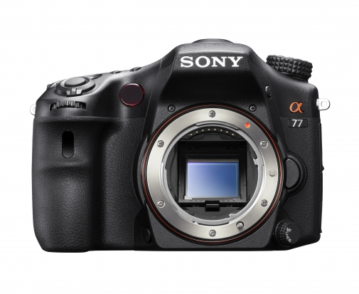
Sony's new Alpha SLT 77 uses ancient tech in a new way. Nifty stuff.
A pellicle mirror is a semi-translucent mirror used in a few very rare and far-between cameras - until recently, when Sony re-introduced the technology in a few of their compact system cameras. So why are Sony reaching into photography history to make new cameras?
Let's take a look at the technology...
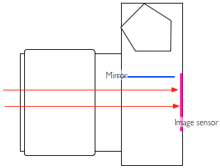
The idea of a pellicle mirror is that it takes the place of a moveable SLR mirror. In traditional SLR cameras, the tech looks something like this:
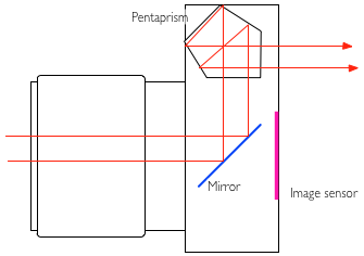
The lens focuses the image and flips it upside-down in the process. It then reflects off the mirror, into the pentaprism. The pentaprism flips the image rightside-up again, so you're looking at the world as you're used to seeing it.
When you are taking a photo, the mirror flips out of the way, so the light reaches the sensor, enabling you to take your photograph:
A pellicle mirror does things differently; it is, in fact, a semi-translucent mirror, which lets some light through to the imaging sensor, and some light through to whatever else needs to see the light: In Pellicle mirror SLR cameras, it sends part of the light into the pentaprism so you can view it through the viewfinder:
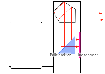
The advantages of using a pellicle mirror are many: The viewfinder never goes dark, so you can see what happens all the time. There's no mirror slap - this is good for macro photography, where even the slightest shake of the camera can cause a blurred image - and it makes the camera significantly quieter as well.
Finally, back when pellicle mirrors were first introduced back in 1965, it was the only way to get high-speed photography done, enabling pictures to be taken at a faster continuous rate. Why? well, because the mirror does not have to go up and down for every image.
The EOS 1N RS (RS stands for Rapid Shooting), for example, can take 10 pictures every second
There are a few disadvantages to using a pellicle mirror - traditionally, pellicle mirrors caused about a 1/3 stop of light loss. (Some light has to go to the viewfinder). In addition, The mirror has to be kept perfectly clean, or else the light sensor and other electronics (as well as the image quality, obviously) will suffer, but cleaning a pellicle mirror is a bit of a specialised job.
The reason why a pellicle mirror has to be kept so much cleaner than a 'normal' mirror, is that a normal mirror isn't part of the optical path to the film or sensor: If you have a dirty mirror in your SLR, that's annoying when you're using your viewfinder, but it flips out of the way before a photo is taken, which means that it doesn't really matter. In addition, when you change lenses, the mirror offers a little bit of protection for the shutters whilst the innards are exposed. On a pellicle-mirror camera, what you see is what you get: It's the front-most element of the camera, and if it gets dirty, your images will degrade in quality.
Pellicle mirrors have been used in the Canon Pellix QL (1965), the Canon F-1 High Speed (a limited edition camera introduced for the 1972 Olympics), the Canon EOS RT (1989), and the Canon EOS 1N RS (1994). On the Nikon side, pellicle mirrors were used in the Nikon F2 HS and the Nikon F3 HS; the latter was introduced for the 1998 Nagano Olympics.
Sony have re-embraced the technology in a couple of new launches, including the top-of-the-line Sony SLT Alpha 77, and the Sony SLT Alpha 65:
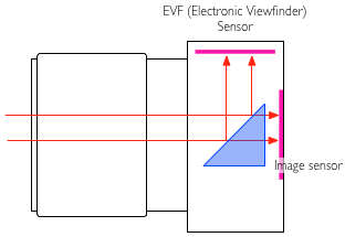
The advantages of using a pellicle mirror in this case are many; Using the image sensor for the EVF causes it to slowly heat up, which degrades image quality through the addition of extra noise. By using a dedicated (presumably lower-power-consumption) secondary sensor for the image preview, you can get better battery life, and higher quality photographs to boot.

In yesterday’s SA article, I referenced the old axiom “write what you know”. I know Hulk Hogan’s real name (Terry Bollea), I know how to play Street Fighter and I know most of the words to Rapper’s Delight. Sadly, none of these are suitable for a photography blog (a shame, because the words to Rapper’s Delight would definitely fill up a full article). Then I remembered I know about editorial photography, which was the fourth and final thing I know, so I figured I’d tell you about my experiences with editorial, how to get into it and finish with a little shoot report about my very first editorial shoot.
Editorial photography, essentially, is photography which accompanies an article or story of some kind to assist in illustrating and bringing life to that story. In short, it’s pretty pictures to look at whilst you read. Editorial is great because those are the only criteria you need to class images as editorial photography, so it can suit a wide range of interests. For example, editorial can be in the form of fashion photography, documentary photography, food photography (like in those nice photos of delicious recipes you find in the weekend magazine supplements that you will never actually make) or editorial portraiture accompanying an interview.
Although editorial is a saturated market, there are a lot of publications around, all with picture editors looking for images to commission. It’s up to you to make yourself known by providing striking, relevant images.
Take a look at your portfolio – what sort of images do you take? Where would you fit in? If you spend all your time shooting landscapes, you might want to look at countryside magazines, walking magazines, or even holiday magazines if your landscapes are shot abroad. If you’re a food-tographer (I just made that portmanteau up: horrible, isn’t it?) then you’ll obviously want to be looking at food mags or supplements in weekend newspapers, as mentioned above. It all depends on what you shoot. What is important is that you contact the image editor / art editor of the right publications for your work.
Be your own harshest critic. Look at your photos, look at the old stuff that doesn’t cut it and replace them with newer, better images. Don’t be sentimental with an old image just because you have a fondness for it – your site should be displaying your best work. I can’t remember where I heard this, so I’m afraid I can’t credit it, but the best single sentence I heard about displaying my work in an online portfolio was “your site is not for you”. Even if there is an image you still like, if it’s not relevant to who you’re trying to attract with your work, or there is one that is technically much stronger, either remove it completely or move it to a different section of the site.
I beg to differ, my friend. There are many reasons I love editorial photography, but the main reason is the pressure. Depending on the shoot, more often than not you’re given a location, a subject and (if you’re lucky) a general idea of what shots you’re required to take. No two shoots are the same. When you arrive, all number of problems could crop up in a variety of areas. There might be terrible light levels, you may encounter snotty, uncooperative PR (as a disclaimer, I’ve encountered some lovely, lovely PR people, too, who have helped me get some of my favourite editorial shots, so there are some lovely PR types, too).

Keita Takahashi, photographed for GamesTM. I had a whole area cordoned off and fifteen minutes to get what I needed. That's more like it!
Sometimes, you’ll have 20 minutes to get your shots, sometimes you’ll have 20 seconds. Sometimes, your flashgun stops communicating with your camera halfway through a shoot and you have to swear under your breath, tear it off, and quickly adjust your settings (that was a fun shoot). Sometimes, you’ll turn up with half a dozen brilliant ideas that you think will look fantastic in the magazine and the subject says “no, we don’t want to do any of those. Just get some of us looking natural”.
Basically, thinking on your feet and creating something aesthetically pleasing and striking using your surroundings is at the heart of on-location editorial photography. And I love it. The satisfaction of solving the photographic puzzle laid out in front of you, and the resulting positive feedback, is one of the main reasons I quit my 9 to 5 and became a full-time freelancer.
Editorial isn’t for everyone, and it can be very hard to break into, but if you’re keen on it just get your work out there: contact picture editors with your stuff and, if it appeals to them (and they don’t already have two dozen photographers already working for them), they might just give you a shot. My main magazine work came simply from me finding out who the photo editor was, sending an email with a link to my online portfolio and, well, that was it. Aim for local magazines, too – people who publish around your area. It might not pay at first, but it’ll look good on your portfolio and, in my opinion, nothing gives you a bigger buzz than seeing your own work published.
Here’s a little story about my first ever editorial commission. GamesTM magazine, a regular client of mine, asked me to accompany a journalist to procure interview and posed portraiture shots of a videogame designer who was visiting from Japan. This would be Goichi Suda – the critically acclaimed and much loved head of Grasshopper Manufacture, one of my favourite companies. So far, we have two stress factors to add to the mix: first editorial ever? Check. Photographing someone who, in my nerdy world, is essentially a celebrity (and a hero of mine)? Check.
We turn up to the fancy London office, only to discover that Suda-san has literally just arrived by alternative flight, Eurostar then underground train, because his original flight was cancelled. He was meant to arrive the day before. Understandably, he’s not that keen on having his photo taken, seeing as he’s not had any sleep for many, many hours. They ask if I can return tomorrow. I’m more than happy to do that and I just sit in on the interview. The thing is, I’ll be returning tomorrow on my own, essentially representing GamesTM. That’s stress factor number three. They warn me that they’ll have to fit me in between two scheduled interviews, so I’ll probably only get fifteen minutes (ah! Fifteen minutes seems like luxury these days). Thankfully, I plan ahead and get some test shots done in the room we’ll be using the following day to shoot.
Except the next day, everything’s moved. And we don’t have fifteen minutes, we have about five. Stress factor number four. I’m not blaming the lovely PR people for that, because they were on an extremely tight schedule and it was kind of them to let me back the next day at all. But five minutes for your first editorial shoot is unbelievably stressful. Did I mention that Suda-san doesn’t really speak any English, apart from “nice to meet you” and “I like your t-shirt” (I had a cool tshirt on, because I’m dead cool and that)?
So now I have five minutes to make sure I get the kind of shots that are good enough to ensure that GamesTM like them enough to ask me back and become a regular customer. In a room I didn’t plan for. I also have to direct my subject through a translator. “Baptism of fire” doesn’t even begin to cover it.
The thing is, I thrived under the pressure: we created a series of fun headshots with a range of expressions that were meant to represent the different sides of Suda51 – his dedication to his artistic vision and his role as a businessman who needs to make sure his work has a broad enough appeal to sell. This is the sort of stuff I would take in my stride these days but, at the time, I felt like my head was going to pop. The payoff, though, when the magazine used about a dozen of the images, turning it into a multi-page article, was more than worth the pressure at the time.
I think everyone should have a go at editorial photography in some way. It is possible to create work with an editorial feel without waiting for a commission. Create a series of images that tell a story, similar to a mini project. If you get into the habit of telling a story with your images, regardless of your subject matter, it will help you get more out of your photos and take them to the next level.