Pictures at an exhibition

IMG_1416

You’re going to think that I’m obsessed with photographers’ rights and am heading up a mission—with a camera in one hand, a light sabre in the other, and Flickr as my shield—to defend the average photographer and prove that cameras won’t irreparably damage anyone’s souls. But please, indulge me this post and then I’ll return to the scheduled programme of camera releases and software updates. (For a while, anyway.)

I follow A Don’s Life, the blog written by Cambridge classicist Mary Beard. Yes, she can be rabidly controversial, but she’s also amusing and thought-provoking and I recommend her musings for your weekly edification. And earlier this week she raised the issue of taking photos in museums. Obviously my ears pricked up.

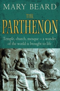
The book that started it all

Specifically, Beard was ranting about the fee she was charged to include a photograph taken at the Acropolis Museum in Athens in the reprint of her book, Parthenon. Her husband had taken the photo, the museum wanted €400, and the print run for the book is only 7,500. But that wasn’t what really caught my attention. It was that shortly after her husband had visited, the museum had imposed a complete ban on photography, whether you were professional, amateur, or seven years old.

What was that all about? It’s not as if anyone needs to contact the spirit of Pheidias to ask his permission; the dude died around 430 BCE. What’s left of the Parthenon has survived nearly 2,500 years, numerous invasions, use as a munitions store, an explosion, being dismantled and shipped to London, and a current tug-of-war between the British Museum and the Acropolis Museum. A few photos are not going to hurt it now.

Intrigued, I wondered about the photography policies of some of the other big museums across the globe. And when I say big museums, I mean those housing artefacts that are regarded as national treasures, whose original makers are generally long dead, and sometimes have slightly dodgy provenances to boot. These are institutions ostensibly run for the cultural betterment of society. Letting visitors take a few snaps shouldn’t be a big deal.

Not in a museum, but old enough to be

So off I toddled and checked out what the British Museum in London, the Met in New York, the Louvre in Paris, the Rijksmuseum in Amsterdam, the Uffizi in Florence, the National Archaeological Museum in Naples, the National Archaeological Museum in Athens, the Israel Museum in Jerusalem, the Hermitage in St Petersburg, and the National Museum of Australia in Canberra had to say.

I was pleasantly surprised: one banned photography outright (the Rijksmuseum), one demanded a permit (the Hermitage), two didn’t make it obvious from their websites (the Uffizi and the Israel Museum) and the rest had a fairly standard approach. No flashes, no tripods, not in the special exhibitions, and personal use only. If you want to use them commercially, speak with them first and they’ll see what they can do.

What’s so hard about that?

I suppose that we just have to hope that they don’t make the arbitrary distinction that anyone using a dSLR is a professional.

Book review: 99 Ways to Make Money From Your Photos

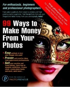
99ways

If you’re a half-decent amateur photographer, making a few extra pennies on the side from your photos is always gratifying. It might not be enough for a holiday in the Maldives, but it’ll buy you a few sundowners on the beach when you get there. Have you considered all the different ways that you could make money from your pictures, though? Apparently, there are at least 99…

99 Ways to Make Money From Your Photos has been produced by the editors of Photopreneur. The title is fairly self-explanatory, but what did I think?

What did I like about it?

Well, most importantly for a book trying to give you ideas for making money from your pictures, some of its suggestions were things that I’d forgotten you could do, never considered, or even heard of. How about bartering your pictures or photographic services? Turning your pictures into colouring books for kiddies, anyone? What about helping people looking for love online present better images of themselves? Yep, some of these ideas were pretty original.

However, it also started in the obvious place—selling pictures to stock houses—and explaining the difference between royalty free and rights managed sales, which is fundamental, I think.

I also appreciated that each idea was laid out so clearly, with a summary box, a series of tips, and a getting started box. The book gives you practical advice and points out things you really ought to consider before taking on a project. It also allows you to judge if the elbow grease that you’ll have to plough into an enterprise will justify its overall return by rating the difficulty, earning potential, and competition for each idea. That’s all rather neat.

What didn’t quite do it for me

A great gift, but probably not a book you'd buy for yourself

There’s a bit of a difference between selling the odd photo that you take in your spare time, and embarking on a career as a professional photographer. This book doesn’t draw that distinction, and mixes up quirky small-time stuff, like selling on Etsy, with serious photographic challenge, for example becoming a forensic photographer. For me, making it a bit clearer for whom each idea is intended would improve the book’s usability.

Obviously, 99 ways to make money is far more enticing than 45 ways to make money from your photos. However, I thought that some of the ideas were scraping the barrel. I wasn’t convinced that using doctors’ surgeries, local cafes and restaurants, and hair-dressing salons as potential sales venues for your photos warranted three individual entries. How about combining taking school photos with dance school photos? What about one entry for the different types of stock photos? The title might not be quite so exciting, but the book will be easier to navigate.

The final thing that I found very odd: for a book about photos, it doesn’t contain a single one, save for the front cover image. Curious.

So what do I really think?

I think it’s a great book to buy as a gift for someone you know who takes great pictures and could make some money from them. It has creative ideas and is honest about how much you can expect to make turning your photos into greetings cards. But at £21.87 (US$34.95), I’m not sure I could justify it for myself.

99 Ways to Make Money From Your Photos, by the editors of Photopreneur. Published by New Media Entertainment Ltd and available in lots of places that sell books.

The white balance of your eyes...

white-balance

People have been thinking about how we perceive the world since the dawn of time. You can go all the way to ancient philosophy, with Plato’s Allegory of the Cave, for example, where Plato wonders whether if you never saw the ‘real’ world, whether you would know. Or, indeed, even care.

The senses are curious, because how would you know whether you see the world the same as somebody else? To me, for example, the rainbow never really made much sense: Sure, it looks the way I have always seen it, but that doesn’t mean it makes any sort of logical sense. How do I know, for example, that what I think of as ‘red’ isn’t what the rest of the population sees as ‘blue’. Of course, I’ve been pointing at colours and naming them since I was barely able to talk, so it’s pretty well-ingrained that ‘red’ is ‘red’, and that ‘orange’ is ‘orange’… But what if they aren’t?  

Deep philosophy about the very core of colour theory aside, I know for a fact that I don’t see the world the same as other people. Specifically, I know that what I see isn’t the real truth, because both of my eyes are giving me a different impression. Yes, really.

Two eyes, two realities

I noticed many years ago that my eyes are subtly different from each other: My left eye has a ‘colder’ colour balance than my right eye. I’ve spent a bit of time experimenting, and it appears that there is about an 800 kelvin difference between the two. That means that if I look at the left photo with my left eye, and the right photo with my right eye, these two look identical:

It’s been a bit of a curiosity for me for a while, and a while ago, I tweeted about it. As a result, I got a pretty big response, with the vast majority of responders saying something along the lines of “omg, me too!”.

That got me to thinking… Seeing as both my eyes are different from each other, there’s a 100% chance that one of them is ‘incorrect’. On the other hand, there’s nearly as big a chance that both my eyes are ‘incorrect’. Of course, white balance can be measured objectively, but ultimately, as photographers, we make a subjective judgement call on how we want to white balance our photos.

How can you test it?

Honestly, I have no idea how you can test it scientifically – but I find it’s most noticeable when I’m indoors, in medium-to-low light (presumably because my pupils will be bigger, but I have no physiological explanation for why this might be the case). Hold a hand in front of one eye, then move it to the other. You’ll see the picture ‘jump’ slightly to the side, but if your eyes differ from each other, you’ll also see the colour temperature change slightly.

So what does that mean to me as a photographer?

Nothing, I think. There are ways you can correct for your colour vision, apparently (you can wear slightly tinted glasses or contacts, for example), but ultimately it makes very little difference: Your eyes are absolutely incredible at capturing light, and your brain can handle colour balancing perfectly fine most of the time. In fact, your eyes / brain combination is vastly superior in this respect than a camera / computer combo.

I just think of it as a curiosity, and secretly, somewhere deep inside, I’m quite pleased that nobody in the whole world sees their surroundings exactly identically to what I do.


Do you enjoy a smattering of random photography links? Well, squire, I welcome thee to join me on Twitter -

© Kamps Consulting Ltd. This article is licenced for use on Pixiq only. Please do not reproduce wholly or in part without a license. More info.

Framing in portraiture

Well will you look at that, miss moneypenny! This time, I'm on the right of the picture! It's pure unadulterated magic. MAGIC, I TELL YOU!

I spend a lot of time giving feedback on photos. One of the comments that pops up again and again is that I’ll feel as if an image is framed awkwardly.

Some times, I’ll find that an image is nigh-on perfect, but it fails to make the mark because it’s difficult to understand the motivation of the photographer: What are they trying to achieve with this photo?

It’s true for all photography, of course, but it’s more complicated with portraiture, as it isn’t necessarily very intuitive. How, after all, can you connect a story to the way a portrait is framed?  


This is not a tutorial. Hell, it isn’t even much of a rant. Just some thoughts. Use of it what you will, and ignore (with great prejudice and much glee) everything you deem to be complete and utter bollocks. There will probably be some of both.

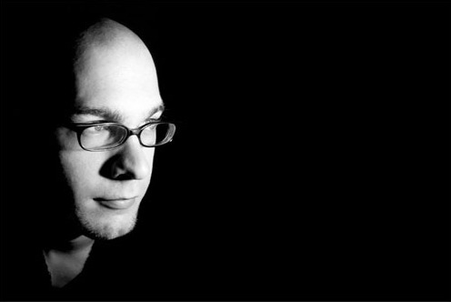
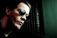
In this image (of myself. because I’m too lazy to dig through my backlog of umpteen million photos to find another one), the subject is dead centre in the image. The quality of the photo itself is unimpressive, and the lighting needs work, but that’s beside the point – we’re talking about framing here.

Centre-framing

Framed dead centre. Not very attractive. Nor is the framing.

In this image, the vast blackness on both sides of my ugly mug means that I’m surrounded by… something. But we can’t see it If I had a fear-struck look on my face, instead of looking smug, this composition may have helped to hint at something I was afraid of. perhaps something lurking in the shadows. But I’m looking vaguely content, so that doesn’t make any sense. In fact, the image has very little impact at all.

Looking into the frame

Cropped so I am looking 'into' the frame.

Fear and Loathing in East London

For my next book, I'll probably use something like this as my author photo. Because I've come a long way as a portrait photographer since my 'steeped in blackness' mysterious stranger days. (clicky for bigger)

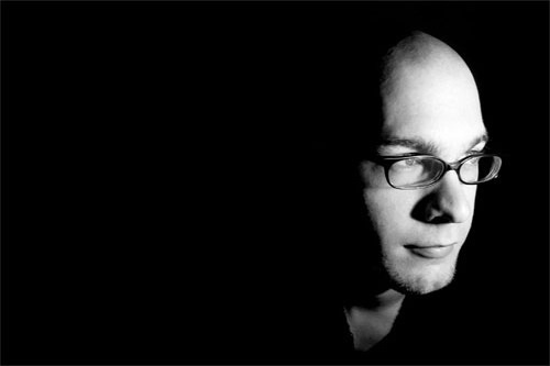
So instead. it is recropped like this. Suddenly. I’m looking across a vast nothingness. Into… into what? I’m looking at something just outside the frame, lire image doesn’t hint at movement, nor does it show any particular emotion, so whatever is off frame isn’t engaging me.

Perhaps I’m watching television. Or I may just be at ease with myself. Due to the framing, the image has very little tension, and serves only to show off my face – great for the jacket-cover of that book I wrote, perhaps (Lo and behold, this is actually the photo I ended up using in my macro book.

This image is vaguely better than the one above. because it has some purpose. It draws the eyes the left, but simultaneously leaves you wondering what it is I’m looking at – And why it is so far away from me.

Looking “out” of the frame

Well will you look at that, miss moneypenny! This time, I'm on the right of the picture! It's pure unadulterated magic. MAGIC, I TELL YOU!

In this image, suddenly something else happens. I’m closer to the edge. Closer to action. Am I about to move towards the light? Am I dead, moving towards the light? At the very least, I appear more curious. And I’ve left a wasteland of darkness behind me. Or perhaps I’m just the first one to step out of the shadows?

This image has the sense of movement, somehow – a dynamic property, which wasn’t there in the previous image – even though the only difference is a net of black pixels.

So, er, what’s the point of all this, Haje?

Well, the main message, I suppose, is test it out, and keep the rule of thirds in the back of your mind.

Take an image, crop it in different ways. See how it impacts the photo, and see if it becomes more interesting. Think about what message you are trying to convey, and see if the image is actually supporting that message. If it is: Great! flit isn’t, perhaps a re-crop, or even a re-shoot would solve the problem.


Do you enjoy a smattering of random photography links? Well, squire, I welcome thee to join me on Twitter -

© Kamps Consulting Ltd. This article is licenced for use on Pixiq only. Please do not reproduce wholly or in part without a license. More info.

DIY Toy camera presets for Lightroom

A street photo from Oslo, Norway, took on a completely different flavour with my new toy camera filters

Given the popularity of the Holga, Lomo, and the other toy cameras out there, I suppose it was only a question of time before some enterprising soul would release Hipstamatic, the app which lets you take cool, toy-camera like photos on your iPhone.

There’s something about that app which jars quite viciously with me, however: Unlike the ‘real’ toy cameras, this app doesn’t actually alter the iPhone camera at all. And despite getting pretty awesome results (if you like that style of photography, of course), it’s all post-processing.

That got me thinking… It has to be possible to make my own post-processing presets for Lightroom, to turn my carefully lit, exquisitely sharp and ridiculously high-resolution camera RAW images into blurry, colourful, vastly attractive garbage. So I created a couple of presets for Lightroom 3 – and I’ll walk you through the thinking behind one of them and I’ll show you how to make your own. How’s that for a double whammy of awesome?  


Toy cameras tend to get their special look by being terrible cameras. Their light meters will be off by a quarter country mile (so we need to either over- or under-expose the images for a start). They are likely to have light leaks (so we ought to add streaks to the picture), and the hip and cool crowd is fond of cross-processing the film, so we need to make a couple of changes to the way the colours are being displayed.

Exposure and sharpness

So, I’m going to start messing about with the exposure in this photo. I’m being conservative by only over-exposing it by 0.75, but you can always change this later, if a photo suits a bigger mis-exposure. Next, I’m ramping up the blacks a little bit to get a feel of a smidge of extra contrast, and I’m whacking the contrast and brightness right up. Yes, this makes your photo look wrong. And no, there’s nothing wrong with that!

Finally on this screen, the clarity goes down a lot. This adds quite an appealing blur to the image, which is typical for the kind of Polaroid effect I’m going for here.

Colours

It’s surprisingly difficult to get a realistic cross-processing look, but since I’m messing about with a polaroid-alike photo here, I’m on safer ground: adding some highlight and shadow toning gives that deliciously ‘not quite right’ polaroid look. To find the settings that work, keep experimenting – it’s not always easy to come up with the look you want.

Crop

Set the crop tool to 1:1 (that’s square), and crop your image. Then, it’s time for a spot of Vignetting – these are meant to be toy cameras after all…

Light leaks

The light leak effects are typical for toy cameras - and my little preset wouldn't be complete without 'em!

To get the proper feel of a toy camera, you’re going to have to try to add some light leaks. This is pretty easy, actually: Simply add a Graduated Filter across your image, with some interesting characteristics.

Personally, I decided to just brighten and then re-darken the image. I created one thin graduated filter with the settings shown below … And then another one just underneath it which had the opposite settings (approximately – it’s not as if toy cameras are an exact science). This creates quite a realistic bar of light leakage across your image.

Of course, light leaks are meant to be unpredictable and a bit random, but the great advantage of doing them in Lightroom is that you can take some of the guesswork out of them. Use the opportunity to move the light leaks around, and highlight the bits of the photo you would like – or hide the bits of the photo you’re not too fond of. There are no rules – make your own!

Finally, I saved all the above settings to a preset called “broken Polaroid”, and now I can go ahead and drastically reduce the quality (and improve the interestingness) of my photos!

Okay, then, let’s see some examples

A couple of guys on a motorcycle in India were a prime candidate for toy camera tasticness

This was the image I used when I first created the Lightroom preset, and I think it works quite well

A street photo from Oslo, Norway, took on a completely different flavour with my new toy camera filters

Laptopogram-tastic!

laptopogram

Fancy having a go at producing a photo that doesn’t require a camera? No, I haven’t lost the plot, of course you can. All you need is a laptop (or a TV, or a mobile phone, or one of those new-fangled iPad malarkies, or any electronic gadget that involves a screen and a backlight, really) and some photographic paper. How cool is that?

You hold the photographic paper to the screen, expose it briefly, and then develop it. You should be left with an image of whatever was on the screen. I have to say it again: How cool is that?

Aditya Mandayam dreamed up the process when on a residency with Benetton at their lab, Fabrica, in Treviso. And I thought Benetton was where my Ma bought me clothes when I was younger. Want to learn more? About laptopograms that is, not Benetton. Go here.

(Thanks Photojojo!)

Your pictures; your rights

I've turned this one into a card. Pretty, no?

I have to admit, I’ve been giggling to myself at some of the comments that are popping up on the sites that have covered the Vampire Weekend image controversy. There seems to be confusion in monumental proportions regarding who owns the rights to a picture, to people’s images in a picture, and what you can—or can’t—do with a picture that you own. Confused much? We’ve put together the Small Aperture Quick and Dirty Guide to Photographs, People’s Images, and Rights. Just remember that we’re not lawyers.

Copyright

This one's mine!

If you shoot a picture, you own the copyright to it*. No one can reproduce it or otherwise make use of it without your permission.

*) The only exception is if you have explicitly signed away your rights. This might be part of your job contract at work – for example if you are taking photos for work, during work hours. In the UK at least, you can only sign away your copyright in writing, and you have to sign the document where you do so. Ticking a box on a website wouldn’t be sufficient.

Moral rights

You also own the moral rights to pictures that you take. In short, that means that your pictures should be attributed to you, and you can ‘protect their integrity’, or stop people from manipulating and distorting them.

Images of people: commercial, editorial, and personal use

If the picture features a person or people who are easily identifiable, you will require a model release, which is essentially that person’s or people’s consent, to use the picture for commercial purposes. If the picture of a yak farmer leading his herd down the mountain is just going to sit on your Flickr stream as part of your holiday snaps from Outer Mongolia, you don’t have to worry. Sell the picture to the publishers of the Encyclopaedic Guide to Mountain Yak Rearing, you’ll need a model release.

But, there are some exceptions to this. Inevitably.

Caveat number 1: Crowd scenes and itty-bitty people on the horizon whom you can’t make out properly (or similar)

You’re standing amongst the crowd at the London Marathon and you manage to snap the perfect shot of hundreds of spectators standing at Canary Wharf, cheering on the runners. It’s so perfect that Nike wants to use it in a commercial campaign. Do you need model releases from everyone in it? Not if they aren’t recognisable individually (even if someone says ‘But I knew I stood right next to that lamp-post all day’), in this instance it wouldn’t be reasonable.

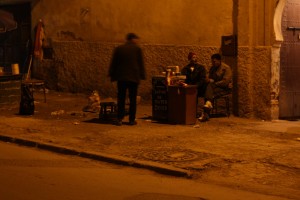
These guys manning a laminating stand (in the middle of the street in Fez, at about 10pm) are probably obscure enough for me to get away with this shot. Probably.

Caveat number 2: Famous people doing famous-people things

It’s pretty much a given that famous people’s pictures taken when they are doing famous-people things, such as tripping the light fantastic up the red carpet at film premieres, opening yet another megalithic shopping centre with a false smile affixed to their faces, or taking an amazing catch at a cricket match, are fair game. But that’s only for personal (i.e. Flickr or your portfolio site) or editorial (i.e. news reporting or reviewing related to the picture) use.

You couldn’t use a photo of Tom Cruise attending a movie premiere to advertise toothpaste—no matter how shiny his teeth are—without a specific model release. And as far as Tom Cruise is concerned – good luck getting one of those.

Caveat number 3: Famous people doing stupid-people things

You’re out having a quiet meal with your best friend when you spot Cruella Manningly-Kneesup, Secretary of State for Juggling, Air Guitar, and Space Cadets locked in a passionate embrace with someone definitely not her husband. In fact, it’s Marco Poloco, whose company was recently awarded the government contract to supply rocket launchers and hover cars to the Space Cadet programme. Hmm. Is something fishy going on? Maybe! Obviously neither of these two is going to give you a model release for the picture that you snap with your ever-handy compact camera, but publishing it would be in the national interest – so you wouldn’t have to worry about privacy or libel too much.

Still the same applies as above: you couldn’t use the same picture of Manningly-Kneesup and Poloco in an advert for birth control. As much as you would like to.

Ownership of rights vs ownership of an artefact

I've turned this one into a card. Pretty, no?

Selling a copy of a picture is different to selling the rights to a picture. I use some of the photos that I take to make greetings cards. Mostly, I make them to send to my friends and family, but every now and then a misguided soul will ask me if they can buy one to send to their great aunt Marjory. I might’ve sold this person a copy of one of my pictures, but that’s it. All they own is the physical artefact, nothing else. They can’t reproduce it or make derivative works from it. Come to think of it, the same goes for the people to whom I give these cards.

Selling rights

Selling the rights to a picture means selling the rights to use a picture. There are different ways of selling the rights to use your pictures, because the number of times it can be used, and how, and where, will be dependent on the contract you agree, and that’s not really for this post. But the simple explanation is that if anyone wants to use a picture that you took, they have to at the very least ask your permission first. Then you can ask them for some money to do so. Okay?

And finally

Remember that you’re allowed to take pictures in UK public places without let or hindrance, and that we’re not solicitors, so all of this is for general guidance only, mkay?

Budding photographers wanted by the RHS

Something exotic at Kew Gardens

We like to get photographers started young and a bit of competition along with the chance to win a digital camera can’t hurt. Little Ones and Slightly Bigger Ones can test out their garden-related photography skills in the Royal Horticultural Society Young Photographer of the Year competition.

Under 11s can submit up to five photographs on anything that catches their eye in the garden, from squirmy tadpoles in a pond to super-tall sunflowers. Under 18s can also submit up to five photos, but theirs have to fall into one of six different categories: a garden plants study; abstract; the seasonal garden; garden wildlife; gardens and gardeners; and fruit and veg.

The overall winner bags a digital camera as well as the title RHS Young Photographer of the Year. Come second or third and receive some photography vouchers. Not bad!

Entries are being accepted now until 31 August 2010. Head over to the RHS website for more information, an entry form, and The Rules.

The model, the photographer, and the album cover

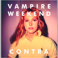
Vampire Weekend - Contra

Well, this is a curious one. It seems as if Vampire Weekend, whom I happened to see on Sunday when they headlined at Latitude, the photographer Tod Brody, and Vampire Weekend’s record company have found themselves in hot water over the photograph of a young woman used on the cover of band’s album, Contra.

It’s the sort of thing that happens when you use a picture of someone for commercial purposes without their consent, which is precisely what Ann Kirsten Kennis—amodel back in the 1980s and 1990s—is alleging. Whilst Brady is claiming that he took the photo as a test shot in 1983, Kennis’ lawyers say that it is more likely that her mum took the picture using a Polaroid camera. They aren’t really sure, though, and don’t know how Brody came to be in possession of the image. Even more odd: the model release that Brady submitted to support the photograph names the model as one Kirsten Johnsen.

Kennis is claiming $2 million in damages whilst Brady is claiming that Kennis has slandered and defamed him.

Hmm. I shall be intrigued to know how this one works out. It might be a while yet. The defendants have not yet submitted a response to Kennis’ allegations and a court date hasn’t been set.

(Thanks Photo District News)

Small freebies up for grabs

rawhdr

If you fancy playing around with HDR but aren’t really sure where to begin, something has just dropped into my inbox that might be what you need.

The dudes over at rawhdr.com have given us 10 free image sets (three raw versions of the same image: one under-exposed, one over-exposed, and one at the ‘correct’ exposure) to give away to our readers. They provide a selection of images suitable for HDR manipulation, you choose which ones you like and download them, and then away you go to manipulate until your heart is content. There are also eight tutorials available, exploring what HDR can do to images and explaining how it works.

The first ten people to get in touch with me by posting a comment below (remember to put your e-mail address in the e-mail field. We won’t publish it, but if you don’t, I won’t be able to contact you!) to win the freebies!

One map and lots of photos at Historypin

historypin

Photos can be a really important historical resource, and it isn’t just the pictures taken at significant events or of famous figures that are valuable. Those pictures stored in boxes in dusty attics or filed away in albums, your mother’s first holiday snaps and your great-grandparents’ wedding portraits, they all have a story to tell.

In fact, I’ve already written about how the images that we capture in our everyday lives will help to teach people living hundreds of years in the future about us. So how about making use of the photos that we already have?

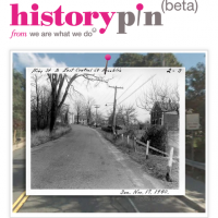
If you head over to Historypin you can find thousands of old photographs pinned to a giant map of the world, and you can add your own together with the story behind the image. You can search by place, by subject, and by date. And you can even compare how an area looked then with how it looks now. Can’t you tell I’ve had far too much fun looking at photos of the area where I live?

The people behind it are We Are What We Do, a movement that aims to inspire social change through lots of people doing lots of little things. The theory behind Historypin is not just to build a resource, but to get different generations talking to each other. They teamed up with Google who supplied the map and the Street View capability that allows old and modern picture comparisons.

Yes, it is still in Beta, which means that there are a few kinks that need working out; and because it a community project some areas are devoid of pictures and others have hundreds, but, I’m completely charmed by the idea. Old pictures and little bits of people’s lives scattered over a giant map of the world. What’s not to like?

Now, I wonder if they have any pictures of where my grandparents were married…

The good, the bad, and the ugly - free picture editing software

Original

If you’re just wetting your feet in photography, or perhaps if money is tight, you might not want, or be able, to splash out on expensive editing software. There is, however, quite a selection of free editing packages out there. We thought that we’d give four of them a spin and tell you what we thought.

Testing out these wonders we have N. Maxwell Lander, a Toronto-based queer photographer and website designer, who also happens to be a bit of a picture editing genius. So, what’s to be said for Picasa and Picnik, GIMP and Pixlr?

The Little Guys – Picasa and Picnik

Picasa is handy. Picnik is similarly handy. Really, what you need in a photo editor will determine which program is best for you. If you need really basic alterations and really awesome organisation, as well as somewhere online to store and share, Picasa is for you.

I’m not gonna lie, I’m a giant Google fan. I use a whole lot of their products for a variety of things. Picasa web albums are my favourite way to share my photos with clients. I don’t, however, use Picasa as a standalone app. My number one reason? No localised edits, save for a retouch brush for blemishes. Picasa—as well Picnik—both do generalised editing, which for the snaps coming out of your point-and-shoot camera are fine. Although, I’m willing to bet your camera came with software that could do all the same things.
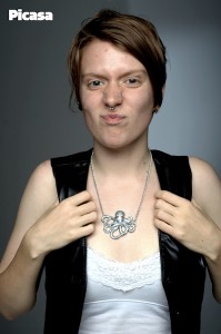
Here's what you can do with Picasa

The perils of online apps

Hands down I’ll recommend Picasa over Picnik. The features are similar, but Picnik is an online app, and I just don’t trust online apps – they get real slow, real fast. Since I can see no advantage of using an online one, it’s a lose-lose scenario for me. Realistically, you’re going to get similar edits out of both as all the basics are there: red eye removal, saturation, contrast, crop, rotate, those bits and pieces. For me, a huge factor in photo editing is how easy the program is to play around in, how much I enjoy being in there. I didn’t end up trying all of Picnik’s features, because I didn’t find it to be an enjoyable experience.

Based on user experience, and especially when we are talking about low-intensity users, I would have to choose Picasa. The layout of everything is easy and accessible, and there aren’t too many options to get overwhelmed by.

But effects can be fun!

There is one thing I will give Picnik – it has fun effects. I am hesitant to admit that since becoming an iPhone user I have gained an appreciation for overdone, stereotypical photo effects. While I think that these types of effects can become cheesy very quickly, I am getting sucked into their charm… but only, and I hope you will follow my example, only for playful snaps. Your slightly wonky party pics will look way cooler in the 1960s effect then a ‘correctly’ adjusted photo.
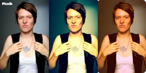
This is the sort of fun that you can have with Picnik

The Big Guns – GIMP and Pixlr

Alright, here’s where things get a little intense. GIMP and Pixlr. In comparison to the last two, they are both wonders. The features that exist in either far surpass anything Picnik and Picasa can offer. Both programs are capable of doing 90% of my Photoshop workflow, which is saying something.

Same same…

Things they both have to offer – localised edits (such as brushes and selections), layers (for “non-destructive” editing and adjustments), a wide variety of adjustment (contrast, saturation, curves, colour…), many many filters, and they both open raw files (although GIMP is the only one that can edit the raw). There are more, but already we’ve a hefty list of features that could keep anyone occupied for years of photography (and probably everything you need to be a pro).
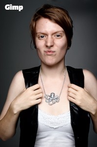
How things turn out using GIMP

…but different

There are a good number of differences between the two, and some negatives to consider, because no program is perfect. With GIMP, the main negatives concern interface. It is irritating to work in. It’s possible that if I weren’t one of Photoshop’s biggest cheerleaders, I wouldn’t find it so, but I’ve checked in with a good number of people and almost everyone I’ve talked to agrees. There is something about the way it is set up that makes it unpleasant to work in, and who wants to be irritated by their editing software?

Trouble with GIMP

As far as technical negatives with GIMP, there are three major ones that stick out for me: limited size of the brush (which I’m sure if I could write code I could change, but really, what a stupid thing to do), no adjustment layers (all adjustments, in order to be non-destructive, must occur on a new merged layer), and, this one is only for Mac users I believe, separate windows for each item. Palettes, toolbox, and image are all separate windows, which means I have to click back on my image before entering a quick key… which makes it not quick… which makes it useful how?
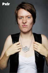
Results using Pixlr

Those are three really big things for me, and coupled with the annoying interface I was irritated beyond belief when trying to complete my whole edit in GIMP.

The ups and downs of Pixlr

Pixlr, on the other hand, only shares the lack of adjustment layers from that list, and isn’t at all obnoxious to work in. I found it an easy and accessible interface, and, would you believe it, the quick keys work! The downside to Pixlr? It’s an online editor. Sometimes it’s slow and it even crashed on me a couple times when I started getting into larger file sizes and more layers…. oh wait, did I forget to mention that GIMP did that too? They both got overwhelmed with serious editing, which is a shame because they could both be amazing options. As it stands, they are more like curate’s eggs: excellent in parts.

The verdict?

Ultimately, you get what you (don’t) pay for. The free suites offer basic editing, some clever effects, as well as some serious technical capabilities. But they also come with speed issues, reliability issues, and in some cases user interfaces that aren’t so user-friendly. But if you’re prepared to persevere, they will do what you need them to.

When is a camera a professional camera?

Concert shot

I’ve just come home from a great weekend of music, poetry, and theatre at the Latitude music festival. There were heaps of cameras floating around Henham Park, from 8 year olds with disposable ones that you can buy in Boots for a few pounds to Nikon D3Ss toted by the press, via mobile phones and all shades of compact camera. But if you were an ordinary paying member of the public, you weren’t allowed to bring in a dSLR.

You see the powers-that-be at Festival Republic—organisers of Latitude and several other big name festivals—had deemed dSLRs as ‘professional’, and that makes them forbidden. If you want the exact text from the website, it’s this: ‘Cameras are normally permitted for personal use. Cameras with detachable telephoto lenses will not be allowed through the three arena entrances. Professional cameras and video/audio equipment are strictly prohibited. Live video/audio recordings made without the permission of the artiste/promoter are prohibited.’

It got me thinking: what exactly is Festival Republic’s logic here?

It seems as if Festival Republic want to protect their professional interests by preventing the commercial sale of images from the festival. In order to do that, they’ve felt that they’ve had to draw a line in the sand regarding what constitutes ‘professional’ equipment. Their distinction is a dSLR camera. I can understand that, to a certain degree: their security personnel can’t be expected to know a zoom from a prime lens or a Canon 1D from a Nikon D3000, so it’s easiest to say dSLRs aren’t allowed. But in many respects, they are doing themselves a huge disservice.

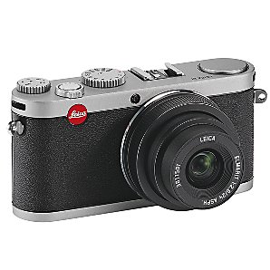
For a start, have they checked out the zoom capabilities on a high-end compact camera? Or even on a lower-end camera, for that matter. Yeah, they have pretty impressive specs.

So this camera would be allowed.

Have they considered that using a dSLR is going to cause less disturbance to performers than common-or-garden variety cameras because the flash doesn’t need to fire to produce an image in low-light settings?

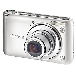
Plenty of compact cameras are able to shoot videos. In fact, I saw a good number of people doing that over the weekend, despite it being prohibited.

This one takes video, but that's still okay.

There are plenty of people out there using dSLR cameras because that’s what they prefer to use. They’re not professional and they don’t even hope to become professional. Their cameras are for personal use. Find a better distinction; realise that a dSLR camera doesn’t make someone a professional, and a professional doesn’t always use a dSLR.

I wonder what would happen if someone tried to use a manual SLR?

Feedback on your photos at Focussion

Focussion

Feedback on photographs can be a funny thing: of course you don’t want to be shot down in flames and told that it’s an awful picture, but more often, you don’t just want to hear: ‘Great shot!’. Knowing why someone thinks it is a great shot, or what you could have done to make it that bit better is far more valuable. But with so many millions of images up for critique in the usual haunts, it’s easier to just say the obvious, or say nothing at all. So how about a site that actively fosters sharing feedback?

This is precisely what Focussion has been designed to encourage: photographers leaving other photographers feedback on their work. Sign up to Focussion (it’s free) and you’re awarded 250 credits. Those 250 credits will allow you to post 10 pictures to the site. In order to be able to post more photos, you need to leave comments on other members’ photos. Each comment that you leave earns you five credits. It’s a feedback economy.

What kind of feedback will this one get?

The focus is on the photographs, not on features, and making sure that they gain feedback. The most recently uploaded images appear on the front page and the most recent comments are on the right side bar. There’s nothing complicated about it, although I would like to see a less clunky method for being able to view a given member’s entire catalogue. Right now, this can only be done by finding one of her or his photos and clicking through from there.

And the cynic in me can’t help but think that it is all too easy to leave ‘Great shot!’ comments, rather than something properly constructive. Perhaps by introducing a second layer of critique, whereby the recipient of the feedback rates how useful it was, the feedback process can be strengthened. But maybe this moves away from the simple model that inspired it. If you give constructive feedback, you’re likely to attract it, too.

Focussion went live on 4 June and already has about 80 members. You should head over there, sign up, and share a little picture-love.

PhotoEngine: edit in real-time

Oloneo

If you’ve ever wanted to turn off or dim a light in a photograph after you’ve taken it, or if you’d like to be able to adjust exposure as if you were still behind the lens but aren’t, then the people over at Oloneo might have just the piece of HDR software for you. What’s more, it makes the adjustments in real-time.

PhotoEngine allows you to alter the lighting in your pictures, for example to switch on or off light sources or adjust their white balance. It also gives you the capacity to recover details lost to over-exposure, or to restore areas that have been under-exposed. And there’s a noise reduction tool, too.

PhotoEngine is still in Beta and is only available for Windows, but you can learn more about it and download it for free from Oloneo.

StudioShare.org: sharing photography resources

StudioShare.org

There’s probably photographic equipment worth a small fortune sitting unused, but still very much loved, all over the world; lenses in boxes on top of wardrobes and lighting umbrellas stashed beneath beds. Wouldn’t it be good if this equipment were actually in use, being hired out to people for a few hours here or a day there? Similarly, there are doubtless acres of studio space which are empty when they could be used for shooting beautiful pictures, along with people who need to use a studio. How useful would it be to bring together equipment and studio space available for hire, along with the people who want to hire it, in one place?

StudioShare.org

StudioShare.org does just that: it facilitates the loan and hire of photographic equipment and studio space between photographers and studio owners. It was dreamed up by Andreas Randow, a photographer who realised how often his studio was sitting empty and thought others might be able to make use of it when he wasn’t. That was in 2008. Over the course of a year he and few other like-minded people developed the concept, wrote the code, and tested the beta on other photographers. StudioShare.org opened to the public in autumn 2009.

What does it do?

Whilst the underlying concept is simple, StudioShare.org does much more than bring together those hiring out studio space or equipment — from macro lenses in Massachusetts to camera bodies in California — with those wanting to hire it. You can even search for people hiring out their services, such as hair and makeup artists, prop and set builders, and post-production specialists.

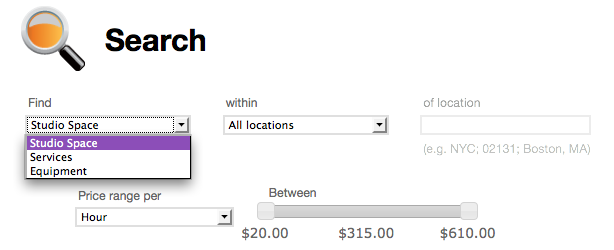
Finding what you want is simple using drop-down menus

It handles everything associated with a booking, from processing the payment, adding the rental to your calendar, emailing you a reminder, to preparing a statement for book-keeping purposes. That is probably one of StudioShare.org’s most widely praised features according to Marin Orlosky, StudioShare.org’s Marketing Manager: it takes the headache out of book-keeping and frees up creative people to be creative.

And how does it work?

Everyone wanting to use StudioShare.org pays an annual subscription fee: US$49 for members — those wishing to hire out or hire equipment or services — or US$79 for studio owners, who also enjoy the same benefits as members. Right now, StudioShare.org has around 1,600 members. Once registered, you can search for what you want, place a request, and expect a response within 24 hours. Then you pay for it, the booking is confirmed, and added to your calendar. You’ll even receive a reminder email.

So what is like to use?

When you log in you have access to a dashboard, which shows you your messages, your agenda, the projects you currently have organised, information from StudioShare.org, and your own account details.

The search interface is simple to use. You select what you need and where you need it (you can set a radius around your location of up to 100 miles) using drop-down boxes and can set a price range using a sliding scale. Then you are presented with a range of options from which to make your selection.

As the system relies on people loaning out their equipment, services, or space, availability can be a bit hit-and-miss. Studio space is pretty wide-spread, but equipment less so, and services are even more sparse. And of course, at the moment it only operates in the United States.

Lots of services are available, but can be a bit hit-and-miss depending on your location

If you are hiring a studio every possible piece of information, from access to post-processing facilities and wall colour to availability of parking and tea and coffee making, is set out for you. Once you have made your request, it will be accepted or declined within 24 hours, so there isn’t too much hanging around and uncertainty.

Keeping track of what you are loaning out or hiring is easy. In particular I liked that you could assign each booking to a given project, so if you needed to hire a studio as well as rent some lighting equipment and maybe an additional lens for the same shoot, they could all be placed in the same project. Not only could you be sure that you had organised all that you need, but everything would show up on the same statement.

Keeping track of what you have hired is clearly set out

What next?

With 1,600 members and growing all the time, StudioShare.org is aiming to become the primary resource for sharing photographic equipment and services. It’s looking at international expansion, especially in Canada, Australia, the UK, and Germany, so that not only can people there share their resources, but if you travel, you can find what you need, too.

The verdict?

Using StudioShare.org is easy, there’s plenty of support in case you need it, and the idea behind it is terrific. Now, it just needs even more people to join and start sharing their equipment and facilities.

Viewbook PhotoStory 2010

PhotoStory

Fancy seeing a series of your photos exhibited at a gallery in Amsterdam? How about having them published in a magazine and a book? I thought it sounded pretty cool, anyway. These are some of the prizes for the talented people who bag the Viewbook PhotoStory 2010 competition.

This is a competition with a bit of a difference, though, because you need to submit a series of photographs that weave a narrative. As the competition director, Alrik Swagerman said: ‘While a single image has a narrative in itself and can be strong in isolation, Viewbook PhotoStory’s focus is specifically on showing series of images, in a well-chosen sequence that triggers a reaction and combines a narrative with photographic excellence.’

Entries will be judged in two categories: documentary and conceptual. Although the overall competition winners will be selected by an international panel of judges, there is also a public vote and the winners of that get some goodies, too. You can submit your entries between now and 1 October 2010, when both public and jury voting commences.

So if you’re pro or amateur and fancy having a go, head over to the competition website. And don’t forget to look at our tips for winning competitions, either!

Phantastical Photography at the Obscura Gallery

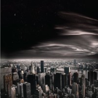
Michael Ross: Once Upon a Time in New York - Chrysler Building

For anyone in, around, or heading to Melbourne over the coming month, you should check out the Phantastical Photography exhibition at the Obscura Gallery in St Kilda.

The exhibition features the imaginative work of three photographers: Vivien Racault, Keren Dobia, and Michael Ross. Racault’s series of pictures, Mysteries, explores the idea of the unknown. Dobia has created a collection of photographs that recreate children’s fairytales in an adult setting, whilst Ross’ ten pictures, 10,000 Miles of Dreaming, is a dreamscape featuring Melbourne, Cambodia, and New York City, some 10,000 miles apart.

Sounds pretty fantastic to me!

Phantastical Photography opens on Sunday 11 July at 16:00, and runs until Thursday 5 August 2010 at the Obscura Gallery, Beller House Suite 11, 285 Carlisle Street, St Kilda, Victoria 3183. The gallery is open Tuesday to Saturday, 12 noon to 18:00.

It ain't the camera...

fstoppers

So you think your camera isn’t good enough? You’re probably wrong. No, seriously – you’re about as wrong as you can possibly be. I know I keep droning on about this, but here’s the proof, once and for all.

The awesome guys over at Fstoppers.com have done a video showing off how they were able to do a photo shoot with the worst camera they could think of.

“To prove this, I’m going to shoot an entire fashion shoot with the worst camera possible… Any Olympus SLR camera”… Of course, that wasn’t bad enough… And they shot the whole thing on an iPhone 3GS instead.

Check out the video:

As Lee Morris says: “I posted a few of the images and asked people to critique them (never exposing that they were shot on my cell phone). I couldn’t help but laugh when a few of our readers claimed that these were ‘the best images I had ever taken.’ Nobody ever claimed that they were too grainy, too soft, or lacked detail.”

Oh snap. Check out the full article with a load of sample photos over on Fstoppers.

Yogile: quick and easy photo-sharing

Yogile

There is such a plethora of web-based photo-sharing options out there that I’m always a little sceptical of someone telling me about a new one. It’s not just that it is a flooded market, but the front-runners do it so well. However, I think I might just have been pointed in the direction of something a little bit different.

How about an online collaborative gallery? One where lots of people can upload their own photos of a particular event — for example a wedding — to a single place, and then share the photos amongst themselves or make it available to the general public. It’s available over at Yogile.

After someone has established a gallery, potential contributors, or just viewers, are emailed a URL and password. They click the link to see the gallery and follow the simple instructions to upload photos. Alternatively, photos can be emailed to the gallery directly. Apart from the person establishing the gallery, no one has to be a member.

It’s a clean, unfussy interface and you can even leave comments. Yep, simple, stress-free photo-sharing. Now someone just needs to get married, or throw a party, or organise a village fete…