I spend a lot of time giving feedback on photos. One of the comments that pops up again and again is that I’ll feel as if an image is framed awkwardly.
Some times, I’ll find that an image is nigh-on perfect, but it fails to make the mark because it’s difficult to understand the motivation of the photographer: What are they trying to achieve with this photo?
It’s true for all photography, of course, but it’s more complicated with portraiture, as it isn’t necessarily very intuitive. How, after all, can you connect a story to the way a portrait is framed?
This is not a tutorial. Hell, it isn’t even much of a rant. Just some thoughts. Use of it what you will, and ignore (with great prejudice and much glee) everything you deem to be complete and utter bollocks. There will probably be some of both.
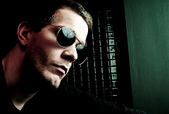
In this image (of myself. because I’m too lazy to dig through my backlog of umpteen million photos to find another one), the subject is dead centre in the image. The quality of the photo itself is unimpressive, and the lighting needs work, but that’s beside the point – we’re talking about framing here.
Centre-framing
In this image, the vast blackness on both sides of my ugly mug means that I’m surrounded by… something. But we can’t see it If I had a fear-struck look on my face, instead of looking smug, this composition may have helped to hint at something I was afraid of. perhaps something lurking in the shadows. But I’m looking vaguely content, so that doesn’t make any sense. In fact, the image has very little impact at all.
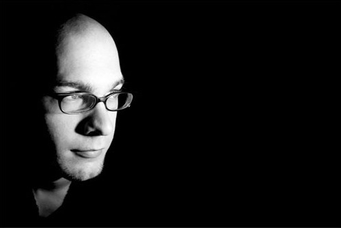
Looking into the frame

For my next book, I'll probably use something like this as my author photo. Because I've come a long way as a portrait photographer since my 'steeped in blackness' mysterious stranger days. (clicky for bigger)
So instead. it is recropped like this. Suddenly. I’m looking across a vast nothingness. Into… into what? I’m looking at something just outside the frame, lire image doesn’t hint at movement, nor does it show any particular emotion, so whatever is off frame isn’t engaging me.
Perhaps I’m watching television. Or I may just be at ease with myself. Due to the framing, the image has very little tension, and serves only to show off my face – great for the jacket-cover of that book I wrote, perhaps (Lo and behold, this is actually the photo I ended up using in my macro book.
This image is vaguely better than the one above. because it has some purpose. It draws the eyes the left, but simultaneously leaves you wondering what it is I’m looking at – And why it is so far away from me.
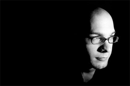
Looking “out” of the frame

Well will you look at that, miss moneypenny! This time, I'm on the right of the picture! It's pure unadulterated magic. MAGIC, I TELL YOU!
In this image, suddenly something else happens. I’m closer to the edge. Closer to action. Am I about to move towards the light? Am I dead, moving towards the light? At the very least, I appear more curious. And I’ve left a wasteland of darkness behind me. Or perhaps I’m just the first one to step out of the shadows?
This image has the sense of movement, somehow – a dynamic property, which wasn’t there in the previous image – even though the only difference is a net of black pixels.
So, er, what’s the point of all this, Haje?
Well, the main message, I suppose, is test it out, and keep the rule of thirds in the back of your mind.
Take an image, crop it in different ways. See how it impacts the photo, and see if it becomes more interesting. Think about what message you are trying to convey, and see if the image is actually supporting that message. If it is: Great! flit isn’t, perhaps a re-crop, or even a re-shoot would solve the problem.
Do you enjoy a smattering of random photography links? Well, squire, I welcome thee to join me on Twitter - Follow @Photocritic
© Kamps Consulting Ltd. This article is licenced for use on Pixiq only. Please do not reproduce wholly or in part without a license. More info.


