Techniques

Learn photography step-by-step

instruct2.jpg

I think it’s pretty safe to say that I’ve got a new favourite website: instructables! It uses a flickr-style, very web 2.0 approach to doing ‘do it yourself’ guides: Hover-over-image items for descriptions of what you are looking at, and many of the instructables available guide you through projects baby-step by baby-step.

There are a lot of them available already, mostly for geek projects. Luckily, there are some wicked photography DIY projects as well – well worth a peek!  


instruct2.jpgSome of my favourite instructables include Photographing in the Ultraviolet spectrum, how to make a macro attachment for a digital compact, converting your Holga to a 35mm (more about holgas), a pretty good guide to creating QuickTime VR panoramas (although, if I were you, I’d use CleVR instead…), a superb guide to taking infra-red photos with your digital compact cameras, building a light tent.

There are also a few truly cheeky guides, such as how you can use a condom to water-proof your camera (it works, but most condoms are not fully translucent, so you’d struggle to get decent-quality photos with this technique)

instruct1.jpgThe instructable to introduction to band photography is decent as well, and well worth a look – but it’s not as good as Photocritic’s discussions of the same, obviously :-)

A quick search on instructables for ‘Photography’ comes up with 51 DIY guides of varying quality – great reading material for a lazy sunday morning!

(thanks, sam, for reminding me to do a post on Instructables! He wrote the condom-waterproof guide and the IR photo guide. Give it some love!)

Portraiture: Borrow their soul!

mika31

A few years ago, I was part of a creative arts project in Arizona and southern Utah, where we did a lot of work with Native American people — a ‘world through our eyes’ type thing. One of the things that was brought up when we were dealing with more traditional tribes, was that we weren’t to take any photos. Perhaps surprisingly, some people believe that when you take photos of them, you steal a part of their soul.

Religions and superstitions aside, I think it’s a good way to look at portraiture. Stealing souls is a bit harsh, but if your photographs don’t at least borrow a little bit of soul from your subjects, I believe you may have failed as a photographer.

For this article, I’ve chosen to do a critique some of the photos submitted to me by Isaac – an USC film student with a passion for photography. His images illustrate very well how adding a touch of feel (or soul, if you will) can lift your portraiture.  


With his photos, Isaac included a note. Now, normally, I don’t pay much heed to what people say about their photos: if they can’t stand on themselves, they aren’t worth critiqueing. In this case, I made an exception: Essentially, Isaac is begging to be kicked to the kerb:

Compliments are nice, but for someone in my position they are useless – I’m a newb and I need people to tear my work apart so that I can improve. Please, please, I beg you, be as harsh as you possibly can. Thanks.

… Which I would have done, if his pictures were actually bad. Luckily, they aren’t. Without any further ado…

Isaac’s first photo has is titled ‘arms’:

arms.jpg

At first, I wasn’t quite sure what to feel about this photo. It’s terribly messy, and you can’t actually see anything of what is going on. I’m also not a big fan of the photographer being reflected in the camera, on a general basis. In this one, however, the expression of the photo comes together in a wonderful way.

To me, it seems as if this photo is taken in a changing room. The girls are performers, preparing to go on stage, perhaps. The girl on the left is showing a slightly worried expression, and is looking at the photographer through her hand in the mirror, while the other model is completely obscured in what seems like a dancer’s pose. Is she snapping her fingers? Is she fixing her hair?

The tension in this photo — and much of its soul — comes from the tension in the photograph. The photographer is intruding into a world where he doesn’t belong, and the way the models obscure their own face almost seems as a defensive gesture, even though the body language of both girls are very open.

Along with the tension and the colour repetition (there is only one accent colour, and it’s pink. It’s reflected in the light source, on the photographer’s shirt, in the left girl’s hair band and the right girl’s top), the thing that intrigues me about this photo is that you can follow the path of the light. Take the left model, for example, you can see her head, then her head in the mirror. You can then follow the light beam through the hand which is obscuring her face, which you can also see in the mirror, and then into the photographic lens. As a photographer, this multi-layered self-referential image is very appealing and exciting to me.

On a technical level, I would probably have tidied the image up a little bit. Darken the background more, black out the writing (on the mirror? On the photographer’s shirt?), and get rid of everything to the left of the left model, and to the right of the right model. Once that has been done, it will increase the focus of the photograph.

The final thing which makes this image really work for me, is that if anyone has had their soul ‘stolen’ in this image, it’s the photographer himself. The models are obscured, and the only person who you can connect with (despite the camera stuck in front of his face), is the person taking the photo.

A powerful, cheeky, and inventive photo indeed.

In Isaac’s second photo, entitled Mika, he’s using a different set of techniques:

mika.jpg

In a way, I really wanted to read a lot of meaning into this photo, but there’s something about it which doesn’t quite allow that for me. The car in itself is delightfully dilapidated, and the dirt, decay and entropy it and the background represents makes a fantastic backdrop for telling a story.

The model is beautiful, and very well captured on your behalf. The problem I have with the image, however, is that she just doesn’t look quite right in her circumstances. The way she is dressed and posed gives the photo an impression of ‘look! an old car! let’s take a picture on it’. If she was dressed differently, there would have been an opportunity for a whole series of different stories worth telling. Dressed very beautifully and glamorously, it could be a story of being lost / being out of ones element. With more frizzy hair, perhaps a scruffy, stained t-shirt, and with dirty, bare feet, it could be a story of despair, loss, and hopelessness. Open the bonnet and make her a spanner monkey, with some creative lighting and perhaps with a streak of oil on her cheek, and you have a classic ‘sassy mechanic’ shot. Sat in the car, perhaps in a bikini, or even nude, it’s a different story again.

I think this photo is an excellent counter-example of the above. All the elements are there: The model is attractive and sultry, the background looks bloody amazing and is well cropped, and the lighting is quite beautiful. However, you haven’t captured the ‘soul’ of the photo, and we’re left with an image that, whilst interesting to look at and quite pretty, doesn’t move me at all.

That doesn’t meant that the photo is beyond saving, of course — technically, it’s close to perfect (the only thing I’d address is the lighter area in the top right of the image. Getting someone to stand in the way of the sunlight, setting up a screen, or just cropping / editing it out in Photoshop would take care of that), and as I say, both the model and the setting have a lot of potential.

… Which semi-elegantly leads me to the last image of today’s critique. Another photo of Mika:
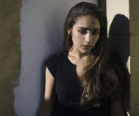
mika3.jpg

This photo fills me with wonder. What’s going on? Why is she stood in the sunshine in front of a half-pointed wall? Her eyes are kind of closed. Is she tired? Is she reacting to the sun? Is she on drugs? She does look sort of suspicious. Is she trying to hide from something or someone? Is she suspicious herself, of does she mistrust the photographer? Is she angry at the photographer?

With an initial impression like that, you’re bound to catch the attention of onlookers, which is a great start in the battle towards getting a photo noticed.

On a technical level, I think I’m not too fond of the sharp side-light. The shadow of her eyelashes on her nose is not particularly flattering, and while it does look as if you’ve used a reflector to lighten up the ‘dark’ side of her face (did you? Or is it merely light reflected back off the wall? It doesn’t look as if there is enough wall surface for that amount of light reflection), it isn’t quite enough. The main thing I have a problem with from a technical point of view, is that even in this photo, it’s possible to see that the model has absolutely gorgeous eyes. We want to be able to see them properly! A fill-flash would definitely have come in handy here. While you’re at it, perhaps a little bit more light on the wall behind the model as well — the sharp contrast between the white and the light olive colours carry this image — use it!

Right, with all that out of the way, let me say that this image is bloody good. Just like the first image, it harbours a lot of emotion and it tells (or rather, hides) a story. The light is low on the horizon, which to me says ‘evening’ or ‘morning’. Based on the make-up, I want to think evening. Or is it morning? Is her tiredness because she’s been out all night? But she doesn’t sweaty or messy enough to be out all night…

Obviously, I haven’t got the faintest idea who the model is, nor what her relationship to the photographer is, nor what her personality is like. Conflicting images of misspent youth, worry, intelligence, drug abuse, perhaps. Whatever it is, this photo oozes feeling, emotion, and — yes — soul.

Right, I do realise that this is the least useful critique I’ve done on here in a long time. There’s just something that really works in this image, and it drives me spare that I can’t put my finger on what it is. I have an idea I’ll come back to this image many times in the future, and every time, I’ll be left wondering. It’s a sign of unbridled greatness. Sort out the technical details, and you’re on to a proper winner. Thank you so much for sharing this.

Can anybody else add anything to the critiques? Do you agree? Not sure? Do you completely disagree? Well that’s what the comments are for.


Do you enjoy a smattering of random photography links? Well, squire, I welcome thee to join me on Twitter -

© Kamps Consulting Ltd. This article is licenced for use on Pixiq only. Please do not reproduce wholly or in part without a license. More info.
Photographing smoke


coloured_smoke_art__25

Abstract photography is nothing new, and people constantly come up with new — or re-invent old — versions of photography techniques. One of the ones that is going like wild-fire (excuse the pun) around the interwebs at the moment is the art of photographing coloured smoke.

The trend started with the highly talented Graham Jefferey, of Sensitive Light fame, whose phenomenal photographs went around the world via blogs,

We’ve managed to talk to Graham, and find out how he does his smoke photos… 

Getting the smoke right

Before anything, Graham points out that there is no ‘right’ way to photograph smoke. His technique has developed over a long period of time, and Graham admits to learning and discovering new things every time he sets out to take the photos.

Smoke photo by Graham JeffereyThe two key secrets to smoke photography is inverting the image, and using gray smoke. Say what now? How does that work? Well, Graham explains: “It’s quite a simple technique, really. All you need to concentrate on when you are taking the photos themselves, is getting good images of the smoke. The colours are generated digitally at a later stage.”

To get the best possible smoke to work with, Graham uses simple incense sticks known as Joss sticks, which can be purchased from most Chinese supermarkets and in every Chinatown anywhere in the world. Alternatively, any reasonably large incense stick should do the trick.

Once you’ve got the smoke, the rest is all down to freezing the motion, and getting the lighting right. “In my opinion,” explains Graham, “the key technical factor is to adequately light the smoke so that it stands out from the background.”

Smoke photo by Graham JeffereyWhile smoke in itself can be an interesting subject matter, Graham points out that in his photos, the smoke itself isn’t the subject matter, it is merely the tool used to create unusual photographs: “I am not trying to create pictures of smoke; I am trying to create pictures by using smoke”. This approach means that you have full creative licence to do what you want to manipulate the smoke as much as necessary — the only thing you have to worry about is getting an impressive final result.

Lighting and exposure

The best way to get ‘cleanly’ lit smoke photos is to use a clean environment with controllable light. A studio would be ideal, but anywhere you can hang up a black background is perfectly usable. The most important thing when photographing smoke is getting enough light to freeze the motion of the smoke in mid-air. You can do this by using a lot of light (think direct sunlight falling through a window) or by using one or more flashes. When you’re photographing the smoke, you’ll want to make sure that no stray light hits the front of your camera lens (this will cause glare or solar-flare type effects), nor on your blackened background (because that will bring out definition in the background, which you don’t want either).

Smoke photo by Graham JeffereyWhen you are photographing, it is easiest to let the smoke rise on its own volition. Instead of trying to manipulate the incense stick, try wafting some motion into the air to disturb the even plume. Alternatively, you can try to create interesting shapes by making the plume turbulent: try introducing a ruler, an upturned spoon, or a sheet of paper into the plume to alter its shape and ‘feel’.

“I want clean lines and shapes”, Graham explains. To do this, he shoots with a lot of light at a small aperture (and thereby a deeper depth of field). “This is very much easier to do if the smoke is allowed to rise naturally.”

With the smaller aperture needed to capture the plumes of smoke properly, you obviously lose quite a bit of light. This is a problem, because in order to freeze the motion of the constantly-moving smoke, you need quite a fast shutter time. In practical terms, this means 1/250 or faster. Simultaneously, you can’t reduce the ISO value on your camera either, because the purile plumes of smokes would be ruined by significant amounts of noise. Needless to say, a coinciding need of low ISO, small apertures and high apertures means that you need a vast amount of light.

Smoke photo by Graham JeffereyPersonally, my best smoke photos were taken with a 2000W Bowen studio flash light with a humongous soft-box fitted on the front. I prefer this solution because the softbox gives even lighting, but it can be difficult to limit where the light goes, so the above-mentioned limitations of “no light on your background or camera lens” can get tricky. I find that if you put the soft box really close to the smoke, you can get excellent results. Having said that, my smoke photos aren’t nearly as good as Graham’s, and he uses a different approach: “For all practical purposes the light used to expose the image comes from one studio flash unit fitted with a snoot and placed at the side or behind the smoke. I realise that not everyone has one of these units, but an off camera flash gun fitted with or placed beside a baffle to protect the background from direct light works just as well.”

If you’re going to be working with external flashes anyway, you probably need to shoot in fully manual mode: Your internal light meter is unlikely to give you a lot of joy on this one. In addition, it’s absolutely vital to get it right. You’ll need to set your flash output and aperture so the brightest part of the smoke is almost completely white, but not quite. Overexposure means that you will lose detail, and the inverted image will have a lot of black in the smoke, which just looks unnatural. Under-exposure, on the other hand, will make it difficult to see the difference between the smoke and the background.

Once you’re taking photos, it’s worth keeping in mind that you need to keep the room well-ventilated. Not because the smoke will harm you (although it probably will, if you breathe in and get enough in your eyes, etc), but, as Graham puts it: “as the air fills up with the fog of dissipated smoke your pictures will be robbed of light, contrast and sharpness” — never mind your health, think of the photos!

Digital manipulation

Smoke photo by Graham JeffereyNow that you’ve captured the photos, it’s time to take it to your digital darkroom. Crop your image to a composition that works for you, and then use levels or curves to adjust the contrast of your photos. You’ll want to make sure that the background is completely black (hold the alt key while adjusting the black-point levels slider in Photoshop, it gives you a preview of what you’re actually doing), so it turns into a pure white when you invert the image.

Once you’re happy with the background, invert your image, and decide if you like the black or white background best — stick with whatever you prefer, but often the white backgrounded images have a lot higher impact. If you have stray smoke, dust, or details in the background you’re unhappy with, use a brush with the same colour as the background (i.e white or black) or clone tool to get rid of them.

To colourise the smoke, use the hue and saturation tool. You can apply the colour to the whole image in one go easily, because your pure white or black background will be unaffected by this tool (if it does make changes, then your background needs some work first). Alternatively, you can colorise part of the image, or use multiple colours, by making a selection of a part of the smoke, and use the ‘feather selection’ command to create a gradient. Using the Hue and Saturation tool now results in colorising parts of the smoke image only. Nifty, yes?

Some inspiration

Smoke photo by Graham JeffereyThe best place to go for some inspiration are Graham’s own images, available on his website. My personal favourites are these: -1- -2- -3-.

Apart from Graham, there are quite a few other people who have taken smoke photography under their wing. Myla Kent’s work (also inspired by Graham’s images) is worth a look, and there’s a Flickr group titled Artsmoke which takes the artform to a new level.

The only way you can get further, though, is to have a go yourself… What are you waiting for?

Article in co-operation with Graham Jefferey. All photographs © Graham Jefferey. To see the bigger versions, hit the Sensitive Light Smoke Gallery.

Think of photos as paintings

washing-the-sand.jpg

There’s a lot to be said for how the accessibility of affordable digital cameras has improved the level of photography overall, and I’m strongly in favour of the idea that digital photography is a good thing.

The downside of digital photography is that we are seeing a whole generation of people who never saw a frame of film as something precious. There are thousands upon thousands of photographers out there who only started thinking about photography when they weren’t limited to 24 or 36 frames before bringing the film to the local shop, and then wait for hours for the results. 


Waiting for 2 days for a letter to arrive? Rubbish — Use e-mail! Looking up something in an encyclopedia? Bollocks to that — throw yourself at Google, and you’ll have an answer in seconds. You don’t even have to know the alphabet or be able to spell the word you’re looking for anymore.

The same thing is happening to photography, and it’s happening fast. In a way, it is sad. I remember when I started out taking photos. I was given a 24 exposure film, and it had to last me a month, because I couldn’t afford to buy, develop, and print more than a single roll of film per month. Digital cameras didn’t exist, computers weren’t powerful enough to do even the simplest image editing, and learning of your own mistakes was a terribly long-winded process.

Everything is different now, and it is difficult to say if it is better or worse. I’m guilty of it myself: Instead of planning carefully, measuring light properly, framing everything perfectly, I snap 20 photos to get the light right, 15 more to get the framing right, and a few test shots for good measure.

All in all, it took a painter with a photo camera to remind me what I am doing wrong with photography.

As part of my Photo Critique sessions, I received an e-mail from Kate Ferris, who lives in Scotland. She’s special in the fact that she doesn’t classify herself as a photographer. In fact, she’s an artist first and foremost, and uses photography almost as a tool to help her along. I don’t know if her workflow is meticulous and slow or quick, measured, and precise, but whatever she is doing, it’s showing in the her photographs.

As she says: “I take photos as paintings”, and I think it is a philosophy that is worth exploring further…

Photographic impressionism

inside-looking-out.jpg

Kate submitted 4 photos for critique, and for the first time in Photocritic history, I’m going to use them all in the critique. The first photo is by far the least good of the lot, but it is being let down on technical grounds rather than on the idea. Titled “Inside looking Out”, it is a photo of an urban scene photographed through a window. The neon yellow near the bottom of the photo looks as if it could be a police officer. The yellow reflections in the window make me think that perhaps the photograph was taken from a bus, and the absolutely ridiculous amount of grain evident in the photo tells me that she was really pushing her camera to the max. It’s probably the only way to capture this photo — especially if it was taken on a moving bus — but the neon, combined with the red light towards the right side of the photograph (a brake light? A stop light) and the more yellow light above it appeals to me.

The great thing about this photo is that it would be easy to re-create, and easy to get it right. The effect is created by streams upon streams of water cascading down the window, and the tasty bits of the image are due to the reflected light. So — grab some lanterns, and re-create the photo in your front garden. Different color lights in the lanterns. Camera on a tripod at a low ISO (100 would be great). Get the water hose out to get the window properly streaming with water. And start experimenting. This photograph is impressionism at its finest.

You can’t see anything of what is going on, and yet it is appealing on a level I can’t quite grasp myself. This photo is rubbish — but the idea behind it is fantastic, and all it needs is some more experimentation, a little more planning and a bit less grain.

Photographic realism

doors-13-dec06.jpg

The next step on the arts ladder in our adventure in photography is realism. You know those paintings you see in museums where the scene looks as if it could be real, but then doesn’t quite work out? I recently went to Edward Hopper’s exhibition at the Tate in London, and found his works to be downright unsettling. With every photo, there would be something subtly wrong, which upset my photographer’s eye for a picture. Eventually, I worked it out: It’s the lighting. Shadows are missing. Shades are going the wrong way. The most important parts of the images don’t have any highlights on them.

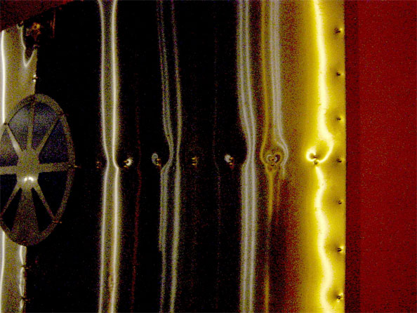
The second photo in this critique invokes that very same feeling on me. I have no idea what I am looking at here — it looks like copper nailed to a wall, perhaps in an old museum or a theatre — but that is not important. The strong, but interrupted vertical lines, along with the unidentifiable object to the left, and the strongly contrasting colours on the right really appeal to me, somehow. It is quite obviously the case of spotting something which appealed to Kate, which she set out to capture. Again, the grain is rampant in this photo (and the particular way the grain manifests itself indicates that this photo is a victim of heavy increases in contrast in Photoshop), and the photograph would have been far better if it had been a more pure representation of the scene, but the idea behind the photo is great. Kate, if you can, go back to the same place, bring a tripod, and try again. I love how you’re thinking, it’s just the execution that’s letting you down.

Photographic Expressionism

washing-the-sand.jpg

Taking a leap of faith into yet another photographic period. The third of Kate’s photos is a bound into expressionism. Moving away from the documentary sphere and into the realm of emotions, the expressionists bend reality to illustrate a frame of mind. To me, this photograph, obviously taken on a beach somewhere, very strongly invokes the feeling of just that. The only frame of reference is a very small speck of sand that isn’t blurry. The rest of the image is a wild mixture of motion, turmoil, and very strong contrast.

Is it a technically perfect photo? Far from it — the foam on the wave is over-exposed, the darker areas of the foam have a very odd blue tinge to them, and I wish a little more of the sand had been stationary and in sharp focus. Having said that, this photo succeeds where many other entries to my photo critique completely fail: It’s illustrating an emotion and has a message. More than that, the photographer saw something that nobody else saw, and decided to try to express it in a way that would show it to casual observers: By capturing it as a photograph.

De Stijl

tie-the-boats-up.jpg

The last photo from Kate is a lot more conventional than the others, but is also the most technically accomplished. The sharpness is spot-on, the exposure is fine, and the colours have a subtle vibrancy in their own right. The-unhurried simplicity of the ropes hanging in the water is an image of deep, heart-felt tranquility.

I know I’m probably pushing the comparison a bit far, but if I were to compare this photograph to a photographic style, it would have to be De Stijl. The most famous Stijlist — Piet Mondrian — became famous for the forced simplicity in his art works as he introduced a strict minimalism and what he saw as a level of order and harmony beyond what common humans could achieve normally. This photograph is rather close to that ideal: Dark colours, prime colours, simplicity and tranquility united in a photograph that would have looked marvellous on my living room wall. Why? Because anybody could have taken it, but one person took the time to capture it for all to see.


Have you completely lost your mind?

Well, probably. The thing is, I’m a little surprised myself at how moved I am by these photographs. Normally, I’m the first to point out the technical flaws in a photo.

There’s a moral to this story, though, and that is that there is a name for people who take perfectly exposed, impeccably focused and faultlessly framed photos every single time: Technicians.

If I were a photography teacher, I’d take on a visionary student without the technical skills over a technically perfect photographer who lacks the imagination. Every time.

So, if you learn one thing from this critique, let it be this: Take a closer look at painters, illustrators, and other artists of times gone by — visit a gallery or two, and stop to think why their art works. Then take as much time as you need to re-create some of it as photography. Trust me, there’s greatness on that path.

Let’s all try it: The 5 shot challenge.

Finally, I have a challenge for you. Take out your digital camera, and go for a walk outside. On your entire walk, you are only allowed to take 5 photographs, and they have to be of 5 different scenes. If you screw up a photo for any reason, you have lost that scene, and are not allowed to try again.

Think of photography as painting. Be meticulous. Be precise. Spend a lot of time looking through the viewfinder. When you’re sure everything is perfect, pull the trigger.

If you try this, I’d love to see the results — post them in a Flickr gallery or on your blog or something, and post a link to it in the comments to this post.


Do you enjoy a smattering of random photography links? Well, squire, I welcome thee to join me on Twitter -

© Kamps Consulting Ltd. This article is licenced for use on Pixiq only. Please do not reproduce wholly or in part without a license. More info.

Your pet peeves...

LF-01-040505-053.jpg

LF-01-040505-053.jpgI spend a lot of time looking at people’s photos, both for work, and for this website. It helps me identify where I go wrong myself. I’ve grown to realise that my biggest downfall is that I tend to use odd crops on photos, and I’m obsessive about certain aspects about my photography.

I’m curious though… Are my hang-ups and failures the same as other photographers’?

Go on, vote below or — even better — go into some detail about the faults that gets you again and again, in the comments.

(you can vote on an existing option, or add your own)

When taking pictures, what's your biggest weakness?

  • Add an Answer

View Results


Do you enjoy a smattering of random photography links? Well, squire, I welcome thee to join me on Twitter -

© Kamps Consulting Ltd. This article is licenced for use on Pixiq only. Please do not reproduce wholly or in part without a license. More info.

Time-lapse photography

dawntodusk.jpg
dawntodusk.jpg
dawntodusk.jpg
dawntodusk.jpg

There’s a lot to be said for the persistency of time-lapse photography – it makes life rather interesting. Reducing a period of a few hours (like a flower opening to the sun), a few months (like a flower growing or a baby growing inside a mother’s belly) or a year (seasonal timelapses, construction work) is amazing stuff.

Have you ever tried time-lapse photography?

  • Yes, I do it all the time
  • Yes, a few times
  • Yes, once
  • No, but I'll give it a shot
  • No, and I don't want to

View Results

To learn more about time-lapse photography, why not try the Wikipedia article. For tutorials, check out the Haworth Village tutorial – it serves as a good introduction as well as a tutorial.

Time-lapse software

Taking the photos is all good and well, but you’ve got two hurdles: Taking a sequence of photographs, and going from photos to stop-animation. Some cameras actually have timelapse photography built in (although I can’t remember seeing it in any cameras since the Casio QV-8000 in the late 1990s – why? It’s easy to implement, and all digital cameras have built-in clocks! Come on, manufacturers, you can do better!), but if you aren’t that lucky, you have to either take the pictures manually, connect a time-lapse device to your camera (Such as the TC80N3), or use your computer to control the camera. The software that came with your camera often has a ‘control your camera from your computer’ type piece of software, which normally has a time-lapse function built in.

On the software side, there are loads of good programmes out there. For the Mac, the old classic is iStopMotion, which I’ve used briefly when it was in Beta, and I found it to be very interesting. It has since ‘grown up’ into a fully-fledged high-quality piece of software which is easy to use.

Granite Bay software make an application especially for Canon cameras, designed to take and merge the photos into videos.

Of course, you don’t have to take the video approach – you can also take very powerful still frame time lapse photos… Like the photo used at the top of this article!

Some inspiration

Check out time lapse photography on YouTube, Google Video.

Highlights: Rebuilding Ground Zero in NYC, Picasso painting, Walking around the Giza Pyramids, Repainting the ice on a hockey rink, a year of seasonal change in Norway, and finally, a time-lapse of a cross-country drive from LA to New York in 5 days.

Cross polarization

cdcover.jpg

Geekery and science meets photography: Cross-polarization is a fantastic little technique that exploits a quirk in the way polarizers work.

Think of light as wooden ice-cream sticks that are flying towards a set of bars. The bars will only let the sticks that happen to be aligned with the bars through, and absorbs all the other sticks. Before the filter, the light is moving in lots of different polarizations. After it has passed through the filter, all the light is moving in the same linear polarization.  


309176019_bf06255025_o.jpgImagine now, if you will, what would happen if you were to put another set of bars, rotated 90 degrees in relation to the first set of bars. In theory, none of the ice-cream sticks would get through, right? Well, that’s how Polarizer filters work, too. Of course, no polarizer filter is perfect, so some light will always get through, but the vast bulk of light is filtered out.
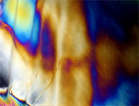
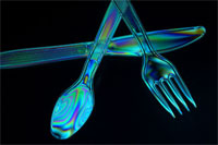
polar2.jpgCross-polarization exploits this by placing objects made of some types of plastic between the first and the second polarizer. For this particular set-up, you’ll want to put your first polarizer in front of the light source, then your plastic object, and then use the second polarizer in front of your lens.

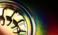
The effect that can be seen when cross-polarizing light is startling. Chances are that you’ve seen cross-polarized images before, and thought that they were digital image manipulations or done with really advanced lighting. The opposite is true: Due to the manufacturing process used in creating injection-moulded clear plastics, the plastic takes on some ability to polarize light itself. When the polarized light passes through these plastics, then, their phase gets altered. By filtering out all other light with the second polarizer, you get the colorful, acid-flashback-style images.

cdcover.jpgYou can buy sheets of polarization film from most photographic outlet – all you need to do is to cut off a piece that is big enough to cover your light source, and another piece that is of a size of the right size to stick in front of your camera lens. Then, the hunt starts for finding the most interesting types of plastic to start playing with…

Photos in this post were found by searching for Cross Polarization (or Cross Polarisation) on Flickr. The cutlery image is by Elyssa, the mad colours image is by Geartron, and the CD cover insert is by _maverick_.


Do you enjoy a smattering of random photography links? Well, squire, I welcome thee to join me on Twitter -

© Kamps Consulting Ltd. This article is licenced for use on Pixiq only. Please do not reproduce wholly or in part without a license. More info.

Using Shallow depth of field

raincoat.jpg

So, you’ve got your exposures down pat, and your framing is getting better by the day. Excellent. What is next? Well, the lovely Andrew Ferguson, who I know via LiveJournal, submitted a couple of photos for critique that illustrate the next logical step forward: Using shallow depth of field in a creative context. 


The first hurdle for many photographers is to get stuff in focus in the first place. The next hurdle is to get the things you want to be out of focus, err, out of focus. Awesome. So how do you go about doing that? Well, let’s learn from Andrew:

Andrew-Ferguson-2.jpg

This photo, which he asked me to take from his overall rather nifty Flickr stream, serves as an excellent example of how you can use DOF to create a multi-layered image.

The eye is automatically drawn to the parts of the photo that are correctly exposed and in focus, whereas the over-exposed background, which is blurry to boot, gets less attention. If this image had been pin-prick sharp all the way, it would not have had any impact whatsoever: The messyness of the people in the background would have seriously detracted from the overall impression of the photograph.

As it stands, I have no idea what the item of jewelry is, or if it means anything. Quite apart from that, the choker the person in the foreground is wearing is vicious-looking, and her black dreaded hair strengthens the impression of a person who has embraced the ‘goth’ lifestyle.

The foreground is rather strongly contrasted with the background, in that it is a very unusual portrait, which can in fact be interpreted in several ways. The two that sprang to mind:

1) The phrase ‘show me your friends and I’ll tell you who you are’ springs to mind with this photo: Instead of showing a full-on portrait of the person who is in focus, the photographer chooses to express her personality through that of her friends, despite the fact that the friends are out of focus.

2) This person is ostracised from her group, and her alternative clothing style, her going-against-the-grain type personality and what comes across as a strong personality is rebelling, but she is paying the prize in the form of loneliness.

If the people in the background had been in school uniforms, or otherwise ‘conformist’ clothing, I would have leaned towards option 2. I believe that this would have made a stronger photograph on an emotional level, too. However, one of the people in the background has blue hair, and the guy standing up seems to have blond dread-locks, which leads me to conclude the 1st explanation.

Obviously, this photograph has a lot going for it in terms of ‘showing a little, hiding a lot’, with multiple possible explanations. It is one of the things I quite like about it, but what really makes this image is how it goes about creating this illusion: By using a very large aperture (f/5.6 at ISO 200 and 24mm focal length, in the case of this photograph), there is only very little of the image that is actually in focus: The foreground model’s jewelry and the far-most locks of hair.

In the beginning of this critique, I explained how this image could easily have been completely rubbish, but I hope that the long-ish monologue (which really wasn’t meant to be quite that long, honest) serves to illustrate how the limited DOF has helped pull this image up. It isn’t perfect — If it were, I would have been able to come up with a more consistent story as to what is going on in this image, and why the people in the background are relevant — but it’s a very fine photograph because it allows the viewer to spend some time thinking, making up his/her mind.

If I were to come up with any ways to improve this image, it would be to use different people in the background, perhaps dressed as jocks, nazis, or even as circus clowns. The point is that they need to serve as either a connection or a contrast, and at present they are too similar, yet too different to offer an unified message in the photo.

Bokeh

bokeh.jpgShallow DOF and bokeh go hand-in-hand as two rather important concepts in photography, and it is something that is worth keeping in mind when you are working with limited depth of field: The type and quality of the lens you are working with has impact on how the out-of-focus parts of your image look. In Andrew’s photo above, the out-of-focus elements of the image are works of impressionistic art in themselves (See the crop to the left, for example).

Because of the beautiful out-of-focus qualities, this image works well. If you experiment with the same, but discover that your out-of-focus backgrounds don’t look as expected, try it with one of your other lenses. If you have any cheap lenses, try with them as well – I have a couple of no-brand, cheap-as-chips lenses that are nigh-on useless for any quality photography, but I keep them around beccause they have tremendous qualities for shallow depth of field photography.

The only real way to find out which lenses work and which ones don’t is to experiment, so have a go!

Andrew’s second photograph is this one, of an old motorbike:

Andrew-Ferguson-1.jpg

… Which I’m not going to say a lot about, other than the fact that it is – yet again – an excellent example of careful use of depth of field.

The photo was taken with a Canon Digital Rebel XT and a moody old 24-105 EF lens at 50mm, 1/250 sec, f/4.0 at ISO 400, and I really enjoy what the increased grain at ISO 400 brings to the photograph. With these kind of lighting conditions, you could easily have shot it at 1/125 ISO 200, or 1/60 ISO 100, but the trade-off of faster shutter time and increased grain works very well, perhaps especially because it’s such a gritty topic of photography.

As a personal preference type thing (i.e lots of people would disagree with me), I think the photograph is too bottom-heavy. The sticker on the fork of the bike is disturbing, and while the dirty, oily rag over the bike, combined with the indicator and the reflector of similar, yet different shades of orange really lift the photo, I think there’s too much going on, and too little of a focal point. I like how you’ve used the rule of thirds in the composition of this photo, and it is fine just the way it is.

Because this is my photo critique, however, and because I can’t let a photo stand without a few suggestions for improvement, I’ll go in line with my usual demands: I would have loved this photo to be a lot tighter, and higher impact.

A humble re-crop suggests the following, for example:

raincoat.jpg

This version uses a different approach to the rule of thirds: it breaks the image by using diagonals. The rain-cover is the only things that stands out in the image because it is teh only thing that is straight down. Everything else is at a diagonal: The rain grid in the background, the boke itself, the outline of the rain cover on the left side, etc. As I say, it’s very much a taste thing, and I would most certainly not insist on an approach such as this one, but I feel that the re-crop also highlights the strength of the original photo – the tack-sharp focus on the bike itself, and the out-of focus-ness of the background.

Finally, the out-of-focus areas on the last photo here shows how much of a difference a different lens can have: The small stones in the asphalt and the slats in the rain grid in the background are not particularly aesthetically pleasing in their own right. Everything else being equal, this photo would have looked rather differently if you had taken it with the same lens as the one you used for the first image.

So, what’s the lesson to take home from this critique? Use a limited DOF to offset your foregrounds effectively, but beware of how different lenses can make the background highlights (‘Bokeh’) look very different from each other. Finally, remember that expensive lenses don’t necessarily have a more pleasing out-of-focus experience.

Andrew, thanks for sharing your photos, and good luck with your future photography!


Do you enjoy a smattering of random photography links? Well, squire, I welcome thee to join me on Twitter -

© Kamps Consulting Ltd. This article is licenced for use on Pixiq only. Please do not reproduce wholly or in part without a license. More info.

First steps in Portraiture

sunglassesintro.jpg

My entry into Photography was a very gentle and gradual one. As such, I don’t actually remember much of how it all came about, nor do I remember the specific steps I took, nor in what order I learned the lessons, or why.

Handy, then, that there are people out there who are just coming to terms with their disease, errr, affliction, errr, passion that is photography. In this case, my dear friend Anna went on a rant-a-licious rampage, which might help some budding photographers gain some self-esteem and follow a new-ish photographer in her first footsteps towards what’s promising to become a life-long obsession: Taking good portrait photos.

Without further ado, I’ll hand you over to Anna! 


This last year I’ve become very interested in taking photos of people. There are several reasons for this; firstly I actually have some friends now and want to take photos of them that they genuinely like and secondly, because it’s a damn difficult thing to do and I like a proper challenge. I don’t do conventional portraits (you know the ones; sit up straight, smile for the camera etc.). You can look at those once, put them in a drawer or on your grandma’s wall and they don’t tell you anything at all about the person. When I take a photo of someone, I want it to convey something about their character and in some cases, when it’s someone I know and care about, I want it to reflect that as well.

monochrome-portrait.jpg
Photo by Anna Badley

guitarplayer.jpgThe first proper portrait I did was April this year. The friend in question was highly suspicious of my abilities, hugely hungover and rather lined and crumpled (he used to smoke 20 a day and had recently given up). I only had a compact digital camera with me at the time and the light was fading rapidly. I put it into sepia and made it look old fashioned because he’d insisted he didn’t want to look ginger on it, the awkward bastard. He was actually quite chuffed with his portrait and has merrily posted it on websites to show people. More importantly though, it stands as a record of how crumpled he actually was, and now, 9 months on, I’ve taken some more photos where he looks a lot less crumpled and he’s pretty pleased about this. This is what giving up smoking does for you.
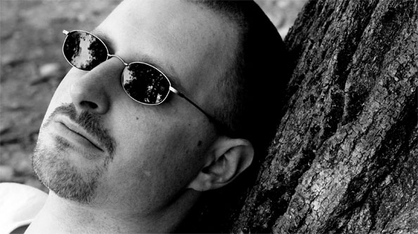
Since then I’ve taken a lot of photos of people. Most of them have been fairly reluctant to let me point a camera at them but glad they did when I show them the results. I’ve found that women are more difficult to photograph than men because they are more worried they will look awful which is a bit of a self-fulfilling prophecy really. If you are anxious about being photoed, the photo will inevitably look crap. This has proved to be the case with my mother. She has the ability to grin inanely in an alarming way that she only ever does when someone points a camera at her. I even managed to capture the stages of facial contortion that lead to the inane grin by taking four photos over the course of a second – normal, anxious having noticed the camera, attempting to form grin, GRINNING ANXIOUSLY.

sunglasses.jpg
Photo by Anna Badley

I suspect this anxiety people instantly develop when a camera is pointed at them is because of too many bad pictures taken in the past – rabbit-in-headlights, blinded by flash, cheesy grinning forced posing type shots that never see the light of day again. Let’s face it, there’s nothing like a crap portrait to knock your confidence about how attractive you are and photos can be horribly unkind because they catch you for the tiniest split second where you might be laughing and thus showing off your crooked teeth.

portraitsalma.jpgThere was a point to this post (I’ll get there in the end, honestly) and it was that as Christmas has just been and gone there are a lot of people out there who have been let loose with new cameras, or new lenses for old cameras. Basically, the world is not a safe place right now if you’re nervous about having your photo taken. However, for all those new camera owners, you might get a photo worth sticking on your wall if you try out these five things:
1. Try and shoot in daylight rather than indoors. This will stop the flash going off and giving people red eye. Red eye makes people look mental. Of course, if this is the aspect of their character you are trying to capture, then that’s fine.

2. Photograph one or two people at a time instead of trying to get large groups together; you’ll never get everyone smiling nicely at once and also big group photos rarely look good when printed because you have to stand further back to take them so everyone looks smaller and blurrier.

portraitjames.jpg
Photo by Haje Jan Kamps

3. Never ask anyone to smile. It never works because it makes them think about what their mouth is doing – disastrous. Tell them a joke or pull faces at them if you must, or take a non-smiling photo for a change. In fact, if you can catch them when they’re not aware you’re taking a photo that’s even better; for example if they are engrossed in doing something they enjoy doing. You could even take a photo of them from an unusual angle – from the back, perhaps? For the truly camera-shy, there is always the option of snapping them whilst they sleep. This is probably a bit ethically dubious, however, and you might want to show them the photos when they wake up and check they’re okay about it.


4. Timing. With a digital camera you can afford to get a bit carried away and blast off fifteen or so shots of one person on the off-chance one will come out right – a great way to learn what works and what doesn’t. There is no shame in this; even the professionals get a bit trigger-happy sometimes. You can also check the photos you’ve just taken to see if people have their eyes closed etc. which is a major bonus. However, whether you’re working with digital or film, it’s still worth watching and waiting for a potentially good shot and not just panicking and pressing the shutter button the moment you’ve got your victim (er…I mean model) where you want them. Talk to them a bit. Give them time to relax. Ply them with drink. Chloroform them if needs be (only kidding).

5. Failing all else, you can hide all sorts of atrocious things by changing your photos to black and white or sepia. This is very easy in digital – quite a lot of digital cameras actually have these options on the camera itself – sometimes under the manual settings. This means you can actually go all arty and shoot in black and white or sepia if the mood takes you. Not so easy in film of course – you have the options of starting off with a black and white film in the first place, or scanning your photos and adjusting them in an art package. Black and white is a wonderful way of hiding spots, disguising drink-related red faces…and getting rid of purple and pink anoraks.

Good lord I went on a bit there. Sorry about that. I’ll shut up now.

Some of the pictures in this article were taken by Haje, because Anna didn’t send me any before she vanished for her Christmas break. If you like her photos, why not check out Anna’s DeviantArt page or her Flickr stream?


Do you enjoy a smattering of random photography links? Well, squire, I welcome thee to join me on Twitter -

© Kamps Consulting Ltd. This article is licenced for use on Pixiq only. Please do not reproduce wholly or in part without a license. More info.

Framing and cropping your images

RishiriFuji3.jpg

lilies.jpgFor this issue of the Photocritic Photo Critique, we’re going far afield! Joel Legassie is a Canadian who is currently living in Japan, and is an avid photographer. His photos are sharp, stylish, and striking… So can we offer him any advice? 
 

Joel uses a I use a 6.3 megapixel Canon Kiss Digital (that’s the Digital Rebel / Canon EOS 300D to the rest of us), with the standard 18-55mm lens.

Photo 1:
lilies.jpg

Water flowers always make for amazing photography, and these Lillies are no different. Initially, the slightly damaged leaves to the left and top of the photo bothered me, but they actually grew on me – the autumnal colours combined with the deel greens and browns of the leaves make a very nice contrast to the strong reds and pinks offered up by the flowers.

The photo seems ever-so-slightly over-exposed: some of the leaves of the flower are a bit whiter than I woul dhave expected. This could be reflected sunshine (i.e the same problem as in our last critique), but I do expect this is a plain overexposure problem. It isn’t overly disturbing in this photo, but nevertheless it would be worth keeping an eye out for in the future.

From the EXIF information embedded in the file, I can see you shot the image at f/8 (a good idea, this is the aperture whee your lens is sharpest) and 1/50 sec shutter time. Personally, I think I would have liked that same photo seen shot with a 50mm prime lens, wide open. If you manage to get close enough to the flowers, that should actually blur out the background ever so slightly, bringing more of the focus on the flowers themselves.

lilies2.jpgThe main beef I have with this photo is that it is a little haphazardly framed. I can’t work out why you decided to put the flowers in the middle of the frame, with the ‘broken’ leaves towards the side. Personally, I have a dirty, dirty fetish, which is (I can tell you all can’t wait to find out…) to crop in tighter. Always closer in to the action. It’s a matter of taste, of course, and I fully respect if you decide to make a different choice, but if I had taken this photo, I would have gone in a lot closer, much like the mock-up crop shown to the right.
The only thing I have done here is to crop a rectangle constrained to an aspect ratio of 3:2 around the three flowers and whatever else came into the frame at that aspect ratio on the left.

Why? Well, for one thing, it gives the image a purpose, a direction, perhaps even a message. The contrast between the wilting leaves on the left, with their dark, decaying colours, against the hope of the pink flowers on the right appeals to me.

The final suggestion I would have made: If there was anyone around, you could have asked them to hold out an arm, a bag, or an umbrella to cast a shadow on the right side of the image. You want the flowers basking in the sun, but anything you can do to help the background be a little less conspicuous would probably be a good idea in this case.


Photo 2:
RishiriFuji.jpg

Joel sent me 4 photos, but I decided to choose another of his photos with flowers in it for the second part of this critique.

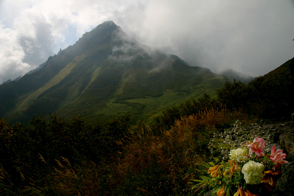
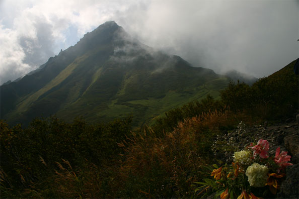
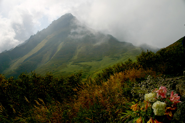
This photo is called RishiriFuji. My Japanese is non-existent, but I assume it means ‘mount fuji, and I totally live the idea behind this photo.

What you did wrong in terms of framing in the previous shot, you definitely did right here. The dimmed hazy colours of the mountain covered in gray clouds in the background is balanced out with the oranges, browns and multicoloured bouquet in the bottom right of the frame.

If I were to nitpick, I think there is too little going on to the right of this image, but it isn’t something that is easily fixed with cropping. Personally, I prefer either a 3:2 or a 1:1 (perfect square) aspect ratio for aestetic reasons, but there is no way you can crop this image using either of those without losing too much on the right, or cutting the top of the mountain off. This could have been addressed on location by taking a step back (making the flowers smaller in the image), moving the camera down (which would put the flowers just beneath the foot of the mountains), and then zooming in slightly (to re-establish the frame).

The other niggle I have about this photo is that I feel it is lacking in contrast, and a little bit too dark. The problem is that the lighting is very soft and even, and that upping the brightness by increasing the shutter time or opening up the aperture would have lost the moody feel of the image. You would have ended up with something like this:

RishiriFuji2.jpg

… Which completely ruins the beauty and subtlety of the original photo.

If you have a tripod, a flashgun and an off-camera flash lad, you could have tried to frame the image properly, expose the photo for the mountain, and then add a tiny dash of flash light on the flowers, just to really make them stand out in the image. Once again, you have to be really careful, as it is very easy to over-do the effect, but just the tiniest change would really draw more attention to the photo. I’ve simulated it here, but fill-flash is rather difficult in Photoshop, so do forgive me for not getting it quite right:

RishiriFuji3.jpg

I hope I got close enough to illustrate what I was trying to say, however!

Anyway, both these two pictures discussed here, and the ones you sent to me separately show a lot of care and interest in photography – I hope this critique serves as a push in the right direction!

The main message to take home, is that after each photo you take, think ‘what is my message’, and ‘what am I trying to achieve’. If the photo you just took doesn’t convey that message, or doesn’t achieve what you would have liked, try to identify why, and to take another photo which may address the issue at hand.


Do you enjoy a smattering of random photography links? Well, squire, I welcome thee to join me on Twitter -

© Kamps Consulting Ltd. This article is licenced for use on Pixiq only. Please do not reproduce wholly or in part without a license. More info.

Expose for the highlights...

Ben-Darfler-1.jpg

Today’s topic came about after I was sent some fabulous images from Ben Darfler, as part of our photo critique series. He sent me four excellent photos, and I picked two that illustrate a common theme: How to expose a photo correctly.

You would think that exposing a photograph correctly would be easy – you just point the camera at what you want to take a picture of, and let the machinery take over from there, right? Well, most of the time, that will give pretty good results, but if you have ambitions of developing as a photographer, manual exposure is where it’s at.

The way you choose your exposure is one of the biggest differences between film and digital photography. When photographing with film, you want your shadows to be drawn as well as possible; because of this, my high-school photography teacher would drone on about “Expose for the shadows; develop for the highlights.” Well, digital changed all that… 


Perhaps surprisingly, a digital imaging chip works much like slide film does: The more an area is exposed, the brighter it gets. Up to a point. Beyond this point, you get ‘burnt out’ images, where a larger area of the image is pure white. This is because your film is beyond its dynamic range. If you think of a film as a continuous light-meter gauge, (which it is, essentially), ‘burn out’ is where the light meter has gone off the scale: If you are putting water into a 1 litre measuring jug, and the jug is full, it will still read ’1 litre’, even if your entire kitchen floor is full of water.

Which brings us to the first picture:

Ben-Darfler-2.jpg

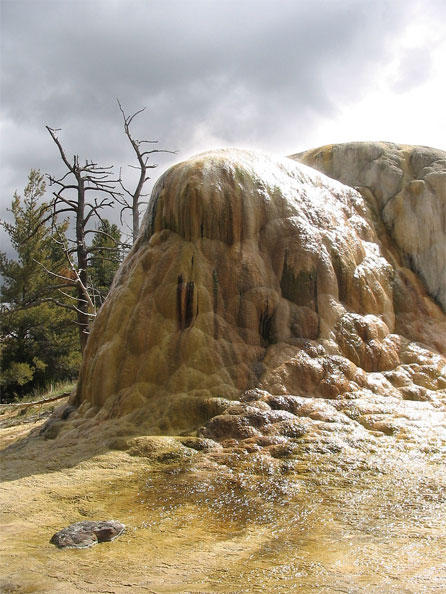
Thanks for submitting it, Ben! Right, in this photo, we have an awful lot of interesting things going on. The unusual shape of that rock, combined with the gnarly trees, the interesting sunlight, and the stream at the bottom are all competing for attention. My first advice, then, would be to tighten up the focus of your image. What was it that intrigued you about this particular scene? Why did you decide to take the photo? That is what you need to decide on, and that’s where your focus needs to be.

Composition

Personally, the barren-ness and the alien landscape appeals to me, while the evergreen(?) trees in the background draw my attention away from these particular aspects. Perhaps you could take about five steps to the left of where you were standing, and eliminate the green from the image that way?

hjk21.jpgThe second thing you could consider is if your cropping makes sense. There’s an awful lot of space at the top and bottom of this image that doesn’t tell a story. Why is it there? Walk, or zoom, in closer to get rid of it, or just chop it off in Photoshop. I’m all for negative space, so in this particular photo, I’d probably go for a square frame – like the crop shown to the right.

Sharpening

A little side note: When taking a closer look at your photo, I see that it’s sharpened quite a lot – either in-camera or with image editing software – to the point that it is actually quite disturbing to the overall image. You can see this has been done by the white ‘halo’ around the barren trees in the background.

Exposure / burned out highlights

The biggest problem in the photo is that you are plagued with serious burn-out on the rock, which detracts from the overall photo. This is a technical issue, not necessarily a creative one. If this image was in the beginning of your portfolio, and I were an art director or a gallery director, I’d close the portfolio right there and then, and send you on your way, instantly losing interest.

It’s a typical beginner’s mistake, and that’s why I’m happy you decided to submit this photo, because now I have an excuse to explain how you can avoid it!

Picture-42.jpgWhat you are looking at in the white areas, is the ‘burn out’ I started talking about in the beginning of this post. You can actually see it digitally too: Open up your photo in Photoshop, and choose “Levels” from the Image – Adjustments menu. You should see a curve which looks a lot like the one seen to the right of this paragraph.
Discovering overexposure

The Levels tool shows a graph of the presence of the brightness of the pixels in your photo. Left is perfect, pitch black, and right is complete, perfect white. As you can see from the graph, you haven’t got a single perfect black pixel, and a sharp spike to the far right of the graph. This indicates that quite a few pixels are ‘off the chart’ – which is why you can see the white stuff in your final image.

Many cameras have built-in histograms (that’s what that graph is called – on Canon cameras, click the ‘info’ button a few times, I’m sure Nikons have the same function), so you can inspect the tonal values of your photos in the field.

Avoiding overexposure

So, now that you know what the problem is and how to spot that something has gone wrong, how do you avoid it? The answer is in the title of this post: Expose for the highlights. In your case, I can’t tell from the photo what shutter time and aperture you used. The solution is simple: You should have used a faster shutter time, or a smaller aperture (ie. a larger aperture number). This makes the whole photo darker, which means that you capture more detail in the highlights. As you can see from your graph, however, you have no ‘black’ pixels, so no harm would have come from exposing the image a little less.

If you prefer to shoot fully automatic, you can force the camera to take a light metering from the lighter areas of the frame by aiming your camera at the lighter area, pressing the Exposure Lock button (marked with a star on Canon cameras, with EL or AE on some other cameras), then framing your image, and finally clicking the shutter to take the photo.

If you don’t wish to do that, you can use EV compensation to force your camera to underexpose, you can use AEB (Auto Exposure Bracketing) to hedge your bets on getting the right exposure, or – the most recommended option – you can just use manual exposure settings, check the result, and adjust accordingly.

Now that you have exposed for the highlights, you can use the Levels tool discussed earlier to bring out the detail in the shadow parties of your photos. You’ll be amazed how much detail is hidden there: Just open a few of your photos and play with all three of the sliders. The leftmost black point slider discards dark tone information from an image, the rightmost white point slider discards light tone information, and the middle mid point slider can be used to induce a bias towards bright or dark photos. For an excellent tutorial on what the Levels tool is and what it does, check out this tutorial over on the Cambridge in Colour site.

Can the photo be saved?

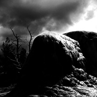
hjk22.jpgFor your particular photo, I don’t think there is a lot of hope of ‘saving’ it… Or is there? I had a play around with it. I turned it into Black and White (using the channel mixer), and increased the contrast ridiculously (by pulling the black point and white point sliders towards the middle of the histogram) – as seen to the right. It isn’t a great solution, but the result is striking, if nothing else.

Try a polarizer

Finally, in this photo, it appears that the highlights are, in fact, sunlight reflected of a moist surface. If I were you, I would have tried using a polarizer filter (more about those on the Luminous Landscape website) to see if you can filter out the reflections. If this would have been possible, you could have gotten away with this photo with similar brightness levels, whilst avoiding much of the reflected sunlight.

Learn more…

If you want to learn more about exposure, you’ll want to have a look at the Zone System (try Norman Koren’s website, or Wikipedia) – it is a tried and tested system explaining all of this in great detail.

Ben’s 2nd picture:

Ben-Darfler-1.jpg

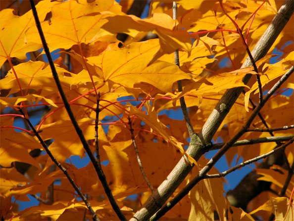
Ben, your second picture is – rather obviously – a drastic departure from your first shot. It has a limited depth of field, which leads the leaves and the branches in the background to be out of focus. This helps the foreground leaves get pulled in as the natural biewing points in the image – a very cool effect indeed.

I love the near-perfect chronographic opposition between the blue background and the orange leaves (open your image in photoshop, then invert the colours of the photo to see what I am talking about), and the lighting is perfect. As is the exposure, the framing is interesting, and there isn’t a lot to detract from the photo itself.

There isn’t much of a message in this photo – it isn’t a love note, an emotive photo, or anything like that, which means it won’t appeal to all people. It isn’t even very original: Sure, I could go out and photograph an image exactly like this on a late summer’s day, as could any other competent photographer out there, but – and here comes the important bit – that is not the point of this photo. It is a technically perfect photo with vibrant colours. If I had taken this photo, I’d have it printed out, and hung it on my wall. It’s one to be proud of.

How to spot faked images

shark-in-pool.jpg

If you’ve ever worked with Adobe Photoshop – or indeed any image manipulation package, you’ll know how easy it is to make small and big changes to a photograph. But do you know how you can spot if an image has been doctored or not? Do you know the difference between a doctored photograph and the genuine thing? 


There’s a knack to spotting if an image has been edited or not. Shadows are usually the first give-away, as is inconsistant lighting. If you suspect a person’s head may have been added to another body, look extremely closely at the skin tones, and gradations. Look at the fringe, and see if the background looks consistent, colour-wise, with the original. Finally, use common sense and don’t believe your own eyes – if something looks unnatural, take a closer look, and see if you can find out why it doesn’t look kosher.

These are but some of the suggestions made in oe magazine’s excellent article on photofakery. Not only does it help you spot edited photos, but if you know what to look for, you will also become a better photo editor and photographer yourself: Concentrate on the pitfalls, and you can eradicate many of them!


Do you enjoy a smattering of random photography links? Well, squire, I welcome thee to join me on Twitter -

© Kamps Consulting Ltd. This article is licenced for use on Pixiq only. Please do not reproduce wholly or in part without a license. More info.

Sharpening your photos using Unsharp Mask

39-2.jpg

The Unsharp Mask is an old photography trick that has become available to ‘the common man’ through the introduction of digital editing tools such as Adobe Photoshop.

In this article, I will share with you my knowledge and experience of the Unsharp mask tool in the darkroom, and also a thorough introduction to its digital name brother, the Photoshop USM filter. 

The name

Traditionally, the sharpening process happened by adding a mask to the original negative. This mask was a blurred (unsharp…) version of the negative, hence the name; Unsharp mask. The final result has nothing to do with unsharp; the whole purpose of this technique is to make an image appear sharper than the negative can convey

Digital USM

So – if you have no idea how to sharpen your photos in a dark-room, why should you care about doing so on a computer? Well, because the computer does the exact same thing, and – despite what you would expect – the computer doesn’t do it better than someone competent in the darkroom. However; The computer offers you the option of a quick undo, which will cut down the learning time a lot.

In this writeup, I’ll be focussing (pun intended) on how things are done in Photoshop – The newest version at the time of writing, to be exact. I am aware that Gimp and Paint Shop Pro can do the same things, and if anyone wants to node the specifics for these packages – feel free.

However; If you are serious about photography, you are not going to get around photoshop – PSP and Gimp are good for a lot, but Photoshop is the industry standard, and it is the package I have been using for years and years (illegaly for ages, legally the past two years or so). If you can get your hands on a copy of PS Elements or PS LE, both of theses should have fully functional USM filters built in, and they are not quite as expensive as the all-singing, all-dancing full version.

(Learning time? But isn’t this a simple tool?)

The USM built into digital image manipulation packages is an extremely powerful tool. If you ask me, it is the reason to own Photoshop (well, that, and levels. And Variations. And CMYK separation tools. And colour proofing tools. Ah, never mind), but like all other powerful tools, it also makes it possible to thoroughly fuck up an image.

On what images to use the USM tool.

Always. Seriously. Even if you only apply it lightly, I have yet to see a picture that didn’t benefit from a run through USM. All digital files need USM applied to them. Even if you have a tack-sharp image on a medium format slide, you will need to apply USM after digitising the image. Why? Because you do; Inherent in the digitalisation tools (digital cameras*, scanners, etc) is a loss of apparent sharpness.

Not convinced how much of a difference USM makes? Check out these before and after images…

39-1.jpg

39-2.jpg

Digital cameras and USM

If you feel that you are photo-savvy enough to use the USM tool on a regular basis, you should have a close look at your digital camera. Usually, there will be a setting in a menu somewhere that says “sharpness” or “sharpen”. You’ll want to turn this down as much as it’ll go. Why? All consumer / prosumer digital cameras sharpen the images in-camera. Why? Because the average consumer only sees the pictures that come out of their camera, and if those images are soft, they will run to the manufacturer and complain, out of ignorance. Sad, but true.

Professional cameras (Canon EOS D30, D60, Nikon D100 and the higher-end models) don’t compensate as much, and also offer the option to turn the sharpening off altogether. This is A Good Thing, because it leaves the photographer with full control. And photographers are control freaks (especially anally-retentive perfectionist photographers), so that’s sweet.

When to use USM

When working on an image, you probably have a long series of steps that you go through. Myself, I always do all basic editing (image corrections, manipulation etc) first, then I apply USM, and then I handle the colour corrections. Most design professionals will tell you to do the USM last, while most photographers will make up their own rules (being photographers and all…). The order DOES matter, as the USM filter is destructive (kinda like JPEG compression algorithms), and you will notice a difference in behaviour of the other filters and corrections you do. Give it a try, and see what you prefer yourself.

How to apply the USM filter.

Open a file in photoshop – the larger the file, the better (the more data the USM filter has to work with, the better.) When I am working on seriously high-precision project, I will first take the 6-megapixel image from my camera, interpolate it up to about 18 megapixels, then do the editing and unsharp mask, before scaling it back down. It might be superstition, but the results do seem to look a lot more refined.

Right – after opening the file, crop it. Then, go to Filter -> Sharpen -> Unsharp mask. You should now see a relatively innocent-looking window with three little sliders, marked A, R and T. Amount; Radius, and Threshold.

Let’s start with the last one first. Threshold. I usually leave this on 0, and so can you, most of the time. However, if you have an image with large amounts of noise (esp. if you are working with digital files that have been made a lot brighter, or taken on a high digital ISO value), you might want to set this to somewhere between 1-5. This also prevents small details from being accentuated. On a portrait, for example, using a high threshold might make skin look smoother (than if you didn’t set the threshold), but the hair of the model will not come out as sharp as if you didn’t set a threshold. As I said; I usually leave this on 0, but if you ever need it; Now you know what it does.

The radius is a sneaky thing. In general, the more pixels the picture has, the larger the radius. You’ll want to get sharp images, but not overly so. On a 6 megapixel image, I usually set the radius between 3 and 6 – but it all depends on what you want and need. Experiment. Also, if the image is more blurry than normal, you’ll want a higher radius. If your image is sharper than normal (i.e has already been sharpened in your camera), you might want to use less. To find how to set the radius, set the amount to 100 %, the Threshold to 0, and experiment. Then, set the threshold, and see if you are still happy with the image. Then tweak the amount:

The amount of USM applied is a function of the threshold and the radius (see below). This is usually the last slider you set. In general, the amount should be between 50 – 150 per cent.

When you are happy with the way the image looks, press ‘OK’, and the whole image is processed. Never – EVER – run USM on an image twice. Wanna know why? Try, and you’ll see. It just looks horrible.

For starting values of the USM filter for different uses, try the ones suggested by PhotographyJam:

Subject Amount Radius Threshold
Soft subjects 150 1 10
Portraits 75 2 3
Moderate sharpening 225 0.5 0
Maximum sharpening 65 4 3
All-purpose sharpening 85 1 4
preparing for Web 400 0.3 0

Advanced use of USM

Right, now you know how to use the basics of USM, but what else can you do with this tool? Lots. For one thing, you can make a ‘fake’ idea of depth of field: Make a loose selection around the items you want to be in your virtual DOF. Then, ‘feather’ the selection a great deal (selection -> feather). If you are working on full-size files, somewhere between 20 and 60 px feather should do it. Then, apply an USM mask. This sharpens the parts of the image you selected, while leaving the non-selected portions intact. This looks a lot more natural than blurring everything else in the image.

Variable USM: every now and then, you’ll find that an image that has USM applied looks good on one side, but not on another. Hit undo (undo the USM), and duplicate the layer you are trying to USM. Then apply the USM to your new layer. Make a layer mask, and put a gradient fill in this layer mask (or use the same feather technique as above). This way, a portion of your layer will become translucent, but your original layer will still show through. This offers the illusion of a partially implemented USM, which looks pretty damn funky.

Manual USM

Remember what we said about photographers being control freaks? Well, here goes nothing: If you want to manually do an USM filter on your images (either to learn and understand how it works, or for full control), here is a quick and dirty way on how to do it. I am not going into details here – if you are pedantic enough to want to try this, you are probably able to work out how to implement every step, too!

  • Make sure your image has a contrast you like. Adjust levels and colours.
  • Duplicate your image into a new layer, two times (the ‘background’ layer will be your backup and reference, so you can see the changes by hiding the top layers)
  • Blur the top layer a bit (1.5 – 10 px, depending on resolution. 3 is usually a good start)
  • Lower the brightness and contrast (approx 25 should do it).
  • Subtract this image from your original (Image – Apply image – set source to original, and mode to subtract). This should leave uou with just the unsharp mask.
  • Move the unsharp mask layer to the top.
  • Invert the unsharp mask layer.
  • Set the channel mode of the unsharp mask layer to multiply.
  • Merge layers.
  • Fix levels / brightness.
  • Congratulations.

The strength of the manual mask can be controlled through the amount of blur, the contrast of the layer, and the opacity of the layer. You get an infinite number of toys to play with here – enjoy!

If anything still is unclear (pun intended), feel free to email me!


Do you enjoy a smattering of random photography links? Well, squire, I welcome thee to join me on Twitter -

© Kamps Consulting Ltd. This article is licenced for use on Pixiq only. Please do not reproduce wholly or in part without a license. More info.

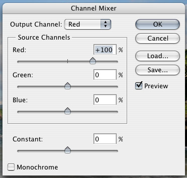
Colour to BW using channel mixer

06-21.jpg

Yeah, I know… It isn’t as if it is rocket science. You press apple + U, and the picture is nice and de-saturated. However, this also means that you have no control whatsoever about the final result of the image. Instead, a little bit of knowledge how RGB colours work will allow you to create some pretty impressive black and white photos from digital files… 


01.jpg

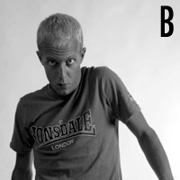
When you de-saturate (apple + shift + u, or image -> adjust -> de-saturate) this picture, this is what happens:

02-1.jpg 02-2.jpg

Yes, it is a black and white picture, but – if you ask me – it isn’t particularly exciting – and definitely not anywhere near a piece of art. To make this picture even remotely interesting, we have to change the way of turning the picture into black and white.

If you have worked with coloured filters to improve your black and white pictures before, you know what I am talking about; The coloured filters block certain colours from hitting your black and white film, thereby enhancing your photograph. This, then, is the secret: When you shoot in colour, you can add these coloured filters later! This is the reason why, even if you digital camera supports taking black and white pictures, you always should shoot in colour.

03.jpgThe best way of turning a picture like this into black and white, is to use something called the channel mixer – one of the lovely functions found in Photoshop, or indeed most image editing apps.

You find the channel mixer in the in the Image menu – here you find a submenu called adjustments. In this menu, you find some of the most useful commands in Photoshop. Among others, you find the Levels tool (I will do a separate tutorial on this tool before too long), a curves tool (incredibly useful, especially for print work), the de-saturate tool (already mentioned above), and – if you have a quick butcher’s down the list, a Channel mixer.

The Channel mixer is your Friend. Trust me on this. When you open the channel mixer menu, you find something along the lines of the illustration to the left.

The channel mixer can be used for adding great effects to colour pictures as well – such as changing the red and blue channels and stuff like that, making colours really wacky, turning the ocean red and the skies green. Stuff like that – I suggest that (after you finish trying out the stuff in this tutorial, of course) you play more with the channel mixer later.

For our purpose, however, we will check the Monochrome checkbox. This changes the output channel from Red (or green or blue) to gray. This means that now you are mixing the three channels (RGB) into one channel. Of course, this is basically what de-saturation does. Except now you have the option of controlling how it is done: The three sliders are there for you to decide how much of each channel is taken into consideration when converting the three channels to black and white (i.e. mixing the channels. Hence, Channel Mixer.).

On the picture below (marked with R, G and B) I have used 100% blue, green and red, to illustrate the difference between the different channels. Because the sky is largely blue, it appears whited out in the blue channel (see the part of the picture marked "B"). In contrast, the palm tree (which is quite red) will have a lot of dark colours in the blue channel, yet a lot brighter in the red channel.

04.jpg

When turning people into black and white, the differences can be even more surprising – and effective:

05-1.jpg


05-2.jpg 05-3.jpg

In this image, using the red channel makes the model unhealthily pale-looking. Using exclusively the blue channel, however, makes him look ridiculously tanned. Basically, this is what the tutorial is all about: Combine the different shades of the colour image, in order to get the exact effect you desire.


In the next example, we combined 60% red, 10 % green and 20% blue to make the black and white edition.

06-1.jpg 06-2.jpg

For women, the red channel is a highway to fair skin (small blemishes – being red, normally – completely disappear), while for men, using the blue channel usually lifts up the facial characteristics. For people who have really faint freckles, pulling up the blue channel a bit will enhance the visibility of the freckles. I once photographed a model who – when she saw the images – claimed I had painted on freckles. I denied, and sent her to a mirror. She was 24 years old, but it took a Photographer and some Photoshopping for her to realise the first time in her life that she actually had freckles!

Now that you know what the different channels do, you will want to start experimenting with the settings, so we can turn the images into black and whites the best possible way.


Do you enjoy a smattering of random photography links? Well, squire, I welcome thee to join me on Twitter -

© Kamps Consulting Ltd. This article is licenced for use on Pixiq only. Please do not reproduce wholly or in part without a license. More info.

Making food look yummy

Picture-3.jpg

Picture-3.jpgI know we’ve featured Still Life With… once before, but they deserve another mention, for being so damn good. This time, they’ve made a fabulous little guide to how you can make food look good, by using creative lighting techniques.

The great thing is that the tips and lessons learned from this post don’t just apply to food – it works excellently for all sorts of stills photography in a studio setting.  


Trainers, fruit, pens, bottles of ketchup, it all makes no difference: Stills photography is stills photography. Food poses its own challenges, of course, and it’s a good thing they are addressed in this article. Personally, I love food, but that’s beside the point: the tips offered are transferrable skills, and I particularly like to pick up new ideas and hone my skills by being challenged to new forms of photography – so why not food?

By using a “show and tell” approach, Still Life With manages to both show you what looks good, explain why it works, and finally take you through the motions of how you can copy the ideas yourself. It’s worth having a look at their Lighting Positioning: Shooting in the Kitchen either way – you won’t regret it!


Do you enjoy a smattering of random photography links? Well, squire, I welcome thee to join me on Twitter -

© Kamps Consulting Ltd. This article is licenced for use on Pixiq only. Please do not reproduce wholly or in part without a license. More info.

Intro to digital photography

Picture-24.jpg

Picture-24.jpgOne of my old mates pointed out that the DIY network has a surprisingly thorough introduction to digital photography.

It appears as if the article series is mostly just a transcript or summary of a television programme, but the articles are very well written, interesting, and have a series of “further reading” links. Although I knew all of this before, I just wasted an entire afternoon reading all the links. Highly recommended, in other words :)


Do you enjoy a smattering of random photography links? Well, squire, I welcome thee to join me on Twitter -

© Kamps Consulting Ltd. This article is licenced for use on Pixiq only. Please do not reproduce wholly or in part without a license. More info.

Try food photography!

photo_ingredients.jpg

photo_ingredients.jpgIf you thought portraiture was difficult, think about how perishable hot foods are. When you photograph it, you’ll want it looking fresh, happy, steaming, and appetising. A normal photo shoot – where you photographs something to perfection – takes a few hours, but the food will only remain good-looking for about 10 minutes at the most.

So what do you do? God knows, I’ve never tried. But my new friend L over at Still Life With laid down the gauntlet… 


This month, I got inspired by Chez Pim’s post a week ago about “the ugliest food photo ever.” It’s stunning that a professional actually published this photo of Tuna Tartare in the New York Times, taking what sounds like a decent recipe and making it look just awful.

Of course, because this was a food article in the NYT, it also included a recipe. The challenge is obvious: Make the food (see, I knew there would be a DIY element to this, even though it is a food DIY rather than a photography DIY), and then take a photo that doesn’t look disgusting.

Read the challenge over at L’s blog, and then get cracking! If you get any good results, tell her, and me too!


Do you enjoy a smattering of random photography links? Well, squire, I welcome thee to join me on Twitter -

© Kamps Consulting Ltd. This article is licenced for use on Pixiq only. Please do not reproduce wholly or in part without a license. More info.

Removing the IR filter from an SLR camera

Picture-2.jpgThis one falls in the “if you are planning to do this, you have to hate your SLR” category. If you enjoyed our earlier tip about IR photography, you will probably have noticed that many cameras – especially DSLR cameras – have IR filters built into the body. Obviously, that means that you can’t use it for IR photography. Unless you remove the filter, that is… I wouldn’t dare do it to my own camera, but if you have a destructive streak (or very steady hands), you could follow the instructions posted on this page. It concerns the Canon EOS 350d, but the procedure should be similar for most camera brands:

1) Take the whole thing apart 2) Locate the IR filter 3) Remove the IR filter 4) Put the whole thing back together again

Hey, we never said it was going to be easy!