News

Getty takes a huge leap and makes millions of images free to embed for non-commercial use

Overnight, Getty Images has announced some big news for small users of images: a large selection of its image library will opened up for free use in non-commerical contexts. Photos will be made available using an embed code that credits the photographer and links back to Getty. Following from Getty's metadata deal with Pinterest in October last year, this is a clear indication that Getty has realised that the photographic landscape has changed and that in order to stay ahead of the game—where images are now common currency—it needs to evolve its models and practices.

As Jonathan Klein, Getty's co-founder and CEO put it: 'Whether via a blog, website or social media, everyone is a publisher and increasingly visually literate. Innovation and disruption are the foundation of Getty Images, and we are excited to open up our vast and growing image collection for easy, legal sharing in a new way that benefits our content contributors and partners, and advances our core mission to enable a more visually-rich world.'
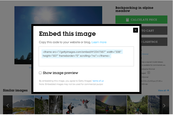
Getty's new embed feature

Not all of its images will be embeddable, however, and photographers won't be given an opt-out. If you license your images via Getty, it's Getty which decides if they're to be free-to-use or not.

The two questions people are likely to be asking then are: how does this benefit Getty and how does it benefit photographers?

In many respects, it's the same answer for the two different questions. Images were already being used without a licence or without a fee being paid. Getty and photographers were fighting a losing battle, especially when images were used by small-time blogs and non-profits. By introducing a means to track use and ensure accreditation for free-to-use images, they can control their content better. It also opens up the possibility of monetisation options at a later date. The theory goes that it's better to give away something when you've little hope of making a profit from it, but keep tabs on it, than it is to try to keep content locked up but have it stolen and roaming free anyway.

When your pictures are being used legally for free, it makes it easier to ensure that they're paid for when they should be, too. Don't forget, this deal only covers images that are put to non-commercial use. Getty still want their fees from commercial enterprises.

However, I do anticipate a great many photographers being unhappy if not that their images can be licensed for free in non-commercial contexts, but that they don't have the opportunity to decide how their images can and cannot be used. It rather flies in the face of the notion that we don't work for exposure. I expect that from Getty's persepctive, it needed to be an all-or-nothing approach to ensure that the new venture got off the ground. Regardless, Getty will always demand its pound flesh, whether from image users or image makers. It might be a risk, but it's certainly a calculated one that Getty expects will reap dividends.

You can check out the embed feature here and ensure that you're making correct use of the free-to-use model by checking Getty's terms and conditions.

The art of scientific photography at the Cambridge Science Festival

The Cambridge Science Festival opens on Monday and as part of its incredibly diverse and packed programme, it has teamed up with the Royal Photographic Society (RPS) and Dr Stefanie Reichelt, a scientist at the University of Cambridge's Cancer Research UK Cambridge Institute, to focus on the science of photography and the promotion of scientific photography. They're providing a range of talks, lectures, demonstrations and exhibitions, with something that should appeal to everyone. Saturday 15 March will be devoted to the subject of imaging and imagery. It starts with a talk asking just how many megapixels you really need and precisely how many do you really get and ends with a talk about developing the imaging tools of tomorrow. This goes via talks on colour vision, high- speed photography, medical imaging and images, 3D and stereo imaging, and whole lot more. The Camper Obscura will also be on-site that weekend. Yes, as its name suggests, its a camera obscura in a camper van.

As well that day devoted to photography, there are other events related to images taking place over the course of the festival: the life sciences poster and image exhibition, the Inspiring images: engineering captured on camera exhibition, and a digital recreation of the earliest known colour photographic technique and an exploration of what happens when you collect the different elements of the colour spectrum separately.

All of the details of all of the events are available on the Cambridge Science Festival website. Specific details about the photography-oriented events is here. You don't need to book and the talks are free, but it is requested that you register for the morning or the afternoon session.

Maybe I'll see you there?

Photo-sharing app EyeEm launches EyeEm Market - a sales platform for mobile images

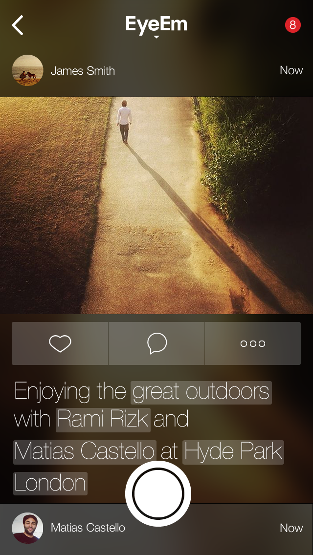
Before Instagram hit the app store with its mission to square crop all of our photos and apply one of a dizzying array of filters, there was a Berlin-based start-up called EyeEm that was offering mobile photographers the opportunity to share their images and get to know each other. Instagram might've grabbed the headlines and the Facebook swag, but EyeEm didn't go anywhere. EyeEm quietly grew its network of users to over 10 million and concentrated on helping them to get the most out of their mobile photography with challenges, blog post tutorials, competitions, and allowing mobile photographers to connect with each other. That's paid off and it's allowed EyeEm to start on its next venture: EyeEm Market. It's what it sounds like, a stock house for mobile images on EyeEm. EyeEm users were invited to join by email this morning and the plan is to launch in late spring 2014.

left_photo_view

Terms for members have already been set out: 'You always remain the copyright holder of your images and make 50% net revenue from each photo you sell.'

While EyeEm hasn't disclosed the details of the potential buyers it has approached, it's confident that it could be helping its users to take their first steps into a new branch of the professional image market. To that end, it's published some image guidelines for those who are hoping to make some sales. This includes no pets, no plants in pots, and no selfies (unless they're particularly unusual); and to concentrate on the holy trinity: business, health, and family. Not forgetting geo-tagged landscapes and images that can be hard to otherwise get.

Is this another nail in the coffin of professional photography, showing how everyone can now be a photographer and make money from their smartphone cameras? Regard the situation from one stand-point, and yes, that is exactly what EyeEm Market means. But think about it from a slightly different perspective and it demonstrates how the image market place is changing.

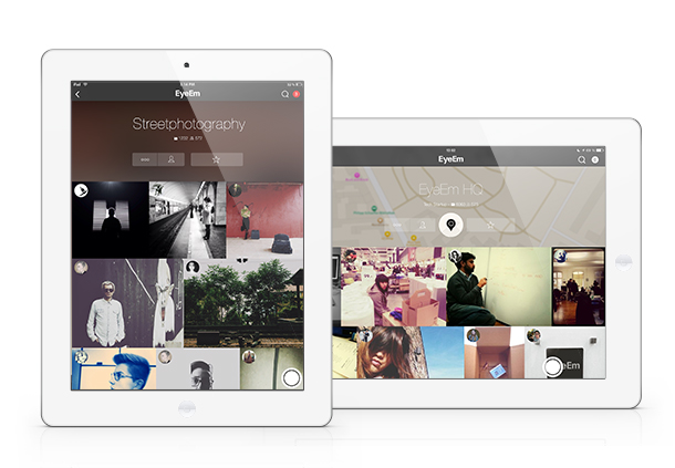
EyeEm on the iPad

Photo-buyers want mobile images. They're part of the photographic landscape now—part of the zeitgeist, if you will—and we can't put the genie back in the bottle. Instead, we have to embrace it. If we can present photo-buyers with an adequate means of accessing and paying for the images that they want, there's a chance it will drive up quality and ensure that the creative industries are rewarded adequately. It's a damn sight better than images being used without recognition and without recompense because there's no means of buying them.

We can't ignore the market; we have to seize all the opportunties that it presents.

And EyeEm has seized its opportunities and shown that there's more than one way to make a buck from photo-sharing apps.

More editing power for Google+ on Android

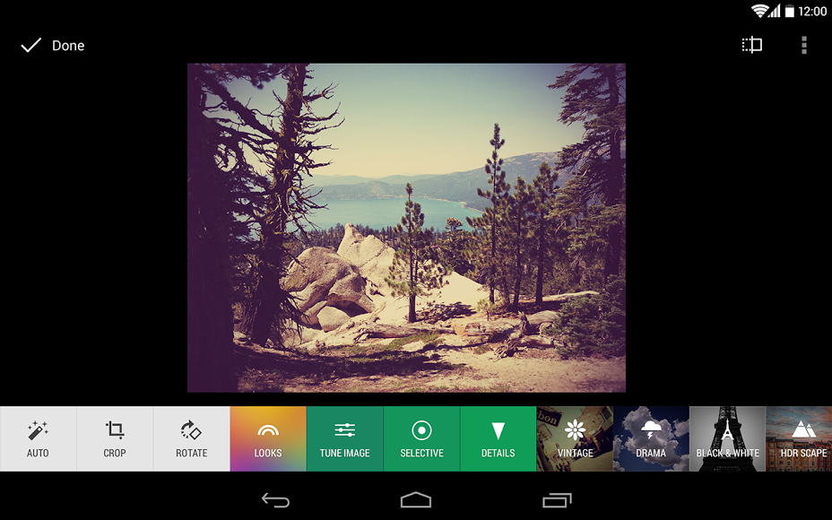
Google has introduced some Snapseed-like editing tools to its Android version of Google+ today, as well as what it calls 'non-destructive editing in the cloud' and new ways to view your images. The updates to the editing tools themselves are fairly basic: crop, rotate, one-touch filters, and enhancements that are familiar to Snapseed users, for example Retrolux and HDR-scape. They're the sorts of tools that you'd expect in a basic editing suite. 'Non-destructive editing in the cloud' is a touch more exciting, however. While it might be a horribly cumbersome term, 'non-destructive editing in the cloud' should make for a far more integrated photo-editing and sharing experience for Google+ users. It is designed to allow users to edit their images across different devices, and being non-destructive, start over if required. This means you can start to edit a photo on your desktop at home, continue your processing on phone on your way to work, and finish it off at your other-half's on their tablet. If you decide you don't like what you've done at any point, you can revert to the original before sharing on Google+.

New tools for editing in Google+ on Android

As for the new ways to view images, the 'All' view allows you to see all of your photo library, whether on the device that you're using or backed up to the cloud, and you can sort them by date. If you've tens of thousands of images, you won't be seeing all of them in the 'All' view yet, but they're on their way.

Whatever you think of Google+ as a social network, it's always worth keeping it in mind as an image storage solution, especially with this integrated approach to editing and filing. You don't have to share your images there if you don't want to.

(Headsup to Engadget, further details from Todd Kennedy at Google)

Juxtaposition: London past and present in pictures

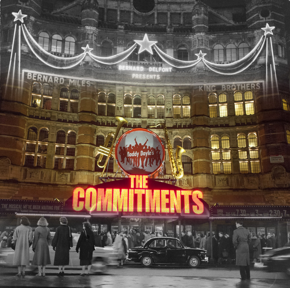
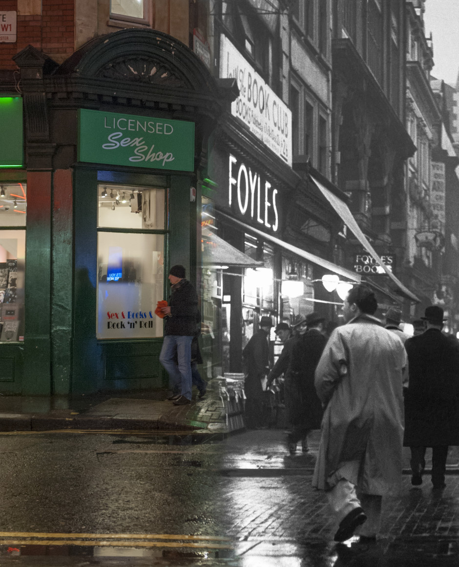
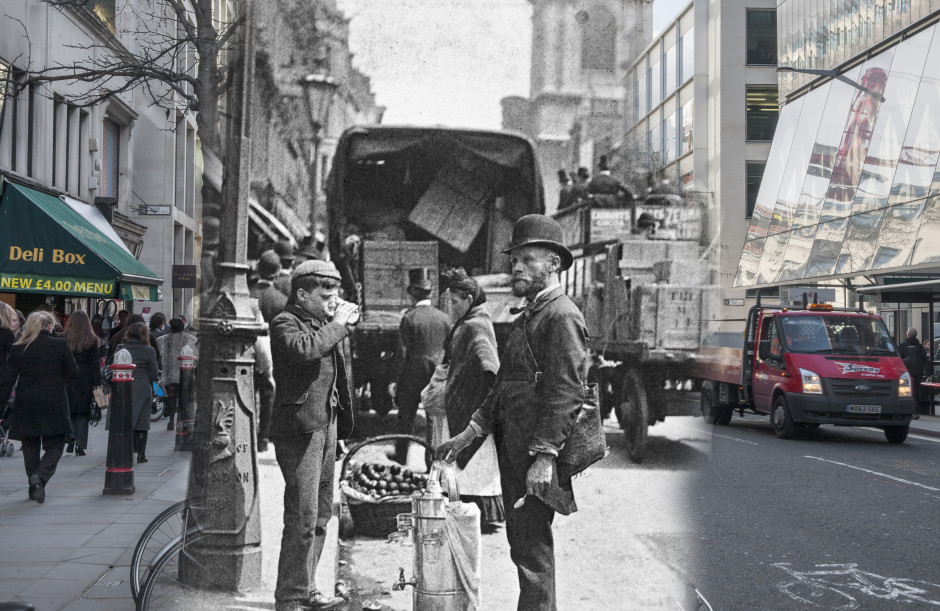
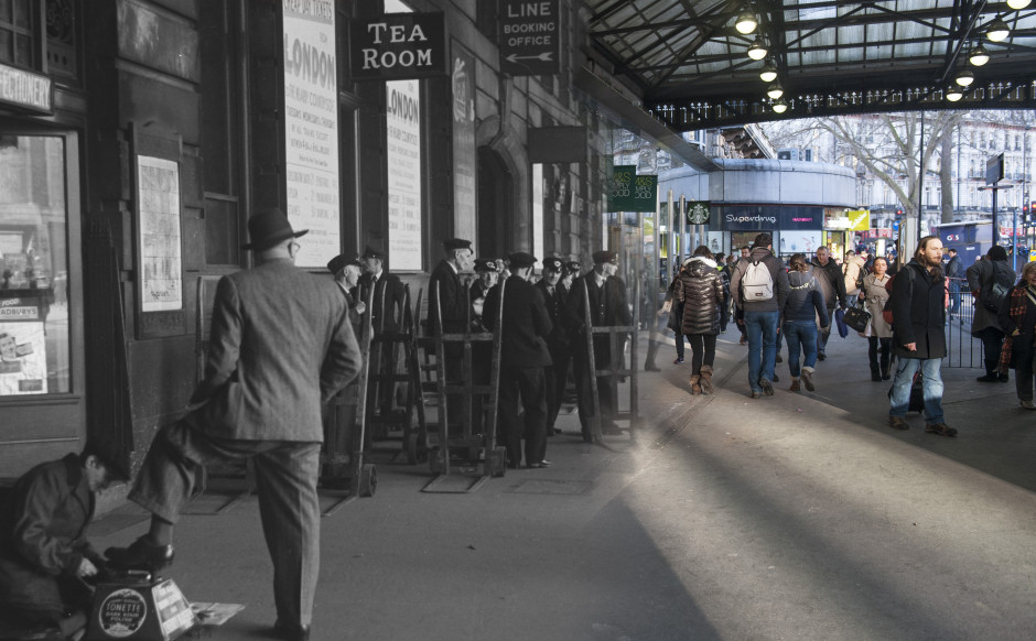
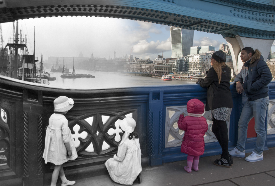
I'm a big fan of the Museum of London. It panders to my penchant for Romans, hosts very interesting exhibitions, and has a great app to guide you around the city itself: Streetmuseum. To mark the launch of version 2.0 of Streetmuseum, the museum has released 16 gorgeous, ghostly images of the city, merging past with present. You can look over the Thames from Tower Bridge, from the 1920s on the left and the 2010s on the right; or stand on the corner of Long Acre and Neal Street (just about where Marks and Sparks is now), looking towards Covent Garden Tube station, 2010 on the left, 1930 on the right. It's wonderful to see how much London has, and hasn't changed. Palace Theatre, 1958, Bob Collins. A night shot outside the Palace Theatre on Shaftesbury Avenue, before an evening's performance.

The new version of the app has had 100s more city locations added to it, meaning that you can select a destination from a London map or let yourself be geo-tagged to your present location. Then a historical image of London will appear on your screen and you can expand it to learn about where you are. Most of these are in central London, but some are in its outer reaches, too.

Charing Cross Road, c.1935, Wolfgang Suschitzky An evening street scene outside Foyles book shop on Charing Cross Road, c.1935.

The photos range in date from 1868 to 2003 and were taken by photographers including Henry Grant, Wolfgang Suschitsky, Roger Mayne, and George Davison Reid.

Cheapside, 1893, Paul Martin. A street seller of sherbert and water is photographed  on Cheapside completely unawares of the camera.  Paul Martin was the first photographer to roam around the streets of London with a disguised camera taking  candid pictures such as this solely for the purpose of showing 'life as it is'.

The app is free to download to your iPhone and is available now.

Victoria Station, 1950, Henry Grant.

Tower Bridge, c. 1930, George Davison Reid

MWC review, with a photographic bent

All the big announcements have been made, now it's a case of rounding up and winding down from the Mobile World Congress held in Barcelona this year. There have been a few new smartphone announcements and some interesting apps have come to the fore that might interest photographers. Here's a swift review. S5

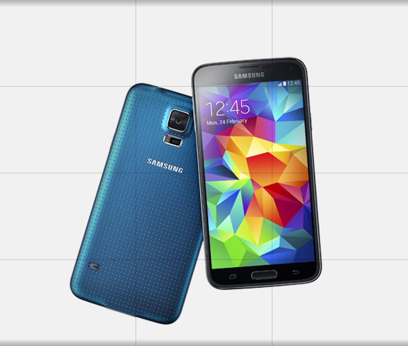
Samsung Galaxy S5

The big news is that this one is waterproof. No more worrying about whipping it out to take a photo in the rain. The S4 had a decent 13 megapixel rear-facing camera, which has been bumped up to 16 megapixels in the S5. The front-facing camera still sits at 2 megapixels. It can shoot 4K video at 30 frames-per-second and comes equipped with HDR and selective focus functionality.

Post-shot focusing means that the camera takes two photos every time you release the shutter and you can choose from a background that's in or out of focus. Samsung reckons that the S5's auto-focusing speed is super-fast, at 0.3 seconds.

It also comes equipped with a reflector-integrated flash LED. What's that mean exactly? Supposedly it will ensure a wider field of view better, allow for better photos, whether day or night, and should mean that everyone in a photo, not just those in the centre of the frame, are illuminated by the flash.

The S5 is due to go on sale in April this year and will cost in the region of £550.

xperia-z2-hero-white-1240x840-3e10d78449d87fa41b4b9126a53ff806

Sony Xperia Z2

This one is also waterproof. It also has a higher resolution count than the Samsung Galaxy S5, with a 20.7 megapixel, 1/2.3-type Exmor RS for mobile CMOS image sensor, and is capable of recording 4K video and enjoys SteadyShot image stabilisation, too.

The Z2 comes pre-loaded with a bundle of camera apps, including timeshift video (a slow-motion effect); creative effect; background defocus; AR effect (augmented reality effects); and Vine4. There's also a dedicated camera button to help when you're shooting underwater.

The Xperia Z2 should be available in March 2014.

Nokia-X-Dual-SIM

The Nokia X-series

Nokia announced its X-series of phones, which run Android rather than Windows. The X, X+, and XL are budget phones and they appear to have cameras to match. There's nothing as exciting as the Lumia or PureView technology going on in these.

Lenovo's DOit apps

As well as a new tablet, Lenovo unvelied five new apps that aim to make your digital life easier by simplifying data management. Called the DOit apps, they break down to: SHAREit, SECUREit, SYNCit, SNAPit and SEEit. SHAREit, SNAPit, and SEEit (the proliferation of caps is getting tiresome now) are those of interest to photographers, with SHAREit there to transfer data, including images between devices easily.

SHAREit comes preloaded on all new Lenovo Android tablets and smartphones and can be downloaded for free from Google Play. Come February, it will also be available for download from the Apple App Store for iPhone/iPad, as well as for Windows PCs.

SNAPit and SEEit are intended to work in tandem: SNAPit being a camera app and SEEit the gallery app. The camera app gives you a selection of functions including panorama and burst mode; the gallery app lets you categorise photos with the help of facial recognition software and has the now-to-be-expected gamut of filters and effects. These, however, are Lenovo-only.

CamMe

Most Innovative Mobile App: CamMe by PointGrab

CamMe is a gesture-controlled remote shutter release app for use with iOS devices. From a distance of upto 16 feet from the phone, you can raise you hand, make a fist, and trigger a three-second timer. You can also use CamMe to take photo booth-style selfies, with three shots arranged in a film-strip.

It's free to download from the App Store.

Screen Shot 2014-02-26 at 13.44.24

UK's most innovative mobile technology company: Seene

Seene allows you to capture, view, and share 3D images from your iPhone. Why might you want to do that, you ask? Well the Seene team see it as great tool to help with 3D printing, or as a superior means for people to view products online.

Seene is free to download from the App Store.

Ember looks to light up iPhone photos

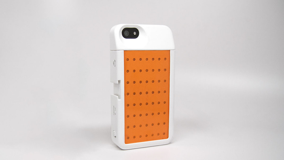
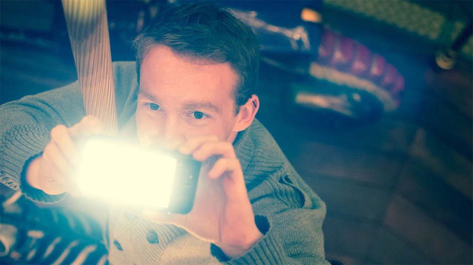
In December last year we featured a Kickstarter project called Lightstrap, which aimed to bring better lighting to smartphone photos. About a week into the campaign, Brick and Pixel, the team behind Lightstrap, pulled the plug on it citing that a better offer had come along. While quite a few people were disappointed by this decision, it has proved to be something of a small mercy for Ember, a new night photography tool that is looking for Kickstarter backing. Ember slides over your smartphone like a case. It comprises 56 LEDs and a diffuser, with the ability to adjust its brightness using a slider and a range of filters to control for light temperature. This should make for more evenly lit photos that don't wash-out people's skintones or give them evil red eyes.

Ember onthe iPhone 5

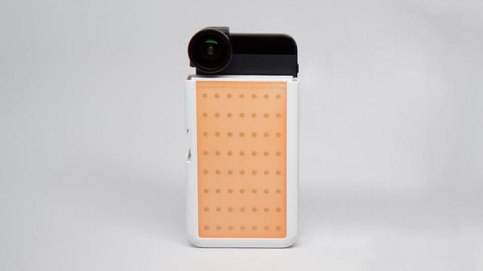
By removing the top of the Ember case, it's possible to continue to use add-on lenses, for example Olloclip or Moment. It's charged through a micro-USB port, making it independent of your phone's battery, and capable of providing light for about four hours of shooting.

Compatible with additional lenses

Embers are only iPhone 5 and 5S compatible, which is a shame for any other type of smartphoneographer; it's not as if we don't take photos or would appreciate some better lighting options. If, however, you're an iPhone 5 or 5S owner and interested, you can help make the Ember happen with an early-bird Kickstarter pledge of $59. Should you miss out on that level, it's $79 for one Ember.

Adjustable brightness and filters for colour temperature control

Ember needs to raise $30,000 to make it a reality; with 25 days to go, it's raised just over $4,000. At this rate, it's touch-and-go if it makes it.

Canon's rumoured withdrawal from the compact market is no great loss

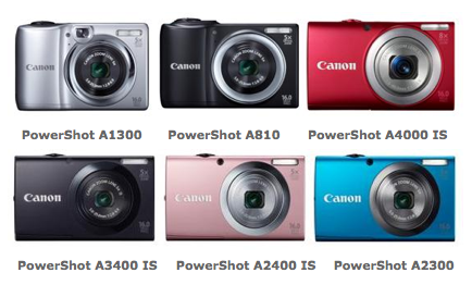
It is only a rumour, but there are suggestions that Canon will soon cease production of lower-end, sub-$200 point-and-shoot cameras. Given the steady erosion of compact camera sales and their inability to compete against the convenience and ubiquity of the smartphone, it's hardly surprising. It's also a step taken already by Olympus by Fujifilm. And just as we stated in the cases of both Olympus and Fujifilm, this is a good thing. By my count since January 2012, Canon has released twelve IXUS model cameras and ten Powershot A-series cameras. These are typically regarded as its cheaper and cheerier models. They tend to range between £80 and £180, although the odd few come in much higher than that, have more than enough megapixels to keep the pushiest salesperson smiling, a decent optical zoom range, the ability to record video, and sometimes are blessed with image stabilisation. Unlike Canon's dSLR range, which comprises a controlled range of cameras with clear spec expectations at given price-points, it's verging on the impossible to discern one compact model from another. Their variations in spec are so slender that they all merge into one rainbow-coloured haze.

Of course consumers need to choose between six almost-identical cameras

Herein is their downfall. First, they're not something that you'd go out to buy when you have a wirelessly connected smartphone in your pocket. There's not really enough value-added to justify the outlay. Second: when there are so many different cameras with so little to differentiate one from another, it's little wonder that consumers' eyes glaze over and they decide to stick with what they now know: their iPhones and their Samsung Galaxys. Choice is a good thing, but sometimes offering too much choice, without making obvious why it's needed, is self-defeating.

Let's not forget, that little tot-up of cameras didn't include any of Canon's Powershot SX range, which covers the superzooms, its D-series rugged cameras, the S- and G-series, which are its high-end compacts, and the quite-frankly-ridiculous N-series.

If anything can convince you that Canon really ought give up on the definitely-fled smartphone crowd, it's the N-series of cameras. They smacked of desperation, of designers under pressure to produce something 'young and funky and with-it' in an attempt to recapture a market long since gone, and engineers who'd rather be working on any other project than that one. Yes, they are out of the 'sub-$200' bracket of cameras that are expected to be axed, but they have no place in the range, either.

By relieving itself of the burden of the cheap end of the compact camera spectrum, Canon can refocus its attentions on the areas where there is hope, where there is potential, where there really is a market. Most definitely on its dSLRs, that seem to have gone off of the boil ever so slightly of late. Perhaps on its higher-end compact cameras, which are still selling and I believe show that compacts do still have a place in the canon of cameras, but could benefit from some innovation and development. And maybe even in the mirror-less division, where the EOS M has been so painfully disappointing.

This shouldn't be regarded as a move of panic or despair on Canon's part. I actually think it's rather mature. It shows how it might be beginning to analyse the market, to identify its strengths and weaknesses, and to come to terms with the idea of an evolving photography world.

Slidestrap: a simple and stylish camera strap

I'm not a great fan of the strap that came with my camera. For a start, who wants to walk around advertising their camera make and model to all and sundry? It's a siren to wannabee muggers that I have an expensive piece of kit on my person. 'Oh yes! Do come over here and relieve me of thousands of pounds-worth of photography gear. I don't mind at all!' Neither is it especially practically designed. Usually, I sling my camera across my body, which means that a 70-200mm protruding from my hip is uncomfortable and has the potential for damage, either to the lens itself or someone or something else. And there's an awkward moment of readjustment when I bring my camera to my eye. Lazily, I've not done anything about this yet. I suppose it's an 'I've coped for this long, so why change my habits now?' mentality. But there's a Kickstarter project in town that might convince me to get my credit card out of my wallet and get a new strap.

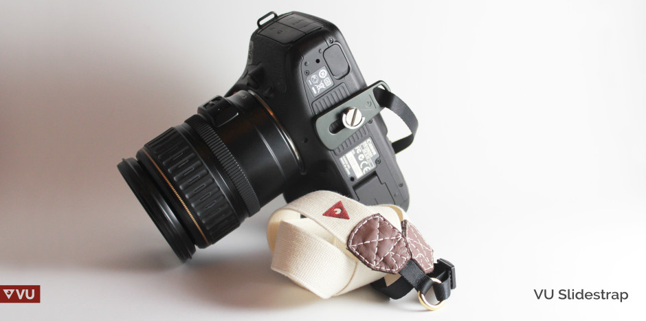
VU's Slidesrtrap

It's called the Slidestrap and it has been developed by Glasgow-based start-up VU Equipment. They couldn't find the strap that suited them (or me): not covered in repeated corporate logos or bright patterns, simple and didn’t require constant adjusting, yet made from high quality materials. The solution? To design one themselves.

The Slidestrap has been designed to be worn across the body but without the need to readjust it to take a photo: just slide the camera along the strap. Its mounting plate ensures that lenses are carried downwards and not outwards, making them less vulnerable to knocks and scrapes. And it's made from cotton and leather: hard-wearing, comfortable, but understated.

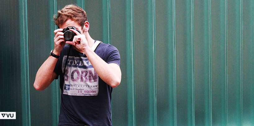
From hip to eye in one slick movement

With 17 days to go the project is 78% funded. With a Slidestrap pledge valued at £29, it needs another 73 backers to get it underway. I hope it makes it.

Student Focus finalists of the Sony World Photography Awards announced

After the finalists of the Sony World Photography Awards open and professional categories were announced last week, this week the ten Student Focus finalists have been unveiled. The Student Focus competition aims to support both up-and-coming photographers and the institutions where they study. It isn't just about the prizes—new cameras for all of the finalists and €35,000 of equipment for the winning student's university—but about the workshops, tutorials, and networks that it brings to them. This year, Student Focus entrants were asked to submit a single image conforming to the brief 'Tomorrow's news'. Ten of those have been selected to go through to the final and complete a second assignment.

Jens has ADHD, by Tor Birk Trads, Danish School of Media (Finalist, Student Focus, 2014 Sony World Photography Awards)

  • Argentina – Nadia Navarro, Al Aire
  • Bangladesh - Rahul Talukder, Pathshala South Asia Media Institute
  • China - Li Dandan, Nanjing University of the Arts
  • Denmark – Tor Birk Trads, Danish School of Media
  • New Zealand - Chloe Riddell, University of Auckland
  • Romania - Sebastian Vacariuc, Babes-Bolyai University
  • South Africa – Russell Bruns, Rhodes University
  • South Africa – Tara Mette, Stellenbosch Academy of Design & Photography
  • United Kingdom – Scarlet Evans, Central St Martins
  • USA - Jordan VanSise, Marylhurst University

Next up: compile a series of images titled Self-portraits. They've all been awarded brand new Sony A7s for making it this far, and they must use them to create the self-portrait series.

Liu Yuanhuang, by Li Dandan, Nanjing University of the Arts (Finalist, Student Focus, 2014 Sony World Photography Awards)

All of the finalists, together with their university tutors, will be flown to the awards ceremony in London in April and their work will be exhibited at Somerset House along with the other awards' finalists.

Men doesn't hide their women side anymore, by Nadia Navarro, Al Aire (Finalist, Student Focus, 2014 Sony World Photography Awards)

Bazaart: easy mobile image compositing with a social side

It started as a Pinterest-based fashion catalogue, but Bazaart's users saw a different potential in the app's capabilities and were more likely to be making collages with it, and not-necessarily fashion-related ones either. Like many good entrepreneurs, Bazaart's founders spotted this trend and rolled with it; as a consequence, they started to pivot away from fashion and towards creating a Pinterest collage-maker. Since then, Bazaart has continued its movement away from fashion and away from Pinterest. It's now a fully-fledged photo editor for iOS. Bazaart is now an editing programme designed to compile composite images from those on your mobile device's camera roll, together with a social sharing element. Once you've turned your brother's head into a beer bottle or given your girlfriend a bed of butterflies, you can share your composite with other Bazaart users, diverting it into searchable channels, for example 'funny' or 'art'.

Compositing made easy with Bazaart?

Tap on any photo and it breaks it down into its component images; you can follow people whose work you particularly like; and you can engage with other users. There are other mobile compositing apps out there, but they don't come with the social features of Bazaart, and that's what its founders are aiming for. They want people to think of Bazaart as a social Photoshop for the masses.

Search for other images, follow other users

Since it completed its pivot to social photography in June last year, Bazaart has enjoyed 250,000 mobile downloads, and has 100,000 monthly active users who have created over 350,000 composite images using more than 2 million photos. It's free to download, but only available for iPhone and iPad running iOS 7, or at least until the end of 2014, when the developers hope to have an Android version up-and-running.

Professional-looking web portfolios from Picmoo

If you're not looking to host your own photo website, there are plenty of photo portfolio building and hosting sites there to do it for it you. Breaking into the market might not necessarily be easy but Vlad Mereuta, a former BBC tech lead, thinks that his new platform, Picmoo, is different enough to turn some heads. For a start, there are no multi-option pricing plans. Sign up for Picmoo and you pay a flat fee of £6.99/€6.99/$9.99 a month (when billed annually; £8.75 a month when paying month-to-month) for everything that Picmoo offers, and that's quite a bit.

Picmoo provides unlimited pages, galleries, and blogs; if you subscribe to an annual subscription, a custom domain is thrown in, too.

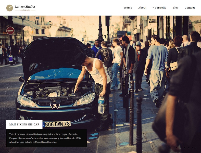
The Lumen gallery template

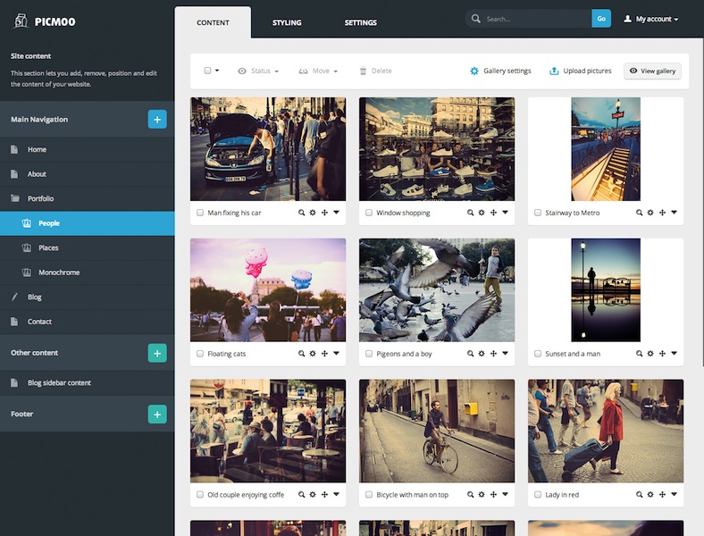
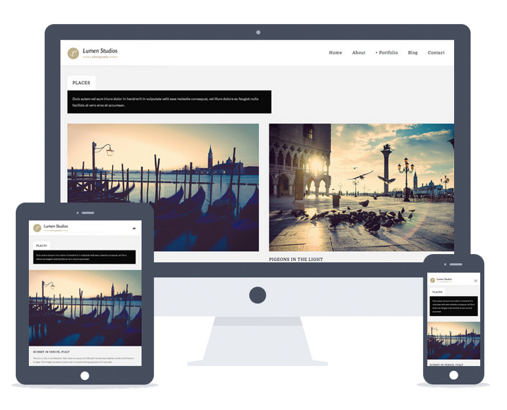
At the moment, subscribers can choose from five mobile-friendly templates for their galleries, with another seven designs in the pipeline. All of these templates can be customised from colour, to typeface, to margins to get the look that you want. When you've settled on that, arranging your content is a drag-and-drop affair.

Drag-and-drop gallery arrangement

Images can be uploaded directly from Adobe's Lightroom using Picmoo's plugin and there's integration with the likes of Flickr, 500px, and Twitter for easy cross-posting. If you're looking to migrate from a different platform, Picmoo has import tools to help you out.

Templates are responsive

I think that Picmoo offers anyone who's trying to show off their images and blog a bit on the side a very reasonable option. If you're looking to start or switch, there's a free 15 day trial to see if it's for you.

Finalists of the 2014 National Geographic Traveller Photography Competition announced

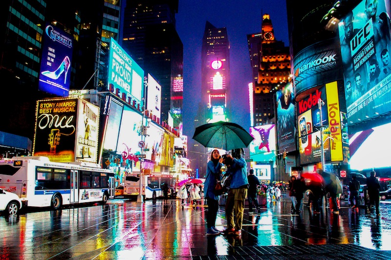
Six stunning photos have been selected as the finalists in the 2014 National Geographic Traveller Photography competition. The winner is due to be unvelied on Saturday, at the Telegraph Outdoor Adventure and Travel show. One photo from each of the six categories—action, city, iconic, modern, natural, and people—has been selected to vie for the overall title, bringing together images of beautiful birds and famous clippers.

Pat Riddell, National Geographic Traveller's editor, was delighted by the number and quality of entries to the competition, which opened in September: 'Once again, we've had a great response to our annual photography competition, and the creativity and photographic quality has been fantastic. Thank you to all those who entered.'

Jonathan Carvajal: The Colour Run, Columbia (Action)

Lynda Cosgrave: Times Square in Blue (City)

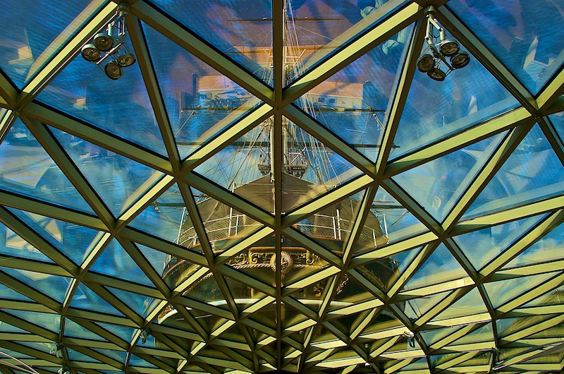
David Stearne: Cutty Sark, Greenwich (Iconic)

Jenny Downing: Oslo's Opera House (Modern)

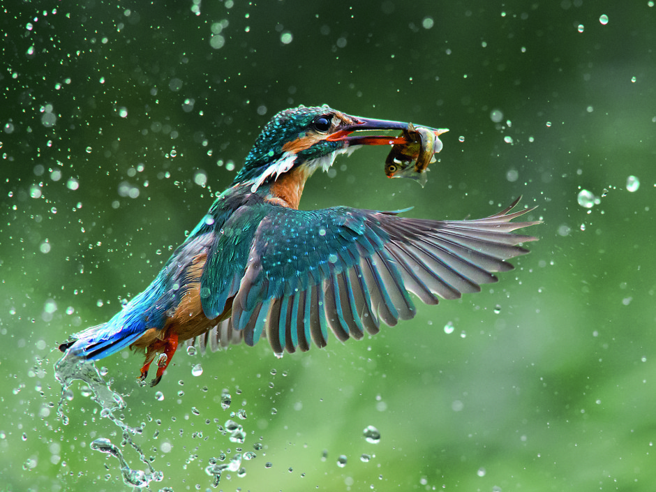
Jaimie MacArthur: Kingfisher in Norfolk (Nature)

George Turnbull: Girl at Angor Wat, Cambodia (People)

2014 Sony World Photography Awards shortlist announced

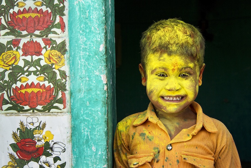
The shortlist for the 2014 Sony World Photography Awards has been announced, having been narrowed down from some 139,000 submissions by photographers from 166 countries. This year the winning entries, together with the grand prize of L'Iris d'Or will be announced on 30 April at an awards ceremony in London. All of the winning images will be on display at Somerset House from 1 to 18 May. To give you a taste of what's on offer, here's a selection of the shortlisted photos, from the Professional, Open, and Youth categories. Yellow Fellow, by Anurag Kumar (Open Category: Smile, 2014 Sony World Photography Awards)

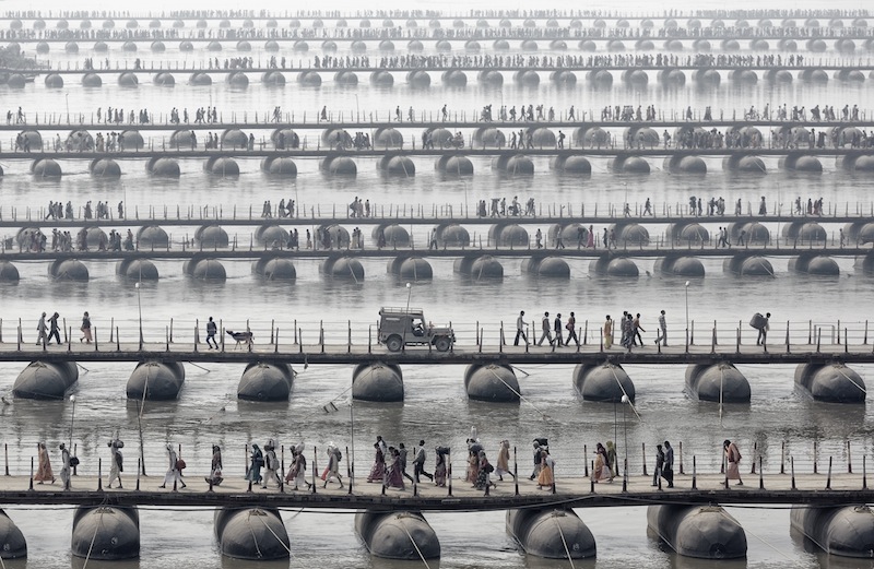
Samsara, by Wolfgang Weinhardt (Open Category: Travel, 2014 Sony World Photography Awards)

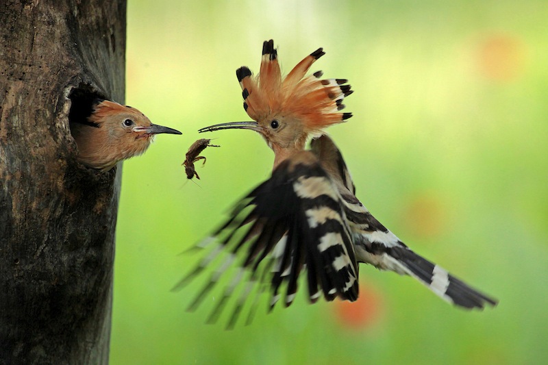
I took this photo in August in my Summer holiday. I went to a small lake near my grandparents' house to take some shots about the landscape, but first I noticed a large amount of water bugs on the surface of the water. I used long shutter speed to render the movement of these interesting insects.

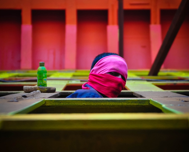
Shariful Alam, a ship painter works at Shagorer Dock at Shadarghat Ship Building Yard works hard till morning to dawn.

Image 1 from the Sparkle Baby series, by Chloe Bartram  (Professional Category: Arts and Culture, 2014 Sony World Photography Awards)

Untitled image from the Beards and Birds series, by Wilfred Berthelsen (Professional Category: Travel, 2014 Sony World Photography Awards)

Bailey's Stardust at the NPG

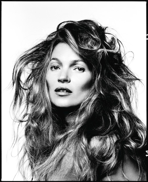
Bailey's Stardust, an exhibition of over 250 of David Bailey's portraits, opens today at the National Portrait Gallery, London, where it takes up virtually all of the ground floor. Kate Moss by David Bailey, 2013

Organised thematically rather than chronologically, the exhibition is based on the notion of stardust: we all begin as dust and we all return to dust. Lesser known portraits will feature alongside some of Bailey's most iconic work, juxtaposing fame, fortune, and glamour with famine, poverty, and despair. The Rolling Stones, London's East End, Papua New Guinea, and East Africa in 1985: it's all there.

From the series Nagaland by David Bailey, 2012

Bailey will be making new silver gelatin prints of his black-and-white portraits especially for the exhibition, showing off photographers, actors, writers, musicians, filmmakers, fashion icons, designers, models, artists, and people encountered on his travels.

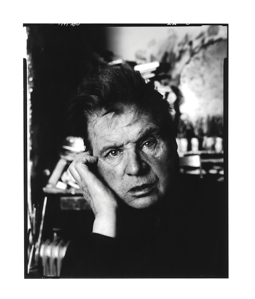
Francis Bacon by David Bailey, 1983

The exhibition, sponsored by Hugo Boss, runs from 6 Fenruary to 1 June 2014 at the National Portrait Gallery, London.

The Photography Show - a quick run-down

When Mary Walker announced that after 20 years co-ordinating Focus on Imaging she thought it time for a change, it was Future Publishing that stepped into the breach to fill the photographic trade show spectacle-type hole in our lives. Future's called their incarnation of mayhem, madness, cameras, and consumerism The Photography Show. The Photography Show is running from 1 to 4 March 2014, opening at 10:00 each day and shutting up shop at 18:00 on the first two days and 17:00 on days three and four, held in halls 11 and 12 of Birmingham's NEC.

Should you want a few highlights of which companies will be setting up a stand, rather than having to wade through the entire list, I've pulled together one for you!

3 Legged Thing Adobe British Institute of Professional Photography Calumet Canon Carl Zeiss CaseLogic Daymen (they'll be exhibiting Lowepro and Joby products) Fujifilm Future (obviously) Giotto's Gitzo Hasselblad Hoya Kenko Kenro Lastolite Manfrotto Nikon Olympus Panasonic Ricoh Samsung Samyang Sigma Slik SmugMug Tamron Tokina Velbon

and The Ilex Press. Seeing as they publish my books, they also twisted my arm to go along for a day and hang around to talk Composition, Surreal, and Social.

Of course, these are the edited highlights. There's a great deal more on offer, from specialist insurance providers, a wealth of photo book printers, colour calibration firms, and, well, pretty much anything pertaining to photography. If you want all the details, its on the Photography Show's website.

Faith: new lighting stands and tripods

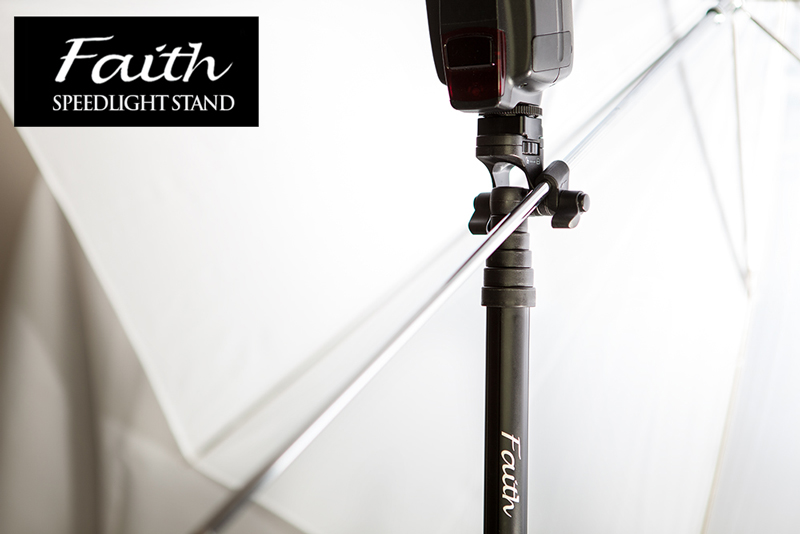
Inspired Photo Gear, the guys behind the lightweight and cute-looking Lollipod, have launched a similarly lightweight and easy-to-erect lighting stand and two tripods that can also be extended in a flash. The Faith lighting stands use the same 'pull to erect' system that the Lollipods do, but are a little more versatile than their smaller siblings, which can also be used to mount flashes. The Faith stands have an integrated umbrella holder, a cold shoe, and a concealed spike should the ground be on the soft side.

Faith SpeeLight Stand by InspiredPhotoGear

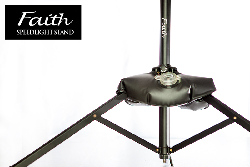
If you need to stabilise it, there's a pocket in the case bag. Just add water and it should keep things steady.

Faith SpeeLight Stand by InspiredPhotoGear

The Faith lighting stand weighs 540g, can hold up to 2.5 kg, has a maximum height 180cm, but folds down to 41.5cm for carrying purposes. It'll cost you £50, which is US$83, €61, or AU$96, and can be ordered from the Inspired Photo Gear online shop.

When it comes to tripods, there are two models on offer: smaller at £150 and bigger at £250. Either can both be erected in under six seconds, so I'm told, owing to their Flash Lock mechanism: pull the leg out fully and it will activate the auto lock function. It should take just 0.6 seconds to extend each leg and around 5 seconds to setup the entire tripod.

There's even a demonstration video to show just how fast you can erect one:

The larger tripod has a maximum height of 148cm and folds down to 39.5cm; it can support upto 30kg, and weighs 1.55kg. The smaller tripod also extends to 148cm but folds down to a more compact 33cm, weighs a slightly lighter 1.05kg, and consequently is capable of supporting 20kg. I'm not sure that the extra 10kg is worth the £100 difference in price, especially when the smaller tripod is more compact and lighter, too!

These, too, are available from the Inspired Photo Gear online shop.

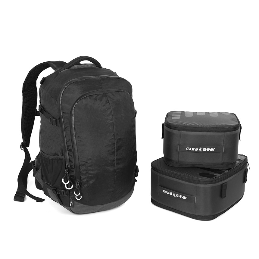
Mix and match with the Gura Gear Uinta

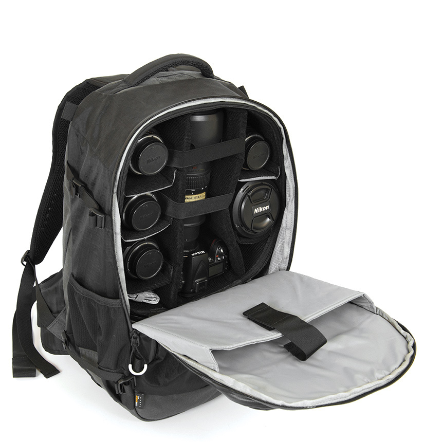
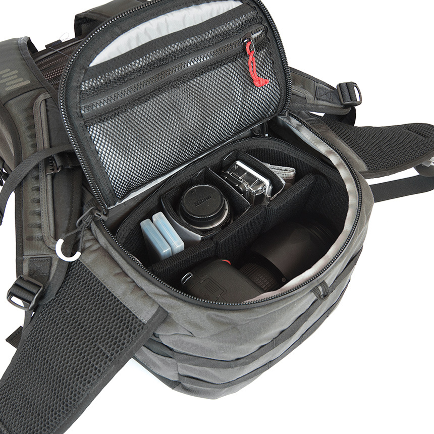
Gura Gear has launched a modular camera bag that you can chop and change depending on how you're planning to use it that day. Whether you're out for a day's street photography, a up-hill and down-dale hike, or a walk with some photography, the Uinta is intended to meet your needs. In addition to the bag, you can purchase modular inserts to secure your kit. Depending on how you want to use the bag, you can configure the modules appropriately. As well as the modules there's an additional Tripod and Hydration System, and the bag has multiple access points, is weatherproof, and has space for a 17" MacBook.

Camera gear + laptop sleeve

As for those mix-and-match modules, they'll let you:

  • Maximise camera storage using both the medium and small modules
  • Carry plenty of camera gear towards the top of the bag in the medium module and pack other necessities in the bottom of the bag
  • Take just a few pieces of camera equipment with the small module and use the rest of the bag for your other gear. The small module fits top or bottom in the bag, letting you distribute the weight as you need to
  • Use no modules at all and just use the bag as a bag

With one module

The bag alone costs £120; the small module is another £43, the medium module will cost an extra £55. For the bag and both modules, you'll pay out £217. For the entire kit-and-caboodle, including the Tripod and Hydration system, it's just over £241. What do you reckon, is Gura Gear's Uinta worth it for the flexibility, or on the over-priced side?

Bag + modules

If you fancy one, you can check it out on the Gura Gear website.

Instafax: BBC news via Instagram video

Here in the UK, you'll hear the BBC referred to as 'Auntie'. There are a few different explanations flying around for the moniker, but the consensus is it derives from the slightly prudish and reserved, 'Auntie knows best' attitude that the corporation had in its early days and well into the 1950s. Now, 'Auntie' is far more a term of endearment, and it can't really be said that the Beeb doesn't innovate. Over the next month the BBC is experimenting with delivering news via Instagram, a venture it's calling 'Instafax', a reference to the late departed text news service, Ceefax. Three times a day it'll post a 15 second video to its BBC News Instagram account.

The videos feature news footage overlaid with text and a music backing. Even if you can't listen, you can still access the salient issues before following through to the full story on the BBC website, or moving on to the next image in your Instagram feed. I've noticed some commenters have found the text a distraction from the footage and would prefer a more news-dense voice-over. I'm going to whisper this because it probably makes me some kind of new media pariah, but I'm not a fan of video content as I find it instrusive. The Instafax hybrid seems to be compromise and one that I like. As BBC person put it:

The idea behind not having a voiceover is that you don't have to have the sound on to understand the video. Additionally, it significantly cuts down on the amount of time the videos take to produce. If we decide to continue producing these after one month, we may consider having both a voiceover and on-screen text.

Why three videos a day? No one wants a feed overwhelmed with BBC news stories.

Doubtless someone, somewhere will be lamenting the demise of longform journalism and decrying the dumbing down of the news, but I'm rather impressed by the BBC's diversification and willingness to embrace social media. It's a pilot that I'd like to see taken up. You can keep up to date by following the BBC's Instagram feed.

(Headsup to DesignTaxi)

Just a fantasy or an unrealistic depiction of perfection? Dunham, Vogue, Jezebel, and now Leibovitz

I don't watch Girls and I don't read Vogue, so the recent controversy involving Girls' Lena Dunham and her appearance in the glossy magazine failed to catch my eye. However, when Amateur Photographer reported that Annie Leibovitz is threatening legal action over the unsanctioned publication of the shoot's original image files, my interest was piqued. Dunham appeared on the cover of, and inside, American Vogue's February edition (we weren't treated to her here in the UK) in a shoot by Annie Leibovitz that raised plenty of eyebrows and plenty of questions. Some people were perplexed by the apparent clash of principles when a feminist role-model could appear in and on the cover of a magazine that is famed for its stylised and heavily post-produced shoots. Other people wondered why Vogue had opted for a head-and-shoulders shot of a woman known for not being the archetypal Hollywood stick-instect, rather than the usual full-body shot for its cover. And some people just worried about the Photoshop job.
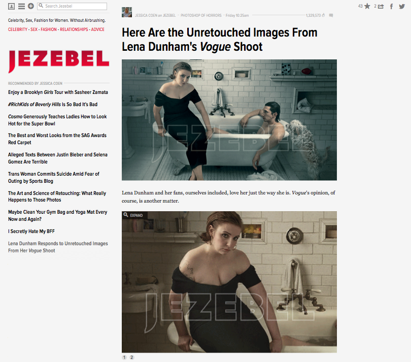
One of the publications most vocal about Dunham's dalliance with Vogue was Jezebel, the feminist blog. Jezebel is highly critical of Vogue's use of idealised, unrealistic images of women that are presented as objections of perfection. While it supported the notion that Vogue could feature a woman who was not its usual front page fodder, it was critical of Dunham being tweaked to make her acceptable for that role: 'Dunham embraces her appearance as that of a real woman; she's as body positive as they come. But that's not really Vogue's thing, is it? Vogue is about perfection as defined by Vogue, and rest assured that they don't hesitate to alter images to meet those standards.'

Jezebel then offered a bounty of $10,000 for Leibovitz's original, unedited image files of Dunham so that it could do a compare-and-contrast. From Jezebel's perspective, this wasn't intended to shame Dunham or criticise her for working with Vogue, although even if it wasn't intentional it's still easy to construe it that way. It's a topsy-turvy version of damning with faint praise. When Vogue is renowned for its fantastical presentation of women, why pick on Dunham's shoot to explore how far it will go if it isn't intended as a criticism of her actions?

Nevertheless, Jezebel got what it asked for.

Compare and contrast

Someone, somewhere, produced the original images and Jezebel was able to lay them side-by-side with the edited versions. Were they extensively retouched? Retouched, definitely. Extensively? That depends on your definition of the word. There's a whole lot more adjustment going on there than I'd make to one of my photos, but I don't shoot for the cover of Vogue and I'm not in the habit of photographing TV stars with pigeons on their heads or posing on the sides of baths wearing evening gowns. As Dunham said to Slate: 'A fashion magazine is like a beautiful fantasy. Vogue isn't the place that we go to look at realistic women, Vogue is the place we go to look at beautiful clothes and fancy places and escapism... '
The furore of whether Dunham should or shouldn't have posed for Vogue, whether or not she's betrayed the feminist ideals that so many seem to have ascribed to her, and just how much alteration the images have undergone has now taken a new twist. For Annie Leibovitz is reportedly extremely unhappy that the unretouched images have made their way to publication and is considering legal action. Precisely what legal action she intends to make, against whom, is unclear. But sources close to Leibovitz claim that she would never have sanctioned the publication of the original images. Vogue has declined to comment and Jezebel has stated that it obtained the images via an anonymous source.
What do I think? I studied history at university. Then I trained to teach it. And I taught it for a bit, too. I'm often asked how I can bear to watch historical dramas without picking holes in their accuracy. My answer is always the same: 'It's a story, not reality.' I don't advise that anyone should take medical advice from a BBC hospital drama, either. When I glance at Vogue, or any other glossy magazine, I treat it in much the same manner. It's a fantasy that deserves the same suspension of disbelief as a film or TV show. It doesn't matter if it's Vogue or Homes and Gardens, it's not reality. When you've resurfaced from your dive into stylised perfection, that's what you need to remember.

(Headsup to Amateur Photographer)