Opinion & Editorial

Shutter Magazine's crumbled Chinese wall between editorial and advertising

Whenever I read a magazine—which I do, actual dead tree publications, usually involving food, I'm a sucker for food magazines—I always find myself skipping over the pages that are discreetly marked 'Advertisement' towards the top or the bottom of the page, but that look suspiciously similar to editorial content. I don't need the gushing exultations of PR people telling me how wonderful, life-changing, and revolutionary a product is; it's the publishing world's equivalent of the infomercial. I'm far more interested in a reviewer's impartial and honestly held opinions. That's rather the point of buying a magazine or subscribing to a blog. It sticks in the throat a bit when you realise that some publications are entirely prepared to, and will even solicit the exchange of money to run copy covering products that masquerades as a review. You read what people have to say because you trust them (or in some cases because they provide a cracking laugh), not because they've been paid by a manufacturer or developer to say it. You might expect that some review models or copies would have been provided gratis for the purposes of the review, but that goes with the territory.

The exchange of money is a slightly different prospect.

When the delineation between editorial and advertisement disappears, how do you trust what the publication says at all? Where does real end and the sunshine and rainbows existence of advertising executives start? My throat is currently jammed up like a beaver's dam because that's exactly what happened when Shutter Magazine approached Triggertrap to feature it as its 'Editor's Pick' for September.

For the fee of $2,000, Shutter Magazine was prepared to endorse Triggertrap's Flash Adapter as a monthly 'Editor's Pick', which would include a full page editorial review of the product, a hi-res image of it, and a video review hosted by Sal Cincotta, Shutter Magazine's publisher. I've taken a very close look at Shutter Magazine and nowhere do I see any previous 'Editor's Picks' labelled as advertisements or paid-for content. Furthermore, it was the publication's Advertising Sales person who made the approach, not the editor requesting a product for review.

Thinking this was rather disingenuous, Haje Jan Kamps (CEO of Triggertrap, publisher of Photocritic, and former editor of gadget website T3.com) probed a little further.
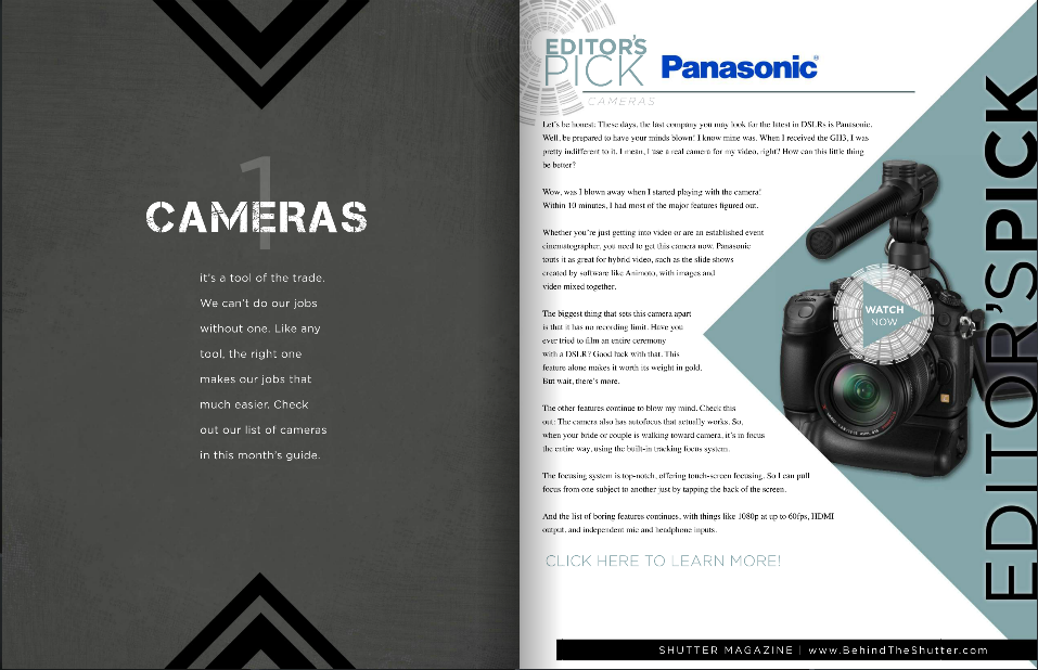
I can't see any kind of advertising disclaimer here. Can you?

Shutter Magazine claimed that the $2,000 fee was primarily to cover the video production costs (having looked at one of the videos, I reckon my grandmother could have done a better job in her living room, but what do I know?) but it would be possible to secure a half-page 'review', without a video, for $600.

'When I was an editor,' says Haje Jan Kamps, former editor of gadget website T3.com, 'running advertising as editorial on my website would have been completely unacceptable, and for good reason: It would completely have ruined the reputation of the site. The importance of the "Chinese wall" between editorial and advertising cannot be overstated. After all, who would trust any recommendations from a publication that sells its Editor's Picks to the highest bidder?'

That sums up the situation effectively: the integrity of any publication depends on its impartiality and for its readers to be able to determine what is genuine editorial content and what has been paid for. There's nothing intrinsically wrong with advertising - we'd be lying if we said we didn't want any here on Photocritic; bloggers have to eat, too - but it needs to be obvious and transparent.

We responded to Shutter Magazine's Advertising Sales person, highlighting that we found the practice distasteful and verging on the unethical, and requested a comment from the editor and the publisher. We're awaiting the director's comment, but Shutter Magazine has been keen to point out that the 'Editor's Picks' run in 'a separate section from our monthly magazine, and that we incur video costs. I also made it 100% clear that we're selective over our Picks as well.' Unfortunately, I cannot find any evidence of the 'Editor's Picks' being indicated to Shutter Magazine's readers as advertorial content, and I'm not convinced there's a world of difference between discerning back-handers or indiscriminate ones.

Kamps' opinion is perhaps even more strident than mine: 'It's entirely possible that this is just an over-zealous sales-man overstepping his mark, but in my mind, passing off paid-for content as editorial awards and editorial content is getting dangerously close to fraud.'

We understand publishing and we understand advertising. We wouldn't expect any publication to forego advertising revenue if that's what it needed to put out copy every issue. We just want to know where the fantasty ends and the reality begins and that when a journalist or writer says something, she or he really means it. Shutter Magazine, we're looking at you.

How many photos do we take?

According to a piece of research commissioned by SmugMug and conducted by pollsters YouGov, we manage to take a quite astonishing 600 million photos every week here in the UK. Ah-ha, 600 million pictures of kittens, puppies, kiddies, and sunsets. Wondering how they got to that figure? It goes like this.

  • The adults questioned for the survey gave the average number of photos they took each week at 19. That doesn't include holidays or special occasions.
  • There're 47,754,569 adults in the UK, 30% of whom do not take photos in an average week.
  • Seventy per cent of 47,754,569 do take photos. That's 33,428,198 people.
  • Multiply 33,428,198 people by 19 photos, and you get just over 635 million.

That's a lot of photos.

Roughly half of those photos are of people, about a fifth are landscapes, and a tenth are of pets and other animals. No one was brave enough to put a figure on how many of those portraits were selfies.

However, 56% of those questioned had lost images because of technical failure, theft, or even human error and almost three-in-ten didn't have a back-up routine of any description. That leaves me wondering, just how valued are images now? Are they becoming so ubiquitous that people aren't too bothered if a swathe of their photographic library suddenly disappeared into the cyber-abyss, or is it more a case that they've never stopped to consider what a catastrophic hard drive failure or a stolen phone might mean? These are slightly different prospects to the threat of fire or flood to printed photos.

The good news is that backing up your photos isn't that difficult and storage is cheap now, too!

Anyway, what do we think? Is 19 a fair number of photos a week? I'd totally skew the figures: I don't think that my potential response of 'Ehm... a few hundred last week,' really counts!

Competition rights grabs don't just exploit photographers, they destroy the industry

When we feature competitions here on Photocritic, we do our best to ensure that they're entrant-friendly: we don't like to promote contests where you run the risk of losing control over your images and we prefer not to support paid-for contests, either. If we're the slightest bit suspicious, the competition PR takes a one-way trip to the delete bin. And if we do feature a competition, we always urge you to check the terms and conditions to ensure that we haven't missed something and that you're happy with the rules.

Last night, I received a communique from an agency representing an internationally renowned publishing house requesting that Photocritic promote a competition aimed at up-and-coming photographers. The prize could be a huge break for an as-yet unrecognised but talented fashion photographer, with a commission, mentoring from some significant individuals, a gallery exhibition, and a chunk of cash.

A closer inspection of the rules, however, has ensured that this competition will not be featured positively here on Photocritic. Indeed, rather than being consigned to the dustbin of broken dreams, I'm going to highlight it for what I believe it is: a rights-grabbing exploitation of ambitious young photographers that has the potential to do them, and the photography industry as a whole, more harm than good.

The issue lies in clause 7a of the contest's rules, covering Ownership and Licence:

All entry materials become the property of the Sponsor and will not be acknowledged or returned. The copyright in any Submission shall remain the property of the entrant, but entry into this Promotion constitutes entrant's irrevocable and perpetual permission and consent, without further compensation, with or without attribution, to use, reproduce, print, publish, transmit, distribute, sell, perform, adapt, enhance, or display such Submission, and the entrant's name and/or likeness, for any purpose, including but not limited to editorial, advertising, trade, commercial, and publicity purposes by the Sponsor and/or others authorized by the Sponsor, in any and all media now in existence or hereinafter created, throughout the world, for the duration or the copyright in the Submission. Sponsor and/or others authorized by the Sponsor shall have the right to edit, adapt, and modify the Submission.

The translation? The competition organisers can use all the images submitted to the competition any way that they want to, across any media known or currently unknown to man, without informing, compensating, or even acknowledging the photographers for the duration of the copyright.

Not only is this an exploitation of the photographers who might submit their images to the competition, but it is damaging to the photography industry as a whole. For every rights-stripped photograph entered into the competition, that's a potential commission taken out of the market. The competition organisers have created for themselves an image archive that they are at liberty to use in perpetuity without compensation. Why would they need to commission material or purchase stock when they have this at their disposal?

Flick through any magazine and you'll see hundreds of images used to bring colour and interest to articles. We use them here on Photocritic. The images aren't intrinsic to the pieces and the content won't suffer from their omission, but the articles look better for them. Team Photocritic tends to trawl through its archives in search of suitable images, but magazine publishers might turn to a stock agency or an in-house photographer for their needs.

For one of the largest and most powerful international magazine publishing houses, it doesn't matter that the images they've harvested from a particular competition are fashion shoots and won't necessarily be front cover material or suitable for splashes. They can be used to illustrate all manner of feature articles across a huge range of publications that need nothing more than a generically beautiful image: 'Ten tips for a tan-ready tummy in twenty days' or '52 things to do before you die'. These free photos can be used time and time again in a huge number of magazines, and in so doing they deprive in-house and stock photographers of work. Cover shots and fashion spreads are the prizes in fashion photography; they're not the bread-and-butter work that keeps rooves over the heads of photographers and food on their tables.

By looking for their big break when they enter a competition that's aimed at up-and-coming photographers, the entrants are quite likely doing themselves out of work in the long run. Please: always read the terms and conditions before entering a competition and don't relinquish your rights cheaply.

Best thing about iOS 7? The camera is bloody fast.

We already took a quick peek at the new camera app in iOS 7, but then I was able to borrow an iPhone 5 running iOS 7 off a friend, to see what changes Apple may have been making to the camera. There are lots of little improvements, but the #1 thing that strikes me about it is how incredibly, incredibly fast it is. The camera in general was one of the things I disliked the most about iOS 6, but in the newest version of the operating system, Apple have completely knocked it out of the ballpark.

Gone is the skeuomorphic "shutter closing" animation that made the camera feel horribly laggy. In the new camera app, you can take photos as quickly as you can press the shutter button. No, seriously - if your subject is bright enough, and your thumb is fast enough, you can practically record video, that's how incredibly fast it is.

It's not just really quick at taking pictures, either - you can swipe from the lock screen to launch the camera, and the code boffins at Apple must have done some serious re-coding of the camera app: It launches in fractions of a second, and and you're immediately ready to take photos.

Let's take a closer look.

At the beginning of the video below, I'm just showing how easy it is to go straight to the camera (Drag from the bottom right of the screen). Then, I'm launching the camera, then going straight into taking a load of photos in rapid succession, followed by showing off the pictures I've just taken in the camera roll:

Really impressive stuff - and that doesn't even touch on any of the other improvements on the photography side of things.

Suffice to say that I think Apple have finally created some software that's worthy of the extremely capable cameras that are finding their ways into the iPhone 5 and new iPod Touch devices. Way to go, guys, and keep up the great work for photographers!

The retreat continues: Fujifilm axes 50% of its compact line

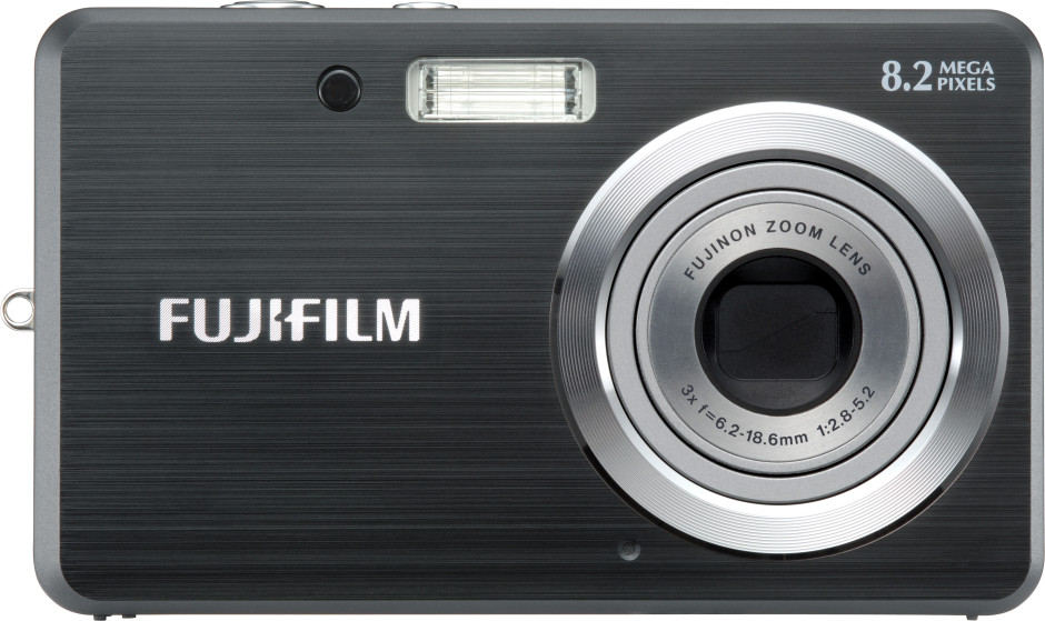
The Fujifilm J10 - not long for this world?

It started with Olympus at the end of May, and now Fujifilm has followed suit: it has announced that it will be axing about 20 cameras from its compact range, mostly at the bottom end of the scale.

Huzzah!

Scaling back compact camera production, and in particular slashing the cameras that once-upon-a-time would have fulfilled the needs of the smartphone picture-takers, is a business move I've advocated for quite a while. The smartphone crowd have gone and won't be coming back until their iPhones or Galaxys no longer meet their photographic needs, if at all. Should they reach the point when a fixed aperture, bad zoom, and no control over shutter speed is frustrating them, they certainly won't be looking for a cheap, plasticy, garishingly coloured camera with a slow lens and horrible auto-focus.

The margins on these lower-end cameras are minimal and why would a serious camera company want to put their name to a camera like that, anyway? It hardly inspires confidence in their manufacturing abilities, nor in the benefits of having a stand-alone camera.

Instead, these manufacturers should be concentrating on the compact camera market that does still exist and needs fulfilling. The premium compacts are the obvious focus, but there's a bigger market out there than just those. People like my parents want a reasonable camera, but not one that's all-singing and all-dancing. People like my cousin and his wife want a camera that they can safely take sailing or snowboarding, but won't drown, freeze, or smash.

It seems to have taken a while, but it looks as if some manufacturers are beginning to re-focus their efforts. (Pentax doesn't appear to be subscribing to this new model, seeing as it announced the £80 Ephina yesterday, but that's okay.) Discerning who needs what from a camera, and providing these consumers with the products that they need can only be a good thing for photography.

Haje's review notes: Canon EOS 6D

After Photocritic editor Daniela came and showed me her shiny new camera - the Canon EOS 6D - I was gobsmacked. I have used my Canon EOS 5D for a while, and for quite a long time, I had been extremely happy with the photos, but living with this nagging feeling that there was something 'off' about the 5d. As soon as I picked up the 6D, I realised what it was. The Canon EOS 5D mark III is an astonishing piece of kit. The low-light capabilities are out of this world, it takes incredible photos, and the controls are so natural that it is probably the camera body I've gotten used to the fastest. It's a masterpiece of electronics and design. However, as I discovered when I first held its baby brother, it's too large.

This may come as a surprise to someone who's met me. I'm a tall guy (around 6'4" / 196 cm or so), and I have freakishly large hands. But, when I was writing a lot of books about photography, I forced myself to use entry-level cameras - not because I particularly wanted to use them, but because one of the key things I make in my books is that equipment doesn't really matter. That is very, very true, up to a point -- but given that most of my books are written for beginners, I had to 'eat my own dogfood', as they say: I figured it wouldn't make any sense to use a 5D mk III and then sing the praises of entry-level SLR cameras.

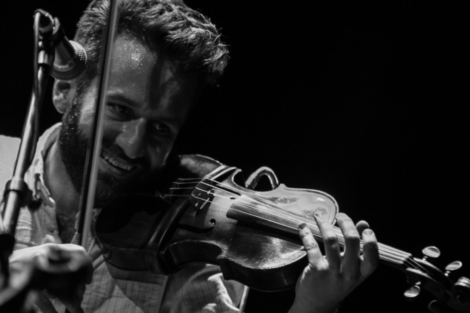
Dead Rat Orchestra -- Concert photos taken at Islington Assembly Hall, 1 June 2013.

Anyway: Last night, I did my first gig with the Canon EOS 6D, and ran into the first time where the 6D fell short. With the 5D, you can take gorgeous 22-megapixel shots in raw all day long; I never ran into a full buffer. On the 6D, however, I ended up missing several of the shots at the concert due to the camera's buffer being full.

I can't quite convey my disappointment: The 6D is a perfect camera for me in so many ways. I love the 20 megapixels, I love the ergonomics, I love the fact that it's a lot smaller and a bit lighter than the 5D. I like that it has GPS built in (great for travel photography!). I suppose it's naïve to think that any camera can completely replace a camera that's £1,000 more expensive.

Despite this one minor hiccup, I do still think I'll end up selling my 5D mk III. In the end, the consideration is this: How often do I take concert photos (not that often), and how often do I travel and take photos (frequently). The lighter weight, smaller size, and built-in GPS are worth more to me than being able to go all rapid-fire at a gig. And, of course, there's a way of dealing with this shortcoming, too: Become a slightly better photographer, and be a little bit more selective about the photos I take.

See the full gallery of concert photos taken with the 6D over in my Flickr set!

A Vivid controversy or a storm in a tea cup in Sydney?

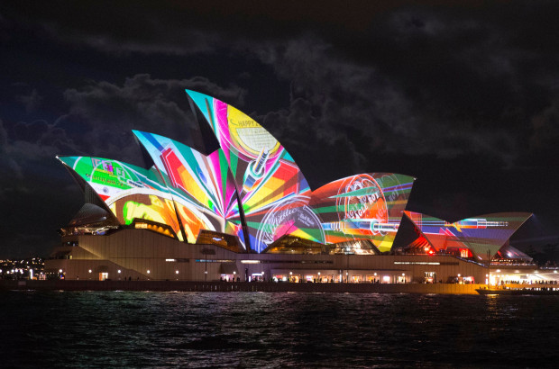
Vivid Sydney opening night One censorship argument at a festival celebrating creativity and inspiration is probably enough for any organising committee, but two is overwhelming and potentially damaging. Still, that's the situation at Vivid Sydney, the light, music, and ideas festival that takes over the Australian city between 24 May and 10 June.

'Culling images?'

The first incident arose on Saturday night, when 18 out of 35 images were pulled from the Reportage exhibition that was being projected onto two large screens near the Museum of Contemporary Art at Circular Quay. (For those who don't know Sydney, Circular Quay is where the Opera House is located.) Reportage was intended to be a showcase for photojournalism, and included submissions from photographers represented by Magnum, Noor, and Contact.

Being a display of photojournalism, the potential for any of these images to be distressing or offensive was high, but this was something that Destination NSW, essentially the New South Wales tourist board which owns and manages Vivid Sydney, seemed to have overlooked until the very last moment. Sandra Chipchase, Destination NSW's CEO stated: 'What we don't want is children walking around the corner and seeing pictures of dead children... We just don't want violence, dead people or anything that could distress people. In that public domain area it's about entertainment and engagement.' I don't know about you, but I'm not sure that I've ever considered photojournalism to be 'entertainment'.

As a consequence, photographs depicting the Cronulla riots, the 1979 Iranian revolution, and even the aftermath of an Australian bushfire were pulled from the big screen. They are available to see in smaller venues, but photographers who had travelled to see their work exhibited on the big stage were disappointed and at least two have withdrawn their work in protest. Hurt feelings, poor communication, and what appears to be a woeful misconception of the material intended for display: not a great start.

Concealed genitalia

Controversy number two involves the exhibition Home, hosted in the Cleland Bond building in The Rocks area of Sydney. Two photos, depicting three naked people, had tape placed over their genitalia. Stephen Dupont, curator of both Home and Reportage, claims that this was at the request of the Sydney Harbour Foreshore Authority; the Sydney Harbour Foreshore Authority has stated that it didn't request that the tape be applied specifically, rather that the exhibition be made suitable for the 'broadest possible audience'.

Dupont discussed the request to tape up the images with the Oculi group, who provided the images for the Home exhibition, and they decided that the photos would stand untaped and as they had intended.

Cut-and-dried

In addition to what can only be described as the naivety of the organisers, there is a question of managing expectations around the exhibitions. In my opinion, how appropriate it is to display gentalia in a closed exhibition with a warning by the door is a cut-and-dried decision: if people are aware of the presence of naked human forms, they can decide whether or not to enter. The request to somehow sanitise the exhibition was unnecessary and offensive to both the photographers and the audience. Apart from finding it condescending for someone to tell me what I can and cannot see, I remain entirely perplexed as to what, exactly, people find so distressing, alarming, or offensive about the human body. We all have one, after all.

A storm in a tea cup?

The decision to pull images that some might find distressing are projected publicly feels much more like a storm in a tea cup to me. Whilst there are some significant questions presented here, not least who gets to decide whether an image is distressing or not, it seems to be a situation resultant of mis-communication and resulting in over-reactions.

Point 1 of mis-communication centres on the expectations surrounding a display of photojournalism. I approached destination NSW, enquiring what, if any, guidance was issued to photographers regarding acceptable material for display at the Reportage exhibition. It responded: 'As per agreed editorial contractual arrangements between Destination NSW and the organisers of Reportage, and given Vivid is a family friendly event, we endeavoured to ensure photos and footage that may cause offence or distress, or were not in keeping with the values of the event, are not presented at the outdoor venue and screen.' My interpretation of this is that Destination NSW wanted 'family-friendly' images, but rather than issue clear guidelines before submissions were made, made reactionary and arbitrary decisions on the acceptability of the material once they'd seen just what was going up on the big screen.

Furthermore, given that Reportage is an exhibition dedicated to photojournalism, I'm intrigued to know exactly what sort of imagery Destination NSW was expecting. By its very nature, photojournalism covers issues that are difficult, distressing, or offensive in a visceral fashion. As Andrew Quilty, the photographer whose bushfire images were pulled from the Reportage projection, put it to Guardian Australia:

I don't know what they [the organisers] expected to come from a festival that shows specifically photojournalism. I don't know if they were expecting photos of cats and what the photographers were eating for breakfast. It seems to be coming from a typical kind of ad-person who has a view of how they want their brand to be perceived.

Point 1 of over-reaction centres on Destination NSW, having been presented with a bundle of images that it wasn't quite anticipating, deciding to pull them from the large outdoor display at the last minute. Running through my head is an xkcd-type scene where bureaucrats are tugging at their hair and screaming: 'But won't you think of the children!'

Having taken a look at the image reel on the Sydney Morning Herald website, which includes the redacted pictures, I have to say that very few provoked feelings of distress or shock in me. Would I be happy allowing my five year old nephew look at the photograph of an Iranian protestor whose hands are covered with blood? Probably not. But the photograph of Mexican immigrants being arrested on the Californian border is hardly controversial. I'm inclined to think that Destination NSW over-reacted, but then I'm not a parent.

I'd be interested to know what you think of the images.

Point 2 of mis-communication focuses on the process of removing the images from the projection. Destination NSW has been quite clear that the images it deemed to be too distressing for display were not removed from Vivid Sydney in their entirety. They can still be viewed at other venues, for example the Customs House, just not on the large public screen. Somehow, though, this seems to have been interpreted as the images have been censored wholesale, and without doubt those photographers who had travelled in order to see their work projected on a large scale, or had expected to see their photos alongside the work of eminent photojournalists, will feel bitterly disappointed.

Point 2 of over-reaction is the response of the photographers. At least two have withdrawn their images from display and Dupont, Reportage's curator, expects more to follow suit. If I were a photographer and my work had been pulled from an exhibition at the very last moment on somewhat spurious grounds, I'd be furious, too. However, foot-stamping and toy-throwing is incredibly unbecoming. How about suggesting an alternative?

After 21:00

Rather than leave Destination NSW looking red-faced with embarrassment and the photographers red-faced with fury, I would be inclined to suggest implementing a watershed for the projection. Before 21:00, it's a more family-friendly set of images that doesn't raise questions parents might not be ready to address with their six year olds. After 21:00, it's a full and frank exhibition. It's a compromise that means no one has to lose out, least of all the photographers who submitted their images in the expectation that they would form part of an extensive and exciting exhibition exploring photojournalism. It would also help to mitigate the impact of a mis-communication that is becoming an international embarrassment.

All those years ago when I was training to become a teacher, one of the fundamental principles instilled into me by my tutor was 'Say what you mean and mean what you say.' Destination NSW could do well to adhere to that notion.

(Headsup to the Guardian and thanks to the Sydney Morning Herald)

You too can be a professional photographer with this app!

We receive all manner of press releases here at the Photocritic Outpost, from the interesting and exciting to the downright boring or even bizarre. I mean, why would anyone want to try to market crisps through a photography website? Some are fortunate enough to bask in our editorial glow; many are placed on a one-way ticket to the delete bin. And then there are the select few that leave us banging our heads against our desks in some crazed act of disbelief. One of those arrived this morning.

The press release in question is for an iPhone app that helps you to pose your models. It sketches out ideas for posing people in all sorts of situations, from kids to something a bit saucy, and groups them according to subject. At first glance this could be vaguely useful: ideas and suggestions for shoots are generally welcome. Sometimes we all need an idea from the aether to inspire our creative juices.

However, if you look at the screen shots of the app in action, you see that it isn't just a collection of pose sketches, but an overlay that you use to arrange your models before snapping them with your iPhone and applying one of the app's range of filters, if it takes your fancy. Thre's no creativity, no vision, and no skills involved. It all feels rather sterile. In fact, it's a bit like painting-by-numbers, but with photographs on your iPhone.

At this stage, the app has reached the 'Heading for deletion unless there's a stupendously redeeming feature in the next sentence' point. Then it comes and you encounter your head-meet-desk moment: the app's makers claim, without any sense of irony, that it can transform you from uninspired amateur to 'professional portraits photographer in only one minute'.

Well that's the 10,000 hours theory blown out of the water in half a sentence and I can probably start selling my Monet reproductions for millions.

In all seriousness, this could probably be a fun app for little 'uns and teenagers to mess about with; I can envisage ten year old me and my best friend having all manner of giggles posing each other and applying ridiculous filters. You would have to remove the more, ehm, suggestive poses from the roll first, though. But a fast-track to professional portraits? No, I don't think so.

(And if you're wondering, of course I'm not going to name the app, especially when the subject line of the PR email specifically asked me to recommend it.)

Olympus getting out of cheap compact cameras? Good!

The news that Olympus is ditching their compact camera division this week caused quite a stir, but I can't help but think that the camera manufacturer is on to something. I've long thought that entry-level compact cameras are a Bad Idea. Nikon's line-up is a great example: Their SLRs are phenomenal. The Nikon 1 series are incredibly capable machines. But their $80 entry-level cameras are best avoided. It's not a particularly closely guarded secret that they're contract manufactured in a completely different factory, the design isn't done by the core Nikon team, etc. Basically, the entry-level cameras don't look or feel like Nikons.

The same goes for Olympus, but they also have a couple of other challenges they're facing.

I think Olympus is probably better off without these fellas.

There are two ways to look at this:

1) If your first camera is a cheap Olympus camera, you might be happy that it didn't break, and you'll buy another Olympus further down the line

2) If your first camera is a cheap Olympus camera, you might be appalled by the build quality, and decide to go elsewhere.

It's a hard gamble, because for cameras that are sold for less than a ton, it's pretty obvious that camera manufacturers have to cut corners somewhere. Cheaper enclosures and naff colours mean that they look and feel cheap. Cheaper LCD screens makes it hard to see how good your pictures came out. And cheaper lenses, sensors, and processors means that the camera will be slow, that there's a physical limit to how good the photos can be, etc. On top of that, the cheapest cameras often end up in the hands of people with the least of a clue - the very same people who could benefit the most from having a more 'intelligent' camera.

So, in deciding to pull the plug on their cheapest cameras, Olympus is making a wise move: They probably can't (and shouldn't) compete in a market that's a race to the bottom: Developing a cheap camera that is designed to be as good as it can be means spending a metric arse-tonne of cash on development, then another huge amount on manufacturing an enormous quantity of them, then piling in the marketing dollars to shift 'em. And even then it's a gamble, hoping that Nikon or another bottom-end manufacturer didn't happen to release a slightly better (or slightly cheaper) model a couple of weeks before you did.

Good riddance, I say: Olympus can now continue focusing their attention on the spaces where they are true innovators: The Olympus OM-D, the other mirrorless cameras, and their superzooms.

The Flickr Spectaculr: what's right, and what's wrong

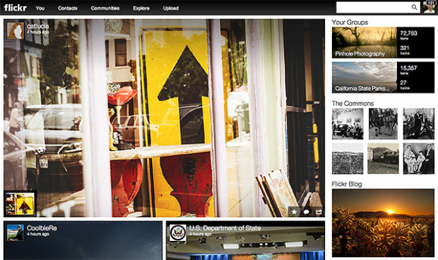
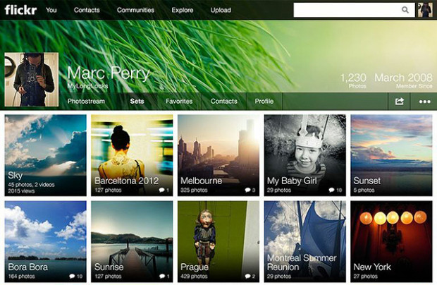
Flickr front page 'Make Flickr awesome again.' That was the Internet's message to Marissa Mayer when she was appointed CEO of Yahoo! last year. Last night's announcement of a new-look Flickr with a new business model was her, and her team's, response to that claxon. But are the changes all that awesome?

To summarise, 'New Flickr' has done away with the divide between 'Free' and 'Pro' accounts. Before, 'Free' membership meant limited image display that was supported by ads. 'Pro' accounts cost about $25 a year, enjoyed unlimited storage, provided statistical analysis, and were ad-free. Now, everyone has one terabyte of storage for free and photos are undoubtedly the heart-and-soul of the newly designed site.

The new-look moasic-style photostream

If you want to enjoy Flickr ad-free and have access to statistics, you need to pay $50 a year. For $500 a year, you can buy a Doublr account and double your storage space.

Understandably, the split between the 'Wow' and the 'Grr' reactions seems to fall along the divide between ordinary members and 'Pro' members. For ordinary members—those who didn't pay about $25 a year for unlimited uploads, statistical analysis, and no ads—it's a win. One terabyte of storage for free, full-resolution display, and some of the organisational tools that were previously the preserve of 'Pro' members: what's to complain about?

There are two primary complaints that Flickr needs to solve, and quickly. The first is the treatment of its old 'Pro' members. I paid for Pro membership because I wanted the unlimited storage, I appreciated the statistical analysis, and I liked the ad-free experience. 'Pro' exists no longer, and instead there is a great deal of confusion as to which old 'Pro' members will be grandfathered in to the new deal on their old terms. It seems as if some might, and some won't. Apart from not being able to determine easily if our previous contracts will be honoured, why the differentiation at all? Flickr's 'Pro' membership was a relatively small percentage of its overall membership; giving all these loyal users the benefit of the doubt seems only fair.

The old 'Pro' members were the old Flickr stalwarts, who stuck by the site when it felt as if Yahoo! had put it out to seed, but continued to pay them their money and keep the community alive with images and conversation. What could have been a positive transition, with clear communication and recognition for their loyalty, feels more like a shafting. It is, however, an easy fix.

The new-look sets lay-out

Second, can Flickr please fix its metadata-stripping antics? Display an image online and you run the risk of it being purloined and used without permission; that's a fact of life. However, there are measures that many of us take to protect our images. Some of us use watermarks, some of us only upload small versions of our images, I've disabled the downloading function on Flickr, and most of us append metadata to our pictures. Metadata are a bit like a dogtag, identifying who took an image, where, and when. Unfortunately, Flickr strips images of their metadata, (or takes the collar off of the dog, if you like) so if someone does manage to download one of your pictures, its owner can't be identified. Now that pictures are being displayed bigger and brighter and bolder on Flickr, this is more important than ever. Ensuring that metadata aren't separated from images really would be awesome.

In terms of the look and the feel of the new Flickr: I love it. If the images can't do the talking, then why bother? And the new moasic layouts and easy enlargement options make it all about the images. When Yahoo! addresses the issues that people are finding troubling, Mayer might've answered the Internet's request.

People in glass houses

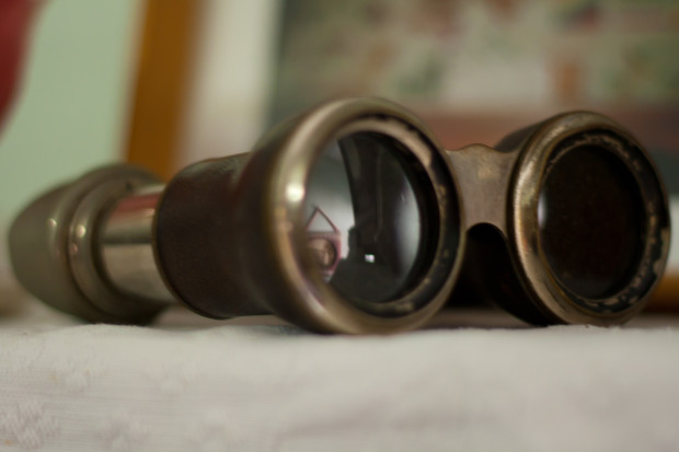
Binoculars Where does the line exist between public and private? At which point does photography become voyeurism, or even exploitation? When you live in the Zinc Building, a glass-fronted set of apartments in New York's TriBeCa district, this question has just been thrown into sharp relief by a new exhibition at the Julie Saul gallery in Chelsea.

Arne Svenson, a photographer living on the second floor of a building opposite the Zinc Building, used a telephoto lens to capture images of the residents of the Zinc Building from his flat. These have now been curated and exhibited at the Julie Saul gallery under the title 'The Neighbors'. None of the subjects can be identified from their images, and Svenson maintains that by living in a glass-fronted building, they are putting themselves on a stage:

For my subjects there is no question of privacy; they are performing behind a transparent scrim on a stage of their own creation with the curtain raised high. The Neighbors don’t know they are being photographed; I carefully shoot from the shadows of my home into theirs.

For the residents of the Zinc Building, however, there is a distinct feeling that their privacy has been violated and consequently they are contemplating legal action. The feeling seems to be that there is a difference between an odd stolen glance and a concerted campaign to document their lives from the shadows. Even if they cannot be identified, it feels creepy.

Bearing in mind I'm in no way a legal expert and certainly not one in New York law, I think that there are two critical factors here; first, that Svenson took these photos from his own flat; second, that the images were captured using a long lens. Would someone standing on the street, without optical assistance, have been able to discern these scenes? If this weren't the case then the residents' expectations of privacy were reasonable and their sense of intrusion justified. Legality aside, from an ethical standpoint Svenson's location adds a distinct element of voyeurism and exploitation to his actions: he observed them purposefully and secretly from the security of his own flat.

Even if Svenson's actions are deemed legal, it is ethically dubious situations such as these, which provoke a sense of violation in the public, that leave photographers facing a barrage of abuse and do nothing to support or promote our rights to shoot in public. To say that we should never push the boundaries and paint ourselves into a photography-less corner would be foolish and detrimental to the medium. Rather, we need to be respectful of our subjects; just because we can do something doesn't mean that we should.

Meanwhile, I might just start drawing my bedroom curtains when I change. Nobody can see me from the street and the only possible view into the room comes from the first floor windows of two houses several hundred metres away. But you never know.

(Headsup to The Online Photographer)

Pixiq.com goes down: the response from Sterling Publishing

The decision by Sterling Publishing, a subsidiary of Barnes and Noble, to close its popular photography blogging platform Pixiq on Friday 10 May, has been met with shock, surprise, and consternation by both its contributors and readers. It is understood that unless they had already tendered their resignations, all contributors were issued with termination agreements earlier this month. However, no details of the closure process were made explicit; no explanations were offered and no timeframe was presented.

I made contact with Pixiq's managing editor on Friday morning, to ascertain the circumstances of the site's closure, but it was Caitlin Friedman, Sterling Publishing's Director of Marketing and Publicity, who initially responded:

Yes, we closed the site down, which is why we ended the agreements with all bloggers but a sincere THANK YOU for everything you contributed to the site.

You can imagine my dismay at this response. A 'sincere thank you' for our contributions doesn't explain why the decision was taken to shut down the site and neither does it explain or excuse the management's failure to offer prior notice of the closure.

Thus followed a rather frustrating exchange of emails where Ms Friedman proceeded to obviate the questions I put to her. Finally, I received an email from Gillian Berman, Sterling Publishing's Director of Legal Affairs, stating:

Sterling Publishing has performed in accordance with the terms of the blogger agreement that we entered into with you, and Sterling Publishing has and will perform as contractually required under the attached termination agreement.

Translating the legalese, this amounts to 'When we agreed to terminate your contract, we said that we could pull the content at any time between then and when you would have served out your notice. That's what we did. We'll give it back to you in accordance with the agreement.' According to the contracts, Sterling Publishing has acted, so far, entirely legally. What it hasn't done is act with courtesy or respect towards its contributors or readers.

Er, okay then...

Undoubtledly businesses do not have to justify their decisions except to their shareholders; however, the decision to pull the plug on the website without so much as an advance notification email to its contributors and an explanatory post to its readers strikes me as unthinking and maybe tactless at best; at worst it is cruel to the contributors, discourteous to the readers, and an indictment of the worst practices of big businesses in general.

Barnes and Noble's financial status has been of concern to the markets for sometime, despite the share-price hike last week following speculation of the sale of its Nook ebook system to Microsoft; the decision to close Pixiq does nothing to assuage fears that it is not best placed to handle the movement towards digital content and neither am I convinced that is a great example of how it handles its employees and personnel, either.

Pixiq.com site goes down, leaving authors and readers in the lurch

Sterling Publishing apparently shut down the popular photography blogging site Pixiq today, only a few days after serving notice to all their bloggers, stating that the staff would no longer be required. Barnes and Nobles have a few things to celebrate this week, including a 20% hike in stock value when the rumours of Microsoft sniffing around their Nook e-book reader started seeping out on the internet.

That didn't stop Sterling Publishing (who operates the Pixiq brand) from shutting down the entire Pixiq.com site, posting a message on the site's homepage stating that the site no longer is active.

The message reads "Thank you for visiting www.pixiq.com. Sorry, this website is no longer active. For information about Pixiq books, please visit www.sterlingpublishing.com", and it appears that Pixiq just flicked off the switch, weeks before their contracts with the bloggers expired.

Er, okay then...

Farewell, Pixiq. You had a good run.

The site didn't communicate its intention of shutting up shop ahead of time, neither to its readers nor to the dozen active writers on the site.

"This is ridiculous", says one of the Pixiq bloggers. "It means I can't get my content back, even though the copyright was still mine, even though I had specific talks about that

Luckily, Photocritic staff Daniela Bowker and Haje Jan Kamps had a backup of their content, and were able to publish all the content on Photocritic.org with a minimum amount of downtime.

None of the editorial or management staff from Pixiq could be reached for a comment as this article was published.

It's my food and I'll photograph it if I want to!

Halloumi I know, it's a title that makes me sound like a spoiled brat. You might have visions of me stomping my feet and tossing my iPhone to the ground in the throes of a tantrum because I can't have my way to take a picture of my sweet potato and chickpea tagine with jewelled saffroned rice. That's not quite how it might seem, I promise.

Last week, the New York Times reported on the growing number of eating establishments that are prohibiting their clientele from photographing their food. No iPhones at Ko in New York and no flashes at Seiobo in Sydney or Shoto in Toronto. It's all becoming too distracting and disturbing, for diners and staff alike, especially when people start rearranging furniture and standing on chairs. Their houses; their rules. And with behaviour like that, I'm not surprised that restaurateurs have called time on wannabe Bon Apetit photographers or people who are too involved in Instagram to actually enjoy their slow roasted pork belly properly.

So I'm here to plead for a little moderation.

I'm the first person to stand up for no flash; apart from it being a terrible disturbance to other people who are eating or working, it does horrible things to images of food that can make them look distinctly unappealing as opposed to wickedly tempting. If you want to do justice to the raspberry and mascarpone creme brulee with brandy tuile, that you're meant to be enjoying and a pastry chef has burned his fingers making, you'll switch off your flash. We don't want slimy looking custard, thankyouverymuch.

As for people who think that they can stand on a restaurant chair in order to get the perfect overhead of their grilled seabass with steamed vegetables, they can go to bed with no supper. You wouldn't do that at a dinner party hosted by a friend, so why do you think it's acceptable when you're in public? Besides, by the time that you've finished faffing, your meal will be cold, you'll not enjoy it as much, and it will have been a waste of time, effort, money, and a dead fish.

Furthermore, if you're meant to be enjoying delicious food, wonderful wine, and charming company, why are you pansying about on Instagram or wittering on Twitter?

But not allowing a discreet smartphone snap or a compact camera capture? That feels a little draconian to me. Without doubt, I'm biased. I take a lot of photos of food. I love cooking and eating, and obviously I love photography: I photograph food that I make and I photograph food that eat when I'm out. I do it because I'm proud of what I've created, because I think that what I've been served looks beautiful and I want to capture that, and because I like to make memories of my restaurant experiences.

I don't want to disturb other diners and I don't want to ruin my own enjoyment of my meal, especially if I'm paying a lot of money for the privilege. What I want is a swift image to revel in. No flash, no furniture rearrangement, no Instagram. Just a discreetly snapped picture that I can look back on years to come to help me recall how perfect that grilled halloumi salad on a terrace a few hours outside of Auckland was.

When I take photos of food in a restaurant it's a compliment. Please accept it as such.

Telling stories

Theatre ii, Palazzolo All photos are about telling stories. From a beautiful lily in bloom to a shell exploding as it careens through a pock-marked wall in a war-torn suburb, they're about conveying a narrative. Much like words, that are also used to express an opinion or tell a tale, sometimes they are about truth and sometimes they are about fantasy. It doesn't matter which type of story a photographer chooses to tell with her or his images, the important factor is that the audience knows which type of story they're looking at: a real one, or a constructed one.

This element of truthfulness has been a matter of hot debate in photojournalistic circles over the past two weeks. It started when Paul Hansen was awarded the World Press Photo of the Year prize for his image of two young boys being carried to their funeral in Gaza. It's a raw and emotive photograph, overwhelmingly blue and dusty in tone. You can feel the cold numbness of heartache seeping through the screen when you look at it. And that, for many people, was the problem with the winning image. This chilled, depressed feeling had been processed into the image specifically for its entry into the competition in order to evoke an emotion in its audience. The tone of the image, the feeling that you get when you compare the competition version with the press version is quite different. Rather than acting as a record of events, it had been transformed into a work of art.

This is problematic for the inegrity of the competition. If it's a press photo competition, should the images not be as they were submitted to publications? Shouldn't they be about assessing the photos used to report the news over the past year and settle on which one tells the story best? If we are content to see images that have been manipulated in post-production in order to produce a response win the industry's major prize, are we also content to see these sorts of images tell the story of the news?

News reporting isn't about art and isn't about winning competitions. First and foremost, it is about telling the stories of those unable to tell them themselves, of keeping the world informed, of bringing light to situations that might otherwise remain festering pits of darkness. It isn't pretty and it is often thankless, but it is vital.

Then comes the Paolo Pellegrin situation, which also arose from his entry into the World Press Photo competition. This is a degree messier than the Hansen situation. His entry into the documentary category was of an ex-Marine sniper in The Crescent, a dodgy (putting it mildly) area of Rochester, New York. Except that the caption on the image was outed by Michael Shaw of BagNewsNotes as not being entirely accurate. Shane Keller, the subject of the image, claims that although he was in the military he was never a sniper; furthermore, the photograph was not taken in the Crescent, but in his basement in an area of Rochester that most definitely isn't the Crescent. Rather than being a proper documentary image that is part of telling the story of the area, it's a bit more posed, maybe even staged, than that. What's more, it looks as if the caption for the image had been lifted from an article in the New York Times published in December 2003.

So we have a situation where a documentary photograph that has been entered into contests and in some cases recognised, isn't necessarily what it claims to be. If this alone isn't disturbing, I'm particularly perturbed by Pellegrin's response to the situation. (And no, I'm not even going to venture into the debate about whether or not BagNewsNotes should have contacted Pellegrin for his comments prior to publication. That's a whole different issue.)

As far as Pellegrin is concerned, this isn't an issue. He might have misunderstood Keller's description of his role in the military and he wasn't sure if the area where the image was taken was indeed The Crescent. But because it tells the story that he aimed to tell, about the deprivation, the gun crime, the drug abuse, and the complicated relationship that exists between them all in Rochester, it doesn't matter. As for the captions, that was a simple mistake.

I'm sorry Signor Pellegrin, but none of those explanations is good enough. You see, if you're a photojournalist or a documentary photographer, I have to be able to trust you. I have to be certain that the stories you are telling through your pictures are accurate. So this means that you need to be certain of whom you're photographing. You need to be certain of where you are taking photographs. And you need to be certain that the captions you attach to them are accurate and indeed your own.

This kind of storytelling isn't about setting up shots to tell the story that you want them to tell; this kind of storytelling is about telling the truth. If I can't trust you here, can I trust you anywhere else?

Photojournalists are the eyes of the world and we rely on their integrity as we rely on their bravery. We have to be certain that the stories that they are telling are the truthful ones, not the fantastical, beautiful, artistic ones. The truth is often ugly: so be it.

Facebook: Photo sharing and premium accounts


The IPO is only one of the many things that are changing rapidly on Facebook. People are starting to point out that there's a huge problem at the very core of Facebook: It's an ad-driven site. And like all ad-driven sites, it has an enormous problem: People are so ridiculously blind to online advertising, that even with the incredible possibilities of putting your adverts right in front of the people who would, in theory, be interested in them, you're barking up the wrong tree. Online advertising, quite simply, is working less and less, and eventually the advertisers are going to realise this, and take their advertising spend and using it differently.

Facebook knows this. They are run by clever people, and post-IPO Facebook has plenty of money to hire more clever people. They've seen this one coming for a long time. And they're nearly ready with their response.

Premium accounts & photo sharing

In parallel with the bottom falling out of the advertising market, there are a few sites that are positively thriving; and many of them are photo- and video related. Vimeo, Flickr and 500px have all gone the free-then-premium-account route, and are making quite a lot of money in the process.

So, premium memberships are one of the potentially incredibly lucrative things that Facebook could offer - but what can they offer, that people haven't yet been used to getting for free?

The core service of Facebook will always remain free: Status updates, events and invitations, and the ever-embarrassing stream of breakups and social drama will continue as it has.

Making sense of Instagram

The big shift is what has been starting to show up on Facebook in other avenues: That change will be premium accounts, and it's going to happen within the end of the year.

The brand new Facebook Camera and the recent Instagram acquisition simply don't make any sense in the larger context of Facebook... Unless there is also another change coming.

Instagram, especially, is one of the apps that has attracted a very large user base of mostly casual photographers. Not only that; but casual photographers who are willing to spend money. A perfect place to start building the brand new service, in other words.

Facebook, with only minor changes to their platform, will be a huge competitor to the Vimeo, Flickr and 500px platforms of the worlds; perhaps not for high-end photographers, but certainly for serious amateurs and semi-professionals who want a solid platform to show off their photography.

The benefit is obvious: When Facebook makes this leap, photographers and video-makers no longer have to invite their audiences to a separate site to view their work: You could simply invite your friends directly, from within the familiar walled garden that is Facebook.

Canon, this is completely ridiculous


$900 for this dastardly pair? You've GOT to be kidding

No doubt about it, for serious photographers, the brand new Canon 1D X has a metric tonne of reasons for why it deserves its place at the top rungs as the Canon flagship. It's nothing short of an incredible piece of kit; one that will have many a photographer drooling, and many a bank manager rubbing their hands in glee. It is, rather obviously, the most epic dSLR camera ever.

Which is, my dear reader, why I'm so bloody furious with Canon. Carrying a hefty £5300 / $6800 price tag, this piece of kit costs more than a snazzy-looking second-hand Porsche, so it had better be bloody awesome. Most signs point to 'yes'. I'm not angry about the things Canon have included in this lovely package of photographic nirvana. I'm pissy about the things they've decided to make optional extras.

Where's my GPS, WiFi and Bluetooth?

Specifically, the pieces of kit that are at the receiving end of my rage is the Canon GP-E1 GPS receiver and the Canon WTF-E6 wireless transmitter. Canon claims that they "designed the GP-E1 to share the same rugged and durable exterior construction as the EOS-1D X without adding additional bulk", which is outrageously ridiculous in itself. The very definition of "adding additional bulk" is having to attach an external thing to your camera in order to add extra functionality.

So, why didn't Canon just build it into the camera? I have heard a few potential explanations, but they're all absolute hogwash...

There isn't enough space in the 1D X camera body - Pick up the smartphone that's closest to you. Let's say, for the sake of this argument, that it's an iPhone 4S, which was launched at roughly the same time as the 1D X. The Jesus-phone contains Bluetooth, a GPS receiver, the radios needed for telephony and data traffic, WiFi, a digital compass, a 3.5-inch 960x640-pixel screen, a load of megapixels to boot, and enough processing power to edit photos on the go.

An Apple iPhone 4S is 63 cm3 and weighs 140g. The camera is 2,150 cm3 or so. That means that the camera is roughly 34 times larger than the phone, and weighs approximately 10 times more*. Saying that there isn't space to include three measly extra radios and a bit of extra electronics is just daft. If anyone tells you otherwise, hold up any modern smart-phone and tell them to shut their pie-holes.

*) Canon haven't released an official weight figure for the Canon EOS 1Dx yet, but its predecessors all weighed in at about 1,550g or so, and after handling a 1D X, I wouldn't say that this thing is going to come out any lighter, exactly...

The technology isn't there - We can't say that there's no precedent for including this sort of tech into cameras either. Say what you will about the Fujifilm FinePix XP30 (for example that it's one of the most hideous cameras ever made), but it comes with a $150 price-tag, and has GPS built-in. As for WiFi, take the Samsung SH100. Acquiring one lightens your wallet by a featherweight $130, and it packs all sorts of gadgets - including WiFi - into a package that's only 94 cm3. And it weighs less than the aforementioned iPhone 4S.

Oh, and on the issue of WiFi, a lot of us have been relying on Eye-Fi memory cards. That's right - a flippin' SD card that packs up to 8GB of storage and full WiFi functionality. I would, at this time, invite you to reach for your nearest camera, and grab the SD card out of it. Now marvel. An Eye-Fi card is the size of a postage stamp and about as thick as a coin. They can be had from about £40, too, which isn't that much more expensive than a non-WiFi-enabled high-end SD card. Tech like this is nothing short of actual magic. But it exists, and has done so for about half a decade.

So, dearest Canon, the tech is out there. I suspect you are aware of this, since most of the SD-card cameras you've sold in the last few years are Eye-Fi compatible. Oh, and do you remember the lovely Canon PowerShot SX230 you announced in February? It's a tiny, tiny camera that has GPS built-in...

Rubbing salt in the wound

If we for a moment ignore the slap in the face of not just including these features in the cameras in the first place, let's take a look at the knockout punch: The price tag of the add-ons.

Once you've plonked down a small family saloon worth of cash, do you really want to pay another (rumored) $300 for GPS functionality and $600 for the WiFi/Bluetooth features? I don't want to sound ungrateful to the Gods of Photography, but $300 for a GPS chip? You have got to be shitting me - you can build your own GPS logger shield for Arduino for under $20, and ready-built USB GPS receivers retail at just over $30.

The WiFi/Bluetooth thingiemajig is even more insulting. Its rumoured $600 price-tag is enough to buy a whole additional Canon SLR camera body. Repeating the same exercise as above, if you were to add Bluetooth to your own homebrew project, you're looking at a $40 pricetag. WiFi is a bit pricier, at $90 for the kit. Nonetheless, that still means that you, as a random average joe, can spend $130 to buy the components needed to build the gadget Canon are selling to you for $600.

Keep in mind that these prices are retail price, too - There's no way Canon doesn't have some pretty serious buying power, both when it comes to twisting suppliers' arms and that little concept of economics known as economy of scale. The components to build the GPS unit won't cost Canon more than $10 or so, and the WiFi/Bluetooth unit might cost them $40. At the most.

So, what it all boils to is that you can buy a weather-proof camera that has WiFi built in for $150 (that's 25% the price of the WiFi attachment for the Canon 1D X), or you could buy a GPS-enabled camera for $130 (less than half the GPS-attachment for Canon's flagship).

My dear Canon, do you really hate your professional photographers that much?

So why wasn't this stuff included?

On their website, Canon state that "The GPS Receiver GP-E1 has not been authorized as required by the rules of the Federal Communications Commission", which might explain in part why they decided to hold off on shipping them out. Presumably, choosing to include GPS, WiFi and Bluetooth would have to include a round of testing that might have delayed their project... But I'm sure people would have merrily waited a couple of months to have this stuff built in.

Another potential (if moderately far-fetched) reason for choosing to keep the GPS / WiFi / Bluetooth stuff external, is that these items are all transmitters/receivers. Not too long ago, for example, I had the opportunity to take photos in a military research facility, and one of the things I had to sign (in addition to the Official Secrets Act), was a declaration that I brought absolutely no electronics into the facility that could transmit or receive data. That included having to re-format my memory cards before entering the facility, in front of the security guys, and handing over my mobile phone and Kindle(!) for safe-keeping before I was allowed into the facility.

This type of thing is already a problem for journalists: It's not illegal to send text messages from a court room, but take a photo, and you could end in deep doo-doo. As such, many journos tape off the cameras on their phones, choose cases for their phones that cover up the camera, or choose phones without cameras - all to avoid being accused of taking photos when they're not supposed to . Employees that work in sensitive industries (such as GCHQ or the Security Services) are running into this problem in a more acute way: For some employees, any phone with a camera is completely banned, no matter if the camera is covered up or not. Have you tried finding a phone that doesn't have a camera on it recently? It's surprisingly tricky.

It isn't unthinkable that there are agencies that need photography but ban all and any use of any GPS, Bluetooth or WiFi. Keeping these units as attachments could solve this problem, meaning that super special scientific spy photographers can continue using Canon's top-of-the-line snapper without running foul with their agency policies. It could also be the case that Canon want to give photographers the option to not have transmitters or receivers on them in case they are taking scientific photos of some sort, that might be disturbed by any electronic interference... But surely there must be a better solution for those edge cases?

So, what would the solution be?

Okay, so I hate the kind of blogger who whines about something without offering up at least some idea towards a solution. Here we go...

If we for a brief moment accept that Canon has a good reason to not want to include radios in their top-end cameras, because a fraction of their user base might be put off by them... It could be solved very differently: Instead of adding expensive and clunky external units they could introduce expansion slots that keep the GPS, WiFi and Bluetooth chips and radios on compact-sized expansion modules, to be inserted into the camera body itself.

Obviously Canon would get big bonus points if these modules come included with the camera, so you can install them and then forget about them, instead of running the risk of forgetting your GPS unit when you really need it. This would keep the potential benefit of being able to update extension modules later. Hell, they could even consider opening up for third-party extension modules that could be inserted into the camera (RadioPopper, I'm looking at you here...), for semi-permanent extensions of functionality.

Just don't insult us by charging us $900 for a set of 'accessories' that really ought to have been part of the original product. It makes your 'flagship' look an awfully lot less flagship-like.

This article was originally written for Gizmodo UK.

Is Apple turning its back on photographers?


Perhaps I should stick to photography...

I've been thinking about this article for a very long time; I've been using both pieces of software for a while, and I think I've now conclusively made my choice: Adobe Lightroom it is.

There are a couple of subjective reasons for that; Ultimately, I prefer the workflow tools offered up by Lightroom over those built into Aperture, and I like how well-integrated Lightroom and Photoshop CS5 are, for the times when I need editing that's beyond Lightroom's very capable hands.

Apple always had the edge over Lightroom when it comes to pricing; but back in January, Apple took out their machetes and slashed the price even further: the price of Aperture plummeted from $199 to £78.99 (when purchased via the App Store), whilst Lightroom is still retailing at $299.

So, it becomes very hard to recommend one piece of software over the other: They are both capable, and they both have their flaws. The price difference may sway some people (and PC users are out of luck altogether; no Aperture for Windows...), but ultimately, I think the question is very different indeed.

Apple doesn't care about its professional users.

fcp_bombs.jpg

For various reasons, I've been reading and learning more about the film and TV industry  (What? Pictures? That move? I can barely get one photo per hour right, never mind 24 pictures per second. You must be out of your mind), and they've been burned by Apple several times now.

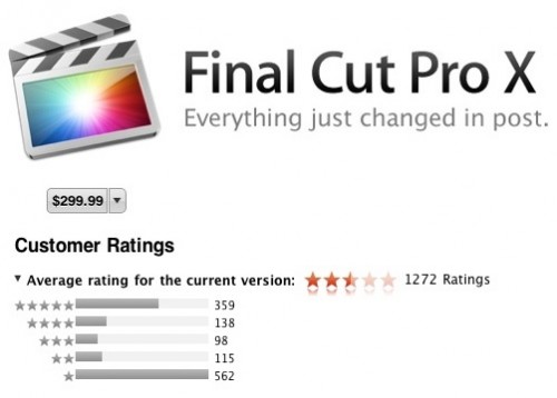
You may have spotted the phenomenal backlash recently when Apple launched their new Final Cut Pro, which set the film industry a-bristle. Instead of having two versions of the software; Final Cut Express for the 'prosumer' market and Final Cut Pro for the, well, 'pro' market, they consilidated the software packages back into one. For Express users, that was pretty good news, because for not-a-lot-of-extra-money, they got a lot of extra functionality.

Professional users, however, were not so lucky. Conan O'Brien's editors got a minute of prime-time to whine about the software, and both the app store reviews and the professionals have trashed it for being a monster-leap backwards. The  reviewers for the mainstream media, however, generally reviewed it quite favourably. The message is clear: It's still one hell of a capable software editing package, but it's no longer fit for purpose for professional use.

apple_shake.jpgIf this was an once-off occurrence, we might have forgiven Apple, but it isn't. There was another piece of software that was of extreme importance; again to the film industry. Shake was aimed squarely at the professional market, and was used for visual effects and compositing - that is, putting the different pieces of digital footage together into a single frame. You know; adding explosions, and adding backgrounds to shots, that sort of thing.

When Apple announced they were unceremoniously closing the doors on Shake, it shook up the market - several huge film productions - multi-million dollar projects - were completely relying on Shake to get completed. To this day, there are special effect studios who had their tools so deeply integrated with Apple's software that they haven't been able to disentangle themselves; including playing an important role in Weta's production of the blockbuster Avatar, for example. And this despite the fact that the last version of the software was launched in November of 2008 - that's 3 years ago. I'm willing to bet that most of us don't run any 3-year-old software, never mind one of the most popular entertainment industries in the world.

The other big entertainment industry - the music business - also have a software package covered by Apple; Logic Pro. The rumour mill is already spinning that the current version of the software (which was launched in July of 2009) is about to receive an update, reportedly labelled Logic Pro X. Perhaps predictably, current Logic Pro users are already in fear about what Apple might be doing to their beloved piece of software.

But, can't you just use the old software instead?

win311logo.gifOf course, a simple counter-argument to all of the above is "if you don't like the new software, why don't you simply not upgrade"? It is true that this is a workable solution for a while, but the truth of the matter is that software slowly loses its lustre over time: Competitors will bring out features and technology that doesn't exist in the old versions of the software, and without the updates, your software cannot benefit from technology advances that happen in the meantime.
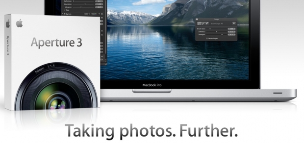
Worst of all, 'unsupported' software is just that - unsupported. So, if something should go horribly wrong with your files, and you are unable to figure out what is going on, nobody is able to help you: A simple query will be deflected with "What version of the software are you using". If your answer is "an old version", then they won't help you. And rightly so, I think: If you call up a web developer today to tell them their site doesn't look right in Internet Explorer 7, the only appropriate answer, in my opinion, is "Why are you using a piece of software that was introduced in 2006, and has been obsolete since 2009"?

Er, aren't we meant to be talking about photography here?

screen_shot_2011_09_20_at_211118.jpg

So what does all of this got to do with photography? Well, when Aperture was first launched back in 2005, it was seen as a bit of a curious beast. Taking a look now at the news around its launch, it's funny to see how news writers couldn't quite make sense of it. http://bit.ly/nUSQox . For one thing, it cost a whopping $499, and it was aimed squarely at professional photographers. Six years ago, it made sense, when Apple were still the underdog; the go-to brand for graphic designers and photographers alike.

Steve Jobs may well have saved Apple when they were at the brink of bankruptcy, against all odds. However, things have changed a lot in Cupertino since then. From being a fringe hardware manufacturer, they've gone well and truly mainstream: iPods, iPhones, Apple TV, the iTunes music store, not to mention the billions and billions of applications sold for iOS devices like the iPhone, iPod Touch and iPad.

screen_shot_2011_09_20_at_211205.jpgIt's hard to imagine any company that is more mainstream than Apple these days; and the software the company is releasing is reflecting that. Instead of innovating, developing and launching industrial-grade tools for professional users, Apple are ramming home their 'simplicity' approach to things. Which is lovely if you are my mother, but not so much if you are a professional artist of any sort.
Apple are making powerful tools more available to the mainstream, which is a good thing for their stockholders: Obviously, it's better to sell a million copies of a piece of software at $80 per copy, than it is to sell fifty copies at $499. What does appear to be the case, however, is that the accountants have taken over the asylum at Apple, and that software engineers are no longer allowed to push the envelope onwards and upwards.

If you ask me, it's only a matter of time before Aperture starts looking more like iPhoto than a professional piece of photo editing software.

As much as I love Apple, I simply don't trust them not to turn their back on me, the professional photographer, and turn instead to the other 200 people who live in my block of flats. After all, why should they bother selling me one copy, when they can sell them two hundred?

So where does that leave Adobe?

If there's one thing you could never accuse Adobe of, it is to simplify their software. Lightroom will, over the coming years, undoubtedly slowly grow out of control with more and more features and more and more bloat. However, as professional photographers, I think we can handle the occasional hardware upgrade to cope with the additional load it'll put on our computers. As a professional, I can trust Adobe to leave all the tools where I need them; right at my fingertips.

And for that 1400-word reason, I'll stick to Adobe Lightroom for the foreseeable future.

Nikon don't need no mirror-less camera

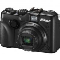
Nikon P7100 front

It didn’t happen last week. The hugely anticpated mirror-less camera from Nikon didn’t materialise amongst all of its other high-end compact, rugged, and more fun point-and-shoot cameras that were announced on Wednesday. There were some very disappointed people about; the rumours have been swirling for over a year, there have been patent leaks galore, there have been name suggestions, and there have been theories that it’ll resurrect the F-mount. So where is this evil creation that has everyone guessing?

Well, according to James Loader, Nikon’s Product Manager for Consumer Products, Nikon isn’t interested in the mirror-less market; he reckons that Nikon has its bases covered and Nikon customers really aren’t looking for a mirror-less camera. He told the guys from TechRadar: ‘When we were at Focus last year, it didn’t get asked for. It’s really only the press that constantly wants to know.’

For Nikon, the P7100 is the perfect camera for someone who isn’t quite ready to make the leap to a dSLR, or as the second shooter for a dSLR user. Why do they need to embroil themselves in the battle for the mirror-less ground, which is already churned up by Olympus, Panasonic, Sony, and Samsung? Far better to concentrate on the devil it knows.

It seems as if Nikon has identified its market and is sticking with it. If that changes, then they’ll think about altering their strategy accordingly: ‘We’re watching the market, the same as everyone else is, we’d be foolish to ignore what’s happening,’ said Loader.

So, no Nikon mirror-less. For now, anyway.

(Headsup to TechRadar)

Flickr's Favourite Camera and How it Really Doesn't Matter

Disgustingly, I took this using my phone. Is it a photograph? Yes, yes it is.

A follow up to a recent TechCrunch article caught our eye here at Small Aperture. The essence of the articles is as follows – the iPhone 4 is dominating Flickr stats as Flickr’s most used camera. The tone taken seems to be one of pure dismay, the Instagram app being the currently favoured target of demonisation. The suggestion is that the saturation of images taken using a camera phone is indicative of “the state of photography right now”. Personally, I am not convinced this is a bad thing.

With the advances in technology over recent years, those who could be classed as “casual photographers” have been able to enjoy the freedom of taking a photo using their phone, adding a few fun effects to it, and uploading it to Flickr, Facebook and other such social community sites to share with their friends incredibly easily and quickly. This upsets some, who feel that photos should only be taken with a “proper” camera, and that to take an image with a smartphone, upload it to Flickr, and have some of your friends praise it, even though you don’t even have an official photography degree or qualification of any kind, is a terrible insult to and a threatening encroachment upon our precious medium.

Passive aggressive sarcasm aside, my point is that I really don’t think it matters that a smartphone camera is at the top of Flickr’s most used stats, whether you’re of the opinion that Flickr is being used incorrectly or whether you’re seeing it as representative of photography’s general decline. In actual fact, I feel there are several positives to draw out of the significant increase in casual photography. Yes, I’m going to begin addressing them now, in a new paragraph which is coming up next. Seamless.

Disgustingly, I took this using my phone. Is it a photograph? Yes, yes it is.

First, it could be argued that the increase in the use of smartphones as cameras has shifted the market and helped to create better defined demarcations between the “casual user”, the “enthusiast” and the “professional” photographer. At one time, anyone with a passing interest in photography and a disposable income would have grabbed themselves a higher end point and shoot or even an entry level DSLR or bridge camera. These would be used purely for better quality family snaps, in anticipation of travelling abroad to document their time visiting various countries or, god forbid, to pursue it as a casual hobby, for fun. This still happens, of course, but now there is a greater degree and freedom of choice for people who enjoy dabbling in photography but can’t or don’t want to spend too much money. I can’t see how this is a negative development. Unless you hate people.

Essentially, we are witnessing the birth of the next generation of photography snobbery. The first generation (sadly still lingering, grumbling in the corner with its slippers and pipe) are the “film is just better” crew. It’s not photography if it’s not film, digital is cheating, I miss inhaling dangerous chemicals and so on. There is a place for both film and digital photography. Film is absolutely beautiful and has that romantic, inimitable quality to it, but when digital came along it brought photography to a brand new audience of enthusiasts and professionals, expanding and developing the medium. This is happening again: we will see photography tackled in new ways and artists will pick up and find a way to embrace the advantages new technology brings.

Another plus to introducing new people to photography is the overall increase in appreciation of the medium. The more commonplace it becomes, the more accepted it is, and we will suffer fewer problems down the line. It’s a bit like one of the other largely demonised interests in my life – videogames. Since the Nintendo Wii came along and introduced casual gaming to a massive new audience, when someone notices a games console in my house, they no longer immediately consider me a dangerous recluse who spends all his time dreaming up violent fantasies, entrenched in his own filth in a basement somewhere, not eating for fear of losing precious gaming seconds (I save all that for weekends). Similarly, the stigma and prejudices aimed at photographers, of which there are many, will start to soften and melt away.

An image from Michael Wolf's "Paris Street View" series, taken by photographing and cropping an image found using Google Street View. See more of Michael's work here - http://www.photomichaelwolf.com

The important thing to take away from all this is that it is problematic and dangerous to hold the stance of “the better the camera, the better the photograph”. Photography should be seen as independent of the equipment used: for me, photography lies in the intangible essence of what you are trying to achieve. It’s about composition, choice of subject, timing and the story you tell by combining all these elements. A stunning example of this is a series of photos that have caused significant controversy this year – a series of images taken using Google Street View by Michael Wolf (link to a February BJP article here). I won’t go into depth on my thoughts of it here, that’s for another article, but I admire the thought process behind this series and applaud it. The outrage caused is most likely the same outrage from those who are upset by the increased use of smartphones being used to take photographs.

This all reminds me of the story of a good friend and fellow photographer of mine. He was once complimented on one of his images by an unwitting fan, who had no intention to offend by any means: “wow”, he enthused, “you must have a really good camera!”.

Visibly disgruntled, he replied “yeah, and Shakespeare had a really nice pen”.