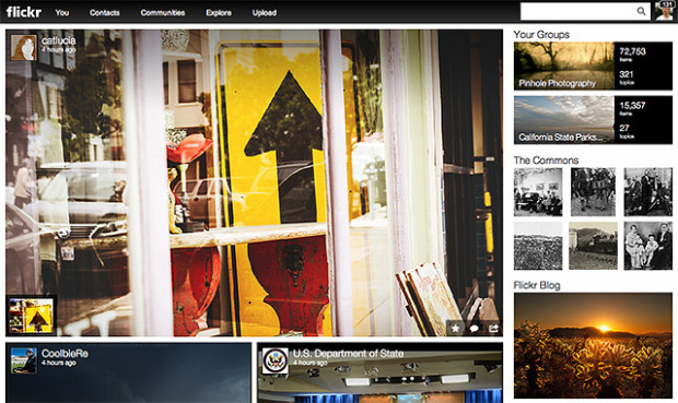
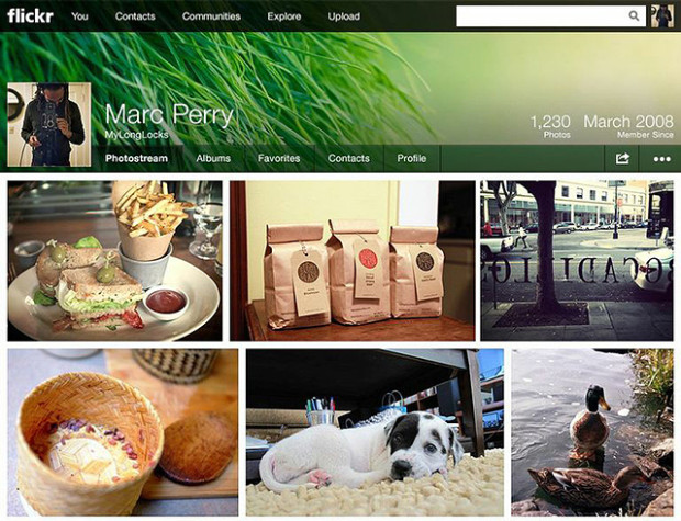
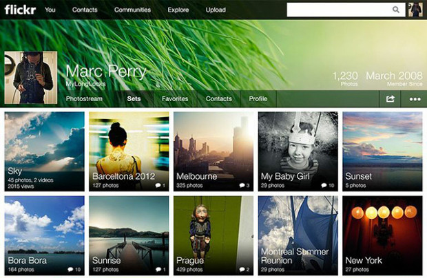
 'Make Flickr awesome again.' That was the Internet's message to Marissa Mayer when she was appointed CEO of Yahoo! last year. Last night's announcement of a new-look Flickr with a new business model was her, and her team's, response to that claxon. But are the changes all that awesome?
To summarise, 'New Flickr' has done away with the divide between 'Free' and 'Pro' accounts. Before, 'Free' membership meant limited image display that was supported by ads. 'Pro' accounts cost about $25 a year, enjoyed unlimited storage, provided statistical analysis, and were ad-free. Now, everyone has one terabyte of storage for free and photos are undoubtedly the heart-and-soul of the newly designed site.
If you want to enjoy Flickr ad-free and have access to statistics, you need to pay $50 a year. For $500 a year, you can buy a Doublr account and double your storage space.
Understandably, the split between the 'Wow' and the 'Grr' reactions seems to fall along the divide between ordinary members and 'Pro' members. For ordinary members—those who didn't pay about $25 a year for unlimited uploads, statistical analysis, and no ads—it's a win. One terabyte of storage for free, full-resolution display, and some of the organisational tools that were previously the preserve of 'Pro' members: what's to complain about?
There are two primary complaints that Flickr needs to solve, and quickly. The first is the treatment of its old 'Pro' members. I paid for Pro membership because I wanted the unlimited storage, I appreciated the statistical analysis, and I liked the ad-free experience. 'Pro' exists no longer, and instead there is a great deal of confusion as to which old 'Pro' members will be grandfathered in to the new deal on their old terms. It seems as if some might, and some won't. Apart from not being able to determine easily if our previous contracts will be honoured, why the differentiation at all? Flickr's 'Pro' membership was a relatively small percentage of its overall membership; giving all these loyal users the benefit of the doubt seems only fair.
The old 'Pro' members were the old Flickr stalwarts, who stuck by the site when it felt as if Yahoo! had put it out to seed, but continued to pay them their money and keep the community alive with images and conversation. What could have been a positive transition, with clear communication and recognition for their loyalty, feels more like a shafting. It is, however, an easy fix.
Second, can Flickr please fix its metadata-stripping antics? Display an image online and you run the risk of it being purloined and used without permission; that's a fact of life. However, there are measures that many of us take to protect our images. Some of us use watermarks, some of us only upload small versions of our images, I've disabled the downloading function on Flickr, and most of us append metadata to our pictures. Metadata are a bit like a dogtag, identifying who took an image, where, and when. Unfortunately, Flickr strips images of their metadata, (or takes the collar off of the dog, if you like) so if someone does manage to download one of your pictures, its owner can't be identified. Now that pictures are being displayed bigger and brighter and bolder on Flickr, this is more important than ever. Ensuring that metadata aren't separated from images really would be awesome.
In terms of the look and the feel of the new Flickr: I love it. If the images can't do the talking, then why bother? And the new moasic layouts and easy enlargement options make it all about the images. When Yahoo! addresses the issues that people are finding troubling, Mayer might've answered the Internet's request.


