News

Searching for places to shoot with ShotHotspots

When you feel as if you've exhausted all the shooting locations in your vicinity and are in search of somewhere fresh; or if you're heading to lands-afar (or maybe just a few hours up the road for a long weekend) and want to know what to photograph and where to take yourself, what do you do? Ask around friends and contacts for new ideas? Scour guide books for advice? Trawl through photo-sharing websites and travel blogs looking for inspiration? I do all of these, and to date they've been effective. But now ShotHotspot is adding another course of action into the mix. homepage
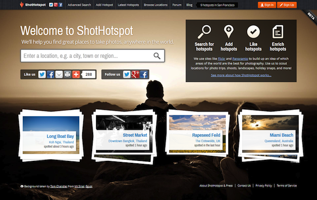
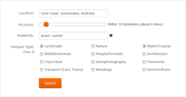
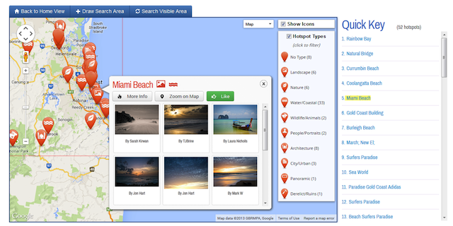
ShotHotspot is a website that aggregates the geo-location data of photos on Flickr and Panoramio in attempt to pinpoint photography hot-spots and display them on a map. When you search, you can specify criteria, for example landscape or architecture, and location accuracy, from exact location to within a 100 kilometre radius, to refine your results. Users can share their own suggestions for places to take photos, too. As more people add their recommendations, the site becomes more valuable.
advanced-search

Of course, the success of ShotHotspots does depend on the willingness of photographers to share their location data and not guard their favourite shooting locations too preciously, as well as for travellers not to be deterred by the same wildly popular location being returned on searches time and time and time again.

Furthermore, it could benefit from some more accurate location data aggregation and increased suggestions from users of the site. To be honest, my experiences with it have been slightly disapppinting so far. For example, searching for 'Wildlife/ Animals' within a 10 mile radius of 'Newmarket, UK' should yield a welter of photos of racehorses galloping up the heath, foals frolicking in their paddocks, not to mention the bees and butterflies that I photographed using my iPhone (and therefore were ably geo-located) and posted to Flickr this summer. There were 11 results.
hotspot-map

Try the same location details but with the key word 'Horse' added, and the category 'Wildlife/ Animals' removed, and you get eight location suggestions. Some of them don't even feature horses. These were far from the only searches I conducted and so often I felt that the site didn't show me anything exciting or special.

I think ShotHotspot has the potential to be a fun, useful site to spend time exploring. Even if you don't want to find new places to practise photography, you can use it to see what's around a particular area. Right now, however, I've had more success using Flickr and a few key search terms. And of course, so much of the fun of travel photography is wandering, exploring, getting lost, and finding things to photograph. Still, keep it in mind.

Loom weaves together your photos from multiple devices into one place

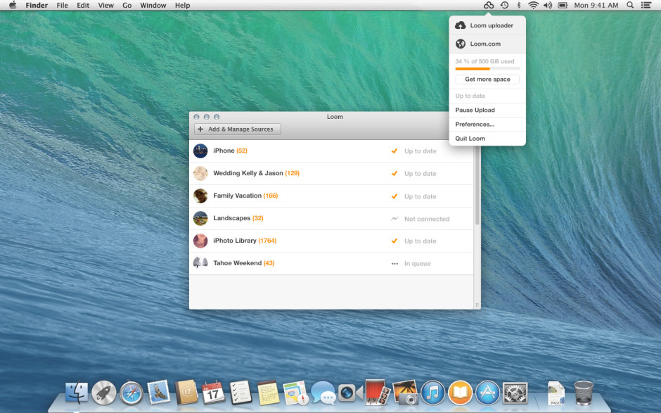
For a little while now I've been testing out the public beta version of Loom, an online photo library that is synchronised across my different devices. In all, I've been rather impressed by what I've seen and given it left public beta today and now anyone can sign up for a Loom account, it only seemed fair to share. With so many cloud storage options available, why would you want to sign up for Loom? From its developers' perspective: 'We’re making it quick and easy for you to access and manage your entire photo and video library on every device, without taking up local storage space.' The idea is that whatever device you used to take a photo and wherever it has been stored and developed initially, you can bring it into Loom's weave and have it accessible and identifiable wherever you are and whether you're on your iPhone or sitting at your Mac. Then you can share it, if you want, via email or message.

From a user's perspective, it does what the founders intended: makes it easy for you to look at all of your images in one place.

Loom all products

Install Loom on your iPhone and when you first log in you'll be asked if you want to transfer your entire camera roll to your Loom library. I clicked 'Yes'; it took a while, but it transfered the lot. Now, every time that I open Loom it copies my new images and videos over from my camera roll to Loom. By selecting the 'Nonstop upload' option in settings, it enables uploading even if you close the app. Useful when you need to shift large numbers of photos in one sitting.

If you install the Loom uploader on your Mac you can use it to hunt down the photos on your internal or external hard drive, be they JPEGs or Raw, and back them up to the cloud. The Loom team reckons that it can support over 130 different types of Raw file, but if you find one that won't trip the light fantastic, let them know and they'll try to fix it.

All of your images will appear in your timeline, but you also have the ability to file them according to whatever Byzantine or idiosyncratic method you prefer. If you delete a photo from your local drive or your phone, it'll still be there in Loom. This has allowed me to free up significant space on my iPhone, precisely what the Loom team intended. (Yes, the photos are backed up somewhere else, too!)

Loom desktop

At present, Loom is iPhone-, iPad-, and Mac-only; however, there are plans to widen its access in due course. The team is very keen to hear what its users want from the service, too. As well as opening itself up to public subscriptions, which might generate it some income, it has also received $1.4 million in seed funding from sources that include Tencent, Google Ventures with MG Siegler, Great Oaks VC and angel investments including Will Smith (Overbrook Entertainment), and Damon Way (founder of DC Shoes).

Your first 5GB of storage comes free; after that there's a 50GB option that costs $39.99 for the year or you can pay $99.99 for a year of 250GB storage. You've nothing to lose by checking it out.

Instagram is introducing ads. And that's okay.

Oh the humanity! Anyone might've thought, by looking at the streams of disappointment, consternation, and even vitriol spewing forth in the comments sections of tech sites such as Engadget, TechCrunch, and the the Verge this morning, that the team behind Instagram had been responsible for the flaying of puppies and drowning of kittens in their own private pleasuredome. The revelation was in fact far more mundane than that: Instagram has announced that it will be introducing advertisements into its subscribers' feeds on a phased basis. Given that we knew this was coming, it was hardly revelatory. And indeed, contrary to wails and huffs of some of its subscribers, it's a perfectly acceptable course of action. A few of the commenters appear convinced that the move to include 'a small number of beautiful, high-quality photos and videos from a handful of brands that are already great members of the Instagram community,' is entirely the responsibility of the nefarious Facebook, which bought Instagram for $1 billion last year. While the specifics of the advertising programme might well have been the brainchild of members of Facebook's staff as opposed to Instagram's, and Instagram would have needed to prove itself profitable to justify the sale, it could hardly have remained either free or ad-free as an autonomous entity. It would have been forced to monetise its platform through some means. Its developers cannot sustain themselves on airballs and its servers do need to function. This requires cash, with or without Facebook.

What then, are the options to raise these funds, aside from advertising? First, Instagram could have opted for a subscription-only model, which would almost certainly have been corporate suicide. Or second, it could have implemented a freemium model, more on which later.

Rather than ask its users to part with their money directly, it's asking companies to part with their cash in order to place their brand in front of Instagrammers' eyeballs. This is sensible. The particular benefit of switching to an ad-supported revenue model is that apart from the aesthetics of the interface, nothing changes for the user. There are no forms to be filled out and importantly, no money needs to be exchanged. From Instagram's perspective, advertising means that it doesn't need to determine an appropriate subscription price-point that makes it attractive to subscribers but simultaneously sustainable.

Presented with the choice of the occasional advertisement appearing in your feed and having to do nothing to continue posting photos of your cats to your legions of followers, or having to pay up front to use a service that has heretofore been free, what's easier and more appealing? Unless you are heavily invested in your Instagram feed, you might think quite carefully about subscribing. A great many people will decide that it isn't worth their money, others will simply not be bothered to get out their credit cards; either way, it would be disastrous for Instagram. Advertisements might deter a few embittered users, but inertia will be the dominant force.

This then, brings me to the freemium model: advertisements for those who aren't prepared to pay at all, and a fee for those who'd prefer their Instagram experience to be ad-free. It's possible this is something that Instagram might consider implementing when advertisements have been rolled-out world-over (at present they're US-only), but if it hasn't, it should.

Instagram, if you're listening, there are plenty of people out there who do understand that you can't survive on hope and feathers. We're generally fine with advertisements, provided that it's obvious they are advertisements and it's easy for us to ignore them. We would, however, prefer to be able to pay a minimal yearly subscription fee or a slightly larger one-off payment in order to avoid the ads. We're reasonable and appreciate the virtues of hot dinners, running water, and rooves over our heads.

For anyone who's disgusted by the notion of Instagram including advertisements, please pause for thought. How do you expect the service to sustain itself without an income? And what are your proposals for an alternative model?

'Vietnam: The Real War' - a book of 300 seminal images from the Associated Press

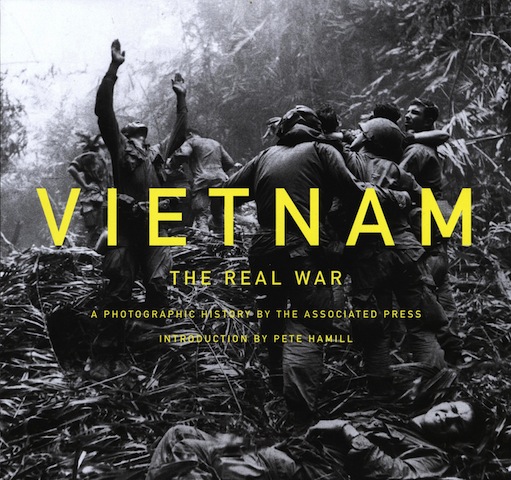
The Vietnam War is sometimes referred to as the 'last newspaper war' - there were TV news reporters there, but their cameras weren't as discreet and portable as 35mm stills cameras and we didn't yet have rolling news coverage. The conflict's iconic images were seen in print, and iconic they were. Many of them are immediately recognisable even if you never saw them on the day that they were published. The Associated Press had over 50 photographers posted to Vietnam, four of whom won Pulitzer prizes for their coverage. Their images documented the war from positions of unequalled battlefront access and today, to commemorate the 50th anniversary of the conflict, 300 of their images are being published in a new book: Vietnam: The Real War.

In the first of a series of fiery suicides by Buddhist monks, Thich Quang Duc burns himself to death on a Saigon street to protest persecution of Buddhists by the South Vietnamese government, June 11, 1963. (AP Photo/Malcolm Browne)

Fifty years on, even after seeing them so many times, these images never fail to shock, horrify, or give you cause to reflect. The collection includes Malcolm Brown's photo of a Buddhist monk self-immolating on a Saigon street in 1963. It was this image, supposedly, that prompted President John F. Kennedy to say: 'We’ve got to do something about that regime.' And there's Nick Ut's photo of a scorched, naked girl fleeing a napalm attack, the veracity of which President Richard Nixon allegedly questioned. Showing the impact of the war on civilians, soldiers, and rebels, the book is a testimony to the power of conflict reporting.

An unidentified American soldier wears a hand-lettered slogan on his helmet, June 1965. The soldier was serving with the 173rd Airborne Brigade on defense duty at the Phuoc Vinh airfield. (AP Photo/Horst Faas)

The book's introduction is by Pete Hammill, who reported from Vietnam in 1965. 'Across the years of the war in Vietnam, the AP photographers saw more combat than any general,' he says. 'This book shows how good they were. As a young reporter, I had learned much from photographers about how to see, not merely look. From Vietnam, photographers taught the world how to see the war.'

A woman mourns over the body of her husband after identifying him by his teeth, and covering his head with her conical hat. The man’s body was found with forty-seven others in a mass grave near Hue, April 11, 1969. The victims were believed killed during the insurgent occupation of Hue as part of the Tet Offensive. (AP Photo/Horst Faas)

Vietnam: The Real War is available to buy from Amazon for £24.99

AP_vietnam_bookcover

Improving Raw-to-JPEG conversion is all well and good, Google, but photographers need Raw editing power

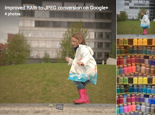
Plenty of people seem to be excited, or at least pleased, by Google's announcement that it has improved its Raw-to-JPEG conversion process for image files created by over 70 different cameras. I, however, cannot help but feel that Google, and the Nik Photography team that worked on the project, have overelooked one of the key factors that motivates photographers to shoot in Raw: we like the flexibility that it provides us. From a to b; Raw to JPEG; in Google+

The Raw-to-JPEG conversion process doesn't allow photographers to make edits to the Raw file, where the majority of the data are stored and where the photographer can have the most significant impact on the final version of her or his photos. Instead, it converts the Raw file to JPEG and expects the photographer to make edits to an already adjusted image. An image that has been adjusted according to what the conversion programme deems best, not the photographer.

It's a process that rather defeats the purpose of shooting in Raw.

I might as well shoot in JPEG format and allow the camera to make the development choices if I'm going to shoot in Raw and then let a series of Google-written algorithms develop my photos for me. It'd save oodles of storage space.

If Google is anticipating that photographers are using Google+ as a back-up of Raw files and just want a glimpse of them in JPEG for identification purposes, that's all well and good, although it does strike me as a ridiculous waste of development time to produce something they believe so sophisticated for what's a relatively trivial demand. Should the aim be for Google+ to rise as a serious contender for serious image storage and processing, it needs to rearrange its cart-and-horse configuration.


For completeness, the cameras whose files are supported by the new conversion process are:

Canon EOS: 100D, 1000D, 1100D, 1D Mark III, 1D Mark IV, 1Ds Mark III, 1Dx, 20D, 30D, 350D, 400D, 40D, 450D, 500D, 50D, 550D, 5D, 5D Mark II, 5D Mark III, 600D, 60D, 650D, 6D, 700D, 7D, M Canon Powershot: G12, G1X, S100 Nikon: 1 J1, 1 J2, 1 J3, 1 S1, 1 V1, 1 V2, Coolpix A, D300, D300s, D3000, D3100, D3200, D4, D40, D40X, D5000, D5100, D5200, D600, D700, D7000, D7100, D800, D800E, D90 Olympus: OM-D E-M5, PEN EP1, PEN EP2, PEN EP3, PEN EPL3, PEN EPL5 Panasonic: LUMIX DMC GF1 Sony: Alpha 700, NEX-5, NEX-5N, NEX-6, NEX-7, NEX-C3, NEX-F3, RX1, RX100, SLT Alpha 55, SLT Alpha 77, SLT Alpha 99


(Headsup to ePhotozine; full details on Google+.)

Canon launches its Student Network to get in with the pros of tomorrow

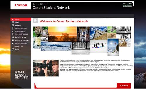
In an attempt to help the next generation of photographers build on both their creative and business skills (and maybe get their claws into them as camera users), Canon has launched the Canon Student Network in collaboration with 11 universities in the UK and Ireland. Being developed in conjunction with these universities, it's meant to act as a complement to their courses. The programme offers opportunities for students on relevant courses to see what it's really like to be a professional fashion photographer at London Fashion Week, or to turn their hands to sports, wildlife, portrait and wedding photography. There are also seminars being laid on across the country and online courses that make use of current professionals' experience and knowledge, competition prizes, and the all-important networking potential, too.

Canon Student Network

To join, first year students need to be studying photography (or its equivalent course) at Ravensbourne, Norwich University, City of Westminster College, Leicester College, Reid Kerr College, Middlesex University, Plymouth College of Art, University of the Arts London, University of East London, University College Falmouth, or Griffith College, and they must sign up to Project 1709, Canon's online image management system. Second year students also need to own a current Canon dSLR and lens (but no one says that they actually have to use it). There's no third year sign-up option at the moment. That'll come in the next academic year, which is rather unfortunate for anyone who's currently in her or his final year. But for those who're are there now, it is free and might be worth checking out.

Interested students can check out the terms and conditions and register if they fancy over on the Canon Student Network website.

Only in England: Photographs by Martin Parr and Tony Ray-Jones

The debut exhibition at London's Science Museum's Media Space also happens to be the first ever major London exhibition of work by British Photographer, Tony Ray-Jones, together with 50 rarely seen early black and white photographs, The Non-Conformists, by Martin Parr. In Ray-Jones and Parr, the exhibitions draws upon the work of two of the most incisive documentary photographers of British life. Before his untimely death from leukemia in 1972, Ray-Jones compiled an archive of work exploring English customs and identity. This in turn had a lasting influence on the work of other photographers, including Martin Parr.

Blackpool, 1968 by Tony Ray-Jones

The exhibition comprises 50 vintage prints as well as 50 previously unseen images from the Tony Ray-Jones archive, held by the National Media Museum. It was Martin Parr who helped to select these new prints, from a selection of over 2,700 contact sheets and negatives. As for Parr's work, it has only ever been exhibited in Hebden Bridge and at Camerawork Gallery, London in 1981.

Only in England: Photographs by Tony Ray-Jones and Martin Parr will run at Media Space, Science Museum from 21 September 2013 to 16 March 2014. The exhibition will then be on display at the National Media Museum from 22 March to 29 June 2014. Admission £8, Concessions £5.

Sleek and smooth: it's Triggertrap Mobile 2.0

It's sleek, it's smooth, it's the new Triggertrap Mobile 2.0 that allows you to trigger your dSLR in 14 ways using your smartphone and a dongle. Want to record a timelapse—that is a sunset timelapse that makes use of bulb-ramping, or timewarped timelapse that has varied intervals between shots, or an HDR timelapse? Or trigger your camera using sound or vibration? How about create a distance-lapse? Maybe record star-trails? Fancy having a go at long-exposure HDR? And do it all wirelessly? Triggertrap has you covered. There's even a wireless flash adapter you can hook it up to for high-speed photography. Triggertrap-Mobile-20-iOS-Bang-Sensor

The new version is available for both iOS and Android devices and has a simplified design that's not just a pretty screen: switching between triggering modes is now easier. There were a few bugs in the old version that should now be squashed and Android users will be happy to hear that the app can now run in the background, even when the phone is locked, allowing you to timelapse away until your heart is content without fatally draining your battery.

The Triggertrap team is rather proud of version 2.0: 'We saw the opportunity to combine what we learned from the first generation app with the tips we received from our diehard fans to make Triggertrap what we always envisioned it could be,' said CEO and Triggertrap inventor Haje Jan Kamps. 'It certainly helps that our fans wear the pants around here and aren’t shy about letting us know what could be improved, and as a result, Triggertrap Mobile 2.0 is the best triggering solution you’ll find anywhere.'

If you don't already use Triggertrap, you can download the app for free from Apple's App Store or Google Play. It works with your device's internal camera or can be hooked up to supported dSLRs or flashguns using hardware available from the Triggertrap shop.

And if you'd rather watch a video, Triggertrap's made you one of those, too!

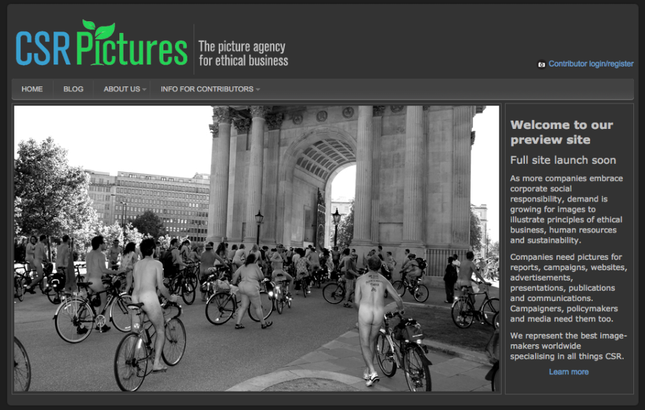
CSR Pictures, a stock agency devoted to corporate social responsibility images, wants contributors

There are hundreds of stock agencies out there, so if you want to break into the market, you have be certain of at least two things; first, that you're providing a service that buyers are demanding and second, that your business model is one that photographers will be happy to supply. On the Ground Media thinks it has identified a niche and from early 2014, it hopes to be providing images specifically relating to corporate social responsibility and sustainability through its new stock agency CSR Pictures. Thinking that a stock agency devoted to corporate social responsibility images might be somewhere on the small side of niche, I asked the people behind it how they felt they might attract a client base. It's not as if the sorts of images that people compiling CSR communications are thin on the ground; type 'poverty', ''money laundering', or 'fraud' into Getty, Alamy, or Corbis and you're presented with thousands of photos. If you're looking for rain forests, polluted oceans, or chimneys belching fumes, you've an even larger selection. Furthermore, when iStockphoto has just changed its name to iStock by Getty as a reflection of people identifying with the brand names, there's a case for bigger is better.

Screen Shot 2013-09-18 at 18.40.53

CSR Pictures isn't concerned by either of these issues. To start: 'Our research suggests that many of the people who need to bring CSR themes to life—CSR managers, corporate communicators, even HR staff—don’t necessarily have the time or inclination to sift through endless images. They’re not traditional image buyers. They want a much more focused search experience. And they want us to work with them to understand their needs and channel to them a steady stream of top-notch images.'

As for the sorts of images CSR Pictures wants to supply, it recognises that there are plenty of generic photos, but very few that are specifically CSR-oriented, for example impact investing, compliance with anti-bribery legislation, mining industry transparency or beneficial ownership of shell companies. It's CSR Pictures' aim to 'work with some of the best image-makers around the world to come up with new and compelling ways to illustrate such areas.' In its opinion, there really is a gap in the market.

Market duly identified, it needs some photos. It is, therefore, inviting photographers the world over—including those from Africa, the Middle East, Asia and Latin America, many of whom lack outlets for their work and steady income streams—to submit their applications to contribute. If you're wondering what sorts of images it's looking for, there's an extensive list on its website. You can submit your application on the site, too.

Should everything go well, CSR Pictures aims to establish a global network of photographers and designers for bespoke photo shoots and projects that its clients can commission.

There isn't a pricing structure in evidence on the site yet, but I've been told that the cheapest royalty-free image for web use will be in the region of £20 to £30 and the website states that each sale is split 50/50 between photographer and agency. They don't demand exclusivity, either. If you've the right images and the agency will be as much in demand as it thinks it will, it could make you a few pennies.

Interested? Think it has legs? All of the details and the opportunity to sign up to contribute are on its preview website.

Adobe's Projects Napoleon and Mighty are go!

Abode mooted Projects Napoleon and Mighty at Adobe MAX in May this year. They were ideas explored by the Experience Design (XD) team: 'Mighty', a cloud pen, and Napoleon, a digital ruler. Today, they've brought them to life. Mighty, the cloud pen, was dreamed-up with a focus on the future of drawing. It's a pressure sensitive device to be used for drawing that's also connected to Adobe's Creative Cloud. This connection allows you pull up Kuler themes and create a 'cloud clipboard' so that you can save, access, and re-use things you've already drawn.

The design of Mighty was down to a team at industrial design firm Ammunition. They settled on a triangular grip with a twisted stem that's comfortable to hold and sits naturally in the hand.

Adobe Napoleon and Mighty

Napoleon is a digital ruler that was designed to bring back some of the feeling of drawing with analogue tools like the t-square and triangle. As Michael Gough, Adobe's VP of experience design puts it: 'There is something about the confidence of drawing a line aided by a physical device—the tactile feedback you get as you move the straightedge around—as well as the fluidity and accuracy of drawing that comes from interacting with physical objects.'

Adobe will teaming up with Adonit, 'an awesome band of makers with a shared belief in the power of creative devices paired with apps and services,' to bring Mighty and Napoleon to you in the first half of 2014.

How NASA uses sound triggers to capture amazing rocket launches

The internet is full of a Crazy Frog (No, not that Crazy Frog, thankfully) today. This little buddy took a leap of faith in front of a photographer's sound-triggered camera at a NASA launchpad. The full story is available over on Mashable, but have you ever wondered how these photographers do their job? NOW WE'RE TALKING.

For security and safety reasons, photographers aren't allowed anywhere near the launch pad at launch. For obvious reasons, they can't use remote-triggered cameras either (Think about it... Would you allow anyone with a radio transmitter near a space rocket?), and so they use other techniques instead. Specifically, sound-triggered cameras.

There are a great many different ways of doing this, of course, but over on the Triggertrap website, there's a fantastic interview with Walter Scriptunas II, who shoots NASA rocket launches using the sound triggers built into the Triggertrap v1 camera triggers. Clever stuff, and well worth a read!

What's that you say Adobe? You've updated Photoshop Express for iOS?

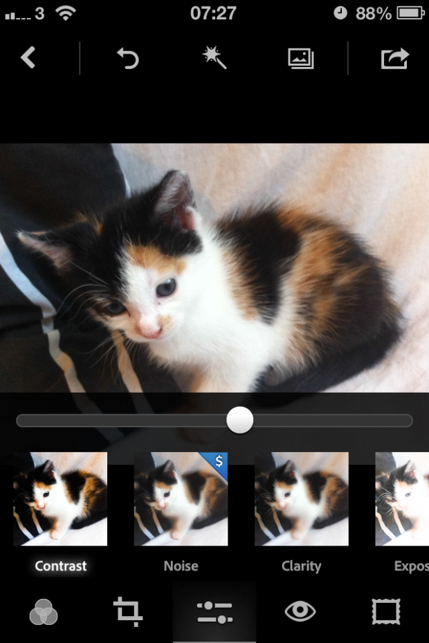
Amongst the bundle of app updates waiting for me this morning there was one from Adobe, for Photoshop Express. I noticed that the icon had altered, which suggested that it was a more significant update than a few bug fixes, and I wasn't wrong. There's a new look and feel to the app, as well as integration with Adobe Revel that allows you to store and share your images across the Cloud. I've already been having an explore. There are now 22 filters to choose from, ranging from a chilly 'Winter' effect, to a soft 'Dream' look, via the sepia-toned 'Memory' filter. I would say that the choice is overwhelming, but the filters take so long to process that I gave up trying to apply them and stuck with natural. The crop function provides the usual suspects of constraints and straighten, as well as the capability to rotate an image or to flip it along its horizontal or vertical axis.

Photo 13-09-2013 07 27 45

In the adjustments tab you're given control over contrast, clarity, exposure, highlights, shadows, temperature, tint, and vibrance. There's also a noise adjustment, but that's a paid-for feature. I found the adjustment controls on the previous version of Photoshop Express difficult to use, with features paired up beneath a tab and one of those controlled by a vertical swipe and the other by a horizontal swipe. It was far too easy to adjust one when you wanted to change the other. The new interface dispenses with the dual-adjustment system, each adjustment is made individually using a slider and some have an auto-adjustment feature. The new sliders are a definite improvement, but they could benefit from some refinement. There's no visual indication (for example a blue line) of how far away from the mid-point you've moved the slider apart from a pop-up numerical value and the mid-point itself isn't marked. Making alterations is, therefore, a little crude.

Just as the filters are slow to render, so are the adjustments. Changes don't happen in real-time as you move your finger along the slider, making it difficult to gauge your alterations. I'm sure that more practice will yield more accurate results, but when I'm already using an app that is responsive, it doesn't inspire me to make the switch to Photoshop Express.

As well as the auto-enhance button, there's a red eye removal option, and the choice of 20 different frames for your pictures. Again, they're very slow to render and they don't encourage me to try adding a frame to my images.

My initial impressions are of a very capable editing app, and to be fair you would expect nothing less from Adobe, that provides a welcome improvement to its interface and offers some very useful features (I'm especially taken by independent highlights and shadows adjustments). However, it is excruciatingly slow, which makes me hesitant to move away from my current favoured edited solutions. If Adobe were to do something about the app's pace, I might well be tempted. It is free, though, so take a look and see what you think.

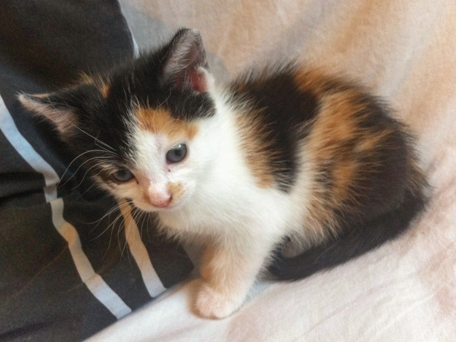
Cookie the month-old kitten, looking adorable

That's Photoshop and Flickr who've both upped their antes in the past few weeks. Snapseed, I think it's your move.

(I've no idea what the Android update is like, or even if there is one. If anyone wants to share - please do!)

The Taylor Wessing Portrait Prize shortlist is announced

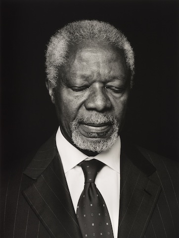
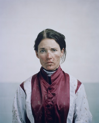
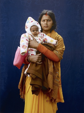
Four photographers have been shortlisted for this year's Taylor Wessing Portrait Prize, hosted by the National Portrait Gallery in London. Anoush Abrar, Dorothee Deiss, Spencer Murphy, and Giles Price are all in the running to claim the £12,000 prize for their entries, having been shortlisted from a total of 5,410 submissions by 2,435 photographers. Kofi Annan by Anoush Abrar, 2013

The twins by Dorothee Deiss, 2013

Katie Walsh by Spencer Murphy, 2013

Kumbh Mela Pilgrim - Mamta Dubey and infant by Giles Price, 2013

My initial reaction is that all of these images feel very safe. They're gorgeous pictures, yes, but there is nothing here that makes the hairs on the back of my neck stand up or leads me to believe that these photographers have pushed any boundaries or limitations. I hope that when I have the opportunity to see the images in the flesh, hanging in the gallery, I'll feel differently about them.

The competition was judged from original prints by: Sandy Nairne Director, National Portrait Gallery, London (Chair); Kate Bush Head of Barbican Art Galleries; Suki Dhanda Photographer; Tim Eyles Managing Partner, Taylor Wessing; Terence Pepper Head of Photographs Collection, National Portrait Gallery; and Rebecca Valentine Photographic Agent.

Sixty portraits have been selected for exhibition later this year, running from 14 November 2013 to 9 February 2014 at the National Portrait Gallery in London.

Google brings Snapseed to Google+

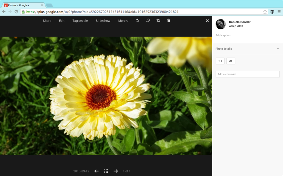
Earlier this year when Google shuttered the Snapseed for desktop app, it didn't exactly leave me heartbroken, but it did mean that I had one fewer cheap and reliable editing option that I could recommend to nascent photographers. (If they'd shuttered Snapseed for iOS, I might've gone into a raging frenzy, but thankfully that wasn't necessary.) Now, however, Snapseed is making a desktop come-back, provided that you use Google+ on Chrome. The 'Edit' button should be appearing on a G+ screen near you soon

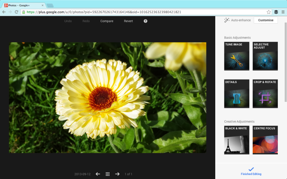
Upload an image to Google+, select it, hit edit, and you're presented the opportunity to adjust it using Snapseed's tools. If you're already familiar with Snapseed for mobile, you'll be right at home. If you're not familiar with Snapseed, it is easy to get along with it and there's always the 'Revert' button for your edits get a little over-zealous.

All the usual Snapseed features are there

It is a rolling roll out, so if you don't see it yet, you should have it soon.

Headsup to Engadget

Compare and contrast: Apple's iPhone 5s and 5c cameras

Just in case you've not had quite enough of your fill of Apple news over the past day or so, here's a run-down of the camera spec for the new iPhone 5s and 5c.

iPhone 5s

iPhone 5s in gold

  • All-new 8 megapixel rear-facing camera - I've heard plenty of people bemoaning the fact that it's 'only 8 megapixels' but do you really need any more on a sensor that's about the size of my little fingernail?
  • Speaking of which, the size of the sensor has been increased - with luck that will help to improve low-light performance and noise levels
  • ƒ/2.2 aperture - a touch brighter than the ƒ/2.4 of old
  • The new processor in the A7 chip should help with faster auto-focusing, faster image capture (thanks-be), automatic image and video stabilisation, and increased dynamic range
  • True Tone flash - a flash with in excess of 1,000 variants in colour and intensity to help produce more natural colours
  • Burst mode - that's going to be reliant on the new faster image capture
  • 120 frames-per-second slow-motion video

iPhone 5c

iPhone 5c in blue

This camera is more akin to the iPhone 5's. It has an 8 megapixel sensor, but not the larger one of the 5s, and it is powered by the A6 chip so won't be as fast as the A7 version. It has an ƒ/2.4 lens, an LED flash, and no burst mode or slow-motion video.

And?

I'm not the kind of person to go out and upgrade my phone on the basis of its camera alone, especially not when you're looking at paying $199 for the 16GB 5s, $299 for the 32GB version, and $399 for the 64GB 5s (if you qualify). If you're an iPhone 4s owner, you're not looking at any major camera upgrade by hopping to the 5c, so it really isn't worth the $99 for the 16GB model or $199 for the 32GB model, again, if you 'qualify'. If you're in need of a whole new phone, however, it might be a different matter.

Wander leads to Planett, but can these apps go any further?

In December 2011 I took a look at an app called Wander (no, not that Wander; a different one) that aimed to let you explore the world through images. It was a bit like having technologically-based pen-pal. Wander allowed you to connect with people in any one of 80 countries and you could share your lunch, your journey to work, and what you do of an evening to get to know each other and where you live, through pictures. It seemed like a fairly neat idea that allowed you to explore and learn about new places while sharing yours. It didn't, however, catch on as the developers had hoped and Wander closed down on 16 August owing to financial difficulties.

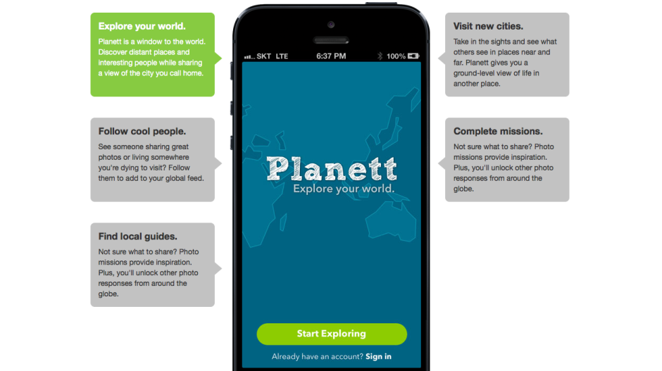
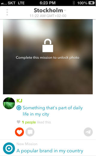
Undeterred, some of Wander's original developers have gone on to launch Planett, a Wander-esque app that allows users to discover new places and people by featuring photos tagged with 'missions' from all over the world and organising them into 'city feeds'. Wander's one-to-one element has had to take a back seat for now, but the Planett team is hoping that it can be introduced soon.

Screen Shot 2013-09-02 at 19.46.11

I'm impressed by the Planett team's tenacity, but I'm left with some nagging doubts about the app's viability. If it failed on financial grounds the first time around, how will the revamped version fare? There are two underpinning factors here: either Wander didn't fulfil a gap in the market and wasn't popular with potential users; or the team weren't able to monetise it effectively.

Rehashing an app that people didn't want to engage with won't necessarily make it any more popular. If that's the case, then Planett is, sadly, already on a hiding-to-nothing.

Not being able to monetise the app effectively could have been because the developers simply didn't know how to do it. They couldn't see a way to make the app economically lucrative and therefore didn't. That's fine if you're able to bankroll an app as a personal project, but not if you need to transform it into a self-sustaining business. Given that Wander closed owing to financial shortcomings, it suggests that it didn't fall into the category of a developer's part-time project. Seeing the way that Wander went doesn't fill me with confidence that Planett can be maintained as a developer's toy, either. If that were the case, then Wander would still be meandering along.

I sincerely hope that the Planett team hasn't sauntered over from Wander thinking that they can monetise it 'somehow' without having thought it through. Attempting the same scheme but expecting a different outcome is somewhere between futile and fanciful. What I would like to know then is what's the plan, Planett? I have asked Planett's developers to elaborate on the app's monetisation potential, but I'm yet to receive response. Without one, I can only anticipate Planett will head towards the same pale blue yonder of Wander.

Alternatively, the Wander team did attempt to monetise their app, but it didn't raise enough revenue. That doesn't bode well for Planett, either: it casts doubt on the monetisation potential of the app. Sure, Planett might have a different vision to Wander, but there's no evidence of it yet. Planett's developers need to consider if their app is something that plugs a gap in the market and if people will be prepared to pay for it, somehow.

Screen Shot 2013-09-02 at 19.46.41Planett's selling points are that it allows you to explore your world, you can follow 'cool people' who share photos from places you want to visit, you can visit cities pictorially and explore them 'at ground level', and it provides you with photo missions to inspire you and get your creative juices flowing. As you share more images of where you live, you can unlock more images uploaded by other people.
Is this enough to tempt people to join and to share their photos? After all, you can already explore the world photographically using geolocation information with Flickr, Instagram, and EyeEm, and you can follow heaps of people with varying degrees of coolness on all three of those sites. EyeEm has the photo missions element built in, too. The real kicker for Planett is that these examples are already well-established communities with billions of photos, and that they're free. Without something to set it apart, Planett is facing an uphill struggle.

Wander's unique selling point was the one-on-one relationships that it fostered. Planett is hoping to adopt this feature but it hasn't got there yet. Without it, or another appealing and original facet, Planett is trying to establish itself amongst already settled groups that might not be willing to shift (or at least join).

There are billions of photos on the Intergoogles and hundreds, if not thousands, of different ways of sharing them. But if a new kid on the block is going to survive against already well-established communities and ensure its sustainability, it has to know to whom it is appealing, and how. Does Planett?

Flickr updates its iOS app

A shiny new update has just appeared in my app store app for Flickr. It's not one of those 'Minor bug fixes' updates, but includes six bullet points of improvements. It is a filter-heavy update, but there are some major changes to the editing features, too. The app has lost its Aviary editing appearance, and Flickr has said that the team who created it were from the recently acquired KitCam and GhostBird software outfits. The look is new and so are the tools.

All new filters for Flickr

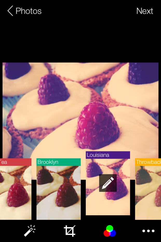
Gone are the previously animal-named filters; instead there are 14 new filters, some with names that give you idea of what to expect, like 'Antique' or 'Lomo' others that, quite frankly, seem to be plucked out of the aether. Say, 'Dublin' or 'Louisiana.' These can be applied 'traditionally' in post-production, or 'live' as you take photos in-app.

If you're using the Flickr app to take photos, rather than the iPhone's native camera app, there are focus and exposure lock options, a pinch-to-zoom tool, and a grid to assist with composition.

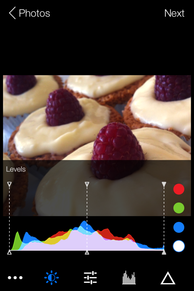
The new editing tools are a more sophisticated selection than before. They include the usual, like brightness, contrast, and white balance, but extend to colour balancing with red, blue, and green channels, a levels tool, and a sharpening function. The crop function allows you to flip and rotate images as well as straighten them. I must say: I don't find the pinch-to-zoom crop function that intuitive to use. Neither am I keen on my cakes being upside down, but you never know when you might need it.

It's possible to add customisable vignettes, linear or radial tilt-shift effects, colour bursts, and worn effects to your images, too. (If you're struggling to find those, they're hiding beneath the filter icons.)

Flickr levels screen shot

The animated transitions for the camera and editing tools that are meant to provide users with 'the best camera experience yet' might be over-egging the pudding a little, but this is an update that suggests Flickr's mobile focus is sharpening. Far more control is being placed in the hands of the people who are using their mobile phones to take photos. It's a sign of the maturation of the mobile photography phenomenon.

Using a variety of different apps to achieve the effect that I want for my photos isn't something I've shied away from. I'll happily bounce between my iPhone's camera app, Snapseed and ColorTime for editing (and maybe other apps like Juxtaposer for more extreme effects), and Flickr for sharing. With this update, it seems that Flickr is trying to make itself into a much more rounded photo-making and photo-sharing facility. I've not spent enough time with it yet to determine if it's enough for me to leave behind Snapseed, but that's certainly Flickr's intention. It's both serious and playful: so can it successfully appeal to both sides of the market?

Photo 20-08-2013 14 32 02

Oh, and I've noticed that the Flickr 'r' is now purple - bringing a touch more Yahoo! to the blue and pink of Flickr.

Sony's A3000 is a big mirrorless camera

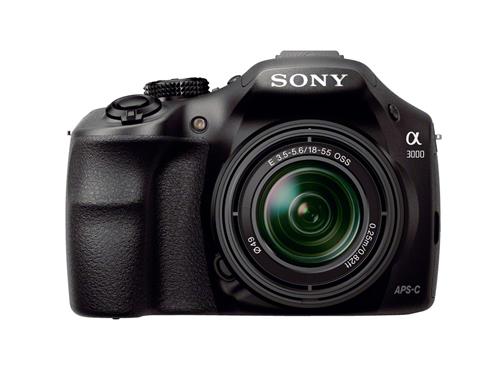
I'm trying my very hardest to get my head around this one. Sony's new A3000 is a mirrorless camera that's bigger than your common-or-garden EVIL camera, a bit smaller than a traditional dSLR, and roughly the same size as the Canon 100D. And it has been deliberately designed to be on the larger side. Sony A3000 with 18-55mm kit lens

This means that Sony has taken a class of camera that was developed with the specific intention of including almost all of the traditional SLR's best features barring the pentaprism and optical viewfinder, which were removed in order to make it smaller, and then made it larger but omitted the key bits of a camera's mechanism that draws people back to the SLR time and time and time again: the pentaprism and optical viewfinder. No. My logic here is failing me. Anyone?

The A3000 is an E-mount camera with a 20 megapixel APS-C sensor that has an ISO range of 100 to 16,000. There are 25 auto-focus points and it can manage 2.5 frames per second continuous shooting. That can be upped to 3.5 frames per second on switching to speed priority shooting mode.

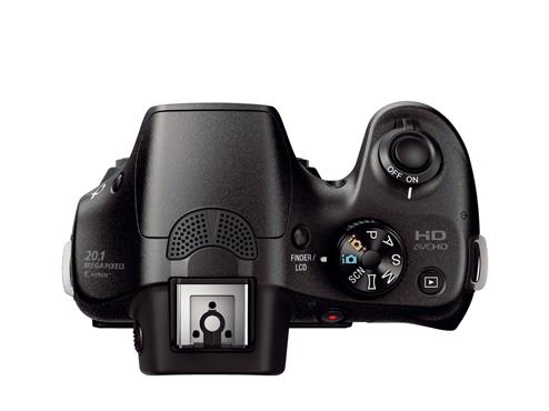
Mode dial, hot shoe, general SLR-likeness, but no mirror

Full HD video can be shot with either 50i or 25p modes and it can be hooked up to stereo microphone. There's also the hotshoe for flashes and a range of filters and effects.

It has a few more megapixels of resolution than Sony's NEX-3N, but they're otherwise very similar cameras. Except that the A3000 is larger and it doesn't have a tiltable screen.

Price-wise it'll be in the region of £370 ($399) and available from September 2013.

Exposure: The Oxfam Photography Prize for Women 2013

UK-based female photographer aged between 18 and 25? You might be just what Oxfam is looking for to complete a commission for its forthcoming spring fundraising campaign. This autumn, Oxfam will be commissioning three female photographers from Magnum to document projects that are taking place in Armenia, Chad, and Sri Lanka. They'd like three young, aspiring photojournalists to join one project each and to help tell the stories of women who live in poverty through a series of 100 images that will be used in Oxfam's future fundraising communications.

As well as having the opportunity to go out on assignment, the successful applicants will receive mentoring from the Magnum photographer on their projects, and receive £1,000 on delivery of the image series.

Image by Abbie Trayler-Smith

Applications for this commission are being handled by IdeasTap. You'll need to complete a selection brief that involves submitting a portfolio of images that highlights your skills as a photojournalist, a story-teller, and portrait photographer. The judges—two from Oxfam, one frm Magnum, and one independent judge—will be looking for all of that as well as originality, a strong relationship to the subject, and excellent communication skills.

As with all IdeasTap briefs, you do need to be an IdeasTap member in order to participate, but it's free to sign up.

You've until midday on Monday 9 September 2013 to complete the application process. More information and the application process are all detailed on the IdeasTap website. Good luck!

EISA 2013-2014: who won what

In 1982, the editors of 20 European publications met to dole out a 'Camera of the Year' award. It went to the Minolta X700. From that meeting, EISA—the European Imaging and Sound Association—was formed and since then, the group comprising representatives from 50 magazines across 20 European countries has been doling out awards that recognise excellence in consumer electronics every June. The awards have grown considerably since 1982 and now encompass audio, home theatre, in-car electronics, video, mobile, and green categories as well as the original 'Camera of the Year' prize. And yes, the photo category is far more extensive than just 'Camera of the Year' now. Looking at the winners, its a broad reflection of where manufacturers are deploying their resources and focusing their efforts. Nothing is especially surprising in the camera categories, but perhaps the lens classes are of more note?

Here's the run-down:

Cameras

Camera 2013-2014: Nikon D7100

Advanced Camera: Sony Alpha SLT-A99

SLR Camera: Canon EOS 100D

Advanced SLR Camera: Canon EOS 6D

Compact System Camera: Samsung NX300

Advanced Compact System Camera: Olympus PEN E-P5

Compact Camera: Sony Cyber-shot DSC-HX50/HX50V

Advanced Compact Camera: Fujifilm X100S

Travel Camera: Olympus TOUGH TG-2

Lenses

Lens 2013-2014: Tamron SP 90 mm ƒ/2.8 Di VC USD Macro 1:1

Zoom Lens: Tamron SP 70-200 mm ƒ/2.8 Di VC USD

Professional lens: Canon EF 200-400mm ƒ/4L IS USM Extender 1.4x

Compact System Lens: ZEISS Touit 2.8/12

Compact System Zoom Lens: Panasonic LUMIX G Vario 14-140 mm ƒ/3.5-5.6

Photo-Video cameras

Photo-Video Camera 2013-2014: Panasonic Lumix DMC-GH3

Photo-Video Accessory: Manfrotto MVH500AH

Action Cam: GoPro HERO3 Black Edition

Software

Photo Software: DxO Optics Pro 8

Innovation of the Year

Photo Innovation 2013-2014: Samsung Galaxy NX