News

Innovative space-saving from Giotto's with its Silk Road tripods


It seems obvious when you think about it: if you mould the centre column of a tripod so that the legs curve into it, rather than making it round, meaning that the legs clash, you save a heap of space. So why has no one done it until now with Giotto's' Silk Road YTL series of tripods?

giottos_y_tube_illustration.JPG

Giotto's is replacing its MTL range of tripods with the YTL series, all of which feature a Y-shaped centre column that saves 30% space on MTL versions when the tripod is collapsed. It doesn't, however, compromise on load-bearing capacity or stability.

The Silk Road series will comprise 12 models and a range of features. These include 5kg, 8kg, and 10kg capacities; options for two-way centre columns or three-way centre columns meant for very low-level shooting; three-section or four-section legs; a bubble spirit level on two-way centre column models; and a swappable thread making Silk Road models compatible with any Giotto's head or standard thread heads from other manufacturers.

I'm also quite taken by the idea of Quick Easy Leg Lock, or QEL, (I can't think why!) as well graduated leg markings to allow for speedy adjustments to your set up.

Silk Road tripods will be available in aluminium or carbon fibre, starting at around £100 for aluminium models and £220 for carbon fibre versions. They'll be online and in-store from mid-January.

If you're wondering about the name, Silk Road, it's after the trading routes that snaked across Asia and the Middle East, into Europe and North Africa. It wasn't just silk, spices, and goods that were exchanged, but knowledge and ideas, too.

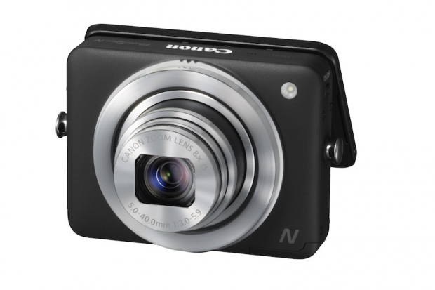
Quirky design, but who's it for? The Canon Powershot N


It looks cute, there are some fun elements to it, but I'm not convinced that Canon has identified a workable target market for the square-shaped, touchscreen Powershot N. Let me explain.

There are some elements of the Powershot N that I like a lot: the lens rings for zooming and shutter release; the tiltable touch-screen that you use the control focus and image review; the 28mm lens with 8× optical zoom; the 12 megapixel sensor with DIGIC 5 processor, and sensitivity to ISO 6,400; the quirky design; and of course, the wi-fi connectivity.

There are some elements of the Powershot N to which I'm indifferent. Being able to apply creative filters in-camera is ubiquitous now. Creative Shot mode, which examines a picture, applies a series of enhancements according to its attributes, and then presents you with five different versions is a novel toy, but doesn't exactly float my photographic boat.

Then there are the elements that leave me going 'Wuh?' Why, exactly, would I want to compile the four seconds of focusing and fiddling before taking any picture in Hybrid Auto mode, so that I can watch some odd kind of meta filmshoot at the end of the day? Why would I want to piddle about taking a photo and then transfering it to my smartphone or tablet so that I can upload it to Flickr because there's no available wi-fi network, when I could just take the photo and apply a filter using my phone? It's a bit gimmicky and feels slightly half-baked. Afterall, there are Android-based 'smartcameras' out there now that provide a whole lot more functionality.

Canon, it looks very to me as if you've designed a camera that is meant to appeal to the Instagramming, filtering, uploading crowd. But the thing is - they've gone and they're not coming back. They love their smartphones and their instant connectivity. They already have the tools they need for the job they want to do. At £270 ($300), I can't see them rushing to buy one in a hurry. In fact, I'm not sure who will.

The fun design demonstrates that you are at least thinking creatively about the point-and-shoot market. Carry on - it needs this. But what you really need to think about are who still uses point-and-shoot cameras. Make cameras for them. With the Powershot N you've a camera that isn't sophisticated enough to be a smartcamera, isn't cheap enough to be a fun camera, and isn't serious enough to be regarded as a game-changer. It isn't even falling between two stools, but three.

Potentially, there are the beginnings of something here, but I'm not sure where you're going with it, Canon.

The 2012 round-up


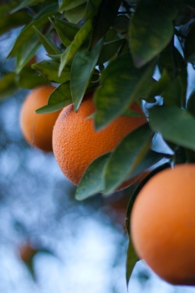
Oranges in the early morning light. Davis, California - January

If you want 2012 in a sentence, it was all about putting big sensors in smaller cameras and the continued rise of social photography. Nikon and Canon both unveiled smaller-bodied cameras that had full-frame sensors, the D600 and a 6D respectively. It was down to Sony to put a full-frame sensor in a compact: the RX1.

As for social photography, that's gone a lot further than Instagram, Twitter, Facebook, and Flickr. It's gone further than wi-fi enabled cameras, too. We've now got 'smartcameras', thanks to Nikon and Samsung. They won't be the only ones.

I'm not going to say that 2012 was an exciting year for photography. Photography is always exciting. But these are the headlines.

January

The new year always brings a flurry of photographic announcements when pretty and shiny new toys are announced at CES in Las Vegas. This year was no exception; if the compact camera is supposed to be dead, manufacturers haven't read that memo yet. Fujifilm unveiled 27 (yes, really, 27) new compacts, as well as a gaggle from Olympus, quite a few from Sony, a couple from Canon, and one from Pentax. There was, however, at least one big-hitter, with the Nikon D4 making its appearance, and not forgetting the Canon G1 X and the Fujifilm X-Pro1, either.

Meanwhile, the Intergoogles went dark to protest about the proposed SOPA legislation, Google axed online editing suite Picnik, things looked very grim for Kodak with the prospect of Chapter 11 bunkruptcy proceedings, and we mourned the death of Eve Arnold.

February

That memo about compact cameras? No, it still hasn't made it to manufacturers: 11 from Canon, ten from Nikon, and two more from Pentax. But, Nikon also brought out the D800, Olympus announced the deliciously retro OM-D, Pentax let the K-01 play in the mirror-less sand-pit, and Canon had some new lenses, too. Oh, and the Japanese authorities made some arrests in the Olympus scandal.

March

The BBC decided that footage from the Canon C300 makes the grade; Sony re-organised itself to give priority to cameras, and it also annunced the SLT-A57.

April

Nikon added the D3200 to its entry-level line-up but officially discontinued the D3x; meanwhile Canon brought out the 1D C and the 60Da especially for astro-photography. When it came to mobile photography, Instagram released its much-anticipated Android app and then jumped into bed with Facebook for $1billion a week later, and Triggertrap launched its mobile app.

There were also vague hints at a Flickr revival: first it brought out the new Uploadr, then it announced that Aviary would be its new partner for editing, after Picnik was rained-off.

May

That potential Flickr revival continued with a few more tweaks that allowed for better control over sizing photos. Adobe Photoshop CS6 was made available, and its subscription service Creative Cloud came with it.

As for new cameras: Pentax's weather-sealed mid-range dSLR, the K-30; rugged cameras from both Olympus and Fujifilm; another SLT (the A37) and a mirror-less (the NEX-F3) from Sony; and some tasty treats from Leica including the M Moncohrom especially for black and white, the X2, and the V-LUX 40.

June

Argyll and Bute council showed themselves be, what I'm wont to describe as, camera-shy wimps who were intimidated by a nine year old who photographed her school meals. Martha Payne, who recorded her exploits in school lunches on her blog Never Seconds, was told that her behaviour was upsetting the kitchen staff, so she couldn't continue. When the rest of the world found out, there was a bit of a out-cry; Argyll and Bute backed down.

Oh, and Fujifilm announced some new lenses for its X-Pro 1, which given the limited offerings, was much-needed.

July

The Olympics began. There was an amazing opening ceremony. The world was focused on that, but it was at the end of the month. Before then Canon went through the mill with a sticky lens problem with the S100 and too much vulcanising agent in the grip on its 650D. However, a years of rumours (that's not an exaggeration), it also announced its mirror-less camera, the EOS M. Nikon brought out its huge 800mm lens and Fujifilm discontinued Velvia 100F and 50.

Flickr users banded together to ask new CEO Marissa Mayer to 'make Flickr awesome again,' and I wondered if there's an ugly truth lurking beneath our beautiful cameras.

August

I spent August glued to the Olympics and the wonderful images it produced. I could say that was all that interested me, but towards the end of the month, things started to ramp up in anticipation of Photokina. Nikon upgraded its 1 Series J1 to a J2, although I wasn't quite sure what the upgrade really comprised. Olympus announced that it was developing a new top-end camera, so the rumour mill started up almost immediately. There were more new camera announcements from Nikon, including the S800c, which is on an Android platform. There was also the C300 from Canon, the Pentax X-5 bridge camera, and the Sony NEX-5R.

Canon celebrated the production of 80 million EF lenses, Getty Images was sold to the Carlyle Group for $3.3 billion, and I took a look at the overall state of the camera market.

September

Ehm... Photokina, anyone? Four new cameras from Canon, including the full-frame 6D and the pocket-rocket S110; Fujifilm's gorgeous XF1 was star of the show; five new cameras from Leica; the new Spark from Lensbaby; the D600 from Nikon; four new lenses and three new cameras from Olympus; an update to the Pentax K-5; Panasonic's GH3; new lenses from Samsung, Samyang, Sigma, and Tamron; and from Sony the full-frame flagship translucent mirror SLT-A99, the full-frame compact the RX1, and the NEX-6.

Otherwise: Smugmug announced a huge subscription fee increase that left quite a few people a little bit upset.

October

Everyone took a breather after Photokina, except for Nikon that turned the V1 into the V2 and Joby, which warned consumers about the perils of fake Gorillapods.

November

Nikon brought out the D5200, Canon set free some new lenses, Adobe updated Photoshop Touch, Triggertrap Mobile was upgraded to allow wireless functionality, and Jordi Ruiz Cirera won the Taylor Wessing Portrait Prize.

December

Apart from a major update to Photoshop, including Retina display compatibility, December was entirely dominated by mobile photography news. There was the minor problem with the Instagram terms of service, awesome editing app Snapseed was made available for Android phones, Twitter and Instagram had a barney, and that Flickr renaissance continued with a much-needed new iOS app and free Pro-subscription for three months for all users.

And 2013?

We're going to be seeing more large-scale sensors in small-form cameras; there's going to be a concerted push towards social photography integration in 'traditional' camera devices; and there will be an increased delineation between dSLR manufacturers and mirror-less camera manufacturers.

Finally, I wish you a healthy, peaceful, and prosperous year ahead.


All images © Daniela Bowker 2012. (Yes, they're my favourites of 2012.)

A much-needed update for Flickr's iOS app


Android users enjoyed a significant upgrade to Flickr in August, but iOS users were left languishing with a fairly basic app that didn't offer half of the functionality of the website. In fact, using the mobile site was a superior experience to the app. That changed around lunchtime (here in the UK, anyway) today. An updated Flickr for iOS is now available, complete with in-app camera and snazzy new layout.

Ignore the moaners and groaners who are dyspeptically lamenting that Flickr has added a filter option to the camera function. Yes, they included the option to wash your photo, taken on the newly introduced camera, with some kind of filter. Everyone's doing it now and it isn't really new or exciting. In fact, it's probably the scourge of modern photography and we'll succumb to scurvy if we continue to apply them.

But you know what? This upgrade is about a whole lot more than a selection of filters. Some much-needed functionality has been added to the app, which was quite frankly rather poor before hand, bringing what you can do with the app closer to what you can do with the website.

For me, the most exciting addition is the ability to interact with the groups you belong to. You can see the photos that have been submitted to them and you can participate in their discussions. Previously, I found not being able to do that from the app highly frustrating.

When you explore your contacts' uploads, you can select from two layouts. One shows you the uploads by adte alone. The other gives you the streams of your contacts organised by most recent upload. 

As for uploading your own images, take a picture, make your edits with Aviary, apply a filter (or not), and then upload it to your photostream, add it to a group or set if you want, write a description, and complete everything with tags. Or you can select one from your phone's camera stream.

This update improves the functionality of the app hugely, but even I, in my rose-tinted Flickr-adoration, know that Flickr has suffered from stagnation. I don't know if it's enough, but it's a start. And I'm very happy about the improvements.

Whoah! And there's more! Flickr has just announced that over the next few days it'll be rolling out an improved navigation bar and a new-style Explore page on its website. I'm not seeing that yet, but I'm looking forward to trying it.

New features for Photoshop


There have been rumours floating around for a little while that Adobe was about to unveil Retina support in Photoshop; those have been confirmed today, along with some other new features for Creative Cloud subscribers.

Whether you have a Photoshop licence or a subscription to Creative Cloud, there's an update available to provide support for HiDPI displays.

If you're a Creative Cloud member your update will also enable to following:

  • Smart Object support in the Blur gallery and with the liquify feature
  • The ability to quickly export CSS code for text and objects as well as import colour swatches to help design incredible websites more easily
  • Crop tool refinements and other timesaving features in the workflow
  • 3D enhancements including improved live previews of shadow effects and additional control over illumination using 32-bit colour picker to create glow effects
  • Conditional Actions that automatically select the appropriate action based on user-defined rules, giving users enhanced image processing speed.

There have also been some updates to Creative Cloud as a whole as well as other Creative Cloud products, not just its Photoshop features. You can now subscribe to Creative Cloud on a team basis; Creative Cloud Connection allows for desktop synching, a la Dropbox; and there's also Creative Cloud Training, which provides members with a library of tutorials and trial courses.

If you're not like one of the one million people already subscribed to Creative Cloud, an annual subscription comes in at £38.12 a month (excluding VAT). Creative Cloud for teams is more expensive whilst there are discounts for for students, teachers, and existing Adobe customers with CS3 or later.

Offering Photoshop updates to Creative Cloud subscribers before they're rolled out to stand-alone licence-holders is clearly a perk of the package, but there's been no indication when these new features (barring the retina support) will be rolled out to everyone. Combined with the discount for CS3+ licence holders, I'm intrigued to see if this is the beginning of a steady enforced obsoletion of the individual package, and a move to a subscription-only package.

Something to keep an eye on.

Instagram and Twitter's playground scuffle


Twitter's new Aviary-powered filters

Instagram and Twitter's current spat is worse than squabbling children. 'Instagram doesn't want to play!' 'But Twitter started it!' 'Well, ner, we'll just play by ourselves then!' 'Fine, we'll find some new toys, too!' I feel like putting them on the naughty step and asking them to explain themselves when they're ready.

This round really kicked off late last week, when Instagram's CEO, Kevin Systrom, confirmed that Instagram will no longer be offering card support on Twitter. That means instead of Instagram pictures appearing directly in a tweet, you'll have to follow a link taking you to Instagram's site.

From Instagram's perspective, this is 'The right thing to do' because it is building on their own social network. Systrom did state that this was in no way a direct result of Instagram's acquisition by Facebook. It is, however, easy to interpret this as Facebook pulling strings and fostering the sort of social networking that prompted the buy-out. Facebook snapped up Instagram because it needed a route into mobile, photographic social networking. By burning bridges with Twitter, it's encouraging its users to stay within its own network, not share the love across them. So really, it isn't so much about being globally socialable, but more about being a global social hegemony. 

From Twitter's perspective there are short-term and long-term implications. In the short-term, it's not that big a deal. That people's Instagram images don't appear directly in tweets is an irritation for some, but Twitter is about so much more than Instagram that it's just that: an irritation. It isn't a fundamental failing. The long-term implications need a bit more thought, though.

From Twitter's perspective, is this that big a deal? I'm inclined to say not really, for now. Twitter is about a great deal more than Instagram. Yes, that people's Instagram images don't appear directly in tweets is an irritation for some, but it's just that: an irritation. Whilst Instagram is a component of Twitter's functionality, Twitter doesn't rely on it for survival. It is, though, a warning signal to Twitter that will need to think about maintaining its attraction to users, because Facebook is gunning for it.

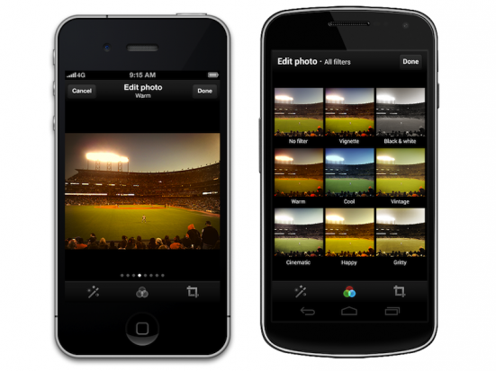
Yesterday, Twitter announced that it has partnered with Aviary–the company that provides image editing services on Flickr and in MailChimp, amongst others–to provide its own photo filters. The timing fits neatly with Instagram's card-retraction move, but isn't a direct result of that. If anything, it's more likely to have been the other way about with Instagram withdrawing cards knowing that Twitter was about to offer its own filters. These filters have thought to have been in the pipeline since Instagram's takeover in April. So Twitter is thinking in terms of its longevity.

As for the in-Twitter editing options, they're available for both iOS and Android, there's a choice of eight filters, all of them can be previewed simultaneously using a grid view, you can crop and zoom, and there's a magic wand to enable auto-correction. It's not nearly as diverse as Instagram's offerings, but it's a start.

Indeed, Instagram made their offerings even more diverse yesterday, too. There was a camera update for iOS users, a new filter called Willow, and some improvements to the tilt-shift effect. The camera update should make it easier to Instagram-ify previously taken photos as well as providing an optional grid when you're taking photos and a permanent grid when you're cropping. That, then, would be a small reminder to its users about the sorts of functionality (barring lack of Twitter integration) that it offers.

Twitter has managed to upset plenty of developers with its stringent API requirements and Instagram seems intent on developing its own (and by extension, Facebook's) network as opposed to playing nicely with others. They might see this as good for their businesses, but the reality is that the users lose out. And it's the users who make these social networks social.

What then for the users? If you're on Instagram for the followers, then you'll have to stick with it, or at least stick with it until you've grown a new network elsewhere. If you use Instagram for its filters and for the purposes of being social, then there are plenty of other ways of doing that.

It's irritating that these big kids can't play nicely and that it has the potential to all end in tears. There really are enough relationships and enough photographs to go around. We don't need to be forced into a social networking hegemony.

You can check out Instagram's update on its blog, and Twitter's update on its blog.

Congratulations to November's competition winner!


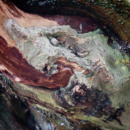
November's competition theme was wood. You presented us with so many wonderful images that we had a lot of fun looking for a winner. This month's prize, however, goes to Flickr used ludovi for his image Wounded Tree.

Wounded Tree

I was immediately drawn to the gorgeous variations in colour in this image. On top of that, it's technically great. We're very happy to award it a 12" Fracture.

There's an honourable mention, too, for Phil Walton and his Just Missed Bonfire Night. It's a fun twist on the theme, with great lighting, that made us laugh. Well done!

Just Missed Bonfire Night

Congratulations, and thanks everyone for entering. If you feel like having a go this month, December's competition is up-and-running.

A photo competition for December


For December's competition we're going back to basics, something simple to round-off the year. We'd like black and white images, please.

Your image can be a portrait, a landscape, a macro... whatever takes your fancy. But it must be in black and white.

The competition is open from today (Friday 7 December) until Friday 28 December 2012. You can submit one entry to the Small Aperture Flickr pool. And the winning image will bag its photographer a 12" Fracture.

I've reproduced the rules for your reference, and here's a wish of good luck:

The Rules

  • If you decide to enter, you agree to The Rules.
  • You can’t be related to either me or Haje to enter.
  • One entry per person – so choose your best!
  • Entries need to be submitted to the right place, which is the Small Aperture Flickr group.
  • There’s a closing date for entries, so make sure you’ve submitted before then.
  • You have to own the copyright to your entry and be at liberty to submit it to a competition. Using other people’s photos is most uncool.
  • It probably goes without saying, but entries do need to be photographs. It’d be a bit of strange photo competition otherwise.
  • Don’t do anything icky – you know, be obscene or defame someone or sell your granny to get the photo.
  • We (that being me and Haje) get to choose the winner and we’ll do our best to do so within a week of the competition closing.
  • You get to keep all the rights to your images. We just want to be able to show off the winners (and maybe some honourable mentions) here on Pixiq.
  • Entry is at your own risk. I can’t see us eating you or anything, but we can’t be responsible for anything that happens to you because you submit a photo to our competition.
  • We are allowed to change The Rules, or even suspend or end the competition, if we want or need to. Obviously we’ll try not to, but just so that you know.

If you've any questions, please just ask!

Snapseed says hello to Android


Snapseed editing awesomeness now available for Android

When Google snapped up Snapseed, which is undoubtedly my favourite editing app for mobile photography, earlier this year there was a lot of groaning and sighing around the Intergoogles. There's been a nasty tendancy to acquire successful companies for their talent, but shutter the product itself. Snapseed, however, might have been a trend-bucker. When Google bought out Nik Software, Snapseed's owners, it was an iOS-only app. But not from today. Now it's all hunky-dory and Android-ified.

Phones and tablets that are running Ice Cream Sandwich or later are able to make use of Snapseed's comprehensive and intuitive editing package. Sure you can do fun things with your photos using Snapseed, for example adding grunge effects or a vintage look, but it offers you the ability to adjust and control the fundamentals–such as the white balance, the contrast, and the sharpening–and make selective adjustments easily, too. Snapseed lets you edit 'properly'; it isn't just about fun filters.

It's this solid base that's made Snapseed so popular, and allowed Dan Chung to live blog from Olympics with his iPhone

Snapseed, whether on iOS or Android supports nine different languages, and as of today is now free, too.

You can download Snapseed from the App Store or Google Play.

The Taylor Wessing Photographic Portrait Prize 2012

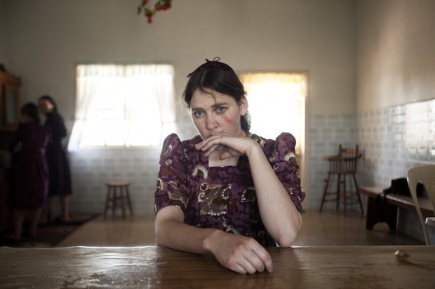
Margarita Teichroeb by Jordi Ruiz Cirera. 1st Prize (Copyright Jordi Ruiz Cirera).
This year the Taylor Wessing Photographic Portrait Prize, hosted at the National Portrait Gallery in London, had 5,340 entries from from 2,350 photographers, some professional, some student, some amateur. Of those entries, 60 are exhibited at the gallery. One picture is judged the winner, and then there are second, third, and fourth placed prizes to be had, too.

I popped along and took a look early in November and Gareth went this week. My immediate reaction to the overall exhibition was that it felt very muted and subdued, with relatively few bold colours. Just like everything, photography has fashions and right now, that's in vogue. Gareth, however, goes into this trend more deeply in his analysis, so I'll hand you over to him, and his impressions of the winning entry and the runners up.

This year's winning entry was Margarita Teichroeb by Jordi Ruiz Cirera. What I have noticed is that, every single year, people react angrily to the winning entry and indeed to many of the shortlisted images. Because I hate being happy, I decided to trawl some comments underneath online articles announcing the winners. Thankfully, it wasn't all bad, but the main complaint was the somewhat reductive argument that it was 'just a woman sat down, looking worried.'

This attitude baffles me. I feel like these comments are the result of a combination of bitterness and laziness, or a reluctance to make an effort to interpret the image. Saying that Margarita Teichroeb is 'just a woman sat down looking worried,' is like saying The Exorcist is 'just a scary film about a little girl.'

Margarita is a woman living in a Mennonite community in Bolivia. Mennonite communities often frown upon and do not allow photography, believing it is a form of graven image. This is reflected in Margarita's deeply worried expression. She is attempting to obscure her face, possibly partly subconsciously, and it is clearly a uncomfortable experience for her.

In print, it is a breathtaking image. The sense of connection between the viewer and the subject as you look into her eyes is really quite powerful: the emotion captured is so raw and real. In being so very nervous, Margarita has laid her honest feelings completely bare in front of us. People often speak of a person looking 'natural' in an image, which they always translate as looking relaxed, essentially. However, I think a 'natural' portrait comes in many flavours, the key being the genuineness of the expression, regardless of what emotion is being expressed. Margarita has a genuine, natural expression of concern on her face.

The deeper level to the image is what it says about the Mennonite community. The beliefs held by these people are clearly strong religious beliefs: Margarita's concern and conviction tell a story of the wider community and give us a telling insight into the isolation and strict rules which typify this community.

For those reasons, I agree with the judges' decision to award it first prize: Margarita Teichroeb is an image that captures genuine, raw emotion whilst simultaneously telling a much wider story. It is not 'just a woman sat down looking worried.' I would recommend you take a moment to visit www.jordiruizcirera.com and have a look at the series that the image came from. They are excellent. I particularly like the contrast between the children's portraits and those of the adults. The children have not yet been moulded by the strict rules of the community the way the adults have, and this is clear to see in their significantly more relaxed and confident expressions.

Addressing the other winning entries, I mostly agree with the judges' decisions here, also, Spencer Murphy's Mark Rylance being my personal favourite. One image that doesn't grab me, however is The Ventriloquist by Alma Haser.

Like any art form, photography often goes through fashion spells. At present, there seems to be a penchant for low contrast images, sometimes with no true blacks, sporting very neutral, window light tones. As it happens, this style really appeals to me, as there is often a feeling of truth to the final shot: a feeling of the image not hiding anything.

With The Ventriloquist, however, it feels as if the photographer is a little too aware of the current trend and has processed it in that style for no real reason other than it being currently popular. I also feel that it has been processed quite clumsily. The story behind the image of two friends is that the photographer 'wanted to turn their verbal banter into a visual image.' I appreciate that interpretation can be a very personal thing, but to me, 'banter' conjures up images of fun and affectionate jibing, a key element of a close friendship. Her decision to capture them both with neutral, blank expressions is at odds with this idea.

I feel that all the visual decisions made in the image were to tick the boxes, so to speak, of what is currently appetising in photography. The clumsy processing and attempts at distant, emotionless expressions leave me cold and feel incongruous to the message and I feel like it doesn't belong in the winning entries. A better replacement for a posed, conceptual portrait would have been Nadia Lee Cohen's absolutely stunning American Nightmare, for example. If the judges were more interested in the sense of companionship and the relationship between the two subjects, a better fit would've been the delightfully simple yet beautiful Rosa and Adoney by Sarah Booker.

Nevertheless, I felt that the entire selection of 60 images were varied and a fair final decision, even if I disagreed with some of the entries.

Should you have the opportunity to pay a visit, do go. It costs £2, and we'd be very interested to hear what you have to say about the entries. The Taylor Wessing Photographic Portrait Prize 2012 exhibition is at the National Portrait Gallery, London, from 8 November 2012 to 17 February 2013.


Gareth Dutton is a portrait and editorial photographer based in London. You can see his work here.

Metroprint, you've a slight problem with your Instagram print service


Pretty-looking prints, but...

I've just received one of 'those' press releases. One where everything seems so promising until you reach a key detail that makes you raise your palm to your forehead and start muttering 'Why?'

Metroprint, a British-based print provider has just unveiled its Instagram print service. It's online or you can walk in to its London store, prints are 35p a pop, and you have a choice of matt or gloss finish. So far, so good. Until you reach the all-important point where you upload your images to their servers. This vital stage in the production of your photos, photos taken on your Intergoogle-enabled smartphone, has to be done from your desktop. There's no mobile app and if you try to upload from your iPhone (as I did) you're told 'Very sorry no-can-do, because we rather need Flash.'

Really, Metroprint? You've set up a print service for a mobileography phenomenon that can't be accessed directly from a smartphone? And isn't ever likely to be accessible from a smartphone as HTML5 has won the war, leaving Flash to slink away and lick its wounds. Did you actually think this one through? Doesn't it strike you as maybe inefficient? Or perhaps counterintuitive? How about entirely contrary to the spirit of Instagram? What about really embarrassing?

If you were the only print service providing Instagram-specific photos, it might, possibly, swing in your favour. You'd be filling a gap in the market and people would probably be prepared to forgive your inconvenience because of your unique service. But you see, you're not. PostalPix is a free app, with reasonably priced paper prints and even aluminium prints. Printstagram isn't app based, but it's simple enough to upload your images straight from your phone or your desktop. It connects directly with your Instagram account, meaning there's no tiresome downloading and re-uploading, a key factor that you seem to have overlooked.

Like anything in life, people love Instagram for a heap of different reasons, but I'm certain that one of those is that it's simple to use and another is that it's verging on instantaneous. When you're setting up a print service for Instagram, no matter how high quality your prints, you have to mirror those attributes or you'll not appeal to your customer base. The workflow that you've implemented for your Instagram prints is clunky and unappealing, if I'm going to be polite about it. If I'm going to be brutally honest, by using obsolete technology for one of the hottest trends around you've made yourself look more out-of-touch than Miss Havisham stepping foot into a Soho club. 

I suggest that you re-think this one, Metroprint.

As for the Metroprint Instagram service, it's available here.


Update! Metroprint got in touch with me to inform me that there is Flash-free upload option that functions from both Android and iOS devices. At the time of the press launch it was down, however. I'm prepared to give them the benefit of the doubt that they had covered this option, but I'm far from impressed that functionality hadn't been assured when the news was announced.

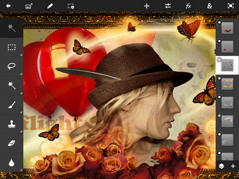
Adobe updates Photoshop Touch


For anyone who uses Adobe's Photoshop Touch on their tablet, there are a few updates waiting for you with version 1.4. For anyone who was thinking about installing it on their baby-tablets, then the latest version is optimised for your iPad Minis and Nexus 7s.

In addition, there's now support for three iPad-compatible styli, the Pogo Connect, the Jot Touch, and the Jaja Stylus. You can share your completed images with Facebook and Twitter direct from the app in new ways. Some new effects have been added, including lens flare and stamp patterns. And there have been some enhancements to performance and workflow: brush strokes should be smootherand there's a new colour selection workflow.

If you're already using Photoshop Touch, the update is free. If you'd like to download it and give its tablet-ised image editing magic a whirl, it's £6.99 ($9.99) from the Apple App Store or Google Play.

Triggertrap Mobile's free! Whee!


Just for the holidays, the Triggertrap Mobile premium application is going to be available for free for both Android and iOS.

There's always been a free version of Triggertrap Mobile, offering a selection of the premium application's camera triggering options, but now anyone with an Android or Apple phone has access to all of Triggertrap's capabilities. These include multiple time-lapse features; sensor controls to trigger your camera using sound, motion, vibration, or metal; facial recognition; and star trail and HDR modes.

To make the most of Triggertrap with your SLR, rather than with your smartphone camera alone, you will need a dongle. This can be purchased for $24.99 from the Triggertrap store. But with the new wireless function, you won't necessarily need a cable. And don't forget to download the app from the App Store, or Google Play.

That's just made one Christmas present a bit cheaper!

Gift-giving to photographers


Photojojo's nifty ring flash adapter

Earlier this week I put together a list of sub-£25 ($40) gift ideas for photographers. If you've a little bit more to spend, these suggestions should keep you going. They start at $40, take you up to $550, and there should be something for everyone!

Ring Flash Adapter

Ring flashes don't necessarily come cheap, but a ring flash adapter–which makes use of your existing external flash–is a handy alternative. Of course it was the clever people at Photojojo that thought of this one!

$40 from the Photojojo Store

A compact camera for kiddies

If you've a budding photographer in the house there's no better way to encourage her or him on the path to becoming their generation's Ansel Adams than with a 'proper' camera. It doesn't need to be fancy, but it does need to be suitable for little fingers. I've been consistently impressed with Fujifilm's entry-level compacts, and this year is no different.

Take a look at the Fujifilm AX500. With 14 megapixels of resolution, movie-making capability, digital image stabilisation, and running off of two AA batteries, it's ideal.

£50 from John Lewis or $73 from Amazon US

Lensbaby Spark

Buying lenses for other people is very rarely a good idea, unless you know precisely what they want or need. A Lensbaby Spark, however, is a fun fixed aperture selective-focus option that should get the creative juices flowing.

$80 from Lensbaby

Dropbox subscription

Earlier this year I wrote about the perils of not having a proper back-up protocol in place. If your photographer friend is living dangerously with their digital storage solutions, why not treat her or him to a Dropbox subscription.

$99 for 100GB annual subscription

Adobe Lightroom 4

Adobe's Lightroom 4 is a superb piece of kit. No, it doesn't have the bells and whistles of Photoshop, but then that's Photoshop. Instead it offers brilliant straight-up editing and photo management. If you know someone who has been uhming and ahhing over it, help them out!

£106 from Adobe UK or $149 from Adobe US

A 'serious' compact camera

My dSLR is my camera of choice and I love my iPhone, but it's very rare that I go anywhere without a pocket-sized compact with full manual control in my handbag. I love my Canon S95 and the reviews of the S110 have been very good. Many people have waxed lyrical over Sony's RX100, too. But the one that's really catching my eye right now is the Olympus XZ-2.

£425 from Amazon UK or $550 from Amazon US

And of course, don't forget to check out last year's slightly-more-expensive gift suggestions.

Seasonal gifts and goodies


It might not take pictures, but it looks the part. £5

If you're looking for a little-ish gift for a photographically inclined loved one, these are eight favourite suggestions coming in at £25 or under (so that's around $40). Some are quirky, some are practical, but with luck, any of them should bring a smile to someone's face. Better yet, they are all available online so you don't need to brave the thronging hordes on the high street.

Camera necklace

In-keeping with my search for a piece of camera-oriented jewellery, this year I went in search of necklaces. I've found a heap of them. Who knew that they'd be so popular? But here are two of my favourites:

Antique-looking silver for $15

Or chunky acrylic for £5

Tiltpod

When I road-tested tiltpods for mobile and compact cameras earlier this year, I said that I thought they'd make great presents, but I wouldn't necessarily buy one for myself. Seeing as this is the season to be giving gifts...

Tiltpods for mobile or compact camera are $14.95

Cookie Cutters

Cookie dough + camera-shaped cookie cutter = An edible Nikon D800. What's not to love?

All of $17.95

Bokeh Masters kit

More than anything I think that adding cute shaped bokeh to the background of your pictures is good fun. This kit gives you 25 pre-cut shapes to play with and an opportunity to craft eight of your own.

$25 from DIY Photography

Triggertrap mobile

Wirelessly control your SLR from your mobile phone (Android or iOS) to make time-lapses or distance-lapses; trigger the shutter using sound, vibration, or facial recognition; chase stars, and generally have far too much fun with a camera.

The app costs $4.99 from Apple or Google Play, the all-important dongle is $29.99

Multi-tool

Having a multi-tool stashed in your kit-bag can be Very Useful Indeed. You never know when you might need a screw driver or a pair of scissors. There are hundreds to choose from, but right now this Leatherman is great value.

$35 on Amazon US

Or £36 on Amazon UK

Book

If someone were to ask me which photography book I'd most like this year, it would be one that's beautiful and inspires me. So I'm going to suggest National Geographic's Life in Color.

$40 from the National Geographic store

Fracture gift certificate

The wonderful people at Fracture sponsor our monthly photo contest here and supply the winner with a gorgeous 12" Fracture. They also offer gift certificates so your beloved photographer can turn their own images into stunning glass prints.

As much as you want to spend

Of course, last year's suggestions are just as valid this year. So do take a look at that list, which includes practical cleaning kits and grey cards as well as adorable camera-shaped rubber stamps.

Triggertrap goes wireless


When Team Triggertrap headed to Photokina in September with their universal camera triggering device and app, one of the questions most frequently asked of them was 'Will there be a cable-free option for the app soon?' Being able to use your mobile phone to remotely control your camera is awesome, but having to use a connection cable can be a bit of a bind.

Without trying to give away too much, Matt and Haje would smile and nod and say that it was something that they were thinking about. They've been thinking about it very hard, in fact, and developing, and testing, and testing some more, and finally some updating. From today you can update your Triggertrap Mobile app, either Android or iOS, so that it can trigger your dSLR or EVIL camera wirelessly.

And it's all down to Wi-Fi.

Your mobile acts at the master device whilst the Triggertrap dongle interfaces with your camera as the slave. If you'd like to control several slave devices from one master, that's possible, too.

Of course, this is all hunky-dory if you happen to be shooting somewhere with a Wi-Fi network, but what if you're in the middle of Nowheresville without one? You can create a personal hotspot using your master device's data network, assuming of course that you have one of those. Ta-dah! You can go forth and wirelessly create time-lapses and distance lapses, or trigger your camera using sound, vibration, or the correct number of faces in the scene.

The update is available for free for existing Triggertrap Premium app users and included in new downloads (Android is here; iOS is here). Don't forget, you will still need the dongle, though. (And yes, I'm still inclined to snigger every time that I hear the word 'dongle'. I don't expect that to change any time soon.)

October's round winner


Crikey! You made it hard for us this month. We almost came to blows trying to settle on a winner for October's round-themed competition. To be fair, it would have been difficult, as none of us is currently in the same city, and we don't really go in for violence, but you get the idea that we struggled to agree.

Eventually, though, it was concluded that Martin's untitled picture should take the spoils of a 12" Fracture. Well done!

Congratulations everyone, you did a sterling job.

If you fancy having a go at November's competition, we're looking for images of wood. All the details are here.

Philip Bloom's fantastic Movember giveaway


It's November. Have you noticed an unsually high number of men sporting the fuzzy beginnings of a moustache? You have? Well, the chances are that they're doing it in aid of Movember: the campaign to raise awareness of and funds for research into prostate cancer. And the chances of a man being diagnosed with prostate cancer? About one in nine.

Prostate cancer is something with which film maker Philip Bloom has a far-too-personal relationship: his grandfather died from it and his uncle is fighting it. The likelihood of him developing it are scarily high. Every November, then, he sprouts a moustache and encourages people to donate to the Movember cause. Last year he raised £18,000 towards prostate cancer research; this year he'd like to do better, and this is where you get involved. Better still, you don't even have to grow a moustache.

He's tapped up members of the film making and photographic community the world over to contribute awesome prizes for his insane Movember Giveaway.

This giveaway comes in two parts. To be eligible for either half you must donate at least $20 to 'Team Bloom Tache' (and let Philip know by emailing him a copy of the receipt), but whilst one half needs just your charity, the other demands your creativity, too.

Get growing mos and making films

As Philip is a film maker, it's hardly surprising that one half of the giveaway involves making films. You've two options: a film that celebrates the moustache or a film that raises awareness of prostate cancer. Whichever you pick, there're super prizes up for grabs for the best film in either category, such as a Compass 12 tripod, thanks to Miller Tripods, or a rig of your choice from the team at Shape, or some goodies from Kessler Crane. Those are just a few examples.

Fun or serious, it doesn't matter, but the films should be short and tight–ideally no longer than two minutes in length–and need to be submitted to the Vimeo group before 20 November 2012.

And don't forget your $20 donation, either!

Just donate

If you're not able to make a film, for whatever reason, you can put yourself into the draw to win all manner of wonderful prizes. All you need to do is donate $20 to Philip's Movember team and then email a copy of the receipt to the designated address. That will put you in with a shout to win a licence for Creative Suite 6 Premium Production, courtesy of Adobe; or a $1,000 voucher for Zacuto; or a Sony RX100 thanks to hireacamera.com; or a GoPro Hero2 and a bundle of accessories from GoPro or... or... or... The list of prizes is huge, and growing!

All the details

To keep an eye on the ever-growing list of prizes, to check out all the terms and conditions, and to make sure you send your donation receipts to the correct email address, check out the giveaway page on Philip's website.

November's photo competition is here!


There's a lot of wood in Kew Gardens

We'll keep this simple. The theme for November's photo contest is wood, from trees coming into bud in the southern hemisphere, to bonfires piled high in the UK, or log cabins in mountainous retreats.

Yes, I might've been inspired by the terrible threat of ash dieback to UK woodlands, especially in East Anglia where my family home is.

You have from today (Friday 2 November) to Friday 30 November to submit your entries to the Small Aperture Flickr pool. It's one submission per person, and the picture that we like the most will win a 12" Fracture.

I've reproduced The Rules for you, and if you're in the UK, I'm adding a small reminder to be careful and avoid spreading the horrible fungus.

The Rules

  • If you decide to enter, you agree to The Rules.
  • You can’t be related to either me or Haje to enter.
  • One entry per person – so choose your best!
  • Entries need to be submitted to the right place, which is the Small Aperture Flickr group.
  • There’s a closing date for entries, so make sure you’ve submitted before then.
  • You have to own the copyright to your entry and be at liberty to submit it to a competition. Using other people’s photos is most uncool.
  • It probably goes without saying, but entries do need to be photographs. It’d be a bit of strange photo competition otherwise.
  • Don’t do anything icky – you know, be obscene or defame someone or sell your granny to get the photo.
  • We (that being me and Haje) get to choose the winner and we’ll do our best to do so within a week of the competition closing.
  • You get to keep all the rights to your images. We just want to be able to show off the winners (and maybe some honourable mentions) here on Pixiq.
  • Entry is at your own risk. I can’t see us eating you or anything, but we can’t be responsible for anything that happens to you because you submit a photo to our competition.
  • We are allowed to change The Rules, or even suspend or end the competition, if we want or need to. Obviously we’ll try not to, but just so that you know.

If you've any questions, please just ask!

Montblanc photographs the entire world at the same time


Now how's this for a brilliant idea - Montblanc have come up with a PR stunt that has participants around the world to take photos at exactly the same time. In “The Montblanc Worldsecond”, the company launches their ambitious photo project that invites everyone to capture moments of beauty photographically. A specially developed mobile photo app (for iPhone and Android) features a countdown function, ensuring that all cameras of will take a picture at the very same instant.

The photos are then uploaded to the worldsecond.montblanc.com Web site, creating a stunning mosaic of globally shared moments, of “Worldseconds”.

The Montblanc Worldsecond mobile app will be available for Apple iPhone and Android phones in November 2012. For further information, visit the website.