News

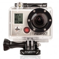
Hero2 helmet cam can record heroic exploits with bikes, cars, and surfboards

hero2

If my Ma had her way, she’d strap one of these things to my helmet whilst I’m racing around London on my bicycle so that she can yell at drivers when they cut me up and yell at me when I zip in and out of traffic. (My bicycle is called Elspeth, by the way.) It’s the GoPro HD Hero2 helmet cam; the super-improved replacement for Go-Pro’s already rather wonderful original Hero helmet camera that records your awesome adventures as you go careening around race tracks and tumbling through waves so that you can relive them with mates and beer whilst you nurse your bruises.

It captures 1080p HD video and 11 megapixel photos. That’s a bit of upgrade from the previous five megapixels, eh? The new lens should be better in low-light, too. Come the winter, you’ll even be able to stream your exploits live via Wifi (if there’s an available Wifi connection, obviously). And the interface has been redesigned so that you should, in theory, be able to use it without the need for destructions.

You can select from three different angles of view: narrow (90º), medium (127º), and wide (170º) for your video, or there’s medium or wide for your timelapse photos that you can set for every half second.

The Hero2 comes in three flavours – outdoor, motorsport, and surf – and is retailing at $299.99. There’s more info from GoPro.

No Ma, if you’re reading this, I’m not getting one. But I’d love to see someone’s exploits as they hurtle down a mountainside with one attached to their helmet.

Rihanna and LaChapelle settle out of court

Rihanna S&M

It seems that a bucket of out-of-court settlement cold water has doused the artistic cat-fight between photographer David LaChapelle and singer Rihanna. Shame, really, as this one could have been interesting.

Rihanna has agreed to pay LaChapelle an undisclosed sum after he sought $1 million in damages from her, citing copyright infringement. LaChapelle thought that some scenes in Rihanna’s S&M video looked suspiciously similar to a set of his photos that had appeared in Italian Vogue.

LaChapelle claimed that Rihanna had copied everything from his images that appeared in the magazine, from the poses to the ligting set-up; Rihanna countered that he was ‘trying to monopolise a whole genre’ of sado-masochistic images. When it went before New York Judge Shira A Scheindlin in July, to decide if he did have a claim at all, she agreed: ‘An ordinary observer may well overlook any differences and regard the aesthetic appeal of “Striped Face” and the “Pink Room Scene” as the same.’

From LaChapelle’s point of view, he has got what he wanted. ‘Musicians commonly pay to sample music or use someone’s beats and there should be no difference when sampling an artist’s visuals.’ He’s happy with the settlement.

As for Rihanna, she might want to consider her next video a bit more carefully. So far she has managed to upset two photographers and a conservative Northern Irish farmer when shooting them. Is anyone opening a book on her next line of attack?

(Headsup to the Guardian)

Focus and re-focus after the event with Lytro

I get asked what I think the next big thing in photography will be, or what direction technology will take, quite a bit. It’s one of those things that you can’t really answer. Not until you’re actually living in that imagined future does it seem possible. So if you’d asked me a few years ago if a camera that would allow you to focus and re-focus your image as much as you wanted to after you’d captured it was on the cards, I’d've probably shrugged my shoulders. But it’s here now. It’s the Lytro.  

The idea behind the Lytro is that it captures all of the light rays in a given scene. According to Lytro, it captures a scene in four dimensions by recording the colour, intensity, and the direction of every ray of light that hits the light field sensor in the camera. And what does it do with all this information? It processes it using a light field engine so that you can re-focus pictures directly on the camera. If you want to share your images on-line, this light field engine will travel will them, allowing anyone to interact with them from any device, from mobile phones to desktop computers. No special software required.

I’ve had a play with some sample images: you click on the area where you want to focus and… tah-daa!… the focus will shift there in a second or so. It’s simple and quite good fun. You can mess around there, too.

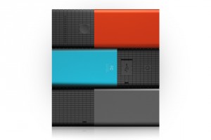
Despite the technology involved, Lytro wants to keep their cameras sleek and simple. There are just two buttons on the camera – on/off and the shutter – and everything else is achieved through a touchscreen. As for the design, I can’t help but think it looks a bit like something I would’ve made using mirrors and cardboard when I was seven, but perhaps I was weirdly ahead of my time. Still, it’s small, light, and comes in blue, red, or graphite.

The lens has a constant aperture of f/2.0 and an 8× optical zoom. With no need to focus, it’s pretty speedy; and as it captures all of the available light in a scene, it should have pretty good low-light capability, too.

The Lytro comes in two sizes, an 8GB model in blue or graphite that stores 350 photos, or a 16GB version in red that holds 750 images. They cost $399 and $499 respectively. If you’re one of Lytro’s first customers, they'll provide you with free storage for your light field images uploaded to Lytro.com, too. They should be shipping come the new year.

You can learn more from Lytro.

Some very odd goings-on at Olympus

Olympus

Oh Olympus, you’re supposed to be in the news for developing exciting camera technology, not for sacking your newly appointed British CEO, issuing contradictory statements about financial transactions, behaving in a way that could generally be perceived as a bit unusual, and seeing your share prices drop by 40% because of it all. But that, in a nutshell, is what’s happened. And it has all happened very quickly. So here’s a potted history of the Japanese camera giant, the British CEO, and the alleged financial irregularities.

Just over two weeks ago Michael Woodford was appointed CEO of Olympus. He was already the company’s President and he’d worked for them for over 30 years. So when they sacked him on Friday, citing a cash of management styles, it seemed a bit, well, odd. I mean, you might think that they’d have known how he operated after so long with them, wouldn’t you? And if his management style were so problematic, how had he managed to rise so high and then be appointed CEO? Perhaps something else was going on?

According to Woodford, yes, something else was going on. And it was very odd. Woodford had noticed some accounting irregularities and asked auditors PriceWaterhouseCoopers to take a closer look. He’d spotted that a payment made to a Cayman Islands-based company as part of the take-over deal of Gyrus (a medical imaging company) was on the excessive side. According to Woodford, it’s usual to pay a fee of 1 or 2% of the total sale price to the broker when a takeover happens. Olympus paid about $2billion for Gyrus, and around $675m in fees to the mysterious Cayman Islands company. So in this instance the fee paid was 36%; he thought that this deserved investigation.

It seems that everyone else at Olympus wasn’t quite so convinced that it needed further investigation and maybe this was the clash of management styles to which they were referring, rather than that he’d uncovered something that he shouldn’t have? Sort of like, not washing the company’s dirty linen in public. Whatever, Woodford was summarily dismissed, told to hand over the keys to his flat (of which he owned 51%), and informed that his driver wouldn’t be able to take him to the airport.

Yesterday, Woodford turned up at the Serious Fraud Office in London and presented them with all of the evidence that he’d accumulated associated with what he regarded as Olympus’ not-quite-okay dealings. In return, Olympus has said that it plans to take legal action against Woodford. It has also denied and confirmed making an excessive payment to the Cayman Islands company.

Since Friday, when Woodford was dismissed, Olympus’ shares have plummeted by about 40%. That’s swiped $3.2 billion off of its market value. That’s a super high price to pay for a divergent management style, isn’t it?

Woodford has given quite a few interviews since his return to the UK. You can hear his own explanation of things to both Channel 4, embedded below, and to the BBC.

This murky and convoluted story is one that could run for a while yet. It’ll be very interesting to see how it unfolds.

Sweet lens filter coasters

coasters

If I weren’t actively attempting to divest myself of belongings in preparation for spending six months overseas next year, I would already have pledged some money towards Joel Malone’s current Kickstarter project to produce sets of lens filter coasters. Then I would have told you guys about it. He’s looking for $10,000 before 6 December this year; you’ll get a stylish photography-related living room accessory in exchange for your financial support.

Pledge $40 and you get four 86mm UV filters in a swanky steel holder. If you’d prefer coloured filter coasters – red, blue, green, and yellow – that’ll set you back $50. Fancy both sets? Then you’ll need add $85 into the pot. If you’re feeling extra rich and have $170 to spare, you’ll get four sets, two UV and two coloured. Maybe you don’t want 16 coasters, but you might have a few photographer mates who’d appreciate a set.

There are no plans to develop these for retail, which means that you’ll have to stump up the cash now, and things are bit more expensive for international shipping, too.

You can go grab yours from the Kickstarter page.

From Pixels to Postcards


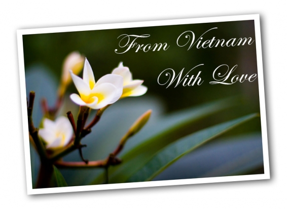
I've done a lot of travelling over the past year (In fact, I'll only be in London for about 100 days in all of 2011 - how's that for a crazy travel schedule), but of course, the People Back Home™ want to know what I've been up to. I do post all my stuff to Flickr as I go along, but sometimes you want to send them a postcard when you're out and about.

There are a slurry of Take-a-photo-send-a-postcard services out there, but some are absolutely useless. The worst failure of the lot is ShootIt, which didn't manage to get any of my postcards to my dying grandmother. Suffice to say that I don't have a lot of time for them.

After I posted the ShootIt post, the lovely people from TouchNote got in touch, with a simple message: "Sorry for your loss, give us a try". I figured 'what the hell', and went for it.

I'll be honest with you, I haven't looked back: The postcards are of fantastic quality, the service is easy to use, and they keep their promises: Postcards are sent out by first class mail the next day, and they arrive promptly most of the time.

Testing the iPhone app

The only hiccup with the service was that their iPhone app wasn't really all that easy to use. No problem, of course, but if you're on the road, it's nifty to be able to take a photo with your iPhone, edit it in Photoshop Express, and then send it as a real postcard to your friends or family. The great news is that they've just updated their app, making it super easy to use.

The service isn't limited only to iPhones, by the way; It's available on iPhone, Android, Windows Phone 7, and Palm devices, and apparently they have managed to convince Sony Ericsson to pre-install their app on millions of phones starting next year, so suffice to say that it seems they've got the economy of scale working for them.

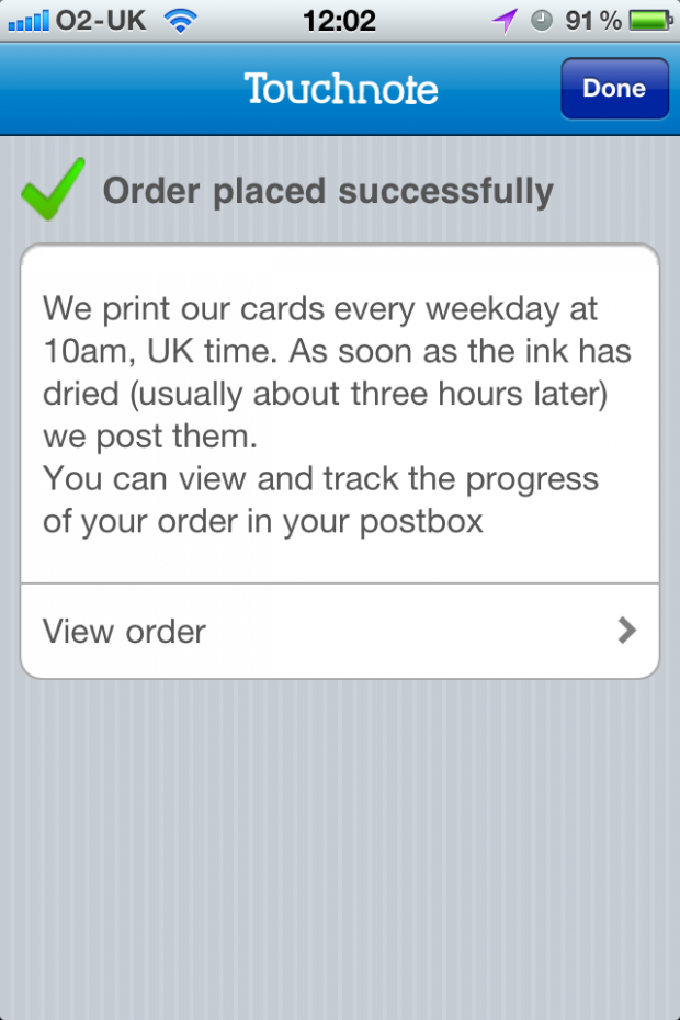
Anyway... The iPhone app. It is so easy to use, in fact, that I can just post a series of images, and you'll see exactly how it all works:

img_0917.PNG

img_0918.PNG

img_0919.PNG

img_0921.PNG

img_0922.PNG

img_0924.PNG

img_0925.PNG

And that was it. Easy, eh? Of course, I did already go to the web-site to add 'credits' (that's 'postcards' to you and me) to my account, which makes it all a little bit smoother.

How much does it cost?

Touchnote charge 1.49 for their postcards. "One fourty-nine what, I hear you cry" - well, anything. It's £1.49 if you're in the UK, $1.49 in the US, and €1.49 in Euroland. Obviously, you're better off paying in Dollars, but whatever currency you're paying, it's a pretty good deal: Here in the UK, at least, you'll frequently find yourself paying £1 for a post-card (and losing your will to live in the process).

Of course, you can also buy more credits in one go, which saves you a nice chunk of cash in the process:

screen_shot_2011_09_29_at_122421.jpg

Conclusions

I love technology. I love photography. I love being able to send post-cards directly from my iPhone. The idea is such a no-brainer, that it's no wonder that there's plenty of people out there offering the service. All they have to do to do it well, is to offer a great service at a good price. In my mind, that's where Touchnote have got their product bang on the money. Competitively priced, great quality, easy to use, and just all-around lovely.

The only downside, I suppose, is that your postcards lose that "ooh, look, a foreign stamp" exotica that you get from getting a postcard sent from a far-flung corner of the world. On the other hand, if you're anything like me, you'll probably forget to post it until you get home and end up sticking a UK stamp on it anyway, so that hardly makes much of a difference.

So - Touchnote. It's highly recommended, and you should definitely give them a shot. Literally.

Master Photography Awards winners

Jose Luis Guardia Vazquez

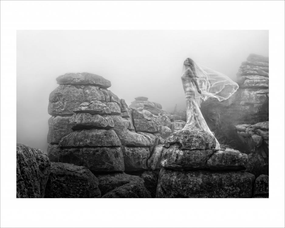
Seeing as the AoP awards received a bit of (not entirely unwarranted) criticism for their choice of winners, shall we see if the Master Photography Awards can do any better? The Masters awards have a vast array of different categories that cover wedding, commerical, and portrait photography. There are prizes for UK and overseas photographers. Winners are judged on the impact, composition, colour management, and workmanship of their photographs.

This year, the International Photographer of the Year was named as Jose Luis Guardia Vazquez. His work also happened to bag him Overseas Best Image and European Portfolio. Clare Louise was judged the winner of the UK Portfolio prize, whilst the Rest of World Portfolio award went to Keda Z. Feng. James Crockford was honoured with the UK Best Image prize.

Jose Luis Guardia Vazquez

Colin Buck, the chief executive of the Master Photographers Association had this to say about the winners: ‘Huge congratulations go to all our major winners. The competition was especially fierce this year and it seems that, once again, the bar has been raised in terms of imagination and technical expertise. The creativity displayed by the top level of photographers is truly amazing and I’m sure it must act as a huge inspiration for the rest of the industry.’

You can check out the rest of the winners on the MPA website.

Photomonth East London

Colour 9 - okay

For the past five years, there’s been a bit of a thing going on every autumn in East London that aims to bring photography to as many people as possible. It’s the East London photomonth, with exhibitions, events, and activities taking place throughout October and November at a host of venues in places whose London postcodes begin ‘E’. Yes, they have called it ‘photomonth’ and it does span October and November. Interesting.

There is, however, so much going on that I can possibly forgive the organisers their somewhat loose definition of a month. You can sign up for a photowalk; have your portfolio reviewed by a bundle of professionals; attend a seminar or ten; buy some prints for charity; develop your skills at a workshop; or take a look at one of the literally hundreds of exhibitions that are being held in cafes, galleries, museums, libraries, pubs, and even record shops across the City, Hackney, and Tower Hamlets.

The exhibitions tend to be free, but if you’re dropping into Lock 7 to look at the photos of Dhaka’s rickshaw riders or having a browse of the Pictures of the Day at Tina, We Salute You (yes, that really is the name of a cafe), do have a coffee. On the other hand, the photowalks are about £20 and the lectures and seminars vary in price; the black and white processing and printing course is £85; a beginner’s guide to digital photography is £40.

Still, there’s nothing to stop you from taking a look at Julia Margaret Cameron’s photographs of children at the Bethnal Green Museum of Childhood, the exhibition of photos documenting the Battle of Cable Street that’s in the Tower Hamlets Local History Library, or Hackney Observed at the Hackney Museum.

For the full run down, head over to the photomonth website, pick a day, and hit East London. (It’s not nearly as scary over here as you might think.)

Making your own grey cards


BEFORE: The Apple iPhone 4 has a great camera, but it's struggling with white balance. By using a grey card, I can fix it...

Most cameras are capable of creating 'acceptably good' white balance on your photos. And even if they're failing, you can make a pretty decent guess for what you think the white balance should have been in post production.

But what if you want to take the guesswork out of the equation, and get perfect white balance every time? The professionals use something called a 'gray card' (or 'grey card', depending on where in the world you learned to write English). The name says it all: it's a gray piece of card or plastic that you can use to balance your photographs.

Finding yourself a gray card

img_0875.JPGDoes that sounds a bit high tech? Well, it really isn't - and the great news is that you can use just about anything that is neutrally coloured. Of course, without advanced colour calibration equipment, it's hard to find something that's actually perfectly neutral. For our purposes, however, you don't need to do that: anything that's just about gray will do. Why? Because once you have your photos balanced consistently, it's easy to make sure they are all well-balanced.

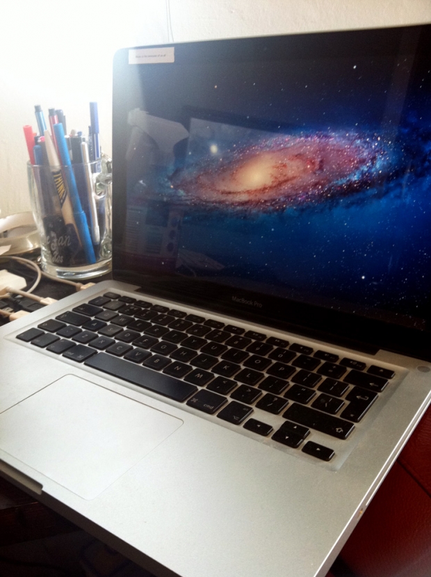
You can use anything that is neutrally coloured, but we would recommend using something that's light gray - it gives the camera the best colour reading, and it makes it easier to do your balancing in post production, too. The lids on coffee cups tend to work pretty well, and personally, I've been using my Macbook. The matt, light silver material is relatively neutral, and since I tend to bring my laptop on photo shoots with me, it's always there when I need it.

Printing off a gray card

If you know what printer you are going to be using to print your images, you could create your own gray card as follows:

1. Open up a photo taken with your camera in Photoshop. This ensures that the correct color profiles are in your image file.

2. Delete the image, and fill the frame with 18% gray.

3. Send the file to your printer, and take it with you on shoots.

The key thing here is that your 'gray card' may not be perfectly neutral, but the important thing is that your printer thinks it is neutral - so if you colour balance your photographs to this particular card, your images should come out neutral when you print them next. Clever, eh?

It could be argued, of course, that if you're serious enough about white balance that you are going to use a gray card, then you may as well buy a set of gray cards that are definitely perfectly colour balanced, but having a home-made set of cards is much better than shooting without anything, so it's a great place to start.

How do you use a gray card? - Whatever you've decided to use as your gray card, the way you use it is pretty simple, and I've covered the process as a video and how-to article; How to use a grey card.

Getting a professional-grade gray card

Of course, you could just decide to go full hog and get a professional gray card. It just so happens that I'm selling some lovely A6-sized cards 

AoP Awards winners

aopawards_photo_4col

In case you missed it, the Association of Photographers held their annual awards last week, which honours professional photographers and their work – both commissioned and non-commissioned – across genres including advertising, portraits, and editorial. So as to keep up with the changes that are being made to cameras, and specifically to cover video capability, the AoP introduced the Moving Image category this year, too.

Almost 3,000 images and videos were submitted by nearly 400 entrants. There were 17 ‘Best in Categories’ and three Gold awards. A few of them are here for your perusal. Enjoy!

Nick Meek – Best in Catergory and Gold winner for the Environment series

Allan Stone – Best in Category and Gold winner for the Object series

To take a look at the other winners, head over to the AoP Awards website!

(All images are, of course, copyright their respective photographers.)

Model release grief for Match.com

A lovely Golden Hour Winter Rose, taken by our very own Daniela

Oh dear. Another photographer and two companies with teams of lawyers who should know better are in hot water over the unauthorised use of someone’s image. This time it’s in Georgia; the photographer’s Roger Kirby, the websites are Match.com and HealthCentral, and the woman in question is Anne Read Lattimore. As with any of these stories, it comes in several parts. Are you sitting comfortably? Then I shall relay the sorry tale of the shiny new hair cut and the maybe-less-than-gleaming websites.

When Anne Read Lattimore’s hairdressing salon set up a new website, the owners asked her if she wouldn’t mind having her photo featured on it. Apparently not, as photographer Roger Kirby took her picture at the salon and Read Lattimore agreed to her image being on the website. She didn’t agree to her image being used anywhere else and no paperwork was signed, but so far, things seemed hunky-dory.

It’s hunky-dory until Kirby uploads his photos to Stock.xchng, a free stock image website run by Getty Images. The licence says that the images can’t be used to endorse a product, but somewhere along the way, this appears to have been overlooked or missed.

Before you can say ‘Mark Getty’, Match.com and HealthCentral are using photos that look suspiciously like Read Lattimore to advertise their dating site and to support a story about coming out as a gay person, respectively. Both of these uses might come as a surprise to anyone who knows Read Lattimore: she’s happily married to a man named William. In fact, her friends who saw her advertising Match.com on places like Facebook were mighty surprised. And so was she. Given that she is now suing Kirby, Match.com, and HealthCentral for defamation and misappropriation of likeness, I’m guessing she’s a bit more than surprised.

Fair enough. If I were to find my image being used to advertise a dating site, I’d be mortified. And I’m single. If I were married, I think I might be verging on the livid. It’s not that hard, people. You get the model to sign a model release and you honour its terms.

Or is it that difficult and I’m missing something here?

The papers were filed towards the end of September, so there might be a little way to go yet until we know anymore, but the moral of this story is undoubtedly, use a model release.

(Headsup to Techdirt)

September photo competition winner!

Champagne copy

After last month’s brief haitus where Haje was incommunicado and I’d crawled into a hole and hidden, leaving Gareth to judge the August photo competition all by his lonesome, we’re back. We really enjoyed judging this month’s low-key entries, too. There were some fantastic variations on the theme, with portraits, animal photos, and landscapes. But one really caught our eye. So the lucky winner of the prize from Fracture is…

Eerie SS Dicky by Steven Johnson

Many congratulations, Steven! If you get in touch with me, I’ll let you know how to claim your prize.

Everyone who entered: thank you. We loved your submissions. Everyone who didn’t enter: please think about entering this month’s competition. The details will be going up soon!

Low-down on the iPhone 4S camera spec

camera_megapixels

There was speculation galore as to what exactly Apple would be revealing at its iPhone announcement yesterday. Whilst some people were disappointed that there was only an iPhone 4S and no iPhone 5 (come on people, it’s a phone, I don’t think that anyone needs to be disappointed by it), the camera spec and app development is a bit interesting. Here’s a quick run down of what Apple’s crammed into its glass and stainless steel body.

  • 8 megapixel sensor. No megapixels aren’t everything, but that is a 60% increase on the last sensor they used.
  • Custom lens with an f/2.4 aperture and an advanced hybrid IR filter to help create sharper and brighter images.
  • The camera is pretty quick, but unfortunately the PR is vague on just how fast. The camera app launches faster than on the iPhone 4 and the shot-to-shot capability is ‘twice as fast’.
  • Taking photos should be easier and faster. You can access the camera by double-tapping the home button and you can use the volume-up button as a shutter release button. There are compositional grid lines onail your rule of thirds and you can lock exposure and focus by tapping the screen.
  • The Photos app gives you some post-processing control, taking care of crop, rotation, red-eye removal, stuff like that. You can organise your images into albums, too. I like that bit.
  • iOS 5′s integration with Twitter and iMessage will let you send your images direct to Twitter or straight to anyone else whose number you have.
  • Photo Stream means that any photo you take on your iPhone gets pushed to the iCloud automatically and then on to your Mac, your iPad, or even your PC. If you’ve Apple TV, you can look at your Photo Stream there.
  • Naturally enough it can make videos. (Well the iPhone 4 could, so they were hardly going to leave it out, were they?) Full 1080p HD resolution and a new video image stabilisation feature. The sensitivity, sharpness, and low light capability have been bumped up, too. And the iMessage thingamy-bob means that you can share your videos with your contacts pretty easily, too.

So that’s that. Did you know that it can make phone calls, too?

(More info from Apple, of course.)

Rest In Peace, Steve Jobs


I'm perfectly happy to admit that it's a little bit curious to be sad about the death of a man I've never met... But there can be little argument that Steve Jobs' impact on the worlds of technology and - indirectly - photography have been absolutely immeasurable.

My thoughts go out to his wife and his four kids - and all the others he leaves behind.

Steve Jobs, thank you for being a strong and inspirational figure.

Editor's note: All of us here at Pixiq are saddened by the death of Steve Jobs. Our thoughts go out to his family, friends, and to everyone who was touched by Steve Jobs. RIP Steve.

Our October photo competition

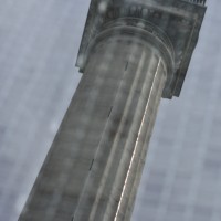
Angles 8 - monument reflected ii

Quite how the inspiration for this month’s competition theme struck me is a bit of an odd one. I wanted to do something associated with postcards, but seeing as ‘go and take a picture-postcard picture’ isn’t exactly very helpful for you or for us, I went for a variation on that. We’re looking for photographs of monuments and landmarks this month. The Eiffel Tower, the Coliseum, the Brandenburg Gate, the Sydney Opera House. That sort of thing. Whatever you fancy, it just needs to be monumental. And preferably quirky. It doesn’t have to be quirky, but we like quirky things here in the Mansion. The one that we like the best will win a fabulous 12″ Fracture.

You’ve from today – Wednesday 5 October – until Wednesday 26 October to submit your entry. As ever, you’re allowed one submission per person, and they need to go in our Flickr pool.

If you’ve any questions at all, drop me a note. Otherwise The Rules are here for your reference, and good luck!

The Rules

  • If you decide to enter, you agree to The Rules.
  • You can’t have written for Small Aperture or be related to either me or Haje to enter.
  • One entry per person – so choose your best!
  • Entries need to be submitted to the right place, which is the Small Aperture Flickr group.
  • There’s a closing date for entries, so make sure you’ve submitted before then.
  • You have to own the copyright to your entry and be at liberty to submit it to a competition. Using other people’s photos is most uncool.
  • It probably goes without saying, but entries do need to be photographs. It’d be a bit of strange photo competition otherwise.
  • Don’t do anything icky – you know, be obscene or defame someone or sell your granny to get the photo.
  • We (that being me and Haje) get to choose the winner and we’ll do our best to do so within a week of the competition closing.
  • You get to keep all the rights to your images. We just want to be able to show off the winners (and maybe some honourable mentions) here on Small Aperture.
  • Entry is at your own risk. I can’t see us eating you or anything, but we can’t be responsible for anything that happens to you because you submit a photo to our competition.
  • We are allowed to change The Rules, or even suspend or end the competition, if we want or need to. Obviously we’ll try not to, but just so that you know.

(The picture? That’s the Monument, in London. Reflected in the walls of a public convenience. I kid you not.)

Capture Tower Hamlets

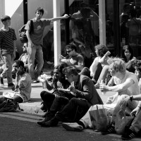
Frame 6 - waiting

Tower Hamlets. London Borough. Home to the Tower of London, Canary Wharf, and what is traditionally regarded as the East End. Did you know that it took its name from being the shambling conglomeration of hamlets that surrounded and serviced William the Bastard’s imposing castle to the north of the Thames? (Now can’t you just tell I’m a historian by training? Don’t worry, lesson’s over.) It’s also a gem for street photography. And the council is somehow managing to encourage people to get out there and have a go at it.

Tower Hamlets council is looking for photographs that summarise the borough in a snapshot. They want people, places, life; everyday and extraordinary. It’s all part of the the Mapping the Change project that aims to document change across three London boroughs.

Anyone over the age of 18 can submit up to five images that they believe capture the essence of Tower Hamlets. The photos must’ve been taken in the borough within the past five years and you need to state exactly where they were taken. (Handy-dandy map here.) So if you happen to be in Outer Mongolia but have photo of Brick Lane that you think deserves a look, why not submit it?

Finalists’ images will be displayed at Tower Hamlets Local History Library and Archive in November and December. There are prizes on offer for the winners, including a camera, a portfolio review, and shopping vouchers. The terms are straightforward, too, which makes a change.

The deadline’s 17 October, so you probably ought to get cracking. All the details are on the project website.

(Picture’s mine, taken on the corner of Brick Lane and Hanbury Street.)

Winners of Street Photography Now

Screen Shot 2011-10-03 at 09.46.24

In October 2010, the Photographers’ Gallery and the authors of Street photography Now, Sophie Howarth and Stephen McLaren, launched a 52 week street photography project. The idea behind it was to get photographers from across the world back on the street and documenting life around them. Each week there was a challenge and photos were submitted to a Flickr pool. Although it wasn’t intended to be a competition, the two people who were deemed to have made the biggest contribution to the project have just been awarded with £500 of Thames and Hudson books. And they were…

Jo Paul Wallace and Jack Simon

B side #20

Week 20 (Slow down, the next picture may be very quiet and close), B-side, by Jo Paul Wallace

/>

Week 48 (Things are what they seem to be, or maybe something else), by Jack Simon

Congratulations both. In addition to their piles of books, both have dedicated galleries of their contributions on the Street Photography Now project website. You can take a look at Jo Paul Wallace’s here and Jack Simon’s here.

September 2011: A record month for me.


It's almost a year since I moved my Photocritic blog over here to Pixiq. I'll be honest with you; it was a tense time. Was I selling out my readers? Would people react well or would they hate it? Would they run away by the droves, or would I collect a nice amount of new readers, and benefit from the cross-promotion with other talented photography writers?

I was worried about giving up control. I was worried about not being able to do the coding myself. I was worried about not being able to implement my own code on the blog. It turns out I was worrying about absolutely nothing. Sure, there are toys I wish I could have, and there are occasional bugs on Pixiq that I think ought to have been fixed quicker (I'm particularly looking at the video player that doesn't work in all browsers - but apparently that is getting fixed soon)...

But ultimately, handing over the keys to the technical side of the blog means that I don't have to worry about caching layers, bandwidth costs, or server tweaking. Being able to ignore all that and concentrate on what I do best - Writing and ranting about photography - has been liberating.

And I believe it shows: the month of September has shown me, more than any other month, that I've made the right decision. My posts alone here on Pixiq attracted a quarter of a million page impressions - yes, that's nearly 250,000 page impressions, just for me. Pixiq as a whole, obviously, got a whole load of extra traffic too.

The top 20 articles in September:

In other words, these are the ones that have been most read... And if you haven't seen one or more of them yet, perhaps you'll find a gem or two here!

  1. Nikon: "A photographer is only as good as the equipment he uses"
  2. 50 inspirational nude photos
  3. Is Apple turning its back on photographers?
  4. Lens thieves ruin the day
  5. Adding passion to nude photography
  6. 150 unmissable photography sites
  7. Top 50 photography websites
  8. The Dirty Tricks of Food Photographers
  9. Making your own flash diffuser
  10. Implied nudity in portraiture
  11. Prime lenses
  12. Macro photography for $10
  13. How much should you charge for a photograph?
  14. How To: Concert Photography
  15. 100 amazing iPhone photos
  16. The ultimate guide to HDR photography
  17. Creating a photography portfolio
  18. Photographing smoke
  19. Create your own IR pass filter
  20. Giving a good photo critique

Photo Credit: "Dance" on Flickr (cc) by Nuno Duarte.

A slightly different side to steamy

Fort William-2303

Our intrepid cruise ship photographer correspondent, Ross, currently isn’t sailing the ocean blue. He’s on holiday. So where in the world is he? Well, at home in Scotland, naturally enough. When you spend your life visiting idyllic holiday destinations for a living, a month at home, on the sofa, with your feet up is probably just what you want. Of course, he has been out and about taking photographs.

One month till I’m back to work in the Caribbean: Time for a quick holiday!

There was a bump against my ankle, waking me suddenly. I glanced around. The surroundings were unfamiliar, the immediate view was not. To my left was a trolley stacked high with the finest Scottish produce, bags of tablet, McCoy’s crisps and of course Tunnock’s caramel wafers. There couldn’t be a more Scottish view to awaken to, unless there were Tennent’s lager tins also on offer. I looked down, there was, a row right beside the Bacardi Breezers. Shaking my head I redirected my gaze out of the misted up window. It was almost time.

Rushing past us, the highlands of the North of Scotland were green for once. I know that’s the way they always look in the films as Mel Gibson runs across them but in reality better adjectives would normally be bleak, sleety, or just plain old grey and drizzly.

Spending my whole life jumping from one exotic country to another there’s little time for a holiday. And when that illusive holiday does come there’s always that tricky choice. Where to go? These days ease and convince come into it in a big way, not to mention cost. Spending so much time in airports I’ll do anything to avoid them when I can. It’s not the long waits or intrusive scanning that’s the issue. I just get annoyed seeing a 60p can of Irn Bru being marked up to £1.99. And don’t get me started on the salted peanuts.

With this in mind my holiday was booked quickly, a five-hour car ride north and I was in the Scottish Highlands.
So here I sat, the countryside flashing by, for less than the cost of a Ryanair flight I was in landscape photographer’s heaven.

The Fort William to Mallaig railway. You’ve seen it, really, you have, it may be an obscure north west of Scotland rail route but it featured in the slightly well known series of films. Almost unique in the fact that it still runs with a steam engine it is perhaps better known as the Hogwarts’ Express. The train and its route over the viaduct through the glen have been committed to celluloid for generations to see. If you ever find yourself in the horrendous situation of having to re-watch the first Harry Potter film then you can take some solace in appreciating that scene and considering the photographic possibilities. Be warned though, there’s still about another hour after that to weather.

I’m getting distracted, anyways, shooting on a steam train brings with it it’s own sets of challenges. From the rapidly moving scenery to the changing of light in the glens to the sudden burst of smoke from the engine covering your lens, the whole experience is a steep learning curve.

I shouldered my way to the spot I’d sussed out when we first got onto the train. The passages between carriages weren’t open to the outside, but there were windows. They were the kind that slid down – not all opened fully though. I had found one on the left side of the train that did. That was my spot. Now we were approaching Loch Ness I steadied myself with one last bite of my Tunnock’s wafer before switching to Aperture Priority, putting on my sunglasses and sticking my head out into the overcast gale.

My mind flashed back to the first time I’d taken my camera for a little outing on a steam train. Boy was that a learning curve. It was Alaska, heading through the Chilcout Pass. Manual was useless, the light changing too much, after a while I realised Aperture Priority was the only way to go. Sunglasses were essential; I learned that one the hard way. All’s going well then suddenly the wind blows the smoke into your face…and the tiny fragments of coal with it. Imagine getting a bit of sand in your eye every five minutes, that’s what it’s like, it’ll spoil the day for
anyone. I had no idea what I was in for, even finding a spot to shoot that day was a challenge.

Every photographer will have their own tips for this type of shooting, but the same simple rule applies: Next time will be better! It’s a big learning curve shooting in that kind of environment and you can’t imagine some of the
challenges you’ll have to overcome on shooting a simple train ride. This applies to every environment though, to every shoot.

Think of it like this; you’d be crazy to spend all that money to go on a holiday photographing the Amazon jungles without having a practice in your local forest first.

With practice you know what you’re looking for. You know the gear you need. You know the techniques your going to employ. All this comes together for you to get the most out of your experience and the most out of your photography. Practice really does make perfect. Without practice you’ll stick your head out of the metaphorical train, looking the opposite way, and get hit on the head by the foliage beside the tracks.

All I’ll say is I got some great shots, both on the train and at each end of the journey. Steam engine plus Scottish glens equals great stuff. Without having done this before I’d not have produced pictures of half the quality. Nor been able to dodge many of the pitfalls that ruined my Alaskan shots.

What’s the moral of the story? Is it to take advantages of the country you live in, of the scenery around you
and discover some amazing shots on your doorstep without spending more than a few pounds? Is it to practice before spending all that money on a fancy photography holiday? No.

The moral of the story: If you’ve never tried Tunnock’s caramel wafers don’t pass the chance up, I highly recommend them.

Ross Sheddon is a portrait photographer and digital artist, currently working for Princess. In his career he’s worked everywhere from Vietnam to China to Egypt, Greece, Alaska, and back. Despite running out of new countries to visit his eyes remain open for new weird and wonderful sights always around him.

Is Apple turning its back on photographers?


Perhaps I should stick to photography...

I've been thinking about this article for a very long time; I've been using both pieces of software for a while, and I think I've now conclusively made my choice: Adobe Lightroom it is.

There are a couple of subjective reasons for that; Ultimately, I prefer the workflow tools offered up by Lightroom over those built into Aperture, and I like how well-integrated Lightroom and Photoshop CS5 are, for the times when I need editing that's beyond Lightroom's very capable hands.

Apple always had the edge over Lightroom when it comes to pricing; but back in January, Apple took out their machetes and slashed the price even further: the price of Aperture plummeted from $199 to £78.99 (when purchased via the App Store), whilst Lightroom is still retailing at $299.

So, it becomes very hard to recommend one piece of software over the other: They are both capable, and they both have their flaws. The price difference may sway some people (and PC users are out of luck altogether; no Aperture for Windows...), but ultimately, I think the question is very different indeed.

Apple doesn't care about its professional users.
fcp_bombs.jpg

For various reasons, I've been reading and learning more about the film and TV industry  (What? Pictures? That move? I can barely get one photo per hour right, never mind 24 pictures per second. You must be out of your mind), and they've been burned by Apple several times now.

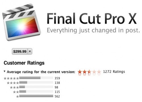
You may have spotted the phenomenal backlash recently when Apple launched their new Final Cut Pro, which set the film industry a-bristle. Instead of having two versions of the software; Final Cut Express for the 'prosumer' market and Final Cut Pro for the, well, 'pro' market, they consilidated the software packages back into one. For Express users, that was pretty good news, because for not-a-lot-of-extra-money, they got a lot of extra functionality.

Professional users, however, were not so lucky. Conan O'Brien's editors got a minute of prime-time to whine about the software, and both the app store reviews and the professionals have trashed it for being a monster-leap backwards. The  reviewers for the mainstream media, however, generally reviewed it quite favourably. The message is clear: It's still one hell of a capable software editing package, but it's no longer fit for purpose for professional use.

apple_shake.jpgIf this was an once-off occurrence, we might have forgiven Apple, but it isn't. There was another piece of software that was of extreme importance; again to the film industry. Shake was aimed squarely at the professional market, and was used for visual effects and compositing - that is, putting the different pieces of digital footage together into a single frame. You know; adding explosions, and adding backgrounds to shots, that sort of thing.

When Apple announced they were unceremoniously closing the doors on Shake, it shook up the market - several huge film productions - multi-million dollar projects - were completely relying on Shake to get completed. To this day, there are special effect studios who had their tools so deeply integrated with Apple's software that they haven't been able to disentangle themselves; including playing an important role in Weta's production of the blockbuster Avatar, for example. And this despite the fact that the last version of the software was launched in November of 2008 - that's 3 years ago. I'm willing to bet that most of us don't run any 3-year-old software, never mind one of the most popular entertainment industries in the world.

The other big entertainment industry - the music business - also have a software package covered by Apple; Logic Pro. The rumour mill is already spinning that the current version of the software (which was launched in July of 2009) is about to receive an update, reportedly labelled Logic Pro X. Perhaps predictably, current Logic Pro users are already in fear about what Apple might be doing to their beloved piece of software.

But, can't you just use the old software instead?

win311logo.gifOf course, a simple counter-argument to all of the above is "if you don't like the new software, why don't you simply not upgrade"? It is true that this is a workable solution for a while, but the truth of the matter is that software slowly loses its lustre over time: Competitors will bring out features and technology that doesn't exist in the old versions of the software, and without the updates, your software cannot benefit from technology advances that happen in the meantime.

Worst of all, 'unsupported' software is just that - unsupported. So, if something should go horribly wrong with your files, and you are unable to figure out what is going on, nobody is able to help you: A simple query will be deflected with "What version of the software are you using". If your answer is "an old version", then they won't help you. And rightly so, I think: If you call up a web developer today to tell them their site doesn't look right in Internet Explorer 7, the only appropriate answer, in my opinion, is "Why are you using a piece of software that was introduced in 2006, and has been obsolete since 2009"?

Er, aren't we meant to be talking about photography here?
screen_shot_2011_09_20_at_211118.jpg

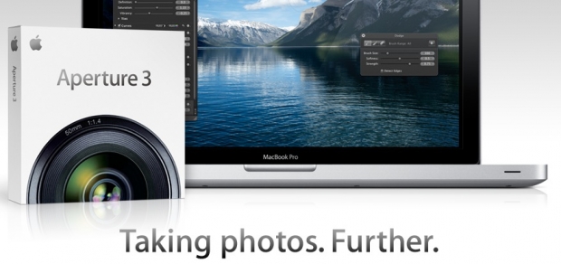
So what does all of this got to do with photography? Well, when Aperture was first launched back in 2005, it was seen as a bit of a curious beast. Taking a look now at the news around its launch, it's funny to see how news writers couldn't quite make sense of it. http://bit.ly/nUSQox . For one thing, it cost a whopping $499, and it was aimed squarely at professional photographers. Six years ago, it made sense, when Apple were still the underdog; the go-to brand for graphic designers and photographers alike.

Steve Jobs may well have saved Apple when they were at the brink of bankruptcy, against all odds. However, things have changed a lot in Cupertino since then. From being a fringe hardware manufacturer, they've gone well and truly mainstream: iPods, iPhones, Apple TV, the iTunes music store, not to mention the billions and billions of applications sold for iOS devices like the iPhone, iPod Touch and iPad.

screen_shot_2011_09_20_at_211205.jpgIt's hard to imagine any company that is more mainstream than Apple these days; and the software the company is releasing is reflecting that. Instead of innovating, developing and launching industrial-grade tools for professional users, Apple are ramming home their 'simplicity' approach to things. Which is lovely if you are my mother, but not so much if you are a professional artist of any sort.

Apple are making powerful tools more available to the mainstream, which is a good thing for their stockholders: Obviously, it's better to sell a million copies of a piece of software at $80 per copy, than it is to sell fifty copies at $499. What does appear to be the case, however, is that the accountants have taken over the asylum at Apple, and that software engineers are no longer allowed to push the envelope onwards and upwards.

If you ask me, it's only a matter of time before Aperture starts looking more like iPhoto than a professional piece of photo editing software.

As much as I love Apple, I simply don't trust them not to turn their back on me, the professional photographer, and turn instead to the other 200 people who live in my block of flats. After all, why should they bother selling me one copy, when they can sell them two hundred?

So where does that leave Adobe?

If there's one thing you could never accuse Adobe of, it is to simplify their software. Lightroom will, over the coming years, undoubtedly slowly grow out of control with more and more features and more and more bloat. However, as professional photographers, I think we can handle the occasional hardware upgrade to cope with the additional load it'll put on our computers. As a professional, I can trust Adobe to leave all the tools where I need them; right at my fingertips.

And for that 1400-word reason, I'll stick to Adobe Lightroom for the foreseeable future.