Getting value for money when buying a camera

Last month, Ricoh 'repositioned' the prices of four of its Pentax cameras: two dSLRs, one EVIL camera, and its 645D digital medium format camera. From Ricoh's perspective, it's an attempt to make the Pentax brand more attractive to consumers and present them with some competitively priced options that aren't Canon, Fujifilm, Nikon, Olympus, or Sony. What does this mean from the consumer's perspective, however? What sort of value for money can a Pentax purchase offer? I decided to do a bit of digging.

K-3: £950 body-only

The K-3 is Pentax's flagship dSLR camera, heading its modest line up of current models. It isn't, however, the likes of a Canon, Nikon, or Sony flagship camera, which are all full-frame. This has an APS-C sensor and is much more similar to their high-end smaller-sensored cameras.
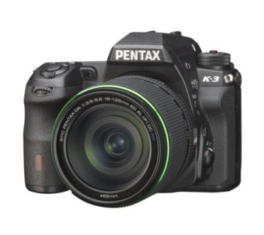
The weather-sealing makes the K-3 attractive

The K-3's key features include a maximum sensitivity of ISO 51,200; top frames-per-second speed of 8.3; a 24 megapixel sensor; a dual SD card slot; and full weather sealing. At its new £950 price point, this leaves the K-3 in an interesting position.

For around £850 you can pick up a Canon 70D or a Nikon D7100. It's not a straight-up comparison against the 70D, though. That has lower resolution (20 megapixels); a slower continuous shooting speed (7 frames-per-second), and its sensitivity tops out at ISO 25,600. Where it does beat the K-3 is on connectivity—it has wi-fi functionality—and on video capability. By all accounts if you're interested in recording video, you're better off with the 70D than the K-3. Finally, Canon has a far broader range of lenses than Pentax, which presents you with much more flexibility as well as purchasing options.

Against the Nikon D7100, you're looking at similar resolution, dual SD card slots, and dust and water resistance (but not water-proofing), but lower sensitivity (ISO 25,600) and slower frames-per-second rate (6). Video on the D7100 is also meant to be good and Nikon has a huge lens selection, too. Unless you're very serious about action photography or need cold-resistance too, the D7100 seems a better option to me.

But if you're prepared to spend a bit more, closer to £1,300, you can pick up a full-frame Canon (6D), Nikon (D610), or Sony. Yes, that is Sony's a7, so it isn't a dSLR, but it's food for thought.

K-50: £500 body-only

The K-50 isn't Pentax's 'entry-level' offering, that's the K-500, but it does boast weather resistance, a top sensitivity of ISO 51,200, and a maximum frames-per-second rate of 6. It's sensor is a 16 megapixel APS-C one. So at around £500 (although you can pick them up cheaper), how does it compare?

Against the Nikon D5300, it's a day at the races: some you win and some you lose. Where the K-50 loses in the megapixel race (16 versus 24) it wins in the frames-per-second stakes (6 versus 5) and the ISO handicap (51,200 versus an expanded 25,600). The K-50 doesn't have an entry when it comes to wi-fi and GPS, giving the Nikon a walk-over; but the situation is reversed when it comes to weather sealing. With the D5300 selling for around £550 body-only, it'll be a case of careful consideration what you want from a camera. Something that slots into a system with which you can grow significantly (the Nikon), or something that's reliably built but doesn't offer huge scope for progression with lenses or more extensive specs.

Unless you specifically want a dSLR, it's also worth looking at EVIL options; around the £500 mark there are a few choices that can give you plenty of camera for your money. There's the Sony NEX-6 or a6000, or Fujifilm's X-M1. You'll be getting very similar specs, and in the case of the a6000 and X-M1 wi-fi to boot, but not the weather sealing. The question is, what do you want from your camera?

Q7: £340
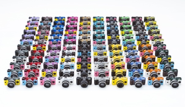
The Q7 comes in a swap-shop of multi-colours

With a 1/1.7" sensor, it's actually a struggle to find a direct EVIL competitor for the Q7. Sony and Canon use APS-C sensors, Panasonic and Olympus use Micro Four Thirds, and Nikon favours CX. There's nothing that small. If you're looking for a camera as handily sized as the Q7, that's reasonably priced, but still has interchangeable lenses, take a look at the Olympus E-PM2. Or you could ignore the interchangeable lens issue—with a camera that small, having interchangeable lenses might overwhelm the benefits of its smaller body anyway—and go for a compact. Something like Canon's S120, Olympus' XZ-2, or if you can stretch the pennies further, Sony's RX100.

645D: £4,250 body-only
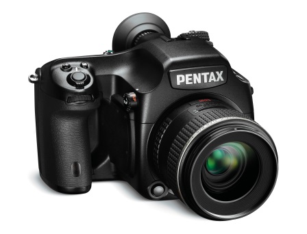
Excellent value for money

This one is the easiest of the lot. If you're looking to dip your feet into medium format waters, there is nothing as affordable as the Pentax 645D. You'll either be sticking with a top-of-the-range Canon or Nikon dSLR, or a Hasselblad or Mamiya medium format.

Conclusion

Having test-driven a few Pentax cameras, there is a lot to like about them. And if you live anywhere that rain or dust might conceivably be an issue, the weather-sealing is a very attractive prospect. But it's a case of considering what your needs are from a camera and whether or not you're looking for heaps of compatible lenses, both native and third party, as well as accessories and add-ons. How far do you think you might want to take your photographic progress? How far do you want to take your camera? How much money do you have to spend?

Getting good value for money isn't just about the pennies in your pocket right now and the current crop's spec sheets. It's also about long-term planning and ensuring that you and your camera—and the system into which you've bought—have a future together.

Whatever you're looking to buy, it's always worth considering all of your options.

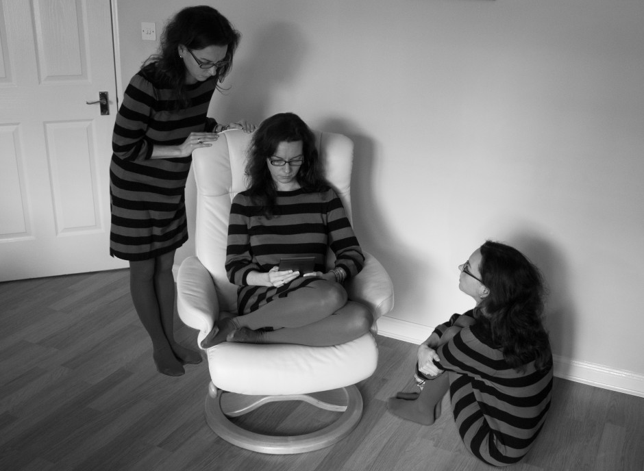
For those days when you need to be in several places at once: multiplicitous images

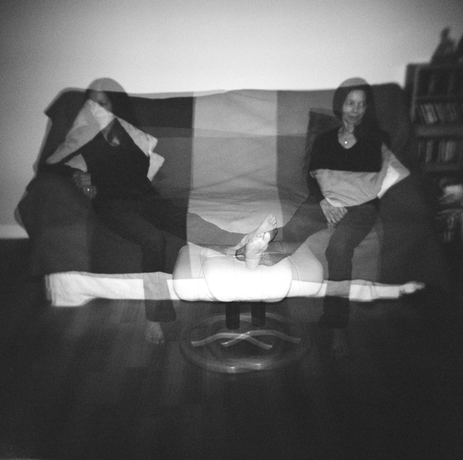
Multiplicity, or the art of creating images containing several yous, or anyone elses for that matter, isn’t a digital discovery. It’s something that people have been doing for decades: it's remarkably easy to achieve with film. You set up your shot and either you don’t wind on your film before re-exposing the frame with your subject positioned anew in the scene; or you wind on your film and then wind it back again in between shots. The important thing here is to slightly under-expose all of your shots in the sequence to ensure that your final image isn’t an over-exposed white mass. That might look like me, but actually it's my Ma

If you don't happen to have a Holga lying about (they're great for creating multiple exposures), you can do it with a digital camera, too. Depending on the camera you have, you've a few options for creating a multiplicitous image. Quite a few come with a multiple exposure setting now: you determine how many exposures you want to make and the camera will re-expose the same 'frame' in-camera and adjust your expose settings accordingly to ensure that you don't end up with a too-dark or too-light image. Marvellous... if you have a camera that can do that. If not, you'll need to make friends with Photoshop, or a Photoshop-esque editing package.

Before we go any further, it’s important to remind you that achieving a great final image relies on producing a good image in-camera first. It doesn’t matter how ginormous the barrage of editing you’re going to subject your photo to, it’s got to be good from the get-go. This is just the same for a multiplicity image as any other.

When you set out to create a multiplicitous image, your starting point is your concept. Think of the story that you're trying to tell and what you need to tell it. Having a clear plan makes it so much easier when you're shooting the images because—unless it's a distinct element of the story—you need consistency in your images: furniture can't move between shots, the light needs to be coming from the same direction, and you don't want to be flapping around.

When the scene's arranged, set your camera on a tripod, adjust it's exposure settings and focal point, and shoot a 'plate' image. This is a base photo, devoid of the story's characters, onto which you'll build your final creation.

Now you can shoot your series of images containing your subject in as many different positions as your composition merits. I've found it useful to go for more rather than fewer photos; it gives you more flexibility when you compile your final image.

[gallery ids="6703,6704,6705"]

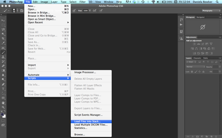
When you've shot your images, import those you think you might want to use into Photoshop using the Load Files in Stacks option (File>Scripts>Load Files in Stack), which should import your images so that they are perfectly layered one on top of the other.

Importing made easy

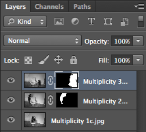
Next apply a layer mask to each of the layers, barring the background image, which should be the ‘empty’ plate.

Using the eye icon on the Layers Palette, toggle off all of the layers from view except Layer 1. Now brush your subject, along with anything like indentations in the chair where she or he is sitting or shadows, out of the image. It's those small details which add credibility to the unbelievable, which is what makes them important to the final composition. And while it might seem counter-intuitive to brush your subject out of the image, it isn't really.

Brush out your subject - it makes sense, really

When you’ve disappeared your subject from the scene and you’re happy with the refinement of the edges, invert your selection by pressing Cmd+I on a Mac or Ctrl+I on a Windows machine. The subject will miraculously reappear and the superfluous background will disappear.

Do take care when you're areas where overlapping occurs, because it's here where your image will succeed or fail in its realism.

Repeat this process for each of the layers, toggling them on and off as necessary to decide on which placements you want to keep, and which you wish to discard. I’d recommend saving the image as a PSD file with all the layers intact, which will allow you to revisit it and re-edit as often as your Dr Jeckyll needs to meddle with your Mr Hyde.

Three wise monkeys? Or something like that

When you've settled on a final version, delete the layers that you don't want, save it as a PSD file, and then flatten it and export it as a JPEG image. Ta-dah!

From light to dark: the Photocritic guide to vignettes

For literary types, a vignette can be either an anecdote or short story, or a illustration—often foliage-inspired—found on chapter headers. For photography types, a vignette is the gradual fall-off of light from the centre towards the edges of the frame of an image. If you enjoy Instagram or play around with Snapseed, you might know a vignette as a cool effect that you can add at will. They are, however, far more than just an effect. Thus we present to you the self-contained, but not necessarily short, Photocritic guide to vignettes, without any vines.

Types of vignette

Photographic vignettes occur because of natural, optical, mechanical, and technical reasons and can appear whether you prefer analogue or digital technology. While we might associate vignetting with vintage, it's hardly stuck in the past. Digital sensors managed to introduce their own form of vignetting, and a great deal of it is down to lenses. What are we looking at, then?

Natural vignetting

You are most likely to see natural vignetting when you use a wide-angle lens. It's a gradual darkening of the image that happens because light reaches the sensor (or film) at different angles. As the photons need to travel further to reach the edges of the sensor, they lose their strength, hence the darkening.

Optical vignetting

Lens design is primarily responsible for optical vignetting; the lens' barrel prevents light reaching the sensor evenly, and the lens elements stacked up on top of each other can have an impact, too. Optical vignetting is more pronounced when shooting at wider apertures; stop-down a bit and you can reduce its prevalence.

Mechanical vignetting

If anything physical blocks the passage of light to the sensor, for example a lens hood or a filter, it can cause a vignette. This is the easiest vignette to correct: check all of your accessories are properly attached.

Pixel vignetting

The pixels towards the edges of a sensor aren't always able to record light at the same intensity as those closer to its centre, mostly because of the angle at which the light hits them. This can lead to a darkening of the image towards its edges. Sensor manufacturers have caught onto this phenomenon, however, and have introduced compensations to rectify it.

Why add a vignette?

If a vignette is regarded as an aberration, why would you want to add one deliberately to an image? When used reservedly, they can bring focus to your subject and draw your eye into the frame, particularly in portraits. First because they allow for fewer distractions at the edges of the frame, but also because they mimic the natural effect of the eye. We don't see sharply all the way to the edges of our vision, and a vignette's fall-off has a similar impact on our photos. They reproduce a degree of 'normality' that we can find pleasing. The essential factor in applying them is to be subtle, therefore.

Adding a vignette

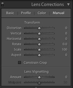
Lightroom allows you both to add artificial vignettes and to correct those produced as the result of optical or mechanical aberrations. If you need to correct a vignette, reveal the Lens Corrections panel, where you can also adjust various types of lens distortion, and nudge the Lens Vignetting sliders until your photo looks 'right'. (They sit beneath the Manual tab.) Easy!

Correct unwanted vignettes in the Lens Corrections panel (or use it to add easy vignettes to uncropped images)

This is also an easy means of adding a subtle vignette to a largely uncropped photo, too. It doesn't let you over-do it, which is the cardinal sin of adding vignettes, and there aren't too many factors to consider. It's sneaky, but if you're working with a cropped photo, not helpful. For a cropped photo, you need to head to the Post-Crop Vignetting options in the Effects panel.

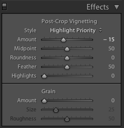
Here, you have far more control over the vignette that you add to your image.

Gently does it with the Post-crop Vignetting options

With three drop-down options and five sliders, it might appear as if adding a vignette is more trouble than it's worth, but it's relatively straightforward. We'll deal with those drop-down options first.

Highlight Priority, Colour Priority, or Paint Overlay?

Highlight Priority, Colour Priority, or Paint Overlay? Highlight Priority allows for highlight corrections and recovery, so is good with images that have specular highlights, but it might have an adverse impact on the colours in the darker areas of your image. If you're working in black and white, colour shifts won't be an issue, so it's an easy choice.

Colour Priority won't produce such a pronounced shift the colours in the darker areas, but it won't let you recover highlights, either. Julieanne Kost, who works for Adobe, reckons it's a more subtle effect. You might want to consider this if your photo is in colour.

As for Paint Overlay, it is supposed to mimic the effects of overlaying your photo with either black or white paint.

To walk through the sliders, I'm using a photo of my nephew Wil for demonstration purposes. It's been cropped, converted to black and white, and had all of its other adjustments made. The last thing on the list is the vignette. That's how you should apply one, too.

Wil, ready for his final curtain vignette

Amount

The Amount slider is the crucial slider when adding a vignette. It determines how strong the darkening or lightening of the edges of the frame will be. Set it at -100 and you'll have deep black edges; conversely, +100 will leave you with bright white edges. Without adjusting this slider, none of the other Post-Crop Vignetting sliders will have any impact on your image.

A bright white vignette with the Amount set to +100

From now on, we'll look at all the other sliders having an effect with the Amount set to -100. It offers the clearest demonstration of their impact.

Amount at -100

Mid-point

The Mid-point slider controls the size of the vignette from the centre of the frame. It naturally sits at 50 points; reduce it to 0 and you'll produce a vignette that encroaches far into the frame.

Amount -100; Mid-point 25

Set it at 100 points and it'll sit closer to the edges of the frame.

Amount -100; Mid-point 75

Roundness

The Roundness slider controls the shape of the vignette. At 50 points, it's elliptical in shape. Push it to 100 points and you'll have a circular vignette. At 0, it's a rectangle with rounded corners. (By pushing all of the Post-crop Vignetting sliders completely to the left, you'll create a rounded-corner rectangular frame effect for your photo.)

Feather

To control the strength of the transition between the vignette and the centre of the image, adjust the Feather slider. 100 points ensures a very subtle transition; 0 points is a sharp transition with a hard edge. Its native position is 50 points; I don't often vary far from there.

Amount -100; Feather 0

Amount -100; Feather 100

Highlights

Finally, we're left with the Highlights slider that starts at 0. Why might you want to increase the highlights slider? It prevents the vignette being applied too heavily to highlights in the image and helps to keep them bright. There's no hard-and-fast rule for this slider; it needs to be adjusted on the merits of each image.

Amount -100; Highlights 100

It's important to note that the Post-crop Vignetting panel applies the vignette centred according to the crop. If you want to introduce a vignette that works around an off-centred subject, you'll need to do that using Radial Blur. That's a whole different article, however.

Other vignette options

If you don't use Lightroom, you can add a vignette using plenty of other editing suites. Photoshop, of course. And Pixelmator. Or Pixlr. Under the 'Centre Focus' tab if you're in Google+. In Apple's Aperture.

The end product

Butter wouldn't melt in his mouth

This is my final version of Wil, with a vignette Amount of -15 and a Mid-point of 75. That was it. Remember: subtle is better!

Adding some va-va-voom with vibrance

A few weeks back, we took a peruse around Lightroom's clarity slider, to see what it does to your photos and how you can get the best out of your photos by giving it a gentle nudge here and there. This week, it's the turn of the vibrance slider—clarity's bed-fellow—to come under the Photocritic microscope. With the vibrance pushed to +20, the greens look more alive, but the sweetpea petals aren't overcooked

Much the same as the clarity slider has its most pronounced effect on the mid-tones of your images, the vibrance slider is also a 'smart slider' and applies its effects selectively. Rather than adjusting the contrast in the mid-tones, a la clarity, vibrance takes hold of the more muted tones in your photo and gives them some oompf. It's a selective saturation slider, if you will.

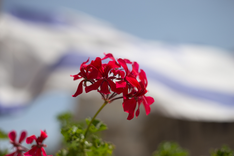
This is where this balcony-dwelling geranium started out

With the saturation at +50, it's too much

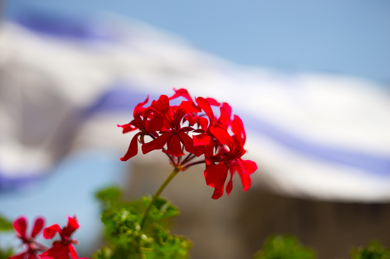
... but with vibrance increased, the sky looks bluer while the reds aren't overdone

More often than not, vibrance will pick up on the blues and greens in a photo but go easier on the reds and oranges. This is great for bringing out the intensity of a sky or making a lawn look that bit more inviting while not letting your portrait subjects look as if they've been tangoed. I've heard some people refer to vibrance as being like 'fill light for colours'.

I've tweaked the contrast and white balance here, but vibrance and saturation are, as yet, untouched

You can see that with +60 on the saturation, my brother's skintone is odd, although the sky looks intense...

... increasing the vibrance, however, gives Josh a better skin tone and the sky a more intense colour. Much better! (Although I'd probably not go as far as +60, as I did here.)

With the exception of the sweetpea, I've not been exactly subtle with either the vibrance or the saturation in any of my examples here, but that's to give you a clear illustration of the difference between them. Usually, I'd be far more reserved and I'm sure you would be, too. But at least you know what vibrance does now, and can begin using it to intensify your colours without feeling you've chucked a red wash over your photos.

The handy-dandy social media photo sharing guide

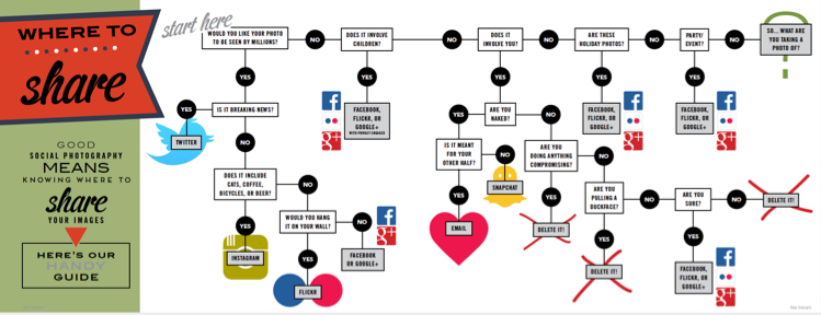
One photo, so many options. Where on this huge web of interconnected social media outlets are we best sharing our quick snaps, our painstakingly created works of art, and our selfies? Really, it all comes down to whom you want to see them. The chances are that different people follow you in different social media spaces, and if Twitter's mostly a work thing for you, selfies on the beach aren't all that appropriate a posting there. You're probably best putting those on your friends- and family-only Facebook account. It only takes a few moments of thought, really, but if you're new to the social media fandango, seeing all those apps lined up on your phone can be a little overwhelming. For a bit of fun, I drew up (quite literally, it involved an enormous sheet of paper and felt-tipped pens) this handy-dandy guide to sharing your photos via social media. Of course it isn't meant to be taken deadly seriously, but it's a pretty useful starting point all the same.
Click for bigger!

You can find it looking even more beautiful in print in the delicious-looking Social Photography, which is available now, either in print or to download!

Like the Google+ Stories idea but not keen on Google+? There are options

On Tuesday, tech and photo sites were awash with the Google+ Stories story. Rather than having to sift through your own images and organise them into virtual albums to chart your travels, document your days out, and record your parties, Google+ can auto-algorithmically-awesomely collate them into Stories or Movies by simple virtue of uploading them there. You can then edit them if necessary, add captions when appropriate, share them if you want to, and generally enjoy. Stories and Movies capabilities are already working on the web and Android platforms and will be making their way to iOS shortly. If you're like me and you auto-upload your iPhone images to Google+, open the web interface and you'll find there are some stories ready and waiting for you.

The Story of my cousin's birthday

But what if you don't want to upload your photos to Google+, for whatever reason, yet still rather like this idea of hands-free image curation? With the vast number of image storage and organisation apps and services out there, someone, somewhere, must be offering an alternative. There are plenty of apps that can organise your images and videos into a timeline, for example Dropbox's Carousel and Picturelife, but not that many which create narrative albums based on time, date, and location that are ready to go. There are, it seems, two apps that manage something along the line of Stories.

Flayvr

Flayvr is an Android- and iOS-compatible app that organises your images and videos into editable and shareable 'Flayvrs', or albums. That's pretty much what the Google+ Stories feature does. But unlike Google+, which collates all your photos and videos stored there, this works by collating the photos and videos stored on your device's camera roll, making it much more mobile-centric. If you're using Google+ to store all of your images, regardless of the device used to capture them, its capable of giving you a more complete story.

Still, it's swish and stylish, free to download, and I've had fun using it to collate some 'Flayvrs'.

Keepsake

I've not been able to download Keepsake for a trial spin because it seems to be a US-only iOS app at the moment. However, it does look to be slick and easy to use. It automatically sorts images into stories that you can edit them using the pinch-and-drag mechanism. When you have a complete story, you can share it with your contacts via text message.

It's also worth remembering that Google+ acts as a storage mechanism for your photos as well as organising them into sharable (or not) albums. Flayvr explicitly states that it isn't a data storage service. That's going to be a plus for some and a minus for others.

There aren't many options, but there are some, and I'm sure that Google's move will herald the insertion of automatically curated albums from other sites before long.

Vote! Yea! Selfie? Nay!

For anyone who's not yet made it to a polling station to cast their ballot in today's European elections, please do go and vote, but please don't take any photographs in the process. Although photography in polling stations isn't against the law itself, if you were to accidentally compromise another voter's right to secret ballot or divulge the unique identification number on a ballot paper, you would be breaking the law. If convicted, you could face a £5,000 fine or up to six months in prison.

Given that the law isn't clear cut, it's best to stay on the safe side and refrain from wielding photo-enabled equipped around a polling station. We'll probably have a clearer picture in the autumn, when the Law Commission publishes its proposals regarding electoral reform, which includes rules regarding secrecy and photography.

(Headsup to the BBC)

For one month only: an 1845 Fox Talbot salt print on display at the Museum of London Docklands

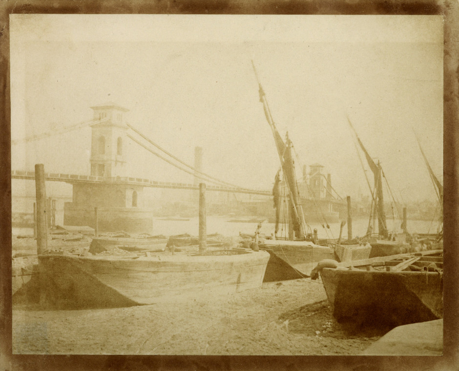
Any exhibition opening is exciting for the curation team behind it, but the Museum of London is particularly excited about its forthcoming exhibition Bridge, which opens at the Docklands branch of the organisation on 27 June. Bridge will feature the oldest photograph in the museum's collection, William Henry Fox Talbot's Old Hungerford Bridge, a salt print made in 1845. The print has never been exhibited by the museum until now, owing to its fragile condition and its special place in photographic history.

While Fox Talbot worked on developing the photographic process throughout the 1830s, it wasn't until 1845 that he made his major breakthrough that allowed photographs to be successfully fixed in a way that wasn't so hit-and-miss. This was a precursor to the development process that was used until the advent of digital photography. And Old Hungerford Bridge would have been one of the first negative-to-positive images fixed in this way.

William Henry Fox Talbot (1800-1877) Hungerford Bridge Salt print, made around 1845

The print itself shows Isambard Kingdom Brunel's original Hungerford Bridge in 1845, the year it opened. (It would be demolished 15 years later to make way for a railway bridge.) 'By contrasting the old barges in the foreground with the Brunel's new iron bridge, Fox Talbot highlights the technological advances of the 19th century,' says Francis Marshall, Bridge's curator. Let alone his own technological advances in the photography world.

Why the difficulty in exhibiting the print? It's extremely fragile and faded due to its age. In order to minimise the risks to the picture, it will be displayed in strictly controlled lighting conditions; in order to see it, visitors will be invited to press a button to illuminate it, reducing its exposure to nnecessary light. It's also only going to be on display for the first month of the exhibition.

As for the rest of the exhibition, it uses a mixture of contemporary and historical artworks, photography, and film to chart the visual history of London. From Hungerford to Blackfriars, Westminster, Millennium, and Thomas Heatherwick’s Garden Bridge design, Bridge looks at how London’s bridges allow people to move around and experience the city.

The exhibition runs from 27 June to 2 November 2014, at the Museum of London Docklands. But the Fox Talbot print will only be on display for the first month. It's free to enter. The entire museum is well worth a trip, and I recommend indulging in a mojito in Rum & Sugar when you've finished.

So near yet so far for Fotor

When I was conducting my recent app spring clean, one of the apps that wasn't sent packing was Fotor, an editing package that I was asked to review by its makers. I've been trying it out for a few days, but the images I've edited specifically for this review I shot today, in glorious sunshine with the help of an Easy Macro band. As an editing package, Fotor offers a lot, but I think it falls short of replacing one of my current favourites. Fotor gives you the option to import photos from your camera roll or take a photo in-app. If you opt for in-app, you get a choice of three subject placement overlays: grid, golden spiral, golden triangle. Or none at all, if you prefer. Whether you take a photo in-app, import it for editing, or save it after editing, it will be stored in Fotor's photo folder, according to date.

In-camera shooting options

When it comes to editing functions, features, and filters, Fotor is well endowed. You can adjust contrast and brightness and saturation and white balance and shadows and highlights, add text and stickers, apply a tilt-shift effect or a vignette, and compile a collage. There's a gamut of free filters—nine folders, ranging from 'Lomo' to 'Scratch', each with nine options—as well as some paid-for additions and 12 paid-for scenes.

A good range of basic edits

Fotor includes some neat touches. Being able to assign your favourite filters to a specific folder, making them easier and faster to apply, for example. Having each photo's details (time and date, exposure, and geo-location) at a tap is great. And I appreciate having plenty of sharing options, too.

More than enough filters to go around

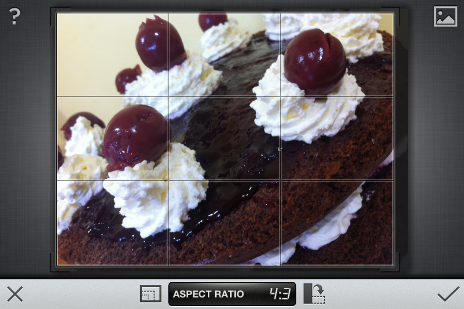
However, there are some frustrating oversights. The omission of a straighten function being top of my list. And not being able to crop a vertical image using a 4:3 aspect ratio without first rotating it to a horizontal aspect, and indeed various other aspect ratios, is a bit... odd.

A very odd crop function and no obvious straighten feature

I didn't find the slider that is used to control the intensity of the adjustments especially accurate: if I tried to set it to 12 points, it would easily wind up at seven or 16. Without a reset button, returning the slider to 0 was sometimes tricky. And I have to confess that I'm fond of being able to compare my adjustments with the original image, which I can't do with Fotor.

But when all was said and done, I did like the final edit

Fotor, I'm afraid, won't be making its way to the 'Photography A' folder on my phone. It doesn't offer me enough of what I need and there's too much of what I don't. But that isn't to say it won't be for you. It's free to download and available for Android and iOS, so worth a look.

EyeEm announces its Photography Awards and Festival 2014

New kit. Maybe some cash. Global exhibition. Publication in a 'Best of 2014' photobook. A trip to Berlin. Sound good? They're all prizes that are up for grabs for winners of the EyeEm Global Photography Awards. Starting today, photo-sharing site EyeEm is looking for the best examples of mobile photography to showcase at the Berlin Holzmarkt as part of its photography festival in September this year. There are ten categories into each of which you can submit a maximum of three images.

Take a photo

Open now are the Portraitist, the Illusionist, and the Explorer categories. That round closes on 1 June, to be followed by the Architect, the Street Photographer, and the Illuminator categories, which are open to submissions from 2 June. The final round opens on 16 June and comprises categories the Speedster, the Landscapist, the Storyteller, and the Stylist.

All you have to do is upload your chosen images to EyeEm and tag them with the appropriate category in the Share screen. If you don't already have an EyeEm account, it's free to join.

b_EyeEm Awards Website

The winners will be chosen by a jury of ten illuminaries from the photographic world, including Anna Dickson, the Huffington Post's Director of Photography, conflict photographer Benjamin Lowy, and Olivier Laurent, who edits TIME's Lightbox magazine. As well as being exhibited at Berlin's Holzmarkt as part of EyeEm's Photography Festival running 12-13 September, winning images will be showcased to the public in London, New York City, San Francisco, Rio de Janeiro, Cape Town, and Tokyo. And the talented entrant named as the EyeEm Photographer of the Year will win a round-trip to Berlin for two, to experience the Festival!

'We’re looking forward to celebrating this new generation of budding photographers, who are defining a new era, with the launch of our Global Photography Festival & Awards,' says Florian Meissner, co-founder and CEO of EyeEm. 'Photography has changed significantly in recent years and at EyeEm we see smartphone photography as a natural evolution of the art form. The creative excellence of our community is the center of EyeEm and the Global Photography Festival & Awards are our way of continuing to support and show the world this incredible talent.'

The EyeEm Photography Festival runs over the 12 and 13 September 2014. It aims to highlight the creative images being made with mobile phones, connect leaders from the photography, devices, and media industry with the next generation of photographers to discuss the state and future of photography, and lay on photowalks, masterclasses, and portfolio reviews for attendees.

All of the details on how to enter the competition and how to book your place at the Festival are available on the EyeEm website. See you there?

Spring cleaning my photography apps

I acquire a huge number of photography-related apps on my phone. Some of them I'm requested to review, some of them I choose to download so that I can compare them against similar apps, some of them I download for a specific purpose and never use again, a few of them I even use on a regular basis. I'm not too bad at sifting through them perodically to delete those which aren't serving any purpose and doing nothing more than consuming memory on my phone, but when I realised that I had four folders of photography apps, I concluded that it was time for a spring clean. Thus began the great app cull of Spring 2014. It was a fairly simple process based on the question 'Do I use this app?' If I did, I kept it; if I didn't, it was sent to the great spare app repository in the cloud. Admittedly, I did make a few exceptions, but all will be revealed.

Snapseed is my go-to editing app (followed by Aviary and ColorTime) so why did I have Photoshop Express lying redundant on my phone?

Adobe Photoshop Express? I don't remember the last time that I used it. I prefer Snapseed or Aviary. Gone!

Camera+? Plenty of people rave about it, but I've never got on with it. Gone!

Camera 360 Ultimate? I downloaded it when I was writing the Surreal book; it's served its purpose. Gone!

Loom? Now integrated with Dropbox making the app defunct. Gone!

Luminance? Again, lots of people love it, but I've never been drawn to it in the same way. Gone!

Marksta? An excellent app if you choose to watermark your mobile images, but I don't. I downloaded it when I was writing the Social book, but seeing as I no longer need it, it's... Gone!

Plastic Bullet? In the unusual event that I want to add filters and washes and heaven-knows-what to my photos, Pixlr-o-matic and FX PhotoStudio get the first looks-in.

Water My Photo? Not used it in almost two years. Does it still work? Gone!

And this list doesn't even skim the surface of those that have already enjoyed their five minutes of screen space and been moved on to pastures new. These include DXP Free (I prefer Juxtaposer); NoCrop, Squaready, and Squaregram (out-flanked by Instacrop and Instasize); and blasts from the past Photogram and Flex Photo Lab.

So what's left? Well, with three folders' worth, still quite a lot. I could probably condense it to two folders if I tried hard enough and made a choice between long exposure apps, plumped for either Instacrop or Instasize, and when I've finished off a few things I'm working on that require apps here and there. But I've still plenty of editing options with Snapseed, Aviary, and ColorTime, not to mention the tools that come with EyeEm, Flickr, and Instagram. There's touchReTouch for heavier duty removals, Touchnote for sending postcards, and Flipagram for flipbook-type-videos. Finally for triggering there's Triggertrap (obviously) and Gorillacam.

And there are a few apps that I've kept despite not having used them very much. I'm hoping that by making them more visible amongst my photo app arsenal, I might feel more inclined to tap them. I'm sure that I was suffering from a case of app-blindness with so many unused ones camouflaging ones that I might otherwise be useful. It's certainly been a liberating experience for my phone's memory; I'm hoping it might be an enlightening one for my mobile photography now.

Less is more, I think.

MBLOK: a cross-platform memory cube for many devices

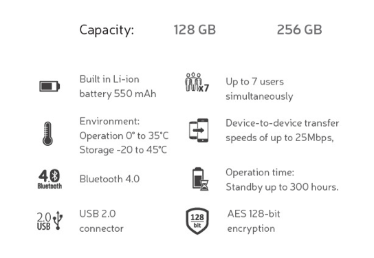
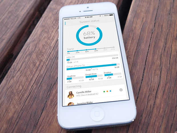
One memory across multiple devices that doesn't involve the cloud? I think I could be tempted by that idea. It's precisely what MBLOK is attempting to achieve via a Kickstarter campaign that launched yesterday. MBLOK is a small, local memory device that connects to PCs and Macs like a flashdrive or communicates with smartphones and tablets via Bluetooth. It should function cross-platform and can connect to upto seven devices simultaneously. There are Android and iOS apps in the works to help you manage your files stored on an MBLOK and keep a track of its battery life. It's meant to last for upto 300 hours. It comes in 128 and 256GB storage capacities.

MBLOK's biggest appeal, for me, is its ability to connect to a variety of different devices without the need for an internet connecton. This makes it ideal for when you're on the move and might want to back up Raw images from your laptop and other photos from your phone, watch films on your tablet, and keep copies of documents, but can't guarantee access to the cloud.

A quick run-down of capability

MBLOK needs to raise $120,000 (Canadian) to reach its Kickstarter goal. That's £65,700. You can pick up an early-bird special 128GB MBLOK for $189 (about £105) or 256GB version for $279 (£155); rising to $249 and $349 respectively when the limited numbers special prices have been snapped up. I was slightly concerned that at these prices and with few lower-tier backing options, MBLOK might struggle. But it's already raised over $15,000 and it isn't even 24 hours into its campaign yet.

Connects to a laptop via USB, to smartphone via Bluetooth

I'm also inclined to regard the MBLOK timeline with scepticism. It seems highly ambitious to me, with a great deal to be accomplished before shipping the product in the first quarter of 2015. This includes establishing suppliers and component production, app development, and a great deal of testing. If I were putting my money into this, I'd be prepared for my device to arrive a little after the anticipated delivery date.

Managed via an app

If you're interested, you can read more and pledge money over on Kickstarter.

Hot and happening trends in stock imagery according to iStock by Getty

A few weeks ago we published our guide to selling stock images, with content suggestions, style advice, and labelling tips, among other hints. This week, iStock by Getty Images has released an infographic documenting the eight leading trends in business imagery that they've charted over the past year. If you're looking to sell business images, these are the kinds of subjects that buyers are after:

  1. Transparency and openness - business-type scenarios shot through windows and glass
  2. Show me "Innovation" - unusual concepts, unusually shot
  3. The New Leader - think start-up trendy rather than power-dressed exec
  4. Service-oriented workforce
  5. Dads on deck - or hands-on dads
  6. Women in power - we're growing in number
  7. Hipsters are taking over - beards, bikes, and coffee (apparently)
  8. Working from home - more of us are doing it, so it needs to be reflected

Top Trends In Business Imagery 2014_iStock by Getty Images

Get cracking, then!

Thoughts on the Sony World Photography exhibition

After my slightly disappointing press view of the Sony World Photography Awards exhibition, when I didn't have the opportunity to take in the photos, I made a return trip to Somerset House yesterday to rectify this situation. I had much more time to wander through both the East and West Wings, admiring the images and pontificating on the judges' choices. Visiting an exhibition that has cherry-picked from vast numbers of photos submitted from across the globe by both amateur and professional photographers gives you the chance to look for trends and fashions, garner some inspiration, and importantly, look through a window into other people's worlds. I enjoyed my saunter through the rooms and Sara Naomi Lewkowicz's l'Irs d'Or winning series Shane and Maggie stands out a mile. I loved Sophie Gamand's wet dogs, which won the portrait prize, Guy Martin's photos from the Gezi Square protests told a defiant story, and I was drawn to the deep and dark photos in Salvatore Di Gregorio's series An Old Fight, which won the sport prize.

Winner of l'Iris d'Or: Sara Naomi Lewkowicz for her series 'Shane and Maggie'. 'Shane and Maggie' attempts to show domestic vilence as a process, as opposed to a single incident.  (Sara Naomi Lewkowicz (USA) Finalist, Contemporary Issues Professional Competition 2014 Sony World Photography Awards)

What, though, were my overwhelming thoughts and questions as I left the exhibition?

The professional category was dominated by black and white images. That is a comment made as neither praise nor criticism, merely as an observation. It is worth noting, however, that l'Iris d'Or winning series comprised colour images and that the photos that have stuck with me are those shot in colour. Maybe it is because they were my preferred shots, or perhaps it is because their colour makes them stand out amongst the monochrome, but it does pay to be different.

Protesters against the government of Tayip Erdogan and his plans for a shopping mall and pedestrianised area in the centre of Instanbul - Guy Martin (UK) Current Affairs Professional Competition, 2014 Sony World Photography Awards

Writing of daring to be different, I think I might've reached Indonesian cow-racing photo saturation point. It's a stunning spectacle that produces stunning images, but there have been examples in the professional or open categories for at least the last three years. It's almost as if their inclusion has become obligatory. I'd appreciate being able to gaze upon something new in future years.

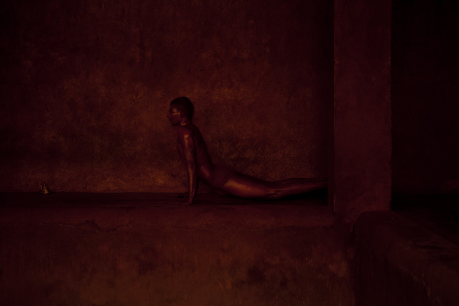
Salvatore Di Gregorio, Italy, Winner, Sport, Professional Competition, 2014 Sony World Photography Awards

Finally, I was surprised by the profusion of manipulated images in the open category. From HDR, to composites, to painterly-type blending, it had it all, and this extended beyond the 'Enhanced' division, which is devoted to manipulated images. As the author of a book on surreal photography, this might be regarded as an unusual comment, but it does present some important questions. First, how much manipulation is too much manipulation? Second, to what degree is photo-manipulation now regarded as an acceptable element of photography? And consequently, at which point does a comeptition become one of photo-manipulation rather than photography? All of these are questions for another day, but ones to ponder.

Wet Dog 2, Sophie Gamand (France) Portraiture Competition, 2014 Sony World Photography Awards

The exhibition runs until Sunday (18 May), and if you have to be in London or its environs, it's worth an hour or so to take it in. I'd love to know what you think.

Sony World Photography Awards exhibition, Somerset House, London, until 18 May 2014.

All the love for Litely?

There's been quite a bit of love for Litely over the past few days, following its release as an iOS app earlier this month. Developed by Cole Rise, one of the engineers behind Instagram filters Amaro, Hudson, Sierra, Sutro, Mayfair, Willow, and Rise, it's a photo editing app that offers a range of subtle filters and simple tools. When Sarah Perez of TechCrunch declared that Litely is the best new photo-filtering application for iOS, I decided that I needed to commandeer my parents' iPad, download it, and give it a whirl. The best new photo-filtering app for iOS is high praise and with my expectations set to stratospheric, I was anticipating something revolutionary. To give Litely its dues, it does have a lovely interface, the filters are subtle, and being able to adjust their intensity is much appreciated. But I think that it requires a little more fine-tuning before it can justify the unmitigated praise that's being heaped upon it.
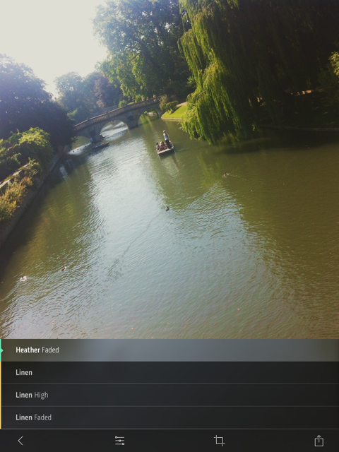
I love the attention to detail, for example the marker beside each filter indicating the colour influence it has.

My most fervent criticism concerns the crop function. Given my dislike for the Flickr app's crop utility, I must be a stickler for them. I don't mind only having the choice between the original and a square aspect ratio, but I'd quite like to be able to actually crop an image and get closer to my subject. Litely lets you do this on-screen using the pinch function, but it doesn't seem to apply the crop after you've selected the 'Tick' icon. Please don't tempt me and then deny me. It's cruel. And if I can't crop, at least let me straighten.

Are these editing functions enough?

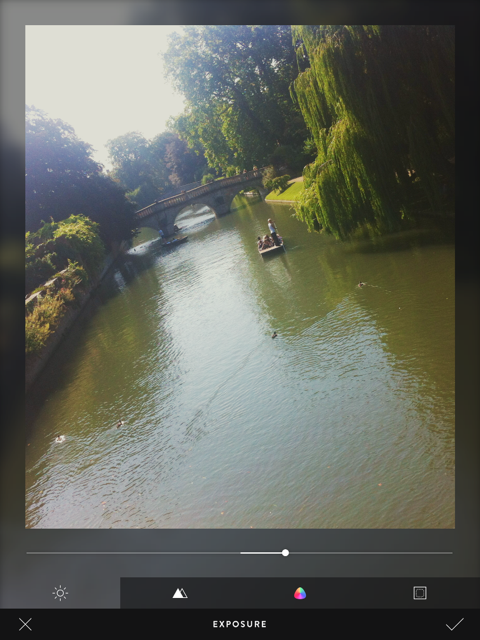
The editing functions comprise exposure, sharpen, vibrancy, and vignette. All of these are useful and easy to apply, but I'd still appreciate a white balance correction (even if I am meant to be adding a filter), a contrast slider, and maybe a tilt-shift option too. Does this make me greedy? Maybe, but I think this is Litely's biggest stumbling block.

Having started out as a collection of pre-sets for Lightroom, Photoshop, Aperture, and Camera Raw, Litely wasn't about actual editing. Those programmes offered all of that functionality with spades. In its transference to an iOS app, it has lost that purity. It's neither a one-stop-editing-shop nor an app devoted to filtering, and neither is there an inherent photo-sharing community, like Instagram or EyeEm.

Using the Heather Faded filter

By offering a few editing tools and nine filters for free, with a further 36 filters available at a price, it is falling between two stools. If it gave me all of the editing tools I want and need, it could possibly tempt me to augment the filters and stick with it. But I'm just not that bothered by a half-baked editing app with a few filters on the side. Equally, would I care to download just a bunch of filters? I'm not likely to, but I know people who are. Without a community to keep me coming back, it doesn't do enough to justify my interest, however delightful the interface or subtle the filters.

In conclusion, I've not fallen in love with Litely the same way that others have, but I do feel that it has potential. Now it must decide what it wants to be.

Litely is available to download for free from the App Store (nine filters plus basic editing fnctions), with three further sets of filters available for $1.99 each.

What is the clarity slider? And why might you want to use it?

Your photography has been progressing and you've made the leap from shooting in JPEG to Raw. Along with this, you've plunged headlong into Lightroom and all of the editing marvels that it affords you. Plenty of the controls are familiar, after all you've been adjusting the white balance in your iPhone photos since you realised you could stop people looking corpse-blue with a simple slide to the right in Snapseed. A few of the others need a bit more thinking about, but they're essentially the same. And then there's the clarity slider. Clarity? What the blinking heck is that all about?

Defining clarity

Before we wade headlong into the ocean of clarity, we need to take a step back and have a quick re-cap of contrast. Contrast is the difference between light and dark in an image. Increase contrast and an image will seem bolder; decrease contrast and it'll have a more muted feel. Adjust the contrast and it has an effect across the entirety of the photo: highlights, shadows, and mid-tones. This is where clarity comes in.

Clarity's influence over contrast happens in the mid-tones of an image; by increasing clarity, you sharpen the edge detail and definition among these tones, leading to a punchier, sharper looking image. Conversely, decrease the clarity value and you'll soften edge detail and lose definition.

Ramping up the examples

The effect that the clarity slider has on your photos is likely as clear as mud until you see it in action. I have, therefore, reproduced the same image but with different clarity adjustments, to see how it looks.

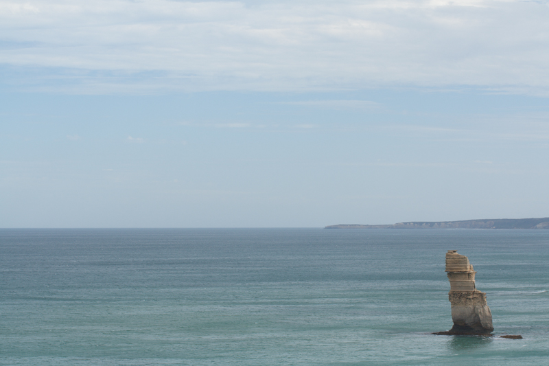
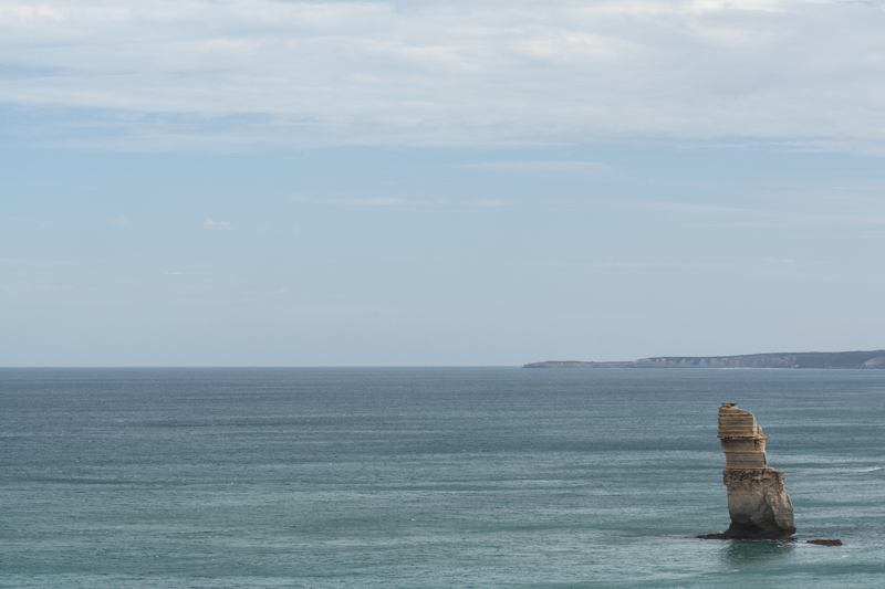
My original photo of a lonely Apostle off of the Victorian coast. It's been adjusted for crop and white balance.

Same image but with the clarity slider pushed to +50. Note how much more defined the waves are, and how the strata in the Apostle are clear?

With the clarity slider moved to -50, everything becomes much softer.

Why, then, would you want to adjust the clarity in your photos? For a start, I've exaggerated the adjustments in my examples to show you precisely the impact it can have. With more subtlety, it can add definition to landscapes, or emphasise a misty, dreamy feel, and give portraits a gentler feel.

Subtler examples

These aren't especially thrilling portraits of my cousin, Emma, but they serve the purpose of exploring the clarity slider perfectly.

Nothing terrible (or exciting, either, to be fair) about the original here

There's nothing at all wrong with the original image (it's been cropped and white balanced); but look at how Emma's skin appears softer and more even with a -15 point adjustment to clarity. The background hasn't been affected too much, but she looks better for it.

But a slight adjustment to the clarity slider (-15), softens Emma's skin a touch.

If you'd like to get even more advanced, you can use Lightroom's adjustment brush to paint softer and more even skin with a negative nudge, but bring definition to a portrait subject's hair by selecting that and giving it a positive clarity adjustment. That's what I've done here.

Here, I've softened Emma's skin with negative clarity, but brought out the definition in her hair with a positive clarity brush.

A cautionary conclusion

As with most things, subtlety is the key to clarity. Too much of it in either direction can leave your photos looking more like cartoons or watercolours than you otherwise might want. And you're not going to want to fiddle with the clarity slider on every photo, either. But at least you can have a bit more confidence about what it does and how you can make it work for you now.

What's the story?

Last week I was fortunate enough to attend a Q&A session with Mary Ellen Mark, winner of this year's Sony World Photography Awards' Outstanding Contribution to Photography. She was asked many pertinent questions and gave a great many eloquent answers, but it was the statement that 'Photography has to say something,' that struck the most resonant chord with me. It chimed right back to one of the very first things that I was taught when I started to wield a camera. I learned the basics of photography from my friend Daniel's mother, exploring the hedgerows around my school and attempting action shots of my classmates playing sport. Linda was patient, enthusiastic, and inventive. I was desperate to do well under her tutelage and one of the most piercing criticisms that she could give of my photos was 'But what's it a photo of, Daniela?' You see, every photo is meant to tell a story, and if your audience cannot discern what you're trying to say, then you've failed in your task as a photographer.

View from the top

'What's the story?' is a mantra that has adhered with me for some 27 years, and it's the starting point for any critique that I give a photo, whether it's mine or it's someone else's. Even a photo of a gorgeous flower in bloom has a story to tell, and this story is the origin of all picture-taking. Your audience needs to be able to connect with your image and they will do that through its story.

All is not what it seems

When you're faced with a compelling scene, it's pointless to wave your camera about wildly, snapping at everything you think is relevant and hoping that something will come out of it. All that you'll succeed in producing will be photos as scatter-brained as your approach. Think about: there is a story there that caught your eye and you need to convey it. So think about what that story is and concentrate on narrating it through an image.

Port cranes at sunset, Livorno

When you shoot a landscape, picking out the isolated stone house nestling in the valley will convey a sense of loneliness, or maybe peace. Catching the glint in your nephew's eye as he sneaks a biscuit out of the tin says everything about his cheeky furtiveness. It's all there for the telling.

Violet

Building further on this notion, by identifying the stories in your photos and concentrating on how you aim to tell them, your photography will improve. You will have a clearer idea of how to compose your frame and it will give you a starting point for your technical settings. You might not get it right first, or even second or third time, but you will be working in the direction of whatever it is that you're trying to say rather than fumbling in the dark. In every possible way you'll be strenghtening your photography: creatively, technically, and practically.

Sometimes, it comes together

Before you depress the shutter button, ask yourself, what's the story and how am I going to tell it? Remember: every photograph has to say something.

For one day only iStock is paying 100% royalties toartists

The terms and conditions under which photographers sell their images via stock agencies are frequently criticised and as a consequence the money that they can make from sales is often lamented. For one day only, however, iStock by Getty Images is trying to make photographers feel better about the deal and their contribution to the stock business. As part of its celebration of Small Business Week in the US, it has declared 14 May 2014 to be '100% Royalty Day'. 100% Royalty Day means that:

  • 100% of sales on all exclusive/only available from iStock content sold through cash and credit file downloads will go directly to iStock by Getty Images artists
  • double royalties will be paid to artists whose exclusive content is sold via iStock by Getty's new subscription scheme

However, it's not quite the gold-plated celebration of small businesses that it appears to be at first blush. That pesky word 'exclusive' makes all the difference. If you're not afraid of a little stock agency promiscuity then you won't be eligible for any extra pennies accrued. And of course, it's not exactly easy to encourage people to select your content for download on 14 May; they'll download it at their convenience. Still, if you are an exclusive iStock by Getty contributor, it's better than a poke in the eye with a sharp stick.

Feature image: Amesy/ iStock by Getty Images

Before entering a competition, read the terms and conditions

This isn't a new drum that we're beating here today, but we think it's a significantly important issue to warrant another parade: competition rights grabs. Or the attempt by competition organisers to inveigle themselves of the right to use any of the images entered into their photographic competitions, for any purposes, with no compensation to the photographer. This reminder comes as I received a call for entries to a competition run in conjunction with an organisation that I respect and trust, and hoped would be above cheap tactics to help magazines or other companies amass a photo library for free. Apparently not. To quote from the terms and conditions:

By entering your photos in the competition you agree to grant REDACTED and REDACTED a non-exclusive licence to reproduce, publish and feature the photos in association with this competition, or for any other purpose, at any time, in any publication, website or other associated media outlets, without compensation. By entering you agree to grant REDACTED and REDACTED an exclusive royalty-free licence to use the full set of images taken on your photography trip [which comprises the prize] for 12 months.

To use images submitted to contests as promotional material for the competition or its future iterations is a reasonable condition of entry; but to demand they be made available for use in any publication associated with the organisers, for any purposes, across all media, and without compensation is, in my opinion, exploitative.

I have written extensively about the damage that these terms and conditions do to both photographers and the photographic industry before now, so I shan't reprise it here. But do bear in mind that if you're seeking your big break from a competition that employs these sorts of terms, you are doing yourself and fellow photographers—amateur and professional—a disservice in the long run. Furthermore, don't assume that just because the competition is being organised by or run in conjunction with a big name that it won't be out to take advantage of you.

The finale to this performance is then: always check the terms and conditions of a competition and if you consider anything to be unsavoury, please don't enter.


Seeing as I've been asked: no, I shan't be naming the competition in question. I'd rather not bring any more publicity to it. Just read the T&Cs!

Something for the weekend? The Last of the Liberators at the Imperial War Museum, Duxford

Not only is 2014 the centenary of the commencement of hostilities of the First World War, but it is also the 70th anniversary of the D-Day landings, which are often thought to be 'the beginning of the end' of the Second World War. As part of its commemoration of the women and men who served in the conflict and who made the Normandy Landings, the Imperial War Museum is hosting a photographic exhibition of portraits of some of the last surviving British veterans of the campaign. D-Day, the Last of the Liberators is an exhibition of 15 portraits of men and women who participated in the Normandy Landings, taken 70 years since. These photos saw their return to the places they most closely associate with the campaign: where they were wounded or saw comrades fall; where they experienced quirks of fate or chance; or where their lives were shaped.

The Last Of The Liberators at IWM Duxford from Lastoftheliberators on Vimeo.

The photos were taken by Robin Savage, whose work is more often linked to actors, but he's always held a fascination for the Second World War, and the Normandy Landings especially. This culminated in his personal project to honour those who served. 'Being in the company of such extraordinary people has been one of the greatest pleasures of my life and I am honoured that many of them have become friends.'

Vera Hay, by Robin Savage Vera was a sister with the Queen Alexandra’s Imperial Military Nursing Service. She landed on Gold Beach about a week after D-Day. She was one of the first British nurses to land at Normandy. Once in position, she and her t…
Vera Hay, by Robin Savage Vera was a sister with the Queen Alexandra’s Imperial Military Nursing Service. She landed on Gold Beach about a week after D-Day. She was one of the first British nurses to land at Normandy. Once in position, she and her team would treat around 200 casualties each day. Sleep was snatched and came in a ditch until tents reached the field hospital at Chateau de Beaussy.

The exhibition, just one part of the museum's D-Day remembrance programme, runs until the end of the year. Entry is included in the price of admission to the Imperial War Museum, Duxford, and under-15s are admitted for free. There are more details on the Imperial War Museum's website.