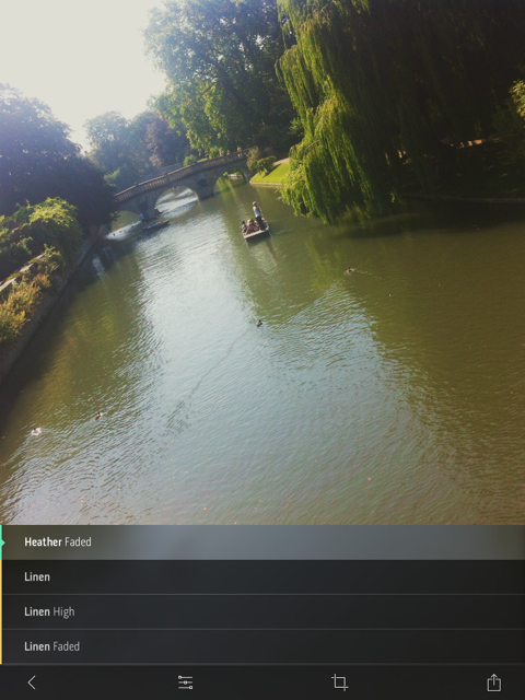
There's been quite a bit of love for Litely over the past few days, following its release as an iOS app earlier this month. Developed by Cole Rise, one of the engineers behind Instagram filters Amaro, Hudson, Sierra, Sutro, Mayfair, Willow, and Rise, it's a photo editing app that offers a range of subtle filters and simple tools. When Sarah Perez of TechCrunch declared that Litely is the best new photo-filtering application for iOS, I decided that I needed to commandeer my parents' iPad, download it, and give it a whirl. The best new photo-filtering app for iOS is high praise and with my expectations set to stratospheric, I was anticipating something revolutionary. To give Litely its dues, it does have a lovely interface, the filters are subtle, and being able to adjust their intensity is much appreciated. But I think that it requires a little more fine-tuning before it can justify the unmitigated praise that's being heaped upon it.

My most fervent criticism concerns the crop function. Given my dislike for the Flickr app's crop utility, I must be a stickler for them. I don't mind only having the choice between the original and a square aspect ratio, but I'd quite like to be able to actually crop an image and get closer to my subject. Litely lets you do this on-screen using the pinch function, but it doesn't seem to apply the crop after you've selected the 'Tick' icon. Please don't tempt me and then deny me. It's cruel. And if I can't crop, at least let me straighten.

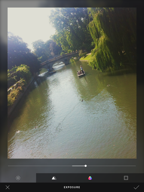
The editing functions comprise exposure, sharpen, vibrancy, and vignette. All of these are useful and easy to apply, but I'd still appreciate a white balance correction (even if I am meant to be adding a filter), a contrast slider, and maybe a tilt-shift option too. Does this make me greedy? Maybe, but I think this is Litely's biggest stumbling block.
Having started out as a collection of pre-sets for Lightroom, Photoshop, Aperture, and Camera Raw, Litely wasn't about actual editing. Those programmes offered all of that functionality with spades. In its transference to an iOS app, it has lost that purity. It's neither a one-stop-editing-shop nor an app devoted to filtering, and neither is there an inherent photo-sharing community, like Instagram or EyeEm.

By offering a few editing tools and nine filters for free, with a further 36 filters available at a price, it is falling between two stools. If it gave me all of the editing tools I want and need, it could possibly tempt me to augment the filters and stick with it. But I'm just not that bothered by a half-baked editing app with a few filters on the side. Equally, would I care to download just a bunch of filters? I'm not likely to, but I know people who are. Without a community to keep me coming back, it doesn't do enough to justify my interest, however delightful the interface or subtle the filters.
In conclusion, I've not fallen in love with Litely the same way that others have, but I do feel that it has potential. Now it must decide what it wants to be.
Litely is available to download for free from the App Store (nine filters plus basic editing fnctions), with three further sets of filters available for $1.99 each.


