Instagram 2.0

Instagram 2.0

The mega-successful photo-sharing and iPhoneography icon, Instagram, with its gajillion users, has just undergone its first major upgrade since it hit the App store just under a year ago. It’s Instagram 2.0. It’s faster and it has a gamut of new features. Wanna know what’s new?

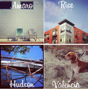
Well, first up is Live Filters, which means that you can apply whichever filter floats your boat before you snap your pic, and see what it looks like. As for those filters, they’ve introduced four new ones: Amaro, Rise, Hudson, and Valencia.

There’s a new tilt-shift doo-dad that’s super-fast: pinch, pan, and rotate and watch it all in live view.

In response to people’s requests for higher resolution images, they’ve done just that. If you use an iPhone 4, resolution has increased from 612×612 to 1936×1936. If you’re stuck with the iPhone 3GS, resolution is now 1536×1536.

Borders are now optional. Much better! And you can now rotate your photos so that they’re not stuck on their sides. Fabulous!

But it’s all still only available for devices-Apple. If you’re an Android user, no Instagram for you.

All the details are over on Instagram’s blog.

Video Photo Critique II: Gay Balloons


Today's video critique is Gay Balloons, by Sam Levy - take a closer look at it on Flickr!

Sam's photo is the second video critique I've done, so let me know if this format works a little bit better. To see all (well... Both) critiques and to find out how to get your own critique, check out this post.

Well then, with that out of the way, let's get cracking on the critique (oh, and if you can't see it because you're looking at it in a RSS reader or similar, simply come to the original of the article here so you can see it!)


AoP Awards Ceremony and Exposure 2011

photographerslogo

Busy next week? Well, Wednesday and Thursday to be precise? Wednesday night is the Association of Photographers’ Awards ceremony, from 17.00-18.00 at Ambika P3 at the University of Westminster, swiftly followed by the awards party at the same venue, from 19:00 onwards. Tickets are £10 for members, £20 for non-members in advance. Wait until the day, though, and those prices go up £5.

Exposure 2011 follows the next day, at the same venue. From 11:30 to 20:00 you can feast your eyes and ears on a series of talks, demonstrations, seminars, and exhibitions. There’s a Blurb book-making workshop; a lighting for fashion and beauty photography demonstration; a discussion of our rights when we take photos in public, as well as lots more. That’ll cost £10 for members or £15 for non-members, too.

If you’re interested, take a look at the Exposure website or Awards Ceremony website for more details.

The AoP Awards Ceremony and Exposure 2011 will be held at Ambika P3, University of Westminster, 35 Marylebone Road, London, on Wednesday 28 and Thursday 29 September 2011.

A closer look at Nikon's compact camera systems


The Nikon J1

It was only a question of time before one of the Big Two was going to join in the compact system camera arms race - and whilst Canon is still considering it and filing patents that suggest they're going to pull their finger out eventually, it was Nikon that got there first.

Joining the Micro Four Thirds system from Panasonic and Olympus, the NEX system from Sony, the NX mount cameras from Samsung - and the slightly outside-the-box systems from Leica (the M system) and Ricoh (with their GXR interchangeable lens unit system), Nikon is a latecomer to the landscape. But oh boy have they done an interesting job.

They're calling it an Advanced Camera with Interchangeable Lens (A-CIL), which adds even more alphabet soup to Compact System Camera (CSC or CoSyCa), Electronic Viewfinder, Interchangeable Lens (EVIL) or Mirrorless Interchangeable Lens Camera (MILC), but they're all the same: No mirror, electronic viewfinder, and interchangeable lenses.

Two shiny new cameras

Nikon's addition to the bunch is a brand new system, complete with a series of new lenses.

The Nikon 1 V1 is "designed to propel your photography forward". Packing a high-resolution electronic viewfinder into a tough body with magnesium alloy body with a multi-accessory port gives the system the freedom to expand further with a range of system accessories. The Nikon 1 V1 is available in matte black and high-gloss white. Basically, it's 'just another compact system camera'.

The slightly cheaper Nikon 1 J1 loses the electronic viewfinder (you'll have to use the LCD display to compose your images instead), and the accessory port - but it's still a capable starter camera. Nikon claim it's equipped with "everything you need to shoot life as it happens", and is available in a range of colours with compact 1 NIKKOR lenses to match, and it boasts a built-in flash that offers extra light when you need it. The colours are high-gloss white, matte black, high-gloss red, silver and even hot pink.

Both cameras 'only' have 10 megapixel resolution sensors, but that seems to be pretty standard for this class of camera.

Innovative new features.

Nikon claims that the Nikon 1 range has a processor that is many times faster than the most professional cameras. They've tapped this extra speed to add in some fabulous new toys for photo lovers, including "Pre- and post- capture". This means that you can start recording images before you fully press the shutter button, and continue after you’ve clicked, to help you capture the 'defining moment'.

They've got some other fun toys to bring to the party as well, which is rather significant, because it shows that Nikon have done more than just take a look at the competition and create a 'me-too' product:

More than any of the other CoSyCa manufacturers,
it appears that the photography giant have taken the opportunities of the new form factor to heart, and really set out to change photography.

Motion Snapshot "brings a photo to life in just one click". It simultaneously records a slow motion movie and a still image, then instantly combines the two to create a photo that moves and captures the story of a moment as never before – a living picture.

Smart Photo Selector "captures the perfect moment in any scene"; shooting 20 full-resolution images in the time it takes you to snap a photo: you just press the shutter once and, utilising the pre and post capture technology, the camera starts to take the pictures before you’ve even fully depressed the button. Your ‘best’ five shots are saved based on facial expression, composition and focus and the ‘perfect’ shot is presented to you. Never again will you miss the very second a dog catches a ball or the joy on your child’s face while they are on a swing.

Still image mode will "make you a master of movement" as you switch to shooting sharp, full-resolution shots of the action at up to 60 frames per second.

And finally, Movie mode "opens up a host of advanced movie functions". You can take a high-resolution photo while filming a Full HD movie, without interrupting recording, or film in extreme slow motion.

New sensors

Taking its place alongside Nikon’s existing DX and FX-format sensors (used on Nikon D-SLRs), the all-new Nikon 1 CX-format CMOS image sensor is designed for Nikon 1 cameras and the 1-mount. Offering the perfect balance between system size, speed, light sensitivity, resolution and depth-of-field, Nikon 1 demonstrates superb colour reproduction with 100-6400 (extended) ISO, low noise, RAW shooting and 10.1 megapixel resolution, delivering consistently superb stills and movies.

New stash

In addition to the camera bodies, Nikon are launching four new lenses - the 1 NIKKOR VR 10-30mm f/3.5-5.6, the 1 NIKKOR VR 30-110mm f/3.8 -5.6, the 1 NIKKOR 10mm f/2.8, and finally the 1 NIKKOR VR 10-100mm f4.5-5.6 PD-ZOOM.

Finally, they've announced a GPS unit for geotagging your images, a compact external flash for illuminating your future, and, most excitingly, the FT-1 mount adapter, enabling you to use any Nikon SLR lens with the compact camera, giving you access to hundreds of fantastic lenses.

It all goes on sale from 20 October or thereabouts.

Photoshop Elements turns 10


Happy birthday to you, happy birthday to you... The baby brother of photo editing behemoth Photoshop turns 10 years old this year, and celebrates by releasing version 10 - Adobe Photoshop Elements 10, to give it its full and official name. As ever, it's aimed at photographers who do want to edit their photos to their heart content, but without having to shell out the full cost for a lot of features most people would never actually use.

Powered by the same engine as Adobe Photoshop, Photoshop Elements 10 utilises "intelligent technology" that is designed to make it easier to give everyday photos a boost. The technology is brought to life through easy-to-follow steps for achieving lovely photo effects in an approachable way with new Guided Edits. These include innovations such as creating a shallow depth of field or designing an interesting layout of snapshots with Picture Stack, or even adding a dream-like diffused glow with the Orton effect.

New text functionality, has been added as well, to appease the scrapbooker audience, including curving, flowing text to a photo that automatically follows the outline of a subject, custom path or shape. In addition, special crop guides now help users create appealing compositions.

Keeping your photos organised - and then sharing them

Perhaps the biggest news in this evolution of Elements is the additional attention given to organising and sharing your photos.

Object Search automatically finds objects within photos, such as a landmark, flower or pet. The Elements Organiser can also automatically detect duplicate or near-duplicate photos so users can clean up and delete the photos they don’t need and quickly group similar collections of photos. If you shoot video, you're in luck, too - your clips can be uploaded directly to Facebook or YouTube.

Whether users are social networking or using sharing sites like Facebook, Flickr, YouTube or Photoshop.com, Photoshop Elements 10 helps you share your photos directly from within the Elements Organiser and view them from virtually anywhere on the go, offering a comprehensive set of sharing capabilities for today’s increasingly social and mobile worlds. For Facebook lovers, Elements even integrates users Facebook Friend Lists for easily tagging photos that can then be shared directly to Facebook. Nifty stuff.

It's available now from your local Adobe website, for windows and mac. Or, if you're so inclined, you can toddle over to your nearest brick-and-mortars software peddler to pick up a nice boxed copy.

The illustration photo in this post is (c) Adobe.

Put your photos in front of 12M people


Studmuffin and saucy minx.

Sit back and think of the phrase 'Every Second Counts' for just a second. What springs to mind? As photographers, we capture the world in fraction-of-a-second slices, all of us hunting for the elusive moment that captures the essence of our subjects.

I suppose it wouldn't be too far-fetched, then, for Justin Timberlake's upcoming film 'In Time', to link in with a photography competition. The concept for Timberlake's newest film is that in the future, people stop aging at 25 and must work to buy themselves more time. A young man (Timberlake, of course) finds himself with more time than he can imagine, and he must run from the corrupt police force to save his life.

All very Hollywood, but what's that got to do with photography?

As the earlier-alluded photography tie-in: Justin is asking photographers to "capture a moment that almost could have been". The photo can be of anything and everything— they're looking for a unique perspective that best embodies the theme.

If you're the lucky winner, you receive global exposure. Among other things, your image will be featured as the official profile picture on Justin Timberlake’s Facebook page (that's where the 12 million pairs of eyes come into play) for the month of November 2011.

The winning photograph will also be displayed in a pop-up gallery at the Premiere of In Time in Los Angeles, and various other places, too.

Awesome, eh? Enter the competition now - every second counts! (And no, they didn't pay me to write this. But maybe they should. Timberlake, if you're reading this, PayPal payments go to h@kamps.org. Thanks! :)

Facebook updates photo tagging


The World Nude Bike Ride is great fun - but that doesn't mean you necessarily want the photos showing up on your Facebook wal

It used to be easy to untag yourself from a photo on Facebook - you simply click 'Untag', and the deed is done. In the most recent Facebook privacy update, there are a few changes.

The bad(ish) news is that the untagging functionality is still there, but it adds another step. The good news is that you are given more options to help manage your digital reputation.

screen_shot_2011_09_19_at_181545.jpg

The new button is now called Report/Remove Tag, and gives you a host of new options; You can tell Facebook whether you want to simply remove a tag, but you can also report it as harassment of yourself or a friend. Finally, you can report it as inappropriate in a different way; whether the image is part of a spam or scam attempt, whether it contains pornography or graphic violence, depictation of illegal drug use, or hate speech / symbols.

screen_shot_2011_09_19_at_181347.jpg

When it comes to the actual de-tagging, things have been updated as well; As before, you can still just remove the tag, but now, you're also able to request the person who uploaded the photo to take it down altogether. Finally, you are given the option to block the person who uploaded the photo altogether. If you do that, all photos they've tagged of you will be un-tagged, and they can no longer contact you via Facebook in any way.

Given how powerful Facebook is becoming, it's refreshing to see how Zuckerberg & co are taking privacy a little bit more seriously. Good news all around, I think!

Oh, and while I have you here and am talking about Facebook anyway - have you "liked" the Photocritic Facebook page yet?

City Cycle Style - pictures of poncey people who pedal

image025

London is positively crawling with über-trendy cyclists. Cape-clad women on their three-speed Dutch bikes and cool-dude guys on their bright orange fixies are everywhere. When I cycle through hipster-tastic Hoxton on my ten-speed racer (she’s called Elspeth, by the way), I couldn’t feel more out of place. But in their wisdom, the City of London is attempting to promote cycling by emphasising just how trendy it is with a series of 40 photographs of London’s ‘most stylish cyclists’.

Sir Paul Smith riding a Limited Range Paul Smith Cycles by Mercian.

All the photos have been taken by fashion photographer Horst A. Friedrichs. They feature London dignitaries the Right Honourable The Lord Mayor of the City of London Alderman Michael Bear, Mayor of London Boris Johnson, fashion designer Sir Paul Smith, and shoe designer Jonathan Kelsey.

The exhibition is being held outdoors, 24 hours a day, at the Royal Exchange, which is bang smack in the City. At the end of the exhibition the pictures will be sold off, with the proceeds going to The Lord Mayor’s Appeal 2011. This year, the appeal is called ‘Bear Necessities – Building Better Lives’ and it aims to help disadvantaged young people in the UK and beyond.

‘From fashionistas to financiers, an increasing number of Londoners are taking to the saddle,’ says Friedrichs. ‘The bicycle is now being seen as a reflection of your own personality and fashion choices rather than a simple way to get around. I hope the exhibition will show London exactly how you can ride in style and encourage more people to start cycling.’ I’m sorry, I think I want to vomit.

The Rt. Hon The Lord Mayor of the City of London Alderman Michael Bear with a 1980 Gentleman’s Raleigh Superbe.

You know, if you really want to encourage people to cycle, you want to emphasise just how universal it is. Fashionistas and hipsters won’t help people who don’t think of themselves as a la mode and constantly on trend. Nope, it’ll just make cycling seem all that much more unobtainable. It would’ve been a far more inclusive and likely successful venture if you’d shown everyone, from couriers dashing across junctions to kiddies pedalling to school, via me on my racer and my friend Elena on the bike that she built herself (how cool is that?), as well as the trendy-types. Oh, and some more women, too.

You don’t need to be stylish to cycle, you just need a bike.

Still, the photos are kinda cool.

City Cycle Style runs from 28 September to 29 October 2011, 24 hours a day, at The Royal Exchange, London, EC3V 3LR.

(Featured image is of Jonathan Kelsey)

Video photo critique I: Pont de Bratislava


Pont de Bratislava, by Flickr user Equismo

Today, I wanted to try something a little bit different. Personally, I'm an enormous fan of photo critiques (that might explain my name on Twitter - @Photocritic), as I think they are a great tool to learn from your mistakes, and from those of others as well, obviously.

I wanted to see if video was a useful way of doing these critiques; so here's a first attempt!

The photo I've taken a closer look at is Pont de Bratislava, by Flickr user Equismo:

Any feedback?

This whole video critique thing is completely new to me, and I'm not sure if I've got it right quite yet - so any feedback you may have would be warmly welcomed! Also, if you want to enter your photos to be considered for critique, please add them to the Flickr group!

Taylor Wessing shortlist announced

Andie, by David Knight

The National Portrait Gallery received 6,000 submissions from 2,506 photographers – some amateur, some professional, and some just graduated from art school – for the 2011 Taylor Wessing Photographic Portrait prize. Somehow, the judges managed to whittle down that list to 60 photos for exhibition and five shortlisted for the £12,000 prize.

Which is your favourite?

Wen, by Jasper Clarke

Clarke was born in 1978. He left school without any qualifications in 1991 and began taking pictures with a camera given to him by his father. He graduated from Edinburgh’s Napier University and moved to London to assist the likes of Nadav Kander and Liz Collins. His shortlisted portrait, taken in hipster-tastic Hackney, is of Wen Wu, a Chinese artist. It’s from a personal project depicting artists, musicians, and other creative types who live where they work.

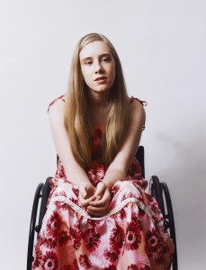
Andie, by David Knight

Although he now lives in Australia, Knight was born in Oxford. This portrait was commissioned by Loud for the Cerebral Palsy Alliance to raise awareness of the condition throughout Australia. Knight commented: ‘I wanted the portraits to be positive and to convey the kids in an uplifting way. You don’t immediately notice Andie is in a wheelchair; you just see a beautiful young woman.’

Christina and Mark, 14 months, by Dona Schwartz

Dona Schwartz is an American photographer based in Minnesota. This image is from her current series, On the Nest, which documents those moments when parents’ lives change. This one shows a parents in their child’s empty bedroom, after he’s flown the nest.

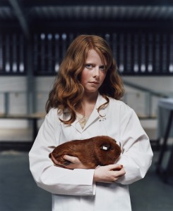
Harriet and Gentleman Jack, by Jooney Woodward

This photo by Jooney Woodward, a London-born and educated, but Dorset-raised photographer, shows 13 year old Harriet Power who was a steward at the Royal Welsh Agricultural Show, in the guinea pig judging enclosure. I didn’t even know guinea pigs were judged at the Royal Welsh Agricultural Show!

Of Lili, by Jill Wooster

Born in Connecticut, Wooster now lives in London. The portrait is part of a series portraying women in their forties and fifties at pivotal stages of their lives. Lili, says Wooster, ‘Is a complicated character. I like the way her androgyny makes her appearance seem both guarded and relaxed at the same time, capturing both her confidence and vulnerability.’

Exhibition

If you want to see the photographs yourself, you can do so at the National Portrait Gallery (St Martin’s Place, London, WC2H 0HE) from Thursday 10 November until 12 February 2012.

(All images are, of course, copyright their photographers and used with permission.)

Introducing the Canon Powershot S100


Today, Canon launched a replacement for the rather spiffing S95. Say hello to the Canon Powershot S100!

The reason why I've been recommending the S95 to everybody, is that it's a mighty awesome piece of kit. It's got a wide-angle lens, a wide maximum aperture, an effective image stabiliser, can shoot in RAW format, has a fantastic 3-inch display, and full manual settings if you want 'em.

Most importantly - in compact camera terms, the imaging sensor is enormous. How big is 'enormous'? Well, it's 1/1.7" (7.49 x 5.52 mm). That's a very big deal indeed, because the bigger sensor means that the pixels are less close together; that means better depth of field, better high-ISO performance, and more bragging rights too, I suppose.

What's updated?

The S100 ups the megapixel count from 10 to 12.1, adds the brand new Digic 5 image processing chip, and adds a couple of new ISO levels; you can now turn it all the way to 11; or rather: 6400. The lens has been improved, too: From the already lovely 28-105mm zoom range, the Powershot S100 has a 24-120mm equivalent zoom, and a closer minimum distance for macro shots (30mm instead of 50mm).

The longer focal range comes at a cost, of course, if you zoom all the way in, your maximum aperture drops to f/5.9. Not super impressive, perhaps, but that's life - and it's usually a good idea not to zoom in all that far on compact cameras anyway. The widest aperture when you're fully zoomed out stays at f/2.0 - rather juicy indeed.

The biggest update on the video front is that the S100 shoots in full HD - 1920 x 1080 pixels at 24 frames per second, whereas the S95 'only' shoots 1280 x 720.

Finally, the S100 adds a built-in GPS receiver, to help you geocode your images as you take them. Presumably, it would also be used to set the clock.

Despite all the new goodies, the S100 is only 4 grams heavier than the S95, whilst keeping roughly the same size otherwise.

So, do I want one? Well, if you already have a Powershot S95, then there doesn't seem to be quite enough of a benefit to upgrade to the new camera - unless you're itching for a spot of GPS action, or if high-def video is a dealbreaker for you. Apart from those two things, the S100 seems to be a solid evolution of an already absolutely rock-solid camera.

Very impressive indeed.

Pentax Optio RS1500 review

templatesRS1500

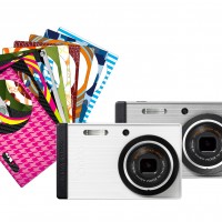
We do enjoy getting toys to play with here at the Small Aperture Mansion. The latest to pass through our grubby mitts has been Pentax’s Optio RS1500, the little point-and-shoot with the customisable front. The idea is that you can take off the lens ring and change the ‘skin’ on the front for anything ranging from candy-cane stripes to camouflage. Armed with its 14 megapixels, 4× optical zoom, 15 picture modes, smile detection, and nine filters, we set about finding out what we thought of it.

Build and design

It’s a small, light-weight camera. Even in my tiny hands, it felt little and I dread to think what sort of damage you might do to it if you drop it. Without any of the fun skins that you can slot beneath the front cover to turn it into a zebra or a Green Lantern superhero special, it’s a plain looking beast. The front’s silver and the back’s matt black. I don’t have any problem with that, but half of the appeal of this camera is its chameleon appearance.

Features and controls

The on-off switch and the shutter release are the only buttons on the top of the camera. Everything else – zoom rocker, play back, smile detection, and menu buttons, customisable ‘green button’, together with the four-way controller – is positioned to the right of the LCD screen. I found the menu system quite fiddly to use, and when I tried to put the camera in Program mode – which is as manual as it gets – trying to adjust the ISO wasn’t as intuitive or as quick to access as it should have been.

Afro Ken does the boudoir look

Its fifteen different shooting modes range from auto to portrait via candlelight and blue sky. They’re accessed from the four-way controller, together with the flash, focus control, and self-timer. You can set the green button, which doubles as the delete button, to access the video mode, EV compensation, or ISO. This will help to alleviate the fiddly-ness factor for one of those settings, but not the others. But then, I’m not sure how bothered someone using this camera will be by EV compensation. So it probably doesn’t matter all that much.

Performance

Roasted tomatoes in auto mode

In daylight, this camera produces some decent images and I really couldn’t complain about them too much. Okay, yes, maybe reds and oranges were a touch over-saturated. But honestly, it was fine.

Roasted tomatoes in food mode. Any different?

With fifteen different modes to choose from, it was almost overwhelming, and honestly, I preferred the photo of some roasted tomatoes taken in auto mode rather than taken in food mode.

It’s in lower light situations where the problems begin to creep in. The auto-focus struggled badly and sometimes couldn’t latch on to anything at all. This was hugely frustrating and resulted in pictures that were mushy and had to be binned. Pictures were pretty noisy, too. And Gareth and I both commented that we found the flash glarey.

Gareth also pointed out that the filters were quite poor. It’s as if they’ve been tacked on because every camera needs to have a toy camera and sepia effect now. As for the screen, Haje commented that its quality isn’t great, but it is quite large.

Verdict?

You get what you pay for with a £70 camera. In daylight, it takes some pretty decent photos. Anything approaching low-light, however, presents its auto-focus with some serious problems and the noise in the images that it does manage to produce is quite unpleasant. With its interchangeable skins, it’s a fun, small, light-weight camera. You could do better, and you could do worse.

Portraits in daylight are just fine

The pictures go round with Adobe Carousel

Adobe Carousel

I do love the imagery of the name Adobe’s given its latest photo editing and synching software, Carousel: your photo gets on at one point and gets off at another.

How does it work? There’s a set of apps for your iPad, iPhone, iPod touch, and your Mac OS (sorry Windows users, you’ll have to wait until sometime in the first half of 2012). You download them across all your devices (provided that they’re compatible, of course: iPhone 3GS and above, iPod Touch 4G, Mac OS X Lion). Then you import your photo library into Adobe Carousel and take new photos using Adobe Carousel on your iPad or iPhone.

Through the magic of the cloud, all those photos will be accessible automatically on any of your Carousel-carrying devices. From then, any edits, deletions or additions to the library that you make on one device will be automatically updated on all the devices linked with your account.

No Flash involved, no manual synching required, and version control for everyone. Oh, and you don’t have to worry about clogging up your iPad with photos, either.

As for the editing software in Carousel, it’s based on Lightroom. It uses multi-touch gestures, and allows you to adjust exposure, shadows, highlights, white balance, vibrance, clarity, and contrast. There are also over 12 ‘looks’, which are basically presets, that allow you to mess around with the look (now there’s a surprise) of your photos.

Unfortunately, none of this comes cheap. The introductory price for Carousel is £39.99 (US $59.99) for a year, or £3.99 (US $5.99) for a month’s subscription. You can renew at that price for two years. Miss the boat, which sails on 31 January 2012, and you’ll be paying £69.99 for a year or £6.99 for a month. Sure, you can install it on as many (Apple) devices as you own, but is synching across them worth that much? I’m not convinced it would be for me.

Have a poke around here and let me know what you think.

Capturing butterflies in flight


My friend Alexander James has been working on a cool project for a while, that I wanted to share with you guys: Photographing butterflies in flight.

screen_shot_2011_09_11_at_162601.jpg"My photographs are always presented ‘as-shot’ without cropping or post production either traditional or digital", Alex says, which immediately made me go back and take another look at the photos. No editing? How... But...
"The quality of the work and the purity of the process is paramount", he says, and explains that he works to distilling elements out of his images with the strong use of deep blacks. "I'm hoping to convey rich layers of meaning in what at first appear deceptively simple images", he explains. 

And as such, the project Distil Ennui became a realisty: Aimed "to extract the essence and beauty of life to appease world weariness".

I think we could all do with a little bit less of the world weariness - and a little bit more with the beauty of life.

Check out AJ's website, blog, and Twitter for more!

Why didn't I take that photo?

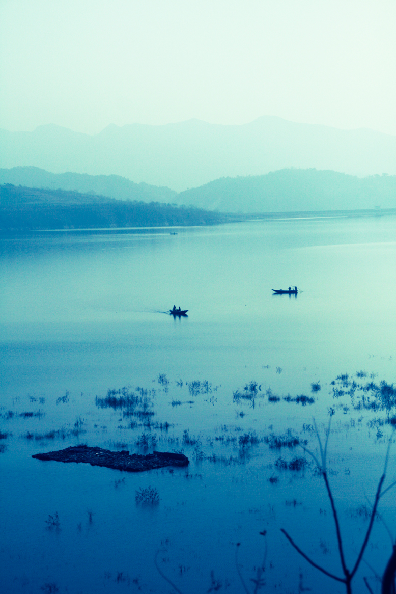
Boats in a lake

It’s Friday. Time for a treat. We’re bringing you the first in an occasional series written by Ross Sheddon, who’s an official ship’s photographer on a cruise liner. How much of an awesome job is that? We thought that we could enjoy his wanderings vicariously, as he talks us through where in the world he happens to be at the moment, and what he’s learned about photography in the process. In turn, what we can learn, too. And try not to turn green with envy. So, here we go, where in the world is Ross, and why didn’t he take that photo?

It’s a beautiful day in Scotland, the sun’s out, it’s almost warm. But I’m not there. Early morning and two hours north east of Qingdao I can see my breath on the cold clear window of the old bus. I wiped the condensation away for the hundredth time as the most amazing vistas of barren fields and leafless trees swept by.

I absent mindedly flicked the shutter speed up another notch on my trusty old 40D. It had been sitting in my lap like a sleeping child for most of the journey. It, like me, had very little to do until we reached our destination.

I sighed, a basic lesson of being a professional is this: You never shoot through windows. And you never, never, never shoot through the windows of a moving vehicle. The urge is always there but training and experience tells you that the shot will not be one of quality. You don’t do it, it’s the rules.

I’m sure you think you see where I’m going with this, rules are meant to be broken et cetera, et cetera. That’s for another article, what to take away from this is not to break the rules, simply to be ready. The best shot will come at you when you least suspect it and if you’re not ready you’ve no chance to capture it. You can’t always be in the front row of the rock concert; you’ve got to make the best of the opportunities that arise.

The bus swerves to give more room to an old truck trying to pass on the inside of the blind bend and I grip my camera a little tighter in reassurance. A flash of trees. A lake appears. It’s there for two seconds or more then it’s gone.

On a small back road, far outside Beijing, early in the morning, I’ve grabbed an image from the world around me. It’s not the sort that you get a second chance to shoot; my colleague behind me didn’t have her camera case open before it was past. If you’re ready when the shot comes you can take it, if not… well we’ve all had the pleasure of looking enviously at our friends and colleagues shots from the day we forgot to charge our battery and accidently left the spare packs in our other bag.

It may not be a shot that’s going to win any competitions; it may not sell as stock. It may simply sit forever on my hard drive but I got it. I got it. Every time I look at the image it reminds me of that time and place, the feel of the piece deeply invokes in me the memories of the moment, of the trip, of the whole country.

Around us at all times are shots waiting to be discovered. If we don’t have a camera in our hands then we’re going to be missing that opportunity. You can’t walk around every day with all your equipment strung around you like a Jessops-sponsored Rambo. I only suggest that when you know something might come, when you’re in an interesting place, have you camera set up and ready to crack of that shot before it presents itself, otherwise who knows what you’ll miss.

Perhaps more importantly remember, whatever country you’re in, the same things will always stop you grabbing that perfect shot:

  • Make sure all your batteries are charged.
  • Don’t leave your memory cards by the PC.
  • Put your camera back into your bag.
  • And never leave your passport in a Starbucks in Singapore – but that’s a story for another time.

Ross is a portrait photographer and digital artist, currently working for Princess. In his career he’s worked everywhere from Vietnam to China to Egypt, Greece, Alaska, and back. Despite running out of new countries to visit his eyes remain open for new weird and wonderful sights always around him.

Super-groovy grey cards from Photocritic

Grey cards

Obviously I’m in a slightly spend-thrift mood at the moment. Following on from yesterday’s t-shirt, these much cheaper and probably more useful (unless of course I had no clothes, or something) grey cards have just caught my eye. Just what we need for making sure our white balance is spot-on.

There’re three A6-sized cards – one matt black, one white, and a neutral 18% grey – all neatly stashed in an envelope. The corners are rounded, there’s drilled hole for lanyard-securing purposes, and on the back of the cards there are instructions for how to use them as well as a rather useful cheat sheet of the aperture scale, zone system, and a pre-shoot check-list. How rather nifty!

All of this for only £6.99, which is bargain-tastic, methinks. Shipping in the UK is free; Europe costs €1.60 and the USA US$2.25. Available here!

Even more – if you want a swift introduction into how use a grey card, take a look at this video.

JPEGmini - like JPEG, but mini

JPEGmini logo

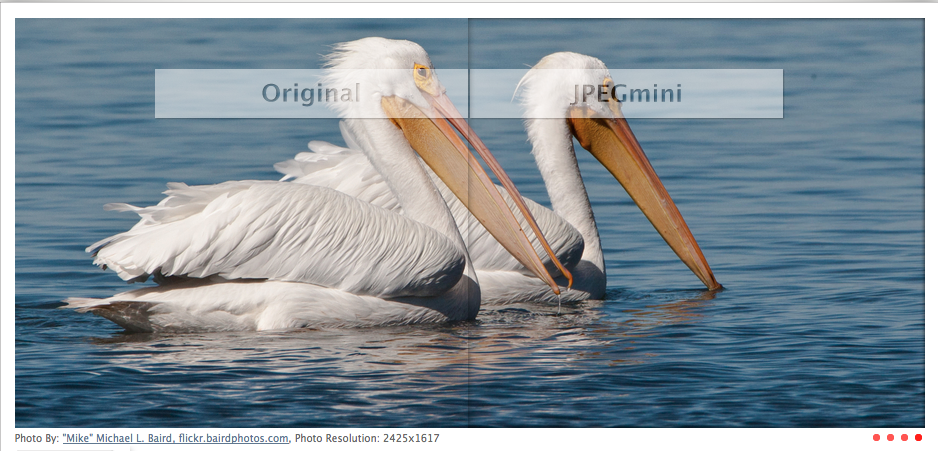
Google might be trying to take the file format world by storm with WebP, but an Israeli tech company, ICVT, would much rather that we took a look at their innovative JPEG-compressing technology, JPEGmini. It takes JPEG files and makes them smaller, without any perceptible loss of quality. As they put it, it’s your photos on a diet. JPEGmini uses baseline JPEG technology, so provided that your device supports JPEG, it’ll support JPEGmini, too.

There’s a maximum of 80% compression achieveable, but in order to manage that, you have to be working with a file that’s resolution in excess of eight megapixels. The smaller the file, the less compression is achievable.

JPEGmini works by assessing the photo to determine just how much compression it can get away with before the image quality becomes noticeably poorer. Then a unique JPEG encoder works its magic and creates the most compact version of the image that’s possible under current JPEG standards.

For the developers – Sharon Carmel and Dror Gill – the idea is to save storage space, to speed up email transfers of photos, and to save money by reducing the time it takes to move data from one place to another. You know, it’d be even more effective and efficient if it weren’t a web-based application and could be downloaded as a desktop app. Cos at the moment we’re all uploading and downloading photos in order to compress them, and when you’re on a slow connection, well it’s like pulling teeth. But the idea, that’s very cool.

You can go have a play and squash some pictures over at JPEGmini, for free. Let me know what you think.

(Headsup to TechCrunch)

Our September photo competition

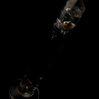
Galileo thermometer

So my lovelies. We’ve had a few creative themes for the past few competitions. They’ve been marvellous, but a change can be as good as a rest, so this month, we thought we’d go and do something technical. We are, therefore, looking for your low-key photos. Dark, brooding, moody, seductive. Whatever take on low-key you want to give us, that’ll be fabulous. The one that we like the best will win a fabulous 12″ Fracture.

You’ve from today – Wednesday 7 September – until Wednesday 28 September to submit your entry. As ever, it’s one submission per person, and they need to go in our Flickr pool.

If you’ve any questions at all, drop me a note. Otherwise The Rules are here for your reference, and good luck!

The Rules

  • If you decide to enter, you agree to The Rules.
  • You can’t have written for Small Aperture or be related to either me or Haje to enter.
  • One entry per person – so choose your best!
  • Entries need to be submitted to the right place, which is the Small Aperture Flickr group.
  • There’s a closing date for entries, so make sure you’ve submitted before then.
  • You have to own the copyright to your entry and be at liberty to submit it to a competition. Using other people’s photos is most uncool.
  • It probably goes without saying, but entries do need to be photographs. It’d be a bit of strange photo competition otherwise.
  • Don’t do anything icky – you know, be obscene or defame someone or sell your granny to get the photo.
  • We (that being me and Haje) get to choose the winner and we’ll do our best to do so within a week of the competition closing.
  • You get to keep all the rights to your images. We just want to be able to show off the winners (and maybe some honourable mentions) here on Small Aperture.
  • Entry is at your own risk. I can’t see us eating you or anything, but we can’t be responsible for anything that happens to you because you submit a photo to our competition.
  • We are allowed to change The Rules, or even suspend or end the competition, if we want or need to. Obviously we’ll try not to, but just so that you know.

Saw this t-shirt; thought of you

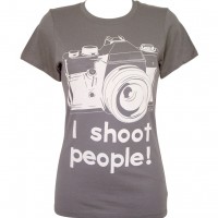
t-shirt

Despite my current quest to divest myself of a vast accumulation of too much stuff, which includes at least half of my wardrobe and a small library of paperbacks, I really would like one of these ‘I shoot people’ t-shirts. In addition to my exploding wardrobe crisis, they’re also a bit pricey, at £21.95 (about US$35) plus postage. They come in small and medium sizes – I’ve no idea why there’s no large – and only in women’s fit. Mwahahaha!

Fancy one to scare the billy-o out of people when you’re indulging in some street photography? Head over to More T Vicar and take a look.

Maybe if I get rid of two old t-shirts, I can have one of these?

[Update: Large sizes should be available from 7 September and More T Vicar will give you a free t-shirt if you spend more than £50.]

Photogram - share photos by email

Screen Shot 2011-09-05 at 21.32.46

I’ve got thousands of photos lingering on my iPhone. Mostly they’re there as reminders of quirky things, such as some crazy tiling I saw in the toilets of an Edinburgh art gallery or silly signs or posters that I spot in music venues, but sometimes I like to send a picture to someone. Usually, I toss it into an email and away it goes. An app was sent my way recently, though, that would let me send four photos in one go in a format that’s a bit more friendly than as an email attachment.

It’s called Photogram. You download it for free, set it up, and away you go. Select up to four photos, throw them into one of a healthy choice of backgrounds, add a message, and them send them on their merry way by email. Or FaceBook. Or Twitter. You can send the same ‘card’ to multiple recipients, and it remembers to whom you’ve sent a photogram previously.

The positives? It’s easy. It’s free. It’s a cute idea.

The negatives? Well, it isn’t eactly a negative, but it’s just not outstanding and I’m not sure how much I’d use it. Still, for nothing, you could do a whole lot worse.

Photogram, send photos for free.