The photos of our year

Haje's niece

Although you might know all of us here more by our words than by our photos, we are all photographers and we wield our cameras with overwhelming levels of enthusiasm. This of course produces prodigious quantities of pictures. You might get to see some of them alongside our articles, but we don’t tend to talk about them much. So to wrap up 2010, we thought that we’d let you see the world through Team Small Aperture’s photographic eyes. These are our favourite pictures that we’ve taken this year.

We hope that next year’s pictures will be even better. But until then, we all wish you a happy, healthy, and peaceful New Year.

Daniela

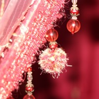
I’ll let you into a secret, I almost deleted this photo. No, not accidentally, but deliberately. Honestly.

I took it in a bead emporium in the souk in Marrakech. Immediately after I’d taken it, I didn’t examine it that closely because I tried not to draw too much attention to myself and my camera. It’s not exactly discreet to stand around critiquing your own work in a bustling market. Later in the evening, when I did stop to look at it, I was a bit disappointed. I’d not really captured what I wanted, but seeing as the chances of me finding that particular bead shop again were slim-to-none, I held on to it.

Back in the UK, where mint tea and haggling over leather goods were but a distant memory, I began to sift through my photos properly. Suddenly, somehow, the picture looked different. The colours seemed vibrant and the depth of field was intriguing. I actually liked it. I even liked it enough to have it printed. It’s on the wall of the library in the Small Aperture mansion. It’s a reminder of an awesome trip, and not to make hasty decisions.

Matt

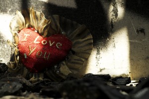
It was honestly really hard to choose. I feel this is my favourite because it is one from my first series, Our Choices, which is a series of four photographs that depicts the choices we make as human beings, and the possible repercussions that can come with them.

Burning My Heart explores our emotional need as human beings, to be loved. Even though our emotions most certainly have been ‘burnt’ repeatedly by failed relationships, we continue to seek out other relationships, searching for our ‘one true love.’

Although, the photo may appear staged, it is not. All the photos in this series were hunted for months until I found the perfect image that I felt best showcased my ideas. You can take a look at all of them here.

David

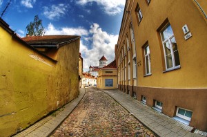
I have a few favourites from 2010, but this one is definitely at the top of my list. This photo was taken on a random side street in Vilnius back in August. I went to Lithuania with my girlfriend to visit her mother. It was my first visit there and it was amazing.

What I love about this picture is that it describes Vilnius exactly how I remember it… the narrow cobblestone streets, the beautiful architecture of the churches, and just the overall feel you get of being in Lithuania. I can’t wait to go back again and I hope to in 2011. More of my Vilnius pictures are here!

Gareth

I found it nigh-on impossible to pick my favourite image I’ve taken this year. To clarify, I don’t mean that in an egotistical way – I didn’t sit at my laptop, scrolling through countless images, crying ‘but they’re ALL magnificent!’ What actually happened was I spent a miserable morning picking holes in every single image I’ve taken, thanks to my somewhat self-critical approach to reviewing my own work. To resolve this, I decided to go for the image that I remember being the most excited about before, during and after the shot itself.

This was a promotional image for a female wrestler who wanted to look simultaneously strong and feminine. The idea actually came to me on the day of shooting, moments before my client was due to arrive. It turned out exactly as I’d hoped – a spot of superheroine magic combined with evoking ideas of weightlifting and strength. The magic dust (also known as bread flour) created this perfect arc just as I hit the shutter release, so a combination of sudden inspiration, a great model to work with and a spot of luck makes this my favourite shot of the year.

If you fancy looking at some more of my pictures, you’ll find them here.

Haje

This is one of my favourite photos of 2010 – it came about more by luck than by anything: I was at the top of a climbing wall, and my niece was climbing up, too. I took a photo, and then realised that the light was absolutely gorgeous. So I kept snapping. She was a fast climber, and I only had about a minute to get the shot, but what came out was entirely worth it.

You can find more of my ‘best of’ on Pixiq.

Creating strong narratives in video

You don't need top-end camera equipment to create some compelling videos - In this video, I'm using a Nokia N8 mobile phone to explain the basics of narrative in videos!


Do you enjoy a smattering of random photography links? Well, squire, I welcome thee to join me on Twitter -

© Kamps Consulting Ltd. This article is licenced for use on Pixiq only. Please do not reproduce wholly or in part without a license. More info.

Shooting action videos with a mobile phone

Getting a feeling of speed and excitement in your video shoots isn't hard - as long as you know what you're doing. Here's some pointers to get you started!


Do you enjoy a smattering of random photography links? Well, squire, I welcome thee to join me on Twitter -

© Kamps Consulting Ltd. This article is licenced for use on Pixiq only. Please do not reproduce wholly or in part without a license. More info.

Street photography with a mobile phone


One way to get great results with street photography, is to ensure that your subjects don't know they are being photographed. An SLR camera will always be noticed - but what if you could get some good snaps with a mobile phone?

In this video, I'm exploring how that would work...


Do you enjoy a smattering of random photography links? Well, squire, I welcome thee to join me on Twitter -

© Kamps Consulting Ltd. This article is licenced for use on Pixiq only. Please do not reproduce wholly or in part without a license. More info.

Macro photography with your mobile phone


In my second round of videos for the Nokia N8 Camera School, I'm getting up close and personal – with some bumble bees. In this video, you’ll see the Nokia N8′s macro mode in action, and the results? Well, let's just say that the compact camera manufactures have plenty to be getting worried about...


Do you enjoy a smattering of random photography links? Well, squire, I welcome thee to join me on Twitter -

© Kamps Consulting Ltd. This article is licenced for use on Pixiq only. Please do not reproduce wholly or in part without a license. More info.

So you call yourself a photographer?

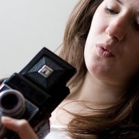
If single lens reflex cameras are banned - can you use a twin-reflex camera instead? The point's moot now anyway, by the look of things.

If someone asks you if you’re a photographer, what do you say? ‘Yes, I’m a photographer.’ Or ‘No, I take pictures, but I’m not a photographer.’ It’s something that’s been playing on my mind recently, and something that I’ve been debating back-and-forth with a friend of mine who is, as far as I am concerned, a bona fide, hand-on-heart photographer, a veteran of the analogue campaigns, with a portfolio to prove it.

The dictionary definition of photographer is pretty straightforward, it’s a person who takes photographs.

And then there are numerous variations on the phrase ‘Owning a camera does not make you a photographer; it makes you a camera-owner.’

By the dictionary definition, just about every single person in the UK is now a photographer, what with the ubiquitous camera-phone and the millions of images uploaded to FaceBook every month. By the slightly more philosophical statement, there are plenty of people out there taking photos, but they can’t all be called photographers.

So we’re at something of an impasse. It seems as if we have a society of potential photographers, but not one of actual photographers.

I’m pretty convinced that every single camera-owner isn’t a photographer. Would you say that someone who owns a dSLR but never takes it off of automode and owns only the kit lens is a photographer? And is someone who is trying her or his hardest to get the most out of a point-and-shoot not a photographer? Nope, the camera that you use, or don’t use, doesn’t make you a photographer (or not).

Still, I’m not too keen on the idea that there is some mythical ability quotient that you have to fulfil before you’re granted the title Photographer, either. Who exactly is it who decides what constitutes ‘good enough’ in this situation? It’s not as if there’s a medieval-style Guild of Photographers who grants us apprentice, journeyman, or Master Photographer status. Ability is a bit too subjective a term to decide if someone is a photographer or not, thinksme. And honestly, don’t we all take bad photos?

Is the divide professional, then? Do you have to make your living by taking photographs to be a photographer? Well, no, I don’t think so. Think of it this way: would any of the players who competed in the 1995 Rugby World Cup be too pleased if you said that they weren’t really rugby players because they happened to be accountants, doctors, and members of the armed forces in their other lives? Why else do we have the most useful terms ‘professional’ and ‘amateur’ in our vocabularies? Photography, and by extension being a photographer, is not something that is determined by money-making status.

There is a common theme running through these slightly manic arguments about who is or isn’t a photographer, though. It might not be about the kit that you own, but it is about doing the best with what you have. It isn’t about whether or not your photos are good enough to be exhibited at the Royal Academy, but whether you strive to make your next shot better than your last shot. And it definitely isn’t about whether or not you earn your living from photography, but it is about wanting every photo that you take to be as good as you can make it.

Being a photographer is about practising a craft. It’s about wanting to create something; it’s about wanting to improve; it’s about wanting to learn.

So next time someone asks you ‘Are you a photographer?’ think about this before you answer: are those pictures that you take an expression of something, and part of a learning curve? If they are, then you’re a photographer.

Reviewing intellectual property, UK Government-style

White rose

Back in November, David Cameron announced that the Government was going to take a closer look at intellectual property. There were probably plenty of people who groaned ‘Not again?’ but if they’re going to do it, they’re going to do it. So as people who make images – and very importantly people who might use those images to make money – we really ought to stand up and make our voices heard.

The review is being led by Professor Ian Hargreaves. He’s Professor of Digital Economy at the Cardiff School of Journalism, Media and Cultural Studies and Cardiff Business School. (Swanky title, no?) Making a decision needs to be based on evidence, and he’s looking for that evidence from people who make use of and benefit from the intellectual property system, and in particular small- and medium-sized businesses.

If you run a small photography business, or any other type of creative business for that matter, that means you.

In true Government consultation-stylee (and believe me, in another life I organised enough of them to know) there’s the web-based thinking bit and the in-person talking bit. The web-based thinking bit provides you with some questions to help marshal your thoughts that you can then send to the review committee, whilst the chit-chat sessions will be taking place in the New Year.

There are quite a few questions, but you don’t have to answer all of them. The key areas are:

  • Supporting new business models – As technology and society changes so do ways of doing business. Does the IP system help or hinder businesses as they seek to adapt to the digital age?
  • Breaking down barriers – New entrants often find it difficult to break into established markets, which can inhibit growth. Does IP form part of the barrier to new entrants? What barriers prevent the effective exploitation of IP rights in creating growth?

Take a closer look here.

The review is due to be published in April 2011. I’ll report back on what it finds.

Wanna join the competition fun?

IMG_0259

In the spirit of Christmas, and good cheer, and giving, and not being grouchy, and trying not to tear out our hair with too many things to do, we thought that we’d give you an extra week to submit your photos to our December competition. This means that you now have until 29 December to snap a gorgeous photobook-winning portrait.

For the full details of the competition, have a look at the competition page, and then submit your portraits to our Flickr pool for our perusal.

Have fun!

Product photos with a mobile phone

When you think 'Product shoot', you probably wouldn't immediately think of taking a load of photos with your mobile phone... or would you? I'm exploring how you can take fantastic product photos - with a Nokia N8.


Do you enjoy a smattering of random photography links? Well, squire, I welcome thee to join me on Twitter -

© Kamps Consulting Ltd. This article is licenced for use on Pixiq only. Please do not reproduce wholly or in part without a license. More info.

Fame in 10... 9... 8...


Think quick: when was the last time you found a photographer you got really excited about? For me, it was a couple of weeks ago, when I came across Lauralyn. Armed with a cheap pocket camera, a 10-second timer, and a great deal of patience, she performs an ongoing fictional autobiography, in a series of photos that ooze raw honesty and sensuality. Obviously, I wanted to find out more - and what's the point in writing for a popular blog if you can't abuse your privileges to get some interviews?

Lauralyn is an unusual photographer in many ways. She doesn't shy away from controversy in her astonishingly, almost voyeuristically frank blog - and her photography is equally honest. As far as vision goes, her conceptual self portraiture would put a great deal of professional photographers to shame, which makes it all the more awesome that she shoots mostly on very simple equipment. "I am on my fifth Sony Cybershot camera", she laughs, "I love 'em, but I do wish Sony would comp me a few - I've got a nasty habit of breaking the suckers".

Of course, with equipment that's cheap enough to nearly be disposable, it enables you to take bigger risks to get the photos you really want. "In lieu of a tripod", Lauralyn explains, "I set my camera in a dish packed with tin foil, and place it on a small table that's lightweight enough to carry from place to place". She might have broken her last camera for a while, though, as she does confess to having taking the plunge on a tasty gorillapod for a recent shoot.

A rebel without a photography course

Lauralyn's interest for art started early on, she recalls. "As a youngster, I was politely asked to leave school mere weeks before completing my 10th grade year. By the time I got kicked out, I was showing up to an average of about 5 classes per week. I chose instead to spend most of my time either in the Art Building drawing and painting, or on the campus of a nearby university - immersing myself in the thriving arts and music scene there."

When she was 18 years old and staying in Paris as a nanny for a while, Lauralyn bought her first camera (a secondhand 35mm Minolta for $135 USD). "I was traveling with a painter who had been accepted into the Cite Internationale des Arts, and she helped me get comfortable with the camera. She persuaded me to use black and white film. There may have been something magical about that camera, or perhaps it was simply the fact that I was capturing images of the most beautiful city I'd ever seen in my life..."

"I have always loved to take "candids" of my friends and my children, but I did nothing artistic with photography from the time I left Paris at age 18 until..." We're getting ahead of ourselves a little bit. Let's rewind a few years...

From Divorcee to Digital Diva in 3 easy steps

"In my early 20's I moved to my mother's birthplace, met the man who would become my husband of 10 years, and the father of my 4 children. We divorced amicably and although I wouldn't say that we're 'friends' exactly, we do manage to be friendly with one another". After her divorce, Lauralyn discovered online dating - with a vengeance. "I became a ravenous online dater", she laughs, and makes a little tiger-growl.

screen_shot_2010_12_20_at_110856.jpg

After one too many dating mishaps, a friend encouraged her to start writing about it - and for the next few years, she spilled the beans on-line, "much to the chagrin of those in my community who felt uncomfortable knowing so much about my indiscretions".

"Where is this blog"? I hear you cry, "I, too, want to hear of these wanton indescretions!". Not to worry, point your fine browsing equipment at the Big Ugly Truck (nsfw).

Online dating turned out to be the inspiration for getting into photography again. "I realized after being on the same dating sites for so long, that guys were showing less and less interest in me and my worn-out, old profile", Lauralyn recalls. So, as any girl with a creative streak would do, she reached for her camera and went for it.

"At first I just held the camera out - away from my face, and snapped fairly uninteresting pics", she recalls, but soon decided to make some changes. "I put up a new avi on Twitter (@biguglyblog) of myself in a black bikini, and saw not only a jump in hits to my blog, but a rise in my Twitter followers as well. One new follower suggested I contribute a photo to Twitter's weekly #HNT (half nekkid Thursday) meme".

The birth of a photo blog

Of course, whenever an attractive lady posts half-naked photos of herself on the internet, the response is predictably popular. "In no time at all, I was addicted to my weekly photo shoots", Lauralyn admits. She decided to let her old blog (and dating, for that matter) fall by the wayside - and instead took up self-portraiture as her new chosen form of self expression, on the freshly minted Big Ugly Pix blog.

"Self portraits", you might say. "Isn't that an exercise in navel-gazing?" Well perhaps, but as I always like to say; the only model you consistently have available (and the only one who might ever 100% agree with your vision), is yourself. Lauralyn would agree - "I'll be the first person to admit that I've become rather self-centered in the last few years, but at the risk of (further) painting an unflattering picture of myself as some sort of reprehensible narcissist", she titters, "I have to be honest and say that - I continue to take these pictures because in doing so - I'm exploring a creative outlet that is thrilling and both mentally and physically challenging. I find it terribly rewarding."

As far as addictions go, Photography tends to be significantly more expensive than any sort of drug abuse - but by using relatively cheap Sony cameras, that particular door to bankruptcy has been bolted shut. Instead, our dastardly auto-portraiturista has channeled her addictions differently. "I have become inexorably addicted to each and every facet of this type of self-portraiture: from brainstorming the themes and the costume, to scouting out locations and then going out on the shoots themselves".

You have probably noted from the photos (and That Other blog, if you took the time to have a quick look there) that Lauralyn doesn't shrink away from a challenge - something that's reflected in all aspects of her work. "I relish testing my physical ability and tempting fate by trespassing on private property or photographing myself naked (or partially so) in public places". The addiction metaphor works well also in the rewards column of the equation. "Coming down from the high I get from pulling off a questionable or particularly difficult shoot can take hours. Obviously, that sensation that was magnified the few times I've been detained by the police in the course of my art."

As photographers, you sometimes can't help yourself at the end of a good day's shooting: The excitement of finally seeing your hard work on a big screen in front of you can be thrilling. "Reviewing a shoot's images for the first time is the closest thing to the ecstasy one feels as a child while tearing into presents and digging through stockings to find all sorts of goodies on Christmas morning, as an adult", Lauralyn explains, her eyes on fire with excitement.

Feeding on Feedback

But of course, the feedback loop doesn't stop there. Lauralyn's work is her own creative insight, of course, but she is deeply populist in that she devours her online feedback with great gusto. "I thrive on getting feedback, whether it's positive or negative", she says, "It lets me know that people are reading my blog". Of course, she prefers favourable comments like the rest of us, but Lauralyn seems to have found a healthy way to deal with negative feedback, too. "Even if my commenters don't approve of my unorthodox behavior, or consider me an artist at all, I do appreciate the feedback".

Lauralyn explains how she lives in a relatively small community (both virtually and in real life), and doesn't do anything to hide her blogs from public view. Needless to say, not everybody approves, and she frequently gets negative responses. "When someone responds to my work with impassioned negativity I take that to mean that something about the images impacted the viewer emotionally - hatred is an emotion, after all."

Whilst she isn't currently making any money of her art, I sense that Lauralyn does seem to have an undercurrent of driven ambition about her. "I will never have a typical high wage-earning career", she says, and points out that she never continued school after she dropped out aged 16. She wears impulsivity on her chest like a medal, and thrives with having come to the realisation that that is who she really is. "I am guilty of following artistic whims, just because I want to", she says, "But I believe that the reason I've dug my heels in all these years and refused to hold down a normal job for very long is because for one thing: it makes me feel like a caged animal".

In a way, she has made it further than many of us. "I've got the what-do-I-wanna-be-when-I-grow-up part finally figured out", she smiles, and hints that it took her a while. "Now I just have to figure out how to make it generate some income."

Whilst Lauralyn's model is the same for every shoot, her repertoire is constantly changing and evolving. She's no stranger to nudity in her shots, and the photos are often bold, challenging, and eye-catching. It may seem like a desperate cry for attention, I ventured, but that notion was laughed away. "If you knew me in person, you might hardly recognize from the photos. I dress like a slob, rarely wear make-up, my hair is a mess, and for the most part I am a happy, upbeat person."

Who is this person?

An actor in her own fictional autobiography, she explains how she is frequently startled when she downloads a new batch of photos. "Oh my god, I don't even know who that is", she laughs, and I'm starting to understand where the 'thrill of the chase' is coming from.

"I don't try to deliberately emote anything specific during a shoot. I go in knowing only this: the location, what to wear and a general idea for a theme or some sort of physical stunt. But getting into frame and striking a convincing pose or performing some physically demanding feat in 10 seconds, sometimes hundreds of times in quick succession, is difficult enough without also trying to manifest any particular emotion", Lauralyn says.

She describes a feeling that seems very familiar to me from long days in the darkroom, or in a photo studio, hell-bent to get the light perfect: "I do find though, that after certain shoots, I kind of snap out of an eerie fog, after which it hits me how deeply immersed I was without even knowing it at the time. It's a very peculiar sensation."

Balancing family life

At 42 and as a mother of four kids, aged 8, 11, 12 and 14; does she worry what her kids might think if they found out about her blog? "What do you mean 'found out'", Lauralyn says, genuinely (and rightly) insulted by the insinuation. "They know they know all about it - in fact, I stick to a policy of never posting pictures on my blog that I wouldn't let my children see. In a way, they are my filter, the litmus test I use before I post."

Personally, I think I was scarcely aware of the fact that nudity even existed (or, at least, not that it meant anything) before I hit puberty, but Lauralyn has taken a progressive approach with her kids. "I realise that there is a possibility that they might at some point be ridiculed by their peers for what I do, and I have discussed that their mother is an artist", she smiles proudly, nodding in the direction where her children are. "Every time I hop up on my little soap box to hammer this stuff into their heads, they nonchalantly reiterate, 'No one talks about it mom'".

Of course, all artists have to struggle with the unavoidable truth that as soon as their art becomes well known enough, people will start talking - but there is no shortage of examples of artists who have dealt with that challenge amicably. One of those artists is Lauralyn's fellow Virginian photographer Sally Mann. "I have to say", Lauralyn muses. 

"Mann has become something of a role model for me. Not so much because I wish to emulate her style of photography - her work, to me, is inimitable as well as unsurpassable - but more so because she raised her kids to have a very firm grasp on what she was doing as an artist and (more importantly) why. They were properly prepared to deal with potential fallout from the controversy surrounding her work, and in adopting and applying Sally Mann's strategy, I hope that my children will be equally as well-equipped to deal with our own (smaller-scale) brouhaha..."

Ultimately, however, Lauralyn has her course set out: "When people fuss at me for posting naked photographs of myself on the internet, claiming that what I'm doing will hurt my children in the long run - all I can think is that I am doing this for my children. Someday", she says, wagging her slender finger at me in mock admonishment, "it's gonna pay off, just watch!"

I think the thing I admire most about Lauralyn's approach to her work, is that she has a very clear picture (pun not intended, of course), of how she benefits from it - directly and indirectly.

And then, just as she takes the last sip of her coffee and gets up to leave, she succinctly voices the dream of every photographer - perhaps every human being - that ever lived. "I'm clinging to the notion that one day I'll earn a living doing the thing that I love most".

Lauralyn works and lives in Virginia. You can check out her photos on her website or on Flickr, follow her daily twitterings at @biguglyblog. Her defunct-since-july-but-still-enthralling-reading dating-and-life-blog is still up at Big Ugly Truck, as well.


Do you enjoy a smattering of random photography links? Well, squire, I welcome thee to join me on Twitter -

© Kamps Consulting Ltd. This article is licenced for use on Pixiq only. Please do not reproduce wholly or in part without a license. More info.

The iPhone camera translator

Picture 2

You’ve been hearing this for years, but by now, I think it’s definitely safe to say that the iPhone has truly changed the way we do things. From geo-tagging photos taken with your DSLR to increasing environmental awareness, the iPhone seems to do it all. And now, you can go ahead and throw away that Spanish to English dictionary. This new iPhone app takes translation to a whole new level.

Yes, yes, there are a billion translation apps available for your iPhone. But there’s only one that uses the iPhone’s camera. That’s right. The newly released Word Lens app actually performs a visual translation in real-time using augmented reality through your iPhone’s camera. Whaaaat?!

Just aim your iPhone’s camera to any Spanish text, so long as it’s not sloppy handwriting, and it will instantly translate it into English and display the new text on your screen. And it even translates back from English to Spanish. However, these are the only languages available at this time.

The only kicker is the price. While the app itself is free, it will cost you a hefty $4.99 for each direction of a translation you want. For example, Spanish to English is five bucks, and it will cost you another fiver to get English to Spanish.

I went ahead and purchased the app earlier today, and while it seems to be a little inaccurate at times, it works pretty well for the most part.

Now, all they need to do is add Korean-English translation so I know what I’m ordering next time I go to my local Korean BBQ joint.

It's never about the equipment


I know I've probably said this about six thousand times already, but if there was ever any doubt that it's all about what you do with your equipment, rather than how many moneys you spent on buying them, check out this slice of niftyness:


So, what are we looking at here? Only an absolutely fantastic animation, made with competely free HTML5 software: Google Documents.

The lesson remains: It doesn't matter if you have cutting edge technology or a 6-year old digital camera: If you haven't got creativity, you don't have a snowball's chance in hell of creating something truly fantastic.

So - don't worry about what's in your camera bag. Worry about what's between your ears.


Do you enjoy a smattering of random photography links? Well, squire, I welcome thee to join me on Twitter -

© Kamps Consulting Ltd. This article is licenced for use on Pixiq only. Please do not reproduce wholly or in part without a license. More info.

Adding passion to nude photography


I’ve been a fan of Renoux on DeviantArt for a long time: His style of strongly emotive nude photography always appealed to me strongly. Playful, and with levels of nudity ranging from regular portraits to borderline pornography, he manages to capture the essence of the human body in a way that is quite unlike any other photographer I have come across.

I had a chat with Pascal Renoux, to find out what drives him…

Depending on your work, this article might not be safe for work.

le_cri_rose_2_by_renoux1

mlle_d____j__r__by_renoux.jpgThe notion of emotive nudes itself is something you rarely find: You often get people expressing emotions in photography, and nude photography are a tuppence a dozen all over the internet. The combination is rare, and people who can pull it off well are even further between.

Pascal Renoux is 45 years old, and started to take photographs in is late teens. The interesting twist? There is a 15-year hiatus in his work, where he worked primarily with painting and drawing. About 4 years ago he re-visited photography again, and has since started producing an impressive catalog of mind-bendingly good photographs.

When you see his photos, you’d be forgiven to think he is a professional photographer, but the equipment he uses would dictate otherwise. “Actually”, he admits, “I only have a Sony DSC-R1 and a light reflector”. Granted, as far as non-SLR cameras go, the R1 is one of the best choices on the market, but it is inspirational to see that Pascal creates his artwork with technology which is financially available to all digital photographers.

muriel___o__by_renoux.jpg“I’ve been working with photography professionally since the beginning of 2007″, Pascal says, and explains that financially, it hasn’t been a dance on roses. Photography “is rather complicated, but filled with enthusiasm.”

“Above all, I am interested in portrait photography”, Pascal explains. In fact, he makes the important distinction that al his people-photography are portraits. “The face is the most important element of a photograph – doubly so for nude photos”.

In portraiture, one of the most important elements is to connect well with the model. “A lot of preparation goes into a shoot”, Pascal says, “I often e-mail back and forth with the model before a session, and we collaborate on the type of images we take. In particular, I am interested to hear from my models about the photographs they would like to see, and what they want to get out of a photography session.”

nu_rouge_by_renoux.jpgDespite preparation, it is never easy to tell how well you connect with a model. “I don’t know why or how, but there is always some form of bond between the model and myself”, Pascal muses. “After all, there is a complicity between us, and we have a common goal: to make the best photographs possible. To do so, I always seek out a tranquil environment to take photos in, it helps relaxing the model, and creates a friendly atmosphere. Then we take it from there”.

The ambition for his nude portraits is always the same. “My goal is to make images that are dynamic and have a capability of moving you. I find the human body to be beautiful, and I have discovered that nudes have a potential to express strong emotions that range well beyond the sensual aspect that is most common for this type of photography”.

un_frais_matin_d__ete_2_by_renoux.jpg“I do use a studio to take my photos”, Pascal says, “but I only use natural light, usually in the morning. I do use reflectors to guide the light where I want it to go, but flashes and artificial lights? None of that”.

Personally, I take a lot of inspiration from Pascal’s work – so where does he go for his? “I am fond of many photographers, and at some time or another, they all inspire me. Particular favourites are Mona Kuhn, Sally Mann, Sarah Moon, Toni Catany, Jock Sturges or Keith Carter”, he says, and hints that if you want to find out more about these photographers, you should tap up his photo blog on artphotoblog.net.

All photos © Pascal Renoux. This interview was conducted in French, which isn’t a language I’m particularly fluent in, so I’ve taken some minor liberties in its translation.

Make sure to check out Pascal’s DeviantArt gallery, his photo blog, and his personal website, too!

To see bigger versions of the photos in this article, try these, in order of appearance: Caroline, Le Cri Rose, Mlle D. jr, Muriel O, Nu Rouge and Un frais matin d’ete. Enjoy!


Do you enjoy a smattering of random photography links? Well, squire, I welcome thee to join me on Twitter -

© Kamps Consulting Ltd. This article is licenced for use on Pixiq only. Please do not reproduce wholly or in part without a license. More info.

Looking at composition

IMG_1365

People have been obsessing over composition – and the theory and maths behind it – for thousands of years. Pythagoras discussed it, Ancient Greek architects used it, and Fibonacci sequenced it. But what does it actually mean for you and me when we take a photograph?

Essentially, the resulting rules of composition help us to create pictures that please the eye and are easy to understand. Composition can make or break a picture, but is so often overlooked. Let’s look at some of the main ideas people are using.

Rule of Thirds

One of the oldest rules in of composition is known as the rule of thirds. It’s easiest to understand if you imagine a grid across your picture, splitting it into nine equal rectangles.

Basically, the rule says that placing your subject(s) on any of these lines will make for a better composition. Let’s look at some examples of the rule of thirds to help explain it:

The rule of thirds applies to landscapes...

...and to portraits

Roughly speaking, the horizon is placed on the bottom of the two horizontal lines (although it also works on the top) and lined up the subject with one of the verticals. You can also place extra emphasis on focal points of the picture by positioning them where the lines cross, such as the girl’s face in the second photo.

Maybe try imagining these lines next time you look through the viewfinder, and adjust your shot to see if it works better. It doesn’t have to be exact!

Symmetry

Almost the polar opposite of the rule of thirds, symmetry can change a photo from ordinary to extraordinary, especially when used in unexpected ways. Using symmetry in portraiture can be very unsettling, but also very effective! To get perfect symmetry in your photos, it’s probably easiest to use a tripod to frame the picture exactly as you want it to appear (and remember, a little ‘cheating’ in image editing software can also help you along the way).

Sharp Symmetry, by Scintt

Place of Contemplation, by Martin Gommel

Leading Lines

Leading lines are exactly what they sound like – they cut through the image, drawing your eye down them and into the picture. These are often used in landscape and architectural photography, and a favourite technique for photos of roads and railings. Often used to great effect when leading to a vanishing point, and frequently combined with symmetry, this can also have very dramatic results. Again, a tripod will help give you set up your shot for the composition you want.

Airport Symmetry, by Doris Hausen

Vanishing Point, by Luigi Caterino

Other techniques

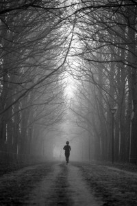
I’ve only scraped the surface of the different techniques used by photographers to give their pictures the composition they want. Try using elements in the composition to frame the subject (such as the trees in the picture with the runner), and maybe try different techniques on the same picture – it might be the easiest way to find the one that works.

Ignoring the Rules

The theory behind what makes a ‘good picture’ can certainly be off-putting for many. After all, isn’t a good photo about how it makes you feel rather than how perfect it is? Possibly. But understanding conventions helps us decide when to follow them, but also when to break them for dramatic effect. So go experiment with unusual crops, dead-centre subjects and skewed horizons – you might just discover something amazing!

All photos used in this article are used according to Creative Commons licences. If you have strong reservations against your photos appearing on Small Aperture, please contact us, and we’ll get them taken down. Please support the artists creating these photos by clicking on the photos to take a closer look at their work!

3D - not for me

Me in 3D

Unless you’ve been living beneath a rock – which I really hope you haven’t been because it seems a bit cold and uncomfortable to me – or on a mission to outer space (you got awesome pictures, didn’t you?), you can’t have failed to notice that Disney’s latest offering, Tron: Legacy hits the screens tomorrow. And it’s bouncing in in an awe-inspiring blaze of 3D glory. Or so we’re meant to think, if we subscribe to the hype. If you’re me, it’s more a shrug of indifference because, dammit, I don’t like 3D.

Really. I don’t like 3D.

Yes, I’m probably supposed to be salivating in star-struck wonderment over the fight scenes and pinned to my seat, hair swooshing behind me, by the realism of the chases, but the truth is, I’m not. I’d much rather be watching it in 2D.

I’m not a miserable technophobic grouch, I promise. Here’s why 3D doesn’t rock my world.

Burning eyes and aching head

My first reason is completely, utterly, and totally personal. And it’s the singular most important one why 3D cinematography and I aren’t getting on. It gives me a headache. Sit me in front of a 3D projection wearing those ridiculous glasses and my eyeballs will begin to pulsate. Before long I’ll think that they are about to canon out of the back of my head in a streaming red and orange arc. I do not want to spend 90 minutes like this. Actually, no, I don’t want to spend even ten minutes like this. If this is supposed to constitute entertainment, then please sign me up for something different.

For a while I thought that I might be some freak of nature whose ocular function was somehow deficient. But, no, I’m not. The more that I ask around, the more that people tell me: ‘Oh yeah, 3D makes my head hurt, too.’ Now in my universe, this does not constitute a good business model. Why persist in making films in a format that will actively deter film-goers when a perfectly acceptable alternative is already being used? If you think I’m going to willfully subject myself to migraine-like symptoms and hand-over my hard-earned pennies to do so, all so that I won’t be able to enjoy a film, you’re from Planet Crazy.

Glasses

The perfect hairband

Then we move on to the glasses. Now, I’m not overly fussed by the aesthetics of wearing 3D glasses. First, I live with sunglasses virtually super-glued to my nose; second, in a cinema, it’s dark. Who’s going see you looking like a human version of Brains from Thunderbirds? (And I’ll tell this for free: they make excellent hairbands.) But going to the cinema shouldn’t be an accessory-dependent experience. Seriously guys, in the grand scheme of cinematography, that’s a retrograde step.

When you consider that the Gerry-Anderson-inspired-glasses also contribute to a 30% loss of colour in your average film, it’s even more regressive. No, it’s not a swing instead of a roundabout, or a small loss for a bigger gain. It’s a third of the sharpness of the imagery being sacrificed for a piece of technology that is supposed to immerse you in the world of the film. But hang on a minute, beautiful cinematography that uses creative camera angles and intriguing depth-of-field, sublime colour, and a tight script well acted will also immerse you in the world of the film. You don’t need 3D to do that.

The Great and the Good

The ever-entertaining and frequently-insightful Mark Kermode also points out that 3D isn’t new technology. It is something that has been pushed on cinema-going audiences since the 1950s (and the first patent for a 3D film was around in the 1890s), but has never caught on. Why, I wonder? Maybe because people who watch films are discerning enough to see that 2D films do what they do really, really well. And why is it being pushed again? Kermode reckons it’s an anti-piracy move.

That’s a good argument, but I can’t help thinking it’s a bit like fashion. Some trendy Shoreditch-type was raiding her Mum’s wardrobe and stumbled on a 1980s retro-tastic jumpsuit. She started wearing it in her infinite fashion-forward-wisdom. And yes, where fashion went, we followed, for five minutes. Then we realised that we looked ridiculous and having to get out of one to have a pee was a Herculean feat. So we consigned them to the ‘Never again’ heaps in our wardrobes, for our daughters to dig them out in twenty years’ time and repeat the sorry cycle.

Martin Scorsese, on the other hand, has been waxing lyrical over 3D. ‘Every shot,’ he says, ‘is rethinking cinema.’ His newest film, Hugo Cabret, is due to be released in late 2011 and has embraced 3D technology to the full. Scorsese points out that we live in 3D, so why can’t we watch films in 3D? Well, I’d hazard because film isn’t real life, it’s film, and 3D gives me a headache.

And if Scorsese wants to sell the aesthetics of 3D like this: ‘But it has a beauty to it also. People look like… like moving statues. They move like sculpture, as if sculpture is moving in a way,’ then he really needs to think again. I’d rather watch realistic 2D people than 3D marionettes, thanks.

Back in its box

So often I hear that 3D is really worth it for one or two scenes in a film, that it makes them stand out far beyond the others. But what about the rest of the film? Is it worth it for that? Does 3D really make for the immersive, spectacular experience that film-makers would have us think? The answer for me is a resounding no.

Until they can find a way to make stereoscopy not induce headaches, not require glasses, and not reduce picture sharpness, it’ll have to remain in the dressing up box, until our kids decide to turn it into a fashion statement. For five minutes.

What happened to Photocritic?


Rest in binary peace, Old Site!

Hello, and welcome to Pixiq! I know a lot of you are going to be hellaconfused about what has happened, but that's OK - that's what this post is all about.

Basically, over the past year, as Photocritic has been becoming more and more popular, I have been spending more of my time in making sure that the Photocritic server doesn't keel over and die a miserable, flame-filled death. Don't get me wrong, I love tinkering with technology and fiddling with servers - but I like it better when it is a hobby. These days, if the Photocritic servers went down, it was a huge problem.

In parallel with the server and bandwidth challenges, I have been running my own business for the past year. I know you wouldn't believe it considering some of the drivel I write on my blog some times, but there's actually quite a few companies who are quite happy to pay me for sitting around, writing about stuff. In fact, that's what I've been doing full-time for the past 18 months, under the guise of Kamps Consulting (I've even got a pretty new website and everything).

Anyway, long story short: Pixiq came along and made me an offer I couldn't refuse. In addition to taking over all the hassle of running my own servers, they offered me a fistful of cash every month to basically just keep doing what I'm doing: Blogging about photography whenever I feel like it, with full freedom to write about whatever the hell I want, use whatever obscene language I felt like, and so on and so forth.

So what does this change mean?

To you, my dear reader, not really all that much. All your old bookmarks will still work, all the articles you know and love (and a lot of the ones you haven't discovered quite yet) are still available, your old RSS feeds should continue to work (although they may look slightly different).

You can subscribe to Pixiq's feed if you want, or you can continue to subscribe just to my feed, if that's more your thing. In parallel with Photocritic on Pixiq, I'll continue to tweet on @Photocritic, and my Photographers on Twitter tool has moved, but still works perfectly fine.

I'll also keep working on my other blog project Small Aperture - whereas the stuff I'm posting here is for features (i.e stuff that should still be relevant 3 and 5 years from now), Small Aperture is at the cutting edge of photography news. I've also got some very exciting news about Small Aperture coming up in the not-too-distant future, but I'll let you know about all of that separately.

Thanks for letting us know. What else are you up to?

Well, it's exciting times in Haje-world. In less than 10 days, I'm going to board a plane to San Francisco with my delectable (much) better half, and I won't be back in London until May. In the meantime, our itinerary says something like "USA, Vietnam, Cambodia, Thailand, Laos, India", but it's one of those types of itineraries that are written on the back of a cheap cocktail napkin with water-soluble ink, and left out in a monsoon rain for a week or so.

Our plans are as fluid as that; so where we'll really end up, nobody knows. But you can know, if you want to - I've set up a travel blog so you can cyberstalk me to your heart's content if you like.

In addition to the travel, I'll be working whilst travelling the world. I'm working on two different book projects (neither of which I can say much about), my next book (which you can pre-order from Amazon UK but, bizarrely, not from Amazon.com yet) is out around May 2011, and I have a lot of other irons in the fire as well.

So, it looks as if 2010 was a hell of a year, and as if 2011 is going to be even betterer and more exciting. Strap yourself in, and join me for the ride!


Do you enjoy a smattering of random photography links? Well, squire, I welcome thee to join me on Twitter -

© Kamps Consulting Ltd. This article is licenced for use on Pixiq only. Please do not reproduce wholly or in part without a license. More info.

Macro photography for $10

So, you like the idea of doing macro photography, but you think you can’t afford it? Think again – with less than £10 worth of equipment, a little bit of sweat and tears (and blood, if you, like me, are a bit on the clumsy side), and you can build yourself a surprisingly good macro lens. Don’t believe me? Well, have a look at the article, and think again!

Of course, as I’m using a Pringles can to make this lens, you also have the opportunity to pause for a snack. Now that’s the type of DIY projects I like.

So you want to take pictures of things up close, do you? You have gone tired of all the regular ways of doing so? Ready for bellows and reversing rings, but can’t afford them? Have no fear, there is a far cheaper way to get a reasonably good result!

Also, Before we go any further… Need I say that you do all of this on your own risk? If you chop a finger off, ruin a lens or your camera body, it’s your own fault, and your own problem. Just be really careful, and you should be fine.


Cannibalising lens covers

This project takes base in cannibalising a few of the lens- and body covers that most of us have laying around. These are great, seeing as they are already created to connect to the camera – the easiest way to get the correct bayonet fittings to attach stuff to your camera body and lenses!

Obviously, the covers are solid, which is no good to us. So, in order to get them into an useful state, I attacked them with a Dremel tool.


Such a grind…

Carefully chopping the fronts out of a camera body cover and a lens cover takes quite a bit of time, not least because I wanted to do it as neatly as possible.

When you are done, remember to matte the cut by using emory paper (sanding paper): You want to make sure it doesn’t reflect light.


Pringles tube to the rescue

What you make the actual distance tube out of is relatively unimportant, as long as it is completely light-proof. I decided to use a pringles tube because I have done projects in the past with them, so I knew that they were approximately the right size. It turned out, in fact, that it was exactly the right size. Nifty.

After removing the top and decantering all the lovely crisps into a bowl (nope, I’m not affiliated with Pringles. And the jury is still out if the crisps type have any impact on the photo quality of the end product), it was time to attack the bottom of the tube…


Sparks! Oh, the pretty sparks!

Cutting out the bottom of the pringles can caused a lot of pretty sparks, so I couldn’t resist the temptation of taking a few shots.

Ladies: sorry about the unwashed hair, beard stubbles, messy room, and general colour mismatching of this photo. If this turns you on, marriage proposals go on an ePostcard to the address at the bottom of the article.


So… Why the lens cover?

There was no logistical reason for why I decided to cut holes in both the body and the lens cover, other than that I thought it might come in handy later. With the final design, it turned out to not be necessary. It did, however, come in quite handy: The lens cover cap works as a flare-reducing hood, and it helps protect the electrical contacts built into the lens. In addition, it makes it easier to grab on to the lens as it is stuck in the tube.

Chalk that one up to luck rather than than planning, but cut a hole in a lens cover as well, because it makes your life easier, and it reduces the chance of putting one of your lenses out of commission. I don’t know about you, but I prefer to keep my lenses in one piece. I’m not that rich: I’m writing an “on the cheap” guide.


A Sticky situation

So, once the pringles tube had a big hole in the bottom, I set out to attaching the body cover and the Pringles tube.

Any strong glue should do. I suspect a hot-glue gun would probably be best, but I was out of glue sticks, so decided to use epoxy glue instead.

Anything to make the two pieces stick firmly to each other. If the glue you use sets translucent, you may want to take a black felt-tip pen and colour it dark, to prevent light leaks.


Firmly attached

After the epoxy glue had set, I had to try to see if it fitted on my Canon 20D.

Sure enough, it was a perfect fit.

Professionality aside, I gladly admit to doing a minor victory dance at this point.

A snug fit – banishing light

My idea was to use black felt to block out the light leaks from outside the lens.

The particular lens I decided to use for this project is the cheapest Canon standard lenses, namely the Canon 50mm f/1.8 MKII.

It is just the right size, and despite being cheap as chips, it has a couple of tricks up its sleeve – more about that in a minute. Ideally, using an older lens would be a better idea – especially if it has manual aperture controls.

By wrapping black fabric (in my case, a t-shirt I didn’t really like anymore) tightly around the lens, I managed to block out all superfluous light.


Textile Hack

I’ll gladly admit that getting it right took a couple of tries, but eventually I found exactly how much fabric was needed. To hold the bundle together, I decided to tape it all together.

After this, the lens fitted snugly in the Pringles container. Not only did it not fall out, it slides quite easily, so if you need to move it, you can just push or pull it to where you need it. Once you let go, it stays put. This is actually quite important, as it’s part of the focussing strategy: You don’t focus using focus rings, but by moving the lens closer or further away from whatever you are photographing.

pringles_diagram.png

Finally: Taking photos!

Right, everything has come together, and now it is time to do the fun stuff: Take pictures!

Depth of field in Macro photography

You’ll probably find that, essentially, you have no depth of field at all. In macro- and microphotography, moving an item half a millimetre forward or backward from the lens changes things dramatically. Of course, you’ll learn soon enough to draw this to your advantage, but there is actually something you can do to increase your depth of field, if only a little: Stop down the lens – more info about that here.

Focussing

Focussing is a serious challenge with microphotography, and it can be bitterly frustrating: The slightest movement throws the object completely out of focus, and even finding your object again can be a nightmare.

My only advice: Try it slowly. Wave your object in front of the lens, and then try focusing it by holding it in your hand, looking through the viewfinder. Once you get the hang of it, understanding how it works, you can try and set it up in a static setup: You are going to want to use a remote release button or the camera’s self timer to reduce shutter shake, so make sure everything is sturdily set up!

Exposure

The internal light-meter is actually a good starting point – it isn’t always accurate, but it gives you an idea. The great thing with digital SLRs, of course, is that you can try and err as much as you like. And trust me, there will be a lot of that while you try and figure out macro photography.

Taking the photo

As mentioned briefly earlier, you’ll want to hold the camera perfectly still. Use the self-timer or use a remote shutter lead to make sure everything is perfectly still.

The photo below is off a simple Bic ballpoint pen (it was the first thing I had to reach).

It is by no means a great macro photo, but it does give an impression of how big things get. That is an un-cropped photo, by the way: I have the photographs below in all their 8 megapixel glory.

The reason for the glare in this photo is that the inside of the Pringles tube was still metallic. The light was bouncing around on the inside of the tube, causing it to look very fuzzy.

Ballpoint pen – Canon 50mm f/1.8 stopped down to f/16, shutter time approx. 10 seconds, ISO 100. Not cropped. (see bigger version)


Ballpoint pen – Canon 50mm f/1.8 stopped down to f/4.0, shutter time approx. 0.3 seconds, ISO 100. Slightly cropped. (see bigger version)

Now in video form!

This article was published in Make Magazine vol.6, and in late 2009, Make Magazine made this their Video Project! I’m proud to say that Kip and the rest of the Make team made a great video guide of it – check it out:

Further improving the system

The first change I made to my initial design was to add a layer of black paper inside the Pringles box. Ideally, black felt or another completely light-eating surface would be better, but felt costs money, and I decided to keep this project as cheap as possible.

Photos taken with the system

During my further experimentation, I decided to have a go at a pack of matches that was conveniently within an arm’s length:

(For all three images, click on them to see them bigger on Flickr. While you’re there, why not add them as favourites while you’re at it?)

Postscript

I hope this article has inspired you to build a macro lens of your own. It is a tremendous amount of fun, and in the process you are likely to learn a lot about photography and optics: Which, in turn, will improve your overall photography performance. You can’t lose!

Protest photography

Tamil separatist supporters demonstrating in London. The 'stop' barrier was pure chance.

I kinda missed out on the whole student protest thing when I was at university. The skirmish around the loss of grants had already been lost, round one in the tuition fees bout went to the Government before my time, and the Iraq war was yet to come. What was left? Better rights for water voles on a four mile stretch of the River Avon? Probably.

But gee whizz! The whole of Europe has been making it up for it this year. Athens, Paris, Lisbon, London, and Rome have seen angry mobs rampaging through the streets demonstrating against police brutality, changes to the retirement age, austerity measures, the imposition of increased student tuition fees, and a probably corrupt and almost certainly inept Prime Minister. And it has all been captured with some superb photography.

Which got me thinking. If you are intent on photographing a demonstration, and something with the potential to turn nasty, how should you go about it?

Preparation

If you’re photographing a planned demonstration, make sure that you know the route. Suss out good vantage points for the beginning, the end, and points along the way. (Barriers or bollards to stand on are a good start.) You’ll want shortcuts between key places, as well.

Tamil separatist supporters demonstrating in London. The 'stop' barrier was pure chance.

Wear appropriate clothing: something inconspicuous that will allow you to move easily and run if you have to.

Dig out your press card if you have one. If you’re in the UK, print off a copy of the police guidance on photography, just in case.

Take as little kit as you can get away with. Your main camera with one lens – so ideally the most versatile that you have – spare memory cards and batteries, and a second camera if you can manage it.

On the day

Be nice to the police. Be co-operative. (I took a few minutes to chat with the officers who were policing a protest by Tamil separatist supporters in London. I found out lots of useful information. They knew who I was. We all won.)

I turned around; he was looking straight at me. Boom!

Even if it doesn’t look as if things will turn hairy, make sure that you have an exit strategy at every point.

Stay alert: both to get the photos that you want, and to stay safe.

Getting photos

Crowd scenes can convey the enormity of the protest, but what’s of greater interest are the individual stories. You want the quirky and unusual and you want to tell the narrative of the protest. So look out for the grandmother marching with her grandchildren, stay alert for flash-points, and keep a watch for the unexpected.

She joined the International Women's Day march, in her owner's handbag!

Don’t delete anything. You never know what might be in the background on closer inspection.

Be brave, but don’t be stupid.

Finally

Your safety is the most important thing. Put that first all the time, whether to stop yourself from tumbling from a lamp post and breaking your neck, or not being in front of a mounted police charge. Mmmkay?

Wish you were here?

wish you were here

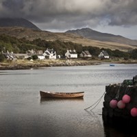
I doubt very much that you wish you were right here. As lovely as the Small Aperture mansion is, it’s pretty drafty right now. How about the Isle of Jura, just off of Scotland’s west coast, for a week next summer? Sounds ideal to me, especially if I could win the trip there with a photograph.

The Isle of Jura and Visit Scotland have dreamed up a competition where three people and their partners can win a week’s holiday on Jura, as well as an Olympus E-PL1, by submitting a ‘postcard’ of a destination that inspires them. Take the photo, explain what makes the place amazing, and submit your postcard. The judging panel includes Jim Richardson of National Geographic fame. (He’ll also be on-hand to give the winners a two day photography master-class.)

Entries are being accepted between now and 21 January 2011. All of the details are available on the competition website.

P.S. Deer out-number humans 30 to 1 on Jura
P.P.S. My favourite whisky comes from Jura