News

Get floral for May's photo competition!


It's May; so spring is springing in the northern hemisphere and autumn is falling in the southern hemisphere. Sprouts are sprouting, shoots are shooting, and blossom is blooming one side; head the other and trees are turning to flame. It's an excellent time to photograph plants, flowers, shrubs, and trees. Your monthly photo mission, therefore (should you choose to accept it), is flora.

The wonderful people at Fracture are supplying the prize for the talented winner.

As usual, entries need to go in the Small Aperture Flickr pool and you've from today (Friday 4 May) until Friday 26 May to submit your entries. Remember, please that it's one submission per person, though.

Any questions? Ah yes, last month's winner. Well, between Haje launching Triggertrap Mobile and me being up to my eyeballs in various projects, we're running behind. We apologise; we haven't forgotten and we'll get there. We promise.

Otherwise, here are the rules, in case you need them.

The Rules

  • If you decide to enter, you agree to The Rules.
  • You can’t be related to either me or Haje to enter.
  • One entry per person – so choose your best!
  • Entries need to be submitted to the right place, which is the Small Aperture Flickr group.
  • There’s a closing date for entries, so make sure you’ve submitted before then.
  • You have to own the copyright to your entry and be at liberty to submit it to a competition. Using other people’s photos is most uncool.
  • It probably goes without saying, but entries do need to be photographs. It’d be a bit of strange photo competition otherwise.
  • Don’t do anything icky – you know, be obscene or defame someone or sell your granny to get the photo.
  • We (that being me and Haje) get to choose the winner and we’ll do our best to do so within a week of the competition closing.
  • You get to keep all the rights to your images. We just want to be able to show off the winners (and maybe some honourable mentions) here on Pixiq.
  • Entry is at your own risk. I can’t see us eating you or anything, but we can’t be responsible for anything that happens to you because you submit a photo to our competition.
  • We are allowed to change The Rules, or even suspend or end the competition, if we want or need to. Obviously we’ll try not to, but just so that you know.

If you've any questions, please just ask!

More new stuff from Flickr


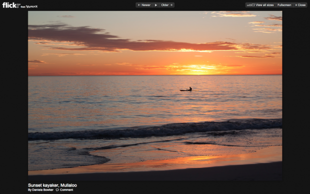
Flickr's full-screen fabulousness

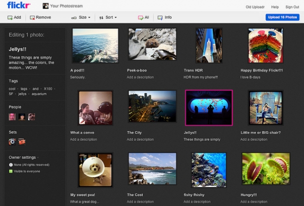
Flickr promised more new toys when they announced the shiny, improved Uploadr last week. They've delivered on that today (or yesterday if you are where I am), with new photo sizes for all users and the ability for Pro users to control the sizes of their displayed images.

Head over to the Lightbox and you'll be able to see your images in 2048 and 1600 pixels, provided that they were uploaded after 1 March this year. Should you not have uploaded anything since then, try out the new Uploadr (mine appeared earlier this week) and have a peek.

As a Pro user, you can also upload your images in their original full resolution wonder, but set a limit for the size at which the rest of the world gets to gaze at them. You can do that in the Image Size setting. Sensible naming convention, that.

If you missed it earlier this week, Flickr has also worked with Pinterest to ensure that any photos that are pinned from Flickr are properly attributed. That means your name, the image's name, and a link back to it all come with the photo. Furthermore, if one of your images has been embedded in a blog and someone has pinned it from there, it'll miraculously be attributed to you and linked back to Flickr.

For the Pinterest lovers, there's a new Pinterest button in the 'Share' menu above every image. (It also works for groups and favourites.) For the Pinterest not-so-lovers, you can disable that feature on your images.

They have been having fun over at Flickr. I wonder if they've anything else up their sleeves?

My first adventure in time-lapse photography

screen_shot_2012_05_01_at_175150_0_620x3361.jpg

I love experimenting with photography, but I've never really had much of a chance to play with time-lapses until I started working with the Triggertrap.

So, in the process of testing it all, I did a load of time-lapses, and I figured that (since we've now finally launched our iPhone version) it was time to show off some of my experiments as well.

This one is a work in progress, as I haven't quite finished all the balancing, and some of the cuts aren't quite where I'd like them... I also need to fix some of the flicker... But I'm rather proud of it as a first attempt!

Triggertrap goes Mobile!


Triggertrap for mobile

When Haje and the Triggertrap team came up with Triggertrap v1 and Triggertrap Shield for Arduino, I thought that was all manner of groovy. The idea of a universal camera trigger rocks, and they were dead proud of themselves. But being crazy inventor-and-developer-types, they weren't quite content with that. They wanted to push things a bit further and see what else they could do. So after a lot of head-scratching, question-asking, code-writing, testing, code re-writing, and more testing, they're excited to unveil Triggertrap Mobile.

It's a camera triggering facility that you operate from your iPhone. That might sound a bit prosaic, but it's far more exciting than that. (And really, we live in an age when we think that using a handheld device that allows us to communicate with someone on the other side of the globe via voice, image, or text to trigger a piece of equipment that produces a digital image is mundane?)

Sure, you can use Triggertrap Mobile with your iPhone, which is pretty awesome, but team it up with the Triggertrap dongle (oh God who invented that word because it makes me snigger every time I read, hear, or say it) and your dSLR or advanced compact camera and you are on to something really exciting.

Time-lapsing

Time-lapses are fabulous and wonderful just as they are, and of course you can use Triggertrap Mobile to produce a time-lapse with your camera, but it also lets you do some very cool things with them; try distance-lapses and eased time-lapses. Distance-lapses and eased time-lapses–you what?

Let's start with the distance-lapse. You can use Triggertrap Mobile to set up your camera to take a photograph at regular distance intervals, for example, every 100 metres. Say you're on the top deck of a bus, recording your journey through a city, you won't end up with a glut of photos from when you're stuck in a traffic jam; similarly, as the bus speeds up, so will the rate at which photos are taken. Stop altogether and so does the Triggertrap.

As for eased time-lapses, these are time-lapses where the interval between each photo taken can be altered. With a traditional time-lapse the interval is set, so it moves at a given speed. An eased time-lapse, on the other hand, can be made to look as if it is speeding up, or slowing down, or both, by controlling how often a photograph is taken. Triggertrap mobile will let you do just that with five different acceleration profiles, spanning from 'mild' to 'brutal'. You can ease in, ease out, or both.

Multiple triggering options

What made Triggertrap v1 so exciting was its ability to allow you to trigger your camera just about any way that you could think of. Carrying that over to an iPhone might be a bit beyond the realms of possibility right now (but I wouldn't bet against Apple and Team Triggertrap), so they've given you 12 different camera-trigger options to keep you occupied until then. You can try anything from facial recognition, to a shock sensor, via a motion sensor, a magnetometer, and a sound sensor to take photos. But perhaps you'd rather use the automatic High Dynamic Range (HDR) bracketing option with up to 19 exposures per set and configurable steps between each exposure, or the HDR time-lapse mode, or the Star Trail photography mode. I can see myself playing around with this thing, descending into a fog of remotely triggered images, and emerging days later wondering why I'm hungry.

If you want something a bit more traditional, Triggertrap Mobile will let you operate your iPhone as a remote control for your camera with its cable release mode. There's a bulb mode where you hold the button for long exposures, a timed bulb mode where you press the button the start the exposure and press it again to stop it, and a long exposure mode that'll allow you exposures of anything from one to 60 seconds.

Shutter channels

Triggertrap Mobile has three different channels, which will allow you to control either your iPhone's internal camera, the focus of an external camera, or the shutter of an external camera independently of each other. Or in combination, if you want.

By getting clever with cables and adapters, you can configure Triggertrap Mobile so that you can trigger your camera, your camera and a flash, or even two independent flashes.

This device is like a triggering nirvana.

Introductory video

There's even an introductory video. How groovy!

Availability

You won't be able to beat me to the front of the queue at the iTunes App Store for this because I've been camping out there since I received the PR, but you can get in line behind me. You've two options.

There's the Triggertrap Mobile Free version, which is, well, free and provides you with three of the modes from the Premium version: cable release, time-lapse, and seismic, which responds to bumps, knocks, and jitters. It's compatible with iPhones 3GS, 4, and 4S, 3rd and 4th generation iPod Touches, and the iPad.

Or you can opt for the $9.99 all-singing-all-dancing-doing-to-okey-cokey Premium Version. It's compatible with all the same devices as the free version, but don't forget that you'll need the dongle (snigger) and you might want a cable, too. You can get those from the Triggertrap store.

Now for the inevitable 'Will they be making an Android version available?' question. Well, they've talked about it, but they aren't making any promises. (I'd say try bribery. They're partial to single malt Scotch, boutique gin, and good wine, red or white.)

I can't wait to see what these guys think of next.

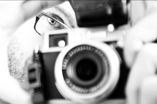
This self-portrait was taken by a stranger on the Internet


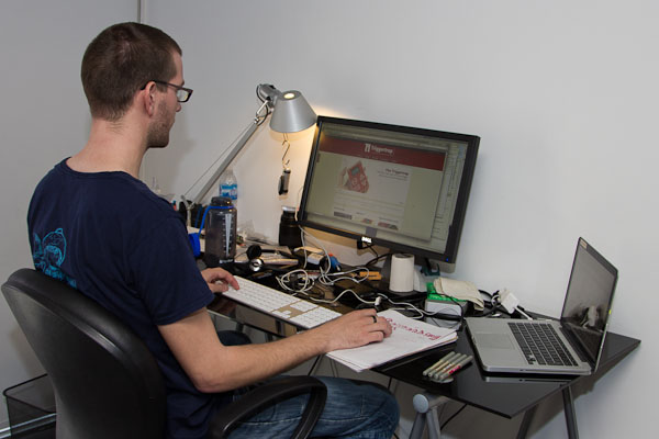
This (admittedly not very interesting) pic of me was taken with my Triggertrap when someone joined the Triggertrap newsletter.

Today's post is brought to you by the how-bloody-meta-is-this department...

So, I've been playing with different concepts of automating the taking of photos, by using the Triggertrap universal camera trigger I invented.

As part of the upcoming Triggertrap website (it's launching on Monday!), I was working on the updated Newsletter sign-ups, and I had an idea: Wouldn't it be cool if someone signing up for a newsletter triggered the camera?

So that's what I did - Now, whenever someone signs up for the Triggertrap newsletter, it automatically takes a photo of me, sitting at my desk, slaving away. Okay, so it isn't a very interesting photograph, but that isn't the point - it's kind of awesome that my camera is taking photos whenever someone else does something. 

If you want to find out how it's done (and if you, too, want to take a photo of me)... Sign up for the newsletter; the explanation is on the sign-up confirmation page. (Pretty sneaky, eh?)

The Avengers and Adventures in Terrible Headaches


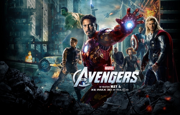
Movie poster courtesy of Disney / Marvel

Avengers is one of those movies that makes you wish your cinema seat had a seat belt - it's a no-holds-barred thrillride cocktail of two parts great casting, one part witty script, a large splash of VFX, blended with copious amounts of visual gags, a squeeze of explosions, and garnished with the odd, completely unneccessary yet utterly delicious shots of rather astonishing-looking eyecandy; Cobie Smulders and that other chick they cast.

Superhero movies have been a mixed bag; so I'll keep this review very short indeed by saying: This is not a mixed bag. This is a sack, filled to the brim with finely selected awesome. Go see it.

It's well-paced, has more laugh-out-loud moments than I remember in any other recent film, the acting's good, the VFX is epic, and the music... Well, not always what I would have chosen, but it doesn't directly get in the way of the fun.

The horror of 3D

Of course, I'm currently in Buenos Aires, which means I have two choices for this film: Watch it in English with Spanish subtitles, in 3D. Or, watch it dubbed to Spanish, in 2D.

So, since my Castellano is still lacking at best, we opted for the 3D version.

Honestly? I don't get it. You spend all this money on making a stunning movie - a feast of explosions, colours, and superfluous shots of Scarlett Johansson's finely shaped bum squeezed in very tight trousers, and you ruin it by halving the brightness, slashing the colour saturation, and giving your audience headaches with poorly implemented 3D?

Don't get me wrong - I used to be in the industry of gadgetry and tech (I edited a website about it for a while), and I understand the appeal of 3D. Well-executed 3D is... A beautiful thing. It's 'realistic' (well, as realistic as staring at a 2D screen and see 3D things pop out at you). But the technology simply isn't there yet - or, if it is - it's not affordable enough that small screens in countries that gets violently abused by the government every time you try to import anything with a value of more than a packet of chewing gum.

So; what I'm trying to say is this: Avengers would be a straight-up 10 out of 10 if it managed to restrict itself to a mere traditionalist two dimensions. In three dimensions, it just falls a bit flat.

Sony World Photography Awards: the winners


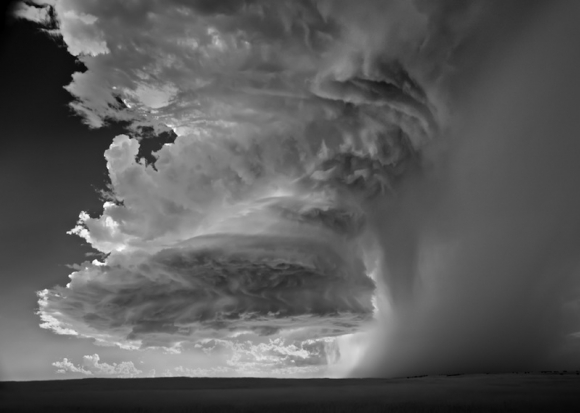
Veil Cloud. Copyright: Mitch Dobrowner, USA, Professional Winner, Landscape, Sony World Photography Awards 2012.

Over 112,000 images were submitted by entrants from 171 countries to the 2012 Sony World Photography Awards. With 14 different categories in the professional division; ten categories in the open division; the student focus, youth, 3D, and moving image awards, too; and a bundle of prizes up for grabs ($25,000 to the winner of the Iris d'Or, no less) then the numbers are hardly surprising. Not to mention a swanky awards ceremony at a posh central London hotel. But really, who won what?

The 2012 Iris d'Or was awarded to American Mitch Dubrowner for his series of images Storms. WM Hunt, who was chairman of the 2012 honorary judging committee, commented on Dubrowner as the choice of winner: 'He brings a sense of its [photography's] history and enormous skill in his craft while pushing his imagination and, even, physical strength. The work offers a visceral rush while being wonderfully well made.' Hold on to your lunches when you look at his work then.

The Open Award went to a 29 year old software engineer from Germany, Tobias Bräuning. He won with Daning Queen, from the Split Second category, which was a new addition to the 2012 line-up. He's bagged $5,000 and a goody bag of Sony's latest imaging equipment.

We already knew who'd won the Outstanding Contribution to Photography Award–that was William Klein.

Asef Ali Mohammad, from Middlesex University, won the Student Focus Award with a series of images documenting the life of young people in Kabul. His institution has picked up €45,000-worth of equipment.

Sergey Kolyaskin, from Russia, picked up the Youth Award for his image The Last Hero. The 3D Award went to Nick Saglimbeni for his image Nuclear Summer. When it came to the Moving Image Award, it was Canadians Natasha Nicholson and Michael McDougall who took the spoils for their piece Dead Languages.

The winning images are all on display at Somerset House, London, over the next month. It's worth popping in to take a look for yourself.


If you're intersted in seeing just who won what and came where in the professional division, here's the complete run down:

Photojournalism and Documentary

Current Affairs

  • Winner: Donald Weber (Canada) / VII PHOTO
  • 2nd: Fernando Alfonso Brito Lizárraga (Mexico)
  • 3rd: Rémi Ochlik (France) / IP3 Press

Contemporary Issues

  • Winner: Kasia Bielska (Poland)
  • 2nd: Gustavo Jononovich (Argentina)
  • 3rd: Alessandro Grassani (Italy)

People

  • Winner: Simon Norfolk (United Kingdom)
  • 2nd: Maja Daniels (Sweden)
  • 3rd: Alejandro Cartagena (Mexico)

Sport

  • Winner: Palmer + Pawel (United Kingdom)
  • 2nd: Pawel Kopczynski (Poland)
  • 3rd: Andrew McConnell (Ireland)

Arts and Culture

  • Winner: Rob Hornstra (Netherlands)
  • 2nd: Mattia Vacca (Italy)
  • 3rd: Anastasia Taylor-Lind (United Kingdom)

Nature & Wildlife

  • Winner: Jacek Kusz (Poland)
  • 2nd: David Chancellor (United Kingdom) / Institute
  • 3rd: Palani Mohan (India)

Commercial

Campaign

  • Winner: Peter Franck (Germany) / Büro stoltenhoff
  • 2nd: Laura Pannack (United Kingdom)
  • 3rd: Javier Arcenillas (Spain)

Travel

  • Winner: Luis Henry Agudelo Cano (Colombia)
  • 2nd: Peter Franck (Germany)
  • 3rd: Jan Brykczynski (Poland)

Fashion

  • Winner: Peter Franck (Germany)
  • 2nd: Elizaveta Porodina (Germany)
  • 3rd: Jayden Tang (China)

Fine Art

Architecture

  • Winner: David Airob (Spain)
  • 2nd: Simon Norfolk (United Kingdom)
  • 3rd: Igor Chirikov (Russian Federation)

Portraiture

  • Winner: Irina Werning (Argentina)
  • 2nd: Paolo Marchetti (Italy)
  • 3rd: Lei Liu (China)

Landscape

  • Winner: Mitch Dobrowner (United States)
  • 2nd: Lee Chee Wai (Malaysia)
  • 3rd: Rona Chang (United States)

Still Life

  • Winner: Helen Thompson (United Kingdom)
  • 2nd: Renan Cepeda (Brazil)
  • 3rd: Rena Effendi (Azerbaijan) / INSTITUTE

Conceptual

  • Winner: Manuel Geerinck (Belgium)
  • 2nd: Cristina De Middel (Spain)
  • 3rd: Luis Mallo (United States)

Eased Time-lapses: Adding some acceleration to Time-lapse videos

So I've been playing with time-lapses a fair bit recently, and I've learned a lot of magical and mysterious things... For example, have you ever considered how it's pretty awesome to be able to speed up time by taking a photo every 2 seconds, and then playing it at 30 fps? When doing it like that, a 1 hour timespan only takes up a minute of video - perfect for sunsets, sunrises, etc. Using this technique, you can create some truly astonishing stuff.

However... That got me thinking. Why have we decided to only have linear intervals? Why stick to a photo every 2 seconds? Why not change the gaps between each photo?

By starting to take photos very quickly at first, and then slowing it down, for example, it would look as if the video was accelerating. Start slowly and speed up, and it looks as if the video is speeding up.

Eased Time-lapse Videos

The next logical step was even more awesome: What if we could use the algorithms used by animators, and actually apply mathematics to the acceleration of each video? So, that's what we decided to do.

Known as Tweened Time-lapse, or Eased Time-lapse videos, we took a leaf out of the animation playbook. So far, I can only share two quick video experiments with you:

The acceleration and decelleration in this video isn't done in post-production: It's done in camera, by varying the intervals between each photograph taken in this time-lapse set. Awesome, eh?

If you want to stay posted on how my experiments progress, or if you want additional information, remember to sign up to the Friends of Triggertrap mailing list!

Flickr's new Uploadr


Serendipity. I'll put it down to serendipity.

Only yesterday I was uploading some photos to Flickr and lamenting a) how slow it was (but being marooned in a north Perth suburb might have something to do with that); b) that my images didn't appear in the order that I selected them, which would mean a trip to the set editing function when they'd finally crawled their way onto Flickr's servers; and c) that everything would be appearing in my photostream before I'd had the opportunity to organise them, tag them, change the titles (rarely do I call something in my files the same as it's titled on Flickr), and all of the other bits and pieces that I do with my photos.

Low and behold I awake this morning to find that Flickr has just announced a brand new shiny Uploadr.

By the wonder that is HTML5, you will now be able to drag-and-drop your images into the Uploadr, see thumbnail previews, and then reorder your pictures before they see the light of day in your photostream. There's also the ability to zoom, rotate, or sort your photos by title.

That bundle responded to one of my most serious gripes and in all honesty I would have been content knowing that the Flickr-dudes are doing some actually useful product development, rather than just treading water or silly stuff, but there's more. Tagging, arranging into sets, and identifying people in your photos can all be done from the Uploadr, and so can amending your licensing options and a few other bits of advanced jiggery-pokery.

Files sizes have now been increased to a whopping 50MB for Pro subscribers and 30MB for free users. Everything should also be uploading faster. I'll reserve judgement on that, but it's good to know.

Flickr has promised even more new features that it'll be rolling out soon. No word on what they are yet, but some actual movement with the product is at least a little promising after all those lay-offs at Yahoo! and some really dud introductions over the past few years.

As ever with Flickr, not everyone will have access to these new toys immediately; they'll be rolled out over the coming weeks. I'm looking forward to trying them!

Photoswarm: professional portfolios made easy


Fabulously add-free

When you can't find a product that meets your needs, what do you do? Well, if you're Will Jennings and Aidan Kane, you build it yourself. Will was struggling to find a website that would host his professional photography portfolio. He wanted something that looked slick, was simple to use, provided him with his own domain name and email address, and also the ability to sell his photos. What was on offer was too expensive and too limited in terms of the number of photos hosted or level of traffic received. Some people might have regarded that as a bit much to ask for, but not Will, or Aidan for that matter. Between Will's creative vision and Aidan's technical prowess, they developed Photoswarm.

All of Will's demands are right there. The site is clean and looks professional, uploading photos to it is a cinch, and it's reasonably priced.

There's a free package that allows you 50 photos on the site and as much traffic as you can generate. Upgrade to the light package–$5.99 a month or $59 for a year–and you can upload unlimited photos, you will have an about page, a contact page, a customisable look, and access to Google analytics. Splash out on the $9.99 a month ($99 annually) Pro package and you get all of that, along with your own domain name, email address, and the ability to sell your photos commission-free.

Whichever package you choose, you'll have access to Photoswarm's peronsal support if you need a bit of help, which is something on which Will prides himself. (He's in charge of customer support.)

Meanwhile, Aidan reckons that the Photoswarm interface is simple enough that even a five year old could create a portfolio. I'm yet to test it out on my six year old niece, but I will affirm that it's easy to use.

The Photoswarm team also endeavours to take care of registering and setting up your personal domain and email for you if you opt for the Pro package. You don't have to mess around registering with a third party and then integrating it into the Photoswarm site. You get a professional looking portfolio with the minimum of fuss. Fantastic!

And now what for the dynamic duo originally from New Zealand but settled in London? 'At present we're working on a fairly complex project of migrating our entire service to Amazon's S3 servers,' says Will. But as soon as that's done, they'll be looking at ways for Instagram and the soon-to-close MobileMe users to automatically import their photos to Photoswarm.

Then they're looking at providing subscribers with their own blogs, to increase the solidity of their web presence and help to showcase their work.

Photoswarm is a vertiable hive of activity, I'd say, and well worth checking out if you're looking for a professional, simple, and reasonably-priced portfolio-hosting option.

TIPA 2012 - who won what

Every year the members of the Technical Image Press Association - representatives from 29 member magazines from 14 countries, plus the Camera Journal Press Club of Japan - gather together in some exotic location (last year it was Istanbul, this year they were sunning themselves in Cape Town) to thrash out what they think were the 'best' photo and imaging products released over the past year.

There are 40 different categories, ranging from best professional dSLR to best colour management programme (X-Rite i1 Display Pro), which is rather a lot of choosing. (And as a consequence, I've given you edited highlights; I don't want you falling asleep before the end.) But what do you think about their selections? Are these the best on offer by the photographic industry in each category?

dSLRs

Canon took the spoils for the high-end, but Nikon has had a good show generally. Fair?

  • Best professional dSLR: Canon Eos 1D X
  • Best expert dSLR: Nikon D800
  • Best advanced dSLR: Sony SLT-A65
  • Best entry-level dSLR: Nikon D5100

Video-capable

Canon all the way. Anyone surprised?

  • Best video dSLR: Canon Eos 5D MkIII
  • Best professional video camera: Canon Eos C300

Compact System Cameras (or EVIL, or mirror-less, or MILC...)

The love was well and truly shared out amongst the manufacturers here.

  • Best professional CSC: Fujifilm X-Pro1
  • Best expert CSC: Sony Alpha NEX-7
  • Best Advanced CSC: Panasonic Lumix GX1
  • Best entry-level CSC: Olympus PEN E-PL3

Compact cameras

Another spread of manufacturers for compact cameras. Given the mahoussive selection out there, it's not that surprising.

  • Best premium camera: Leica M9-P
  • Best expert compact camera: Canon G1X
  • Best superzoom: Fujifilm X-S1
  • Best rugged camera: Pentax Optio WG-2 (I still think it's ugly, all manner of awards will not change my mind)
  • Best general compact camera: Samsung MV800

Lenses

A strong showing by the third-party providers for dSLR, and note the inclusion of mirror-less camera choices, after just two cameras - let alone their lenses - were up for awards last year.

  • Best professional dSLR lens: Canon EF 8-15mm f/4.0 L USM fisheye
  • Best expert dSLR lens: Sigma APO Macro 180mm f/2.8 EX DG OS HSM
  • Best entry level dSLR lens: Sigma 18-200mm f/3.5-6.3 II DC OS HSM
  • Best CSC fixed focus lens: Olympus M.ZUIKO Digital ED 12mm f/2.0
  • Best CSC expert lens: Panasonic Lumix G X Vario PZ 14-42mm

Best of the rest

You know, mobile stuff, editing software, and tripods.

  • Best photo software: Adobe Photoshop Elements 10
  • Best mobile photo app: Snapseed (Yay! for the awesome Snapseed!)
  • Best mobile imaging device: Samsung Galaxy Nexus
  • Best tripod: Gitzo New Systematic series
  • Best professional flash system: Nikon SB-910


If you'd like to check out the rest of the TIPA winners, such as best camera bag and inkjet paper, it's on the TIPA website.

Free Photography School


Insert a deeply insightful caption with something about building blocks here.

You're just starting out in photography, but you can't quite seem to get the hang of things? Or perhaps you've been taking photos for a while, and you're itching to get some inspiration to develop? Or maybe you've always been a person who learns best when they get a little bit of a push in the right direction?

Well, I've got some good news for you; I'm starting a photography school.

Well, a virtual one, anyway.

The first ever course starts on May 1st, so if you sign up before then, you'll be part of the very first course - but don't worry; we're starting additional courses after that, too.

It's completely free, it'll be a lot of fun, and you'll learn a load about photography in the process. How awesome is that?

For more information and to enroll, check out the Photocritic Photography School website.

Enjoy!

Carving out an online identity

Have you ever thought about how important an online 'brand' is, even when you're a person, rather than a brand? It's something that sprung to mind recently, when I was looking through my Twitter followers. Some of them have great, very easy-to-recognise icons - and others, not so much.

Colin is a great example of someone who is doing it right; He has this icon on a lot of his digital life:

screen_shot_2012_04_12_at_191109.jpg

Between the blue sky, the red hair, and the welding goggles, it is instantly recognisable, no matter what size the photo is shown. That, and it's a bloody awesome photo to begin with, which is a huge bonus.

Myself, I've been using another photo for quite a while:

20101023_img_3789_600px.jpg

But, despite being quite recognisable as me, I never really liked it all that much. Having said that, I never really found a better photo to replace it with, so it's been my online identity for, oh, the best part of two years now. It doesn't help that it's part of a mugshot taken for our The Girl is Mime project, of course:

20101023_img_3789_600px_2.jpg

So, when I was futzing with some stuff at my desk this evening, I was idly staring into nothingness, as the sun was going down. A beautiful golden light struck the wall, and because of some trees outside, it created an awesome pattern, too. I reached for the first camera I could find - my iPhone 4 - stuck my head into the photo, and snapped.

One photo, that was all I had time for; the sun only illuminated my wall for a minute or so... But that was also all I wanted. The original shot may not have been anything to write home about:

photo_1.jpg

... But it definitely had some potential. I loaded it into Snapseed; my favourite iPhone photo editing tool, and played with it for a bit...

photo_2.jpg

... Much better. But there was something raw, something dirty in there; the digital noise from the iPhone's sensor, combined with the play of light and dark; That had to be amplified a little, so I added some grunge filters to make it stand out even further...

photo_3.jpg

... And that's what I decided would be my new online identity for the foreseeable future: It has everything I need from one: It reflects photography, it's creative, and it is (sort of) recogniseable as me. It works at all sizes from the tiniest icon (as seen on Twitter and Flickr), via medium sizes (Google Plus) and in larger sizes, too - like the banner across my user page here on Pixiq.

And, because I'm using the same photo everywhere (more or less...) it's instantly recognisable to anyone who's visited any of my other online presences. Spiffing.

500px offers 'Plus' membership, in between free and 'Awesome'


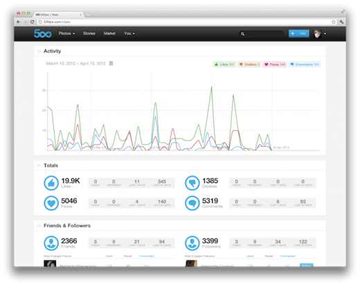
Pretty graphs from 500px

500px has just announced a subscription package in between its free-forever-but-somewhat-limited membership and its all-singing-all-dancing-$49.95-a-year-Awesome service. Called the slightly-less-than-inspired Plus membership, it costs $19.95 a year and offers almost everything that Awesome does, barring the 'personalised portfolio'.

That means you can upload as many photos as you want (uploads are limited to 10 a week with the free service), it allows you to sell your images via the 500px store (something you can do with free memebership), it provides you with the ability to collate your images into collections, sets, or stories, and it gives you access to advanced statistics on your images. Yes, it is all rather similar to Flickr's Pro membership, and comes in about $5 a year cheaper, too.

The analytics includes the basic stats that you'd expect: the number of likes, dislikes, favourites, and comments that each of your photos receives over a time period of your choice. However, it also allows you to analyse who are your most engaged followers and friends and shows you which were your most popular images. And it comes with an interactive graph. Being a sucker for graphs and pie-charts, this is the bit that I like the most.

For anyone who is in the slightest concerned about Flickr's longterm future, 500px is looking increasingly like a viable alternative. You can check out the site here, and the membership options here.

Facebook and Instagram sitting in a tree

Honestly, when I woke up this morning and saw that Facebook had forked out a mind-blowing $1 billion for Instagram, I had to do the BBC-thing and verify it from three independent sources. That one of my sources was the BBC didn't matter. Still, there it was in MacBook screen technicolour.

Last week, when I asked what was next for Instagram, I mentioned that it was taking slow and carefully placed steps towards social media domination. Over 30 million people were sharing their lives photographically through the app, and it was set to grow, and grow, and grow. Facebook was hardly going to be ignorant of this, and there was no better means of keeping their photo-sharing enemy closer than by gobbling it up. Even if Facebook wasn't concerned for Instagram's independent rise, which I doubt, the prospect of another company laying its grubby mitts on the 30 million subscriber prize would have been enough to motivate it to make Instagram an offer it couldn't refuse.

Zuckerberg has been quick to point out that Instagram will continue to be developed independently of Facebook and that users won't be forced to share their images on Facebook or prevented from sharing them via any other means of social media: 'We plan on keeping features like the ability to post to other social networks, the ability to not share your Instagrams on Facebook if you want, and the ability to have followers and follow people separately from your friends on Facebook.'

Kevin Systrom echoed similar sentiments on his blog over at Instagram: 'You’ll still have all the same people you follow and that follow you.You’ll still be able to share to other social networks. And you’ll still have all the other features that make the app so fun and unique.'

I'm terribly cynical when it comes to Facebook - that's not something I've ever kept secret - so whilst it may remain the case that Instagram users need have no obvious and overt relationship with Facebook, it's still Facebook at the top of the foodchain with its talons firmly embedded in its photo-snapping prey. Also, I wouldn't be surprised if a little further down the line sharing photos to Facebook becomes a default and sharing to other networks just that tiny bit harder. But I am a cynic.

I'm not the only one, though; there has been a clutch of people jacking in their Instagram accounts in protest. It's highly doubtful that out of Instagram's 30 million users there will be more than a handful of dissenters, so their impact won't be more than a drop in an ocean. However, for a lot of people Instagram's appeal was its simplicity - just a photo and a filter. That's the one thing that Instagram and Facebook need most definitely to hang on to.

A photo competition for April!


For April we'd like to see your photographs of glass vying for the top spot in our competition pool. (Don't ask me how I came up with the theme; I don't know.)

So perhaps you'll photograph an interestingly lit wineglass, maybe some delicate Venetian glass perfume bottles will catch your eye, or a window could be just the thing that gets your creative juices flowing. As long as the photo features glass, it's eligible.

The super team at Fracture are providing a 12" Fracture for the talented winner.

The competition opens today (Thursday 5 April) and runs until Thursday 26 April 2012. Entries should be submitted to the Small Aperture Flickr pool, but please remember that it is one photograph per person. Thank you.

The Rules have been produced below, for your reference:

The Rules

  • If you decide to enter, you agree to The Rules.
  • You can’t be related to either me or Haje to enter.
  • One entry per person – so choose your best!
  • Entries need to be submitted to the right place, which is the Small Aperture Flickr group.
  • There’s a closing date for entries, so make sure you’ve submitted before then.
  • You have to own the copyright to your entry and be at liberty to submit it to a competition. Using other people’s photos is most uncool.
  • It probably goes without saying, but entries do need to be photographs. It’d be a bit of strange photo competition otherwise.
  • Don’t do anything icky – you know, be obscene or defame someone or sell your granny to get the photo.
  • We (that being me and Haje) get to choose the winner and we’ll do our best to do so within a week of the competition closing.
  • You get to keep all the rights to your images. We just want to be able to show off the winners (and maybe some honourable mentions) here on Pixiq.
  • Entry is at your own risk. I can’t see us eating you or anything, but we can’t be responsible for anything that happens to you because you submit a photo to our competition.
  • We are allowed to change The Rules, or even suspend or end the competition, if we want or need to. Obviously we’ll try not to, but just so that you know.

If you've any questions, please just ask!

Should you do a photography degree?


I was browsing Quora the other day, and found an awesome question: What's the benefit of studying photography? At first, I just answered 'Not much'... But then I erased those two words, and let things get a little bit out of hand. Enjoy:

Let's take the first things first: Having a degree in photography doesn't make you a photographer. Taking photos makes you a photographer.

With that out of the way, let me start by answering with an anecdote: I studied Journalism in university, as an undergrad. I have to say, it was the biggest waste of time of my life.

On the flipside, it did give me an 'excuse' to spend a lot of time on other projects. Since I was a 'student', nothing was expected of me - other than being a student- and the three years I spent in Uni were incredibly productive - just not in terms of university work.

After University, I was utterly demoralised, and decided I would never work in journalism again, so I set up as a photographer. I was able to snare a few early client, and ended up doing quite a lot of work as a photographer - some fashion work, some architectural stuff, etc. I also started blogging about photography.

You learn best when you're curious...

As a photographer, I am completely self-taught. As a journalist / writer; well, I do technically have a degree in Journalism, but I wouldn't say that it was useful in any way, shape or form. The academic parts of my degree were interesting from an academic standpoint, but they were completely useless to my career as a journalist. The practical aspects of my degree were so far removed from the real life of a journalist, that they were completely useless.

I think I can very safely say that everything I know about writing and photography, I've learned outside of formal learning - and I guess, given that I currently write about photography for a living, I must have done pretty well at both of them.

Mark Twain said: I never let school get in the way of my education. I think that's a pretty healthy path to take.

By all means; if you're interested in having 'MA' behind your name, do it. If you think you are interested in the academic side, and want to study photography from a historical, or a social point of view, knock yourself out.

If you want to be a photographer? I wouldn't bother with a degree.

You learn to be a photographer by taking photos. Be the best photographer you can be: Start by emulating others. Find your favourite photos on Flickr, and recreate them. Then, add your own slant. Make them better. Make the style yours. Combine, create, develop. Work on the artistic side of your photography (the ideas). Work on the technical side of your photography (turning your ideas into photographs). Work on both at the same time. Keep challenging and pushing yourself.

Once you know how to take good photos, you need connections to be able to do anything with the photos. Whether you want to have fine art exhibition, you want to start selling your pictures to magazines or agencies, etc etc etc, it's all about the connections you're able to make.

Making connections is hard, but it's a skill that's completely unrelated to the photography side of things; so whatever you do, don't do a degree just to make connections. Drop an e-mail to your favourite photography blogger. Go to a local Flickr meetup. Go to small photo gallery openings locally, and start talking to people. Show off your work to anyone who'll take a look, and get some feedback. Talk to people, submit your photos to magazines, get your local pub to hang a couple of your photos on the wall, create a website, get active on DeviantArt, Flickr, etc... Get involved.

Success as a photographer doesn't happen overnight. Hell, it doesn't happen over many nights. I know many extremely talented photographers who never got a break - but to be honest, I also know many mediocre photographers, who believe they should have had their break a long time ago. I don't have the heart to tell them that they've got a long way to go before their work is where it needs to be, in order to break through in an incredibly competitive market.

This is where being self-critical and being able to critique your own work comes in: It's not easy, but it'll be one of the most powerful tools you have available to you.

So... Doing a degree or not? I wouldn't.

But whatever you do... never give up.

Flickr introduces Aviary as its replacement image editing suite


When Google announced that it was pulling the plug on Picnik - its free, web-based image editing service - millions of us were left wondering just what we'd use to replace it, and that included photo-sharing behemoth Flickr. Picnik was Flickr's in-house photo editor. You clicked on 'Actions' above any photo and there it was, towards the bottom of the list, 'Edit photo in Picnik'. From 19 April, though, that wouldn't be an option.

A saviour has swooped down to rescue millions of Flickr users from the ignominy of badly cropped photos and skewed white balance: Aviary. From Thursday 5 April, Flickr will begin to implement New York-based start-up Aviary as its default editing suite.

When Flickr began its search for a replacement editing service, it sought the opinion of its members, who came back with two primary demands: speed and simplicity. People wanted to be able to load a photo and have it ready to edit. They also wanted to be able to make their changes with the minimum of fuss. Aviary provides just that.

Users can make alterations to all the aspects of an image you'd expect - such as crop, colour, and contrast - but it also lets you add stickers and text and apply filters. A click here and a click there, and it's done and your photo is back in your photostream, looking more gorgeous than ever. Aviary's real clincher, though, is that it's built using HTML5, meaning that it is iPad-compatible.

Flickr's anticipating that the roll-out process could take up to two weeks to reach every user. I'm looking forward to giving Aviary a whirl when it appears in my Actions menu!

A stunning silhouette for March

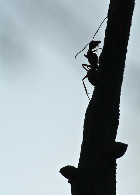
Thank you, everyone, for your fantatsic entries in our silhouette-themed photo competition. What a stunning collection of photos made their way into the Flickr pool. The winner, though, is this stand-out image, Ant on a twig:

Ant on a twig

Oh it's a simple photo, but it has been tremendously well executed. The detail and sharpness of the ant is superb. It's a wonderful example of a silhouette. Congratulations Drew Eldridge!

The lovely people at Fracture are kindly providing a 12" Fracture as a prize for Drew.

April's competition will be opening within the next day or so, so please keep tuned for that. Don't forget, though, that you can always keep up-to-date with the latest competition news - and other photographic shenanigans - by following @SmallAperture on Twitter.

Instagram's made it to Android. Now what?


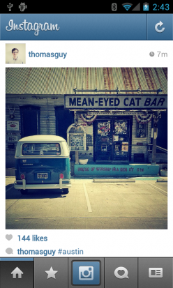
How the feed looks

Instagram - the dastardly easy photo-sharing app - has been a darling of the iPhoneography community since its launch in October 2010. It had over one million subscribers within a month and two million within six weeks, all snapping photos, applying filters, and sharing them with the world via a live stream. Now, it has in excess over 30 million subscribers and over 5 million photos are uploaded every day. But anyone with an Android phone couldn't join in the fun because there wasn't an Android app. All the fun was reserved for iPhone-owners. Until today, that is, when Instagram launched its Android version. At last, anyone with a camera-phone running Android 2.2 or above with support for OpenGL ES 2 can download the app, for free, and start snapping and sharing.

If you're wondering just how left-out the Android crowd were feeling, there were over 430,000 people who'd signed up to the Instagram-for-Android waiting list.

Whether this is just people jumping on a bandwagon or they are genuinely excited to be able to share snippets of their days photographically, it doesn't really matter. The numbers are incredible. All of Instagram's numbers are incredible.

The same team who built the app for iOS also worked on the Android incarnation, with the intention of making the experience as similar as possible between the two platforms. Although there are a couple of features missing from the Android version that are extant on the iOS version (Tilt Shift/Blur, Share from Feed, Live Preview and Share to Flickr), they should be coming soon; but the filters and the community are the same. There're no features on the Android app that aren't on the iOS version, and this is something that Instagram intends to maintain.

So apart from ironing out a few kinks in the system and bringing the Android app completely up to speed, where next for Instagram? They're being pretty reticent about the future: 'We have nothing to announce at this time, but we are always actively considering ways to expand Instagram's utility to everyone in the world.' That could mean bringing it to other phones, but it could also mean making an app suitable for all those millions of beautiful tablets that are sliding their ways into people's bags and onto their coffee tables. Wouldn't that make sense?

Wherever Instagram goes next, I can't see it being in a hurry - after all, it took over a year to develop a non-iOS app - but if it's even half as eagerly anticipated as the Android version, then the astonishing rise of the photo-sharing app will take another - slow, but carefully placed - step towards social media domination.