Instafax: BBC news via Instagram video

Here in the UK, you'll hear the BBC referred to as 'Auntie'. There are a few different explanations flying around for the moniker, but the consensus is it derives from the slightly prudish and reserved, 'Auntie knows best' attitude that the corporation had in its early days and well into the 1950s. Now, 'Auntie' is far more a term of endearment, and it can't really be said that the Beeb doesn't innovate. Over the next month the BBC is experimenting with delivering news via Instagram, a venture it's calling 'Instafax', a reference to the late departed text news service, Ceefax. Three times a day it'll post a 15 second video to its BBC News Instagram account.

The videos feature news footage overlaid with text and a music backing. Even if you can't listen, you can still access the salient issues before following through to the full story on the BBC website, or moving on to the next image in your Instagram feed. I've noticed some commenters have found the text a distraction from the footage and would prefer a more news-dense voice-over. I'm going to whisper this because it probably makes me some kind of new media pariah, but I'm not a fan of video content as I find it instrusive. The Instafax hybrid seems to be compromise and one that I like. As BBC person put it:

The idea behind not having a voiceover is that you don't have to have the sound on to understand the video. Additionally, it significantly cuts down on the amount of time the videos take to produce. If we decide to continue producing these after one month, we may consider having both a voiceover and on-screen text.

Why three videos a day? No one wants a feed overwhelmed with BBC news stories.

Doubtless someone, somewhere will be lamenting the demise of longform journalism and decrying the dumbing down of the news, but I'm rather impressed by the BBC's diversification and willingness to embrace social media. It's a pilot that I'd like to see taken up. You can keep up to date by following the BBC's Instagram feed.

(Headsup to DesignTaxi)

Just a fantasy or an unrealistic depiction of perfection? Dunham, Vogue, Jezebel, and now Leibovitz

I don't watch Girls and I don't read Vogue, so the recent controversy involving Girls' Lena Dunham and her appearance in the glossy magazine failed to catch my eye. However, when Amateur Photographer reported that Annie Leibovitz is threatening legal action over the unsanctioned publication of the shoot's original image files, my interest was piqued. Dunham appeared on the cover of, and inside, American Vogue's February edition (we weren't treated to her here in the UK) in a shoot by Annie Leibovitz that raised plenty of eyebrows and plenty of questions. Some people were perplexed by the apparent clash of principles when a feminist role-model could appear in and on the cover of a magazine that is famed for its stylised and heavily post-produced shoots. Other people wondered why Vogue had opted for a head-and-shoulders shot of a woman known for not being the archetypal Hollywood stick-instect, rather than the usual full-body shot for its cover. And some people just worried about the Photoshop job.

One of the publications most vocal about Dunham's dalliance with Vogue was Jezebel, the feminist blog. Jezebel is highly critical of Vogue's use of idealised, unrealistic images of women that are presented as objections of perfection. While it supported the notion that Vogue could feature a woman who was not its usual front page fodder, it was critical of Dunham being tweaked to make her acceptable for that role: 'Dunham embraces her appearance as that of a real woman; she's as body positive as they come. But that's not really Vogue's thing, is it? Vogue is about perfection as defined by Vogue, and rest assured that they don't hesitate to alter images to meet those standards.'

Jezebel then offered a bounty of $10,000 for Leibovitz's original, unedited image files of Dunham so that it could do a compare-and-contrast. From Jezebel's perspective, this wasn't intended to shame Dunham or criticise her for working with Vogue, although even if it wasn't intentional it's still easy to construe it that way. It's a topsy-turvy version of damning with faint praise. When Vogue is renowned for its fantastical presentation of women, why pick on Dunham's shoot to explore how far it will go if it isn't intended as a criticism of her actions?

Nevertheless, Jezebel got what it asked for.

Compare and contrast

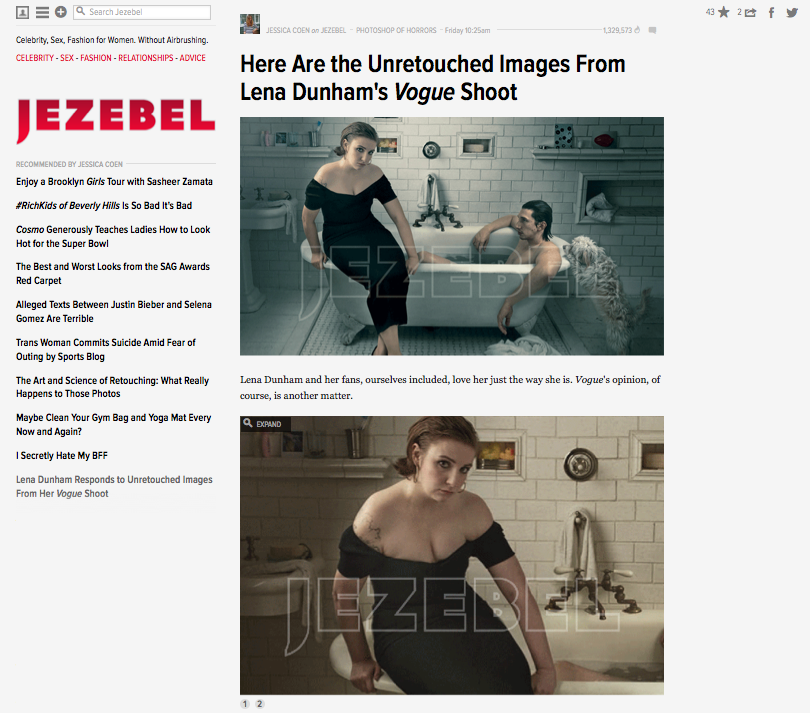
Someone, somewhere, produced the original images and Jezebel was able to lay them side-by-side with the edited versions. Were they extensively retouched? Retouched, definitely. Extensively? That depends on your definition of the word. There's a whole lot more adjustment going on there than I'd make to one of my photos, but I don't shoot for the cover of Vogue and I'm not in the habit of photographing TV stars with pigeons on their heads or posing on the sides of baths wearing evening gowns. As Dunham said to Slate: 'A fashion magazine is like a beautiful fantasy. Vogue isn't the place that we go to look at realistic women, Vogue is the place we go to look at beautiful clothes and fancy places and escapism... '

The furore of whether Dunham should or shouldn't have posed for Vogue, whether or not she's betrayed the feminist ideals that so many seem to have ascribed to her, and just how much alteration the images have undergone has now taken a new twist. For Annie Leibovitz is reportedly extremely unhappy that the unretouched images have made their way to publication and is considering legal action. Precisely what legal action she intends to make, against whom, is unclear. But sources close to Leibovitz claim that she would never have sanctioned the publication of the original images. Vogue has declined to comment and Jezebel has stated that it obtained the images via an anonymous source.

What do I think? I studied history at university. Then I trained to teach it. And I taught it for a bit, too. I'm often asked how I can bear to watch historical dramas without picking holes in their accuracy. My answer is always the same: 'It's a story, not reality.' I don't advise that anyone should take medical advice from a BBC hospital drama, either. When I glance at Vogue, or any other glossy magazine, I treat it in much the same manner. It's a fantasy that deserves the same suspension of disbelief as a film or TV show. It doesn't matter if it's Vogue or Homes and Gardens, it's not reality. When you've resurfaced from your dive into stylised perfection, that's what you need to remember.

(Headsup to Amateur Photographer)

Fujifilm teases its new X-mount camera

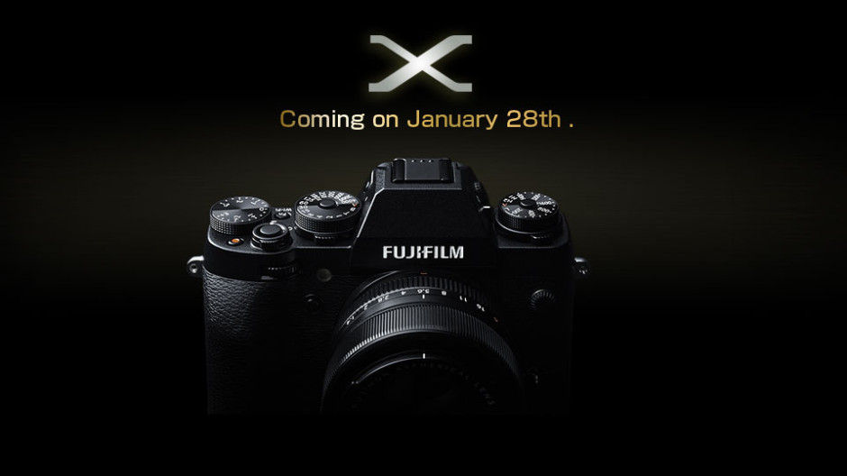
It's not a leak; it's a teaser. Fujifilm has posted an image of a new X-mount camera to its website and the line 'Coming on January 28th.' Here, you can see it for yourself: Coming on 28 January. (Ahem.)

Apart from what we can see of the retro-esque design that Fuji's made its trademark (dials to control exposure compensation, shutter speed, and ISO), there are rumours that it will be weather-sealed, have a 16 megapixel APS-C sensor, and be called the X-T1. There're also a few murmurings about it taking on Nikon's retro-looking, video-free, full-frame beast, the Df. We'll wait to see; it's due out next Tuesday.

Fujifilm's X-mount teaser

Paramount Pictures makes the digital-only distribution switch in the US

According to a report in the Los Angeles Times published over the weekend, Paramount Pictures has announced that it has ceased to distribute films in analogue format in the US. Anchorman 2: The Legend Continues was its final 35mm format release and The Wolf of Wall Street has been a solely digital release. This transition to digital-only distribution is hardly unexpected. Both Disney and 20th Century Fox have communicated the expectation of digital-only content within the next few years to cinemas. Now that Paramount has set the ball rolling, it could happen sooner rather than later.

What of the impact on cinemas? First of all, this distribution decision applies only to US cinemas. In regions where analogue projection is still the norm, 35mm imprints will still be sent. Second, about 92% of cinemas in the US are capable of projecting digitally distributed content. For the remaining 8%, the cost of replacing their analogue projectors with digital projectors will be in the region of $70,000 per unit. For some smaller community-led cinemas, this could sound their death-knell.

At roughly $2,000 to produce a 35mm print and $100 for a digital print, studios' preference for digital format is obvious. Even if it does leave those who favour analogue prints reeling.

(Headsup to Engadget)

Stand on the spray-painted feet for superior snaps of San Francisco (and New York City)

If you're to wander through some of the more touristy areas of San Francisco and New York City, you might notice some bright yellow stencilled feet, spray-painted onto the pavement, and the exhortation to 'Place feet, point and click.' They're part of Mimi Chan's and Utsavi Jhaveri's #NoShittyPhotos project, aimed to help visitors snap the best possible archetypal touristy photos in the cities. Chan and Jhaveri were students at Miami Ad School and they decided that they could do something about the plethora of photos that people try to take of the most famous landmarks and monuments in San Francisco and New York City, but come out looking not-so-great. They could mark out the optimal places to stand to capture the Golden Gate Bridge and the Flatiron Building. No more ugly Instagram feeds, and #NoShittyPhotos.

In the process of spray-painting their tourist aids, Chan and Jhaveri narrowly escaped being caught vandalising at least once and quite a few of the NYC markers have since been removed by ant-graffiti vans. These guys would have a great deal of fun looking for the perfect spot to shoot in London, but they'd certainly be at the mercy of the law, and more concerningly, private security firms.

As for the concept, of course we don't want everyone's photos to look like clones, but if people get better photos because of a helping hand, I'm in.

(Headsup to DesignTaxi and Mimi Chan's site)

Lolloping around with a Lollipod

Just before Christmas the lovely guys at Lollipod sent me an ice blue version of their lightweight, compact, multi-functional support device to test. The Lollipod can't withstand anything that weighs more than 420g, but that makes it perfect for mobile phone photography and compact cameras, and it can be used a sound boom, too. I've given it a go with my Canon S95, which attaches to the Lollipod directly, and my iPhone 4, which attaches using Lollipod's additional spring-loaded adapter. (You can use a Joby Griptight, too.) Lollipod

The good

The Lollipod really is light. I took the liberty of plonking it on the kitchen scales and it weighed in around 275g, or 9oz. So much of the appeal of smartphone or compact camera photography is that it's convenient. You don't want heaps of weighty (and expensive) kit when your camera fits in your pocket. However, there are occasions when you want to be able to steady your picture-taking device, for example when you're taking night shots, or self-portraits. Schlepping around something designed to take a dSLR might be overkill, but the Lollipod isn't.

Secure an iPhone with the Lollipod adapter

When it's fully retracted, the Lollipod isn't any more than 33cm (just over one foot) long. That's small enough to put in a daypack, a messenger bag, or even one of my larger handbags. Combined with its light weight, that makes the Lollipod supremely portable.

I was also impressed by the screw mechanism that secured your compact camera or the mobile adapter to the Lollipod. It's integrated into the Lollipod, so there's no ferreting around to find something to screw a plate into the camera or adapter, or even a plate to lose.

A built-in screw mechanism keeps things neat

Extending and retracting the Lollipod is quick and easy. There are no locking mechanisms: everything just slides in and out. Despite my initial concerns that this could result in the Lollipod retracting into itself, that never happened. After all, neither my camera or phone were that heavy and you're not meant to put anything weighing more than 420g on a Lollipod.

See? Very compact.

The not-so-good

Being so light means that the Lollipod isn't always as stable as it could be, especially when it's fully extended. Unless I set the self-timer on my compact camera it was quite difficult to capture an image without camera-shake. I had much more success with my iPhone, though. It is possible to weight down the Lollipod—you use the carrying case that comes with it, and something like a water bottle or handy rock—but I'd still be apprehensive about using it in windy weather. Without independently adjustable feet, it wouldn't be stable on uneven ground, either.

If you're accustomed to the flexibility of motion in a standard tripod head, you might feel restricted by the Lollipod's limited movement. It can only move through one axis, so you'll need to decide between setting your device so that you can switch between portrait and landscape, or so that you can tilt it. Tilting with a camera on the Lollipod wasn't a problem at all, but I didn't feel that my iPhone was sufficiently secure in its adapter for that.

In conclusion

When you're accustomed to a heavy-weight tripod with a head that moves in almost any direction imaginable, the Lollipod feels incredibly limited and restrictive. But that's comparing apples with oranges, really. The Lollipod has been designed as a lightweight, flexible support, and it fulfils that brief. If you need to stop your camera from shaking when taking photos in the dark, it'll do the job. If you want something to have a go at self-portraiture with your phone, it's great. If you need a lightweight and portable support for a small camera or smartphone, that's exactly what it is. Just don't try it out in a force nine gale.

Lollipods are available direct from Lollipod and cost £30.

Adobe unleashes some new Photoshop tools

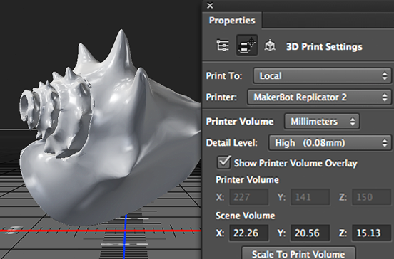
Adobe has announced an update to its Creative Cloud suite of applications, and with it some new tools for Photoshop. Headlining the update is the integration of 3D printing capability into Photoshop. It should now be possible to design print-ready 3D models from scratch or to refine existing models and then send them to a locally connected 3D printer or make use of new partnerships with MakerBot and Shapeways to have them print 3D creations. If you're not so exciting by 3D printing as Adobe is (or perhaps wondering why 3D modelling is included in an image manipulation package), Adobe has also brough Perspective Warp and linked Smart Objects to Photoshop.

Print to your own 3D printer, or connect to a commercial one!

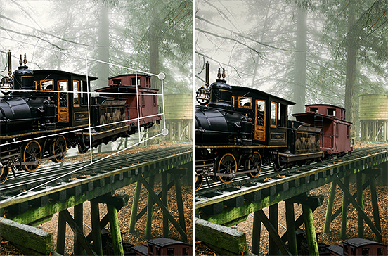
Perspective Warp is able to manipulate an image to alter the standpoint from which a subject is viewed. That could have particular creative uses when playing around with composites, but more general practical advantages to correct distortion in lenses.

Perspective warp: great for surreal creations, or just correcting lens distortions

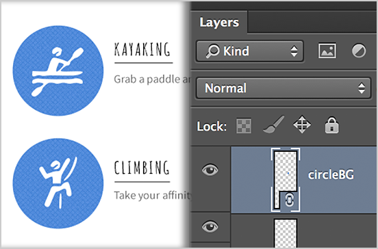
Linked smart objects should improve collaborative processes by automatically updating a final design (for example a poster) if a file contained in it (a photograph, for instance) is amended or updated. No longer will the old version of the photo need to be removed and replaced with the new edit.

Re-edit a linked smart object and it'll autimatically update in a final design

In line with the subscription model, these applications, together with those made to InDesign and Illustrator, will not have to be paid for and should be available for use as soon as Creative Cloud updates.

The ZSL Animal Photography Prize 2014 is now open!

The Zoological Society of London's Animal Photography Prize is now in its third year and open for entries. Seeing as you have to pay to submit your photos to the adult competition, we'll focus on the under-18s competition, which is free to enter. There are six categories and young photographers can enter one image into each. Each image needs to be different and they must relate clearly to the category into which they've been submitted. The categories are: The Perfect Moment, which rewards the patience needed to capture a stunning shot; Last Chance to See?, a focus on threatened habitats and endangered species; Weird & Wonderful looks for EDGE species, amazing adaptations, and unexpected surprises; Size Matters covers photos from the massive to the microscopic; The Birds and the Bees is for avians and invertebrates; and Deep & Meaningful is devoted to anything aquatic.

The junior winner of last year's Deep & Meaningful category: Knotted, by Connie Beith

The judging panel includes television presenter Kate Humble and ornithologist Bill Oddie. The photographers of the images that they deem to be best in catoegory (one for each), will receive two complimentary tickets to the presentation ceremony and preview evening in London, a personalised certificate, and £250 in prize money.

The young person whose image is awarded the 'Judges Choice' for overall winner will receive a certificate and an additional £500 in prize money.

To be eligible to enter the young person's competition, you need to be under 18 years of age on the competition's closing date: 1 April 2014.

All of the details are on the ZSL website, and as always we advise you to check out the terms and conditions.

Moment wants to bring more variety to smartphone additional lenses via Kickstarter

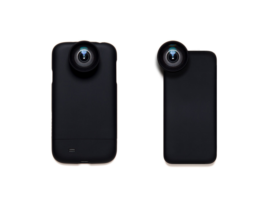
How many different lens manufacturers can you name in the next ten or fifteen seconds? Quite a few, I bet. We're accustomed to being able to choose between our camera manufacturers' lenses as well as third party lenses manufactured by the likes of Sigma, Tamron, Tokina, Samyang et alios. Now that smartphones are the snapshot-camera-du-jour, and a vertaible feast of apps and accessories are springing up to help people make the most from them, why not a selection of additional lens manufacturers? Moment is aiming to bring some diversity to the smartphone lens accessory marketplace with its Kickstarter project that launches today. If it successfully raises $50,000, it should be shipping wide-angle and telephoto lenses, suitable for iPhones (4s, 5, 5c, and 5s), iPads (third and fourth generation iPad 2), and Samsung Galaxy smartphones (S2, S3, and S4), to its backers around June 2014.

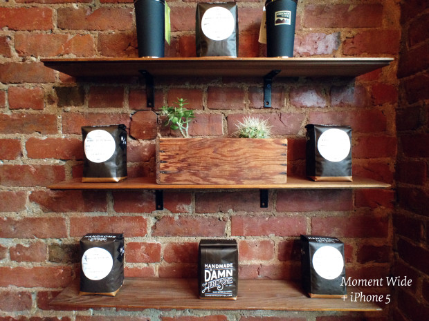
Available for iPhone and Samsung Galaxy phones

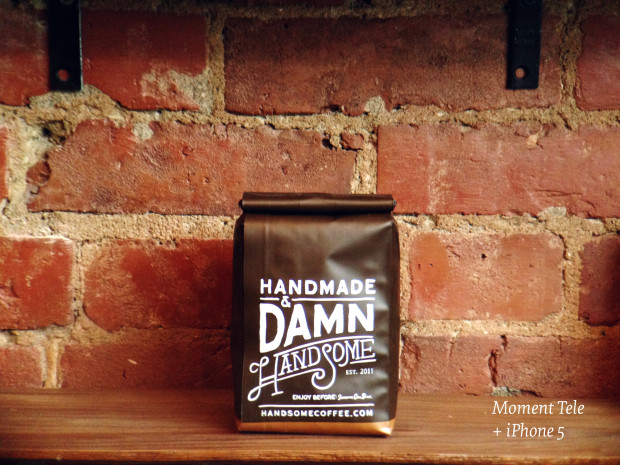
The wide-angle lens offers a 35mm equivalent focal length of around 18mm (it varies slightly according to phone model); the telephoto lens' focal length equates to approximately 60mm, again depending on the smartphone model, in 35mm equivalent. Pledge $49 and you put yourself in line for one lens; $99 will secure you a pair.

iPhone 5 + Moment tlephoto lens

The mounting mechanism attaches a metal plate to your phone—either with or without a case—and to this you secure the lens with a bayonet fitting. The Moment team thinks, after lots of prototype testing, that this is the easiest, quickest, and most secure mount around.

And with the wide-angle lens

Moment is convinced that it offers the best quality lens you can attach to a smartphone. Some of its developers have worked in the manufacture of cinema lenses, and they've applied that knowledge to Moment's smartphone attachments to minimise distortion and chromatic aberration and maximise sharpness. Without a model to test, you have to take the manufacturers' word for it; but that's the gamble of Kickstarter.

You can check out the Moment video down below, or wander over to its Kickstarter page for a closer look!

Update! Moment reached its Kickstarter funding goal in under 24 hours. But that shouldn't stop you from taking a look!

After the competition, here's how the cover of Social Photography looks

In November last year we ran a competition, together with the Ilex Press, to find a photo to add to the front cover mosaic of my forthcoming book, Social Photography. So many fantastic entries were submitted to the pool that we found ourselves selecting two winners, who were announced in December. After a little rearrangement by Kate the Designer, there's now a gorgeous final version of the cover! social photography cover

In case you're wondering, Elisa's photo is in the top left corner, the very first image on the cover; Ben's is the third image down in the fifth column across. It's definitely worth checking out their Flickr streams, too!

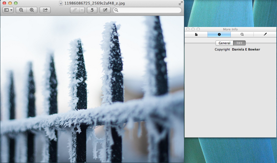
Google's just made it easier to search for images according to licence type

'I found it on Google, so that makes it alright!' No, no, and no. Just because you found an image on the Intergoogles does not make it free to use. How many times have we been through this? I've lost count, I'm sure. It's simple: unless the copyright owner says otherwise, you can't use her or his photos without permission. There are some images that are free to use, but you have to search for them specifically. Thankfully, Google has just made that easier. To be fair, Google Image Search has allowed for refined searches for quite some time, but now they've made it more obvious and easier. Hit the 'Search tools' button and it presents a series of drop-down menus that allow you to select the size, colour, age, file type, and licensing options for your desired image.

Define which type of licence you need in your search

Searchers can choose licences covering available for reuse, commerical reuse, reuse with modification, and commercial reuse with modification. So whether you need a poinsettia to illustrate a blog post or a giraffe to add to a surreal composite, the search tools to find them are at your fingertips.

According to the tweet from Googler Matt Cutts, the suggestion for the refinement came from law professor Lawrence Lessig, who's heavily involved in the Creative Commons movement.

It will still be incumbent upon anyone wanting to reuse an image to double-check its rights and ensure that they comply with any caveats, for example proper attribution, that might be ascribed to it. However, together with Bing's refined image licence search, there are fewer and fewer excuses of the whine of 'But I found it on the Internet!' when it comes to image theft an misuse.

(Headsup to Dave Stevenson and the Google blog)

Snapchat spam gets an apology

Following revelations over Christmas of a potential software vulnerability in its 'Find Friends' service that could allow its users' names to be linked with their phone numbers and a subsequent security breach around New Year, the last thing that ephemeral-image-sharing app Snapchat needs is another bothersome bug. Especially when it was veeeerrry slow to offer an apology and a fix to the first one. But that's just what Snapchat's got. This time, its users are reporting the receipt of unusually high numbers of spammy 'snaps'. Snapchat's developers are insistent that this incident is in no way related to the festive season 'Find Friends' vulnerability and they're working on a fix for it. They've also apologised for the inconvenience, which is a definite improvement on last time. However, until they can push through an update, the best advice on offer for users to adjust their settings so that only their friends can send them snaps. There's no means to report a Snapchat spammer, only block her or him, but maybe with this spate of spam, a solution will emerge.

(More details on the Snapchat blog)

Who wants to conform? Choosing an app for rectangular Instagram images

Instagram images are distinctive because of their filters and their square crops. They're the first two elements on the Instagram Spotter's Guide. But who wants to be forced to conform and always have to slice off the sides of your photos and submit a perfect square? Exactly! An entire industry has grown up around the Instagram phenomenon, encompassing everything from postcards to marshmallows, and it includes a goodly selection of apps that add a border to your rectangular photos that'll ensure they look square when imported to Instagram. (And if you choose a coloured border, it empahsises how the image is, in fact, square.)

I road-tested five of these apps. If I had the choice of a paid or a free version, I always went for the free one, which meant that one of my judging criteria was how intrusive or distracting the ads were. Otherwise, I was looking for an intuitive interface and something that didn't run too slowly. Thus, in order of preference, I present the Oblong Collective.


Instacrop logo

=1. Instacrop

iOS-only, free

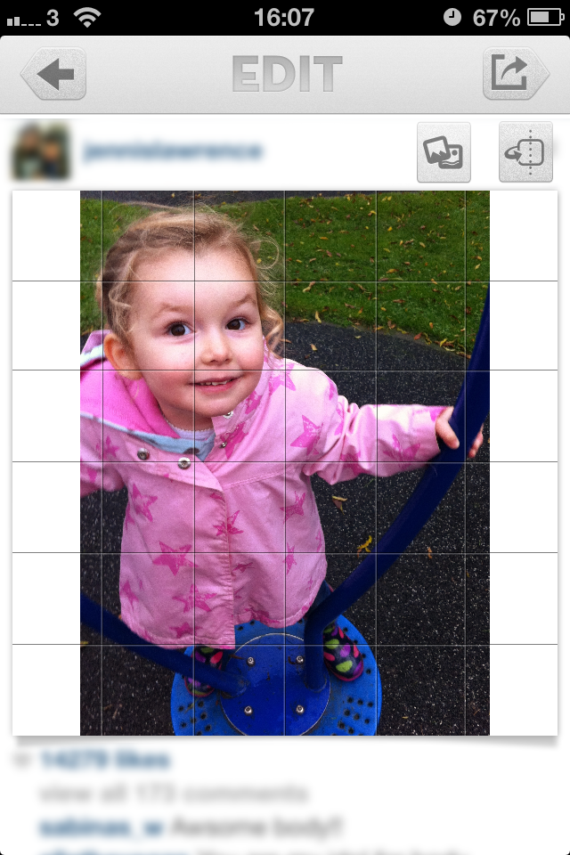
With no frills and a desperately simple interface, Instacrop comes joint top of my list. Tap to select a photo from your camera roll, hit share to select from Instagram or EyeEm, and you're done. If you're so inclined you can select from paid-for border colours. There are banner ads at the bottom of the screen and a pop-up ad before you can share your photo, but I didn't find them too instrusive.

No-frills Instacrop


Instasize logo

=1. Instasize

Android and iOS, free

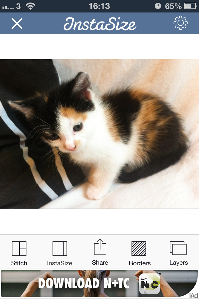
As well as allowing you to post rectangular images to Instagram (and Facebook and Twitter), Instasize allows you to create diptychs and triptychs, overlay a filter or text, and choose from a huge variety of borders. I didn't find the ads too distracting and the app didn't run too slowly, either. It shares top spot because if you're looking for a bit more functionality than just rectangular images, it has it.

Lots of options with Instasize, and still easy to use


NoCrop logo

3. #NoCrop

Android and iOS, free

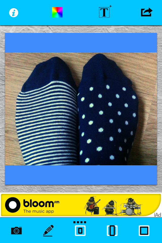
As with Instacrop, it's a case of tapping to import an image from your camera roll and then tapping to share to Instagram, Facebook, or Twitter. You can email or save the image, too. #NoCrop gives you the option to adjust your border size using a pinch-to-zoom motion or to reposition your image in the frame. This one is also ad-supported and they pop-up every now and again.

Middle-of-the-road with #NoCrop


Squaready logo

4. Squaready

iOS-only, free; Squaready Pro, £1.49

Squaready gives you lots of options to borderise your images: let it do it for you with an instant adjustment, choose from three different sized borders, or pinch-to-zoom to alter it yourself, and then select a border colour. There're are options to edit your images with Camera+ or three other programmes, too. All of this sounds great, but I didn't find the interface as simple to use as Instasize and it was much slower, too.

Squaready: not as simple as it could be


Squaregram logo

5. Squaregram

iOS-only, free (There is a SquareGram for Android, but it's developed by a different company.)

My first encounter with Squaregram did not end well: I closed it in a fit of frustration. Apart from it running very slowly with lots of intrusive ads, the interface wasn't especially intuitive. I couldn't figure out how to remove a text box when I'd been experimenting with adding one, which really bothered me. I did give it another go, and I liked that I was able to choose a border colour and corner curvature, but it ddn't make up for how disappointing it was first time around.

Relinquish hope all who enter here!

If you've any pet apps for sharing non-square images to Instagram, let us know down there!

Will Toshiba be bringing Lytro-like refocusing to smartphones?

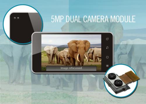
We've grown accustomed to the idea of photos that we can refocus after the fact thanks to Lytro's lightfield camera and to Nokia's Refocus app that takes between two and eight photos that you can play with to your heart is content. Now Toshiba has announced the first dual camera module designed for inclusion in phones and tablets, which is able to record depth data and well as an image simultaneously. The catchily named TCM9518MD comprises two quarter-inch five-megapixel CMOS camera sensors and a dedicated processor. This dual camera module can capture images where the foreground and background, and everywhere in-between, are in focus along with depth data for each object in the picture. Not only can the module allow you to focus, defocus, and refocus the images it produces, but it can generate 13-megapixel images by up-scaling images taken by its two cameras.

Focus and refocus with Toshiba's dual camera module

Andrew Burt, vice president of the Image Sensor Business Unit, added that: 'Not only does the dual camera module enable these advanced capabilities [e.g. refocusing] with fast digital focus and little shutter lag, the device doesn't require any focus motors, so it can be built much thinner than today's 13-megapixel camera modules.'

Toshiba has made sample modules available to smartphone and tablet manufacturers (they cost $50 a pop), so which devices will be the first to feature them?

(Headsup to the Verge, further information from PR Newswire)

The inimitable xkcd on taking photos

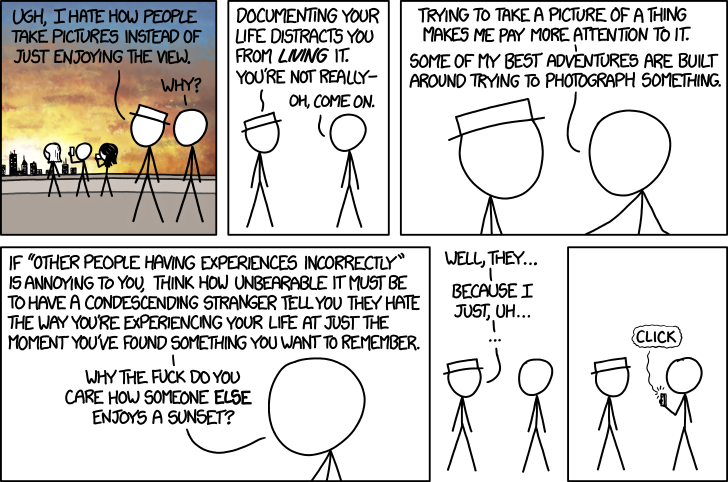
That whole debate about whether taking photos diminishes or improves your memory of events? I couldn't give a toss about it. Sometimes waltzing around a dancefloor with my brother to Sweet Caroline is a far better experience than taking photos of everyone else dancing. Other times, it's the act of climbing onto the shed roof in a floor-length skirt to take a picture of everyone singing happy birthday to my mother that forms the strongest recollection of an event. Use the camera or put it down: it doesn't really matter. You have to do what feels more important right then and there. But I do know that I'd rather not watch the entirety of a live concert via a four-inch smartphone screen and I certainly don't want my view obscured or enjoyment diminished by other people doing just that.

The wonderful xkcd sums up my sentiments perfectly. Thank you, Randall Munroe.

photos

Polaroid's novelty slalom

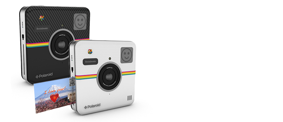
Polaroid has been showing off a few different products at CES, and not all of them cameras. However, photographically the interest has been in its square-shaped instant camera, the Socialmatic, and the tiny cube-shaped C3 camera. Neither of them is especially a mainstream product, but there are plenty of companies who can succeed in making a go out of the novelty factor. The skill is in marketing a product to which people can become easily attached, at a price that works. Has Polaroid accomplished this? The Socialmatic was announced some time ago; now we're told that we can expect it in the autumn and it'll cost $299. It has a 14 megapixel front-facing camera and a two megapixel rear-facing camera. It is built on an Android platform. It can share images over a wi-fi connection or via Bluetooth. And it can print sticker photos using its built-in ZINK printer. Along with its square shape, that's its killer feature that gives it desirability and the necessary degree of novelty. The question is, would you spend $299 on a novelty camera? Of course it is going to have appeal to some people, but I suspect they'll be limited in number. Continuing to use the smartphone that you already have and linking it up to a (much cheaper) Fujifilm instax SHARE SP-1 printer would make much more sense.

Print your social photos on the go

The C3 cube, on the other hand, seems to hold more appeal. It measures 35mm by 35mm by 35mm; holds a five megapixel camera with a lens that has a 120° angle of view; is waterproof to two metres; and it contains 2MB of internal storage that can be augmented with a micro SD card. There's a button to release the shutter and it'll cost $99. It's perfect for any sort of remote-controlled vehicle, for sticking to a helmet or set of handlebars, or for wedging in a corner. It's still a novelty device, but a more affordable one.

Snapchat: persona non grata at Eton

In a short interlude from CES coverage, we'll revert to some Snapchat chat (there's been a bit of that recently) and an amusing story that emerged out of Eton College—educator of Prime Ministers and future kings of England—over the weekend. Following concerns that some of its students might've been using the ephemeral messaging service to share less than wholesome photos, the college has blocked access to Snapchat via its wi-fi network. It's hoped that this move will encourage students to consider the ramefication of what they share and how they choose to share it. As Headmaster Tony Little told The Sunday Telegraph: '... we hope that blocking it on our network will at least make them think twice. This is part of our continuing effort to educate boys in the sensible use of technology.'

Of course, it won't prevent anyone who's determined to send or receive a salacious (or otherwise) image from flipping off wi-fi and using cellular data from doing the deed, but the delay might give them pause for thought.

(Headsup to Gizmodo)

Canon Powershot N100 - another attempt at being cool

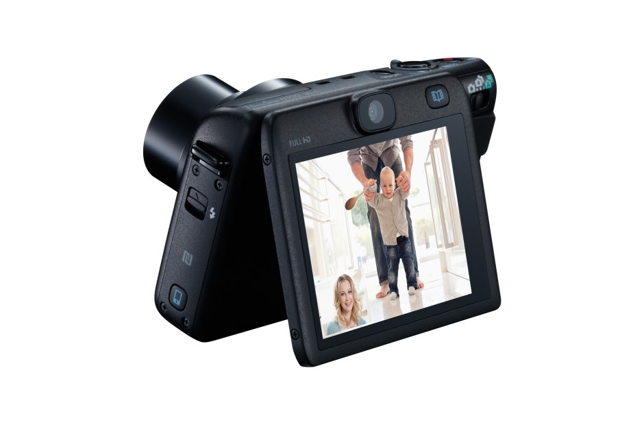
Canon has announced the Powershot N100 at CES: the idea behind it (or even in front of it), is that it's a camera that can tell both sides of the photographic story with simultaneous functioning front- and rear-facing cameras. After the launch of the Powershot N at CES last year, which appeared to be Canon's quirky attempt to lure smartphone users back to compact cameras (as if that were ever going to happen in a hurry), the N100 is more functional type of camera aimed at people who want to use photos to capture life in front of and behind the lens, and share it easily. My immediate reaction to the dual camera function is that I have absolutely no desire for anyone or anything to try to photograph me while I'm taking a photo. I'm usually pulling a face or sticking out my tongue in concentration (I have a habit of doing that). Canon, however, sees it as a way to ensure that you record your own reaction, either in still or video, to a situation that warrants it: baby's first steps, for example.

Smart Auto Technology has a bank of 58 different scene options to ensure that you make the most of your photo situations. There's the Hybrid Auto feature, too, which captures four seconds of video before you release the shutter when taking a still image.

The N100 tries hard, but is it getting anywhere?

There's also a Story Highlights mode that's meant to take the strain out of editing. It uses an algorithm to analyse all of your photos and create a highlights album organised by theme, date, or faces (if you've registered with the camera). I don't know about you, but I'd be concerned that the important photos, the ones that weren't quite perfect or captured something slightly abstract, would be overlooked and ignored.

The N100 has built-in wi-fi. It connects to smartphones using the Mobile Device Connect Button with NFC support, via Canon’s CameraWindow app. You can also back up your images to cloud storage sites or Flickr via the Mobile Device Connect Button in conjunction with CANON iMAGE GATEWAY. The CameraWindow app also gives you the option to remotely control the N100 directly your smartphone.

The N100 has more bells, whistles, and toys than you can shake a stick at, with modes such as background defocus and Creative Twist that lets you capture six different versions of one image. It has 46 different creative effects, grouped into four categories – Monochrome, Retro, Special and Natural – for you to pre-select from before you start shooting.

Tilting screen - always useful

Spec-wise, the N100 is powered by a DIGIC 6 processor with a 12.1 Megapixel 1/1.7" CMOS sensor. On the front it has a 24mm lens with 5× optical zoom. On the back, it's a 25mm lens. It'll cost £350 (or $349 if you're in the US). And it won't be available until May. May!

Oh Canon. I think you've done it again. I think you've tried to be quirky, fun, and innovative, but you've ended up looking like your great auntie Doris who's turned up to a party wearing clothes that were in fashion 20 years ago and are four sizes too small for her. I doubt that much here can tempt someone away from a smartphone for £350, or offer much that someone who's actively looking for a compact camera really needs. Given that it's not slated to appear until May, how many smartphones will be recording with front- and rear-facing cameras simultaneously by then? You have to give Canon some marks for trying, but not many for execution.

Want to take photos of the weather? Please be careful

The UK has been battered by high winds and heavy rain on an intermittent basis since the end of October last year. Powerlines go down, homes flood, and trains and planes are cancelled. We appear to be caught in a cycle of disruption and inconvenience followed by respite that's becoming increasingly trying and increasingly deadly. Sadly, it isn't just people who are in the wrong place at the wrong time whose lives are being taken by falling trees or rising waters. Today the search is resuming for Harry Martin, a photography student from South Devon, who went out to photograph the stormy coastal waters on Thursday and has not been seen since.

In excess of 200 people have been involved in the search for the young man over the weekend along a 20 mile stretch of coastline close to his family home at Membland, Newton Ferrers.

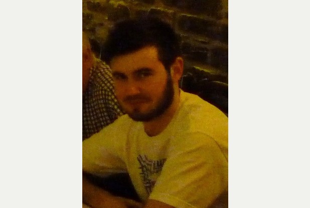
Harry Martin, last seen on Thursday. (Photo issued by Devon and Cornwall Police)

Inspector John Livingstone, of Devon and Cornwall Police, said that although the primary concern was that Harry had become lost on the exposed stormy coastline, it was always possible that he may be with friends. Being absent for this long without letting anyone know his whereabouts is, however, out-of-character for the young man who is studying film production at Greenwich University and was back home with his family in Devon for the Christmas holidays.

Waves of up to eight metres have been recorded off of Land's End, flats overlooking the seafront in Aberystwyth have been evacuated, and huge waves and more flooding are expected across the country today and tomorrow. All of this might look spectacular and make for very impressive photographs, but please be careful. I've done some ludicrous things to get photos before now, but they're never worth risking your safety, or those of people who might have to rescue you.

(Headsup to the BBC, additional information from the Torquay Herald Express)