Oi! You! No pictures!

istock_000000880427xsmall.jpg

A few months ago, I ran a story on how the UK government was trying to restrict public photography. It seems as if they’re now playing the back-pedalling game in a big kind of way. Once the petition hit 60,000 signatures, the Prime Minister’s office issued a statement which can be summarised into ‘uh, no, we never intended these kinds of changes to be made’.

What I really want to know: Do you have any stories of instances where people tried to stop you from taking photos? Leave a comment!

Have you ever been stopped from taking a photo?

View Results

It’s hard to tell if the guy who set up the petition was, in fact, petitioning the wrong people (the government wasn’t imposing restrictions, but private security firms might have been), or if the government have gone ‘whoopsie, a lot of people feel strongly about this, let’s try and save our skins’. Either way, the text of the statement is as follows:

Thank you for signing the petition on the Downing Street website calling for the Prime Minister to stop proposed restrictions on photography in public places.

This petition has already attracted over 60,000 signatures from people who obviously share your concern. Not surprisingly, the idea that the Government might be poised to restrict your ability to take photos has caused some puzzlement and even alarm.

We have therefore decided to respond to this petition before its closing date of August, in order to reassure people.

The Government appreciates that millions of people in this country enjoy photography. So we have checked carefully to see if any Government department was considering any proposal that might possibly lead to the sort of restrictions suggested by this petition. We have been assured this is not the case.

There may be cases where individual schools or other bodies believe it is necessary to have some restrictions on photography, for instance to protect children, but that would be a matter for local decisions.

So… Do you have any stories of when you were prevented from taking a photo by slightly over-zealous security personnel? What happened? What did they say? What did you say? Did you have to stop taking photos?

(Photo © iStockPhoto)


Do you enjoy a smattering of random photography links? Well, squire, I welcome thee to join me on Twitter -

© Kamps Consulting Ltd. This article is licenced for use on Pixiq only. Please do not reproduce wholly or in part without a license. More info.

Portraiture: Borrow their soul!

mika31

A few years ago, I was part of a creative arts project in Arizona and southern Utah, where we did a lot of work with Native American people — a ‘world through our eyes’ type thing. One of the things that was brought up when we were dealing with more traditional tribes, was that we weren’t to take any photos. Perhaps surprisingly, some people believe that when you take photos of them, you steal a part of their soul.

Religions and superstitions aside, I think it’s a good way to look at portraiture. Stealing souls is a bit harsh, but if your photographs don’t at least borrow a little bit of soul from your subjects, I believe you may have failed as a photographer.

For this article, I’ve chosen to do a critique some of the photos submitted to me by Isaac – an USC film student with a passion for photography. His images illustrate very well how adding a touch of feel (or soul, if you will) can lift your portraiture.  


With his photos, Isaac included a note. Now, normally, I don’t pay much heed to what people say about their photos: if they can’t stand on themselves, they aren’t worth critiqueing. In this case, I made an exception: Essentially, Isaac is begging to be kicked to the kerb:

Compliments are nice, but for someone in my position they are useless – I’m a newb and I need people to tear my work apart so that I can improve. Please, please, I beg you, be as harsh as you possibly can. Thanks.

… Which I would have done, if his pictures were actually bad. Luckily, they aren’t. Without any further ado…

Isaac’s first photo has is titled ‘arms’:

arms.jpg

At first, I wasn’t quite sure what to feel about this photo. It’s terribly messy, and you can’t actually see anything of what is going on. I’m also not a big fan of the photographer being reflected in the camera, on a general basis. In this one, however, the expression of the photo comes together in a wonderful way.

To me, it seems as if this photo is taken in a changing room. The girls are performers, preparing to go on stage, perhaps. The girl on the left is showing a slightly worried expression, and is looking at the photographer through her hand in the mirror, while the other model is completely obscured in what seems like a dancer’s pose. Is she snapping her fingers? Is she fixing her hair?

The tension in this photo — and much of its soul — comes from the tension in the photograph. The photographer is intruding into a world where he doesn’t belong, and the way the models obscure their own face almost seems as a defensive gesture, even though the body language of both girls are very open.

Along with the tension and the colour repetition (there is only one accent colour, and it’s pink. It’s reflected in the light source, on the photographer’s shirt, in the left girl’s hair band and the right girl’s top), the thing that intrigues me about this photo is that you can follow the path of the light. Take the left model, for example, you can see her head, then her head in the mirror. You can then follow the light beam through the hand which is obscuring her face, which you can also see in the mirror, and then into the photographic lens. As a photographer, this multi-layered self-referential image is very appealing and exciting to me.

On a technical level, I would probably have tidied the image up a little bit. Darken the background more, black out the writing (on the mirror? On the photographer’s shirt?), and get rid of everything to the left of the left model, and to the right of the right model. Once that has been done, it will increase the focus of the photograph.

The final thing which makes this image really work for me, is that if anyone has had their soul ‘stolen’ in this image, it’s the photographer himself. The models are obscured, and the only person who you can connect with (despite the camera stuck in front of his face), is the person taking the photo.

A powerful, cheeky, and inventive photo indeed.

In Isaac’s second photo, entitled Mika, he’s using a different set of techniques:

mika.jpg

In a way, I really wanted to read a lot of meaning into this photo, but there’s something about it which doesn’t quite allow that for me. The car in itself is delightfully dilapidated, and the dirt, decay and entropy it and the background represents makes a fantastic backdrop for telling a story.

The model is beautiful, and very well captured on your behalf. The problem I have with the image, however, is that she just doesn’t look quite right in her circumstances. The way she is dressed and posed gives the photo an impression of ‘look! an old car! let’s take a picture on it’. If she was dressed differently, there would have been an opportunity for a whole series of different stories worth telling. Dressed very beautifully and glamorously, it could be a story of being lost / being out of ones element. With more frizzy hair, perhaps a scruffy, stained t-shirt, and with dirty, bare feet, it could be a story of despair, loss, and hopelessness. Open the bonnet and make her a spanner monkey, with some creative lighting and perhaps with a streak of oil on her cheek, and you have a classic ‘sassy mechanic’ shot. Sat in the car, perhaps in a bikini, or even nude, it’s a different story again.

I think this photo is an excellent counter-example of the above. All the elements are there: The model is attractive and sultry, the background looks bloody amazing and is well cropped, and the lighting is quite beautiful. However, you haven’t captured the ‘soul’ of the photo, and we’re left with an image that, whilst interesting to look at and quite pretty, doesn’t move me at all.

That doesn’t meant that the photo is beyond saving, of course — technically, it’s close to perfect (the only thing I’d address is the lighter area in the top right of the image. Getting someone to stand in the way of the sunlight, setting up a screen, or just cropping / editing it out in Photoshop would take care of that), and as I say, both the model and the setting have a lot of potential.

… Which semi-elegantly leads me to the last image of today’s critique. Another photo of Mika:
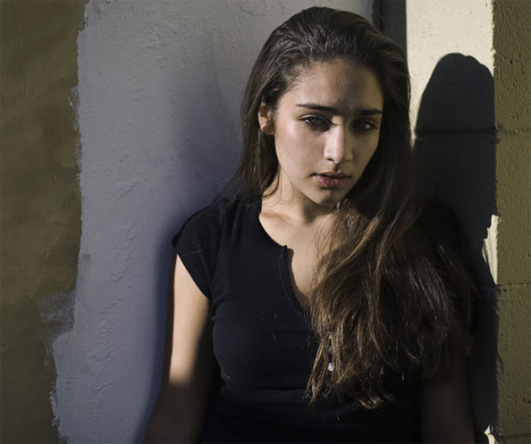
mika3.jpg

This photo fills me with wonder. What’s going on? Why is she stood in the sunshine in front of a half-pointed wall? Her eyes are kind of closed. Is she tired? Is she reacting to the sun? Is she on drugs? She does look sort of suspicious. Is she trying to hide from something or someone? Is she suspicious herself, of does she mistrust the photographer? Is she angry at the photographer?

With an initial impression like that, you’re bound to catch the attention of onlookers, which is a great start in the battle towards getting a photo noticed.

On a technical level, I think I’m not too fond of the sharp side-light. The shadow of her eyelashes on her nose is not particularly flattering, and while it does look as if you’ve used a reflector to lighten up the ‘dark’ side of her face (did you? Or is it merely light reflected back off the wall? It doesn’t look as if there is enough wall surface for that amount of light reflection), it isn’t quite enough. The main thing I have a problem with from a technical point of view, is that even in this photo, it’s possible to see that the model has absolutely gorgeous eyes. We want to be able to see them properly! A fill-flash would definitely have come in handy here. While you’re at it, perhaps a little bit more light on the wall behind the model as well — the sharp contrast between the white and the light olive colours carry this image — use it!

Right, with all that out of the way, let me say that this image is bloody good. Just like the first image, it harbours a lot of emotion and it tells (or rather, hides) a story. The light is low on the horizon, which to me says ‘evening’ or ‘morning’. Based on the make-up, I want to think evening. Or is it morning? Is her tiredness because she’s been out all night? But she doesn’t sweaty or messy enough to be out all night…

Obviously, I haven’t got the faintest idea who the model is, nor what her relationship to the photographer is, nor what her personality is like. Conflicting images of misspent youth, worry, intelligence, drug abuse, perhaps. Whatever it is, this photo oozes feeling, emotion, and — yes — soul.

Right, I do realise that this is the least useful critique I’ve done on here in a long time. There’s just something that really works in this image, and it drives me spare that I can’t put my finger on what it is. I have an idea I’ll come back to this image many times in the future, and every time, I’ll be left wondering. It’s a sign of unbridled greatness. Sort out the technical details, and you’re on to a proper winner. Thank you so much for sharing this.

Can anybody else add anything to the critiques? Do you agree? Not sure? Do you completely disagree? Well that’s what the comments are for.


Do you enjoy a smattering of random photography links? Well, squire, I welcome thee to join me on Twitter -

© Kamps Consulting Ltd. This article is licenced for use on Pixiq only. Please do not reproduce wholly or in part without a license. More info.
Mobile macro magic!

One of the advantages of having a camera with a small sensor is that it’s cheap and easy to make lenses that focus to very close distances.

Combined with the increased depth of field that the very wide lenses have (and the slower shutter speeds mean you can handhold them), the result is that that they are really good for macro-style shots. Can you think of any camera that might fit these descriptions? That’s right — webcams and mobile telephones! 

When photographing children especially, it’s a lot easier to point a mobile phone or small camera at them, rather than a digital SLR with a great big lens on the front (although most children eventually warm to the idea of having cameras pointed at them, and ultimately just grow bored with the attention, allowing you to catch some seriously lovely spontaneous portraits).


Anyway, this means that mobile phones, and small compact cameras are really good for close up macro style portraits (or still life, or whatever). The photo used above, for example was shot with a K800i with no flash (in fact, 1/20s, f/2.8 at ISO 200).

zetec.jpgWhat are your experiences with using mobile phones / camera phones / for photography purposes? Personally, I’ve seen some incredible shots done with mobile phones. Theederv over on DeviantArt, for example, recently posted some photos of his motor (seen to the right, check out a higher res version on DeviantArt), which look pukka, despite being with a mobile.

Is the age of mobile telephone photography upon us?

(thanks to Ed for contributing the bulk of this article!)


Do you enjoy a smattering of random photography links? Well, squire, I welcome thee to join me on Twitter -

© Kamps Consulting Ltd. This article is licenced for use on Pixiq only. Please do not reproduce wholly or in part without a license. More info.

Keep the dust off your lens

ixus.jpg

If you’ve got a compact camera, you know how bloody annoying it is to have to clean your lens. It’s tiny, and it seems to attract dust as if it was a lamp, and the dust were moths, confused by the lovely, bright source of light. Right? Right? Right.

There’s a ridiculously simple solution worth trying: When you know you’re going to be in a particularly vulnerable situation (a desert, a dusty place, or a night on the lash*, for example), you could do some pre-emptive maintenance: Just cover up your lens with a piece of high-quality scotch tape!

Important: Obviously, only use the following tip if your front lens element (that’s the glass bit) doesn’t actually stick out further than the lens barrel. Otherwise, you’ll make your lens sticky and dirty and the whole point is gone! 


Sounds simple? Well, that’s because all the greatest solutions usually are. The better quality your tape is (i.e. the more translucent it is), the better. The best thing, obviously, is that the scotch tape is a hell of a lot easier to clean off than the crinkly, unreachable crevices of your digital compact camera!

Bonza.

*) on the lash is a Britishism for being pished as a newt. Hammered. Whacked. Smashed. Pissed. Fucked. Or, in the parlance of our times: ‘drunk beyond reason’.

Extra special thanks to CalebVaughn for this ridiculously simple, yet incredibly effective tip!


Do you enjoy a smattering of random photography links? Well, squire, I welcome thee to join me on Twitter -

© Kamps Consulting Ltd. This article is licenced for use on Pixiq only. Please do not reproduce wholly or in part without a license. More info.

Your photos, 300-style!

300-03.jpg

Movie audiences of the world are vastly and completely amazed by the beauty of the new movie 300. With its extremely distinctive style, quick-moving plot and — like Sin City, another of my favourites — relatively closely based on one of Frank Miller’s graphical novels, it’s got it goin’ on.

If you’ve seen the film, you can’t have failed to notice the amazing quality of the artwork involved: The CGI is amazing, of course, but even the live-action bits of the film is nothing short of stunning. So, how, exactly, can you recreate the effects? We interviewed graphic artist Jason Niedle to find out more… 


300-02.jpg300 was shot entirely using blue- and green-screen, which is a technology which allows you to create the backgrounds digitally. Of course, the actors use props etc, but the fact remains that nearly 90% of all the footage used in the film involves various types of visual effects. The film was in post production for nearly a year — ages, in film industry terms.

Oh, so you’re a tech geek, are you? Well, let’s find out what IMDB tells us about the technology used:

300-03.jpgThe film was edited on an Avid, with an HD cut also maintained in Final Cut Pro The 3D was made using Maya, XSI, and Lightwave The 2D composites were made with Shake, Inferno, Fusion, and Combustion. The film makers prefer Macintosh, but large portions of the movie were made under Linux. Asset management was handled by custom software written in the Panorama development environment, made by Provue. Color management was handled by Truelight software. The film was scanned on a northlight scanner and was recorded on the arrilaser. Most of the film was shot at high speed, between 50 and 150fps. Normal film is at 24fps. The film was transferred to HD SR tape and quicktime, and HD quicktimes were the basis for the HD preview cuts. The working resolution for the film was 2K, at a working aspect ratio of 2.11 and a projected aspect ratio of 2.35.

Err, right. If anyone fancies translating that into English, feel free to post a comment. That’s totally not why we’re here, though, and I’ve let my mind wander way off track (it does that a lot recently, I blame the fact that I’ll soon be visited by my lovely girlfriend, who I haven’t seen in more than two weeks. It does weird things to my mind. Oh, I’m waffling again. But then again, as a regular reader, I’m sure you’re used to that from me by now… Right?)

How did they achieve the special look of the film? As it turns out, the directors and film editors decided to do a ‘crush’ technique. This means that you extend the blacks (‘crush’) to up the contrast and make a scene look eerie.

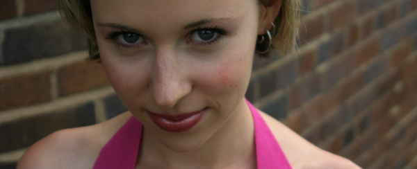
Let’s illustrate. Starting with a straight-up photo of the lovely Christine, where she’s looking ever-so-slightly devious:

crush-01.jpg

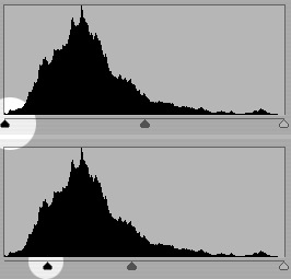
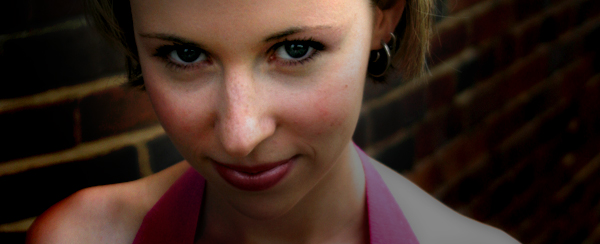
crush-02.jpgNow, to apply the ‘crush’ technique, you need to adjust the levels on your image so the black comes out stronger. Obviously, you need to do these changes only to a selection of your image, otherwise, it’ll come out way too dark.

Now, with some careful selections and some drastic image editing, you can turn this photo into something that has far higher impact and offers up a lot more contrast to work with. This is important, especially because the contrasty style of 300 would be impossible to recreate without, err, contrast.

crush-03.jpg

ip-01-1.jpgWhen you’ve got the contrast right, you’ve got to start playing with the colour — it’s got to be right, after all.

When Jason saw the movie, he explains, he wanted to re-create the effect. Re-visiting a photo he took a while ago, he combined the photograph with some stock stuff, and came up with the image to the right.

“I spent a little time balancing the brightness of the images”, he recalls, such as darkening the background and making the model stand out properly. Subsequently, he added a Sepia tone to the image:

ip-02.jpg

… Which brings the photograph in line with the colour feel of 300, apart from the whole ’300 being in colour’ bit. What next? “Well, I liked the effect quite a lot, but it didn’t quite cut it. For one, it wasn’t nearly colourful enough”, Jason explains, “so I took the base image, made a copy of the layer and put it right back on top”. By using the ‘multiply’ channel layer and fine-adjusting the opacity of the new layer in Photoshop, it adds some of the colour back into the image, and amicably imitates the ‘crush’ feel of 300.


ip-03.jpg

We’re getting close now, but the lighting- and director of photography of 300 had shot the film with rather dramatic lighting. In addition, a lot of the scenes in 300 has the models oiled up (or, at the very least, sweating like pigs. Wouldn’t you, in the heat of battle?), so the powerful lighting reflects off the models in a wicked way. “Basically, I added a motion blur to the background, and added it as a separate layer to the Photoshop file”, Jason explains.

The final result? Judge for yourself:

ip-04.jpg

Jason suggests that the original photo could have done with more powerful, side-on lighting, but the basic feel of the 300 movie posters is there… Wouldn’t you agree?

Jason is a graphic designer and photographer based in Orange County, California. Read more of his stuff on Jasontopia. The first three images in this article are used courtesy of Warner Brothers under Fair Use / Fair Dealing, for illustrative purposes. For full-res versions and more info about the movie, check out the official 300 website.

What's in your kit bag, and why?

canonelph.jpg

On Photocritic, I don’t generally bother talking too much about equipment, unless I’m particularly excited about something. My approach towards photography is that a good photographer can take good pictures with bad equipment. A bad photographer can only take mediocre photos with good equipment. In other words: If your technical skills and photographic insight aren’t up to scratch, you’ve already lost the game: No amount of equipment can save you.

Nevertheless, I often get comments and e-mails asking about what type of equipment I use. It’s an interesting question, but asked wrongly. My equipment list is boring. The argumentation for choosing each of these pieces of equipment is what is interesting, because it might help you pick which lens or gadget you buy next!  

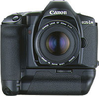
1994_eos-1n-hs.jpgThroughout my photographic history, I’ve had a lot of different cameras. I started with a Canon A-1 SLR (which I still have!), and then went through a series of exciting cameras. I had a Canon RS, which used to be the fastest camera Canon ever made. I had a Canon EOS 1Nhs, which was pretty damn quick as well. Then I went digital, and had a D60, 10D, 20D, 300D, and now I’m on a 30D. Why such a quick succession? Well, I used to work as a photographer, and cameras get used a lot. They get bumped into things, they get dropped, and the shutter mechanism gets slack after taking tens of thousands of photos. Also, I’m a gadgets nut, and I love playing with a new camera. Sure, there are no massive differences between the D60, 10D, 20D and 30D, but for every upgrade, there was a little bit more speed, a few new toys, and they just got better and better.

So why do I use a 30D now, rather than, say, a 400D or a 5D? The simple answer is cost and timing. I love the fact that Canon brought out the 300/350/400 cameras, because they bring photography to the masses. I genuinely believe that every aspiring photographer should be able to afford a digital SLR, because it’s the single best purchase you can make. It doesn’t matter if it’s Canon, Nikon, or one of the other brands. It doesn’t matter if it’s the bottom of the line model. By their very nature, dSLR cameras are unlikely to be the bottleneck of your photography skills. Lenses, flash guns, studio equipment, and all that might be, but especially as you’re first starting out, it doesn’t really matter.

Personally, I’m a right clumsy git, so I decided to invest a little bit more money to get the 30D. When I was in the market for a camera again around the same time as when my book deal came through, the 30D just started to become available. I like its bigger screen than the 20D, and I like the fact that it’s sturdy, rugged, and looks like it can take a battering. Because I no longer work as a professional photographer, I take a lot fewer photos (and my stuff is no longer insured against any damage, so I take better care of it too), so in retrospect the 30D is probably a bit over-kill: I could have easily done with a 400D. My main argument for it now isn’t that it’s stronger and faster, but that it’s heavier. I’ve got huge hands and I’m not very good at holding stuff still, so a heavier camera is rather useful in that respect.

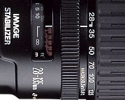
28-135.jpgThe first lens I bought for my kit was the 28-105 f/3.5 zoom from Canon. It is a decent lens, but in retrospect, I regretted buying it. I quickly replaced it with the 28-135 f/3.5 image stabilized lens. When I go travelling and have to pick a single lens, is the lens that gets to go on adventure with me. It’s wide enough to be useful for most landscape stuff, and zooms in far enough to be good for portraiture, wildlife, and all that. It’s also a macro lens, and it works surprisingly well at taking photos up close, too. It’s not a cheap lens, and it’s not all that sharp either, but it has a special place in my heart nonetheless…

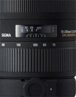
sigma70-200.jpgThe next lens I bought was a 70-200 f/2.8 EX APO lens from Sigma. It’s bloody expensive, but it’s also one of the best lenses I own. Because it stays at f/2.8 throughout its zoom range (in general, zoom lenses that have the same aperture throughout their zoom range are of better quality for reasons that are slightly beyond this write-up, I’ll do that one as a separate article some day), you get a long lens that’s perfect for concert photography. Which, incidentally, is why I bought it. (more about concert photography here and here). The lens is quite heavy, but it’s really sharp, handles well, has a fantastic bokeh, and is great for all sorts of sneaky photography.

For work, I started doing a great deal of interior photography, and needed to go wider than the 28mm afforded by my other lenses. With my recent success with the Sigma lens, I decided to go with the Sigma 17-35mm f/2.8-4.0 lens. It’s a peach, what else can I say.

pringlesmacro.jpgOther stuff in my kit bag is the Lensbaby lens, which I’ve fallen completely in love with (as explained at great length here), a 50mm f/1.8 mk1 prime (as rambled about here), my home-made macro extension tube, and a Canon 135mm f/2.8 Soft Focus lens, which I to this date haven’t quite figured out how to use. Sure, it’s a great prime lens, but the soft focus bit is an absolute mystery to me.

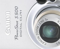
canonelph.jpgFor parties, going out, and all that sort of stuff, I keep a nifty little Canon Digital Elph S500 handy, too. The battery life of it is absolutely amazing, and the lens is spot-on. Sharp and reasonably fast. The camera itself is virtually indestructable, too (I’ve dropped it more often than I care to remember, but its metal casing really holds its own), and it’s small enough to carry around everywhere.

My final gadgets are a Slik tripod, a standard Canon Speedlite 420 flash gun (my 550s kept breaking or getting stolen, it seems as if the 420 agrees with me better — knock on wood), and a LowePro Stealth Tracker photography backpack to lug it all around.

The last piece of kit worth mentioning is my Apple dual G5 2.0 Ghz with a 19″ Eizo flatscreen TFT monitor and Photoshop CS2. It’s not strictly photo gear, but I couldn’t be a photographer without it, so it obviously belongs in this list :)


So, where do I go from here? I’m currently drooling over the Canon 100mm f/2.8 Macro lens, as based on my experiences, and those of many of my friends, it’s supposedly one of the sharpest and best prime lenses out there. The fact that it’s a perfect focal length for portraiture, the fact that it’s a magnificent macro lens, and the fact that it’s not actually that expensive for what you’re getting, means that I have to fight hard to keep my credit card in my pocket. Must… save… up… money…

So, enough about me. What’s in your kit bag? Why? And what is your next purchase?


Do you enjoy a smattering of random photography links? Well, squire, I welcome thee to join me on Twitter -

© Kamps Consulting Ltd. This article is licenced for use on Pixiq only. Please do not reproduce wholly or in part without a license. More info.

Emergency tripod? Piece of string!

picture-24_165x140.jpg

The main problem of taking photos free-hand is that your hands aren’t particularly sturdy. Myself, I find using a heavier camera makes it a lot easier (the inertia of the camera means it is reluctant to move, so up to a point, a heavy camera is easier to hold still for the duration of a photographic exposure than a very light camera), but what about lighter cameras?

The obvious answer is a tripod or a monopod, but these devices can be terribly heavy, and they are not particularly portable. One solution is to hold the camera against a surface (a tree, a building, or a signpost), but that doesn’t always work either, and none of these items offer an awful lot of flexibility.

How do you stabilise your camera most often?

  • Quadrapod
  • Tripod
  • Monopod
  • Mini Tripod or similar
  • Gorillapod or similar
  • String tripod ('chainpod')
  • A rock / table / whatever
  • Freehand with a fast lens
  • Freehand with an IS lens
  • Freehand
  • Stabilise my camera? But why?
  • I don't take photos

View Results

How?

I often find myself thinking 'Damn, if there was only a way to anchor the camera to the ground…', and I recently found a solution that works: A String Tripod (also known as a Chainpod)!

It is a laughably simple device: You get a wing nut bolt (or anything that screws in) that fits into the tripod hole of your camera (you are looking for a bolt with 3.5×8″ threads), and drill a small hole into the bolt. Then, you attach a length of string to it, with a loop at the end. If you use the shearing lines available for tents, you can vary the length of the loop, and, as such, the height of the camera.

To use one of these string tripods, put your foot (or feet) through the loop, and pull the string taut against your foot. Now, out of nowhere, your camera will be a lot more stable, as it has an axis against which it cannot move (up/down). This means that you can hold the camera a lot calmer – you would be surprised how much of a difference this can make!

But… But…

Sure, it will never replace a proper tripod or monopod, but I wouldn’t be surprised if you gain a couple of stops on your shutter time by using this system. And the best thing? Making one of these is going to cost you less than a bottle of milk and a loaf of bread!

Be careful what you sign!

useragree.jpg

We’ve talked about how photo licencing works before, but it seems as if people are just not learning their lessons. So, as the newest instalment in our Photography Business article series, an important reminder…

The newest horror story comes from a website called UK Expert. If you sign up to their website, and click ‘ok’ on the terms as conditions (Let’s face it – when did you last read the terms and conditions to anything), they are trying to get you to sign over the copyright to your photos. Yikes!

The lesson today?

Read the terms and conditions
before you upload any photos.
Seriously.

Today, Geir tipped me about the problem with UK Expert, a photo competition website. While they aren’t the only ones doing that out there, they are among the naughtiest I have come across. In their terms and conditions portion of their Registration process, they’ve got the following to say about copyright:

useragree.jpg

By submitting images and messages and other material to ukexpert.co.uk you warrant that you are the copyright owner and that you grant ukexpert.co.uk permanent copyright ownership equal to your own for all materials uploaded.

I can understand the reasoning for part 1 of this: If you don’t have the right to use a photo, you are committing breach of copyright if you upload the material. (However, there are situations where copyright owners are not allowed to use material — such as when the material is already under exclusive licence — and there are situations where it is perfectly fine to upload material, even if you don’t own the copyright)

It’s the second part that is scary though: “you grant ukexpert.co.uk permanent copyright ownership” is a sneaky, nasty way of trying to steal the copyright to an item from a photographer. They are a competition website, and it’s fair to think that people would upload their best photos, in order to try and win the competitions. Imagine losing the copyright to all your best photographs — how would you feel?

You’re in luck, though, because they also write the following in their terms and conditions: “ukexpert is based in England, and English law applies.” What they are doing is, in fact, unlawful under UK copyright law: It is impossible to re-assign the ownership of copyright without an explisit, written contract. Checking a box on a website doesn’t constitute such a contract, so you haven’t given away anything.

However, if you do have any photos uploaded on UK Expert, I’d remove them as soon as you can. Don’t let them get away with trying to steal your photos from you!

So — yet again — make sure you know what you are signing up for, know your rights, and if you believe the licensed use for the material you upload is too broad, just walk away. Guys like this don’t deserve your photos.

Getting your photos removed

So, what do you do when you’ve already uploaded your photos, and want to take them down?

Over on Pixalo, a poster is lamenting the fact that it’s nearly impossible to remove your own photos from the site. To check this out for myself, I set up an account and uploaded a photo, and was unable to figure out how to remove it. If there is a way, there’s no easy way, which sounds a little bit on the shady side to me.

The best tip I can give you, is to report your own photo for a violation, and write “I revoke the licence for the use of this photo, effective immediately. Please remove it within 24 hours”.

24 hours later, if the photos aren’t gone, write a NTD (Notice and Take Down). This is a legal request in which you are demanding a website to remove the copyrighted material from their site. The fact that you own the copyright means that you can revoke the license for the use of the photos. In fact, you already did (when you warned them 24 hours ago), so now, they are in breach of copyright!

If they still don’t take the photos down within a ‘reasonable time’ (which I would say is about 1 working day, but that’s a bit fluid), you are actually legally entitled to go after the ISP or hosting company of the website in question. Serve them the ‘notice and take down’, and the hosting company will pull the plug on the website.

A lot more information about how this all works is available on the Cambridge University website (scroll down to Copyright and other laws, but make sure to read the rest of the page as well). Examples of NTDs, and more information on how to write one, are available on-line.

Important notice: I not use any information on this web site as actual legal advice. If you do find yourself in a situation where you need to turn to the law to protect your intellectual property rights, get a solicitor involved. And make sure to file a claim against the company involved for any costs incurred (in the small claims court if you have to) — including the cost of your solicitor.

Rediscovering black and white

kevin-bost-03b.jpg

In our newest instalment of the photo critique series, I’m taking a look at a series of black and white photographs taken by Kevin Bost. In the process, I’ll be exploring why Black and White photography still has a valid place in today’s colourful society… 

Black and white photography...

View Results


Black and white photography is very much the cradle of photography: Before colour, there was black and white. Before that, there was paint brushes and paint. Many photographers saw the introduction of colour photography as the death of black and white, but they were wrong: In fact, even today, a lot of photographers work largely — even exclusively — in monochrome. Why?

To me, black and white has an amazing quality to it — Seeing something in monochrome allows you to give it a detachment from reality.

Seen at its very simplest, any photograph has four elements: shape, texture, lighting, and colour. Think about a tennis ball: The basic shape is round. The texture is fuzzy and hairy. The colour will often be yellow, and lighting will determine how you perceive it all. The interesting thing is that of all of these qualities, you can’t strip many of them away: You can ignore the shape by getting in close enough to focus on the texture (using macro to capture the small hairs on the tennis ball, for example). You can ignore the texture by getting far enough away that the texture doesn’t matter, or by adding a motion blur (a spinning tennis-ball photographed with a long enough shutter time will have no texture). Without lighting, you wouldn’t be able to see the ball at all.

Colour falls in a completely different category: By stripping it out of your photography, the other qualities of a photograph — especially textures, which often are drowned out by colours — become more apparent. Stripping away colour, then, abstracts yet familiarises a photograph.

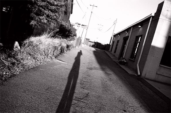
kevin-bost-01.jpg

Going to Kevin’s first photograph is a phenomenal way of illustrating how textures suddenly become vastly more important. The reason why this photo appeals to me is the way the asphalt on the road springs out at you. The lovely contrast in the top-right of the image, combined with the relatively lower contrast in the rest of the photo adds a touch of drama.

To me, this appears to be a photograph commenting on aspects of mental health: The deep black of the trees contrasting against the blown-out highlights on the horizon. The way the photographer takes up a significant part of the photo without really being visible. I don’t know the photographer, and I don’t know how accurate my interpretation might be.

While the general principe of the photo is exciting to me (I loved the angled composition), it does have some serious flaws. I wouldn’t have minded the vastly blown-out horizon so much — it’s one of the charms about black and white photography, that strong contrast and even going outside the dynamic range of your film / imaging sensor / printing paper can look damn hot — but the building and the plants along the road on the left side are a bit peculiarly exposed. The old adage of exposing for the highlights and developing for the shadows (as discussed in an earlier photo critique) would have come in handy here, as it would have allowed you more data to work with, so you can either keep the telegraph poles on the horizon, or so you can edit them out successfully in Photoshop.

If I personally had taken this photo, I would have gone back with a tripod and had a shot at turning it into a High Dynamic Range photograph, just to have some more data to work with to help it along.

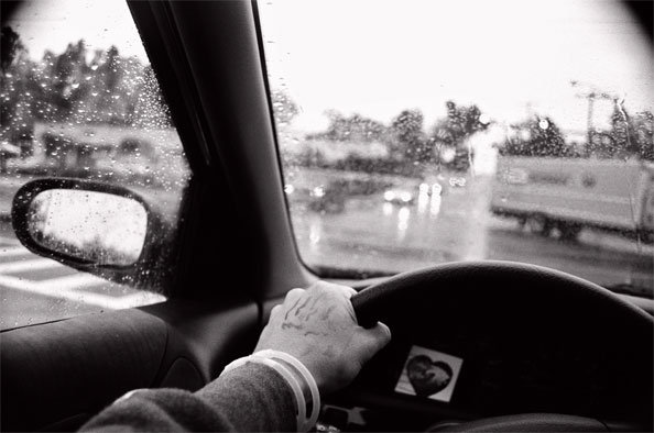
kevin-bost-02.jpg

Kevin’s second photo had me a little bit baffled. Mostly, I just can’t figure out what’s going on here. Sure, it’s some guy driving a car in the rain, but what intrigues me is the hand. The thing around the wrist — is that a hospital tag? What is the liquid on the driver’s hand? That looks a lit like it could be blood. Is it a doctor, on their way to an emergency? Is the heart-shaped item on the dashboard a radiogram? Is the guy about to be a father?

It is a really simple photo, which interestingly enough draws its focus, yet again, from its wild and varied contrast. The sky is completely blown out. The dashboard is pure darkness. And the hand is the only part of the photo that stands out as being ‘correctly’ exposed. A very fascinating photo that raises a ton of questions.


The real question, though: If I hadn’t done a critique of this photo, would I even have looked at it a second time? Probably not: it’s a guy in a car. I would never have noticed the heart, the armband or the blood(?) on his hand. Personally, I think this would have been a better photo if the background had been a lot calmer. A long, open motorway, perhaps, or a forest, or even a hospital in the background… Anything to stop you from looking out of the wind shield, wondering what you’re supposed to be looking at.

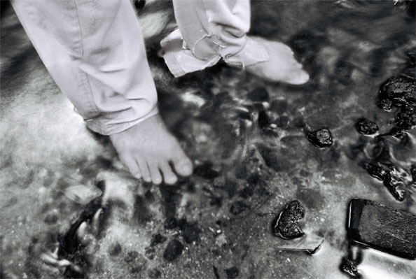
kevin-bost-03.jpg

Of all the photos Kevin sent to me, this is by far my favourite, and it also rather clearly embodies what I feel black and white photography is about. The photo comes across as an impressionistic piece, in that his toes are in a blur (is it because he’s in a river, and the refractions work as a motion blur? Maybe…). The torn trousers and the fluid motion of the water bring holiday-type-thoughts to my mind. While this photo might have a lot less of a message than, say, the previous photograph, it is a much more appealing photo to me, visually. This photograph wouldn’t be out of place in a trendy restaurant or an edgy art gallery: It’s obviously not a snapshot of someone’s feet: Deliberation, planning, and exquisite exposure comes together to create a powerful visual image.

In addition, it’s worth noting that this photo doesn’t look as if colour would have added much to it: It’s all about the motion and texture.

On a personal level, I would probably have treated the photograph to a slight re-crop. It’s a personal preference thing, which doesn’t necessarily add much to the photo the way the photographer intended, but I’m very much a ‘get into the action’ kind of guy: In artistic photos, I find you often don’t need the context that is added to a photo. As such, with a bit of re-cropping, I landed at this:

kevin-bost-03b.jpg

So, why should people still bother with black and white in the digital age? Well, in many ways, black and white photography has become easier than ever. By using the digital darkroom (and especially by using the channel mixer to turn a colour photo into monochrome), you get a lot more influence and control over how your photograph is rendered.

That, and what is there not to love about monochromatic art? If it was good enough for Ansel Adams, it’s good enough for me…


Do you enjoy a smattering of random photography links? Well, squire, I welcome thee to join me on Twitter -

© Kamps Consulting Ltd. This article is licenced for use on Pixiq only. Please do not reproduce wholly or in part without a license. More info.

Clean your imaging sensor!

DSLR sensor chips collect dust. That is a Photoshop-time-consuming fact of digital life. At The Sun, whenever we send in our DSLRs to be otherwise repaired, one nice little bonus is that (along with the obscene repair bill) they come back with a freshly cleaned CCD.

Which, of course, lasts for about a week. Two if you are lucky. 


You may not even notice that you have dust at all, until you stop down and shoot with a wide lens or macro. Then, all of a sudden it looks like you are looking through an electron microscope or something. Eww.

Heck, I used to even keep a little sticker on one of my bodies to denote which one had the “cleaner” (and I use the term in the relative sense) CCD. That was so I would know which one to use if I needed to shoot something at f/11 or higher.

Read the rest of David’s article over on the Strobist blog!


Do you enjoy a smattering of random photography links? Well, squire, I welcome thee to join me on Twitter -

© Kamps Consulting Ltd. This article is licenced for use on Pixiq only. Please do not reproduce wholly or in part without a license. More info.

The Lensbaby lens


A good while ago, I discovered the phenomenon of the lensbaby lens. Basically, it’s a bendable lens that you can use for creative effect. It means that you get what essentially is a tilt/shift lens which allows you to work with creative selective focus, extreme macro photography, and lots of creative freedom.

I recently got my grubby paws on a Lensbaby, and ever since, I’ve been a complete convert. I recently spent 4 days exploring Madrid, and despite of having a lot of expensive glass, I ended up only using the Lensbaby lens throughout the whole trip.

Using the Lensbaby 3G

lensinaction.jpgThe lens I have is the Lensbaby 3G, which is the newest and funkiest Lensbaby created to date. It’s a funky-looking little lens which has a vast range of versitility. You can use it like the original lensbaby, by just squeezing it (to focus) and bending it (for selective focus) by hand, or you can lock it off. When you lock the collar, the little sticks that stick out through the lens come to their own: They’re actually threaded, so you can twist them to fine-adjust the focus and selective focus of the lens. In addition, there’s a focussing ring you can use to get focus right, rather then compressing or stretching the whole bellow.

For something that basically started out as a toy, the Lensbaby is growing into its own shoes as a pretty damn important and impressive player in the photography scene.

magnets.jpgFor Aperture, the Lensbaby has a really clever solution, too: instead of a shutter-based aperture, the lens uses small black circular bits that are held in place in front of the lens element by magnets! It sounds completely ridiculous, but it works surprisingly well.

Getting used to the Lensbaby takes a long time, perhaps because it initially seems so damn counter-intuitive. Focussing, selective focus, and tilt/shift theory is pretty confusing stuff. But then the same happens to you as what happened to me: Suddenly, it just clicks, and the whole thing becomes a three-dimentional photography experience. You have the shutter speed, ISO, the disc-based aperture control, and the bendy-lens goodness.

How to get the best results

Especially when the lens is new to you, it’s incredibly tempting to over-do the effect. ‘look what my lens can do’ is cool for a while, but it’s kind of like the kid who discovered the cloud filter in Photoshop, and now can’t stop using it for everything (I was that kid once. Shut up.). When using the Lensbaby, it’s definitely a case of less is more, and it’s a lesson that is hard to learn.

When I was first shooting with the Lens Baby, I went to the New Forest, and ended up with this photo:

img_0072.jpg

Needless to say, it’s an excellent example of seriously overdoing the effect. Since, I’d love to think I’ve started to get the hang of it a little bit better.

What surprises me, is how versatile this seemingly simple lens can be. I’ve successfully used in portraiture, for example, a genre where I wouldn’t have thought that the Lensbaby would be able to excel. This particular photo also shows the absolutely exquisite bokeh the lens is able to produce:

img_0089.jpg

Other experiments I tried include architectural photography:

img_0154-corrected.jpg

Street photography:

img_0163-corrected.jpg

Obscure abstract photography:

img_0240-corrected.jpg

Product photography:

img_0249-corrected.jpg

Hell, with the vast amount of creative vibe I got off the lens, I even had a shot at food photography (although, generally, that’s best left to the lovely folks over at Still Life With…), although I’d be the first person to admit that I probably over-did the effect a little bit on this photograph…

img_0302-corrected.jpg

As a general tip: When you are photographing with a Lensbaby lens, make sure you put your camera into manual mode, and control everything yourself. Also, make sure you use Raw file format. Exposure can be really tricky, and you can tease some amazing colours out of Lensbaby photos, and the extra flexibility offered by the Raw file format really helps in that department.

Verdict

“So, all of this is good and well.”, I hear you say. “You’ve had the lens for a week or so, and you’ve taken some shit hot photos”, you continue. “But is it really worth it? After all, the 3G version costs a whopping $270.00, the version 2 costs $150.00, and even the original lensbaby is not exactly the cheapest gadget you can buy at $96.00!”

Well, you are right, for what it is, it is slightly on the pricey side. On the other hand, I was surprised about one particular aspect of the Lensbaby: In its simplicity, it’s actually an extremely powerful lens, which not only offers a level of artistic and photographic freedom which I haven’t experienced before or since, but it also offers a deeper level of insight into the deepest roots of photography. By instinctively starting to grasp how you can bend a lens one way for one effect, and another for another effect, you develop as a photographer: One step closer to complete photography zen, where you become one with the camera.

If the ‘photography zen’ wishy-washy stuff doesn’t do it for you, then be persuaded by the photos above. Or the photos taken with lensbabies on Flickr. Or by the excitement of using a lens that is unique, exciting, and creative in a fantastic way. Or the fact that nobody has ever asked me about any photography equipment I carried around, but despite me not speaking much Spanish, half a dozen people struck up conversations with me in Madrid because of the funny-looking lens I was using.

Is it a brilliant lens? Definitely. Is it worth the money? Well, it depends on how much money you have to spend, and how you want to develop as a photographer. If you don’t have any prime lenses, I’d say buy a 50/1.8 first. Once you’ve got one of those, build yourself a macro lens. Then, take a damn good look at the Lensbabies. I, for one, know I’ll never want to be without one of these things in my photo bag. It really is that good.


Do you enjoy a smattering of random photography links? Well, squire, I welcome thee to join me on Twitter -

© Kamps Consulting Ltd. This article is licenced for use on Pixiq only. Please do not reproduce wholly or in part without a license. More info.

DIY Digital Picture Frames

framed.jpg

Photo frames are an easy way to add some gusto to your images. The future of this particular business, of course, is digital photography frames. You just upload some of your favourite photos to the frame, and then the frame cycles through the photos for you. If the frame is cleverly enough disguised and lit, it looks like a perfectly normal frame, with the only difference that the photo changes before your very eyes!  


They make for great gifts, and can look pretty damn smart in various installations too. But sadly, they’re often quite expensive. Understandably, you might wish to try and make your own. I decided to start researching the topic, and was surprised to find the Laptop to Digital Picture Frame page on Likelysoft. It’s got over a hundred projects explaining how you can convert your old laptop into a gorgeous photo frame. The articles cover software, how to build the frame itself, and presentation opportunities.

With the weather being so damn lousy at the moment (hey, I live in the UK, I should be used to it by now, right?), it makes sense to have a nice little home DIY project. So dig out your old laptop and get crackin’! :)


Do you enjoy a smattering of random photography links? Well, squire, I welcome thee to join me on Twitter -

© Kamps Consulting Ltd. This article is licenced for use on Pixiq only. Please do not reproduce wholly or in part without a license. More info.

The rule of Thirds

10-thirds.jpg

What is this rule of thirds thing anyway? Basically, it’s a rule of the thumb designed to help you compose powerful images. As with most rules in photography, it is important to learn it, understand it, and make it your friend, before you start breaking it. The biggest argument is that once you know what conventionally creates a strong photograph, you can make informed decisions as to how you can adapt and bend the rules to create even stronger compositions.

The great thing about the rule of thirds is that you can use it as little or as much as you want: It’s always there, and you use it when you need it.

Well, a long time ago, a Kodak photographer described it as “playing Tic-Tac-Toe” I think that is fairly accurate:

diagram-1.jpg

Divide up the view mentally into nine equal segments – two horizontal lines dividing the plane at 1/3rd intervals and two vertical lines dividing the plane at 1/3rd intervals.

At the intersection of these lines you will have four “dots”. These foci are where you would place a point of interest for a subject.

As you compose, you would put major planes on the lines – horizons on the horizontal lines, buildings and trees on the vertical lines. Here’s an example from Yellowstone Lake:

01-thirds.jpg
Yellowstone Lake

Notice that the horizon and the trees are close to the lines. Sometimes in your viewfinder you can show guides, I tend to turn them on.

About those guides – when you have something with an edge or a line – like a horizon, you would place the horizon on one of the two horizonal 1/3rd lines. The bottom if you want to concentrate on the sky, and the top one if you want to show more of the ground.

This is not a hard and fast rule, notice that in this next example the foreground, midground, and distance are separated in general by thirds.

02-thirds.jpg
Black Canyon of the Gunnison

The intersection of the lines creates a focal point. Some photographs will draw attention to the subject by placing the object on the intersection of these lines.

This windmill in Nebraska is a good example of simple composition on the rule of thirds.

03-thirds.jpg
Nebraska Windmill

This next photograph of a tree puts a barbed wire fence and a tree covered by ice on the focal point.

04-thirds.jpg
Kansas Ice Storm

It’s all open to discussion — don’t stick to the rules religiously!

The rule of thirds is open to modification. Here is another diagram. The fourths are in blue, and the centers in yellow. I’ve found that you can play with the fourths and thirds, even connecting the edges with hard lines running at diagonals.

diagram-2.jpg

Check out this photograph. The peak of the barn is on the center, but the diagonals of the roof run to the upper left one quarter, and the other side down to the lower right corner. Meanwhile, a large negative space is on the thirds. The windows are positioned on focal points.

05-thirds.jpg
Miller’s Backpost Ranch

Crop to essentials. Take this flower as an example. The blossoms are on quarters and thirds.

06-thirds.jpg
Prairie Spiderwort

There is a second “rule” at work here – if something is symmetric, only show enough information that is unique.

On a flower – only show 1/4 – since the rest will repeat the viewer’s mind will create the rest beyond the edge of the photograph. Pardon this example, this one is lousy, but you may get the point.

07-thirds.jpg
Gerbera Daisy

You will see photos on useflim where only half the face is shown. We only need to see half of the face because we humans are symmetric.

Hey – you don’t have to use these rules all the time, nor be exact, but it is good to know why some of the photos you like “work”…

There are some times when you want to center a photograph and keep it centered. Sometimes not.

If you have a reflection, or a symmetric composition, by all means PLEASE put the composition on the center.

In this photograph, the buildings and tower are symmetric. Power of thirds on the horizon, but everything is mirrored down the center.

08-thirds.jpg
Liberty Memorial, Kansas City

Another example, a literal reflection.

09-thirds.jpg
Big Bend, Texas

Sometimes you can pose objects. Easier to control. I’ll end with this example, because it may lead you to start thinking about depth of field…

10-thirds.jpg
Forks

Last of all:

you don’t have to be exact on the rule of thirds. It’s a guideline, more than a set of rules, and the most important thing is to try and balance the various elements of the photograph properly. You can put stuff on the 1/4 or the 1/5th or whatever as long as the “weight” of everything balances.

11-thirds.jpg
Lower Falls of the Yellowstone

To see more things written by guest writers, check out the guest writer category, and if you fancy contributing something yourself, check out this article for more info.

Michael Kanemoto is a Kansas artist specializing in landscape and outdoor photography. Michael has been taking photographs since 1986, and has a BFA from the University of Michigan School of Art and Design. He is currently working in Research and Innovation at Sprint Nextel.


Do you enjoy a smattering of random photography links? Well, squire, I welcome thee to join me on Twitter -

© Kamps Consulting Ltd. This article is licenced for use on Pixiq only. Please do not reproduce wholly or in part without a license. More info.

Don't buy camera gear via Froogle etc

It’s old advice, but it certainly hits the spot…

Since the dawn of the commercial web we have been warned to not be suckered by “too good to be true” online deals. Keep your friends close and your credit card closer. Over and over scummy retailers are exposed but a quick name-change are back online trading their crap, fake or purely imaginary goods. 


Still forum posters continue to be burned by dodgy online traders. The problem comes down to customers shopping on price alone. Like the apocryphal lemmings over a cliff they are drawn to the low bidding merchants in shopping search engines. When the item doesn’t turn up, or unexpected (and unexplained) costs appear on the credit card statement or when they get zero (or abusive) customer service they look around for help and sympathy. But there is only one person to blame in the end; the customer. Emptors and caveats, etc.

When you understand how these businesses operate you can see why there are so many problems and how little is in your power to avoid being taken. When I started this blog one of the ex-members here had his own online camera store. I learned a lot about how the business worked and the more I learned the more sure I was my policy of sticking to the high street was the right one, even though it meant paying a premium.

… Thus begins the fantastic article by Chris over on the dSLR blog. He explains how some of the scams work, and also tells you how to avoid them.

I’ve been bitten by one of these scams myself, ages ago when I was buying my first article, so take heed, folks, there’s nothing quite as horrible as the feeling of being parted with your hard-earned cash, and seeing none


Do you enjoy a smattering of random photography links? Well, squire, I welcome thee to join me on Twitter -

© Kamps Consulting Ltd. This article is licenced for use on Pixiq only. Please do not reproduce wholly or in part without a license. More info.

In defence of the Holga

holgathumb.jpg

Regular followers of Photocritic know I don’t have a lot of time for the Holga, as illustrated in this post. The response to that post was ear-deafening: The blogosphere (ick I hate that word) went mental at me in the defence of the Holga.

The other day, Robin McAulay tried to be a little bit more eloquent of the Holga. He succeeded, and offers the following guest article… 


holga-02.jpgAnyone buying a holga expecting hasselblad results would be foolish indeed – for many who have seen the results the urge to own and use one is the need to escape the over saturated digital market – ready made crystal clear, sharp and predictable images at a snap. Now anyone can be a technically great photographer without using so much as half an hour charging the battery for a point and shoot without any prior experience with a camera.

When two Austrian guys bought themselves a mass produced soviet lomo LCA on a break in prague, saw the strange funky results it produced and started cleverly marketing it as a modern western object of desire … no one would have guessed how popular it would become. Producing images that looked like your dad took them when you were still in nappies – blurred, light leaks from imperfect body seals and double exposed due to faulty winding mechinisms just added to the charm. It was rebellious and fun.

holga-01.jpgAnother great marketing idea.. the holga crossed over into “Lomography”. The holga carries on the tradition where the LCA left. Nothing to do with the soviet union Lomo factory (made in hong kong) it was dragged in as another lomographic gimick that produces similar but heightened results, pushed on bored lomographers as the natural step further into the cult. The lomo story was a brave one if it stayed were it was – underground. It has essentially became what it balked at from the begining and become a great money spinner.

The small group of artists who seriously use the holga for the aesthetic value of the image it produces usually cringe when stumbling on lomographer sites. Using the holga based on lomography rule of thumb has become as narrow minded as the technophile DSLR world we live in today.

things reach a state of perfection people like to revert back to the meat and two potatoes they remember with glassy eyed fondness – usually never as good as the memory.. but that’s never the the point.

The photos in this article were taken by Robin McAulay, and you can see more of his work over on his Toycamera.com profile.


Do you enjoy a smattering of random photography links? Well, squire, I welcome thee to join me on Twitter -

© Kamps Consulting Ltd. This article is licenced for use on Pixiq only. Please do not reproduce wholly or in part without a license. More info.

Web 2.0, meet Photoshop

pntools.jpg

Ever find yourself on a computer without any editing software? All you want to do is to crop an image, fix the contrast, and resize it?

Well, if you’ve got a reasonably new browser, you’re saved: Enter Picnik, a brand new type of image editing software, bringing the genre well into line with all the other Web 2.0 apps out there.

In short, Picnik is to Photoshop what gmail is to e-mail, YouTube is to videos, Flickr is to pictures, Pandora is to music, and CleVR is to panoramas! 


I discovered it a couple of hours ago, and am already deeply in love with it. I expect the Digg crowd and Slashdot will turn their server to mush within the next, oh, 20 minutes or so, but once the storm has died down, go have a play!

pntools.jpg

So far, the Picnik service is a little bit limited — you only get rotation, cropping, exposure (brightness / contrast and, amazingly, a levels tool), colours (white balance and saturation), sharpening tools, and a couple of auto-fix tools. However, I don’t know about you, but those are my most frequently used tools anywhere. I doubt it’ll replace Photoshop anytime soon, but as far as quick hack-up image editing goes, it’s not at all badl

No doubt the MySpace crowd will love it to bits, and even seasoned photographers might find it saves them in a pinch.

In summary, Picnik is well worth adding to your bookmarks!

Via Matt of CleVR fame…


Do you enjoy a smattering of random photography links? Well, squire, I welcome thee to join me on Twitter -

© Kamps Consulting Ltd. This article is licenced for use on Pixiq only. Please do not reproduce wholly or in part without a license. More info.

Using adjustment layers

salmaphoto-highkey.jpg

Photo editing falls into two categories: Adjustments, which affect the whole photograph (much like our introduction to contrast, using the levels tool, from yesterday), and spot editing, which affects a smaller part of an image. Any photo editing you do with brushes, selection tools etc would be a spot edit.

While spot editing can be useful, it’s adjustment editing which is the big advantage for most photographers. Exposure a little bit off? Fix it in Photoshop. White balance problem? Photoshop. Want your picture in black and white? Photos… you get the idea.

What most photographers don’t know, however, is that you can do a wide array of adjustment editing experiments without even touching the original photograph. You can do this by adding so-called adjustment layers. This is a layer added on a photo which affects all the layers underneath. The upside of using this technique is that you can turn adjustments layers on and off, you can change their order, and their parameters. The main effect is that it is much easier to experiment with your photos, in the hunt for finding a combination of adjustments that makes your photo perfect. 


My old friend Matt Greer explains:

The benefit to using adjustment layers is that no edit is permanent until you flatten the image. You can even save the image with all of its adjustment layers as a Photoshop Document (.psd), and when you reopen it, all the changes you made to the adjustment layers will still be there for you to change back, remove, or alter.

If you were to, for example, edit curves without layers, then go on to change saturation, crop the image, then add vignetting, the only way to go back and change what you did to the curves would be to go back in the history, to when you changed the curve (thus losing all work done since), or start the image editing from scratch.

With adjustment layers, however, so long as that adjustment layer is still there, you can go back and alter the adjustment at any point in the editing process. It is a lossless editing process, and very handy. Sometimes one edit will effect the way another edit appears, so the first edit may need to be tweaked. This makes editing far more efficient and accurate!

The kid obviously knows what he is talking about. So — instead of trying my damndest to explain the arcane arts of adjustment layers, I’ll lett Matt do the talking, in his fabulous blog article titled Standard Photoshop Adjustment Layers.


Do you enjoy a smattering of random photography links? Well, squire, I welcome thee to join me on Twitter -

© Kamps Consulting Ltd. This article is licenced for use on Pixiq only. Please do not reproduce wholly or in part without a license. More info.

Photographing smoke


coloured_smoke_art__25

Abstract photography is nothing new, and people constantly come up with new — or re-invent old — versions of photography techniques. One of the ones that is going like wild-fire (excuse the pun) around the interwebs at the moment is the art of photographing coloured smoke.

The trend started with the highly talented Graham Jefferey, of Sensitive Light fame, whose phenomenal photographs went around the world via blogs,

We’ve managed to talk to Graham, and find out how he does his smoke photos… 

Getting the smoke right

Before anything, Graham points out that there is no ‘right’ way to photograph smoke. His technique has developed over a long period of time, and Graham admits to learning and discovering new things every time he sets out to take the photos.

Smoke photo by Graham JeffereyThe two key secrets to smoke photography is inverting the image, and using gray smoke. Say what now? How does that work? Well, Graham explains: “It’s quite a simple technique, really. All you need to concentrate on when you are taking the photos themselves, is getting good images of the smoke. The colours are generated digitally at a later stage.”

To get the best possible smoke to work with, Graham uses simple incense sticks known as Joss sticks, which can be purchased from most Chinese supermarkets and in every Chinatown anywhere in the world. Alternatively, any reasonably large incense stick should do the trick.

Once you’ve got the smoke, the rest is all down to freezing the motion, and getting the lighting right. “In my opinion,” explains Graham, “the key technical factor is to adequately light the smoke so that it stands out from the background.”

Smoke photo by Graham JeffereyWhile smoke in itself can be an interesting subject matter, Graham points out that in his photos, the smoke itself isn’t the subject matter, it is merely the tool used to create unusual photographs: “I am not trying to create pictures of smoke; I am trying to create pictures by using smoke”. This approach means that you have full creative licence to do what you want to manipulate the smoke as much as necessary — the only thing you have to worry about is getting an impressive final result.

Lighting and exposure

The best way to get ‘cleanly’ lit smoke photos is to use a clean environment with controllable light. A studio would be ideal, but anywhere you can hang up a black background is perfectly usable. The most important thing when photographing smoke is getting enough light to freeze the motion of the smoke in mid-air. You can do this by using a lot of light (think direct sunlight falling through a window) or by using one or more flashes. When you’re photographing the smoke, you’ll want to make sure that no stray light hits the front of your camera lens (this will cause glare or solar-flare type effects), nor on your blackened background (because that will bring out definition in the background, which you don’t want either).

Smoke photo by Graham JeffereyWhen you are photographing, it is easiest to let the smoke rise on its own volition. Instead of trying to manipulate the incense stick, try wafting some motion into the air to disturb the even plume. Alternatively, you can try to create interesting shapes by making the plume turbulent: try introducing a ruler, an upturned spoon, or a sheet of paper into the plume to alter its shape and ‘feel’.

“I want clean lines and shapes”, Graham explains. To do this, he shoots with a lot of light at a small aperture (and thereby a deeper depth of field). “This is very much easier to do if the smoke is allowed to rise naturally.”

With the smaller aperture needed to capture the plumes of smoke properly, you obviously lose quite a bit of light. This is a problem, because in order to freeze the motion of the constantly-moving smoke, you need quite a fast shutter time. In practical terms, this means 1/250 or faster. Simultaneously, you can’t reduce the ISO value on your camera either, because the purile plumes of smokes would be ruined by significant amounts of noise. Needless to say, a coinciding need of low ISO, small apertures and high apertures means that you need a vast amount of light.

Smoke photo by Graham JeffereyPersonally, my best smoke photos were taken with a 2000W Bowen studio flash light with a humongous soft-box fitted on the front. I prefer this solution because the softbox gives even lighting, but it can be difficult to limit where the light goes, so the above-mentioned limitations of “no light on your background or camera lens” can get tricky. I find that if you put the soft box really close to the smoke, you can get excellent results. Having said that, my smoke photos aren’t nearly as good as Graham’s, and he uses a different approach: “For all practical purposes the light used to expose the image comes from one studio flash unit fitted with a snoot and placed at the side or behind the smoke. I realise that not everyone has one of these units, but an off camera flash gun fitted with or placed beside a baffle to protect the background from direct light works just as well.”

If you’re going to be working with external flashes anyway, you probably need to shoot in fully manual mode: Your internal light meter is unlikely to give you a lot of joy on this one. In addition, it’s absolutely vital to get it right. You’ll need to set your flash output and aperture so the brightest part of the smoke is almost completely white, but not quite. Overexposure means that you will lose detail, and the inverted image will have a lot of black in the smoke, which just looks unnatural. Under-exposure, on the other hand, will make it difficult to see the difference between the smoke and the background.

Once you’re taking photos, it’s worth keeping in mind that you need to keep the room well-ventilated. Not because the smoke will harm you (although it probably will, if you breathe in and get enough in your eyes, etc), but, as Graham puts it: “as the air fills up with the fog of dissipated smoke your pictures will be robbed of light, contrast and sharpness” — never mind your health, think of the photos!

Digital manipulation

Smoke photo by Graham JeffereyNow that you’ve captured the photos, it’s time to take it to your digital darkroom. Crop your image to a composition that works for you, and then use levels or curves to adjust the contrast of your photos. You’ll want to make sure that the background is completely black (hold the alt key while adjusting the black-point levels slider in Photoshop, it gives you a preview of what you’re actually doing), so it turns into a pure white when you invert the image.

Once you’re happy with the background, invert your image, and decide if you like the black or white background best — stick with whatever you prefer, but often the white backgrounded images have a lot higher impact. If you have stray smoke, dust, or details in the background you’re unhappy with, use a brush with the same colour as the background (i.e white or black) or clone tool to get rid of them.

To colourise the smoke, use the hue and saturation tool. You can apply the colour to the whole image in one go easily, because your pure white or black background will be unaffected by this tool (if it does make changes, then your background needs some work first). Alternatively, you can colorise part of the image, or use multiple colours, by making a selection of a part of the smoke, and use the ‘feather selection’ command to create a gradient. Using the Hue and Saturation tool now results in colorising parts of the smoke image only. Nifty, yes?

Some inspiration

Smoke photo by Graham JeffereyThe best place to go for some inspiration are Graham’s own images, available on his website. My personal favourites are these: -1- -2- -3-.

Apart from Graham, there are quite a few other people who have taken smoke photography under their wing. Myla Kent’s work (also inspired by Graham’s images) is worth a look, and there’s a Flickr group titled Artsmoke which takes the artform to a new level.

The only way you can get further, though, is to have a go yourself… What are you waiting for?

Article in co-operation with Graham Jefferey. All photographs © Graham Jefferey. To see the bigger versions, hit the Sensitive Light Smoke Gallery.

Renting camera equipment

lenses.jpg

I know I keep going on about this, but there’s no denying that photography can be an insanely expensive hobby: Especially if you’re curious about why people start shelling out thousands and thousands of dollars/pounds/euros on glass with a little red L on it… Once you’ve shot a couple of hundred photos with professional equipment, it’s too easy to reach for your credit card and let ‘er rip: The sheer sharpness of the photos and the vastly superior results than you get from average-grade consumer lenses is staggering.

The solution, many people find, is renting camera equipment for a weekend or so. But how do you go about choosing what you rent? And what are the benefits of renting over buying? What are the downsides?

My good friend Andrew over at Golden God has taken a closer look, exploring the topic in greater detail in this guest writer article.  


cabbit-renting-01.jpgOne of the things that put a lot of people off from photography is the exorbitant cost of absolutely everything. Equipment and camera rental can be an affordable way to get the shots you want without sacrificing quality.

See, the thing is, I’m poor. Not ridiculously so, but I’ve made some mistakes and have had some misfortunes in my life, and as a result a large portion of my income is going towards paying off old credit card debts. I can’t afford fancy lenses, but I want them. In other words: renting lenses is a way for me to be able to play with fancy equipment on a limited budget.

cabbit-renting-03.jpgI currently use a local outfit here in Vancouver called Leo’s Camera Supply for all my camera rental needs. These guys are, to use the parlance of our times, mad sexy. If I were the kind of gentleman who’d attempt to court a store as if it were a lady, this would be the first place to receive chocolate, roses and an invite for a RomCom in the local cinema. I have only ever had one problem with them, and somehow, they managed to turn it around into one of my best customer service experiences ever: They accidentally double-booked a Canon EF 24-105mm F4 ‘L’ IS USM lens I wanted for a single day. I couldn’t get my lens because they technically promised it to the other guy first. I understood, but was frustrated because I still had to shoot an event that day. They set me up with a Sigma EX 24-70mm f2.8 DG Macro for three days, at no charge, and I didn’t even ask for a deal. That’s service.

Obviously, if you’re outside of Vancouver, Leo’s is a lot less helpful. If you’re in Canada, my advice is to check your local photography shops and pray for the best. If you’re in America, options expand somewhat. For one thing, there are a pair of mail-order optics rental companies: Ziplens and RentGlass. Sadly, I know nothing about either company beyond what’s in their FAQs. In addition, there’s Calumet, who have 11 stores dotted around the US, along with 14 stores in the UK, and half a dozen stores scattered around the rest of the EU. Haje tells me he’s had some experience with Calumet Liverpool and Bristol, and that he has never had anything but the highest levels of service from them.

cabbit-renting-04.jpgRenting equipment is a choice I’ve made because it works for me, for now. I know I won’t be doing it forever, and I know it’s not the best choice for everyone.

Lens Rental Pros:

  • This is an excellent way to save money on equipment costs when you’re starting out, particularly if you schedule multiple shoots during the same rental period.
  • No need to buy accessories. Most rentals come with a good UV filter, lens hood, and carrying case.
  • Let’s be honest, how often are you going to need that 400mm fixed lens? That’s what I thought.
  • Less risk of damage if you have kids/pets/roommates. It’s easy to be vigilant about a $2,000 lens when you’ve only got it for two days. It’s a lot harder when you own it.
  • Stuff always works: Lenses are checked after every rental, and if something does break, you’re not liable (you did sign up for that extra insurance that most rental shops offer, right?) for it.

cabbit-renting-02.jpgLens Rental Cons:

  • You can’t always get what you want (Hey, didn’t they write a song about that?). You are at the whim of what they have in stock, unless you reserve well in advance.
  • The cost on frequent lens or camera rental can add up fast. This will start to dig into the money you were saving to purchase equipment.
  • You can’t be as spontaneous as you’d like to be. I run into situations all the time, sometimes right after I return my rental, where that lens would be useful.
  • It’s cool to own things! There is a distinct happiness that comes from owning your own equipment.
  • Sometimes, photographic equipment has quirks and niggles: Think about your own photography equipment. That one lens that works fine as long as you do X, and the flash that works fine, if you do Y? That happens to rental equipment, too, and re-learning the strengths, weaknesses of a particular lens every time is a pain.

Ultimately, it’s up to everyone to evaluate the idea of camera equipment rental and make the decision themselves. Those of you who use special camera equipment and lenses, do you rent? Why or why not?

All text and photos by Andrew Ferguson, edited for Photocritic by Haje. If you like Andrew’s stuff, check out his photo gallery as well!


Do you enjoy a smattering of random photography links? Well, squire, I welcome thee to join me on Twitter -

© Kamps Consulting Ltd. This article is licenced for use on Pixiq only. Please do not reproduce wholly or in part without a license. More info.

My book is finished!

macrocover.jpg

Even though it won’t go on sale for another couple of months – It’s on sale now!, things are starting to happen really quickly now. I’ve finished most of my involvement of the book, and I’ve handed it over to the project-, copy- and technical editors, designers, and publishing boffins.

They never told me quite how much work it is to write a book on macro photography. It’s been a hell of a ride, and I’ve loved every second of it.

I was first contacted by the publishers on the 10th of August last year. Today, nearly six months later, I am sending the last files of the last chapter to the publisher.

The book is already on Amazon.com (and on Amazon UK, too!), although it’s not due to go on sale for another few months, and even though the cover image isn’t the one that will be used on the final book.

58,560 words. 232 photograps. 288 pages. 10 chapters. 2 appendices. 164 days. And my name on the front cover. My first book.

macrocover.jpgSure, there’s still a lot of work that needs doing (a few more photos need to be sourced, I need to do the Author Reviews of each chapter, and there are a lot of other bits and pieces), but the vast bulk of the work is behind me.

I can’t express how I feel right now, but I can’t stop grinning.

Once the book has a proper, official release date set by the publishers (John Wiley & Sons — yup, that’s the same guys who do Cliff’s notes, the For Dummies books, etc), I’ll post some excerpts for you guys, so you can see what it’s all about. For now, I’m going to re-claim some of the life I haven’t been living over the past 5 months or so, and heading to the pub.

The most obvious poll ever…

n

Would you buy my Macro Photography book?

View Results


Do you enjoy a smattering of random photography links? Well, squire, I welcome thee to join me on Twitter -

© Kamps Consulting Ltd. This article is licenced for use on Pixiq only. Please do not reproduce wholly or in part without a license. More info.