Feature Articles

International Women's Day 2013


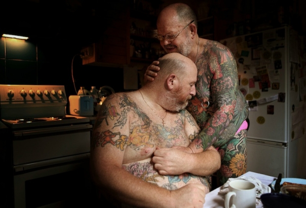
In honour of International Women's Day, I've pulled together five stories told by five female photojournalists that I think elucidate why we need a day to celebrate our mothers, sisters, and wives. There's a great deal that I could say about women's rights, but the photos say it better. Please take a look.

Agnes Dherbeys: The Street With No Name Cambodia
Because women shouldn't feel that there's no alternative than to sell sex to make ends meet.

Anastasia Taylor-Lind: The National Womb
Because women are more than baby-making machines.

Andrea Bruce: The Widows of Varanasi
Because women are more than just wives to their husbands.

Lynsey Addario: The Criminalization Mothers
Because women are people, too.

Stephanie Sinclair: Self-Immolation: A Cry for Help
Because no woman should live in fear.

These are not the only stories told about women, by women. There are millions of women and billions of stories. These images are barely a drop in an ocean.

Delving into the 'Skill vs Kit' myth


Taken with a point-and-shoot

A few days ago I found myself in the midst of an interesting Twitter conversation with a young photographer who has been debating upgrading to a dSLR from her point-and-shoot. However, she has read so many articles telling her not to bother that she wasn't sure if it were the right thing to do. Oh? People are actively saying don't buy an interchangeable lens camera? Really? This is what she told me:

I like photography and find my point-and-shoot limiting but everyone says to me better pictures is you and never the camera.

Oops! Something has definitely got lost in translation there, because I am undoubtedly one of the body of 'everyone' who extols photographic skill over camera prowess every time, but that's not at the expense of achievement. What I don't mean is that a young photographer should feel frustrated because she can't do what she wants to do with her camera and is scared of buying something new. You see, the key phrase in my correspondent's correspondence was 'find my point-and-shoot limiting'.

When we talk about photographic skill trumping your kit's capabilities, what we mean, on a most basic level, is that having the most expensive, all-singing, all-dancing   camera with bells, whistles, and a hotline to the President of the United States won't automatically make you a better photographer. You have to know how to use it. A couple of winters ago, my cousin wanted to upgrade from her Panasonic Lumix point-and-shoot to a Canon 5D Mk II. She asked me what I thought. I told her to save her money and buy something a bit lower down the pecking order; invest in some good lenses and some books instead. Bless my cousin, money burns a hole in her pocket and she couldn't quite understand this. Her response: 'But it'll take better pictures!' Not quite, of course, as she will be the driving force behind her camera, and the one responsible for taking better pictures.

Ultimately, a bad photographer with an expensive camera will still produce bad photographs.

A good photographer with a camera that doesn't allow them the control they desperately want will still take good photos, but they might feel a bit frustrated in the process. Give these frustrated photographers cameras where they can call the shots, and a whole new world opens up to them. It isn't so much about having a 'better' camera, it's about having a camera that allows you to do more.

In my early days with an SLR, I came into a bundle of money and decided that it was time to buy a new lens to augment the few I already had. Not really knowing what to buy, I asked someone with a lot more experience than me what he thought would be a good choice. His advice: 'Leave the money in the bank. When you can't do what you want to do with what you already have, then you'll know what to spend it on.' He was absolutely right. It's not about having kit for the sake of having kit; it's about having kit and knowing what to do with it.

So to any photographer who's frustrated by a point-and-shoot: do seriously consider investing in something that gives you more control and more flexibility. What you don't need to do is spend all of your spare pennies, and probably quite a few that aren't spare, on a camera that's in excess of your needs. Buy the one that fits the bill and spend the rest on a good prime lens. When you can't get in close enough to photograph wildlife, or realise that you love taking photos of teeny-tiny things, or that your kits lens is giving you landscapes that are a bit too mushy, then it's time to think about a long lens, or a macro lens, or a wide-angle lens. (And remember that it is always worth investing in good glass. Cameras might come and go, but lenses will last you for years.) Eventually you might find that you need a camera with better low-light capability or more extensive continuous shooting functions–it might even fall apart or meet a sticky end–it's about knowing what meets your needs and then working to push yourself past that point.

Good photography is always about a good photographer, one who knows what to do with their kit.

A snapshot of time

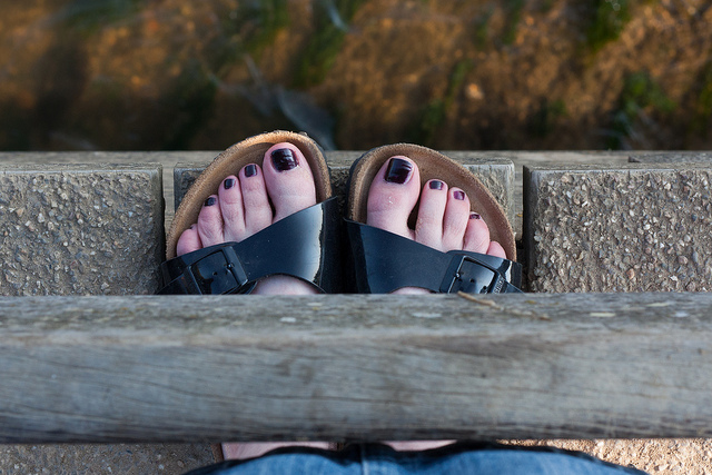
Toes Forgive the moment of introspection, but I've just stumbled into a dilemma. The beginning of this month has necessitated dealing with a pile of important paperwork, from passports to pensions. They are the sorts of tasks that require both finding and filing documentation, some of which you don't tend to look for especially frequently. It was whilst I was sifting through some of these significant documents I encountered my conundrum.

Stashed in an envelope and nestling amongst some papers, I found some photographs sent to me a few years ago by a guy whom I used to date. The photos aren't anything special, either in terms of our relationship or their photographic merits - he was no photographer - but I'm loathe to throw away photographs.

To start, who am I to discard someone else's creative output? That would place me in a category of Philistines with whom I have no desire to associate. I am not the Lady High Overseer of what Deserves to be Preserved, except with respect to what I produce myself. My photographs? Yes, I can choose to delete, to bin, to even burn those. Someone else's photographs? No, they are not within my gift to declare inferior, to determine insignificant, and then to destroy.

I don't intend to get too melodramatic about it; afterall, I'm not convinced that me throwing away a handful of photos taken of nothing-in-particular in New York City maybe ten years ago is cultural imperialism on a scale comparable to the 1497 Bonfire of the Vanities. But it does seem casually inconsiderate, especially when you read about the extent to which people have gone to protect a collection of ancient manuscripts from senseless destruction in Mali.

It's not the done thing.

Furthermore, destroying photos rankles with me because even the most mundane image can be valuable, whether that's emotionally or historically. Actually, especially historically.

We have a tendency to forget that the everyday is the most easily overlooked constituent of our lives, and therefore the least recorded. It is, though, one that fascinates historians and any documentation of the day-to-day are, really, significant for them. Right now, these photos might not mean anything to anyone; but one day they could. (Although to be honest, decontextualised and found amongst my papers in 60 years' time, they have the ability to confuse rather than elucidate.)

There is a nagging doubt at the back of my mind that these pictures could somehow, someday, complete a jigsaw puzzle for a historian. I don't know what this puzzle is and I don't know how these pictures might teach someone about life in the early twenty-first century. If I did, I'd be in remarkably privileged position of foresight. And of course, it is precisely because I don't know that I'm so reluctant to discard them.

Finally, I can't bring myself to dispose of these photos because once-upon-a-time they were important enough to him that he decided he should send them to me.

I could, it's true, return them to him. But we fell out of touch and have not spoken in years. Aside from having to look him up, the last that I heard, he was married. So I'm not sure how appropriate this would be. There is something romantic about the notion of receiving a fragment of your history recorded on photographic paper through the mail, a time capsule wrapped in brown paper to make you stop and think. But I'd want this to be just that, a flicker of time, to make him smile a moment.

They're in an envelope, sitting unaddressed on my desk. What to do? What to do?

'Make it memorable' - looking for the Sony World Photography Awards' winning image


Tobias Brauning's winning image for the 'Split Second' category in the Open division - 'Dancing Queen'

Entering any type of competition, from a photography contest to a tennis match, can be nerve-wracking: you're making yourself vulnerable by subjecting yourself to judgement, which can leave you feeling incredibly proud or terribly humiliated at the end of the process. If you overcome that frisson of tension or the butterflies in your tummy, though, you're in with a shout of winning a fabulous prize and having your name up in lights (sometimes literally and sometimes metaphorically) for a bit. That's rather awesome. Not to mention that there is usually something that can be learned from entering a competition, whether that's the betterment of your skills or personal experience.

All of this is true for the annual Sony World Photography Awards, which is one of the most prestigious, and valuable, photography competitions around. It's top prize in the Professional category, L'Iris d'Or, is worth $25,000 to the winner; the Open category winner gets $5,000, a trip to London to the awards ceremony, and a bundle of equipment from Sony. I don't think any of that can be sniffed at, so maybe you'd like to enter? It's open to both amateur and professional photographers and there is sure to be a division that suits you, from architecture to low light to contemporary issues to portraiture.

Of course, getting a feel for the competition and knowing what the judges might be looking for can be helpful in over-coming the nerves and feeling a smidge of confidence in the work that you're submitting.

I've been fortunate enough to have the opportunity to pick the brains of three of the Sony World Photography Awards' Honorary Judges–Caroline Metcalfe, Macduff Everton, and Tim Paton–and ask them precisely what they're looking for in a competition-winning image.

Caroline Metcalfe is the Director of Photography at Condé Nast Traveller (UK) and is responsible for commissioning and overseeing all of the publication's photographic content, with the exception of its fashion stories. She'll be lending her judging expertise to the Professional Travel, Landscape, and Nature & Wildlife categories.

Macduff Everton is a contributing editor at National Geographic Traveler and has works included in the collections at the Bibliotheque Nationale in Paris, the British Museum in London, and the Museum of Modern Art in New York. He'll be on the panels judging the Professional Travel, Landscape, and Nature & Wildlife categories.

Tim Paton started the photo agency Balcony Jump in 1995, which is now regarded as one of the best and most-respected agencies in London, but if you've ever picked up a copy of the NME, you're likely to have seen his work there. Tim will help to judge the Professional Sport, Campaign, Fashion & Beauty, and Lifestyle categories.

Unsurprisingly, all of them have brought their individual experiences and preferences to the panel and as Tim Paton puts it: 'A picture that I love, the judge next to me might hate.' But to start with, they are all united in one sentiment: it's all about the content.

Whatever the picture or series of pictures that you submit, the story in the image and the connection that it evokes with the audience is the driving feature. For Macduff Everton, the key difference between a snapshot and an award winning image is the narrative and the emotion that it conveys. 'The caption can't read: "Well, you should have been there."' The image has to speak clearly. Caroline Metcalfe points out that great images are ones that viewers will want to linger over, to absorb, and to return to over and over again; they fascinate and they intrigue.

All of the judges return to the same point: a photo needs to be memorable and surprising. You might be photographing something that has been captured a million times before, but if you can do it in a way that is unusual, that demonstrates your vision and your talent, that capitalises on the conditions–for example light or weather–and sticks in the viewers' minds, then you are on to a winner. 

It doesn't matter if you're in the most stunning location imaginable for your travel photography or photographing a well-known landmark, whatever the image, it needs to be original. That can arise from a visual twist or a new interpretation, and it relies on your own endeavours. You have to create the shot. Everton probably puts this best: 'We've all seen [a picture of] an elephant. Create an image so that when we next think of an elephant, we think of your image.'

Both Metcalfe and Paton are clear that it isn't about the kit: 'I don't care what lens, filter, or camera you used. I am only interested in the content of the image,' says Paton. Metcalfe is maybe a little more subtle: '… it is not technical expertise or sophisticated hardware, it is always about the individual creative eye, skill, and talent.'

Metcalfe has some practical advice, too. She reminds people entering a series of images to ensure that each image is as strong as the others. 'I often see entries where one image in a series lets the whole portfolio down,' they need to work together, as a coherent story. And of course, check the rules and make sure that you submit by the deadline!

Everton suggests that you look to the techniques of other creative disciplines to ensure that you nail your images. For example, the corners of a picture are just as important to a painter as the centre of the image is, so do not forget about those. They shouldn't be dead space and they shouldn't be overlooked. And if you're photographing a building, think about how the architect envisaged it and bring some drama to your image. Finally, there's the key to photography: light. You need to understand light to get a good photograph.

Every year, Paton is sent thousands of images for his consideration; only about two of those will stop him in his tracks, but that's precisely what he wants when he's judging the WPO. He wants to be able to see that a photographer has gone the extra mile and made a real effort.

If this has inspired you, or maybe given you the insight you need to submit an entry, remember that it's free to enter both the Professional and Open divisions of the Sony World Photography Awards 2013, and the deadline for entries, which must have been shot or first published in 2012, is Wednesday 9 January at 23:59:59. There are of course terms and conditions governing what you must submit and where you are permitted to submit entries. These are all available on the WPO website.

Good luck!


Headline image: Copyright Tobias Brauning, Germany, Split Second, Open Winner, Sony World Photography Awards 2012

Call your phone to trigger your camera


One of the most awesome things about working on the Triggertrap is the community we've built up already. And, like any great community, we keep getting fantastic ideas via our Get Satisfaction forums.

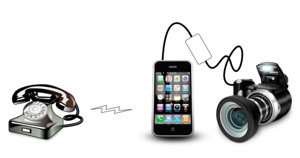
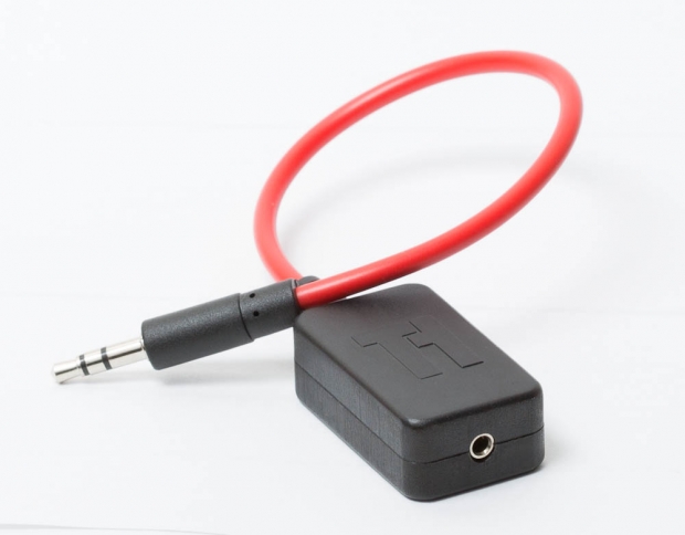
triggertrap_tt_d2_004.jpgAs soon as Triggertrap Mobile launched, we had a fantastic idea from Travis, who wished he could trigger his camera by calling his iPhones... The big dirty secret, however, is that this is already possible, if you have a Triggertrap Mobile Dongle! The little trick is to choose the top secret special triggering sound we use in the Triggertrap App as your ring tone, and then to turn the ring tone sound to maximum. Here's how

WARNING - It's worth pointing out that if you're planning to do this, make sure you keep your Triggertrap dongle plugged in the whole time, and switch the special Triggertrap tone for another ring tone before you unplug it. The tone is meant to be listened to by the Triggertrap Mobile Dongle only; It isn't great for human consumption (For exterior use only; do not swallow; consult a doctor if you spill this sound in your eye socket, etc). Anyway.

How to trigger your SLR by calling your telephone

To be able to call your iPhone or Android phone to trigger your camera:

  1. Plug your Triggertrap Mobile Dongle into the headphone socket of your iPhone.
  2. Download the Triggertrap Mobile Ringtone for your iPhone as a .zip file.
  3. Unzip the tone (it's a .m4r file; Apple's special m4r ringtone format.)
  4. Install the tone to your phone2
  5. Choose the Triggertrap Tone as your ring-tone3
  6. Set up your camera using Single Shot1 and preferably manual focus, too
  7. Call your iPhone from another phone to take a photo.
  8. When you're done, choose your old ring tone3 again, before un-plugging your Triggertrap Mobile Dongle from your iPhone

Brilliant, eh? 1) You could also set it to Continuous mode, but we'll be sending a very long shutter signal to your camera (5 seconds in total), so it would be like pressing and holding your shutter button for 5 seconds. Try it now; press and hold your shutter button. If it takes 30 photos in quick succession, that's what'll happen when you use this trick to trigger your camera. If you'd prefer to just take one photo, use single shot mode!

Additional help and assistance

2) How do you install a custom ring tone to your phone?

  1. Set your computer's sound to mute.
  2. Drag the .m4r ringtone file to your iTunes. If you forgot to set your computer to mute, you'll now get a horrible sound playing through your speakers. Trust me; you don't want this sound: It's bad for your computer and for your ears.
  3. Plug your iPhone into your computer with the USB lead
  4. Click on your iPhone within iTunes
  5. Select 'Tones' from the bar across the top (this is also where you select what music, movies, and apps you want to sync to your phone)
  6. Either choose 'all tones' or just 'Selected Tones' and then tick the Trigger Tone box.
  7. Click 'Apply'
  8. Click 'Sync'.

3) How do you choose a ring tone on your phone?

  1. Go into the Settings app on your iPhone
  2. Choose Sounds
  3. Click Ring Tone
  4. Choose the ring tone you want as your ring tone. In this case, Trigger Tone. If you've only just uploaded it to your phone, it'll show up right at the top.

#payphoneography - the ironic art of photographing public telephones with your mobile phone


Did you know that in 2000, there were about 2.2 million payphones across the United States? Or that there are still about 500,000 operational ones? Or that they handle roughly 1.7 billion calls a year? I didn't know that until about five minutes ago, and neither was I likely to before Dan Marker-Moore dropped me a note about #payphoneography, his ironically inspired project to photograph public telephones with the very device that has contributed to their demise.

#payphoneography started in December 2011, as a personal piece of fun in Dan's corner of California. See a payphone, snap it, share it. Before long, people as far away as Australia had been photographing and sharing images of public telephones using #payphoneography on Instagram, Facebook, and Twitter. Dan says it's been fascinating watching the idea catch on, both spontaneously and as the result of his carefully crafted stickers.

'I made stickers that fit perfectly on the handsets that say #payphoneography. Without any instructions people see the sticker and know how to share. They pull out their mobile phones take a picture and include the hash tag #payphoneography when they share it.'

At the moment over 4,000 images have been contributed to the cause from countries including South Africa, Russia, Italy, and Japan. But Dan says that his favourite phones are from São Paulo: 'Their phones are surrounded by a suspended dome booth and feature bright yellows and blues. Recently these phones were featured in art project where they were transformed into sculptures and paintings.'

And yes, Dan says that a phone has started to ring just after he'd photographed it. He checked very carefully for a lurking Kiefer Sutherland before he answered it, only to be met by the screeching of a fax machine on the other end!

With a 4,000-strong international portfolio, where do you go next? Well, Dan would definitely like to start photographing overseas phones for himself. But he'd like to get the project into print, too.

Want to take part? You know what to do! Want to look at payphones from across the globe? Head the #payphoneography website: blog.payphoneography.com

Becoming a better photographer - with Photo Forensics!

If you've been anywhere near a technology magazine in the past few months, you can't have failed to see a series of Tamron adverts, showing off their 'astonishingly compact and leightweight' lens with 15x zoom lens. However, when I was having a peek at the advert, I started wondering what, exactly was going on here.

The advert in question is this one:

screen_shot_2012_09_26_at_144731.jpg

Now, don't get me wrong, this is a lovely photograph. But I can't help but wonder whether we're all victim of somewhat false advertising here. There are a whole load of things wrong with this photographer, and as an observant student of photography, I'm sure you can spot at least some of them. Take a close look at the image, and think like a photographer - what are you seeing?

Depth of field

One of the problems I had with this photograph, are the claims about zoom length and depth of field. The two photos are a wide shot and a very up-close photos, and since this is a 18-270mm lens, it stands to reason that Tamron have taken one photo at each of the focal lengths. So, that means that the widest possible aperture the main photo could have been taken at, is f/6.3 (this is a f/3.5-6.3 lens after all). As such, the top photo would have been taken at 270mm and f/6.3.

screen_shot_2012_09_26_at_144735.jpg

The shadow and highlight on the adult's arm, along with the highlight portion on the boy's arm would indicate that the light is coming from above and left in this photograph. Lovely; but that leaves us with some questions. If we follow the 'sunny 16' rule, this photo would have to be taken at ISO 100 with 1/100th of a second at f/16.

However, there's a very distinct shallow depth of field thing going on, which leads me to believe that this image will have to have been taken wide open - at f/6.3. That's entirely possible, of course, but then the camera would have to be shooting at 1/4000th of a second or thereabouts. No problem, but there appears to be some motion blur on the droplets falling off the oar in the background - indicating that this image will have been taken with a shutter speed of 1/200 or less.

Of course, all of this is possible if they used a Neutral Density filter (in this case, to get from 1/4000 to 1/200, you'd need a ND4 filter or thereabouts) when taking this photo, but as far as a like-for-like comparison goes, that seems a little bit weird for an entry-level consumer lens.

screen_shot_2012_09_26_at_153319.jpg

Another argument for why this photo doesn't quite stack up in my mind, is that for this particular lens, you only have to focus up to about a 30ft / 10m distance. After that, you've focused to infinity, which means that even at f/6.3, you actually have pretty decent depth of field. If the top photo is taken from the distance implied by the bottom photo, I'd say that something really curious is going on in these shots: To me, it looks that the distance to the boat is about 10 meters - and if that is true, then the picture is a physical impossibility without extensive photoshopping.

Or rather: I can't really see how a 270mm f/6.3 lens could have taken this photo from the distance the bottom image would imply - especially considering how the boy is perfectly in focus, whilst the boat just in front of him, and the paddle just behind him is out of focus.

If you ask me, it looks as if the photo was taken from much closer than the inset photo claims, the lens blur on the foreground (on the boat) is genuine, whereas the person in the background has been blurred in Photoshop, after carefully applying a mask around the boy. That would certainly explain why there doesn't appear to be any further depth of field fall-off between the man's elbow / paddle and his face - they all seem to be blurred the same amount, which seems unlikely if the photo was taken in the way it is implied

Lighting

The other thing that I find weird in this photograph, is how it looks like the lighting is quite different in the two photos. If you look at the smaller, inset photo, you can see that the life vest the boy is wearing is significantly brighter than his face. On the main photo, however, we are getting remarkable detail and dynamic range in his face.

In fact, the fact that we have perfect definition in the directly sunlit arms of both the people in the photo is astonishing; you'd expect a lot less definition in the shadows in this image... Which makes me believe that this photo has either been through some rather extensive photoshopping to lighten the shadows (nothing wrong with that...) or that a reflector was used to achieve the top photograph.

Again, of course, there's nothing wrong with using a reflector, or photoshopping a photo to make it look better, but I can't quite help but think that whatever is going on here, it would take some expert photoshop or lighting skills to get that much detail out of the photo - and if that is the case, is it a honest comparison between the two shots?

No help from Tamron

Of course, I wanted to find out for myself how these photos compared to their originals, so I e-mailed Tamron back in May to get my hands on higher-resolution versions of the photos used in this advert. Back then, I received an out-of-office e-mail from their press office, but I never received a reply to that e-mail, nor to any of my other enquiries. A shame; I think it could have been really interesting to see how far off I was in my 'photo forensics'.

What can you learn?

Anyway - the point of this article isn't to point fingers - it is entirely possible that Tamron's photos are entirely above board, and that the photos shown are direct-out-of-the-camera versions of photos taken with the Tamron 18-270mm lens...

The point I'm trying to make is that you can learn an incredible amount about a photograph by just looking at it, without having any additional information about the equipment used. The key to learning something from this exercise is to ask the right questions, and apply everything you know about photography to the image to 'reverse engineer' how it was taken.

I made a habit of analysing photographs I've seen in magazines a long time ago:

  • Where does the lighting come from? Is it natural lighting, flood, or flash lighting? How is the light managed / adjusted / reflected / diffused?
  • What is the shutter speed and aperture likely to be?
  • What angle was the photo taken from?
  • What focal length lens was the picture taken with? Was it taken with a telefocus or a wide-angle lens?
  • What digital enhancements were done on the photo before it ended up on print?

By spending 30 seconds on any photo you see around you, you can train yourself to become a better photographer, even when you are miles away from your photographic equipment!

A Closer Look: Jonathan May


I've handed over the reigns to Gareth again today. He's taken a slightly different approach to his article this week: he's going to take a closer look at a photographer he admires, and examine just what it is that does it for him.

All yours, Gareth...

A Closer Look is a series of articles looking at the work of photographers whose work means something to me. When I am influenced by the work of others, I like to take less tangible elements away from the images. It isn't useful, in my opinion, to closely study the technical style of a given photographer, as you are at risk of losing your individuality. A more useful practice is to study what you love about an image beyond the immediately visible.

This week, I'm looking at Jonathan May, a photographer I became aware of when he was selected as a finalist in the National Portrait Gallery's Taylor Wessing 2011 Photographic Portrait Prize.

A small disclaimer: just because I admire May's work doesn't necessarily mean I can speak about it with authority – I merely aspire to describe what I like about it.

may.jpg

The first thing that strikes me about May's work is that it's often very positive in tone. This is extremely refreshing in the current climate, because so many photo stories, whilst absolutely beautiful and shot with a mastery that leaves me open-mouthed, are of subjects that are, frequently, unrelentingly bleak. Now don't get me wrong, I think it's  vital for photography to be able to highlight issues and tell stories that would go untold and unseen by the world. Not only that, but I think the people who bring such stories to the world are genuine superheroes (and possibly slightly unhinged): it's just that the saturation of such stories makes me yearn for something different.

You can see this immediately in his set L'Afrique. I feel that, in the West, we have a skewed image of Africa: a combination of the doom and gloom of the media and the plethora of photo projects that cover injustice, poverty, war and political horrors throughout the continent. It feels like from north to south, east to west, it comprises misery and human suffering. There is, of course, much of that, all of which needs to be exposed to the world and not kept a secret, but there is also a vast and beautiful culture and history which is seldom celebrated in the face of documenting all that is wrong with Africa.

May's shots of Africa exhibit a warmth, respect and admiration for African culture. It is refreshing to see a story of Africa that feels more celebratory than exploitative: in L'Afrique we become students, soaking in the beauty, gazing up at these people, learning, engaging on a human level.

afrique.jpg

The most important skill exhibited in L'Afrique is May's ability to act as the humble recorder whilst still applying his style, skill and proficiency to the images. If an image evokes more of the photographer than it does the subject, it's doing something wrong, in my opinion. This is something May is acutely aware of and he elevates his subjects whilst remaining anonymous to us, the viewer.

It's a feeling May achieves in many of his projects and is something evident in any story he tackles. I love his ability to find beauty in topics and stories that are infrequently covered. This is why one of my favourite photo stories of his is Greens: a look at crown green bowling, more specifically the bowling club his grandfather founded.

There is something quite beautiful in the telling of a story through the paraphernalia and objects that surround the people involved in the story, and Greens achieves this beautifully. An image of a somewhat chintzy clubhouse carpet with a table occupying the corner tells us as much as a one of his intimate, shallow depth of field portraits does. It's when these two are combined in a series that they unlock the power of one another: although they are strong images on their own, the effect is compounded when they are brought together, contrasting as they are in content.

greens.jpg

As a portrait photographer halfway through my first ever long-term photo project, I am fascinated with the idea that a portrait of someone can be greatly enhanced by an image of their surroundings, or of something that is illustrative in some way of who they are, as opposed to a single image of the actual person.

There are dozens of single images within Jonathan May's work that I love but, in the interests of not making this article tediously enormous, I will look at my absolute favourite and attempt to articulate why I adore it.

caravanport.jpg

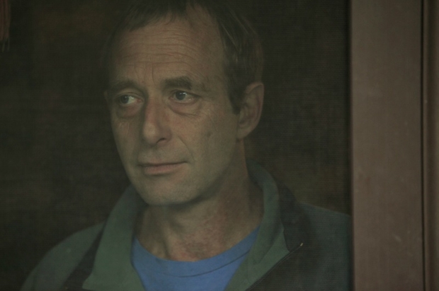
This is a portrait from May's series Caravans, a story about a society that is often looked down on and dehumanised in many ways. The series itself has all the trademarks of May's work, but there is something about this particular portrait that, as I cycled through the images, was like a punch in the stomach: a good punch in the stomach, if that makes sense (it doesn't).

Initially, the intimacy of the composition grabbed me, so I brought it up in full screen. The background is uncluttered and plain yet far from blank: it further draws us to the subject's face. The expression that May has captured is utterly captivating: it's an expression that is both inscrutable and full of emotion at the same time. His mouth is ever so slightly curled up at one side, suggesting a smile may be breaking out. There is the tiniest hint of a wet glint in his eye, as if he is holding back a tear, but it's all so slight that we're not sure whether that is a projection of what we are seeing in his face or the reality of the situation. When I look at his face, I see a man remembering: an expression of fond reminiscence. We are the ones to lay down the final brushstroke, the canvas is left open for us.

And 'canvas' is an appropriate word here: the mesh of the door has muted and diffused the light and the wooden frame forms the right hand side of the image, creating the feel of a Renaissance-era painting, faded over time. I love the idea that something so beautiful can come from a seemingly innocuous shot of a man looking out of a window in his caravan. That, dear readers, is the magic of photography.

What I'd really like is for these columns to become discussion points about the artist in question. I want to hear what you think of Jonathan May's work – does it resonate with you? Does it excite you? Does it bore you? What do you like? What do you hate? Let's hear your opinions!


The illustration was by the mightily talented James, of Sweet Meats Illustration.

You can check out Gareth's photography here.

And if you're wondering about the copyright implications of reproducing May's work in this article, it's covered under fair dealing, as criticism and review.

Commissioning a website


I’ve been creating websites since around 1996 or so. When I got started, Netscape Navigator Gold was the, er, gold standard for creating web pages – it even came with a HTML WYSIWYG editor built-in. Cutting edge stuff. Oh how things have changed.

Throughout my web-life, I’ve seen quite a few different sides of websites: I’ve designed some (badly). I’ve programmed a few. I’ve been the editor of some major sites; I’ve specced and project managed the build of a load of very high-end sites, including one for a national broadcaster and one for a mobile phone company you may have heard of.

I’ve worked in SEO. I’ve contributed to open-source projects. I became a certified Scrum product owner, and embraced agile project management… etc. I guess, since I’ve done all these different roles at some time, what I’m trying to say is that I’ve started to figure out how it all hangs together.

So, what follows is a ridiculously comprehensive guide to how you can work with various agencies to get a great web-site built for you or your company.

Why you need a website
img_2664_edit_edit.jpg

There are plethora reasons for why you might want a website. Your competitors might have one, perhaps you wish to make information easily available to your customers, or you may be considering selling your goods or services on the internet.

While it can be cheap and easy to just fling something out on the internet and see what happens, it is worth considering what your hopes and aspirations are for your site.

Attract new customers

Attracting new customers is a logical reason for a website. If you sell widgets, you want your customers to find you when they type ‘Widgets’ into a search engine. You want to impress them with your site, and ultimately, you want these potential customers to convert into actual money-spending customers.

A good web site can be a phenomenal sales tool: It can help you stand out from the competition with the unique selling points of your products and services. If your product is better than that of your competitor – make a big deal out of it. Is it cheaper? Your website is your PA system shout your bargain prices from the virtual rooftops!

Marketing to existing customers

Of course, it’s not just about convincing new customers about how awesome you are: your existing customers will also benefit from you having a website.

With existing customers, you have a few benefits already. For one thing, they know your brand and they trust the service you deliver. They will want to stay up to date on what your company is up to, and how your new products and services can make their lives easier. Your site can explain why the new versions of your new products are better than the old ones, and hopefully cause the orders to come rolling in.

Enhance your reputation

Websites are great repositories of information, and you can leverage this to help improve your reputation. You can be quite public about how great your customer service is, for example, by running customer support forums.

Even if the customer relations part of your business is classified due to sensitive clients (or you might simply decide it’s not in your interest to have everything publicly available), it is possible to distill questions that are repeatedly asked to your customer service team into a Frequently Asked Questions (FAQ) document.

Imagine the delight of a customer who runs into a problem, Googles it in an effort to find a solution, and ends up on your own website, with a complete and thorough solution to their problem!

Such a scenario is a phenomenal user experience, which sticks in the mind of your customers. It wouldn’t be the first time that a negative product experience (they did need to search for help, after all) was turned into a very positive one because of a well made website. People realise that things go wrong some times, and truth is, some times you end up with a better image of a company which screwed up but made things right quickly and efficiently, than a company which didn’t make any mistakes in the first place!

The Virtual Pamphlet

There are many ways people can end up on your website, but all traffic has one thing in common: They are there for a reason, to complete an action of some description.

They might wish to find a mailing address for your company so they can send you a crate of wine after a job well done (Hey, we can’t but hope, right?), maybe they want to buy something you’re selling, or they could be searching for instructions about how to use or care for a product you’ve made or sold.

Your whole website is a representation of all these things: Helping your customers in the best way possible. But it’s important to remember that you can get more explicit, too – if you need your website to be a sales tool, make it work hard for you. Get your visitors interested, convince them that what you’re selling is what they are looking for, and spur them into action.

A font of information

Back in the day, if you needed any information about a business, you’d have to find the yellow pages, find their number and call them. You would be forwarded through a hellish maze of automated telephone machinery, before you finally get to speak to someone, just to ask a very simple question. We’ve come a long way, haven’t we?

These days, websites have taken over a lot of the basic information distribution. Where is the coffee bar? Their website will have a map. When is the film you want to watch on at your local cinema? Check out their website for film listings. What are the opening hours of the library down the road? Website. The most recent shareholders report, that press release which was sent out last week, and the mailing address for the eastern district office? Website, website, website.

A good website can save you a lot of time (and, therefore, money). Instead of having to put resources into answering simple questions over the phone, let your site do the heavy lifting. Of course, if you want this to be possible, your site has to be easy to navigate and make it intuitive to find the kind of information you are looking for. That’s where a good web design agency comes in.

Creating a good website

1c9a2946.jpg

So, by now you probably have a pretty good idea of the kind of things you want your website to accomplish. You might be thinking of ways it can help you save money, things it can do to help you make more money, and so on. You’ll have noted that we have used the phrase ‘good website’ above a few times… So what, exactly, makes a good website?

Content is King

Often, it is easy to get distracted right at the beginning building a new website. It is easy to get lost in the pretty colours and nifty features we can / will / should add to a new site. It’s crucial to remember one thing: None of that is as important as the content you will have available on your site.

It is often said that people aren’t prepared to visit a pretty site without content – but they are willing to suffer a horribly designed and poorly presented website to get to good content.

The lesson to take away from this is that you have to think about your content as much – if not more – than you think about how the site looks and works. If you are using videos, make sure they are well-produced, short, and to the point. Get a copywriter involved to make sure your written content is as hard-hitting and clear as it can be.

For every piece of content you decide to put on your website, think ‘How does this benefit our users’ and ‘how can we make this content better?’

Finally, remember that your website is like a chain of information, and your site visitors might enter your site at any point. That slightly ugly page with the profile of your CEO, which is hidden away somewhere in the depths of your site, and that you were meaning to update ages ago? That might be the first page a visitor sees if they Google for some obscure term – immediately giving them a negative impression of your site and your company.

The web is all about sharing – so endeavour to do some. Write blog posts or news stories when something exciting happens at your company. Share your victories, celebrate your triumphs, and encourage your staff to write interesting pieces about aspects of what you are working on.

By consistently providing relevant, interesting information, you gain a lot of benefits: In addition to becoming a de facto go-to place for information in your field, you will attract inbound links from relevant sites. In time, this should be a cornerstone in your Search Engine Optimisation (SEO) strategy in the long run. Don’t worry; we’ll talk about SEO later on in this guide.

Understand your medium

In order to create a good and efficient website, you have to understand your audience, the internet, and how the two of them connect.

Internet users are incredibly fickle: They won’t start by reading your headline, then your introduction, then the body of your text, like they might read a newspaper or a magazine.

Internet users tend to flick from one thing to another. They won’t scroll down to read more, they won’t read instructions on how to use your website, and they won’t be guided.

Web users are getting clever, and they have one ace up their sleeves: If your site doesn’t give them what they want, there is probably anything between a dozen and a million other sites offering exactly the same information. you have to make the content on your site count. Your text has to be engaging, short, and to the point. Unnecessary content will quite simply not be read: At best, it will be ignored and at worst, it might encourage users to abandon your website completely.

Another trap many people fall into is to include all sorts of gadgets on a website just because it is possible. Complicated Flash menus can look nice, and flashy address lists can be cool; but what is the added value to the people visiting the site?

§Skip the bells and whistles – instead, put more energy into helping your visitors find the information or perform the actions they want to complete on your website as smoothly and elegantly as possible. As soon as a visitor feels as if you’re wasting their time, they probably won’t be back.

Look at the bigger picture

When you’re in building-a-website mode, it’s very easy to forget that there are more things out there than just your website. The site is important, no doubt about that, but ultimately, it’s merely a smaller part of your overall marketing strategy.

Just to take an example: In your company, does everyone’s e-mail signature promote the website? Does your website promote your newsletter? Does your newsletter remind your readers of your hottest sales offers? Does your product documentation reference your website? Do your business cards add value to the overall mix? Do you send out sales letters? If so, do they integrate well with the rest of your marketing? Are your advertising efforts as efficient as they can be?

Everything your business does should sing part of the same symphony: Advertising, website, other marketing efforts, customer support, even the products or services themselves. If you have a colour scheme, it should be reflected everywhere. If you have a logo, use it all the time.

Your marketing message should be completely saturating all communication channels you have with your (potential) customers. In short: think about the bigger picture, and figure out how your website is part of this.

Blogging
1c9a2920.jpg

There is a subtle difference between having a news site, and running a good blog on your site. The distinction is further muddled by the fact that many news websites currently run on blog platforms like WordPress or Movable Type, and some blogs aren’t really blogs at all.

So, just to get the distinction right; if you are running a site with stories about what you’re doing at your company, without linking much to other sites, then you’re probably running news on your site. That’s perfectly fine, and can be an efficient tool, but the internet has moved on from there.

The word ‘blog’ came from ‘web log’ and started originally as just that: A ‘blogger’ would surf the internet, and discover new articles and sites. As they did, they gave their opinion on the site, news story, or event, sprinkled with links containing more information.

Good bloggers often serve as hubs of information, comparing different sources, analysing how the sources’ angles or opinions differ, and pick apart poorly-written or badly researched pieces about a specific topic on the ‘net.

Cornering the market with a blog

Blogging can be extremely valuable to your company from a business point of view, especially if your industry doesn’t have a go-to news source.

Say, for example, that you’re the manufacturer of a very specific type of hinge used in car doors. This hinge is better than that on all other car doors in the world: Your customers are car manufacturers. Your competitors are other hinge manufacturers. People who repair cars (or super-geeky drivers) might also be interested in what you might have to say.

There won’t be too many blogs out there specifically about car door hinges, which is a good thing: when you start it, you have an opportunity to corner the whole market. Get a good writer involved, and start writing.

What are you doing differently? Perhaps you can write comparatively about various alloys you’ve used in door hinges. Maybe you can show some of the experiments you did that went wrong, and how you can learn from them. You can keep your readers up to date with cutting-edge news, musings on the future of technology, or perhaps some historical articles, about how things were done 50, 25, or even 5 years ago…

Sounds lame, right? But trust me: You stand far better chances at getting an in-depth, loyal following on your company blog by writing about something very specific, than about whole cars.

Sure, more people are interested in whole cars, but there are sites out there with a huge writing staff, lots of marketing money, and plenty of other resources. By picking your target audience carefully, you can be the biggest fish in a tiny pond – speaking directly to your potential customers (the 200 or so people in the world who are interested in car door hinges), instead of people who might be interested (the billions of people who drive cars), but who ultimately aren’t going to spend as much as a penny with your company directly.

Of course, you’ll have to be careful so you don’t give away too much information – you don’t want to leak your carefully guarded industrial secrets to your biggest competitors, but on the flip-side, you have to be a little bit brave as well. If appropriate, you can consider to link to your competitors when they do something impressive, for example.

How does your blog help your business?

The internet is absolutely huge: Chances are that if you are doing something, then there are people out there who are interested in the same thing as you. These people have friends who are also interested in the same thing.

By blogging authoritatively about things your readers are passionate about, you’re inviting all sorts of positive behaviour: People might comment on your blog post with great ideas for new posts, improvements to current posts, and maybe even suggestions for improvements to your products.

Even if suggestions from your readers aren’t directly related, you’ll often find that crazy ideas from the hive-mind that is the internet have a core of a good idea in them – if something seems like a good idea, send it on to the product development team, and see what happens. If it’s rubbish, you may have wasted 10 minutes of their time. If it turns out to be a stroke of genius, you might have made your company a lot of money – just by monitoring the comments on your blog!

There are many other advantages, too: Good articles attract links from around the internet. When we see something we agree with, we’ll post it on Facebook. We’ll share it on our own blogs, or forward it to relevant news sites for potential inclusion. All these inbound links have a great side-effect in addition to the extra traffic: When search engines see that big, important websites are linking to your site, they realise that your site has grown in importance. That means that your site will rank better in the search engines

Finally, blogging is a way of promoting good press. Are people saying good things about you? Tell the world in your blog. Are you doing something awesome? Spread the word. Are you excited about something as a company? Here’s your zero-cost platform for making everybody know about it. The journalists covering your industry will definitely be reading your blog – and with a bit of clever PR and a good relationship with the relevant publications, it’s a great way of getting the positive press you’re hoping for!

Considering a microsite

20120515_00478.jpg

A microsite does exactly what it says: It’s a small, self-contained site. The purpose of a microsite is to create a site that has a specific goal, rather than just a set of pages that are part of a bigger site.

Creating a microsite has a few advantages: It doesn’t have to plug into your main content management system (CMS) and it can be designed quite differently than your main site. This means that if you need an ad-hoc site for an event or similar, it can be quicker to develop a microsite than to try and integrate the new (and potentially temporary) section into your main site.

Microsites for specific marketing goals

Imagine you’re a motorcycle manufacturer who makes two different types of motorbikes, for example: One is a large, Harley Davidson-style chopper, and the other is a smaller, race-focussed sports bike. You could try to fit them both into the same website, but the former would probably look best when photographed and surrounded by open highways and canyons, whilst the latter would be more at home leaned over going around the corner of a race track.

Using micro-sites gives you an opportunity: you could building a main site for your company, and then a couple of micro-sites to cover your motorcycle models would be easier: you could stay on brand and encourage your designers to create a perfect design for the respective bike types and the customers likely to buy them, instead of making a half-way compromise. In addition, it would make launching additional models (or removing outgoing models) much easier!

The great thing about using a microsite is that you can separate your customers easier, which enables more specific marketing messages, without having to worry about customers getting ‘lost’ in parts of the site which are less likely to be of interest to them.

Planning and contracts
20120514_00206.jpg

Before you go anywhere near a coloured pen or a line of code, you’ll have to do a spot of planning.

Launch Timelines

It’s worth considering the time frame of the launch: Does the site have to launch to coincide with a particular event or product launch? Would it be acceptable if the site was delivered late? If not, then you need to ensure that delivery timeframes and deadlines are specified in the contract(s) you have with your suppliers.

Bear in mind that time will not be treated as a critical factor by the law unless it is specified as such in your agreement. Ensure it’s black on white. If it’s particularly vital that the site is live on time, it is worth considering adding penalty clauses to the contract(s), to further incentivise the timely delivery of your site.

Standards and constraints

As part of your planning, you should also tackle some big questions that might help you later on.

These ‘big questions’ are often known as ‘constraints’ – they are over-arching rules that every page on your site has to conform to.

Examples of constraints could be what do you want your URLs and TITLE tags to, for example. This particular example which will come in very handy when it comes to marketing (like SEO – Search Engine Optimisation) later on. If it is defined as part of your planning, it’s easy to get it implemented as part of the project. Changing the URL and directory structure of your site just before launch might be possible, but it won’t be cheap!

At this point, you also need to set some standards: Which web standards are your developers and designers working to? How is the code structure going to work? To which level do you require compliance with accessibility legislation, like the Disability Discrimination Act? Should the site be accessible to colour-blind people? If so, to what level, and how will it be tested at the end? How will traffic to your site be tracked? If you are using Google Analytics or similar, how should it be implemented?

Remember to get all the constraints and standards written into your contracts – that way, there can be no confusion about what your expectations are, and if your designers or developers fail to deliver the site conforming to the agreed standards, you can send them back to the drawing board to get the work re-done or amended.

Support and hosting

Support doesn’t really come into it until the site is launched – but it is something that needs to be agreed and be ready well before the time comes.

The same goes with hosting: Do you need one server, or more? What levels of traffic are you expecting? Are you willing to accept any downtime, or do you need a more robust and redundant system in place?

Ensure that all the support and hosting questions are resolved early on – nothing is more frustrating than having a site ready to go, but no hosting platform ready to launch on!

Content management System

Another thing you need to think about is whether you want to use a Content Management System (CMS).

Sites that are updated only very infrequently might not need a CMS. In some situations, it is easier to simply re-upload certain pages when they need to be updated. On the other hand, this does demand a technician with CSS, HTML, and some design skills to be at hand whenever you want to make a change to the site, and might mean that you would have to contact your web design company to make even minor adjustments to the site.

Most modern sites use a CMS, to make it easier to update content. The difference is that instead of uploading new files, you log into the CMS, and make changes there. Depending on the CMS and its configuration, you may be able to create new sections, pages, news articles, and edit the front page from the CMS, in a much more user-friendly way than editing the HTML code of your site manually.

Many CMSes are created so they are as easy to use as your online email service (like Hotmail or Google Mail): You simply click ‘new’ to create a new page or news article, and to edit one, you would click on it and type away.

Many CMSes have dynamic functionality that goes far beyond what is possible with uploaded ‘static files’. You might be able to set a press release to get published at a specific time, for example, or your site might be able to keep track of the stock levels of your products, so people aren’t able to buy more of a certain product when you are sold out.

Keeping data safe and secure

20120228_img_0896.jpg

The Internet can be a nasty place, and accidents do happen, unfortunately. You can never plan for all eventualities, but you can try, of course!

Security

Up front, it is worth thinking about how secure your site needs to be. If you only want a simple page showing the opening times of your nightclub, you probably don’t need to worry too much about security – although it would be good if nobody could hack into the site to change your opening hours or, much worse, distribute viruses or similar.

If you are storing data about people (names, addresses, etc), you immediately need to be more careful with security. How do you store this data? Who has access to it? How easily would a hacker be able to break in to download this information, or how difficult would it be to intercept it in transit?

Of course, if you are going to take payments via the internet, that raises the stakes even further. People would be (rightfully) upset if their e-mail address was leaked to a group of spammers, but the severity of the situation grows a lot as soon as credit card or bank details are involved.

If you’re planning to take payments, it’s worth involving a security consultant early on, to discuss what an acceptable level of security would be. Does your user data need to be encrypted? Does your site need to use HTTPS and a security certificate?

Is your data sensitive enough that you should worry about more than just external risks? What about potential disgruntled employees? How much access to sensitive data would an intern or work experience student have on your systems?

You may also consider whether you need to log all changes made to the site, multi-level access control (so some site users can read, edit, or delete only some bits of content, for example).

As a rule of thumb, more secure is more expensive from a development point of view – and if the risks are high enough, you may want to look into additional insurance as well, in case something does go wrong!

Backups

Even if nobody gets access to your data and tries to hack or steal it, remember that you need to protect it from mishaps. Hard drives break some times, data centres can go down, or there might be a bug in your software which causes it to corrupt or damage the data in some way.

Everyone who has lost a Word document at some point knows the importance of saving your data and taking regular back-ups, but this is even more important for business-critical data that might be stored on your web server.

There are myriad ways of doing backups in a web context, and everybody’s requirements will be different. Our best advice is to work with your web host or development company to create a good backup plan which is redundant, backs up often, and is easy to restore.

Considering Open Source software

20120122_img_6692.jpg

Open source software is ‘free’ software that offers some unique challenges and opportunities. Some open source projects are extremely active, secure, and well-developed, others are not quite as robust.

Using an open source software package as the basis for your own web site might save you a tremendous amount of time. After all, why should you waste your time and money creating a new blogging platform when there are half a dozen great ones to choose from?

Using open source can be a lucrative shortcut to your ideal site, but if you need to make customisations, remember that the way this is done is important. Some open source software works using ‘plug-ins’, which means that the core software can be updated without affecting your customisations. This is useful, because that means you get the full benefit from the open source community: Bug- and security fixes can be added to your site whenever they are released, keeping your site safer.

Some argue that open source poses a risk in itself: because the source code is available, in theory, hackers can look at the source code to find vulnerabilities and use it to attack your site. On the bright side, these kinds of bugs and weaknesses are often fixed very quickly on active open source projects – this is why it is extremely important to keep your site updated with the most recent software.

Special considerations when using open source

Not all open source software is completely free; some is only free for personal use, for example, and if you want to make money off your website, it could fall in another category. Your web development company should be able to advise you, but you should certainly obtain a guarantee from your developers that the software licences have been properly complied with.

In addition, the use of open source software increases the importance of including clauses in the contract related to the provision of support: Who is responsible for keeping the software up to date? Who fixes bugs when new ones are discovered?

Building the website

20120117_img_3347.jpg

The kids who live down the street from you are probably able to build a website. When you’re aiming for professionalism and more advanced build, however, it’s quite important to keep in mind that different people have quite different skills – and they all need to do different things.

A website usually starts with a goal – or a series of goals. The website for a shop, for example, might have “Helping customers find information about the shop”, “Increasing footfall to the shop” and “selling things online” as goals. To reach these goals, you need to jump through a series of hoops, which usually involves a series of different people.

If you are building a very complicated site, you might need to get an information architect involved, to find out which types of data you are storing, how they need to interact, etc. Most sites don’t need this step, and jump straight to…

Functional design

The design step. Now, it’s crucial to understand that we’re not talking about the ‘pretty pictures’ yet in this case. The graphical part of the site comes later.

The first design step is ‘functional design’ – basically, which part of the site is meant to do what? What happens when you search on the site? What happens if you subscribe to a newsletter? Which benefits does a logged-in user have, compared to an anonymous user? All of these things are addressed at the ‘functional design’ stage of a build. This should include things like what goes on each page, and should also outline the ‘business logic’ behind each step a user can make.

Let’s use the example of a shop, for example: Do you want to list your products alphabetically, by type, by price, or by some other order? If you want categories, are these defined up front, or are they changeable later on?

All of these choices are extremely important, and need to be considered up front. If you decide in the beginning of your project, for example, that all products are always ordered alphabetically, and later decide that your users should be able to order them by price, you might get a nasty surprise, because the site might not be coded with this in mind. So: As far as possible, think of all the functionality up front.

It is often a good idea to get some advice from an SEO agency or consultant as part of the functional design as well: some of the things search engines are very finicky about can be very tricky to fix late on in a project!

There are a few possible ways to deliver a functional design – usually, you would expect wireframes and a functional specification as outcomes of this step.

User testing!

Now that your functional design is well on its way, it is worth thinking about getting the site user-tested.

This can seem quite abstract, because we haven’t created any designs yet, but it is possible to talk your user through your wireframes. The idea is to take a small sample of your users through a user journey.

Set them a task: buying a hammer from the shop, for example, and ask them how they would go about it.

You’ll find that some of your users would reach for the search bar. Others might start browsing the ‘hardware’ section. But then, there might be someone else who wants to do something in a different way, or who gets stuck, because want to put ‘Claw hammer’ in the search box. Your shop doesn’t sell claw hammers, but what should happen when someone searches for something that doesn’t exist? Should you just tell them ‘no results found’, or should your site make a guess, and show a list of all hammers you have available?

These are the kind of things that even the best-prepared teams forget about from time to time, and a good group of user testers can give great recommendations to your site. If they find something major (say, 80% of your users want to search for ‘hammer’, but you don’t have a search function for your shop), you may have to go back to the Functional design to solve these problems.

Testing can seem like a step that is easily skipped, but the worst nightmares of website builds happen when you realise a problem too late: Then, you have to re-do a lot of work, which can cost a small fortune.

In general, for testing, the rule is ‘test early, test often’. It is better to spend a little bit of extra money on over-testing your site with actual users, than discovering the day before launch that there’s a huge flaw in your structure.

If you can afford it, spend a bit of money on testing, certainly after functional design, and again before the designs are fully polished. It’s incredible how frequently you’ll hear a test user say ‘Hey, but wouldn’t it be easier if…’

Develop the site

The outcome of the two previous steps is that we know exactly what the site is going to do, and which pages we need. The next logical step is to start developing.

Development is usually done by a separate team of specialists: developers. These are people who can write program code which makes your website do things: Output dynamic pages, process and store data, etc.

Some times, you might be best off with a simple off-the-shelf solution like a blog or similar, in which case the ‘development’ phase is practically nonexistent.

In other cases, you might want an existing software package adjusted with additional functionality, you might want some of the functionality changed for some reason, or you may decide to get the web site written completely from scratch.

Web forms, downloads, online shops, commenting forms, online help, forums… All of these things need to be coded (or at least implemented) by developers.

During development, the developers will make sure that the functionality of the site matches your functional design and the spec. Ideally, at the end of development, all the functionality of the site should be in place, but it won’t look very good yet, because it hasn’t yet received the beautiful design.

That is done by another team again, however…

Web design

There are many types of designers out there – Graphical designers tend to create printed designs, like posters, magazines, etc. Product designers design everything you see around you – the monitor you are reading this on, the computer it is connected to, down to the little switches and buttons you have in your car.

For your website, you’ll want a web designer – these are specialists in making web sites work well and function beautifully.

Design is a very subjective thing, and getting the look and feel of the site right is important, but it is much less important than you would imagine: As we’ve said before, people are willing to suffer a horribly designed site to get at good content and functionality. There’s no point in having a beautiful site that doesn’t work, or that doesn’t have good content.

Think of the web design as a thin layer of paint on top of all the things that happen ‘under the bonnet. It is often much easier to change a colour – or even the complete layout of a site – than it is to change significant things about the functionality of the site.

For huge projects, it might be a good idea to do a series of ‘concept designs’ – well-polished versions of a few key pages on your site. That way, you can decide whether the designers are moving in the right direction, or if you’d rather they did something different.

These concept designs can also be shown to your board of directors (if your organisation has one), your friends, and other people around your organisation. Getting feedback at this stage is very useful, because the concept designs are relatively simple to change.

It is often a good idea to user-test at the web-design step as well – Get some of your target users together, and get them to give feedback. Is the text easy to read? Do the colours look good? Do the users ‘feel’ as if they have a deeper understanding of the brand and what you are doing with your site?

Once you’ve agreed on the concept designs, it’s time to do the detail designs of all the pages required on the site.

Design implementation

Once the designers have done their bit, they hand it back over to a team of developers.

The people who did the development of the functional spec are often known as ‘back-end developers’; they do the heavy lifting in getting the site to do what you want it to. This time around, you might find that you need a different team of coders: The front-end developers.

As you might be aware, there are lots of different web browsers (like Firefox and Internet Explorer) out there, and your site has to work well in most of the browsers your target audience is likely to use. This is a specialised field of development that is quite different from the work the back-end guys did for you before.

Implementing design often takes a significant amount of time – and if you want changes done after this is completed, you’re often talking about a significant investment. This is why it’s a good idea to try to get the ‘look and feel’ of the site nailed down firmly before the design implementation phase.

User acceptance testing

An oft-overlooked phase of development is UAT – or User Acceptance Testing. This is done by the client (that’s you!) to ensure that the website you have had developed now is actually the website you were expecting.

If things on your brand new site don’t look like the detailed designs, if your site search doesn’t work, if users are unable to create an account, or if a particular page looks wonky in the Safari browser on a Mac, you’ve got a challenge on your hands. Often, this would mean that the project needs to be sent back to the relevant designers or developers to get fixed.

At this step, you will also want to re-visit the standards you set in the beginning of the project. Is everything compliant with relevant laws, like the Disability Discrimination Act? Do all pages validate to the design- and development standards you specified?

Content

Now that you have a shiny new site, it’s right back to the point we made in the start of this guide: Content. Before you launch the site, you need to add content to it (also known as ‘populating’ your site).

If you’ve got a shop, you may need to add pictures, descriptions, prices, and stock levels etc. If you’re running a news site, you’ll need to consider how many articles you want at launch, etc. Do remember, though: The content is more important than the design and more important than the functionality.

Get the content wrong, and your site isn’t going to work. That sounds pretty scary, right? The great news is that great content is automatically also good for SEO: Good articles tend to attract links, people send the pages to their friends, and you connect better with your visitors, too – it’s much easier to create good content and get people excited about it, than to try to put a marketing sheen on content which is rubbish.

Let’s get it out there!
20111229_img_0043.jpg

Launch strategy

The day of the launch, what happens? Are you just going to flick a switch? What happens to your old site? If you already have a site out there, it’s important to not alienate your current users in the process.

Both from a usability point of view and from an SEO point of view, you’ll want your old URLs redirecting to your new pages as well as possible. In addition, these redirects need to be the correct type of redirects (specifically, 301: Moved Permanently redirects are preferable).

Marketing

Now that you’re ready to get your site out there, you need to think about how you’re going to launch it. Are you going to just release it and see what happens, or are you operating a PR drive? Will you be doing advertising? Are you going to start an SEO push to get your site ranking better in the search engines as soon as possible?

Online marketing is a big, complicated mish-mash of many specialist fields. We’ve already mentioned SEO, but there is also Search Engine Marketing (SEM), which covers the paid-for advertising, like the contextual advertising that comes up when you search for something in, say, Google.

In addition, you might want to do a social marketing push to get ‘buzz’ around your site on Twitter, Digg, Reddit, Del.icio.us, Facebook, MySpace, and all the other social networking sites which your target audience might interact with. You may also wish to attempt a ‘viral’ campaign, which is related to all of these, but is a different set of specialists again.

In conclusion

Creating a website isn’t easy, and there are many pitfalls – our top advice would be to find a design and development company which isn’t afraid to give you advice, when they think they have a better solution than the one you have in mind.

Every day, millions of pounds are made on-line, and it’s time that you saw some of that money: Follow this guide, and you’ll be well on your way.

Good luck!

How the iPhone copes with only having a f/2.8 aperture


If you ask any photographer whether they would be willing to take photos with a fixed focal length lens, many would say 'yes'. Prime lenses are as old as photography itself, and there are many excellent reasons to embrace them. Ask the same photographer if they'd be happen to work with a fixed-aperture lens, however, and you wouldn't get many good responses.

And yet, this is the reality of taking photos with an iPhone 4: It doesn't matter how bright or dark your scene is, you're stuck with a f/2.8 aperture lens. This is a problem if you want to use the iPhone with an external flash (not that you could anyway - here is why) - but how does the iPhone cope with extremely bright situations?

The lower limits

As you (probably) know, an exposure is controlled by 3 factors: ISO, Aperture and shutter speed. If aperture is fixed, you have to deal with any lighting situations with the other two. In low light, the iPhone will ramp up the ISO.

In fact, if I press my iPhone against a dark surface and take a photo, the camera reveals its limits:

photo_2_2.jpg

This incredibly boring photo reveals the limits of the iPhone's camera: It won't use slower shutter speeds than 1/15th of a second, and it won't go beyond ISO 1,000:

screen_shot_2012_08_16_at_150955.jpg

The upper limits

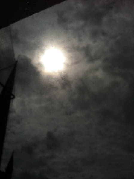
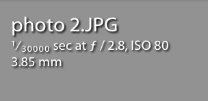
Similarly, it's easy to test the iPhone's upper limits, by pointing the camera at a ridiculously bright light source. The sun will do. This photo:

photo_2.jpg

... Reveals the other set of extremes:

screen_shot_2012_08_16_at_151109.jpg

... Which is that whilst the iPhone is still stuck at f/2.8, the maximum shutter speed is an incredible 1/30,000th of a second.

Putting these two figures together (about 4 EV steps of ISO and another 11 EV steps of shutter speed) reveals the exposure range available to an iPhone  photographer: an impressive 15 stops of difference from the lowest light to the brightest lighting situations.

Of course, this is nothing compared to the extreme shutter speed, aperture, and ISO ranges of modern SLR cameras, but hey - it's not bad for a device you keep in your pocket at all times!

Make over your portfolio


When I first started to use Lightroom to post-process my images, I described its non-destructive capability as being able to go back to your teacher and ask for a new sheet of drawing paper when you'd messed up your finger-painting by adding a few too many red splodges. When you're editing your work first time around, this is marvellous, wondrous, and often absolutely heaven-sent. But what about second time around? Third time around? A few years down the road? You change, you learn more, fashions change, and suites are upgraded. You can still go back, dig out that original Raw file, and edit it all over again. Gareth is here to tell precisely why you should be doing this.

Today, we're going to look at some photos with horrible processing and make fun of them. You might think that is harsh, cruel, or even downright bad form, but I don't care: I'm here to kick the ever-loving shingles out of these images because they're bad. Compositionally and conceptually, they're fine, but the processing on them is horrible. So we're going to tear them apart (semi-constructively) and tell you what's bad about them, and how bad or unnecessary processing can lead to an inferior portfolio, and what you can do to improve your existing work without leaving your computer.

olddad.jpg

Easy on the clarity slider, buddy – I can only imagine this chap thought 'Maybe if I keep hitting "sharpen", the image will get better and better every single time! I've seen Manny Librodo's stuff – everyone loves that guy. Let's copy it!'

Add to that the weird yellow glow which I can only imagine is coming from a nearby burning Lancaster Bomber and you have an introspective moment ruined by gaudy, overblown highlights and a shirt that STANDS OUT like a neon, strobe-lit fifty foot long thumb. Ugh.

oldinaba.jpg

Someone get some ice on that guy's cheek, it appears to be approaching 1,000 degrees Celsius. Not only that, but I'm pretty sure that's a wig: nobody's hair is THAT shiny.

oldmoly.jpg

Now this is an absolute cracker. What better way to draw attention away from the background than to put a massive, gaudy vignette around your image? I mean he might as well have put a large, red arrow pointing at the subject, accompanied by the words 'HERE! THE THING YOU SHOULD BE LOOKING AT IS THE DUDE IN THE MIDDLE. OK? GLAD I COULD HELP, DUDE.'

As for the headshot, I see the Germans took down another one of our brave pilots. Better move away from that burning wreckage, my friend – it looks like you're within about a metre of it.

The Not-at-all-obvious Reveal

These photos all have something in common: they're all my photos. 'Crikey O'Reilly of the First Degree!' I hear you exclaim, as your monocle pings out and shoots across the room, ricocheting off your cat, Mr Plot Twist, and sends him screeching and careering out of the room.

We all know it's very easy to allow your online portfolio to go stale: we diligently replace our old images with new, better work, ensuring only a representative and varied handful of our best work is on display at all times. Don't we? Admittedly sometimes we forget, and we all probably need to update, replace and trim the deadwood more often than we do. However, there is another way a portfolio can go stale, something that is much harder to detect: I'm talking about our processing.

My process of keeping my online portfolio up to date usually goes as follows: look over recent shoots and pick some of my absolute favourite images, look at my existing online work, hold a sort of faux television talent show where I print out all the photos, consider each one intently, and then pause for a ludicrously long time–giving everyone involved the collywobbles, or just sending them catatonic with boredom–before announcing who's made the cut and is still in with an opportunity of landing themselves a Christmas number one and first album deal that everyone will promptly ignore after the next series. Oh, sorry, no, just a place on my website. But anyway, the point is, I clean out the deadwood and ensure that only my best work is on display... except there's something I've missed.

With every portfolio update, there are always a couple of images that never get cut. This usually is either down to them having a particularly interesting quality or because they are notable in some other way, such as being a portrait of someone well known (or well known in the videogame world, in my case). The problem is, these images tend to evade scrutiny with each portfolio update. Well it hit me the other day when looking at some of my images that survive the cut every time, just how rough the processing was and how much I had learned since I'd first taken them, processed them, and uploaded them with a glowing sense of pride to my website.

I decided to pull the original files off my backup external hard drive (you are all backing up your images, right?) and reprocess some from scratch. Not only did they look better, thanks to a more careful post-processing approach than my previous, ham-fisted attempts, the reprocessed images actually helped my portfolio look stronger as a whole, as these new images now fitted into to the overall aesthetic a lot better. What I ended up with was a more consistent look which reflects my current style, instead of a fairly consistent style punctuated by nasty little poorly processed shots.

It's a really great, uplifting thing to do: I was happy with what I had captured in these images but shocked at how I had treated them in post. In addition, it allowed me to reflect on what lessons I had learned from my days as a naive, wet-behind-the-ears but terribly enthusiastic post-processor to where I am today.

One of my biggest lessons? You don't need to over-process everything. Sometimes a shot benefits from an aggressive filter. Sometimes a vignette is appropriate: it depends on your customer, the target audience, and the theme.

For example, although I reprocessed a couple of the photos of game designer and artist Keita Takahashi, I retained the aggressive processing, because the images are intended to reflect Takahashi's wild and bizarre imagination. Seeing as the background is a mural painted by Takahashi himself, I wanted the images to feel like we were inside his imagination.

taka.jpg

More often than not, however, filtering and gaudy effects are unnecessary and often detract from the final image. Keep your eye on what's interesting in the original image and draw out that; if there's nothing of interest there, then it's probably not the photo for your portfolio.

Another lesson learned was the importance of good cropping, an understanding and respect of the power of composition and how it can can draw out a lot more from an image than a gaudy filter. 

moly.jpg

I looked at the image of Peter Molyneux sat at a table with the counters properly for the first time in a long time and wanted to crawl into a very tiny space, never to emerge, feeding on moss and small insects that were unlucky enough to scuttle into my awful, fauxtographic gobhole. What was I thinking adding that horrendous vignette?! If I wanted to draw attention to the subject, a good crop would do a significantly better job than a vignette on a whiteboard.

And just for completeness, here are the re-edited versions of the other two originals:

dad.jpg


inaba.jpg

It will hurt and it will force you to critically tear your own work apart but it's a bit like doing the vacuuming: the longer you leave it, the worse it will get, but you'll feel so much better afterwards.


The illustration is by the talented James of Sweet Meats Illusttration.


Using an external flash with your iPhone

Since we launched the Triggertrap Mobile, we've added lots of awesome extra functionality to the iPhone camera - and given our customers the world's most powerful application for triggering their SLR cameras. One question that keeps coming up again time and time again, however, is if there's a way of using the iPhone's built-in camera with an external strobe. screen_shot_2012_08_16_at_150216.jpg


To answer this question, we need to understand a few things about how cameras work. The iPhone - and especially the iPhone 4S - is an extremely capable camera. But it is not perfect: The biggest problem with it is that it uses a rolling shutter.

The iPhone's camera and how it works

What this means is that instead of reading the whole photo at the same time (as you would do with a film-based SLR camera, for example), the camera effectively 'scans' the photo from top to bottom, one row at the time. This process is very fast, but it's not instantaneous.

The other problem with the camera on the iPhone, is that there's no way of influencing its settings; you can focus and take a light metering from a particular point, but that's it: You cannot chose a shutter speed or ISO, and the aperture is fixed at f/2.8. It can't be changed even if Apple gave you a software slider to adjust it: This is a physical limitation of the iPhone's camera.

There are other phones that get around this by implementing much better photo cameras, complete with shutters, apertures, focus mechanisms, and even built-in xenon flashes - but not the iPhone.

How a flash works

A flash, however, is a very different piece of kit; to ensure the correct amount of power output, the flash charges its capacitors, and then dumps a high voltage through a flash tube. The amount of light coming out of the flash tube is directly proportional to the amount of power it dumps through the flash tube - a lot of power means a lot of light.

Advanced flashes even have light-meters built in, where they are able to 'turn off' the flash after microseconds worth of light, for precise light level control. This is a small part of how E-TTL flash metering works with the flash power output to get perfect exposure.

All flashes have the 'one flash only' approach, except so-called 'high sync speed' flashes. Instead of using a single flash, these flashes can synchronise with shutters at speeds of up to 1/16,000th of a second (that's not a typo- but it is absolutely incredible, from a technology point of view). I've written a separate article about high-speed flash sync, if you're curious.

So, can you use an external strobe to take a photo with the iPhone?

In a word, no.

In many words: There are several problems with getting the flash to sync with your iPhone:

The first problem we would have to overcome is to find a way of syncing the flash with the iPhone. The challenge there is that we don't actually have any way of doing that. Remember that a 'normal' shutter speed for the iPhone will be in the region of 1/15th of a second to 1/30,000th of a second (or, at least, that is what the EXIF data of your files reports when you take a photo directly into the sun) or so.

The only indications the iPhone gives that it is taking a photo is the flash (which goes on for about 300 milliseconds - that's about 160 times longer than the duration of a flash). The other indication we can access is the sound the recorded "cah-chunk" sound the iPhone plays when you are taking a photo. Whilst slightly shorter than the LED flash built into the iPhone, it is still way too long to be able to derive an exact shutter duration from - especially if you are planning to use an electronic flash. It goes without saying that trying to synchronise a 1/30,000 second shutter duration (on an iPhone) to a 1/50,000 flash pulse (on a high-end, high-speed flash gun) based exclusively on a light flash that lasts 1/3 seconds is an exercise in utter futility.

However, if we somehow found a way of getting the iPhone to report exactly when it is taking a photo, we have a secondary problem: Since the iPhone uses a rolling shutter, you cannot use the single flash approach. Even if you were able to somehow fire the flash at exactly the right time, it would only affect a very small 'sliver' of the exposure. The problem is obvious, and would look a little bit like this:

photo_2.jpg

So, the first hurdle is finding out when the iPhone camera is triggering. The second hurdle is the rolling shutter. But if you shomehow managed to overcome both of those; we're facing a third problem: Since the iPhone doesn't support any manual settings, and since flashes are too fast for the iPhone once the exposure has started, your photos will almost certainly come out over-exposed.

From the iPhone's point of view, a flash of light (or, more likely, a rapid series of flashes of light, to counteract the rolling shutter issue), is far, far more light than it expects. In the studio, you would 'expose for the backgrounds, and stop down for the flash' - which, in practice, means that if you shoot with a fast shutter speed, you kill off the ambient light (as described in my Darkening a room by adding light article). You would regulate how much of the strobe light you want to have an effect on your photos by choosing a smaller aperture.

Unfortunately, with the iPhone, you only get one aperture (f/2.8), and you have no influence over the shutter speed or ISO. So: When you take an image, your photos would be exposed for the pre-flash lighting situation. Once the flash goes off, the image would be grossly over-exposed and utterly useless for anything.

In summary

In summary; there are three reasons for why you cannot use an external flash with an iPhone: There's no way of knowing exactly when your iPhone is exposing the photo, and even if you did, you would need to ensure the photo is exposed not with a flash, but for the whole duration of the exposure. The iPhone will not report how long an exposure is (it can vary between 1/15th of a second to 1/30,000th of a second...). Even if you managed to overcome these two problems, your iPhone wouldn't be expecting the light, and you'd dramatically over-expose your images.

The work-around

The obvious work-around for improving your lighting quality for iPhone photos, is to not rely on flash synchronisation at all, but to instead use continuous light. This photo, for example, was taken with a desk lamp and the light from an iPad's backlight (!) - for near studio quality lighting:

20111026_img_0080.jpg

The rise of the Fauxtographer


And now on Pixiq, in the latest installment of Dutton's Musings, photographer Gareth Dutton investigates the rise of a dangerous species of human frequently mistaken for an industry professional: the Fauxtographer. Readers are advised that this article contains strong language and should approached with a sense of humour.

Disclaimers

Now it’s important to throw in a few disclaimers and make some important distinctions here. I do not consider myself to be some kind of extreme photography super-being, moulded into human form by the very hands of the Gods of Photography: in fact I recently investigated the concept of self-critque and the need for evaluation and improvement. The kind of photography I admire is leagues and leagues ahead of anything I’ve ever produced, and is something I aspire to be able to match in terms of quality following many, many more years of hard work, effort and self-evaluation. With this in mind, this is not a column simply being used as a vehicle to look down on people with less talent than me (not that I consider myself of particularly exceptional talent).

This isn’t an article to disparage, condescend to, or discourage new photographers, either – everyone begins at the bottom and works their way up. I applaud anyone who has a love of photography and works hard to improve their craft. Finally, I like to think of myself as a photographer before anything else, but I still have respect for those to whom photography is a business first and an art from second, provided they back it up with a professional product / service and knowledge of their craft. This is an article to identify a menace that affects any photographer trying to make a living in the current environment.

The beast in question

With that clarified, I will now identify the creature known as 'The Fauxtographer' by its defining characteristics. The Fauxtographer is a parasitic creature of which there are many classes, but they all share common, easily identifiable traits: they are born when they notice a competent photographer making money from their images and conclude 'I can have a go at that.' Much like the common head louse, the incubation period of the Fauxtographer can often be as short as one to two weeks. Off they pop to buy a dSLR, whack the settings to auto, and carelessly snap away. They spend a ludicrous amount of time working on their bio and their marketing strategy to work out how they might sell the atrocious abomination of light they end up with. The Fauxtographer can often be found greviously abusing Adobe Photoshop and is genetically incapable of understanding the concept of subtlety. 

In fact, for the purposes of your elucidation and to help you spot a Fauxtographer in the wild, I have provided a handy example of the banner ad you might find emblazoned across the website of the specimen in question. Be warned, you might require sunglasses, a sickbag, or both:

fauxtogs.jpg

More often than not, the Fauxtographer actually believes it is creating something with which it could approach a customer wearing a completely straight face. It’s not fully known whether the beast‘s astonishing lack of self-awareness is a universal trait or one exhibited by specific species of Fauxtographer. To dig deeper into the genetic makeup and behavioural traits of the Fauxtographer, we will initially focus on a particularly common and harmful breed, the Wedding Fauxtographer.

The Wedding Fauxtographer

Fortunately, we have a case study for you today, thanks to the magic of YouTube and the somewhat farcical television show Judge Joe Brown (oh America and your crazy TV – we’re secretly slightly jealous that something so ludicrous would never be commissioned this side of the Atlantic). It’s quite a long clip, so I will point you to the important moments.

  • 3:20 – when asked what speed her lens is, the fauxtographer in question replies with 'I don’t know.'
  • 4:43 – the horrible photos in question, to the amusement of the 'jury'. All the hallmarks of mind-breakingly ugly fauxtography are on show here – selective colouring, stupid filters, a cruddy cut and paste job situating the faces of the bride and groom in front of a background of flowers for some reason and, most importantly, a basic lack of technical and artistic understanding of how to take a photo. The Fauxtographer goes on to avoid the question 'What ƒ-stop did you use?' several times because the beast clearly had no idea what Joe was asking it.

The Wedding Fauxtographer is one of the most dangerous species of Fauxtographer currently known to entomologists, as their potential to damage their surrounding environment is arguably the greatest. First, the Wedding Fauxtographer manages to simultaneously ruin a significant moment in the lives of at least two people and likely their families, too, as well as charge them for the privilege. Furthermore, if family members in the wedding party had passed on since the event, this especially galling, even infuriating.

Second, the Wedding Fauxtographer (although this is applicable to any Fauxtographer) damages local business. In areas with a significant Fauxtographer infestation, the skilful, talented photographer charging a reasonable price for quality work is undercut by the Fauxtographer. This is due to the Fauxtographer charging peanuts for work that looks like it’s been conceived, photographed, and post-produced by a drunken monkey.

The unsuspecting victim is drawn in using marketing non-words and phoney titles the Fauxtographer has obtained from some worthless three day course, such as 'Supreme Explosive High Wizard of Photosmithery'. It sounds impressive but is, in fact, complete, unadulterated, purified, distilled toss.

Treatment and removal

So what can be done to eradicate this infestation? Sadly, it seems the rate of reproduction may be too rapid to make a significant impact on their numbers, but there is a way to improve the situation in your local area: ensure you charge a reasonable price for your photography. If there is a Fauxtographer near you peddling cheap twaddle, do not attempt to match its price. Instead, you must maintain your rates. This will help educate the typical customer and create a distinction between what you do and what the Fauxtographer is doing. In time, the old adage 'you get what you pay for' will ring true in their ears and customers will come to you for your images, your service and your prices. Not only that, it will alter the perception of what is considered a reasonable rate in the eyes of the customer.

Are they really that dangerous a creature?

Whilst it is undoubtedly entertaining and amusing to spend an hour perusing the worst of the worst output created by these horrific hominids, it is my belief that they are a genuine pest, requiring fumigation. I’m mostly speaking metaphorically, there. Mostly.

Putting the silly, painfully extended metaphor aside, people who saturate the market with poor quality images and carefully crafted marketing nonsense to dupe customers into buying into their product are utterly loathsome: it gives photography a bad name and puts us in a bad light. Any photographer worth their salt would rather create something they can be proud of and value it accordingly than to peddle cheap and nasty wares to the uninitiated: the customer relies on us and trusts us to do a good job.

Once, when I was particularly struggling for money, I accepted a wedding reception photobooth gig: it was an easy job for an easy paycheque. However, when I got there, the business owners didn’t know a damn thing about photography or what equipment they had, except that it was the cheapest they could get away with. When I started adjusting the aperture and shutter speed, they nearly had heart attacks and shrieked: 'Don't touch the settings! Our mate has them set just right.'

I had landed in the Fauxtographer’s den and was assisting in propagating their species – these were people who were posing as professionals to make an easy buck out of the uninitiated.

They asked me back for further gigs, I turned them down. Some of you might find that insane, given that I was struggling with my bills, but that wasn’t photography to me, and it wasn’t the reason I pick up a camera every day and take photos.

I am not a Fauxtographer, and I never will be. If I am ever in dire need of extra cash, I‘ll do something more honest, like go door to door selling vulnerable old people insurance policies they don’t need.


Illustration by the very talented James of Sweet Meats Illustration.

It's a cannibal meat market


The camera market is a complicated place: technologically fast-moving, ubiquitous but hierarchical, and with blurred lines between professional and amateur. It has to fulfil a variety of different needs and market itself across a broad spectrum of consumers. This is no easy feat, and right now, I'm not convinced that the manufacturers are getting it right. Some consumers are falling through the cracks, manufacturers are trying too hard in some areas but seem to be oblivious of their strengths in others. It's time for a consolidated camera market fit for the 21st century.

The smartphone battle has been lost...

It's a truth, perhaps sad but definitely undeniable, that camera manufacturers have lost their battle to prevent a certain chunk of picture-takers defecting from compact cameras to smartphones. It is also a truth, probably even more sad and still undeniable, that they are refusing to acknowledge their defeat. You only have to look at the vast range of gimmicks that are being bolted on the constantly refreshed, garishly coloured swathe of compact cameras being churned out by everyone from Nikon to Panasonic to see that they are desperately scrabbling around for something, anything, that will convince the Smartphone-istas that a compact camera is what they need.

But for people who record their every coffee and croissant and subsequent pee and burp on Facebook, their smartphone is just what they need. They don't need a bright pink point-and-shoot with 12 filters and a dodgy wi-fi connection. Instagram is enough.

They've flown and they're not coming back. Get over it and move on, because trust me, there are people out there who really do want compact cameras.

... but there remains a market for compact cameras

So who are these mythical individuals still in the market for compact cameras? Well, they're not necessarily as trendy and it is likely that they're smaller than the share lost to Apple, Nokia, and Samsung, but they are real. So if you're listening Canon, Fujifilm, Nikon, Olympus, Panasonic, Pentax, Sony, et alios, give over, and go where you're wanted and needed.

As I see it, there are three primary consumers for compact cameras. I've written about this before, but indulge me with a recapitulation. First, there are people like me (and probably quite a few of you, too). My primary camera is a dSLR. However, I dislike being without a camera at all, so I want something little to live in my bag, and there are occasions when a dSLR is just too conspicuous, too cumbersome, or too illicit to use. In which case, I want a smaller, lighter, less obviously expensive alternative that enjoys full manual control and a good lens. I have a Canon S95 for this very purpose; other people prefer the Olympus XZ-1, and the Sony RX100 looks a hot new option. These are cameras that help to complete people's photographic arsenals. They are not insignificant.

Second, for people who enjoy recording their exploits up mountains, in deserts, and underwater, a rugged compact is an ideal companion. Tough compacts used to be the laughing stock of the photographic trade; they were cumbersome, badly specced, and resembled something designed for a toddler to teeth on rather than to take photos. Recently, however, manufacturers have been upping their game here and producing cameras capable of taking a decent image in sub-zero temperatures. The advent of the Sony TX200V, a well-specced compact camera that was casually all-weather, has opened up a new direction for compacts, too. You're sniffing at the possibilities here, manufacturers: you'd best run with them.

Finally, there are the people who want a camera that isn't in a phone. People like my parents who enjoy taking photos, who don't need something with interchangeable lenses, but haven't got smartphones and aren't likely to own one, either. People who are learning about photography, especially chidren, who need a dedicated camera, but one that is simple to use and inexpensive. Not everyone wants to use their phone, you see.

I told you, the market might not be as glamourous as the cocktail-sipping Twitterati, but it's definitely there, and it needs to be serviced.

If you want EVIL cameras to be taken seriously, treat them seriously

When I wrote my particularly scathing announcement article for Nikon's J2, one of my Twitter followers asked me why camera consumers aren't taking EVIL cameras seriously. Although the Japanese have embraced EVIL technology (sales of EVIL cameras amount to approximately 40% of the market) sales are much smaller in Europe and the US and might even be stagnating. Why? I'd posit that there are two branches of the same trunk governing this phenomenon: because camera manufacturers don't treat EVIL cameras seriously.

When so much R&D is devoted to EVIL cameras and they are being regarded as the breakthrough technology in photography, this might appear a contrary statement, so allow me to expand.

First, EVIL cameras are marketed poorly. The pace of change in the development of their technology does mean that new iterations are to be expected frequently, but this doesn't always give a great deal of incentive to consumers to purchase a new camera if it is going to be obsolete within six months. If tech lust gets the better of you, perhaps you will upgrade regularly, but when people are laying down in the area of £600 for a camera, they want to be assured that they're getting value for money. If manufacturers were to hold off on the 'release early and release often' principle favoured by coders, and instead release models with significant upgrades at less frequent intervals, consumers might be more tempted to bite. This is a far more sustainable model, economically and environmentally.

Furthermore, this constantly iterative process aligns EVIL cameras more closely with compact cameras, with their fast product cycling and large release numbers, than with flagship dSLR cameras. The product lifecycle for a dSLR is far slower than it is for a compact camera. This lends it gravitas: consumers recognise the research dedicated to developing it, and getting it right, and regard it as an investment rather than something more disposable, more like a compact camera.

At present, Olympus has six PEN models on the market, each with the same Micro Four Thirds, 12 megapixel sensor. I've argued for the benefit of choice quite passionately before now, but choice needs to be meaningful and not present for its own sake. When there is so little to discern the EP3 from the EPM1 or EPL2, it does nothing to suggest that these are carefully considered, designed, developed, and manufactured products. If manufacturers want us to take EVIL cameras seriously, they need to be cycled and marketed on a par with their other 'serious' cameras.

Second: the concept behind EVIL cameras can be overwhelmingly weak. If an EVIL camera is meant to be a serious alternative to a dSLR, fit it with a dSLR-sized sensor. Using a compact camera-sized sensor makes it nothing more than a glorified point-and-shoot; why would I spend £500 on a Nikon J2 or a Pentax Q when I can get similar results from a Canon S100 at £350?

Has Canon cracked it?

When you study the industrial revolution, one the key learning points is how, in the long term, the pioneers of change often suffered for being at the forefront of development. With the majority of their resources devoted to the initial breakthrough technology, the ability to adapt and to adopt refined versions was highly restricted. Sometimes this was a financial limitation, but occassionally, it was an emotional restriction, too: they didn't want to be seen to admit their mistakes or abandon their original technology.

The pace of change meant that second and third generation inventors and adopters often fared much better by biding their time and building on the platforms developed by the pioneers. They had the benefit of a bigger picture, working models, and a lack of emotional investment. *

A version of this model could be applied to the EVIL camera market, and in the words of one of Small Aperture's Twitter followers, it's why Canon has cracked it.

Just over a year ago, I argued that Canon's primary interest is in the video market, not the EVIL one. As a consequence, if it had any desire to play in the EVIL sandpit at all, it would only be if it could rock up and be reigning monarch. Canon had no interest in being seen as a pioneer there, those resources could be better devoted to video, it just needed to produce something good.

By biding its time and watching the constant iterations of EVIL cameras churned out by Olympus, Sony, and Samsung, Canon has been able to hone and refine its product. The result is the EOS M - a camera that is essentially a scaled-down version of the 650D. In terms of concept, what more perfect embodiment of an EVIL camera could you want?

We still love our dSLRs

Will the number of dSLR sales decrease noticeably? In the long run, probably, especially if the manufacturers get the EVIL product right and market it right. There are, after all, only so many photographers to go around. It doesn't mean that demand will disappear to nothing, it just means that camera manufacturers need to be aware of the different groups of people buying their products with different aims in mind. They need to produce to their different needs and market to them appropriately.

As a writer, you are always told to know your audience. Manufacturers need to know their consumer base.

Choice needs to be meaningful; the market must be sustainable

How and why people take photographs has changed; camera manufacturers cannot retroactively influence this by trying to convince the social media crowd that a compact is just what they need when they've found that their smartphone fits the bill. They can't assume that people will flock to EVIL cameras just because they have interchangeable lenses when their tiny sensors don't offer any significant advantage over cheaper and more portable compact cameras. They need to assess where the market is now and project why people will be buying cameras in the future. They need to consolidate their ranges whilst retaining the options that consumers want. They need to start thinking a lot smarter.

As it stands, camera manufacturers are succeeding in cannibalising their own market. Consumers want and need choice, but it has to be meaningful. When it is overwhelming, it serves best to deter people rather than convince them of the benefits of owning both a dSLR and a high-end compact; or an EVIL and to make more use of their smartphone camera. The current approach to R&D and marketing isn't sustainable. It's time for a rethink.


* This is an argument usually applied on a micro level to mill owners, but it can be transfered to a macro level, too.

Backing up your work - a cautionary tale


1TB hard drive, currently available for about £75 in the UK or $85 in the US

I'm not sure how many virtual column inches here at Pixiq have been devoted to our exhortations that you should implement a proper backup policy for your images, music, and other precious electronic files, but it is not insignificant. There are guides to establishing a workable routine, reviews of different pieces of hardware and software, advice for keeping your data safe when travelling, and now I'm going to throw personal experience into the mix.

Before anyone starts to gaffaw, no, I haven't just lost thousands of images in one catastrophic swoop. This is something that happened to someone else, but has had an impact on me. And still please don't gaffaw.

Over the past few months I've been working on a project that's a collaboration between me and a heap of other photographers. I've been in charge of curating it, which has been an exercise in military-grade planning. If I were to tell you about the number of spreadsheets I have, covering the most miniscule of details, and the different documents that I've going out and coming in, you'd die of boredom, but it has all been a necessary part of the process.

For the most part, my excessive attention to organisational minutiae has proved successful. But still, somewhere, despite colour-coded spreadsheets and meticulous filing, I slipped up. One of my collaborators wriggled through one of my barrage of checks and hadn't sent me a high-res JPEG of one of his images.

I sent him a quick email asking him to deposit the image in question in the Dropbox we'd been using for the project. When I read his response to my request, my heart sank like a stone. He couldn't send me the high-res version because he'd suffered a hard drive failure and he'd lost his images. They weren't backed up. Poof! All gone.

For the project, this is a bit of a disappointment, but it is in no way catastrophic. For the photographer, on the other hand, this is a huge collection of images that he's lost because he didn't have copies floating in the cloud or secreted away on another hard drive or two, or preferably both. I don't even want to think about how devastated he must feel.

If he'd have sent me the JPEG when I'd originally requested it, or if I'd noticed that I didn't have it initially, at least I would have had a copy. But it wouldn't have saved the rest of his images on his hard drive.

There are a bundle of different means of keeping your data safe. They don't necessarily cost the earth, either. Please don't be one of these people who loses important data because you don't have a backup plan in place.

Biography Buzzword Bingo!


Earlier this week I had the terrible misfortune to follow a link on Twitter that took me through to a photography-oriented q&a column. Someone posed a question and the readers chimed in with answers in the comments section. Of course, a q&a column in and of itself isn't a gruesome thing, and in fact neither was the question. A young photographer was querying the importance of a biography and an artist's statement; she'd never written one before, she didn't know exactly how significant they were, and because she didn't really write she wasn't sure how to approach it. That's pretty straightforward, but Eurynome on a unicycle, the answers left me gagging.

The adage that you should never read the bottom half of the Intergoogles held good here–and given that the article was entirely incomplete without the bottom half, was somewhat unfortunate–because it would seem that there's a shutter of photographers out there who take themselves far too seriously. No, that doesn't mean that you shouldn't take a bio or an artist's statement seriously; they're how your audience or your potential clients connect to you as an individual. What it means is that they need to be honest, approachable, and a reflection of who you are.

Your biography shouldn't be so vomit-inducing or cringe-worthy that people can't make it past the first sentence, or so esoteric or unbelievable that people have no idea what you're going on about or think that you're off your rocker. You're a photographer, you take photos; it is highly unlikely that you're capable of changing the world through the medium of your art. If you truly are one those handful of photographers who is able to influence the way that the global community sees the world, the chances are you don't have time to write about it in your bio. And what the hell are are doing reading this?

After I'd restrained the urge to scratch out my eyeballs as a result of the sheer vulgarity of what I'd read, I showed it to Gareth. Thankfully, he had a slightly different reaction: he fell about laughing. When he'd regained his composure (it took a while) he came up with some far superior advice for the young photographer struggling to construct her biography. Here, then, speaks the voice of experience.

Gareth Dutton (Bsc, MA, Ph.D, RGB, ABS, NBA, NBC, HBO, ROFL, LMAO, OMGWTFBBQ) is a hyper-dynamic, dangerously powerful photo-leopard and the proud owner of the title Impossibly Powerful Light Lord of the Entire Photoverse, which is a prestigious title given only to those who undertake a seven day course where you are assigned to photograph a graveyard to learn about black and white conversion: a course run by the prestigious Dr. FraudGob McUntrustworthy-Smyth.

Gareth doesn't just create photographs, though; he visually transcribes the art waves that he detects and accumulates in his emotional core to create powerful, tear-inducing art-tographs. The “Dutton Experience” is one that his clients talk about long after they leave the studio, when returning to their imaginary homes, whilst wearing their imaginary clothes that cover their imaginary bodies.

Seriously, you expect anyone to believe that hurtling ball of imaginary nonsense? Does it say anything at all about the photographer? Does it distinguish his work from any other photographer's? And this is where far too many photographers get it wrong: it's the difference between a bio written by a photographer and bio written by a salesperson.

For a long time, I had no bio on my website, because I just couldn't think of something that didn't sound awful. I had a go at one, looked at it a week later and cringed so hard I burst the blood vessels in my forehead and inadvertently pierced both my ears with my shoulder blades. A few rewrites later and I felt much better, massive haemorrhaging notwithstanding. So why is it so hard to write a bio? The problem lies in avoiding the buzzword trap.

Think about it; how many times have you read these lines?

  • 'I love to capture a moment in time before it is lost forever.' That translates as 'I love to take photos.'
  • 'Gareth's timeless images push the boundaries / are at the cutting edge of photography / display his completely innovative style'. Really? Unless you really are that influential, writing this makes you look silly.
  • 'Clients come away knowing that they've experienced a Gareth Dutton shoot.'  Oh please! Nobody is going to walk away from a photoshoot going 'I really feel like I've just experienced a Gareth Dutton shoot.' Admittedly, this does sometimes happen with me, but that feeling they have is a sense of terrible unease and creeping dread.

Essentially, you want to avoid making your bio sound like a press release: a procession of vague half-lies, presented in the form of sterilised, buzzword-heavy non-sentences. As a result, I was wracking my brain, wondering what I could write about myself that wasn't clichéd and embarrassing. Eventually, I realised I should probably just be honest and show a little personality. I just wrote about what I do, the type of photography I undertake and added the tiniest sprinkling of humour, or 'humour', depending on your standpoint.

It's a bit like taking a self-portrait: you can set up some studio lights, get your face all chiaroscuro'd up, look moody and interesting and then clone out all those blackheads in Photoshop, but is it a portrait of you anymore? Step away from the word processor, forget about writing a bio, and just say something out loud about yourself, to yourself. Don't worry, no one else can hear you, so you don't sound like a prize prat.

Now write it down.

Tiresome ramblings aside, the important thing is to write honestly. Why do you take photographs? What do you like about photography (apart from 'capturing a moment forever')? Anyone you admire specifically? Is there an area of photography you specialise in, or undertake more frequently than others? What are your hobbies? What gets you going creatively, emotionally, aside from photography? These are all good starting points for a more interesting, more personalised bio.

In my opinion, the golden rule is to read a sentence out loud and then imagine yourself saying it to another human being in a bar. If this imaginary scene ends with the human being in question quietly downing their drink, placing the glass down on the bar and saying 'Excuse me, but I need to go and talk to... well, someone who isn't you,' then it's probably a sentence you should edit or remove.

It's that time again, my elegant photo-beasts and beastettes – homework time. Your homework is to have a look at your bio and remove anything that sounds like it belongs in an intro for the Managing Director of a Global Logistics Solutions company (whatever one of those is) and rewrite it.

Then, when you've rewritten your bio so that you don't sound as if you've been processed by a Z-list celebrity agent, we've a treat for you: Bio Buzzword Bingo! You can download your very own word search and seek out the collection of marketing-tastic words that really shouldn't be anywhere else than hidden away in a grid of otherwise incomprehensible letters.

buzzwordbingo.jpg

Now if you'll excuse me, I'm off to find out whether 'synergy' can still be used in a sentence or if it's been ruined forever.


The gorgeous illustration, by the way, was drawn by the highly talented James Park of Sweetmeats Illustration.

The Ultimate Guide to HDR Photography

Haunting, surreal, and quite possibly the first major way in which digital photography does something which film photography can’t emulate – or even come near. HDR – or High Dynamic Range – photography is nothing new, but as new tools and techniques make the artform more available, HDR photography is taking off in a big way.

If you’ve never had a go… and especially if you don’t even know what I’m on about – you’re in for a real treat…

What is HDR Photography?

paul_hdr.jpg

High Dynamic Range photography or HDR photography is an advanced set of photography techniques that play on image’s dynamic range in exposures. HDR Photography allows photographers to capture a greater range of tonal detail than any camera could capture thru a single photo.

While many imaging experts regard HDR photography as the future of digital photography, the discipline has long been in existence.

HDR photography is present in many pictures taken through modern day digital cameras. The truth is, if you are a real photography enthusiast then there is a great chance that you have taken at least one photo exemplifying HDR photography.

The real functions or even executions of HDR photography may be debatable. But no matter which website or source you consult they will always say it is a technique that employs the great use of exposure range to get distinct values between light and dark areas of the image. Its real intention is to create an image that accurately characterizes the intensity levels found in natural scenes. If you ever wondered why the picture you took was different from the scenery you actually saw, then maybe it’s time for you to learn HDR photography.

HDR Photography is the technique used to capture and represent the full (as possible) DR found in a scene with high perceptual accuracy and precision. To remember things better, think of the 3S: sunlight, shadows and subjects. These are the things that make an ordinary picture an HDR image.

The history of HDR Photography

While the technique is more commonly used now to create astounding images of art, fashion and landscape photography, HDR photography’s humble beginning is ironically designed to capture a rather fearing, shocking and destructive image – nuclear explosion.

Charles Wyckoff (the same guy who inspired Computational Photography) developed HDR photography in 1930s to 1940s. He is genius who took the 1940s Life magazine cover of nuclear explosions – an image that would later change the world. Of course the technique didn’t have the acronym HDR before, but the principles remained the same.

A deeper and perhaps more scientific understanding of HDR photography and imaging was first introduced in 1993. This was done by playing on two established photography elements: tone mapping and bracketing. A complex mathematical theory regarding differently exposed images of the same subject matter was then released two years after. Paul Debevec, a computer graphic researcher, applied this theory and combined several differently exposed images to produce a single HDR image was accomplished. Talk about putting a lot of science and even math to discipline.

Today, things are a lot easier. Thanks to the wide selection of portable and digital cameras as well as easy-to-use software, HDR is no longer limited to people studying nuclear explosion and computer graphics technology. But the technology on image capture, storage, editing and printing devices still has some limitations. And since each of these elements affect the DR of image; we need to study them if we want to get an HDR image with superb quality.

Theory Behind HDR photography

There are two theories behind HDR photography. And as the technology around HDR photography evolves so is the discipline itself. But if one wants to take HDR imagery seriously then he must first understand the concepts and theories that make up this discipline.

The most fundamental of all HDR photography theories is to take multiple shots at varying exposure levels of a particular subject. A special computer program will then combine the images together into a single image. This is just an incarnation of the original theory during the time when there are no digital cameras and advanced computers and programs were nothing more than a work of science-fiction.

The second theory is the one that capitalizes on the RAW processing software to create various exposure levels of the same image. Modern Digital SLR camera and a lot of the Point and Shoot models allow photographers to capture RAW images. A RAW image or file is the data captured by your Camera’s sensor that is not processed yet and therefore does have color information. You can manipulate this file, adjust its color, lighting or while balance.

How to gather data for HDR photographs

Taking the images is the first stage in HDR photography. You can use a simple point and shoot camera or a fully configurable digital SLR camera camera.

In both techniques you will need a camera with configurable exposure settings. All DSLRs and most point and shoot cameras have this. Certain SLR cameras have bracketing function which makes it easier for photographers to change exposure settings.

For starters, you can use the following setting: ISO 200 and Aperture Priority Mode. And as they say good things come in threes, you can take picture with three different exposure settings: EV 0, EV -2 and EV +2. You can experiment more on these but generally speaking, the more exposure versions you can have, the better your final image will be.

If you want to take more exposures as part of your HDR photos - up to 19, in fact - it's worth taking a closer look at Triggertrap Mobile, a mobile phone app that hooks up to your SLR camera. At $20 for the hardware and $10 for the software, it's an absolute bargain.

Oh, and obviously, It is recommended to use a tripod when taking HDR photo. This is because tripod stabilizes the camera and you need to get the clearest image you can get since you are experimenting on exposure values. The best way to do this is to use a shutter remote or if your camera doesn’t have one, just make sure you press the shutter button lightly.

Post-processing

ir_hdr.jpg

Incredibly, the above photo is an Infra-Red HDR photo. Awesome, eh?

Post processing is the last stage in HDR photography that you can really control. This is where technical skills merge with creative sensibility. And with the introduction of advanced digital cameras and photo editing software, HDR image post-processing is made a lot easier.

However, this does not guarantee that having an excellent HDR image will be as easy as clicking the shutter button. There may be times that the three or more images you took with varying exposure values are simply not enough. With this, the only chance you are left with is to do a post-processing of the image.

Post-processing generally involves color correction, saturation, contrast and brightness and darkness adjustment and other image element manipulation. But in HDR photography we need to concentrate on contrast and brightness and darkness adjustment. Brightness and darkness adjustment is the direct digital translation of exposure manipulation in the picture taking stage. If in the camera you adjust exposure settings, in the post-processing stage you will adjust the brightness.

The main advantage of process is surpassing the limitation of actually configuring your camera in different exposure levels. While some cameras may have eight exposure settings and therefore 8 different images, post-processing can simply give you a limitless number.

After the shoot, transfer the images to your computer. There is a merge to HDR feature in many photo editing software including Adobe Photoshop and above, Photomatix Pro, Dynamic Photo HDR and others.

Post-processing software also allows you to blend photographs with different exposures. This clearly increases the dynamic range of the final output photo. There is also tone mapping which reveals highlight and shadow details in an HDR image made from multiple exposures.

Further exploration

Whether you are an HDR photography amateur, hobbyists or a professional these websites will surely give you something to focus on.

HDR 101

The site claims that it is the first and most visited HDR tutorial on the web. It offers easy to understand tutorials as well as Photomatix software walkthrough. But we think HDR101′s best content is the monthly favorite Flickr.com HDR photos.

HDRSoft’s Resources

HDRSoft, maker of one of the most popular HDR software Photomatix gathered tutorials, DVDs and videos as well as mailing list subscriptions for all HDR photography enthusiasts.

CambridgeInColour

CambridgeInColour offers photography tutorials and forum where photography professionals and enthusiasts like you can discuss anything about photography.

Flickr’s HDR Group

This HDR group has 30,000 members and counting. Share your passion and be inspired with HDR images on different subjects taken by photographers from all over the world.

SmashingMagazine’s 35 Fantastic HDR Pictures

One of the most popular blogs combined “35 extremely beautiful and perfectly executed HDR-pictures” on different subjects and execution.

Visual Photo Guide

Camera, equipment and photography software reviews and video tutorials on HDR photography all in one place.

HDR Crème

HDRcreme is the first HDR photo gallery that lets you share photos, explore and learn about High dynamic range imaging.

Tutorial Blog’s Collection

A Single link to many great HDR Photography resources.

Photo credits

The photos in this article are from Flickr, licenced under CC/Attribution licence. See the full-size photos of Pasargad Bank Branch by Hamed Saber, Moon on Mars by Extranoise, Tour Eiffel by Al Ianni, Toronto City Hall by Paul Bica, San Isidro IR HDR Panorama and HDR 01 by CodyR on Flickr.

Top tip: a Flickr search for ‘HDR’ filtered by ‘most interesting’ is a great way to get some awesome inspiration.

Enjoy!

The ugly truth behind our beautiful cameras


I seem to be doing okay with my current camera. Do I really need a new one?

Rampant consumerism; it's well, rampant. Apple releases a new iPhone every year; in January, Fujifilm announced 27 new compact cameras (yes, 27, go check it out if you like, I'll be waiting when you get back); we've lost track of the numbers in the Lumix G-series; and if Canon doesn't come up with a 70D in time for Photokina, I'll be a bit surprised. (I could be wrong, though, so don't lay money on it on my account.) New products are the bread-and-butter of my writing on Pixiq, and don't for one moment get me wrong; I'm fascinated by the advances that we've made in camera technology and I cannot wait to see where we get next. However, an email that I received today, alerting me to Canon's announcement of its corporate social responsibility plan, got me thinking.

Every camera that rolls off of the production line has a huge impact on the environment, and in fact on communities far from where it was made or where it will eventually end up. They comprise thousands of parts made from hundreds of different materials. But have you ever considered where they come from, how they're made, and what happens to them when we decide that they're obsolete - something that happens far too quickly? You've probably heard of conflict minerals, but do you know how many are in your camera? Any idea what a rare earth element is? Do you know anything about the major manufacturers' dedication, or lack of it, to their corporate social responsibilities?

Put it this way, it is admirable that Canon has published a document that holds it to some kind of standard, but I don't think it went far enough. There's more to being environmentally aware than agreeing to reduce your carbon dioxide emissions, as necessary as that is; and social responsibility goes a heck of a lot further than being able to further the artisitic endeavours of the people who buy their products.

For the record, none of this is about wanting to hold back development or somehow artificially suppress the advance of technology. My phone today can do things that I could scarcely dream of when I picked up my first one 16 years ago, and that's truly marvellous; I sit awestruck at the advances I've seen in camera technology since I switched from analogue to digital. But somehow, we need to make our hunger for gadgets and the relentless cycle of new products sustainable, because right now, it isn't. This is more than just a mentality of buying something new rather than repairing it, and whilst it encompasses the desire to always be in possession of the most up-to-date gadgets available, it goes deeper than that. This one really is about life and death, and not just death from embarrassment because you still use an iPhone 3G.

If you've never thought about what goes into your camera and where it comes from, sit down, take a deep breath, and read on. It might not be pretty, but I hope it's thought provoking.

Rare earth elements

First of all, we should clear up the misnomer around 'rare earth', because this group of 17 metallic elements aren't that rare at all. Cerium's more common than copper. It's just a name that they happened to end up with after the discovery of yttrium in 1787 by a Swedish military officer. They're lightweight, unusually strong, and magnetic, qualities that make indispensable in electronic gadgetry.

It's not just europium and terbium that are used in the screens on our cameras, the samarium-cobalt magnets that control our shutters, or the bundle of others that are melted into circuit boards, though. Lanthanum oxide is used in lens production to help prevent distortion, too. In minuscule quantities, our cameras are riddled with rare earth elements.

So what's the problem with the rare earths? Whilst they might not be rare in general, they are rare in large concentrations. When they are found in concentration, it is usually in proximity to radioactive elements uranium and thorium, making them dangerous and expensive to mine.

At the end of 2011, roughly 50% of the world's rare earth concentrations were in China, and China produces nigh-on 97% of the world's supply of rare earth elements. Not only do you have a single country responsible for the overwhelming production of a group of elements vital to just about any electronic gadget in current production, but this country also has a terrible record of human rights abuses. Mining; radioactive materials; near-monopoly; you join the dots.

Now add to this the prediction that China's own demand for rare earths will outstrip its potential supply within the next five years and you can see that there's a bit of a problem. As far as the UN is concerned we have to start recycling our rare earth elements more.

Conflict minerals

There's no misnomer to clear up here, conflict minerals are just that: minerals mined under conditions of conflict. Primarily this concerns mines in the eastern provinces of the Democratic Republic of the Congo, some of them under the control of the Congolese National Army, others rebel militias. It's isn't just that the profits from the mines are ploughed back into a continued and bloody war that's destroying a country and that there are the inevitable battles over the mines themselves, but that the mines exploit the local population mercilessly. Think forced labour, coercion, extortion, violence, and rape.

Coltan, or columbite-tantalite, is the ore from which tantalum is extracted. You'll find tantalum used in the manufacture of capacitors, whilst tantalum oxide is used to produce high refractive index glass. That, of course, is used in lenses.

Circuit boards are put together with solder, solder is made using tin, tin comes from cassiterite, and cassiterite is a conflict mineral.

Wolframite is a tungsten-bearing ore, with tungsten carbide being used in some electronic devices, but predominantly in drill bits and the milling process, because it's stupidly hard.

Finally, we get to the G of 3TG, as conflict minerals are sometimes known, gold. It's an excellent conductor, very ductile, has low toxicity, and is hard to corrode. You'll find it used in electrical contacts.

Thankfully, unlike rare earth elements, deposits of conflict minerals aren't limited to war-ravaged central Africa. There are extensive tantalum deposits in Australia, tin is found world-wide, tungsten has huge deposits in China, but can be mined elsewhere, and gold isn't exactly ubiquitous, but it's found in plenty more places than central Africa. The problem is how conflict minerals secrete their way into the market–you're dealing with warlords here, after all–and the inability, perhaps even the unwillingness, of buyers to attempt to trace the origins of their raw materials. It's a case of asking no questions and being told no lies. But that doesn't really help the DRC.

And everything else

Rare earth elements and potential conflict minerals comprise just a fraction of any camera or lens. There's also the plastics, the glass, the other metals, and the rubber, not forgetting the waste products like carbon dioxide. After they've been packaged and shipped, we charge them up with electricity and heaven knows how far we drive or fly to use them.

So what to do?

Without wanting to sound too much like the tree-huggy liberal that I am, it's something for which we all have to take responsibility: you, me, and the guys who run Olympus. As consumers, it's easy for us to say that we need manufacturers to do more–which, yes, they absolutely must do–but we need to take action ourselves. Manufacturers, if you happen to be listening, don't abrogate yourselves of responsibility by blaming consumers for their wanton desires and penny-pinching ways. You're people, too, and you live in this world. 

I'm not nearly virtuous enough to say that I'm never going to buy another electronic device unless it comes with a certificate of guarantee that it's conflict mineral-free. At the moment, there just isn't a programme in place that can guarantee this. Besides, when you say something like that, you set yourself up for a monumental fall. I mean, I try never to eat Nestle products, but I'm sure that I must've slipped up at some point in the past 15 years or so. And I won't hold you guys to a higher standard than I can hold myself, either. I can, however, look out for producers that make more of an effort, and all of them can start asking more questions of their suppliers.

But the disused iPod, the broken down iBook, the drawer full of obsolete mobile phones dating back to 1996, and the heaven-knows how many cameras that I keep 'just in case' could all be recycled.

I've been contemplating a new dSLR for a while now, but do I really need one? How much of my desire for more megapixels, for faster frames per second, for increased sensitivity is driven by tech lust, and not because I actually need these things and my current model is, in fact, adequate? How much of this is going to have a discernible impact on my photography, as opposed to me reading more, shooting more, and evaluating better? For any photograph, the photographer is the critical factor and not the camera. Upgrading your kit won't make you a better photographer or make you take better images; that's down to your skill and talent not your camera's spec.

If and when the time comes for me to upgrade, what will I do with my old camera? There are better options than leaving it in my store in the studio. It's perfectly saleable on the secondhand market.

Wouldn't it be great if manufacturers gave more consideration to product cycling, and provided easy means to recycle their products, too? 'Here, Canon, I'd quite like to upgrade my S90 to an S100. Why don't you give me some money towards the new one, and strip the old one for parts?' Everyone wins there, me, Canon, and the kids in the eastern DRC.

We need to ask more questions, and not pretend that these are problems that don't exist; we need to be more discerning; and, yes, we all need to be a little less greedy: consumers for the latest bit of tech and corporations for the last penny of profit. It won't hurt, I promise.


I used heaps of sources in writing this, most influential amongst them:

You are bad at photography: Improving your work whilst managing self-confidence


Flipping Nora Madcakes - this is proper rubbish!

After a manic six weeks, I'm finally taking a day off. It will involve Olympics-watching, novel-reading, and cake-baking. Whilst I'm lounging on the sofa, I shall leave you in Gareth's capable hands to tell you that you're a bad photographer, but it isn't as terrible and soul-crushing as you might think.

You'll be glad to hear that I'm not here to shamelessly plug something, or big myself up (I think that phrase went out of fashion in the mid-nineties), or to give you the bottom line on how to use a particular lens, or how you should photograph faces, or plants, or the sky, or... anything, actually. I'm not here to shove a project in your face, either (the next edition of that will be in a couple of weeks or so, I imagine).

I'm here to tell you that you are bad at photography.

You are a bad, bad photo person. Yes, I know that shot you posted got favourited twenty times on Flickr and you were invited to add your image to the group called "Baffling HDRs of Random Nonsense!", but you are bad at photography. I know that portait session with your friend was a lot of fun, and she loved all the images, and she put them up on Facebook where they got dozens of likes, but you are bad at photography.

You are bad at photography and so am I. Why do I say this? To be honest, I mainly say it to get a reaction out of you so you actually bother reading my nonsense (it's known as "The Tabloid Tactic"). Manipulative, I know. I imagine you are currently puce with pure, unbridled photo-rage, clawing and scratching at the screen with your bare hands, fingernails now bleeding, in the (utterly insane) belief that you can physically harm me via The Internet: you're shouting "I think you'll find I came third in The Guardian's Photo Competition last week, you ingrate! The theme was 'tranquility'! TRANQUILITY!", before breaking down and sobbing into your brunch. Which you just took an Instagram photo of. Tear-sodden Eggs Benedict.

Calm down, this is not a personal attack, I promise. What I'm really trying to say, or rather ask, is, what do we gain from considering ourselves "good" photographers? What use is there in looking at an image you've taken and thinking 'Yep. Maximum art achieved. I have mastered the art of photography, right there. Nothing left for me to learn'?

Here's where I get serious for a whole three sentences: I think "good" is a dangerous word in photography, because it lets you settle. You snuggle up in that comfy 'I'm good now' seat and you remain at that skill level; in short, you stagnate creatively.

I know it's not nice, but it's necessary: critique, both self and from others, is what improves our images. If there's one thing you should do to every photograph that you take, it's to evaluate it. It should be noted, however, that it is very possible to go too far the other way: maintaining a healthy balance is the key. Instead of saying 'This photo is great,' I tend to go with 'I'm happy with this shot.' Similarly, it's better to identify what you could have done better with a photo you're not happy with, as opposed to sitting, head in hands, wailing uncontrollably because your subject isn't quite on the rule of thirds. Not that I've ever done this. Nope.

So where the piggles do I get such critique, I hear you collectively ask? Well, I happen to know that Daniela is turning her attentions to this very question in the not-too-distant future, but until then, one place to get some useful feedback is on DPChallenge. It's a good place to begin, but my personal advice would be to take critiques with a pinch of salt – the members of DPChallenge tend to be very focused on technical elements of critique. This certainly isn't an awful thing to focus on, but there will come a time where you are much more comfortable with the technical basics and you want to experiment with rule breaking. It all depends on your current skill level, really, but you'll definitely learn a thing or two, regardless of experience.

Immerse yourself in as much critique as possible – look at images that you really like on the site, images that you think are stunning and you feel a million miles away from, ability-wise. Now have a look at the critiques and what people think the photographer could have done better. The more critique you read, the better you will get at critiquing images yourself, including your own. Hey, look: you're getting better! Soon you'll be looking at work you create six months ago and thinking 'I can't believe all the mistakes there are in that photo – what a load of rubbish!' You see that? That's progress.

Here's your homework, then: get some proper, constructive feedback and critique on your work and learn something from the experience. It's daunting at first, but take it on the chin and keep working at getting better. Not "good", not "great", just better.

Hello personal project! Hello Games!


For readers who've followed me here from Small Aperture, you might have been wondering what happened to my trusty side-kick Gareth. Well, apart from becoming Daddy to his adorable little girl in December, he's embarked on a project to document a year in the life of a videogame company. This is his mid-term report, showing how he settled upon the project, the insane fears that initially overwhelmed him, and how he thinks he's doing so far.

Welcome back, Gareth...

When we think of great photography, to many, it's the idea of that one, iconic image: the one that sums up a whole story, an attitude, a way of thinking, an era, in one shot. These images should form imprints on our minds, be burned into our retinas as significant, moving pieces of imagery that make waves, make things happen, raise awareness, engender change.

Well I'm here to say knockers to that, because I'm doing the exact opposite – a long term photo project that will, once it's done, have taken me over a year to complete. Although it's true that everyone loves an iconic image, it's also true that everyone loves a good photobook, or a photo story. Yes, everyone. Yes, no, I can see your hand raised there, I'm going to ignore it. You DO enjoy a photobook, now put your hand down. All the way down. And don't sulk. I can see thattoo, so stop it. Thank you.

This is, essentially, my first, proper, long term, large-scale personal project. The first thing that smacked me in my big, beardy face was the difference between a project like this and a single commission. Imagine taking the visualisation you have in your head of a shoot lasting four or five hours. Now try and do that for a year.

How am I supposed to imagine where this will be in a year's time? What if we have hovercars by then? Should I incorporate that into my plan? Maybe cameras will be installed directly into our eyes and I will have become redundant as a photographer. Maybe, just maybe, cameras will have become sentient, like those Terminator films, and they'll be walking around, Gorillapods for legs, photographing us and uploading the images to Flickr where their other camera friends will comment on how good the shot is, even if it's not that good: 'Sony Cybershot #432 says "great shot, love the tones on that human, lol"'. We'll all be rendered artistically obsolete, and all the Canon EOS 1Ds will have MySpace profiles where they photograph themselves from a high angle to make their bodies look thinner.

Admittedly, I may have panicked a bit too much about it, but with these incredibly likely future events looming on the horizon, I wondered whether I was too casually getting into a project of a scale far larger than I was used to.

As one of my main hobbies is videogames and I have a bulk of editorial portraiture work I have undertaken for videogame publications, I decided to approach a small, independent games company with the prospect of documenting their day-to-day lives as they developed a videogame. I decided on this project for three, simple, extremely important reasons:

  1. My heart would be in it, as it's a subject I'm passionate about.
  2. It is a subject that I have not seen covered before anywhere else, so it is unique and fresh.
  3. Arguably the most important reason, it is about the people involved and a document about how much they love and care about what they are doing.

Keeping these reasons in mind simultaneously boosted my confidence and raised the stakes. These people had seen my quite-nice-portraits of industry figures they recognised and loved: they had been taken in by those images. As far as they were concerned, I would definitely do a good job of documenting their lives and the images would all come out as absolute classics to rival Neil Leifer's shot of Muhammad Ali standing over a downed Sonny Liston. Except instead of it being in a boxing ring in front of a couple of thousand people in Lewiston, Maine, I was to create the same, timeless images in a small, converted office that houses ten people in Guildford, Surrey.

The whole team are so nice and we get on so well that I would constantly (and still do, to some extent) have this enormous fear that I would let them down, that the work would not measure up to what they were expecting. My first piece of advice to anyone undertaking a large project would be to get a mock up put together as soon as you can. I spent a good six months looking at the images I had been taking in isolation, but once we did a mock up or put them in context in some way, I felt so much better about them. Similarly, when the article recently went live on Eurogamer (a popular gaming news and features website) and I could see the images in context, with an accompanying story, it made so much more sense.

Essentially, I'm learning as I go: it's incredibly fun, if a little stressful, and I am soon to spend an entire week with them in the attempt to capture some more natural shots of the more nervous members of the team, by sheer virtue of battering them into submission by constantly being there.

So to summarise this wall of insane, yet honest, writing, I'll tell you what I've learned about photo projects:

  1. Make sure you give a damn about the subject you're covering. If your heart's not in it, you won't produce interesting, emotional results.
  2. It's about the story and the people, and not necessarily about whether everyone in the shot is on the rule of thirds or exposed perfectly (although don't use this as an excuse for sloppy images)
  3. Get the shots in context in some way as soon as you can. Seriously, it will stop you from going insane.

Once the intensive week is complete (and I get a second to myself), I will bring you another update, documenting my ups, downs, and ultimately what I have learned from the experience. Basically, you'll be my collective, silent psychiatrist.