Feature Articles

Camera theory

eye.jpg

eye.jpgI just found the best web page ever. I know, it’s a bit of a tall claim, but I think it’s probably the truth.

What if there was a web-site out there that explained in great detail how cameras work, history of photography, and offer up a ton of cheap mods you can do to a camera to broaden its use to astrophotography, micro photography, and lots of other nifty stuff? Yeah, I thought that’d catch your attention! 


The page in question is On Camera Creation, Standards, and Custom-made Cameras. It’s an amazing article on Digit-Life.com, and covers a tremendous number of big topics, including how cameras are built, how they work, how lenses attach to your camera, how focussing works, how shutters, aperture and… and…

Okay, so the article is a bit on the rambly side, but it’s an excellent read. What are you still reading this for? Go read the article!


Do you enjoy a smattering of random photography links? Well, squire, I welcome thee to join me on Twitter -

© Kamps Consulting Ltd. This article is licenced for use on Pixiq only. Please do not reproduce wholly or in part without a license. More info.

Try before you buy: Rent glass!

rentglass.jpg

rentglass.jpgA good way to get to grips with camera equipment is to go out and rent some. Here in the UK, I’ve found Calumet Photo to be an invaluable source of expensive glass on a temporary basis (they also have a presence in Germany, Holland, and the US), but I just stumbled across a brand new concept: On-line lens rental! 


It is such an obvious thing to do, but I guess it’s like Columbus’ egg – you have to think about it first. Of course, you can’t keep a good idea to yourself for very long, so when I started to look for it, I actually found two companies that do on-line camera equipment rental – One of them is Ziplens, and the other is the unimaginatively named RentGlass.

As far as I can tell, they both only cater for the US market, but hey – it’s a brilliant idea, and I bet it’s only a matter of time before the concept goes around the planet.


Do you enjoy a smattering of random photography links? Well, squire, I welcome thee to join me on Twitter -

© Kamps Consulting Ltd. This article is licenced for use on Pixiq only. Please do not reproduce wholly or in part without a license. More info.

Insuring your camera stuff

If you’re anything like me, your photography hobby is more expensive than an out-of-control crack habit. Spending a lot of money on buying top-end photography gear is all good and well (and it feels lovely to have equipment that does what you want it to), but there’s a lot to be said for making sure your equipment is safe.

Yes, folks, it’s time for the most boring blog entry you’re ever gonna find here on Photocritic: Insurance.  


Most house-insurances will cover photographic equipment – even if you’ve removed it from your house – up to a limit. Because you are already paying them, it may be worth giving them a ring, to see if perhaps they are able to insure all your camera gear cheaply. Be aware that many of them will only offer like-for-like insurance, however, so if your camera is a very well-kept, 2 year old EOS 20D, the insurance company will go on eBay and look for 2 year old 20D cameras, and you won’t get nearly as money back as you need to buy a new camera.

If you travel a lot, it may be that your travel insurance actually covers your camera equipment – in that case, your house insurance will cover your stuff when you’re at home, and your travel insurance will cover it at all other times. Make sure to check this first, however.

Also note that most insurance policies only cover theft, and occasionally damage done by third parties (baggage handlers at Heathrow, I’m looking at you…)

The best way forward – especially if you are working (semi-)professionally, is to get a dedicated photographer’s insurance. There are a lot of them out there, and prices vary, so shop around.

The most expensive insurance companies will offer new-for-old (the 20D in the above example would be replaced with a new 20D, or a 30D if the 20D has gone off sale), will cover loss (if you drop it in the ocean), damage (if you are butter-fingered), theft, theft from car boot or other securely locked place, and lots of other things. Basically, unless you give your camera to a stranger and forget about it, you should be covered.

In addition, it is worth considering getting public indemnity insurance and public liability insurance. These are often offered as part of the professional photographer’s insurances. Between them, it means that:

  • If you drop a camera on that expensive Bugatti Veyron you’ve been asked to photograph, the insurance company will pay for the damages.
  • If a model sues you after you ask her to take just one step back and she tumbles off a cliff, the insurance company picks up the tab.
  • If you photograph a wedding, only to discover the next day that your memory cards have become irrecoverably corrupted, the bride and groom will hate you lots, and probably sue you for being an unprofessional bastard. The insurance will pick up that tab, too.

The best way to find a good photographer’s insurance is to go on a big photography forum such as dpreview.com or photo.net, and have a look what people say about photographic insurances. You’ll always find some good and some bad feed-back, but go with your gut instinct. It’s also worth asking other photographers who work in your area (both photographically and geographically) and find out who they are using, and if they are any good.

Insurance can be expensive, but can you afford to replace all your photo gear if something happens to it?

Knock on wood, folks, keep your fingers crossed and count your lucky stars, but just to make sure, that insurance policy may be just what keeps you from going nuts in the case something does happen.


Do you enjoy a smattering of random photography links? Well, squire, I welcome thee to join me on Twitter -

© Kamps Consulting Ltd. This article is licenced for use on Pixiq only. Please do not reproduce wholly or in part without a license. More info.

Rule of Thirds explained

Picture-5.jpg

Picture-5.jpgIt is an age-old adage, but the Rule of Thirds is present in a surprising amount of photographs.

The rule states that an image can be divided into nine equal parts by two equally-spaced horizontal lines and two equally-spaced vertical lines. The four points formed by the intersections of these lines can be used to align features in the photograph. Proponents of this technique claim that aligning a photograph with these points creates more tension, energy and interest in the photo than simply centering the feature would.  


There are quite a few sites out there that talk about the rule of thirds, and there is a lot of discussion going on as to wether it’s a load of poo-poo, or if there is some sense to it. We’d be the last people to say that you should be using the rule of thirds, but one thing it certainly does is that you become more aware of your framing and what’s actually going on in your frame.

Read more about the rule of thirds on Silverlight, Wikipedia and Everything2.

To see some examples of the Rule of Thirds in action, check out the example galleries on Pixalo, PhotoInf, Digital Photography 101 and Better Photo!

Now go out there and give it a try!


Do you enjoy a smattering of random photography links? Well, squire, I welcome thee to join me on Twitter -

© Kamps Consulting Ltd. This article is licenced for use on Pixiq only. Please do not reproduce wholly or in part without a license. More info.

Sharpening your photos using Unsharp Mask

39-2.jpg

The Unsharp Mask is an old photography trick that has become available to ‘the common man’ through the introduction of digital editing tools such as Adobe Photoshop.

In this article, I will share with you my knowledge and experience of the Unsharp mask tool in the darkroom, and also a thorough introduction to its digital name brother, the Photoshop USM filter. 

The name

Traditionally, the sharpening process happened by adding a mask to the original negative. This mask was a blurred (unsharp…) version of the negative, hence the name; Unsharp mask. The final result has nothing to do with unsharp; the whole purpose of this technique is to make an image appear sharper than the negative can convey

Digital USM

So – if you have no idea how to sharpen your photos in a dark-room, why should you care about doing so on a computer? Well, because the computer does the exact same thing, and – despite what you would expect – the computer doesn’t do it better than someone competent in the darkroom. However; The computer offers you the option of a quick undo, which will cut down the learning time a lot.

In this writeup, I’ll be focussing (pun intended) on how things are done in Photoshop – The newest version at the time of writing, to be exact. I am aware that Gimp and Paint Shop Pro can do the same things, and if anyone wants to node the specifics for these packages – feel free.

However; If you are serious about photography, you are not going to get around photoshop – PSP and Gimp are good for a lot, but Photoshop is the industry standard, and it is the package I have been using for years and years (illegaly for ages, legally the past two years or so). If you can get your hands on a copy of PS Elements or PS LE, both of theses should have fully functional USM filters built in, and they are not quite as expensive as the all-singing, all-dancing full version.

(Learning time? But isn’t this a simple tool?)

The USM built into digital image manipulation packages is an extremely powerful tool. If you ask me, it is the reason to own Photoshop (well, that, and levels. And Variations. And CMYK separation tools. And colour proofing tools. Ah, never mind), but like all other powerful tools, it also makes it possible to thoroughly fuck up an image.

On what images to use the USM tool.

Always. Seriously. Even if you only apply it lightly, I have yet to see a picture that didn’t benefit from a run through USM. All digital files need USM applied to them. Even if you have a tack-sharp image on a medium format slide, you will need to apply USM after digitising the image. Why? Because you do; Inherent in the digitalisation tools (digital cameras*, scanners, etc) is a loss of apparent sharpness.

Not convinced how much of a difference USM makes? Check out these before and after images…

39-1.jpg

39-2.jpg

Digital cameras and USM

If you feel that you are photo-savvy enough to use the USM tool on a regular basis, you should have a close look at your digital camera. Usually, there will be a setting in a menu somewhere that says “sharpness” or “sharpen”. You’ll want to turn this down as much as it’ll go. Why? All consumer / prosumer digital cameras sharpen the images in-camera. Why? Because the average consumer only sees the pictures that come out of their camera, and if those images are soft, they will run to the manufacturer and complain, out of ignorance. Sad, but true.

Professional cameras (Canon EOS D30, D60, Nikon D100 and the higher-end models) don’t compensate as much, and also offer the option to turn the sharpening off altogether. This is A Good Thing, because it leaves the photographer with full control. And photographers are control freaks (especially anally-retentive perfectionist photographers), so that’s sweet.

When to use USM

When working on an image, you probably have a long series of steps that you go through. Myself, I always do all basic editing (image corrections, manipulation etc) first, then I apply USM, and then I handle the colour corrections. Most design professionals will tell you to do the USM last, while most photographers will make up their own rules (being photographers and all…). The order DOES matter, as the USM filter is destructive (kinda like JPEG compression algorithms), and you will notice a difference in behaviour of the other filters and corrections you do. Give it a try, and see what you prefer yourself.

How to apply the USM filter.

Open a file in photoshop – the larger the file, the better (the more data the USM filter has to work with, the better.) When I am working on seriously high-precision project, I will first take the 6-megapixel image from my camera, interpolate it up to about 18 megapixels, then do the editing and unsharp mask, before scaling it back down. It might be superstition, but the results do seem to look a lot more refined.

Right – after opening the file, crop it. Then, go to Filter -> Sharpen -> Unsharp mask. You should now see a relatively innocent-looking window with three little sliders, marked A, R and T. Amount; Radius, and Threshold.

Let’s start with the last one first. Threshold. I usually leave this on 0, and so can you, most of the time. However, if you have an image with large amounts of noise (esp. if you are working with digital files that have been made a lot brighter, or taken on a high digital ISO value), you might want to set this to somewhere between 1-5. This also prevents small details from being accentuated. On a portrait, for example, using a high threshold might make skin look smoother (than if you didn’t set the threshold), but the hair of the model will not come out as sharp as if you didn’t set a threshold. As I said; I usually leave this on 0, but if you ever need it; Now you know what it does.

The radius is a sneaky thing. In general, the more pixels the picture has, the larger the radius. You’ll want to get sharp images, but not overly so. On a 6 megapixel image, I usually set the radius between 3 and 6 – but it all depends on what you want and need. Experiment. Also, if the image is more blurry than normal, you’ll want a higher radius. If your image is sharper than normal (i.e has already been sharpened in your camera), you might want to use less. To find how to set the radius, set the amount to 100 %, the Threshold to 0, and experiment. Then, set the threshold, and see if you are still happy with the image. Then tweak the amount:

The amount of USM applied is a function of the threshold and the radius (see below). This is usually the last slider you set. In general, the amount should be between 50 – 150 per cent.

When you are happy with the way the image looks, press ‘OK’, and the whole image is processed. Never – EVER – run USM on an image twice. Wanna know why? Try, and you’ll see. It just looks horrible.

For starting values of the USM filter for different uses, try the ones suggested by PhotographyJam:

Subject Amount Radius Threshold
Soft subjects 150 1 10
Portraits 75 2 3
Moderate sharpening 225 0.5 0
Maximum sharpening 65 4 3
All-purpose sharpening 85 1 4
preparing for Web 400 0.3 0

Advanced use of USM

Right, now you know how to use the basics of USM, but what else can you do with this tool? Lots. For one thing, you can make a ‘fake’ idea of depth of field: Make a loose selection around the items you want to be in your virtual DOF. Then, ‘feather’ the selection a great deal (selection -> feather). If you are working on full-size files, somewhere between 20 and 60 px feather should do it. Then, apply an USM mask. This sharpens the parts of the image you selected, while leaving the non-selected portions intact. This looks a lot more natural than blurring everything else in the image.

Variable USM: every now and then, you’ll find that an image that has USM applied looks good on one side, but not on another. Hit undo (undo the USM), and duplicate the layer you are trying to USM. Then apply the USM to your new layer. Make a layer mask, and put a gradient fill in this layer mask (or use the same feather technique as above). This way, a portion of your layer will become translucent, but your original layer will still show through. This offers the illusion of a partially implemented USM, which looks pretty damn funky.

Manual USM

Remember what we said about photographers being control freaks? Well, here goes nothing: If you want to manually do an USM filter on your images (either to learn and understand how it works, or for full control), here is a quick and dirty way on how to do it. I am not going into details here – if you are pedantic enough to want to try this, you are probably able to work out how to implement every step, too!

  • Make sure your image has a contrast you like. Adjust levels and colours.
  • Duplicate your image into a new layer, two times (the ‘background’ layer will be your backup and reference, so you can see the changes by hiding the top layers)
  • Blur the top layer a bit (1.5 – 10 px, depending on resolution. 3 is usually a good start)
  • Lower the brightness and contrast (approx 25 should do it).
  • Subtract this image from your original (Image – Apply image – set source to original, and mode to subtract). This should leave uou with just the unsharp mask.
  • Move the unsharp mask layer to the top.
  • Invert the unsharp mask layer.
  • Set the channel mode of the unsharp mask layer to multiply.
  • Merge layers.
  • Fix levels / brightness.
  • Congratulations.

The strength of the manual mask can be controlled through the amount of blur, the contrast of the layer, and the opacity of the layer. You get an infinite number of toys to play with here – enjoy!

If anything still is unclear (pun intended), feel free to email me!


Do you enjoy a smattering of random photography links? Well, squire, I welcome thee to join me on Twitter -

© Kamps Consulting Ltd. This article is licenced for use on Pixiq only. Please do not reproduce wholly or in part without a license. More info.
Colour to BW using channel mixer

06-21.jpg

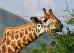
Yeah, I know… It isn’t as if it is rocket science. You press apple + U, and the picture is nice and de-saturated. However, this also means that you have no control whatsoever about the final result of the image. Instead, a little bit of knowledge how RGB colours work will allow you to create some pretty impressive black and white photos from digital files… 


01.jpg

When you de-saturate (apple + shift + u, or image -> adjust -> de-saturate) this picture, this is what happens:

02-1.jpg 02-2.jpg

Yes, it is a black and white picture, but – if you ask me – it isn’t particularly exciting – and definitely not anywhere near a piece of art. To make this picture even remotely interesting, we have to change the way of turning the picture into black and white.

If you have worked with coloured filters to improve your black and white pictures before, you know what I am talking about; The coloured filters block certain colours from hitting your black and white film, thereby enhancing your photograph. This, then, is the secret: When you shoot in colour, you can add these coloured filters later! This is the reason why, even if you digital camera supports taking black and white pictures, you always should shoot in colour.

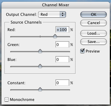
03.jpgThe best way of turning a picture like this into black and white, is to use something called the channel mixer – one of the lovely functions found in Photoshop, or indeed most image editing apps.

You find the channel mixer in the in the Image menu – here you find a submenu called adjustments. In this menu, you find some of the most useful commands in Photoshop. Among others, you find the Levels tool (I will do a separate tutorial on this tool before too long), a curves tool (incredibly useful, especially for print work), the de-saturate tool (already mentioned above), and – if you have a quick butcher’s down the list, a Channel mixer.

The Channel mixer is your Friend. Trust me on this. When you open the channel mixer menu, you find something along the lines of the illustration to the left.

The channel mixer can be used for adding great effects to colour pictures as well – such as changing the red and blue channels and stuff like that, making colours really wacky, turning the ocean red and the skies green. Stuff like that – I suggest that (after you finish trying out the stuff in this tutorial, of course) you play more with the channel mixer later.

For our purpose, however, we will check the Monochrome checkbox. This changes the output channel from Red (or green or blue) to gray. This means that now you are mixing the three channels (RGB) into one channel. Of course, this is basically what de-saturation does. Except now you have the option of controlling how it is done: The three sliders are there for you to decide how much of each channel is taken into consideration when converting the three channels to black and white (i.e. mixing the channels. Hence, Channel Mixer.).

On the picture below (marked with R, G and B) I have used 100% blue, green and red, to illustrate the difference between the different channels. Because the sky is largely blue, it appears whited out in the blue channel (see the part of the picture marked "B"). In contrast, the palm tree (which is quite red) will have a lot of dark colours in the blue channel, yet a lot brighter in the red channel.

04.jpg

When turning people into black and white, the differences can be even more surprising – and effective:

05-1.jpg


05-2.jpg 05-3.jpg

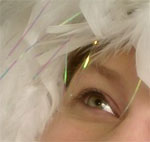
In this image, using the red channel makes the model unhealthily pale-looking. Using exclusively the blue channel, however, makes him look ridiculously tanned. Basically, this is what the tutorial is all about: Combine the different shades of the colour image, in order to get the exact effect you desire.


In the next example, we combined 60% red, 10 % green and 20% blue to make the black and white edition.

06-1.jpg 06-2.jpg

For women, the red channel is a highway to fair skin (small blemishes – being red, normally – completely disappear), while for men, using the blue channel usually lifts up the facial characteristics. For people who have really faint freckles, pulling up the blue channel a bit will enhance the visibility of the freckles. I once photographed a model who – when she saw the images – claimed I had painted on freckles. I denied, and sent her to a mirror. She was 24 years old, but it took a Photographer and some Photoshopping for her to realise the first time in her life that she actually had freckles!

Now that you know what the different channels do, you will want to start experimenting with the settings, so we can turn the images into black and whites the best possible way.


Do you enjoy a smattering of random photography links? Well, squire, I welcome thee to join me on Twitter -

© Kamps Consulting Ltd. This article is licenced for use on Pixiq only. Please do not reproduce wholly or in part without a license. More info.

Making food look yummy

Picture-3.jpg

Picture-3.jpgI know we’ve featured Still Life With… once before, but they deserve another mention, for being so damn good. This time, they’ve made a fabulous little guide to how you can make food look good, by using creative lighting techniques.

The great thing is that the tips and lessons learned from this post don’t just apply to food – it works excellently for all sorts of stills photography in a studio setting.  


Trainers, fruit, pens, bottles of ketchup, it all makes no difference: Stills photography is stills photography. Food poses its own challenges, of course, and it’s a good thing they are addressed in this article. Personally, I love food, but that’s beside the point: the tips offered are transferrable skills, and I particularly like to pick up new ideas and hone my skills by being challenged to new forms of photography – so why not food?

By using a “show and tell” approach, Still Life With manages to both show you what looks good, explain why it works, and finally take you through the motions of how you can copy the ideas yourself. It’s worth having a look at their Lighting Positioning: Shooting in the Kitchen either way – you won’t regret it!


Do you enjoy a smattering of random photography links? Well, squire, I welcome thee to join me on Twitter -

© Kamps Consulting Ltd. This article is licenced for use on Pixiq only. Please do not reproduce wholly or in part without a license. More info.

Intro to digital photography

Picture-24.jpg

Picture-24.jpgOne of my old mates pointed out that the DIY network has a surprisingly thorough introduction to digital photography.

It appears as if the article series is mostly just a transcript or summary of a television programme, but the articles are very well written, interesting, and have a series of “further reading” links. Although I knew all of this before, I just wasted an entire afternoon reading all the links. Highly recommended, in other words :)


Do you enjoy a smattering of random photography links? Well, squire, I welcome thee to join me on Twitter -

© Kamps Consulting Ltd. This article is licenced for use on Pixiq only. Please do not reproduce wholly or in part without a license. More info.

Buying the right camera

eos.jpg

eos.jpgIn a completely unrelated post, I received a rather lengthy comment today. I suspect the main purpose of the post was to get a link to his site, but of course, Photocritic uses REL=NOFOLLOW (read why) on all the user-contributed links, so the spamming activity went without any particular merit.

What was insteresting, however, was that this person actually raised an interesting issue and an fascinating question. He says that 75% of people buy the wrong camera for his photography courses… 

I am a photography teacher.

I find that 75% of people buy the wrong camera. So just how do they end up in one of my classes with the wrong camera. The short answer is that they bought the most fashionable looking camera without really knowing what to look for in a digital camera.

The questions you should ask the sales person is: how long does the camera take to turn on? How long does the camera take to focus on the subject? And how long does it take to actually take the photo? Turning on the camera can take between 1-5 seconds, focus can take from 0-2 seconds and shutter lag can take up to 1 second.

Why is this important, well try taking a photo of a child blowing out the candles with a camera that takes 2 seconds to focus and 1 second to take the photo and all you will be left with is a child looking away and smouldering candles. This is where the new D70s rise above all the other cameras in its class with instant turn on focus and shutter release.

We highly recommend the D70 to someone who wants a camera to last him or her for many years without the frustration of a slow camera. We are so happy with our D70s we bought four more we highly recommend them to anyone who loves photography and does not want to have to upgrade when they learn more about photography!


Why 75%? Surely, everybody who buys an D-SLR has a camera good enough? Why are you talking about shutter lag and camera turn-on-lag? It’s a long time ago that this was a big issue for digital compact cameras. Sure, there are still crummy cameras out there, but the vast majority of digital compact cameras are not struggling with the problems mentioned here. Granted, most of them aren’t good for a photography course because you don’t have aperture and shutter speed settings, but still…

And finally – Why recommend the Nikon D70 specifically? Do you work for Nikon? I would argue that any digital SLR (even the ages-old Canon EOS 30D, if you can pick it up for cheap off eBay) is more than good enough to use for learning photography. Hell, according to Froogle, you can pick up a digital SLR for about $650 (£350, approx). Furthermore, there isn’t that much difference between the D-SLRs anymore. Of course, the better cameras have more features and are more sturdy, but image quality wise, a 8mpx camera is as good as most other 8mpx cameras – especially in the DSLR world, where you supply your own glass anyway.

So folks, ignore all previous advice, and buy any DSLR (preferably Canon or Nikon, I don’t quite trust the others yet) you want.

… And just because this guy with his spamming managed to raise an interesting issue, I’m going to thank him by linking to his website anyway. Although, strictly speaking, I probably wouldn’t bother with going to any of the courses. If his Photocritic commenting skillz are anything to go by…


Do you enjoy a smattering of random photography links? Well, squire, I welcome thee to join me on Twitter -

© Kamps Consulting Ltd. This article is licenced for use on Pixiq only. Please do not reproduce wholly or in part without a license. More info.

Try food photography!

photo_ingredients.jpg

photo_ingredients.jpgIf you thought portraiture was difficult, think about how perishable hot foods are. When you photograph it, you’ll want it looking fresh, happy, steaming, and appetising. A normal photo shoot – where you photographs something to perfection – takes a few hours, but the food will only remain good-looking for about 10 minutes at the most.

So what do you do? God knows, I’ve never tried. But my new friend L over at Still Life With laid down the gauntlet… 


This month, I got inspired by Chez Pim’s post a week ago about “the ugliest food photo ever.” It’s stunning that a professional actually published this photo of Tuna Tartare in the New York Times, taking what sounds like a decent recipe and making it look just awful.

Of course, because this was a food article in the NYT, it also included a recipe. The challenge is obvious: Make the food (see, I knew there would be a DIY element to this, even though it is a food DIY rather than a photography DIY), and then take a photo that doesn’t look disgusting.

Read the challenge over at L’s blog, and then get cracking! If you get any good results, tell her, and me too!


Do you enjoy a smattering of random photography links? Well, squire, I welcome thee to join me on Twitter -

© Kamps Consulting Ltd. This article is licenced for use on Pixiq only. Please do not reproduce wholly or in part without a license. More info.

Removing the IR filter from an SLR camera

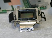
Picture-2.jpgThis one falls in the “if you are planning to do this, you have to hate your SLR” category. If you enjoyed our earlier tip about IR photography, you will probably have noticed that many cameras – especially DSLR cameras – have IR filters built into the body. Obviously, that means that you can’t use it for IR photography. Unless you remove the filter, that is… I wouldn’t dare do it to my own camera, but if you have a destructive streak (or very steady hands), you could follow the instructions posted on this page. It concerns the Canon EOS 350d, but the procedure should be similar for most camera brands:

1) Take the whole thing apart 2) Locate the IR filter 3) Remove the IR filter 4) Put the whole thing back together again

Hey, we never said it was going to be easy!