Equipment

Hands-on with the Fujifilm X-T1

In one of life's odd little turns, I found myself pitching up at the Fujifilm X-T1 press conference in Bangkok this lunchtime. Yes, today was meant to be a rest day between excursions, but I couldn't resist the invitation to join Daniel, the editor of ThemePhoto, just around the corner from where I'm staying. There were a few X-T1 bodies with different lenses floating around, plenty of tea and coffee, and I had the opportunity to play around with Fujifilm's newest addition: weather-sealed, dSLR-look-alike, and 16 megapixel APS-C sensored. After all that pre-amble, what did I think? Mostly, that I enjoyed getting to know it, albeit briefly, and I would appreciate being able to spend more time with it. Without a dedicated mode dial you alter the sensitivity and shutter speed dials independently, selecting 'A' on each if you want it in automatic, and switch between automatic and manual on the aperture ring to control your exposure. If you want to shoot aperture priority but manually control the ISO, you set the shutter speed dial to 'A' and the adjust the other two as required.

Compact, but SLR-styled

There's an exposure compensation dial on top of the camera, beside the shutter speed dial, and a front-facing dial that gives you more refined control over your shutter speed. Without the standard mode dial giving you 'Sport' and 'Portrait' options, it makes you think that this is a photographer's camera. Yes, there are soft-focus and toy camera options, but they're hidden away and not obvious.

However, I did find it quite tricky to adjust the shutter speed dial while holding the camera to my eye. Unless this is something that I could get used to (I'm not sure) it could get trying very quickly. I found the rings to switch between metering modes (beneath the shutter speed dial) and drive modes (beneath the ISO dial) a little awkward to adjust, too. Your milage may vary.

The four-way controller gives you control over your most-used functions, for example white balance, macro mode, and Fujifilm's film replication effects. You can make it into the camera that you want it to be.

Did I notice any lag with the EVF? Well, yes. But, it is possible to select whether you shoot EVF-only, EVF+LCD screen, or LCD-only. I thought it felt faster and less laggy in EVF-only mode. You know what I did like, though? That when you shift orientation from landscape to portrait, the information that appears on the EVF re-orients itself, too.

I tried out the 18-55mm kit lens, which handled very well, the gorgeous XF56mm ƒ/1.2, and the 55-200mm telephoto lens. I found that last one had a fairly stiff, not very smooth zoom ring, but some people might prefer that. At launch, there's no weather-sealed lens to go with the weather-sealed camera, which is a shame, but the X-mount range is growing and the weather-resistant 18-135mm is scheduled to arrive in summer this year, to be followed by two more later in 2014.

When I had the opportunity to chat with Somkiat Narattanakulkitti, Fujifilm's General Manager of Marketing and Sales in Thailand, apart from him asking me if I weren't put off by the protests, he was keen to point out how Fujifilm thinks it's important to innovate, and the X-T1 is a part of that. People want a camera that looks stylish, performs well, but isn't a cumbersome brute. Okay, so he didn't use the words 'cumbersome brute', but the X-T1 is about form and function and Fujifilm's direction is definitely to keep on keeping on. No, I couldn't get him to confirm if a full-frame camera is coming next, but it wouldn't surprise me.

At £1099 body-only, the X-T1 is a compelling piece of kit. I won't be trading in my current camera for it any time soon, but I can certainly see how some people would be tempted by it, and I wouldn't mind it for an extended stay!

Faith: new lighting stands and tripods

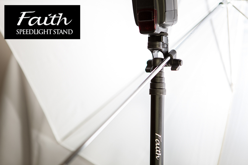
Inspired Photo Gear, the guys behind the lightweight and cute-looking Lollipod, have launched a similarly lightweight and easy-to-erect lighting stand and two tripods that can also be extended in a flash. The Faith lighting stands use the same 'pull to erect' system that the Lollipods do, but are a little more versatile than their smaller siblings, which can also be used to mount flashes. The Faith stands have an integrated umbrella holder, a cold shoe, and a concealed spike should the ground be on the soft side.

Faith SpeeLight Stand by InspiredPhotoGear

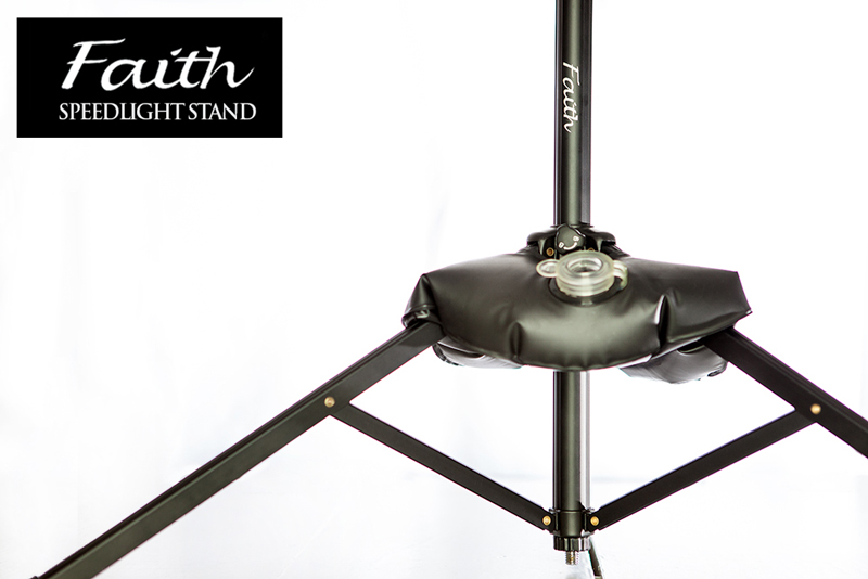
If you need to stabilise it, there's a pocket in the case bag. Just add water and it should keep things steady.

Faith SpeeLight Stand by InspiredPhotoGear

The Faith lighting stand weighs 540g, can hold up to 2.5 kg, has a maximum height 180cm, but folds down to 41.5cm for carrying purposes. It'll cost you £50, which is US$83, €61, or AU$96, and can be ordered from the Inspired Photo Gear online shop.

When it comes to tripods, there are two models on offer: smaller at £150 and bigger at £250. Either can both be erected in under six seconds, so I'm told, owing to their Flash Lock mechanism: pull the leg out fully and it will activate the auto lock function. It should take just 0.6 seconds to extend each leg and around 5 seconds to setup the entire tripod.

There's even a demonstration video to show just how fast you can erect one:

The larger tripod has a maximum height of 148cm and folds down to 39.5cm; it can support upto 30kg, and weighs 1.55kg. The smaller tripod also extends to 148cm but folds down to a more compact 33cm, weighs a slightly lighter 1.05kg, and consequently is capable of supporting 20kg. I'm not sure that the extra 10kg is worth the £100 difference in price, especially when the smaller tripod is more compact and lighter, too!

These, too, are available from the Inspired Photo Gear online shop.

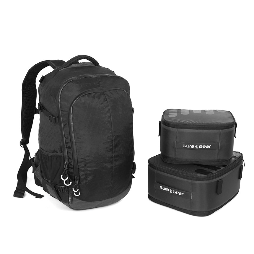
Mix and match with the Gura Gear Uinta

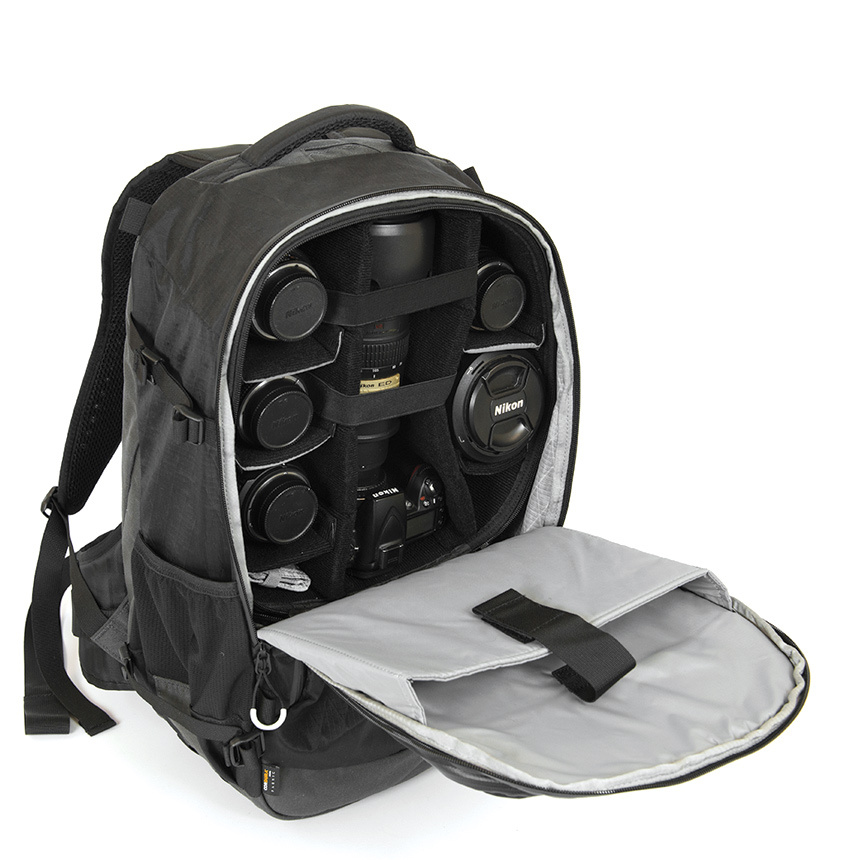
Gura Gear has launched a modular camera bag that you can chop and change depending on how you're planning to use it that day. Whether you're out for a day's street photography, a up-hill and down-dale hike, or a walk with some photography, the Uinta is intended to meet your needs. In addition to the bag, you can purchase modular inserts to secure your kit. Depending on how you want to use the bag, you can configure the modules appropriately. As well as the modules there's an additional Tripod and Hydration System, and the bag has multiple access points, is weatherproof, and has space for a 17" MacBook.

Camera gear + laptop sleeve

As for those mix-and-match modules, they'll let you:

  • Maximise camera storage using both the medium and small modules
  • Carry plenty of camera gear towards the top of the bag in the medium module and pack other necessities in the bottom of the bag
  • Take just a few pieces of camera equipment with the small module and use the rest of the bag for your other gear. The small module fits top or bottom in the bag, letting you distribute the weight as you need to
  • Use no modules at all and just use the bag as a bag

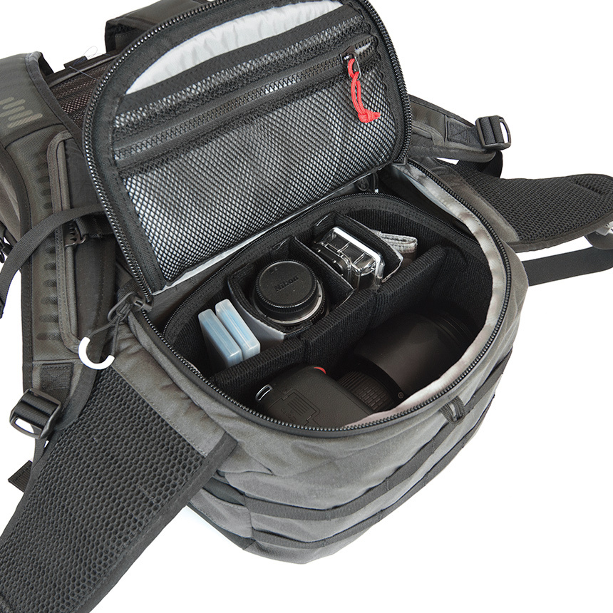
With one module

The bag alone costs £120; the small module is another £43, the medium module will cost an extra £55. For the bag and both modules, you'll pay out £217. For the entire kit-and-caboodle, including the Tripod and Hydration system, it's just over £241. What do you reckon, is Gura Gear's Uinta worth it for the flexibility, or on the over-priced side?

Bag + modules

If you fancy one, you can check it out on the Gura Gear website.

Lolloping around with a Lollipod

Just before Christmas the lovely guys at Lollipod sent me an ice blue version of their lightweight, compact, multi-functional support device to test. The Lollipod can't withstand anything that weighs more than 420g, but that makes it perfect for mobile phone photography and compact cameras, and it can be used a sound boom, too. I've given it a go with my Canon S95, which attaches to the Lollipod directly, and my iPhone 4, which attaches using Lollipod's additional spring-loaded adapter. (You can use a Joby Griptight, too.) Lollipod

The good

The Lollipod really is light. I took the liberty of plonking it on the kitchen scales and it weighed in around 275g, or 9oz. So much of the appeal of smartphone or compact camera photography is that it's convenient. You don't want heaps of weighty (and expensive) kit when your camera fits in your pocket. However, there are occasions when you want to be able to steady your picture-taking device, for example when you're taking night shots, or self-portraits. Schlepping around something designed to take a dSLR might be overkill, but the Lollipod isn't.

Secure an iPhone with the Lollipod adapter

When it's fully retracted, the Lollipod isn't any more than 33cm (just over one foot) long. That's small enough to put in a daypack, a messenger bag, or even one of my larger handbags. Combined with its light weight, that makes the Lollipod supremely portable.

I was also impressed by the screw mechanism that secured your compact camera or the mobile adapter to the Lollipod. It's integrated into the Lollipod, so there's no ferreting around to find something to screw a plate into the camera or adapter, or even a plate to lose.

A built-in screw mechanism keeps things neat

Extending and retracting the Lollipod is quick and easy. There are no locking mechanisms: everything just slides in and out. Despite my initial concerns that this could result in the Lollipod retracting into itself, that never happened. After all, neither my camera or phone were that heavy and you're not meant to put anything weighing more than 420g on a Lollipod.

See? Very compact.

The not-so-good

Being so light means that the Lollipod isn't always as stable as it could be, especially when it's fully extended. Unless I set the self-timer on my compact camera it was quite difficult to capture an image without camera-shake. I had much more success with my iPhone, though. It is possible to weight down the Lollipod—you use the carrying case that comes with it, and something like a water bottle or handy rock—but I'd still be apprehensive about using it in windy weather. Without independently adjustable feet, it wouldn't be stable on uneven ground, either.

If you're accustomed to the flexibility of motion in a standard tripod head, you might feel restricted by the Lollipod's limited movement. It can only move through one axis, so you'll need to decide between setting your device so that you can switch between portrait and landscape, or so that you can tilt it. Tilting with a camera on the Lollipod wasn't a problem at all, but I didn't feel that my iPhone was sufficiently secure in its adapter for that.

In conclusion

When you're accustomed to a heavy-weight tripod with a head that moves in almost any direction imaginable, the Lollipod feels incredibly limited and restrictive. But that's comparing apples with oranges, really. The Lollipod has been designed as a lightweight, flexible support, and it fulfils that brief. If you need to stop your camera from shaking when taking photos in the dark, it'll do the job. If you want something to have a go at self-portraiture with your phone, it's great. If you need a lightweight and portable support for a small camera or smartphone, that's exactly what it is. Just don't try it out in a force nine gale.

Lollipods are available direct from Lollipod and cost £30.

Adobe unleashes some new Photoshop tools

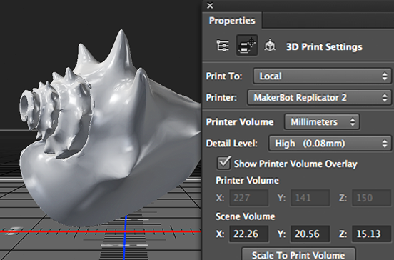
Adobe has announced an update to its Creative Cloud suite of applications, and with it some new tools for Photoshop. Headlining the update is the integration of 3D printing capability into Photoshop. It should now be possible to design print-ready 3D models from scratch or to refine existing models and then send them to a locally connected 3D printer or make use of new partnerships with MakerBot and Shapeways to have them print 3D creations. If you're not so exciting by 3D printing as Adobe is (or perhaps wondering why 3D modelling is included in an image manipulation package), Adobe has also brough Perspective Warp and linked Smart Objects to Photoshop.

Print to your own 3D printer, or connect to a commercial one!

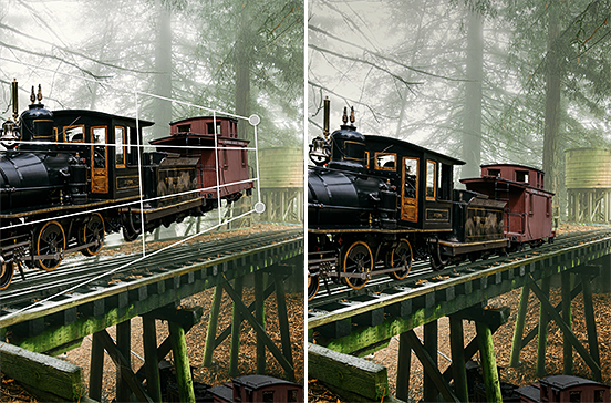
Perspective Warp is able to manipulate an image to alter the standpoint from which a subject is viewed. That could have particular creative uses when playing around with composites, but more general practical advantages to correct distortion in lenses.

Perspective warp: great for surreal creations, or just correcting lens distortions

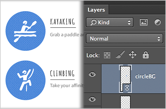
Linked smart objects should improve collaborative processes by automatically updating a final design (for example a poster) if a file contained in it (a photograph, for instance) is amended or updated. No longer will the old version of the photo need to be removed and replaced with the new edit.

Re-edit a linked smart object and it'll autimatically update in a final design

In line with the subscription model, these applications, together with those made to InDesign and Illustrator, will not have to be paid for and should be available for use as soon as Creative Cloud updates.

Who wants to conform? Choosing an app for rectangular Instagram images

Instagram images are distinctive because of their filters and their square crops. They're the first two elements on the Instagram Spotter's Guide. But who wants to be forced to conform and always have to slice off the sides of your photos and submit a perfect square? Exactly! An entire industry has grown up around the Instagram phenomenon, encompassing everything from postcards to marshmallows, and it includes a goodly selection of apps that add a border to your rectangular photos that'll ensure they look square when imported to Instagram. (And if you choose a coloured border, it empahsises how the image is, in fact, square.)

I road-tested five of these apps. If I had the choice of a paid or a free version, I always went for the free one, which meant that one of my judging criteria was how intrusive or distracting the ads were. Otherwise, I was looking for an intuitive interface and something that didn't run too slowly. Thus, in order of preference, I present the Oblong Collective.


Instacrop logo

=1. Instacrop

iOS-only, free

With no frills and a desperately simple interface, Instacrop comes joint top of my list. Tap to select a photo from your camera roll, hit share to select from Instagram or EyeEm, and you're done. If you're so inclined you can select from paid-for border colours. There are banner ads at the bottom of the screen and a pop-up ad before you can share your photo, but I didn't find them too instrusive.

No-frills Instacrop


Instasize logo

=1. Instasize

Android and iOS, free

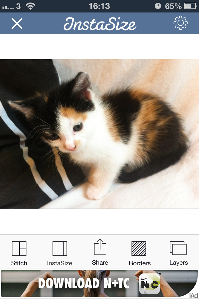
As well as allowing you to post rectangular images to Instagram (and Facebook and Twitter), Instasize allows you to create diptychs and triptychs, overlay a filter or text, and choose from a huge variety of borders. I didn't find the ads too distracting and the app didn't run too slowly, either. It shares top spot because if you're looking for a bit more functionality than just rectangular images, it has it.

Lots of options with Instasize, and still easy to use


NoCrop logo

3. #NoCrop

Android and iOS, free

As with Instacrop, it's a case of tapping to import an image from your camera roll and then tapping to share to Instagram, Facebook, or Twitter. You can email or save the image, too. #NoCrop gives you the option to adjust your border size using a pinch-to-zoom motion or to reposition your image in the frame. This one is also ad-supported and they pop-up every now and again.

Middle-of-the-road with #NoCrop


Squaready logo

4. Squaready

iOS-only, free; Squaready Pro, £1.49

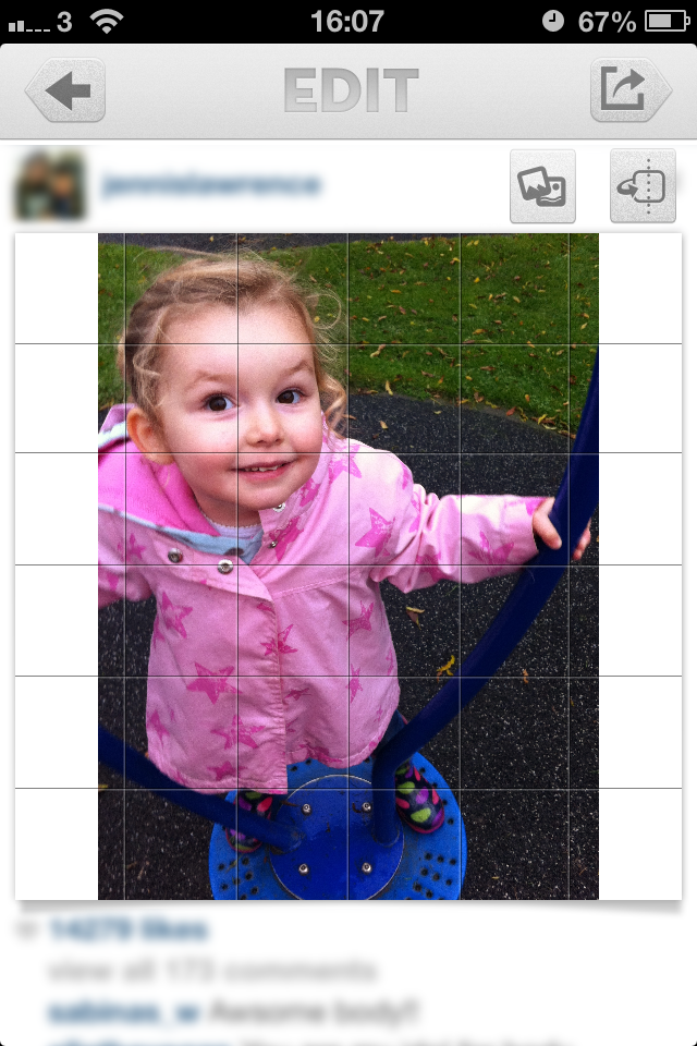
Squaready gives you lots of options to borderise your images: let it do it for you with an instant adjustment, choose from three different sized borders, or pinch-to-zoom to alter it yourself, and then select a border colour. There're are options to edit your images with Camera+ or three other programmes, too. All of this sounds great, but I didn't find the interface as simple to use as Instasize and it was much slower, too.

Squaready: not as simple as it could be


Squaregram logo

5. Squaregram

iOS-only, free (There is a SquareGram for Android, but it's developed by a different company.)

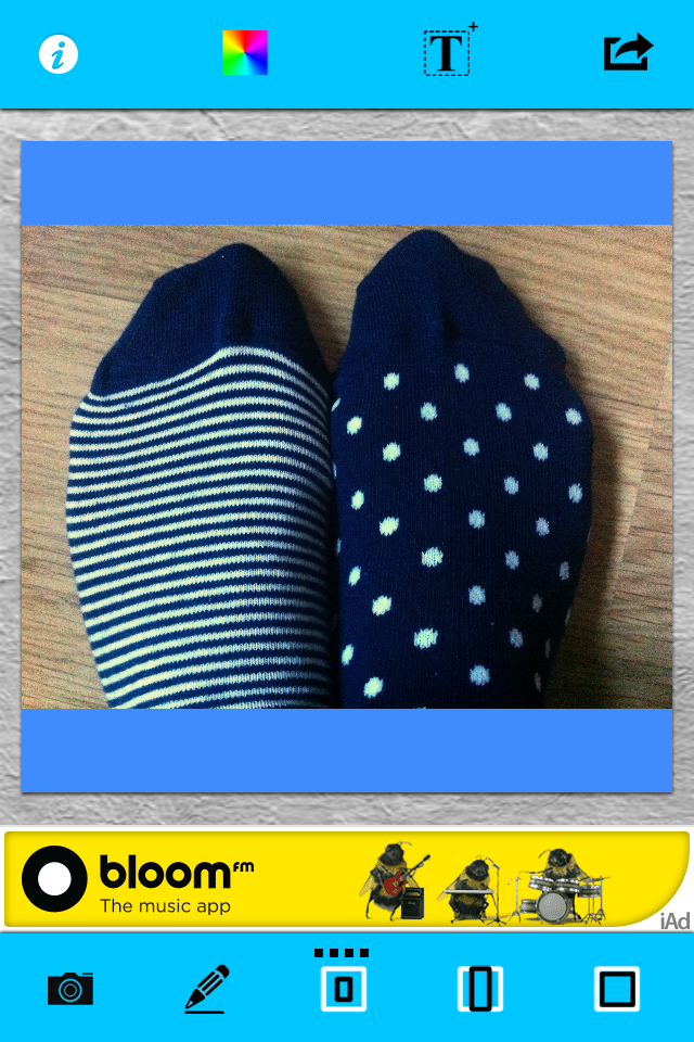
My first encounter with Squaregram did not end well: I closed it in a fit of frustration. Apart from it running very slowly with lots of intrusive ads, the interface wasn't especially intuitive. I couldn't figure out how to remove a text box when I'd been experimenting with adding one, which really bothered me. I did give it another go, and I liked that I was able to choose a border colour and corner curvature, but it ddn't make up for how disappointing it was first time around.

Relinquish hope all who enter here!

If you've any pet apps for sharing non-square images to Instagram, let us know down there!

Will Toshiba be bringing Lytro-like refocusing to smartphones?

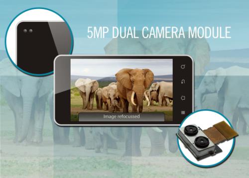
We've grown accustomed to the idea of photos that we can refocus after the fact thanks to Lytro's lightfield camera and to Nokia's Refocus app that takes between two and eight photos that you can play with to your heart is content. Now Toshiba has announced the first dual camera module designed for inclusion in phones and tablets, which is able to record depth data and well as an image simultaneously. The catchily named TCM9518MD comprises two quarter-inch five-megapixel CMOS camera sensors and a dedicated processor. This dual camera module can capture images where the foreground and background, and everywhere in-between, are in focus along with depth data for each object in the picture. Not only can the module allow you to focus, defocus, and refocus the images it produces, but it can generate 13-megapixel images by up-scaling images taken by its two cameras.

Focus and refocus with Toshiba's dual camera module

Andrew Burt, vice president of the Image Sensor Business Unit, added that: 'Not only does the dual camera module enable these advanced capabilities [e.g. refocusing] with fast digital focus and little shutter lag, the device doesn't require any focus motors, so it can be built much thinner than today's 13-megapixel camera modules.'

Toshiba has made sample modules available to smartphone and tablet manufacturers (they cost $50 a pop), so which devices will be the first to feature them?

(Headsup to the Verge, further information from PR Newswire)

Polaroid's novelty slalom

Polaroid has been showing off a few different products at CES, and not all of them cameras. However, photographically the interest has been in its square-shaped instant camera, the Socialmatic, and the tiny cube-shaped C3 camera. Neither of them is especially a mainstream product, but there are plenty of companies who can succeed in making a go out of the novelty factor. The skill is in marketing a product to which people can become easily attached, at a price that works. Has Polaroid accomplished this? The Socialmatic was announced some time ago; now we're told that we can expect it in the autumn and it'll cost $299. It has a 14 megapixel front-facing camera and a two megapixel rear-facing camera. It is built on an Android platform. It can share images over a wi-fi connection or via Bluetooth. And it can print sticker photos using its built-in ZINK printer. Along with its square shape, that's its killer feature that gives it desirability and the necessary degree of novelty. The question is, would you spend $299 on a novelty camera? Of course it is going to have appeal to some people, but I suspect they'll be limited in number. Continuing to use the smartphone that you already have and linking it up to a (much cheaper) Fujifilm instax SHARE SP-1 printer would make much more sense.

Print your social photos on the go

The C3 cube, on the other hand, seems to hold more appeal. It measures 35mm by 35mm by 35mm; holds a five megapixel camera with a lens that has a 120° angle of view; is waterproof to two metres; and it contains 2MB of internal storage that can be augmented with a micro SD card. There's a button to release the shutter and it'll cost $99. It's perfect for any sort of remote-controlled vehicle, for sticking to a helmet or set of handlebars, or for wedging in a corner. It's still a novelty device, but a more affordable one.

Canon Powershot N100 - another attempt at being cool

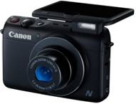
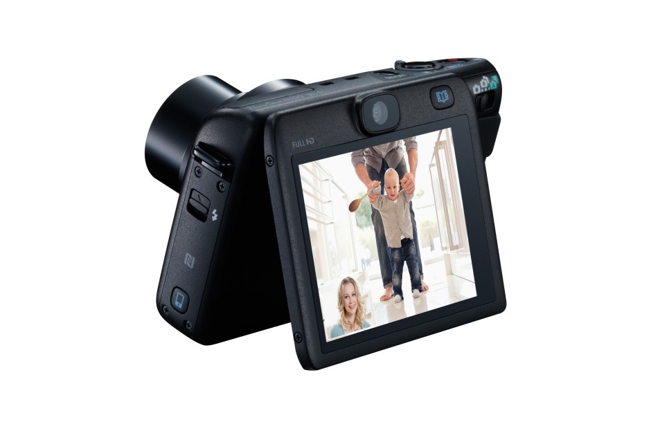
Canon has announced the Powershot N100 at CES: the idea behind it (or even in front of it), is that it's a camera that can tell both sides of the photographic story with simultaneous functioning front- and rear-facing cameras. After the launch of the Powershot N at CES last year, which appeared to be Canon's quirky attempt to lure smartphone users back to compact cameras (as if that were ever going to happen in a hurry), the N100 is more functional type of camera aimed at people who want to use photos to capture life in front of and behind the lens, and share it easily. My immediate reaction to the dual camera function is that I have absolutely no desire for anyone or anything to try to photograph me while I'm taking a photo. I'm usually pulling a face or sticking out my tongue in concentration (I have a habit of doing that). Canon, however, sees it as a way to ensure that you record your own reaction, either in still or video, to a situation that warrants it: baby's first steps, for example.

Smart Auto Technology has a bank of 58 different scene options to ensure that you make the most of your photo situations. There's the Hybrid Auto feature, too, which captures four seconds of video before you release the shutter when taking a still image.

The N100 tries hard, but is it getting anywhere?

There's also a Story Highlights mode that's meant to take the strain out of editing. It uses an algorithm to analyse all of your photos and create a highlights album organised by theme, date, or faces (if you've registered with the camera). I don't know about you, but I'd be concerned that the important photos, the ones that weren't quite perfect or captured something slightly abstract, would be overlooked and ignored.

The N100 has built-in wi-fi. It connects to smartphones using the Mobile Device Connect Button with NFC support, via Canon’s CameraWindow app. You can also back up your images to cloud storage sites or Flickr via the Mobile Device Connect Button in conjunction with CANON iMAGE GATEWAY. The CameraWindow app also gives you the option to remotely control the N100 directly your smartphone.

The N100 has more bells, whistles, and toys than you can shake a stick at, with modes such as background defocus and Creative Twist that lets you capture six different versions of one image. It has 46 different creative effects, grouped into four categories – Monochrome, Retro, Special and Natural – for you to pre-select from before you start shooting.

Tilting screen - always useful

Spec-wise, the N100 is powered by a DIGIC 6 processor with a 12.1 Megapixel 1/1.7" CMOS sensor. On the front it has a 24mm lens with 5× optical zoom. On the back, it's a 25mm lens. It'll cost £350 (or $349 if you're in the US). And it won't be available until May. May!
Oh Canon. I think you've done it again. I think you've tried to be quirky, fun, and innovative, but you've ended up looking like your great auntie Doris who's turned up to a party wearing clothes that were in fashion 20 years ago and are four sizes too small for her. I doubt that much here can tempt someone away from a smartphone for £350, or offer much that someone who's actively looking for a compact camera really needs. Given that it's not slated to appear until May, how many smartphones will be recording with front- and rear-facing cameras simultaneously by then? You have to give Canon some marks for trying, but not many for execution.

Easy-to-make photo videos with Flipagram

Seeing as half the world and their spouses appear to be producing some variation on 2013 In Review articles, videos, and compilations, I thought I'd go for a variation on the variation of 2013 In Review. I've made a sneak peek Flipagram of some of the photos that will be appearing in my Social Photography book, which is due to be released in spring 2014. It's a prospective retrospective, I suppose.

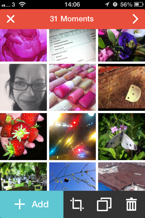
As for Flipagram, it's a rather nifty app that I discovered when a photographer whom I follow on Instagram compiled her best bits of 2013 into a slick looking video. (Thanks, Natalie Norton!) It allows you to hook up to Instagram to make a digital flipbook of your favourite photos, or if you're not of the Instagram persuasion, to do it from your smartphone's camera roll.

Photo 30-12-2013 14 06 01

Once you've selected your images you can arrange them in your preferred order, crop them to fit Flipagram's square format, duplicate them for added impact, decide between a 15 second or 30 second video playtime, and choose a soundtrack if you fancy. After that, you hit the button and Flipagram compiles your video for you. Then you can share to Instagram, Facebook, Twitter, Pinterest, or YouTube, or you can email it away. There's no option to embed your videos from the Flipagram site, but if you upload them to YouTube, you can embed from there.

I was impressed by how easy it was to compile a little video and finish it the way that I wanted it finished. At the moment you can't return to edit a saved video, but Flipagram has developments in the pipeline, so that might be one of them. And useful it would be, too.

Flipagram is free, nothing to do with Flipboard, available for Android and iOS, and worth a download for a bit of fun.

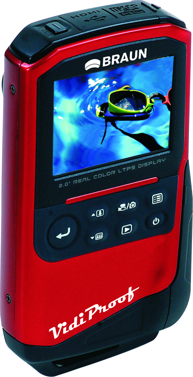
Video in and around the sea for around £100 with the Braun Vidi Proof

'Cheap' and 'underwater safe' aren't words that often go together when it comes to cameras. 'Cheap' is of course a relative term, and to what depth you can take a camera under the surface is also variable, but most of the time you're looking at a good few hundred pounds to get your hands on anything that you can drop in the surf. Braun is hoping that its new Vidi Proof Camcorder will allow snorkellers, surfers, and kayakers a reasonably priced option to record their exploits in motion and stills pictures. Primarily it's designed for making video, upto 60 minutes in length, and to a depth of three metres. However, it's capable of capturing stills, too, with a five megapixel CMOS sensor and 4× digital zoom. It runs off of two AA batteries and uses a Micro SD card up to 16GB in capacity.

Waterproof to three metres, the Braun Vidi Proof

If you're thinking that Braun is more readily associated with electric razors, depilators, and toothbrushes, that's a different Braun, which is owned by Proctor and Gamble. This Braun is the Braun Photo Technik GmbH, which used to be known as Carl Braun Camera-Werk. This company specialises in digital imaging equipment, from binoculars and graphics tablets to filters and video cameras.

The Vidi Proof will cost in the region of £100 and it should be available soon.

Video comes to photo storage app Loom

I've been a fan of Loom since since I tried out its public beta version earlier this year. It's a photo storage service that allows you to access your images across all of your devices as well as auto-upload them to take some of the strain off of keeping your back-ups secure. It's easy to use and looks good, too. Today they've released their biggest update to date, which will allow users to play and stream videos on their iPhones, iPads, and from the website. The process that their developers have implemented lets users watch their videos almost automatically without any of that pesky buffering. As soon as you press 'play' it starts to stream the lowest quality version of the recording while simultaneously buffering the higher quality one and switching to that as soon as your Internet cnnection and screen resolution lets you. Yes, it's similar to the system that Netflix uses.

They've made a pretty video to show it off, too:

Loom already gives you 5GB of storage for free; 50GB costs $39.99 for a year, or $99.99 buys 250GB of storage for a year. However, if you refer your family and friends to Loom you can pick up an extra 5GB for free.

Yes, Loom is only iOS-only at the moment, but Android expansion is planned. Let's hope that's Loom's next major update and it comes along quickly!
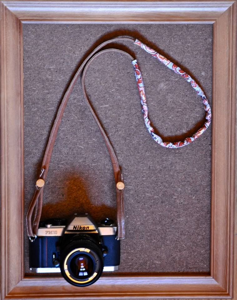
Gorgeous handmade camera straps from Signe Vicky

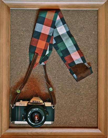
I've never been especially fond of the camera strap that came with my camera. Having a black, red, and white piece of fabric slung around my neck emblazoned with the words 'Canon' and 'EOS 6D' seems a bit indiscreet, really. 'Oh yes, muggers. Do come and pinch my several-thousand-pounds-worth of kit that I have casually suspended from my body.' So how about a handmade, individually numbered camera strap, produced at a workshop in France? Not only is it far more discreet but it's a bit more classy and definitely unique. Tartan?

French-Canadian maker, Signe Vicky, is responsible for these beauties. There are full length straps priced at €60 or wrist straps that cost €30. They can be shipped anywhere in the world, and if you get in quick you can pick one up to have sent directly as a Christmas present.

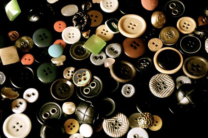
Pick a button, any button

The best way to get hold of one is to contact Signe Vicky through her Facebook page or to drop her an email. I have to say, I'm very tempted.

Paisley?

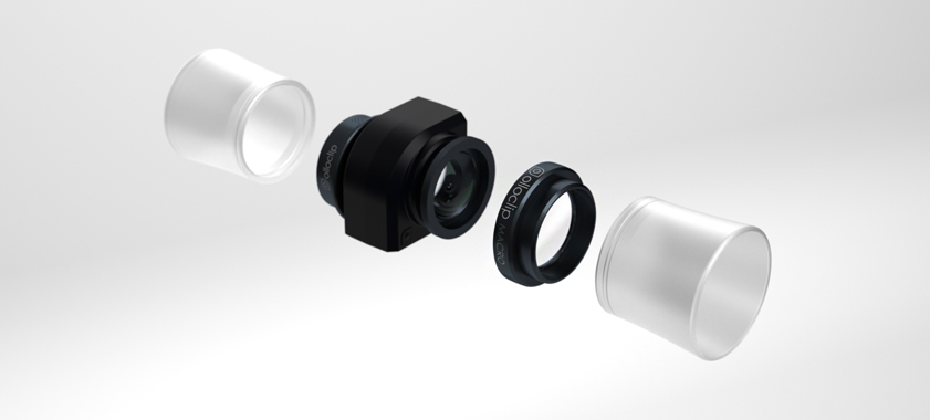
Getting up close with your iPhone and Olloclip's 3-in-1 macro lens

Last week Olloclip unveiled its 4-in-1 lens in Holidays-special gold and space grey options to match iPhone 5s models. This week it has announced a brand new 3-in-1 macro lens attachment for iPhone 5 and 5s phones. One reversible attachment and one adapter brings 7×, 14×, and 21× magnification to your iPhone photos. Two magnification factors one side, and one on the other

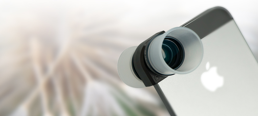
Just like other Olloclip attachments, it works by slotting over your iPhone camera. The 7× and 14× factor magnification options are on one side of the attachment—you switch from 14× to 7× by removing the adapter—the 21× lens on the other. You get two diffuser heads to help soften the light, too.

Light-diffusing hoods included

The 3-in-1 macro lens is available from Olloclip for $70. This one doesn't come in spangly colours, just black. But it does look rather smart.

(Headsup to Engadget)

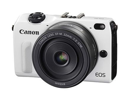
Canon EOS M2 announced in Japan. When next the rest of the world?

Finally! There have been months of rumours and speculation swirling about the upgrade to Canon's mirror-less EOS M camera and at last the great unveiling has taken place. At least, in Japan. The rest of the world must wait to see if Canon has put any guts and determination into this model. When the EOS M was launched last year, I was convinced that a late, single entry into the mirror-less market by Canon would have made it a camera worth waiting for. Canon would crack the mirror-less market and take the photography world by storm. Sadly, I was desperately mistaken when all that one heard about it was how mindbendingly slow the auto-focus was and it felt more like a camera that Canon felt obligated to produce, rather than one it had engineered with heart and soul. I'm not convinced that the EOS M2 is going to rekindle any verve or sparkle in the notion of a Canon mirror-less camera, either.
And it comes in black, too.

The M2's new Hybrid CMOS AF II auto-focus system is meant to be 2.3× faster than that in its predecessor, but the impression that I have is that they'd have to actively try to make it any slower, so this doesn't say very much. I'm seeing a few raised eyebrows that the M2 isn't capitalising on the dual pixel technology seen in the 70D, which makes for smoother and faster auto-focusing when in live view mode.

The M2 still uses an 18 megapixel APS-C CMOS sensor powered by a DIGIC 5 processor, but there's now wi-fi and it's approximately 8% smaller than the original EOS M. But why-oh-why when the Sony NEX-6 has a frames-per-second rate of 10, does the EOS M2 languish with 4.6? When you're not producing an entire range of mirror-less cameras, you need your solitary flagship to stand out from the crowd.

Apart from seeing if the auto-focus has improved, there's nothing about the EOS M2 that makes me want to pick it up and try it. There's no sense of excitement or innovation about it. It's coming over as just another camera and dammit, I don't want that.

Engadget is pricing it at ¥84,800 with a kit lens, or ¥64,800 body-only, due out later this month. Those prices equate to roughly $820 and $625, but you should never make straight conversions. When the EOS M2 does reach Europe and the US, it'll likely be more pricey.

Review: ArcSoft Portrait+ editing package

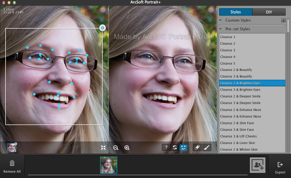
ArcSoft got in touch with me to ask if I would like to review their Portrait+ editing package. It's an automated portrait editing programme that detects upto 20 faces in any photo and allows you to apply 28 preset functions to your subjects, to apply more specific 'DIY' actions, including eye brightness, smile depth, and skin quality, and to create your own presets from these specific actions if you want. You can even apply makeup. Once you've loaded up Portrait+ you import an image, wait for the programme to detect the face, and then get to work. Unless the face is perfectly square-on in the frame, the software can have a few problems pin-pointing features, so it pays to look at where it thinks the key points are and adjust them as necessary.

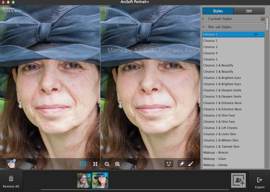
Adjust the key points of facial features to ensure it makes accurate edits

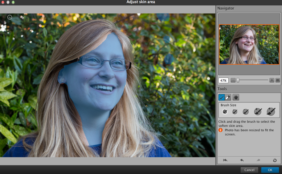
It also cannot identify faces that are in profile or at awkward angles. For these, there is no way of manually identifying the features, which means that they can't be treated in Portrait+. You can also ensure that all of the skin area is covered for adjustment, and you can paint in or paint out areas that the programme doesn't quite catch.

Ensure that the skin is recognised for enhancement

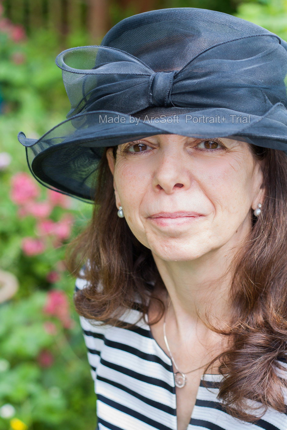
The first photo ran through Portrait+ was one of my mother. I was pleased with the effect of the very lightest touch (Cleanse 1) to her face, but anything above that felt excessive and unnatural. It was easy for her to slip from being elegant to plastic. This was especially true of any of the makeup packages. I'm also not the sort of person to go in for face-slimming or nose-enhancement. If you need to make use of these functions, however, they are there and you can apply them either as a part of a preset (for example, Cleanse 3 and Deepen Smile) or as a DIY action, which allows you to decide how deep you want to make the smile and then pair it with Cleanse 1 if you prefer.

Cleanse 1 and nothing else. It kept things natural enough.

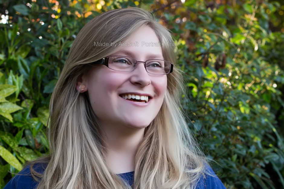
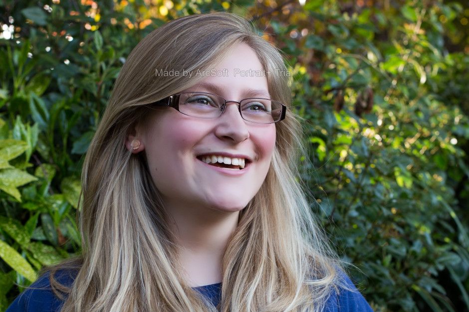
A photo of my cousin was more tolerant of the more extreme preset adjustments, but it was still all too easy to push things too far and leave her looking like a Barbie doll than a living, breathing, producer of theatrical shows.

Cleanse 4 leaves Emma looking fake, to my eye

It's easy to fix spots, marks, and aberrations in skin tone with the blemish removal tool, and it works well in combination with the lighter touch presets. This is where I think Portrait+ is at its most successful. Use it to remove circles from around the eyes, fix any obvious blemishes, and gently even out skin tones, and you can produce an improved but still natural looking portrait.

Blemish removal, a little skin evening, and tidying up around the eyes

While I find that some of the effects are far too extreme for my tastes and I'm not the kind of person to go in for face slimming and cheek lifting, it is an easy way to take a portrait and clean it up. The 'Remove Circles' function is a very easy fix for tired looking eyes that enhances someone's appearance without looking false. Unfortunately, I don't think that I can justify $150 for a bit of eye improvement alone.

If you take a lot of portraits, and you need a standardised and easy editing programme, you could well find Portrait+ a valuable asset in your arsenal. However, if you take a lot of portraits that involve profiles or slightly obscured faces, the inability of Portrait+ to detect them won't make it useful for you. And of course, if you prefer to keep a tight reign on your edits and make precise adjustments, it won't fulfil your needs either. It's too much of a broad brush product. The good thing is that you trial it for free and decide if Potrait+ will meet your needs, or not. Should you decide it is for you, here's a 45% discount coupon for you, too. Use the code Portrait45.

With added makeup!

Portrait+ 3.0 is available for Windows systems, and offers even more functionality than the Mac version that I tested. That should be ready soon, though.

Adobe extends its Photoshop + Lightroom subscription offer to everyone

In September, Adobe announced that, for a limited time, owners of Photoshop CS3 would be eligible to sign up to a special Photoshop + Lightroom subscription that would cost them only £8.78 ($9.99) a month. I thought it read like a sweetner for the huge numbers of loyal Photoshop users who felt snubbed by the switch to Adobe's subscription-only model. However, it wasn't of any use to anyone who owned Lightroom and felt like trying Photoshop, or was just getting started with Creative Cloud. Now, if you're not too disgusted with Adobe's handling of its hacking fiasco and prepared to trust it with your credit card details, anyone can sign up for this not-bad-value offer, regardless of whether you own CS3 or later.

Photoshop + Lightroom for $9.99 a month for everyone (but sign up soon)

For £8.78 ($9.99) a month, you will have access to Photoshop, Lightroom, 20GB of cloud storage, and Behance ProSite. However, you must commit to an annual subscription and you must sign up between now and 19:59 GMT on 2 December 2013. (For CS3 owners, you still have until 31 December 2013 to sign up.)

All the details are waiting for you on Adobe's website.

Lollipod: versatile, light-weight, colourful camera supports

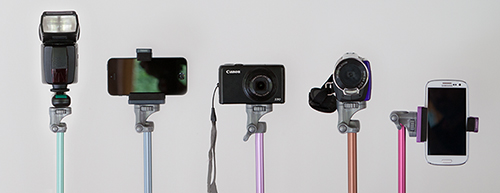
For anyone who has been searching for a light-weight, multi-functional support device, the very thing might just have been announced today. It's called the Lollipod and it is designed to switch between acting as a tripod, monopod, boom, and lighting stand. The Lollipod weighs 320g, is 320mm when collapsed, can extend to a maximum of 1,130mm, and is capable of supporting a camera, flash, or smartphone up to 430g in weight. That means any point-and-shoot should be fine on it and you might get away with a Canon 100D, too. But chuck your camera (or strobe or whatever else) on a set of scales first to check.

Strobe, phone, or point-and-shoot

It comes with a standard fit ball head, which means that you'll need to purchase an adapter to secure your smartphone. Lollipod will be introducing their own universal one sometime early next year. Until then, the team recommends the Joby JM1–1ww GripTight. There's also a stabilising kit for windy days and carrying bag for convenience.

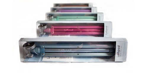
You can choose from gold, dark blue, light blue, hot pink, violet, and minty green and they're on sale at an introductory price of £29.99 (usually £34.99); €37 (usually €41.99); or $48 (usually $55.66), plus shipping. They're not, however, available in Australia, South East Asia, or France. All purchases are made direct from Lollipod.

Pick a colour!

Now, if only someone would develop a microphone-stand-come-tripod; ideal for all those photographer-musicians in the world.

Non-destructive editing capability built into Android Kitkat

Google gave us a few new things to think about last week, including improved photo editing and archiving tools in Google+ and an update to Snapseed, but something seems to have been overlooked. Sitting quietly in the Gallery app on Android devices running Kitkat, you'll find a new and rather tasty peach of an addition to your mobile post-production needs: a non-destructive editing programme that's equipped with some powerful tools. Developed by Nicolas Roard and his team, you can use the suite to adjust curves, apply graduated filters, make local adjustments, and fiddle with individual colour channels, as well as create your own pre-sets.

There's a demonstration video to show you even more of what it's capable of accomplishing, but nothing beats a bit of experimentation.

There's only an auto-white balance function, which is something of an oversight in my opinion, layers capability is on the way (from what I can tell), and there's no Raw support; all the same, the Google team is showing that they are growing in stature when it comes to their image editing options.

Some people have wondered how this sits alongside Snapseed and the photo editing options in Google+. For a start, Snapseed is universally available whereas the Gallery editor is Android-only. If you're an Android user, they do different things. The Gallery editor is non-destructive and lets you play around a lot more than Snapseed; Snapseed is super for making quick adjustments and applying ready-made effects. It all depends on what you want for your photos.

(Headsup to Engadget)

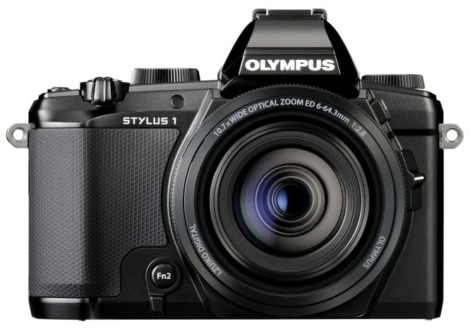
Olympus' Stylus 1 feels like a curate's egg of a camera

The best way that I can describe Olympus' new Stylus 1 premium compact camera is as a curate's egg: it's good in parts. Some elements of it really appeal and some leave me indifferent at best. For a camera that Olympus had hoped would shake up the top end of the compact camera market it feels rather lack-lustre. Channeling the OM-D series of cameras, but scaled down in size

For a start, the zoom range is impressive. At the equivalent of 28 to 300mm, it beats its Nikon, Canon, and Fujifilm rivals into a cocked hat. None of those (the Nikon P330, Canon S120, Fujifilm XQ1) goes beyond 120mm. And the Stylus 1 has a constant ƒ/2.8 aperture across the range; there's no dropping down to ƒ/5.6 as you zoom in on your subject. But this is where some trade-off comes in. The others have bright ƒ/1.8 apertures at their lenses' widest angles, which narrow as the focal length increases. What would you prefer?

I'm not convinced by that 'hump' in my pocket

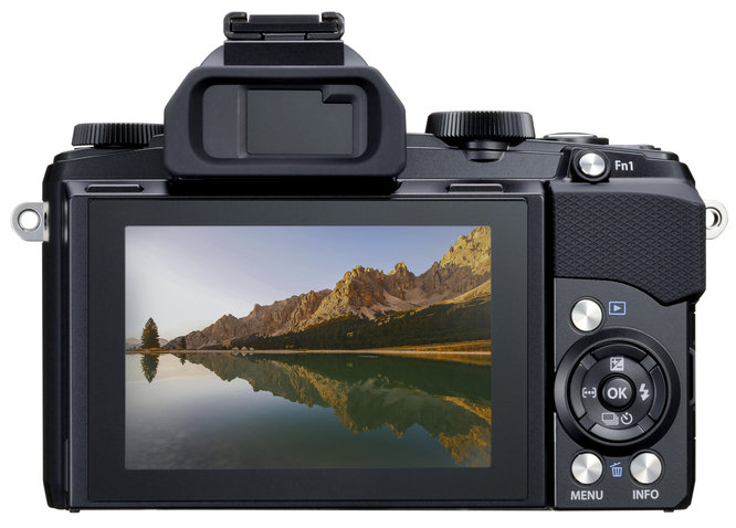
The standard resolution for this type of camera is 12 megapixels and Olympus hasn't deviated from that. Is there any need to? There's wi-fi, which you'd expect; a customisable lens ring and to button to put your most-used functions where you want them; it has a sensitivity range of ISO 100 to 12,800; and everything is powered by a TruePic VI processor.

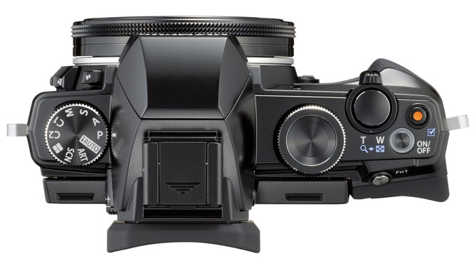
Aesthetically, the Stylus 1 is channeling the OM-D E-M series, a look that is driven home by the inclusion of an EVF that comes with a 'hump'. This is a strange addition for something that is designed to slip into a pocket; it measures 116 by 87 by 56.5mm, but would you want something lumpy sitting against your thigh? There appears to have a disconnect between the camera's technical intentions and its ergonomics. It's not a design that's blowing back my hair and I'd be inclined to pass it over in favour of the Fujifilm XQ1.

All the controls you'd expect from a top-end compact

The biggest disappointment, though, is the 1/1.7" sensor. Fujifilm squashed a 2/3" sensor into the XQ1 and Sony has managed a full-frame sensor in a compact body. We know that it can be done and this is where Olympus really could have broken away from Canon and Nikon, but it hasn't. And at £550 (or $700), it feels very unsatisfactory.

There are things to like about the Stylus 1, but for me, there isn't enough. Olympus, you could have done better.