Stay in touch on Twitter - find us on @Photocritic

Haje Jan Kamps

If you think that photos all in one colour are boring, think again!

No, we don't mean black and white here. We mean all one colour. All red, all green, all yellow. All anything. Colour is one of the most powerful tools in your compositional arsenal and it can be easy to forget how striking images composed of all one colour can be; we get caught up in the idea of complementary colours and of our images having to contain enough to satisfy and intrigue their viewers. And monochromatic images can do that: the key is to have as many different varieties of one colour within an image so that it becomes an exercise in naming the different shades, tones, and tints of one hue. Colours are able to elicit strong emotions in people. It might sound terribly airy-fairy, but there are introverted—blues, greens, and some purples—colours that give a calm, even subdued feeling and there are extroverted colours, such as reds, oranges, and some yellows, that are positive and energetic. You can prompt particular responses from your audience by using particular colours in your photos.

Red

Red is regarded as the 'strongest' colour; certainly, if you've a multi-colour image that contains just a speck of red, people's eyes will automatically be drawn to that red dot. But if you choose a monochromatic red image, be prepared for something that feels passionate, energetic, and vital. A strong colour will incite a strong response.

Orange

It shouldn't come as any great surprise that I have a particular fondness for orange: I'm Dutch. Daniela rather likes it, too, if how often she wears it is anything to go by. Hardly surprising, then, that we chose it as the Photocritic theme colour. There's something very inviting and reliable about it. Maybe that's because it's the colour of sunrise and sunset. You know it'll happen every day, and that you have the the chance the start over and then to put everything beind you.

Yellow

Yellow is cheerful, optimistic, uplifting, vigorous: anything positive, really. And it's easy to grasp the association with the sun, with good weather, with the opposite of darkness.

Green

It's spring here in the UK, and we're being presented with a riot of green. It is abundant, youthful, verdant, and symbolic of growth and renewal.

Blue

Ever since I can remember, my parents have painted their bedroom blue. They do it precisely because of blue's qualities: it's calming, contemplative, and restful.

Violet

You don't find that many purply tones in nature. Of course there are some, especially amongst flora, but it's rarity means that violet tends to have a mysterious and superstitious quality to it. The expense of dying fabric purple in Roman times (the dye came from murex shells) meant that it was reserved for only the highest echelons of power, which contributes to the regal and superior feeling purple has, too.

So, don't be afraid of the monochrome: embrace and experiment with it!

3D printing a rubber stamp

As most of you are aware by now, I'm a bit of an all-round nerd, and I've been keeping an eye on 3D printing for a while now. Yesterday I took delivery of my printer, and I just wanted to share my first little project with you guys: Creating a rubber stamp. I haven't really been in love with any of the 3D printing tech... Until the Form 1 came along. Instead of using filament, the Form 1 prints using a technology called 'stereo lithography', which means that instead of depositing layers of plastic on top of each other, it uses FRIKKIN' LASERS to cure an UV-sensitive resin.

Anyway, enough about that - what I wanted to show off, was the end-to-end process of creating a rubber stamp.

Wot I used

  • MacBook Air
  • Modeling software: Side Effects Houdini FX, which is a procedural, nodes-based nerdfest of epic proportions (I also tried Blender and 123D, but Houdini 'clicked' with the way I can see myself working, so I'll continue using it for now)
  • Printing software: PreForm (comes with the Form 1 printer)
  • Form 1 printer
  • Sugru
  • Ink pad

Wot I did

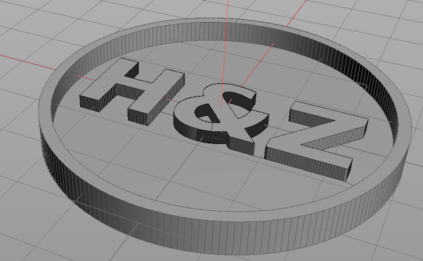
Shape Step 1 was to model the shape I wanted to turn into a stamp. In this case, I wanted to make sort of an signet stamp for my bonnie lass and I. Since our names start with H and Z, I figured it would make sense to use those letters.

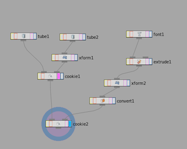
NodeNetwork The modelling itself is a little bit outside the scope of this write-up, but above is the node network representing this shape. At the top left, you can see two 'tubes' - these are the outer and inner wall of the stamp. On the right, I'm creating the text, giving it width, then placing it into the circle. The great thing about Houdini, is that if I later want to change the text, I can go into the 'Font' node, and type in something else - everything else just cascades through the node structure, and I can print another stamp easily. The two 'Cookies' you can see are boolean operations, which is combining the various shapes (in effect, adding or subtracting them)

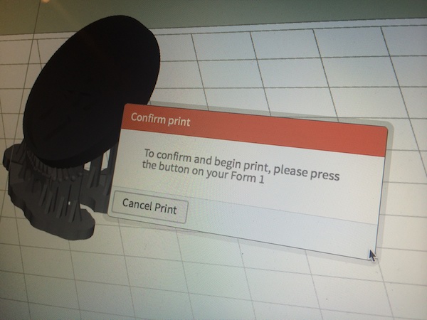
10-print With the model completed, it was time to try to print my very first 3D object! How flippin' exciting. In this photo, you can see the supports the PreForm software adds to the item - and all I had to do next is to press 'print'.

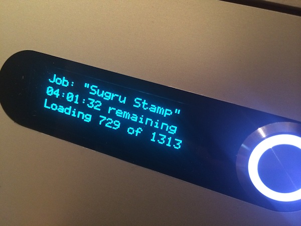
20-printing Unbearable excitement would have to be beared for about 4 hours, as I decided to print at the highest resolution. In retrospect, that was completely unnecessary and vastly over-kill (there was no way I'd be able to translate 25 micron layers to a stamp anyway...), but you live you learn!

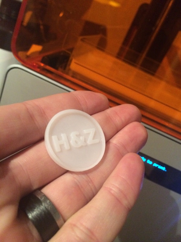
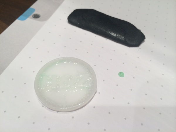
30-printed After a quick bath in acetone (I couldn't find any rubbing alcohol at 18:45 on a Friday night, and I figured 'what's the worst that can happen'? Turns out Acetone works just fine) and a spot of extra curing, I removed the supports, and my mould was ready!

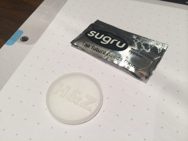
40-sugru Now, it was time to use the mold to create the stamp itself. I picked Sugru for the job (I am a relentless fanboy - Sugru is awesome, and if you've never tried it: Buy some!)...

50-soap To prevent the Sugru from sticking to the mold, I put some some washing-up liquid on the 3D printed part...

60-handle And then pressed a tea-candle into the back of the Sugru, to use as a handle.

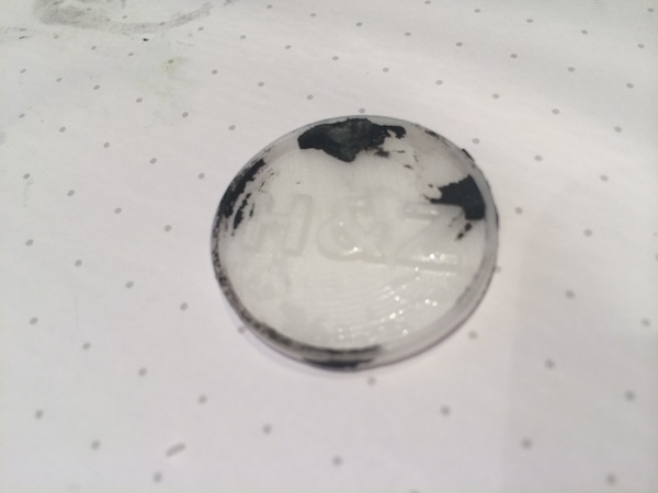
70-fail To my dismay, it turns out I hadn't used enough washing up liquid (or rather: I didn't ensure the whole part was covered), and I was also too impatient, leaving the Sugru in the mold for only an hour. When I removed it from the mold, some of the Sugru was left stuck inside.

80-fail It looked OK, but the top bit was missing, which was a bit of a shame... So I decided to try again!

90-trying This time, I just created a handle out of the Sugru instead of using a tea candle, jsut to try something new. I did leave it to cure for 10 hours this time, to make absolutely sure it was fully set.

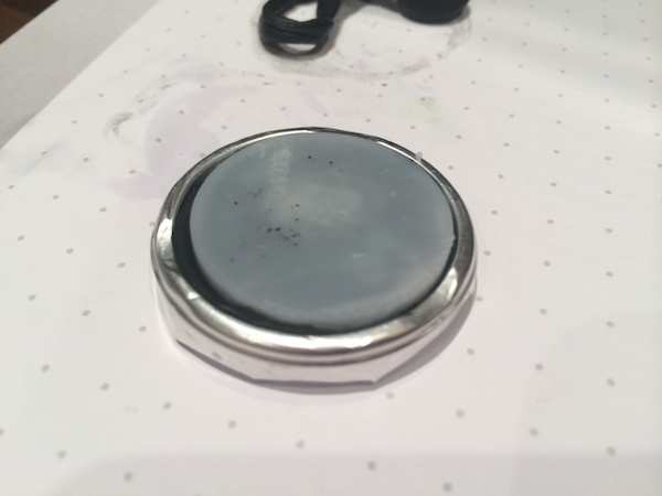
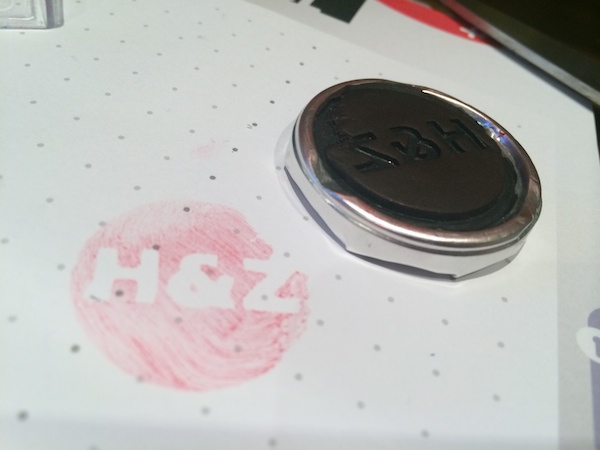
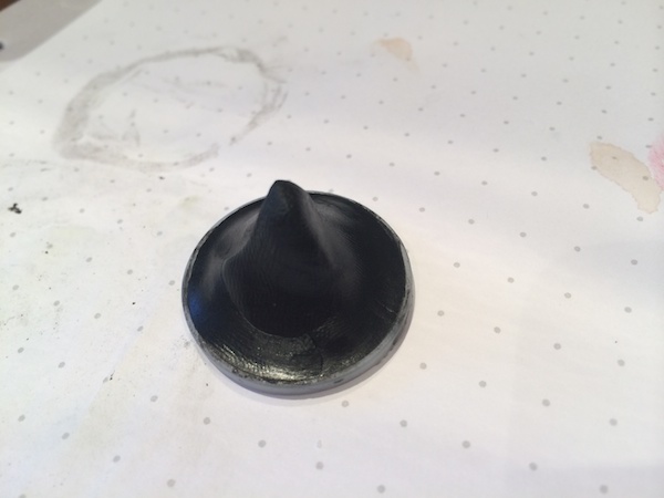
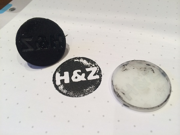
99-yay And the final stamp worked well! Hurrah!

What did I learn?

Well, it turns out that 3D printing is pretty easy. 3D modelling is harder than you'd think. Sugru is brilliant, of course. Learning new things is fun. And I'm looking forward to experiment more with casting, making, 3D printing, and other nerdy endeavours.

Next stop: Inventing and 3D printing some photography gadgets!

Visualising studio lighting

Once you feel you’ve started to get the knack of pointing your camera at things and clicking the button, it’s time to start taking control of all the lighting in the scene. But, as it turns out, that’s bloody tricky.

I keep having to explain how to ‘visualise’ different types of lighting to people, and it turns out that it’s rather difficult – not because what I’m doing is particularly advanced, but because sometimes, it’s just tricky to make the connection between what is happening in a photo, lighting-wise, and how the lights are set up.

I’ve put together a collection of examples which I hope will help. For these photos, I’ve used a figurine with a nearly round head – this will be very useful to determine where the light is coming from; but remember that all of this is as valid with more complicated shapes, including people.

This picture of HappyHead is part of a series of photos designed to explain some basics of studio lighting.

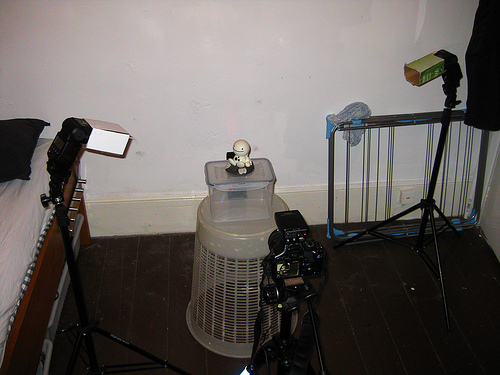
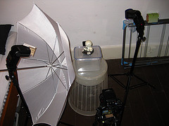
If you’re curious, this is the equipment I’m using throughout this post (and when I’m taking photos in general, for that matter).

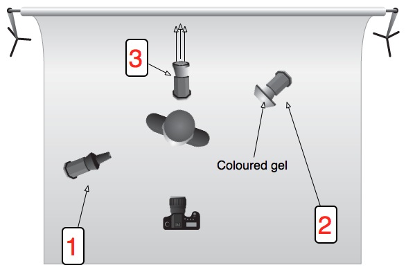
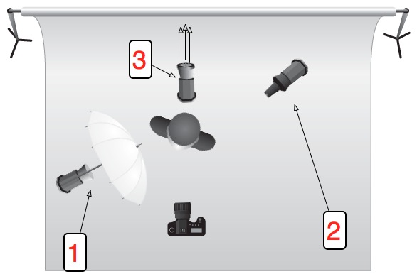
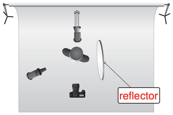
For most of the photos, the lighting set-up is like this:

Lighting setup, ItL

Check out the Flickr page for a detailed breakdown of everything you see in this photo.

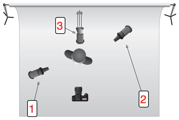
Or, for additional clarity:

illu_lighting_setup.jpg

A couple of basics

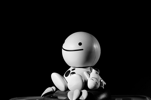
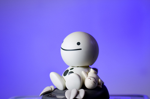
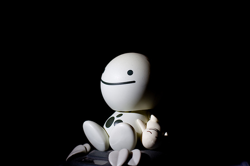
Introduction to Lighting - 1 Picture 1 – Lit by a single 580EX II flash from top left (flash 1 on the schematic) at 1/32 power output.

Introduction to Lighting - 2 Picture 2 – Same as Picture 1, but with an additional flash from the right (flash 2 on the schematic), slightly behind HappyHead, at 1/64 power, to lift the shadow a little.

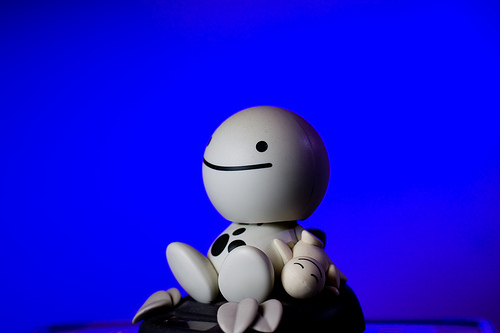
Introduction to Lighting - 3 Picture 3 – Same as Picture 2, but with an additional flash at full blast on the background (flash 3 on the schematic). Note the light fall-off to the right, due to the flash being too close to the wall, and not aimed correctly.

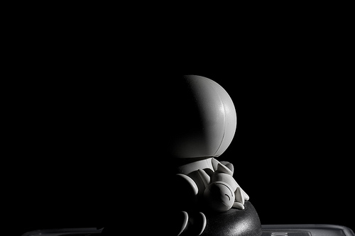
Introduction to Lighting - 4 Picture 4 – Shows just the flash to the right (flash 2 on the schematic), slightly behind HappyHead.

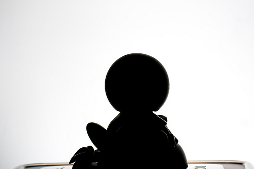
Introduction to Lighting - 5 Picture 5 – Shows just the flash behind HappyHead (flash 3 on the schematic), used to blast the background.

Troubleshooting lighting.

The observant among you will have figured out that Picture 1 + Picture 4 + Picture 5 = Picture 3. As a general rule, you can often just switch on one flash at a time to figure out which flash gives what kind of light – but only when they are in manual mode, obviously: In E-TTL mode, the flashes will attempt to compensate for the missing flashes.

So what is all of this good for?

istock_000006420114small.jpg

When you’ve perfected this lighting setup with a figurine, it’s time to replace the doll with a real, live person. Take a close look at this photo – the lighting setup is exactly the same as that we used for HappyHead!

Gels add a touch of colour

gel.jpg

Introduction to Lighting - 6 Picture 6 – introduces the use of coloured gels. This is basically Picture 1 plus the same set-up as picture 2. However, the gelled flash has a much higher power output (1/32) to help overcome the light loss from the blue gels

Umbrellas or softboxes make the light softer

brolly.jpg

Introduction to Lighting - 7 Picture 7 – This uses the same flash setup as we’ve had so far, but with an umbrella on the left-hand flash to make the light softer. Notice how much gentler the light fall-off (i.e. how much less harsh the shadow is) is in this photo compared to the ones before in this series

Preventing spill-light

Introduction to Lighting - 8 Picture 8 – Same as picture 7, but I have turned the right-side flash to the background, with the blue gels on it. Note how the blue in the background looks quite washed out. This is because the umbrella is great at spreading the light, but it also throws a lot of light onto the background, which causes the blue light to be ‘contaminated’ with white light

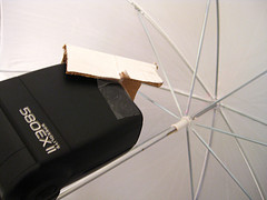
Introduction to Lighting - 9 Picture 9 – Same as picture 8, but here, I have added a piece of cardboard to the flash on the left, to ensure less of the light hits the left side of the umbrella:

Lighting setup, ItL w/ umbrella A simple barndoor

That, in turn, that means that less light is diffused onto the background, so now the blue flash can do its job better. Note that the flash output in Pic 8 and Pic 9 is identical – the only thing that changes is a tiny bit of cardboard. Incredible, eh?

Don’t forget about reflectors

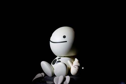
Introduction to Lighting - 10 Picture 10 – Okay, back to the original (this is a different picture than pic 1, but uses essentially the same settings, so should look very similar). See how dark the right side of HappyFace’s head is? In Picture 2, I fixed it by adding a flash, but you can be more economical with your flashes

reflector.jpg

Introduction to Lighting - 11 Picture 11 – is exactly the same photo as Picture 10, except I’m holding a reflector (that’s a posh word for ‘a piece of A4 paper’) just out of the frame on the right side of the image. The light from the flash is reflected off the paper and back onto HappyFace, causing it to look much less dramatic.

From night to day with the flick of a switch

Introduction to Lighting - 12 Picture 12 – is quite similar to Picture 1, but has been set up to contrast with picture 13… Also note how the light has been moved further towards the camera (i.e. further to the front of HappyFace). This is so you can tell the edge of the head better – instead of getting the effect like in picture 7, where you can barely tell where the side of his head ends and the wall begins, here you get a clearer definition of his head.

Introduction to Lighting - 13 Picture 13 – The only difference between picture 12 and 13 is that in Picture 13, I have turned the flash lighting up the background off. Two completely different looks at the flick of a switch. It’s bloody magic, I’m telling you

Time to show off

Introduction to Lighting - 14 Picture 14 – is just showing off, really, and combines a whole series of lessons: The background is beautifully lit with a 420EX, the right side of HappyHead’s face is lit with the familar strobe, but with a red gel on it.

Iin retrospect, I wish I had umbrella’ed that strobe, because it’d have gotten rid of that bright red specular highlight just at the edge of HappyHead’s mouth.

Good luck!

This is only a very quick’n'dirty introduction to lighting, but it seems as if most people who e-mail me are actually struggling at this level – I’ll pick up with a more advanced lesson in a couple of months, I think.


Originally posted on 26 May 2011, but definitely worth dusting off and dragging out of the archives.

Translating the mode wheel

If you look at the top of your SLR camera, you’ll probably find a little round dial, which has a whole load of different settings on them. Some of them are automatic settings (like the green square), some of them are ‘creative automatic’ settings (like the little runner), and others are the modes that let you do the heavy lifting yourself (P, Tv, Av and M).

This little dial is called your mode wheel, and it’s your mortal enemy, the destroyer of creativity, and the root of all evil in the world including, but not limited to, wars, swine flu, and stepping in chewing gum with a new pair of shoes.

In this article, I’m going to show you the error of your ways (if you’ve been using it), or I’ll show you what each of the settings means, what it does, and how to recreate the effect by using the manual shooting modes instead.  

Why do they upset you so much?

Good question. The creative automatic modes make me angry because they take important decisions out of your hands, but that’s not the worst of it: People who are using the creative automatic modes might, in the short term, be able to take photographs of a technical quality beyond what they would normally be able to, but if you resign yourself to letting your camera do the work and make the creative decisions for you, the problem is that you don’t understand the underlying theory behind what you are doing, and despite getting better results, you’re not becoming a better photographer.

Imagine, say, that you had an oven that would automatically detect what you put in the oven, then calculate how big it is, what you’re trying to do with it, and select the right temperature and time, before beeping at you when your Sunday roast / cake is finished or your socks are dry. (What? You don’t dry your socks in the oven? Hmm, just me, then.) Either way, the result would be perfect every time, but where’s the satisfaction in not knowing what your oven did to bake this cake? And more importantly, what if you want to take creative liberties – say, you might prefer your cookies a little bit American-style; gooey inside – or you might want to make them crispier, for example…

The purpose of this article, then, is to ensure that if you want gooey or crispy photographs, you know how much heat you need to turn on, for how long, and if your cookie tray needs to go in the top or the bottom of the oven.

Okay, enough of the dodgy similes already, let’s have it!

modewheel-whole

Right, in the picture above, starting from the top, going counter-clockwise, the modes are:

Suppress Flash

Into the warmth

Why this is even a mode to itself I have no idea – depending on why you want to shoot without a flash, the easiest thing to do is to use Program mode (but also see Tv and Av, below), which means that the flash will only come on if you tell it to.

If you’re in a low-light situation, pick a higher ISO speed – this will create a bit more digital noise in your photo, but it means that you reduce the need for using a flash. If possible, select a bigger aperture so your shutter speed becomes lower.

Remember the general rule that you can hand-hold a camera at a shutter speed which is the same as the focal length of your lens: So if you’re shooting at 300mm, you should use 1/300 second shutter time or faster. If you’re using a sexy little 50mm prime lens, you can hand-hold at 1/50th of a second. Zooms are the same: if you’re using a 17-35mm zoom, you can hand-hold at about 1/10th of a second at full wide angle, and about 1/30th of a second at full zoom.

Of course, it’s possible to bend these rules, but if you adjust your ISO speed and shutter time to stick with them, you generally get a good, blur-free exposure without having to resort to using your flash gun.

Night-time portraiture

Electric light Afro

Night-time portraiture is the only of these settings which actually has any merit, in my opinion – not because it’s that difficult to do, but until someone has explained to you how you can get good night-time portraits, it can be a little bit counter-intuitive.

Imagine you’re in Paris with a loved one, and you want to take a photo of them, at night, with the Eiffel Tower in the background. You take a photo with a flash, and you can’t see the tower. You take a photo without a flash, and you can see the tower just fine, but your friend, who naturally is unable to stand still for more than a microsecond at the time, is all blurry and hazy. What to do?

Actually, Av is your friend: In Programme and Tv modes, the flash and shutter time will combine to try to expose your foreground correctly. In Aperture-priority, however, your camera will measure the light that is available to you, and then fire the flash to ‘fill in’ the foreground.

What, in effect, is happening, is that your camera is taking a ‘normal’ photo – exposed for the background – but then also uses the flash to expose the foreground correctly.

For further control (you might decide, for example, that the full 3-second exposure to get the ‘right’ exposure for the background isn’t necessary, and that the background looks OK after only a second, or fraction of a second), you can use full manual mode. On most D-SLR cameras and some external flashguns, you can also set the flash output manually, or adjusting it up or down. This differs from camera to camera (on the Canon, you’re looking for Flash Exposure Compensation, or F-EV), so check in your manual.

Top Tip: For creative effect, try to take a photo in AV mode, but move the camera or use the zoom while you’re taking the photo. Because of the flash your foreground will be static, but you get a hugely dramatic and awesome swirling, moving streaks effect because of the lights in the background.

Sports

Skate-zo-phrenia-104.jpg

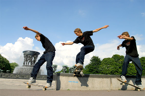
Sports mode is a complete fraud: Use Tv mode, set to a fast shutter time (‘fast’ in this case depends on the sport you’re trying to capture. For snooker, fast isn’t very fast, and 1/60 of a second should do, but for horse racing, you need a much faster shutter time), and see what your camera comes up with.

If the pictures are too dark, it’s because your camera needs to use an aperture which is bigger than your lens can do (say, it’s using ƒ/5.6 but needs ƒ/2.8 to do the correct exposure). This is signified by a blinking aperture in your viewfinder, and can be solved by either using a lens with a larger maximum aperture, setting a higher ISO speed, or using a flash gun (although, say, darts players don’t really like it when flashes are going off in their face when they’re trying to throw A HUNNNNDRED AND EEEEEIGHTYYYYYYYY).

Macro

Coloured Paper (Macro)

I know a couple of things about macro photography, and I genuinely can’t see a single good reason for that Macro mode being on a SLR camera. For a compact camera, sure: It puts the lens into a ‘focus close to the camera instead of in the far distance’ mode, which means that it’s not wasting its time trying to focus far away. On a SLR, if you’re savvy enough to have bought a macro lens, you probably will be fine with Programme mode, and if you haven’t got a macro lens, then you’re basically out of luck (unless you build your own, of course, but that’s a different article altogether).

To replicate this mode in the real world, use programme or Manual mode, use a macro lens, and snap away.

Landscape

Freedom in Black and White

Landscapes, glorious landscapes. Set your lens to manual focus, and turn it to the little ∞ (infinity) symbol. Note that it IS possible to focus past infinity – that’s because when you’re working with infrared photography, the light is refracted slightly differently, and you may actually need to focus past what is ‘infinity’ for daylight.

Anyway, your lens at infinity, set your mode dial to Av, and select a large-ish aperture. f/8 or f/11 is a good starting point.

Select as low an ISO mode you can get away with (bearing in mind the rule about hand-holding your camera, above, or just go ahead and use a tripod), and bob’s your uncle.

If you want to get advanced, and you need a very deep depth of field – say, for example – you want a person in the foreground, but you also want the background in focus – read up on ‘Hyperfocal distance’ and prepare to be amazed.

Portraiture

Shaken, Not Stirred

I can’t believe they created a separate thing for portraiture – do a search on Flickr for portraiture, and see what comes up. How can they possibly assume that one single mode fits all styles of portraiture?

Anywhoo – for getting good portraits, start with a reasonably long lens (130mm or so is perfect), stand back a little, use a large-ish aperture (ƒ/4 or so) to throw the background out of focus, and start from there.

Full automatic

This mode will select whether you use a flash or not, your ISO speed, your shutter speed and your aperture for you. It reduces your nice, expensive dSLR camera to nothing more than a big point-and-shoot. If I ever catch you (yes, you, I’m looking at you) with your camera set to the fully automatic mode, I’m afraid I’m going to have to ban you from visiting this site ever again.

Go on, live a little, flick your mode dial one notch, and enter the world of Program mode. The camera still does most of the thinking for you, but at least you are controlling it, rather than the other way around.

P – Program mode

Is one step up from automatic mode – and I confess to using it on occasion: The photographer selects everything except the aperture and shutter time, which the camera calculates for you. If it comes up with a combination of the two you don’t like, use your index finger wheel to change them – turn one way and you’ll see the aperture get smaller and the shutter speeds get faster – and vice-versa for turning it the other way, obviously. Use EV compensation to over- or under-expose your images a little, etc.

Program mode is great if you just want to get the right exposure, and you’re concentrating on just getting the photo, without worrying too much about depth of field etc. I know quite a few news photographers (!) who decided that manual mode was too finicky for them, and are shooting in programme mode most of the time. If it’s good enough for the national press, it’s good enough for me.

Tv – Shutter-speed priority AE mode

In Tv-mode, you dial in a shutter speed (say, 1/200 second), and the camera will attempt to get the ‘correct’ exposure by using the aperture to compensate for varying lighting situations.

… Interestingly, I very rarely use Tv mode, but that’s mostly because if I find myself in a situation where I want to actually control the shutter speed directly, I’m already shooting in fully manual.

One situation where it might be handy is if you’re shooting sports – say, rally racing – where you know you want a fast shutter speed, but the light can change quickly. The other situation I can think of is if you’re panning (i.e. a bicyclist comes flying past you, and you want to get them in focus while the background is out of focus), and you need a slightly slower shutter speed.

One thing to be aware of is that most lenses have a far more limited aperture range than your camera has a shutter time range. Think about it: your camera can do from several minute exposures to a fraction of a second, while your lens will only usefully span a much lower range. If you’re shooting in Tv, keep an eye on which apertures your camera is selecting for you, because if it’s getting too big, some of your photos might come out over-exposed

Av – Aperture priority AE mode

Av mode is the opposite of Tv mode, above: You select the aperture, and the camera calculates the right shutter time. Generally, I shoot either in Av or in fully manual, because for most of my photography, the depth of field (i.e. how much of the photo is in focus) is more important to me than whether the motion is frozen or not.

You get a deep depth of field by selecting a small aperture (ƒ/22, ƒ/32), or a shallow depth of field by selecting a big aperture (ƒ/1.8, ƒ/2.8).

When shooting in Av mode, still keep an eye on your shutter times – if they are very fast without you needing them to be, you may be able to use a slower ISO (switching from ISO 400 to ISO 200), which gives images with less noise. If they’re very slow, your photos might be coming out blurry, and you may want to ramp up the ISO or use a slightly larger aperture.

M – Manual

Go on. Try it for a week. You’ll love it. This is photography at its most control-freakishly delicious.

A-DEP: Automatic depth of field

...Is just plain weird. The idea is that you focus on the point that is furthest away, then on the point that is closest to you, and the camera will then focus and select the aperture you need for you. Basically, it’s using the Hyperfocal Distance (mentioned above, under landscapes), but in an automatic way which is actually more complicated to wrap your head around than just doing it yourself in the first place.

I think I can honestly say that I’ve never, ever used A-DEP before in my life, and that I don’t think I ever will. Give me manual exposure and a bit of guesswork any day of the week :-)

Go forth! Prosper!

So, in summary, what I would love for you to do is to reduce your photography to only four of the modes above: P, Tv, Av, M. if you’re feeling particularly hardcore, limit yourself to Av and M only.

And if you are a truly epic photographer with skillz beyond my wildest dreams, set your camera to M and pry the button off altogether. Chuck it away. You’ve graduated. Nothing’s gonna stop you now!


Originally published back in the mists of August 2012, but it bears repeating.

How to clean your dSLR sensor

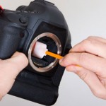
One of the students in the Photocritic Photography School asked us how to deal with a dirty sensor not long ago. Many cameras clean their sensors with a bit of vibration each time that you switch them on or off. That's fine for dust, but it isn't so effective if for dirty splotches. Thankfully, there are ways of dealing with those, too! sensorcleaning-2

So you have spent thousands on your camera and you’re wondering how to clean it? Well it’s a good question to ask; a dirty sensor will impact every single one of your images, as it is – quite literally – the focal point of all the camera’s technology. That’s right, your hard earned dollars reduced to the mercy of the elements. Scary thought eh? Despair thee not, young padawan, help is at hand…

Your goal is to remove dust (and possibly moisture) off the sensor. You want to do this as carefully and easily as you can. There are myriad people who are delighted to take your money off you to help you do this, so let’s start by picking some of the best:

Sensor Swab

Sensor Swab‘ is the preferred method and for a very good reason; it’s a mighty fine product which is recommended by quite a few of the camera manufacturers to boot. Sensor Swab is a wet solution which is applied to the sensor by a, well, swab.

For around $45 you can get yourself a kit and that will remove both wet and dry dust. It is 99.9% effective when done properly and even offers a guarantee in case of damage to the sensor – which is handy, because replacing a damaged sensor is filthy expensive. The downside is that it can’t be shipped by air and is illegal in some countries (due to containing methanol). If you’ve got a decent camera shop nearby, however, they probably stock some – go talk to your friendly neighbourhood lenspeddler to find out.

Brush

Here is the old fashion method. Offering multiple uses and a straight forward method the brush definitely has some advantages. Brushes generally use a method that utilizes static allowing the brush fibers to remove stubborn dust. A brush is also very transportable.

Down sides include the fact that the brush cannot be cleaned and can’t remove wet dust or moisture. A standard brush will cost about $25 while the ‘Brush Off‘ brand (which is more effective) will set you back about $50.

Blower

Using an air blower – like the Giottos Air Rocket – is what your manual will recommend, the reason for this is there is no contact required with the sensor, which reduces the risk of anything going wrong. Unfortunately the downside is that the blower is not that effective, and doesn’t actually remove the dust from the inside of your camera; it merely shuffles it about a bit. In addition, it will struggle to remove dust with a static charge and anything with moisture.

Despite its downsides, using an air blower is often the easiest thing to do when you’re in the field – it’s easy to transport, relatively cheap, and gets rid of the worst dust in a quick and capable way.

Time for a spring clean!

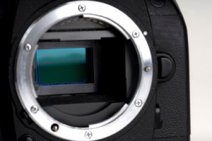
sensor-1 Every once and again, you need to clean your sensor properly; depends on how much you use your camera, but for me, it’s approximately every 2-3 months or so, a process which involves several of the products above. Here’s how to do it:

Charge the Battery – If your battery dies at any point this can be very bad news and step 2 explains why.

Open Shutter – This is different for all cameras but most have a ‘sensor cleaning mode’ which will open the shutter and move the mirror aside so you can access the sensor for cleaning. If the battery dies during this phase will close and possible take the swab with it which will probably cause damage to the inside of your camera.

Blow out excess dust – Look for a dust free environment and begin blowing, this removes the big particles of dust. Never use compressed air in a ‘spray can’ for this (it leaves a residue) – get one of the bellow-style blowers like the Giottos Air Rocket described earlier in this article. This is extremely important because if this isn’t done at a later stage you can be dragging particles around with the swab, causing scratches and more problems than you had before. (NOTE: Some people will suggest using a foot pump because your hands are free, DO NOT DO THIS. Reason being a foot pump has too much power and sits on the floor drawing in dust and dirt)

Take a look – Use a small torch/flashlight (the little single-LED torches are great for this) to spot exactly where there are dust particles on your sensor

Swab – Use as little swabbing liquid as you can while swabbing and apply with the pressure of the pen. Use one side of the swab for the liquid solution, and the other to wipe when complete – whatever you do, don’t touch the swab itself.

Do some test shots – the easiest way to do this is to take a photo of a blue sky or similar even, bright surface, and look at your image at 100% magnification on your computer. If you still see problems, it’s back to point 1 for a second try.

Now comes the trickiest bit; going back out there and taking shots so awesome that they’re worthy of your freshly cleaned imaging sensor. Good luck and have fun!

What is white balance?

You may have spotted the lightbulb, cloud, electricity and woodshed symbols on your camera's screen or menus. You may have also ignored them as being yet another degree of complexity that you don't need to know about. Alternatively, you may have seen people on the Internet earnestly discussing colour temperature and swearing by all sorts of essential products that will guarantee perfect results, if you re-mortgage your house this one last time. And ignored it as another expense that you can probably do without.

Well that thing you're ignoring is one of the most powerful ways of making your photos convey the scene you wanted to capture: white balance.

All a question of balance

WB.jpgThe idea behind white balance is very simple: it's a way to correct all the colours in your image to take account of the light they were shot with. This is because not all light sources (bulbs, fluorescent strip lamps, conveniently nearby stars), produce light equally across the whole of the visible spectrum.
Midday sunlight pretty much does, but conventional tungsten-filament light bulbs don't – they mainly produce light down at the red and yellow end of the spectrum. This is why all you get rather muddy orange photos if you take pictures indoors without a flash. Fluorescent strip lights, street lights and camera flashes also produce limited ranges of colours.

The visual spectrum

WB2.jpg

Although this scale is only approximate, it gives an idea of how colors relate to one another. The visual spectrum are the colours that your eyes are sensitive to. Idealised midday sun will shine roughly equally across this whole range. Other light sources will only emit some of these frequencies, or will be biased towards one end of the spectrum.

Your eyes are good at compensating for this — amazingly good, in fact — but your camera isn't.

How it works

Although the maths behind it is pretty fiendish, the way cameras deal with white balance isn't too hard to understand. Your camera measures the amount of red, green and blue light that have been reflected onto its sensor. If the light source you're using isn't producing much at the blue end of the spectrum, then the blue bits of your sensor will receive much less light than they would in daylight. The green will be a bit muted and the red end of things will be quite happy.

Changing the white balance simply tells the camera to expect disproportionately low levels of blue light and makes sure it bears this in mind when deciding what colours things should be.

What do I do about it?

There are several ways of making sure you get the white balance right. The first is to choose one of your camera's presets that is designed for the type of light you're working with. Choosing the light bulb setting when you're working under conventional light bulbs should give a pretty good result, for instance. It won't be perfect, though, because light bulbs aren't all exactly the same, and one fresh out of the packet will produce whiter light than one that has been hanging around for a couple of years, so you may find that none of the presets give you the right result. Morning or afternoon sun won't match the ‘sunshine' setting, and particularly light or heavy cloud cover won't match the ‘cloudy' setting, so camera presets have to be averages and best-guesses.

A much better way of getting the right result is to set the white balance based on the actual light you're shooting under. Most cameras have the ability to set a manual white balance. This usually involves shooting a picture of a white (or, better still, neutral grey), object under the lighting that you're working under. This teaches it how to balance the levels of the red, green and blue information that it's recording. You must remember to do this every time the lighting conditions change, though.

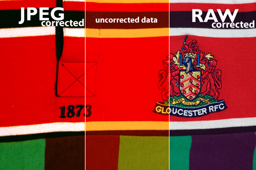
The final way of getting the white balance right is to correct it later. Without wanting to get dragged into a debate about file formats (I can be as geeky and techie as the next man, often more so, but life really is too short), the best way of correcting the white balance after you've taken your shot is to save the RAW data coming from the sensor. Although some software will try to adjust the white balance of jpeg images, the results are simply not as good because there's a risk that the data the software needs to work with is exactly the data that's been thrown away in order to make the file so lovely and small.

jpgvsraw.jpg

Let's look at this with an example — This raw and a jpeg files above are intentionally exposed with completely the incorrect white balance (see the middle bit). The raw was very easily corrected to give a realistic impression of colour. However, in spite of a great deal of tweaking, the same rendering of colour could not be pulled back out of the JPEG file. Note especially the areas in the intersecting area between the red and white: The RAW file renders this perfectly, while the JPEG file is obviously struggling.

However, if your camera doesn't let you save the raw data, don't worry, you can usually tweak the white balance a little bit before the quality suffers too much. As with every other aspect of photography, the best thing you can do is get the shot as perfect as possible when you press the shutter button. If you set a manual white balance before you take the shot, it will minimise or eliminate the need to correct later.

Buy buy buy

There are a variety of products available that can help you get your white balance right. They fall into two main categories: neutral cards and diffusers. Neutral grey cards can either be used as a known-neutral object for setting a manual white balance value, or can be slipped into the photo and used as a reference, when fiddling around on the computer later. Diffusers slip onto the front of the lens so that, when pointed at a light source, they spread the light out across the sensor and allow a manual white balance to be set.

That's it. No magic involved at all. They don't really add functionality, they just let you use your camera's built-in functions better.

What to do instead

Some people try to use the translucent plastic lids from various snacks as improvised diffusers. This can work, so long as the lid is neutral in colour. But most people find that they get good results using a piece of photocopier paper. You know, the white stuff. It's not always perfectly white and it can be a bit hard to get hold of half way up a mountain, but for most situations, it works very well. It won't guarantee that the bride's dress appears EXACTLY the right shade of off-white, but it'll make sure that your team's rugby shirts are recognisably cherry and white. Which is what's important.

WB4.jpg

For reasons that aren't entirely obvious, that icon just up there is a common symbol for manual white balance. Perhaps it is supposed to be a gray card? Only icon designers will ever know.

WB3.jpg

Although this scale is only approximate, it gives an idea of how the presets relate to one another, with the ‘tungsten' lightbulb correcting for very orange light and the ‘shade' setting compensating for very blue light.

No right answer

All the way through this article, I've talked about getting the white balance ‘right'. Well, just like the eternal question ‘which camera should I buy,' there is no definitive right answer. That's because, up until now, I've been talking about how to get white (and, as a result, colours), to appear as it would do under bright sunlight. However, there are lots of situations in which you don't want your photo to look like it was taken in midday sun.

Sunrises, for instance. Or sunsets. If you're going to spend three hours sitting in a cold field, waiting for the sun to rise or set and give you the perfect light, I wouldn't recommend that you then try to correct for the thing that made the light so good: the fact that it doesn't look like midday sun. So don't try to set a manual white balance and make sure the camera isn't trying to automatically correct the colour. So try using the ‘sunny' preset value, this will ensure the image shows just how different from midday sunshine the scene looked (which is presumably why you're taking it).

You may find, however, that this gives a more extreme orange or blue tinge than you expected. This is because your brain is very good at compensating for different colour temperature and still judging what colours should look like. That's why photos taken in orange-ish light come out astonishingly orange. So I'm afraid you still have to play around on the computer if you really want to convey the scene as you remember it or to tell the story you want to. Because, hell, this is photography, not a science.

How does White Balance relate to Colour Temperature?

In this section, we're getting geek-a-licious, and going into depth to find out why white balance is important, how it works, what colour temperature is, etc. If you're new to all of this, you can happily skip this, and know that the first half of this article probably made you a much better photographer. If you're a hard-core photographer, geek, or perhaps even both, however, you'll want to read the rest of this… Because geeks get all the hot chicks.

Depending on which camera and software you use, you may have found white balance described in terms of colour temperatures, using a scale marked K. Although it may seem like an odd way of describing the characteristics of light sources, there is actually a good reason for it.

The idea of colour temperatures comes from a simplified model used by physicists to show how energy is given off objects when they are heated. Think about how hot steel becomes red hot, then white hot: that's essentially what they're going on about.

Who is this Kelvin bloke, anyway?

lordkelvin.jpgColour temperature is measured in Kelvin (named after a rather clever physicist who was made Lord Kelvin in recognition of his work and, like all good Victorian scientists, had an excellent beard), which is pretty much the same as Celsius, but starts counting at absolute zero (-273 degrees C), rather than the freezing point of water. Its relationship to colour is actually the work of Max Planck who, being more recent German scientist, had a moustache, rather than a beard.
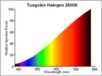
Basically, the idea is that as an object gets hotter, it gives off shorter, more energetic, wavelengths of light. So when it's relatively cool (a mere 1500K – 1773 degrees C), it gives off most of its energy at the red end of the spectrum and could be described as red hot. By 5500K, it will give off all frequencies in the visible spectrum equally – it will be white hot. As it gets hotter still, its output will increase and it will produce less red light, lots of blue and even some UV light, beyond the limits of human vision. You can think of it as the crest of a wave, rolling through the visible spectrum from red to violet as the temperature increases, if that helps.

halogen.jpg

A traditional lightbulb (‘tungsten light') has a low colour temperature, it produces most of its light at the red end of the spectrum. Boosting the levels of blue and reducing the levels of red will compensate for this.

d65.jpg

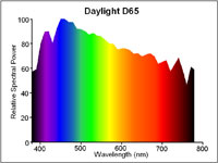
6500K (also known as D65) is the standard for midday sunshine. The entire visible spectrum is lit with roughly equal amounts of all colours and a neutral object would reflect red, green and blue equally. Many cameras use 5500K as their daylight setting because the sun in the morning and afternoon is cooler than D65.

It's worth noting that, rather helpfully, red and orange-tinged light relates to a colder temperature than blue-tinged light, which occurs at high temperatures. So be careful when you start talking about making pictures look warmer, because you could mean two completely contradictory things by saying it.

What does this mean for my camera?

Your camera measures light in RGB, which is a colour space which takes light measurements at three points along the visible spectrum, red at one end, green in the middle and blue near the other end.

As we have seen, under candlelight, there are far more red photons bouncing around than blue photons, so you have to tell your camera to adjust the levels of red, green and blue in relation to one another, so that they compensate for the low temperature of the light. More precisely, colour temperature actually adjusts the relationship between red and blue, with very little need to mess about with the green.

A different light

Now think about a situation in which your subject is sitting in mixed lighting. Take a picture of a person sitting under artificial light, but with daylight coming in from the window. Try to correct for the daylight and the artificial light goes orange, correct for the artificial light and the daylight goes blue. Unfortunately, there's nothing white balance can do about this. Even the most expensive white balance correction tool won't help, the best it will offer is an average of the light sources, depending on how you use it. The best thing to do is close the curtains or add some flash to ensure you have control over the dominant light source.

But that's not quite the end of the story, because there's more to white balance than just colour temperature. Colour temperature is based on the behaviour of heating an idealised material, which is a good approximation for light sources that generate light by heating things (lightbulbs, candles, the sun). The key property they share is producing light all the way across the visible spectrum; they are just biased towards one or other end.

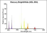
This is not true of all light sources however and, consequently, not all light sources can be adequately described with a colour temperature. Fluorescent strip lights, for example don't work by being heated*, so don't behave like the idealised material and only produce light at certain wavelengths along the spectrum.

mercurybright.jpg

Even a modern, bright white fluorescent strip light will only emit light at very specific points along the spectrum. Note the large green spike. Correction for this peak requires more than a simple colour temperature, red/blue adjustment.

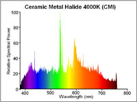
ceramichalide.jpg

Exotic light sources (such as ceramic metal halide arc lights) produce an even output across the whole spectrum, making them excellent for judging colour. The pronounced green spike is still present.

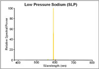
The same is true of street lamps. In fact, the low pressure sodium vapour street lights used by many countries to light motorways only produce light at two wavelengths along the spectrum, both of which are orangey-yellow. If you were to shoot a photo under these lights, no matter how you tweaked the white balance settings, you would never get the colours right because the only thing that your camera could tell you about the objects is how well they reflect orange. A black and orange image, rather than black and white.

slp.jpg

Low pressure sodium lights only emit light at two very specific wavelengths. It is impossible to interpret any colours under such a light.

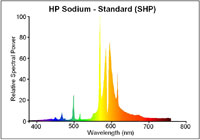
shp.jpg

High pressure sodium lights tend to be used in town. They're still predominantly orange but produce enough other wavelengths to allow colour recognition.

That's an extreme example, though. Usually, the problem is just that there are gaps, here and there, in the light's emission spectrum. The way that your camera or software deals for this is to boost or reduce the level of green. This adjustment of the green, in relation to the red and blue you adjusted with the colour temperature, attempts to compensate for a peak or an absence in the middle of the spectrum. It can't work miracles, of course and, as we've seen with the low-pressure sodium lamp example, it can't create information about colours that weren't being lit in the first place, but in most cases, correct use of white balance will get your whites brilliant white. Though not at 303K (30 degrees C).

Footnotes

All diagrams with kind permission of lamptech.co.uk

*) Extra geekery: fluorescent light strips work by electrically exciting mercury until it emits UV light, which is then absorbed by a coating on the bulb that then re-emits the energy as a lower-energy, visible light photon in a process known as fluorescence. Well, you did ask…

This article was written by my good friend Rich. In his everyday life he's an engineer and a journalist, but after work hours, he becomes the uber-geek and highly talented photographer I know best :)

Vibration and camera shake << Photography Fundamentals >> Zoom

Photographing Fireworks: How to get the perfect firework photos

Oh my, it’s nearly That Time Of Year again: burning effigies, sparklers, terrified dogs, and jacket potatoes with charred skins and raw middles. Guy Fawkes' Night is 5 November, so perhaps it’s a good idea to brush up on the ol' fireworks skills in preparation for displays this weekend and next, yes? Indeed…

Rock on… 

Many a budding shutterbug has attempted unsuccessfully to photograph fireworks by merely pointing their film camera to the sky and shooting, resulting dark useless prints. With the advent of digital photography, photographing fireworks has become easy, just by following some basic steps…

fworks2.jpg

  1. Find a location away from the crowd and power lines. An elevated location on a hillside works well. You might want to scout out your perch beforehand: Especially on big fireworks nights (such as July 4th in the US, November 5th in the UK, and new year's eve in most of the world), a lot of the prime photography spots will be taken hours before the fireworks, so plan ahead!
  2. Set the shutter speed to 1 second or longer. Don’t be afraid of underexposing your photos, though. You won’t.
  3. Use a low ISO - you want as little digital noise as possible.
  4. Use a tripod. If you can’t find a tripod use a nice steady base.
  5. Turn off the flash. This might seem like common sense, but remember you are photographing lights, so you don’t need to add more light yourself.
  6. Shoot in RAW. You need as much exposure latitude as you can get, in order to be able to do any adjustments you need to do in post-production.

Point your camera toward the sky and shoot. A key to getting a good shot is anticipating when the firework will explode. Initially you will have many hit and miss shots. As the show goes along, you will be able to perfect your timing, and getting better shots as you're learning!

Case study

screen_shot_2011_11_04_at_123826.jpg

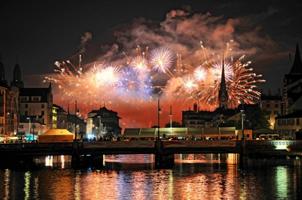
This fantastic photo is called Fireworks over Zürich, and is (cc) Tambako the Jaguar on Flickr

To get a shot like this, you'll need to use all the above tips, and you'll probably need to shoot in fully manual (although, interestingly, this shot was taken in Aperture priority).

Take a load of test exposures to see what works best; expose for the fireworks (so, use your histogram to determine how your exposures are working out) where possible, and adjust your shooting as you go along. The above photo was taken with an f/3.2 exposure, using a 1/4th of a second shutter speed, and ISO 400, with a -1/3 EV exposure bias. The results are gorgeous, but a slightly longer shutter speed might have made the water look more 'flowing', and could have increased the 'streaks' of the photographs just that little bit extra. Switching the camera to ISO 100 and 1 second shutter speed would have achieved both of these things.

The most important thing to keep in mind is that there aren't any hard-and-fast rules for how to get the best fireworks shots - Experiment and see what works best for your particular lighting scene!

Even more fireworks photography!

Can’t get enough? Well, try the guides, tutorials and tips from Better Photo.com, Garry Black, about.com, calphoto, DPchallenge, and Smithsonian institute!

Using the Light Blaster in commercial work

I've got to say; I've had a Light Blaster for quite a while now, and I love mine, but I'm finding myself spending relatively little time in the studio recently. Well, that is, until we started working on a brand new Triggertrap product... But that's not what this post is about, and I'm not able to share those shots yet, so... Check out these three videos of people using the Light Blaster in commercial jobs, and feel the creativity sizzle...

http://youtu.be/H3mYTHuelhI

http://youtu.be/zSzokXLAv0o

http://youtu.be/_0p3bHva-Bo

Embracing automatic ISO.

Recently, I find myself in more and more situations where I know what I'd like my shutter speed and aperture to be, but realising that the light situation is changing around me. In a recent round of street photography, for example, I wanted to shoot wide open (f/2.8, using my 70-200mm lens), and I knew that I wanted reasonably fast shutter speeds (I spent the day shooting at 1/800 second)... But given that I was walking down Southbank in London, where there's a lot of trees, overhangs, and rapidly changing light situations, what's a guy to do? The solution, more and more often, is automatic ISO: Select the things you care about, and let your camera adapt to the changing lighting situations by varying the ISO.

It isn't that long ago since this would have been completely impossible - Most of the camera bodies I've had so far, have had rubbish quality photos beyond ISO 3200 or so. With my most recent camera bodies, however (Canon EOS 5D mark 3, which I ended up selling because I found it too heavy for everyday street photography, and replacing with a Canon EOS 6D instead), the full breadth of the ISO range is perfectly usable.

'Yah, whatever...'

The above photo, for example, I captured by setting my camera to f/2.8 and 1/800. The camera selected ISO 320 for this shot. Perfectly fine; there's no discernable noise in the image at all.

Going Macro

More extreme, however, was the example I experienced recently. I've done a fair bit of macro photography (I did write the book on it, after all), but I found myself in a situation that was nearly impossible: Taking photos of insects on the move, without my usual flashguns. What to do? I was shooting with my 100mm f/2.8 Macro attached to my Canon EOS 6D, and no light sources or light shapers. All natural meant that I needed a relatively high shutter speed (because I was shooting hand-held), and a relatively small aperture (to deal with the extremely limited depth of field). Even in bright sunlight, that doesn't leave an awful lot of light left... But it turns out that automatic ISO still does the trick:

Shot at 1/800 second shutter speed and f/8.0, the camera chose ISO 4000 to fit the lighting conditions. Which, as it turned out, was perfect!

So I guess the lesson here is that on modern cameras, you can in many situations leave the camera to get things right, whether you're willing to let shutter speed, aperture, or ISO to be variable. Nifty stuff.

Flickr mysteriously grows a personality

I've got to say... When the Flickr re-launch happened, I wasn't so sure... But it's really warmed on me. It's good to see that Mayer & co are taking the Flickr property seriously... And they've even been able to inject a spot of personality in the process. Take their 'sorry we are down for maintenance' screen, for example. Very cute indeed.

Bad panda.

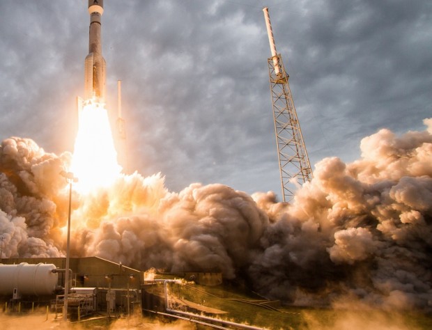
How NASA uses sound triggers to capture amazing rocket launches

The internet is full of a Crazy Frog (No, not that Crazy Frog, thankfully) today. This little buddy took a leap of faith in front of a photographer's sound-triggered camera at a NASA launchpad. The full story is available over on Mashable, but have you ever wondered how these photographers do their job? NOW WE'RE TALKING.

For security and safety reasons, photographers aren't allowed anywhere near the launch pad at launch. For obvious reasons, they can't use remote-triggered cameras either (Think about it... Would you allow anyone with a radio transmitter near a space rocket?), and so they use other techniques instead. Specifically, sound-triggered cameras.

There are a great many different ways of doing this, of course, but over on the Triggertrap website, there's a fantastic interview with Walter Scriptunas II, who shoots NASA rocket launches using the sound triggers built into the Triggertrap v1 camera triggers. Clever stuff, and well worth a read!

Case Logic SLRC-206-BLACK camera bag review

With lots of clever features, and great ergonomics, Case Logic pulls a surprise winner out of the hat. When you're thinking camera bags, Case Logic may not be the first brand that pops to mind, but my recent experiences with one of their very reasonably-priced photo backpacks might just be enough to change your mind.

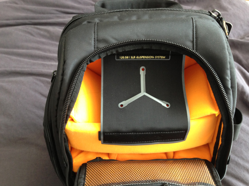
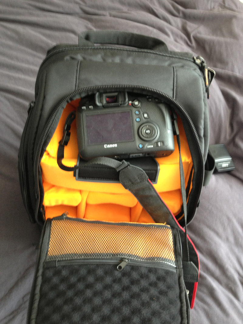
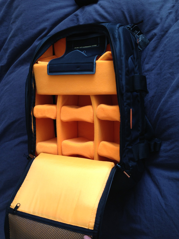
The not-really-that-creatively-named SLRC-206-BLACK is a good-looking bag that has a load of features I haven't seen on any camera bags in the past. For one thing, their 'SLR Suspension' system is incredibly clever: There are two straps of velcro that stop the zippers from opening beyond a certain point. If you open the bag like that, only the top part of the main compartment is available, and it has a clever 'suspension system' which enables you to put your camera away and grab it again in a matter of seconds. The main compartment of the backpack also has oodles of re-configurable space for lenses and other accessories. As you might expect, the bag also has several front- and side pockets for keeping filters, lens caps, and any other equipment you may be lugging around.

At the side of the bag, it has a couple of incredibly sturdy nylon straps for strapping down a tripod or similar. These are the biggest and most flexible I've ever seen on a camera bag, too - an absolute winner.

At the back, there's a large laptop pocket that should fit most laptops - and best of all, it's secured with zippers that make me confident of its water-resistance prowess.

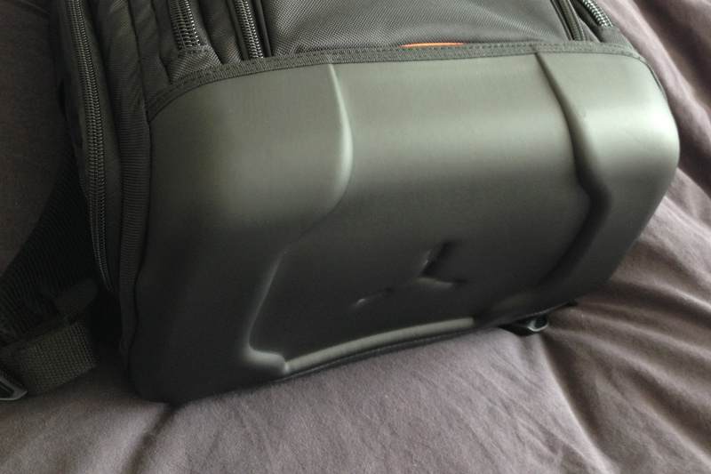
The final cleverness is the bottom of the bag - CaseLogic decided to envelope the bottom in a sturdy rubberised plastic, resulting in a base that is rock solid (even when loaded with only a heavy camera, it wouldn't topple over), and water-proof. Perfect for photographers on the go.

So is it all heaven and butterflies? Well, no. Personally, I'd have wished they had attached the shoulder straps to the other side of the zips, so you'd have to move the straps aside to access the laptop compartment. As it stands, the entire weight of your camera rests on a zip that is perhaps a little bit too good, so on one occasion it zipped itself open. Because the straps are attached to the 'loose' side, it means that if the zip opens, the entire laptop compartment is pulled open by the weight of your cameras and lenses, leaving it a big gaping rain-trap, with your laptop reaching for the heavens. It's a minor niggle, of course, but I was surprised that Case Logic had missed such a simple thing, when they were so incredibly careful with the design of the rest of the bag.

Anyway; As I mentioned in the beginning of the article, if there's one thing I've learned from this review, it's that Case Logic is worth a closer look; They have an extensive range range of camera bags and camera cases, and if the build quality (and price tag!) of this one is anything to go by, they may well be a force to be reckoned with.

The Camera Case

The SLR suspension system is really quite clever

Camera in its Special Place

Great lens storage compartment

Laptop case

Great waterproof bottom

Q&A: What's the best compact camera with an optical or electronic viewfinder?

Personally, I have a bit of a love relationship with the Canon S-series of cameras. Yes, they don't have an optical or EVF viewfinder, but think about it this way: In designing these cameras, Canon decided to create the highest-end compact cameras they could, and there was no way that they were going to stick a poor screen on there. Even in bright screen, my S95 (and, subsequently the S100 and S110) work fantastically well, regardless of situation: I've used mine extensively both under and above water (see www.flickr.com/search/?w=83688756@N00&q=Canon+S95 for a rather broad sample), and I've never missed the viewfinder even once.

The other benefit of no viewfinders is that the screens can be far, far bigger, which has its own benefits.

TL;DR: Don't ignore cameras without viewfinders, LCD tech has gotten very far in the past few years.

Question via Quora.

What is a prime lens?

We've taken a jump over 'O' and landed directly on 'P' for the next part of the Photography Fundamentals series. Here, we'll be taking a look at prime lenses, what they are, and why you should have one. At least one. In fact, we reckon that until you've got a decent prime lens, you've not really lived, photographically speaking. Here's why.

Define prime

What's a prime lens? For once, it's a simple definition: it's a lens with a fixed focal length. They might be 35mm, 50mm, 85mm, 100mm, whatever, they just don't move. And yes, this can most definitely be a good thing.

A bit of history

Back in the infancy of photography, we never had anything but prime lenses. When you bought a camera body, you also had to buy a camera lens to go with it. A 50mm ƒ/1.8 was pretty much the slowest lens you could buy as a starter kit.

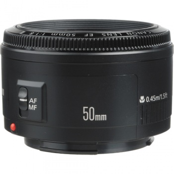
To this day, a 50mm ƒ/1.8 is the cheapest lens you can buy in the entire Canon EF lens arsenal. And if you don’t have one, you’re missing out.

Canon's 50mm ƒ/1.8 - a bargain at under £100

From your first prime, you move on. You might get a faster ‘normal’ prime, like a 50mm ƒ/1.4 or a ƒ/1.2 (or, if you’re intro your retro gear, the incredibly bright Canon 50mm ƒ/0.95. This lens is four times faster than the human eye, and is one of the fastest lenses in the world along with, for example, the lenses available for the Nikon 7 range finders in the early 1950s.)

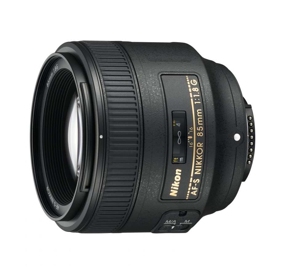
If you’re into landscapes, a 28mm would be the natural choice. 85mm, 100mm, and 135mm prime lenses became the de facto standard for portrait photography all ’round the world.

Nikon's 85mm ƒ1.8

The first zoom lenses were patented in the early 1900s, and the first commercial production of zoom lenses for stills photography started in the early 1960s. All of a sudden, zoom lenses were all the rage.

Why would you limit yourself to a single focal length, when you can cover a whole range? So, manufacturers shrugged, and started creating zoom lenses.

What’s going on now?

Nowadays, all ‘kit lenses’ (lenses you get bundled with camera bundles) are consumer-grade zoom lenses. My dad recently got suckered into buying an 18-55mm and a 55-200mm lens (after I explicitly told him to buy a Canon 28-135 ƒ/3.5 Image Stabilised lens… Tssk, doesn’t the lad know I run a photography blog, or something?), for example, and he isn’t stupid. It’s just too tempting to get a wider zoom range, in the hope that the increased flexibility will get you the photos you need.

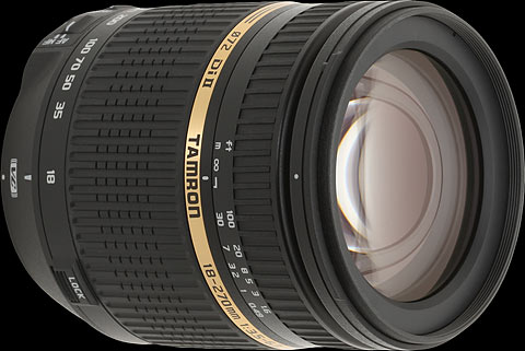
Tamron's 18-270mm offers a huge focal range, but is it as sharp as a prime lens?

The thing is, a zoom range is all good and well, but ultimately, it’s all about sharpness. Are your photos so crisp they jump out of the screen at you? If not, you’re probably doing something wrong. So what happens if I tell you that one of the sharpest lenses a consumer can buy is also the cheapest lens Canon makes? You’d be surprised, right? But it’s the truth. Time and time again, people are amazed when they review consumer-grade zooms against far cheaper prime lenses. But — as Tabaware explores — they aren’t even in the same league.

So why is this? Well, it’s damn simple, really… it’s far easier to mass produce a prime lens: Because it only has to be sharp at one focal length, the optics are a hell of a lot simpler. So they can concentrate on getting it to be really good, rather than just being good enough.

Why should I care?

It really depends, to be honest: What do you want out of your photography? If you are looking for convenience and holiday snaps, by all means, go for the first and best zoom lens. Hell, I've a few of them myself and love to use them, but still, there’s a certain feeling of zen about using prime lenses. They can be slightly limited, sure, but they’re also sharper than a surgeon’s scalpel, cheap as a bag of crisps, and they are just a better idea overall, especially as you are just learning about photography.

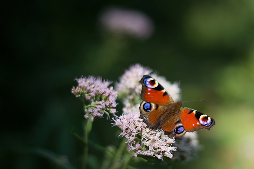
Peacock butterfly

So, if you’re in the market for a new camera, and the kit comes with some two-bit zoom lens, see if you can’t convince the salesperson to do you a deal. “So, you want to sell me this lens? How much does it normally cost? Interesting. I can see that you sell a 50mm ƒ/1.8 for less than that. Can you give me one of those instead?” Sure, money-wise, you’ll lose out. But your portfolio will thank you for it for years to come.

Are prime lenses really such a good idea?

Well, yes, I would argue so. I'm a frequent traveller and it isn't unusual for me to get on a plane with just my camera body, a 50mm ƒ/1.4, and Canon PowerShot S95.

Check out the gallery from one of my trips to Vietnam, or a bigger collection of my photos taken with the humble 50mm.

Convinced yet? Good. Head over to your favourite photographic retailer, and buy yourself a lovely little prime. Lazy? Okay then - Canon users, click here. Nikon users, click here. Pentax users, you can click here. Sony users, click here. And Olympus users, click here. You're welcome.

TL;DR

  • Prime lenses are lenses with fixed focal lengths
  • They are usually sharper than zoom lenses because they have fewer moving parts
  • And fewer moving parts also makes them cheaper to manufacture and less likely to suffer from a fault

Noise << Photography Fundamentals >> Quality versus quantity

Q&A: What is the ideal image spec that can be used for web and print?

The key thing to keep in mind is resolution. An image online that covers the entire width of the Quora page would be less than 1000 pixels wide. If that photo is as tall as it is wide, it's a 1 megapixel photo (1,000 x 1,000 pixels) If you take that photo and print it in high quality (300 dots per inch), it would be quite small (8.4 x 8.4 cm / 3 x 3 inches). So, if you are looking to buy / commission / create photographs that work both in print and on screen, then worry about print resolutions, not about the resolution on screen.

The second thing you need to worry about, is sharpening the image for its target output medium. Glossy magazines need the photos sharpened differently than if you want to show it on screen, or print it on newsprint. Cambridge in Colour has a great Guide to Image Sharpening.

Question via Quora

Can you fix the focus on a blurry photo after the fact?

I seem to be on a roll this week, with finding incredibly interesting topics to write about over on Quora. In this case, the question was as simple as it was interesting: "Is it possible to focus an unfocused image with a computer program?".

Answer...

There are many technical challenges with focusing an image after the fact, and it depends heavily on how out-of-focus the original image is. It is possible to do some sharpening that gives the illusion of a photo being in better focus, but actually re-focusing the photo? Not so much.

Here's why...

Take an image like this for example (see the photo on my Flickr stream for a larger version):

Just chillin'

The bird in the foreground is in focus (well, more or less), but the plants in the background are not. Now, blurring this photo would be relatively trivial, because you are discarding information.

If your goal was to 're-focus' the photograph so the trees in the background were in focus, however, you're looking at a completely different problem, at least if your photo is taken with a conventional camera (Light-field cameras like the Lytro work differently)... The problem is that you're trying to re-generate information that simply isn't there.

Another example

Let's take another example. This photo, for example (see Flickr for a larger version):

What big eyes you have...

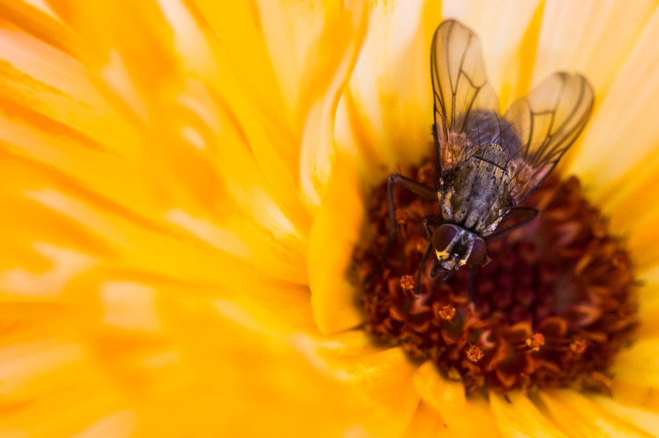
In this photo, you have an extreme macro shot of a fly. You can see the individual facet eyes of the fly, and count the hairs on its back. However, it has very shallow depth of field, and if you look at the legs in the background of the photo, they are just blurry stalks. Now, the technology you are looking for, would somehow magically be able to find out the size, direction, and shape of each of the hairs on the fly's legs that are out of focus in the background.

It stands to reason that this information simply doesn't exist. I took the photo, and I have no idea what colour the hairs were, how many there were, and how evenly they were spaced. This photo is a pretty good document of the fly, of course, but it is physically impossible to recreate information that isn't there - unless you have a data source to base this information on.

On the other hand, Adobe is doing some really interesting stuff with their 'deblur' technology. This isn't the same as focus blur, however; the idea of Adobe's deblurring is to take a photo that was sharp to begin with, but suffers from motion blur. This means that, in theory, a lot of additional information exists in the image, it is just spread over an even surface. As such, it is possible to 'unblur' the image by throwing clever algorithms and a lot of computing power at the problem. Sadly, this is only possible in very limited cases. It's not possible to re-focus an image, but it is possible to evaluate the photo to remove certain image artefacts, much like noise reduction filters etc.

For further reading, check out the vaguely related concepts of Focus stacking (which uses focusing at several focus depths, and calculates an image with deeper depth of field), HDR (which does a similar thing, but for images with various exposures) and, of course, the Lytro camera, which is able to focus after the fact, but struggles with its own problems (including much lower final resolution than we are used to from our digital images).

TL;DR: No, you can't focus an image after the fact.

Crowdfunding an iPhone camera: Is the Ladibird project a scam?

Today, I came across an interesting IndieGogo campaign, for the Ladibird; a snap-on professional camera for the iPhone 5. Initially, I thought it was a brilliant idea, but then I started reading about the product, and I immediately became incredibly skeptical. Allow me to explain...

The sample images

First of all, the thing that made me wonder what's going on, were the sample images. They look fantastic, without a doubt, but when you look at the Ladibird video, you see that the product is just a 3D render. So that made me wonder: Where did the example photos come from? Right at the bottom of the page, they explain that the shots are taken with "a 50mm prime lens on a 12 megapixel Nikon D700".

Now, there's a lot of problems with this, in my mind: For one thing, the Nikon D700 is a high-end professional camera that cost USD $3000. It's also a full-frame camera, with a 36mm x 24mm sensor built in. The Nikon lens used (a 50mm f1/8) is also a mighty sharp piece of kit. Do you think it's fair to use photos taken with a pro-level camera as examples for what an iPhone accessory lens can do?

The specifications

In the IndieGogo campaign, the Ladibird manufacturers do the following:

The Specifications

The thing that isn't clear to me, is why they are talking about a 'mirrorless sensor' as if that's a standard. Mirrorless cameras have wildly different sensor sizes; The Pentax Q has a 6.17 x 4.55 mm sensor. The Sony NEX-6 has a 23.5 x 15.6 mm sensor. The Leica M9 has a 36 x 24 mm sensor. And there are tons of sizes in between.

The lens spec itself, too, is fuzzy. They are talking about a "Ladibird 50mm (35mm equivalent) large aperture prime lens", which patently doesn't make sense, unless they have a sensor that is 45% larger than that found in the highest of high-end SLR cameras. A more likely explanation is that they have their terms mixed up, and that they have a lens which actually has a 35mm focal length (Which is roughly a 50mm equivalent on an APS-C size sensor), but it does worry me: Would you trust a lens designed by a company that isn't sure which way around the crop sensor conversion factors go?

Developing sharp lenses is an incredibly difficult and challenging task.

But what about the large sensor and 50mm?

All of this makes sense, apart from the fact that they are talking about limited depth of field, which doesn't depend on the focal length: There's no reason why a 50mm should have more pleasing depth of field than a 100mm lens. It is mostly dependent on the aperture, but that isn't mentioned in the marketing material.

The Ladibird guys have done a great marketing tasks, but as someone who's written a book on mirrorless cameras, and has technical edited a rather chunky stack of books about photography, I can't help but feel I'm somewhat qualified to evaluate this project, and it's setting off all manner of alarm bells.

In their marketing site, they've equaled small sensors with blurry photos. That's patently not true: The Nikon 1 series have tiny sensors in them, but are capable of producing fantastically sharp images. Similarly, my iPhone 5 has a miniscule sensor in it, a quick browse through the 'most interesting' photos taken with the iPhone 5 on Flickr reveals that many of them are tack-sharp works of art. This would infer that a small sensor is in and of itself no reason to buy a Ladibird.

The other argument they make is that the 50mm f/1.8 lens is cruise control to awesome photos. Now, in most cases that might well be true, but those specs alone aren't enough. "50mm" only means that the lens has a focal length of 50mm. There's nothing inherently better about this, and there are many examples of absolutely dreadful 50mm lenses out there. In fact, I could build a 50mm lens myself out of a couple of lens elements, a kitchen roll, and some Blu-Tack in about 20 minutes, but I can pretty much guarantee that the photo quality is going to be severely lacking.

So, is Ladibird a scam?

I have no way of knowing that, but the IndieGogo page does set off an awful lot of alarm bells.

I won't be backing the IndieGogo campaign myself, and I'll tell you why: I know how incredibly hard it is to build photography equipment, and so far, we haven't seen a single prototype or sample image from these guys. Even the mock-up image doesn't seem realistic (to have a 50mm focal length, the lens barrel would probably need to be longer), which makes me wonder how far along in the process they have come.

If the mockup image represents the current state of play, then I fear they're about to get a rude awakening if they think that $20,000 is enough money to develop a fully functional prototype of the Ladibird. For a product this advanced (Apple MFi; App development; Sensor design; Lens design; Testing; industrial design; production design; prototyping...), I'd estimate you may not be able to complete the full development cycle for less than $150,000. Bear in mind two things: $150k is a very low estimate for a product this advanced, and at the end of this phase, they will have perhaps half a dozen prototypes; they still wouldn't have created a single Ladibird for the Indiegogo backers.

Don't get me wrong, I really do want a product like the Ladibird to exist, but wouldn't part with any money until I've seen at least a couple of sample images.

The biggest worry is that the marketing material is such a hodge-podge of technical, factual, and physics-related inaccuracies... Let's put it this way: if Ladibird was a book, and it was passed to me for technical editing, I'd have to craft a very difficult letter to the publisher, suggesting that it's in a shape beyond where a tech-editor can help, recommending that the book was cancelled or seriously re-written. It certainly wouldn't be in a state to offer pre-selling it to the public.

Or, put in other words: I'd probably just wait until the product is available to buy in a store.

What is noise?

Photography Fundamentals has reached part 'N', for 'noise'. Digital noise is instantly recognisable in a photo, and we know that keeping your ISO low is the best way to avoid it, but why exactly does it happen? Why does your image quality go down the pan as soon as you touch that ISO dial? What's with all the digital noise?


In 2006, this was the reality of digital noise in photos ...

How does an imaging chip work?

Whether you use a CCD or a CMOS chip in your camera, the basic functioning of an imaging chip is pretty much the same: Imagine millions of tiny little light meters squashed into a tiny little chip the size of a postage stamp. How many million? Well that depends on the resolution of your camera, of course, but if you’ve bought yourself a Canon EOS 700D, you’ve got a 18.5 or so million pixels (of which 18 million are used). All of these pixels are somehow fitted on roughly 22mm by 16mm sized space – yes, that’s about the same area as the button on your average door-bell.

When you take a photograph, there are a set of shutter curtains which move aside – exposing the imaging chip for as little as one eight thousandth of a second – giving the sensor time to measure the light that falls on it. Then, the shutters close again, and the sensor sends the measurements to the camera’s cpu, which does some calculations, and then stores the whole thing as a digital file.

Where does ISO come into it?

Now you know pretty much how an imaging chip works – but where does ISO come into it? Well, all imaging chips operate at the lowest ISO your camera supports – usually ISO 100. In this mode, your camera takes its light measurements from its millions of tiny little light sensors, passes it directly to the brain of the camera, which then stores it.

When you crank up the ISO value to, say ISO 400, another step is added to the mix: Your camera still takes the same measurement, but in the CPU of the camera, the measured values are multiplied by 4, to get ISO 400. Or by 8 to get ISO 800. Or by 32 to get ISO 3200. Pretty straight-forward stuff, right?

So, er, Where does digital noise come from?

Silhouette in concert
Silhouette in Concert by yours truly – Also see the full-resolution image for an excellent example of digital noise in photography

Well, think about it: while chips have gotten much, much better in recent years, it’s still a case of 18 million tiny little sensors doing their thing in a space the size of your thumb nail.

The problem is that – as with all precision measuring instruments – they can only be so precise: all of them introduce a degree of measuring inaccuracy. The problem with imaging chips is that they are internally inconsistent, and they are unpredictable.

The inconsistency is a problem which can largely be resolved: The camera can take a photograph, and realises that if one particular pixel always reads a little bit higher than its immediate brethren, it can calibrate so that one pixel is adjusted down to fit better. This calibration is done before the camera leaves the factory, and it’s trivial for camera manufacturers to built-in calibration checks on an ongoing basis – it’s relatively trivial to detect a dead pixel, for example, and then interpolate what its likely value would have been from its surrounding neighbours; and because there are 18 million of them, and we rarely check each individual pixel of a photograph, you’d never know.

The unpredictability issue is different, however; imaging chips are sensitive to temperature, and the act of taking a photograph actually causes the chips to warm up a tiny little bit (there’s a lot of electronics in a camera, after all, including the battery, the CPU, and all the circuitry to tie it all together – all of which generates various amounts of heat). Some cameras have a ‘noise reduction’ feature where they take another photograph immediately after you take a long-shutter-time photograph – but with the shutters closed. The theory is that it should be recording perfect darkness, but in practice it records a variety of readings from all the sensors. By subtracting these readings from the original image, you reduce (some of) the digital noise in an image.

Imaging chips are precise enough that at ISO 100, the differences in readings introduced by digital noise are practically unnoticeable. The problem comes from the multiplication process.

A thought experiment

Imagine you take a photograph of a perfectly grey wall at ISO 100, ƒ/8.0 and 1/30 second exposure time. Three randomly selected pixels now read 100.5, 100 and 102. No problem; it looks great, and the stored values are within 2% of each other – the wall looks like a perfectly even, gorgeous grey wall.

iso_100.png

Now, switch the camera settings ISO to 800, ƒ/8.0 and 1/240 second. The final result — in a perfect world — should be precisely the same: We’ve reduced the shutter speed to 1/8 of the original exposure, but the camera will multiply the exposure by 8 because we’ve changed the ISO. The same pixels now read 12.6, 12.5 and 15.5: The margins of error are the same as above. The camera multiplies it all by 8, and stores 101, 100 and 120 to the memory card. Suddenly, there’s a 20% discrepancy between the three values, which becomes very clear in the final image: What you’re seeing here is digital noise.

iso_800.png

Now, imagine the same effect at ISO 3200: the pixels read 3.5406, 3.1250 and 5.1875, which the camera multiplies back up to 113, 100 and 166 – a far shot off from the 100, 100, 100 you’d get with a perfect imaging chip.

iso_3200.png

In reality, the metering tolerances in an imaging chip aren’t that pronounced; but the point is that if you multiply any meter reading by 32 (or much more, depending on how your ISO settings on your camera will take you), you’re talking about pretty serious discrepancies, and some pretty serious noise in your final image.

How can I reduce digital noise in my pictures?

Use as low ISO as you can get away with; Often, it’s better to use a tripod and a remote release cable combined with a longer shutter speed and lower ISO, than trying to shoot free-hand at shorter shutter speeds and higher ISO.

Use shorter shutter speeds; If you can, use shorter shutter speeds – the metering discrepancies will still be there, but less pronounced.

Keep your camera’s insides cool; when you take a lot of photos, you’re introducing more camera noise. Also, if your camera has a ‘Live View’ mode, it sucks battery, and means that the camera’s electronics are constantly working hard – which causes heat, and introduces more noise.

Use noise-reduction software; There’s a few options out there by now, but I've been consistently impressed by the RAW processor built into Lightroom - the before-and-after pics at the top of this article, for example, were processed with Adobe Lightroom. Personally, I quite like a bit of noise in my photos – it makes them look more accessible and ‘real’, I feel – but that might just be me.

noisynoisy.jpg

TL:DR;

A super-brief summary of all of the above, courtesy of Redditor IAmSparticles

When you increase the ISO setting on a digital camera, you're increasing the gain and magnifying any faults in the data from the sensor. It's like turning up the volume on a radio station with really bad reception. You can hear the faint signal better, but the static gets louder, too.

The problem is worse on smaller sensor chips (pocket cameras and phone cameras) because all the pixel sensors are packed together in a tighter space, causing more heat buildup and interference between them, and therefore more errors in the output.

Macro << Photography Fundamentals >> Prime lens

10 ways to break photographer's block

A spot of pinhole photography may help you break your photographer's block.

As a writer, I know the feeling all too well – with a sense of dread and a deep sense of apathy, I stare at the blinking cursor and the completely blank TextMate document. I have ten thousand thoughts and feelings and stories that are chomping at the bit to get told, but it’s just so difficult to get started… And the exact same thing can happen to me when I’m taking photos.

So… What can you do to get out there and beat photographer’s block? What can you do when your camera’s batteries are charged, your memory card is fresh, the weather is fabulous, and the light is reflecting tantalizingly off your expensive glass lenses, but your inspiration is just kicking it on a rocking chair on the porch with a cold ice tea, like a metaphor stretched to well beyond the sensible breaking point?

Fear ye not, my photo siblings… Here’s my Top 10 tips to breaking the photographers’ block.

1. The 100 step challenge

The 100 step challenge is one I’ve promoted here on Photocritic before – because it’s one of those things I’ve found work incredibly well indeed. It’s easy: Grab your camera, and start walking. Count your steps. After 100 steps, stop where you are, and where you’re standing, you have to take a photograph.

“But there won’t be anything there”, I hear you cry. Well, yes, but that’s the point. The idea behind the 100 step challenge is to force yourself to see scenes and to create pictures even if there’s nothing there to be seen. It’s kind of like free association writing, where you just start writing, and keep your hand moving even if you have nothing to say – sometimes, the greatest things are created when you’ve run out of things to say.

Even if you don’t get a single good photo out of your 100-step challenge, you’ll have had a nice walk out of it, right?

2. Recreate a photograph you love

Everyone has a photo that they really like. Hopefully, you’ve got a few hundred photos in mind – think about the great photographers who’ve lived before you, and pick one of their photos. Then go ahead and copy it – sure, it’ll be plagiarism, but you’ll learn something in the meantime.

The photo on the right is Still waiting (Yorgos III), from my Flickr stream. Click on it to see it bigger.

3. Learn from the greats

Only in the last few weeks, I’ve written about The top 50 photography websites and 50 amazing flickr streams. That’s 100 URLs worth of inspiration. Pick one at random, study their style, and either recreate one of their photos, or use the observations you’ve learned about style to create a photograph in a similar style.

Flickr especially tends to be open to questions, so if you’re struggling to recreate a style or a ‘feel’ – go ahead and post your best try to Flickr, and ask the photographer whose work you’re imitating where you went wrong…

4. Self Portraiture

The only model you’ll have consistently available is yourself – go ahead, do something awesome. Use make-up if you don’t usually use make-up. Wear girl’s clothes if you’re a boy, or vice-versa. Try to make a recognisable portrait of yourself without showing your face. Go crazy – here’s some inspiration.

Photo on the right: Self portrait sans self

5. Rapid Fire

120 minutes – 120 different photos. Related to the 100 step challenge, but more hectic. This works well with street photography especially – go ahead, shoot first and ask questions later. You may end up with 120 duds, of course, but hell, it’s a lot of fun to come up with them anyway, right?

6. Play the Random game

Play the Random Game – which you do by calling up a Wordsmith random word of the day. That’s the word you have to try to illustrate with a photograph.

If you’re struggling, plug the word into Google Image Search. If it comes up with something, then go ahead and try to copy it!

Bonus challenge: As I was writing this, the word that came up randomly was Bloviate. Illustrate that :)

7. Flickr’s Interestingness

Skate-zo-phrenia-105.jpg

This is Skatezophrenia, from my Flickr stream. Click on it to see it bigger.

I keep telling people this, but if you manage to stay uninspired even after browsing Flickr’s Interesting in the last 7 days for half an hour, you may as well hang up your photographic spurs.

If you want to continue exploring, find the Flickr name of a photographer you admire (or one you’ve just discovered), and plug their name into the Flickr Scout tool from Big Huge Labs, sorting by Best Position – that’ll list a users ‘most interesting’ photos – a great way to get an introduction to a user’s most popular photographic work.

8. Try something new

Lamb of God at Sonisphere IPhotography generally comes in a ton of genres, and I bet you a lot of money that you’re not as conversant in all of them. So why not try to work on improving your work in one genre? For me personally, portraiture really clicked after I had done a load of animal and live band photography.

Not convinced? Well, then… Start a whacky project, like photographing only feet for a few days, or taking photos of toilet locks (see also). If that doesn't float your boat... Have you tried panoramas (see CleVR)? HDR (see our guide / HDR on Flickr)? Portraiture (see “Portraiture: Borrow their soul!” and Do It Yourself: Build A 1600W Studio Broadlight at Shutterbug)? Nude photography (see Renoux’ work and my own Nude photography 101: Photographing your girlfriend)?

How about macro photography (on Flickr)? Long exposure photography (on Flickr)? Photojournalistic photography? Astrophotography (on Flickr)? Street or candid photography (on Flickr, Wikipedia and Photo.net’s guide)? Paperazzi-style photography? Food photography (for all the icky tricks, read my article)? War photography (my modest contribution can be found in this Flickr set)?

Kite aerial photography? Lomography? Night photography? Infrared photography? The list is long, and this is only a small selection of ideas…

Surely, there’s one style or another where you feel that perhaps you could try it again, and improve a little?

Photo: Lamb of God at Sonisphere

9. Don’t take any photos

Perhaps if you don’t feel like taking photos, it means that you’re not ready to take any photos. Hey, it could happen.

Dig out your library, see if there’s any of your photos you’ve missed. Re-edit some photo sets. Re-upload some of your photos to Flickr, and see if you can’t get some inspiration from your old work.

10. Stop procrastinating

What are you doing reading these guides on the internet anyway? Grab your camera, get out there, do stuff. Stop moaning. No, seriously, outside. Or inside, for that matter. Just do it already!

11. Help your fellow photographers

Do you have something that breaks you out of a rotten spell of photography block every time? Or even just some of the time? Or perhaps just once? The tips above do it for me every time (especially 7, 5 and 2, to be honest, but I guess it’s more important to find something that works for you)… Go on, leave a comment and tell us how you broke your dry spell!

Hat tip to @karbassi on Twitter for the idea for this article!

8 tips for better Smartphone photographs


Taken with an iPhone 4

Forgive me for stating the obvious: You get much better photos with a camera than without one. So, whilst I would much rather always be taking photos with SLR body with a sharp Prime lens, the truth of the matter is that you'll sometimes come across moments where you're just bursting to take a photo - and you may not have a 'real' camera handy.

If you're a hard-core photographer, you'll probably have a reasonably recent smart-phone. Great news: The phone comes with a surprisingly capable camera built-in.

It's not without limitations, of course, but here's eight tips to get the most out of your mobile phone snaps...

1) Clean your lens

Mobile phones are usually subjected to all sorts of abuse. Mine lives in my hand and my pocket; neither of which is the greatest environment for a clean lens.

Fingerprints, grease, or pocket fluff are the #1 reason for rubbish smart-phone photos, so check it, and clean it before shooting!

2) Shine a light

Modern mobile phones often come with impressive ISO ranges so you can take photos even in low light; but that doesn't mean you should: The small sensor size introduces a lot of noise, which isn't very nice, and certainly isn't conducive to awesome snaps.

Turn up the lights in the room, or go outside in daylight for the best photos.

3) Rez it up

If your camera has several settings, use 'em! As a general rule, the higher the resolution of your mobile camera, the clearer your photographs will be.

Bear in mind, though, that the higher the resolution of your photo, the larger its file size will be, so if you're e-mailing them, try to make them smaller before you kill your grandma's 28.8 kbit/s modem.

4) Nix the digi-zoom

Using digital zoom to zero in on your subject is fun if you want to use your mobile phone instead of binoculars, but it ain't much good if you're wanting to take photos. For photography, keep it zoomed all the way out, and crop the images later instead.

5) Steady now

When taking photographs, the more steady your camera is, the clearer your picture will be. Simples. If you can, lean your elbows on a sturdy surface, or place the phone against a lamp-post or similar for extra crispness.

6) Don't lose your (white) balance

If your mobile phone has the option of adjusting the camera using white balance, go ahead and experiment how the different settings impact on your photographs.

7) Get closer. No, even closer

To avoid having to zoom in or crop your shots later, ensure that your subject fills your viewfinder.

8) Sprinkle some editing magic

Even though your phone may have built-in editing features out of the box, consider editing them with a separate app instead.

For the iPhone, my favourite editing apps are Snapseed and Photoshop Express - Try 'em out, and use the filters and editing tools to add a bit of sizzle.

Got that? Great. Now go snap some photos you're proud of. Oh, and post them in the comments, I'd love to see what you guys come up with!