A Vivid controversy or a storm in a tea cup in Sydney?

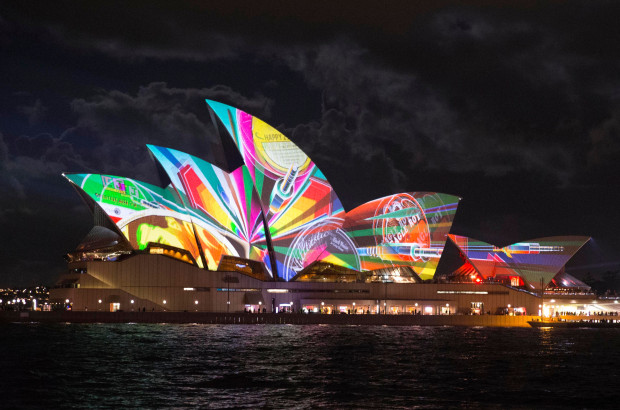
Vivid Sydney opening night One censorship argument at a festival celebrating creativity and inspiration is probably enough for any organising committee, but two is overwhelming and potentially damaging. Still, that's the situation at Vivid Sydney, the light, music, and ideas festival that takes over the Australian city between 24 May and 10 June.

'Culling images?'

The first incident arose on Saturday night, when 18 out of 35 images were pulled from the Reportage exhibition that was being projected onto two large screens near the Museum of Contemporary Art at Circular Quay. (For those who don't know Sydney, Circular Quay is where the Opera House is located.) Reportage was intended to be a showcase for photojournalism, and included submissions from photographers represented by Magnum, Noor, and Contact.

Being a display of photojournalism, the potential for any of these images to be distressing or offensive was high, but this was something that Destination NSW, essentially the New South Wales tourist board which owns and manages Vivid Sydney, seemed to have overlooked until the very last moment. Sandra Chipchase, Destination NSW's CEO stated: 'What we don't want is children walking around the corner and seeing pictures of dead children... We just don't want violence, dead people or anything that could distress people. In that public domain area it's about entertainment and engagement.' I don't know about you, but I'm not sure that I've ever considered photojournalism to be 'entertainment'.

As a consequence, photographs depicting the Cronulla riots, the 1979 Iranian revolution, and even the aftermath of an Australian bushfire were pulled from the big screen. They are available to see in smaller venues, but photographers who had travelled to see their work exhibited on the big stage were disappointed and at least two have withdrawn their work in protest. Hurt feelings, poor communication, and what appears to be a woeful misconception of the material intended for display: not a great start.

Concealed genitalia

Controversy number two involves the exhibition Home, hosted in the Cleland Bond building in The Rocks area of Sydney. Two photos, depicting three naked people, had tape placed over their genitalia. Stephen Dupont, curator of both Home and Reportage, claims that this was at the request of the Sydney Harbour Foreshore Authority; the Sydney Harbour Foreshore Authority has stated that it didn't request that the tape be applied specifically, rather that the exhibition be made suitable for the 'broadest possible audience'.

Dupont discussed the request to tape up the images with the Oculi group, who provided the images for the Home exhibition, and they decided that the photos would stand untaped and as they had intended.

Cut-and-dried

In addition to what can only be described as the naivety of the organisers, there is a question of managing expectations around the exhibitions. In my opinion, how appropriate it is to display gentalia in a closed exhibition with a warning by the door is a cut-and-dried decision: if people are aware of the presence of naked human forms, they can decide whether or not to enter. The request to somehow sanitise the exhibition was unnecessary and offensive to both the photographers and the audience. Apart from finding it condescending for someone to tell me what I can and cannot see, I remain entirely perplexed as to what, exactly, people find so distressing, alarming, or offensive about the human body. We all have one, after all.

A storm in a tea cup?

The decision to pull images that some might find distressing are projected publicly feels much more like a storm in a tea cup to me. Whilst there are some significant questions presented here, not least who gets to decide whether an image is distressing or not, it seems to be a situation resultant of mis-communication and resulting in over-reactions.

Point 1 of mis-communication centres on the expectations surrounding a display of photojournalism. I approached destination NSW, enquiring what, if any, guidance was issued to photographers regarding acceptable material for display at the Reportage exhibition. It responded: 'As per agreed editorial contractual arrangements between Destination NSW and the organisers of Reportage, and given Vivid is a family friendly event, we endeavoured to ensure photos and footage that may cause offence or distress, or were not in keeping with the values of the event, are not presented at the outdoor venue and screen.' My interpretation of this is that Destination NSW wanted 'family-friendly' images, but rather than issue clear guidelines before submissions were made, made reactionary and arbitrary decisions on the acceptability of the material once they'd seen just what was going up on the big screen.

Furthermore, given that Reportage is an exhibition dedicated to photojournalism, I'm intrigued to know exactly what sort of imagery Destination NSW was expecting. By its very nature, photojournalism covers issues that are difficult, distressing, or offensive in a visceral fashion. As Andrew Quilty, the photographer whose bushfire images were pulled from the Reportage projection, put it to Guardian Australia:

I don't know what they [the organisers] expected to come from a festival that shows specifically photojournalism. I don't know if they were expecting photos of cats and what the photographers were eating for breakfast. It seems to be coming from a typical kind of ad-person who has a view of how they want their brand to be perceived.

Point 1 of over-reaction centres on Destination NSW, having been presented with a bundle of images that it wasn't quite anticipating, deciding to pull them from the large outdoor display at the last minute. Running through my head is an xkcd-type scene where bureaucrats are tugging at their hair and screaming: 'But won't you think of the children!'

Having taken a look at the image reel on the Sydney Morning Herald website, which includes the redacted pictures, I have to say that very few provoked feelings of distress or shock in me. Would I be happy allowing my five year old nephew look at the photograph of an Iranian protestor whose hands are covered with blood? Probably not. But the photograph of Mexican immigrants being arrested on the Californian border is hardly controversial. I'm inclined to think that Destination NSW over-reacted, but then I'm not a parent.

I'd be interested to know what you think of the images.

Point 2 of mis-communication focuses on the process of removing the images from the projection. Destination NSW has been quite clear that the images it deemed to be too distressing for display were not removed from Vivid Sydney in their entirety. They can still be viewed at other venues, for example the Customs House, just not on the large public screen. Somehow, though, this seems to have been interpreted as the images have been censored wholesale, and without doubt those photographers who had travelled in order to see their work projected on a large scale, or had expected to see their photos alongside the work of eminent photojournalists, will feel bitterly disappointed.

Point 2 of over-reaction is the response of the photographers. At least two have withdrawn their images from display and Dupont, Reportage's curator, expects more to follow suit. If I were a photographer and my work had been pulled from an exhibition at the very last moment on somewhat spurious grounds, I'd be furious, too. However, foot-stamping and toy-throwing is incredibly unbecoming. How about suggesting an alternative?

After 21:00

Rather than leave Destination NSW looking red-faced with embarrassment and the photographers red-faced with fury, I would be inclined to suggest implementing a watershed for the projection. Before 21:00, it's a more family-friendly set of images that doesn't raise questions parents might not be ready to address with their six year olds. After 21:00, it's a full and frank exhibition. It's a compromise that means no one has to lose out, least of all the photographers who submitted their images in the expectation that they would form part of an extensive and exciting exhibition exploring photojournalism. It would also help to mitigate the impact of a mis-communication that is becoming an international embarrassment.

All those years ago when I was training to become a teacher, one of the fundamental principles instilled into me by my tutor was 'Say what you mean and mean what you say.' Destination NSW could do well to adhere to that notion.

(Headsup to the Guardian and thanks to the Sydney Morning Herald)

Kickstarter: Photographer looks at what happened to the Olympic Mascots

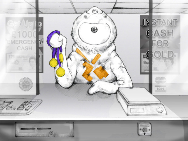
I can't lie - I'm pretty partial to Kickstarter (and that's not just because I'm a prolific backer on there, nor because I've done a campaign myself)... So when our old friend Joe Giacomet reached out and told Photocritic about his project Cash for Gold, I was hooked... Struggling a bit there, Wenlock?!

Cash for Gold is a satirical look at the London 2012 Olympic Legacy and sees London Olympics mascot Wenlock a year on from the end of the Olympics.

Poor Wenlock is now an alcoholic, depressed and disheveled inside a cash for gold shop cashing in his 3 gold medals.

The image is being crowd-funded through Kickstarter -- quite possibly the first Kickstarter campaign I've seen that's targeted at funding just a single image - but what an image it is!

Check out the video below, and then bounce along to the Kickstarter page for Cash for Gold, for the rest of the deets.

You too can be a professional photographer with this app!

We receive all manner of press releases here at the Photocritic Outpost, from the interesting and exciting to the downright boring or even bizarre. I mean, why would anyone want to try to market crisps through a photography website? Some are fortunate enough to bask in our editorial glow; many are placed on a one-way ticket to the delete bin. And then there are the select few that leave us banging our heads against our desks in some crazed act of disbelief. One of those arrived this morning.

The press release in question is for an iPhone app that helps you to pose your models. It sketches out ideas for posing people in all sorts of situations, from kids to something a bit saucy, and groups them according to subject. At first glance this could be vaguely useful: ideas and suggestions for shoots are generally welcome. Sometimes we all need an idea from the aether to inspire our creative juices.

However, if you look at the screen shots of the app in action, you see that it isn't just a collection of pose sketches, but an overlay that you use to arrange your models before snapping them with your iPhone and applying one of the app's range of filters, if it takes your fancy. Thre's no creativity, no vision, and no skills involved. It all feels rather sterile. In fact, it's a bit like painting-by-numbers, but with photographs on your iPhone.

At this stage, the app has reached the 'Heading for deletion unless there's a stupendously redeeming feature in the next sentence' point. Then it comes and you encounter your head-meet-desk moment: the app's makers claim, without any sense of irony, that it can transform you from uninspired amateur to 'professional portraits photographer in only one minute'.

Well that's the 10,000 hours theory blown out of the water in half a sentence and I can probably start selling my Monet reproductions for millions.

In all seriousness, this could probably be a fun app for little 'uns and teenagers to mess about with; I can envisage ten year old me and my best friend having all manner of giggles posing each other and applying ridiculous filters. You would have to remove the more, ehm, suggestive poses from the roll first, though. But a fast-track to professional portraits? No, I don't think so.

(And if you're wondering, of course I'm not going to name the app, especially when the subject line of the PR email specifically asked me to recommend it.)

Mark your calendars: remote camera triggering webinar on Thursday

If you're free on Thursday at around 2PM EDT (7PM BST, or see this handy link for the correct time zone near you), you're in for a treat: Triggertrap and Datacolor are doing a webinar on remote camera triggering! It's like a seminar, but online!Most cameras have a range of creative remote control capabilities you may not even know exist. In this exploration of remote camera control possibilities we will cover the basics of shooting tethered to a computer, remote release devices, time and interval shooting (including interval shooting for combination into video streaming later) and remote triggering via long-run wired and wireless connections.

Applications will include, but are not limited to: commercial, stop-motion, wildlife, city and landscape photography.

It's a 1-hour seminar with David Saffir and C David Tobie, discussing the creative approaches you can use to trigger your camera remotely!

You can register for the seminar on the Datacolor webinars page today.

Enjoy!

Olympus getting out of cheap compact cameras? Good!

The news that Olympus is ditching their compact camera division this week caused quite a stir, but I can't help but think that the camera manufacturer is on to something. I've long thought that entry-level compact cameras are a Bad Idea. Nikon's line-up is a great example: Their SLRs are phenomenal. The Nikon 1 series are incredibly capable machines. But their $80 entry-level cameras are best avoided. It's not a particularly closely guarded secret that they're contract manufactured in a completely different factory, the design isn't done by the core Nikon team, etc. Basically, the entry-level cameras don't look or feel like Nikons.

The same goes for Olympus, but they also have a couple of other challenges they're facing.

I think Olympus is probably better off without these fellas.

There are two ways to look at this:

1) If your first camera is a cheap Olympus camera, you might be happy that it didn't break, and you'll buy another Olympus further down the line

2) If your first camera is a cheap Olympus camera, you might be appalled by the build quality, and decide to go elsewhere.

It's a hard gamble, because for cameras that are sold for less than a ton, it's pretty obvious that camera manufacturers have to cut corners somewhere. Cheaper enclosures and naff colours mean that they look and feel cheap. Cheaper LCD screens makes it hard to see how good your pictures came out. And cheaper lenses, sensors, and processors means that the camera will be slow, that there's a physical limit to how good the photos can be, etc. On top of that, the cheapest cameras often end up in the hands of people with the least of a clue - the very same people who could benefit the most from having a more 'intelligent' camera.

So, in deciding to pull the plug on their cheapest cameras, Olympus is making a wise move: They probably can't (and shouldn't) compete in a market that's a race to the bottom: Developing a cheap camera that is designed to be as good as it can be means spending a metric arse-tonne of cash on development, then another huge amount on manufacturing an enormous quantity of them, then piling in the marketing dollars to shift 'em. And even then it's a gamble, hoping that Nikon or another bottom-end manufacturer didn't happen to release a slightly better (or slightly cheaper) model a couple of weeks before you did.

Good riddance, I say: Olympus can now continue focusing their attention on the spaces where they are true innovators: The Olympus OM-D, the other mirrorless cameras, and their superzooms.

Have you seen Flickr's new avatars?

As well as the new layout and the new business model that it rolled out this week, Flickr also introduced 12 new default avatars for anyone who chooses not to upload her or his own identifying image to attach to their homepage and comments. Designed by Charis Tsevis, they're bright, blocky, and I have to say I rather like them. The designs fall into the genre that Tsevis calls 'Neo-Futurism' or 'Neo-Cubism' and feature stylised cameras that include Canon or Nikon dSLRs; medium format, twin lens reflex, and old-fashioned polaroid cameras; mirror-less cameras that might be from Olympus, Nikon, and maybe Sony; as well as compact cameras resembling Fujis and Sonys; and of course the smartphone. He goes into more detail on the brief and his design process on his blog.

I think I might start a round of Flickr avatar bingo. Anyone up for it?

(Headsup to Design Taxi)

Why white-balance lens caps don't make sense

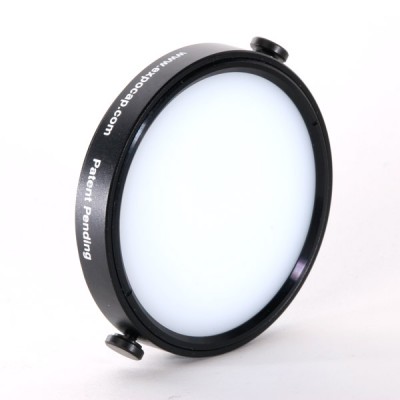
400x400_expocap.jpgIt may be purely coincidental, but over the last few days, I've heard a lot of buzz about various products that clip onto the front of your camera to help you white balance your images. The idea is that you place a special lens cap on your camera, snap a photo, and use that color as a reference color when you edit your photographs. The devices come in lots of different types: full-covering caps, dome-shaped caps, home-made versions made out of coffee filters or Pringles caps, or any number of other surfaces.

In theory, it's a great idea, but it has a flaw: A white balancing cap like this measures all light that hits it. Can you spot what the problem might be?

Imagine your lighting set-up is like this, for example

shade2.png

You are in the sun, but your subjects are in the shade. Your white-balancing cap will measure the light that's hitting your camera (direct sunlight - or around 5,500 Kelvin or so). However, your subject will be in the shade (around 7,000 Kelvin or thereabouts).

The outcome is utterly predictable: Your white balance is going to be miles off.

So, what's the solution? It's simple:

Don't white-balance where you are taking photos from... White-balance what you are taking photos of.

Flickr confirms: 'Pro' memberships can be retained

It seems as if creating a fuss can sometimes reap rewards. One of my, and just about every other 'Pro' user of Flickr's, concerns regarding the site overhaul and changes to its business model has been clarified. 'Pro' members do now have the chance to renew their membership at the existing price (about $25 for a year) and retain its benefits, with no plans to do away with it just yet. You won't have the luxury of allowing your membership to lapse, however, so if you're intent on keeping it, best sign up for recurring renewal. You can future-proof your subscription by heading to your Settings. It's right there under Personal Information. And all the details about retaining 'Pro' status are here in this FAQ.

(Headsup to Engadget)

The Flickr Spectaculr: what's right, and what's wrong

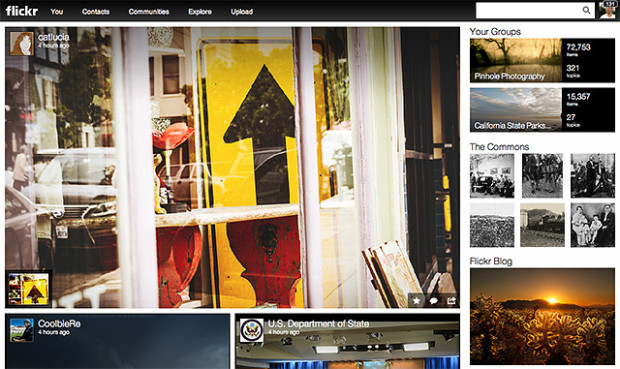
Flickr front page 'Make Flickr awesome again.' That was the Internet's message to Marissa Mayer when she was appointed CEO of Yahoo! last year. Last night's announcement of a new-look Flickr with a new business model was her, and her team's, response to that claxon. But are the changes all that awesome?

To summarise, 'New Flickr' has done away with the divide between 'Free' and 'Pro' accounts. Before, 'Free' membership meant limited image display that was supported by ads. 'Pro' accounts cost about $25 a year, enjoyed unlimited storage, provided statistical analysis, and were ad-free. Now, everyone has one terabyte of storage for free and photos are undoubtedly the heart-and-soul of the newly designed site.

The new-look moasic-style photostream

If you want to enjoy Flickr ad-free and have access to statistics, you need to pay $50 a year. For $500 a year, you can buy a Doublr account and double your storage space.

Understandably, the split between the 'Wow' and the 'Grr' reactions seems to fall along the divide between ordinary members and 'Pro' members. For ordinary members—those who didn't pay about $25 a year for unlimited uploads, statistical analysis, and no ads—it's a win. One terabyte of storage for free, full-resolution display, and some of the organisational tools that were previously the preserve of 'Pro' members: what's to complain about?

There are two primary complaints that Flickr needs to solve, and quickly. The first is the treatment of its old 'Pro' members. I paid for Pro membership because I wanted the unlimited storage, I appreciated the statistical analysis, and I liked the ad-free experience. 'Pro' exists no longer, and instead there is a great deal of confusion as to which old 'Pro' members will be grandfathered in to the new deal on their old terms. It seems as if some might, and some won't. Apart from not being able to determine easily if our previous contracts will be honoured, why the differentiation at all? Flickr's 'Pro' membership was a relatively small percentage of its overall membership; giving all these loyal users the benefit of the doubt seems only fair.

The old 'Pro' members were the old Flickr stalwarts, who stuck by the site when it felt as if Yahoo! had put it out to seed, but continued to pay them their money and keep the community alive with images and conversation. What could have been a positive transition, with clear communication and recognition for their loyalty, feels more like a shafting. It is, however, an easy fix.

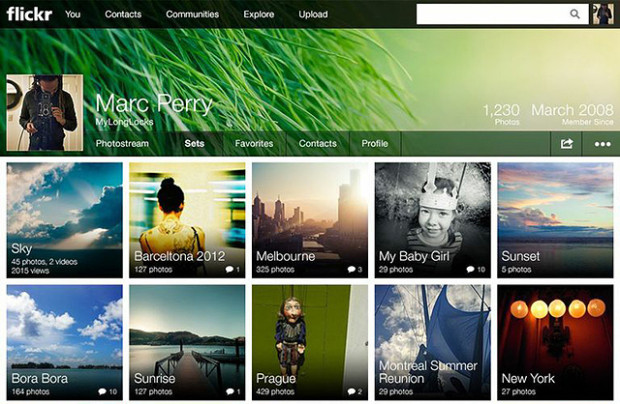
The new-look sets lay-out

Second, can Flickr please fix its metadata-stripping antics? Display an image online and you run the risk of it being purloined and used without permission; that's a fact of life. However, there are measures that many of us take to protect our images. Some of us use watermarks, some of us only upload small versions of our images, I've disabled the downloading function on Flickr, and most of us append metadata to our pictures. Metadata are a bit like a dogtag, identifying who took an image, where, and when. Unfortunately, Flickr strips images of their metadata, (or takes the collar off of the dog, if you like) so if someone does manage to download one of your pictures, its owner can't be identified. Now that pictures are being displayed bigger and brighter and bolder on Flickr, this is more important than ever. Ensuring that metadata aren't separated from images really would be awesome.

In terms of the look and the feel of the new Flickr: I love it. If the images can't do the talking, then why bother? And the new moasic layouts and easy enlargement options make it all about the images. When Yahoo! addresses the issues that people are finding troubling, Mayer might've answered the Internet's request.

Brand new site celebrating time-lapse photography!

It's pretty incredible what you can knock up in a day if you're suitably caffeinated–or slowly on your way to getting sozzled. In the case of the Triggertrap Company Hackathon, I decided to build a site celebrating one of my favourite hobbies: time-lapse photography.

A screen shot of a website? What's next, an interpretative dance recital of a haiku poem? Actually, come to think of it, that's not such a bad idea.

Primelapse.com is the name, and it is a collection of a load of rather fabulous timelapses from around the world, organised by location, technique, and theme.

If HDR photography is your poison, we've got you covered. Looking for time-lapses from California? Done. How about a load of timelapses taken from space? Yeah, sure, why the hell not.

It's a brand new site, so there's a load of things I still want to add to the site, but for now, we've got the first hundred or so timelapses live on there, so why not pop over and have a look?!

Using time-lapse to help make babies

care-maps-9-cells For most of us, time-lapse photography is something that is beautiful to look at and tricky to get right; for a team of researchers at a lab in Manchester, their time-lapse photography doesn't need to be beautiful to look at, but it does need to be right. They've been using it to monitor the development of embryos in the IVF process, consequently increasing the chances of a successful live birth.

The most common cause of IVF failure is aneuploidy, or chromosomal abnormality. In fact, it's estimated that about 70% of fertilised eggs, whether achieved naturally or via IVF, don't reach birth and in many cases the loss or gain of single chromosome is key.

By imaging an embryo every ten to 20 minutes and observing it at key stages of its development, the team at the CARE fertility clinic is able to identify if it is at low, medium, or high risk of chromosomal abnormality. In all, each embryo is photographed about 5,000 times before it is implanted, or not. The lower the risk of chromosomal abnormality, the higher the chance of a successful implantation, pregnancy, and birth.

At the moment, it is only a very small sample of embryos that have been subjected to CARE's cameras (88, in fact), but the results are encouraging. There was a 61% success rate of babies born to the low-risk group. The medium risk group had a 19% success rate, whilst the high-risk group didn't have any births.

It's early days, but for couples struggling to conceive, time-lapses might be the way forward.

(Via BBC radio news and the website)

People in glass houses

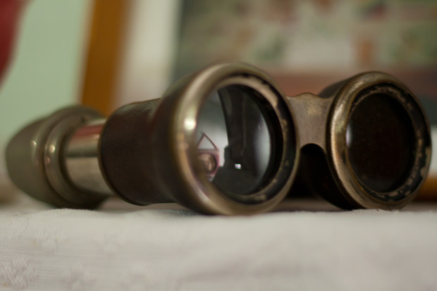
Binoculars Where does the line exist between public and private? At which point does photography become voyeurism, or even exploitation? When you live in the Zinc Building, a glass-fronted set of apartments in New York's TriBeCa district, this question has just been thrown into sharp relief by a new exhibition at the Julie Saul gallery in Chelsea.

Arne Svenson, a photographer living on the second floor of a building opposite the Zinc Building, used a telephoto lens to capture images of the residents of the Zinc Building from his flat. These have now been curated and exhibited at the Julie Saul gallery under the title 'The Neighbors'. None of the subjects can be identified from their images, and Svenson maintains that by living in a glass-fronted building, they are putting themselves on a stage:

For my subjects there is no question of privacy; they are performing behind a transparent scrim on a stage of their own creation with the curtain raised high. The Neighbors don’t know they are being photographed; I carefully shoot from the shadows of my home into theirs.

For the residents of the Zinc Building, however, there is a distinct feeling that their privacy has been violated and consequently they are contemplating legal action. The feeling seems to be that there is a difference between an odd stolen glance and a concerted campaign to document their lives from the shadows. Even if they cannot be identified, it feels creepy.

Bearing in mind I'm in no way a legal expert and certainly not one in New York law, I think that there are two critical factors here; first, that Svenson took these photos from his own flat; second, that the images were captured using a long lens. Would someone standing on the street, without optical assistance, have been able to discern these scenes? If this weren't the case then the residents' expectations of privacy were reasonable and their sense of intrusion justified. Legality aside, from an ethical standpoint Svenson's location adds a distinct element of voyeurism and exploitation to his actions: he observed them purposefully and secretly from the security of his own flat.

Even if Svenson's actions are deemed legal, it is ethically dubious situations such as these, which provoke a sense of violation in the public, that leave photographers facing a barrage of abuse and do nothing to support or promote our rights to shoot in public. To say that we should never push the boundaries and paint ourselves into a photography-less corner would be foolish and detrimental to the medium. Rather, we need to be respectful of our subjects; just because we can do something doesn't mean that we should.

Meanwhile, I might just start drawing my bedroom curtains when I change. Nobody can see me from the street and the only possible view into the room comes from the first floor windows of two houses several hundred metres away. But you never know.

(Headsup to The Online Photographer)

May's other-worldly photo competition

Floating on By

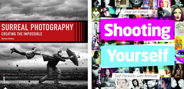
To celebrate the launch of my newest book, Surreal Photography: Creating the Impossible, it seemed entirely appropriate that the theme for May's competition should be surreal.

Whether you construct a meticulous composite of gods and monsters battling it out in an as-yet undiscovered universe, or create a scene at five degrees to the world we know using papier mache, we don't mind. It can be Photoshopped to Kingdom Come or created entirely in-camera, what we're looking for is a strong image.

The Ilex Press, publishers of the book in the UK, are very kindly supplying a copy of the book as a prize. You have until Friday 31 May to submit your entry to our Flickr pool and link the image in May's thread. Please remember: it is one entry per person and the image must be posted to the thread.

I think that just about covers the details, but I have produced The Rules for your reference. Good luck!

The Rules

  • If you decide to enter, you agree to The Rules.
  • You can’t be related to either me, Haje, or Gareth to enter.
  • One entry per person – so choose your best!
  • Entries need to be submitted to the right place, which is the relevant monthly thread within the Small Aperture Flickr group.
  • There’s a closing date for entries, so make sure you’ve submitted before then.
  • You have to own the copyright to your entry and be at liberty to submit it to a competition. Using other people’s photos is most uncool.
  • It probably goes without saying, but entries do need to be photographs. It’d be a bit of strange photo competition otherwise.
  • Don’t do anything icky – you know, be obscene or defame someone or sell your granny to get the photo.
  • We (that being me, Haje, and Gareth) get to choose the winner and we’ll do our best to do so within a week of the competition closing.
  • You get to keep all the rights to your images. We just want to be able to show off the winners (and maybe some honourable mentions) here on Photocritic.
  • Entry is at your own risk. I can’t see us eating you or anything, but we can’t be responsible for anything that happens to you because you submit a photo to our competition.
  • We are allowed to change The Rules, or even suspend or end the competition, if we want or need to. Obviously we’ll try not to, but just so that you know.

If you've any questions, please just ask!

This competition was launched when Photocritic and Small Aperture were still hosted by Pixiq. Unfortunately, it was lost in the transition. This is a re-posted article containing the same details, although the exact content will be slightly different.

Get your entries in for the 2013 IdeasTap Photographic Award

IdeasTap IdeasTap is a charity focused on helping creative people who are just starting out in their careers to find their feet, to get the support and encouragement that they need, and to develop their passion into a workable career path. It covers a diverse range of creative disciplines and works with some of the biggest names in those fields to bring insight and opportunities to its members. In the case of photographers, it is working with Magnum Photos for the 2013 Photographic Award. It doesn't get much bigger than that!

The IdeasTap 2013 Photographic Award offers three winners £5,000 in prize money, £1,500 in project funding, mentoring from Magnum photographers, and the chance to work at Magnum’s offices in London or New York. One winner will be selected from each of the age categories: 16 to 22, 23 to 30, and 31+; in addition, there will be prizes for 18 shortlisted photographers (six from each age group).

The short-listed candidates will benefit from a mentoring session with a Magnum Photographer, Blurb book vouchers, and £150 to have their pictures printed. Come the autumn, their photos will be exhibited, too.

At the exhibition, nine finalists—three from each group—will be selected. The nine finalists will each receive £1,500 to shoot the project of their dreams, create a multimedia Magnum in Motion project, and will receive a second mentoring session. Then of course, the three overall winners will be chosen.

The brief for each category is the same: submit a series of ten photos that fit with one of five themes: conflict, climate, memory, human relationships, or journey. The deadline is 31 May, so if you're interested, you need to get a wriggle on!

All of the details, including how to join IdeasTap (it's free), is available on the IdeasTap website.

On not taking photos and black eyes: Team Photocritic in conversation

If you missed Team Photocritic live in conversation yesterday afternoon from Ilex HQ in Lewes, you're in luck. There's a recording of our musings on our newest books, collaborating with other photographers, and setting up Photocritic. I think that there's only one major use of profanity and somehow we work cake into the dialogue. Not bad for an afternoon's work in front of a camera.

There's also 50% off the digital versions of our books in Ilex's webstore for a few more days, but you'll need a special code to claim it. And that's revealed during the interview. Mwahahaha!

Big thanks to Adam at Ilex for setting up the session and acting as technical director, being the Voice of God, and editing the recording. If you couldn't guess, we really enjoyed ourselves.

And the name I so embarrassingly forgot: Adrian Sommeling. Profuse apologies.

TIPA 2013 - who won what

logo-tipa-2013 Once a year the Technical Press Imaging Association, or TIPA, meets in a desirable location—this year it was Hong Kong, last year in was Cape Town—to settle on which manufacturers have produced the best easy-to-use compact cameras, most innovative tripods, and the swishest top-end dSLRs over the past 12 months.

There are in fact 40 different categories that are decided on by representatives from TIPA's 27 member magazines, as well as the Camera Journal Press Club of Japan.

Canon took most of the dSLR spoils, winning best entry-level with the 100D, best expert with the 6D, and best video dSLR with the 1D C; Nikon, however, won the advanced category with its D7100.

When it came to compact system cameras, or mirror-less cameras, or EVIL cameras, Fujifilm, Olympus, Panasonic, and Samsung all had a look-in. Fujifilm's X-E1 won the best expert CSC award; Olympus took the entry level CSC honours with the PEN E-PL5; the professional CSC prize went to Panasonic for its GH3; and finally the advanced prize was won by the Samsung Smart Camera NX300. If you can wade your through the difference between 'professional', 'advanced' and 'expert', then you're a better woman than I am.

The compact camera categories were split between Nikon and Panasonic. Nikon walked off with awards for its Coolpix S01 in the 'easy' class and its P520 superzoom. The rugged camera was Panasonic's prize, though, for the FT5 (or TS5, depending on where you are).

Canon, Fujinon, Nikon, Sigma, and Sony all won prizes for their lenses, ranging from 'best CSC prime' (the Fujinon XF 14mm ƒ/2.8 R) to 'best professional lens' (Canon's EF 24-70mm ƒ/2.8L II USM), via best entry-level dSLR lens (the Sigma 17-70mm ƒ/2.8-4 DC MACRO OS HSM).

As for best premium camera, that was the Sony RX1; best professional camera was the Leica M; and best imaging innovation was awarded to Samsung for its 45mm ƒ/1.8 (2D/3D) lens.

If you want to check out the rest of the winners, which includes best media storage, imaging monitor, and photo TV, you can see the whole list on TIPA's website.

I can't help but feel that with a carousel of categories where the differences in criteria aren't necessarily discernible, it's more a case of 'These were all really good products and we need to find some way of showing that.' I can't say that the awards will encourage me to buy a Nikon superzoom, but it must be gratifying for the manufacturers to receive a pat on the back.

Team Photocritic, live and in conversation

Surreal + SYS On Wednesday 15 May at 16:00 BST, Team Photocritic (otherwise known as Haje and Daniela) will be coming to you live and direct across the Intergoogles from the HQ of the Ilex Press, which publishes some of our books. Video cameras, live transmission, and two excitable writer-photographers. What can possibly go wrong?

We're going to be in conversation, discussing our newest books and our current projects. If there's time and we don't get too carried away, we'll squeeze in a Q&A session. Do line up any questions that you might want to put to us.

Ilex is hosting the event on its Ilex Live site. Tune in for 16:00 if you're in the UK, and if you're not in the UK, here's a nifty timezone converter.

As an added bonus, Ilex will be offering a super-special discount on the e-versions of some of our books. If you head over to the webstore, you'll see what's on offer. The details covering how to claim your discount will be revealed during the broadcast!

See you tomorrow!

The Disappearing Review & why I left Pixiq

Back in November 2012, I received an e-mail from the Powers that Be at Pixiq, stating that they had unpublished a post I wrote back in June of 2011, entitled 42nd Street Photo: One to Avoid, after they had received a formal complaint from the photographic retailer about the post I had written. As far as I can tell, it appears that 42nd Street Photo approached Barnes & Noble directly, requesting that the post is taken down. Pixiq's editorial director decided to fold without first discussing the matter with me, and instructed the Pixiq editors to take the post down.

Obviously, if the editorial director feels that the post was worthy of being taken down, he is probably right, but as someone who is rather passionate about copyright, and the protection thereof, I found it rather interesting that 42 Street Photo decided to use the DMCA to get my post taken down.

Of course, since I'm now back on Photocritic, I can publish whatever I like without a gag order, and the review is back where it belongs: On-line, for anyone to read.

Copyright Infringement?

This was the photograph 42nd street photo claimed was copyright infringement, as I didn't have 'permission' from them to take a screen shot.

As far as I can tell, the DMCA portion of 42 Street Photo's complaint pivoted on the fact that I had a screen shot of the 42 Street Photo included as part of my blog post:

Says 42 Street Photo: "The author has unlawfully taken a screenshot of the 42photo.com Web site and logo without the express written consent of the copyright holder, 42nd Street Photo."

Now, this is quite interesting, because this isn't technically a copyright infringement; It falls both under US fair use laws, and UK Fair Dealing laws: Using a screen shot in this manner would fall under both news reporting or criticism.

Of course, it is scary to receive a letter from a lawyer saying that you're accused of something under the DMCA, but does that warrant removing the whole blog post?

Libel?

The other part of the complaint from 42 Street Photo is that my negative review might somehow fall under defamation legislation. That's an interesting angle to take. However, for something to be defamatory (whether it's published defamation, in which case it is known as libel, or a more transient defamation, in which case it might be slander), it has to be both malicious and false. It also, generally, has to be about a person - it is rather difficult to defame a company.

Whether my blog post was malicious is neither here nor there, but it most certainly wasn't false.

It is interesting, then, to see how a company like 42 Street Photo decided it was appropriate to turn to the law to try to get negative posts about them expunged from the internet.

Specifically, they wrote that: (...) this post is a highly subjective description of a one-time event allegedly experienced by someone other than the author (...).

'The person other than the author' in this case was my fiancee, now my wife, so the suggestion that I might not know or understand the full details of the case is quite funny.

As for 'highly subjective' — Well... Yes. Of course it is highly subjective; that is sort of what online reviews are all about.

More worryingly, however, is that they claim that the post is "libelous, tortious, harmful and/or defamatory", based specifically on quotes like “42nd Street Photo: One to avoid” (the title of my post) “Tales of dodgy behaviour and atrocious customer service” (after they went through a series of weird business practices that), and “an apparent lack of care about fraud prevention” (charges added to the order by someone who wasn't authorised to do so by the card holder).

So, what's the problem?

42nd Street Photo's lawyers were using playground bully tactics - and Pixiq let themselves be bullied.

Anyway, the worrying thing here is in two parts:

1) By equating a online user review that 42 Street Photo disapproves of as 'harmful' or 'libellous', they are in effect saying that any negative reviews are somehow illegal. I can't quite figure out what they are getting at, but I suspect that 42 Street Photo has received one too many negative reviews, and that they are now trying to do some serious damage limitation — that's the only reason I can imagine why they suddenly decided to take action on a 532-day-old blog post buried deep in the bowels of a very active website.

2) That Pixiq decides to bow to their request by removing my post.

Now, point 2 could be completely innocent (they acted before they read the request properly), mildly immoral (they are trying to get 42 Street Photo to advertise on the site, and don't want to rub them the wrong way), or deeply worrying (negative reviews of any kind are permanently banned from Pixiq, completely ruining the credibility of the site in the process).

What now?

The discussion on the above continued for a while, but I never actually got a response from Pixiq about why they decided not to stand up for one of their writers.

I should add at this point that I have been in journalism for a long time, most notably, I suppose, as the editor of T3.com. We did occasionally get ourselves into some legal wrangling after we wrote something, but that's sort of the way of the world: You write something, someone takes offence, and tries to do something about it. The big difference, however, is that you'll usually find that your publisher will stand up for you: They have a large legal team on staff, and will help defend their editors and writers, if they have done their due diligence.

The fact that Pixiq decided to roll over, and pull my article without even discussing it with me was ridiculous. I'm vaguely amused with 42nd Street Photo's legal petulence, but I'm furious with Pixiq for not shrugging it off for what it was: It was a schoolyard bully squaring up to them, and they ran away without taking on a fight they knew they would win.

I don't know about you, but I think I'm better off here at Photocritic, where I can tell 42nd Street Photo what Pixiq should have said: Your request is hogwash, and the review is staying. Have a lovely week.

Further Reading


Raspberry Pi, meet camera

Raspberry Pi camera For the princely sum of £20 you can now attach a camera to your Raspberry Pi unit, to fiddle about with and figure out how to take a photo with bare-bones code. This is very much more about learning to code than learning about photography, but it's about learning: I'm enamoured.

The camera unit comprises a five megapixel sensor and lens on a board measuring 25mm x 20mm x 9mm, that's capable of recording 1080p video.

Given it attaches to the Raspberry Pi via a socket and is little more than bare lens, chip, and board, and in order to release the shutter you need to enter a line of code, you might need a bit of ingenuity or teamwork to take a picture. And don't forget that once the camera's plugged in, it's up to you to figure out the code needed to operate it and locate the images that it captures. (Although the Raspberry Pi community is very good at lending a helping hand.)

But isn't that the point? Raspberry Pi is meant to spark children's enthusiasm and curiosity for programming. You plug it in and through a process of trial, error, and discovery, you get to where you want to go. (Or maybe nowhere near it, but it was fun all the same.) In particular with a camera, it gives children something that's both familar and tangible to latch on to whilst they're in the process of learning. Learning, after all, is supposed to be fun.

Once you've figured out how to take a picture, where it's kept, and what to do with it next, there's a Raspberry Pi photograph competition running until 14 June 2013. Pictures need to be taken with a Raspberry Pi (d'uh) and fall into one of four categories: Your Workshop/Den; Your Pi Project; People and Pets; Outdoors.

I think I'm buying one for my niece. (And naturally, by that I mean that I'm buying one for Eva so that I can play with it.)

Raspberry Pis can be purchased on the Farnell element14 Raspberry Pi website for just over £28. The camera unit is just under £20.

(Via Engadget)

Space Oddity, in space

If you've not already seen this, here's Commander Chris Hadfield's rendition of David Bowie's Space Oddity, recorded on the International Space Station on Sunday. It was his farewell before returning to earth after nearly five months in orbit. If you have already seen it, there's no harm in watching it again.

Via sources too numerous to mention