The return of street photography

festivalfaces-collage.jpg

You’re a keen photographer, and you find yourself in a city where the world’s biggest art festival sneaks up on you. It’d be rude not to do anything, really… But what?

Katie Cooke, a long-term friend of mine, who might be more known in the photography world as the queen of pinhole photography, decided to set up a little market stall in the middle of the mayhem, and take photos of people who felt like being photographed. Using a classic Toyp 45CF field camera loaded with Ilford HP5+, she decided to show the Fringe from an unusual angle… We’ve caught up with her to find out how and why. 


festival-faces-01.jpg“I was lucky to find a spot in Hunter Square that suited me really well: a north-west facing plain wall close to the main action of the madness of the Royal Mile during the Fringe, but tucked away between a portacabin on one side and a big tourist information map on the other.”, Katie recalls. She did two sessions of photographs, and made sure that the tripod stayed in the same place throughout the shoot. “I wanted a consistent viewpoint and scale”, she comments.

Photographing with a field camera is no walk in the park. Apart from the massively heavy camera with a 210mm lens (that’s equivalent to roughly a 65mm lens on a 35mm camera), Katie had to lug a tripod, a light meter, dark cloth, a loupe (for checking focus on the ground-glass focusing screen), eight film holders (which take one sheet on each side), a spare box of HP5+ film and a changing bag so she would be able to load more film if necessary. She also brought a stack of model release forms, to avoid any nasty accidents later on.

Selecting the models

festival-faces-02.jpgIn the beginning, Katie spent a lot of time people-watching before carefully selecting her subjects. “I was looking looking for people who weren’t in a mad hurry or a large group”, she explains. Picking someone out of a crowd is easy, of course – the difficult bit is what comes next: Asking them if they want to be photographed. “I had huge waves of shyness, and a fear of being creepy. I kept seeing fascinating people, but not having the courage to ask them to stop for me, partly because I was fretting they would take it the wrong way.”

For the second shoot, Katie got the help from two friends, who jumped at the chance to help out with this unique project. One of them had a particular advantage, of course “He had a secret weapon”, Katie grins, “it’s hard for people to feel threatened when approached by someone with a laughing baby strapped to their chest.”

Of course, you are in the middle of a massive art festival, and if there’s one thing that always struck me with the Fringe festival, it’s that you never know what around you is part of a performance, and what isn’t. Still, as it turned out, most people were nice about being asked for an impromptu modelling session. “There was a general sense of slight bafflement, mixed with curiosity, and relief that I wasn’t trying to persuade them to go to yet another show.”, Katie explains.

toyo.jpgKatie believes that perhaps it helped to use an odd-looking camera. “at least some people wanted to know what that was all about, and why on earth I’d choose to use such an old-fashioned monster”.

Originally, the plan was to entice the models into modeling by bribing them with baked goods: “I had planned to do a pile of baking, and offer a fairycake for a photograph. I really wish I’d got around to doing that, as it defuses the potential creepy factor, and turns the whole business into something of a game, which seems more in the spirit of the festival.”, but that’s where the festival sneaking up on you comes in, and the plan fell by the wayside.

Connecting with strangers

festival-faces-03.jpgNormally, you spend a fair bit of time getting under the skin of your models, in order to get to know them, and to find a way how you can best show them off. That, unfortunately, is not a luxury that’s afforded to a photographer working in the hustle and bustle of a busy festival.

Nonetheless, as a seasoned and experienced portrait photographer, Katie decided to condense this initial chit-chat into as short a time-frame as possible: “I wanted to work fast so that no one would get to the point of feeling uncomfortable or put out by giving up too much time, so I didn’t have as long as I really like to talk to people before making the photos. I just tried to get a conversation going back and forth from the moment I walked up to them to the point where the shutter closed, all the time watching them to see how their faces moved, how their bodies moved, and trying to get a sense of who they were. I really enjoyed these brief meetings, and was struck by how generous and open people can be.”

festival-faces-04.jpgOnce again, the camera format helps: Once the focusing is set, there’s no reason to be standing behind the camera anymore. “It’s easier to get a connection with someone when you don’t have a camera stuck to your face.”, Katie notes.

The funny thing is that when you become part of a festival in this kind of way, you’re not merely documenting the goings-on – especially with a camera – you become part of the festival itself.

“The project started from curiosity”, Katie says, and says she was just curious about the people who all pile into Edinburgh for the festival. She decided she was particularly interested in the fact that the festival is such a public spectacle. “There is a weird divide between the watchers and the watched, between the performers and the endless snapping of cameras”, she muses, and notices the contrast between taking photos at random and asking the subjects to come to you. “By setting up in a fixed place, almost as a small event, I wanted to get around the idea of grabbing or sneaking photos, but invite people to be willing collaborators in the project.”

Shooting with old-fashioned equipment

festival-faces-05.jpgI imagine that most readers of this blog are regular users of digital cameras – our recent poll in which 70% of you said your main camera was a dSLR would certainly indicate that – and that many of you have never taken a photo with a field camera. It was exactly part of the allure for this project, however: “I don’t think I could have made these pictures with a digital camera, because I don’t work well with digital and I don’t enjoy it.”

“Photographing digitally doesn’t suit how I see or think. So I stopped using digital cameras a few years ago, because they made me stupid. This is a very different way of working”, Katie explains, and continues with a point that hits very close to my own heart “I find the discipline of slow, expensive photography to be perversely liberating: each shot has to count, and each shot requires thought and commitment.”

Getting results

festival-faces-06.jpgBeing part of a festival could have been easily accomplished by not bothering with film in the camera – that would have made an entirely acceptable performance art piece, for example: “I think I’d have been happy even if the photographs themselves had been a washout, because the experience and the process was so enjoyable, and I learned a huge amount by doing it.” – but Katie is a photographer at heart, and the final results will be the memories that out-live all others from the day. As she admits: “Getting some good pictures out of the endeavour was a massive bonus”. So how, exactly, do you go about getting a good photo under that kind of pressure?

Throughout the two days, 28 people were photographed, with 2 exposures of each. Needless to say, there is a lot of pressure on ‘getting it right’ if you only get 2 chances at getting a photo to be right. Katie notes that there are some interesting patterns in the way the 2 photos compare to each other, however “Often one will have a “smile for the camera” smile, and the other will have a real smile that’s come from the situation or the conversation, and the latter is clearly the stronger picture.”

In retrospect, more photography time might have resulted in even better results, Katie ponders: “I wish I’d been there all through the Festival, rather than just two afternoons. And I wish I’d made myself a little more visible, which would have helped entice people into my photographic lair, though perhaps that would have changed the results in unexpected ways. ”

“But more than anything, I really wish I had a way of developing more than four sheets of film at a time.”

festivalfaces-collage.jpg

Check out the full gallery of Festival Faces in Katie’s Flickr set!

(photos © Katie Cooke, reproduced by permission – also check out Katie’s website, over on Slowlight.net.)


Do you enjoy a smattering of random photography links? Well, squire, I welcome thee to join me on Twitter -

© Kamps Consulting Ltd. This article is licenced for use on Pixiq only. Please do not reproduce wholly or in part without a license. More info.

Challenge: Portraiture styles

galletti-thumb.jpg

Have you ever noticed how most photographers tend to develop a very specific photography style? It’s a great way to create a very distinctive appearance, of course, but it may also cause you to stagnate as a photographer.

Long-term reader of my blog Cristian Galletti posted a comment on my ‘loosen up your portraiture style‘ post a while ago, where he shows off how he manages to use half a dozen completely different photography styles. The quirk? Well, the photos are all of the same model.  


Check out 3 completely different shots here:

christian-galetti-portraits-01.jpg

christian-galetti-portraits-06.jpg

christian-galetti-portraits-02.jpg

…If you want more, check out his website. A series of photos of the same model can be seen here: photo 1, photo 2, photo 3, photo 4, photo 5 and photo 6. To get rid of the post-its over the top of the pictures, click the eye icon at the bottom-right of your screen. Finally, also make sure to check out the rest of Cristian’s website!

Amazing eh?

Challenge o clock!

My challenge to you, then: Do the same.

Use a single model, and create 4 very distinctive, completely different photographs. When successful, why not post a link to your efforts as a comment to this post? I’d love to see what you guys come up with!


Do you enjoy a smattering of random photography links? Well, squire, I welcome thee to join me on Twitter -

© Kamps Consulting Ltd. This article is licenced for use on Pixiq only. Please do not reproduce wholly or in part without a license. More info.

Best pictures - ever!

girl-t3.jpg

A friend of mine sent me a link the other day, and I’ve been deeply fascinated by it – and its concept – ever since. The website is known as ‘best pic ever’, and it’s probably a pretty good description of what the site does – and what it does really quite well.

Click on ‘random image‘, and you’re offered a series of weird and wonderful images. Some of them are truly some of the most creative photographs I have seen in my life. Others are less technically proficient, but are still likely to make you grin broadly.

Not all is well in paradise, however: Where are the photos coming from?

bestever-2.jpgThe site is a bloody good good source of inspiration – have a click-about, and explore the wonderful world of creative photography – as I said, the random image section will have you boggling for hours, and the ‘popular‘ list offers some insight into what the rest of the internet finds exciting.

“But, it’s a great site”, I hear you cry, “why don’t you like it?”

I don’t wanna be a spoilsport, but the site worries me more than a little: sure, the photos are amazing, but I can’t help but wonder where they all came from.

Paying for a selection of photos like this would be very expensive indeed – the stock value of this level of professional photography is immense – far higher than the level of advertising on the website would dictate. Of course, in the crazy Web 2.0 times, it’s always possible that the people running the website are doing so with capital investment money, but I doubt it…

(The photos used in this article are from iStockphoto.)


Do you enjoy a smattering of random photography links? Well, squire, I welcome thee to join me on Twitter -

© Kamps Consulting Ltd. This article is licenced for use on Pixiq only. Please do not reproduce wholly or in part without a license. More info.

When less is more

grzesiek

It can often be incredibly tempting to try and fit more information into a photograph. Understandably so – wherever you turn, you find a barrage of information. Minimalism truly is a lost art in photography, and you’d be surprised to find that it’s actually quite difficult to get right.

In this photo critique, I am doing things in a slightly new way, and I’m cherrypicking some of the best photos that have been submitted to me over the past couple of months. Together, we’ll explore photographic minimalism, and how you can make hellastrong photos with less.  


Showing emotions

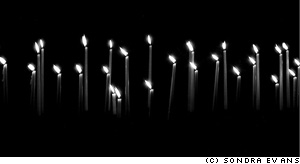
sondra-evans-01.jpgMinimalism is one of those concepts that’s difficult to wrap your head around – In one way, it can be described as just keeping it simple, but there’s a lot more to taking a good minimalist photograph.

Take this photo taken by Sondra Evans, for example: On the surface, it is just a photo of a series of cake candles on a black background, but look closer: despite of its deceptive simplicity, the image is telling a story… Some of the candles are burned down further. Why? Also, all the flames are pointing to the left, which gives me, personally, a feeling of longing. I read from left to right (as do you, I would hope, esnes yna ekam dluow siht fo enon ,esiwrehto), so the fact that the candles are left-oriented makes me feel as if they are pining for the past. I associate candles with romance, birthdays and love, but given the blackness and the sombre settings, I’m thinking candles of mourning: Are the candles on a grave? Or on a coffin? Is the photographer mourning the loss of a loved one?

So many ideas, thoughts and feelings, invoked by such a simple photograph. I love it.

Surrealism

grzesiek.jpgThe minimalist movement started in the late 1960s, which sort of makes sense: I’m all for the music of the era, but tie-dye would do my fucking nut – no wonder people were striving for simplicity. As a stepping stone to post-modernism, minimalism works very well when combined with surrealism – and that’s where Grzesiek’s photograph comes in…

Photographing a light-bulb upside-down, combined with the strong patterns created by the walls around it is a stroke of genius – and I love how the image causes you to re-think perspective, lighting, and photography itself. It has often been said (by myself, but more importantly, by people who actually know a lot about photography) that photography is all about light (hell, the word itself means ‘drawing with light’). Photographing a light source, then, becomes a documentation both of the method and the result of a photograph at once – that goes both for the photo of the candles, and this photo of the lightbulb.

This is a particularly good example of how you can use clean, simple lines, and a philosophy of ‘less is more’ to great effect. I’d be proud to have this hanging on my wall – wouldn’t you?

Playing with light

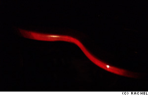
rachel-01.jpgTo me, minimalism is all about doing creative things with lighting: by being selective about what you light and how you have a fantastic opportunity to pick out details from a scene.

Rachel’s photo to the left, for example, illuminates the side of a coffee table (is it? or is it a chair? A cane? An electric guitar?). This particular photo has quite a bit of noise in it, sadly, and I would have cropped it entirely differently, for effect.

If you light something to make something disappear, or to allude that there is something more to the image, I always feel it is more useful to actually include the blank space in the image.

haje-rachel.jpgRather than making what you’ve carefully lit the center of the focus of the image, you’re essentially drawing the onlooker’s attention on what isn’t there – check out the image to the right.

What you are looking at is the same basic photograph as the one Rachel sent me, but re-coloured, and re-cropped in Photoshop. The large area of nothingness adds to the interest of the photo, because it’s practically jumping up and down, screaming ‘look at me! I’m mysterious! I’m an enigma! Try and solve me!’. Dunno ’bout you, but I find that strongly appealing.

haje2.jpg

The photo above is a simple egg in an egg-cup. Lit from the right and behind the photo, I’m particularly fond of this image (but then I would be – I took it), because around 96% of the frame is pure black – yet the 4% that aren’t give enough ‘feel’ that it’s perfectly possible not only to know what, exactly, you are looking at, but also add a sense of mystery and very strong visual lines.

fernando-adame-monkeysensei02a.jpgThe egg-in-eggcup is an odd one as well, because it conforms quite strongly to the rule of thirds, but the elements that fall on the dividing lines are not actually visible in the image. In effect, your eyes are ‘filling in’ the bits of the photo that are missing, and creates a pleasing visual image out of something that ain’t there. Call me a geek, but stuff like that makes me smile on the inside.

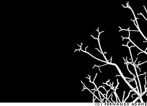
While we’re in the mood for crazy lighting schemes, do realise that side-lit subtlety is but one way of getting powerful images. The photo on the left, taken by Fernando (you might know him as MonkeySensei if you hang out on DeviantArt much), is a cheeky little example of how to do things differently. This image is almost Sin City-esque in its simplicity, but I love it.

The technique applied for taking this photo is so easy it’s almost embarrassing: Go outside on a dark night, find a tree, blast it with your flashgun on full pelt, et voila – a perfect photo. The composition in this image is what really gets me though – it’s almost as if the branches create a gradient feel to the image, as if they are cracks in an ice surface, propagating throughout the photograph. Especially amazing is that this photo barely has any grays in it: Everything is either pure white or pure black – you can’t get much plainer than that. Fantastic.

jasondeehr.jpgColour in minimalism

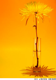
Of course, if you’re trying to keep things simple, going black-and-white is the easy way, but you can get some really stunning results by using colour, too. Jason Deehr, for example, sent me a photo which was minimalism with a twist: By using a background and a subject that are of very similar colour, suddenly the photograph becomes a celebration of colour, life, and warmth.

The tonality of ochre, light orange and yellow plays a careful, intricate game, turning what would be a rather sombre black-and-white image into a vibrant ode to life. There isn’t much of a story in this photograph, no pretenses, no deeper meaning, but it all just doesn’t matter – it’s gorgeous, simple, and full of optimism and innocence.

Of course, by varying the colours, you can create a whole series of moods – a yellow, an orange and a red panel in a triptych, anyone? It would make a great way to greet visitors to your house – hang three next to each other in the hallway!

While strong colours are a good option, a larger degree of subtlety can also have desirable effects – take this photo by Paul Mongan, of an unusual building, for example:

paulmongan.jpg

roof-haje.jpgI was torn as to whether the photo can be labelled as ‘minimalist’ or not – but similarly, it’s easy to see how the very same scene could be photographed at a different time of day, for a much stronger impact.

The high contrast between a clearer sky (or, perhaps, just overexpose the sky so it becomes much paler) and the distinctive shape of the building roof, could be a strongly striking, and visually appealing, impactful image. Of course, in my mock-up (to the right) you do lose much of the colour, but you do re-gain a lot of the oomph that I feel an image like this should have: washed-out colours and low contrast don’t cut it when you have source material which is crying out for drama.

People, but less

rachel-02.jpgObviously, there’s nothing to stop you from including people in your adventures in minimalism either – It’s just far more difficult.

One of the main reasons is that people are complicated shapes – faces are anything but minimalist, and there’s hair, ears, legs, arms – by the time you’ve taken a shot, you’ve got enough clutter in there that it’s difficult to fill an image with the tranquility and simplicity that minimalism is characterised by.

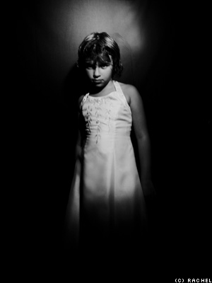
yorgos-haje.jpgRachel’s experiments in keeping portraiture simple, however are particularly effective. The style of the image on the right remind me of the work of the amazing Katie Cooke (who runs the Slowlight pinhole photography website), and is a good example how slight motion blur can actually smooth out an image quite a bit – certainly something worth further experimentation.

One way of simplifying portraiture is to go the high-contrast, slightly surrealist route (like my photo to on the right), but none but the nuttiest among us would concede that the picture is minimalist as such.

Challenge

So, it’s challenge ‘o’ clock, folks – can you take a portrait of a person that leaps off the screen, which is simple – even minimalist – yet captures a characteristic of the person you are photographing? If so, post it on DA, Flickr, or similar, and post a comment to this post with the link – I’d love to see it!


Do you enjoy a smattering of random photography links? Well, squire, I welcome thee to join me on Twitter -

© Kamps Consulting Ltd. This article is licenced for use on Pixiq only. Please do not reproduce wholly or in part without a license. More info.

They're, like, all calm, man...

marijuana.jpg

If you’ve been reading Photocritic for a while, you’ll have seen my post on how to make a killing jar (and the dozens of comments to the effect that it was mean to kill insects) and the backlash which was ‘why kill ‘em, when taking live photos of insects is far better?’

With that, I expected it all to be over and done with, but I did get a comment which I think deserves a post all of its own. You’ll never guess how this reader suggests to stun insects before photographing them…  


Eh check it out i know of a way to put insects into an almost comatose like state that would allow you to manipulate them touch move and almost damn near do anything you want to them…

This is going to sound strange and maybe even harsh but believe when i say through extensive research and study it does work and the insects depending on the extreme may or may not survive…you ready MARIJUANA…YES I HAVE DONE THIS MYSELF AND KNOW IT WORKS!

Ok you have a blunt joint or what ever you rolled it up to smoke with hell even a bong would work… you take a regular jar or cup preferably a mason jar with a lid to trap the insect.

Once trapped on the jar you dont kill it: light the blunt and either hit it or turn it around for a shotgun. crack the jar and blow the smoke in be careful not to let the bug out but fill the jar with smoke FILL IT all the way up… Let it sit until you see the wasp drop they will be very high and it will be evident they will still move and be alive…

Remove the top and turn jar over to drop the bug out of the smoke… You will only have a short time for the insects senses come back and it starts moving and walking around shortly after they will try to take flight but will only be able to fly in circles for a short time.

NOTE… remember it is weed and they are high they can overdose and die the longer submerged in the smoke or even if you recapture and try again a little while later they might die immediately. Like i said wasps work better they seem to withstand the THC a little better… Flies die immediately… Bees are kind of funny they die easily but if done repeatedly to a number of bees it seems they like it and come back for more EVERY TIME IF IM LYIN IM DYIN….BUT that takes a while and require a different method.

(I know all of this because I had a beehive behind my house that i baked out with a bunch of times and the bees became very tame and easily handled they had no interest in stinging anything and always came out when i smoked in my backyard)


This tip was sent by an anonymous submitter – if you’re out there, drop me an e-mail and let me know who I should attribute this to!

Also, while this post is true to the spirit of the tip, I’ve tidied it up a little: It was littered with spelling, typing, and grammatical errors. I fear perhaps the commenter had taken a little too much of his own medicine before clicking the ‘send’ button. Thanks muchly, though – it might just be the golden middle way between photographing live and dead insect… They might just be slightly mashed, though. Man.


Do you enjoy a smattering of random photography links? Well, squire, I welcome thee to join me on Twitter -

© Kamps Consulting Ltd. This article is licenced for use on Pixiq only. Please do not reproduce wholly or in part without a license. More info.

Cameras of the future

nikon1.jpg

I’ve done a lot of thinking recently, about what’s next for photography.

Think about it – while the manufacturers launch new cameras every couple of months, there hasn’t been a single fundamental change in the art of photography since the mid-1960s, when through-the-lens lightmetering on SLR cameras meant that you didn’t have to have a separate light meter anymore.

So, I wonder, what’s next? 


A lot of other things have happened since then, of course – flashguns have become more advanced, lenses have become sharper, and there’s that little thing called Digital. But ultimately – it’s all progression from old technology: Better flashguns are merely flashguns that have more functions and are more intelligent than old flash guns. Sharper lenses are simply, er, sharper.

Digital might be the biggest change, in that you can store hundreds – even thousands – of photos in your camera, rather than the 24 or 36 you were limited to before that, but the digital medium itself is really just a progression from capturing light on silver halide, just like we did in the days of film.

The next 50 years

If there have been no big changes in the past 50 years, then what does the next 50 hold for us photographers?

The evolution – rather than revolution – is benefiting everybody who is passionate about photography: More and better cameras are available, more cheaply than ever, and the Internet is helping photographers of all ages and skill levels to improve (through feedback sites like PhotoSIG and Deviant Art) and sell (through companies like PhotoStock Plus) their photography.

The big question in my mind – what is the next big change in photography? Gadget magazine T3 claims that the future is panoramic photography (disclaimer: I work for T3), which I can kind of see – while panoramic photography in itself isn’t anything new, next-generation technologies can make panorama taking a lot easier – and now that we have ways of showing off panoramic images in a sensible way (through, say, CleVR), perhaps that’s where the next big development will come from.

No new technology in sight

On the other hand, panoramas are just another development (and a rather small, niche subject in the world of photography) in the grander photographic world. You could argue that ‘new’ genres of photography are progress (say, the rekindled interest for macro photography and smoke photography), but ultimately, it’s just other ways of using photographic techniques that have been around for scores of years.

hdr.jpgThe only genuinely new addition to photography itself is strictly part of post-production, but high dynamic range imaging (HDR photography – read more on Wikipedia) deserves a special mention, because it uses digital darkroom techniques in combination with a novel way of using current photographic techiques to create an entirely new genre.

What do you think?

I guess I don’t have any answers – what do you think might be the future of photography? What is about to be invented, or make it mainstream, that will revolutionise photography, technically?

Or perhaps we don’t actually need any new technology: Is it time that we started getting more creative with the tech we already have available to us?

What is the future of photography?

View Results

The photo of the Nikon camera is from T3.co.uk (here). The HDR image is by webmonkie (here). Please visit them both to see the images in their full sizes!


Do you enjoy a smattering of random photography links? Well, squire, I welcome thee to join me on Twitter -

© Kamps Consulting Ltd. This article is licenced for use on Pixiq only. Please do not reproduce wholly or in part without a license. More info.

Going to the Moo-vies

stickerbook1.jpg

There are dozens of ways of presenting your photographs, but ultimately, we all want to distribute our photos in as classy a way as possible. Moo is an unusual printing company that might just be able to help.

It’s very easy to explain what Moo is – it’s web 2.0 meets photography meets printing. What isn’t as easy to explain, however, is why people go completely bonkers about Moo’s products. It helps that it’s great quality at bargain-basement prices, of course, but there’s also other things at play – a little something that the Big Brother generation would call the X Factor…

minicards.jpgThe simplest product Moo does is Moo minicards. It’s like business cards, but with a difference: Upload up to 100 pictures, or let Moo take the photos directly from your Flickr stream, and you get up to 100 different mini business cards.

Whatever you choose to have printed on the back stays the same across the range of cards, of course, but if you want, you can have 100 different fronts: Perfect for a photographer who wants to stand out from a crowd, or if you want to give cards to your friends. At only £10 for 100 cards, they’re so cheap that you can print them on a whim. Print your birthday invitations, your web site address, or anything you’d like to spread out there.

notecards1.jpgAnd that’s where the greatness of Moo cards come in. The first time someone gets a Moo minicard in their hands, the response is, invariably, Ooh, wow, that’s superb! Then, they usually run off to get their own Moo cards printed. Then, something fun happens: The second time someone gets a Moo card, they smile conspiratorially, and nod. And that’s where the fraternity of Moo begins.

In addition to the fabulous Moo cards, you can get Moo Notecards, which is like postcards, but cooler, and Moo Stickers, which gives you a sticker-book of 100 small square stickers – a perfect way to cheer up your envelopes with your own photographs. Or – seeing as you can, of course, add text in your images – have a guerilla art project. Tip: Print up 100 stickers with ‘have you smiled yet today’, and sticker them everywhere in your school or office building. Your janitor will hate you, but people will be smiling in a bemused kind of way for weeks, while the more obscurely hidden stickers are found, over time.

stickerbook1.jpgStill not convinced?

Step 1) Try searching for Moocards on Flickr
Step 2) Check out the Moo site!

Moo?

View Results

And no, I know what you’re thinking – I’m not being paid to write this. Although hey, if they want to let me print up some sticker books so I can make the world around me smile, I wouldn’t turn them down!


Do you enjoy a smattering of random photography links? Well, squire, I welcome thee to join me on Twitter -

© Kamps Consulting Ltd. This article is licenced for use on Pixiq only. Please do not reproduce wholly or in part without a license. More info.

Taking photos through windows

istock_000000051791xsmall.jpg

When you’re inside a city, getting high up is easy, but you do have to suffer taking photos through windows. It isn’t that difficult, but you do have to do it right.

Your biggest enemy when trying to catch photographs through windows is reflections, but if you know how to get rid of them, you’re laughing.

With a bit of practice, you can make your cityscapes look as if they’ve been taken from a helicopter – like the photograph to the right, which is an impressive city-scape of Chicago!

Check out this article for the full low-down and 5 valuable tips.

the photo on this article was purchased from iStockPhoto


Do you enjoy a smattering of random photography links? Well, squire, I welcome thee to join me on Twitter -

© Kamps Consulting Ltd. This article is licenced for use on Pixiq only. Please do not reproduce wholly or in part without a license. More info.

How a polarizer filter works

plane.jpg

The two best things about summer are clear blue skies and beautiful sparkling oceans as far as the eye can see. Unfortunately, these are also two of the most reflective things out there.

If you’re not careful, you can wind up with summer photos that have big ugly reflections and white, blown-out skies. How can you fix it? A polarizing filter for your camera, properly used, can help enhance the deep blue colour of the sky. It will also help you minimize harsh reflections from water, making your summer photos look gorgeous!

What is a Polarizing Filter?

A ‘polarizing filter’ or polarizer is a filter for your camera that controls how much polarized light you allow to enter the lens. There are two types of polarizing filter: linear polarizers and circular polarizers.

Originally photographers used linear polarizers, which blocked the light with a series of horizontal openings like venetian blinds. Eventually, advances in the way auto-focus mechanisms worked rendered linear polarizers useless. Circular polarizers were developed, designed to work with newer auto-focusing systems. They also allow you to adjust the effect by turning the ring around the filter.

fergus.jpg

How Polarizers Work

Light coming from a reflected surface is all the same wavelength. This allows the filter to eliminate reflected light on that specific wavelength, making the reflections fainter. This is useful if you’re taking a photo of someone wearing sunglasses or landscape photos of the ocean.

You can also apply that same effect to the sky, but it works a bit differently. Since the light is reflecting off all the moisture in the stratosphere, you make the sky appear a deeper blue. It’ll also increase your contrast between the clouds and the sky. Polarizing filters are the filters of choice for landscape photographers.

cd-nocp.jpg

Disadvantages of Polarizing Filters

Polarizing filters can get expensive. Where your average UV filter runs from $10-20, most polarizing filters start at $60 and go up to $150. A trick to avoid buying polarizers for each of your lenses is to buy one polarizer for the diameter of your widest lens and use cheap step-up rings for smaller lenses.

plane.jpgAnother disadvantage is that the filters are quite dark. They will force your exposure down at least one stop, making it harder for you to use a high shutter speed. This is the biggest argument against leaving them on your camera all the time.

Polarizing filters an essential tool in the landscape photographer’s toolkit. Photographers of all skill levels and fields find them useful at one time or another. In the end, it’s up to the individual photographer to decide if they want one. Just keep in mind that good use of a polarizing filter can make your summer photos really pop!

Credits

This article was written by my good friend Andrew Ferguson, who runs the Golden God blog, which is full of fabulous articles – much like Photocritic, in fact, and well worth a slot in your RSS reader. Fancy writing a guest article for Photocritic? Drop me an e-mail with an article idea!

The photo of the building is © Andrew Ferguson. The 4-up comparison of with-and-without polariser images is under creative commons, and was done by Flickr user Higashitori. All non-marked photos are © Haje Jan Kamps / Photocritic.org

Find Amazon bargains!

I just stumbled over a clever tip over at the Consumerist – Basically, there’s a clever way of searching on Amazon.com, where you can find deals on photography gear at massive discounts! Set your credit card to stun…

The trick is quite cunning – all you have to do is to hack the URL a little bit, allowing you to find deals with a certain percentage off the recommended retail price!

Collected in an useful list here:

Fabulous, yes? Of course, (forgive me for the ruthless nameplugging) you can also get my book at 35% off from Amazon :-)

Fabulous stuff. Thanks for the tip, Consumerist!


Do you enjoy a smattering of random photography links? Well, squire, I welcome thee to join me on Twitter -

© Kamps Consulting Ltd. This article is licenced for use on Pixiq only. Please do not reproduce wholly or in part without a license. More info.

My book on sale NOW!

Hi guys,

Sorry about the lack of updates recently, it’s been rather hectic in Haje-World recently: I’ve recently moved, and I’ve got a new job, so I’ve been a bit stacked with stuff to do. Finally, I haven’t got the internet sorted at home yet, so I’m typing this from an internet cafe with sticky keys, bad coffee and worse music.

The exciting news, however, is that my book (discussed in some more detail earlier) has just gone on sale on Amazon, a few weeks(!) earlier than expected, so YAY!

Go have a look at it on the website, and if you fancy a copy (completely written in American English, no less – you have no idea how much that took getting used to! Luckily I had good copy editors, is all I can say), go ahead – treat yourself! Links directly to the book on Amazon are below. If you fancy buying your copy from an old-fashioned woodpulp dealer, get them to order it in: ISBN 978 04 7011 876 4!


Do you enjoy a smattering of random photography links? Well, squire, I welcome thee to join me on Twitter -

© Kamps Consulting Ltd. This article is licenced for use on Pixiq only. Please do not reproduce wholly or in part without a license. More info.

Say 'no' to insect killing

tanakawho.jpg

Dearie me, it seems as if we’ve got some truly pacifist photographers in our midst: My recent post on making a killing jar to easier be able to take macro photos of insects attracted 27 comments, largely along the lines of ‘sure, you can kill them, but where’s the challenge in that?’ – with variations, of course.

David Harper felt particularly strongly about the topic, and went to the point of sending me a series of photos taken with a Canon SD-100, and argues that if he can take photographs like this with simple equipment without killing anything, then why should you have to? The man’s got a point…  


paco.jpgA bit of further research shows that the vast majority of photographers shun the idea of killing insects to get photos of them – in our poll, a full 51% said that snuffing the little beasties was ‘absolutely not’ okay – and another 22% argue that, well, you can kill them if you absolutely have to. The point is, however, that it turns out that you don’t actually have to kill anything in order to photograph it.

Searching through pages and pages of amazing macro photos on Flickr is a truly humbling experience for a budding macro photographer – there are literally thousands of downright amazing photographs.

tanakawho.jpg

Interestingly, none of them feature insects that have been killed. And of course, if you feel like you can’t get the photos you need, there are many ways you can simply stun insects for a limited time – Check out the many insightful comments in this thread to learn more, and perhaps to get some inspiration, too!

Photos used in this post are all under creative commons licence, and found on Flickr. Big thanks to *micky*, Paco Espinoza and Tanakawho.


Do you enjoy a smattering of random photography links? Well, squire, I welcome thee to join me on Twitter -

© Kamps Consulting Ltd. This article is licenced for use on Pixiq only. Please do not reproduce wholly or in part without a license. More info.

Making a killing jar

kill-600.jpg

If you want to get extremely close to insects, you may have to convince them to stop moving somehow.

Sadly I have yet to come across tranquilliser darts for bumblebees (if you know of any, post a comment!), so killing them is the only way to persuade them to sit still.

Is it OK to kill insects to photograph them?

View Results

It sounds terribly barbaric, but it isn’t, really: If you make one of these jars correctly, you can kill insects quickly and painlessly. If you feel bad about it afterwards, you can always bury it in a tiny grave and sing it a song – make sure you get photos first, though! 

Entomologists (that’s really just a posh word for people who collect insects) have perfected the art of killing insects as humanely as possible, by using a ‘killing jar’. To make a rudimentary killing jar, use a reasonably large jar with a tightly closing lid.

Cut out a circle of an old t-shirt or other thick cotton material, and make sure it fits snugly on the bottom of the jar. You’ll want a few layers of cotton. To this jar, add enough ethyl acetate (you can buy this from lab suppliers and hobby stores – be careful not to breathe it in yourself though, it’s nasty stuff!) to saturate the cotton, but no more. Put your insects in the jar, and leave them for a few minutes to kill them.


Wanna learn more? Check out killing jars on Wikipedia, or this article on the University of Illinois website!

For approximately ten billion more tips (and photos!) like this, check out my book – it’s on sale in exactly a month, but you can pre-order it today!


Do you enjoy a smattering of random photography links? Well, squire, I welcome thee to join me on Twitter -

© Kamps Consulting Ltd. This article is licenced for use on Pixiq only. Please do not reproduce wholly or in part without a license. More info.

Red Bubble: selling stuff on-line

angelsofallah.jpg

By now, there are a hundred ways of displaying and selling your art on-line. We’ve looked at a few solutions in the past (Including the rather impressive one-man-band FotoViva I wrote about a while back), but I recently found a new one, Red Bubble, which seems to really resound positively with me.

Using a user interface that reminds me a little bit of JPG Magazine (i.e extremely Web 2.0: Simple but pretty and functional), Red Bubble doesn’t pitch itself initially as a photo sales site. Instead, it’s an online art gallery where you can upload – and sell – your artwork.  


rb-tea_tart.jpgIt’s a much simpler solution than some others out there, and it looks damn fine, too. I caught up with James Pierce, who works for Red Bubble, to find out how it all hangs together.

For a website that launches only about 4 months ago, they’ve sure grown fast, explains James: “At the end of May it has more than 3500 members and 30,000 works online.

rb-albertstone.jpg“Artists and buyers from around the world are brought together online to interact, transact and enjoy art.”, he says, and claims that the most talented photographers have been able to make a large number of sales, too.

Judging by the list of most popular photos, ‘most talented’ actually means something in this context as well, with a large number of photos that aren’t only fantastic on a technical level, but are carefully selected to be great from an artistic perspective.

Doing a quick browse-around of the site, you find artists like Melody, Paul, Joe and, of course James’ own work, showing off a tremendous breadth of art genres and photography styles.

angelsofallah.jpg

This photo, titled Angels of Allah was done by Anthony Begovic: an excellent example of the kind of creativity you can expect over on RB. Check out the rest of Anthony’s art, too!

Selling your art on Red Bubble

rb-stolencar2.jpgEager to give me the marketing spiel of how RB works, James explains how it all hangs together: “RedBubble is free to sign up, and takes the risk out of selling your photos on-line – RedBubble only earns money when you succeed and sell your work. The photographer sets the retail price for everything they sell by choosing their percentage mark-up above the base price set by
RedBubble. 10%, 100%, 1000%, it’s up to the photographer.”, James explains.

The thing that drew my attention, however, was how the money works: “Unlike a gallery or stock agency, RedBubble only shares in the value it creates, the base price of each item; They believe the photographer deserves to get all their markup, regardless of how big or small it may be, as that’s the value the photographer creates.”.

rb-bombo-e1.jpgWhat’s this? A honourable art gallery / picture peddler? Surely not? Well, yeah, that’s how it works! With products available spanning everything from simple flat prints (from $15) via mounted prints (from $40) to gorgeous, framed prints (from $80), there’s something for everybody!

In the future, Red Bubble are planning to do canvas prints, post cards and all that lark as well, so it’s worth staying tuned!

(photos used in this article are © their respective artists, used by permission. See (and buy, if you like ‘em) the full versions: Angels of Allah by Anthony Begovic, Tea & Tart by Naomi Mawson, Stolen Car by ARPhotography, Bombo Beach by Alex Lau, and Albert Stone by James Pierce)


Do you enjoy a smattering of random photography links? Well, squire, I welcome thee to join me on Twitter -

© Kamps Consulting Ltd. This article is licenced for use on Pixiq only. Please do not reproduce wholly or in part without a license. More info.

Submitting photos to magazines

csheet.jpg

I get a lot of questions about how you should prepare your images for magazine submissions. Should you just whack all your images on a CD? Is it worth including the RAW files or should you only send JPEG files? Should you leave all the images in a folder, or should you organise them?

Obviously, things differ from magazine to magazine, and many publishers have guidelines – if they do, try to get a copy of them, and follow them. If you’re submitting unrequested material, however, there are a few things you can do to encourage the image editor / art editor to keep hold of your photos.

The most important thing you need to remember is that magazine production is hectic stuff. That means that decisions are often made quickly, and if you do your submission wrong, you may not get another shot… 


File formats and directory structure

When you take photos digitally, always shoot in RAW, and submit the RAW files on the DVD you are submitting. When shooting, you should probably take your photos in RAW+JPG – it doesn’t matter if the JPEG files aren’t in full resolution – they will frequently be used for composition, and replaced with optimised RAW files later on in the workflow – In effect, you’re saving the crayons (that’s magazine slang for the arts department – layout and designers) a lot of time, and you’ll be remembered with fondness.

Depending on what you’re photographing, you need to put a little bit of time into how you put the images on the DVD. If you’re doing glamour shoots, for example, having a separate folder with ‘recommended shots’ will be beneficial, and you’ll find that these are the photos that will be used most of the time. The reason for this is two-fold: As the photographer, you’re likely to know which shots worked out better than others, so your selection (of 10-12 photos or so) will probably be right on the money. Secondly, the commissioning editors often have a lot of things to do. Give them the choice of choosing from 10 or 100 photos, they’ll take the former, and everybody saves time.

If you’re photographing at a trade show or similar, it’s worth putting the photos in different folders (‘Kitchenaid stand’, ‘Sebatier stand’, ‘Bosch stand’ etc) to allow the arts people to find the photos they are looking for more quickly.

Contact sheeting

The word ‘contact sheet’ comes from the old days of darkroom photography. Instead of copying each frame individually, you’d do a contact print, which means you put your negatives on photosensitive paper, and develop that. It means you could get a load of negatives on the same sheet, look at the photos properly, before deciding which ones to invest more time into developing properly.

csheet.jpgThe digital variant of this practice is still known as a ‘contact sheet’, and is basically a load of photos printed on the same sheet of paper. This is then handed over to the writers / editors, who select which photos they want to use. This sheet is then passed to the designers, who lay out the page based on the selections.

Contact sheeting can easily be done automatically (in Photoshop, choose File – Automate – Contact sheet), but it’s a pain in the neck, because it can easily take about an hour to contact sheet a large photo shoot. This is downtime in the production, and is generally despised by arts people.

The best thing you can do, therefore, is to make their jobs easier. Run the contact sheet command, and either save the resulting files in a folder on the DVD you send in (that way, you give them the option of printing them off, or making their own contact sheets), or do that and print them off for them.

When contact sheeting, make sure that your photos are big enough to be useful, and small enough to save you from printing tons of pages – trial and error is the key.

Presentation

Presentation is incredibly important if you are submitting work unsolicited, but even if you’ve been commissioned to do photos, think about how your DVD arrives. I’ve worked with photographers who sent me a loose DVD in a brown envelope – it worked fine, but these were important photos, and I was irked at the photographer obviously not giving a damn.

cshell.jpgInstead, at the very least use a c-shell case (they are light-weight and sturdy, so they can be sent in the mail easily). Having said that, we also frequently work with a photographer who send in his DVD in a full-size DVD case (like the ones films come in) and prints off two of the best photos on the front and back cover of the DVD. It probably takes him 3 minutes – if that – but we never lose his DVDs in the mail, and it allows us to see at a glance what is inside. It sounds mundane, but we love the guy for it – why not be remembered by the arts people as someone who does everything they can to be on their side?
Cover letter

If you’re commissioned, don’t worry too much about the cover letter – a quick note is enough, and include an invoice as well, so it can go into the queue of invoices that need paying.

If you’re submitting work unsolicited, the cover letter will be far more expensive. For one thing, make sure you’ve got your contact details in the letter, but also be sure to write it on the DVD itself. Also make sure that these photos are copyrighted (a small (c) and your name on the DVD is enough), and include details on your rates in the cover letter.

Follow-up call

2-3 days after you’ve sent the DVD, give a quick follow-up call. Catch up with the people who commissioned you, make sure the DVD arrived, and find out if they have more work for you.

If you are trying to cold-sell your photos, it’s a good idea to invite the magazine to file your images away – who knows, if they suddenly decide to run a feature along the lines of what your photo shoot was about, you may end up getting paid 4 months later – always a welcome bonus!

Oh, and finally, Good luck!


Do you enjoy a smattering of random photography links? Well, squire, I welcome thee to join me on Twitter -

© Kamps Consulting Ltd. This article is licenced for use on Pixiq only. Please do not reproduce wholly or in part without a license. More info.

Do snappers have a responsibility?

footie.jpg

For photographers who sell microstock, or who sell a photo every once in a blue moon, getting serious pay-outs for a single photo may sound as a dream. For those of us who deal in licenced photography, however, serious levels of payment aren’t unheard of. Personally, my best-selling set of photos have netted me a fair sum of cash: They’re very specific, and get sold again and again.

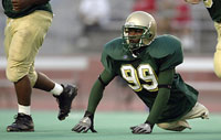
Today, I stumbled across the work of Thomas E. Witte, in a brilliant article over on Sports Shooter. Witte managed to snap a couple of photos that turned out to be pure gold dust: A high school football player who doesn’t have any feet. The photos netted him $12K.

What makes me wonder, though: Could it be argued that the photographers have an obligation to their subjects directly? Should Witte give the football player some of the money he earned in this case? Or does the opposite apply — like for photographers who cover conflict zones — that if you get involved, you are immediately unable to do your job properly? 


It could be argued, of course, that the photos of Bobby Martin – the football player in the photos – are exploitative. After all, the only thing he is doing is what he loves: To play Football. In the grand scheme of things, Martin is probably unlikely to make any money of his passion: The big bucks are in the NFL, but a legless NFL player is probably not going to happen in our time. The alternative is the Paralympics, which is at least partially sponsorship-driven, and has made stars of a few games (like Wheelchair Rugby, as shown in the highly recommended film Murderball).

So, as fellow photographers, how should we feel? Personally, I am torn. On one hand, I want to say “Good work, Witte, for creating a motivational icon of Bobby Martin”, I mean, hell – there aren’t a lot of people who would have the guts to face the big burly opponents on the football pitch if you’re half their size, and especially if you lack legs. Without Witte’s work, chances of anyone finding out about Martin are slim. By showing his strength to the world, Witte’s photos could be a motivation to a generation of less-abled people.

On the other hand, I’m tempted to say “jeez, Witte, this is just a bit harsh. You’ve made a lot more money out of these photos than you expected. How about you split the cash with Martin? Keep $6K for yourself, and give $6K to him. It’s only polite.”

And finally, the cynic and paparazzi photographer in me goes, “Sod it, it’s a white-hot photo, and you deserve every penny you can get. What happens to a photo after you’ve taken it isn’t your problem, congrats on making a nice pile of cash out of it”.

Do photographers have a responsibility to their subjects?

View Results

How do you feel about these photos? Do photographers have a responsibility to their subject? Vote above, and let me know your opinions in the comments, below!

The photo in this article is a thumbnail taken from the Sports Shooter website, used under UK Fair Dealing law. The photograph is © Thomas E. Witte. To see the full version and more photos by the same photographer, please check out the source article


Do you enjoy a smattering of random photography links? Well, squire, I welcome thee to join me on Twitter -

© Kamps Consulting Ltd. This article is licenced for use on Pixiq only. Please do not reproduce wholly or in part without a license. More info.

Digital SLRs drop under £300

picture-2.jpg

A couple of weeks ago, I discovered that my trusty Canon Digital Elph S500 had gone walkies. “What?” I hear you ask, “Isn’t this guy supposed to be a proper photographer? What the hell is he doing with a compact camera?”. The answer to that, really, is quite simple: I often find myself in situations where carrying a full-size camera around would be uncomfortable, unnecessary, or even downright dangerous. As such, I decided to buy the then-top-of-the-line Canon compact camera.

Interestingly enough, in this round of research, I discovered that yes, if I wanted a shit-hot digital compact, I needed to shell out some serious dosh. I ended up paying (Yes! Paying! Obviously, the camera manufacturers haven’t noticed Photocritic well enough to send me free cameras yet. The scoundrels!) £300 for what is undoubtedly the best compact camera I’ve ever used: the 10 megapixel Canon Digital Ixus 900 Ti. It’s got lots of pixels, a battery that lasts and lasts, an amazing screen, and a body of titanium, so it can take the next few years of abuse.

Imagine my surprise, then, when I discovered on the T3 website that digital SLR packages have dropped to under £300!  


Okay, okay, I shan’t keep you in suspense any longer. The camera in question is the Pentax K110D – I haven’t seen any reviews of this camera, and I haven’t had a chance to play around with it myself, yet, but Pentax has a long history of being a sturdy brand, and it would certainly be worth taking a closer look before you decide to splash the extra money for another dSLR! Check it out on Amazon UK or Amazon USA!


Do you enjoy a smattering of random photography links? Well, squire, I welcome thee to join me on Twitter -

© Kamps Consulting Ltd. This article is licenced for use on Pixiq only. Please do not reproduce wholly or in part without a license. More info.

Case study: Selling your photos on-line

a-fotoviva-4.jpg

A lot of people take photos. No, seriously. A lot of people. But the number of people who actually do something with their photographs are an absolute minority. I decided to catch up with a friend of mine – Jason – to see how he turned his hobby into a multi-million, global sales success.

Okay, so I’m full of it: he barely even breaks even. But still – he’s found a cool way of trying to do something with his photos. And that’s worth taking a closer look at, methinks! 


a-fotoviva-2.jpgI’ve stumbled across Jason’s site, fotoviva, several times before I even got to know him. It goes to show that this global village of ours isn’t always as big as we think, I guess.

Jason is a web designer who’s an old-timer in the world of photography: He’s been taking photos for about 15 years, but always on a hobby basis. He’s a Nikon fan (Boo! Okay, just kidding), and shoots most of his photos with a modest D50. The results certainly make it worth it, however!

Occasionally, he takes photos that are so good that they deserve to be shared – but how? There are so many venues where you can show off or sell your photos, but Jason decided they weren’t good enough for him: Either they were a bit lacking, or they weren’t quite what he was looking for.

There are some great pieces of on-line gallery software out there, but they are limiting in that you can’t sell your work. The sales galleries? Well, they’re a bit crap too. So, being the ever-creative soul he is, Jason decided to just go ahead and start from scratch.

a-fotoviva-3.jpg“Basically”, he says, “I launched it as a site to try and sell my own pictures as canvas and poster prints 5 months ago. Then I realised that there are so many really good photographers out there, completely unknown, yet they have no idea about the internet or how to create a website to sell their work and earn some extra cash.”
So he opened up his website to other photographers as well. “When I find a photographer whose work I like”, Jason explains, “I ask them if they would like to try and sell some of their pictures using my site.”

It’s not exactly a new approach (it’s what I do over on 3Songs.org for concert photography, for example), but it’s a win-win situation. As Jason sees it: “This helps build up my site, and offers the other photographers an outlet to sell their prints”

I think Jason’s Foto Viva website is one of the more elegant photo gallery / sales solutions I’ve seen, so I thought I’d share it with you guys.

a-fotoviva-4.jpg

So, he’s got a successful website and is a pretty accomplished photographer. Surely, that means he’s had all his dreams come true? Not quite… “One day I would like to spend at least half my time taking photos”, he admits, “not only
in England but around the world, whilst continuing website and graphic design on a much reduced scale.”

Spoken like a true photographer, that is.


Do you enjoy a smattering of random photography links? Well, squire, I welcome thee to join me on Twitter -

© Kamps Consulting Ltd. This article is licenced for use on Pixiq only. Please do not reproduce wholly or in part without a license. More info.

Photographing for charities

charity.jpg

If you’re working as a photographer – and perhaps especially if you’re just starting out, in the hope that you can build up a bit of a portfolio – you are often asked to take on the strangest assignments. Some of them can be a lot of fun, while others… in the immortal words of Borat: Not so much.

I’ve done a fair bit of work which involves charities, and a few years back I noticed a new trend: They will want you to sign a contract as part of the photography work. You’ll want to read it carefully, because ‘charity’ isn’t automatically synonymous with ‘good people’: Some of their contracts will try and rob you of all your rights.  


My good friend and long-time Photocritic reader David W came across the same recently:

I friend of mine volunteered to take pictures of an event… But, to do so, she had to sign a contract saying that she would: A) Give the organization full ownership of the images (copyright, etc) B) Destroy all copies of the images, not keeping any for personal use

This seemed fairly odd to me… But, then, I do not know very much about what is to be expected when doing photography on a somewhat professional level.

Would you mind telling me a bit about what is to be expected in a professional contract?

To be fair, there are no real ‘rules’ for what a charity can and can’t ask you to sign, and as a photographer, the only rebuttal you have is to walk away from the job. I recently had a similar situation as well, where I was asked to sign what I was assured was a ‘standard contract’. The contract was drawn up for a major charity*, and demanded that I send them a DVD with all my photographs, and hand over all copyright to the charity.

In a way, I can understand that they want to do this: Having a stock library they can use for future promotional material is great. In addition to that, well, it is a charity, and as it is a charity I support, I would have been happy to give them a permanent licence to use the photos. But signing over my copyright? That’s less of a good idea.

So – what can you do?

The sad truth is that you don’t have a lot of things you can do if and when this happens to you.

You can choose not to sign the contract, and explain why you aren’t signing it. This might mean you don’t get a photo pass for the event, and if you’re covering the event for a magazine, you could run the risk of returning without images. You’d better have a damn good working relationship with your photo editor if you even consider doing this, because you could potentially put them in a lot of trouble.

You can choose not to sign the contract, and just hand it back. Hope nobody notices, and just go take the photos you wanted. It means that they have no legal power over you, but this is quite unlikely to work.

You can choose to swallow your pride (and breach what at least should be your principles), sign the contract, take the photos, and send them your images.

Of course, you could also try to sign the contract, take the photos, use the ones you need for the purpose you need them for, and then ‘lose’ the DVD where you stored the photos in the mail. If you’re particularly bastard-like here, you could just send them an empty envelope by recorded delivery, torn open, and claim that the DVD got lost in the mail, and that you’ve destroyed all other copies — as instructed.

Personally, I don’t think any of these are particularly good solutions. The thing is – I don’t think there are many organisations that do this who understand what they are doing, and why trying to steal your copyright is morally wrong. Which is ironic, because charities, especially, ought to be finely tuned-in to issues like this. The best solution, then, is to contact the people responsible for PR. Tell them that you are unhappy with the contract, because it is too restrictive on your use (at least, you’ll want portfolio use, but you should also be able to use the photos commercially if appropriate). You could offer them a counter proposal which would be to offer them a permanent licence to use the photos for PR and press use. This means that they can use it to promote events etc, but if they use it for marketing purposes (such as trying to get people to donate money), they’d have to come to you for an extended licence. At this point, you could choose to expand the licence for this use, or ask them for money.

My personal take on all of this is that, well, you give a little and you take a little: By being a little bit lenient with the charities when it comes to money, you’re helping them along. In the same way, you could expect them to do the same. Just make sure that you don’t sign away anything, or that you get tied to terms you are unhappy with: if it appears you run a risk of this happening, you should just walk away.

*) I do support this charity, and I believe that they just took dodgy advice from a law firm, and as such, I don’t think it’s in anybody’s interest to divulge their name in this article. Let’s just leave it at this: It’s an UK national charity which you will definitely have heard of, if you live in the UK.

You may also enjoy How much should I charge for a photo and Be careful what you sign.


Do you enjoy a smattering of random photography links? Well, squire, I welcome thee to join me on Twitter -

© Kamps Consulting Ltd. This article is licenced for use on Pixiq only. Please do not reproduce wholly or in part without a license. More info.

Learn photography step-by-step

instruct2.jpg

I think it’s pretty safe to say that I’ve got a new favourite website: instructables! It uses a flickr-style, very web 2.0 approach to doing ‘do it yourself’ guides: Hover-over-image items for descriptions of what you are looking at, and many of the instructables available guide you through projects baby-step by baby-step.

There are a lot of them available already, mostly for geek projects. Luckily, there are some wicked photography DIY projects as well – well worth a peek!  


instruct2.jpgSome of my favourite instructables include Photographing in the Ultraviolet spectrum, how to make a macro attachment for a digital compact, converting your Holga to a 35mm (more about holgas), a pretty good guide to creating QuickTime VR panoramas (although, if I were you, I’d use CleVR instead…), a superb guide to taking infra-red photos with your digital compact cameras, building a light tent.

There are also a few truly cheeky guides, such as how you can use a condom to water-proof your camera (it works, but most condoms are not fully translucent, so you’d struggle to get decent-quality photos with this technique)

instruct1.jpgThe instructable to introduction to band photography is decent as well, and well worth a look – but it’s not as good as Photocritic’s discussions of the same, obviously :-)

A quick search on instructables for ‘Photography’ comes up with 51 DIY guides of varying quality – great reading material for a lazy sunday morning!

(thanks, sam, for reminding me to do a post on Instructables! He wrote the condom-waterproof guide and the IR photo guide. Give it some love!)