Feature Articles

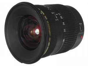
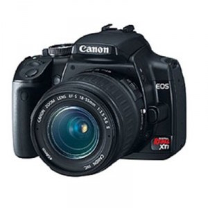
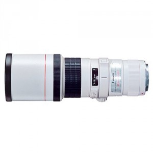
Front focus? Back focus?

Many of us trust our autofocus implicitly – because it’s just one less thing to worry about, really. But what when the lens starts to do weird stuff? My mate Chris over at DSLR Blog has the skinny…

If you auto-focus on an object the camera will attempt to fix the focus at the correct distance between the camera and the object.

Front focusing is when this calculation goes wrong and it focuses before the object, back focusing is where it incorrectly focuses behind the object. Either way what you achieve is a photograph where the focus is in the wrong place making your object blurred or soft.

Manually focusing still works but in effect something is wrong with either the lens or the camera.

Some more info, along with tips as to how you can test for these problems, in the Front and Back Focussing Explained article.

Coherency in photo exhibits

fomu

For a while now, I’ve been wanting to write a review of a photographic exhibition. I wasn’t especially concerned by which exhibition, more that I wanted to look at an exhibition holistically: as a collection of photographs that had been brought together with a specific aim or purpose. I wanted to consider what I thought worked, what didn’t, and what could be done better. Ultimately, I wanted to be able to say if I thought that the exhibition had achieved its aim, or if it had made me feel something.

When I was on holiday – exploring Flemish cathedrals and drinking Trappist beer – I spent an afternoon at the Antwerpen FotoMuseum, or FoMu. Amongst its other exhibitions, it was displaying a collection of photographs taken by Belgian photographers in the inter-war years.

The potential for the exhibition was sweeping. Its introduction said how: ‘…the period between the two world wars was a time of sweeping social changes. Developments in photography reflect this,’ as well as mentioning the ‘fierce conflict’ that arose between traditionalist and modernist photographers. I was looking forward to an exhibition of contrasts and of conflicts, a series of photographs that illustrated progress in photography and changes in society. I looked back on an exhibition that disappointed me and didn’t live up to its potential.

What I saw was an interesting selection of photographs – portraits and landscapes, street scenes and still lifes, abstracts and studies – that had been beautifully framed, some of which were unusual and some thought-provoking, but I felt as if there was nothing more to the exhibition than a group of pictures taken between 1918 and 1939. There was no sense of cohesion, no aim, no signal emotion aroused by the images. If there was an objective to the exhibition, I couldn’t tell you what it was, and in my case it certainly didn’t accomplish it.

Organisation

Perhaps the most obvious way to arrange the collection would have been chronologically, which would have charted the devastated landscape, shredded society, and ruptured economy of 1918 that rose, grew, and progressed through the 20s and 30s to women’s suffrage, the jazz age, and technological accomplishment, before collapsing into the abyss of the totalitarian invasion in 1939. But it wasn’t chronological. I wasn’t able to see social change and innovation depicted in a series of photographs.

It’s possible that a curator would prefer to move away from the obvious, perhaps instead exploring the photographs thematically. The vast range of pictures available could have been arranged according to any principle you might imagine, and within those principles it would have been so easy to compare the traditionalists with the modernists and enjoy the artistic conflict of the time. Portraits, landscapes, and still lifes; studies in light and shade, texture, and natural phenomena; contrasts of mundane and usual. Instead, I found myself looking at a pair of beautiful studies of light and shade – chess pieces in shade and a woman’s hand holding a coffee cup – that had been flanked inexplicably by a street scene and an uninspiring still life. A series of three nudes were hung between a picture of a child doing arithmetic and a woman rowing on a lake. Whatever feelings those nudes might have aroused were superbly stifled by the pictures adjacent to them.

Tucked around a corner, as the exhibition reached its close, were two beautiful abstract portraits: a pair of eyes and a hand resting on a book. How effective could it have been to pair these with more traditional portraits? A sort of compare and contrast exercise, if you like. Instead, I very nearly missed them. It was only because I took a second turn around the gallery that I found them. I’m sorry if someone else should have missed these gems.

The art of showing less

FoMu had an opportunity to present something beautiful here; something unusual and enlightening that displayed some searing pictures. Instead, I felt as if the exhibition curator was so overwhelmed by the possibilities to present the pictures that he flung them at the walls and hung them where they stuck. Rather than leave the exhibition feeling as if I’d enjoyed a journey through the Belgian photographic psyche, I felt a sense of discordance. I didn’t know what the angle of the exhibition was and I had no lever into it. All the same, I’m glad that I went, and there’s a picture of some piercing eyes that I’ll not forget in a hurry.

Pictures have a wonderful ability to inspire, be it awe, surprise, amusement, social enlightenment, even historical insight. Let them do that.

Photography in Belgium Between the Wars,

FotoMuseum.be / FotoMuseum, Waalse Kaai 47, 2000 Antwerpen, Belgium

The case for Pentax

For your first step into the world of digital photography, look beyond the two big brands for some creative features and competitive pricing!

When I recently posted my guide to choosing your first dSLR, I was ripped to shreds in the comments for overlooking Olympus and Pentax… Which is quite wrong of me: Pentax have long made some pretty awesome cameras, with features that Canon and Nikon haven’t had (like being able to remote control external strobes – a feature Canon has never had until the introduction of the Canon 7D!)

Someone who was particularly outraged is the most fabulous John Cavan, who wrote a passionate and well-articulated plea to stop ignoring Pentax – and he’s got a pretty damn good case, actually… here’s why:  

Canon, Nikon. Nikon, Canon. When most people think of buying a dSLR, that is often the debate that they wage with themselves. Of course, with the Sony purchase of Minolta, they may even now start to think of Sony in that debate. There is, however, another player on the market, a player that has been around for a very long time. In fact, they were once synonymous with SLR photography: Pentax.

Pentax is the first Japanese company to release a 35mm SLR in 1952 and, for quite a while, were the defacto standard for 35mm photography. The M42 screw mount, while not a Pentax invention, was made so prevalent by Pentax that it became known as the Pentax mount. In a sense, Pentax ushered in the age of SLR photography producing more cameras than all other manufacturers combined. So, what happened to them? They didn’t fall off the 35mm radar, even as they lost ground to names like Nikon and Canon, Pentax continued to innovate, but they were the last to move from the limited capability of the M42 mount and, to some degree, that probably hurt them the most.

However, Pentax didn’t go away. They continued to produce excellent cameras, including the classic K1000, first created in 1976 as a basic SLR, it managed to outlive all of its brethren and almost all successors because of its elegance and simplicity, finally hitting end of life in 1997. In 2003, Pentax entered the digital age and didn’t stop their innovation. By this time, however, the Canon/Nikon duopoly was pretty complete. A tough nut to crack, no?


Pentax is trying to crack that nut, so I’m going to talk about Pentax as it started getting serious about dSLR photography with the arrival of the K100D, K110D, and the K10D. The first two were the entry level dSLRs and the last was aimed at the prosumer. As with all of their cameras, Pentax focussed on certain key areas: backwards compatibility and the photographic experience. These are factors that continue to be key to Pentax since the introduction of these cameras, so let’s talk about them.

Backwards compatibility is a funny statement with digital, but it is applicable because it means that over 50 years of high grade optics are still available to you. Many of us Pentaxians have in our kits lenses that the modern dSLR owner wouldn’t even think of, wouldn’t even be aware of. We don’t have these lenses because there aren’t modern options for Pentax, because we have those too, but because they present optical quality as good as any current lens and at a price that you can’t hope to beat brand new. To give you an example, I own a Vivitar Series 1 100mm f/2.8 Macro manufactured by Kiron. This lens is widely regarded as one of the best, if not the best, macro lens ever produced and it’s nearly 40 years old. I paid $160 (Canadian) for it. To compare, a Canon EF 100mm f/2.8 Macro lens currently retails for $730 or $1249 with image stabilization.

Another backwards compatibility feature, which makes my last comment even more interesting, is Pentax image stabilization (or anti-shake) is in the body of the camera. There are certainly advantages to IS on the lens, such as IS in the viewfinder, but the single biggest advantage to it on the body is that every single lens I attach to my Pentax, regardless of age, can be stabilized. Of the major dSLR manufacturers, only Sony can say that, and they don’t have the lens history of Pentax. There’s another advantage: price. You can see that above, IS adds $500 to the price for what is otherwise the same lens.

For your first step into the world of digital photography, look beyond the two big brands for some creative features and competitive pricing!

For your first step into the world of digital photography, look beyond the two big brands for some creative features and competitive pricing!

Now, of course, Pentax isn’t just leaving us in the world of historical lenses, scouring eBay and Craigslist so that we can take pictures. They do have a very good line-up of modern lenses with zooms and primes, wide to telephoto including what many, such as DP Review, call highly desirable limited lenses. It isn’t just Pentax, we also have Sigma, Tamron, and others producing good optics for a good price. So, with Pentax, you can pull from the old (even ancient, M42 can be adapted to the modern bayonet mount) and the new. Heck, with an adapter, you can even put a monstrous medium format lens on it! I know a local photographer that uses his Pentax 67 lenses on his K20D all the time.

Alright, I think I’ve established that Pentax is good at keeping the old available to the new, but I also mentioned the photographic experience. Most modern dSRLs offer what I would call point-and-shoot features and, to some degree, that is a wise choice. Pentax took a different approach, aiming their line at people looking to have the pleasure of the 35mm film experience in a digital package. So, instead of scene modes on the dial, they added things like hyper-program (a way to quickly switch between aperture and shutter priority modes), sensitivity priority (control ISO with the rear dial), and shutter/aperture priority (camera sets ISO based on shutter and aperture). Other ideas, such as the “green” button near the shutter release that quickly resets the exposure, even in manual, giving you a good starting point for creative adjustment. They also have the RAW+jpeg button that will easily give you both formats for the next shot, a feature that just made it to Canon now.

So, where is Pentax today? Well, they have a line up modern dSLRs that have continuously received top reviews time and again. In the entry market, we have the K200D, K-m and the K-x cameras. The K-x is the newest and is something worth talking about, so much so that Photography blog gave it a rare “essential” rating. At the higher end, we have the K20D and the K7, both very highly regarded. The K7 was recently compared to the latest Canon prosumer (the 7D) on DP Review and came out very close, but also costs quite a bit less. I’m not going to go into detailed features for them, this is widely covered on the Internet, but I will note that the prosumer versions of the Pentax line offer a number of features that are usually only seen in substantially more expensive cameras. Where Pentax lacks is at the truly pro end of the spectrum, something they hope to rectify with a medium format digital in the new year. Mind you, that’s probably more than most of us would wish to handle if we’re not doing commercial photography.

In any case, I’m not writing to convince you to buy Pentax (it means more great lenses for me on Craigslist if you don’t), but to consider it. Canon, Nikon, and Sony all produce excellent cameras as well. I don’t think you, as the consumer, are going to be left feeling cheated with any of them. My only advice would be to get your hands on to the cameras and try them, all of them. The feel, the weight, and the placement of the controls are all going to be factors that should influence you as much as anything and that you can only get by putting it into your hands with a decent lens. If you do that, in a good photography store that lets you, then I think you’ll find that Pentax is as good as any of them and perhaps, now, the debate you wage won’t just be Canon, Nikon or Nikon, Canon.

About John

John is a software architect that just happens to be an avid amateur photographer. He did a lot of 35mm film (used Yashica and Pentax) in college as the editor of the newspaper, but then kind of let it slide for years after that because he could never be bothered to develop the film. Ultimately, he got back into photography with the Pentax K10D and then it just went from there. Check out his website, too!


Do you enjoy a smattering of random photography links? Well, squire, I welcome thee to join me on Twitter -

© Kamps Consulting Ltd. This article is licenced for use on Pixiq only. Please do not reproduce wholly or in part without a license. More info.

Computers for Photographers

new-macbook

If you’ve dabbled in computing much, you’ve probably come across Moore’s law – basically; as Wikipedia so succinctly puts it, “Since the invention of the integrated circuit in 1958, the number of transistors that can be placed inexpensively on an integrated circuit has increased exponentially, doubling approximately every two years”

All good and dandy, but recently something funny has happened – people seem to simply not need faster computers anymore. This is relevant to photographers, because there’s a parallel between computing and photography: Just like you eventually don’t need more megapixels in a camera (one group has gone as far as saying that 6mpx is all you need, and – with a few notable exceptions, I think I am inclined to agree), you eventually have all the speed you need from a computer.  


This one became clear to me when I started looking into replacing my now-3-year-old MacBook. It’s a black one, with a dual-core 2Ghz processor. It started its life as a 1GB/120GB configuration, but I since upgraded it to 4GB/250GB (an upgrade you can do today for about £70/$100). You know what’s odd? If you look at the current-spec 13-inch unibody MacBook Pro, it’s got essentially the same spec: 2.26 Ghz / 2GB / 160GB… I think Apple have realised what the rest of the world realised, too: Computers are finally Good Enough.

new-macbookSure, there are always groups of people who will perennially have an insatiable hunger for more processor cores, more memory, and more storage space; serious gamers, video editors, and scientists spring to mind – but even for the power-users (I do count myself as one), we’re starting to hit a plateau where it’s perfectly okay to own a 3-year-old computer. Which just messes with my brain; when I first started getting into computers, the second you bought one, it was out of date. I remember the first time I plonked down a serious amount of money on a new computer (before then, I’d always had hand-me-downs or I’d bought second-hand computers) – it was a Dell, which had a Pentium III, 600 Mhz. I’m telling you, it was the cream-of-the-crop, one of the fastest computers you could buy. It had a whopping 1GB of memory, too, which was insanely expensive, and made it incredibly fast indeed. Six months later, I found myself upgrading several of its components, and six months after that, again. And again. And again.

So I’m no longer a serious gamer (or indeed, a gamer at all – I moved to the place where I live now, about four months ago, and my poor Xbox has never been out of its box), but I am a pretty serious photographer. I run the CS3 suite by Adobe, and I take all my photographs in RAW format. It’s not that long ago that editing RAW photos was a huge chore which would take bloody ages, but with 4GB of memory (which is a trivial upgrade, both in DIY-skills and in monetary investment) is of huge help.

The thing that dawned on me the other day is that no, you no longer need the cutting edge of computer equipment to play with the big boys: while I love the design of the new MacBook Pros, i’d be spending the best part of a grand without actually upgrading my kit all that much: I’d still have to buy extra RAM and harddrive space to make the computer faster than the one I’ve got now.

So what do you recommend

I guess what I’m trying to say is that we’re in a very good place for photographers when it comes to computers: You don’t need a new, or even a fast computer to be able to edit your photos at a professional level – and the longer this plateau stays around, the cheaper computers are going to get. Which, again, is good news.

Of course, the real reason I wrote this rambly-rant of a blog post is so I have something to point people to when they ask what kind of computer they need to buy to be able to edit their photos properly; my answer is simple: Even the cheapest Dell computer will do the trick: Right now, you can pick up a Dell Inspiron with a 2.6 GHz dual-core processor, 3GB of memory, a 20-inch widescreen monitor, 320 Gb harddrive, optical mouse and built-in card-readers for under 375 quid. That, ladies and gentlemen, is a lot of computer for not-a-lot of money.

Specifically, however, I’d recommend you make sure you have enough memory (2GB should be enough, 4GB is plenty), and a screen which you like to work on – bigger is better, I’d recommend 19-inch or bigger. An optical mouse makes precision-work a little easier (I know a lot of photographers who buy expensive gaming mice for increased precision, but I think that’s probably a bit overkill), and beyond that, a copy of Photoshop (which will cost about the same as the computer outlined above, but is a must-have for anyone who is serious about photography), and you’re done.

So Haje, what is your set-up, then?

Thought you’d never ask. I use a MacBook 2Ghz / 4GB / 250GB hooked up to a Samsung 23-inch monitor and a Logitech LX710 wireless keyboard and mouse. Not technically part of the computer set-up is a set of nice studio monitor speakers and a Pioneer amp to play tunes – but I can’t work without music (right this very second, for example, I’m listening to a spot of Gatas Parlament, a Norwegian hip-hop group – if you want to take your aural stalking to a higher level, look me up on Last.fm), so the music bit of all of this is completely essential.

But ultimately, personally, I’d be perfectly happy with any laptop with an Apple logo on it, manufactured in the past 3-4 years or so.


Do you enjoy a smattering of random photography links? Well, squire, I welcome thee to join me on Twitter -

© Kamps Consulting Ltd. This article is licenced for use on Pixiq only. Please do not reproduce wholly or in part without a license. More info.

Nude self portraiture

pregnant-main

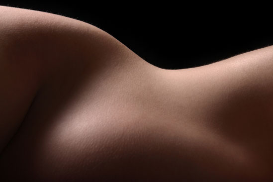
Taking photos of yourself has a certain under-tone of intimacy about it at the very least; but choosing to shed your clothes and do the same thing adds a whole new dimension to the experience.

One of my long-time readers, Brigitte, told me her approach to nude photography; She doesn’t share her photos with anyone, but decided to take them for her own sake. It made me think; I know that my blog is quite strongly in favour in sharing all your photos with the whole world, but perhaps that misses a little bit of the point; Who are we, in fact taking photos for? Anyway – that’s a topic for another post… Today, it’s Brigitte’s turn… 


Nude in front of (and behind) the lens

A few days ago I was reading articles on nude photography… and these took me down memory lane. When I was pregnant for the second time, I used to take a thorough look at myself everyday in the mirror and marvel at the way my body had changed. There is an immense softness in a pregnant woman’s curves which I find very appealing, and I knew from my first pregnancy that once the baby is born, it’s easy to forget the way you looked before.

This time, I very much wanted to be able to remember my whole life the way my body was right before I gave birth. Of course, I had lots of pictures taken by my family and friends, but it felt like cheating, by hiding some of the curves while emphasizing others. Most were not very becoming, either… these pictures were taken on the fly, showing me in whatever position I had deemed comfortable at the time, and I felt it was really unfair. To be totally honest, I’m pretty sure I’ve torn and thrown away the vast majority of these!

pregnant-main

Trusting others vs trusting yourself

I know lots of people can undress in front of a photographer they trust (Demi Moore, to name but one!), but I simply felt I could never do that, underwear or not, nine months pregnant or not. I did not trust anybody else’s look but mine on my body to take these pictures, not even my husband’s (OK, he’s a poor photographer anyway!), and I realized I would have to be both the photographer and the model.

pregnant-2I selected a plain white wall with a wooden door as the background for my pictures, no direct sunlight but no artificial light either, and set-up my Canon EOS 20D on a tripod. I made the necessary adjustments in terms of sensibility and focus, selected the B&W mode, and used the self-timer to take the pictures. Between each shot I practiced in front of a full length mirror… I wanted to be able to share these pictures with my children when they grow up, so I was determined to be as beautiful as possible (of course!), and if sensuality was permitted, I did not want these pictures to turn out erotic.

And that’s the best part. I know I may sound like a control freak, but I was the one who wanted these pictures, and I greatly appreciate the fact that I got to do them myself, without being subjected to anyone’s influence. In the end, all the decisions were mine, and if I had not liked the result, I could just have discarded all the pictures without any hesitations, regrets, or fear to offend the photographer.

Find out more!

Brigitte is a 34-year-old French lady who works as a translator and editor. You can find Brigitte’s blog on tequilas-secrets.com, with her photos in the, er, photos category. If you’re of the Twittering kind, she can be found on @Brigitte_Ba, as well.

The photos in this post are from iStockPhoto


Do you enjoy a smattering of random photography links? Well, squire, I welcome thee to join me on Twitter -

© Kamps Consulting Ltd. This article is licenced for use on Pixiq only. Please do not reproduce wholly or in part without a license. More info.

Publishing your own photo book

finis

A while ago, I was talking with my good friend Randy Kruzan, who told me he had self-published a book – or, as he likes to put it – how he made the transition from “being a fool with a camera to being a fool with a book”.

There’s a lot of things that go into creating your own book (I should know, I’ve helped friends and clients self-publish things in the past, and I’ve been published with my own stuff) – but the interesting thing is that a lot of the things that take time aren’t the things you’d think…

I managed to talk Randy into writing a guest article for me here on Photocritic, explaining how his book came about, and what you should do if you want your photos to end up as a coffee-table book yourself.

The beginning

I was in a rut. No, that’s too cliche. I was between myself… yeah, that’s pretty accurate. My creative needs were being stifled by day-to-day work as a software engineer. On top of that, I was doing more of the same freelancing and, I have to tell you, there’s only so much left brain activity I can take. My right brain was screaming “There must be something more!” and there was. Is? Whatever.

Dave Browne, a friend of mine, former co-worker and fellow photographer, recently came back from an 18 month trip around the world. Upon his return we started having coffee once a week when schedules permitted. It would be melodramatic to say this changed my life, but it definitely put things in perspective. Call it a shove in the right direction.

Discussing photography with him is always enlightening, more for me than he, I think. He told me he was working on a book that he was going to publish himself. I had been playing with the very same idea for months but never found the time nor motivation, until he brought his book the next time we met.

It was gorgeous! The photos were taken on his trip with a Diana (that’s a plastic camera you pay real camera prices for through Lomo). The paper and finish were top notch, the design and layout were complimentary and it truly equalled traditionally published books.
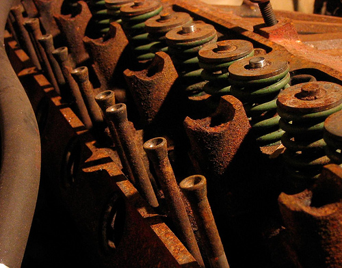
Cylinder Head
Cylinder Head by Randy Kruzan on Flickr

That was enough motivation, on the way home that night I decided to stop stalling. First I had to wrap up open freelance projects and stop taking more. Then I could get to work on my book. A couple of weeks later I was free(er).

After seeing Dave’s book, I realized mine could be better than I had been thinking about. Knowing I would never be good enough for myself (too critical), I asked him if he would help out with my book. He agreed and now I had an editor as well as someone to handle design and guide me through layout.

The middle

My theme was to be loss and abandonment, things left behind. I had several dozen photos fitting this theme taken over the last 4 years. Some black and white, some color and taken with two different cameras. Geographically they were split between Washington State and Illinois. Overall a nice smattering of styles, composition and colors.

I wanted a landscape oriented book with full bleed, so I cleared out any photos in portrait orientation. Next to go were any with focus or other technical problems. Eventually it filtered down to 32 photos. Now I could send them to Dave and get the editing and layout process underway. This is where it really pays to have someone you can collaborate with. Another eye, unbiased and critical, is invaluable.

We whittled those 32 photos down further. Some were just too bland, too flat. Others were great pictures but against the bulk of the remaining lot, didn’t fit anymore. Here I learned another lesson, to be flexible, to change direction if that’s where the photos are leading you.

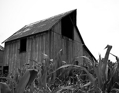
In my case, the theme of abandonment and loss had transformed into something a little different. The majority of photos I started out with were structures that were either abandoned or left to fall apart, but this didn’t stand out right away until we started cutting shots. The stack I was left with wasn’t saying loss any longer, it was saying something about persistence in the face of ruin. Yeah, these things were left alone or abandoned or simply neglected, but looking at them I could see that they were also surviving.
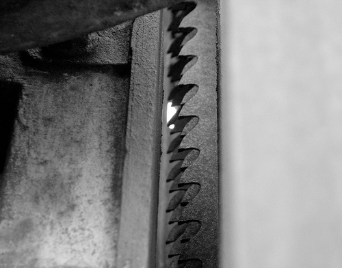
Mill Series no.6
Mill Series #6 by Randy Kruzan on Flickr

By the end of a few rounds of this, I was down to less than 14 pictures. With a revised theme in mind and to add more bulk (you’ll see why that’s funny later), I set out to shoot some new photos, and reshoot some I had liked originally but rejected for technical reasons. While I did this, Dave began working on my layout and design. Out of another 50 or so new pics, 12 made my first cut. 7 were finally selected and sent to Dave, who approved. My count was now up to 21 and he had picked one for the cover. It wasn’t the one I had picked but after the title was added, I capitulated. It looked right. Dave is always right, ask him.

The end

All that was left was for me to write up the copy for my title and copyright page and an introduction, then it was up to him to tie it all together. We were almost done.

Almost. (Since you’ve already been reading this in a little voice in your head, go ahead and insert snickering laughter here)

In the last few weeks before we finished, I waffled on the title. Nothing I was coming up with fit, and every change meant a revision to part of the intro. If that wasn’t bad enough, I had second thoughts about some of the images. I wanted to pull some, add others. I realized I was still fighting for the old theme and kept trying to find ways to work that in somehow. That realization (and Dave telling me to leave it alone) was enough to get me over the last little hurdle and just give in to it. The final book is about things at the end of their useful lives, their defiance in the face of decomposition and neglect. I chose “finis” which is the temporal end. I subtitled it “Exploring the end”, revised my into copy and we were done.

He delivered, unintentionally, the final assets on my birthday and two days later my book was in manufacture. I used the same company he did, Viovio, since I had already seen the quality first hand. Nine days later I had the first print in my hands, and I have to say, I love it. With 21 images and the copy pages, it only comes to 12 paper pages! I laughed out loud when I opened the box and saw that. It didn’t occur to me during production that I was only going to have a 12 page book. It doesn’t matter. Dave did a great job, I am really happy with the pics and I think it’s a neat little book. Literally.

That’s my story about how a fool with a camera became a fool with a book.

How to self-publish

Now let’s talk about self publishing. What it is, why you should do it and what you stand to gain.

The road to publication

We’re photographers. As photographers we speak to the world through images we share. It’s natural to want to share those with as wide an audience as we can, and often dream of having our work recognized. The road to recognition for most of us is long, and unfortunately, sparsely populated. Oh, and, that road ends in a cul-de-sac, which is really just a fancy dead end, albeit one with a turn around. For those of us on this road, our turn around is self publishing.
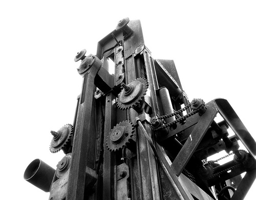
Mill Series no.5
Mill Series #5 by Randy Kruzan on Flickr

First, a little clarification. When I say self publish, I am not talking about the photo books you can have made at Shutterfly and similar services. For those, you pick a template, add pics and captions, pick your binding, and you’re done. Those are fine for keepsakes, and I’ve made them for birthdays and such, but they’re not the same caliber as an honest-to-goodness book.

What we’re talking about here is a product that when you’re done you can be proud of and looks professional.

So… What is self publishing?

Put simply, self publishing is paying to have your work published.

Traditionally, a publisher pays you to write or put together a book of your work. You get some portion of sales from the book and they handle the rest. Maybe it works out and you get another book deal and repeat the process.

When you publish your own work, you get to have all the fun. You pick the content. You come up with the design and layout, and edit it yourself. Promotions? Marketing? All you, baby! It can be a lot of work, and often is. Maybe it even SHOULD be! The sense of accomplishment and satisfaction of finally getting your first copy in hand after all of that work is worth it.

Will it make me famous?

Hmm. Stranger things have happened! Look at that guy Jared from the Subway commercials. At the very least, it can allow more people to enjoy your work and who knows what that can lead to.

Fine. Will it make me rich?

Probably not. I know that’s not what you want to hear, and I don’t want to crush any hopes you might have, it’s just not very likely. Like any other adventure, you’ll get out of it what you put in. You might make some money. For me, if I sell one copy more than I bought, I’ll be stoked. If I make enough money from self publishing books to buy a new prime or two, man, I’ll be on cloud nine.

Then why self publish?

Unless you already have a book deal, or are pursuing one and are extraordinarily lucky, incredibly persistent or some combination of those things, self publishing is the perfect way to share your work with the public NOW. Indeed, it may be the only way you’d ever get a book published, but that’s fine! You don’t need to be famous and your work doesn’t have to be well known to publish yourself. You might be a virtual nobody (case in point, myself), but a nobody with a book (dude, me again). If nothing else, it’s an exercise to see if you can do it.

Just remember… Always look on the bright side of life

I had this conversation with my friend and editor, Dave Browne, where I told him I didn’t have any illusions about doing this book. I don’t expect to become famous or land on some best seller’s list, but it would be nice to sell a few. He put it this way: “Buy two books. Keep one for yourself. If you sell two in a year, your demand will have outstripped supply!” Sure, it’s only two books, a minor detail, but your sales will have doubled in your first year.

Benefits of self-publishing

Do a little searching on the Internet for folks who self publish and you’ll find artists, authors, comic book artists and a whole host of others who have either had publishing contracts in the past or were pursuing them and were unhappy about how little control they had as new authors.

SP is a different world: yours.

You have complete creative control. What’s on the cover, how the book is laid out, what images and text go where, it’s all under your control.

You market or promote as much or as little as you want. Self publishing is perfect for photographers who run their own websites or blogs or have an online presence where they can advertise and promote their books.

You don’t have to hold inventory. Because self publishing is typically print on-demand, nobody actually holds your book in inventory.
You only pay manufacture on the copies you want to buy. If you want one copy of your book or twenty, you only pay manufacture on those copies. When someone else buys your book, they pay manufacture as part of the total cost.

You don’t have to handle sales and fulfillment. Unless you’re buying copies to hold onto and sell yourself, the printing company you’re using will handle taking money and shipping the books out to people who buy it.

You can make money on sales. Blurb is one company that allows you to set your own prices on your books at no extra charge. For companies that allow you to do this, there is a base rate (the price of manufacture) and you set your sale price, the difference between the two is yours.

You hold all the rights. The rights to your work are yours alone. Unless the company you’re dealing with has some clause to the contrary, you are the sole rights holder. If you find that’s not the case when shopping around, find someone else.

How to self publish

Or: ‘How I made self publishing made for you, without any guarantees that the same will work for you, but you could do a lot worse than starting here anyway’

Do you really want to do this? It might seem like a no-brainer, but it’s the first question you should ask yourself. There will be at least some monetary expense and of course the cost of your time. If you get a friend to help like I did, you should consider their time as well. Are they up for it? Start here. If you can’t commit, don’t start. Wait until you’re ready.

What’s it about? Do you want to tell a story with your photos like a photo essay? Or is it many stories? Is it just a portfolio? Is there a common theme it should have? Is it mixed photo and text, for example, like a guide book? You can always change this as the project progresses, but you should start out with a solid idea and build on it.

Know your choices, know the requirements – Shop around the service you’re going to use (or for that matter, shop around FOR services if you haven’t yet, see below). Do they have a product that matches your ideal book size and layout? What, if any, are the minimum page count requirements? Do you have images big enough for that size book? (I’ve included a link to a pixel to print size calculator at the end)

If you’re not using a service-provided tool (Blurb has an excellent book builder) then chances are high your final work will need to be a PDF, and any fonts you use will need to be embedded in the PDF. Check their publishing guidelines and know what you need to conform to in your final layout.

Will it bleed? – This is another point to consider before you actually start gathering up your prospects. If you’re going to do a full bleed book, where the image runs to the edges of the page without a border, then it’s probably best to choose photos that are all of the same orientation. No-bleed pages, or even multiple images per page, is less restrictive.

Gather, review, cull, repeat – Find all of the photos you think might work for your book. Digital is the way to go here, if your pics aren’t digitized already they’re going to have to be for printing, so really just do this now. If you have a favorite photo app with a workflow you’re used to, great- go with it. If not, the simplest thing to do is just copy (not move) all of the prospective images to a folder called “My Awesome Book”. For each round of review, make a new folder and only copy those images that make the cut into it. It’s draconian but when you have to dig up something from an earlier revision, you’ll know where it is.

Review your choices. Do they match what your book is about? Are there technical flaws you don’t like (and don’t want to or can’t fix)? Do some just not feel right? You’re never destroying pictures by excluding them, you should be as critical as you want here.

When you’re done reviewing and have made your choices for the next round, open them all up so you can view them in a batch. How does it look? Are you short of meeting the minimum page count? Add if you need to.

Repeat this process until you feel you’re at that point where they’re all good, then sleep on it and review again once more. If it’s still OK, then you have your final set.

Copy editing – Write all of your copy in a simple text editor. You’re not going to format your text until you’re in the layout stage, so simple text works well. It makes it easier to work with.

Regardless of how much text your book has, it’s a good idea to have it copy edited. Even if it’s simply asking your most grammatically advanced friend to review it, get a second set of eyes on it. Proof read. Spell check. Grammar check. Send me a check. Ahh, gotcha ;)

Cover yourself – You can’t judge a book by it’s cover… yeah, yeah, yeah, we do it anyway. Choose a legible font, no matter how cool the squiggly one you found looks. If your book is about puppies, don’t put a truck on it. Unless the puppies are stealing it. That would be awesome.

I prefer simple, but it’s your book. Choose a picture that represents the book.

Final touches – If the publishing service you went with doesn’t automatically build the copyright and title pages, spend a little time to see how those are laid out. I like to mirror the copy (font, placements and sizes) from the cover on the title page. Then the copy page, then the intro. Spend some time getting it right, good fit and finish is one of the things that sets a good self published book apart from the rest.

Layout and conversion – All of the SP services have different guides, sizes and requirements. This is why you should figure out ahead of time what the print guidelines are. Decent services will provide you templates to assist in the layout. In Design or similar publishing and layout software experience pays off here, my friends.

If you need to treat your copy in fancy ways, do it in this stage. Fonts, colors, leading, etc.

Most of the services I looked at all accept PDFs of at least the inner contents and a separate PDF for the cover. Fonts usually have to be embedded in the PDF. Viovio lets you do one PDF for the front cover and another for the back. If you’re not using tools (or using a SP service that doesn’t have tools) then PDF is the only way to go. Again, and I can’t stress this enough, follow their guidelines and requirements.

A simpler alternative – Layout can suck. It can be confusing and a pain. If it’s not your cup of tea, find a SP service that has a book builder tool. As of this writing, both Viovio and Blurb have such a tool available. These tools give you varying degrees of control over colors, styles, fonts, picture layouts and so on and so forth. If you’re going it alone and don’t have In Design skills, this may be your best bet. Don’t fear it. Embrace it.

And finally a word on rights – To nutshell it: If it’s not yours, don’t print it.

You must own or hold the rights to everything you publish in your book, or get written or other specified permission from the rights holder in order to use their materials. There are all kinds of details and legalities surrounding this, but that’s the high level and if you’re in doubt, don’t use it.

Not all publishers are equal
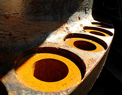
Orange HolesWhen you’re shopping for a publisher keep these things in mind: size, cost, quality and the ability sell your book.

Product types – Do they have a book that matches your desired size and layout (portrait, landscape or square)? It’s also a good idea to look at the minimum page requirements. For some products you simply might not meet the final page count.

Costs and fees – How much are they charging you for your book size? Is it comparable to other publishers? What about retailing fees- are there any? Viovio, for example, will only let you set your own price and collect money on sales of your book if you pay for a $35/year membership. Other companies might not charge a fee, but may be limiting in some other factor like available sizes.

Print and paper quality – Before you settle on a publisher, be sure to read reviews from people who have used them. Solicit opinions from friends and colleagues. It’s also a good idea, if you can afford it, to print a sample book from a company you’re considering. It doesn’t have to be fancy, the idea is just to get it in your hands where you can judge the print and paper quality yourself.

Retailing – If your goal is to market your book and make money from sales, you should also look for the ability to retail your book through the publisher unless you’re planning on buying inventory to hold and sell yourself.

Popular doesn’t always mean great – Read reviews from other SP authors on the services you’re considering using. How do people feel about the final result? Was their system easy to use and navigate? Were there gotchas along the way?

To ISBN or not to ISBN, that is the question…

ISBN stands for International Standard Book Number. It’s a 10 or 13 digit code that uniquely identifies your book from every other book in the world. This is supposed to make cataloging easier or faster or some such thing.

Amazon’s CreateSpace is one of the SP services that will assign your book an ISBN if you don’t have one already, because your book will be sold through amazon.com.
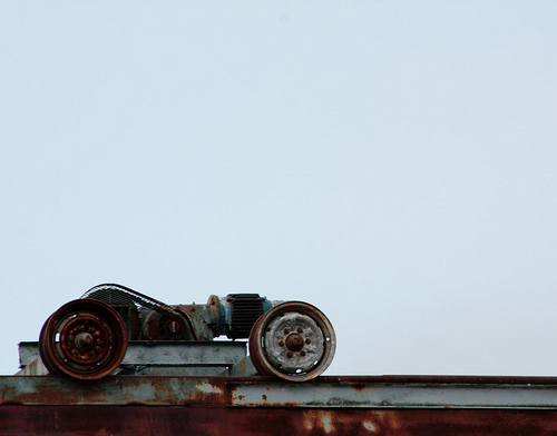
Dead Lift
Dead Lift by Randy Kruzan on Flickr (and also the cover of his book; ‘Finis’)

If you’re not planning on selling your SP book through a wholesaler, bookstore or other retailer, you probably don’t need an ISBN at this time. If you are contacted by a publisher who wants to publish and distribute your book, they will handle ISBN assignment at that point because part of the ISBN is the publisher code.

Get help, man – If you’re serious about self publishing your work and don’t have the skills (or the discipline) to manage the creation of your book, and don’t know someone who does, you’re in luck. Sort of. You just have to pay for it.

Some companies, like Blurb and BookSurge, offer professional help with editing, layout, design and/or final preflight. You can even buy a professional review for your book.

Making it better through collaboration – I honestly believe that my own book would not be half what it turned out to be if it weren’t for my friend who handled editing duties. Obviously if I felt he wasn’t up to the task I wouldn’t have asked him, so keep that in mind if you approach your friends or colleagues.

Once you’ve acquired help, figure out who is doing what. Better yet, you should have an idea of what you need help with before you go asking. If they’re only agreeing to do cover design, for example, you might not want to push book layout on them as well. If they’ve agreed to copy edit, let them. Don’t assign work and take it away.

Keep it fun, and be open to criticism and feedback. It is your book, but if you’re asking advice, at least hear it with an open mind.

Getting them to commit to your project is just as important as you making sure you respect their time and effort. You both have to be on the same page. (Booooooo, bad pun, I know)

Closing – The subject of self publishing could really be turned into a book itself, and I hope that I’ve been helpful here in this space sharing my own SP story and giving some information and advice.

Thanks very much to Haje for the invitation to guest write on Photocritic.org, it was a much needed break from the 140 character world of twitter.

About the author

Randy Kruzan is a photographer and author well disguised as a software engineer. He lives near Seabeck, Washington with his awesome family. Tweet him up @randykruzan on twitter or on the Internet at randykruzan.com

Randy Kruzan’s book can be purchased from Viovio

More resources

Publishing and print on-demand services

Blurb – blurb.com

Viovio – viovio.com

Other resources

Amazon’s self publish and print on demand – createspace.com

Amazon’s assisted publishing – booksurge.com

Pixel to print size calculator at ScanTips.com – scantips.com/calc.html


Do you enjoy a smattering of random photography links? Well, squire, I welcome thee to join me on Twitter -

© Kamps Consulting Ltd. This article is licenced for use on Pixiq only. Please do not reproduce wholly or in part without a license. More info.

The best camera is one you actually use

blurry-haje

Those of you who are following @photocritic on Twitter (or, in fact, if you were paying attention to the RSS feed), can’t have failed to notice that I was out on the road. If you’re making a particularly good job of stalking me, you’ll also have noted a load of photos posted to my Flickr stream, most of which were taken with my iPhone, and some of ‘em were taken with my little Canon Digital Ixus camera.

Yes, that’s right, I was out globetrotting – on a motorcycle, to be precise. Due to the extremely limited space I had available to me, I didn’t bring my full assortment of lenses with me. In fact, I only brought a single lens; My mighty fine Canon 50mm f/1.4 prime lens (I know I keep banging on about it, but you need a prime lens). Then, as I was traveling around, something very, very interesting happened; I didn’t use my SLR camera at all.  


What? No SLR?! You call yourself a photographer?!

I know, it surprised me, too; I brought my little Canon digital IXUS camera with me as a back-up camera, in case something happened with my big camera. And in case I was planning on going out drinking, in which case I consider the IXUS to be as close to you get as a disposable digital camera (have you noticed that you never lose anything you don’t really worry about losing, and always lose or drop your expensive stuff? Exactly…)

So anyway, I was riding along, and the first 1,500 miles, it was raining, and I had my Canon EOS 450D in the top box of my motorcycle. Which means that in order to actually get to it, I would have to:

  • Spot something awesome
  • Get on the brakes, nearly causing an accident with the car driving behind me
  • Park the bike
  • Put the bike on its side-stand
  • Take the key out of the ignition
  • Unlock and open the back box
  • Take the camera out of the back-box
  • Take off my gloves and helmet (can’t use the SLR with my helmet on)
  • Point the camera, take the photo
  • Put the camera back in the back-box
  • Close and lock the back-box
  • Get back on the bike
  • Start the bike
  • Ride off into the sunset

By comparison, taking pictures with my Digital Ixus was much easier; I was less worried about it getting wet, so I just carried it in the inside pocket of my leather motorcycle jacket. That means it’s protected from the rain by my outter rain layer and the jacket itself. As it turned out, this was more than a-plenty: The camera came out perfectly dry every time. Because of this, it was a lot easier to take photos:

  • Spot something awesome
  • Get on the brakes, still nearly getting myself killed because cage-drivers never pay attention, and because my motorcycle brakes are an order of magnitude better than any car brakes
  • Find somewhere safe to stop, and hold the bike upright with my thighs
  • Reach in my inner pocket
  • Point the camera, take the photo
  • Put camera back in inner pocket
  • Ride off into the sunset

All about the opportunism and impulsivity

Now, the fact that I was able to stop on a whim, fish out a camera without having to stop the motorcycle’s engine, without having to lock and unlock the suitcase strapped to the back of the bike, and without having to take my gloves and helmet off, meant that I started the trip taking photos with the Ixus…

… And then never stopped. Sure, at one point (after it stopped raining, of course) I moved the 450D into the tank bag, so it would be easily accessible, but even then, the hassle of taking my helmet off (you’d be surprised: I have to take my gloves off, take my glasses off, then undo the buckle, pull it off of my head, put it somewhere safe so it doesn’t fall off. Then when I want to put it back on, I have to put my ear-plugs (or headphones, if I’m in a music-kind-of-mood) back in, because they invariably get unsettled by taking my helmet off) seemed like too much of an obstacle to bother.

So, despite riding 3500 miles through some of the most amazing landscapes known to man (Seriously, if you’ve never been to Norway, I highly recommend riding or driving from Oslo to Bergen via the Hardangervidda road over the mountain pass, and then follow the coast around all the way to Kristiansand. You’ll be awestruck in the original sense of the word), I never really felt inclined to dig out my SLR camera. In fact, of all the things I brought with me in my (admittedly very limited-spaced) luggage, there were only three things I didn’t use: My long underwear (It never got cold enough to warrant putting them on), my Tyreweld kit (because I didn’t have any punctures) and my Canon EOS 450D.

Needless to say, when you’re on the road for 3 weeks, it gives you a lot of time to think. In the last week, I spent a lot of time wondering if perhaps I should dig out my SLR camera and try taking some photos. And yet, I never did. Which made me think; am I really so lazy that I’m willing to pass up the opportunity for some awesome photos, just because I can’t be arsed digging out a proper camera?

But… Why?!

Part of the reason, I think, is that this tour was never really meant to be a photo tour – if it were, I think I would have taken the time. This trip was meant to act as punctuation between my previous job (which I hated with the passion of an iberian street argument), and my my new job as a writer. But ultimately, I’m still a photographer at heart… So why?

Then it dawned on me; the very same argument for not being bothered to dig out a proper camera is the precise reason why the Apple iPhone is topping the lists for most uploaded photos on Flickr, and why camera phones are so incredibly popular: Phones, by their very nature, have to be very accessible: It’s no good having a telephone which needs to be locked out of a case, taken out of a protective pouch, and pampered into life before you can answer a call. It rings, you fish it out of your hand-bag or pocket, you answer it. This accessibility – and expectation of accessibility – is what makes camera phones such great photography tools; reaching for your mobile phone has become a well-trained movement, whereas most of us are more careful with our cameras. When going out on the lash for a night, you do bring your phone, but you might not bring a camera, for example.

I know I have been slightly schizophrenic in my reaction to camera phones; my hatred of their poor quality optics and results is stemmed by their accessibility (‘everyone’ has a mobile phone, and I defy you to find a mobile phone which doesn’t have a camera on it these days) and ubiquitous presence. Formally, and officially: Camera phones are a good thing. I’ll tell you why:

On this trip, I discovered that having a compact camera which I use is infinitely better than a SLR camera that I don’t use, even if the latter has has the potential for much better photos than the former.

The best camera you own is the one you actually end up using… and that’s worth keeping in mind when you pack for a trip, I think…


Do you enjoy a smattering of random photography links? Well, squire, I welcome thee to join me on Twitter -

© Kamps Consulting Ltd. This article is licenced for use on Pixiq only. Please do not reproduce wholly or in part without a license. More info.

Photographing dancers

dance-photography

A couple of months ago, I had to eat my pride after my first foray into dance photography went terribly awry.

Since, I’ve spoken to Laurie, who is a friend, Ruby on Rails coder, dancer, and fellow photographer, who offered to write me an article explaining how to get dance photography done The Right Way™. His top tip: Learning about dancing makes you a better dance photographer!


Take it away Laurie…

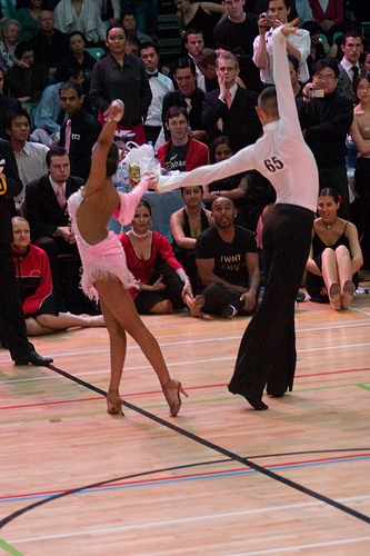
DancersBallroom dancing is the hardest photographic challenge I have personally come across. It seems everything is set up to make it hard, and nothing makes it easy. Everyone moves too fast, the lighting is horrible, and getting a spot to stand can be a challenge in itself. None the less, after years of working on it. I finally think I know enough to pass on some advice.

Photo on the right © Laurie Young – see it bigger on Laurie’s Flickr stream!

The first thing, as with any photographic trip is to know what you want to get. For me there are three different goals I can be thinking of. The first is to try and great stunning photos. The sort that i want to frame and maybe even sell as art. Secondly I want to document the dancing, including all the bits that don’t look so good, the mistakes and the moments in between the rehearsed lines. Surprisingly this is what most dancers are looking for when they ask to see my photos, as it helps them improve. Finally I want to capture the emotion of the day, the excitement and nerves before the competition, the release after coming off the floor, and the joy or disappointment that any competition brings. I’m not going to talk about this one today, as technically its similar to portraiture, and so off topic.

Like any demanding field of photography, the equipment you have really makes a difference. You are just not going to get really good photos with anything less than a semi-professional DSLR.

The biggest single leap I took was getting my hands on a camera with no shutter lag. If you are waiting between when you press the shutter and when it takes the photo, you have no chance of getting anything, dancing is ALL about timing, and so is dance photography. Hand in hand with this is a camera with fast autofocus. More than anything else you can spend your money on, no lag, and instant AF will improve your pictures.

Dancers

For the choice of lenses, I like to go for the extremes, either a telephoto, or a wide-angle. Standard lenses have little to no place in my kit bag. Having said that, I use the telephoto to pick out just one couple or dancer, and if the competition is in a small room, then this job is done best by a slightly longer than standard lens like 70mm.

Either way, the lighting is going to be low, so the fastest lens is going to pay dividends. Personally I use a Sigma HSM 70-200 f/2.8, and this seems to be the lens of choice among the other photographers. For wide angle I like about 20mm, which i use mainly for the Standard (ballroom) dances from right up close.

Photo on the right © Laurie Young – see it bigger on Laurie’s Flickr stream!

Flash is a good next addition to your kit. You are going to be taking a LOT of photos, so it needs to recharge really fast. In a dark room you are going to be dumping a lot of charge with each flash. I use a Metz Hotshoe Mounted gun, charged from a Quantum battery pack, and even then can easily go through 2-3 full charges of it in a day.

The last thing you need is memory cards. Lots. If your shooting an all day competition, you are probably looking at between 1000 and 5000 photos. At full quality thats a lot of GB, so stock up, or bring a laptop to download onto.

When I arrive at the competition the first thing I do is get a feel for the light levels. Competitions are held in lots of different venues, from community halls with lots of windows and ample natural light, to the Winter Gardens in Blackpool, a massive hall with quite dim lighting. If you are lucky there will be some spots of lights from down-lighters, or even follow spots, which can make for some great photos. Personally I prefer not needing to use flash, it is hard to avoid flash shadows, but its not always an option.

I tend to meter manually, taking some sample shots till I am happy with the ambient light, then setting the flash on auto, (use the most advanced form of auto your camera supports) which will generally do a nice fill in. Because the dancers are moving so fast, and because the background at competitions is typically horrible, a wide aperture and really fast shutter speed is the best. Autofocus should be on, but if your camera can’t focus fast enough, then pre-focus on a specific part of the floor, and only take photos when people dance on that spot.

Dancers in the DarkNext decide where to position yourself. My two favorite spots are on the balcony, looking down with a telephoto, or right on the edge of the floor, close enough to get hit by the girls dresses as they go past.

Photo on the left © Laurie Young – see it bigger on Laurie’s Flickr stream!

If you do this, be nice to the judges. They are competing for the same floor space, and often have to stand right in front of you to get their job done. It can often feel like part of the judge’s training is learning how to stand right in front of photographers, but I have been assured this is not true. Annoying as it is, its something you have to accept. If you are at the floor edge, then kneel down. Your camera should be at or below the dancers waist height. Otherwise you are going to foreshorten their legs, and no girl, and pretty much no dancing guy is going to be happy with that look. The lower the camera is the nicer the legs will look. Just don’t get so low you get accused of trying to take photos up the girls skirts!

Now its time to take photos. This is where your biggest problems are going to begin. At first it will feel like lots of random motion is going on, and you only ever see a good photo after you have missed the chance to capture it. To fix this, you need to learn more about dancing, and learn the individual couples routines. Here Latin and ballroom start to differ. Ballroom is all about motion, so still photos are always going to be difficult. Add that to the fact that each couple is effectively embracing each other for the whole dance, you will always get the back of one persons head.

Except in the “lines”, those moments when the dancers stay on the same part of the floor for a bar, and show how they can stretch, and create impressive shapes. Learn the routines. If you watch them for a lap or two of the floor you can start to see that they repeat the same steps each time. This lets you predict when such a line is about to happen.

In the Latin dances, there are lots of accents. Highlights in the music where the dances do something dynamic, powerful, or sudden. As you learn more about the music these become more predictable. In Cha Cha, its normally on count 1, in Rumba, its on 4. In Paso there are two specific highlights. Learn the music and you can tell when these accents are coming. If you have learnt the couples routines, you can know when they are about to go into a line, if not, assume they are going to do something that hits the accent. You will be surprised how often you are right.

You really have to listen to the music, and be as aware of it as the dancers are. Its the only way to get good photos of dancing.

Thank you!

Thank you, Laurie, for writing up your guide for us. If you liked Laurie’s writing, check out his website, and of course, give his Flickr stream some love, too.

Inspiration

As with so many other things in life, Flickr is great for inspiration for finding great dance photography. Plug in the name of the dance and search by most interesting, get a feel for what can be done!

Can’t be bothered searching yourself? Can’t blame you – here, let me help: Tango, Paso Doble, cha cha, Rumba, Salsa, Merengue

Other searches worth trying: Latin dance and dance, of course.


Do you enjoy a smattering of random photography links? Well, squire, I welcome thee to join me on Twitter -

© Kamps Consulting Ltd. This article is licenced for use on Pixiq only. Please do not reproduce wholly or in part without a license. More info.

When the media steals your photos

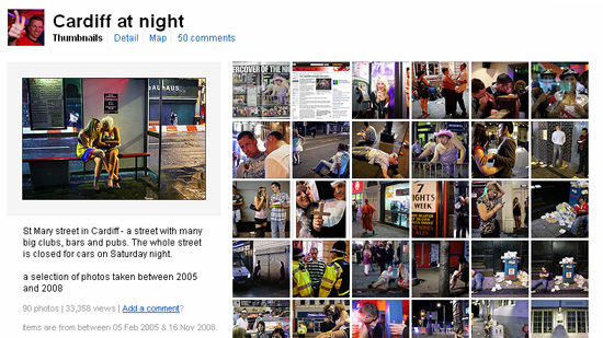
cardiff-at-night

The story of a photographer whose photos went astray – and got re-published by one of the UK’s biggest newspapers without permission

There’s something really difficult about looking after your copyright on the internet. Every single word I’ve ever typed in this blog, for example, is duplicated at least a couple of times around the web. The problem is that words are easy to find. Pictures, on the other hand, are a different tumbler of guppies… As Maciej Dakowicz found out, when his photographs suddenly surfaced on the Telegraph’s online edition… 


Photos going astray…

What had happened in this case is that someone found his rather awesome Flickr set called Cardiff at Night. Go look at it. Maciej is a brave, brave man for taking a Canon 5D out on the streets of Cardiff. It’s not the roughest city in the world, but, well, look at the photos; I did a photo project like this in Liverpool once, and people tried to mug me on several occasions. As for Maciej’s set, see Be Blessed, Night Calling, Cold Night and Police Car. In fact, look at the whole set, it’s a rather fine collection of night-time photography.

I’m digressing like a drunken prostitute in a snowstorm. Let me try to start that sentence again. What happened in this case is that someone found his rather awesome Flickr set, and posted it on an Hungarian site, probably with a title along the lines of ‘lol look at thz drnk english twats’, which would be largely incorrect, because the spelling hurts my eyes, and Cardiff is, in fact in Wales, so it’d be more fair to assume that the bulk of people in the photos are Welsh. I digress again.

cardiff-at-night
Facsimile of Maciej’s Cardiff at Night Flickr set. (screenshot used under Fair Dealing)

After suffering the injustice of having his photos nicked once, someone at the Telegraph came across the photos, hashed them into a photo gallery, and published them. A lot of people – myself included - were impressed by the photo gallery, and ended up linking to it via blogs, Twitter, etc.

I shan’t speculate as to what sort of procedures the Telegraph have for checking copyright and reimbursing the photographers involved, but it’s pretty safe to say that whoever they got permission from didn’t have authority to give such permission. Someone subsequently recognised some of Maciej’s photos, and notified him. Understandably, he was pretty damn pissed off, grabbed a screen-shot, and e-mailed the Telegraph.

The Telegraph apologised and took the gallery down, offered their ‘usual fee they pay for online galleries’, says Maciej, which comes to £125. Nice of them, and I guess they’re making some sort of effort to solve the situation. My personal opinion is that offering up £125 for having stolen a gallery of photos is an insult, and that Maciej should get in touch with a solicitor to get suitable compensation, but that’s not the point of this article.

The point is, however, that this could have happened to just about anybody – .

So, what do you do when this happens to you?

First off, calm down.

No, really. Calm down. Flying off the handle is not going to do anyone any good – lot of people (yours truly very much included) get very indignant and angry about things like this, but naming and shaming (or ranting and raving, for that matter) is generally not the right thing to do – there are systems in place for dealing with copyright infringement, so use them…

If the people using your photos are a professional outfit (like a company, as opposed to, say, some random blog), your steps should be as follows: First off, immediately send a NTD – Notice and Take Down. This is a legal request in which you’re demanding the website in question removes your images immediately. In effect, they’ll have to remove them as quickly as possible, which normally means within 24 hours. For a publication (websites, newspapers etc), send the request to the photo editor – if the photo editor’s contact details aren’t on the website, give them a bell and ask for their details. CC the editor of the publication.

Now, hopefully, they’ve taken down your copyrighted material (if they haven’t, contact a solicitor, because they are now knowingly infringing on your copyright, which raises the stakes all around), and it’s up to you what you want to do. Personally, I’ve on occasion guilt-tripped the photo editor in buying other photography work from me in the future (with the idea that if my work is good enough to steal, it must be good enough to pay for), and in effect, I still supply photographs to one publication which stole my images by accident.

Alternatively, you can send them a bill (see how much shoudl I charge for a photo for an indication of how big that bill shoudl be) for unauthorised used. If they don’t pay, then file a small claims court judgement (this normally costs £25). What normally happens when you do that is that they’ll get in touch with you and settle well before it ends up in court. If you billed them £1,000 for a set of photos, and they offer you £600, I’d go for it, it’s more money than nothing, and it saves you the hassle of going through the legal system.

What if you can’t get in touch with them?

Some times, it’s nearly impossible to find out who is actually responsible for the copyright infringement – if someone posts your photos as their own on Flickr, you contact Flickr and they’ll deal with it for you. If it’s a hosted blog (like wordpress.com or blogger), you can report them to the host, and they’ll deal with it. If, however, it turns out that it’s someone running on a foreign domain, without any contact details (or, say, whenever you call the phone number on the domain registrar you get through to someone who only speaks Chinese – which happened to me once), you might find yourself in a spot of bother. This thread from 2004, for example, outlines what happened when someone nicked around 100 photos and placed them on a Russian site.

Lots more advice is available from the UK Copyright Service (like their Copyright Infringement Fact Sheet or the very useful 10 copyright myths). The Publishers Association Infringing Websites helps with some terminology which may come in useful.

Finally, it’s actually possible to go after the ISPs of the people hosting your content – which only helps if you can actually contact them, of course. If any part of the hosting business is based in the UK or USA, you have a case for going to them directly – they can then shut down the entire site if necessary – but only if they are co-operative, of course.

Finally, you can ensure that the enfringing site gets de-listed from Google by filing a Google Digital Millennium Copyright Act Infringement Notification, which takes a while, but might at least mean that the site hosting your copyrighted content gets less traffic than they normally would.

Further reading

I’ve done a lot of writing on this general topic recently – check, for example, Photo Licencing and the Law, Be careful what you sign, Can I use the photos I’ve taken? and how much should I charge for a photo?.

Finally, please note that I’m not a solicitor, and nothing posted in this blog may be construed as legal advice. Contact a solicitor for advice.


Do you enjoy a smattering of random photography links? Well, squire, I welcome thee to join me on Twitter -

© Kamps Consulting Ltd. This article is licenced for use on Pixiq only. Please do not reproduce wholly or in part without a license. More info.

Painting with light

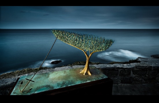
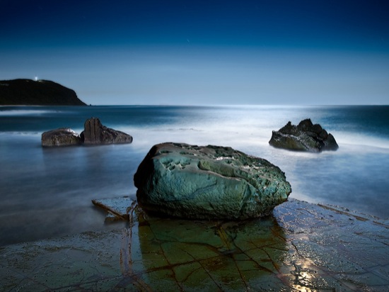
sculpture_by_sea

You’ve probably seen the effect of camera blur (moving your camera, giving a fuzzy, streaky effect), zoom blur (by zooming during an exposure, I have a modest example here), and motion blur (something moving on camera). But what do you reckon would happen if your scene isn’t moving, your camera is firmly locked down on a tripod, but your light-source moves?

Well, if you can imagine such a thing, you’ve just imagined the bright art of painting with light. I’ve spoken to my good friend Brent Pearson who is ‘a bit good’ at this light painting malarkey, in the same way that Pele is a bit handy with a Football, and Antonio Lucio Vivaldi knew a thing or two about chord progressions.  


“I have enjoyed landscape photography for almost 30 years”, Pearson told me in a recent interview. “However over the past few years my landscape photography has evolved and I’ve started doing more and more long-exposure photography.”

sculpture_by_sea

It was as part of this long-exposure work that I first ‘discovered’ Pearson – he has an amazing way of combining the zen-like peace of landscapes with the chaos of motion and light.

Getting into light painting

“I enjoyed capturing the movement in landscapes and the abstraction that long exposures introduced to my images allowing me to simplify my compositions.”, Pearson explains. Night-time landscape photography was the natural extension of that work

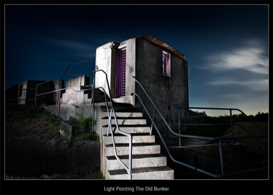
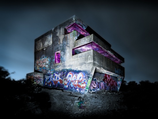
middle_head_bunker

Of course, landscapes are tricky enough when they’re done during the day – take away the sunlight, and you’re up against a whole new set of challenges. “Composing and focusing when you can’t see through the viewfinder is tricky”, Pearson laughs, but obviously there are issues beyond merely not being able to see what the hell you’re doing, like the challenge of calculating your exposure at night without the aid of a light meter, and managing noise of long exposures with a digital SLR.

“With a reasonable amount of experimentation and trial and error I started understanding the techniques that would give me consistent results at night and wanted to continue exploring and experimenting with night photography.”, Pearson explains “… And that is how I was introduced into the world of light painting.”

Light painting is a term that often associated with the creation of light trails in an image, however there is a totally different type of light painting that offers the landscape photographer unprecedented levels of creativity – the painting of landscape images using light sources that are not visible to the camera.

malabar_bunker

“By photographic standards, this is the Wild West!”, Pearson claims, “There are new frontiers to explore and new trails to blaze. There aren’t many photographers doing this type of photography… perhaps because of the technical challenges associated with photographing at night, or perhaps because there are not a lot of comprehensive guides or manuals to help photographers climb the learning curve without becoming frustrated. ”

The Benefits of Landscape Lightpainting

By having control over the light, light painting is like unleashing the control and creativity of studio photography into the outdoors. With the long exposures that are associated with night photography, you are not limited to lights being statically positioned; “free to wander around a scene with various light sources literally painting landscape features with light means you get a completely different level of creative control.”, Pearson says, and lists off some of the extra control you’re granted by taking the camera outside in the dead of night:

You get the chance to control the direction and intensity of light, the quality (by changing your light sources) of the light, and the focus and colour as well, by using light painting techniques, coloured gels, ‘barn doors’, etc

In post-production you also have incredible control to blend your light painted images together with the control of a lighting director using a light mixer.

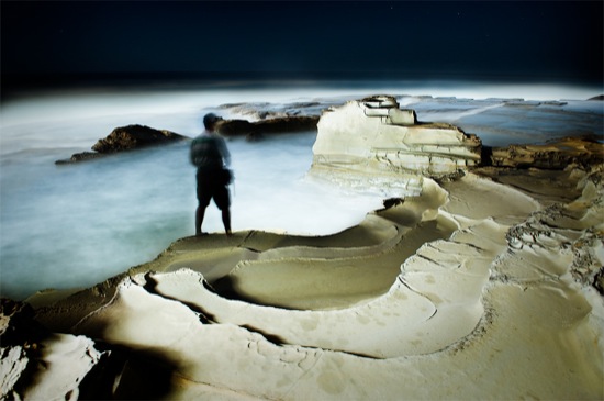
forrester_rocks

Getting started with light painting

Probably the most important component of light painting is the light source(s) that you use.

“Over the past 12 months I have been trialling a variety of light sources from the humble house torch through to home-built high powered light sources that emit a very even high-quality light”, Pearson says. “My light painting kit now includes three light painting tools: My workhorse light which is a high powered fluorescent light, my camera flash unit, which is great for lighting interiors with colour, and my high-powered head torch LED that can light objects up to 80m away.”

Learn from the master

Pearson has been noticed, and is often approached by people who want to learn the tricks of the trade. “I’ve had numerous photographers ask me how they can learn how to light paint landscapes.”, Pearson says. Like any good teacher, he decided to seize the opportunity and run with it: “I have finally put together a comprehensive step-by-step guide to night photography and landscape light painting” – which is available on his Night Photography Guide website.

caught_in_act

“If you feel like your ready for the next photographic challenge”, Pearson concludes, “then I urge you to get out at night and start discovering a new photographic world!” – and I couldn’t agree with him more! Get over to Brent Pearson’s site and grab a copy of his eBook – it’s well worth the cash, I reckon!

If you’ve taken any light-painted landscapes (or any other style of photography for that matter), do post a comment with the URL in the comments below – I’d love to have a look!


Do you enjoy a smattering of random photography links? Well, squire, I welcome thee to join me on Twitter -

© Kamps Consulting Ltd. This article is licenced for use on Pixiq only. Please do not reproduce wholly or in part without a license. More info.

Digital Schizophrenia

schizo-progress-cutout.jpg

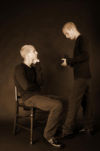
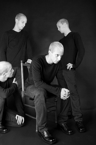
One of the first things I started doing when I started shooting digital images, was thinking of ways of doing digital double exposures – adding one part of an image to another – for a greater impact of my digital shots. It turned out to be relatively simple, but carrying high impact. All it takes is suitable photos, a copy of Photoshop (or the Gimp, which is sort-of nearly as good as Photoshop, but free), and a bucket full of time…

Have you made any cool images using this method? Post them somewhere on the internet – your blog, perhaps – and add a link to the comments, so we can admire the photos! 


Starting with a series of photographs taken with the camera on a tripod, to ensure that the angle doesn’t change:

schizo-progress-5.jpg

schizo-progress-4.jpg

schizo-progress-2.jpg

schizo-progress-1.jpg

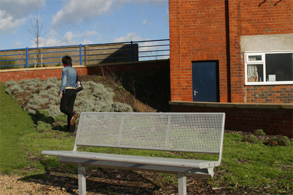
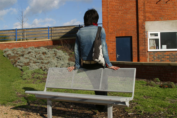
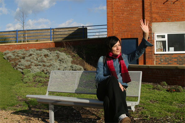
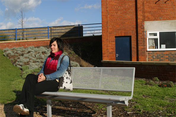
I loaded all of them into Photoshop, and copied them to the same document in different layers. When doing this type of editing, it makes sense to arrange the images in a way that allows you to work from top to bottom, or from left to right. So the first thing you need to do is arrange the layers in a way where they have a logical progression. In the case of the images above, I layered them in the order 4 – 5 – 2 – 1, with 1 on the bottom

The easiest way of doing these photos is by doing it in a way that the character doesn’t interact with itself, but on the other hand it is a lot more believable if they occupy the same field of view (i.e overlap) or interact in some way – getting them to hand things to each other, or similar, is an additional layer of messing with your readers’ brains.

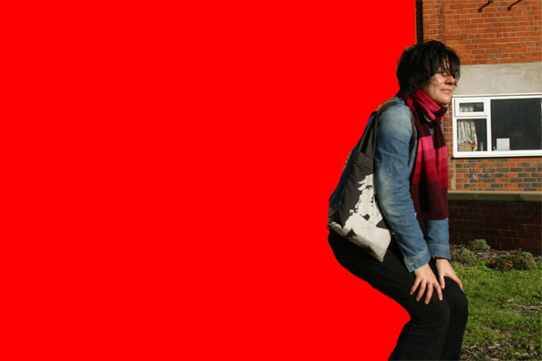
Now, in the top image, carefully cut out the area you don’t need. The trick is to cut off as little as possible. For the sake of example, I’ll show you what I would do if I were to add another photo all the way to the right of this montage:

schizo-progress-cutout.jpg

By leaving as much of the image intact as possible, chances of getting the cut-out wrong are limited. In this case, because the right side of the girl isn’t cut out at all, there are no mistakes to be made!

Hide this layer, and move on to the next one, and the next one, etc.

Finally, you’ll probably spend a bit of time carefully polishing your cut-outs. You may also need to darken some areas to ensure that the shadows look genuine – do you remember what we said about that in How to spot Photoshopped Images? Exactly.

Now, when you’ve put all the photos together, you get a result that looks like it could happen, if it hadn’t been for the fact that this lady doesn’t have any siblings, much less quaduplets…

schizo-finished.jpg

Couple of examples

Do you like this stuff? Well, have a go at it yourself! And just to get you on your way, why don’t we add some more examples? The following three were taken free-hand, with quick series of five shots for each photo. In case you recognise the background: Yes, it’s taken in Vigerlandsparken, in Oslo, Norway. I think it was around 2003 or so.

Skatezophrenia
Photo: Skatezophrenia by Photocritic.org on Flickr

Skate-zo-phrenia-104.jpg
Photo: Skate-zo-phrenia 104 by Photocritic.org on Flickr

Skate-zo-phrenia
Photo: Skate-zo-phrenia by Photocritic.org on Flickr

So, what do you reckon? Can you do better? Of course you can! Get cracking, and post the results in the comments – I’m curious!

Couple of other examples

Self portrait with self
Photo: Self portrait with self by Photocritic.org on Flickr

Jonathan Squared
Photo: Jonathan Squared by Photocritic.org on Flickr

Finally, if you like these, you can get loads more inspiration on the Multiple Exposure group on Flickr!

This post was originally posted in 2006 (which is why the observant among you will notice a couple of old comments on this post – so no, you’re not going loopy:). I’ve updated it and added a few more photos, hence the re-publish.


Do you enjoy a smattering of random photography links? Well, squire, I welcome thee to join me on Twitter -

© Kamps Consulting Ltd. This article is licenced for use on Pixiq only. Please do not reproduce wholly or in part without a license. More info.

A shot at street photography

london-street-2009-03023

Recently, I realised that while I do an awful lot of writing about photography, I’m not actually spending all that much time actually taking pictures myself anymore.

A sad state of affairs – especially as I recently bought a gorgeous Canon 50mm f/1.4 prime lens. (I could rant about prime lenses for hours, but I’ve done so in a previous post, which (if I may nest my parantheses and be so bold as to recommend one of my own articles) is well worth a read), and I have a fabulous city right on my doorstep.

Anyway, so I have never really done that much street photography before, but I figured it’d be a crying shame not to have a go at it…

For someone who hasn’t done much (read: any) street photography before, I think I did pretty well – these are some of my favourites:

Mean Fiddler

Mean Fiddler

This photo, Mean Fiddler by Photocritic.org on Flickr, was a lucky one indeed. Shot from the hip just as he was finishing playing a song, the colours came out magnificently, and I got quite lucky with the focussing as well – Seeing as how I was shooting from the hip at f/1.4, it wasn’t as if I had a lot of leeway with my depth of field.

Technical Details: Canon EOS 450D with a Canon 50mm f/1.4 prime lens. 1/320 second at f/1.4 and ISO 100, metered in Aperture-priority AE with a -2/3 stop EV bias. More tech info here.

"Is he taking a picture of me?"

"Is he taking a picture of me?"
This photo, "Is he taking a picture of me?" by Photocritic.org on Flickr, was taken in the midst of a St Patrick’s day parade on Trafalgar square. She was hanging out with some of her friends in front of a fountain, and the light kept catching her, so I figured I’d try and capture that. The back-lighting was quite tricky (and, considering that all of these photos were taken on a single attempt, with one shot at getting it right, I think I got lucky), and I’m happy that I was shooting this in RAW, because I needed to do a few adjustments to make the photo come out well.

Technical Details: Canon EOS 450D with a Canon 50mm f/1.4 prime lens. 1/1250 second at f/1.4 and ISO 100, metered in Aperture-priority AE with a -2/3 stop EV bias. More tech info here.

Dreaming over Coffee

Dreaming over Coffee
This particular shot, Dreaming over Coffee by Photocritic.org on Flickr, came about right at the beginning of the walkabout in London – I was in line for the queue at Nero coffee, and spotted this girl, who was sitting there, enjoying her coffee, and being rather blase about checking out the cute guys walking by – what is more summerly than that? When the moment came, I simply lifted the camera to my face, snapped the shot, and paid for my coffee. Simples.

Technical Details: Canon EOS 450D with a Canon 50mm f/1.4 prime lens. 1/200 second at f/1.4 and ISO 100, metered in Aperture-priority AE without EV bias. More tech info here.

Me too, brother. Me too.

Me to, brother. Me too.
This one, Me to, brother. Me too. by Photocritic.org on Flickr, was taken immediately after the girl above. We were sitting on the statue in the middle of Seven Sisters, and were watching the world go by. This fellow just showed up, stopped right next to me, and stared at the sky for a bit – His T-shirt made me laugh, so I couldn’t not take the shot.

Technical Details: Canon EOS 450D with a Canon 50mm f/1.4 prime lens. 1/200 second at f/2.8 and ISO 100, metered in Program-mode AE with a -2/3 stop EV bias. More tech info here.

MOAR!

If you want to se more, you can see the whole set on Flickr.

Also, if you haven’t seen many updates from me recently, it’s because I’m out of the country for a while, doing a load of photography and eating a lot of lovely food while visiting my parents in Mumbai, to be precise. When I come back, I’m finally moving back to London again – if I can find myself a place to stay, that is.

Enough with the megapixels already

new-road-iphone

I’m all for camera phones – for a photography nut such as myself, there’s nothing quite as awesome as always having a camera in my pocket – but things are getting a little bit silly now. Earlier this month, Sony Ericsson showed off a prototype of a 12 megapixel camera phone, and apparently the Swedes are planning to have 20 mpx crammed into phones in time for the 2012 olympic games.

So why am I being whiney? Well, just like horsepower isn’t everything on a car (a Mazda MX-5 would trash a 1000 horsepower drag racing car on a twisty race track) and clock frequency isn’t everything on computer processors (a 2 Ghz current-generation processor wipes the floor with a 4Ghz Pentium 4), Megapixels by themselves mean absolutely nothing.  


The first prosumer-grade dSLR – the Canon EOS D30 – only has 3.1 megapixels, but the photos it was capable of taking is a world of difference from even the best current camera phones.

“Three megapixels”, I hear you cry, “That is laughable in a world where you are buried in a deluge of 5- and 6 megapixel chattersticks the second you step into a Carphone For You!”. And you’d be right. Nonetheless, the fact that the D30 takes high-quality glass means that the photos it delivers is sharper than any camera phone (and most compact cameras, for that matter).

What happened to the Old One?
What happened to the Old One? by Photocritic.org on Flickr

The point is that even though it’s possible to take some fantastic photos with a simple camera phone (I recently wrote about the amazing stuff people are doing with the comparatively inferior iPhone camera, for example), the phone manufacturers need to get their priorities straight: Megapixels only affect the size you can show (or print) a photograph. Most of us post our photos on Facebook, Flickr or send them to our mates, so size clearly doesn’t matter – but quality does.

Most photographers would much rather have a 2-megapixel camera with a good lens than a 20 megapixel camera with poor glass at the front.

So Sony Ericsson, LG, Apple, Nokia and the rest of the gang; if you are reading this: give us proper auto-focus, faster and higher-quality lenses, flashes, proper shutters, and the possibility to manually override the automatic exposure.

This article was originally published on FiveFWD.


Do you enjoy a smattering of random photography links? Well, squire, I welcome thee to join me on Twitter -

© Kamps Consulting Ltd. This article is licenced for use on Pixiq only. Please do not reproduce wholly or in part without a license. More info.
How To: Concert Photography


Of all the types of photography ever invented, I would claim that live concert photography is up there among the most difficult ones. You have five thousand fans behind you, and there is a band in front of you. Nobody stands still. In fact, even the notion of standing still ruins the idea of a good music photo. The bouncers hate you, because you are in their way. The crowd is jealous of you. Crowdsurfers will kick you in the head. The band thinks you’re annoying. The lighting is never bright enough, and changes so frequently that you’re screwed even in the few moments that it is.

And nonetheless, concert photography is one of my all-time favourite pasttimes. It’s hard. It’s unrewarding. But it’s deeply gratifying on a personal lever. It’s about capturing the mood. Capturing the looks. Capturing something the audience is feeling.

Of course, it’s also something I know something about – I’ve done my share of concerts…

Tristania - Live in Manchester
Tristania – Live in Manchester by Photocritic.org on Flickr


So, how can you take photos at a concert successfully? First of all, remember the “standard” rules for most concerts:

  • No flash photography
  • First 3 songs only
  • What the security guys say is Gospel

The first two rules are a blessing and a curse rolled into one. No flash photography is a nightmare at many venues, but it is often better to take photos without. You don’t get the “feel” of the gig without the stage lighting. The “first 3 songs” rule is a bugger – most bands look the most energetic towards the end of their set. On the other hand, it means that you have a very clear time limit: You’ve got 10 minutes (or so) to get the photos you need. If you screw it up, well, you’re unlucky. But there is no saving film, you obviously have to make the best of the time you have.

Emanuel in concert 2
Using the available lighting is a challenge, but can be rewarding, especially if you manage to cotton on to the pattern of the lights. This is Emanuel in concert 2 by Photocritic.org, on Flickr. More Emmanuel photos here.

Equipment

Personally, I have done all all my concert photos with a Canon 60D, 10D or 20D. Don’t even bother trying with a compact camera – you’ll look like an idiot, and the photos will come out rubbish. (Granted, I have worked with a few photographers who have proved me wrong on this point, but why make your life more difficult than it has to be?).

My lenses of choice are a Sigma DX 70-200mm f/2.8 lens, which is great for getting in close, a Sigma 17-35mm f/2.8-4.0 lens which is great for overview shots, and a Canon 50mm f/1.4 fixed length lens. Notice a pattern? Damn right – go for brightness all the way. If you can’t afford zoom glass that is bright enough, then get a 50mm f/1.8 lens. it is normally the cheapest piece of glass you can find, and focussing is a bitch, but you need all the light you can get when doing this type of photography.

18 Visions in Concerts 3
Try to capture the artists in the moment where they are most “into” their song. Photo of Eighteen Visions on Flickr. More 18 visions.

How to get in the pit

The first problem you are faced with is that unless you have credentials, the bouncers are unlikely to let you into the venue with professional (i.e anything beyond a compact) camera equipment. So you need a photo pass.

They don’t hand these out to everyone and his dog, but there are a few ways you can get them. Personally, I was shooting for an agency, so they sorted out the photo pass for me, but you can call up your local rag and ask them if they would like concert X photographing. Offer to do it for free. When they say they want the photos, call the venue, and tell them that you are photographing it for the local rag. This isn’t going to work when Metallica comes to town (the local newspaper will send their own photographers, no doubt), but for smaller bands, it usually works: The small bands are thirsting for publicity, the newspaper wants photos, you want into the pit and to get some experience. Everybody wins.

The second avenue is to become an in-house photographer for a venue. This doesn’t work with all venues, and it means you need to get friendly with the managers of the venue. Expect to photograph crappy small local bands for a while, but once they see what you can do, and they start to get faith in you, you may do better.

Finally, you can just call the venue anyway. Tell them that you are a budding photographer, and would love to take some photos. “you have ‘no’, and can’t get a ‘yes’ unless you ask”, as my mother used to say.

Nightwish in Concert 8
Photo of Tarja, of Nightwish. More Nightwish

Tips to taking good photos

So, you are in the photographer’s pit in front of the crowd. Well done. Now, you need to actually take the blasted pictures.

First of all, select an ISO value on your camera that is as low as you can get away with. ISO 200 will give you far better photos than ISO 800, but if all your photos turn out blurry because of lack of light, then you would have been better off with ISO 800 after all.

Second, observe. Concert lighting move in patterns, and you need to try and snap the photo of once the lighting is exactly right.

Always shoot in fully manual. It’ll be too dark for your auto focus, and the rapidly changing lights mean that your light meter is worthless. You need to be good, but your instincts will save you. If you can’t “feel” how a photo is going to turn out before you look at your digital display at the back of the camera, perhaps you aren’t ready for concert photography quite yet. There’s no shame in that – just keep practicing.

Take a lot of photos. Personally, I throw away 99% of my concert photos. In fact, some times, I come home without any really good photos – it isn’t always your fault. The lighting can be particularly tricky, etc. And you can’t plan for any of it – you have to roll with the punches.

Change your vantage point. You can walk all the way back and forth in front of the stage. Do it. If you are in your face enough, chances are that the lead singer will show off for the camera a little – they may even look at your cam for a fraction of a second. That is your cue. Get the photo.

Finally, get as close as you can. I guess this is mostly a personal thing, but I prefer photos where I get really close. Action portraits, if you will: photos taken of an artist at work.

Inspiration

Check out Lithium Picnic’s concert photography galleries, or talented music photographer Andrew Kendall’s photo gallery.

We’ve also done a separate article on ‘more on live concert photography‘ and ‘concert photography at smaller venues‘, both of which might be of interest to you :)

Making money off your concert photos

Originally, we had a lot of information here on how you could monetize your concert photography, but it all became a bit wieldy. I would strongly recommend you have a look at our seperate writeup on event photography, and our making money off your photos article.

Join us on Twitter -

The world through a lens: Photo etiquette

etiq-5

As all photographers know, travel photography can be about more than safeguarding memories. Holidays are the perfect time to discover new cultures and customs, be outside of one’s comfort zone, eat new food, and, of course, really get stuck into the different lenses and ISO numbers. Coming home with that perfect picture of something or someone that fascinated you makes the enjoyment of the getaway last that much longer.

The way the local population expects you as a photographer to behave with your camera may be very different in countries other than your own. This Photo Etiquette may, however, not be easy to understand or adhere to, especially when it comes to photographing people as a subject, so we decided to have a closer look at what you might encounter…

When travelling, I find that shots of sights, animals and nature are often rewarding, but not enough. Photographing people gives a richer texture to the cultures you have visited. In hindsight, I have often regretted foregoing on a large part of the experience, simply because I did not know whether it was okay to take photos of people.

Not wishing to be photographed

Many people do not wish to be photographed, for many different reasons. Native peoples, such as some Native Americans in the US, might refuse being photographed because they believe a mirror does not reflect reality, but a persons’ soul. A picture, taken by a device that relies heavily on mirrors, may therefore capture and enslave the soul. Sometimes, this restriction only counts for infants and children, as their souls are fragile, and can more easily leave the body.

Others, such as some Caribbean cultures, believe that a representation of a person may be used in ‘sympathetic magic’ to cast voodoo spells on the person in question. Others again, especially in tourist areas, do not want to be in photos because, frankly, they are sick of them. Try to imagine how you would feel if a constant stream of tourists would come by your office and photograph you.

In some countries, such as China, taking someone’s picture without their consent is simply extremely rude. Others might feel they are not photogenic, and do not want their face to be splashed all over Flickr. And you need to be wary that some locations (places of worship, official buildings and structures, museums and military bases) may prohibit photography for security reasons.

If all that was not enough, you also need to consider the implications of a photo. If you might land someone in trouble for taking the photo (if photographing individuals at a political rally etc.) you might want to reconsider taking the photo. In other words, there should be a lot of prudence and respect on your part as the photographer.

Permission is key

Figuring out when it is okay to take a photo and when it is not will help you bring home more than just pictures of puppies, buildings and your travelling partner. The best way of finding this out is simply by asking. I have been asked for money in exchange for a photo on several occasions in India, and you will have to consider whether that money is worth the photo. If you deem it is not, just smile, shake your head and move along. Alternatively, they might ask you to buy something off them. Again, by all means do, if it is something you wanted, and if you think the price is worth the photo, if not, just keep going.

But, in general, rule number one is, get permission. It is essential that your behaviour and attitude is not one of right, but one of friendly coexistence. When you smile and nod while pointing at your camera, it is pretty clear what you want. This might sometimes mean that your photo will not be as spontaneous as you might wish, but at least you will not end up in sticky situations where the subject feels their personal space, or religion is violated. Especially on the topic of photographing children, you need to be very cautious, make sure to ask the parents or guardians for permission, no matter where in the world you are.

Rule number two is respect people’s wishes. If a person refuses your request of a photo, just move along and find other subjects. This will sometimes mean you do not get a photo at all, but do not try to sneak one in if someone has already said no. Never forget that there will be other opportunities for photos elsewhere.

If they ask you to stop; stop…

Rule number three is that if someone asks you to stop taking photos, either verbally, by turning away, by looking uncomfortable, or by running for cover, as happened to me in Vietnam, stop. No matter the reason why someone might want you to stop, it is important that you keep in mind what Darren Rowse said on his blog: people are not tourist sites. They have feelings that must be respected. And you will only end up with photos of people with their backs turned to you, and minimal amounts of goodwill. It is just not worth it.

And finally, if you wish to finish a friendly exchange with a stranger whom you just took a photo of on a high note, you may wish to show them the photo afterwards if you have a digital display. It is not only courteous, but it has sometimes caused me to have a multitude of other subjects wanting to be photographed to see themselves on the little screen, including in Indonesia and Vietnam.

This article was written by Meke Kamps for Photocritic


Do you enjoy a smattering of random photography links? Well, squire, I welcome thee to join me on Twitter -

© Kamps Consulting Ltd. This article is licenced for use on Pixiq only. Please do not reproduce wholly or in part without a license. More info.
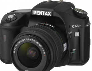
Photography Gift Guide

telephoto

Are you looking for the perfect Christmas gift for that special photographer in your life? If so, you’ve come to the right place. I know from personal experience that present shopping for photography-obsessed people can be tough.

The world of photography turns quickly, so it can be a challenge for many of us to keep up. That’s why I thought I’d bring out this handy Christmas gift guide just in time for the holidays. (Well, that, and last year’s guide was one of my better visited pages, so I figured it’d be rude to not do a re-run with a bit of an update, too)

No matter what your budget, you should find something on this list that will bring a picture perfect smile to your photo-junky friend’s face.

Behold… Photocritic’s From sub-$40 to credit crisis-incurring gift guide (of DOOM)  


In the $40s and below range:

Looking for an inexpensive photography related gift? I won’t lie; sometimes it can be tough to find a good photography gift in this price range, especially with everyone switching to digital.

Unless you know for a fact that your friend still uses film on a regular basis a well-wrapped box of film canisters and photopaper won’t cut it like it did in past years. However, we’ve been able to scrounge up a few interesting possibilities.

Out of the five listed below, we feel that the Westcott 750 Photo Basics 7.5-Foot Light Stand ($29.90) is the best buy in the $20-$40 dollar range. This sturdy 7.5 foot stand receives consistently good reviews and enjoys uniform popularity. Unlike some accessories, an extra one of these is almost never a bad thing.

For other low cost options try the Photography Studio Continuous Lighting Umbrella Kit ($39.99) or the Digital Concepts Ps-101 Portable Lighting Studio ($40.67).

If none of these seem quite right, you could always resort to buying one of these two popular photography related books: Microstock Photography: How to Make Money from Your Digital Images ($16.47), or the bestseller The Digital Photography Book ($11.99). Or, you know, my book; Macro Photography Workshop :)

In the $40 to $100 range:

In this range, I’d recommend the XPRO Studio Photography White Photo Light Tent ($49.99). This cleverly designed light tent is perfect for creating professional looking photos of medium sized objects.

Since it is made out of special outer nylon shell, it diffuses light much better than other light tents in this price range. Not only this, but its comes with an easy portable carrying case and contains internal elastic tabs for suspending objects by clear wires.

Does your friend already have one of these? You could also try another one of the following options in this price range: American Recorder SIB-101CS Photo Studio-in-a-Box ($69.99) Small Stand for Background Support from Interfit COR755 ($76.99) Philips 6.5-Inch Digital Photo Frame ($89.99). Who doesn’t like these? 2 Photography Studio Continuous Lighting Kits for just under $80! This is a great deal for any photographer who needs lighting equipment for a good price.

In the $100 to $250 range:

Once you get into this price range its possible to start looking at some decent tripods and lenses. However, before you go out and buy a tripod for your photographer friend, be warned that both tripods and lenses can be very personal things for some photographers.

If you can, try to get the low down on what your friend already has versus what they might want. If he or she isn’t sure, you might consider going with the sturdy Manafrotto 725B Digi Tripod. This model gets top reviews over and over again ceaselessly repeating the same word: “sturdy”;

But what if your friend already has one? Never fear; try one of these alternative gift ideas: Lowepro SlingShot 300 All-Weather Camera Bag ($109.95) Black & White Backdrop System from Steve Kaeser ($132.00) Westcott Photo Basics 501 Backlight Kit ($99.95) SPD100 Digital Exposure Meter from Polaris ($169.99)

In the $250 to $500 range:

Alright, now we’re talkin’. In this price range, you can really find some quality lenses.

If your photography buddy already has their standard lenses set, why not spring for a high quality wide angle lens? This lens from Tamron is less expensive than many of its kind and is specifically designed to work well with the popular Canon Digital SLR cameras. This is great for any photographer who is looking to get into landscape portraits for the first time.

Or, if you’re not sure about what your friend wants, why not just get a gift voucher from Amazon? Then they can get whatever they want. Even so, you might find some of these other suggestions useful: Sigma 10-20mm f/4-5.6 EX DC HSM Lens for Canon Digital SLR Cameras ($449.00) Canon EF 20mm f/2.8 USM Wide Angle Lens for Canon SLR Cameras ($427.01) Canon EF 50mm f1.4 USM Standard & Medium Telephoto Lens for Canon SLR Cameras ($319.95) Induro C213 Carbon 8X C-Series Tripod Leg Set, Extends to 62.49″, Supports 17 lbs. ($279.99)

In the $500 to $1000 range:

Bestower of Christmas joy…

…you have just stepped into the digital SLR camera zone.

If your photographer friend has not yet experienced owning a digital SLR camera, this might be your opportunity to change his or her life forever.

With a 10.1 megapixel CMOS censor, a lightweight body, automatic cleaning system, and a 2.5″ LCD monitor, there are few cameras like the Canon Digital Rebel XTi (Canon EOS 1000D) ($499.95) for its price. This is a perfect gift for someone who is either just making the conversion from film to digital, or who wants to finally quite fooling around with simple point and shoot digital cameras.

You might also consider the Nikon model as an alternative: Nikon D40 6.1MP Digital SLR Camera ($549.00) Or, if your friend already has one of these, maybe one of these lenses could work: Nikon 18-200mm f/3.5-5.6 G ED-IF AF-S VR DX Zoom-Nikkor Lens ($634.95) Canon EF 135mm f/2L USM Lens for Canon SLR Cameras ($921.90) Canon EF 200mm f/2.8L II USM Telephoto Lens for Canon SLR Cameras ($630.13)

In the $1000 to $2000 range:

Now that you’re ready to start pulling out the big bucks, you’ve got a very important choice to make.

Do you want to buy that oh-so-special photographer a top of the line camera (like this one: the Olympus Evolt E-3 10.1MP Digital SLR Camera with Mechanical Image Stabilization with ED 12-60mm f/2.8-4.0 Lens and FL-50R Flash ($1,999.99), or should you choose one of these groovy telephoto lenses($1,140), eh? (They’re perfect for taking photos of moving objects and capturing elements of vision that are imperceptible to the human eye.)

You’re best bet is to get the inside word about whether or not your friend is interested in switching camera models. If so, you might want to go with a new camera. But if not, I’d say consider going with the lens.

And then again, if you feel like you still need more options, you might want to take a look at these other viable choices: Canon EF 300mm f/4L IS USM Telephoto Lens for Canon SLR Cameras ($1,109.95) Canon EF 85mm f1.2L II USM Lens for Canon DSLR Cameras ($1,828.98) Canon 14mm f/2.8L II EF USM Ultra-Wide Angle Lens for Canon Digital SLR Cameras ($1,879.95) Canon EF 70-200mm f/2.8L IS USM Telephoto Zoom Lens for Canon SLR Cameras ($1,529.95)

If price is not a concern…

If you are really willing to go all out this Christmas (and I mean really all out), then consider buying a medium format digital camera from Hasselblad. We’re talking about the high end of the high end here. Hasselblad’s H3DII-31 ($37,995.00) offers picture quality that is absolutely unimaginable with even the highest quality 35mm cameras.

Imagine shooting at 31 Mpix with some of the most advanced lenses in the world. Let it be known that the people at Hasselblad don’t mess around when it comes to digital photography!

Want to take a look at a few other (potentially wallet-busting) jaw-droppers? Check these out: Hassleblad’s H3DII-50 ($21,995.00) Canon EF 800mm f/5.6L IS USM Super Telephoto Lens for Canon Digital SLR Cameras ($10,998.98) Canon EF 600mm f/4L IS USM Super Telephoto Lens for Canon SLR Cameras ($7,399.00) Canon EF 400mm f/2.8L IS USM Super Telephoto Lens for Canon SLR Cameras  ($6,800.00)

Happy Christmas!

Finally, when you click on the Amazon links above, it’s tied to my affiliate account. That means that you pay the same as you always would for any of the goods listed, but I get a couple of percent in return for sending the traffic from this blog to Amazon, which I can spend to save up to buy a kitten and a mountain of cat-food… Having said that, Amazon might not always be the cheapest, so do shop around to get the best deal you can.

So, all that’s left to say – have a fantastic holiday (whether you celebrate Christmas or something else – and I’m probably going to take a bit of a break for the holidays… Catch you in the new year!

Photography History: The Digital Era

So far, we’ve covered the pre-film and the film era, so no prizes for guessing what today’s history lesson is going to be about – yup, that’s right, the digital era is upon us, and we’re taking a look at history as it’s happening all around us…

Let’s launch into the third and final installment in our 3-part series: The history of photography: The Era of Digital.

The history of digital photography is one that is as much about the technology of digital photography as it is about the photographers themselves; it is a history of advances in image quality and the violent manipulation of images; most importantly, it is a history which is still being written.

Many photographers who established themselves during the era of film (such as Annie Lebovitz) have made or are making the switch to digital photography. Others, (including Yann Arthus Bertrand, famous for his amazing aerial photography) have resisted the change and cite several reasons why the older model remains superior. However, few will question the fact that digital photography has changed the status of photography and the photograph in our 21st century society.

Rise of the Digital Camera

Although the digital camera was not available to consumers until 1990, the most important technology behind digital cameras, the CCD or charge-couple device, was invented in 1969. CCD is an image sensor which allows for the direct conversion of images into digital data without a chemical process. In the begging the technology was mostly applied to video cameras for use in television broadcasts. In 1981, Sony came out with a prototype digital camera which could take still images and store them on a floppy disk. Over the next ten years, companies like Logitech and Kodak worked on their own models.

The first digital camera which was actually available for consumer use was produced by Logitech and was called the “Dycam Model 1.” It had onboard memory which could store thirty-two images at once and shot pictures in black, white, and shades of gray only. With a resolution of only 376 x 240 it wasn’t exactly impressive by today’s standards, but it did open up an entirely new world for digital photography.

In the nearly two decades since the first digital camera was placed on the market, digital technology has developed at an astounding rate. The resolution of just over 90,000 pixels of the original logitech model has given way to resolutions of several millions, creating cameras which can rival the level of detail offered by film based models.

For more on the history of the digital camera, try the following links; Brief History of Digital Photography by Bob Brooke, History of the Digital Camera on CNET and SnapJunky.com’s History of the Digital Camera.

Changes to the Industry

With improvements in technology, digital cameras have not only become more powerful, but they have become less and less expensive as well. Cameras with resolutions of two megapixels or more can now be purchased for under $100. While this may still be more expensive than some film cameras, the money saved in film, chemicals, and other development hardware is well worth it to many photographers young and old.

As a result, many companies have been forced to scrap or greatly reduce their film camera lines and up their production of digital models. As would be expected, photographers have met this news with mixed feelings. For many, this symbolizes progress and increased accessibility for photographic equipment, a sort of populist revolution (not to mention the impact on feature film makers, many of whom are making movies with smaller budgets than ever before).

For others, the advent of digital photography means the end of an era, quite possibly an era that they loved. And for those who still believe that film photography offers a level of quality unmatched by digital cameras, feelings cannot be wholly positive. Nevertheless, the industry has followed suit with demand and continues to move toward a more and more digital oriented business model.

Changes to the Art Form

The question of quality is only one of the controversial issues surrounding the ascension of digital photography, and perhaps not even the biggest one. In fact as time goes on, those who argue that digital photography offers an image quality which is not meaningfully distinguished from that of film photography increase in numbers.

But at the same time, the art form is faced with what is perhaps an even more interesting issue. As digital photographic technology continues to increase, the potential for the manipulation of images increases as well.

Of course, artificial manipulation of images is not unique to digital photography. In fact, photographers have been reworking photographic images since at least the 1860′s (one famous example is a portrait of Abraham Lincoln in which his head has been pasted onto another politician’s body). However, the equipment required to perform this kind of manipulation was not widely available at this time. But in the last two decades, the digital camera has coupled with the personal computer to grant digital manipulation technology to the masses.

Some, photographers have used computer based programs such as photoshop as a means for creating new types of photographs based on principles of collage. Often, these remediated photographs purposefully draw attention to their “unreal” quality. However, others have used computers in order to cause photographs for magazine publication to look more appealing without making it explicitly clear that the image has been altered. As the monetary price for this technology has become less and less expensive, digital manipulation of published photographs is becoming the norm rather than the exception.

Look at this study on Photo Tampering Throughout History by H. Farid for more information on digital manipulation.

Future Greats of Digital Photography?

Digital photography is still a young art form, and ultimately, it isn’t actually any different from film photography – the techniques are the same, it’s just the technology that’s shifting.

Having said that, I think that these are some of the young photographers who are currently producing compelling photographic work, often in the digital medium…

Michael Wolf

Wolf is best known for his photographs of cities, especially those of Chicago. Many of his photos attempt to capture elements of the city which are obvious, and yet which normally escape the eye of the camera.

Michael Wolfe at the Museum of Contemporary Photography.

Deanna Dikeman

Dikeman is slightly less well known, but has a very original style of depicting clothing. It is almost never shown on the body, but instead in the wardrobe. A photography that finds itself on the other side of fashion.

Deana Dikeman at the Museum of Contemporary Photography.

Johnathan Gitelson

Gitelson is an excellent example of how collage has been absorbed by the general practices of digital photography. His art has been compared to the comic book, and his playful/serious wit confirms this.

Johnathan Gitelson at the Museum of Contemporary Photography.

Tim Long

Long follows in the tradition of early 20th century realism with his “heartbreaking” photographs of the city of Havana. His work as a whole however, shows a great sense of diversity and a large scope of vision.

Tim Long at the Museum of Contemporary Photography.

Matt Siber

Siber’s work is an excellent example of the power of digital editing to act as a critique of the image and of culture itself. His most famous photographic series “Floating Logos” acts as a study of the icons of our time, Playboy, Denny’s, etc. Floating signs at gas stations litter his photographic vision of America.

Matt Siber at the Museum of Contemporary Photography.

Additional Information on Digital Photography and its History – Digital Photography on Wikipedia, Digital Versus Film, DMOZ’s Digital Photography Links, Digital Photography FAQ from Ronald Parr, Digital Versus Film Website and finally A List of Photographer’s who’ve Chosen to Revert Back to Film (they do exist!)

Haje’s History of Photography

The History of Photography part 1 - Before Film
The History of Photography part 2 - The Firm Era
The History of Photography part 3 - The Digital Era


Do you enjoy a smattering of random photography links? Well, squire, I welcome thee to join me on Twitter -

© Kamps Consulting Ltd. This article is licenced for use on Pixiq only. Please do not reproduce wholly or in part without a license. More info.

Photography History: The Film Era

Right, yesterday’s post was all about how photography came about before film was invented. We had people printing on pewter and inventing the photographic negative, but we all know that the real fun began when we started losing our films down the back of sofas and ruining them when clumsily pressing the wrong button on the camera…

So without further ado, the second installment in our 3-part series: The history of photography: The Era of Film.  

In 1884, the world of photography was changed forever through the invention of film. The bulky, cumbersome photographic plates which had been the standard in photography up until this point became a thing of the past as they were replaced by the much more practical film roll technology.

George Eastman and Kodak

At age twenty-three George Eastman abandoned his career as a bank clerk and started working in a photographic lab. It was then that George imagined a new type of photographic plate which would be lighter and more portable. This would become what Eastman called the “dry plate” and what we call “film.” Once he had fully worked out this technology, Eastman invented a compact camera to compliment the film and started his own company to market this product. The company was called “Eastman Kodak” and continues to be one of the largest commercial photography companies to this day. (You know – Kodak, as in “Kodak moment.”)

Eastman’s Kodak camera was sold to consumers with 100 pictures-worth of film preloaded. For the first time, a camera had been built which was small enough to take anywhere, and which required no technical knowledge to use. Any person with $25 could buy Eastman’s camera and take pictures with the push of a button. Once the customer had taken 100 pictures, they would merely post the camera back to the Eastman Kodak Co. and within weeks they would receive back prints of their pictures and a fresh load of film. This sudden burst of accessibility completely changed the photography industry. Eastman Kodak’s slogan was “You press the button, we do the rest.”

More? Sure thing, how about George Eastman’s Grave, Kodak’s own Biography of George Eastman, The George Eastman House (A museum dedicated to Eastman) and Information on and Pictures of Antique Kodak Cameras

Film Photography Going into the 20th Century

As the world moved into the twentieth century photography was still attempting to define its role in society. As photography became more accessible, it in some ways took over the function which painting had fulfilled in the nineteenth century. Many felt, that it was a superior tool for creating realistic portraits, as well as landscape and still life studies. At the same time, advances in the technology of film resulted in increased commercialization as well as the rapid development of the world’s newest art form: cinema.

But throughout all of these changes, photography as an art never ceased to flourish, and many of the photographs which have become indelible elements of our global consciousness were created during this period. Below are just a few of the important names who helped to capture these images.

Jacob Riis

The Danish-American Riis began his career in photography at just about the time when film was becoming an industry standard. From the beginning Riis had an unflagging dedication to using his art as a means for bringing the lives of the poor of New York City into a venue of representation visible to all.

It was Riis’ great collection of photographs How the Other Half Lives (1890) which exposed the sordid reality of poverty in America to the public eye and which convinced the then president Theodore Roosevelt to shut down the inhuman state run poor houses of New York. His photographs of working class people and their lives still communicate a sense of awe and shocking immediacy today.

It’s well worth delving into Riis’ history a bit further, so check out Riis on Wikipedia, A short biography of Riis on the Harvard site, and some Photographs by Riis

Edward Curtis

By the beginning of the twentieth century, many of the cultures of the native peoples of the North American continent had begun to disappear as a result of United States expansionism. Wealthy American financier J.P. Morgan paid photographer Edward Curtis to photograph these cultures and compile his photos into a book called The North American Indian.

Although Curtis has sometimes been criticized for manipulating his photographs to represent Native Americans in a way consistent with the stereotypes of his day, it nevertheless remains that he succeeded in capturing images of many Native American leaders who would have otherwise been forgotten by history.

More on Curtis on Wikipedia, and a good essay; Edward S. Curtis in Context.

André Kertész

By the 1920′s, while many photographers continued in the tradition of the realism of Curtis and Riis (most notably: Dorothea Lange), other photographers worked to discover a more esoteric style which could answer to the new developments in Modernist painting and sculpture. Hungarian born André Kertész was just such a photographer.

Born in the final years of the nineteenth century, Kertész was completely self-educated in photography. When he moved to France in 1925, he fit in easily with the Dada movement of artists and poets. His work is conceptual, and often attempts to make visible elements of the world which are not immediately visible to the naked eye. He accomplishes this through close-ups, unusual lighting, and mirrors, among other tropes.

More on Kertész: Photographs by Kertész, André Kertész on PBS’s American Masters and More photographs by Kertész

Ansel Adams

Ansel Adams is perhaps the most well known photographer in the English Speaking world for his famous landscape and nature photographs. Images such as Monolith, Adam’s imposing portrait of the Half Dome cliff in Yosemite California have made his name internationally recognizable.

Throughout his life, which lasted well into the latter years of the twentieth century, Adams was dedicated to nature photography and to nature itself as a treasure to be protected. He saw his photographs as a way to communicate the value of natural open spaces. However, Adams always insisted that beyond any political motivation, the final purpose of any photograph should be its sheer aesthetic beauty.

More on Adams can be found at The Ansel Adams Gallery, Zpub’s Short Biography of Adams and Ansel Adams: A Documentary Film on PBS

Annie Leibovitz

Moving closer towards the digital age the role of photography again found itself destabilized. Annie Leibovitz, born in 1949 is a contemporary photographer who has repeatedly problematized the distinction between art and popular photography. She has worked in both media, but her work is powerful regardless of its “content.”

Most famously, she captured the final photograph of John Lennon of Beatles fame. What had been intended as a solo portrait of Lennon became the famous image of a nude John holding on desperately to the fully clothed Yoko. Leibovitz has continued to produce work in all subject categories which is varied in conception. From political to comic, dense to sparse, it continues to amaze.

More on Leibovitz; Leibovitz’s Portraits.

Oh, and if you’re hanging about in London, there’s a Leibovitz exhibit on at the National Portrait Gallery until mid-February. Well worth a trip.

Haje’s History of Photography

The History of Photography part 1 - Before Film
The History of Photography part 2 - The Firm Era
The History of Photography part 3 - The Digital Era


Do you enjoy a smattering of random photography links? Well, squire, I welcome thee to join me on Twitter -

© Kamps Consulting Ltd. This article is licenced for use on Pixiq only. Please do not reproduce wholly or in part without a license. More info.

Photography History: Before Film


A few weeks ago, I had a long and interesting discussion about the History of Photography with a friend of mine, and I discovered that while photography is incredibly close to my heart, I didn’t really know all that much about everything that has happened in the past.

Obviously, that had to change – I give you the first in a 3-part series entitled, without a shred of originality, History of Photography. This time around, we’re having a look at what happened before they went ahead and invented film… 

The Camera Obscura

The primary grounding principle of photography was already know as early as the fifth century B.C.E. It was the Chinese philosopher Mo-Ti who remarked at this time that when a small hole is opened up on one side of a darkened room, light diffuses through this hole onto the opposite wall in the form of an upside-down projection of the outside scene, a phenomenon almost identical to what happens on the inside of a modern film camera.

In the eleventh century the Islamic scientist Ibn al-Haytham elaborated this principle further by conducting experiments which made use of a lantern placed strategically in front of a similar setup in order to create this effect artificially. He was also the first to document this phenomenon in detail by creating diagrams which give a hypothetical account of the trajectory of light as it passes through the dark room hole. Al-Haytham is to this day widely respected for this important contribution. (His face is printed on the Iraqi 10,000 Dinar note.)

During the Renaissance period in Europe many other scientists including Leonardo Da Vinci invented further improvements to this device, including modifications that allowed for the use of a small box for projection instead of a large room and a lens instead of a simple hole. This allowed for a much clearer projection of the image. Using mirrors, the image could then be projected onto a piece of paper which artists would use as a tracing image. However, it was not until 17th century that the German scientist Johannes Kepler gave the device its name: the camera obscura, Latin for “Dark Room.”

Several room size camera obscuras still exist today including a very large one in San Francisco, California which, built in the shape of a modern 35mm film camera!

For more information on camera obscuras, Bright Bytes and Wikipedia have loads of interesting info

Nicéphore Niépce

Photography developed out of the principle of the camera obscura when the French inventor Nicéphore Niépce created the first permanent photograph in 1825. Now, instead of projecting the image onto a blank screen, it was projected onto a pewter plate which was coated with a light-sensitive petroleum derivative. This chemical then reacted to the light by creating a colored imprint of the projected image. However, because of the nature of the chemical, it took eight full hours for the picture to become exposed. Niépce’s first photograph using this process is also the earliest known photograph which is still in existence. It can be seen here along with further information about its creation and preservation.

Later Niépce began experimenting with a new silver-based compound which allowed for a shorter fifteen minute exposure time. This was still arguably too long for practical photographic portraiture. However, one of Niépce’s photographs from this period did accidentally become the first photograph of a human being. He had set his equipment up at the end of a street and intended to capture the landscape of the town. Most of the traffic on the street is invisible to the camera since it is moving to fast for the fifteen minute exposure to capture. However, there just happened to be a single man stopping to have his shoe shined on the corner for a period which was just long enough for his image to be imprinted on the photograph. This picture can be seen here.

Louis Daguerre

After the death of Nicéphore Niépce, his assistant Louis Daguerre continued his work and made improvements to the photographic process. Most importantly he invented what is known as the “Daguerrotype Process.” The process further reduced total exposure time and thereby made photographic portraiture a commercial reality. At the same time that Daguerre was perfecting his process a Brazilian inventor named Hercules Florence was developing an almost identical process. It was he who gave this process the name “Photographie.”

More about Daguerre? It’s fascinating stuff – check out wwar.com and Wikipedia’s entry on the Daguerrotype

William Fox Talbot

Meanwhile in England, another inventor was also working on a similar photographic process. This man was William Fox Talbot, the first photographer to employ a “negative” in his process. This would allow him to create a single negative image during exposure which would then be used to print an unlimited number of positive copies. This became the model for most photographic processes which would follow during the next 100 years and beyond. In addition to his achievements as a photographic inventor, Talbot was himself a groundbreaking photographer, with work ranging from portraiture to images of Paris and London.

Today there is an entire museum dedicated to Talbot, his inventions, and his photographs – for more, check out The Correspondence of William Fox Talbot and ‘Talbot’ vs. ‘Fox Talbot’

John Herschel and Anna Atkins

John Herschel was a mathematician and astronomer who made several improvements on and experimented with Talbot’s model. Among these improvements, was a process called “cyanotype” which produces a blue colored print. In addition, it was Herschel who supplied Talbot with the terms “negative” and “positive.” Another photographer named Anna Atkins later used Herschel’s cyanotype process to produce a series of books on plant life illustrated with blue-tinted photographs. For this work, she is known as the first female photographer.

For more on John Herschel try the following links on seds.org and wikipedia; For more on Anna Atkins and her beautiful cyanotype prints try
Getty

Frederick Scott Archer

By the 1850′s the interest in and demand for photographs was growing at an steady rate. Unfortunately, both of the dominant photographic procedures were still terribly flawed. The Daguerrotype could produce a very fine picture, but it required a still relatively long sitting time for portrait customers. On the other hand, Talbot’s process, although it was more efficient, produced an image with weak contrast and poor definition.

As a solution to the problem, Archer invented his own process named the collodion process. In an act of photography history sainthood, Archer decided not to patent his invention, but instead, to allow its use by one and all alike, without fee. Partially as a result of this failure to protect his own interests, Archer never attained financial success. When he died in 1857 he was poor and relatively unknown.

However, Archer’s developments and those of his predecessors led to the immanent invention of film which was to revolutionize the world of photography once again…

Haje’s History of Photography

The History of Photography part 1 - Before Film
The History of Photography part 2 - The Firm Era
The History of Photography part 3 - The Digital Era


Do you enjoy a smattering of random photography links? Well, squire, I welcome thee to join me on Twitter -

© Kamps Consulting Ltd. This article is licenced for use on Pixiq only. Please do not reproduce wholly or in part without a license. More info.

The quiet revolution in photography

dynamic-range-thumb

Shutter speeds? Yaaawn. ISO speeds? Oh-god-not-again. Megapixels? Oh puh-bloody-lease, that’s so 2003. The newest frontier of digital photography is dynamic range – and it’s arguably the most exciting (r)evolution that’s happened in dSLR-world so far.

Interestingly, most manufacturers are continually improving the dynamic range of their cameras, but somehow seem to forget to tell us about it – which means that we’re witnessing – or should I say not witnessing – a quiet revolution.

It seems as if ‘dynamic range’ gets forgotten in PR world, where a bigger screen, better battery life or Live View is an easier way of getting regular consumers exited. The real technological leaps have been happening under the bonnet, though, and the result of the ongoing improvements will mean that your next camera will be significantly better than your current one – but you wouldn’t be able to tell from just reading its specification sheet.

So, why, exactly does this make a difference to us as photographers? All will be revealed… 

Is this the same as HDR?

Well, we’re still talking about ‘Dynamic Range’, and higher-dynamic-range-than-before at that, but when people are usually talking about ‘HDR’, they mean multi-shot HDR photography, which we covered thoroughly a few weeks back.

Multi-shot HDR is very exciting stuff, and it’s a taste of what is to come, but this time around, we’re talking about single-shot HDR photography and how cameras have been steadily improving over the years.

The improvements have happened so slowly, it seems, that nobody has really noticed – but grab a 5 year old dSLR and compare it to a current-day snapper, and the biggest difference in picture comes from the dynamic range.

Whatevz, can we start from the the beginning, please? What is dynamic range?

The human senses have an absolutely incredible dynamic range – think about it: when you’re inside a concert venue at a rock gig, you can hear every note and enjoy every instrument.
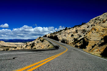
When you’re in a quiet room, you can hear water flowing through your radiator heater, and the extremely faint buzzing of the phone charger is loud enough to notice. More incredibly still, you can keep a conversation going with someone in the next seat while the jet you are sitting in is taking off, which is a testament to the width of dynamic range which is possible – although that particular example has more to do with psycho-acoustics than your ears themselves.

If you thought your hearing was amazing, well, your eyes are even more incredible. On a bright day, you can see perfectly, but you can also see things by moon- and starlight on a clear night. Not impressed? Try taking a photograph or do some filming by starlight without using a tripod…

Now, these examples of your eyes’ dynamic range come with a caveat – you cannot stand in a dark room and look out into a sunny landscape and see both perfectly – you’ll either be able to see the indoors, or the outside, with the other being over- or under- exposed, respectively. For photography purposes, the important thing is how much dynamic range you can see simultaneously.

Allow me to illustrate: Take a landscape photo where the clouds are nearly over-exposed. The dynamic range of the particular imaging-chip you’ve got, decides how much details you get in the darker parties of the image. The higher dynamic range, the more shadow-details you can expect.

A theoretical camera with perfect dynamic range wouldn’t need shutter speeds – you would select an aperture to get your depth of field, and you could select any shutter speed you need. The sun would have texture, and the deepest, darkest shadow parties of your image would still have detail in them, too. Of course, perfect dynamic range is impossible (for now…) but that doesn’t mean that increasing dynamic range isn’t a great thing…

Riveting, I’m sure. But is it really that different from 5 years ago?

Back when I first started taking digital photographs in the mid-1990s (I know, we still listened to The Cardigans, Tracey Bonham, Marcy Playground and Tonic…) and I did some playing about with shooting in RAW format, comparing it to just using the JPEGs straight out of the camera. Back then, I decided that RAW was a complete waste of expensive memory stick space, because it was nigh-on impossible to spot the difference. I didn’t know why that was the case back then, but I think the answer is pretty clear right now: The dynamic range of 8-bit JPEG photographs was, in fact, pretty similar to that of the imaging sensor inside the camera.

A couple of years ago, I believe when I got the then-brand-new-on-the-market Canon EOS 20D, I decided to switch to RAW. I spotted that the quality was better than with JPEG, and I stuck with it. Mostly, I did it because I could never quite get the white balance right, and with RAW, you defer the decision until you’re at your computer, which always suited me quite well.

More recently, I upgraded again, this time to a Canon EOS 450D, and the difference is quite noticeable – right from the start, I felt that the 450D was taking better photos than my old 30D, but I was struggling to figure out why. Ignoring the resolution (the 30D delivers 8.2mpx files, whereas the 450D has a slightly smaller imaging chip, but saves 12.2 mpx files to the memory card), the 30D is a better camera in all possible ways: Better top ISO, faster top shutter speed, better autofocus, quicker continuous drive, magnesium body, and so on and so forth. Nonetheless, I swear I was getting better photos with the 450D than with the 30D, on quite a consistent basis.

Then, finally, a few days ago, the penny dropped. I did some test shots on my 450D, setting it to shoot JPEGs, and then some more shooting RAW. The difference was vast – by using Photoshop’s built-in RAW editing tool, I was able to pull incredible amounts of extra information out of the RAW images from the 450D, compared to the ones from my 30D.

Now, add to that the fact that the Canon EOS 450D is Canon’s entry-level digital SLR, and that Canon’s R&D department haven’t been twiddling their thumbs in the meantime either – but as always, they save the best goodies for the people who cough up serious cash for the more hard-core semi-pro and professional lines of cameras.

I haven’t had a chance to have a go myself yet, but it’s rumoured from various fora that the Canon EOS 5D mk2′s RAW files (in addition to being full-frame and significantly higher resolution) have a 15-bit dynamic range which is completely out of this world.

What’s in it for me? How does this mumbo-jumbo make my photos better?

Much in the same way as how tastefully done multi-shot HDR photographs can look realistic and fantastic at the same time, single-shot HDR photographs can do a lot of good for you as a photographer.

Already, photographers all over are shooting in RAW instead of JPEG, because they’ve noticed that it’s a Better Thing – but only rarely do people stop to think why that might be. The reasons are above: you simply gain a lot more flexibility by having a higher dynamic range to play with, than if you limit yourself to the 8-bit limit of JPEG.

This extra flexibility isn’t just camera geekery either: It’s extra raw data in your photograph which you can genuinely use to deliver better final photographs. When I’m out taking photos in difficult lighting situations (such as dancing, concert photography or similar), I now routinely dial back the exposure by a full stop.

Yes, I know that it means that I lose some data in the top end, but because I’m shooting in RAW, I get away with it: The software will save me, and, more importantly, I can get a full stop faster shutter speed. When you’re out taking photos at a concert, the difference between 1/60th of a second and 1/100th are significant.

It isn’t just in poor light that the benefits are obvious, however – In fact, I can’t think of a single genre of photography where extra flexibility isn’t a good thing.

Look at it this way: If you go on holiday and bring two sweaters, you can always choose to wear the thick one or the thin one; when you’re shooting in RAW, you can always decide to go with the suggested automatic choices, and at worst you’ll have lost a few megabytes of storage space for a few hours (or days, or weeks, depending on how long you keep your photos on your camera), but seeing how cheap memory cards are these days, that’s hardly a huge problem – the extra flexibility is there when you need it, and it’s better to throw away data when you don’t need it, than to wish you had more when you don’t.

OK, I’m convinced, how can I join the fun?

So, how can you gain from all this extra goodness already? Easy – just set your camera to RAW. Stop reading right now, and set your camera to RAW. Yes, you. Yes, now. Then experiment. See how much your photos allow themselves to be tweaked without losing significant quality in the process.

What’s coming up in the future?

Frankly, I think digital SLR cameras can only go in one direction.

We already have higher resolutions than we know what to do with (I stick to my opinion that we never needed more than 6 megapixels, although it’s nice to be able to crop your images when needed without quality loss), and the top professional cameras are currently better, both in terms of dynamic range and resolution, than the top film-based SLR cameras ever were (and are rapidly closing in on medium format film cameras), and there are DSLR cameras that can film in full 1080p high definition video.

The way forward, is that dSLRs drop further in price, as the components that go into them get cheaper, and people get bored of the megapixel race. Canon, Nikon, if you’re listening, start selling a $200 8-megapixel sub-entry-level, and you’ll make enough money on the licensing of your lens mounts to make up for the loss in body sales; much like the way printer manufacturers (including Canon, interestingly), sell cheap printers with expensive ink refills.

The other boundary that needs to be pushed is dynamic range – I want a camera with completely ridiculous dynamic range, please, and I don’t mind if I have to sacrifice a bit of resolution or ISO speed to get there either. 20 bits worth would be nice. 24 bits if I can get it, so the dynamic range of my camera matches that of my screen.

Having such a camera means that I can become sloppy, but I can still rescue any photo unless I really balls it up. More importantly, however, it’ll allow me to do stunning HDR photos in a single click of the shutter. And, finally, it’ll be the last nail in the celluloid for those poor sods who still hang on to their film with a desperation which is inversely proportional to their dignity – and directly proportional to the grin on my face.

But seriously – start using RAW now, you might be amazed at how good your camera really is.