emotion

Creating a photography portfolio

You are into taking photos, obviously – so what do you do with them? Many of you probably make online galleries, or you create prints to hang on your walls – or perhaps you even sell prints to others. Eventually, as photography progresses from a mild interest via passionate hobby and into the realms of what could be seen as a professional career, you are going to have to create a portfolio of your images, to show to prospective clients.

Heck, even if you have no clients, you will still want to make a portfolio. Imagine how great it’ll be to show the grandkids! 

So, you are a photographer, and you want to make a portfolio. I have had to do this a few times, and I have fucked up a few times, so I learned all of this the harshest way possible. Ah well – on with the show

Image selection

Galleries
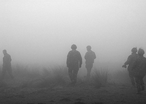
Into the Mist (Territorial Army III) Into the Mist (Territorial Army III) by Photocritic.org, on Flickr

If you want to show your pictures in a gallery, you will need to make a selection of images around a theme of some sort. If you just run around and snap pictures, you will have to scrutinize them, to find out what they really are about. If there is no connection whatsoever between them, you might want to consider not making a portfolio, and rather concentrate on taking more pictures.

Why is a theme important? Well, although single pictures can be interesting, galleries tend to be interested in offering its visitors with a journey. Pick an emotion, and explore it visually, or perhaps a situation or a place. As long as there is some kind of “red thread” tying your images into a whole, you’ll be all right.

Make sure that the images are in a logical order – either cronological, or through mood development. Be prepared that you will probably have to talk the person you are presenting your portfolio to through all the pictures, so if you have some kind of story prepared, all the better. If you decide to mix colour prints and black and white prints, you’d better have a very good explanation as to why.

A good selection of images is 10-20. If you have several themes, make different portfolios, and present them separately.

Image libraries

This type of portfolio is the photographic equivalent of a “Best Of…” album.

Image libraries are the other extreme – here, it is okay to have a large batch of single, non-interconnected images, as this is not what the target audience is looking for. What they are looking for, however, is genericicity and perfection. The more generic the image is, the bigger the chance somebody will use it, as it is adaptable for many different situations.

If your image has a flaw, ditch it. If your image is only slightly out of focus, ditch it. If your image has brand names or visible logos in it, chances are it is worthless in connection with image libraries. If you do not have model releases for the people in your images, get rid of the pictures.

In short: Make sure you only show your very best images. It is better to pitch 3 perfect pictures than 15 good ones, but that don’t stand out from the mass. You should aim for 7-15 great pictures, however.

Commercial photography

Strongly emotive photos can help your portfolio shine

If you are making a commercial portfolio, be prepared to make it focussed. You might need to change your portfolio around depending on who you are pitching it to. If you are pitching fashion work, make sure you have 5-6 pictures from each series you have done, to show that you can consistently take good pictures. If you are doing product photography, make sure that you do the same: Same product from various angles etc.

If you try to pitch your general skills as a photographer, make sure that you make several portfolios. One for portraiture, one for nature, one for product photography, etc. That way, the person reviewing your portfolio can mentally prepare for something else. Also, it allows you to show only the portfolios that are relevant for the job you are doing.

If you have gotten pictures in print (especially viable if you are planning to do freelance news photography), include both prints and newspaper clippings – side by side on adjecent pages is good.

Portfolio Presentation

This is what people ask about most: How do you present your portfolio?
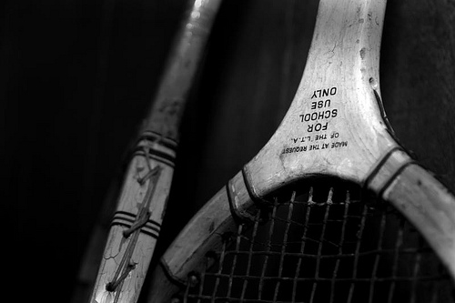
For School Use Only For School Use Only by Photocritic.org, on Flickr

First of all, make sure that your prints are of the best quality possible. This means that they should be of a decent size (approximate A4 / letter size is an ideal tradeoff between presentability and portability)

As for the actual presentation of the portfolio, the answer is difficult to offer. Although a nice leather folder with high-quality plastic inlays to keep your images in offers a good initial impact, it may not be ideal, as the plastic may introduce sheen and / or reflections on the images, making them difficult to see.

In the past, I have seen portfolios that are presented as pictures mounted on cardboard, even loose pictures in a rolodex-style folder. You could consider getting a mini- easel that you can place the images on individually. That allows you and the reviewer to take a few steps away from the images – an especially good bonus if that is how the images are meant to be seen.

Creativity is a big bonus – if you manage to come up with a good way to present your portfolio effectively, it probably means you are doing the right thing. Don’t fall for the temptation to show your images on a computer screen or data projector, however, unless this is how they are meant to be presented. If you only have slides, there is no way around showing it on a slide projector, but if there is any way you won’t have to bring and / or arrange a projector, it is better.

Oh, and it is all in the attitude. Go in there, be sure of yourself, talk, talk, talk, and don’t for a second let up that you had even slightly considered the possibility of them not liking your images. You’d be amazed what difference it makes.

Good luck!

Tips for winning photography competitions

Be prepared!

Have you ever entered a photography competition and not won a bean?

Don’t worry, it happens to all of us. To help you along, we’ve collected together some of the best tips from some top judges to see if we can’t help you lay your hands on that so-far elusive first prize!

  • Edit ruthlessly and only submit your best shot — don’t be sentimental and don’t submit an almost-shot, submit your best one.
  • Be original — you want something that will make the judges go ‘Oooh!’, with your approach, your technique, and your interpretation. And don’t try to imitate another photographer.
  • Know your craft — ensure that you are seen as in control of the image: you shot it in black and white for a reason; the lighting is just right; its focus is exactly how you wanted it; you get the best out of shooting on film or digital.
  • Seek the opinions of others — don’t be too hard on yourself and don’t be too sentimental about your images.
  • Evoke emotion — be personal and be powerful.
  • Know the rules — you don’t want to be disqualified because you didn’t do it properly. And don’t forget to put your name and the name of the image on your files!
  • Finally: persevere — you might not win this time around, but there is always next time and you’ll have learned from the process.

If you want some more insight, including tips from some competition judges, why not have a look at what Photocritic and PhotoRadar have to say, too?

Now, go forth and conquer!

Coherency in photo exhibits

fomu

For a while now, I’ve been wanting to write a review of a photographic exhibition. I wasn’t especially concerned by which exhibition, more that I wanted to look at an exhibition holistically: as a collection of photographs that had been brought together with a specific aim or purpose. I wanted to consider what I thought worked, what didn’t, and what could be done better. Ultimately, I wanted to be able to say if I thought that the exhibition had achieved its aim, or if it had made me feel something.

When I was on holiday – exploring Flemish cathedrals and drinking Trappist beer – I spent an afternoon at the Antwerpen FotoMuseum, or FoMu. Amongst its other exhibitions, it was displaying a collection of photographs taken by Belgian photographers in the inter-war years.

The potential for the exhibition was sweeping. Its introduction said how: ‘…the period between the two world wars was a time of sweeping social changes. Developments in photography reflect this,’ as well as mentioning the ‘fierce conflict’ that arose between traditionalist and modernist photographers. I was looking forward to an exhibition of contrasts and of conflicts, a series of photographs that illustrated progress in photography and changes in society. I looked back on an exhibition that disappointed me and didn’t live up to its potential.

What I saw was an interesting selection of photographs – portraits and landscapes, street scenes and still lifes, abstracts and studies – that had been beautifully framed, some of which were unusual and some thought-provoking, but I felt as if there was nothing more to the exhibition than a group of pictures taken between 1918 and 1939. There was no sense of cohesion, no aim, no signal emotion aroused by the images. If there was an objective to the exhibition, I couldn’t tell you what it was, and in my case it certainly didn’t accomplish it.

Organisation

Perhaps the most obvious way to arrange the collection would have been chronologically, which would have charted the devastated landscape, shredded society, and ruptured economy of 1918 that rose, grew, and progressed through the 20s and 30s to women’s suffrage, the jazz age, and technological accomplishment, before collapsing into the abyss of the totalitarian invasion in 1939. But it wasn’t chronological. I wasn’t able to see social change and innovation depicted in a series of photographs.

It’s possible that a curator would prefer to move away from the obvious, perhaps instead exploring the photographs thematically. The vast range of pictures available could have been arranged according to any principle you might imagine, and within those principles it would have been so easy to compare the traditionalists with the modernists and enjoy the artistic conflict of the time. Portraits, landscapes, and still lifes; studies in light and shade, texture, and natural phenomena; contrasts of mundane and usual. Instead, I found myself looking at a pair of beautiful studies of light and shade – chess pieces in shade and a woman’s hand holding a coffee cup – that had been flanked inexplicably by a street scene and an uninspiring still life. A series of three nudes were hung between a picture of a child doing arithmetic and a woman rowing on a lake. Whatever feelings those nudes might have aroused were superbly stifled by the pictures adjacent to them.

Tucked around a corner, as the exhibition reached its close, were two beautiful abstract portraits: a pair of eyes and a hand resting on a book. How effective could it have been to pair these with more traditional portraits? A sort of compare and contrast exercise, if you like. Instead, I very nearly missed them. It was only because I took a second turn around the gallery that I found them. I’m sorry if someone else should have missed these gems.

The art of showing less

FoMu had an opportunity to present something beautiful here; something unusual and enlightening that displayed some searing pictures. Instead, I felt as if the exhibition curator was so overwhelmed by the possibilities to present the pictures that he flung them at the walls and hung them where they stuck. Rather than leave the exhibition feeling as if I’d enjoyed a journey through the Belgian photographic psyche, I felt a sense of discordance. I didn’t know what the angle of the exhibition was and I had no lever into it. All the same, I’m glad that I went, and there’s a picture of some piercing eyes that I’ll not forget in a hurry.

Pictures have a wonderful ability to inspire, be it awe, surprise, amusement, social enlightenment, even historical insight. Let them do that.

Photography in Belgium Between the Wars,

FotoMuseum.be / FotoMuseum, Waalse Kaai 47, 2000 Antwerpen, Belgium